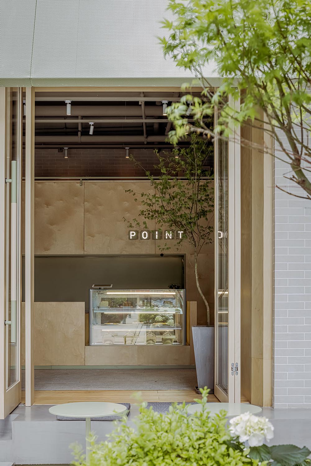
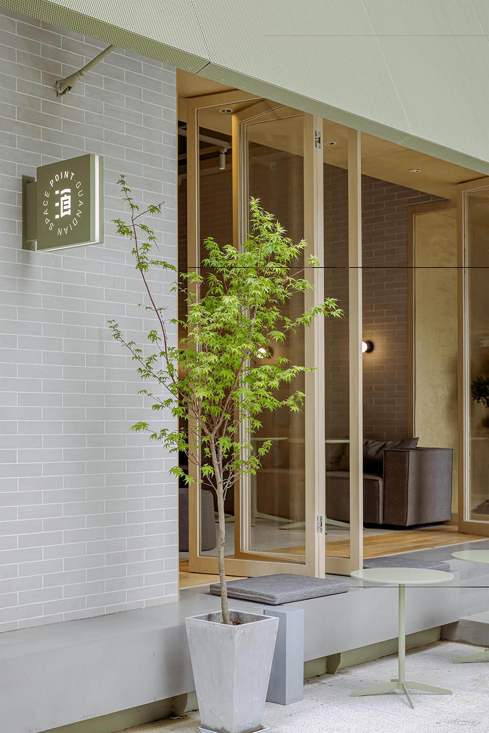
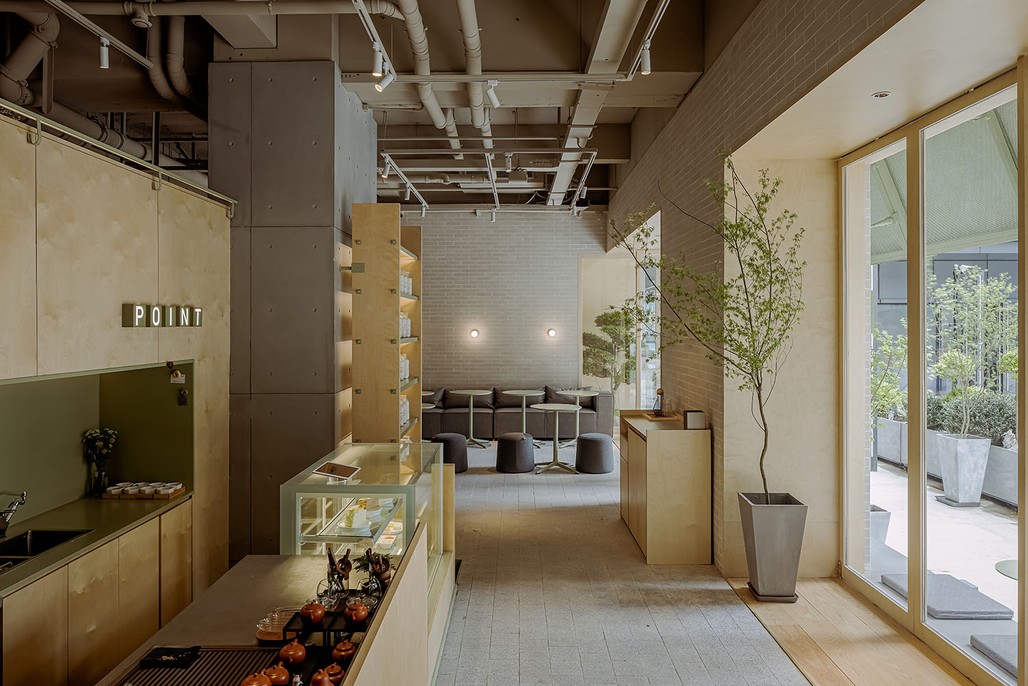
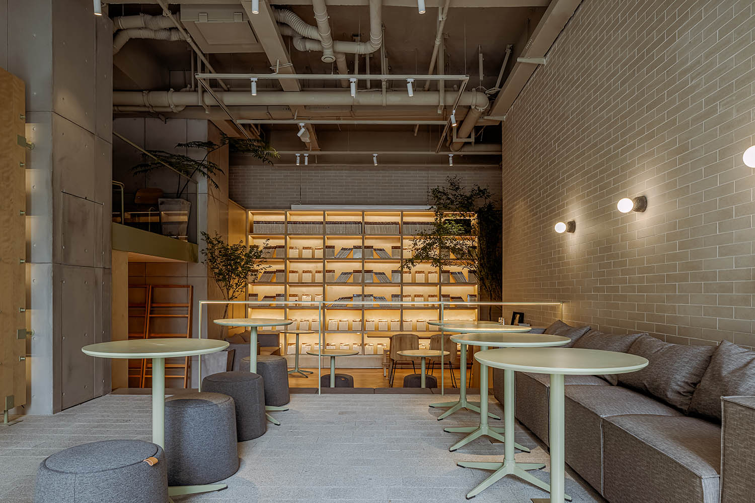
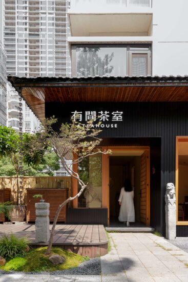
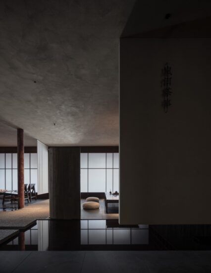
觀點茶室是位於南京秦淮區漢中路上的一家以茶飲為主的集合型商業體驗空間。毗鄰商圈與高校。在設計概念上希望傳達出“茶田”般的空間感受,同時在布局策略上迎合“聚落”主題。室內環境以錯落設計而加強空間的開放性和體驗性,有別於其他大部分專注零售業務的茶飲店,在商售業態營造之外,使顧客在品牌文化上也更豐富地感受空間本身,從而也能突出空間中的的社交功能。
POINT is a tea-based integrated commercial experience space located on Hanzhong Road, Qinhuai District, Nanjing, adjacent to the business district and universities. In the design con- cept, it is hoped to convey a “tea field”-like spatial feeling, and at the same time to cater to the theme of “settlement” in the layout strategy. The interior environment of POINT is designed with staggered design to enhance the openness and experience of the space. Different from most other tea shops that focus on retail business, in addition to the construction of commer- cial formats, customers can feel the space itself in brand culture more abundantly, and the so- cial functions of POINT are also intertwined in the space.
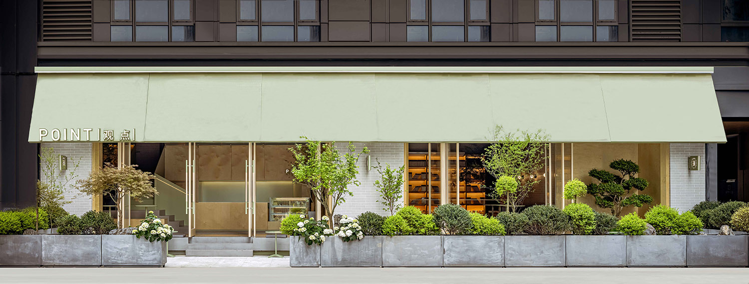
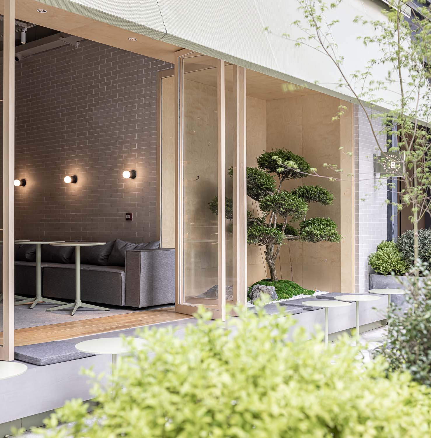
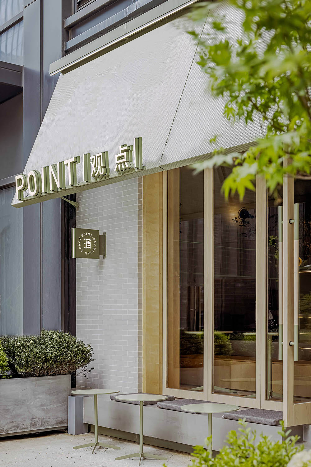
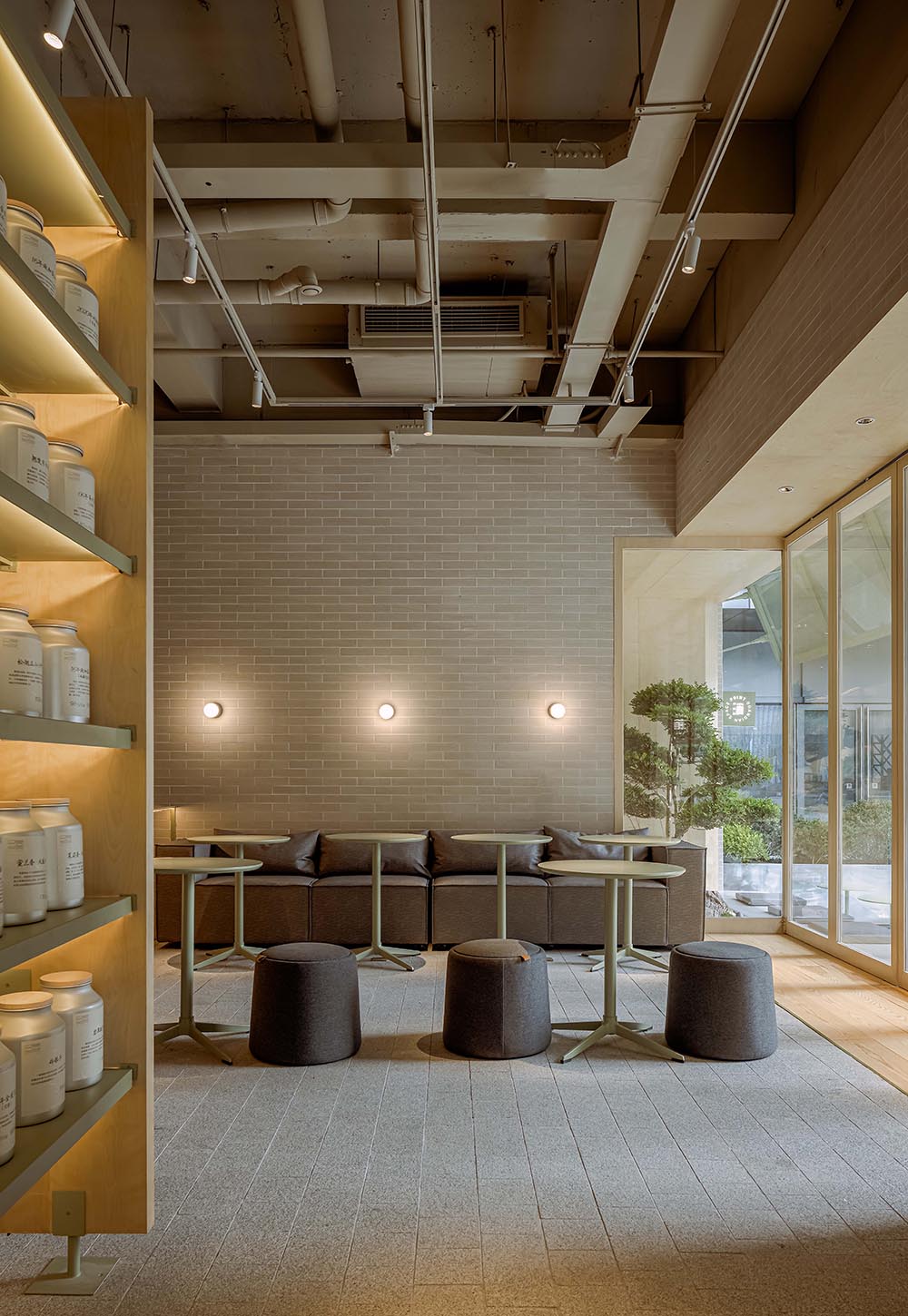
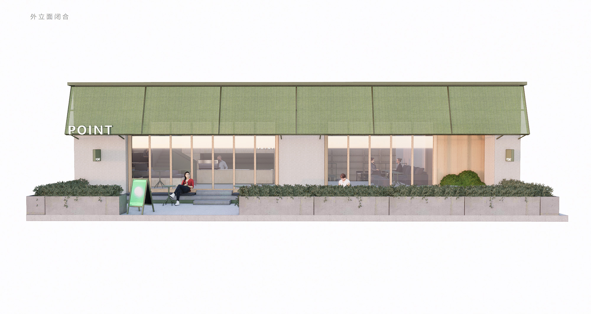
人們從室外步入店內時,首先會經過一方庭院,清晰爽朗的景觀線條勾勒出的這塊空間將承擔空間的過渡緩衝屬性,帶來情緒鋪墊,使得進入的動線變得豐富。通透舒暢的大片落地門窗將室外景觀更大限度地引入室內,光線和風的充盈流動,也進一步室內空間中混凝土材質所帶來的凝重感。
When people walk into the store from the outside, they will first pass through a courtyard. The clear and hearty landscape line outlines the space that will assume the transitional buffering properties of the space, bring emotional paving, and en rich the flow of entry. The transparent and comfortable large floor-to-ceiling doors and windows bring the outdoor landscape into the room to a greater extent, and the flow of light and wind also adds to the dignity brought by the concrete material in the indoor space.
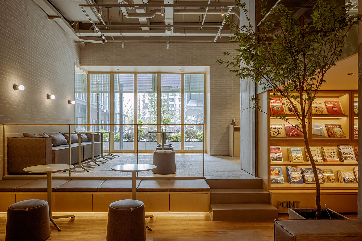
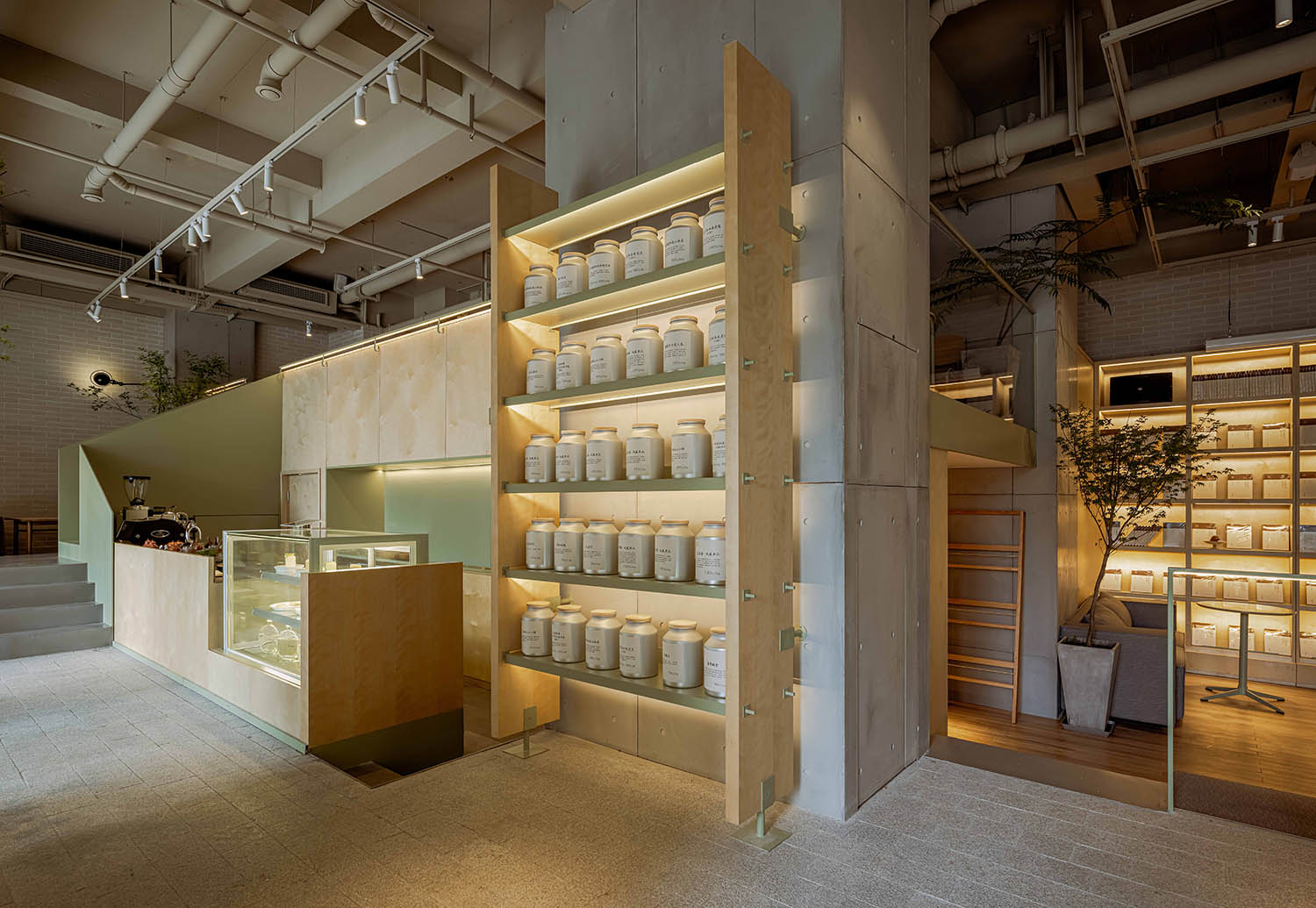
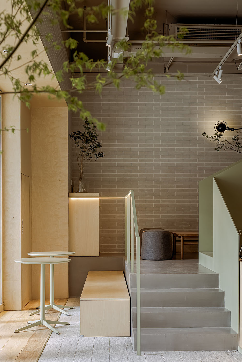
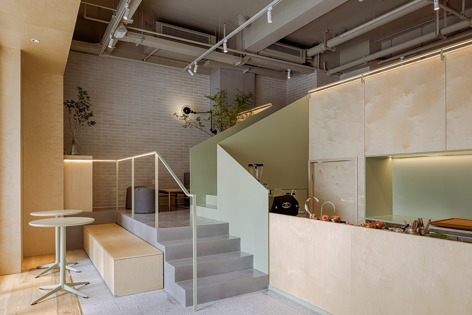
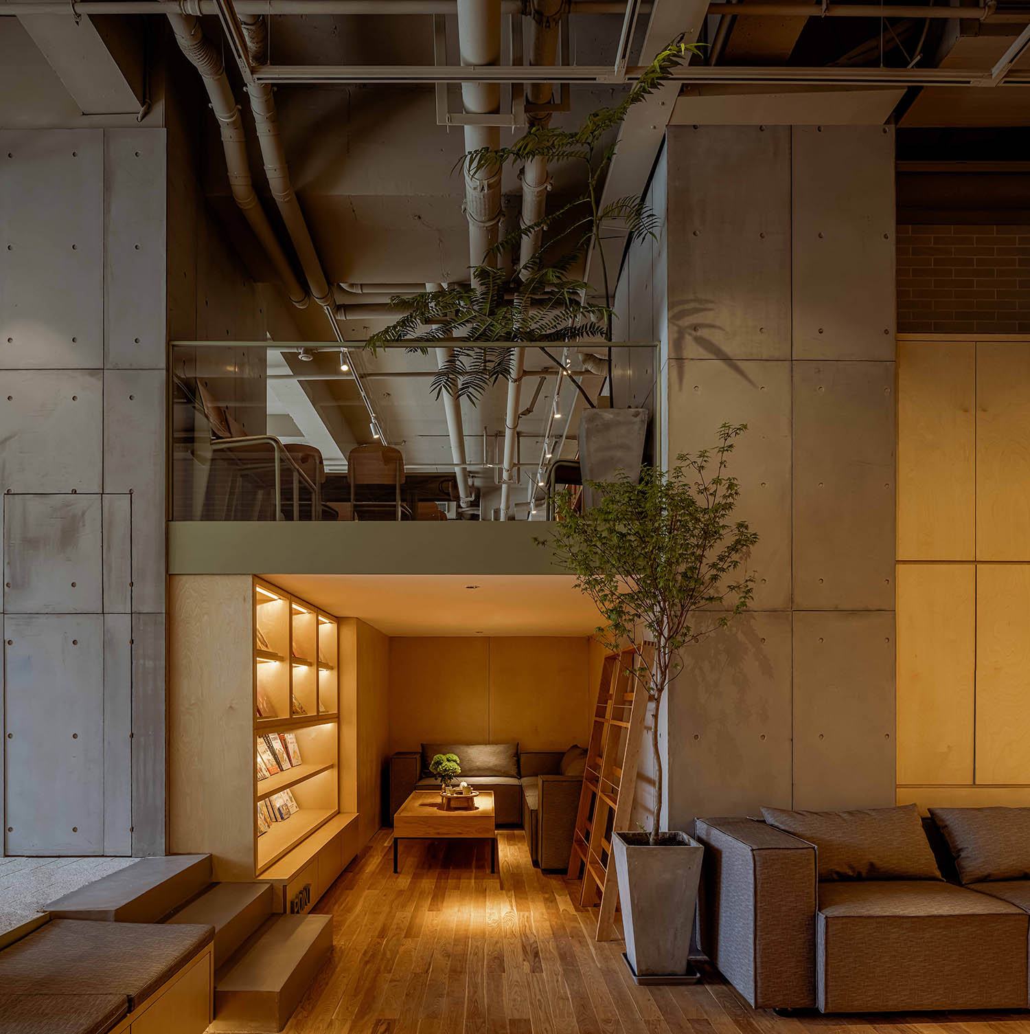
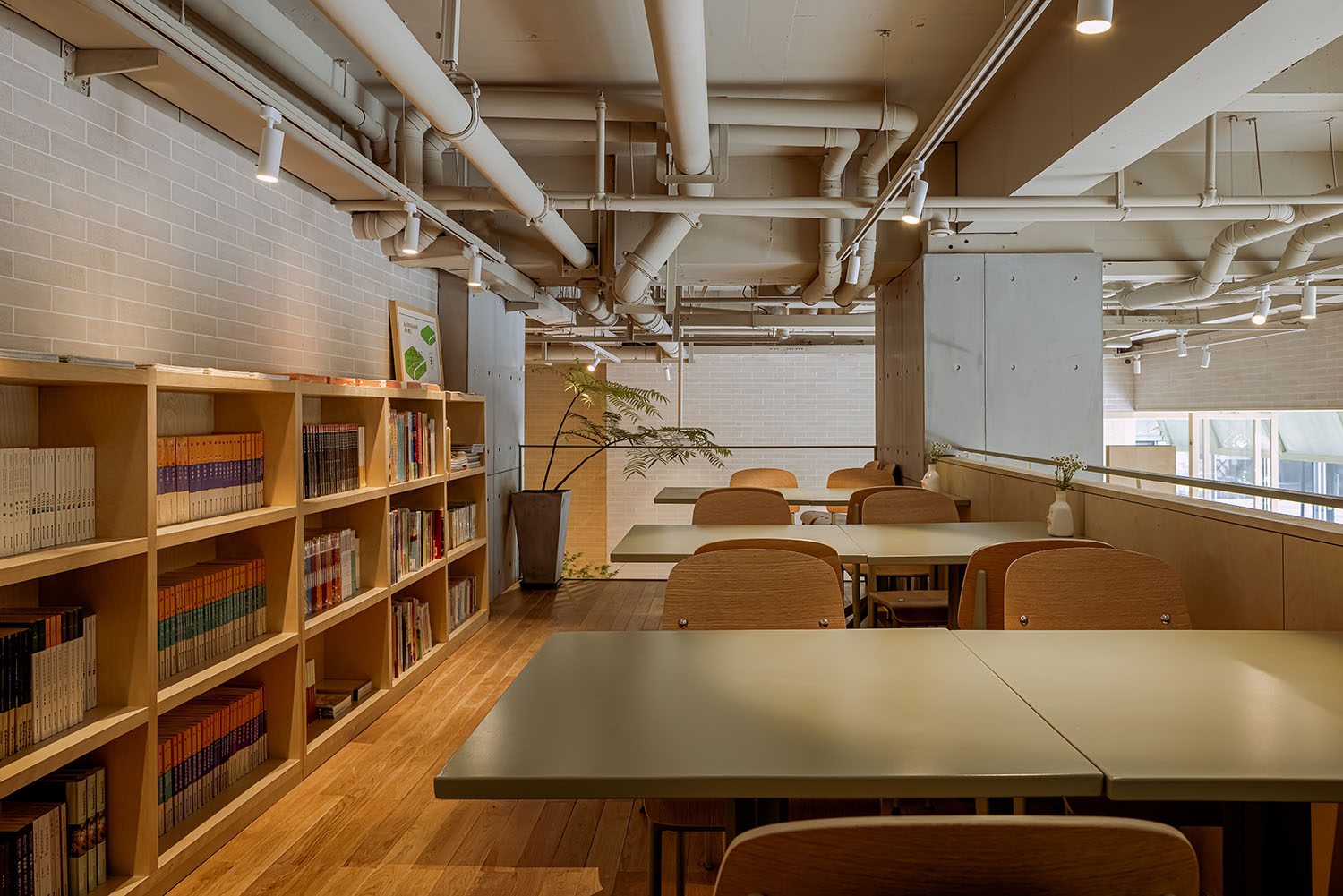
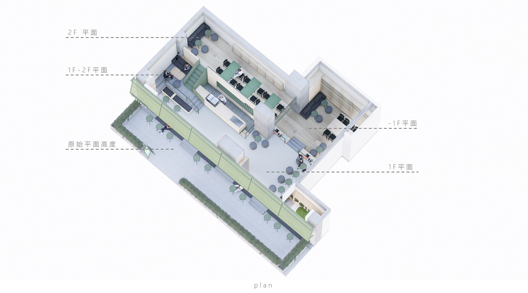
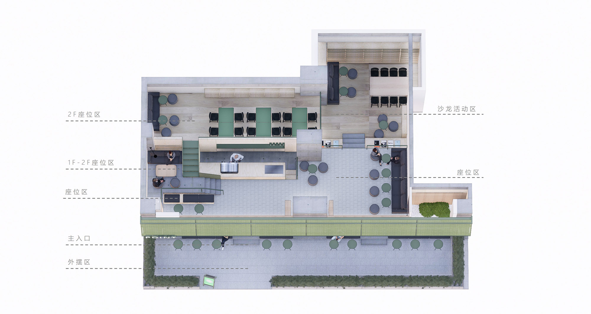
在空間材料上選用混凝土預製板作為主材,營造空間的簡潔明快,搭配實木家具陳設與綠植景觀的引入,人們在茶席之間亦可作為充滿親密感的公共社交空間。在空間劃分上利用大方高度切分出挑高二層空間,並在一樓與二樓的通行區域增拓出新的過渡休憩區域,增強空間利用性的同時在茶田般的落差間增強著空間的聚落感。
Precast concrete panels are selected as the main materials for the space materials to create a simple and lively space. With the introduction of solid wood furnishings and green landscapes, people can also be used as public social spaces full of intimacy between tea seats. POINT utilize the space into two-story high ceiling height Parsing and traffic area on the first floor and the second floor by the extension of a new transitional open area, enhanced time space availability, and enhance the sense of space settlements between the gap.
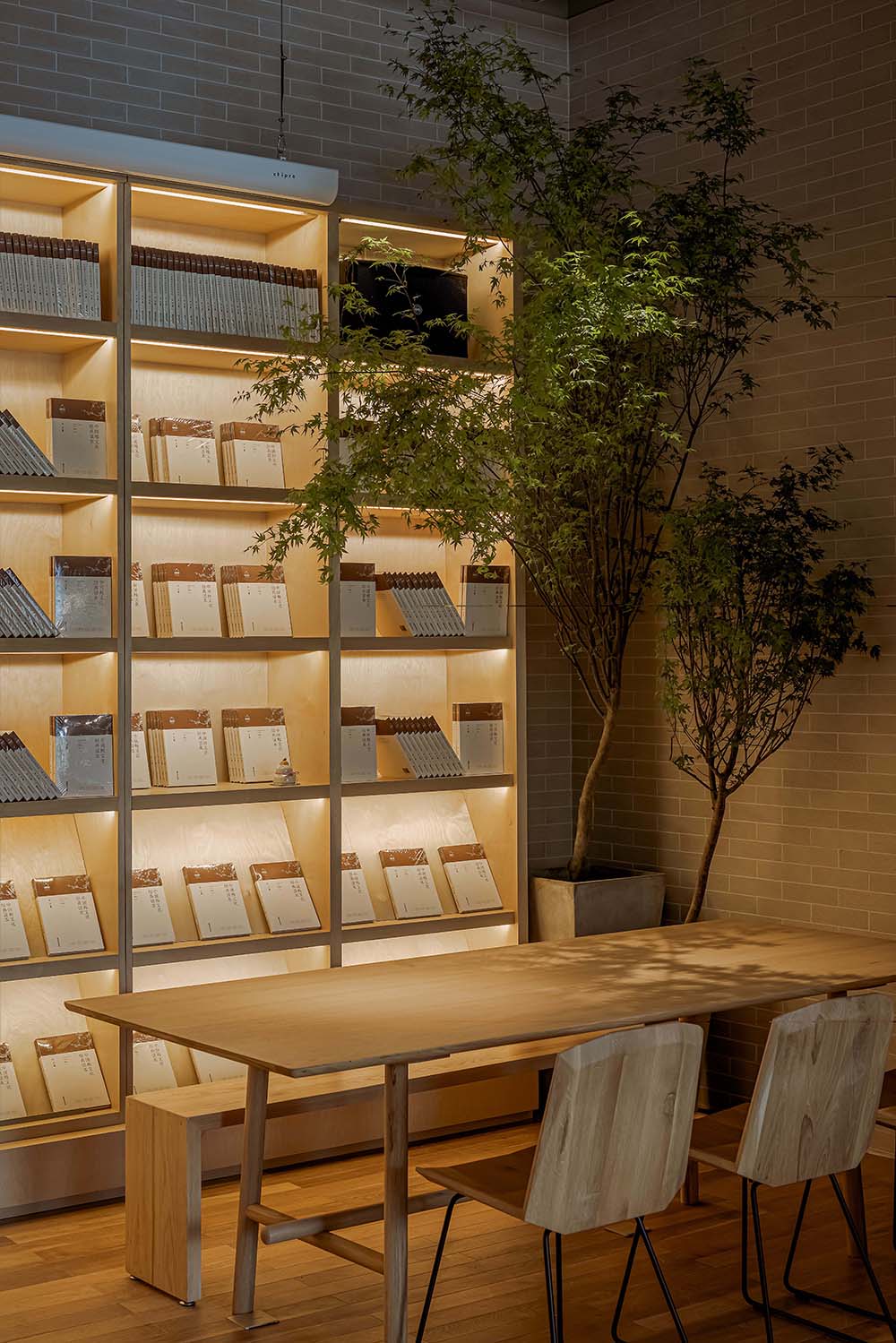
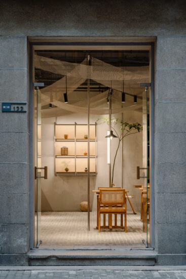
暖色燈光設計與實木紋理相互交融,磚牆紋理、裸露的頂部造型和混凝柱都在空間布局的切分中被保留下來。
The warm-color lighting design blends with the solid wood texture. The brick wall texture, the exposed top shape and the concrete column are all preserved in the division of the space layout.
整個空間營造過程中,在充分保證可用性與開放性的同時,精心對空間中每一處角落進行打磨,豐富的細節處理仍保持著觀點茶室所秉持的樸素質感和靈活美學,鼓勵停留店中的客人們移步異景地收獲更多元的感受,在讀書品茶間,與友談笑風生,虛度一段寧靜的時光亦是我們最真切的空間意願。
In the entire space creation process, while fully ensuring the usability and openness, every corner in the space is carefully polished, and the rich detail processing still maintains the simple quality and flexible aesthetics that POINT upholds. Encourage the guests staying in the store to gain more diversified feelings. In the reading and tasting tea room, chatting and laughing with friends, and wasting a quiet time is also our most true spatial de- sire.
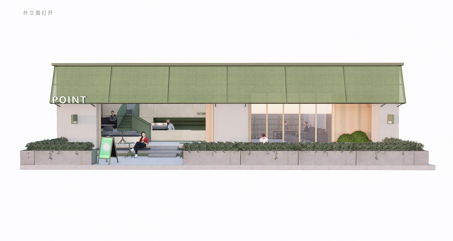
∇ 外立麵打開 Facade open
∇ 外立麵閉合 Facade closed
∇ 空間分層 Spatial stratification
∇ 空間功能布局 Space function layout
項目信息
項目名稱:觀點茶室
項目類型:餐飲空間
設計時間:2020年10月—2021年1月
施工時間:2021年1月—2021年2月
設計團隊:三厘社TRIOSTUDIO
項目地址:江蘇南京
項目狀態:建成
建築麵積:127平方米
客戶:觀點茶室
攝影版權:EMMA
品牌合作:邦喜建材 臻藏古木 易格自然
公眾號:三厘社TRIOSTUDIO


