有點建築設計受ACG國際藝術教育中心的委托設計其在蘇州的總部校區。場地位於蘇州工業園區CBD的一棟高層寫字樓之中,由三間店鋪組合成一個L型場地。校方希望在一個月的裝修期限內,通過有限的預算打造一個舒適,獨特,適合藝術創作的學習與辦公環境。500平的空間需要滿足四個藝術門類的工作室,小型研討教室,作品展廳,公共自習區,攝影區等多種功能。
Someone Studio was commissioned by ATA Creativity Global to design its campus in Suzhou. The site is in a high-rise office building in the CBD of Suzhou Industrial Park. Three office space are combined into an L-shaped site. The school hopes to create a comfortable and unique study environment, suitable for artistic creation within a one-month renovation period and a very limited budget. The 500-square-meter space needs to meet various functions such as studios for four art majors, small seminar classrooms, art exhibition area, self-study zone, and photography stage.
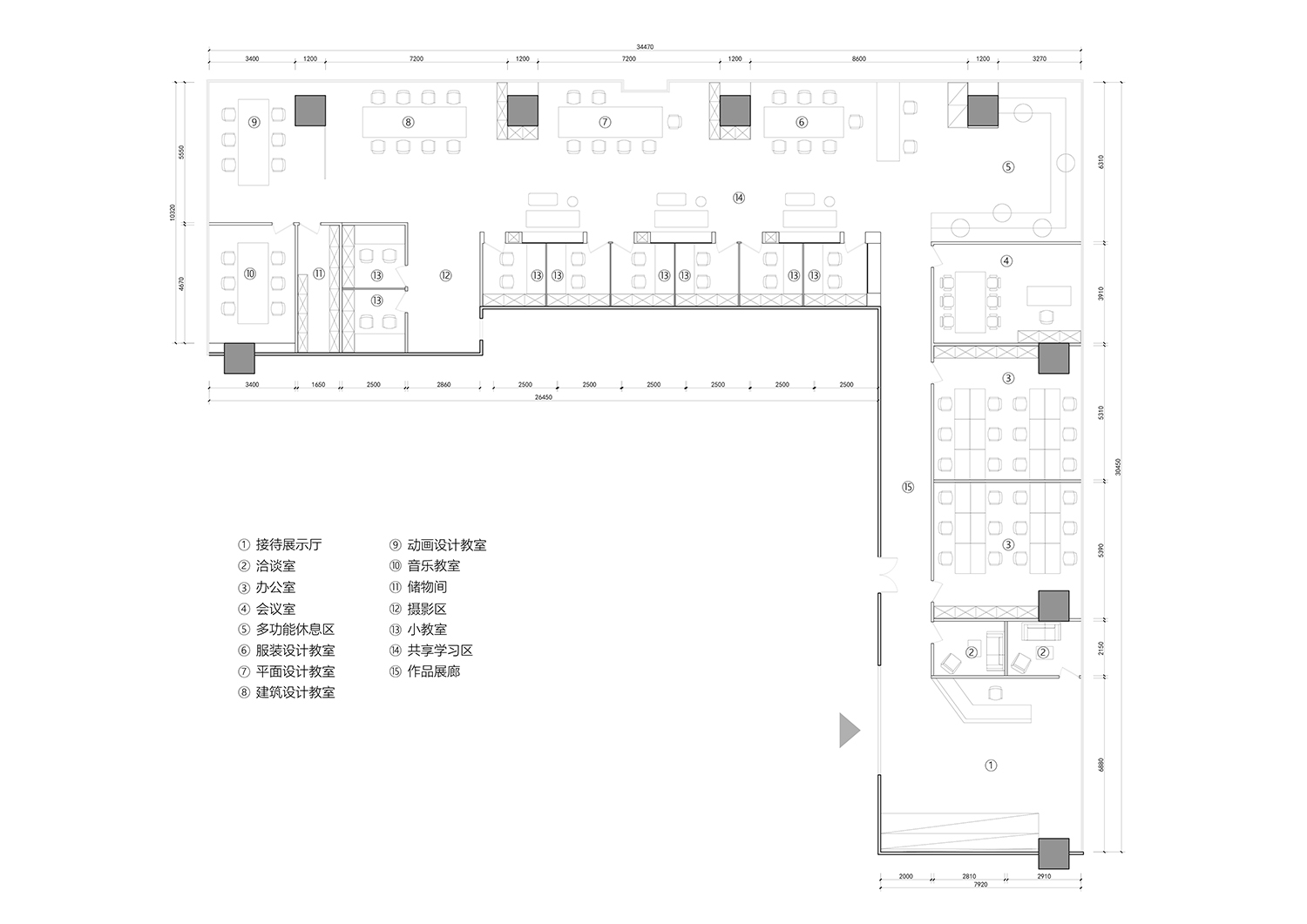
由於場地極為規整且麵寬不寬,整體的功能布局與流線十分清晰簡單,前端布置展廳,後端布置教室。如何在方正普通的場地中打造出有趣特別的,與普通教學空間有差異化的空間成為了本次設計的重點。
Provided with a regular and linear shape site, the overall functional layout and circulation is very clear and simple, with exhibition halls at the front and classrooms at the back. How to create an interesting and unique space in the ordinary venue, which is different from the normal study space, became the focus of this design.
∇ 教學空間概覽 ©林圭佳棟 Overview of teaching space © Guijiadong Lin
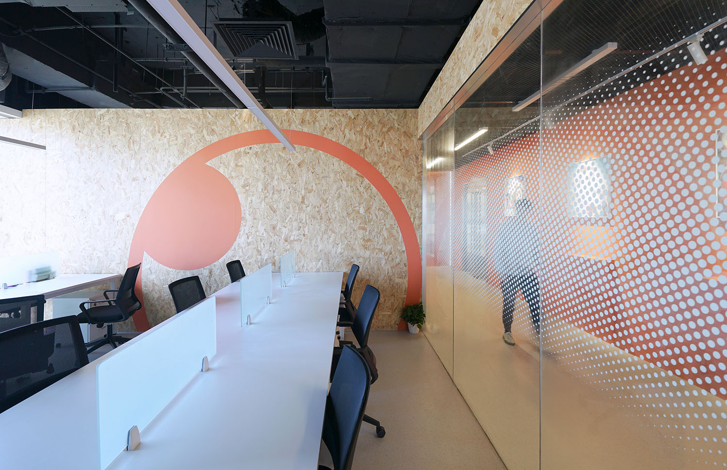
在平麵布置上,由於小教室的尺寸小,排布密集,平時的使用率不高,因此我們將它們布置在靠牆一側的位置,避免擋住落地窗的光線與景色。服裝設計,空間設計,平麵設計和動畫設計四間大工作室同時講課的幾率不高,對隔音的要求相對較低,更類似於專業內同學老師聚集的工作區。因此我們將大教室做成半開放的形式,布置在靠近落地窗的一側,使得空間整體視覺上更加開闊,自然光線也得以照進內側的小教室。
In terms of layout, due to the small size and dense arrangement of small classrooms, the usual usage rate is not high, so we arranged them on the side of the wall to avoid blocking the light and scenery of the floor-to-ceiling windows. The four major studios of clothing design, space design, graphic design and animation design have a low chance of giving lectures at the same time, and the requirements for sound insulation are relatively low, more similar to the work area where students and teachers gather in the major. Therefore, we made the large classroom into a semi-open form and arranged it on the side close to the floor-to-ceiling windows, so that the overall visual experience of the space is more open, and natural light can also shine into the small classroom on the inside.
∇ 平麵設計教室 ©林圭佳棟 Graphic Design Classroom © Guijiadong Lin
∇ 小型研討教室 ©林圭佳棟 Small seminar classroom © Guijiadong Lin
∇ 多功能休息區 ©林圭佳棟 Multifunctional rest area © Guijiadong Lin
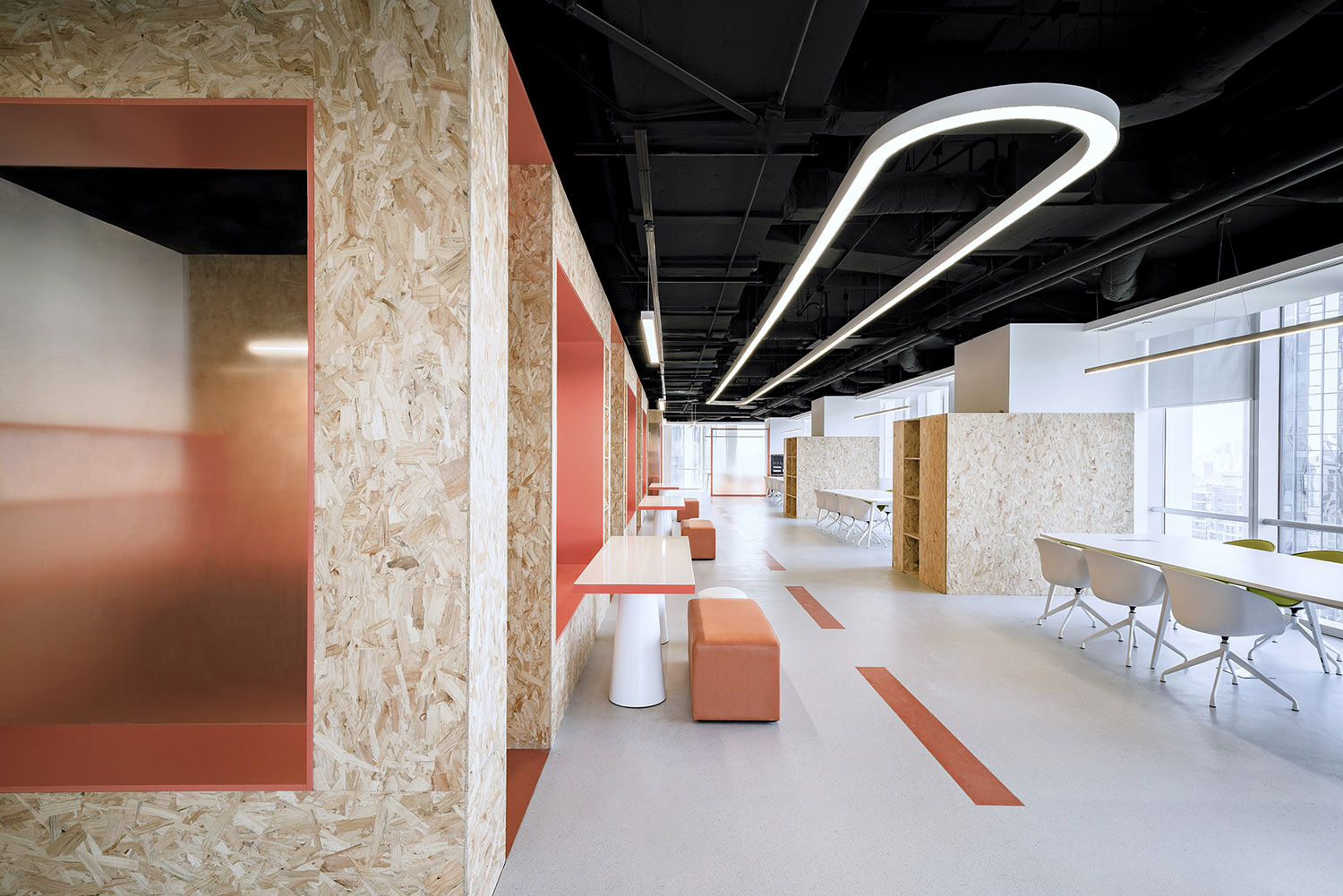
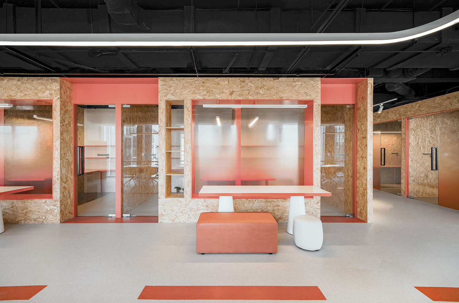
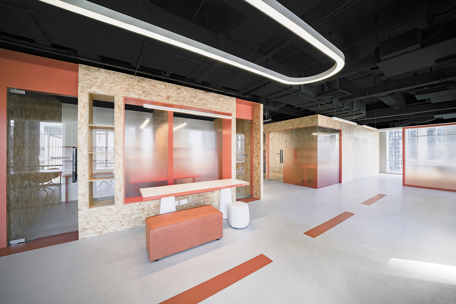
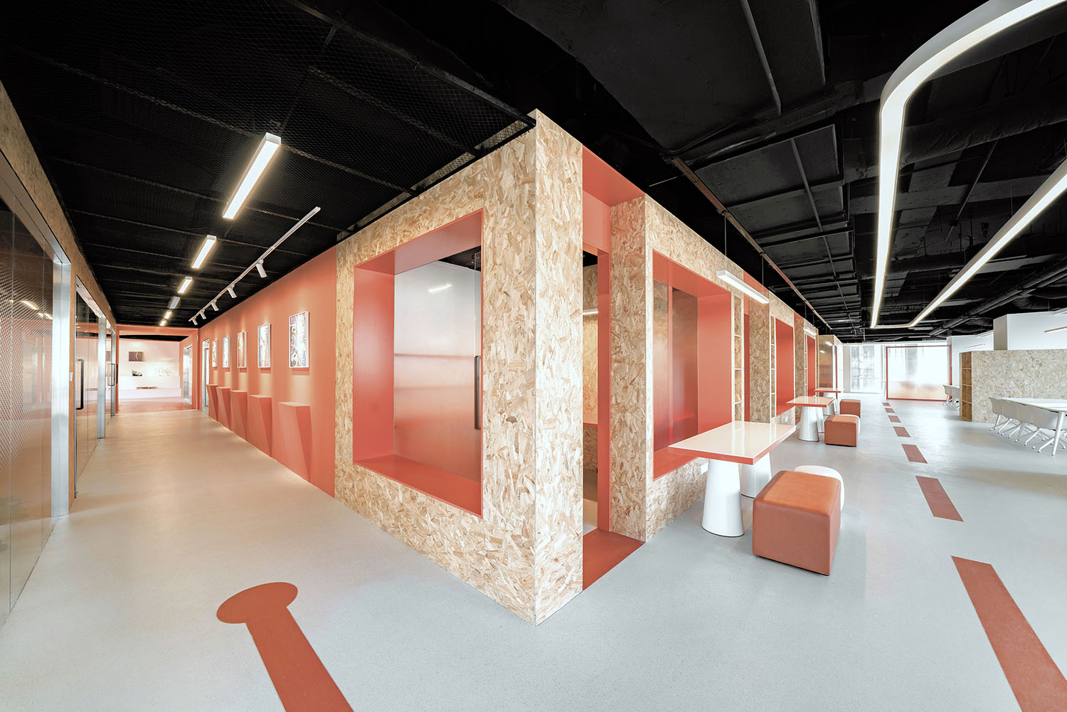
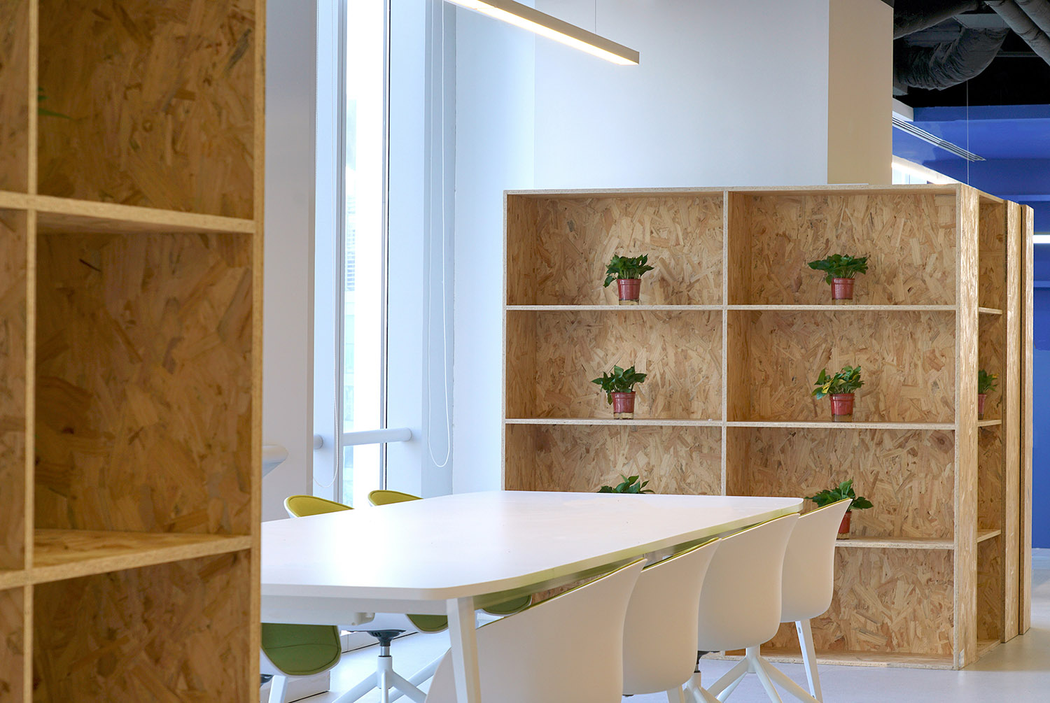
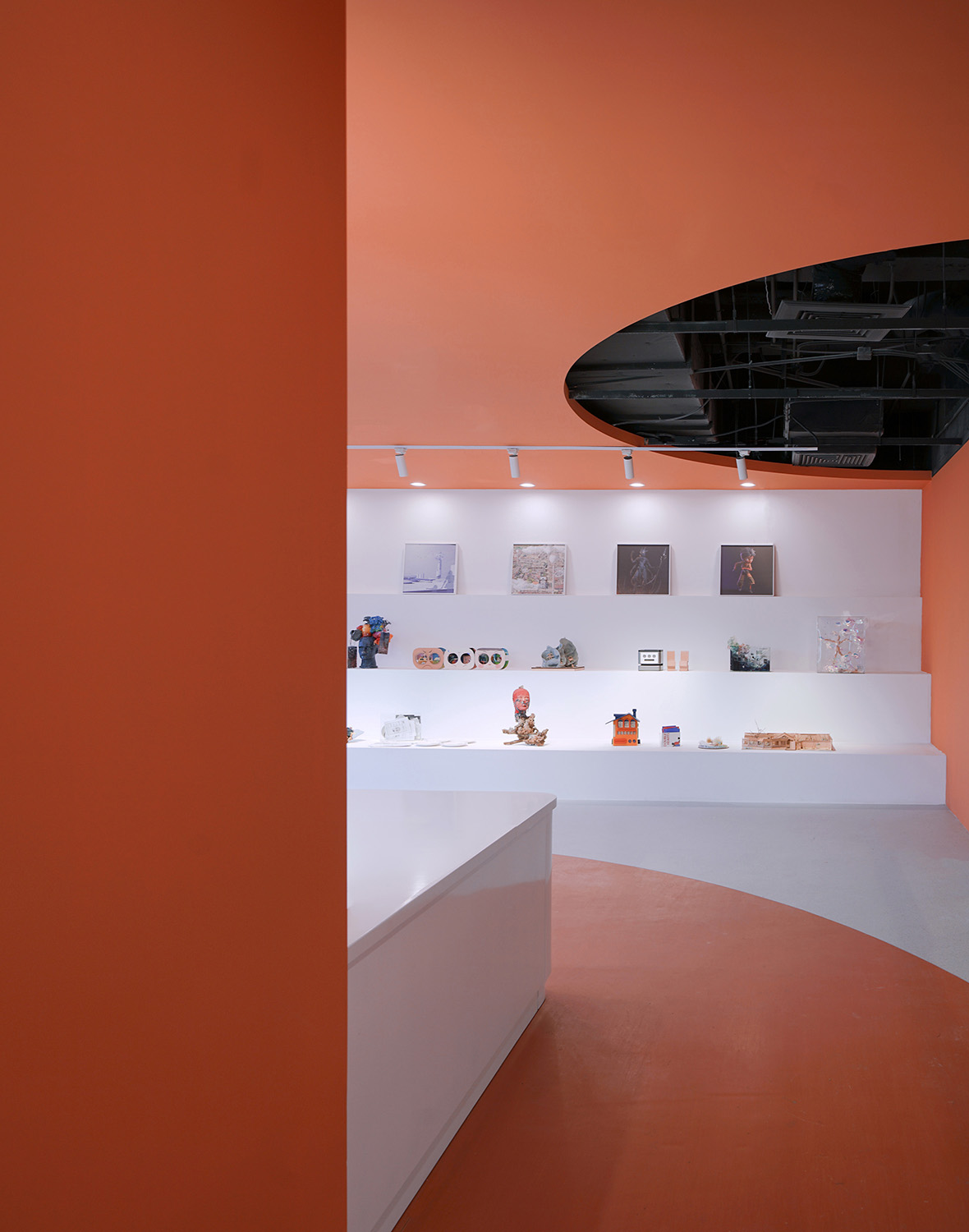
布置完平麵功能之後,我們從硬裝的造型入手來增加空間的趣味性和差異化,提出了“藝術倉庫”的設計概念,藝術教育中心不僅是當下的培訓教室,也是未來藝術家、設計師的預備基地,存儲著未來的藝術人才和藝術作品。因此我們提取“藝術倉庫”作為主題,空間內的新建牆麵不再是隻有100厚度的隔牆,而是集儲物,展示,座位,隔斷,櫥窗等多功能於一體的“小型倉庫”。通過牆麵上門窗的凹凸造型,展示櫃的隔斷,營造出多個方盒子型的倉儲空間,對內可以隔音,創造安靜的私人學習空間,而外圈可以提供半圍合的創作空間,展示藝術作品。
After laid out the function in plan, we started with the hard-covered shape in order to add interest and diversity. We proposed the design concept of “art warehouse”. The art education center is not only the current training classroom, but also the future artists and designers. A preparatory base to store future artistic talents and works of art. Therefore, we take “art warehouse” as the theme. The new wall in the space is no longer a partition wall with a thickness of only 100, but a “small warehouse” integrating storage, display, seating, partition, window and other functions. Through the concave and convex shapes of the doors and windows on the wall and the partition of the display cabinet, multiple square box-shaped storage spaces are created, which can be soundproofed internally, creating a quiet private study room while the outer ring provide a semi-enclosed creativity zone, as well as display racks.
∇ “藝術倉庫” ©林圭佳棟 “Art Warehouse” © Guijiadong Lin
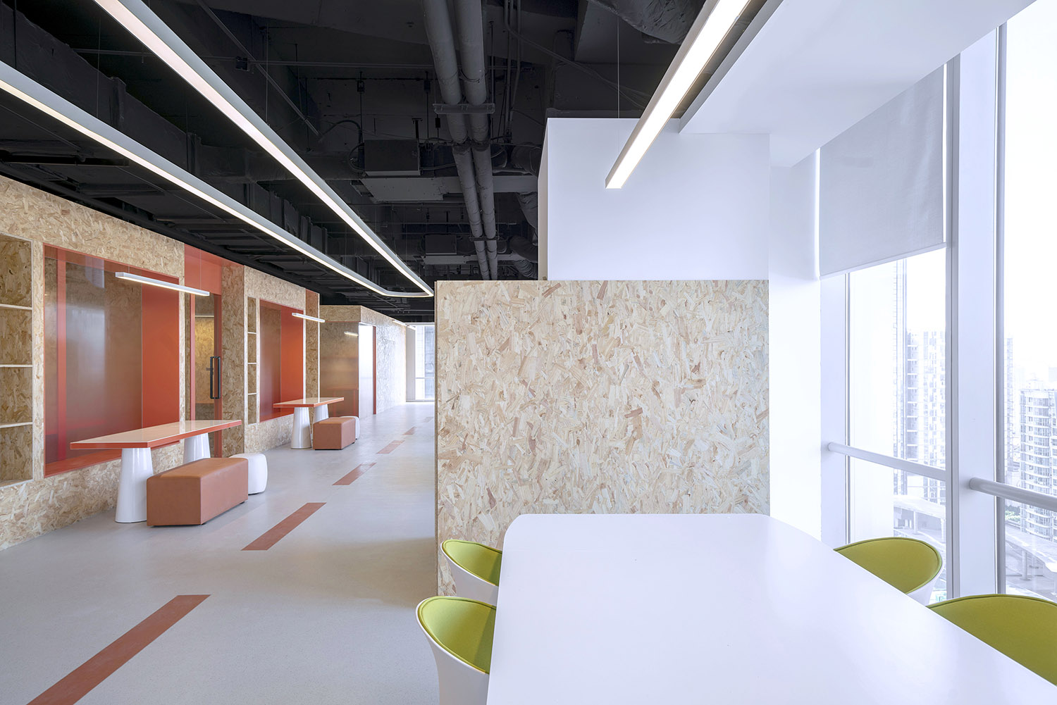
同時,因為小教室隔斷牆麵兼具了座位的功能,原本的過道不再是簡單的交通空間,在擺放桌椅之後,過道兼具了學習研討的功能。整個空間的結構因為“藝術倉庫”概念的引進,由教室-過道-教室的三段式單一布置,變為了教室-共享研討\過道-教室的多層次複合結構,形成了從私密到開放的過渡。整個教學空間無論是從功能使用上還是視覺層次上都更加豐富。
Meanwhile, because the partition wall of the small classroom also functions as a seat, the original aisle is no longer a simple traffic space. After the tables and chairs are placed, the aisle also has the function of learning and discussion. Due to the introduction of the concept of “art warehouse”, the structure of the entire space has changed from a three-stage single arrangement of classroom-aisle-classroom to a multi-level composite structure of classroom-sharing seminar\aisle-classroom, forming a transition from private to the openness. The entire art classroom is richer both in terms of functional use and visual level.
∇ 共享學習空間 ©林圭佳棟 Shared learning space © Guijiadong Lin
除了小教室,空間內其它隔斷也都遵循著“倉儲與展示一體”的原則,大教室的隔斷牆對外可以釘貼掛畫,對內存儲學生做模型用的原材料,在最小的空間實現最大化的功能排布。
In addition to the small classroom, other partitions in the space also follow the principle of “integration of storage and display”. The partition wall of the large classroom can be nailed and hung on the outside, and the raw materials for students to make models can be stored inside, so as to maximize the functional arrangement within the smallest space.
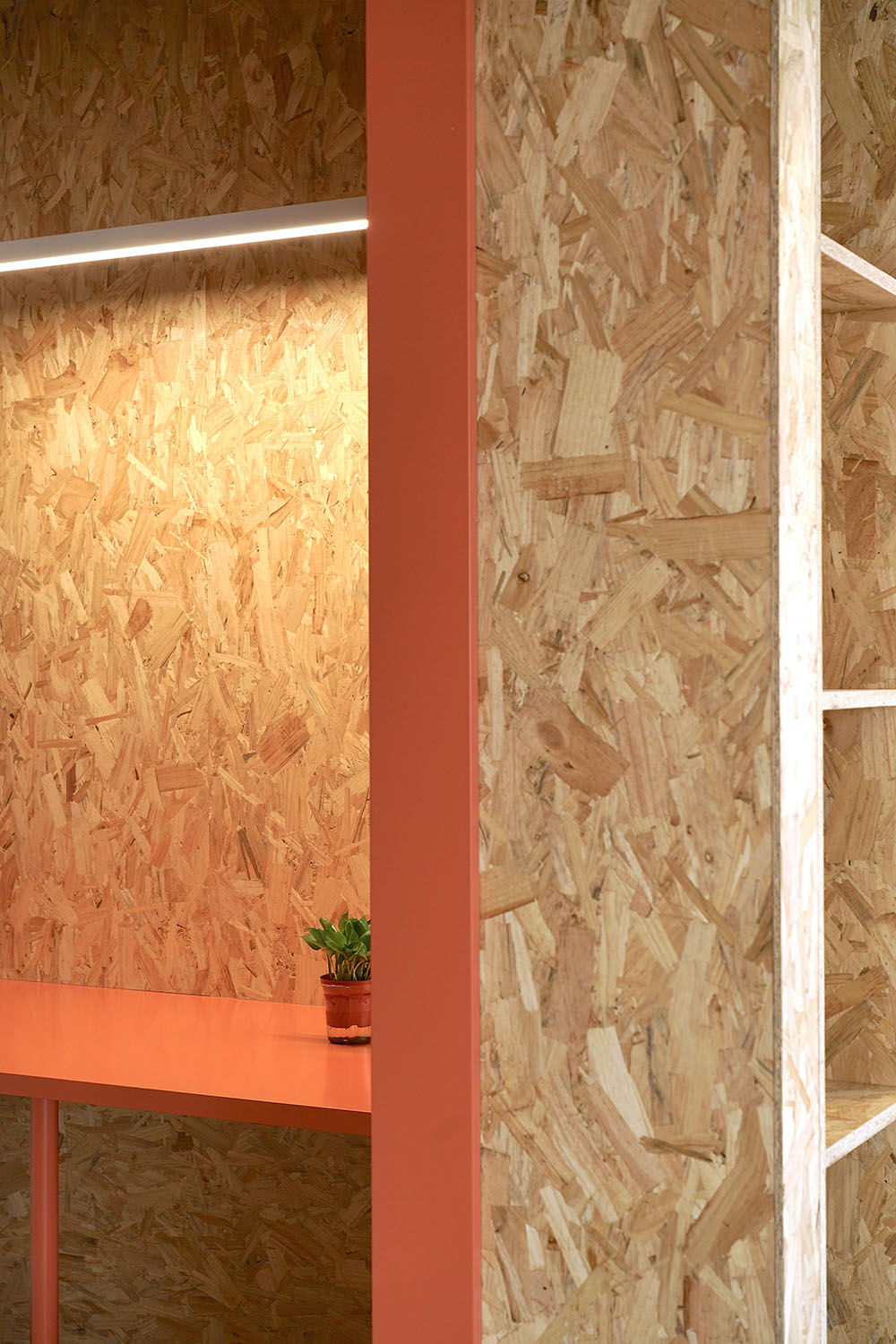
為了使空間的整體氛圍更有特點,在材料和顏色的選取上,我們大膽選用了普通裝修中作為打底材料的歐鬆板作為主要材料裸露在外。希望這種原始自然的材料可以營造輕鬆活潑的氛圍,同時加入少量的橘色和藍色烤漆板以活躍氣氛。整體空間沒有鋪貼多餘的裝飾材料,頂麵未做吊頂。通過在裝飾上盡量做減法,使得功能性和展示性一體的歐鬆板隔斷成為視覺的中心和整個設計的重點。
In order to make the overall atmosphere of the space more characteristic, in the selection of materials and colors, we boldly chose the OSB, which is normally been used as base material in regular projects, as the main material to be exposed. It is hoped that this raw and natural material can create a relaxed and lively atmosphere, while adding a small amount of orange and blue varnished boards to liven up the atmosphere. The overall space is not paved with redundant decorative materials, and the ceiling is kept as it is. By doing as much subtraction as possible in decoration, the functional and display-integrated OSB board partition becomes the center of vision and the feature of the whole design.
∇ 橘色學習空間 ©林圭佳棟 Orange study space © Guijiadong Lin
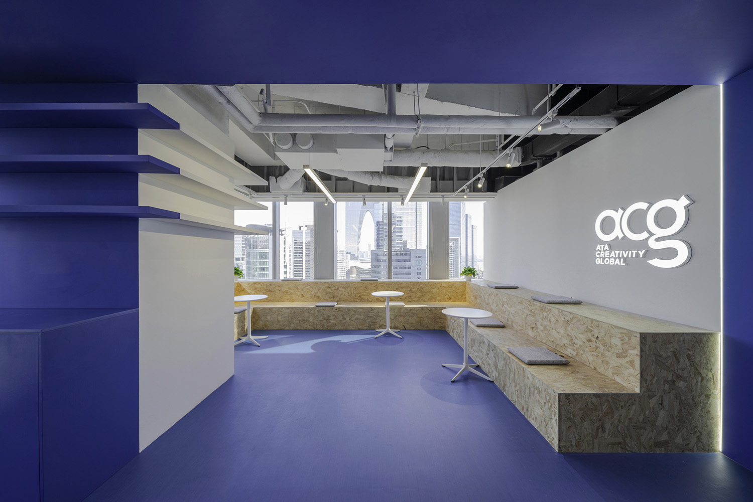
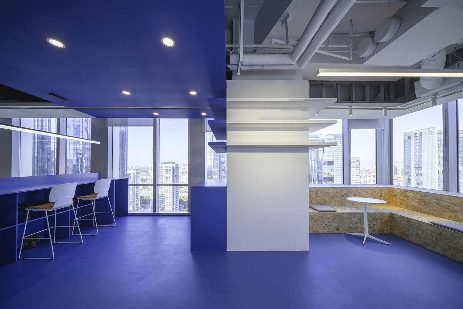
∇ 藍色休息空間 ©林圭佳棟 Blue rest space © Guijiadong Lin
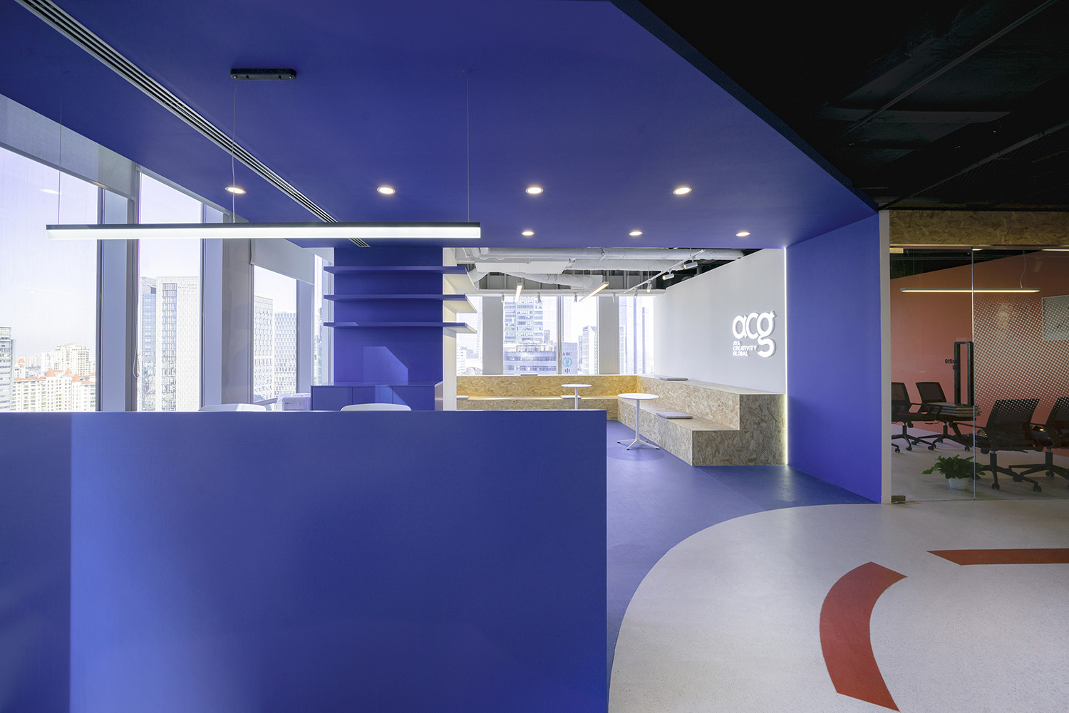
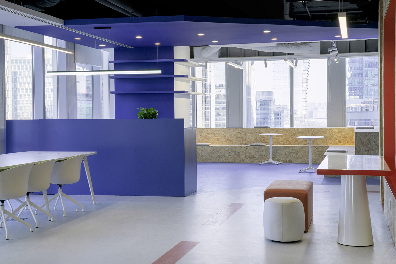
空間色彩的選取也與功能有關,教學區以橙色為點綴,橙色在心理上可以使人振奮有活力,有創造力。茶水休息區以藍色為主,藍色使人放鬆安靜。一橙一藍,一動一靜,互相穿插交錯,組合成完整的教學空間,便於學生和老師勞逸結合。
The selection of space color is also related to functions. The teaching area is decorated with orange, which can make people psychologically invigorating, energetic and creative. The tea rest area is dominated by blue, which makes people relax and quiet. Together, orange and blue, movement and stillness, are interspersed with each other to form a complete teaching space, which is convenient for students and teachers to combine work and rest.
∇ 藍色橙色相互融合 ©林圭佳棟 Blue and orange blend with each other © Guijiadong Lin
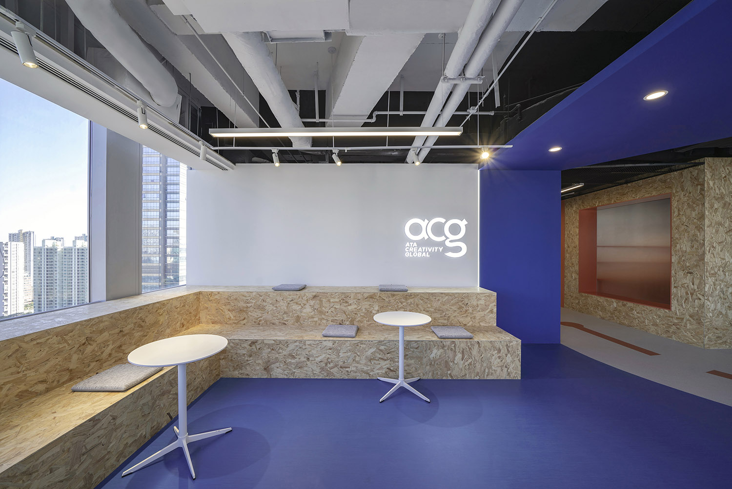
L型場地的拐角處兩邊均有落地窗,是采光觀景最好的位置,但由於中間粗大承重柱的存在,無法作為教室使用。因此我們將這塊地方安排為多功能休息區。柱子與水吧台結合以節省空間,同時弱化柱子。靠牆設計了台階式的座位,既可以並排坐人舉行小型研討會議,也可以配合圓桌分散坐人,小組討論,還可以獨坐一桌喝飲料休息放鬆。
There are floor-to-ceiling windows on both sides of the corner of the L-shaped site, which is the best place for lighting and viewing, but there is a large pillar inserted in it, which is not possible to arrange as a classroom. So we allocated this place as a multifunctional lounge area. The pillars are combined with the water bar to save space while weakening the pillars. A step-type seat is designed against the wall, which can sit side by side for small seminars and meetings, and can also be used with a round table to disperse people, group discussions, or sit alone at a table to drink drinks and relax.
∇ 多功能休息區台階式座位 ©林圭佳棟 Step seating in the multi-functional rest area. Image © Guijiadong Lin
∇ 水吧台及展架與柱子結合 ©林圭佳棟 Water bar and display rack combined with pillars © Guijiadong Lin
∇ 細節材料展示 歐鬆板 ©林圭佳棟 Detail material display OSB board © Guijiadong Lin
∇ 平麵布置圖 ©有點建築設計 Floor plan © Someone Studio
項目信息
項目名稱:多學科藝術教室
設計方:有點建築(蘇州有點建築設計有限公司)
項目設計&完成年份:2021.10-2021.11
主創設計:王乙童、林圭佳棟
項目地址:江蘇省蘇州市工業園區蘇悅廣場南樓
建築麵積:500㎡
攝影版權:林圭佳棟
客戶:蘇州ACG國際藝術教育中心
施工造價:35萬
project name: Multidisciplinary art classroom
Designer: Someone Studio (Suzhou Youdian Architectural Design Co., Ltd.)
Project Design & Completion Year: 2021.10-2021.11
Main creative design: Yitong Wang, Guijiadong Lin
Project Address: South Building, Suyue Plaza, Suzhou Industrial Park, Jiangsu Province
Building area: 500㎡
Photography copyright: Guijiadong Lin
Client: ATA Creativity Global
Construction cost: 350,000 rmb


