以情感張力觸發生活感知
如果有一個品牌能夠象征意大利家具的發展史,那必然是專注於高端衣櫃和係統家具的Molteni&C——創始於1934年,獨到前沿的設計理念與完整的生產鏈,以及長達八十餘年臻於內在品質的堅定追求,讓其成為家具生產和設計領域的頂級品牌,不僅在行業內備受推崇,更是各界名流青睞的上乘之選。
Founded in 1934, Molteni&C is a time-honored brand that represents the history of design furniture in Italy, dedicated to creating superior closets and system furniture products. Based on innovative design ideas, a complete production chain and a persistent pursuit of quality for more than eight decades, Molteni&C has been a leading popular design furniture brand across the globe.
正反設計提煉其品牌基因,解構品牌特質,將商業理念溶解於空間之中,營造注重情緒價值輸出的居所氛圍。“我們一直在想這所SHOWROOM沒有怎麼在張力上的用力,這是情感上的努力。這個空間,都是關於情感的。我們希望是一個居所的情感寄托,就像感知裏麵每一件產品用於生活的感觸,才匹配這麼多設計大師的作品。”
As conceiving the showroom for Molteni&C in Ningbo, design studio OUTIN. DESIGN dug into the brand’s genes and character, incorporated business ideas into the space, and created a “home” setting with a focus on emotional experience.
“For this showroom, we emphasized emotional experience rather than visual tension. The entire space is about emotions. By bringing in multiple furniture pieces designed by master designers, we created immersive, emotion-evoking home scenes to let customers better perceive the displayed furniture’s application in daily life.” the design team explained.
1、空間內外的構建法則
Holistic interior and exterior design
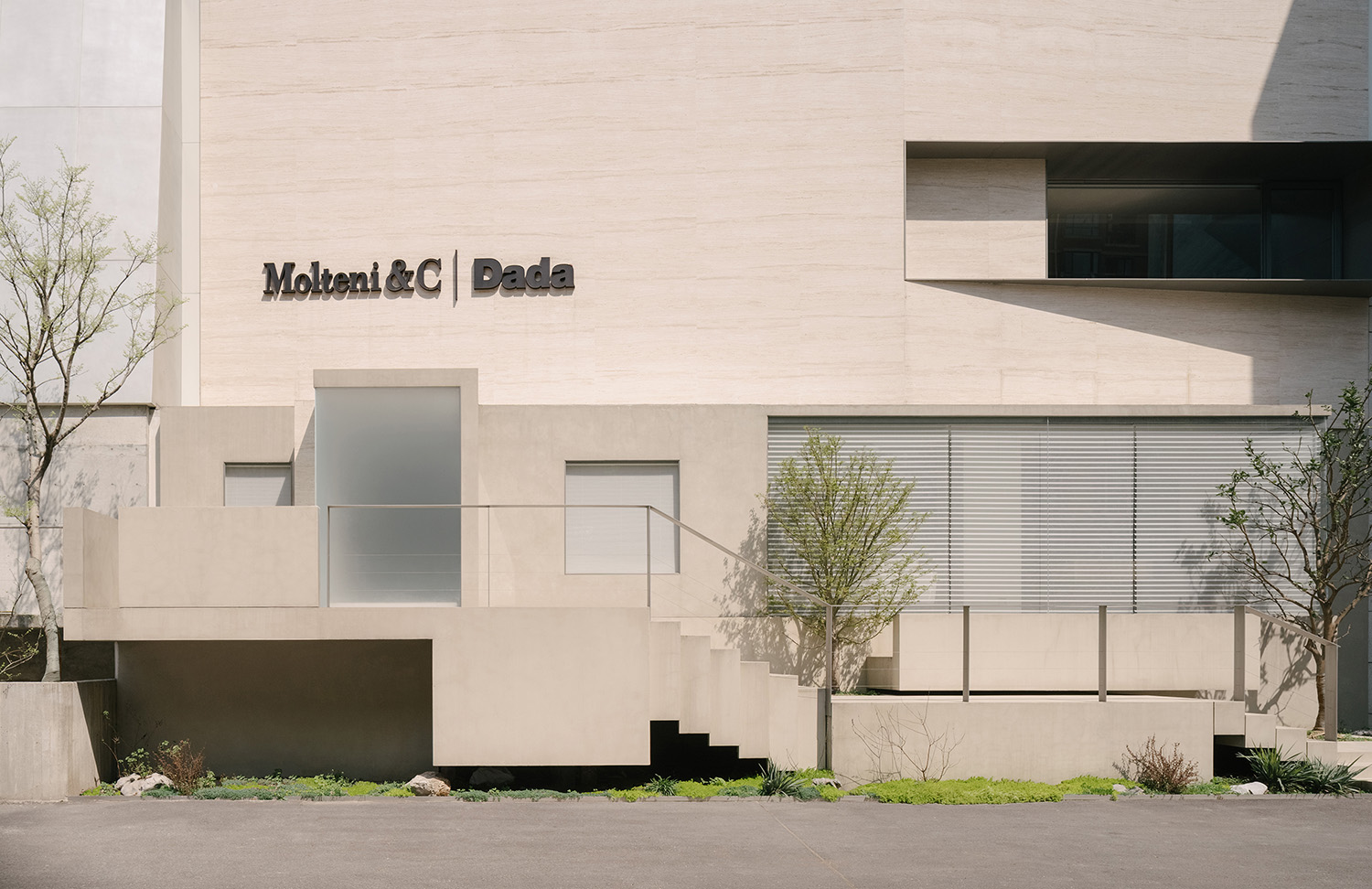
在保留原始建築物的原有結構上,正反設計為Molteni&C(寧波店)打造幹淨簡潔、更趨於本質化的外立麵。展區一層與未進行改造的路麵呈現出落差感,不僅是塑造外立麵的設計基礎,也是展廳融入城市的過渡點。
While retaining the original structures of the building, OUTIN. DESIGN created a clean, simple and pure facade for Molteni&C | Dada Showroom in Ningbo. The exterior of the exhibition area on 1F presents a strong contrast with the unrenovated road outside, and acts as an interface that blends the showroom into the city.
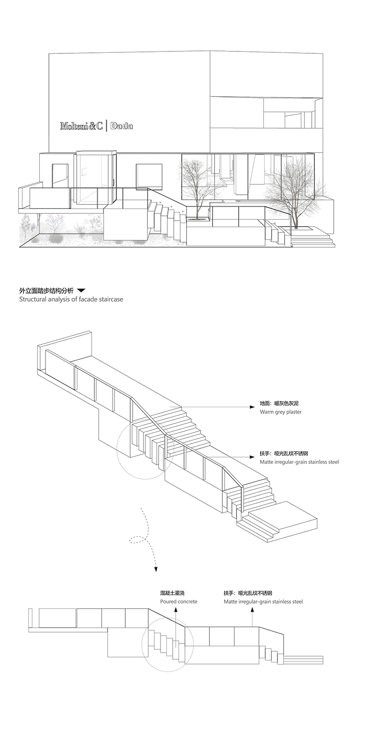
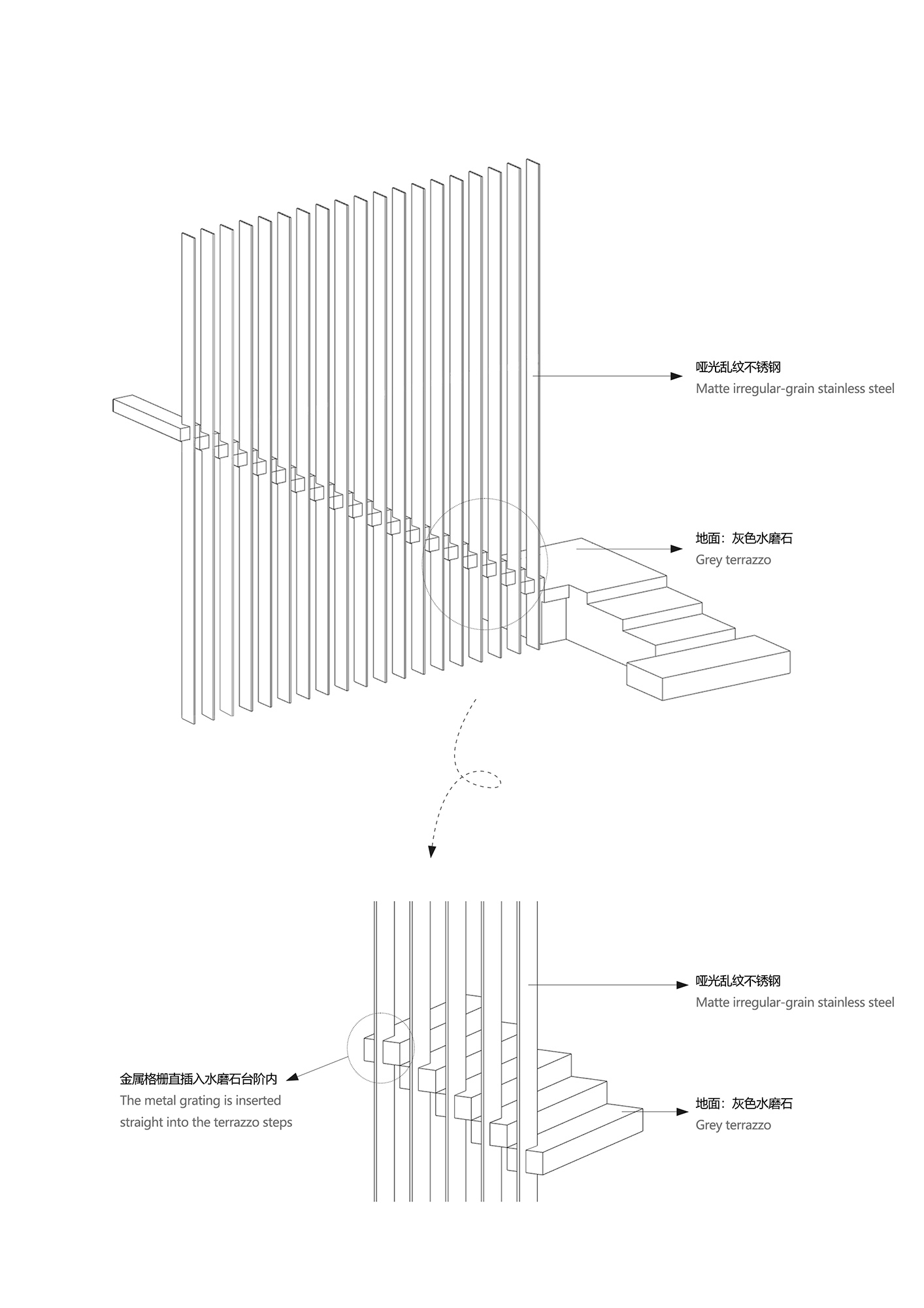
∇ 戶外樓梯結構圖
室內空間也並非是獨立於外界的存在,而將其視為城市建築的延續,在品牌空間中窺見城市的吉光片羽。不受“新與舊”的區分定義,不追求特定的意義歸屬,隻是將故事與理念訴諸於空間,又以空間形式進行宣發和深化,讓觀者對產品有所感觸,讓“居所”成為情感寄托的有形載體。
The interior space is not isolated from the outside, but is regarded as the continuation of the urban architecture. Rather than clearly distinguishing the old and new, or pursuing specific meaning of the space, the designers focused on telling stories, conveying brand values and strengthening customers’ perception of products by creating a series of “home” scenes that stimulate emotional resonance.
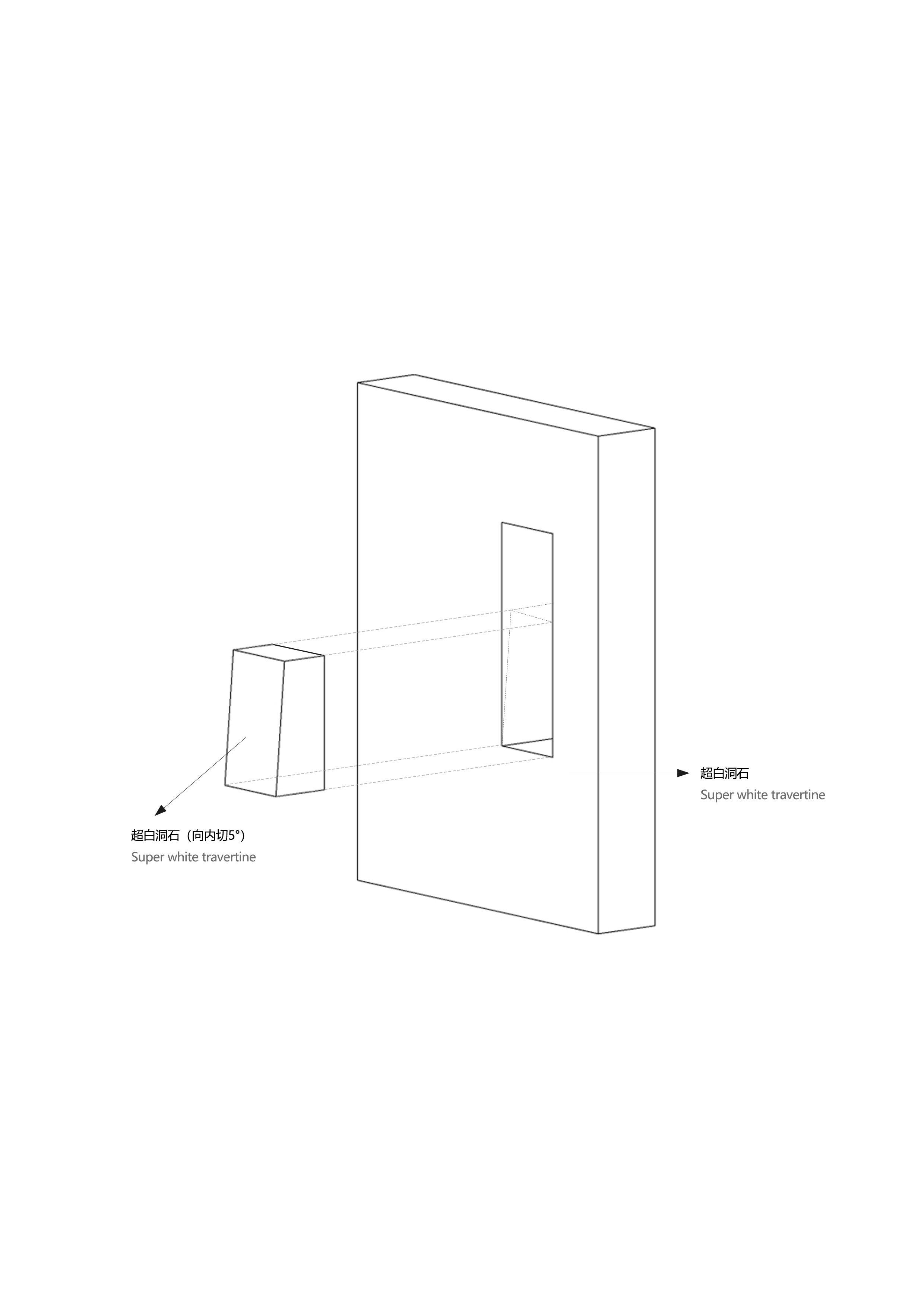
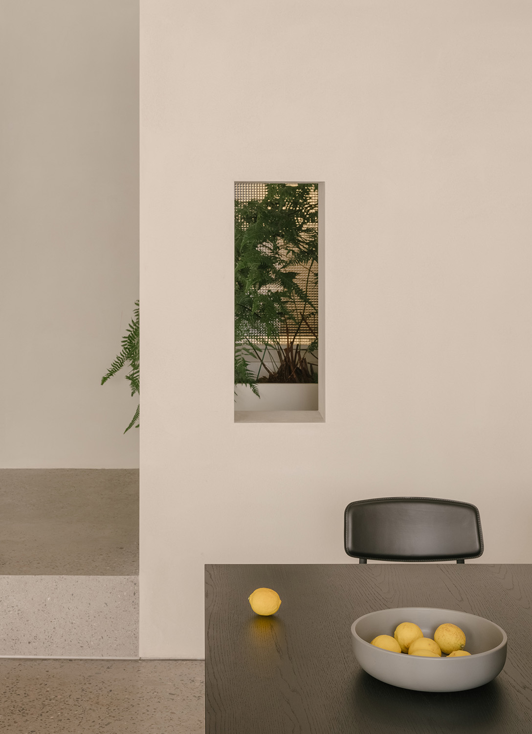
∇ 窗口分析 Window opening diagram
室內與室外空間的雙重塑造讓設計理念闡釋得更為完整生動,從內到外貫徹著簡靜寧和的品牌形象,情緒空間的故事便在體塊的介入中娓娓道來。
The interior and the exterior are unified to vividly interpret the design concept, and to communicate a simple, calm brand image from the inside out. After inserting blocks into the space, a storytelling, emotional space is created.
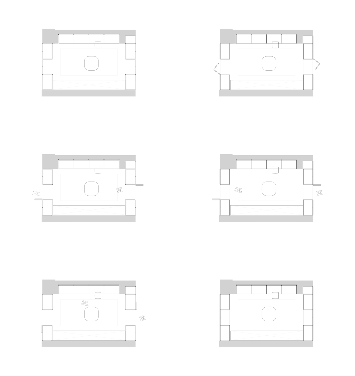
2、以櫃築形 Space shaped by cabinets
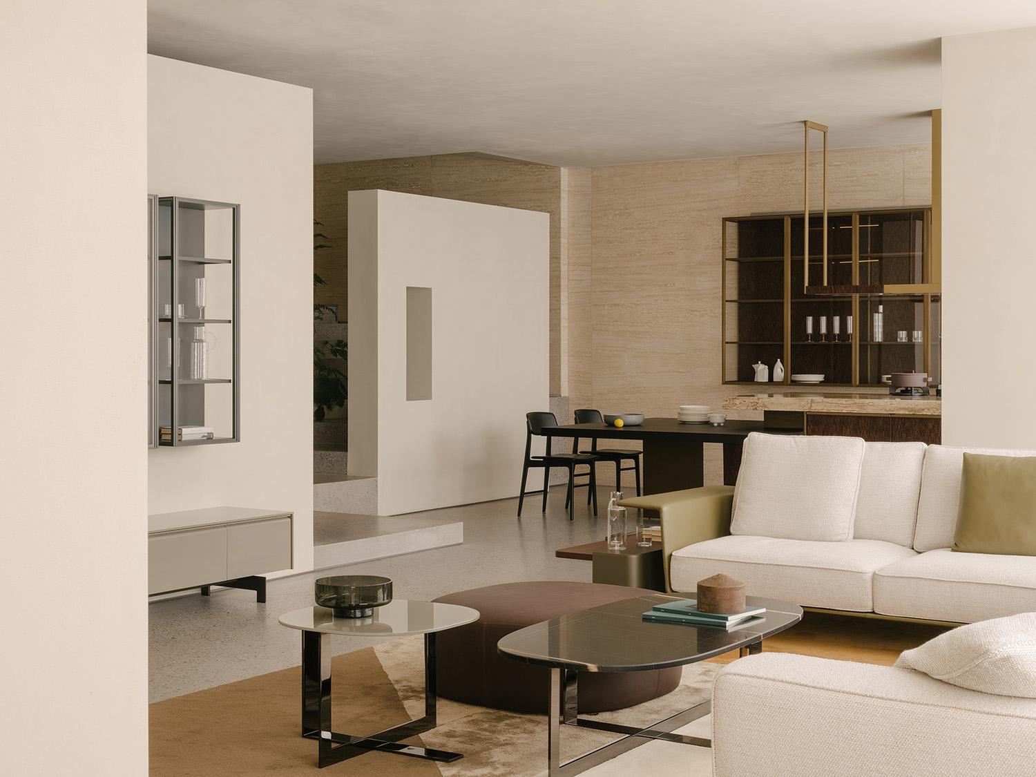
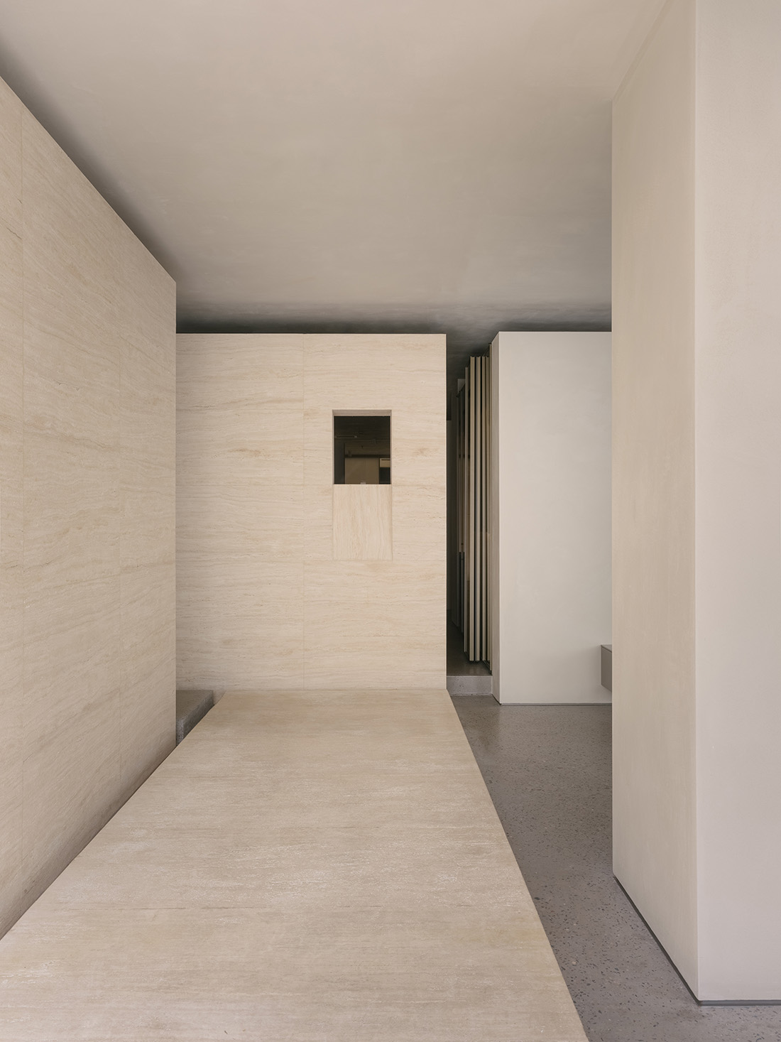
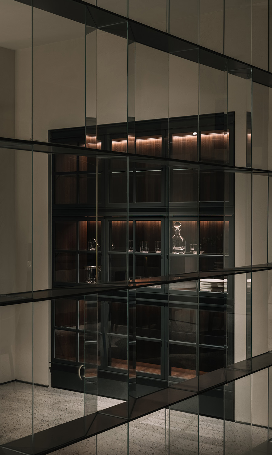
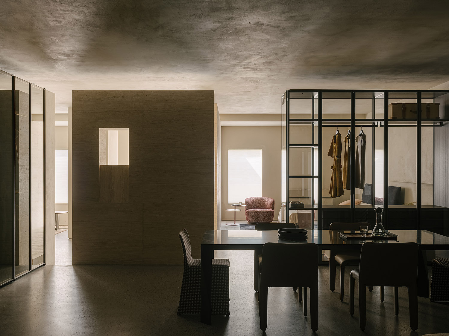
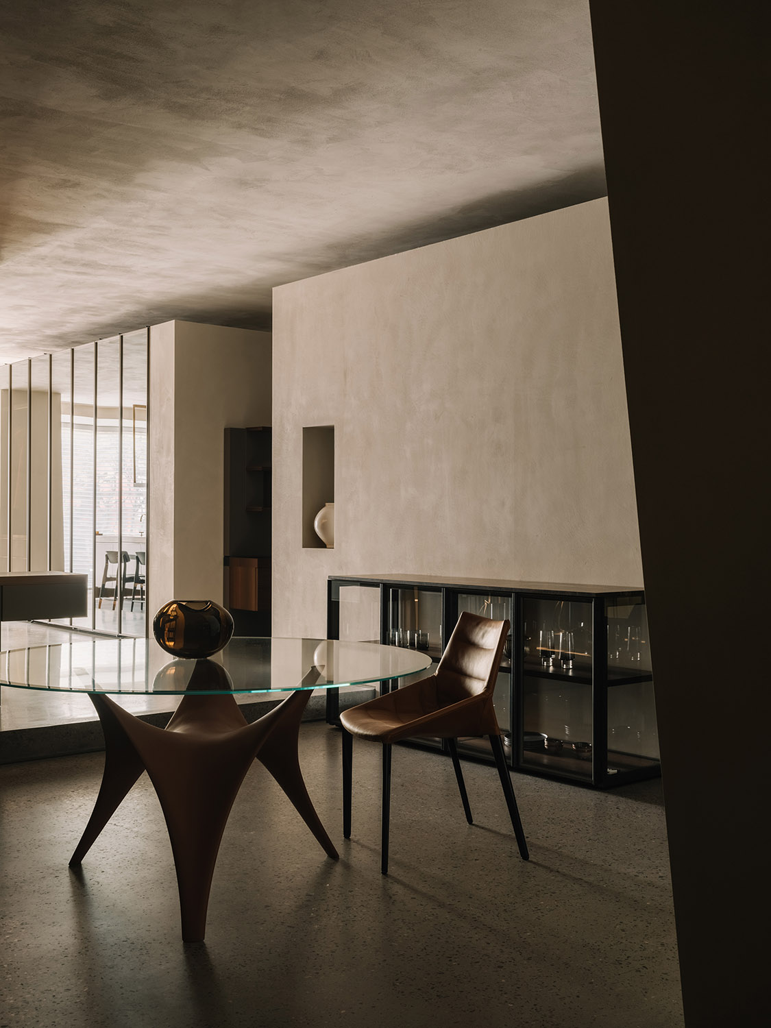
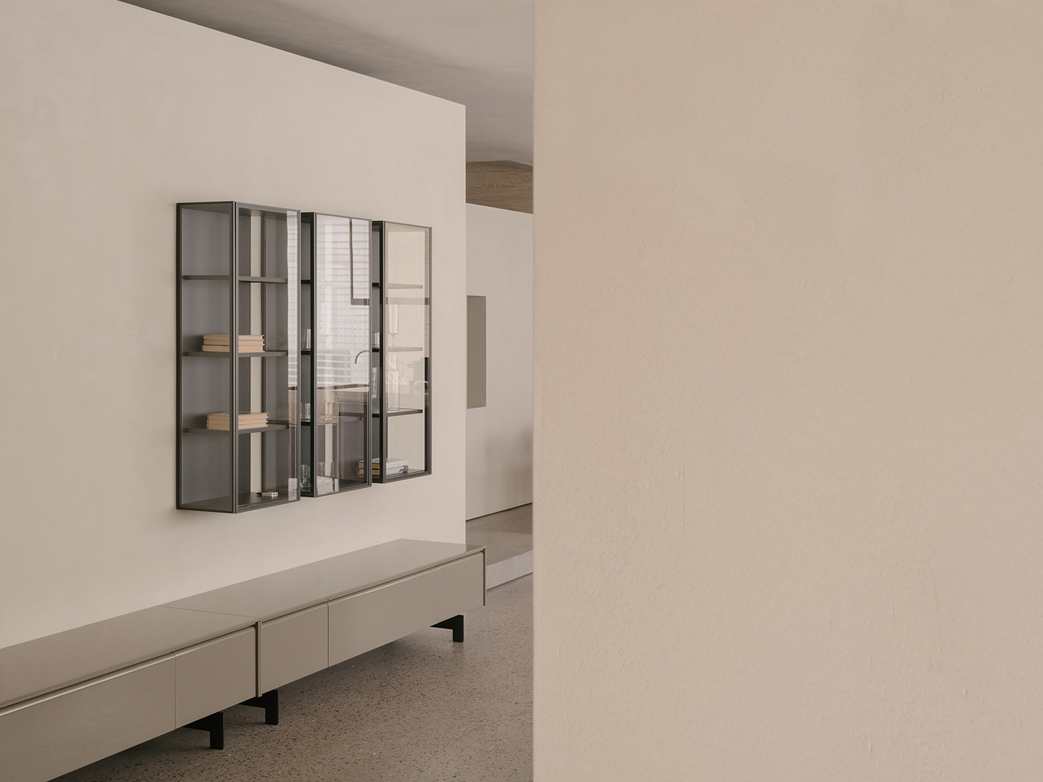
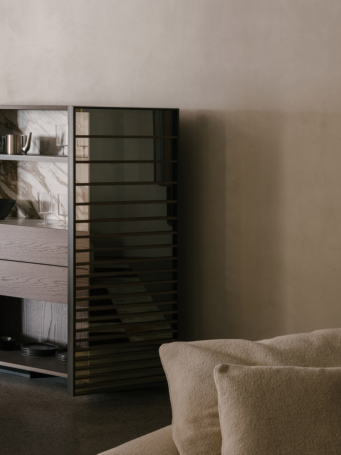
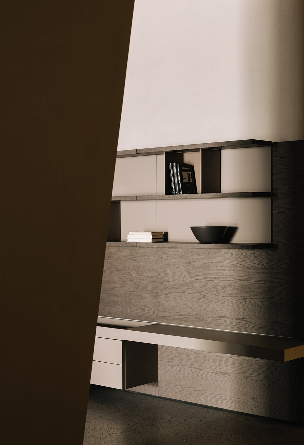
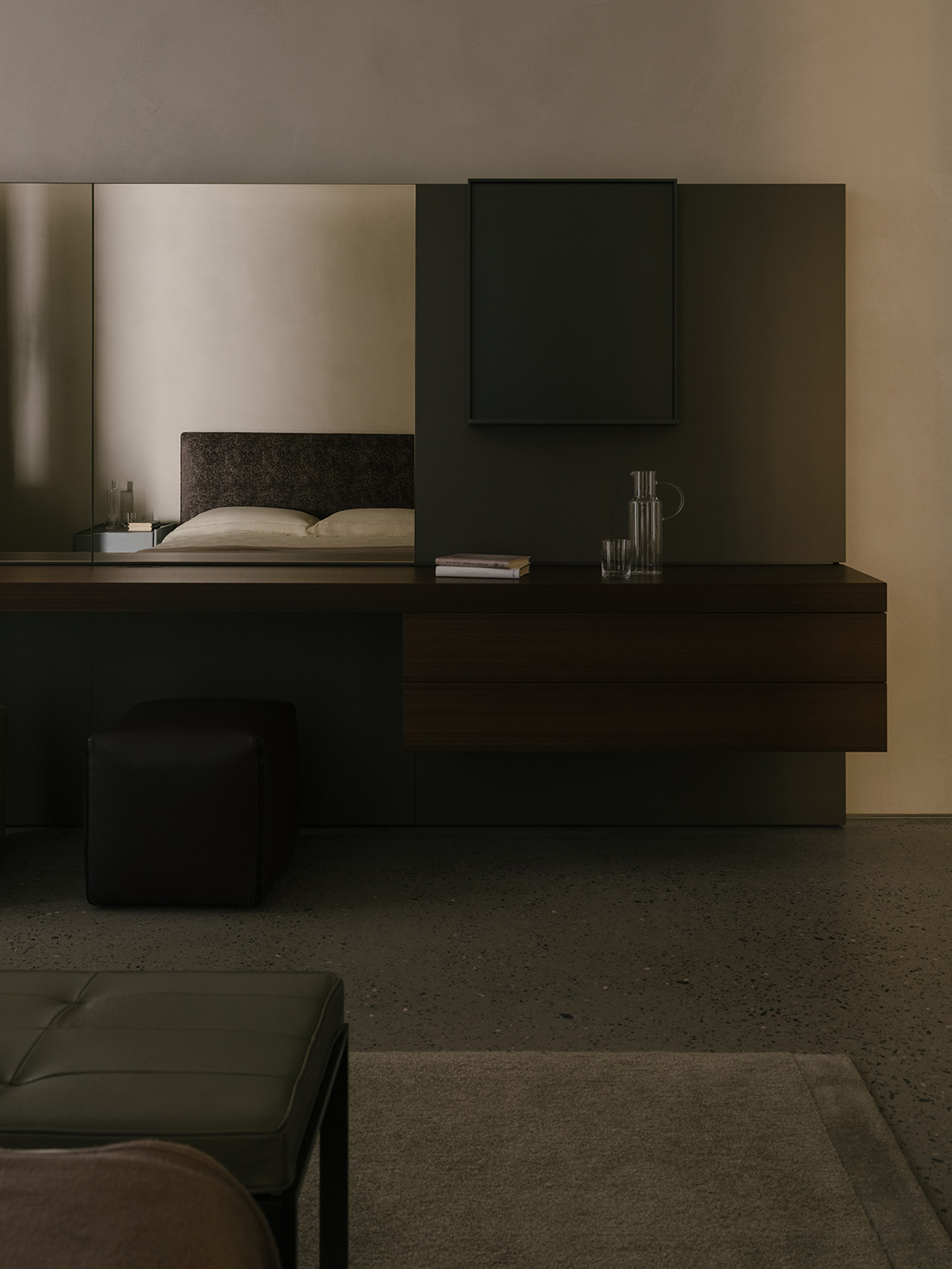
比起空間形式上的張力,正反更傾向於溫和的建構法則,這也是基於Molteni&C本身內斂氣質的考量。削減商業氣息卻不脫離商業屬性,透明玻璃打造通透性視點,室內架構清晰而呈。采用櫃體與家具相結合的方法,創造出相對“完整”的居所環境。
Instead of trying to create a spatial form full of tension, the designers tended to adopt more moderate structural languages, to fit into the brand’s character. The design weakened the commercial atmosphere without breaking away from the showroom’s commercial attribute. The transparent glass allows for clear sight lines, unveiling interior structures distinctly. Through combining cabinets with furniture pieces, a relatively complete “home” setting is created.
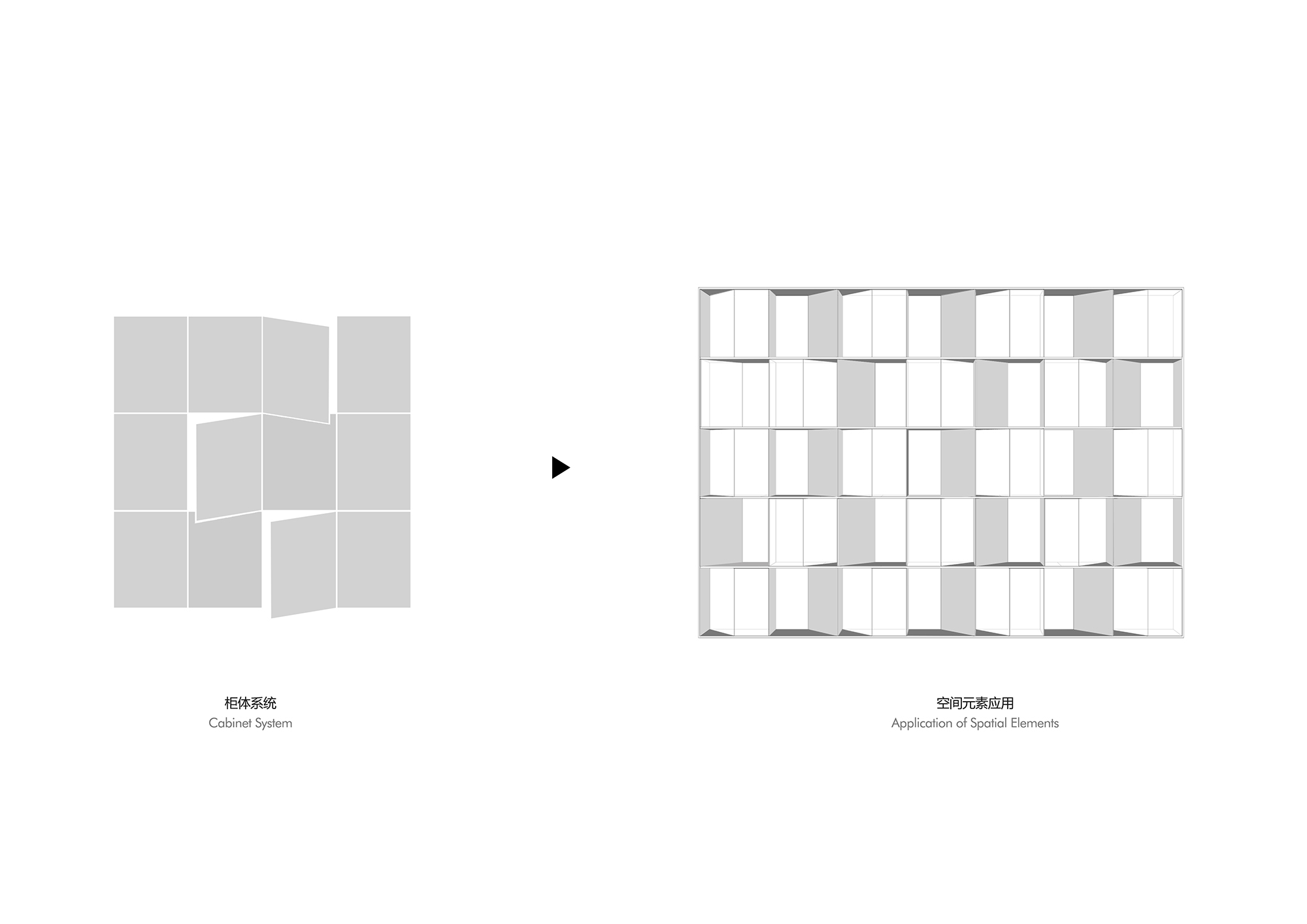
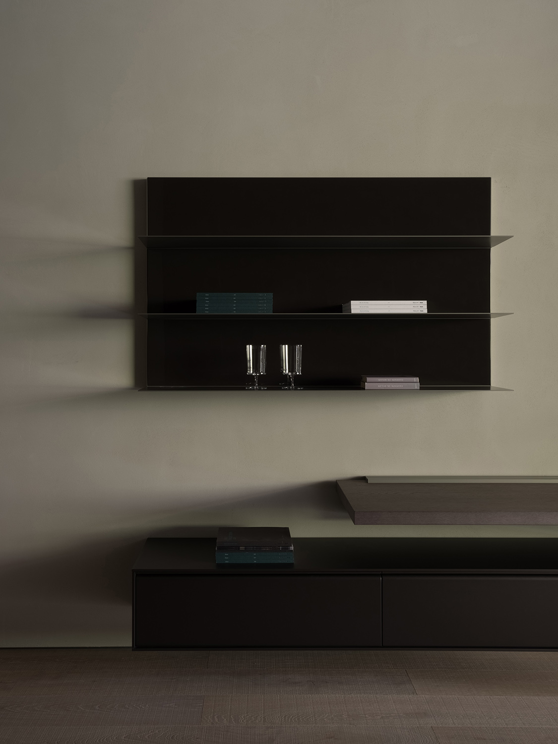
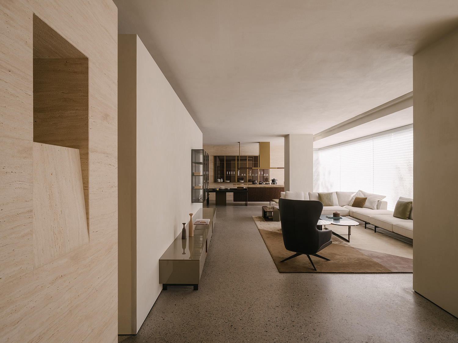
引用櫃體的直麵與斜麵,截取動態畫麵,穿插於空間各處,讓品牌曆史的回響來建立空間秩序。對櫃體的體塊進行解構與融合,形成更具結構化的場域,以形化意彰顯品牌基因。
The design team extracted the dynamic straight and oblique surfaces of cabinets, and inserted them into the space, to create the spatial order that echoes the brand. Through deconstructing and combining cabinet blocks, the design team created a structural realm that communicates the brand’s genes.
∇ 元素分析 Element analysis diagram
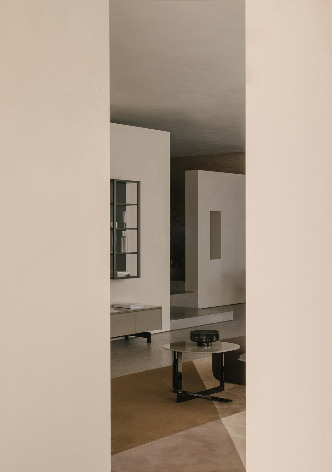
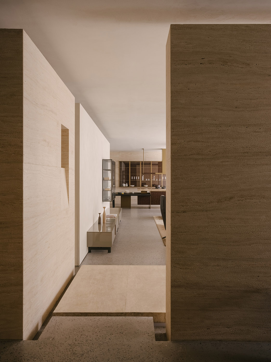
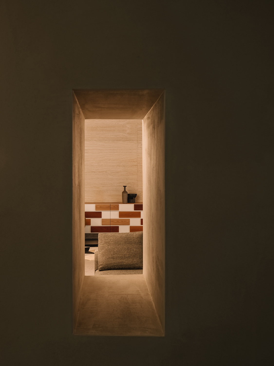
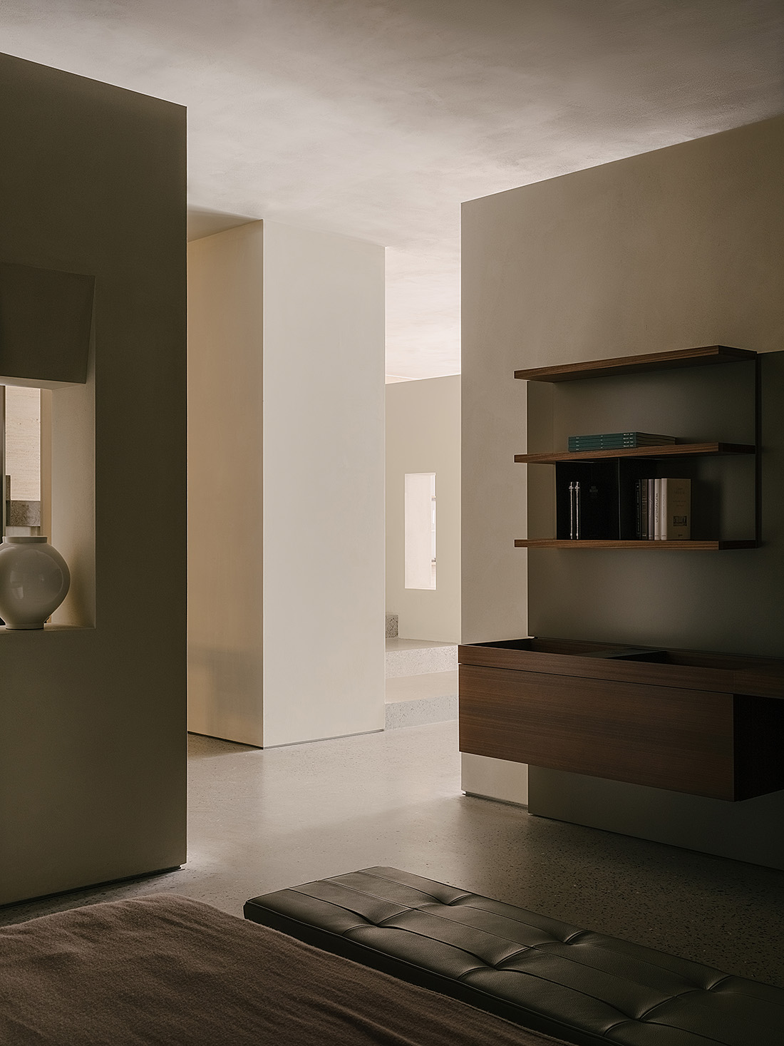
以產品與空間之間的鏈接,實現更具完整的居所概念,顛覆人們對於“門”的固有印象,建造出“隔而不絕”的整體空間,使其成為空間的連接者。產品與空間聯結並互動,以此消解空間的邊界感,創造出隔斷卻連續的經典美學。讓衣帽間成為既是相對獨立的微型場域,也是靈活互動的中轉站,如同隱藏著不同驚喜的神秘盲盒,打開後通往未知的領域,感知Molteni&C品牌在建築空間中釋放的無盡魅力。
By building connection between products and space, the project presents a complete series of home scenes. It breaks with the stereotype of “doors”, and forms various separate yet connected areas, making products the connectors in the overall space. Products interact with the space, which alleviate the sense of boundary and create a classic separate yet continuous aesthetic. The walk-in closet acts as an independent micro spatial realm, and also a flexible, interactive “transit station”. It’s like a surprising, mysterious “blind box”, which opens up an unknown field and invites customers to perceive the charm of Molteni&C in the space.
∇ 衣帽間
設計理念之於品牌空間的構造,一方麵需要尊重品牌曆史弧度的印跡,另一方麵也需要對所表達之情緒的精準拿捏。
The design needs to not only respond to the brand’s context, but also convey emotions accurately.
3、品牌空間的情緒錨點 Emotion-evoking space
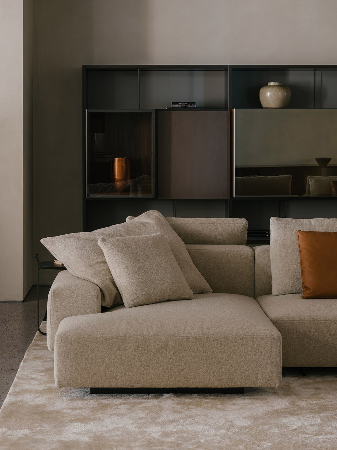
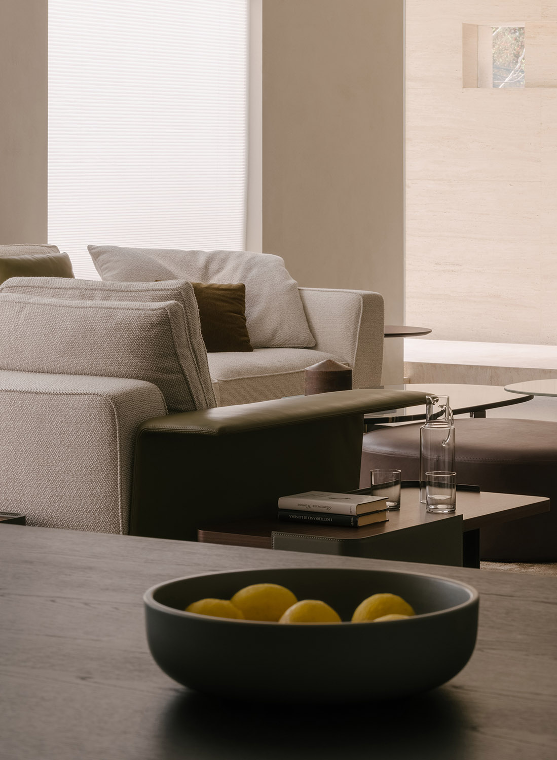
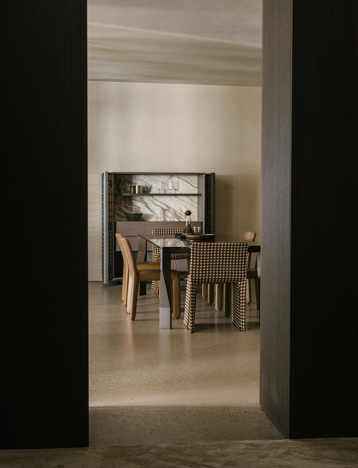
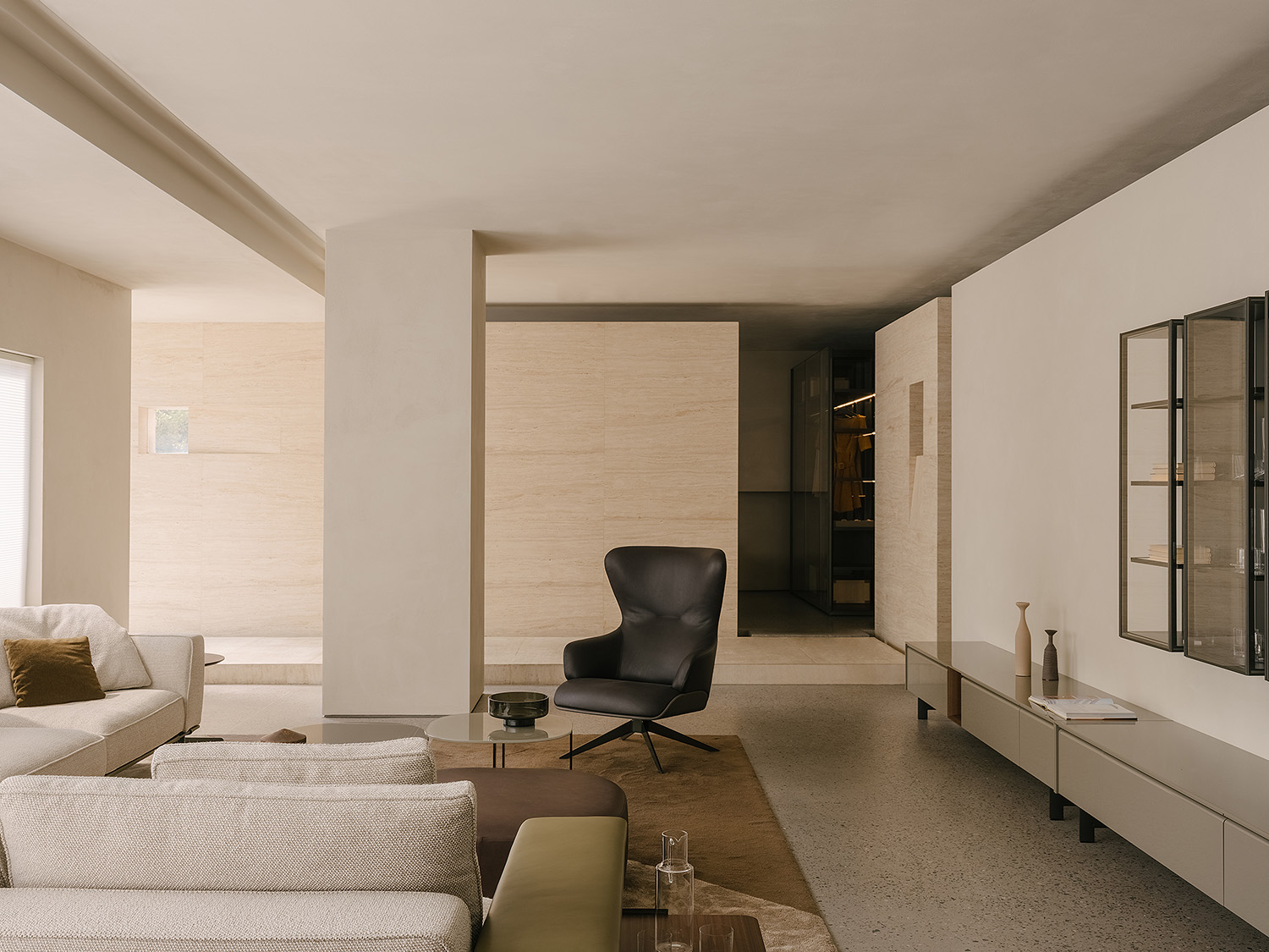
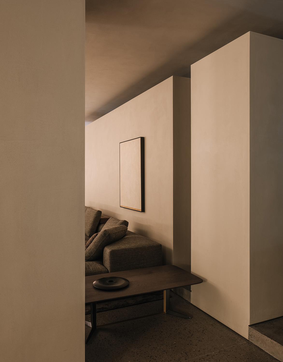
不是簡單的產品陳列,而是在塑造的空間基調之上,用各類產品圍合出居所氛圍,引發觀者的情緒共鳴。
The spatial design is not merely about products display, but more about creating a living atmosphere through various furniture products, so as to evoke customers’ emotional resonance.
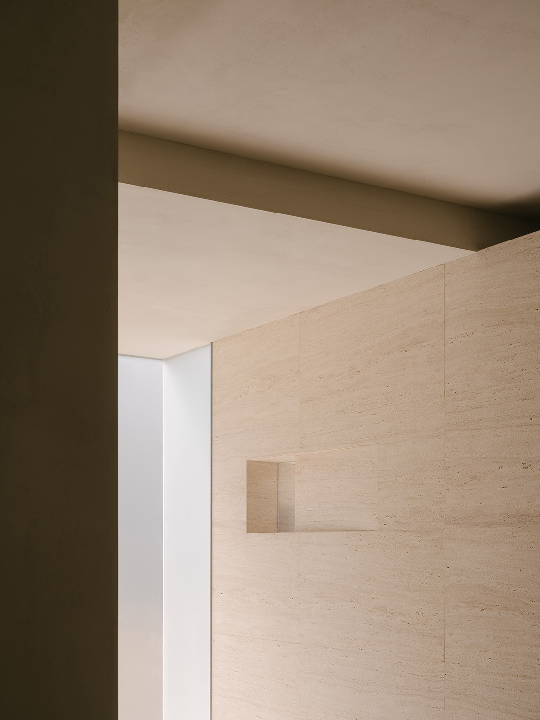
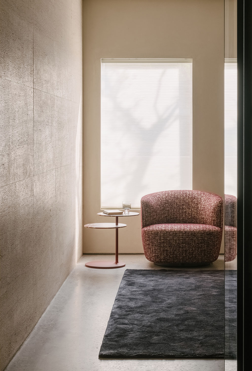
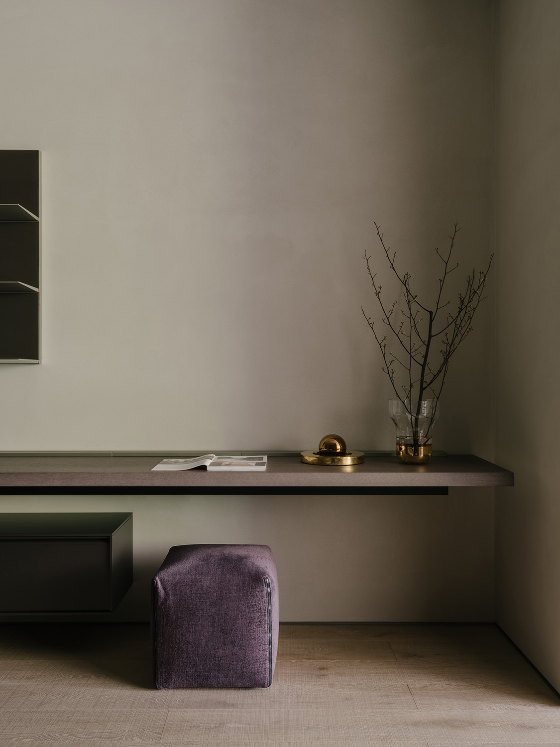
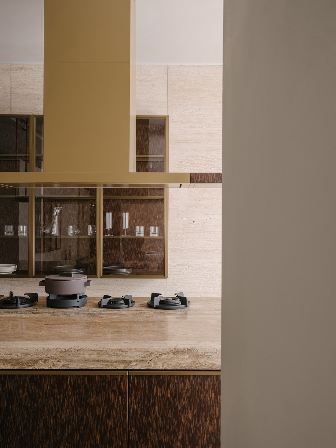
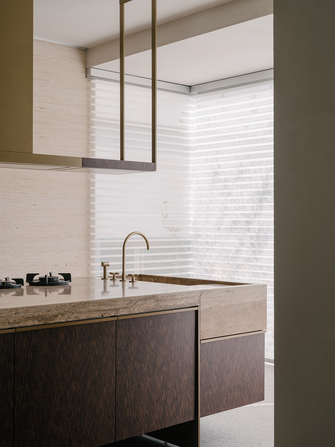
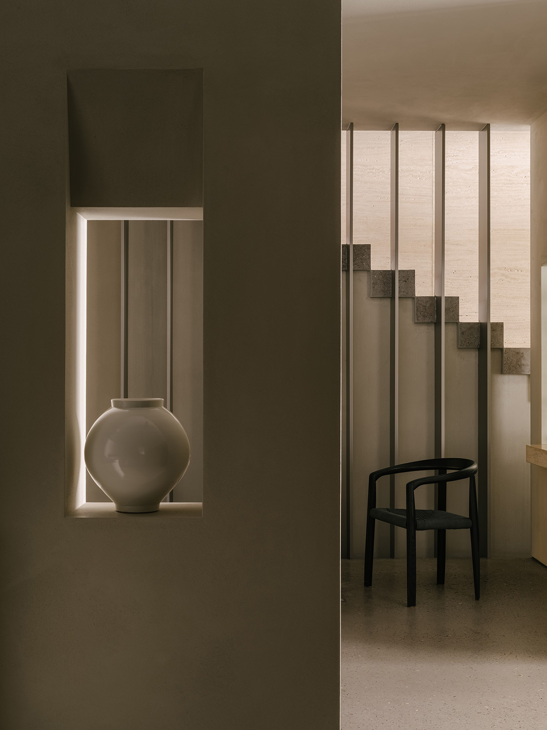
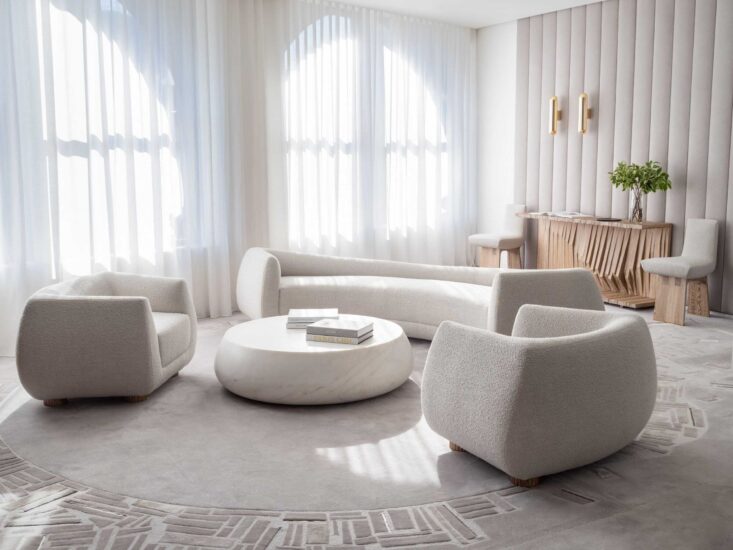
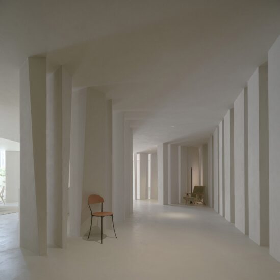
溫和肌理弱化光線的反射強度,柔美的色調營造具有溫度的視覺畫麵。自然的光線經由磨砂玻璃過濾,以更柔和的語彙描繪更貼近“居所”的感覺,牽引出飽滿的生活顆粒感。
The gentle material textures weaken the reflection of light, and the soft spatial tones offer a warm visual experience. Natural light is filtered in and softened by the frosted glass, enhancing the living atmosphere of the space.
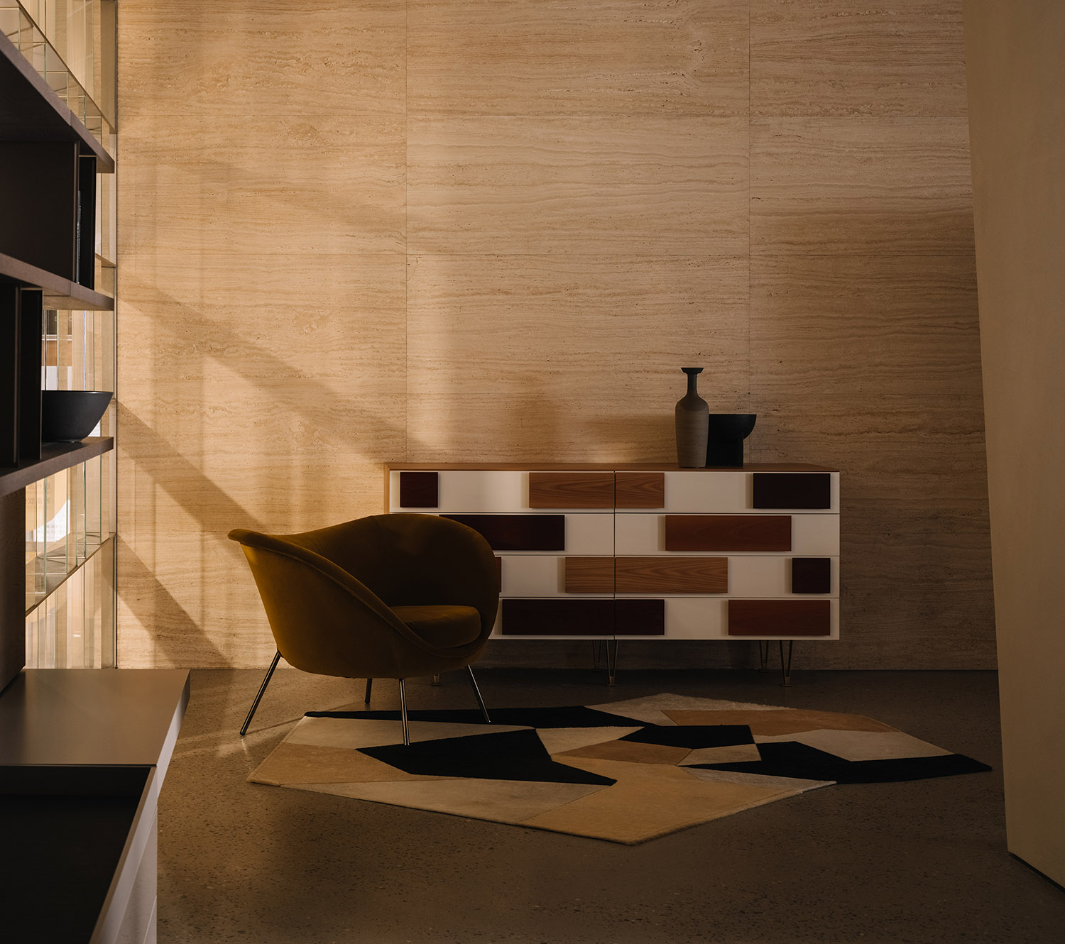
淺色調的平和與深色係的沉靜在跌宕的光線中互為加持,歲月的疏影在此間悄無聲息地流動。
Peaceful pale hues and dark colors complement each other under the light, which creates shadows and fluidity in the space.
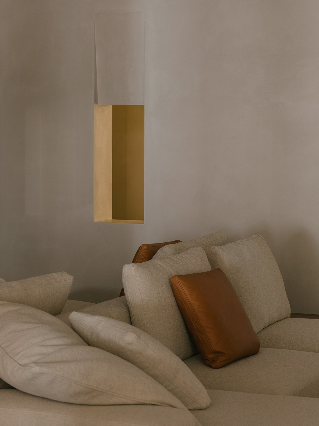
從色係、光線到材質的不同層次細節考量,讓感官情緒在簡單純粹卻又豐盈的居所氛圍之中謐然生長。
With meticulous consideration into color palette, light, material textures and details, the design created a simple, pure yet strong home-like atmosphere in the showroom, which stimulates infinite sensory and emotional experiences.
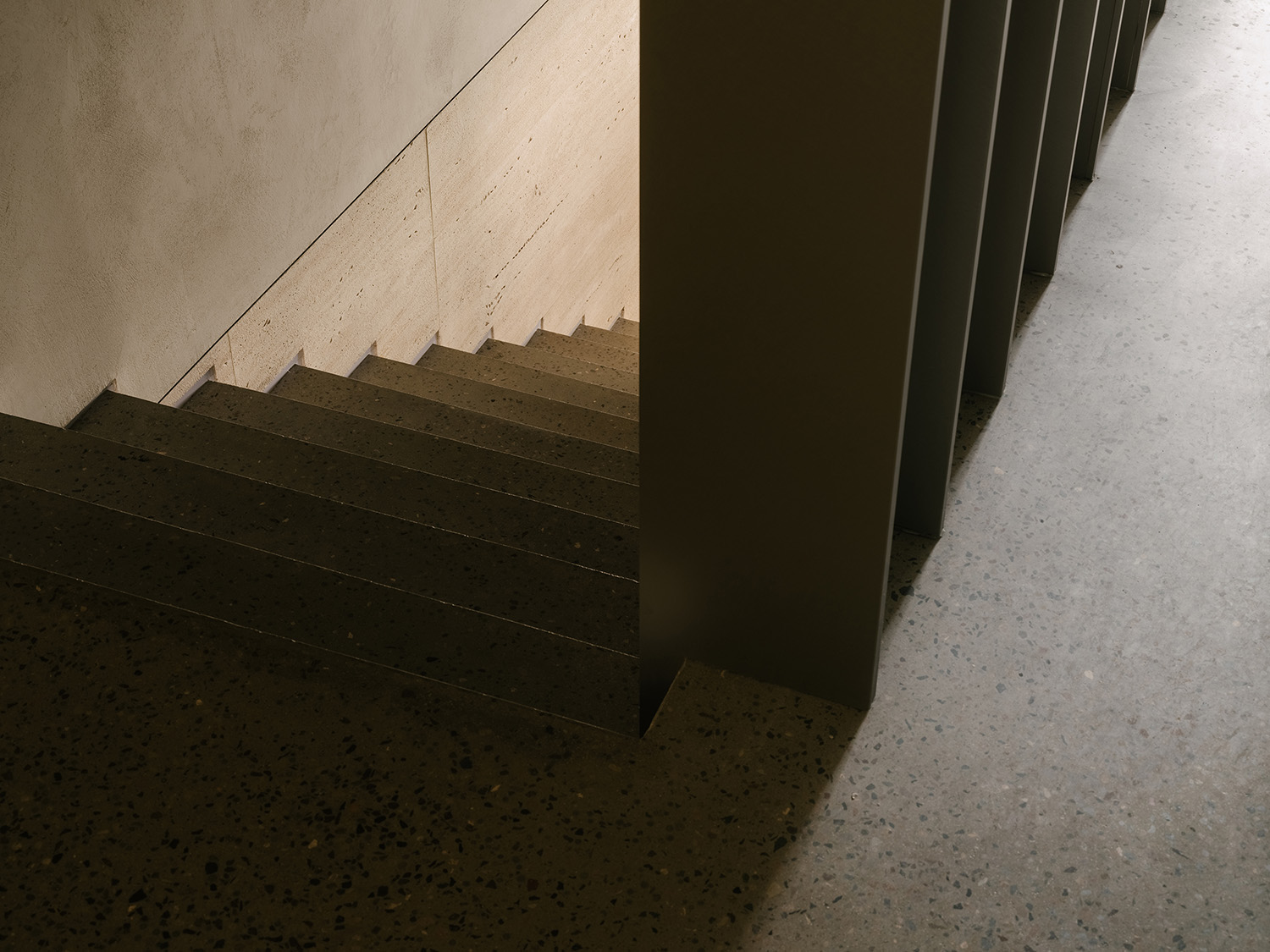
∇ 樓梯細節 Staircase details
以內斂的空間衍造富有延展力的精神性場域,讓產品與空間的關係在生活感觸的漫延下形成內在共鳴。
The restrained space forms a spiritual field filled with a sense of extension, where displayed products and space dialogue with each other.
一個品牌向外界傳達理念的方式,並非隻能是張揚高調的昭示。也許附著溫度的內凝敘事更能詮釋其時間沉澱後的內核理念。以Molteni&C本身氣質為出發點,構建空間的內與外,尊重其曆史特質,讓情緒在品牌空間裏自然流淌。
The way that a brand communicates itself doesn’t necessarily have to be high-profile. Perhaps a storytelling narrative may help better interpret and convey the core values of the time-honored brand. Starting from the character and history of Molteni&C, the design team conceived both the interior and exterior of the showroom, which evokes customers’ emotional resonance with the brand.
項目信息
項目名稱|Molteni&C|Dada(寧波店)
項目地點|中國 浙江
項目商體|第六空間DERLOOK
項目麵積|570㎡
完工時間|2021年9月
設計公司|正反設計/OUTIN. DESIGN
設計主持|王琛 W.C
設計管理|正反OUTIN – R.E.C Team
道具製造|正反OUTIN – R.E.C Team
燈光設計|正反OUTIN – R.E.C Team*雲曦照明
陳列設計|四般Sìbān
市場媒體|殺菌
項目攝影|Wen Studio
主要物料|水磨石、白洞石、肌理塗料
Project name: Molteni&C|Dada Showroom, Ningbo
Location: DERLOOK, Ningbo, Zhejiang, China
Area: 570 square meters
Completion time: September 2021
Design firm: OUTIN. DESIGN
Chief designer: Wang Chen
Design management: OUTIN – R.E.C Team
Props production: OUTIN – R.E.C Team
Lighting design: OUTIN – R.E.C Team, Yunxi Lighting Co., Ltd.
Display design: Sìbān
Market promotion: Shajun
Photography: Wen Studio
Main materials: terrazzo, white travertine, textured coating


