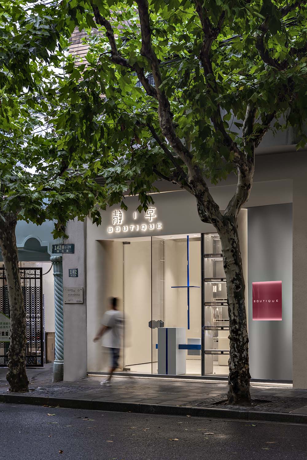
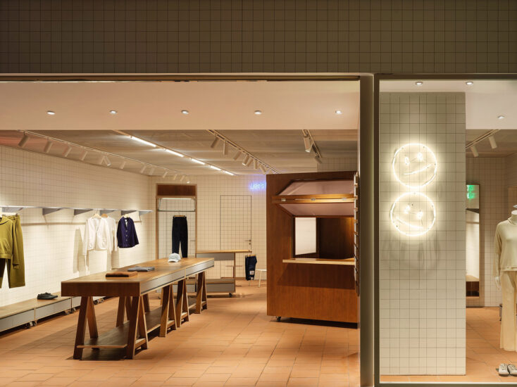
項目位於上海新樂的沿街店鋪,這條路上接連著90年代的老居民樓,這種老房子總是會給人一種過去與未來的碰撞對話,狹小的空間格局是這些房子的特色,如何在這樣的空間裏塑造一個關於包包的買手店,在我們的腦海中產生了一次又一次的碰撞。
The project is located in the shops along the street in Xinle, Shanghai.This road is connected to the old residential buildings in the 1990s. Thiskind of old house will always give people a collision and dialogue between the past and the future. The narrow space pattern is the characteristic of these houses. How? In such a space, a buyer’s shop about bags has been created again and again in our minds.
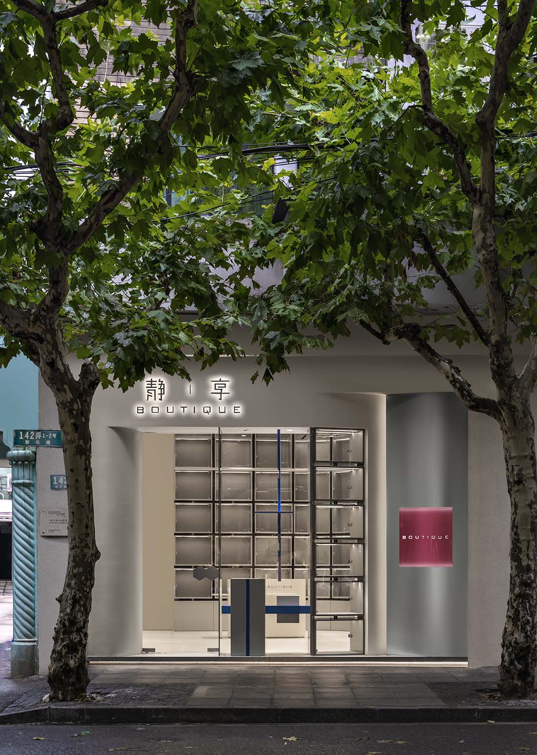
∇ 項目外觀 exterior of the project
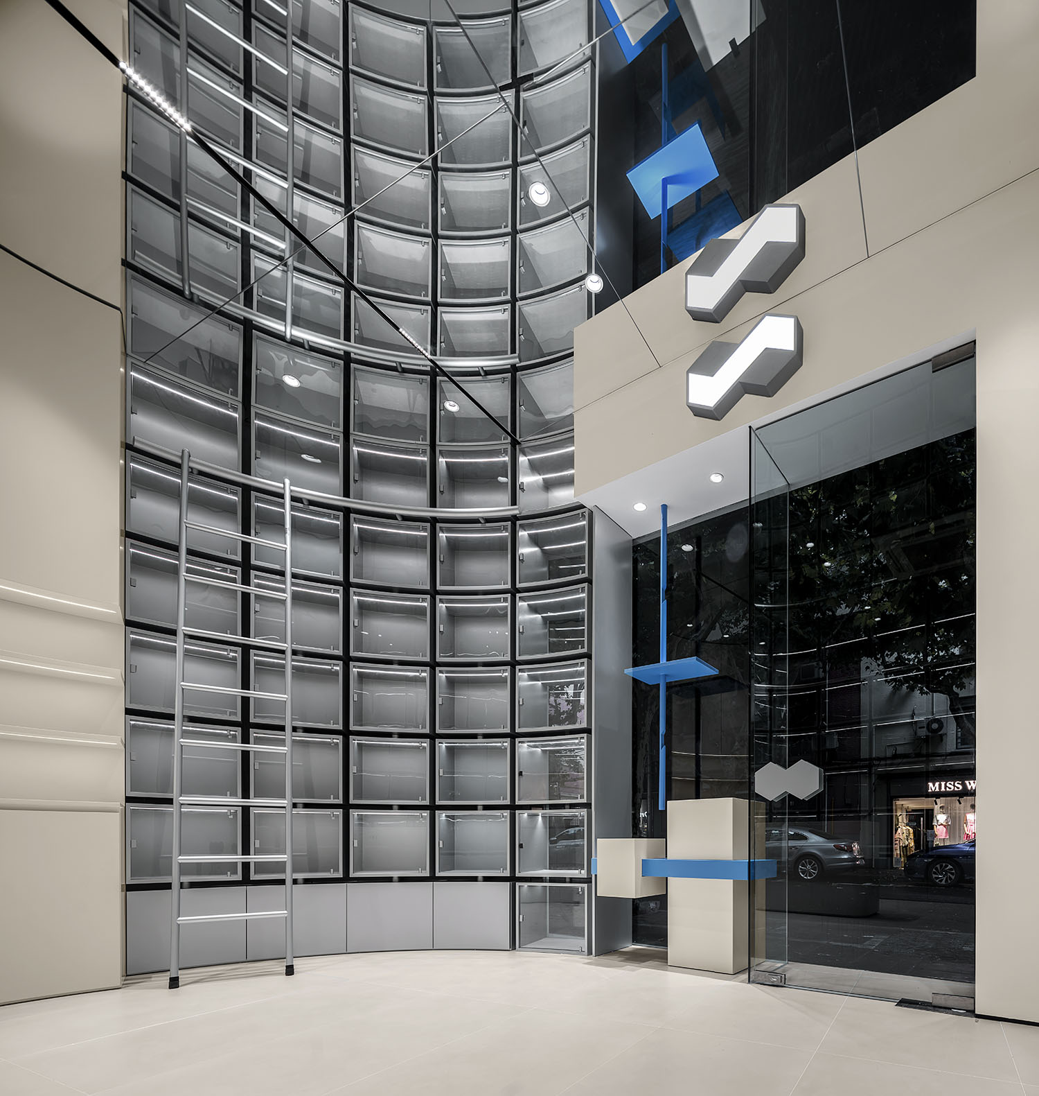
入口的位置我們嚐試盡可能在內部空間不足的基礎上去打開我們的展示空間,為了減少門頭和周邊的突兀感,我們嚐試用同色的灰泥材質去做外立麵的材料。新舊兩種同顏色,同屬性的材質的碰撞,在闡釋這個空間過去和現在的對話。
The location of the entrance We try to open our display space as much as possible on the basis of insufficient internal space, so as to In order to reduce the abruptness of the door and the surrounding area, we tried to use the same color stucco material as the material of the façade. new The collision of the old two materials of the same color and the same properties is explaining the dialogue between the past and the present in this space.
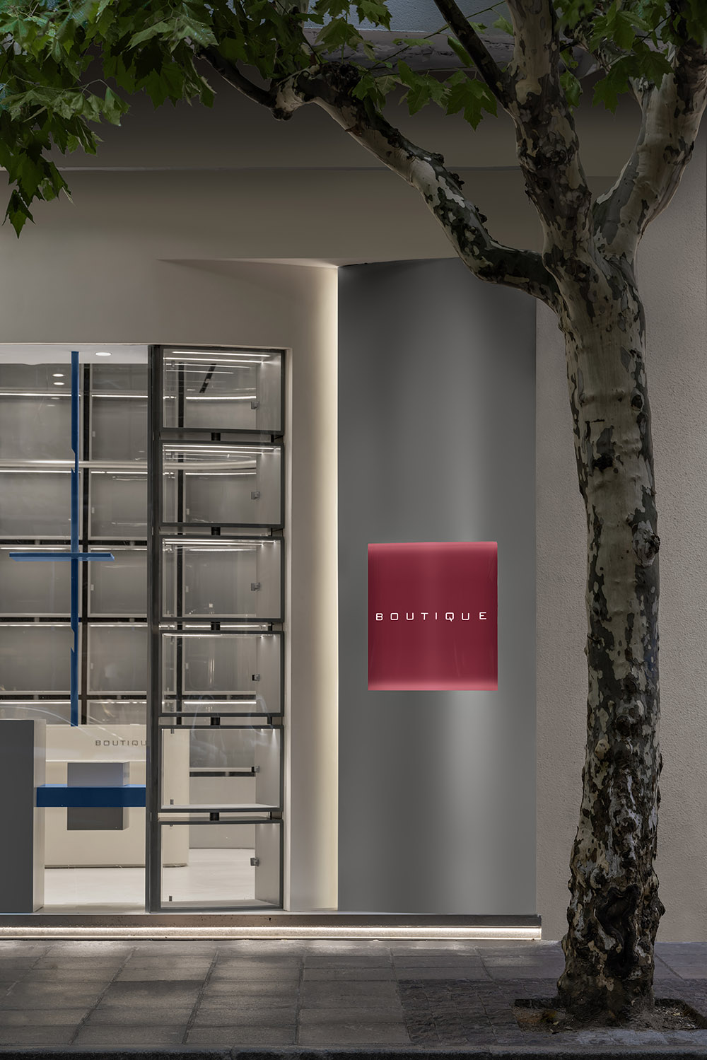
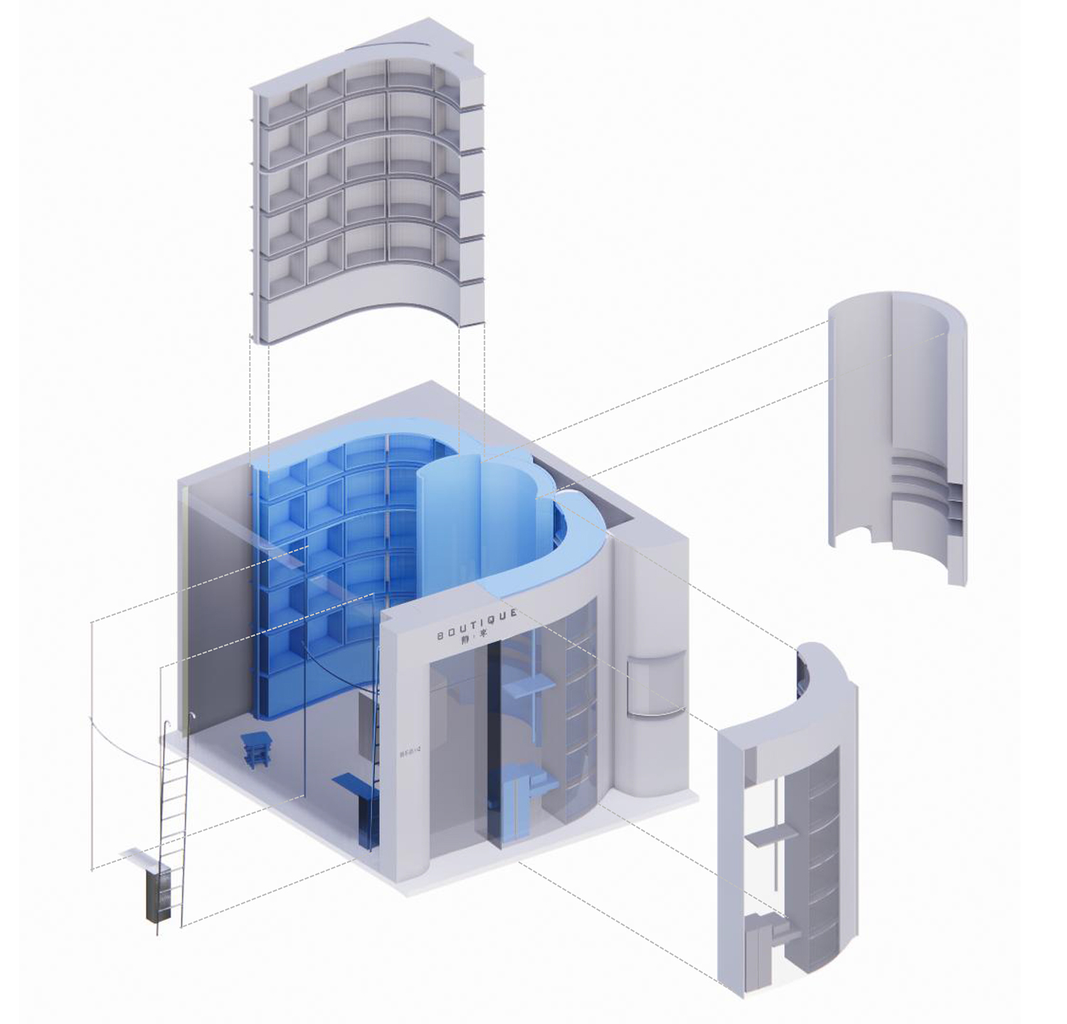
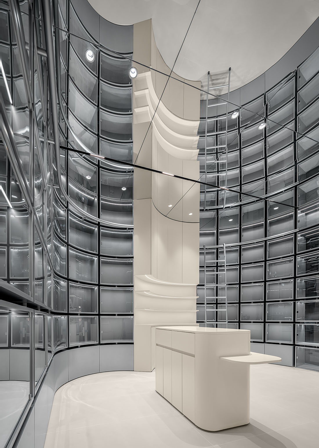
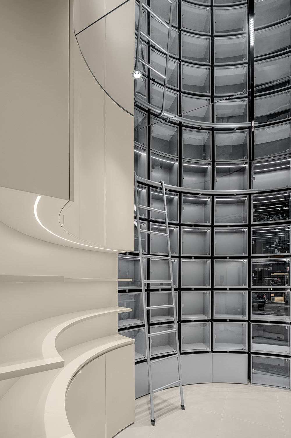
建築原有結構這裏有個一米寬度的柱子是無法移動的,於是我們決定在平整的空間上做一個弧形的包柱,讓展示麵由之前的平麵轉為更為靈活的弧線,跳脫傳統的固定思維,旋轉的曲線讓空間的視覺關係得到升華。
In the original structure of the building, there is a one-meter-wide column that cannot be moved, so we decided to build a flat empty space. Make an arc-shaped column in between, so that the display surface can be changed from the previous plane to a more flexible arc, breaking away from the traditional. The fixed thinking, the rotating curve sublimates the visual relationship of the space.
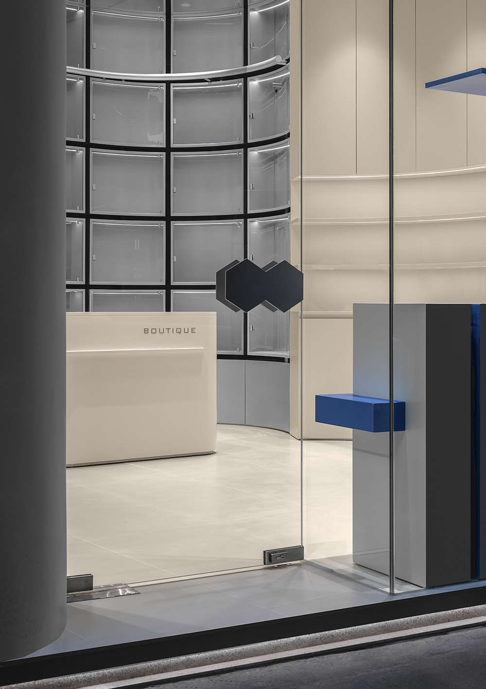
∇ 外觀細節 Appearance details
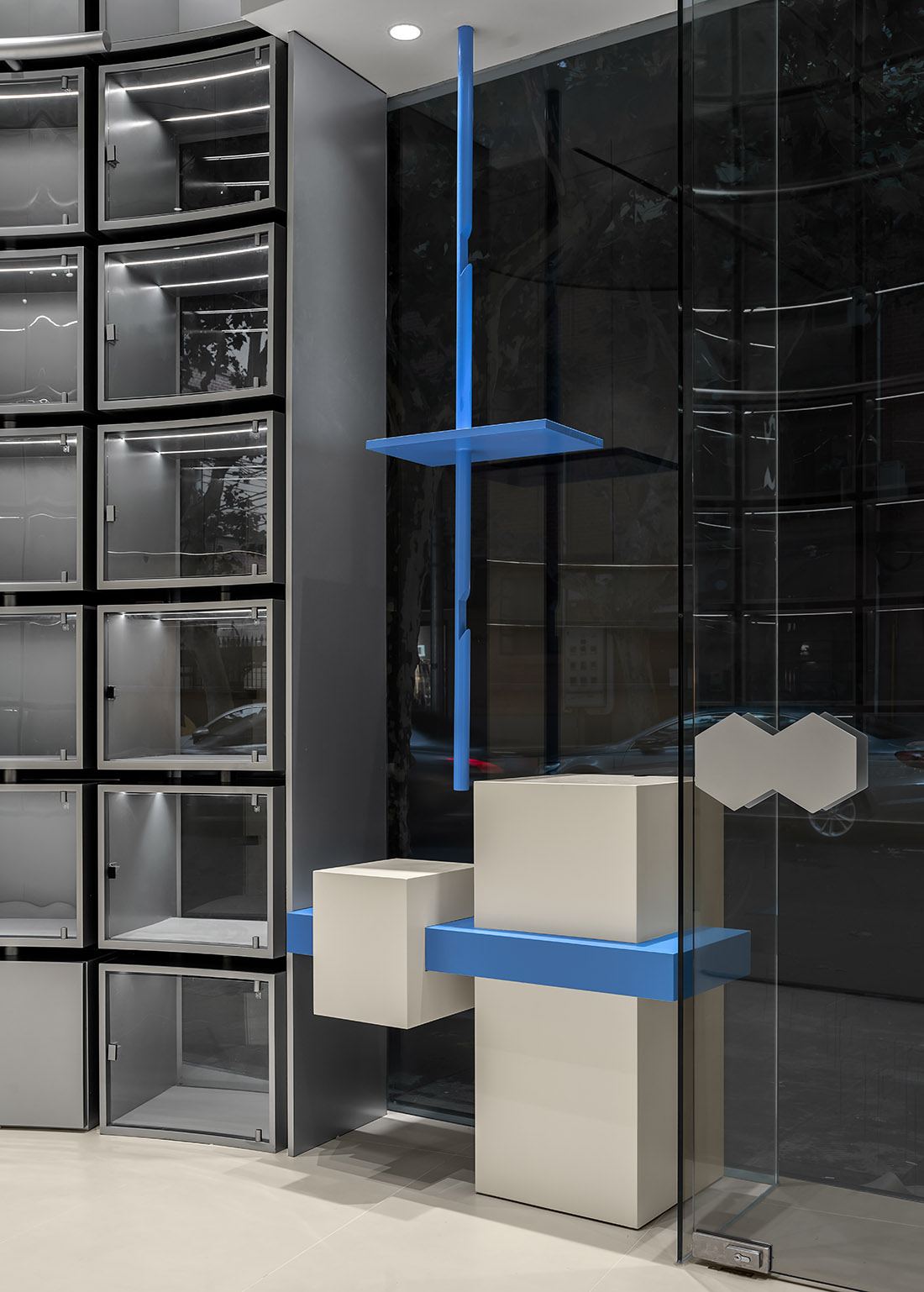
進門的把手也用了品牌LOGO的造型,凸顯品牌的特性,設計和品牌的結合,向一個緯度加深了力量的衝擊。
highlights the characteristics of the brand and the combination of design and brand. Towards a latitude deepens the impact of power.
∇ 入口空間 entrance space
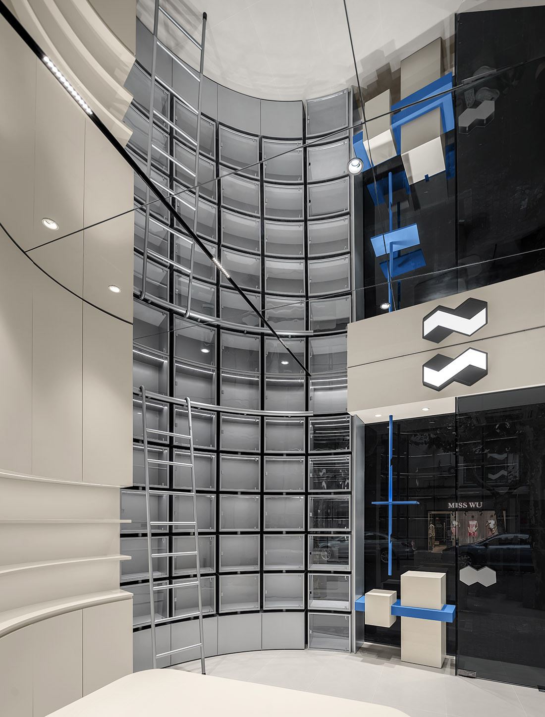
沒有煩躁的造型,空間需要有一個鮮明主題元素來凸顯空間的特性,我們結合包店的理念,選定了盒子這個概念,用盒子概念和空間的結合,在用鏡麵的材質將鏡麵裏麵的空間鏈接在一起,形成一種空間的對話,同時也給我們帶來的視覺呼吸感。
There is no irritable shape, the space needs to have a distinct theme element to highlight the characteristics of the space, we combine the package For the concept of the store, the concept of the box was selected, and the combination of the box concept and the space was used to combine the mirror material.
The spaces inside the mirror are linked together to form a space dialogue, and at the same time bring us a visual appeal. suction The excessively smooth space needs a bright color to highlight the characteristics of the space. The combination of tone and product.
∇ 陳列區域 Display area
∇ 空間軸側圖 Concept axonometric diagram
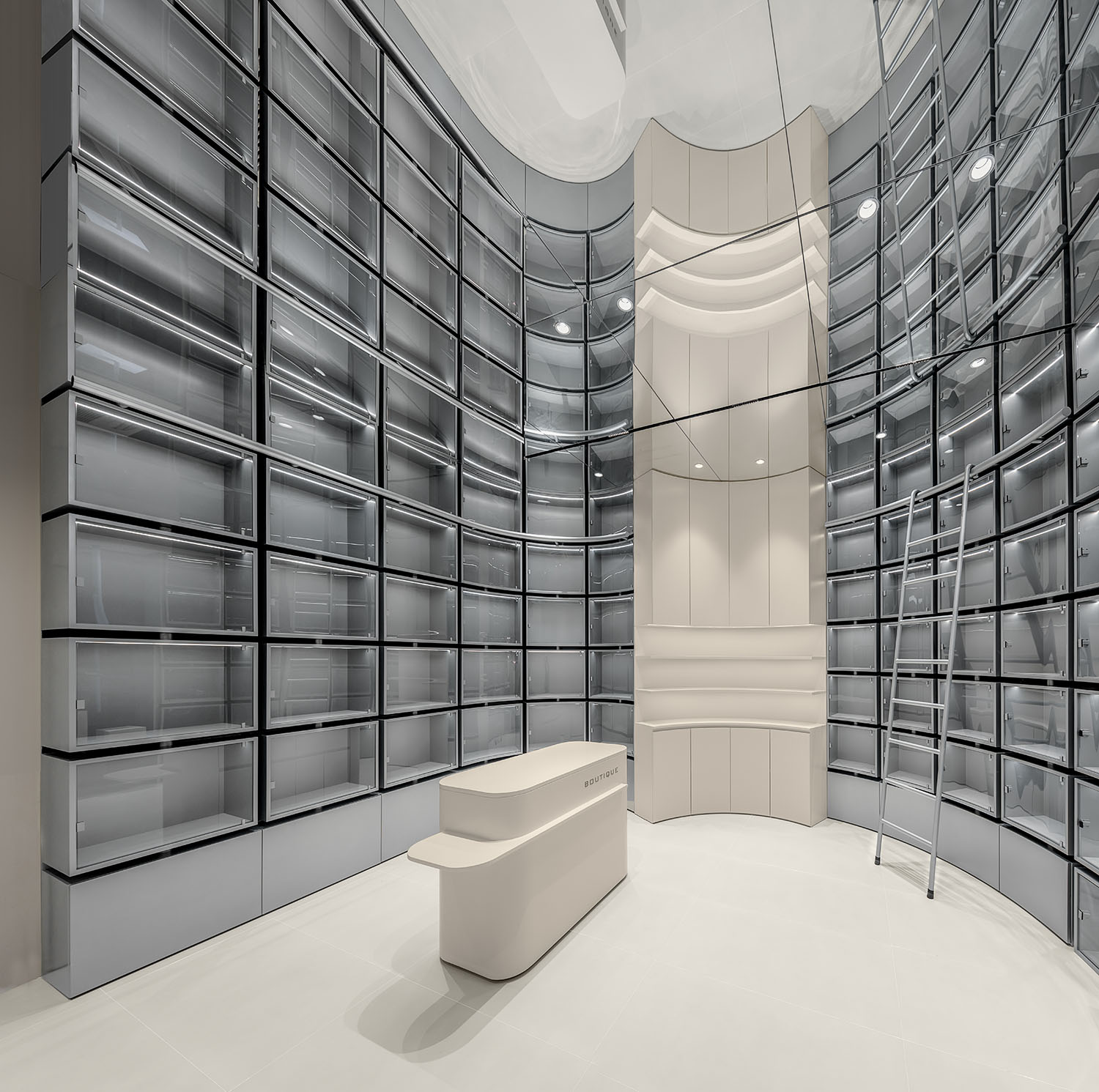
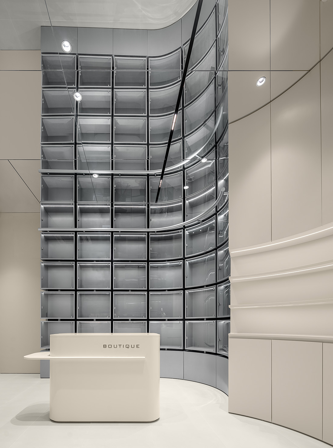
空間元素的主體定義之後,所以的造型都可以為這個理念去讓步,收銀台和側邊的展示櫃做了簡單的弧形和空間呼應。
After the main body of the space element is defined, all shapes can make concessions to this concept. The cashier counter and the display cabinet on the side have a simple arc and echo the space.
∇ 收銀區域 Cashier area
∇ 陳列櫃細部 Display cabinet details
進門的區域連接陳列櫥窗的櫃體也是做了弧形,吧背後的柱體隱藏住,同時跟外立麵的弧形材質呼應,連接的陳列櫃也相應的做了弧形,它們既是獨立的,又和空間相互交融。
The cabinets connecting the display windows in the entrance area are also arc-shaped, and the pillars behind the bar are hidden, and at the same time follow the outside.
The curved material of the façade echoes, and the connected showcases are also curved accordingly. They are both independent and harmonious. Space blends with each other.
∇ 櫥窗區域 Window area
∇ 櫥窗特寫 Window close-up
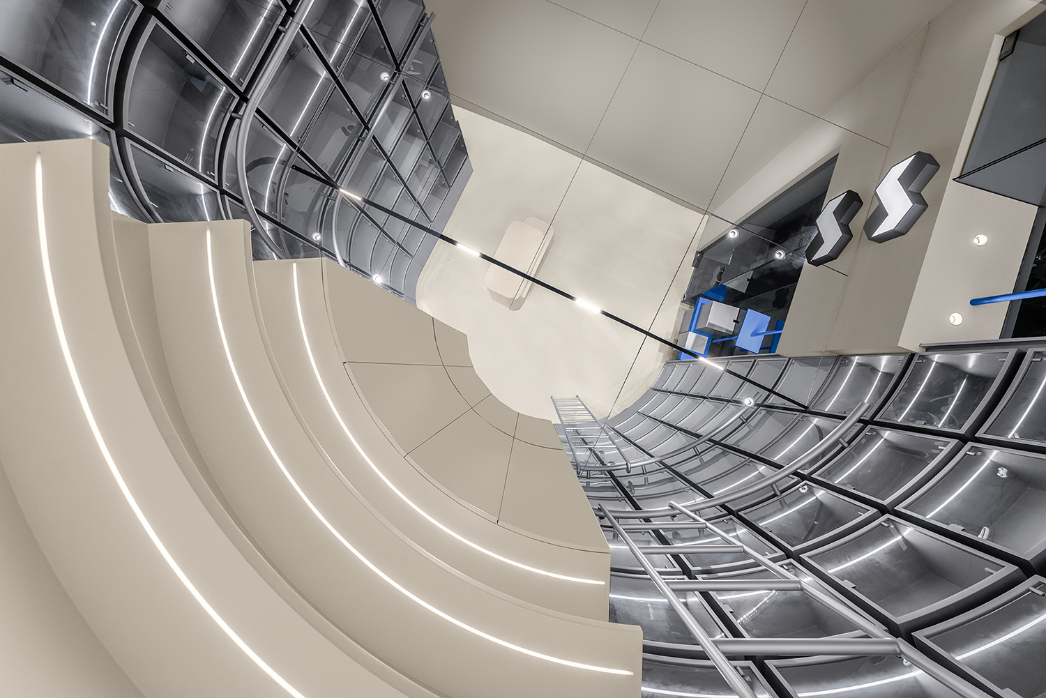
從底部望向空中,既看不到邊界,卻又能空間相互交融。自然而然帶動著空間的節奏,古老的建築在與我們的時代對話,過去與未來的超時空的對話將在這裏一直延續下去。
Looking at the air from the bottom, you can not see the boundary, but the space can blend with each other. Naturally drives the rhythm of the space, the ancient buildings are in dialogue with our times, and the dialogue between the past and the future in time and space will continue here forever.
∇ 鏡麵反射特寫 Specular close-up
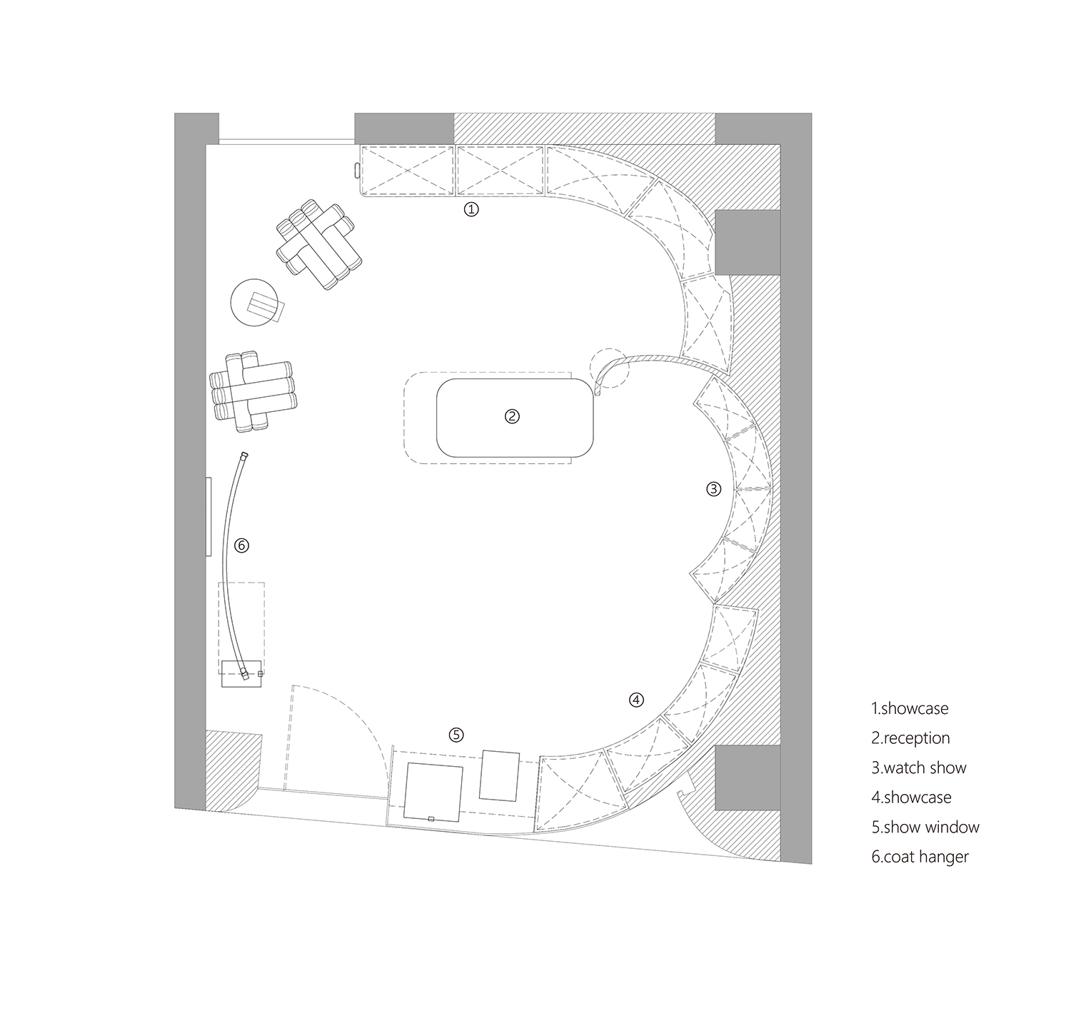
∇ 平麵圖 plan
項目信息
項目名稱:靜|享
設計方:原一空間設計
項目設計 & 完成年份:2022/05~2022/07
主創及設計團隊:陳一夫/張原/郭強/徐誌慧
項目地址:上海
建築麵積:35㎡
攝影版權:小謝世
合作方:浙江組流建設
客戶:靜|享
品牌:金屬烤漆板/水銀鏡/灰泥


