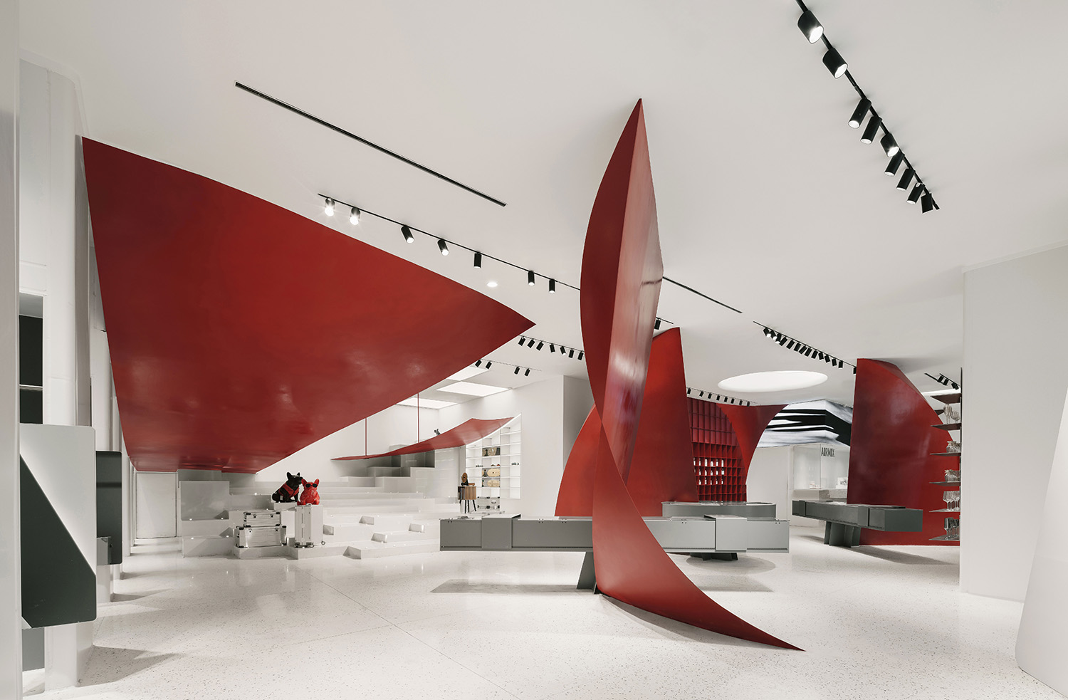
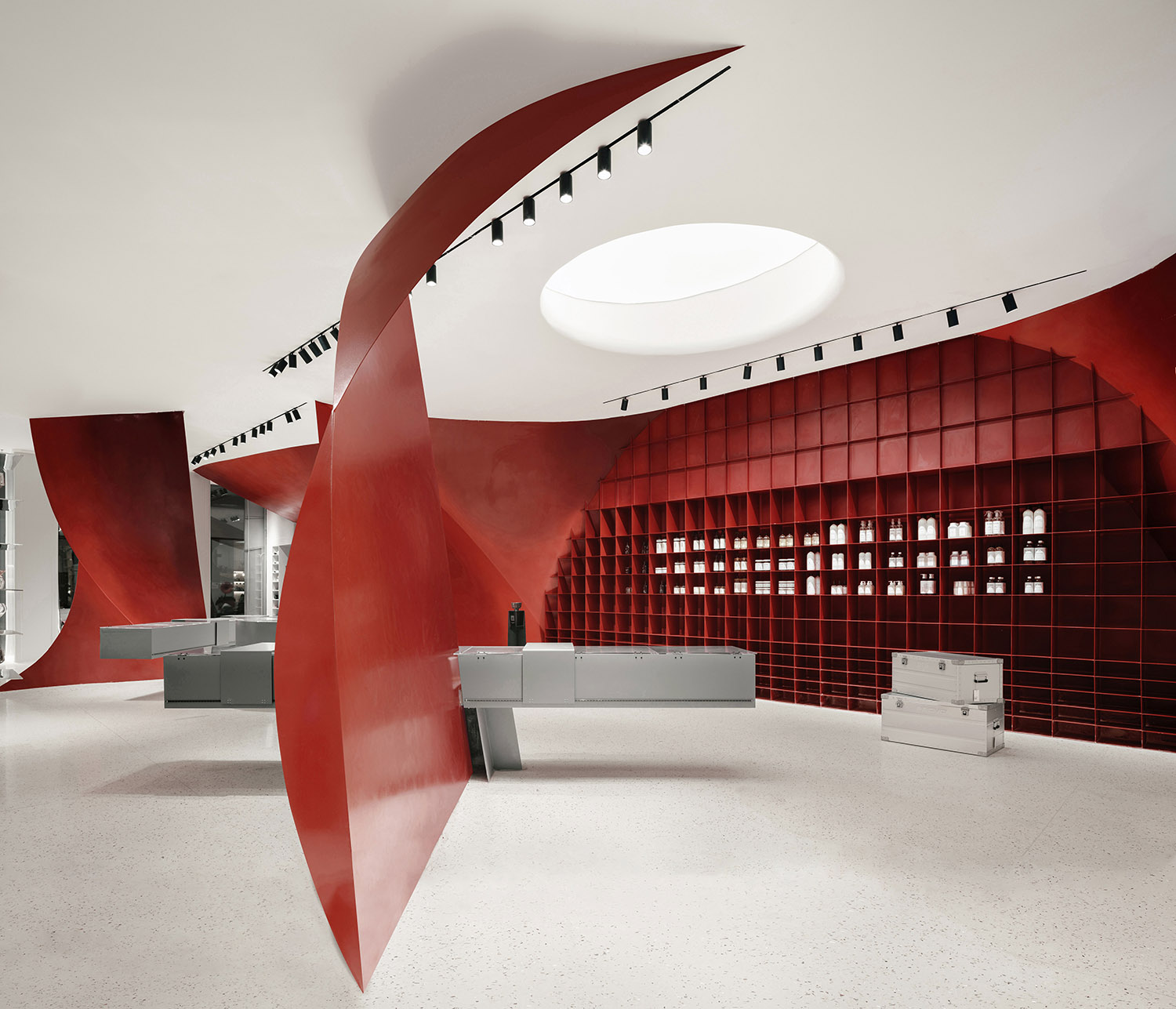
AIRMIX是源於古城西安的一家生活方式潮品連鎖店。這家麵積240平米的店鋪位於西安最具潮流特征的曲江創意穀,作為品牌首店,肩負為品牌開局和定調的重任。項目的首要挑戰是如何在一個相對小的空間中為這個全新的初創品牌創造出強烈鮮明、讓人過目不忘的品牌形象。SpActrum譜觀通過對生活方式產品的透析,提取“氣泡”作為感官與象征的概念,將氣泡的物理特性作為形式操作手段,創造出具有象征意味的雕塑形態展陳,作為空間和體驗流的組織器,輔以具有透明性的巨型logo立麵,塑造出極具辨識度的店鋪形象,同時也探索了通過室內設計激活街道和城市空間,將人們從日常生活體驗中抽離,激發藝術想象的獨特體驗,重新詮釋了生活方式類零售空間的內涵與邊界。
AIRMIX is a lifestyle boutique located in Xi’an, designed by SpActrum. AIRMIX Lifestyle Boutique (Xi’an Store) is the first showroom store of the newly established lifestyle boutique buyer brand. The challenge of the project consists in a relatively small shop area, where a strong image of the new brand is to be showcased while building a significant identity for AIRMIX. It starts by redefining the position that lifestyle holds for human life. Rather than something adhesive to everyday life, SpActrum understands lifestyle as an essential need deep inside humanity. It’s fragile yet unhesitatingly steady. It’s like a bubble of soap, transient and pleasuring. Bubbles become both a metaphor for such need and the form-making concept of the design.
形式概念 Form Concept
氣泡的構想來自一個隱喻、一種象征物。設計師追問生活方式產品的本質,其通常被視為富足後的次生需求。但從生物進化的角度卻不盡如此,很大程度上,美來源於“性選擇”和對於生活環境的辨識,那些有利於生存和物種延續的特征逐漸構成了美感重要的組成部分。長天白雲、獅子的肌肉和鬃毛、鳥兒跳躍的求偶舞蹈,美對於生命有著非凡的意義。SpActrum譜觀的主創設計師潘岩發現肥皂泡是對於生活方式產品的絕佳隱喻,肥皂泡帶來看似短暫的美麗和愉悅,但再一次吹出一個泡泡的欲望是連綿不斷的。氣泡美麗而脆弱,一旦消亡,人們又有動力迅速地再次創造它。氣泡作為設計的切入點,SpActrum譜觀不僅僅將其作為某種“形象”看待,更是試圖了解和剖析氣泡的形態規律,並將其作為形式操作的工具。
SpActrum introduces the metaphor “bubbles”, which is not only a design concept echoing the lifestyle boutique topic, but also a form manipulation methodology used as part of the design. The final formal presentation is a collection of the deliberately selected fragments of the latent generative geometry, or “bubble clusters”, which are developed into a series of seemingly very diverse sculptural display objects: altar, cabinets, shelves, floating slice, etc., formally optimised yet functionally-customized for best showcasing specific products. Although not apparent at a first glance, the order of the latent generative geometry creates a formal consistency and unifies the objects in space.
設計元素 Design Elements
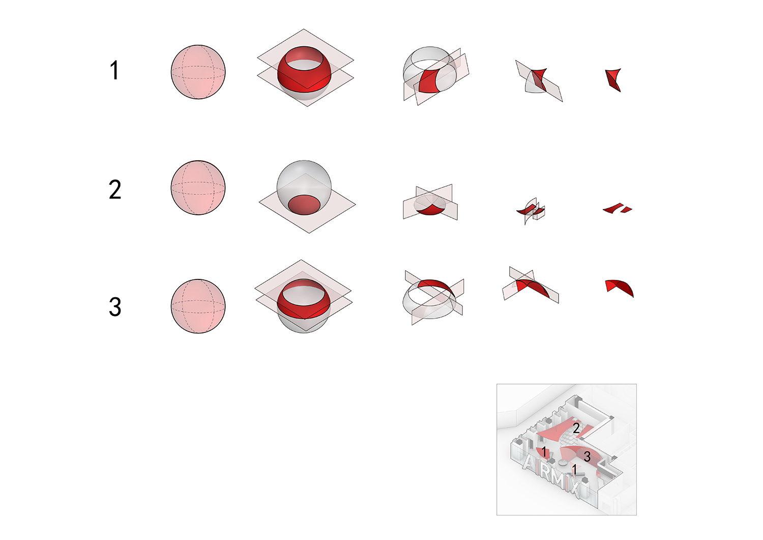
氣泡在單獨出現和層疊堆積中由於表麵張力從圓變成由直立氣泡壁和圓拱組成的形態,這是一個物理塑形的過程。SpActrum譜觀設想空氣中幾個巨型球體互相堆積,被店鋪空間所限定並相互切割。球體與直立麵一起形成了介於平麵與曲麵間的強韌而鋒銳的形態。
When soap bubbles cluster together, they form a series of interconnected domes, with planar walls separating each bubble from the next. The form and structure of a bubble as a physical phenomenon serves as a formal inspiration for the design.
形式操作帶來的形態可能性在本案中被充分探討,通過對空間和流線的分析判斷,形體以四種方式發生:
Through geometrical iterations of bubbles shifting in scale, being intersected by planes or other bubbles create a series of sculptural fragments that populate, connect and divide space.
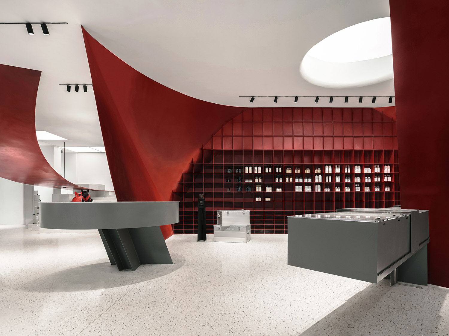
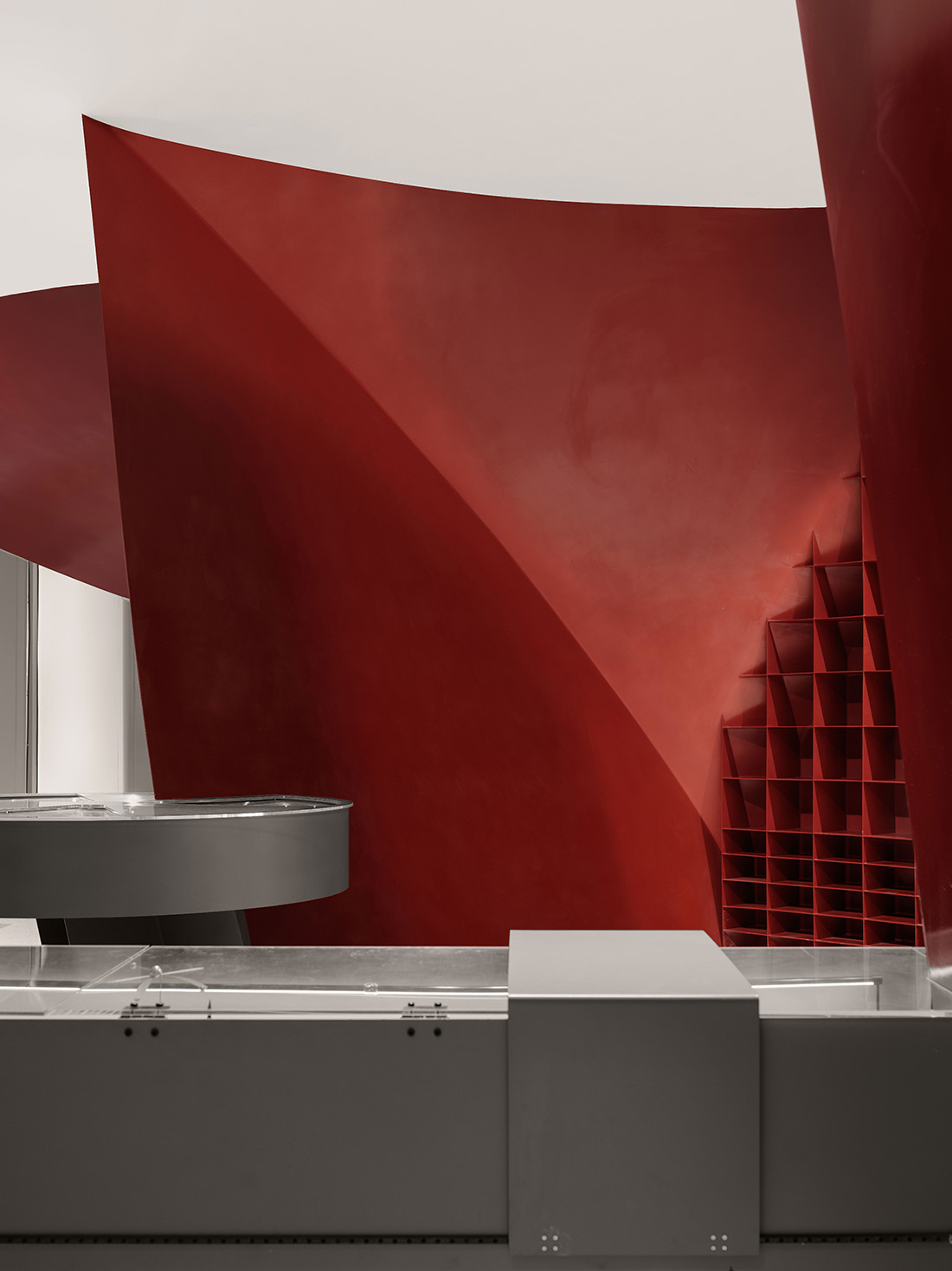
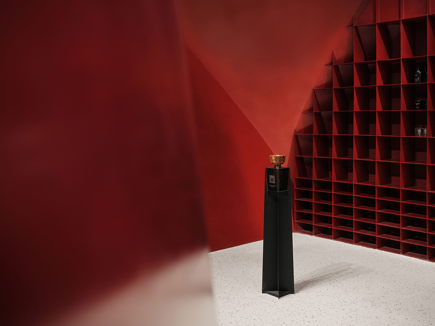
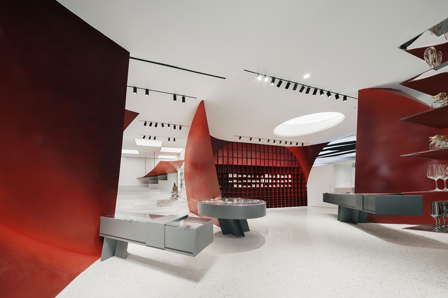
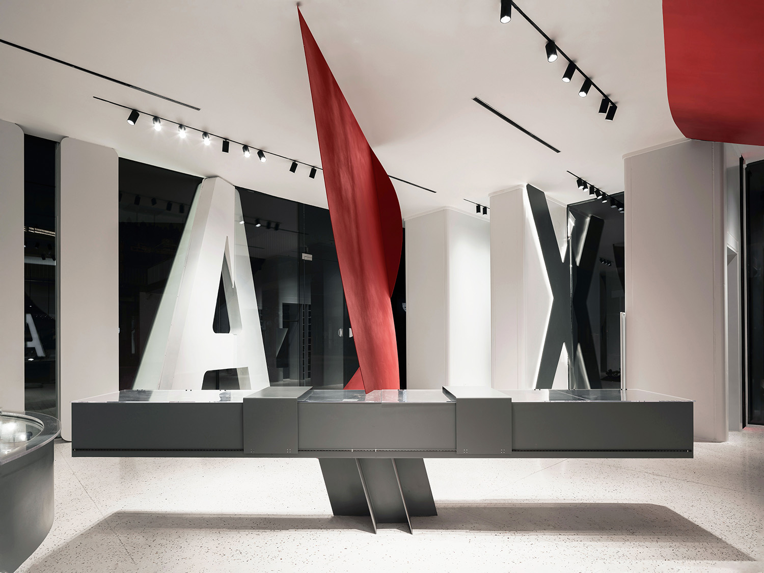
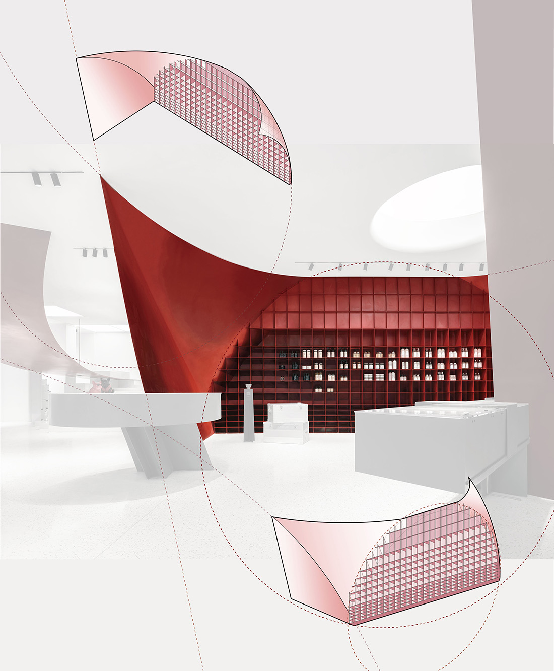
一、氣泡聖壇。以大麵積直立牆體占據店內主空間的牆麵,直立側壁和拱頂,配合頂部特別設計的天光,產生某種深沉完滿的體驗,是整個空間的主體。
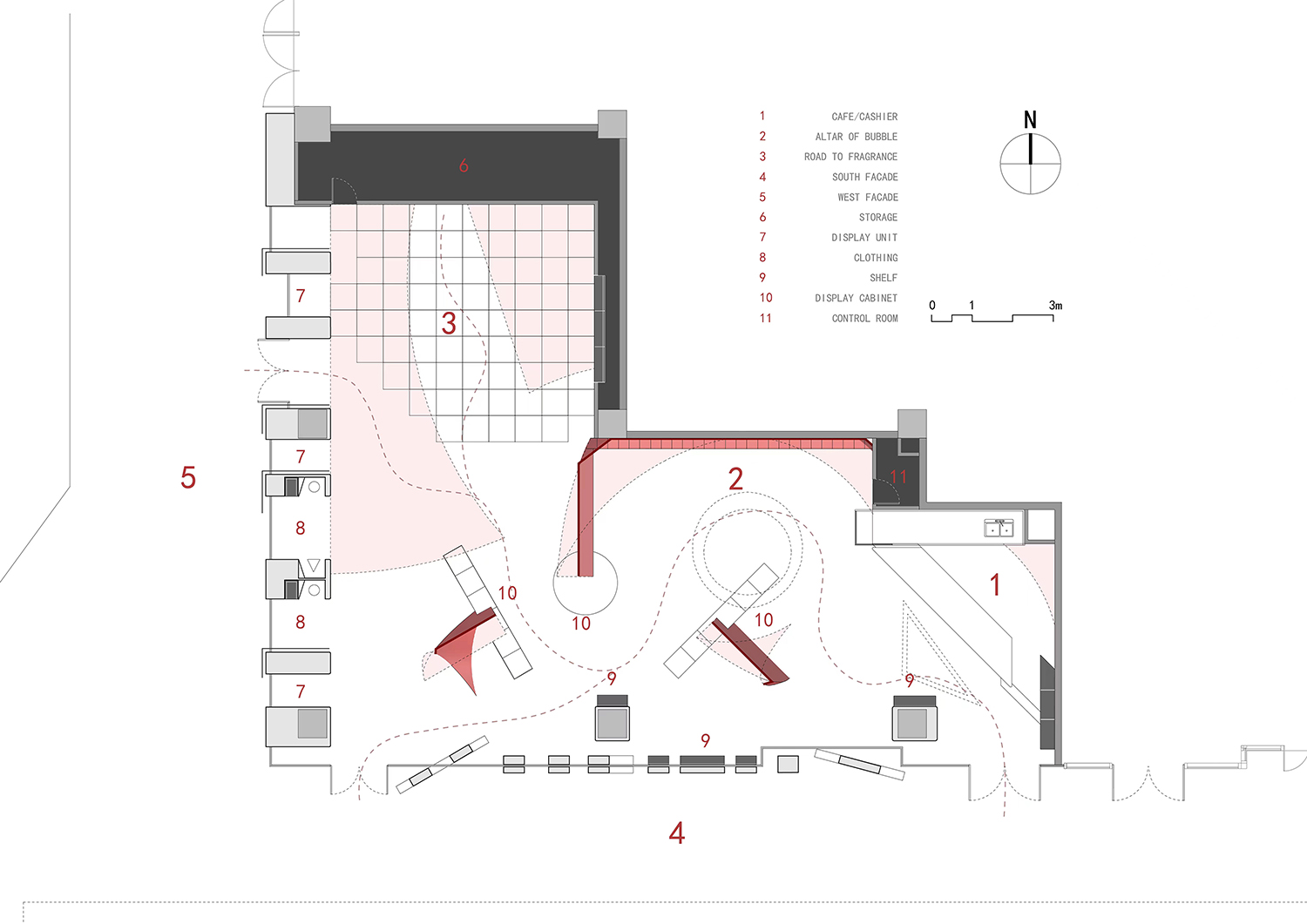
The fragments of bubbles are sculptural elements that divide and connect space. The shop is situated in a corner of a bustling mall. The longer side of the L-shaped space faces the south side. Along its back wall, the debris of the bubble makes an altar-like space for skin products and cosmetics. The intensity of the lighting from the ceiling in contrast with the serenity of the altar is a subtle ironic gesture of consumerism.
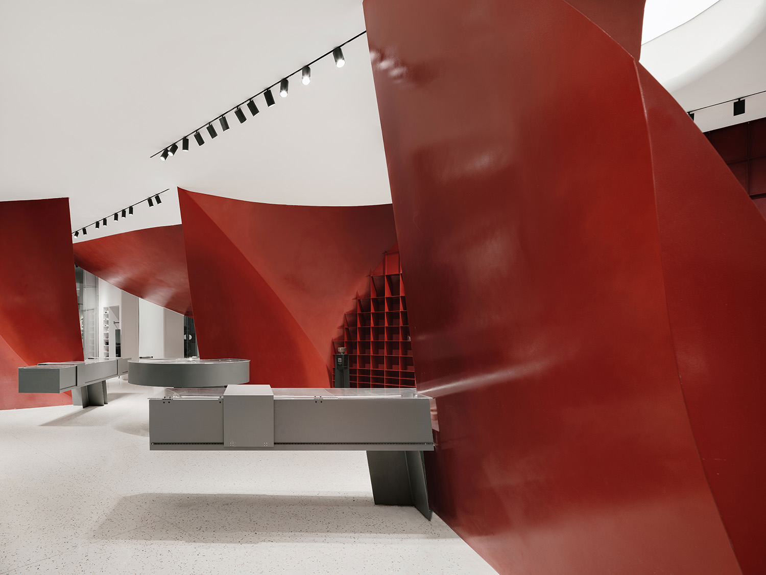
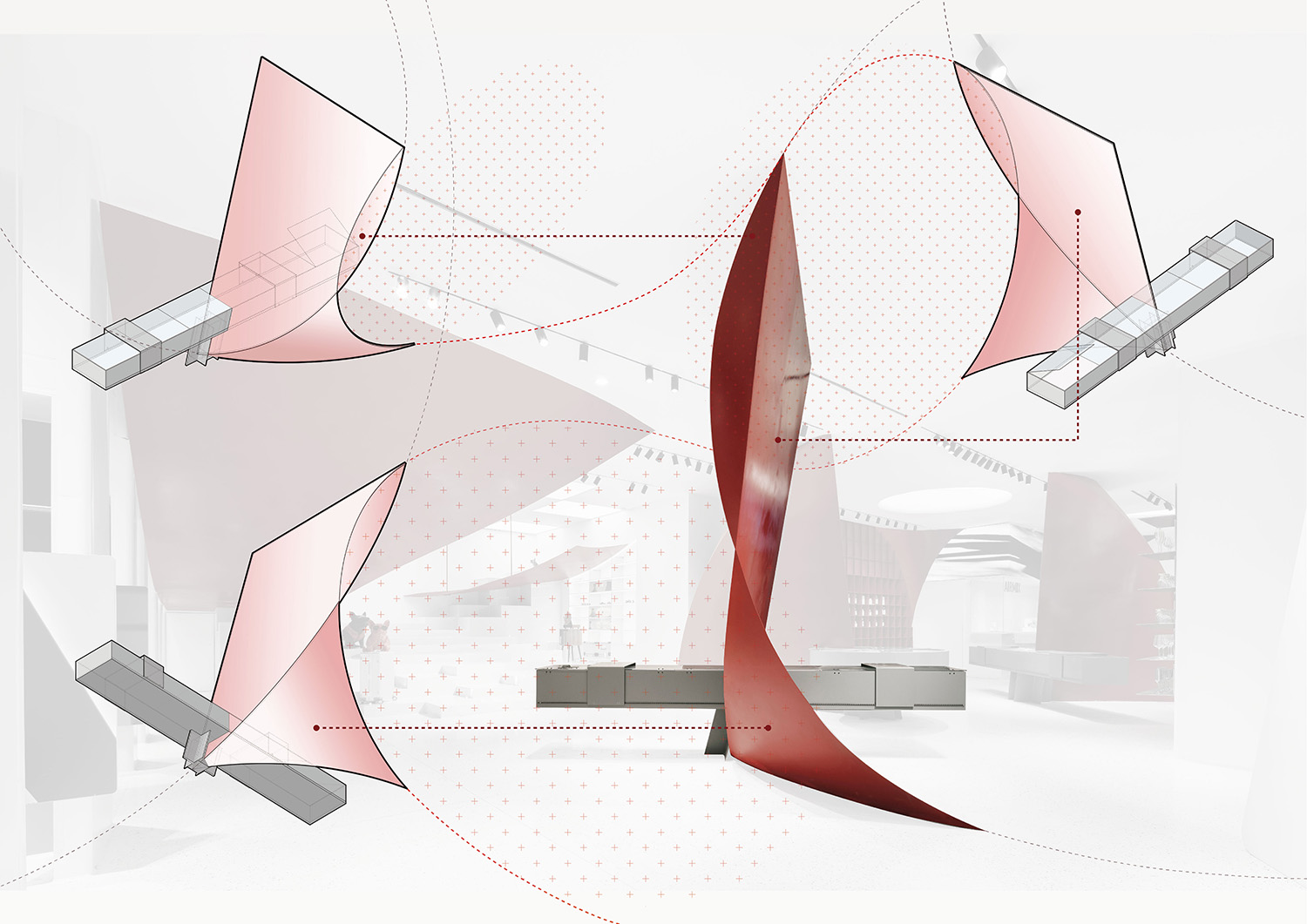
二、聖壇兩側以殘存氣泡球體組合直立平板構成旗幟一般的雕塑形態。這兩件雕塑與聖壇的穩定完滿形成鮮明對比,且自身充滿矛盾:曲麵與平麵、垂直與水平、纖薄的厚度與巨大的形體、輕盈的高大站立物承載著水平展櫃的重量感。視覺的即刻衝擊與對於重力和厚度的慣常印象之間產生明顯的衝突,這種衝突就是審美張力的來源。脫離常規的思維,激起審美的愉悅。
Two vaulted shapes sit along two sides of the altar like flags, and there are grey liner display boxes alongside balancing on those shapes, together with the round display unit on one side of the altar, they are display cabinets for watches, lighters and other small chic goods. They regulate passes for customers.
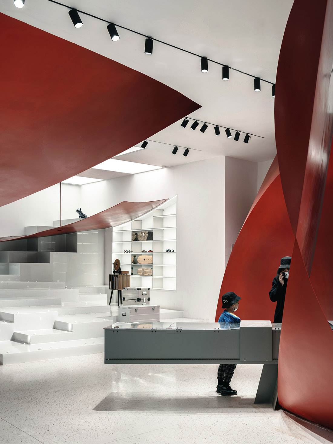
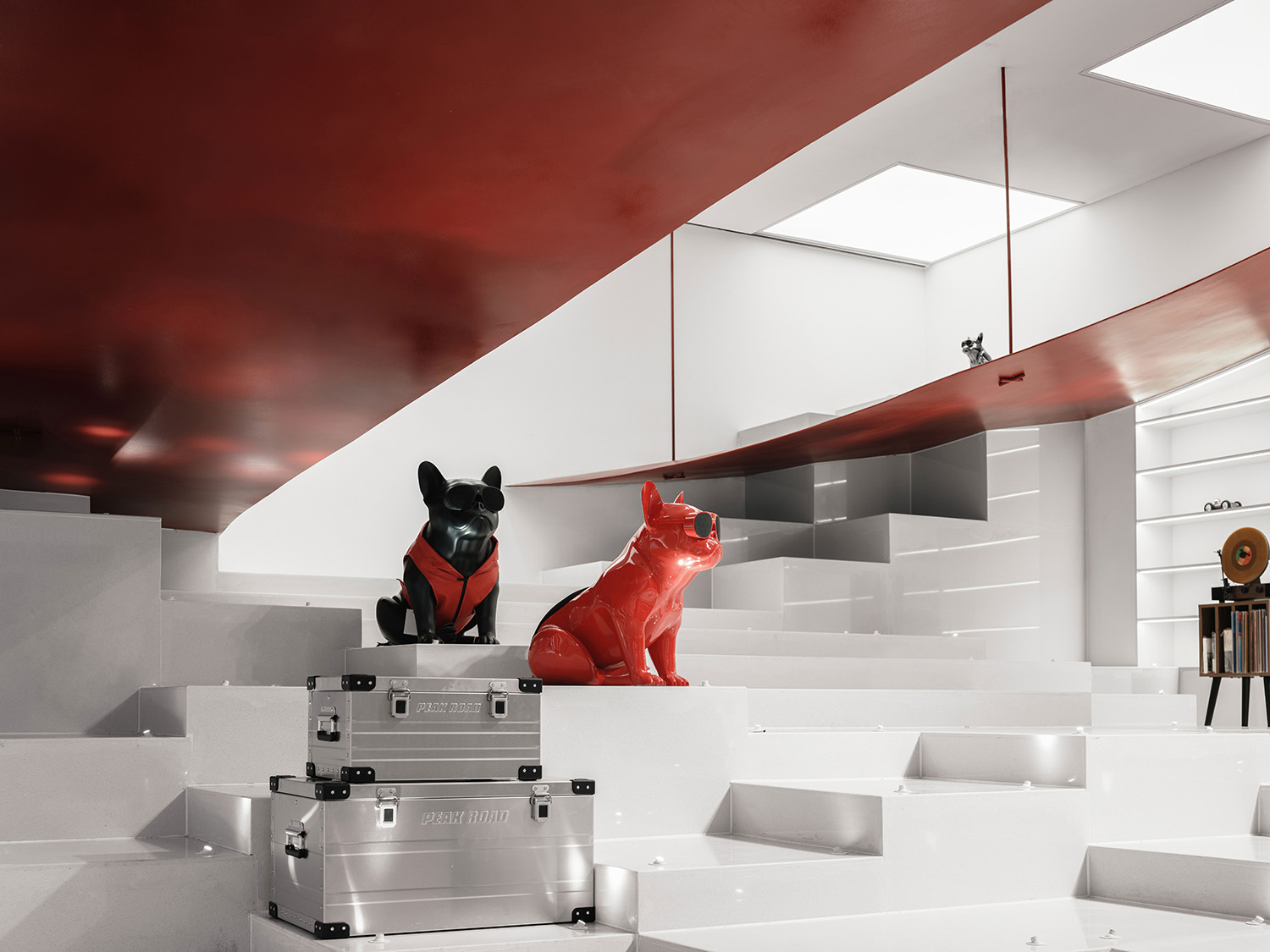
三、設想一個懸掛在店麵上空巨大的球,隻有底端的局部被容納在店中,一條路徑從中間切割開,沿著它的邊緣擺放著各種氣味的香氛,“芳香之旅”即刻開啟。懸掛的物體產生空間的水平隔斷,頭部作為感覺的主要器官仿佛被隔離在氣泡中,而身軀則在如同海岸的巨人石柱上移動,這種對分離感的體驗帶來十足的樂趣。
The large walkable steps are also display units in themselves allocated for oversized items such as luggage, speakers or similar. The “bubble debris” hanging from the ceiling identifies a “Road to Fragrance”, which grabs the attention when looking up and creates a route that can be navigated by following the scents that are applied to the edges of the bubble fragments themselves.
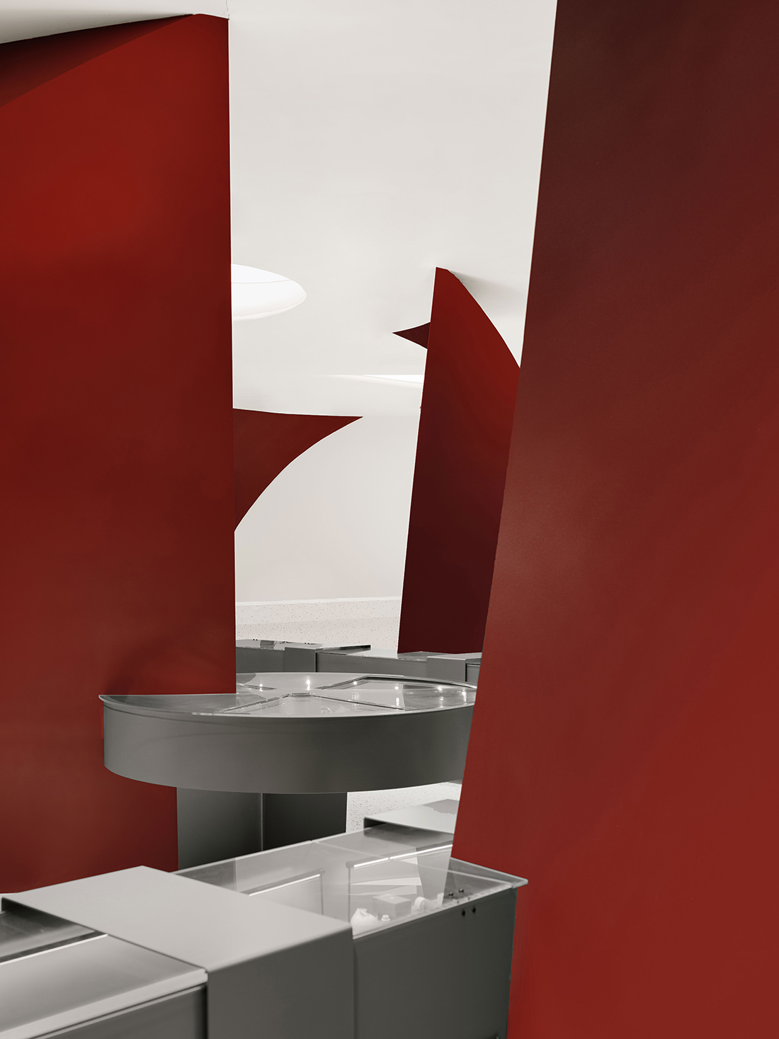
四、在各個邊角出現的“殘片”,它們表征著無窮空間裏無窮的氣泡,暗示著呈現在眼前的隻是整個氣泡世界的冰山一角,氣泡如同暗物質一樣,無處不在。
The “fragments” that populate the store space represent an infinity of bubbles in infinite space, implying that what appears in front of us is only the tip of the iceberg of the entire bubble world. Just like dark matter, bubbles are everywhere.
色彩&材料 Color & Materials
氣泡被構想為以最鮮豔深刻的色彩存在。色彩方案的研究是通過數字渲染、微型模型和全尺寸模型進行的,經過多次打樣試驗,直到如同恒星的光滑過宛如生命體的緋紅異星時,這種具有宇宙感的時刻被確定下來。這是一種並非勻質,具有生命體質感,隨著空間遊曆視覺上有時間性變化的深紅色,接近郎窯紅的深紅色漸變。展櫃以灰色存在,四壁地麵以白色為主調,為氣泡提供充分聚焦的舞台。
The colour scheme studies were carried out via digital rendering, miniature models and full-scale prototypes until a gradient of red was made to resemble a stellar sunset on an alien planet. The resulting colour is a crimson with a non-homogeneous texture which makes it almost look like a living thing, at the same time having a close resemblance to the “Langyao Red”, a gradient famously used in traditional Chinese porcelain.
設計階段的幾何研究給了所有元素一個具有內在統一性的形式語言。這些令人印象深刻的巨型紅色雕塑體展陳裝置是委托西安當地一家專業的藝術品製作工作室加工製作而成的。巨大的鋼板在專業的鋼鐵車間裏切割成型,建築師和工廠技師對安裝和焊接細節進行了密切深入的討論,以確保精確和高效的製造和安裝。這間工作室為許多中國知名的當代藝術家製作大型藝術裝置,得益於其在製作大型異形物體方麵的豐富經驗以及先進的機械加工技術,最終呈現的成果是融合了精確高效的當代工業製造和具有精微的審美意識的工匠勞作的結晶。
The geometrical studies carried out during the design phase give all the elements of a general formal language which was further progressed and detailed with the manufacturers. The steel plates have been cut and shaped in a steel workshop which specializes in art pieces. Fixing and welding details have been discussed with the appropriate know-how to ensure precise and efficient manufacture and installation. The construction of the impressive giant red sculptural fixtures is commissioned to a local prestigious fine art manufacturing studio based in Xi’an, famous for its high-quality production of large-scale art installations for some of China’s first-class artists. Benefited from its rich experience in producing abnormal-shaped objects and the advanced machinery and techniques, the final result is a bold fusion of industrial manufacture precision and the subtleties of artisan labour with a highly refined aesthetic.
可持續發展策略在該項目的材料選擇中發揮了關鍵作用,SpActrum譜觀試圖通過材料輕量化的形式和它所代表的可持續生活方式,為“沉重”的城市生活帶來輕盈的一瞥。項目使用大量的可回收材料,如鋼鐵和玻璃。店鋪照明100% 采用LED燈具,以降低能耗。大部分的建造和建材供應商都是位於項目50公裏的半徑範圍內,從而減少項目運輸的碳足跡。
Most of the materials used, such as steel and glass, are fully recyclable. 100% LED lighting is used to reduce energy consumption. Most of the suppliers for construction are located within a 50km-radius, which helps to reduce the carbon footprint on transportation. This boutique’s purpose is to bring a glimpse of lightness to the “heaviness” of urban life both by its bright form and the sustainable lifestyle it represents.
城市細胞 City Cells
SpActrum譜觀廣泛參與城市更新項目,對於這類體量龐大的項目來說,每個具體而微小的店鋪都是巨大軀體的鮮活細胞。在室內項目中,SpActrum譜觀回應城市的巨大尺度,打破“城市-街道-店鋪”的層級壁壘,讓室內成為街道和城市的一部分,這種來自細胞的對於生命整體的積極構建使得SpActrum譜觀的作品充滿交流感,他們無一例外的在對城市、對更廣闊的公共空間發聲。
SpActrum has been extensively involved in urban regeneration projects, and especially for such large-scale projects, every specific micro store is an living cell, part of a large body of the city. In its interior projects, SpActrum consciously responds to the vastness of the urban-scape, breaking the barriers of routine hierarchy of “store-street-city”, and making the interior a part of the street and city. Treating the urban environment or architecture as a living thing, and constructing a whole from a cell makes SpActrum’s work full of humanity and inspiring a sense of connection. Without exception, all of these projects speak for the city and the wider public space.
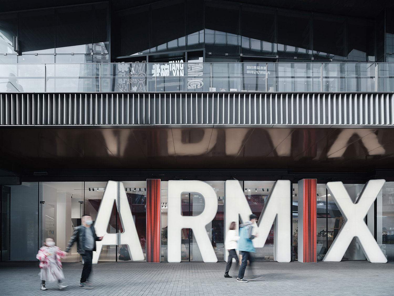
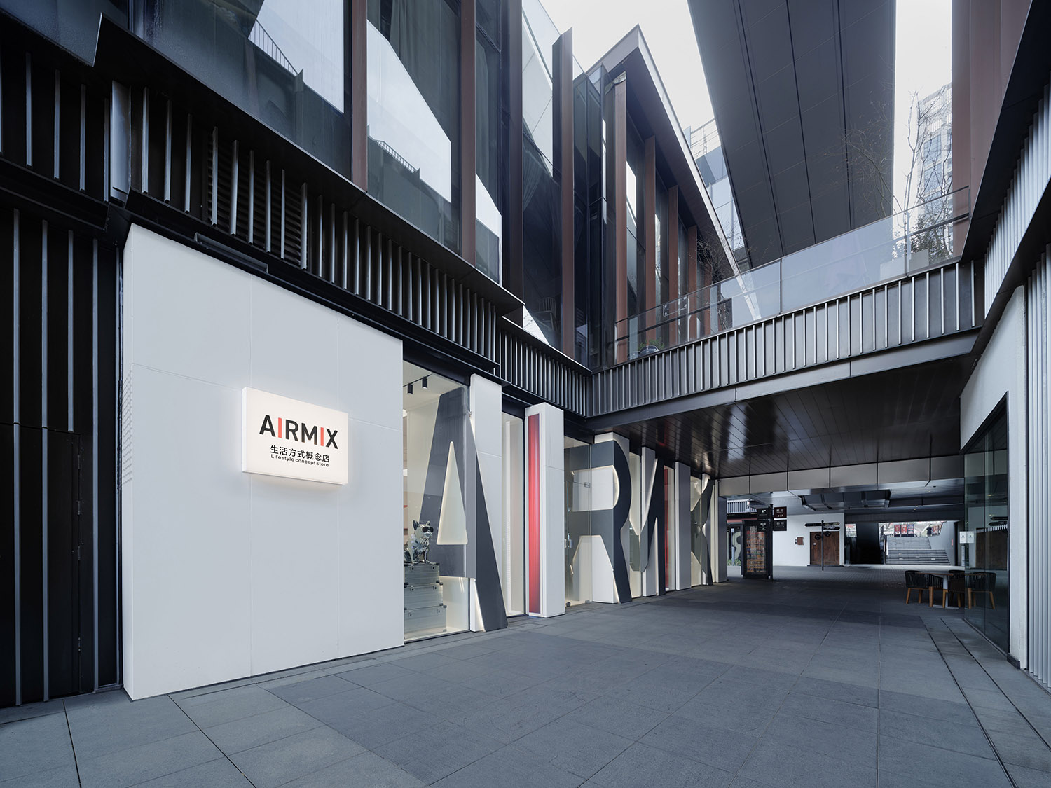
AIRMIX位於曲江創意穀的一個街角, SpActrum譜觀將兩個臨街麵非常直接的作為品牌logo展示麵,巨大的logo是對城市發表的宣言。城市需要安靜妥帖的功能性處所,也需要這樣狂放不羈的興奮點,為平淡和規則尋求一些突破的窗口。
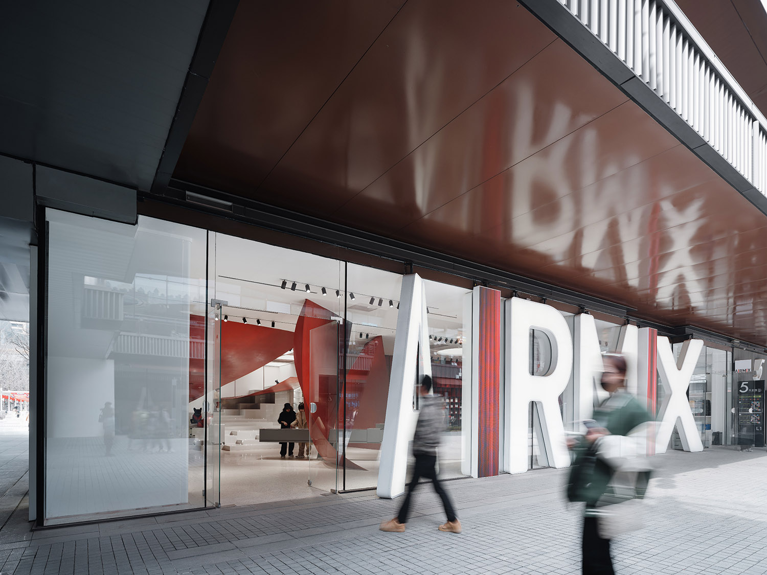
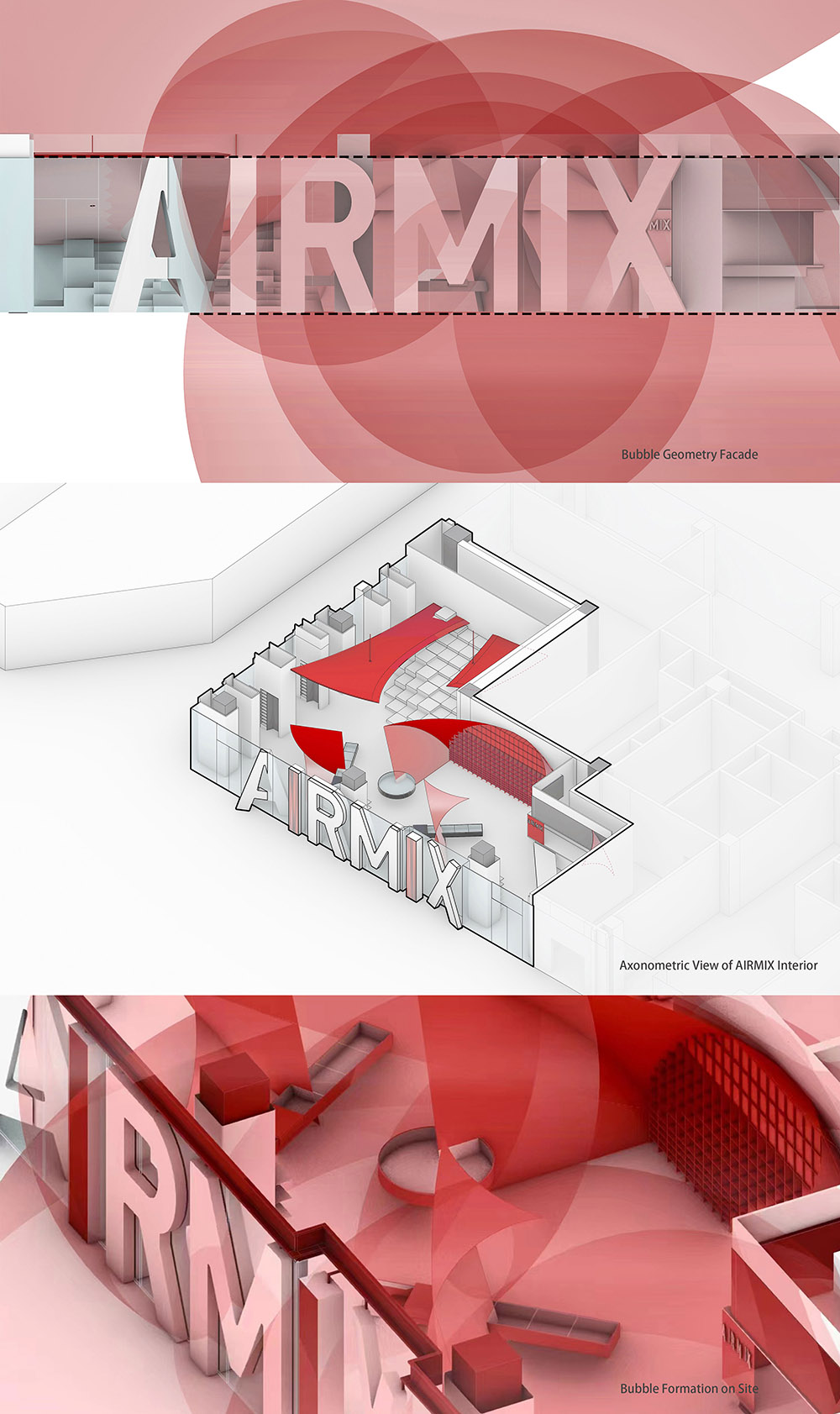
To strengthen the brand image of AIRMIX, SpActrum takes advantage of the fact that both facades face busy pedestrian streets, erecting the giant illuminated brand logos as advertisement billboards and showcase windows. The facades become a kind of communication interfaces, as well as filters between the external and the internal.
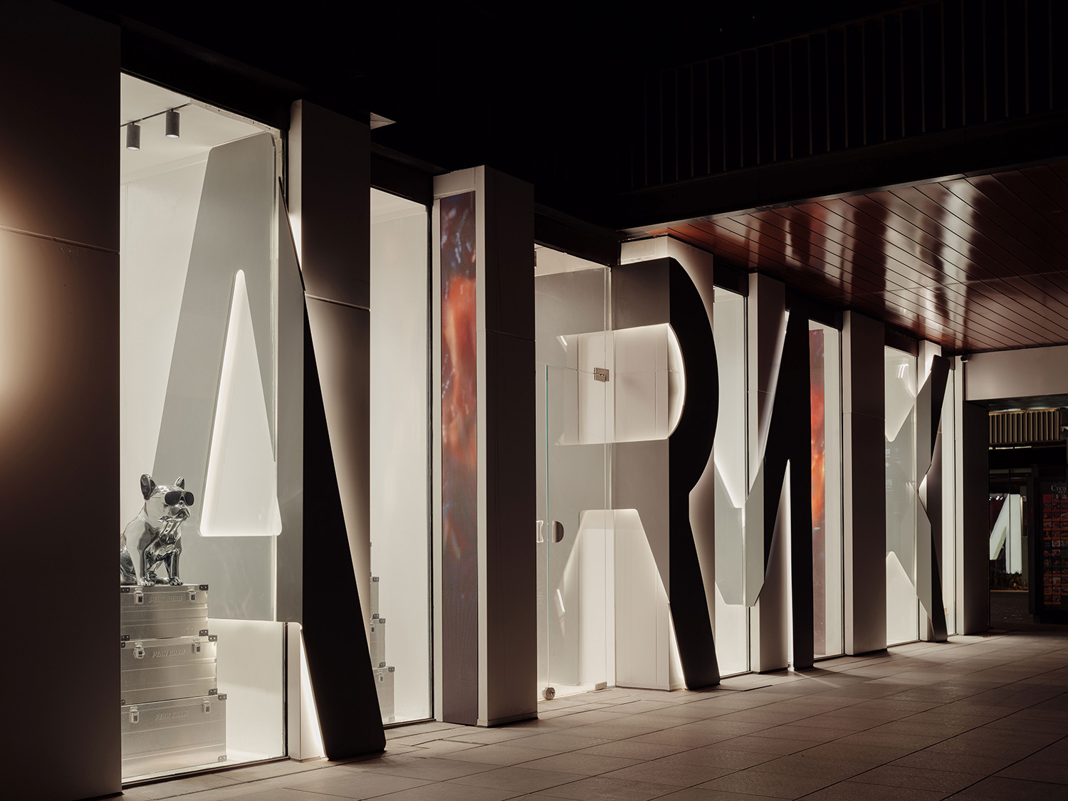
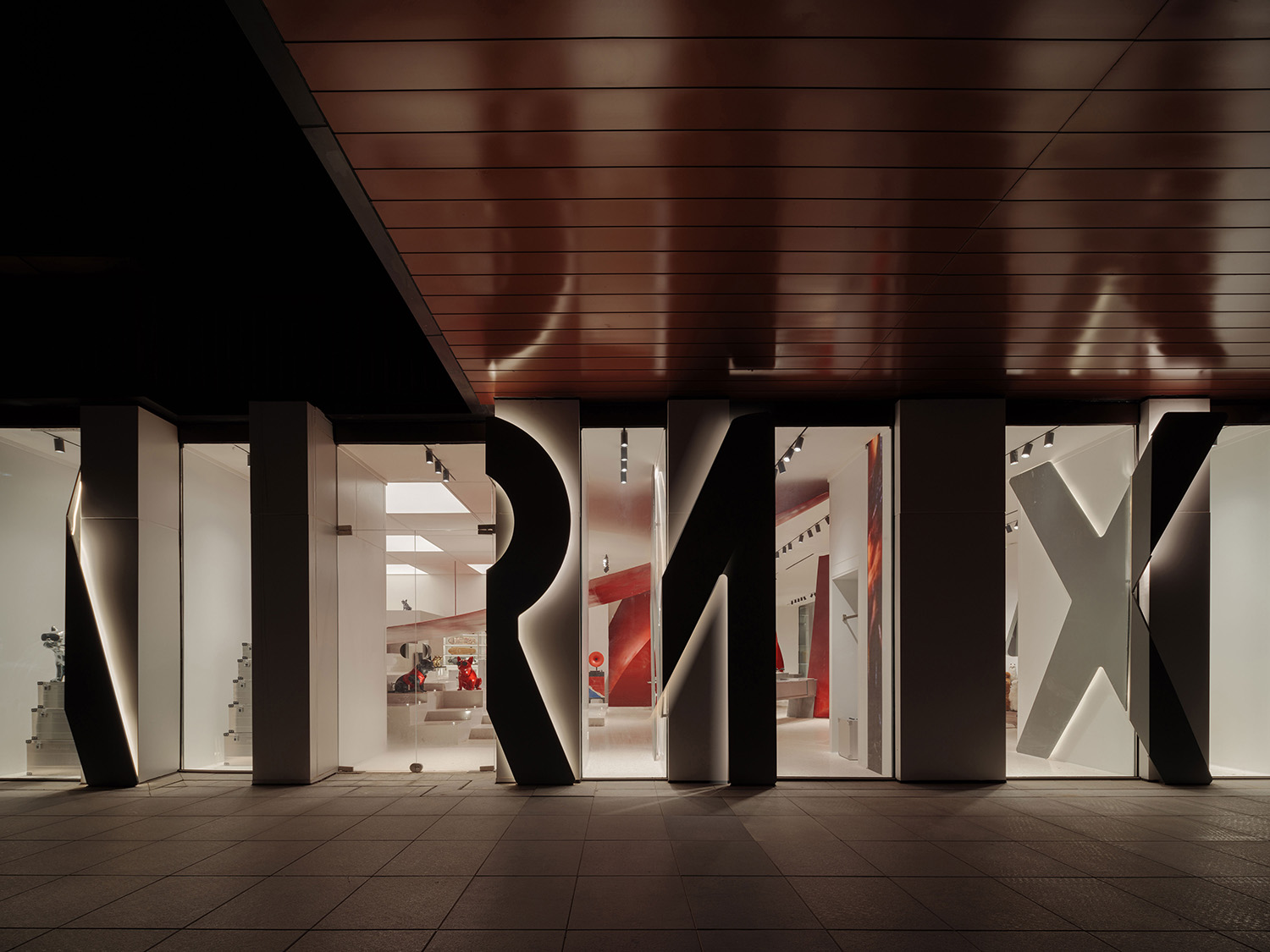
AIRMIX巨大的logo提供強烈的辨識性,A和X分別向首尾略微傾斜,表示出入口。兩個I是LED顯示屏幕,和其他字母一起,夜晚它們成為麵向公共空間展示的巨大燈箱。側立麵作為正麵燈箱的側壁,等牆高的Logo以金屬板纏繞短牆,既有實體的感受,又通過不同間距的短牆以梳狀的排列方式構成入口和櫥窗。
Being a new boutique brand, the front facade features the full height brand logo as illuminated boxes and LED screens. A-I-R-M-I-X, with A and X, gently tilted towards the centre to indicate two entrances at two ends. The other side of the L-shaped space faces a busy corridor connecting to plazas. The logo is repeated on the short side with the letters wrapping around the vertical storage units. From the direction you walk towards the shop, depth hides the gaps in-between, and the whole of the logo letters are revealed.
本案展現了SpActrum譜觀的設計態度:將客戶需求通過思考與更廣泛的社會問題相連接,產生超脫於設計客體的抽象思維。並在設計中主動尋求探索超越客戶指令和社會功能的普遍知識和美學原則,通過設計問題的轉譯,在完成功能性需求的同時,創造具有強烈識別性的空間,並以批判性的思考與實踐將設計的探索引入純粹知識領域。SpActrum譜觀希望為AIRMIX創造一種有別於日常生活情境,具有激發性的氛圍空間,以張揚、大膽、強烈的藝術屬性激發人們的好奇心和想象力性,契合品牌提升生活品質的美好願景,以獨特理念和創造性地展陳設計及立麵設計,為零售業態在展售的多樣性和品牌形象塑造方麵提供了嶄新的思路和視角。
Through this design SpActrum helps the newborn brand AIRMIX to establish a distinct and memorable brand image — strong, trendy, arty, and out of the ordinary. It successfully raised the awareness of the AIRMIX brand among the target customer group and significantly promoted the sales; furthermore, it has played a key role in a laying a solid foundation and setting the keynote for the brand’s chain store development in the future.
∇ 平麵圖
∇ “空間中的氣泡”概念分析圖
∇ 形態生成圖解
∇ 氣泡1:聖壇圖解
∇ 氣泡2:風帆陳列櫃圖解
項目信息
項目名稱:AIRMIX生活方式概念店
項目地址:西安雁塔區曲江創意穀
麵積:240平方米
項目完成日期:2022.03
客戶:陝西空港新絲路商貿有限公司
建築設計:SpActrum譜觀
主創設計師:潘岩
設計團隊:張禕潔、李真、唐一萌、萬瀟、萬金宇
照明顧問:孫巍
施工單位:陝西三屹建設工程有限公司
雕塑裝置加工:西安嘉泓景文化創意有限公司
水磨石施工:思摩士
攝影&視頻製作:言隅建築攝影
圖紙&圖解版權:SpActrum譜觀
Project Name: AIRMIX Lifestyle Concept Store
Project Location: Qujiang Creative Circle, Yanta District, Xi’an, China
Area: 240 sqm
Date of Completion: March 2022
Client: Shaanxi Airport Xinsilu Trade Co.,Ltd.
Architecture Design:SpActrum
Chief Architect: Yan Pan
Design Team: Yijie Zhang, Zhen Li, Yimeng Tang, Xiao Wan, Jinyu Wan
Lighting Consultant: Wei Sun
Contractor: Shaanxi Sanyi Construction Engineering Co., Ltd
Still Plates & Sculpture Installation : JIAHONGJING
Terrazzo Floor: SMOOTH
Photography & Video: INSPACE
Drawings and Diagrams: SpActrum
材料與品牌信息
水磨石地麵:思摩士(北京思摩士科技有限公司)
燈光照明:嘉美照明(佛山市南海嘉美時代照明有限公司)
鋼板定製加工:嘉泓景 (西安嘉泓景文化創意有限公司)
Terrazzo Floor: SMOOTH
Lighting: JOM
Steel Plate Customization: JIAHONGJING


