北京大學協作式學習中心位於第二教學樓內,毗鄰食堂與數學科學學院,如何將原有樓梯底下和旁邊的邊角位空間改造成融合北大元素,讓學生都能有心理認同感的多元、交互、無界空間是本項目的重點。
The Collaborative Learning Center of Peking University is located in the Second Teaching Building, adjacent to the canteen and the School of Mathematical Sciences. How to transform the original corner space under and around the staircase into a diversified, interactive and borderless space that integrates typical elements of Peking University and gives the students a sense of psychological identity is the focus of this project.
北京大學是教育改革的先行者,我們希望在項目的改造設計中體現“守正和創新”的北大精神,並使之成為北大的人文景觀新地標。這個空間是多元教育空間的試點,為自主式學習提供新場景。
Peking University has been a pioneer in education reform, and we hope to embody the University’s spirit of “Sticking to Convention and Encouraging Innovation” and to make it a new landmark of the University’s humanistic landscape. This space is a pilot of diversified education space, providing a new scene for autonomous learning.
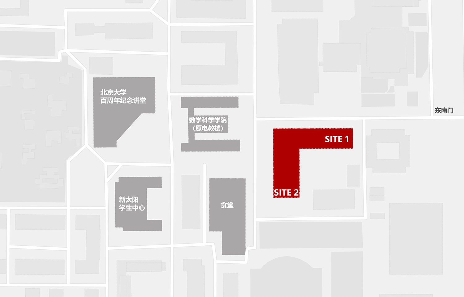
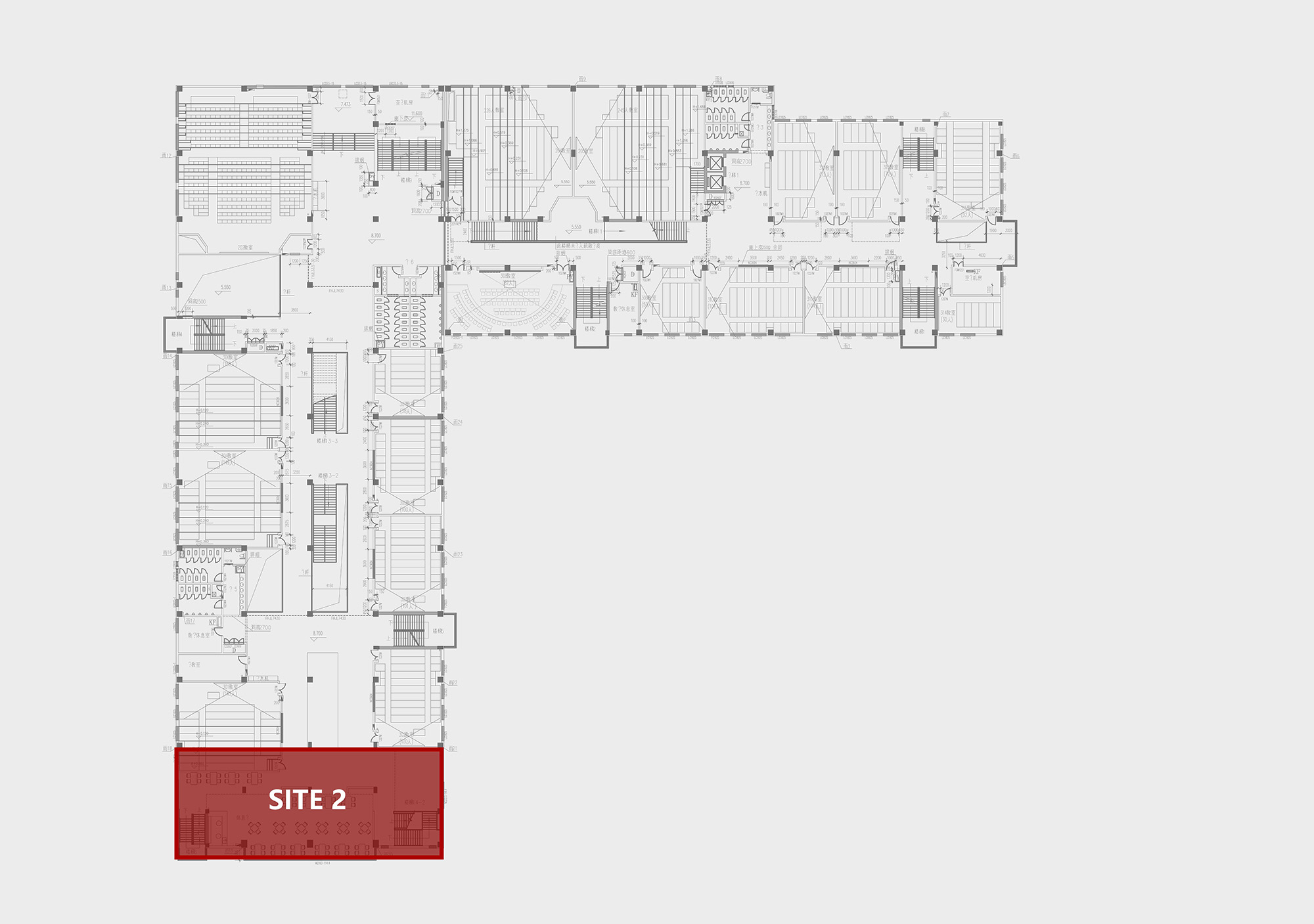
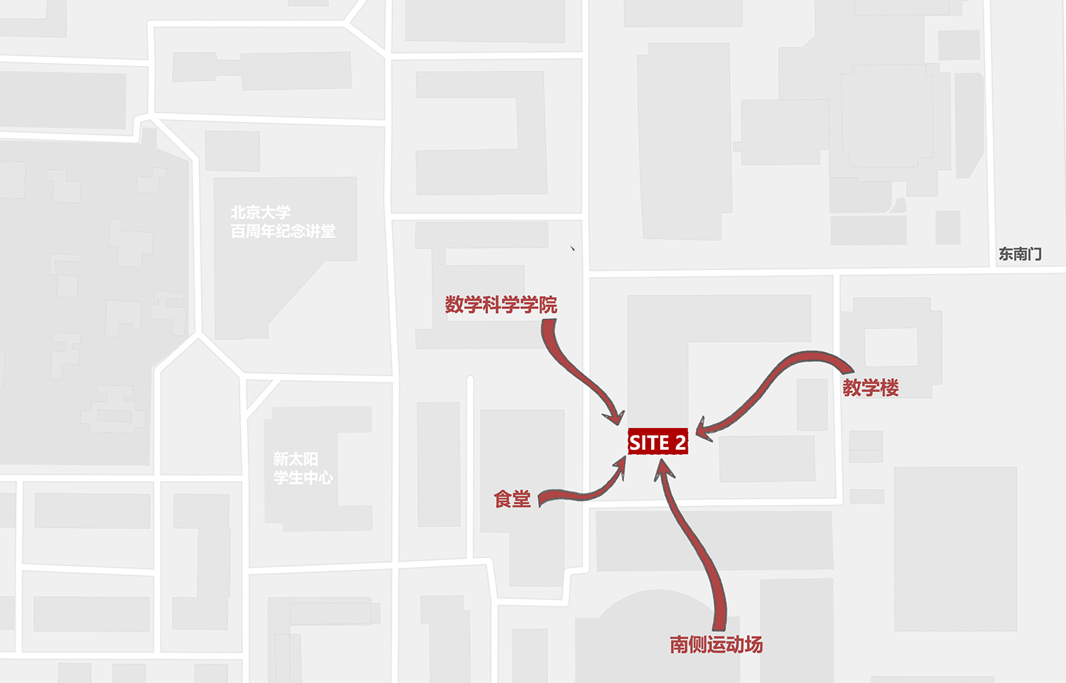
∇ 項目區位 ©扉建築 Site ©FEI Architects
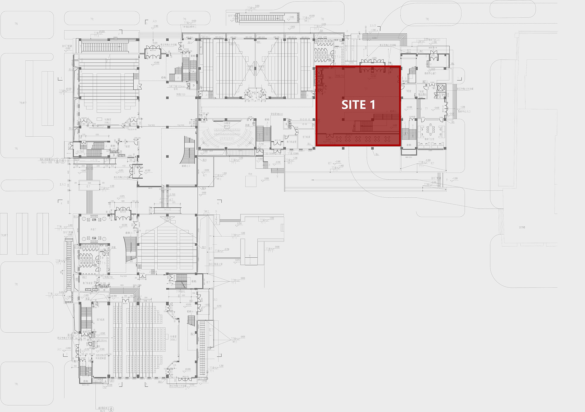
∇ 第二教學樓首層平麵圖 ©扉建築 First Floor Plan of the Second Teaching Building @FEI Architects
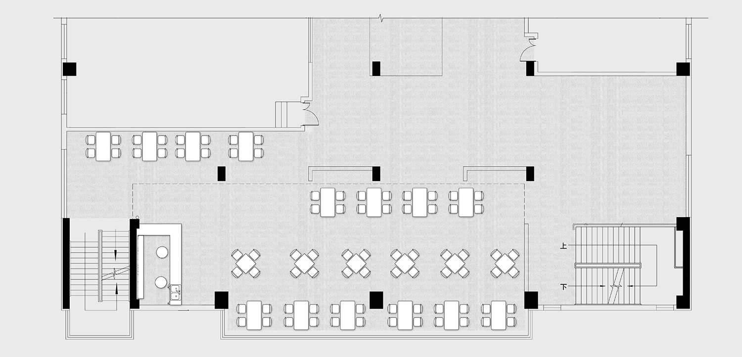
∇ 第二教學樓三層平麵圖 ©扉建築 Third Floor Plan of the Second Teaching Building @FEI Architects
SITE 1:梯下空間再利用
SITE1: Reuse of Space under Staircase
北區學習中心位於第二教學樓的首層,選址於此主要是考慮到方便課間短時間的自修,同時靠近與社會外界聯係最密切的東南門,在功能上可以作為一個交彙點,方便校內校外人士於此交流會麵。但由於有個大樓梯的存在,導致原有空間低矮零碎,沒有人氣。
The Northern Learning Center is located on the first floor of the Second Teaching Building for the convenience of short-time self-study during break. Besides, it is near the southeast gate, which has the closest connection with the outside world. Functionally, it can serve as a joint point for people inside and outside the school to meet and communicate. However, due to the existence of a large staircase, the original space is low and fragmented, and thus lacks popularity.
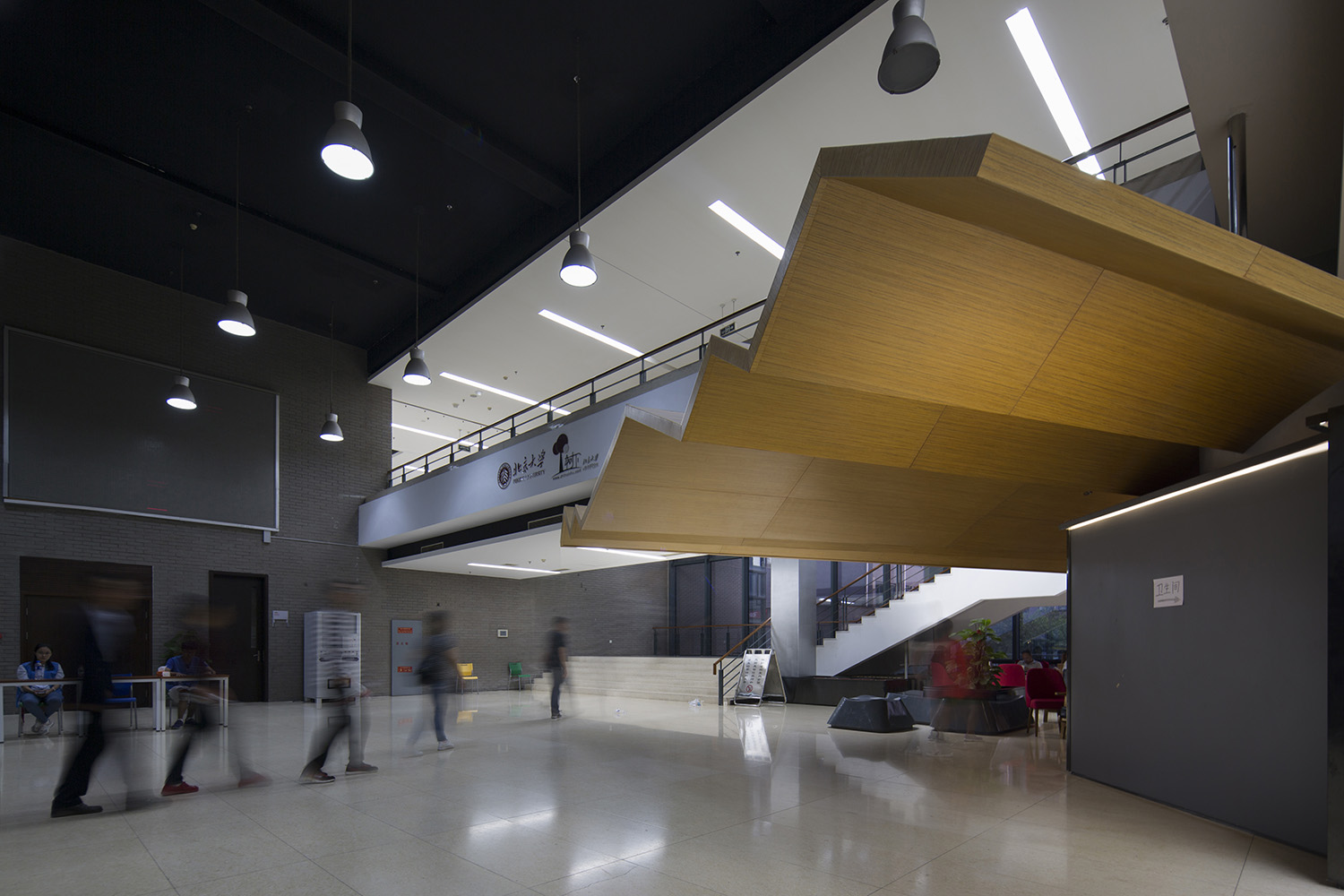
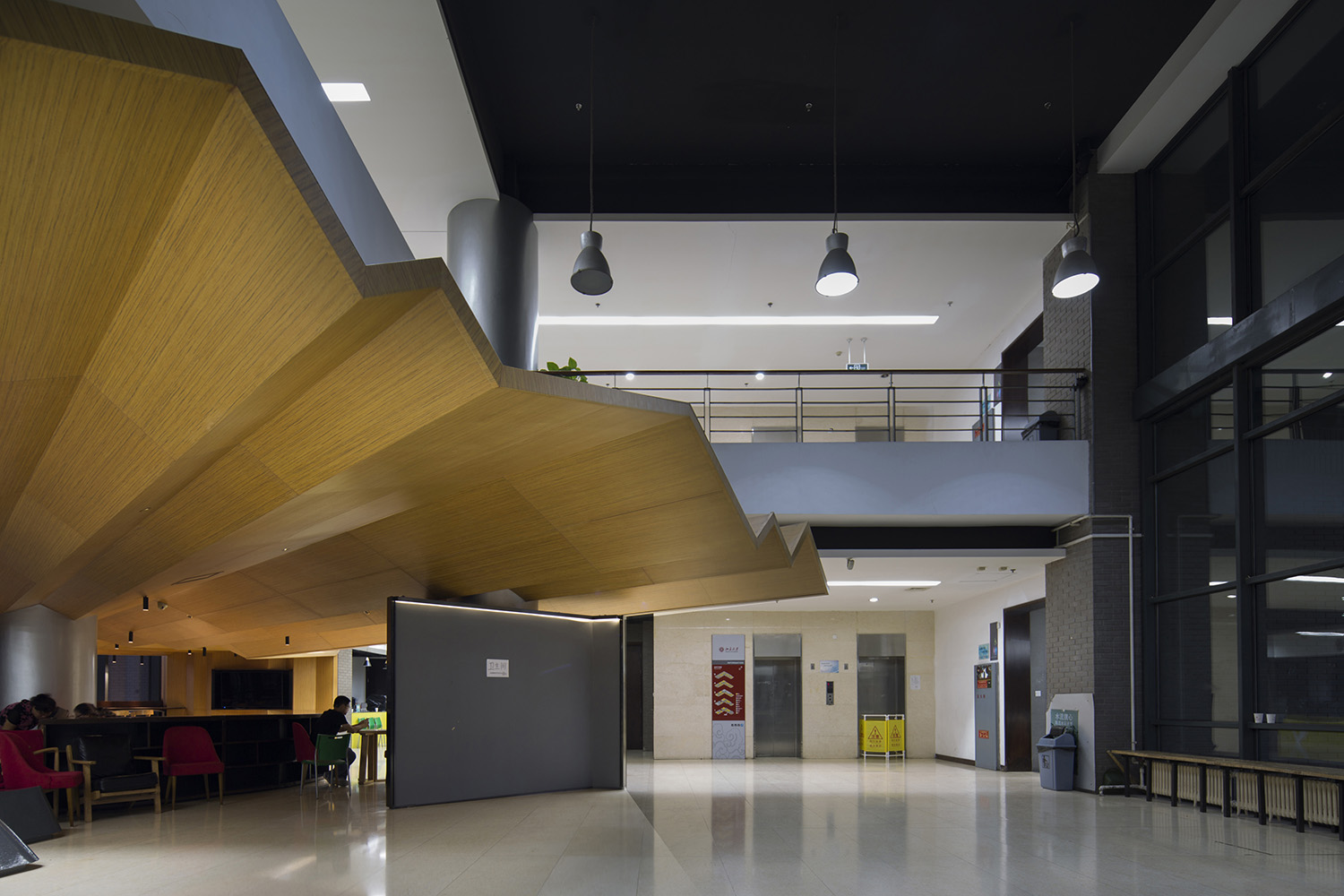
為了引導人流,我們設計了一個朝向主入口大門的折形吊頂裝置,並把原有低矮的樓梯底空間包了起來,木色材質也讓人有了親切感,將閑置空間變成了社交空間。大堂中間的柱子也被三麵展板包了起來,成為了活動展演信息的傳播牆。
In order to guide the pedestrian flow, we designed a folding ceiling device facing the main entrance, and wrapped up the bottom space of the original low staircase. The wood color material gives people a sense of intimacy, turning the idle space into a social space. The pillars in the middle of the lobby are also wrapped up by three exhibition boards, which have become bulletin board for activities information.
∇ 北區學習中心改造前平麵 ©扉建築 Plan of Northern Learning Center Before Renovation @FEI Architects
∇ 北區學習中心改造後平麵 ©扉建築 Plan of Northern Learning Center After Renovation @FEI Architects
∇ 北區學習中心改造前 ©扉建築 Northern Learning Center Before Renovation @FEI Architects
∇ 北區學習中心改造後 ©扉建築 Northern Learning Center After Renovation @FEI Architects
SITE 2:“樹下”的學習空間
SITE2: Learning Space under the Tree
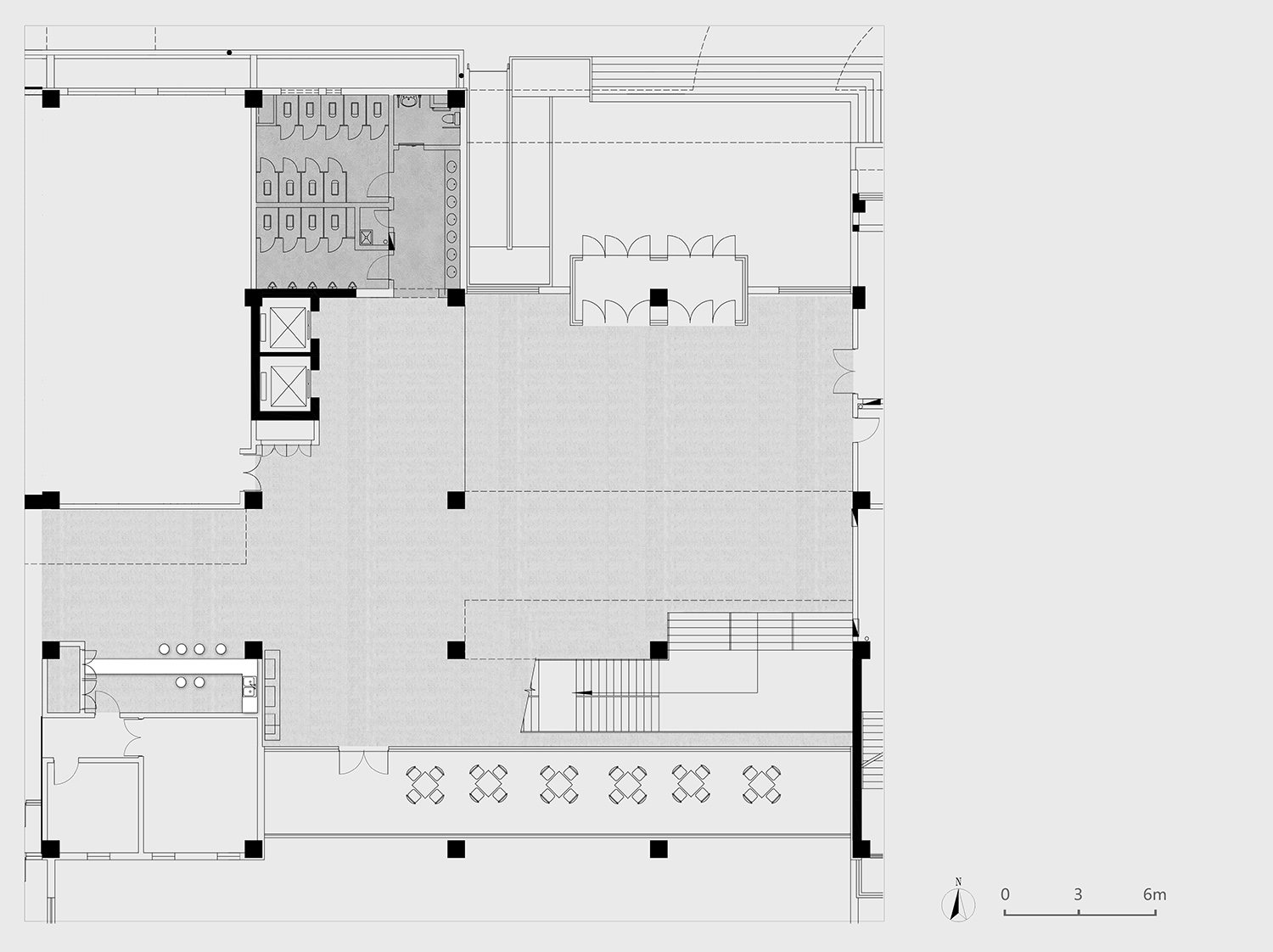
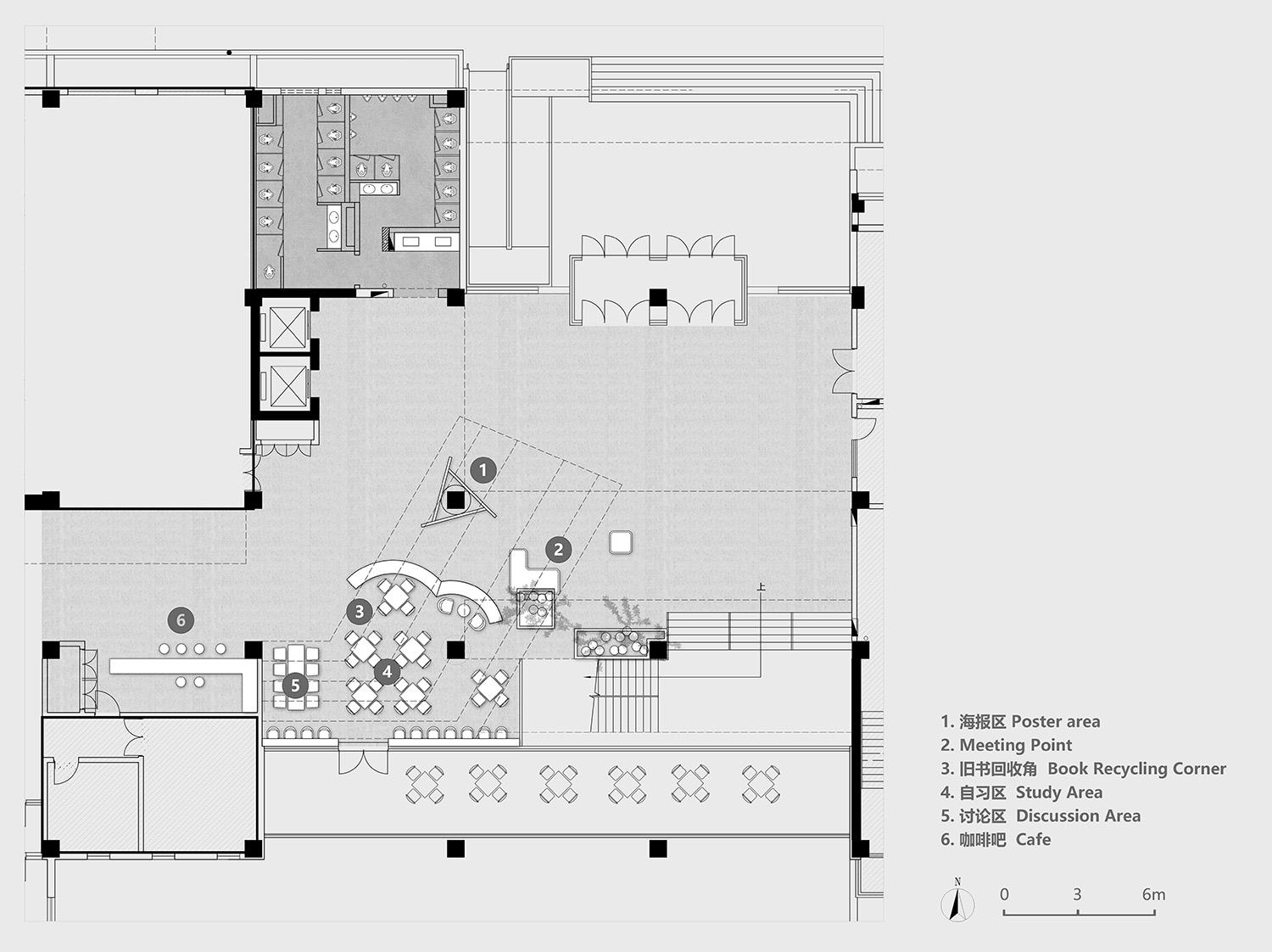
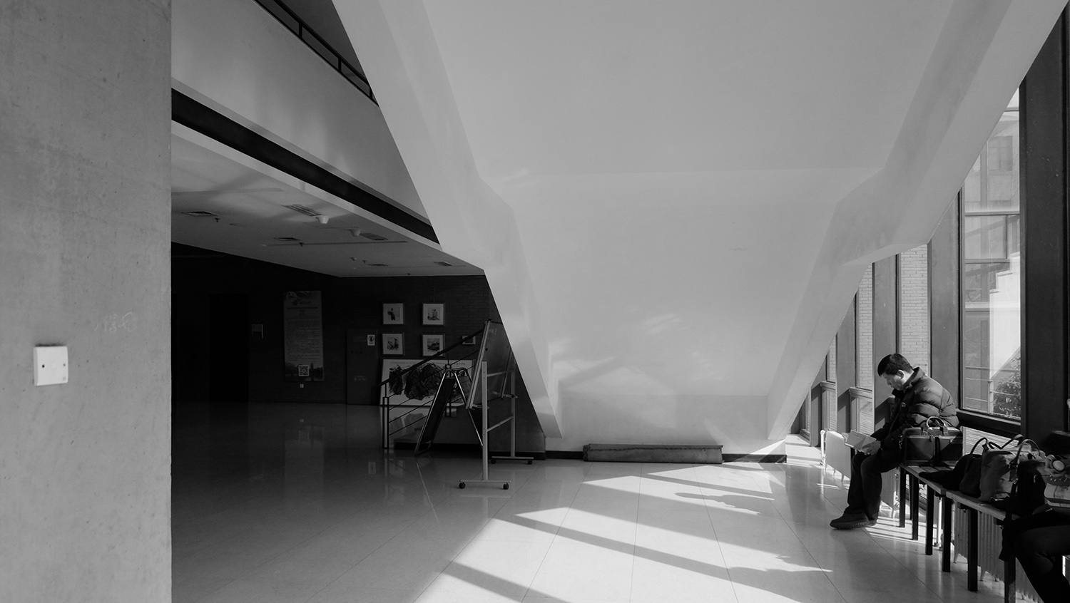
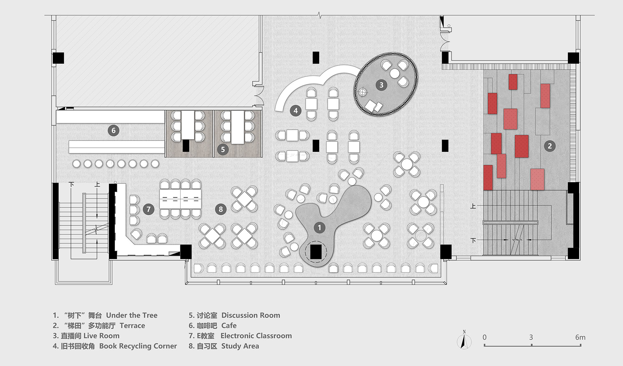
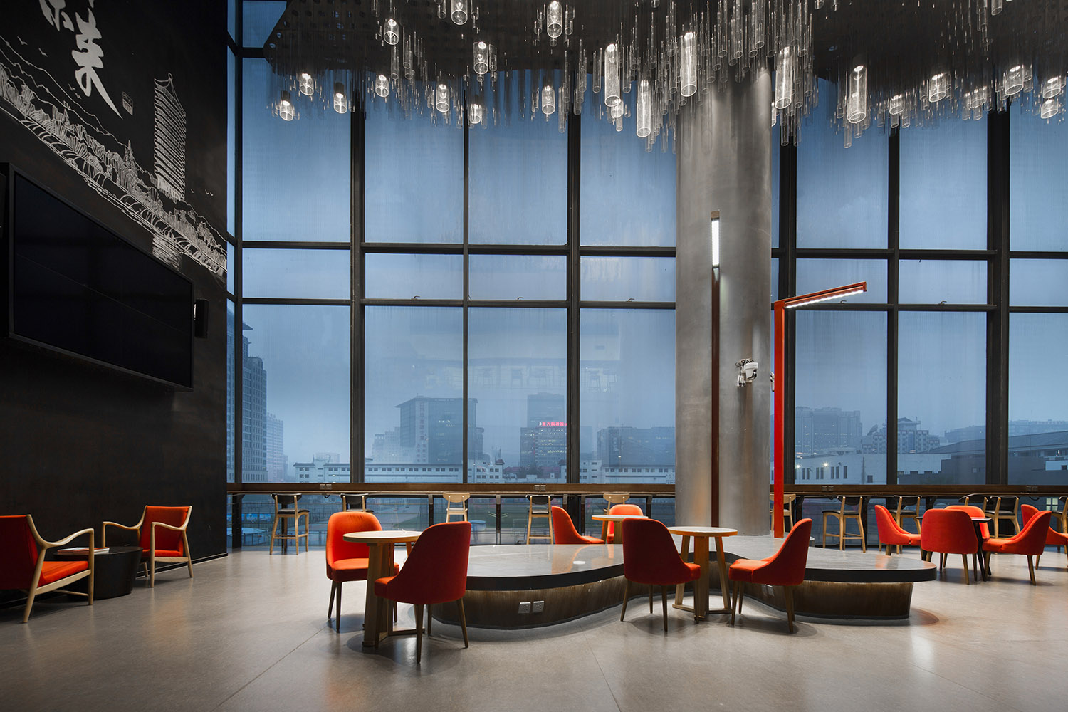
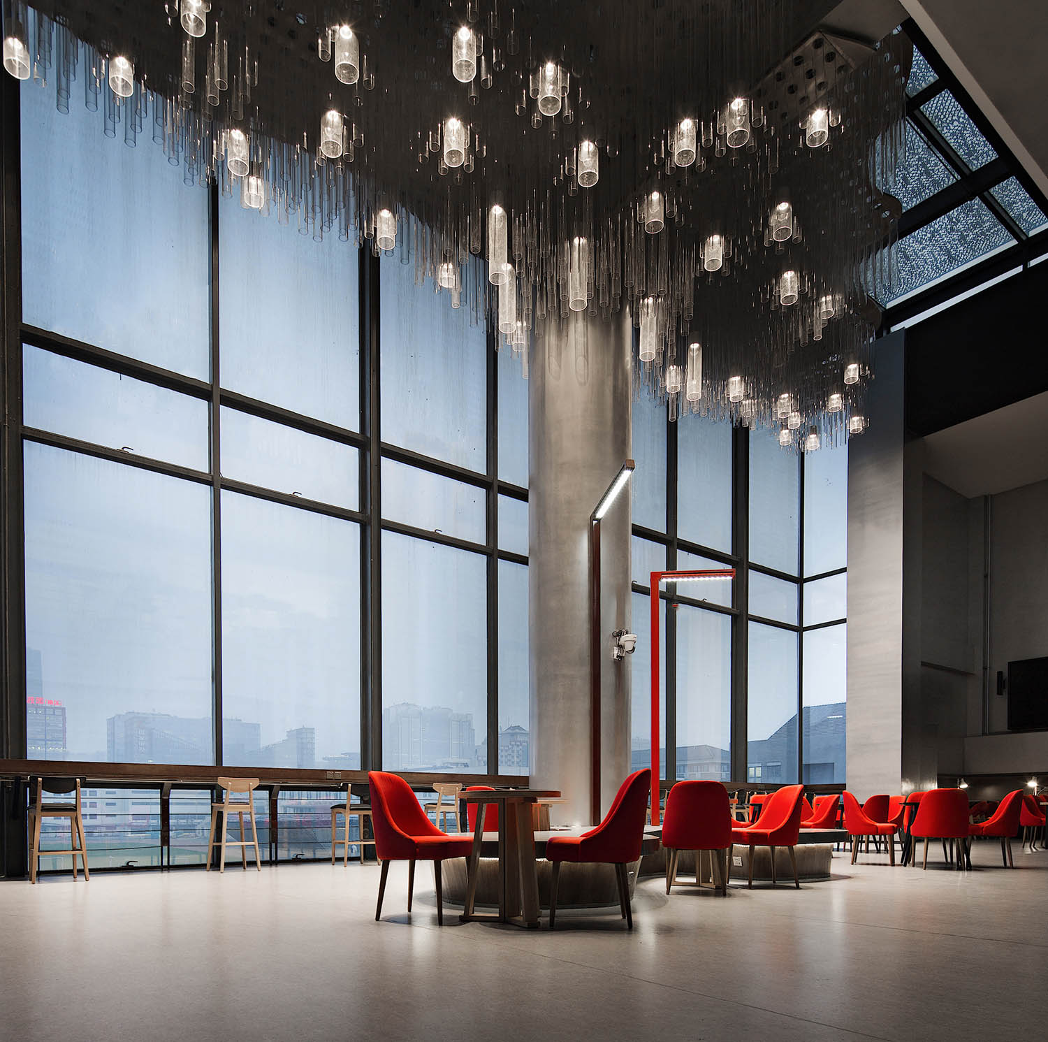
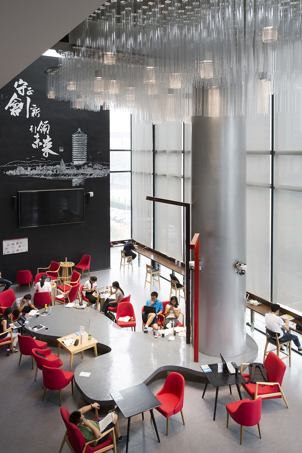
南區學習中心位於第二教學樓三層的最南側,址於此主要是考慮到能彙聚三個方向的人流,且靠近校園主幹道,方便往來教學樓建築群和飯堂的學生人群抵達使用,但由於從立麵到天花都是玻璃幕牆,夏天陽光直射,又悶又曬。於是我們在三個方向人流的彙聚處圍繞其中一根柱子設計了一顆“大樹”,“樹下”可以成為學習交流的空間,同時樹頂飄蕩著的團團星雲又起到遮陽防曬的作用。
The Southern Learning Center is located on the southernmost side of the third floor of the Second Teaching Building and the main reason for choosing this site is that it can gather people from three directions. Moreover, it is close to the main road of the campus, which is convenient for students commuting between the teaching building complex and the dining hall to arrive and use. But in summer, sunshine shoots in directly through the facade and ceiling made of glass curtain, making the place stuffy and sunny. Therefore, we designed a “big tree” around one of the pillars at the gathering point for people from three directions. Now “under the tree” can be a space for learning and communication, with the nebula floating above the treetop playing a role of solar screen.
∇ 人流動線分析 ©扉建築 Analysis of Pedestrian Flow @FEI Architects
∇ 南區學習中心改造前平麵 ©扉建築 Southern Learning Center Before Renovation @FEI Architects
∇ 南區學習中心改造後平麵 ©扉建築 Southern Learning Center After Renovation @FEI Architects
∇ 利用現場的柱子作為“樹”,設計“樹下”學習空間 ©扉建築
Using pillars on site as “trees” to design learning space “under the trees” @FEI Architects
∇ 南區學習中心 ©扉建築 Southern Learning Center @FEI Architects
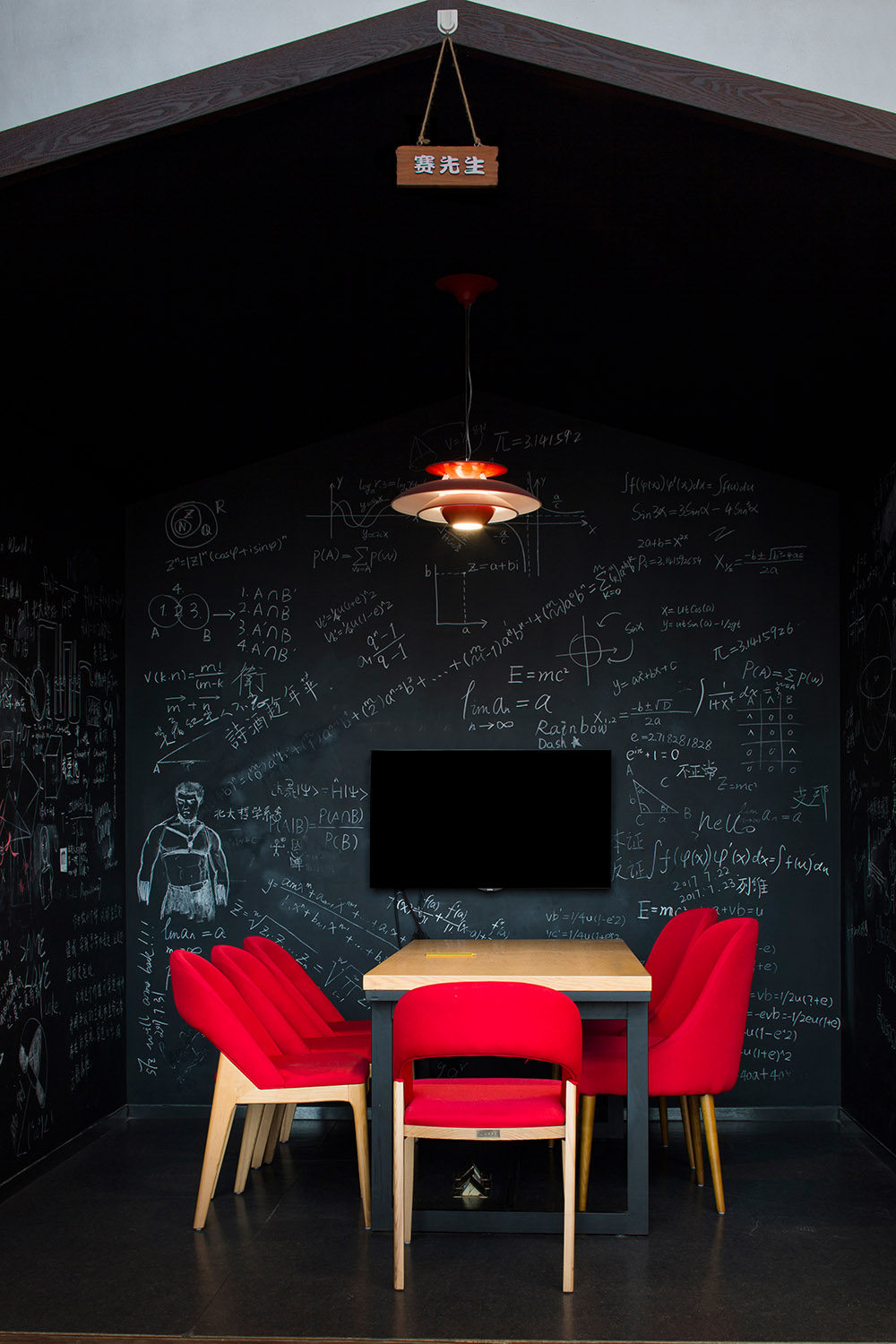
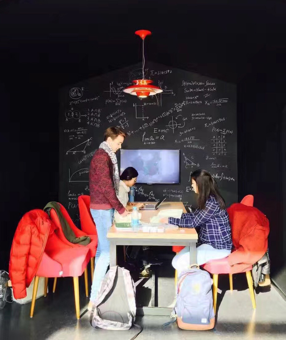
“樹”旁邊還有兩個別致的“樹屋”——“德先生”和“賽先生”,身處其中,黑色的主色調讓人沉靜,注意力集中;而半封閉的空間設計,既不會幹擾他人,又不使人完全孤立。
There are two unique “treehouses” next to the “tree” – “Mr. Democracy and Mr. Science”, in which the main color of black makes people calm and concentrated; while the semi-enclosed space design makes sure people won’t interfere with others, but are not completely isolated either.
“人們聚集在村口的大樹下,彼此交談,相互協作,旁邊還有兩間小房子。這就是樹下空間在自然界的映射,一種極強的歸屬感。”—— 米笑(扉建築創始人)
People gather under a big tree at the entrance of the village, talking and cooperating with each other, with two small houses nearby. This reflects the space under trees in nature and a strong sense of belonging.
—— Michelle Yip(Founder of FEI Architects)
∇ “樹”旁的“賽先生”樹屋 ©扉建築 “Mr. Science” Treehouse beside the “Tree” @FEI Architects
∇ 在“樹屋”中學習 ©扉建築 Learning in the “Treehouse” @FEI Architects
多元交互的可能
The Possibility of Diversified Interaction
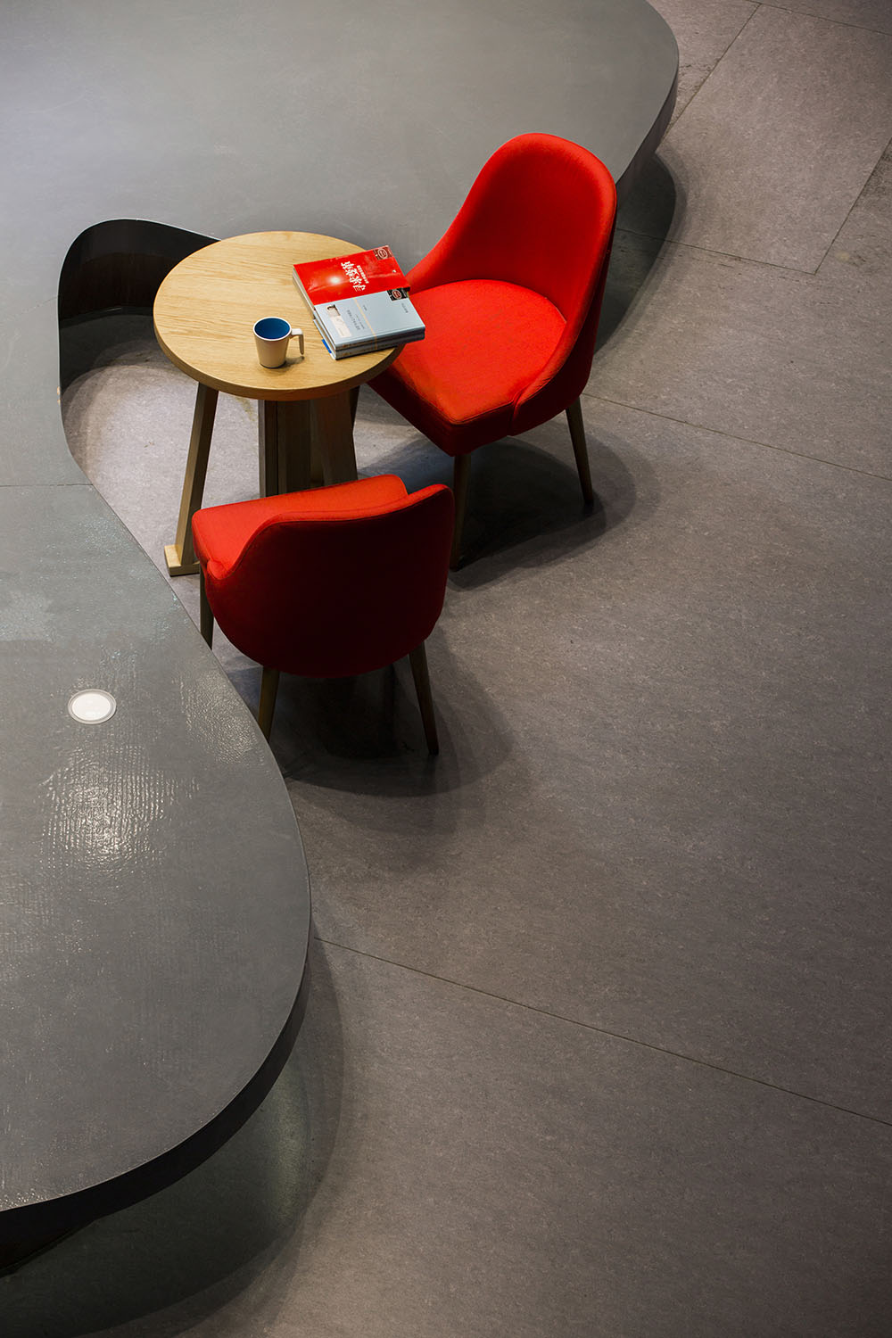
設計師在空間設計中充分考慮了各種各樣不同的功能需求。中央的自由式舞台采用流線型的設計,讓空間多了靈動感。台子不高,既可在平時隨意就坐,也可在有分享活動時用作舞台。同時為了盡可能呈現空間的多樣性和層次感,在每個區域都布置有屏幕可供討論分享。
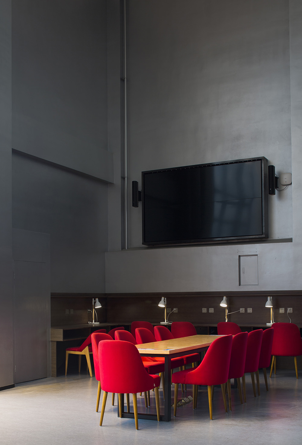
A variety of functional requirements have been fully considered in the space design. The freestyle stage in the center adopts streamline design, which makes the space more flexible. The platform is not high, which can be used as a stage when there are sharing activities as well as for sitting freely at other times. At the same time, in order to present the diversity and multi-level vision of the space as much as possible, there are projection screens in each area for discussion and sharing.
∇ 流線型的中央舞台 ©扉建築 Streamlined Center Stage @FEI Architects
∇ 隨處可見的屏幕 ©扉建築 Screen Everywhere @FEI Architects
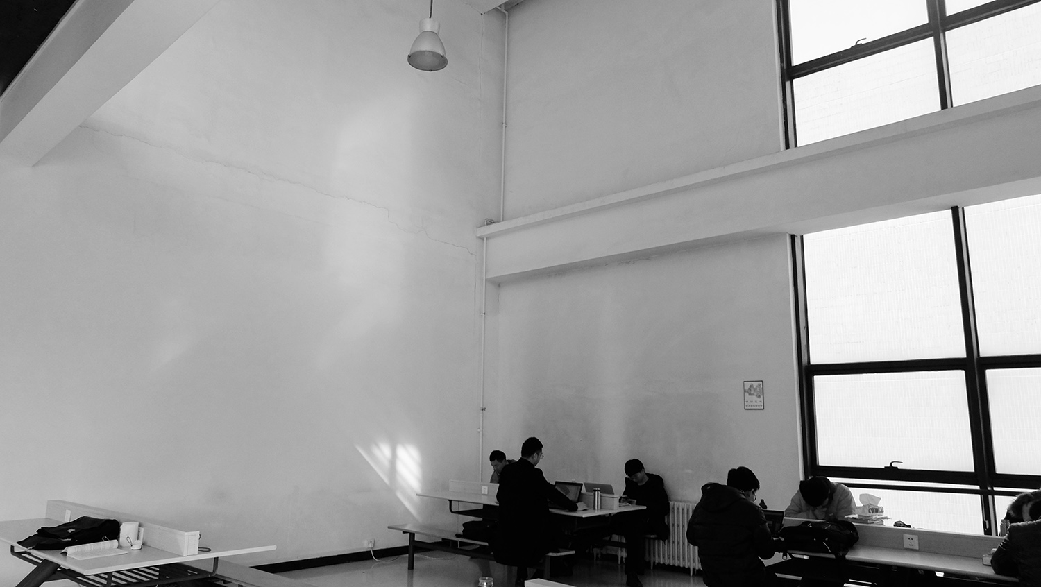
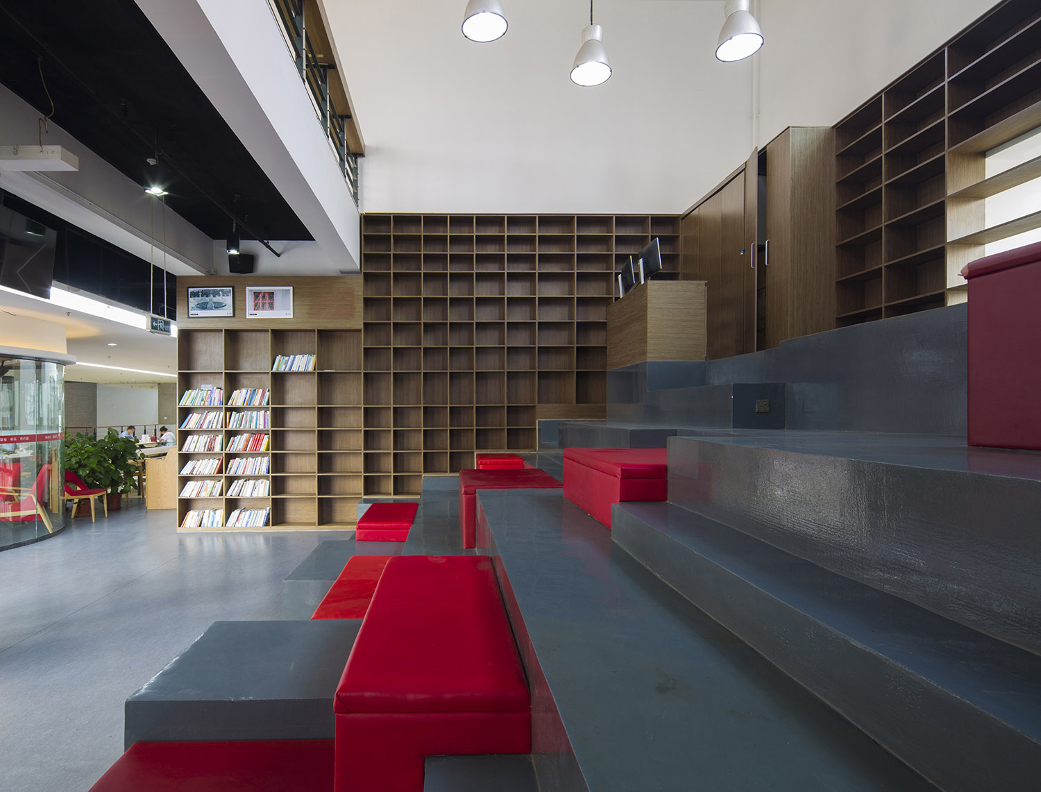
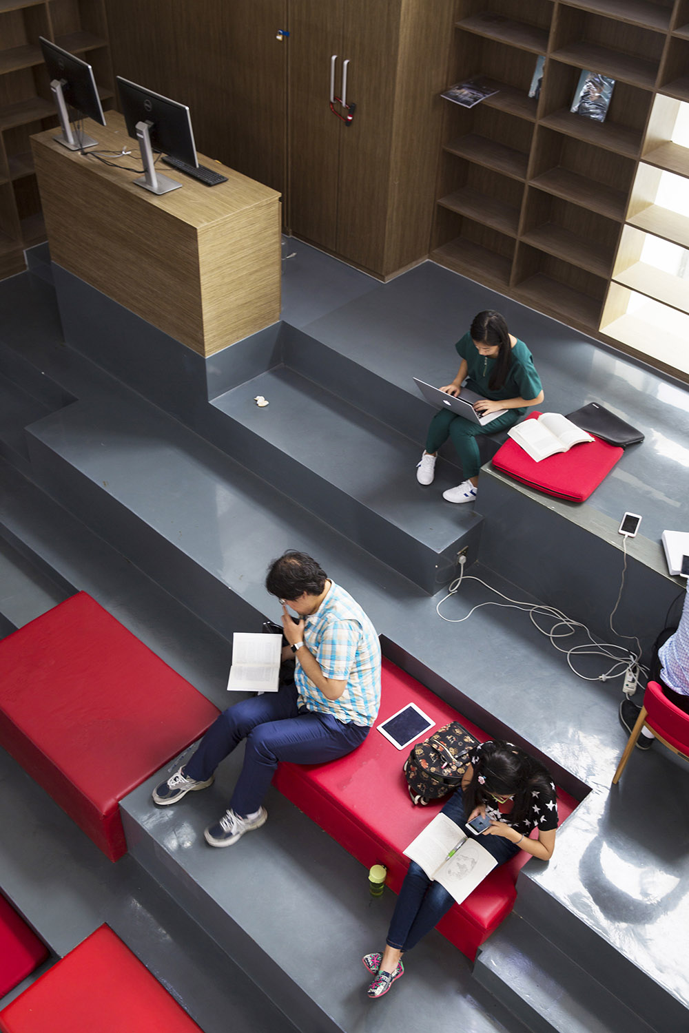
學習空間改造前有一處兩層通高的口袋空間,由於過於空曠而令人無法安定。這個空間旁邊正好是樓梯,於是我們決定拆除欄杆,把台階延伸至這個通高空間形成階梯式的多功能座席。不僅大大增加了學習空間的座位數,也讓空間尺度更加宜人。
Before the renovation, there was a two-storey pocket space, which was too empty to make people stay long. Next to this space is the staircase, so we decided to remove the railings and extend the steps to this high space to form a multi-functional stepped stand. It not only greatly increases the number of seats in the learning space, but also makes the space scale more pleasant.
黑紅相間的“梯田”與書櫃牆搭配,台階的錯落讓空間更加立體,為討論式的學習提供一種新的可能性。有演講演出的時候,這些稍微遠離舞台的座席往往更受歡迎,它可以在參與與自修之間自由切換。
The black and red “terraces” are matched with the bookcase wall, and the scattered steps make the space more three-dimensional, providing a new possibility for discussion-based learning. When there is a speech or performance, these seats relatively away from the stage are often more popular for they can be freely switched between participation and self-study.
∇ 改造前的兩層通高空間 ©扉建築 Two-storey High Space Before Renovation @FEI Architects
∇ 改造後成為黑紅相間的“梯田”空間 ©扉建築 Black and Red Terrace Space After Renovation @FEI Architects
藝術與設計的融合
Integration of Art and Design
我們在改造的過程中利用PVC管設計了一件名為“智慧”的藝術裝置,既是遮陽的措施,又是晚上照明的燈具,還是一件原創藝術品。藝術與設計的融合,營造了美與無界的體驗。
In the process of renovation, we used PVC pipe to design an art installation named “Wisdom”. Besides being shading device and lamp for lighting in the evening, it is also an original work of art. The integration of art and design creates an experience of beauty and borderless.
∇ 原創藝術品:“智慧”燈 ©扉建築 Original Artwork: “Wisdom” Lamp @FEI Architects
∇ 藝術與設計的融合 ©扉建築 Integration of Art and Design @FEI Architects
參與式設計
Participatory Design
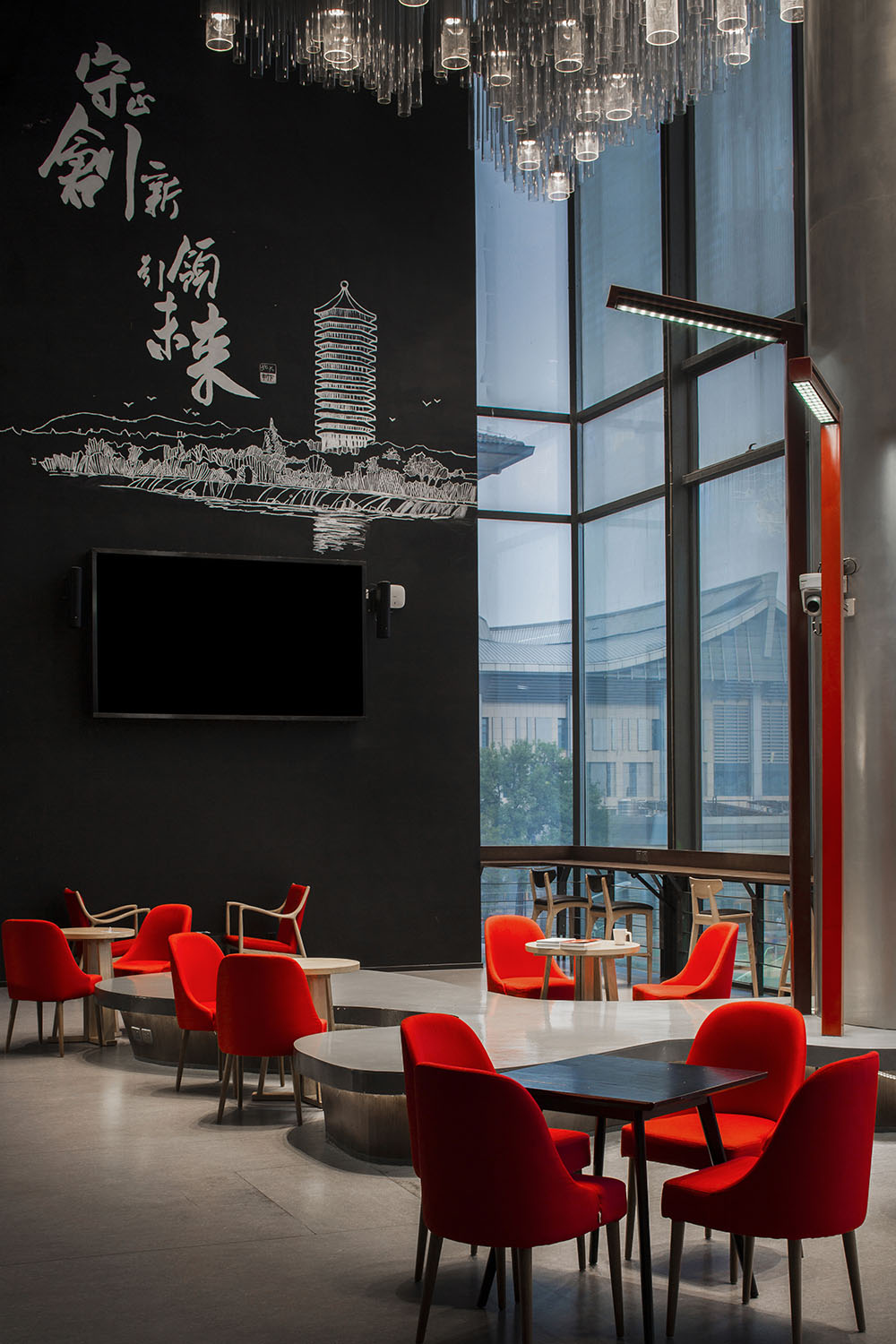
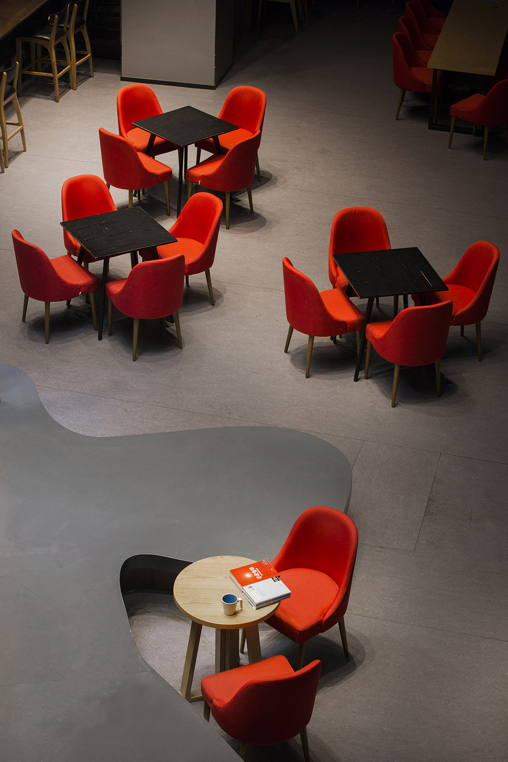
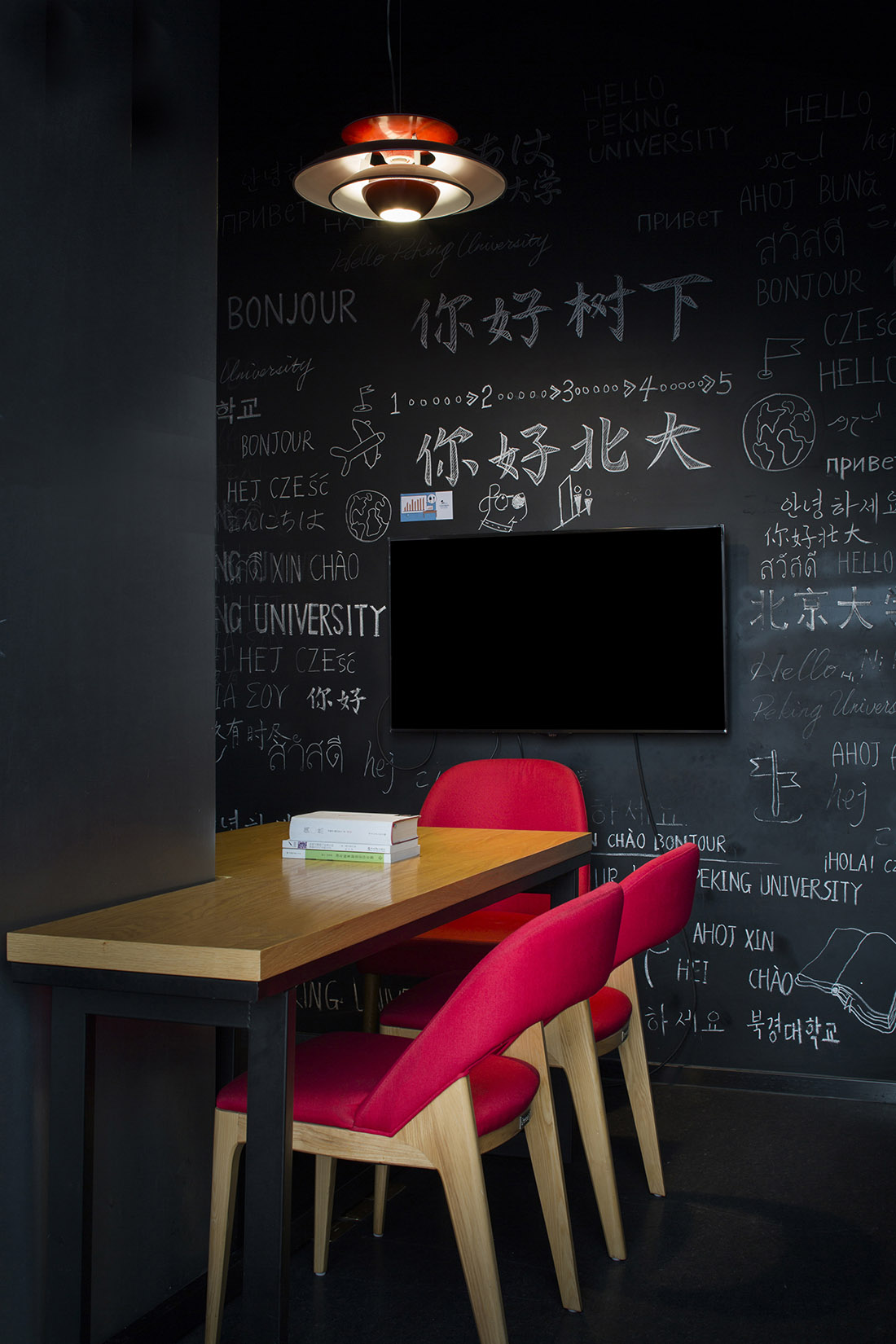
通過組織“北大紅”藝術工作坊,在工作坊中被師生們選出來的心中的“北大紅”被運用於設計當中。主題牆和書屋黑板的設計繪製也都由師生共同完成。“參與式設計”的方式讓師生們從一開始就參與項目形象的構建,傳達出了和而不同的理念,體現了北大的自由精神與多元文化。
Through the “PKU Red” art workshop, the kind of red representing the University in the hearts of the teachers and students was selected and used in the design. The design drawing of the theme wall and the blackboard of the bookstore are also completed by teachers and students. The approach of “participatory design” enables teachers and students to participate in the construction of project image from the beginning, conveying the concept of “harmony with diversity”, and embodying the spirit of freedom and multiculturalism of Peking University.
∇ 被師生選出來的“北大紅”運用於設計當中 ©扉建築
“PKU Red” Selected by Teachers & Students and Used in the Design @FEI Architects
∇ 隨處可見的“北大紅” ©扉建築 “PKU Red” Seen Everywhere @FEI Architects
∇ 由師生共同繪製的黑板牆 ©扉建築 Blackboard Wall Drawn by Teachers and Students @FEI Architects
項目信息
項目名稱:北京大學協作式學習中心
項目地點:北京大學
麵積:423平方米
主創建築師:米笑
設計團隊:黃毅、卓錦萬
業主:北京大學
Project Name:Collaborative Learning Center of Peking University
Location: Peking University
Building Area:423 m²
Chief Architect: Michelle Yip
Project Team: Erin Huang、Zhuo Jinwan
Clients:Peking University




![[4K] 2.1G 虛空之美-100個日式庭院](http://www.online4teile.com/wp-content/uploads/2023/09/1_202309111611111-8-414x550.jpg)
