序言
在日漸定型的商業體係中,不被訓化
打破思維桎梏或是一種方式
Not trained in the increasingly stereotyped business system
Break the shackles of thinking or a way
隨著大趨勢的消費升級,品牌力逐漸成為了本土企業拓展的重要武器。BEIMU(貝姆)國內個性化家居品牌新典範,委托喬裏進行品牌展廳設計,希望借以設計力量,場域的構建進一步傳遞品牌價值,深化品牌內核。
With the trend of consumption upgrading, brand power has gradually become an important weapon for local enterprises to expand. Beimu (Beimu) is a new model of domestic personalized home furnishing brand, and entrusted Qiao Li to design the brand exhibition hall, hoping to further convey the brand value and deepen the brand core through the design power and the construction of the field.
品牌展廳不僅是產品的展示,而是給予觀者一定的空間,使觀者在進入其間後,充分感受、體驗、探索,從而形成與品牌之間的互動與情感鏈接。針對品牌屬性,設計師規避傳統展廳的陳詞濫調,以“家”的概念展開空間敘述。
The brand exhibition hall is not only a display of products, but also a certain space for visitors to fully feel, experience and explore after entering the exhibition hall, so as to form an interaction and emotional link with the brand. In view of the brand attribute, the designer evades the cliches of the traditional exhibition hall and unfolds the spatial description with the concept of “home”.
未知與探索
Unknown and Exploration
擺脫日常頓感
將 已知 轉變成 未知
Get rid of everyday Epiphany
Turn known into unknown
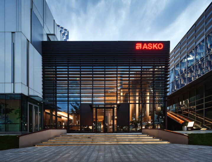
在資訊轟炸的當下,獲取信息的成本越來越低,隨之喪失的是寶貴的好奇心,好在對未知的探索是人們與生俱來的天性。建築外立麵做了抬高處理,在大麵積的白色與木色之間,建築如同等待拆開的寶盒,吸引著人們前往一探究竟。
In the era of information bombardment, the cost of obtaining information is getting lower and lower, and what is lost is valuable curiosity. Fortunately, it is people’s innate nature to explore the unknown. The external facade of the building has been raised. Between the large area of white and wood color, the building is like a treasure box waiting to be opened, attracting people to go to the bottom.
木色象征著溫暖,映襯家的主題。入口由內衍生而出的木飾麵是一片傾斜的牆體,銜接著連廊式玄關,遠處觀看是懸浮盒子,位於近處則有著明顯的導向作用。
Wood color symbolizes warmth and sets off the theme of home. The wood veneer derived from the inside of the entrance is an inclined wall connecting with the corridor porch. When viewed from a distance, it is a suspended box, and when located near, it has an obvious guiding effect.
∇ 動態分析圖
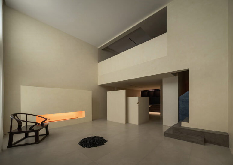
刻意縮小的入口再一次細微地捕捉著人們窺探未知的心理,神秘的光線由裏滲透而出,引導著來訪者開啟一段探索的旅程。
The deliberately narrowed entrance once again subtly captures people’s psychology of peeping into the unknown. Mysterious light penetrates from the inside and guides visitors to start a journey of exploration.
品牌與體驗
Brand and Experience
空間是顯性的品牌敘述
Space is a dominant brand narrative
∇ 分析圖
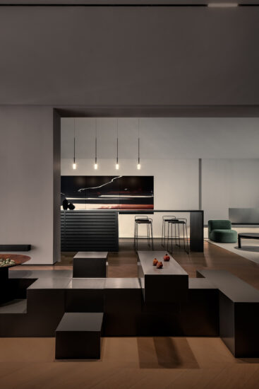
品牌之所以能夠深入人心,在於其滿足了消費者的心理預期。洽談區占據整體空間的C位,是來訪者與品牌建立深鏈接的核心區域。舍棄傳統的一對一等對談模式,而是通過模擬“家”的場景,淡化商業感,營造更加自由輕鬆的交流氛圍。
The reason why the brand can be popular is that it satisfies the psychological expectations of consumers. The negotiation area occupies position C of the overall space and is the core area for visitors to establish deep links with the brand. Instead of the traditional one-to-one conversation mode, we simulate the “home” scene to dilute the sense of business and create a more free and relaxed communication atmosphere.
∇ 分析圖
作為家居品牌展廳,家具是空間中的陳設,亦是展廳中無處不在的展品。空間布局隨著不同家具展開不同場景感受,在家具與空間之間形成環形的參觀動線,優雅從容,引導著來訪者逐步深入品牌體驗,產生共鳴。
As a household brand exhibition hall, furniture is not only the display in the space, but also the ubiquitous exhibits in the exhibition hall. Space layout: with different furniture unfolding different scene feelings, a circular tour line is formed between the furniture and the space, which is elegant and calm, guiding visitors to gradually deepen the brand experience and generate resonance.
審美與創造
Aesthetics and Creation
當你凝視這個世界 會發現一切都是獨立的
每個事物都有自己的步調和獨到之處
—— 埃爾斯沃思·凱利
When you look at the world, you will find that everything is independent
Everything has its own pace and uniqueness
——Ellsworth Kelly
當審美形成了積累,便有了創造。埃爾斯沃思·凱利,20世紀傑出的抽象畫家、雕塑家。他曾講到“幾何時了無生趣的,我隻想要輕鬆愉快的藝術”,擅長將抽象形態運用到繪畫之中,創造出令人難忘的簡潔的不規則幾何形象。
When aesthetics is accumulated, there is creation. Ellsworth Kelly is an outstanding abstract painter and sculptor in the 20th century. He once said, “geometry is boring, I just want a relaxed and happy art”. He is good at applying abstract forms to paintings to create unforgettable and simple irregular geometric images.
以純粹的藝術雕琢品牌形象,在空間中的核心區域置入埃爾斯沃思·凱利的作品《黑色上的白色浮雕》,其畫作線條恰好與入口玄關造型遙相呼應,強調藝術、形式和空間的統一。
The brand image is carved with pure art, and the white relief on black by Ellsworth Kelly is placed in the core area of the space. The lines of the painting just echo the shape of the entrance porch, emphasizing the unity of art, form and space.
經典之所以經典,在乎曆久彌新。於1962年Eilleen Gray設計的Bibendum Armchair,至今誕生已有近百年,卻依舊擁有無與倫比的辨識度。簡潔的力量與精致的現代主義,為空間注入更多靈動氣息。
The reason why classics are classics is that they are old and new. Bibendum armchair, designed by eilleen gray in 1962, has been born for nearly 100 years, but it still has incomparable recognition. The power of simplicity and exquisite modernism inject more vivid breath into the space.
從繪畫到家具的展示,塑造了一個藝術、設計、時尚共存的沉浸式場景,使來訪者身處其間,足夠勾勒出對家的無限想象。
From painting to furniture display, it has created an immersive scene in which art, design and fashion coexist, so that visitors can be in it, enough to outline the infinite imagination of home.
光線與流動
Light and Flow
流動的光影賦予空間純粹美感
The flowing light and shadow endow the space with pure beauty
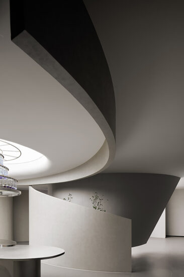
以光線和流動為空間表達內核展開敘述,重新梳理空間邏輯,撇棄無關冗長的裝飾,讓空間隻是隨著光線滲透變幻,方寸之間,呈現空間最原始幹淨的美感,流動性盡顯。
With light and flow as the core of space expression, the narrative is unfolded, the logic of space is rearranged, and the irrelevant and lengthy decoration is discarded, so that the space changes only with the penetration of light, presenting the most original and clean aesthetic feeling of the space, and the mobility is fully displayed.
光是自然的饋贈,在空間表達中,光的引入會傳遞更多細膩的情感。大片玻璃運用,讓光最大化流入室內,進一步強化空間的流動形態,美中帶著肆意,細碎而自然。
Light is a natural gift. In the spatial expression, the introduction of light will convey more delicate feelings. The use of large pieces of glass maximizes the flow of light into the room and further strengthens the flow pattern of the space. The beauty is free, fine and natural.
肌理與細節
Texture and Details
當代文明與原始肌理
相互交錯 穿插 融合 殊途同歸
成就空間的獨特底色
Contemporary civilization and primitive texture
Interlace and merge with each other, and achieve the same goal through different paths
The unique background of the achievement space
微妙的細節是一種奢侈的品格,凝聚成極致的空間體驗。以花崗岩為主體的藝術牆帶來原始的遼闊和自然的質感,材質之間形成的新舊對比,由遠及近,由淺到深,呼吸之間,流淌著永恒之美。
Subtle details are a luxury character, condensed into the ultimate space experience. The art wall with granite as the main body brings the original vastness and natural texture. The contrast between the old and the new materials, from far to near, from shallow to deep, flows eternal beauty between breathing.
在注重體驗的當下,空間與空間的界限已逐漸模糊。比起傳統定義,能否符合商業需求,深入品牌基因,使設計真正為品牌賦能更應該成為設計的重要考量標準。
At the moment when people pay attention to experience, the boundary between space and space has gradually blurred. Compared with the traditional definition, whether it can meet the commercial needs, penetrate the brand gene, and make the design truly empower the brand should become an important consideration standard of design.
項目信息
項目名稱:貝姆(BEIMU)品牌展廳
Project Name: BEIMU
設計機構:喬裏設計
Design Firm: Jollydesign
總設計師:黃柏榕
Chief Designer: huangbairong
設計團隊:徐誌衡、黃雨涵、王傍興、劉夢思、劉夢凱
Design Team: Xu Zhiheng, Huang Yuhan, Wang Bingxing, Liu Mengsi, Liu Mengkai
項目地點:廣東東莞
Location: dongguan, Guangdong
建築麵積:200㎡
Area: 200 square meters
設計時間:2021年12月
Start Time: February 2022
竣工時間:2022年8月
Completion Time: August 2022
項目攝影:覃昭量,SUNWAY山外
Photography: Qin Zhaoliang,Sunway
特別鳴謝
BEIMU團隊、RECASA家具、NOVACOLOR、MARAZZI岩板、晶輝石材、久盛木地板、燈光照明(江喬)


