季節印象 Autumn Impressions
作為一個新型的健康食品品牌,T97以低卡咖啡、燃脂咖啡切入該賽道的細分市場。隨著國內大健康市場的快速發展,T97啟動線下門店計劃。
As a brand of new healthy food, T97 taps into the niche market with low-calorie coffee and fat-burning coffee. It has launched the brick-and-mortar program in the wake of rapid development of health market.
作為首個線下項目的探索和嚐試,T97委托MOC為其設計位於杭州天目裏園區的短周期運營的快閃店項目。
In the exploration and experimentation of the first offline store, T97 has commissioned MOC to design a popup care in OōEli Art Park, Hangzhou, which will be running for a short period of time.
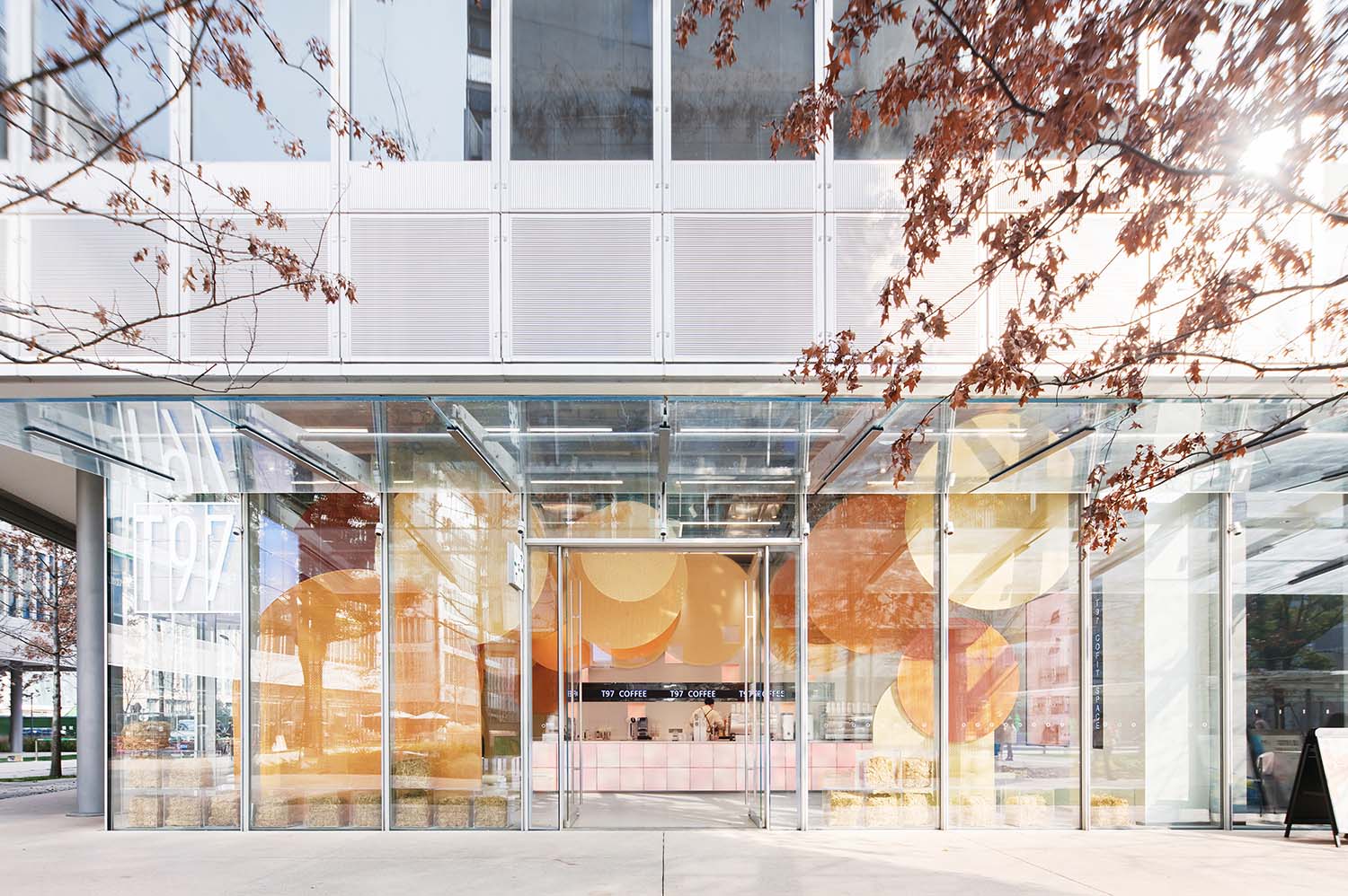
結合T97的產品特點,以及項目開業首月所對應的季節,MOC以“秋之印象”為主題進行設計,結合快閃店的特點以可快速搭建和撤除的方式進行。
Based on T97 product features and the season of opening, MOC has adopted the theme of “Autumn Impressions” in the interior design. The entire popup café can be easily built up and taken down.
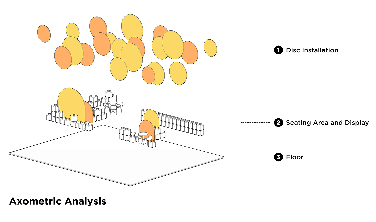
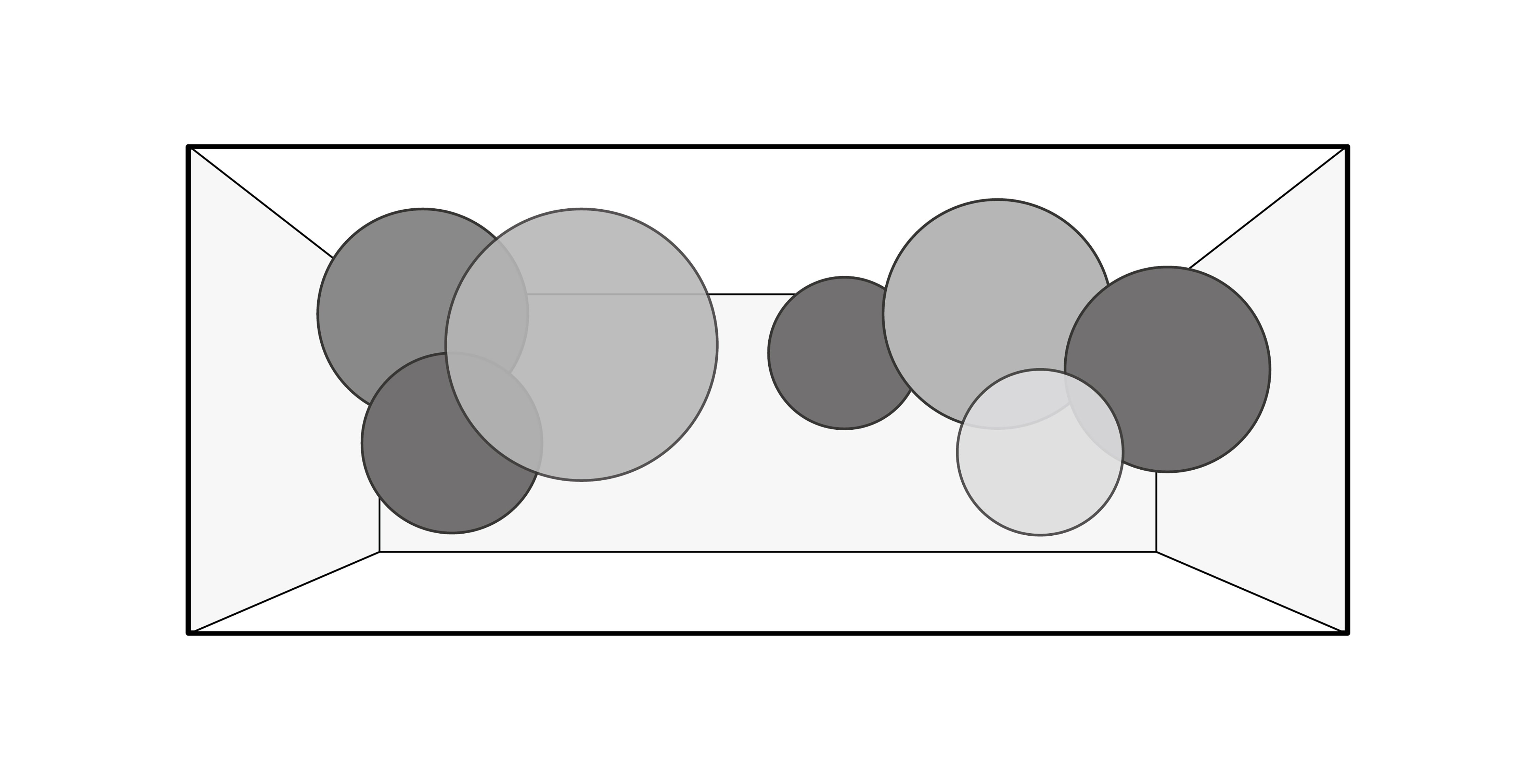
∇ 空間軸測圖
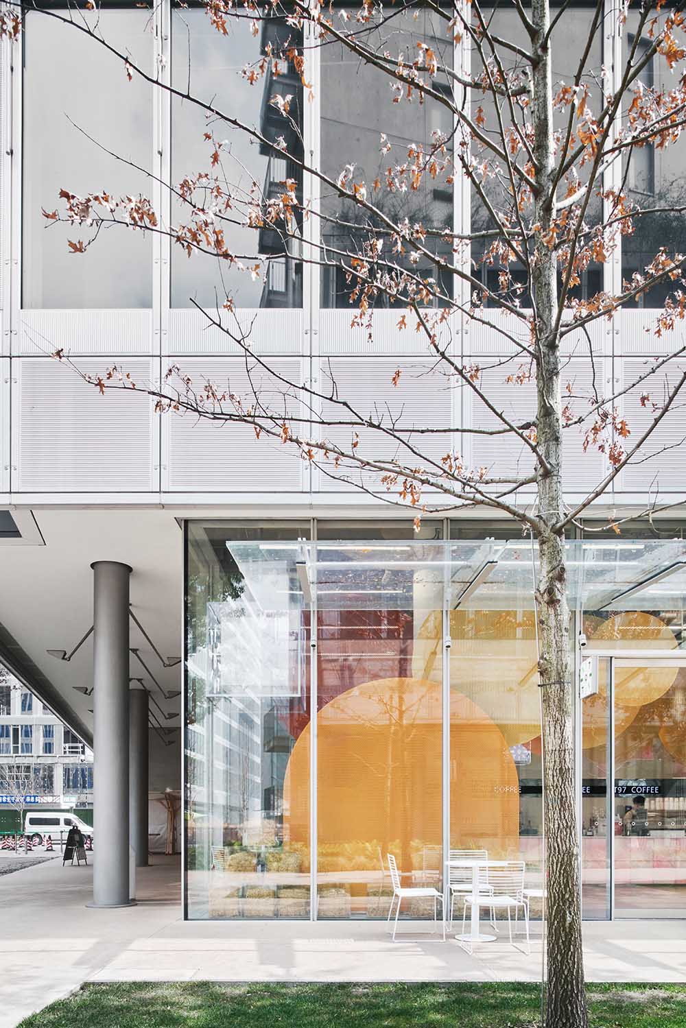
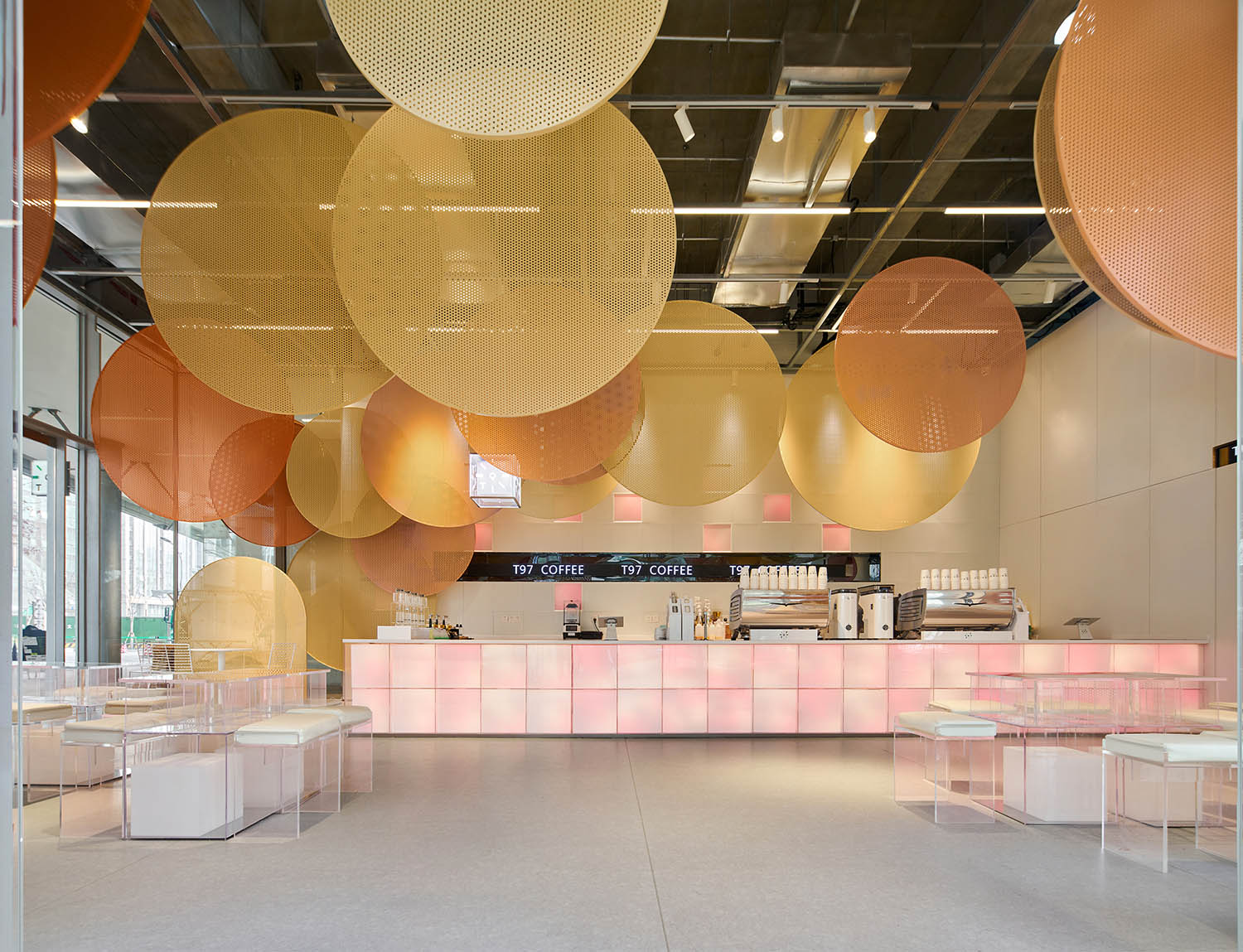
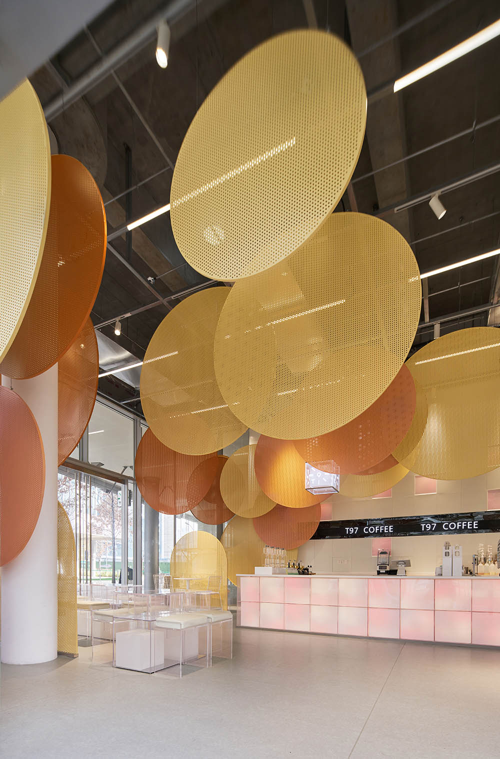
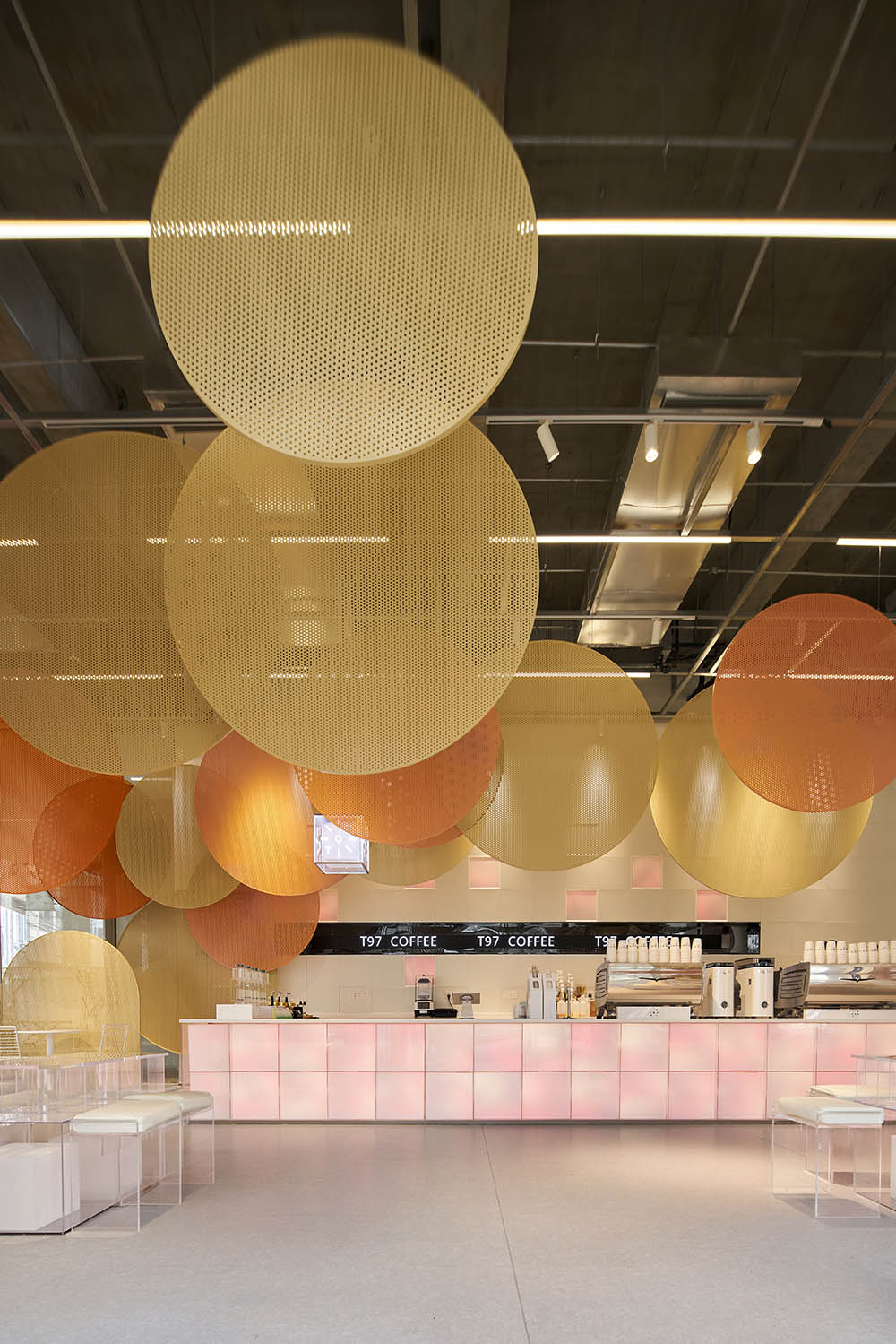
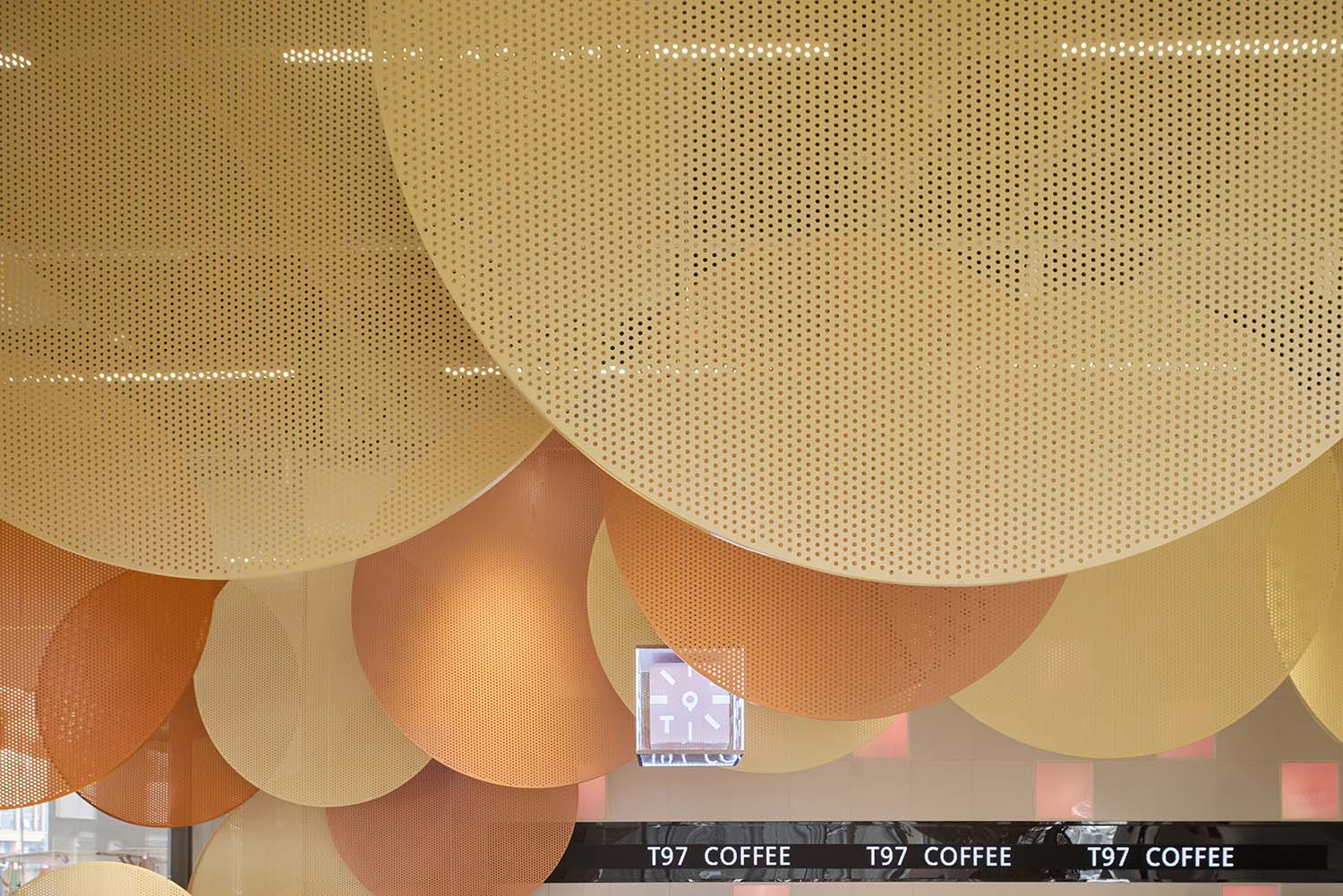
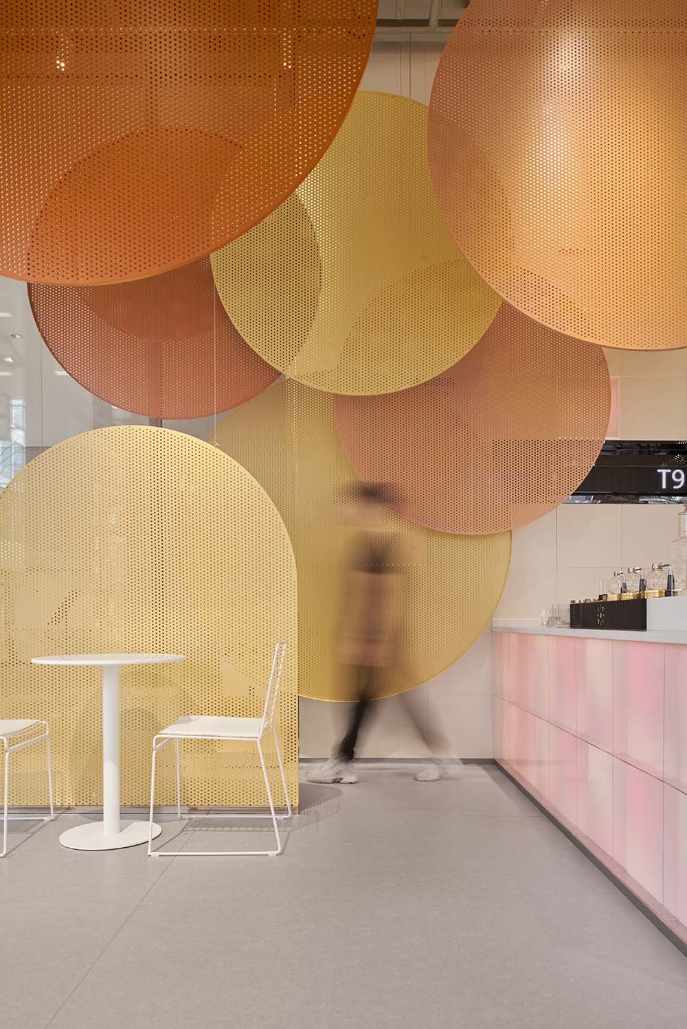
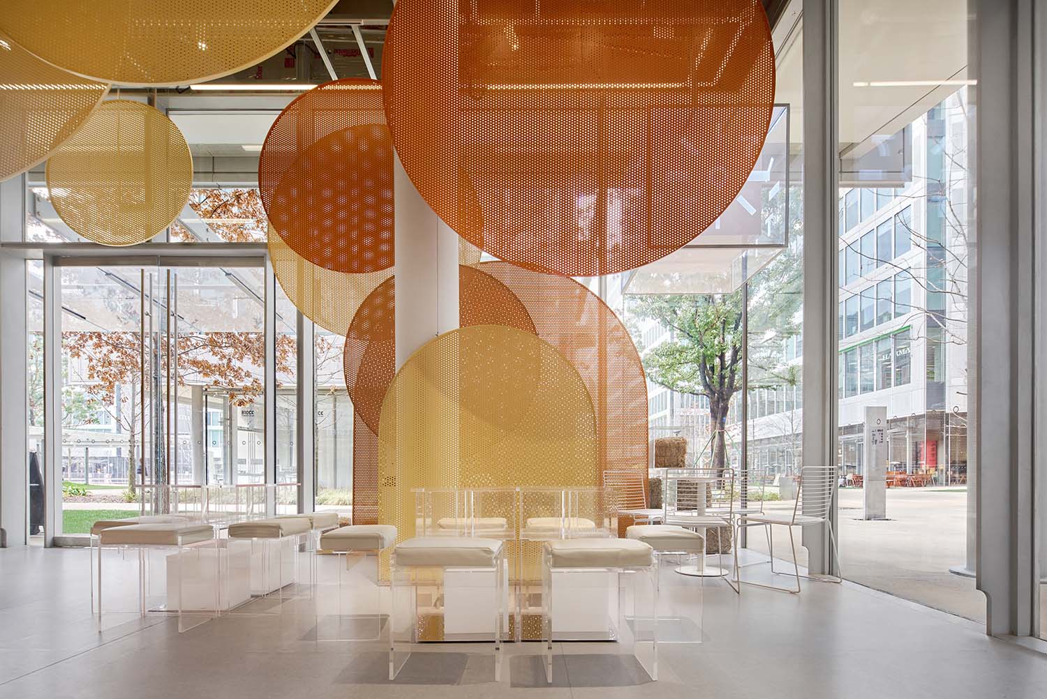
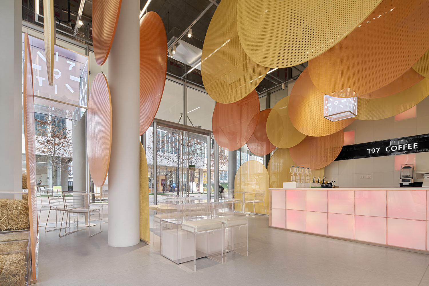
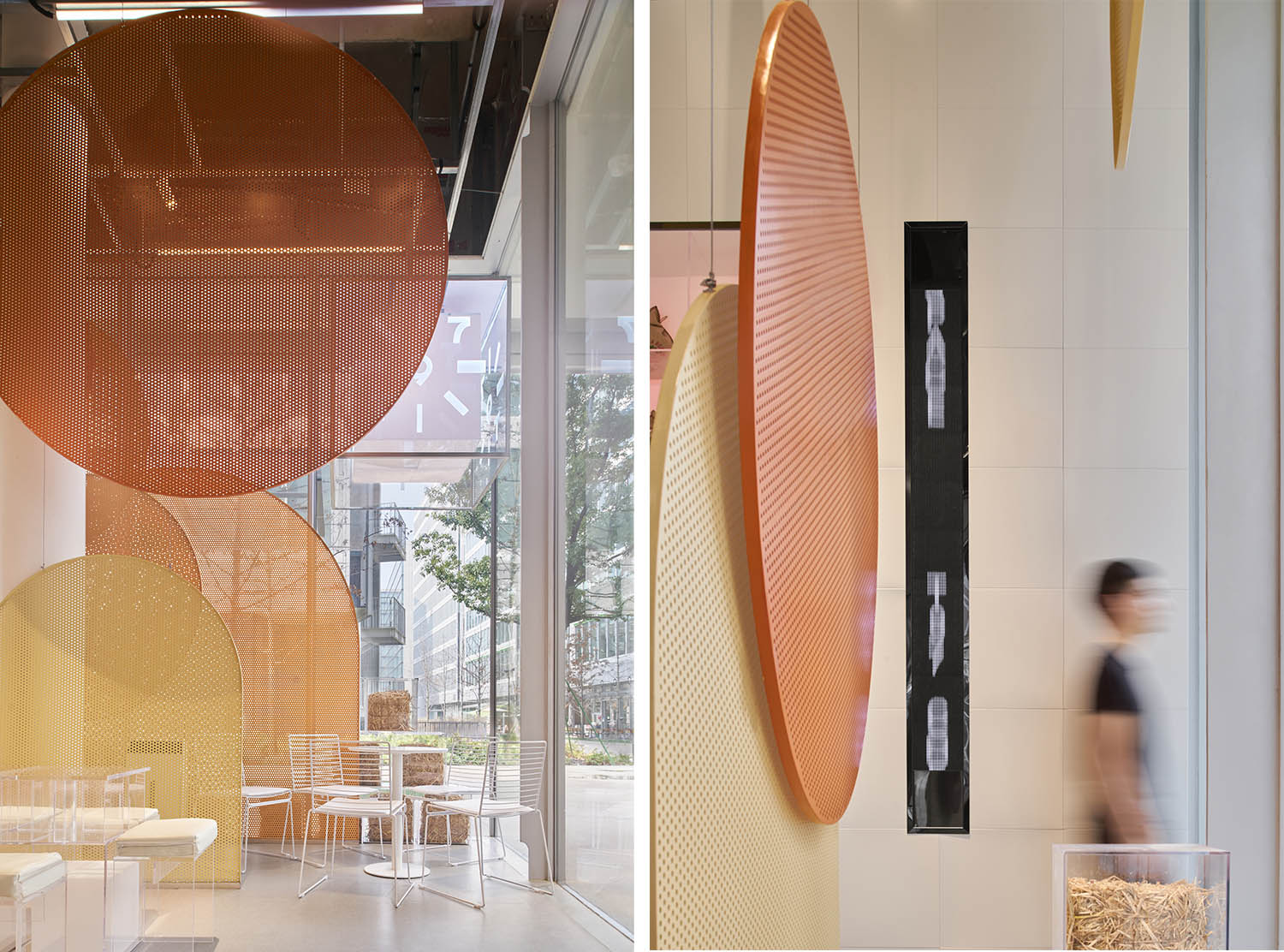
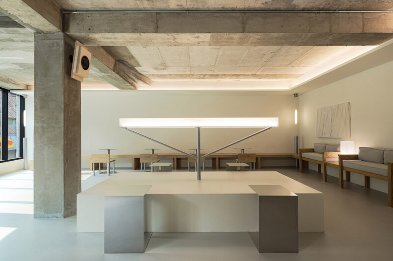
空間內部保留了裸露的混凝土天花,在其中搭建框架,框架上方用懸掛固定不同大小的定製衝孔板,不同大小的橙色係衝孔板構築出的色彩層次,抽象化的回應秋日印象,與戶外的逐步變黃的綠植景觀互相呼應。
The exposed concrete ceiling is retained in the interior space. A frame is installed to hang up custom perforated orange panels in different sizes to create layers of colors, which abstractly respond to the impressions of autumn and gradually yellowing greenery in the outdoor landscape.
吧台內置可變色燈板,除了匹配秋季色彩主題,更考慮後續可根據不同季節場景調整匹配的顏色。
The bar is equipped with built-in light panels. It does not only match the autumn colors, but also adapts to the changing colors of different scenarios in another season.
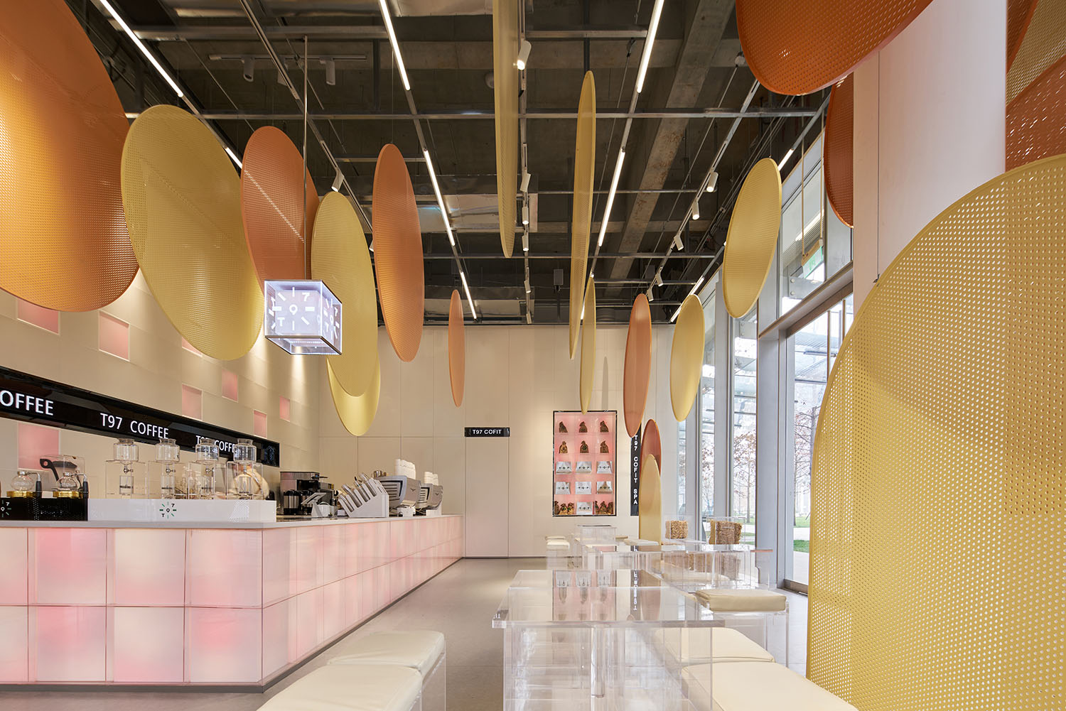
以空間懸掛的裝置作為場景視覺焦點,我們弱化了家具的存在感,為該項目定製了透明亞克力的茶幾和展台,透明亞克力內部可填充對應季節的內容物。在本場秋季主題中填充草垛回應季節特點。
The hanging installation is the visual focal point of the site. MOC has weakened the presence of furniture and customized the coffee tables and displays with transparent acrylic. Different elements can be fit into the acrylic to create different effects. For this specific autumn theme, straw bales are the seasonal feature.
∇ 分析圖
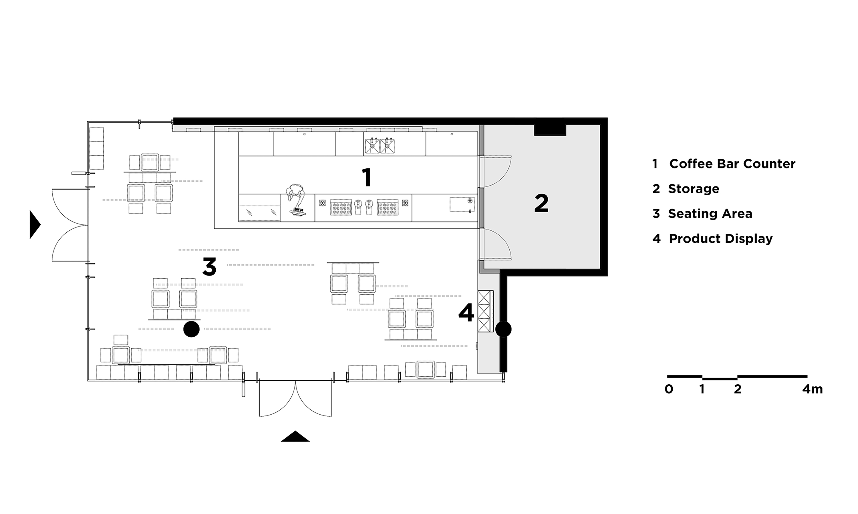
∇ 平麵圖
項目信息
項目名稱: T97杭州天目裏快閃店
主持設計:楊振鈺、梁寧森
項目管理:楊振鈺
設計團隊:MOC Design Team
設計周期:2021.9-10
竣工:2021.11
項目地址:浙江省杭州市天目裏園區一層
麵積:105㎡
主材:阿姆斯壯PVC地板,金屬衝孔板,透明亞克力
業主:T97
攝影:雲眠
Project Name: T97 Popup Store, OōEli Hangzhou
Leading Designers: Yang Zhenyu, Liang Ningsen
Project Manager: Yang Zhenyu
Design Team: MOC Design Team
Design Phase: September – October 2021
Completion: November 2021
Location: 1st Floor, OōEli Art Park, Hangzhou, Zhejiang Province
Area: 105㎡
Materials: Armstrong floor PVC, metal perforated plate, transparent acrylic
Client: T97
Photography: Yuuuunstudio


