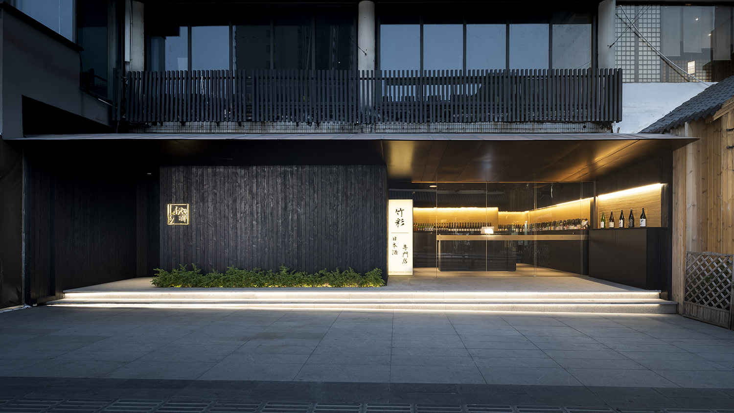
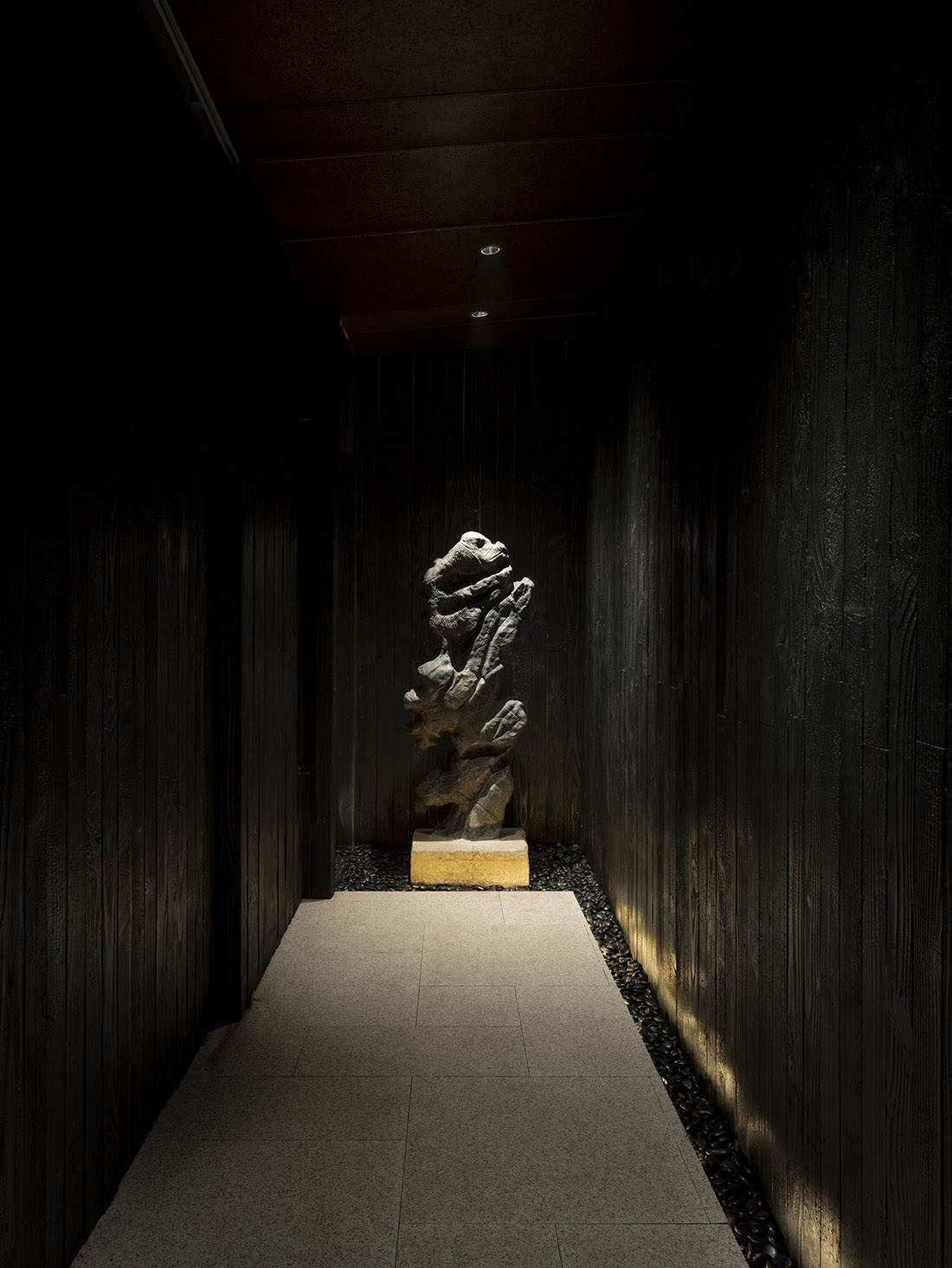
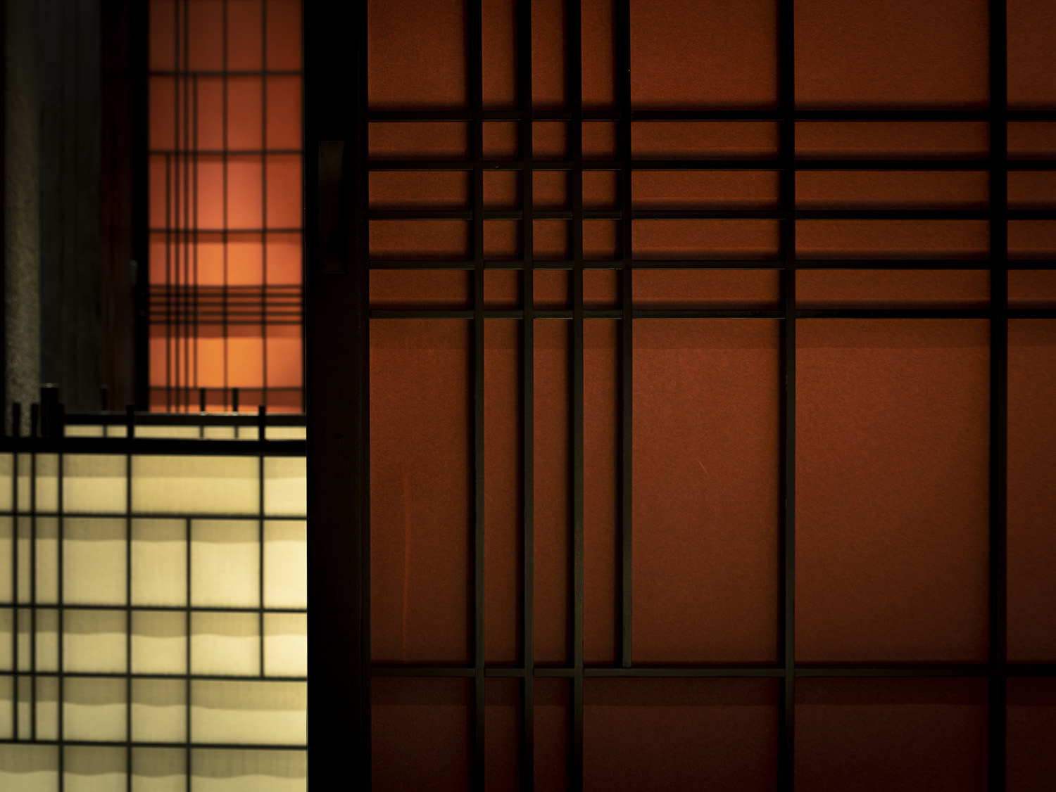
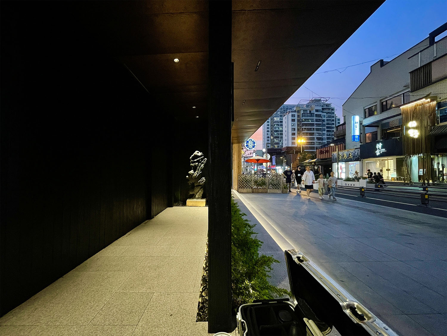
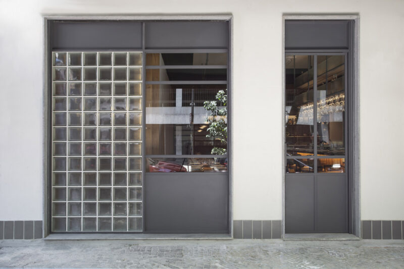
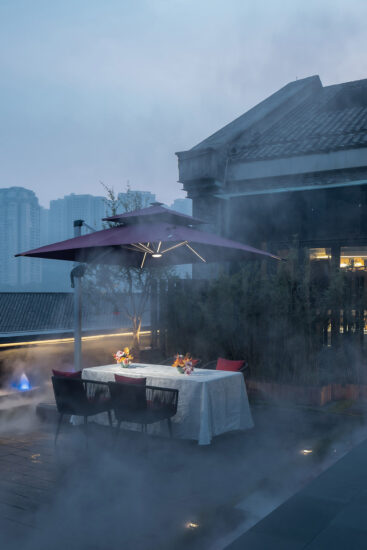
店鋪位於個性張揚,五彩斑斕的蘇州淮海街。本店外立麵采用燒杉板與不鏽鋼金屬板、以低調內斂地方式區別於街道其他商鋪。店麵入口隱蔽地設置在外立麵背後,經過彎折的,色調暗淡的小徑入店,將店鋪內環境與喧鬧的戶外街道緩慢地劃分。
The store is located on the colorful and individual Huaihai Street in Suzhou. The facade of the store is made of burnt cedar panels and stainless steel metal panels, which distinguish it from other shops on the street in a discreet and restrained manner. The entrance to the store is hidden behind the facade and is accessed by a curving, dark pathway that slowly separates the interior of the shop from the hustle and bustle of the outdoor street.
伊都竹彩的室內空間充分反映“都”與”彩”兩個元素,消除在常規日料店中頻繁出現的仿日式裝飾。
The interior space of ‘YIDUZHUCAI’ fully reflects the two elements of “DU” and “CAI”, eliminating the imitation Japanese decoration that frequently appears in conventional Japanese food stores.
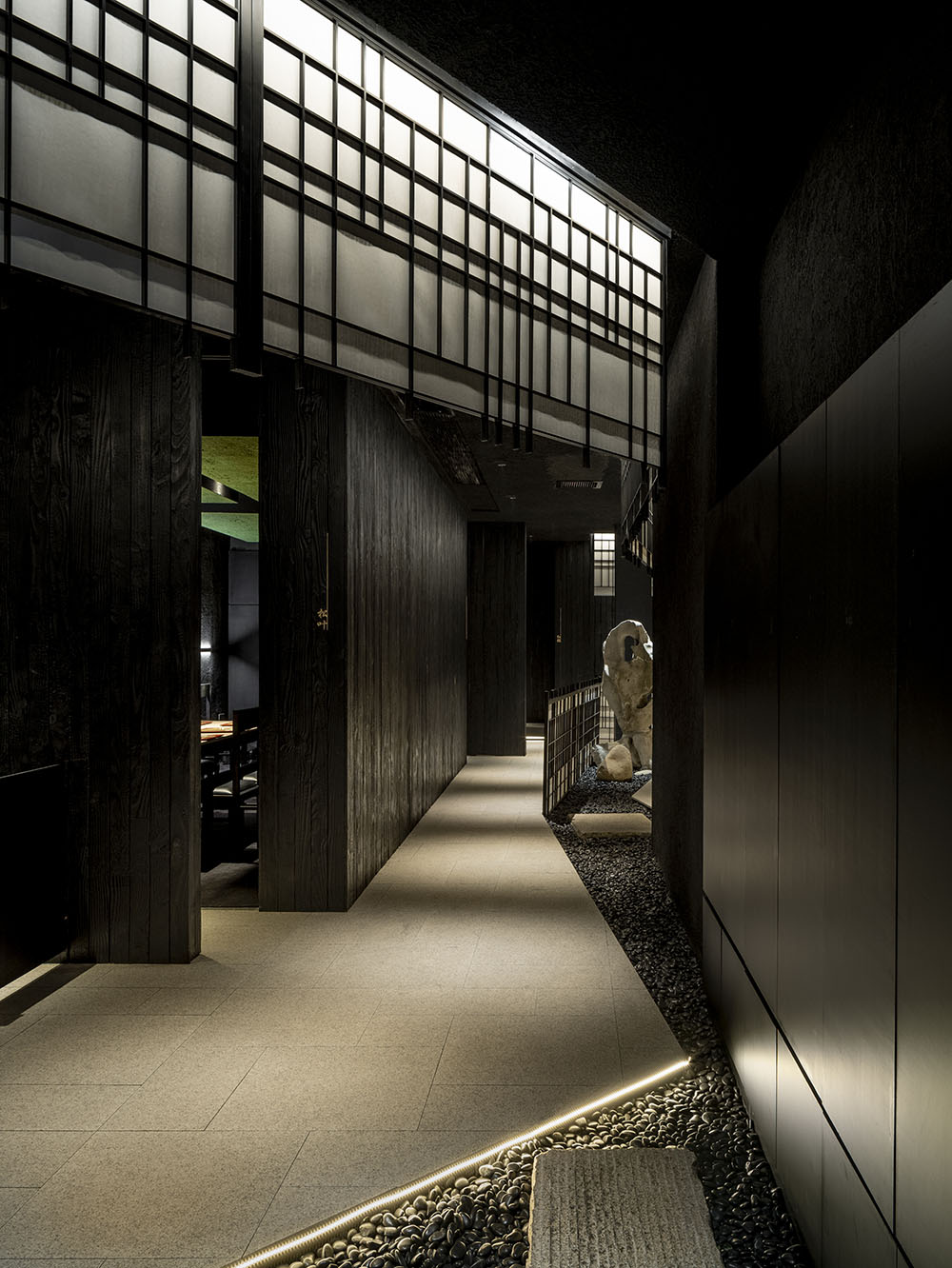
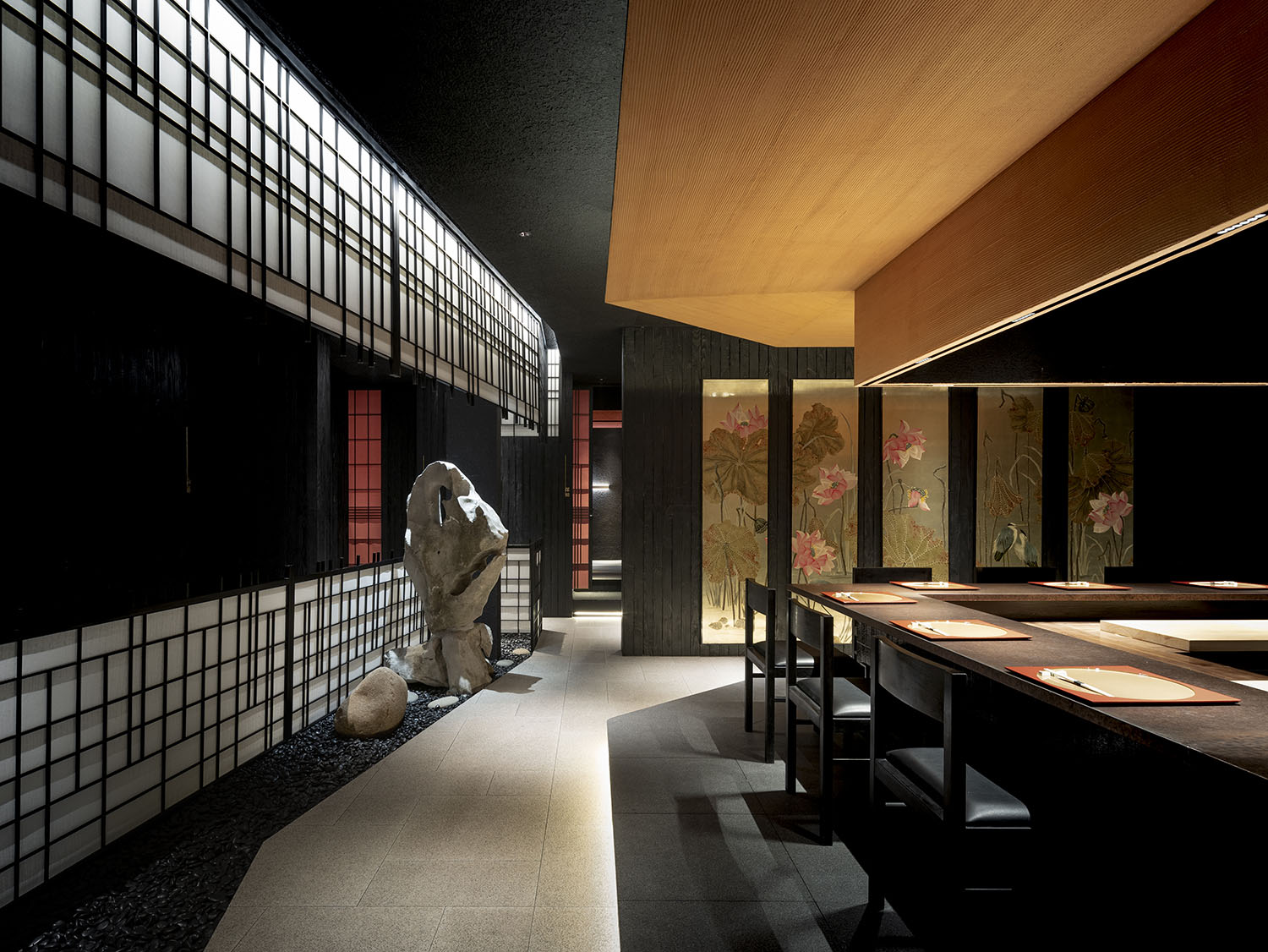
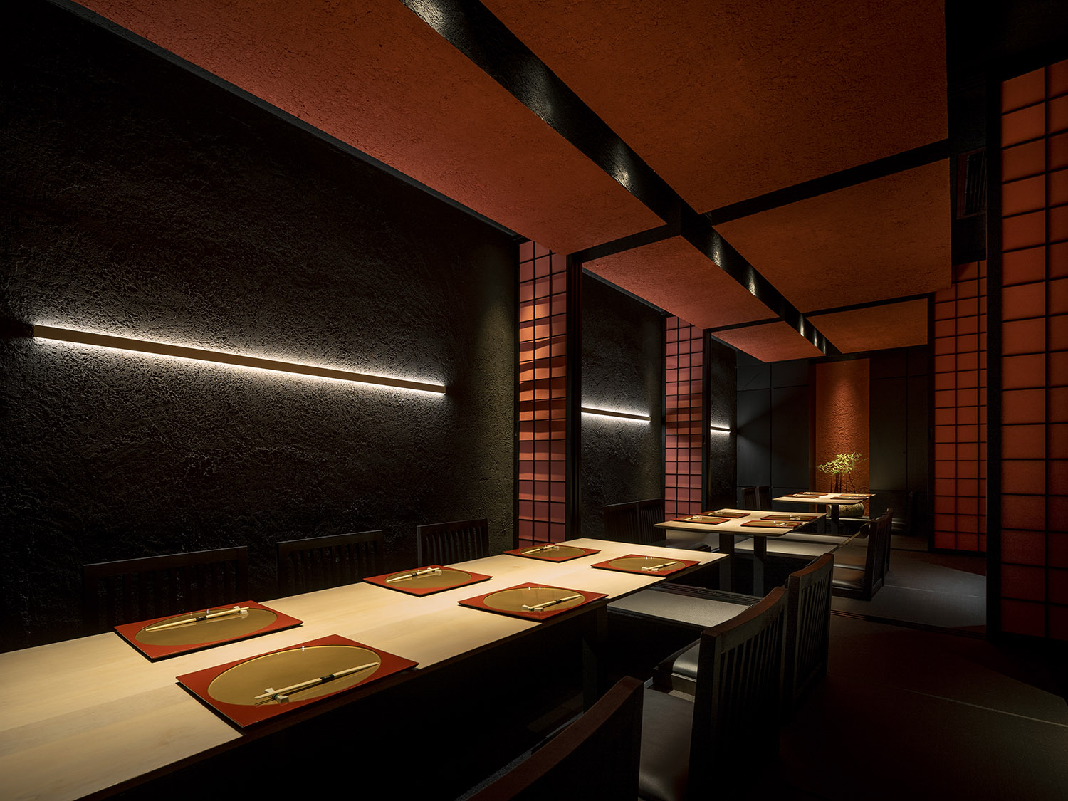
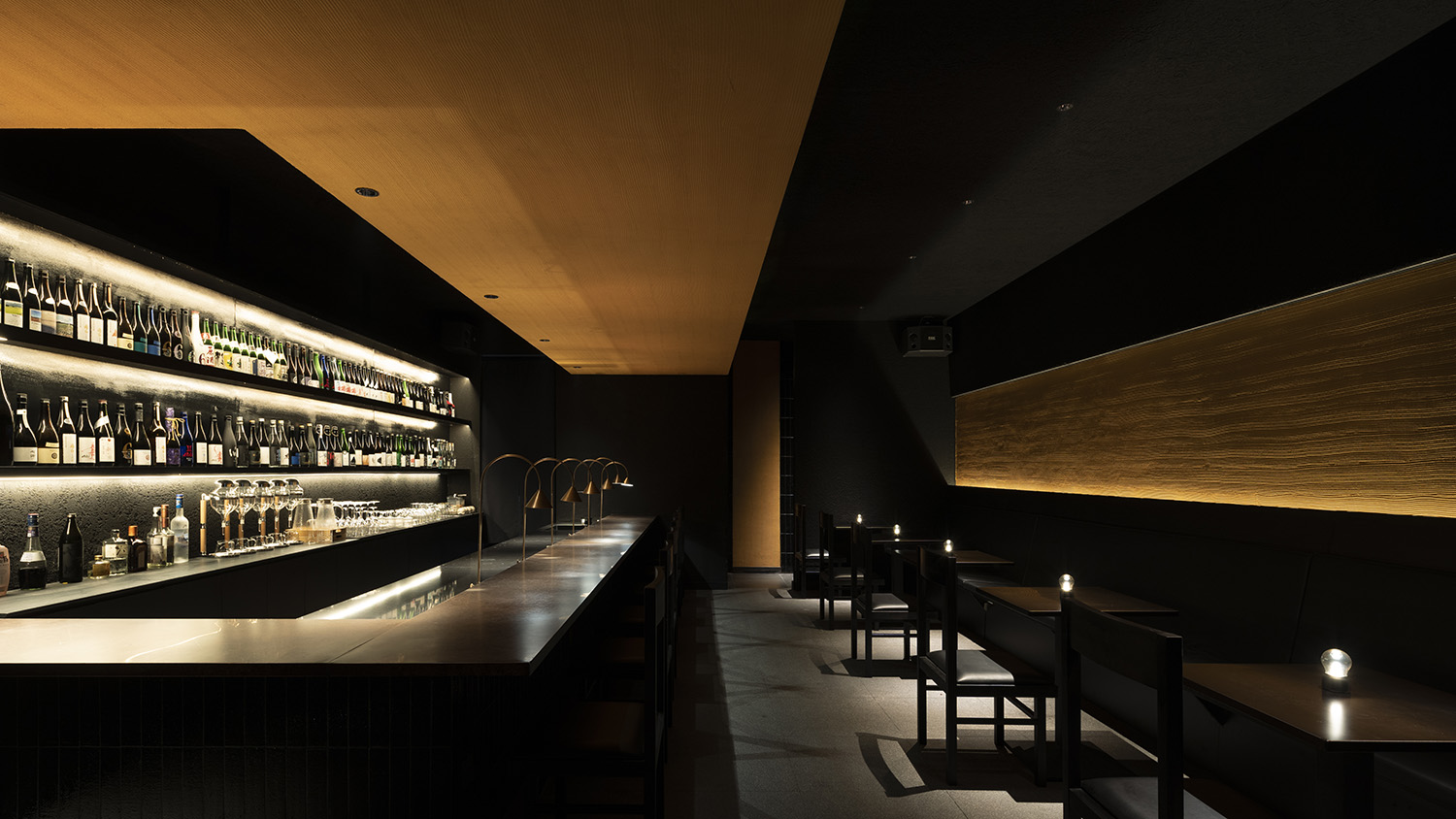
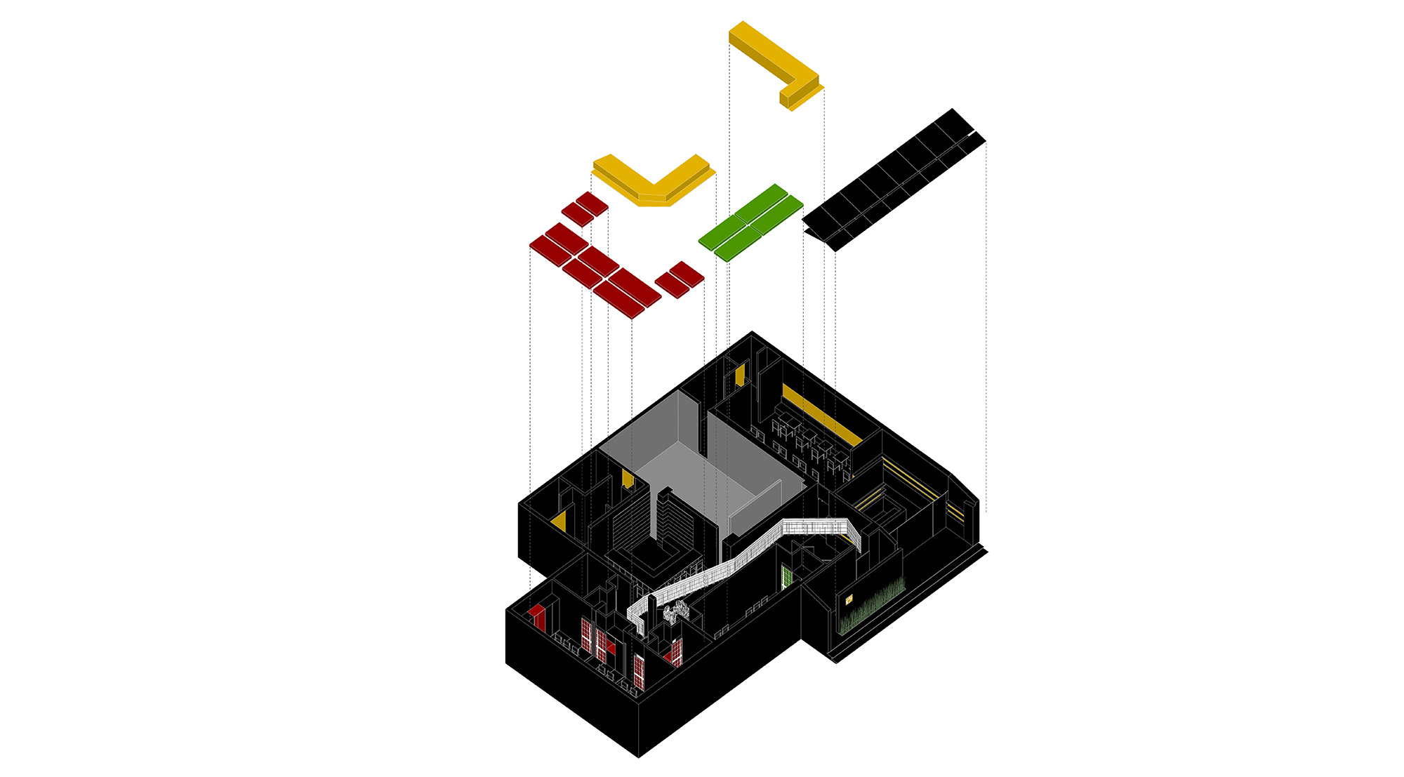
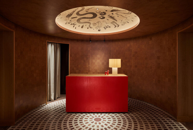
都:利用原本建築框架的高淨空,在室內製作若幹有高差的吊頂,通過不同淨高高差將大環境分割成若幹空間,仿佛一座小都市。公共走道區處於高淨高處,反映小都市的戶外,在此處設置環形動線的人造景。就餐區在低淨高處,反映小都市內的一處處房屋。
DU: Taking advantage of the high headroom of the original building frame, several suspended ceilings with differential heights have been created in the interior, dividing the large environment into several spaces through differential heights, resembling a small city. The public walkway area is at a high headroom, reflecting the outdoors of a small city, where a circular movement of the man-made landscape is set up. The dining area is at a low clear height, reflecting the houses in the small city.
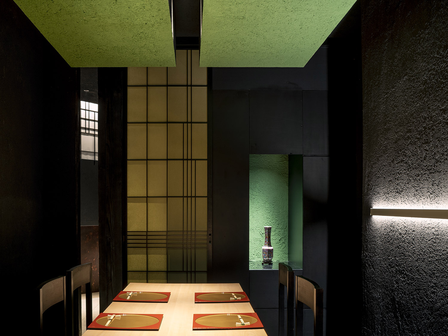
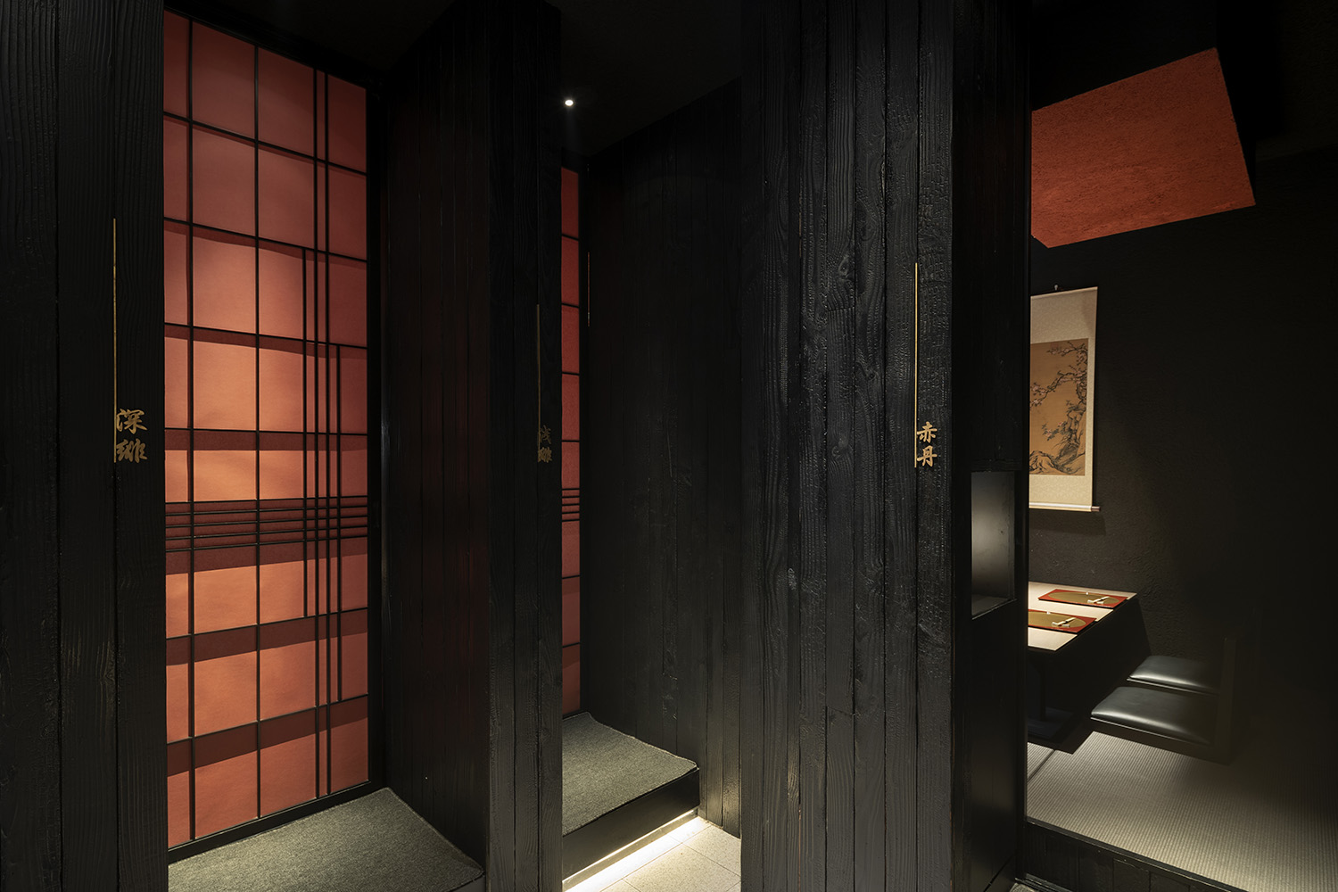
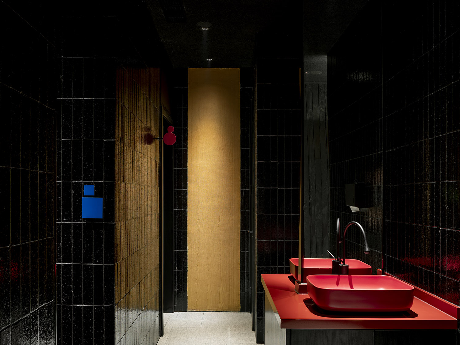
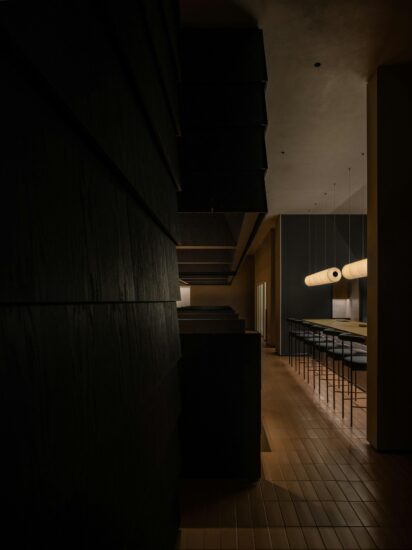
彩:在日本的和服正裝與禮物包裝會用彩色的”帶“作為點綴。本店的內部空間中,大麵積運用暗淡的黑色調,在營造別於日常生活的非日常體驗的同時,通過”帶“狀的彩色點綴強調空間的獨特性。”帶”前設置就地取材的太湖石、枯花木以及定製燈具,成為”帶”中點綴,增添景色的層次。
CAI:In Japan, kimono formal wear and gift wrapping are embellished with colored ‘bands’. In the interior of the shop, the use of dark black tones is used extensively to create a non-daily experience that is different from everyday life while emphasizing the uniqueness of the space through the colored accents of the “band”. In front of the ‘band’, locally sourced Taihu stones, dead wood, and bespoke lighting are used as accents in the ‘band’ to add layers to the landscape.
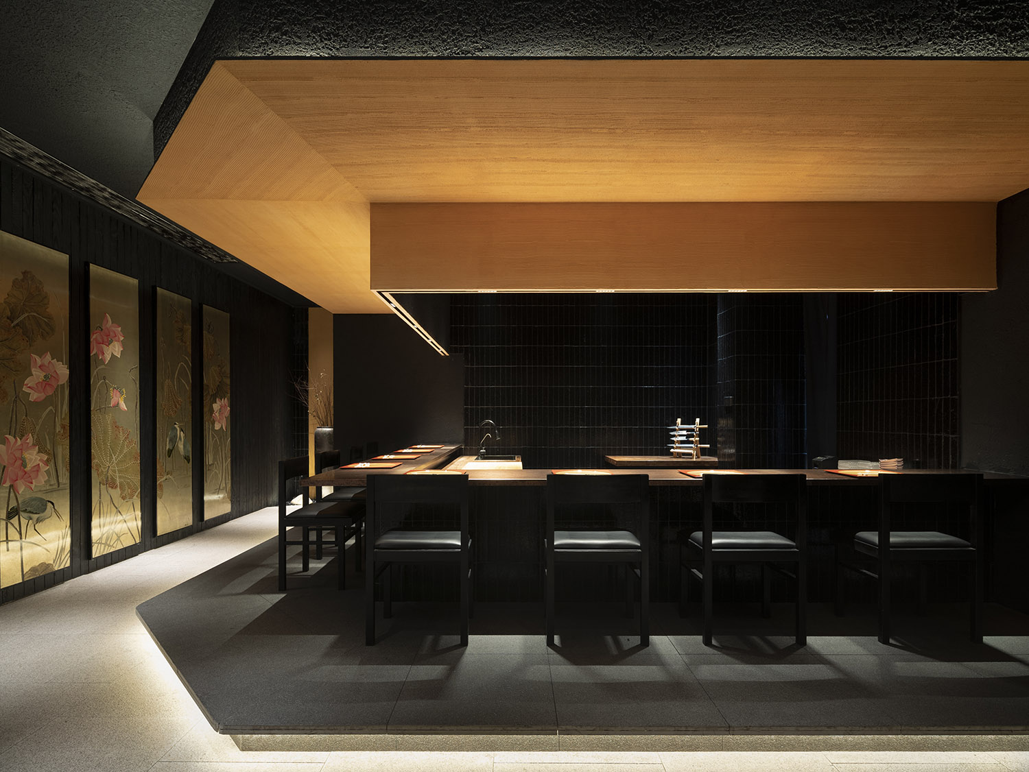
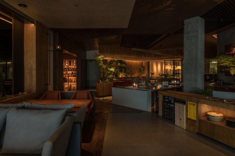
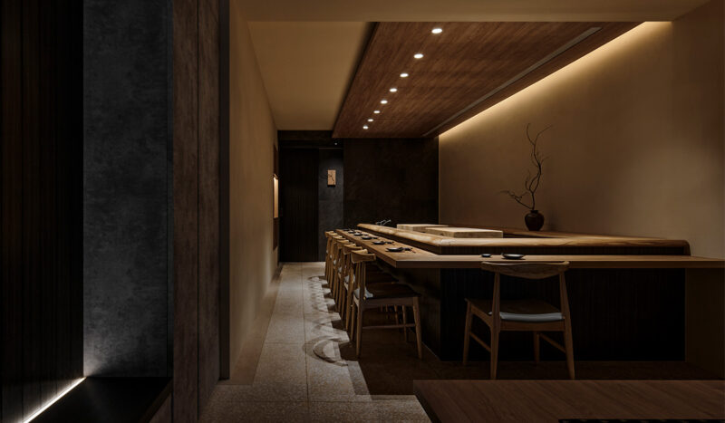
包廂內、餐吧台通過明暗色調對比,包廂內的淺色櫸木桌麵板與餐吧櫃台的光麵金屬板仿佛漂浮在空中,暗淡的空間中突顯桌麵的菜品與對麵人物的膚色麵孔,產生戲劇般的就餐體驗。
The contrast between the light beech wood tabletop panels in the booths and the glossy metal panels of the bar counter seems to float in the air through the contrast of light and dark tones, highlighting the dishes on the table and the complexioned faces of the opposite of the character in the dark space, producing a theatrical dining experience.
∇ 軸測圖
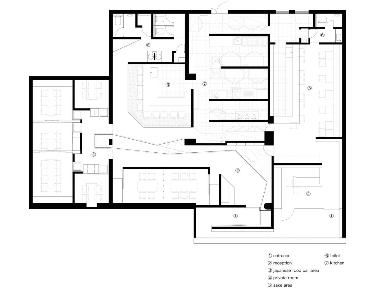
∇ 平麵圖
項目信息
項目名稱:伊都竹彩日式料理店空間設計
設計團隊:樹獺建築(素螺建築設計(上海)有限公司)(英文名稱:Slothwork Architects)
設計師:秋天(Qiutian),張雪薇(Xuewei Zhang)
公司所在地:中國上海
項目完成年份:2022
建築麵積:280m²
項目地址: 中國江蘇省蘇州市虎丘區淮海街
委托方:伊都竹彩日式料理
攝影師: Eiichi Kano


