「 原 境 」
ORIGIN REALM
流動即是本源
Flow is the source
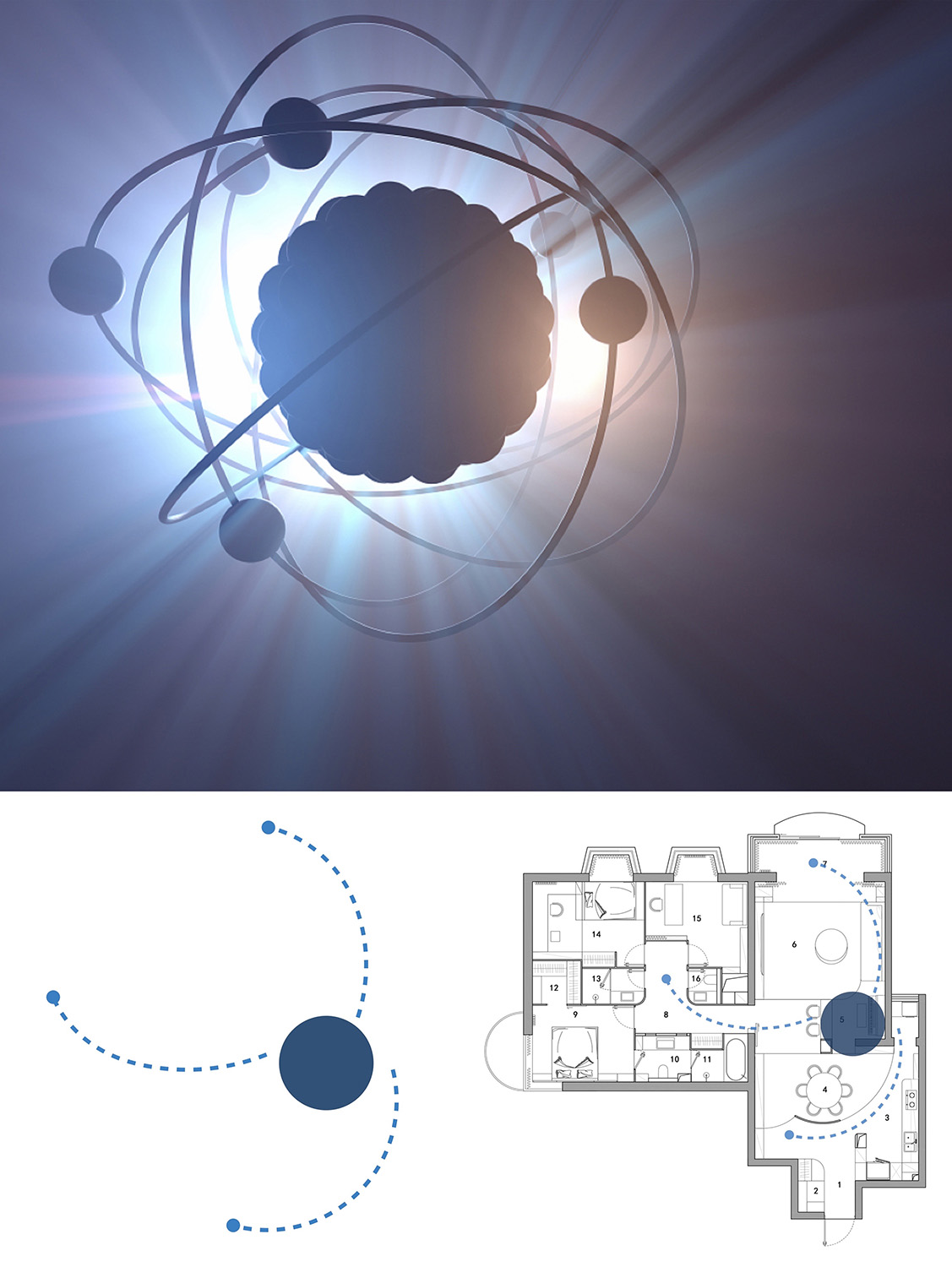
∇ 圖片來源:視覺中國(上),戲構建築工作室(下) Image from Visual China Group (up), XIGO STUDIO (down)
概念闡述
Concept Statement
在方案之初戲構建築設計工作室在思考住宅設計的本源問題,梳理人與空間中的運動關係,希望能讓空間變得更加流動也會更加親人。通過研究自然界中的基本形態,給予設計充分想象與賦能。“原子”就作為本次方案的概念演化,設計團隊將這一最小粒子的物理模型延伸到本案的設計改造中。將原子的結構形式進行抽象提取,在空間和平麵中形成轉譯。意在用物理層麵的物質本原展現空間形態的純粹本真。
At the beginning of designing the scheme, XIGO STUDIO thought about the origin of housing design, and hoped to create a more mobile and closer space while sorting out the movement relationship between human and space. By studying the basic forms in nature, the design team made the design full of imagination and power. Taking “Atom” as the conceptual demo of the project, they extended the physical model of this smallest particle to the design transformation of this project. The designers abstracted the structural form of atom, and transformed it in space and plane so as to show the purity and nature of the space form through the material origin of physical aspect.
前期分析
Site Analysis
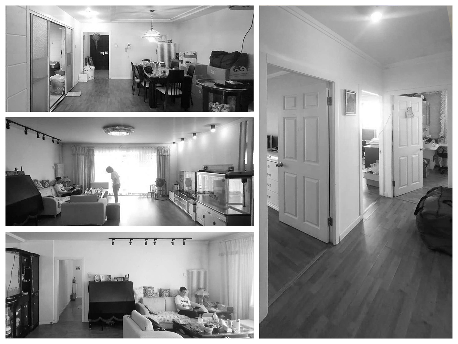
房屋主人為三口之家,對於居住生活的衛生和收納條件有很高要求,形式上希望力求簡潔,保持空間的整體性。188平米的麵積下,原始結構中的“動靜區”劃分規整,拆除廚房牆體隔斷後,公共區域呈現為一個通透開敞的完整空間體量。如此開敞的大戶型設計上也應該可以有更多可能。
The apartment owner is a family of three, who has very high requirements on living sanitation and storage condition, and hopes to have a simple space form while maintaining the integrity of the space. With the area of 188 square meters, the original structure has well-regulated “dynamic and static zones”. After the wall partition of the kitchen is dismantled, the public area presents as a complete space structure that is transparent and open. With such an open and large house type, there should be more design possibilities.
∇ 場地概況 © 戲構建築工作室 Site condition © XIGO STUDIO
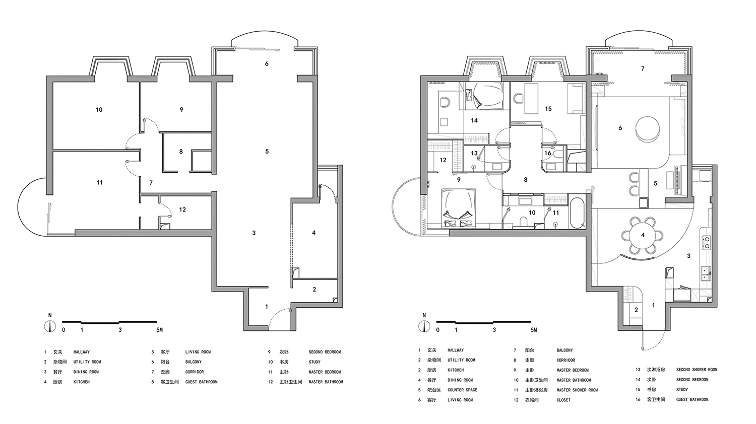
∇ 平麵前後對比 © 戲構建築工作室 Comparison of before and after plan © XIGO STUDIO
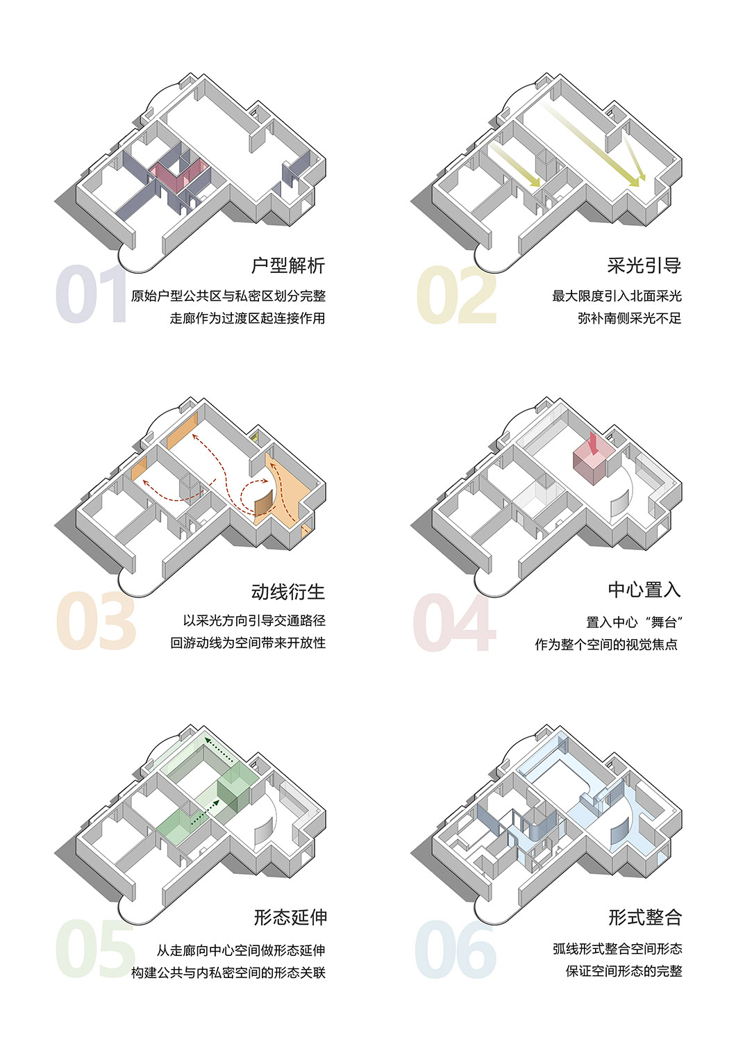
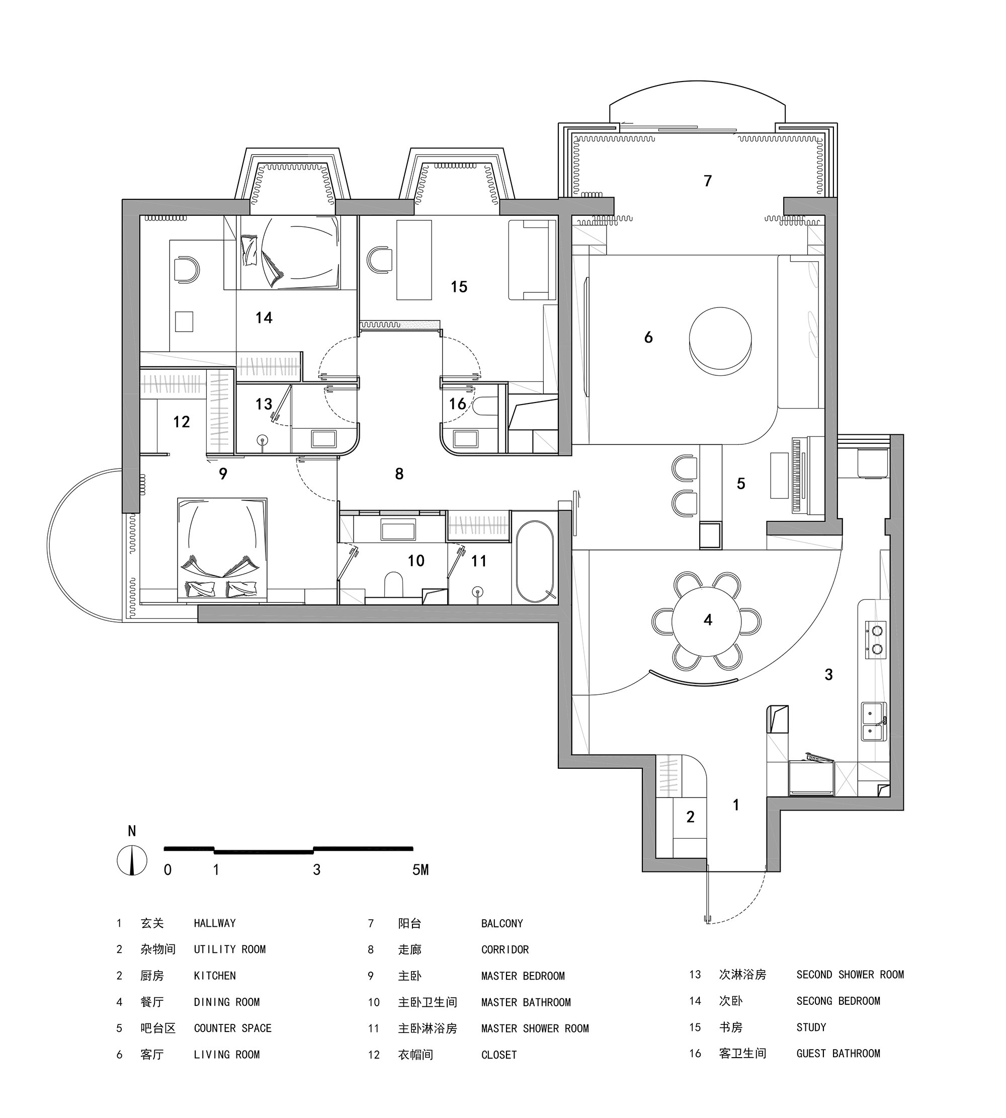
改造後平麵仍然保持基本的三居室格局,但設計團隊重新梳理了公共區域的空間組織和不同房間的結構關係,賦予原單一“方盒體”一種遞進變化的空間序列,同時專注於空間形式構築,通過形態帶動功能,產生附有聯係的依存關係,讓人在行進過程中具有非常豐富的空間體驗。
After reconstruction, the plane still remained the basic pattern of three-bedroom. However, XIGO STUDIO rearranged the space of the public areas, reframed the structural relationships of different rooms, and endowed the originally single “box body” with a space sequence with progressive changes. Meanwhile, they focused on the construction of space form, promoted the function through form, and developed a dependency relation full of connectivity so that the habitants can have rich space experience when they live there.
∇ 概念分析 © 戲構建築工作室 Conceptual analysis © XIGO STUDIO
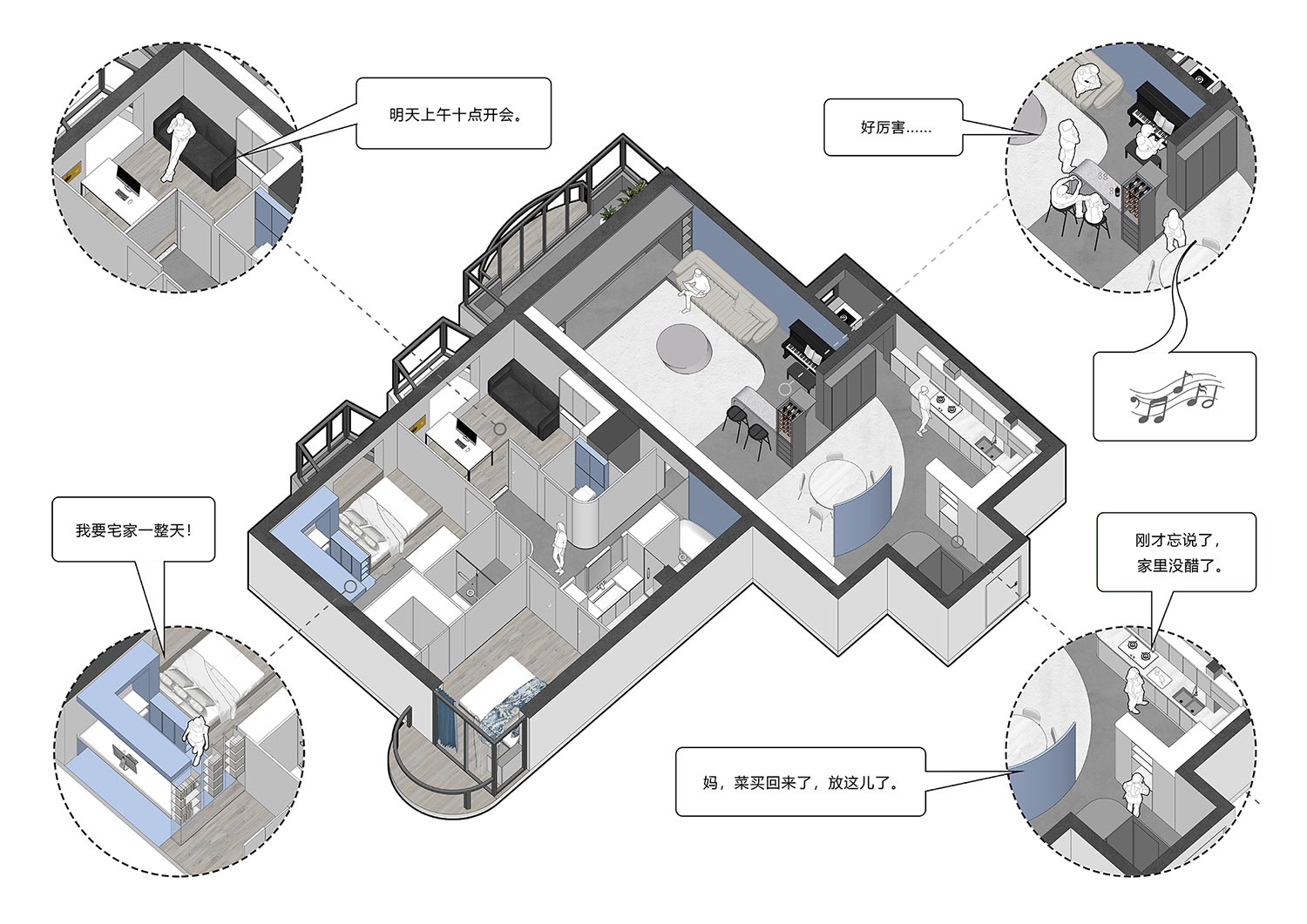
∇ 敘事軸測圖 © 戲構建築工作室 Axonometric drawing © XIGO STUDIO
弧形影壁
Arc Screen Wall
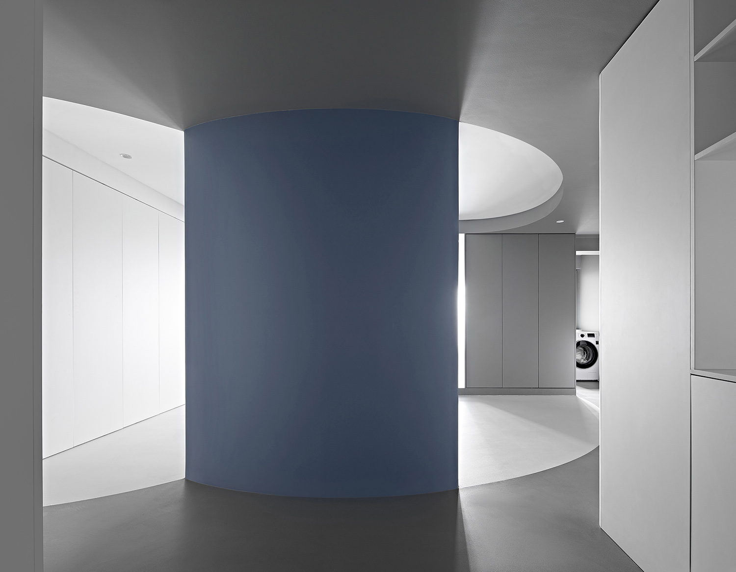
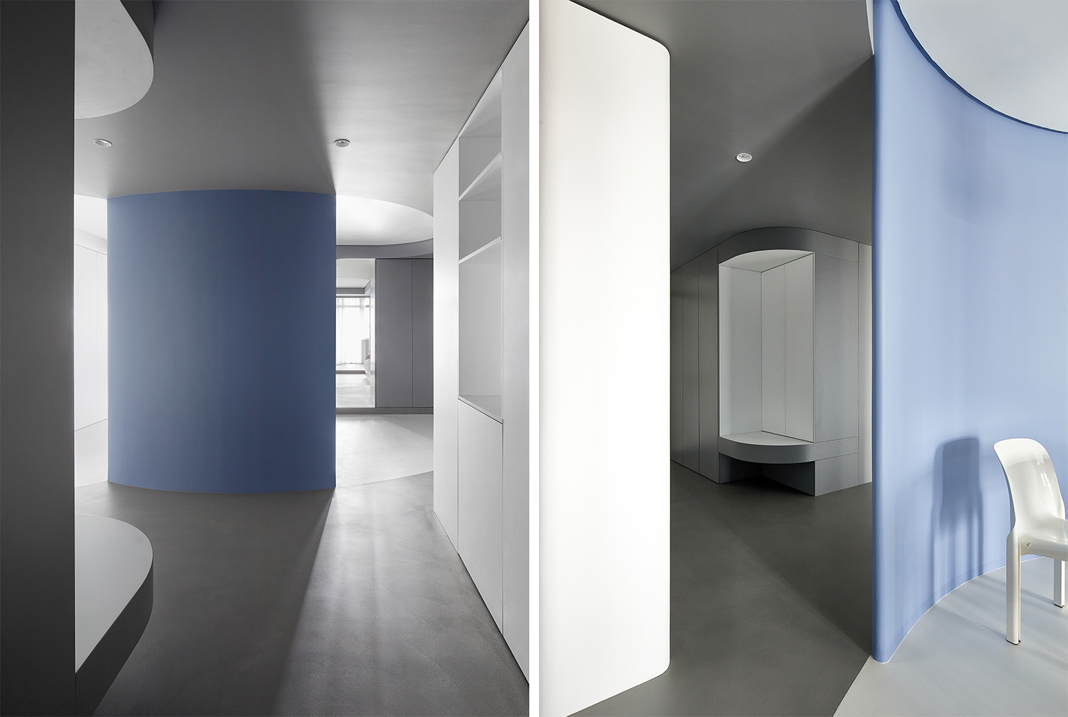
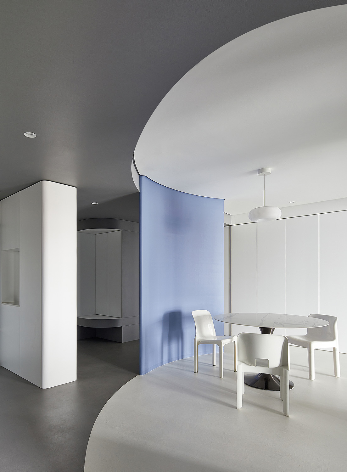
步入玄關的第一視覺落在玄關與餐廳之間的弧形影壁上。影壁的設立劃分出兩條“向光而行”的動線方向,左側入口通向串聯整個空間的主動線,直達毗鄰陽台的客廳區。右側動線連接開放式廚房,通向另一位於洗衣區的采光口。兩動線之間構成圍繞影壁後餐廳區的第三條回遊動線,帶來空間的開放性。
When habitants enter into the hallway, their first sight will be cast at the arc screen wall between the hallway and dining room. Two moving lines that “move in the direction of light” are designed in the screen wall. The entrance on the left leads to the main moving line which connects the whole space, and reaches the living room adjacent to the balcony. While, the moving line on the right is connected with the open kitchen and leads to another daylight opening located in the laundry area. Between the two moving lines, the third back-and-forth moving line is formed around the dining area behind the screen wall, which endows the space with openness.
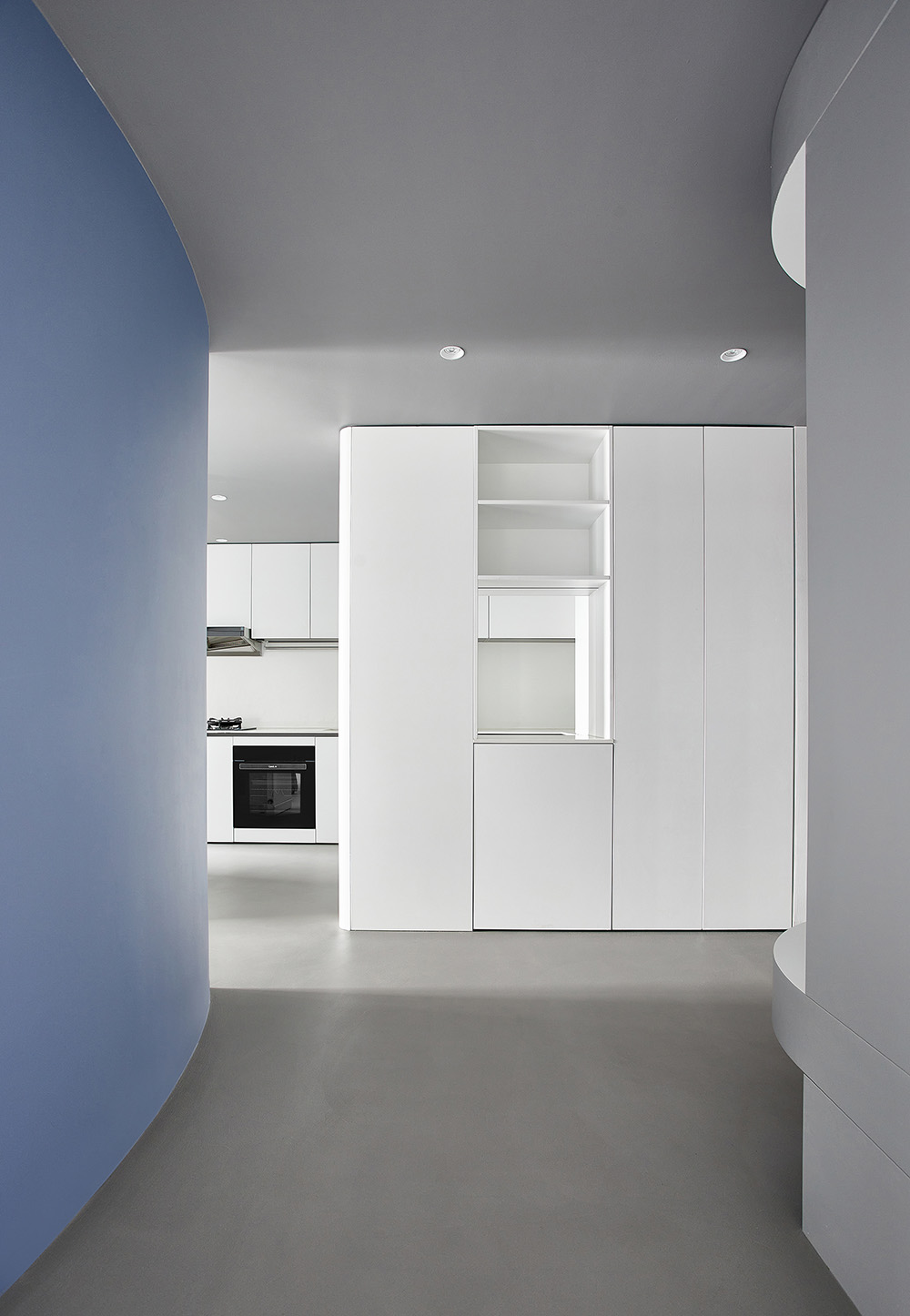
弧形影壁的遮蔽功能一方麵保證內部空間的隱密性,另一方麵為後續的空間敘事做鋪墊。影壁與入戶門口的小距離錯位,將采光引入相對獨立的玄關空間。入口玄關區設計了非常強大的儲物空間,同時嵌套了一個弧線元素為合起來的白色換鞋區。右側動線連接廚房,通頂櫃體開設洞口,提供進門後買菜放置的區域,形成廚房與玄關之間的互通。
The shielding function of the arc screen wall, on the one hand, ensures the privacy of the internal space, on the other hand, it foreshadows the subsequent space functions. Between the screen wall and the entrance door, a small distance dislocation is formed to introduce light into the relatively independent hallway space. In the hallway area, a space with very strong storage function is designed. And an arc element is embedded as the closed and white area for shoe changing. The moving line on the right is connected with the kitchen. The roof-connected kitchen cabinet is designed with holes to provide area for putting vegetables after habitants enter the apartment, which forms the interconnection between the kitchen and the hallway.
旋轉餐廳
Revolving Dining Room
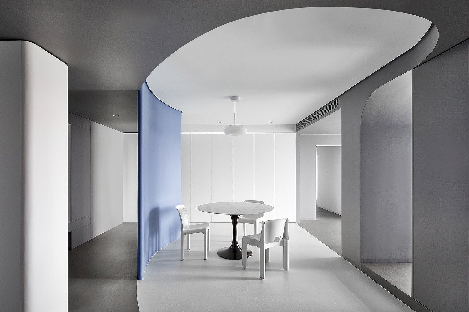
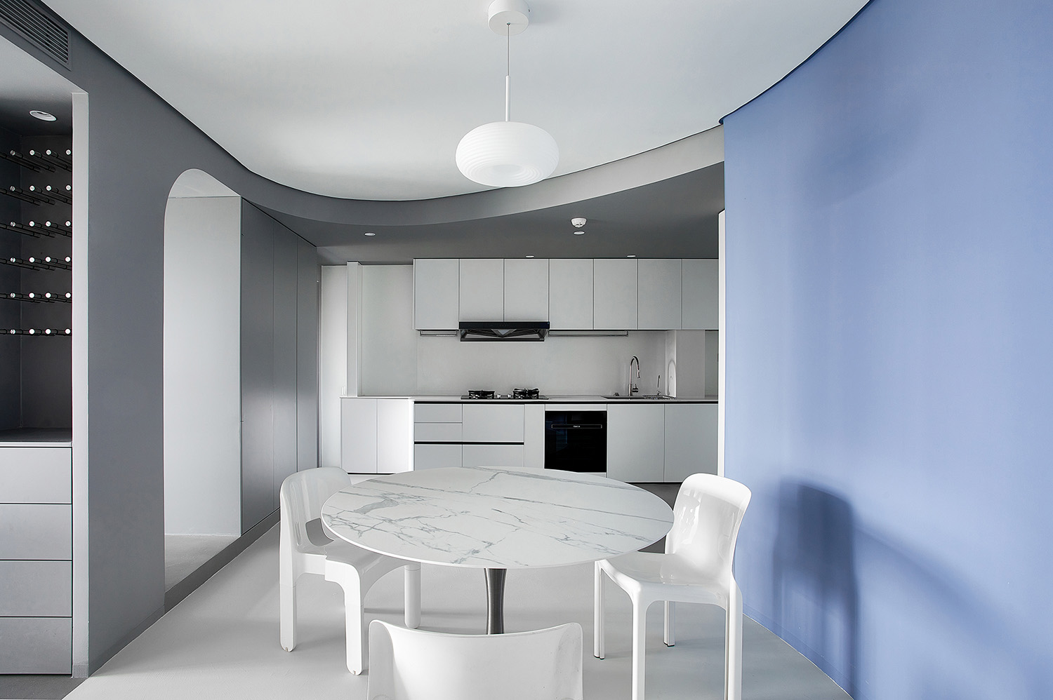
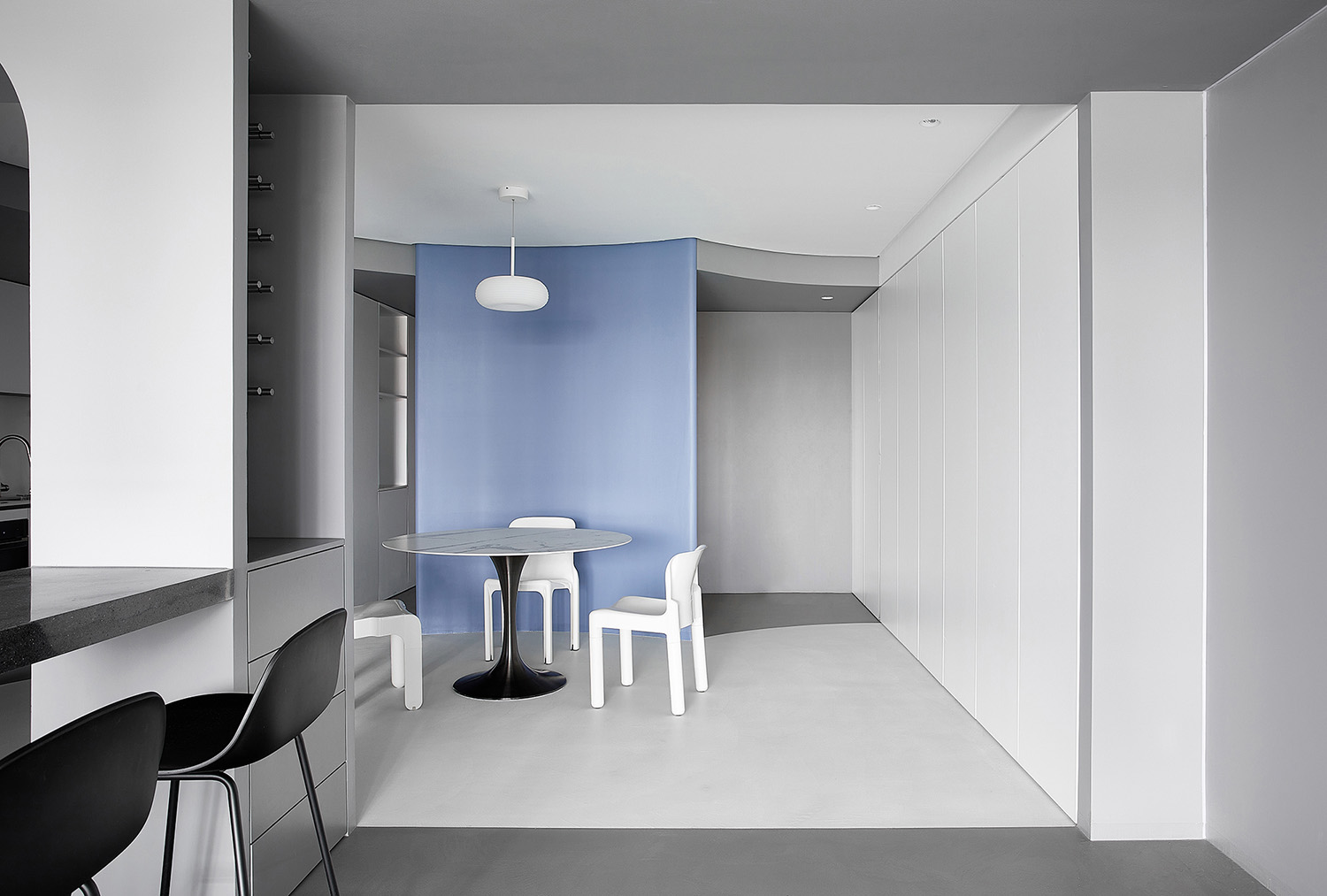
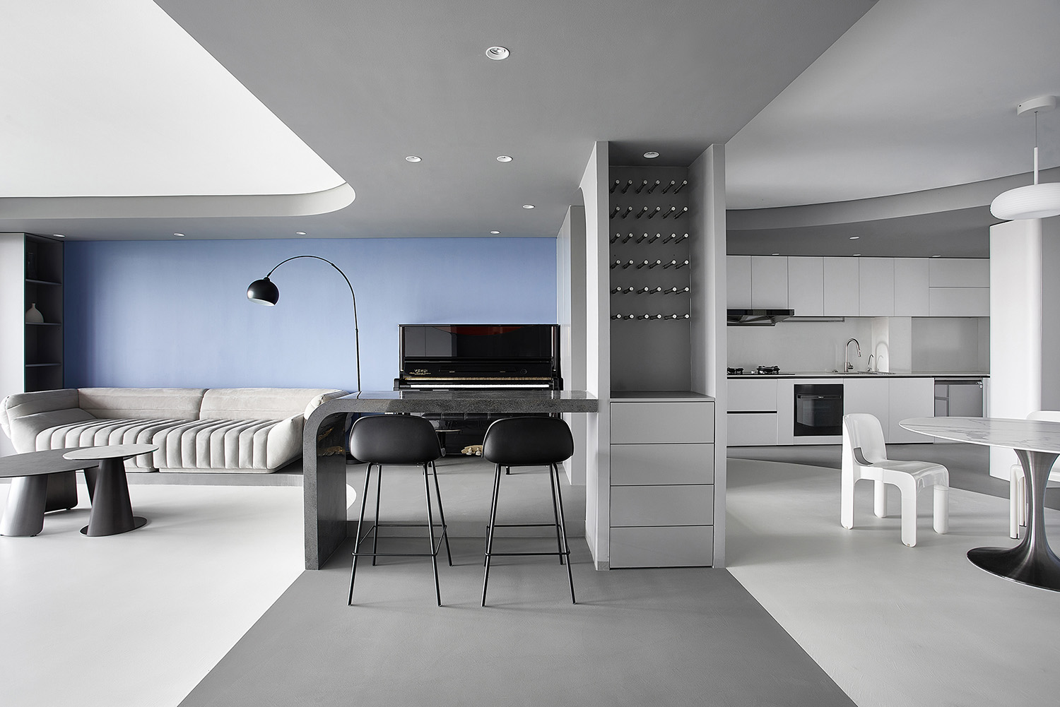
餐廳通過清晰的色域邊界的劃分和色塊量體的構建,對空間形態進行大膽提煉和概括,從窗邊延伸至室內的流線,圍繞餐廳旋轉讓空間更加活躍,動勢節奏愈加劇烈,與客廳吧台空間的流線吊頂形成節奏變化。極度簡化的形式中功能性的內容被保留,冷色係的色彩運用和幾何形的穿插共同賦予餐廳一種藝術展廳的既視感,白色桌椅、燈具成為“展廳”中的藝術藏品,形態和色彩與環境相呼應。
Through the clear division of gamut boundaries and the construction of color lump and structure, XIGO STUDIO boldly abstracted and summarized the space form. The streamline that extends from the window to the interior, and rotates around the dining room makes the space more active, and the dynamic rhythm more intense. And the streamline, together with the streamline ceiling of the bar space in the living room also forms a rhythm change. In the minimal form, the functional content is retained. The application of cool colors and integration of geometric shapes jointly endow the dining room with a visual sense of art exhibition hall. Accordingly, the white tables, chairs, lamps and lanterns become the art collections in the “exhibition hall”, and echo with the environment in form and color.
從客廳看過去,天邊引出的流線與水平框線相互嵌套疊望。充足的收納牆和餐邊櫃,解決了一家人的儲物問題。場景中三把中古椅具有一定的收藏價值,分別為No.4860 Universale Chair由Joe Colombo於1965年設計;Artemide selene chair 由Vico Magistretti於1969年設計;Carlo Bartoli Chair Model 4875 for Kartell於1970年設計。
Seeing from the living room, we can find that the streamline starting from the horizon embeds and overlays with the horizontal frame line. The adequate storage wall and sideboard cabinets solve the storage problem for the whole family. The three vintage chairs in the scene have certain collection value. They are respectively No.4860 Universale Chair designed by Joe Colombo in 1965, Artemide Selene Chair designed by Vico Magistretti in 1969, and Carlo Bartoli Chair Model 4875 designed for Kartell in 1970.
中心舞台
Center Stage
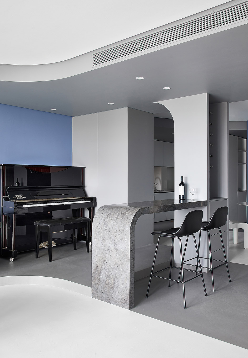
將酒吧台與鋼琴融合為一個中心舞台,整體空間組織圍繞著舞台展開,舞台作為帶動空間形態產生流線運動的核心,如同空間的“原子核”聯係各功能分區。入口玄關、餐廳、舞台、客廳四個功能分區延北側光源方向依次排布,光照影響在四個空間層級的過渡中漸強漸弱,營造從入戶至房屋內部的遞進空間節奏。流線形在中心空間交集,舞台也形成整個空間的核心視覺焦點。
The designers integrated the bar counter with the piano area as the center stage, and arranged the overall space around the stage. The stage, as the core that drives the space form to produce streamline motion, is like the “nucleus” of the space, connecting with each functional area. The four functional zones: entrance porch, dining room, stage and living room are arranged in sequence along the direction of the light source from the north side. The influence of light is gradually strengthened and weakened in the transition of the four spatial levels, creating a progressive spatial rhythm from the entrance to the interior of the apartment. Streamline forms intersect in the central space. The stage also forms the core visual focus of the entire space meanwhile.
流動客廳
Dynamic Living Room
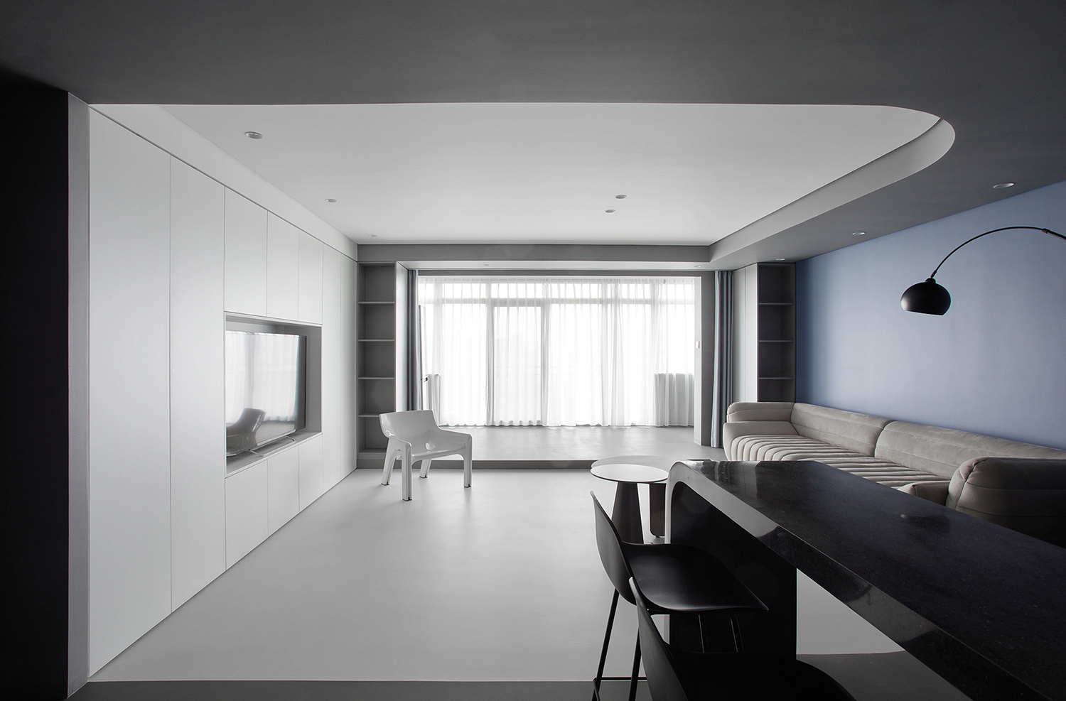
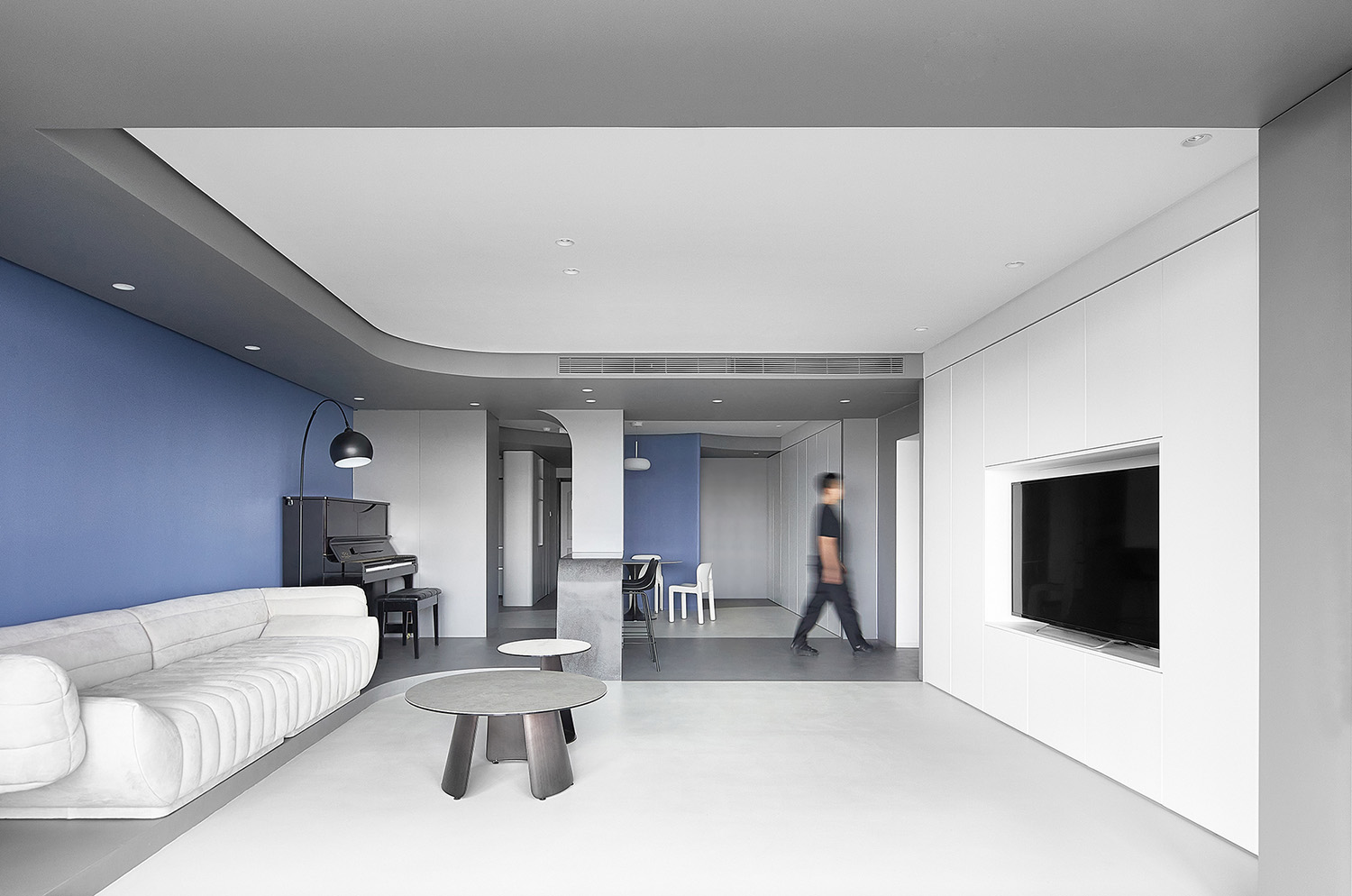
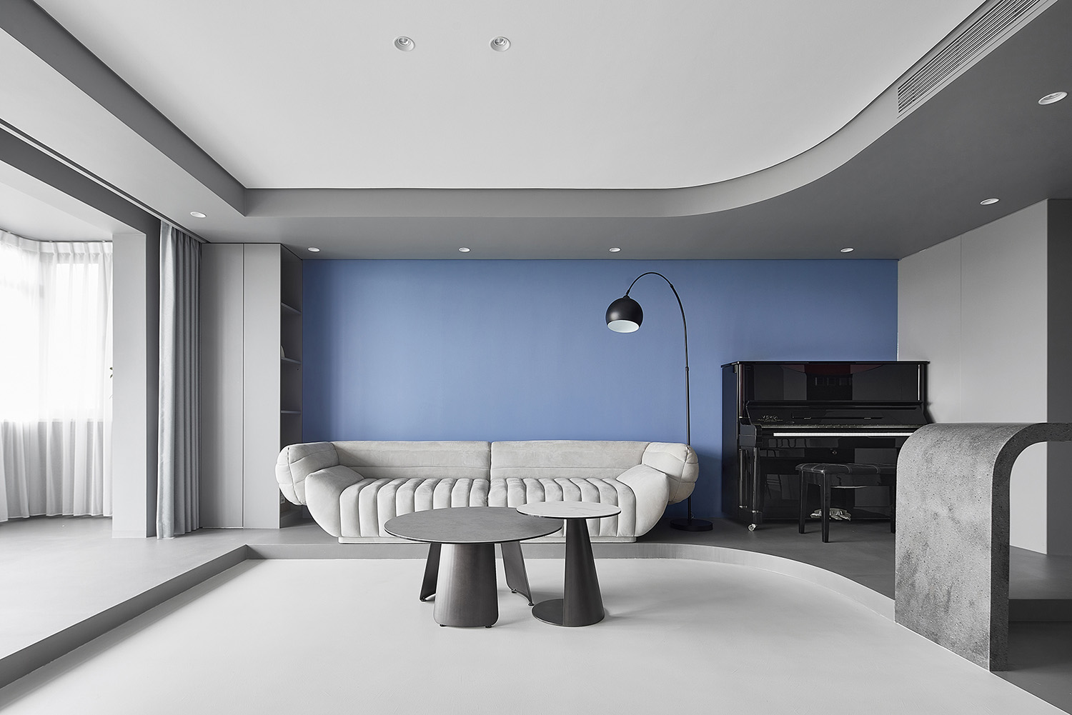
流線吊頂自陽台延伸至走廊,灰色與白色的色彩區分強調流線的形態軌跡。同時將平麵的色彩區隔延展到立體的空間分割中,地麵的色域形狀劃分呼應天花的顏色形態,對應構成的灰色體量延伸至內部走廊。站在端點望向客廳,連續的流線吊頂勾勒出空間圖景的邊框,灰色吊頂延伸至旁側的走廊入口,將空間動勢引向內部。
The streamlined drop ceiling extends from the balcony to the corridor. The color distinction of gray and white emphasizes the form track of the streamline. At the same time, the plane’s color partition extends to the three-dimensional space segmentation. The color gamut’s shape division of the floor echoes with the color form of the ceiling. Meanwhile, the gray structure formed correspondingly extends to the internal corridor. Looking towards the living room when standing at the end, habitants can find that the continuous streamlined drop ceiling outlines the frame of the space picture. The gray drop ceiling extends to the entrance of the corridor on the side, leading the space’s kinetic potential to the interior of apartment.
空間的形態構築以外,家具單品的使用克製在最低限度,沙發單品選擇意大利設計師Vincenzo De Cotiis,2014年為Baxter設計的這款TACTILE香蕉船沙發。沙發利用線條那種擁抱的形態和延展性與空間和諧統一。電視牆設計整麵落地儲物係統,最大限度的收納讓空間更加整潔。
Apart from the space’s form construction, the use of furniture items is kept to a minimum. TACTILE banana boat sofa designed by Italian designer Vincenzo De Cotiis for Baxter in 2014 is adopted. The sofa is in harmony and unified with the space through its streamlines’ hugging shape and ductility. The whole TV wall is designed with a storage system that starts from the ground, which provides a maximum storage space, making the space more neat.
引光入室
Introduce Light into the Apartment Interior
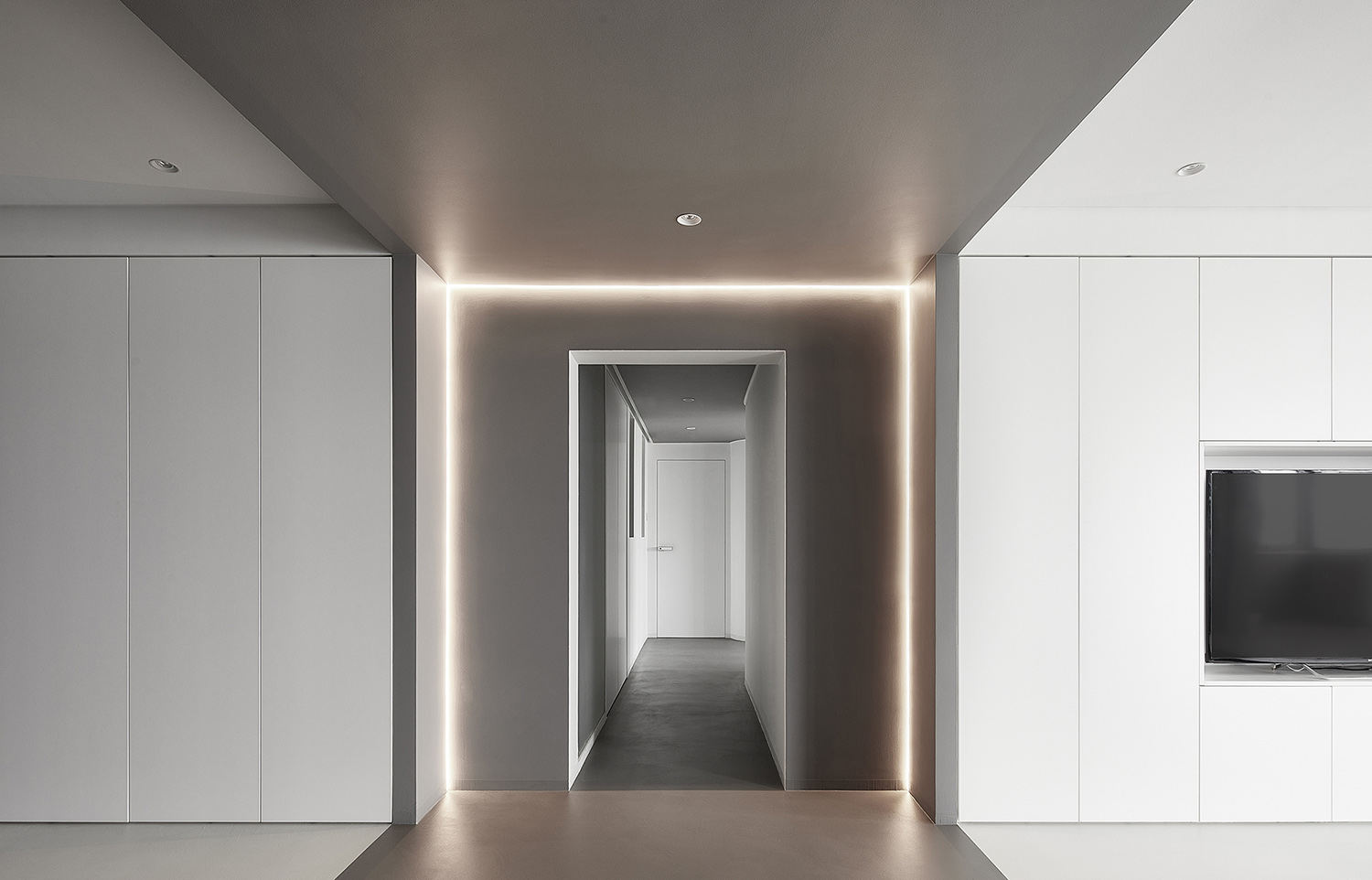
光的參與是空間之所以能作為“空間”呈現在我們視野中的先決條件。設計團隊希望自然光線能夠盡可能地伸入到空間的各個角落。灰色乳膠漆的吊頂與地麵鋪裝延伸至走廊盡頭,三麵環繞的燈帶營造出科幻隧道的未來感。
The participation of light is a prerequisite for space to be presented in our vision in the form of “space”. The designers hope the natural light can penetrate into every corner of the space as much as possible. The gray drop ceiling painted with latex paint, and floor decoration extend to the end of the corridor. The light belts that surround three sides create a sense of future like the sci-fi tunnel.
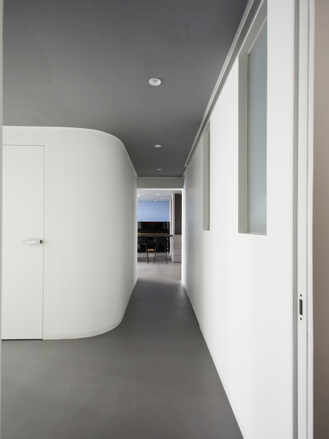
原走廊作為公共區與私密區的過度空間被包裹在整個空間結構的中心,顯得封閉狹小。設計團隊將原書房與次臥的位置對調,方便打開視口,將北側自然光線引致走廊,再傳遞至南側主衛生間。主臥入口與走廊入口相對位,日間臥室門開啟時,走廊將獲得第三個方向上的自然采光。
The original corridor, as the transitional space for public and private areas, is wrapped in the center of the whole space structure, which appears closed and narrow. XIGO STUDIO exchanged the location of the original study with the secondary bedroom to create a more convenient viewport so that the natural light from the north side can be introduced into the corridor and then to the master bathroom on the south side. The entrance of the master bedroom is designed opposite to that of the corridor so that the corridor can receive natural light from the third direction when the bedroom door opens in the daytime.
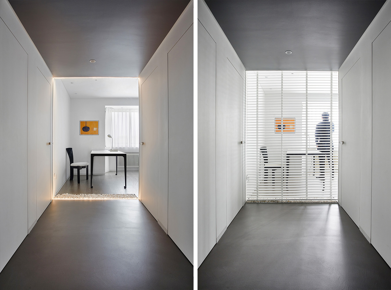
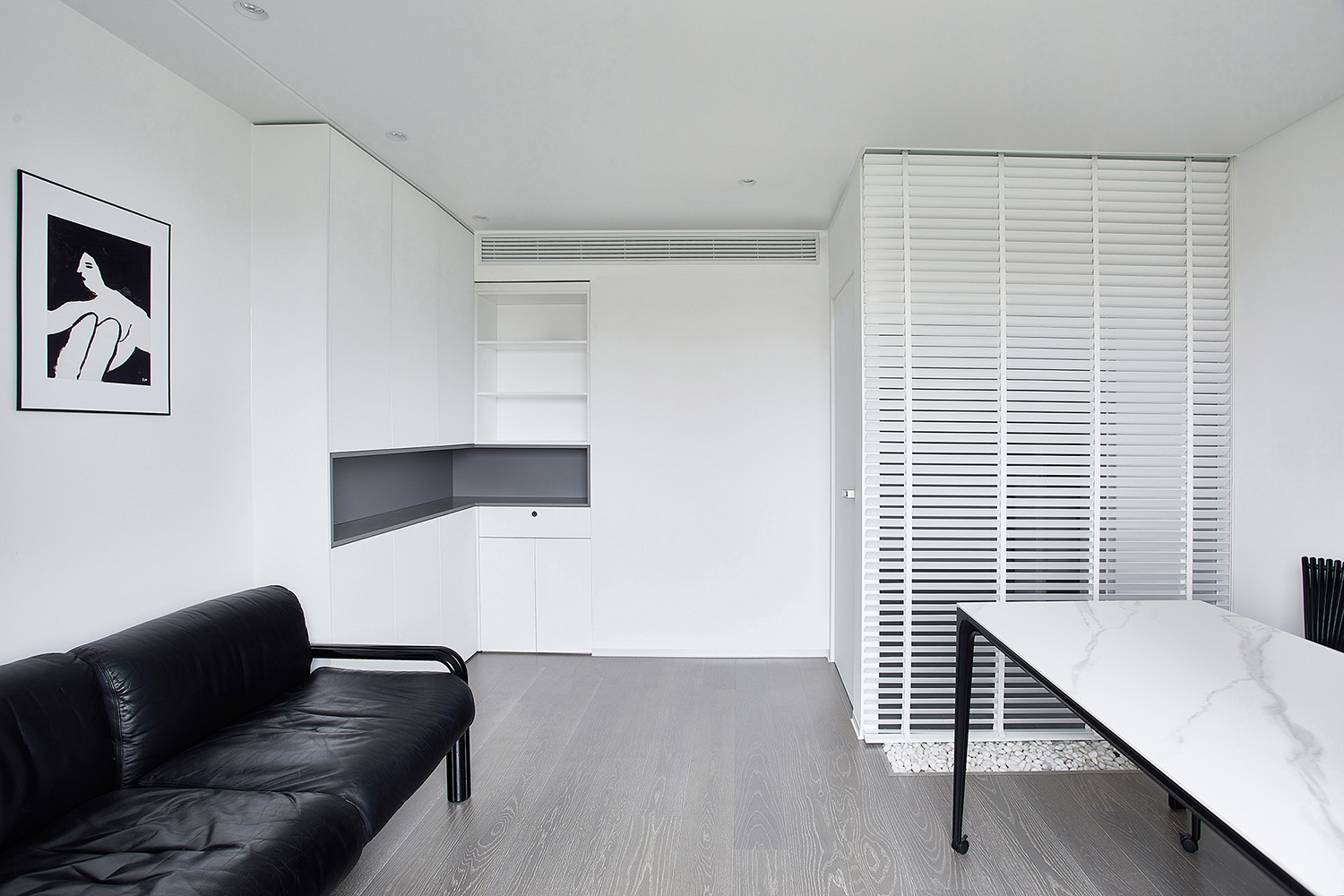
通過擴展通向書房的走廊寬度,利用超白玻璃作為書房與走廊之間的隔斷,保證通透性。將客衛生間分為馬桶間和淋浴間兩個區域分別排布在走廊兩側的位置,順勢實現了客衛的幹濕分離。百葉窗簾的開合可以根據使用的需要靈活改變書房的封閉開敞狀態,靈活的使用功能也能為走廊帶來豐富的光影變化,同時有效保障了書房的私密性。
Meanwhile, the designers expanded the width of the corridor leading to the study. Ultra white glass is used as the partition between the study and corridor, ensuring the transparency. The guest bathroom was divided into two areas: namely closestool cubicle and shower cubicle. The two areas are respectively arranged on the both sides of the corridor. Accordingly, this design helps to realize dry and wet separation in the guest bathroom. The opening and closing of venetian blind can flexibly change the state of the study according to the need for use. Besides, the flexible function of venetian blind also can endow the corridor with rich light and shadow change, and effectively ensure the privacy of the study at the same time.
獨立天地
Independent Space
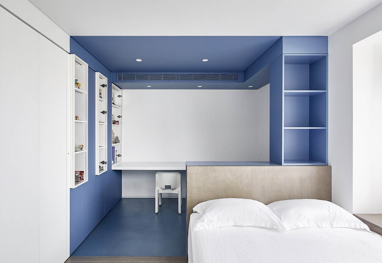
屋主女兒需要一個可以宅在房間一天的獨立天地,女兒有收藏手辦、動漫周邊等藏品的愛好。根據需求在次臥設置了三組玻璃門儲物櫃,間隔的排列方式豐富立麵變化,玻璃櫃門帶來透氣感。
The apartment owner’s daughter needs an independent space where she can stay in the room all day. Since the owner’s daughter has the hobbies of collecting garage kits, anime products and other objects, three sets of lockers with glass doors are installed at intervals in the secondary bedroom according to the demand, which enriches the space. Besides, the glass doors of the lockers create a sense of breathability.
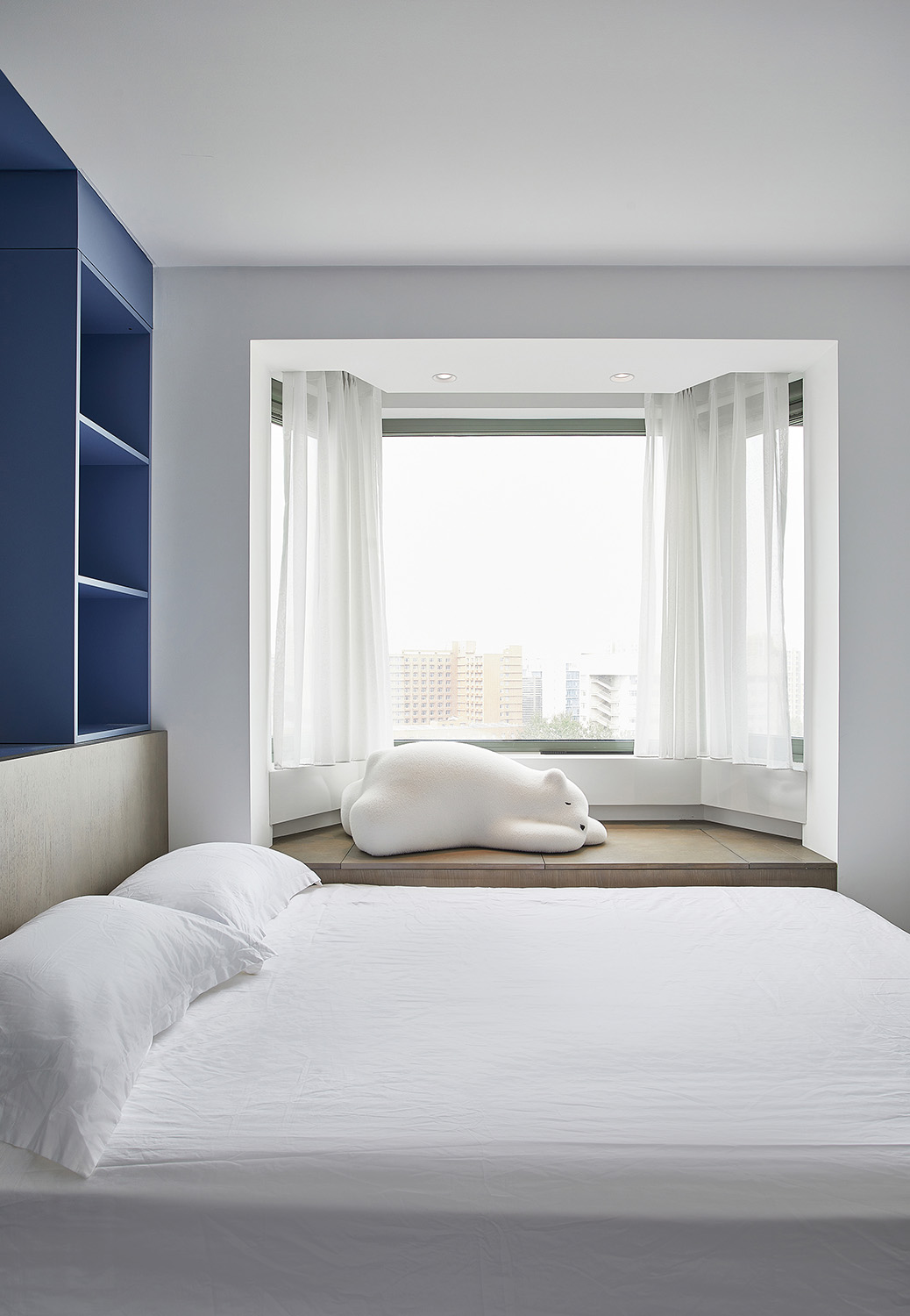
要滿足女孩日常睡覺起居的同時,灰藍色體量的植入界定了學習遊戲的功能分區。在次臥的小尺度空間中,區域安排有序,色域互相區分,形態相互關聯。另一側床體連接飄窗形成一個整體的休息區,飄窗下設計了儲物櫃提供床品的收納功能。
To meet the girl’s requirements on daily sleeping and living at the same time, the implantation of gray and blue structures define the functional division of learning and game. In the small space of the secondary bedroom, zones are arranged orderly, color gamuts are differentiated from each other, and forms are related to each other. In the other side, bed is connected to the bay window, forming an overall rest area. Under the bay window, a storage cabinet is designed to provide storage function for bed products.
主臥收納
Storage in the Master Bedroom
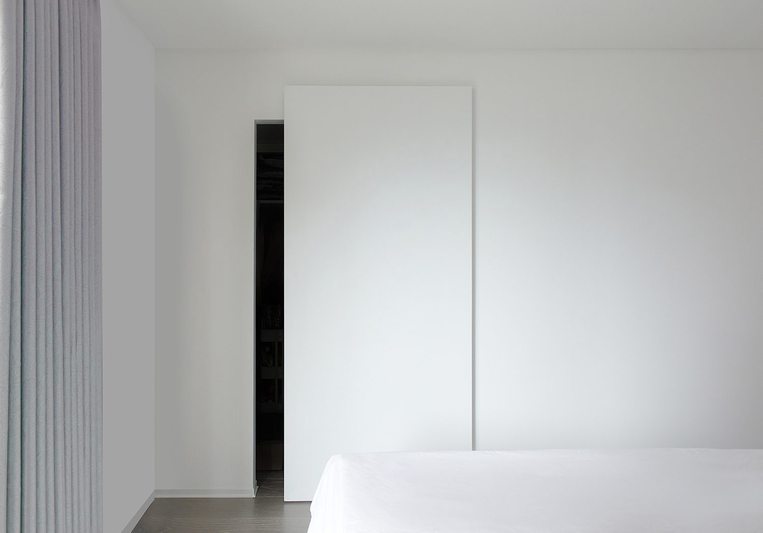
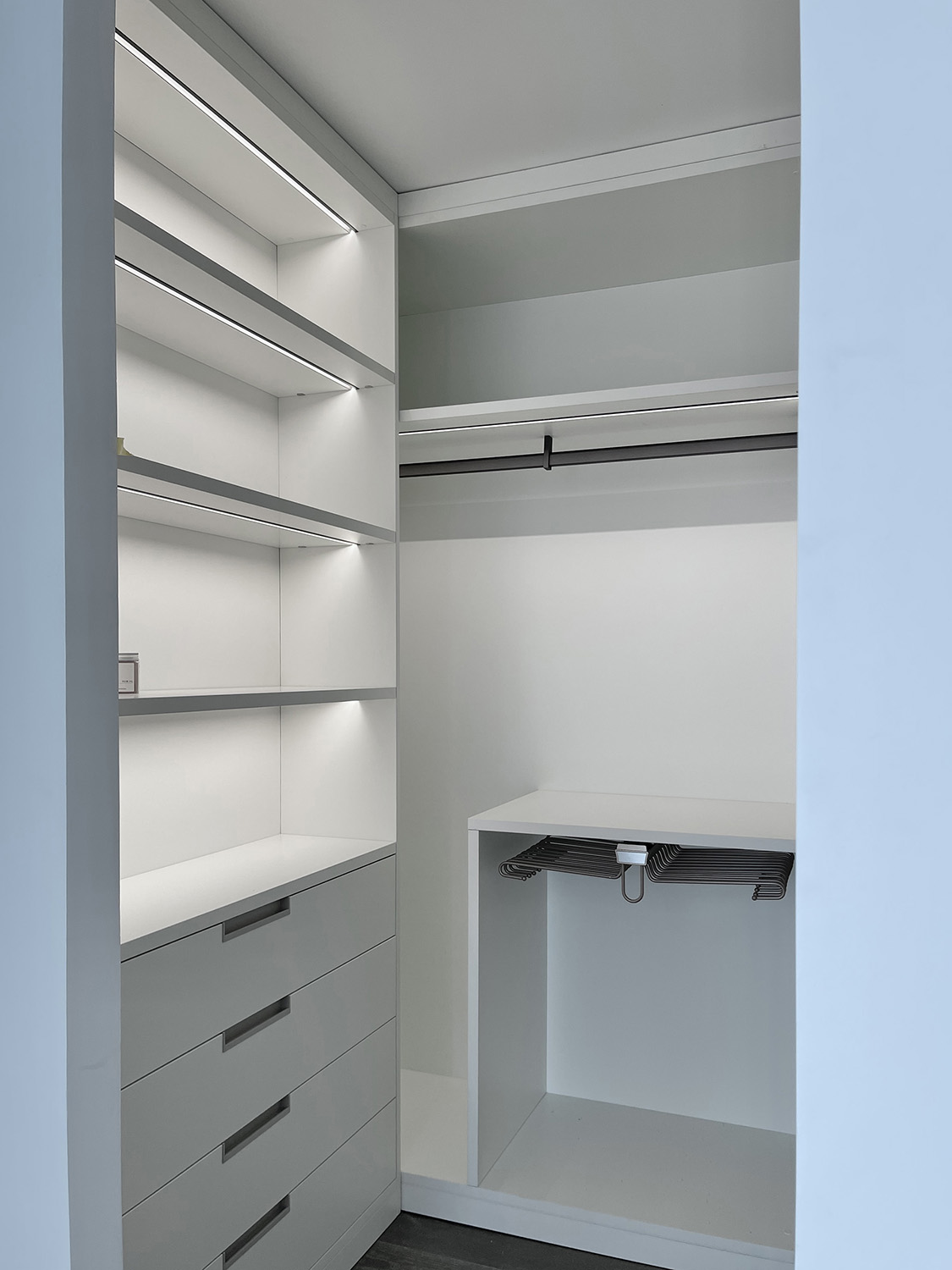
主臥室為男女主人居住的房間,地麵選用灰色木地板,房間整體較為簡潔。為了解決收納問題,設置了步入式衣帽間,配置幽靈門,軌道藏進了門的內側實現了極簡懸浮的效果。衣帽間內部擁有強大的開放式收納係統,完全解決了業主日常生活衣物收納問題。
The master bedroom is a room designed for the male owner and female owner. Gray wood floor is used for paving the floor. The whole room is relatively neat and simple. To solve the storage problem, XIGO STUDIO designed a walk-in cloakroom installed with an orbital stealth door whose track is hidden inside the door, achieving the effect of minimal suspension. Inside the cloakroom, there is a powerful open storage system which completely solves the problem of storing owners’ clothes for daily use.
極致衛浴
Exquisite Bathroom
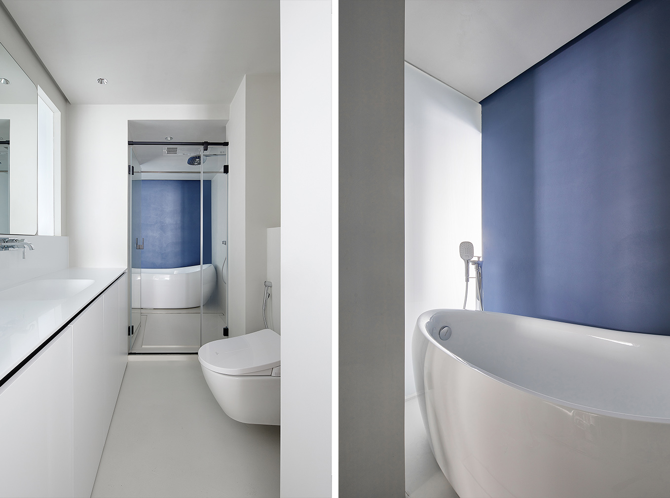
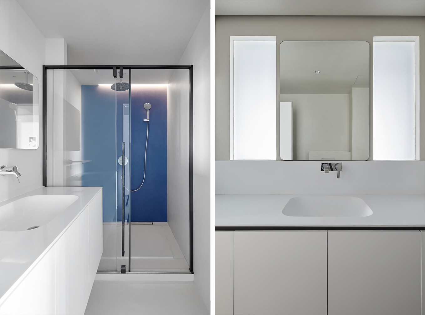
衛浴部分總體分為三個區域,主臥衛生間、客衛生間和獨立洗浴間。衛生間做到了幹濕分離,幹區選用壁掛式馬桶和人造石一體盆,極致無縫。主臥衛生間幹區和濕區都有開窗,搭配長虹油砂玻璃,給予衛生間充分的采光同時材料自身帶有朦朧的曖昧美感。
The bathroom is totally divided into three areas: master bathroom, guest bathroom and independent bathroom. Dry and wet separation is realized in the bathroom. In the dry area, wall-mounted closestool and artificial stone basin are installed, achieving a high-efficiency of seamlessness. Windows are designed both in the dry area and wet area of the master bathroom. The windows, together with the Changhong oil sand glass provide the bathroom with sufficient daylight. Meanwhile the materials used present a hazy ambiguous aesthetic feeling.
∇ 平麵圖 © 戲構建築工作室 Plan © XIGO STUDIO
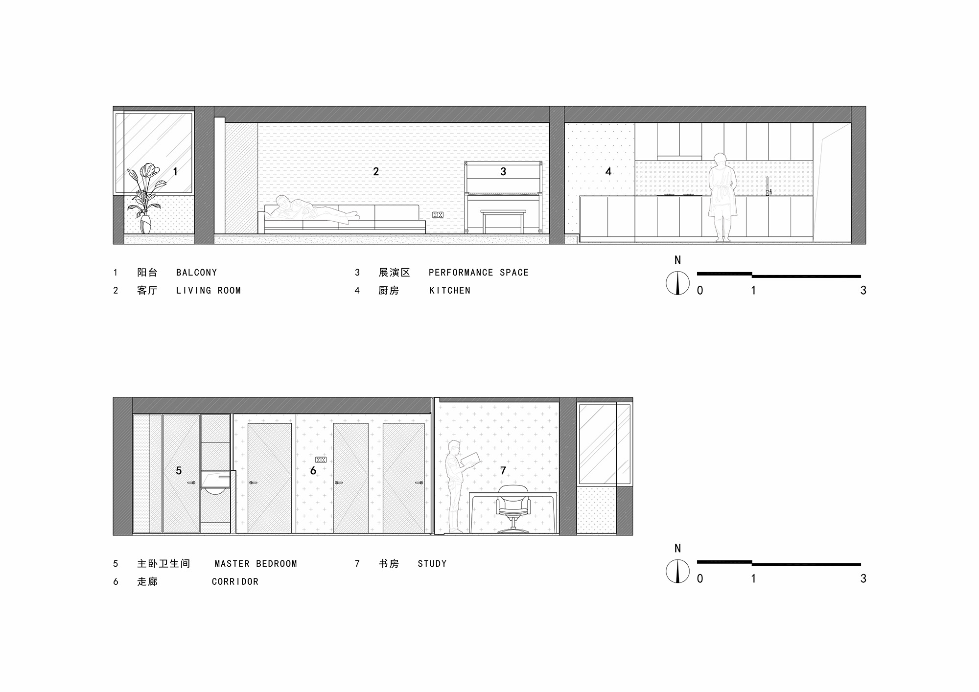
∇ 立麵圖 © 戲構建築工作室 Elevation © XIGO STUDIO
項目信息
項目名稱:原境
項目類型:住宅公寓
項目地址:北京市海澱區紫竹院路
建築麵積:188㎡
設計公司:戲構建築設計工作室
方案主創:劉陽、張藝馨
方案深化:王丹
設計時間:2019年7月-2021年6月
竣工時間:2022年4月
撰文排版:劉陽、於水驕
攝影版權:立明
學術顧問:朱力
施工工長:朱新貴
主要材料:高鋇特樹脂、佐敦漆、德利豐岩板、享木地板
家具軟裝:步川廚房與衣櫃、那裏國際家居Siloni casa、Collectie中古家居
Project Name: Origin Realm
Project Type: Apartment
Project Address: Zizhuyuan Road, Haidian District, Beijing City
Building Area: 188 square meters
Design Company: XIGO STUDIO
Chief Designers: Liu Yang, Zhang Yixin
Scheme Deepening Design: Wang Dan
Design Period: July 2019 – June 2021
Completion of Construction: April 2022
Copywriter and Editor: Liu Yang, Yu Shuijiao
Photo credit: Li Ming
Academic Adviser: Zhu Li
Construction Foreman: Zhu Xingui
Materials: Gobbetto Resin, Jotun Paint, Delfone Rock Beam, and Enjoywood Floor
Furniture: BUCHUAN LIFE · Kitchen & Armoire, Siloni Casa, Collectie Vintage Furniture


