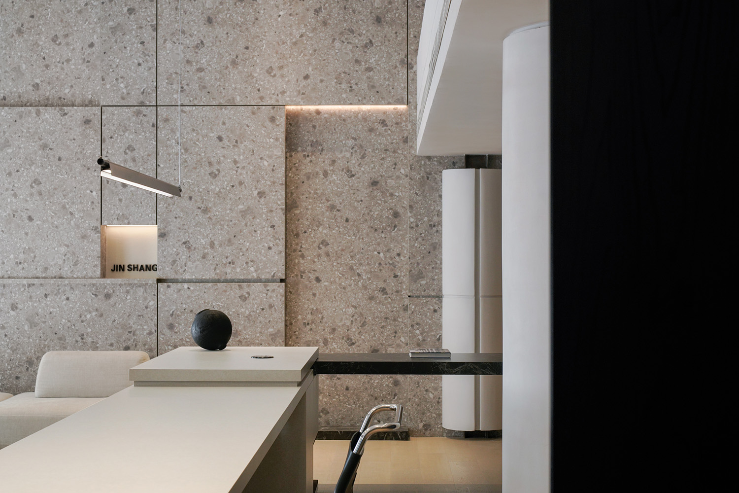
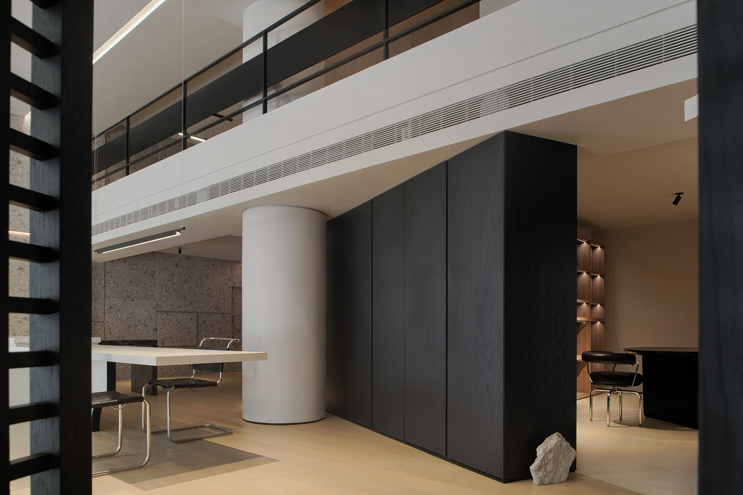
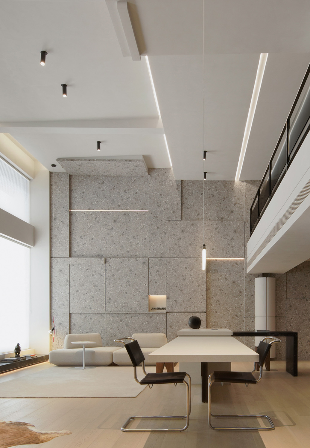
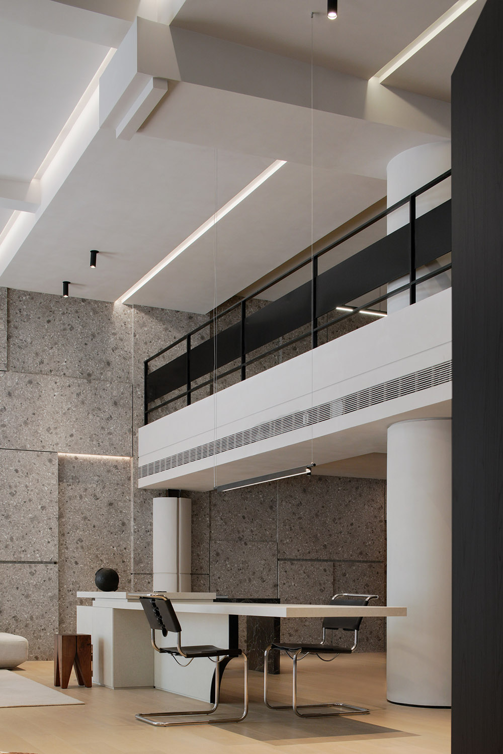
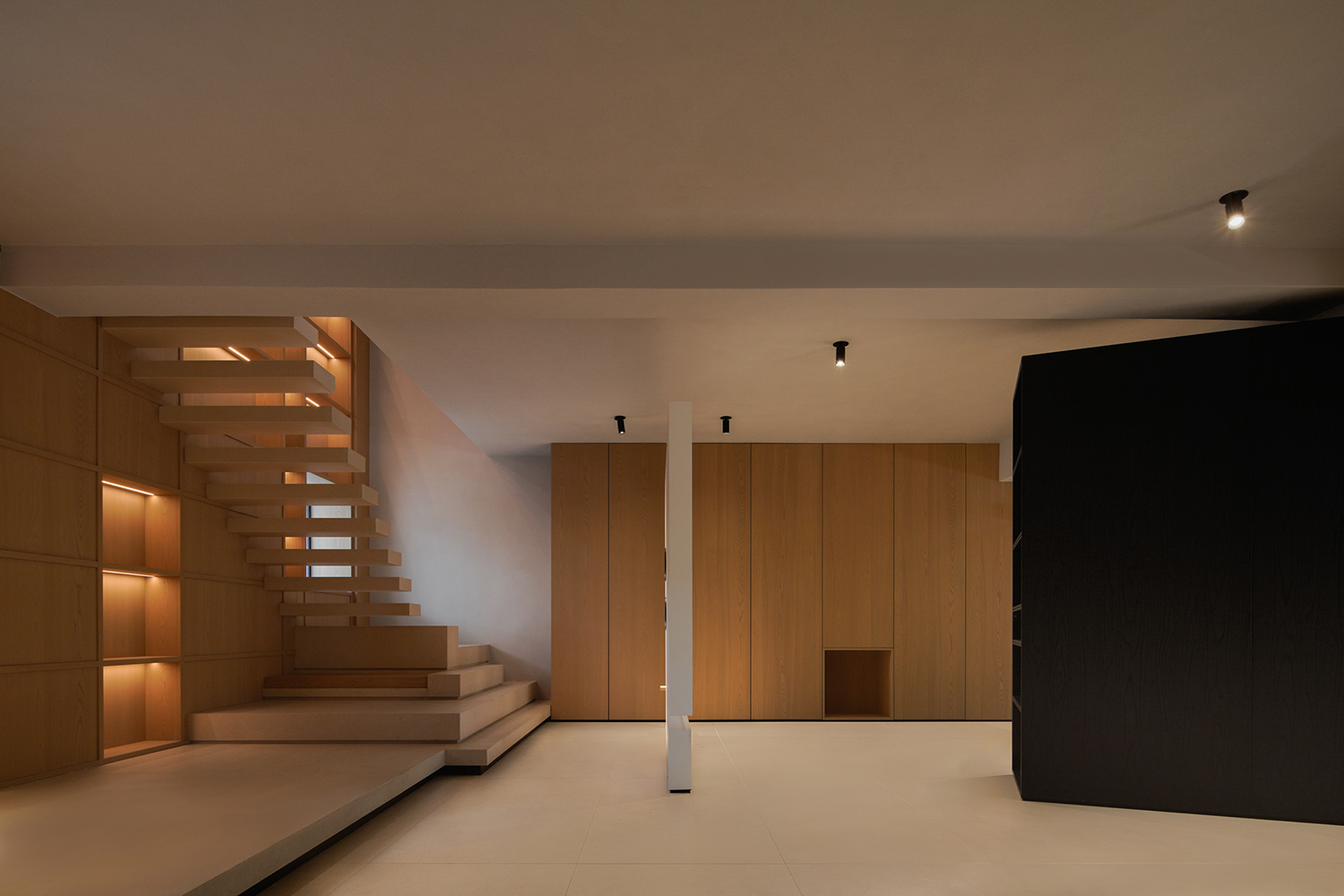
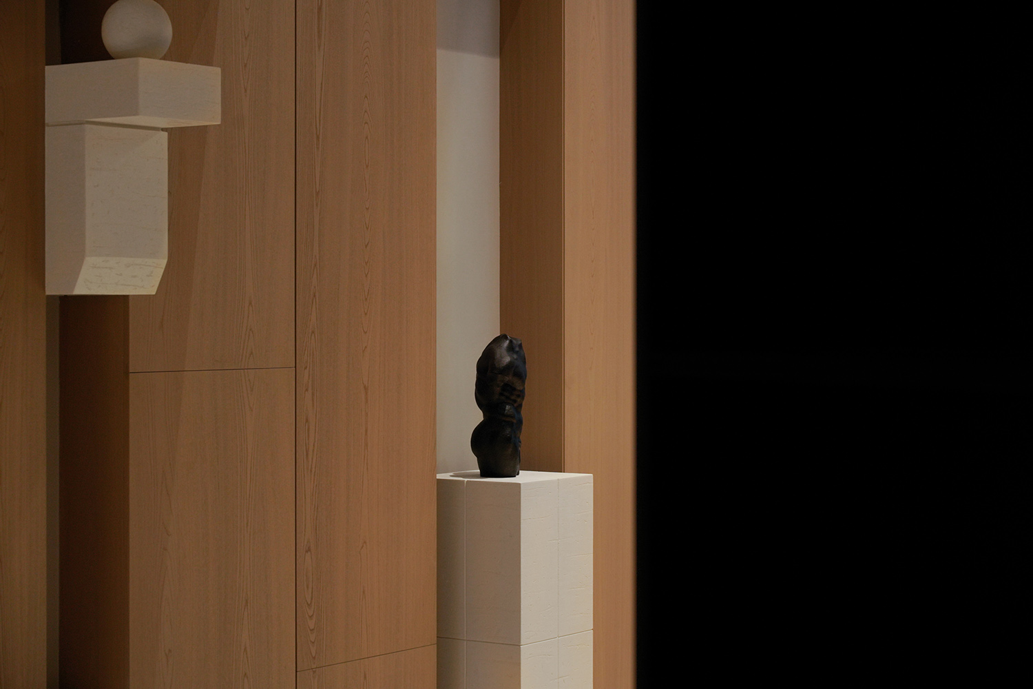
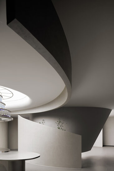
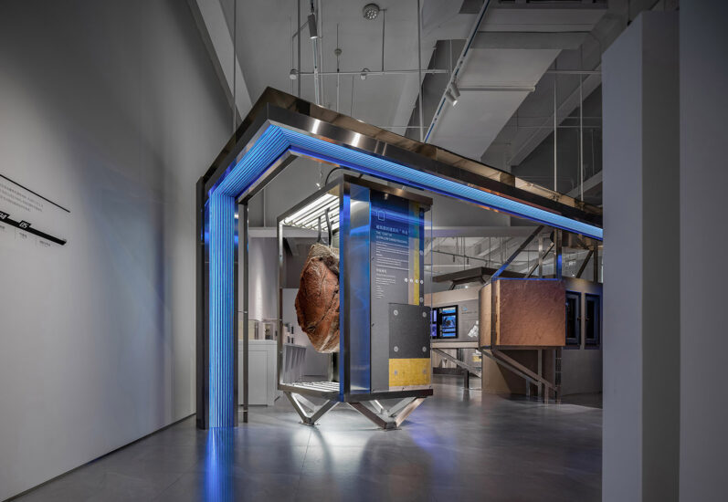
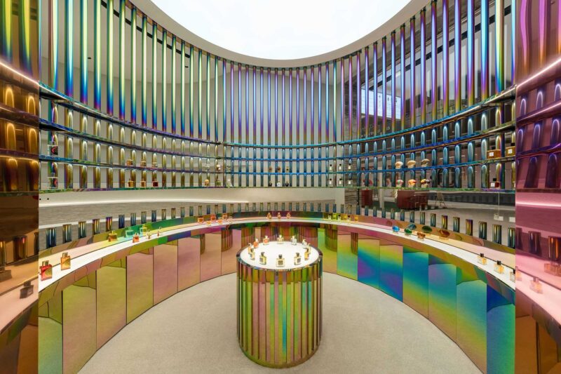
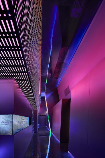
以軸向來定義切分,有結合的引導行為意識
探索事物於不同角度的發散認知,以相對述平化的方式
Explore the divergent cognition of things from different angles, in a relatively flat way
來闡述其內在諸多的複雜可能性,挖掘更多不同的生活方式探討和對人性的再思考,讓空間更具可考究及情感共鳴的建立…
To elaborate its many complex possibilities, explore more different ways of life and rethink human nature, so that the space can be more tractable and the establishment of emotional resonance…
於‘秩序性’
On the order_
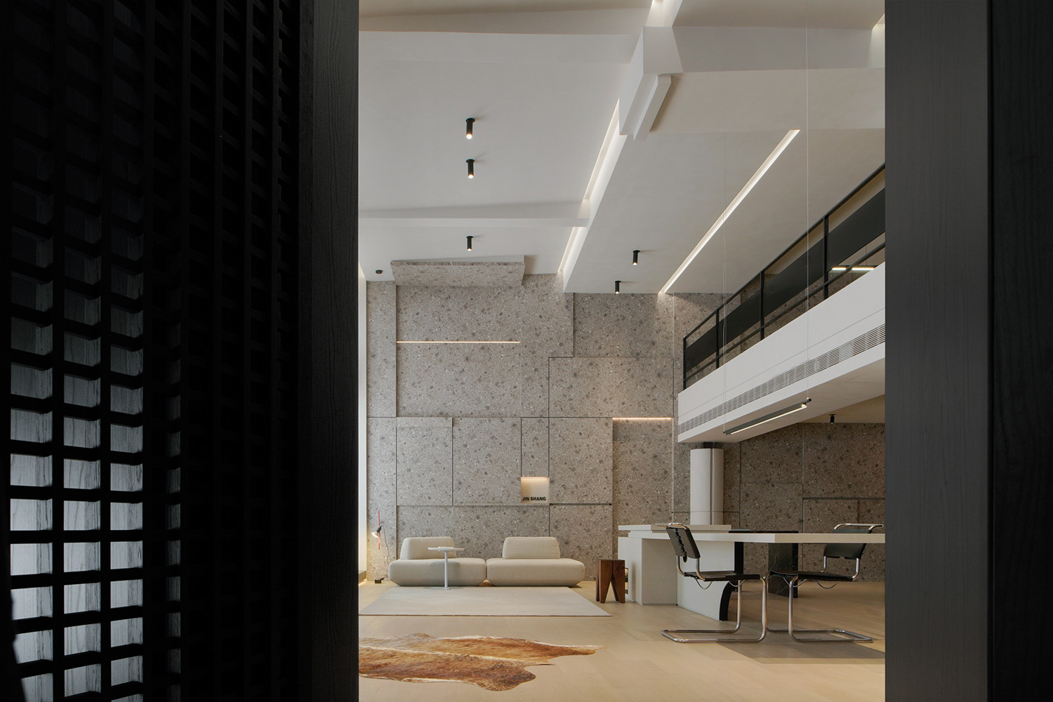
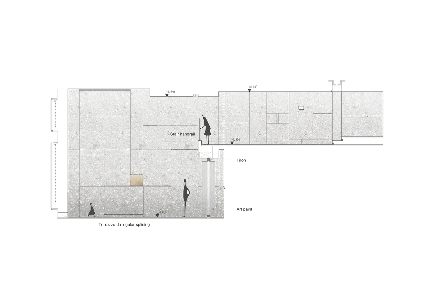
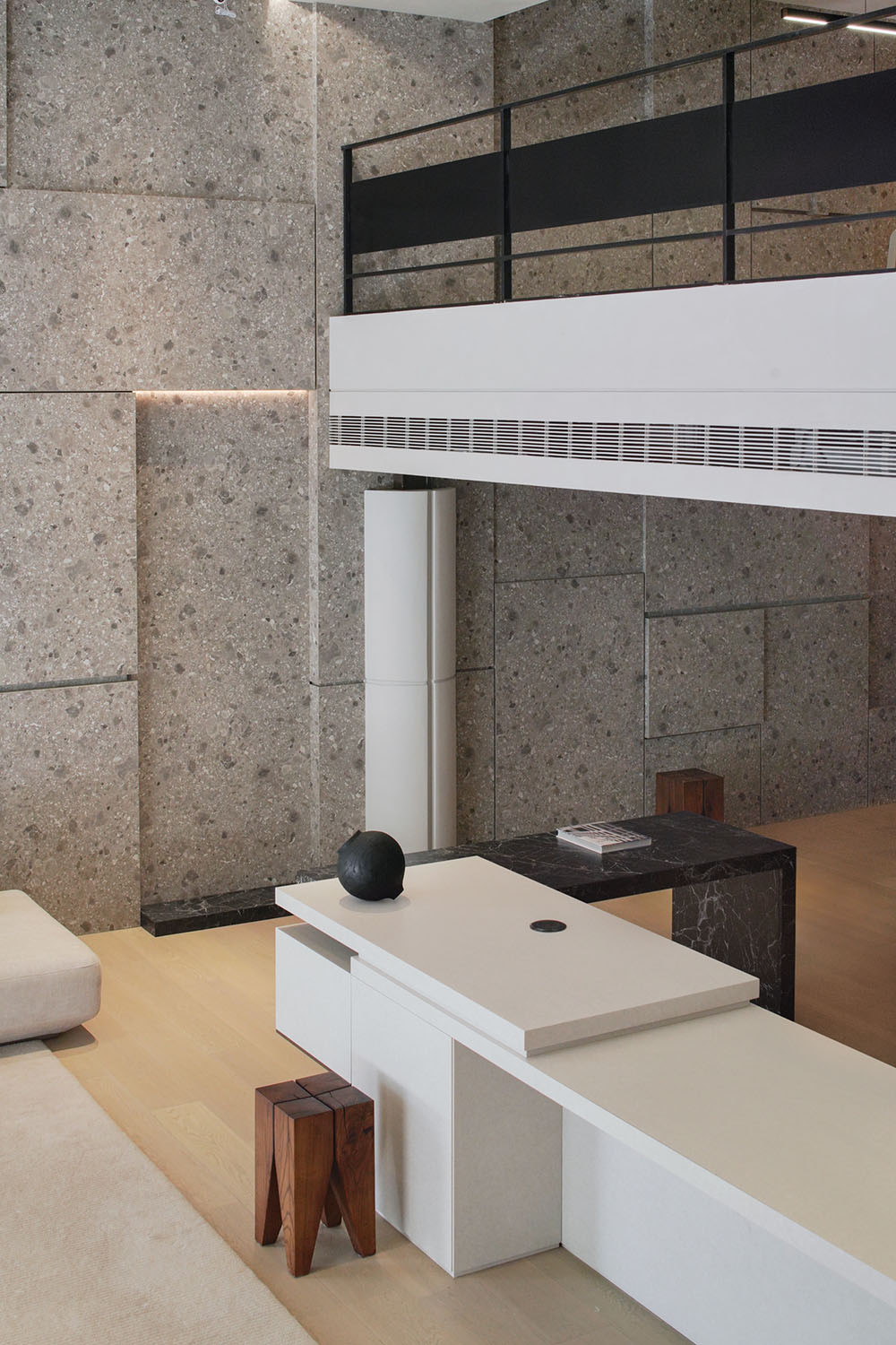
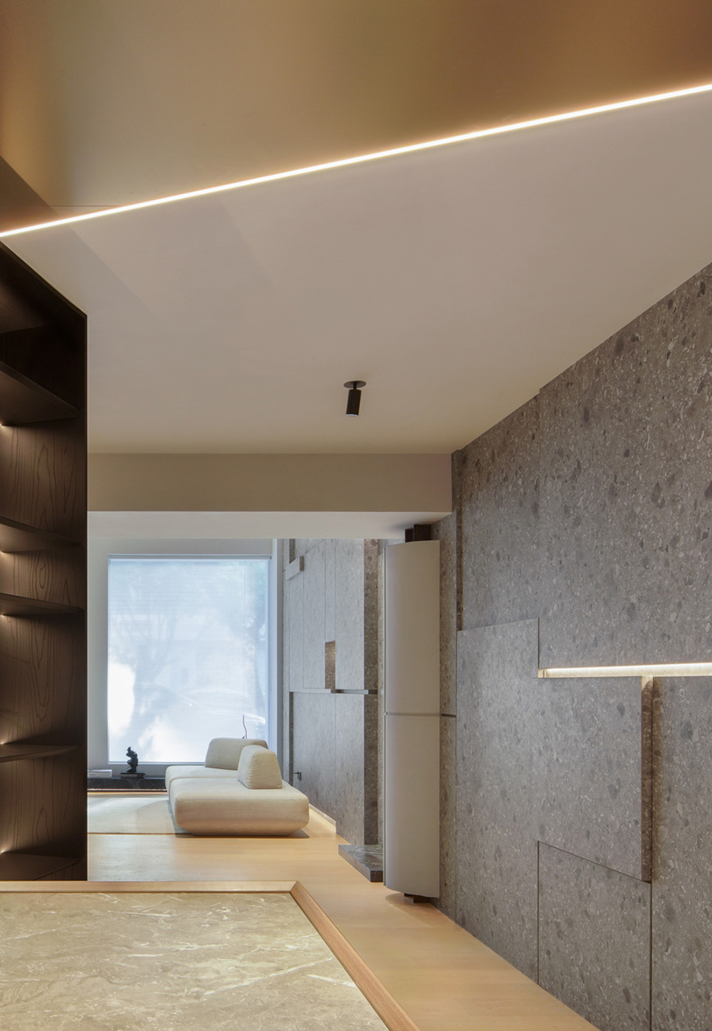
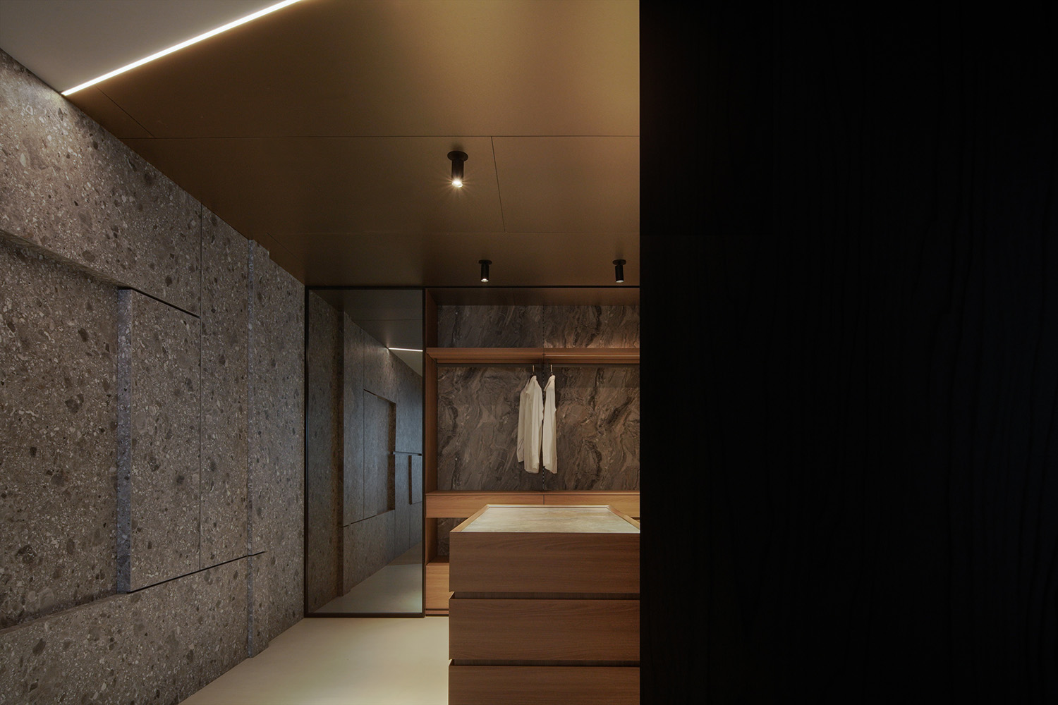
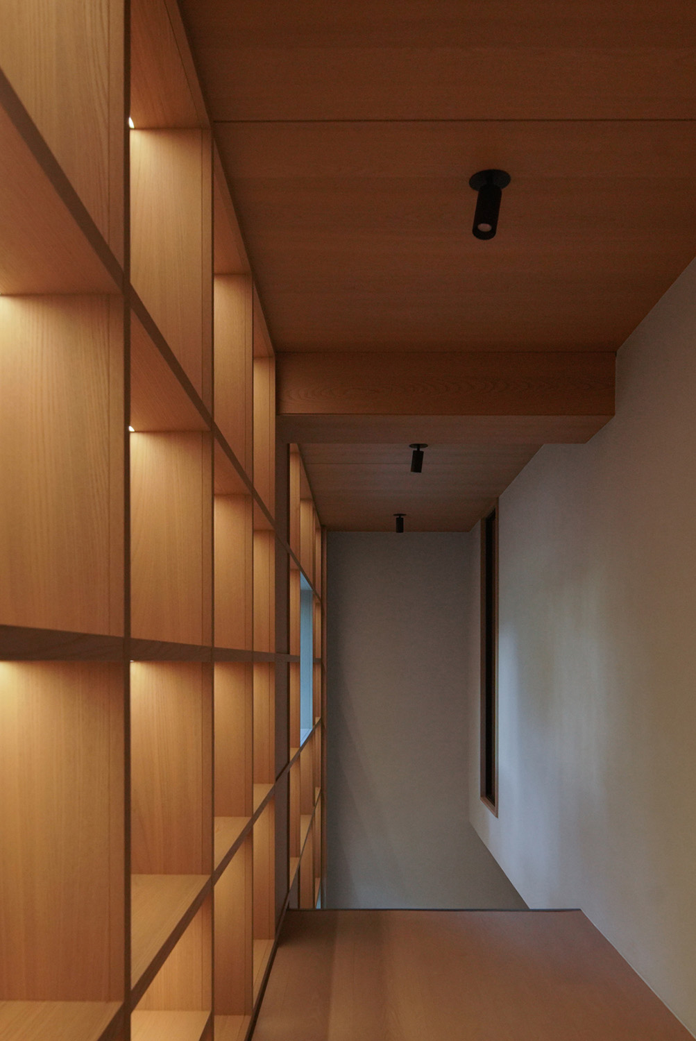
借助內結構脈絡的邏輯梳理,來強化對其‘設計語言’的拆分敘述,以此來建造更多的延伸組合可能性,且反饋到‘木作’本身的體係與其相關的材質過渡及銜接,由此來解說該品牌定位的體係建立,與金屬、與岩板、石材及漆麵工藝…
Use comb structure within the context of the logic, to strengthen the ‘design language of the resolution, in order to build more extended combination possibilities, and feedback to the’ wooden ‘itself system with related material transition and cohesion, which illustrate the brand positioning system, and metal, and the rock, stone material and paint process…
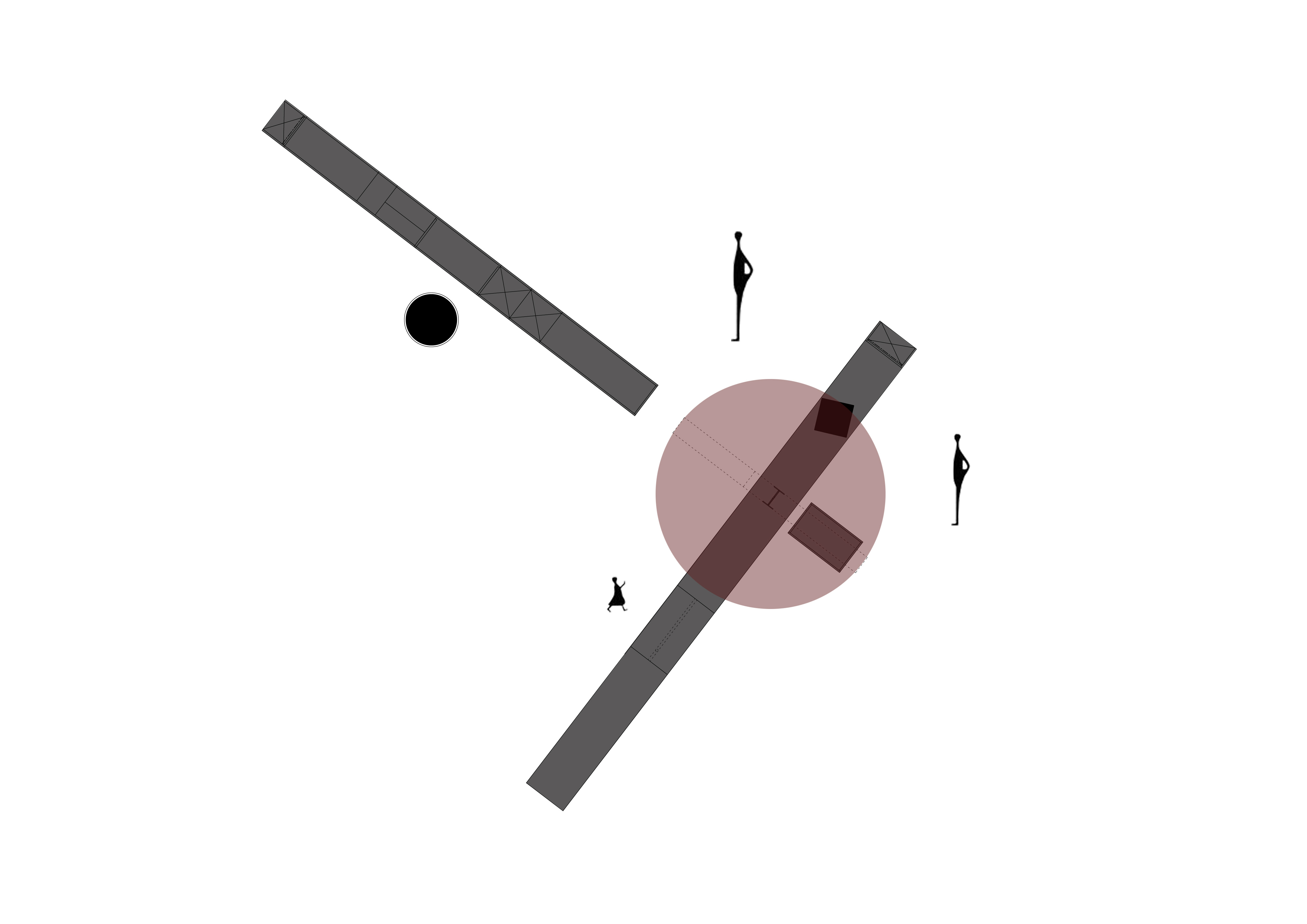
∇ 正視角立麵圖詳
於‘建構性’
On ‘Constructivism’_
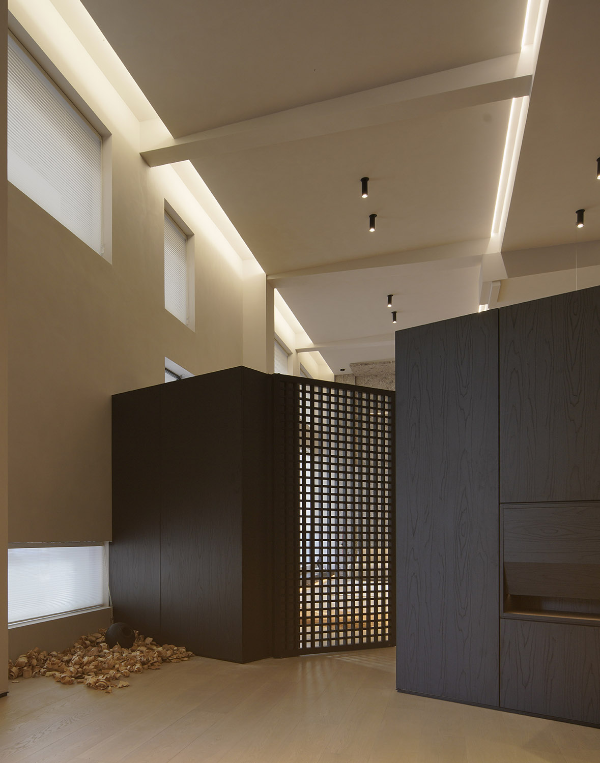
以‘再建構’的方式來作為木作品牌的切入及內部探索,組件的拆分及重組,連貫著單件的組合性,以‘分散’來對應整體的切割依據,擴展各分區的組合構件。
The way of “re-construction” is used as the entry and internal exploration of the wood brand. The split and reorganization of components are consistent with the combination of single pieces. The “dispersion” corresponds to the cutting basis of the whole, and the combined components of each partition are expanded.
於‘情緒空間化’
On ‘Emotion spatialization’_
諸如體驗後的感官變化,同行為於人所延伸的情緒使然,二者的矛盾及碰撞,所製造的思考過程,更貼近體態之中的自然,於空間而暢所己想。
For example, the sensory changes after the experience, and the extended emotions caused by the behavior, the contradiction and collision of the two make the thinking process closer to the nature in the body, and free one’s mind in the space.
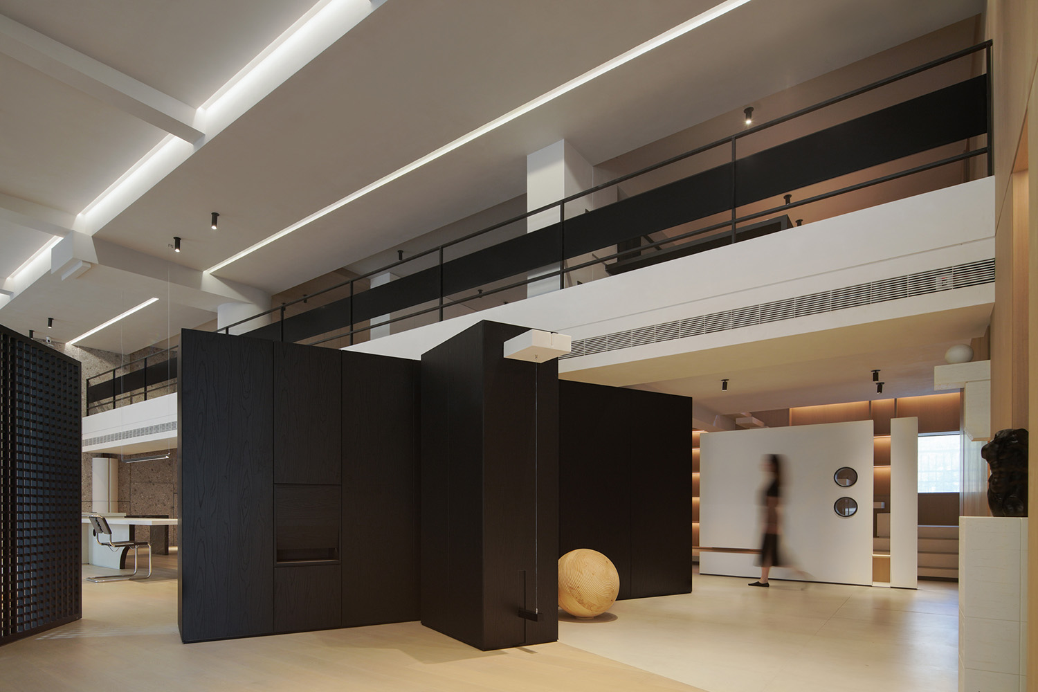
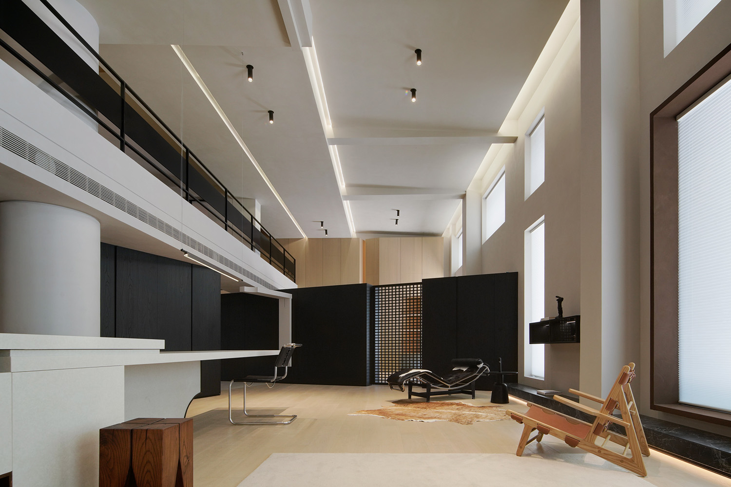
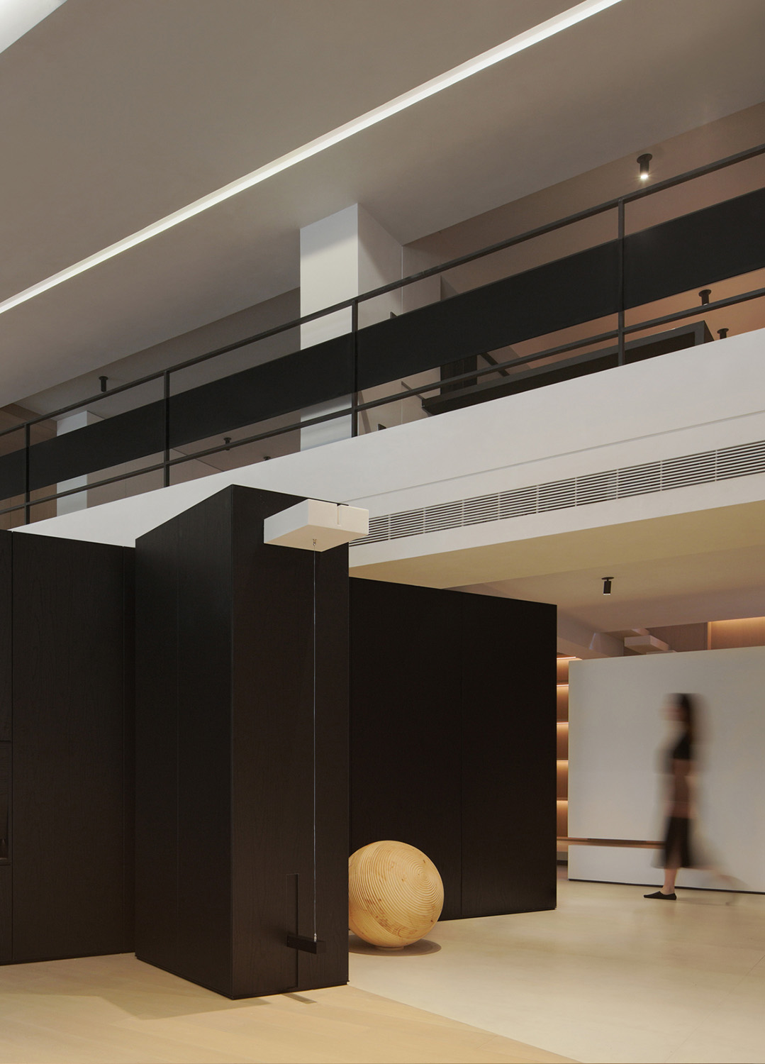
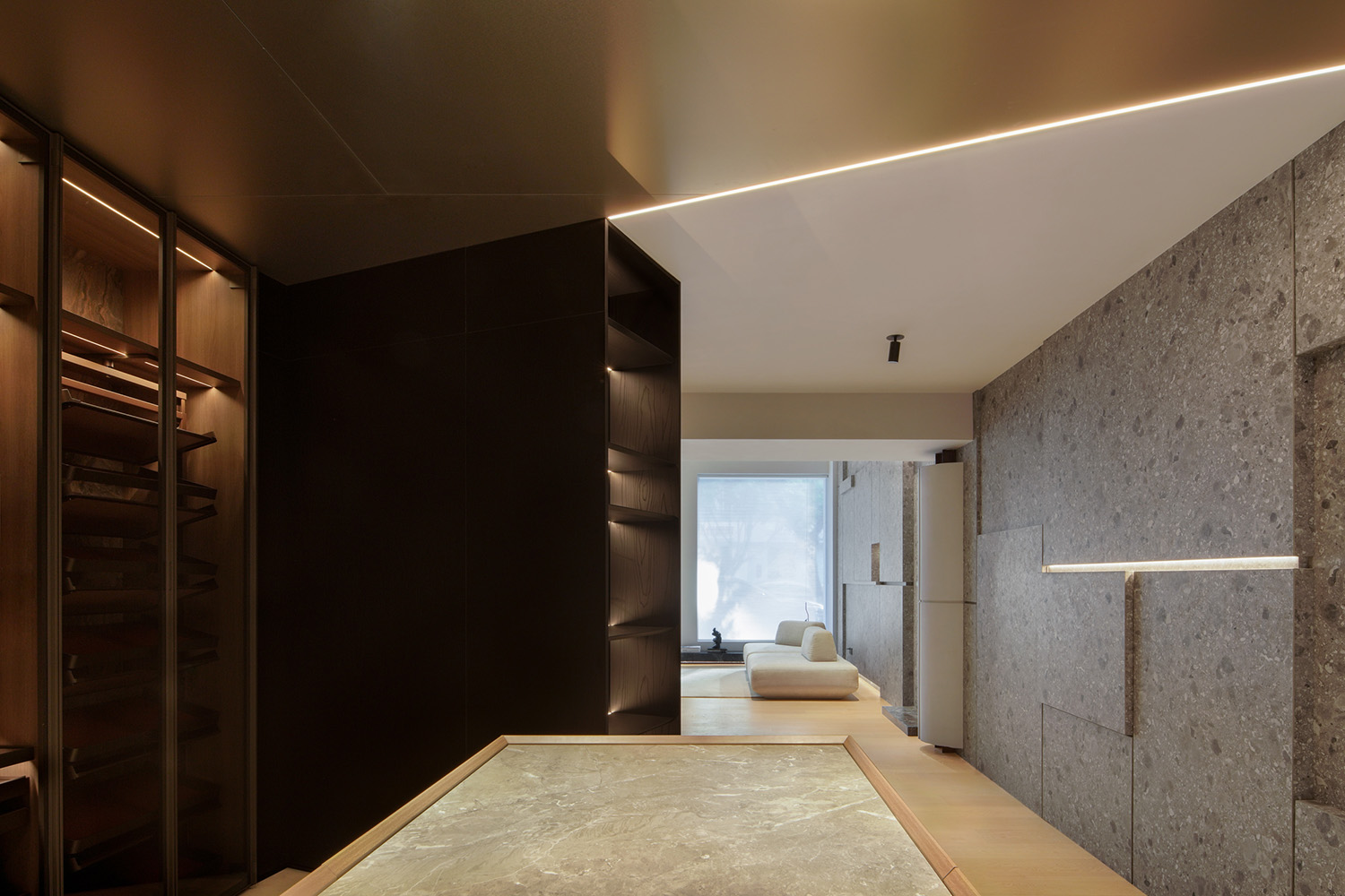
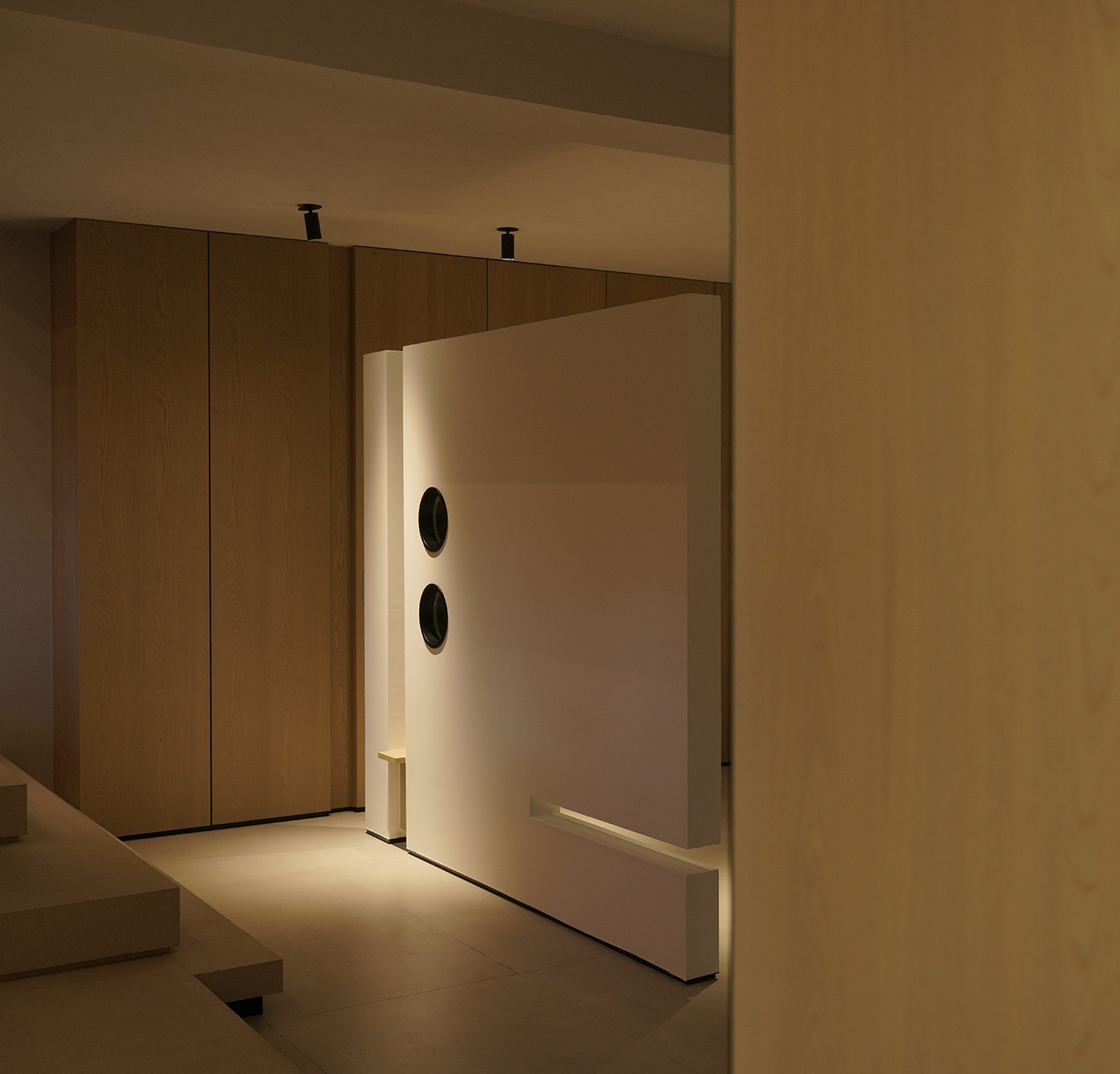
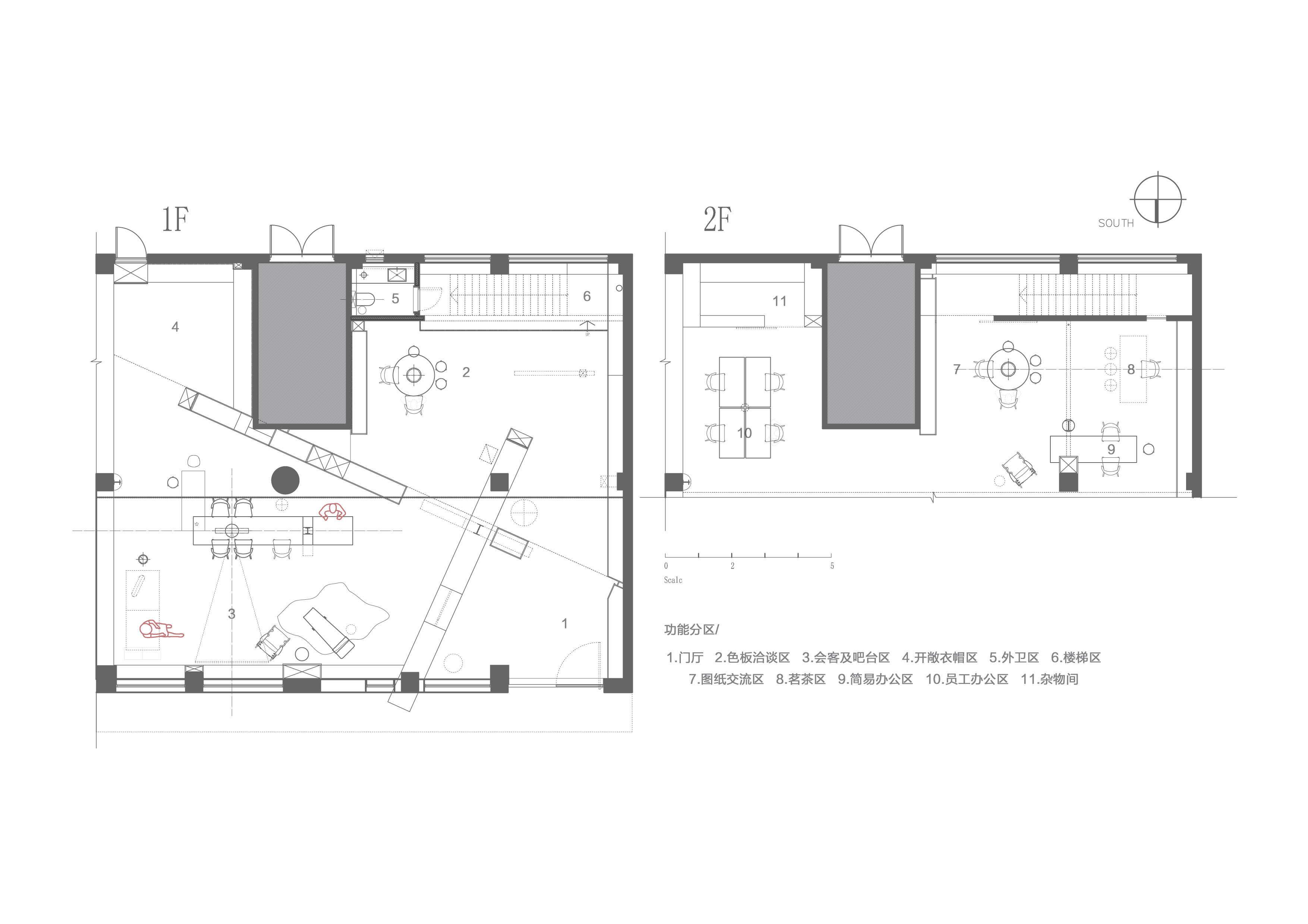
借由‘斜麵’交錯的闊斧切割方式,來分化行為動線的疏導,使其分區的獨立性保留的同時,也可兼具對應緩衝的情緒轉換,交錯的邊界作為動線的環繞分斷。
The “inclined plane” staggered broad axe cutting method is used to divide the routing of the moving line, so that the independence of its partition is preserved, and the corresponding buffer emotional conversion can be concurrently concurrently, and the staggered boundary is used as the wrapping and breaking of the moving line.
於‘結構組合’
On ‘Structure Combination’_
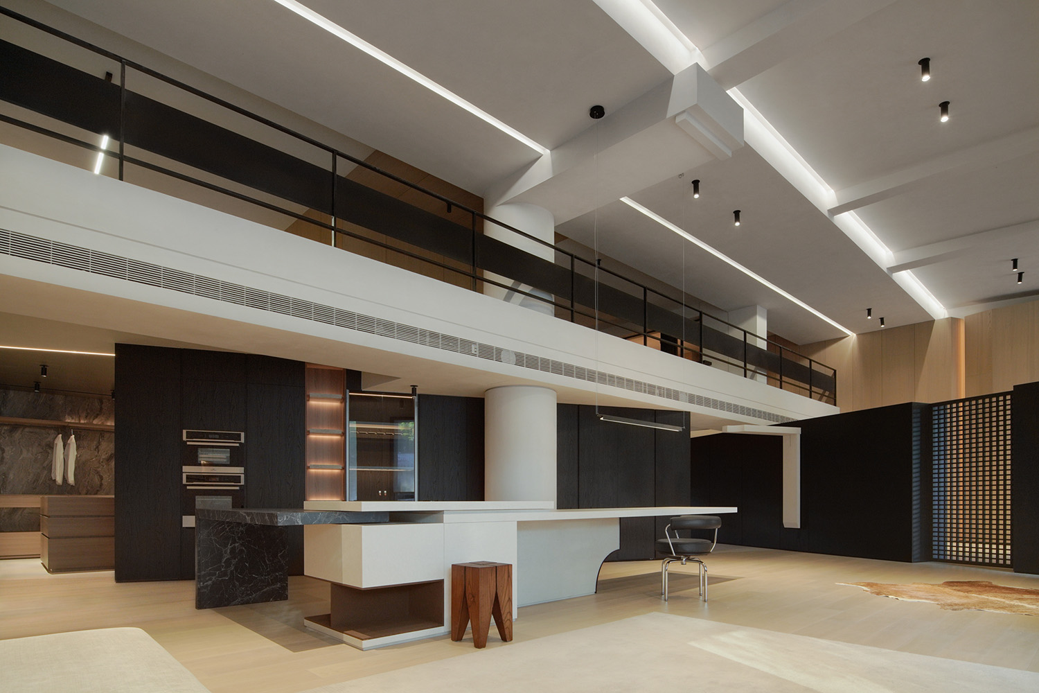
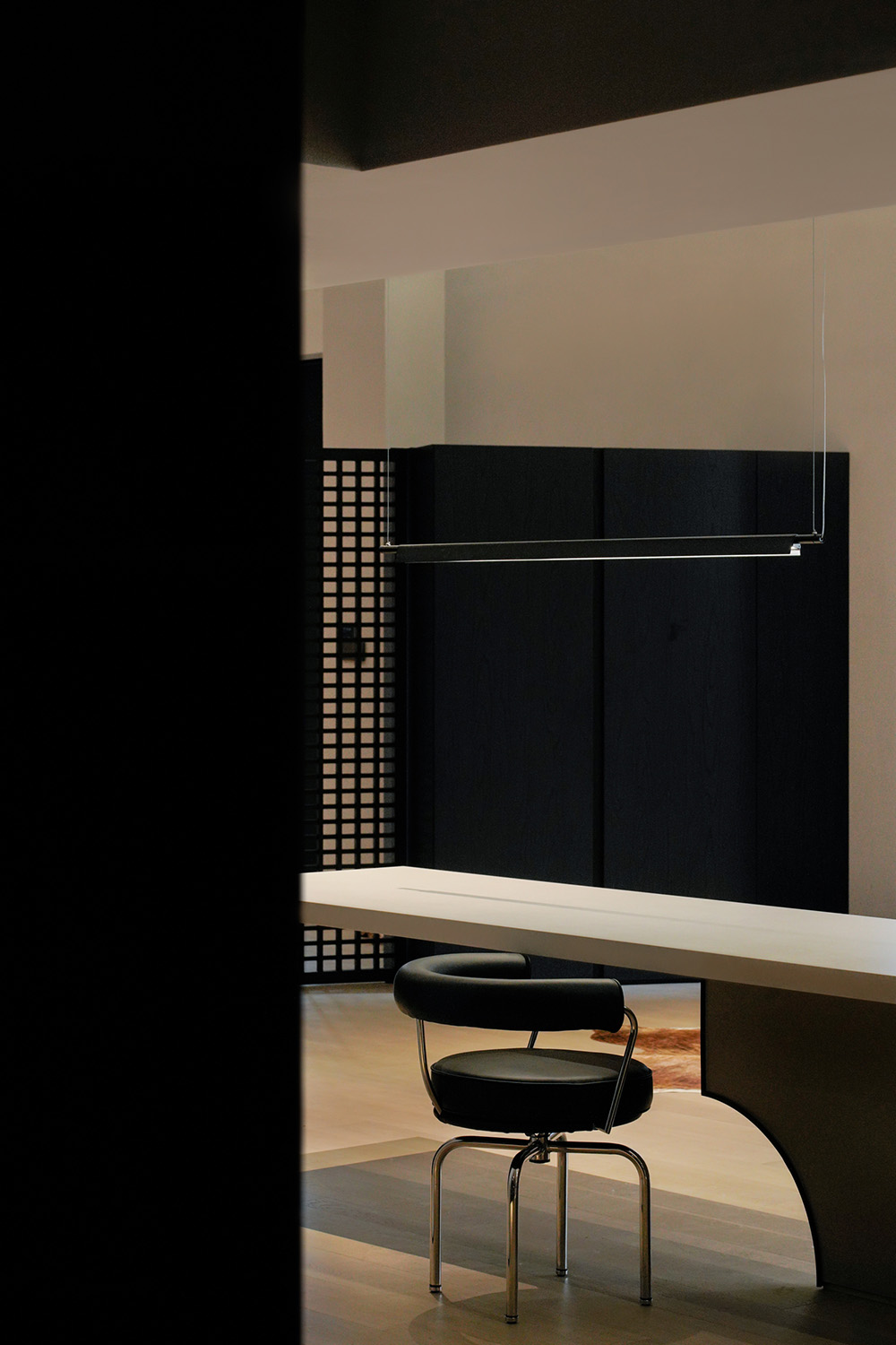
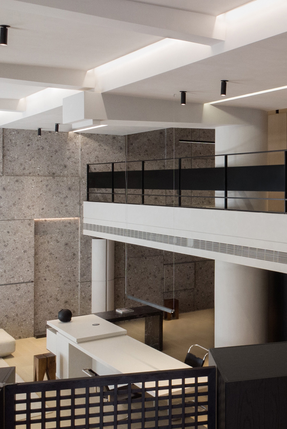
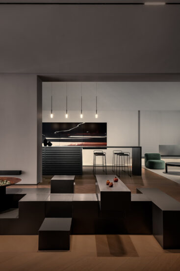
讓‘中吧台’作為動線緩衝及交際互動的中心,與相鄰功能分區互成交流之勢,再對於其‘本身’進行拆分,借助形體的多樣變換來處理體塊之間的重合關係,來顯現物件本身的多樣化呈現。
The ‘middle bar’ serves as the center of moving line buffer and communication interaction, forming a potential for communication with adjacent functional zones. Then the ‘itself’ is split, and the overlapping relationship between the blocks is processed with the help of diverse transformation of forms, so as to show the diversified presentation of objects themselves.
‘前序’
‘before the order’_
在溝通之初,在與甲方就項目的定位及立案來展開溝通時,如何讓現有的產品體係更好的與空間格局融合?是甲方特別重視的點位之一,又想拋開傳統定義上的分區套分區,及以背景裝飾為轉換麵的功能產品形式,且加入更好的入店體驗度及人與人之間更多的互動交流性。對此,在前端基於分區的展示形式,也羅列了很多的對應空間素材形式來溝通展開…
At the beginning of communication, when communicating with Party A about the positioning and filing of the project, how to make the existing product system better integrate with the spatial pattern? It is one of the points that Party A attaches special importance to. It also wants to put aside the traditional definition of zoning and zoning, and use background decoration as the conversion surface of functional products, and add better in-store experience and more interaction between people. In this regard, in the front based on the partition of the display form, also listed a lot of corresponding space material forms to communicate and expand…
“對於該品牌來講,他們深知客戶到店之後的體驗及感受是至關重要的,同樣的產品置於不同的環境內,所對應的呈現和感官是完全不同的,這也是未改造之前的銷售痛點。包括市場於不同時間段下的風格傾向趨勢,原本最初的產品出樣體係已不能滿足客戶到店之後的產品體驗及對於諸多點位的認同,再者結合當下年輕客群的年齡層轉換,對於產品的考究也更為全麵。”
“For this brand, they know that the experience and feeling of customers after coming to the store is very important. The same product in different environments will have completely different presentation and senses, which is also the sales pain point before the transformation. Including the style trend of the market in different periods of time, the original product sampling system can no longer meet the customer’s product experience and recognition of many points after coming to the store. Moreover, combined with the age change of the current young customers, the product research is more comprehensive.”
於‘軸稱式’
On ‘axis scale’_
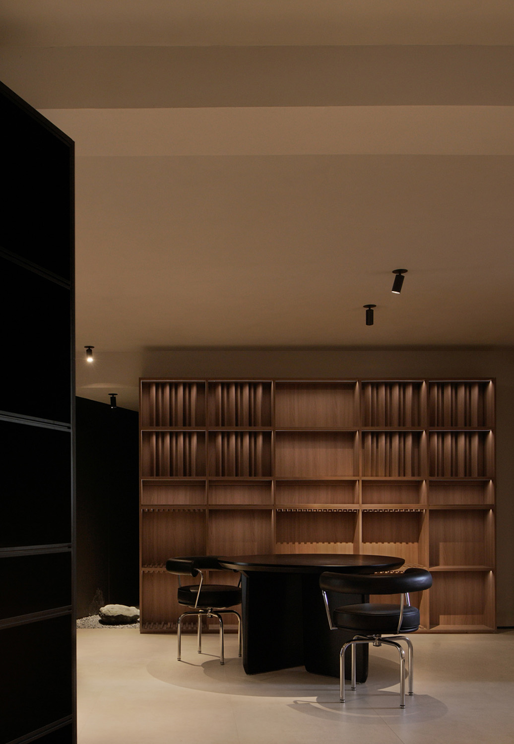
以‘軸向’來作為定義空間分區的切分樞紐,結合軸端的兩向延伸點來界定功能區麵的劃分,再通過獨立的位麵形式來區隔視線的交錯,引導其行為的自然發生狀態…
“Axial direction” is used as the dividing hub to define the spatial partition, and the functional plane is divided by combining the two extension points of the axial end. Then the staggered line of sight is separated by the independent plane form, and the natural occurrence state of its behavior is guided.
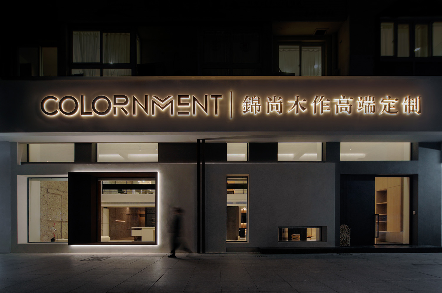
出於以上的種種的綜合考量,該品牌決定在原有的基礎上,擴展自己更多的優勢(理念、美學觀感及工藝的多樣化體現),包括對於‘COLORNMENT’品牌的雙向優勢疊加,以此來擴展自身更多的對內探索,基於對工藝及多樣化的設計要求,來配合到項目空間的精準落實。
Due to the above comprehensive considerations, the brand has decided to expand more of its own strengths (diversified reflection of ideas, aesthetics and techniques) on the original basis, including in relation to the bidirectional advantages of the brand ‘colorin relation’, in order to expand its own internal exploration, based on the requirements for techniques and diversified design. To cooperate with the precise implementation of the project space.
於‘插序’
In ‘insertion order’_
其更強調直覺的重要性,最初的構思往往源自於現場
的特質所激發的直覺,而構思的主件明晰、發展、成熟則需要時間。對於自己而言,並不存在通向成功的創作捷徑,而是在形象、空間秩序的直覺和結構、功能及環境等更為具體的因素之間,存在著一個來回往複運動的過程。在這一過程中,人的思維方式並不是線性的,而以曲線或‘之’字形迂回的方式,這是一種更為綜合的方式。這種非線性的思維對任何可能的情況都是開放的。–阿爾瓦羅.西紮
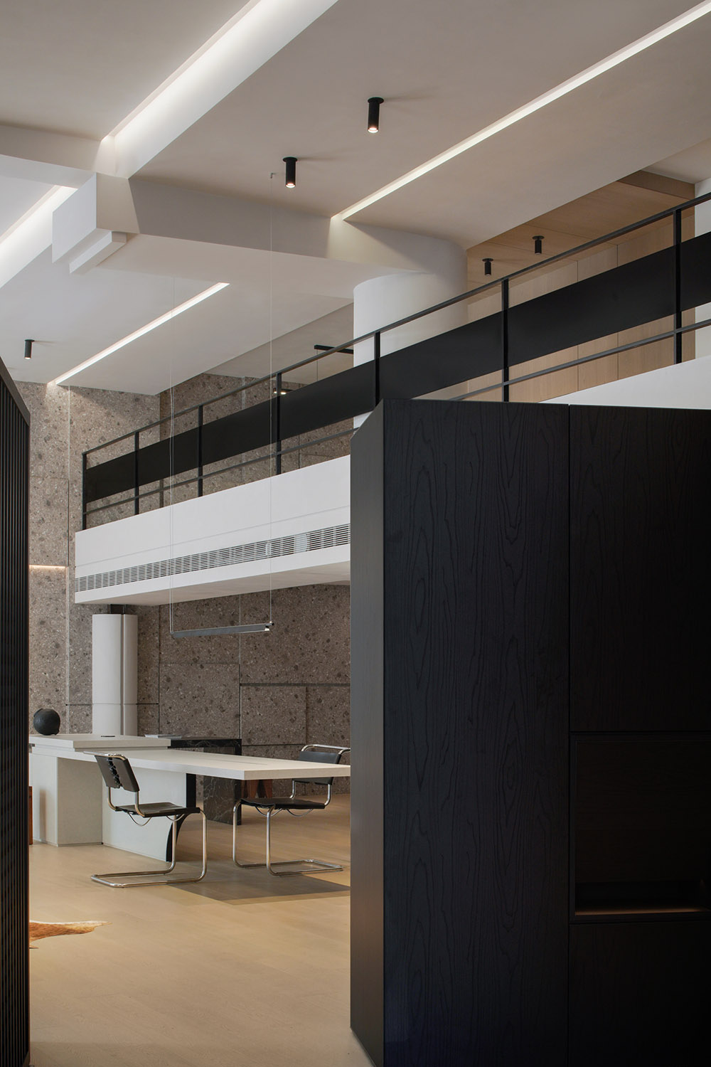
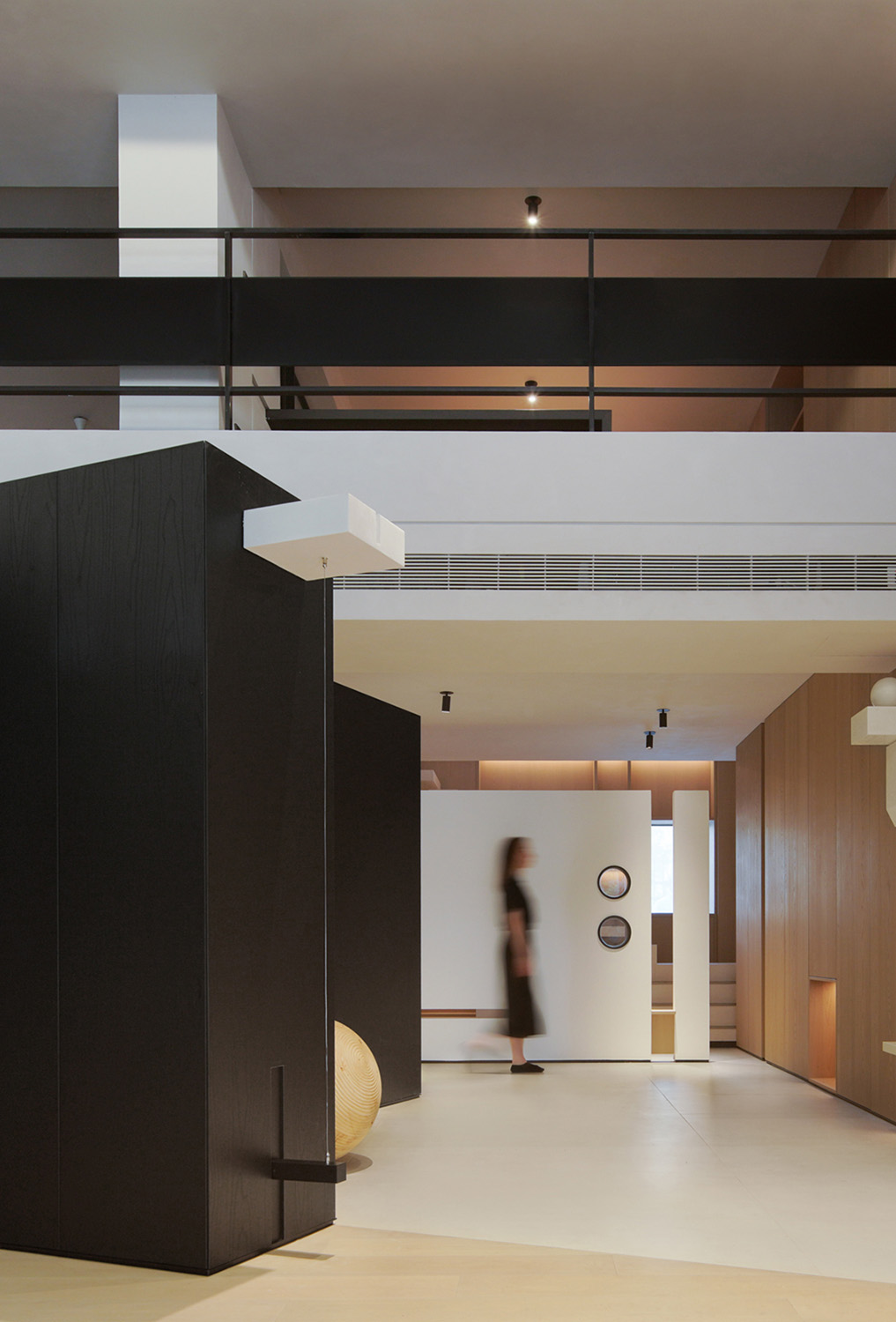
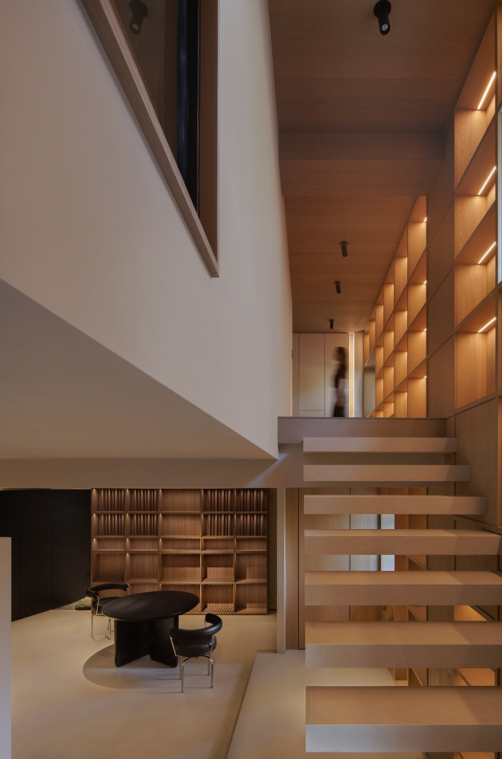
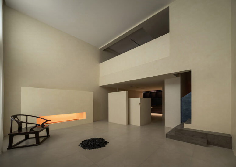
考慮1F為主要展示分區,樓上均作為內部團隊使用,故在分段樓層高度的階段,把更舒適的視覺感受給到了底層,2F以滿足極限高度為準,確保正常的動線分隔及使用感受。
Considering 1F as the main display area, the upstairs is used by the internal team, so in the stage of dividing the floor height, more comfortable visual feeling is given to the ground floor, 2F is subject to the limit height, to ensure normal moving line separation and use feeling.
以‘產品模塊化’的形式來組合變換可能性的呈現,再通過設計語言的引導至分斷區域的過渡,以此來作為連接相鄰分斷區位麵的整體統一性。
The presentation of transformation possibility is combined in the form of “product modularity”, and then the transition to the breaking area is guided by the design language, so as to connect the whole unity of adjacent breaking area.
∇ 平麵圖
項目信息
項目名稱:木作(錦尚)展廳改造
Project name: Woodwork (Jinshang) renovation of the exhibition hall
項目地址:浙江省,溫州市,瑞安市
Project Address: Ruian, Wenzhou City, Zhejiang Province
主創及設計團隊:隹聿設計工作室
Creative and design team: Zhui yu Studio
工程負責:雲尚名居_林華友
Project Manager: Yun Shang Mingju _ Lin Huayou
建築麵積:240 m²
Building area: 240 m²
主持設計師:蘭斯,林思思
Host designer: Lance Lindsey
設計參與:王利勇,曹建豪,滕蓓蕾,湯晴一,季勇強
Design participants: Wang Liyong, Cao Jianhao, Teng Beilei,Tang Qingyi, Ji Yongqiang
項目完成時間/ 2022.7
Project Completion Time / 2022.8
攝影單位/ 雲眠攝影工作室
Photography unit/Yunmian Photography Studio


