對商業空間而言,會員中心的意義在哪裏?
Where the significance of the VIP Lounge lies for commercial space?
∇ 圖據網絡
很多年前,全球許多著名零售商如沃爾瑪、IKEA、亞馬遜等看到了“會員經濟”背後的潛在價值,紛紛建立自己的會員體係,負責商場會員的管理及組織。
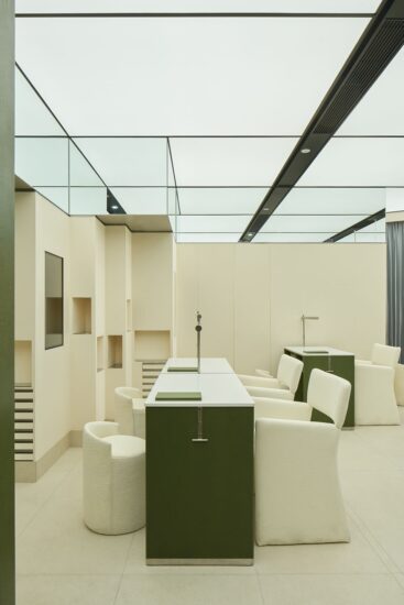
技術服務商為商場提供的數字化解決方案裏都有圍繞會員展開的喚醒、召回計劃。作為實體商場,特別對中高端項目而言,會員中心(VIP Lounge)作為與會員建立緊密連接、實力寵粉的空間載體,無疑是重要一環。可以說,會員中心是商業空間的大勢所趨,更是對未來市場拓展、人脈延伸都有著深遠的影響。
Many years ago, various famous retailers worldwide, such as Walmart, IKEA, Amazon, etc., uncovered the potential value behind the “VIP economy” and set up VIP systems to manage and organize VIPs of their malls.
The VIP-oriented wake-up and recall programs are included in the digital solutions offered by technology service providers. For physical malls, especially for mid-to-high-end projects, the VIP Lounge, as the space carrier, is undoubtedly an integral part of establishing a close connection with VIPs and bringing benefits to them. The VIP Lounge is the general trend of commercial space, and it also has a profound impact on the future market expansion and the extension of connections. As it is, VIP Lounge is the development trend of the commercial space, exerting a profound influence on the future market expansion and the extension of connections.
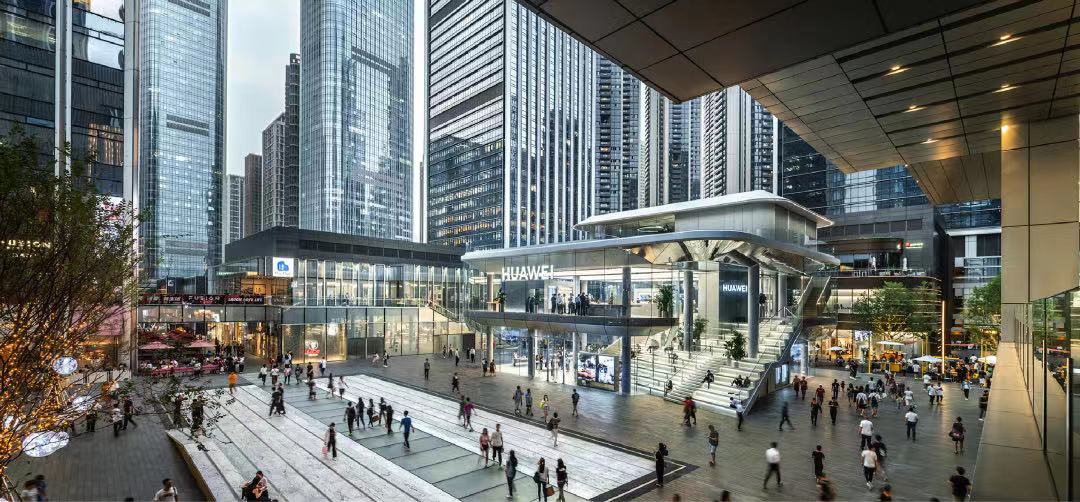
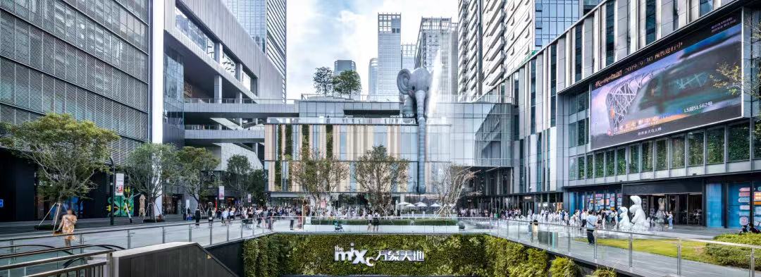
深圳 · 萬象天地 SHENZHEN MIXC WORLD
基於商業價值 以包容的姿態去設計
∇ 圖據網絡
圈層的媒介 THE MEDIUM OF CIRCLES
做會員中心的首要目的,是為商場導流、促進會員增長、鏈接圈層、鞏固人脈,最終指向可持續、有增量的交易的產生。所以其首要任務,是對顧客的“導”和“引”。
The primary purposes of a VIP Lounge are to attract clients, increase the number of VIPs, link circles, consolidate connections, and ultimately realize sustainable incremental transactions. Therefore, the primary task of the VIP Lounge is to conduct outbound and inbound marketing strategies.
它作為“高定私人空間”,我們應思考作為臨時性場所所的互動性與與場景化功能。其受眾群體的藝術認知度、視覺偏好傾向“高級”“個性”等主觀特質,對此空間要“包容”,要有開放的視角去求同存異,攬闊所有場景與故事。
The VIP Lounge is a private commercial advanced customization space, so interactivity and scenes are the top priorities in our consideration. “High-end” and “personalized” art and visual preference characteristics are more easily recognized by the target audience. Given that, designers should design the space with an inclusive attitude, and seek common ground while preserving differences from an open perspective, thus enabling clients to unfold various scenes and stories in the space.
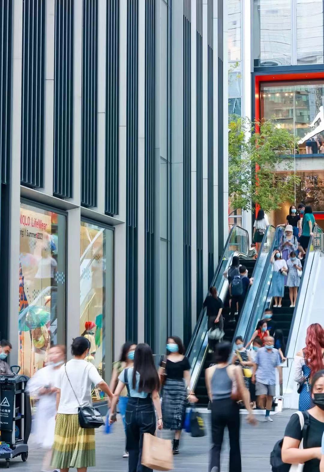
在某種程度上,深圳 · 萬象天地可以看做是深圳商業藝術的一個縮影。它不同於傳統商業體,在物質消費之外,增強了藝術化、生活化的視角追求。
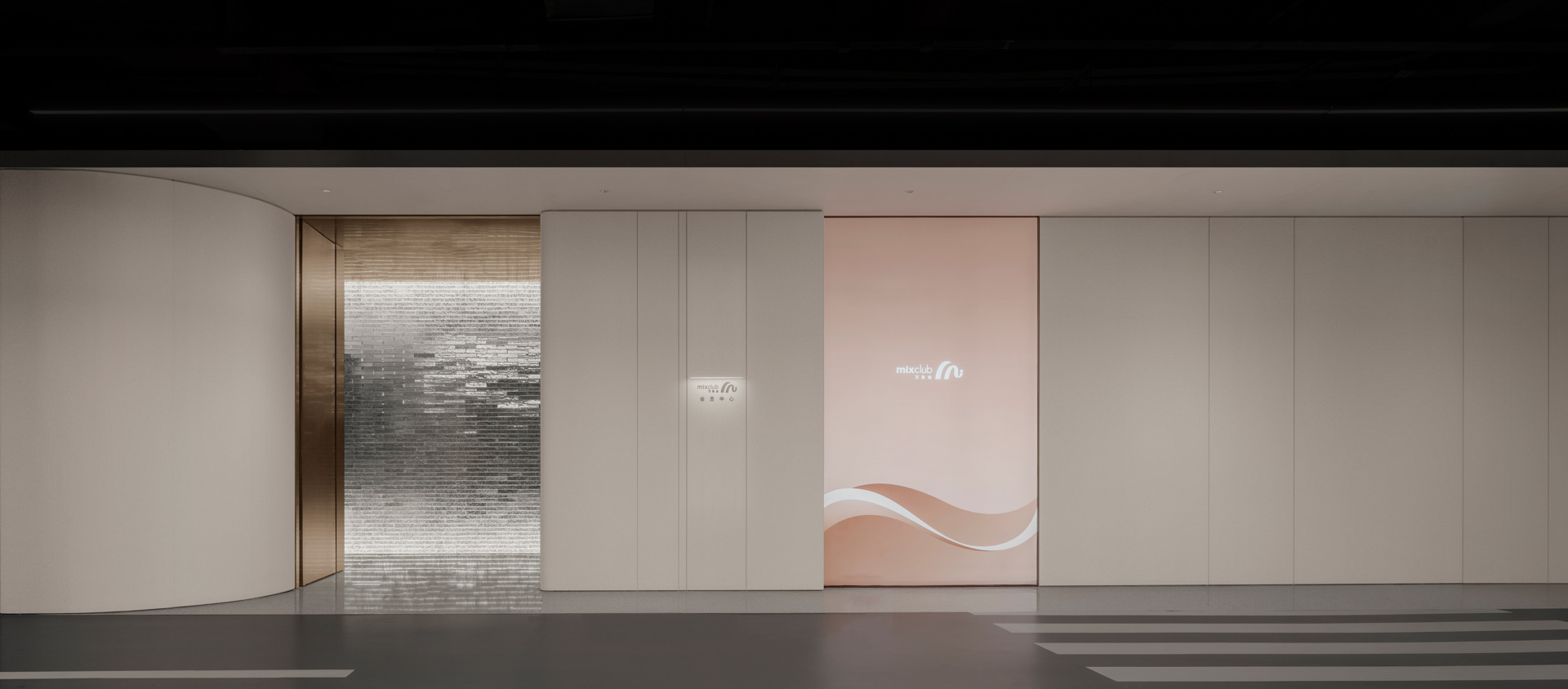
會員中心位於商場L1層,麵積300㎡。EK DESIGN 異開設計與WOW DECO沃屋陳設分別擔綱此空間的硬裝及軟裝設計,在萬象天地會員中心展現出外在內核都與眾不同、精致靈活的一麵。
To some extent, Shenzhen·The Mixc is the epitome of commercial art in Shenzhen, which differs from the conventional commerce complex. Apart from physical consumption, it highlights the pursuit of art and life.
The VIP Lounge is located on the mall’s first floor, with an area of 300 square meters. EK DESIGN and WOW DECO are responsible for the hard and soft decoration designs, respectively. With their efforts, the uniqueness, exquisiteness, and flexibility of the Mixc VIP Lounge are fully unfolded, both at its core and in its appearance.
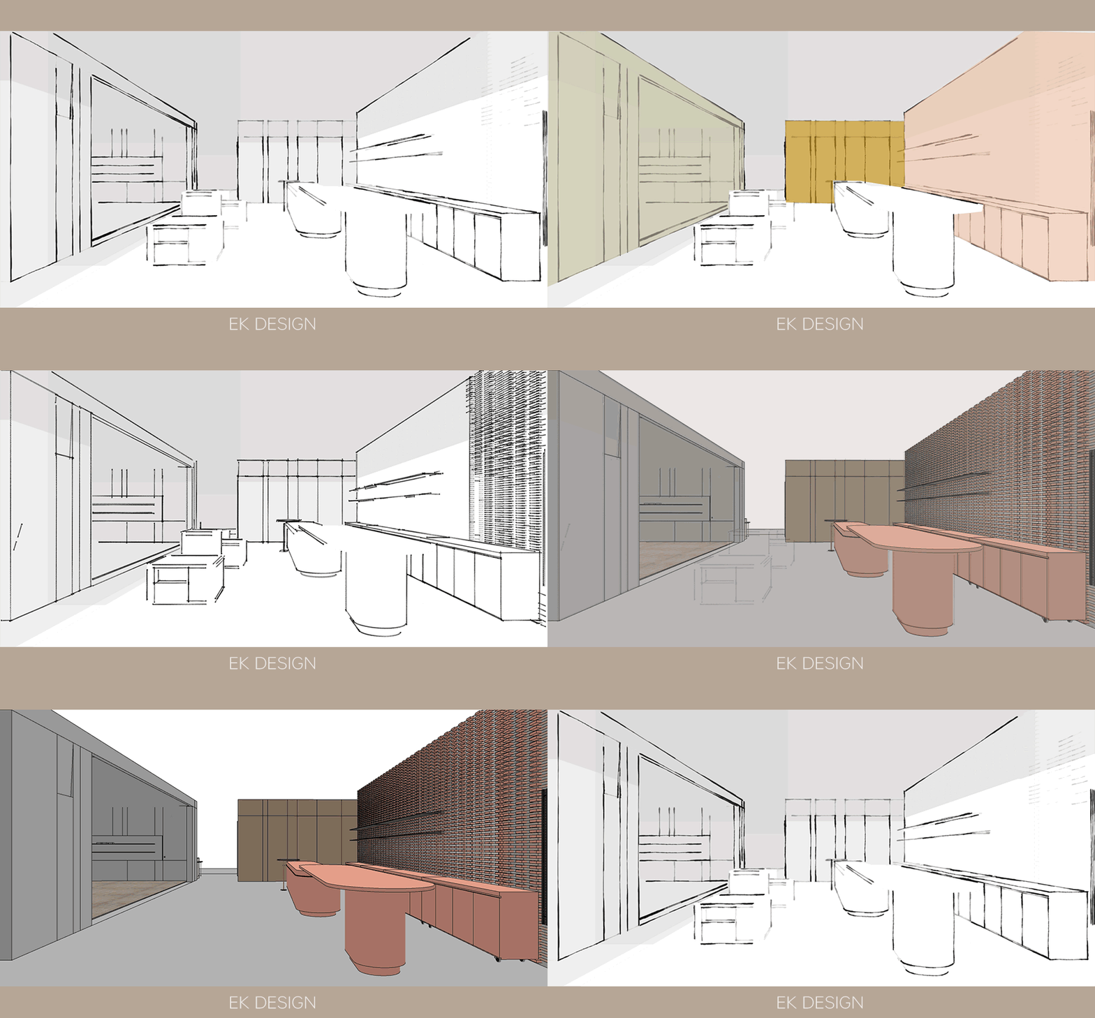
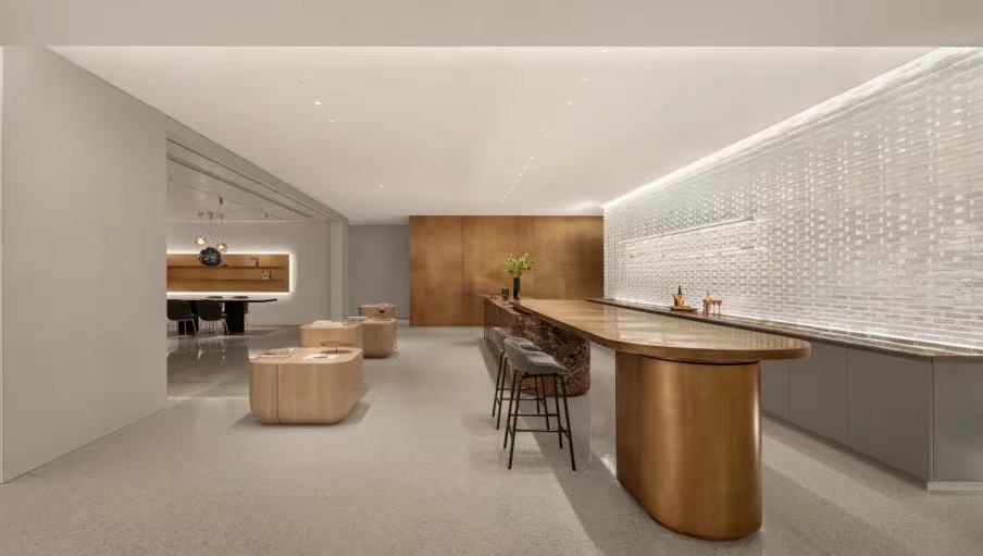
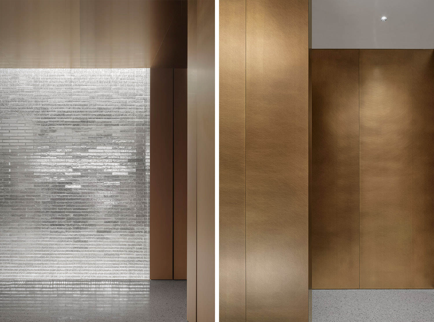
我們將主體大空間視覺用“體塊感”的概念統領。每個體塊由黃銅、玻璃磚等“盒子”渲染圍合,不同的功能區對應不同的基礎方塊,同時順延客戶的行進動線,層層遞進。
The concept of “module” dominates the main space. Each module is enclosed by a “box” built with brass and glass bricks. Different functional areas correspond to different basic modules. At the same time, the space design also follows clients’ incremental and progressive movement line.
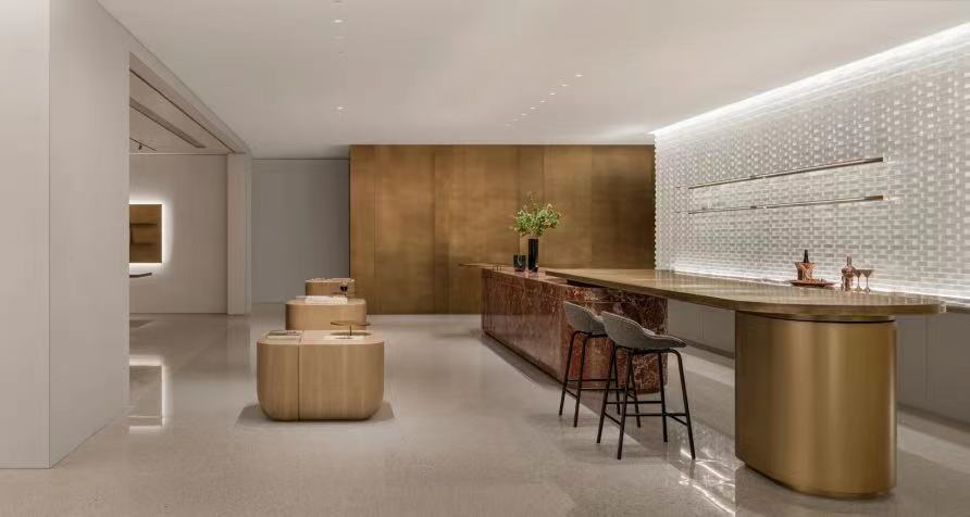
每個體塊的色澤材質都根據場景功能作出區分,帶來不同的視覺感受:入口及水吧格局開放且作為核心區,玲瓏剔透的視覺引領精致的尊享感;洽談區人群作為空間主角,所以模塊留白,促進深度溝通。
The color and material of each module are distinguished according to scene functions, shaping different visual experiences: The entrance and water bar serve as the core area with an open pattern. The dainty and exquisite vision creates a sense of delicacy and exclusiveness. In the communication area, people are the protagonist of the space, so the blank-leaving in this module is designed to promote in-depth communication.
“肌理”在視覺形式上體現為二維的“麵”,而“組合”體現在三維的“體”。
The two-dimensional “plane” reflects the “texture” of the building visually, and the three-dimensional “body” reflects the “combination”.
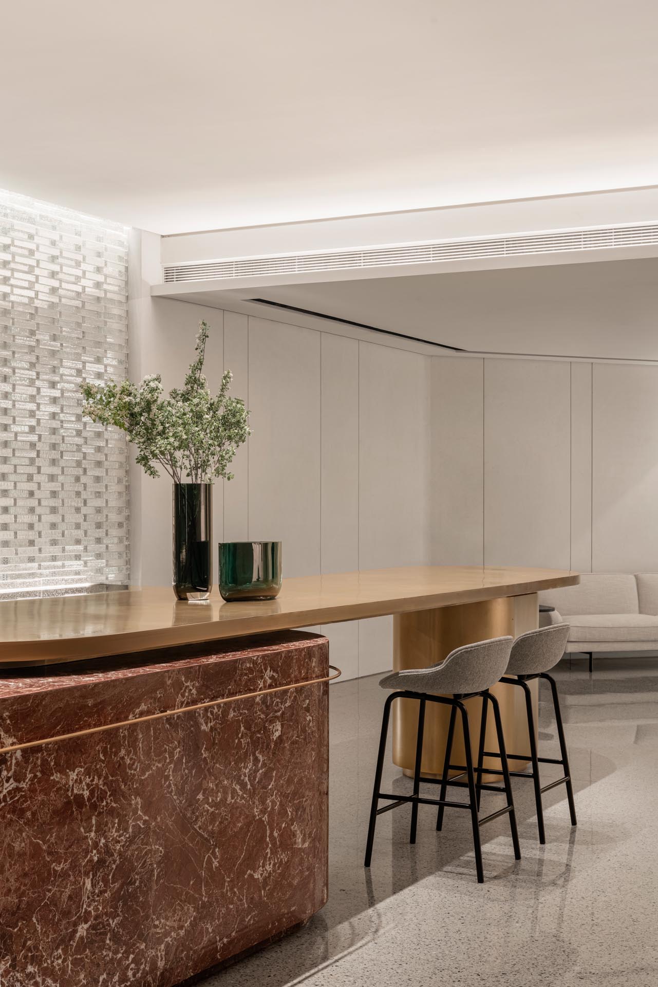
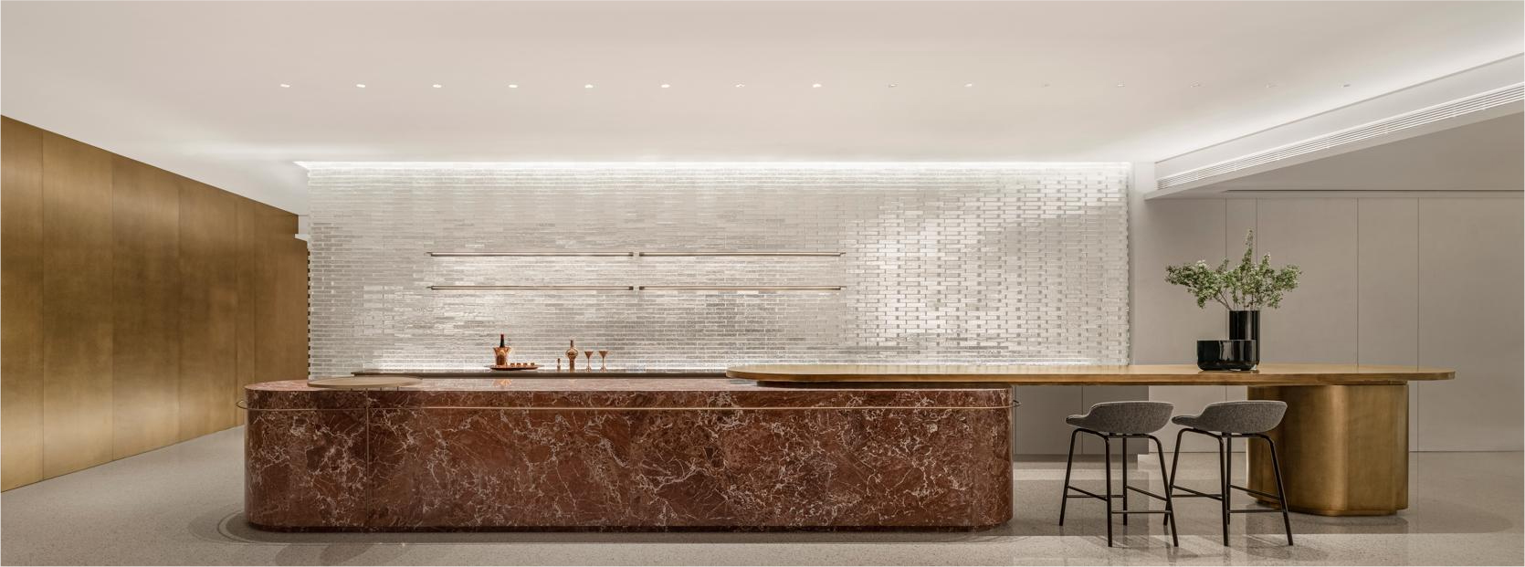
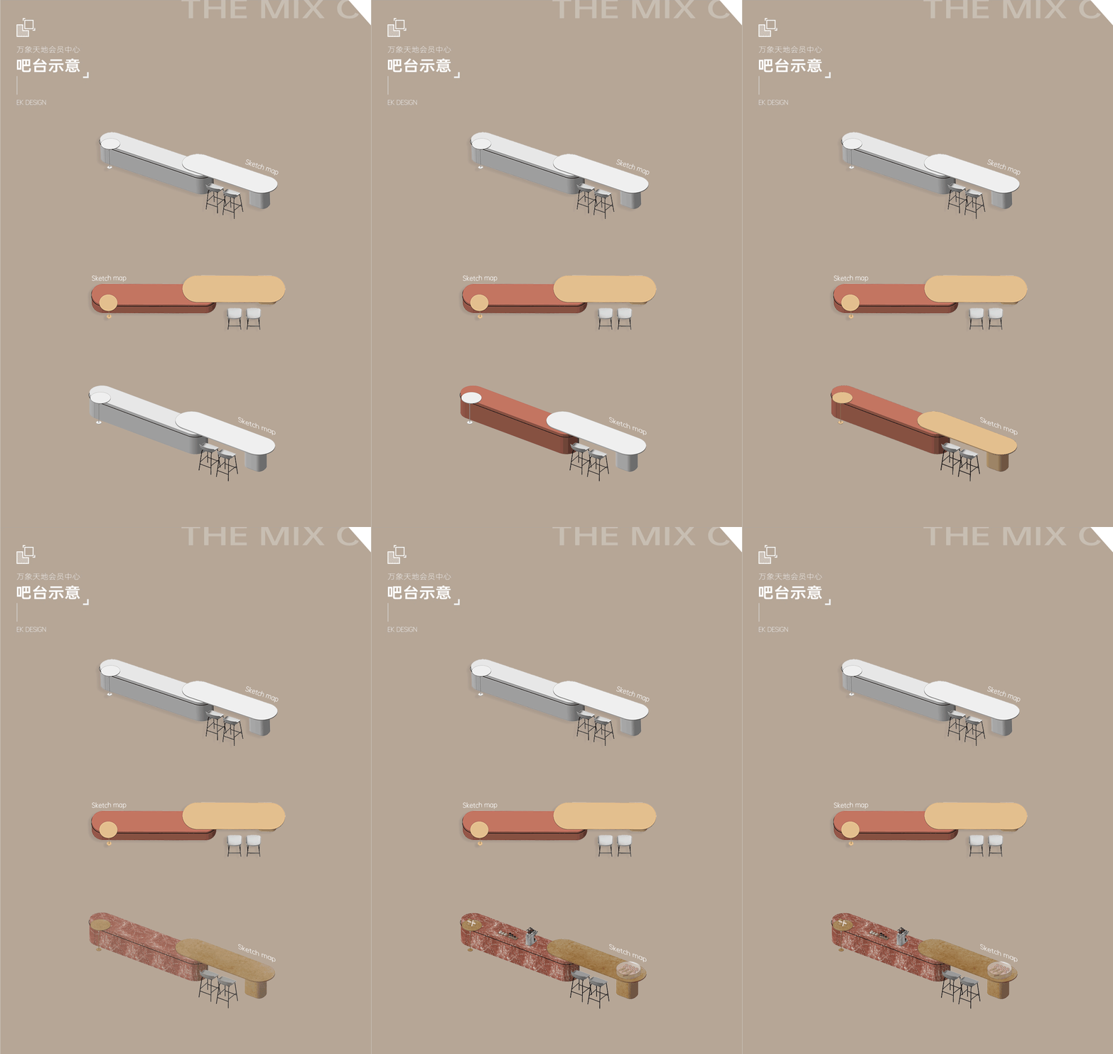
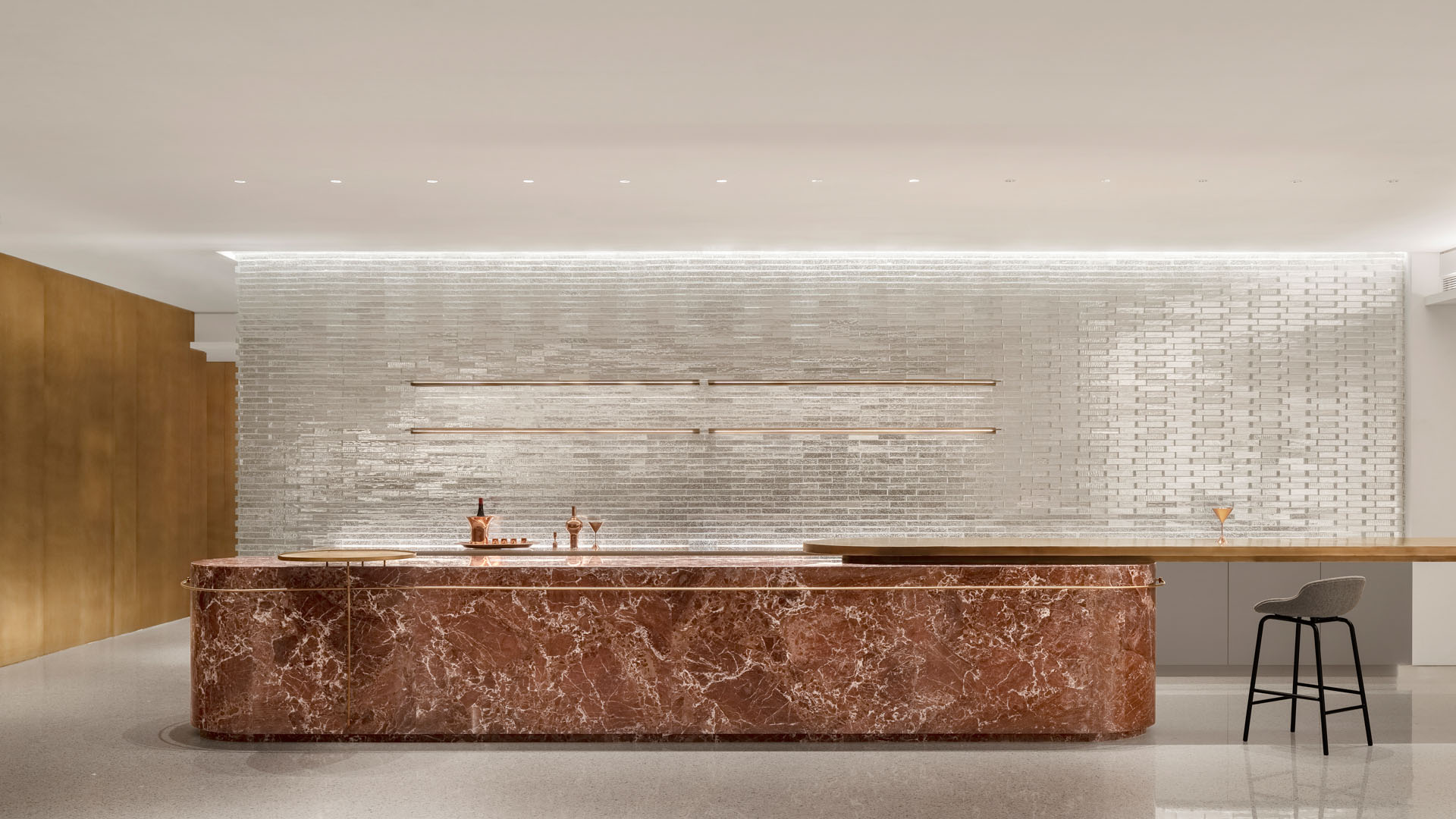
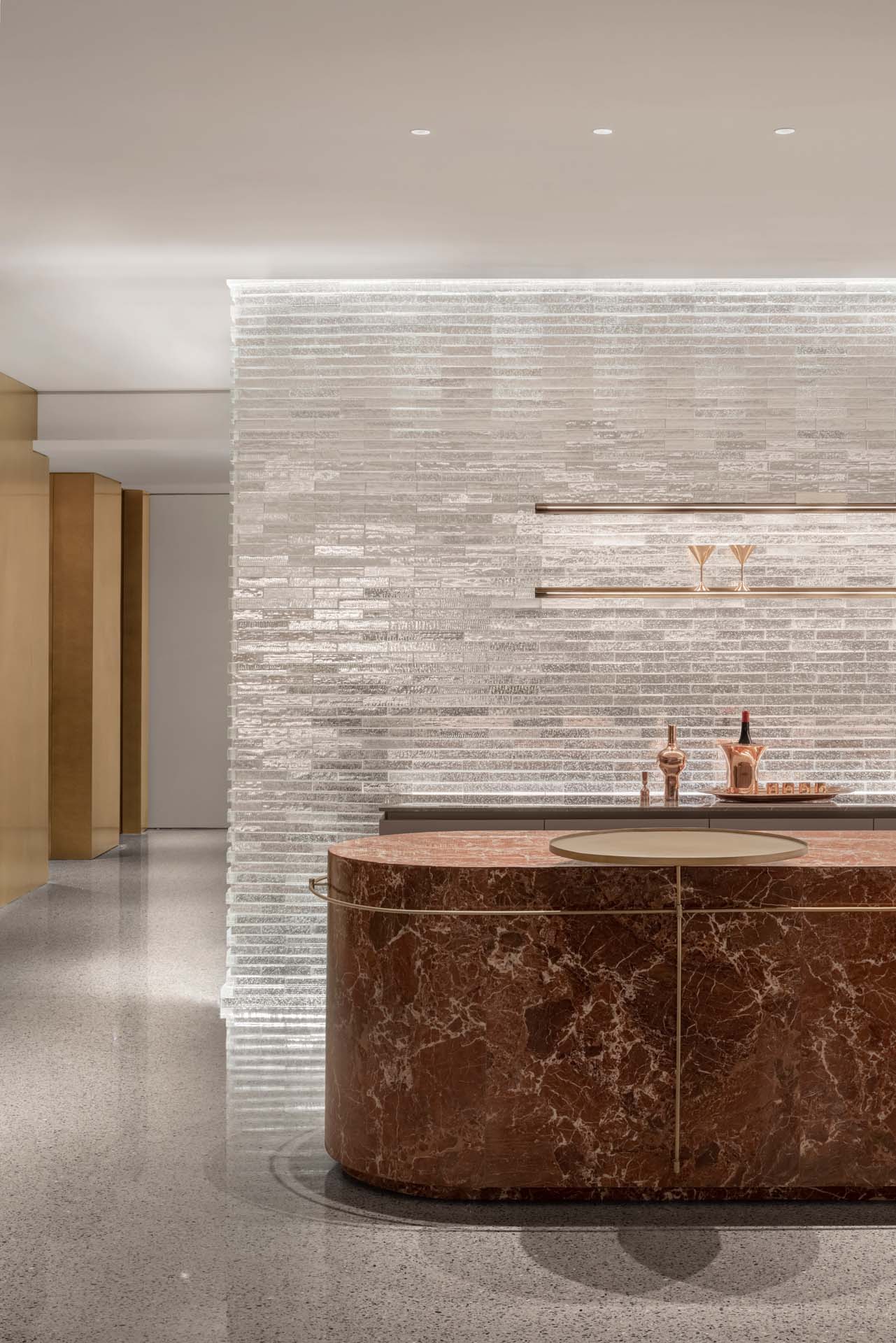
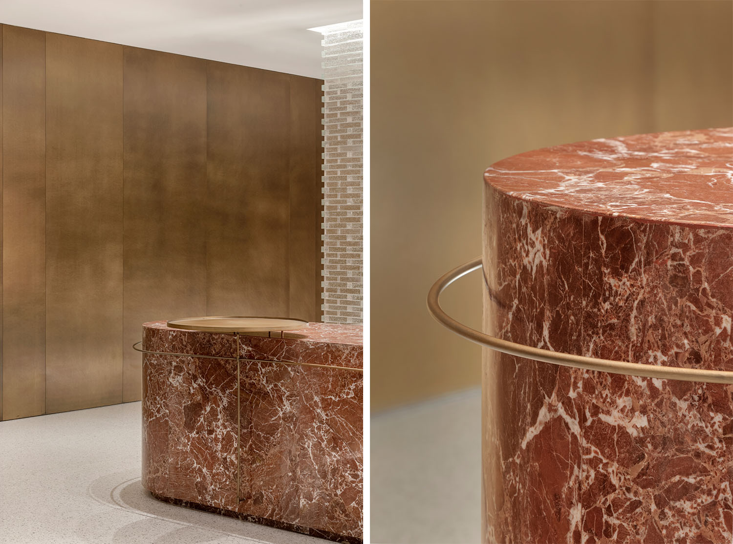
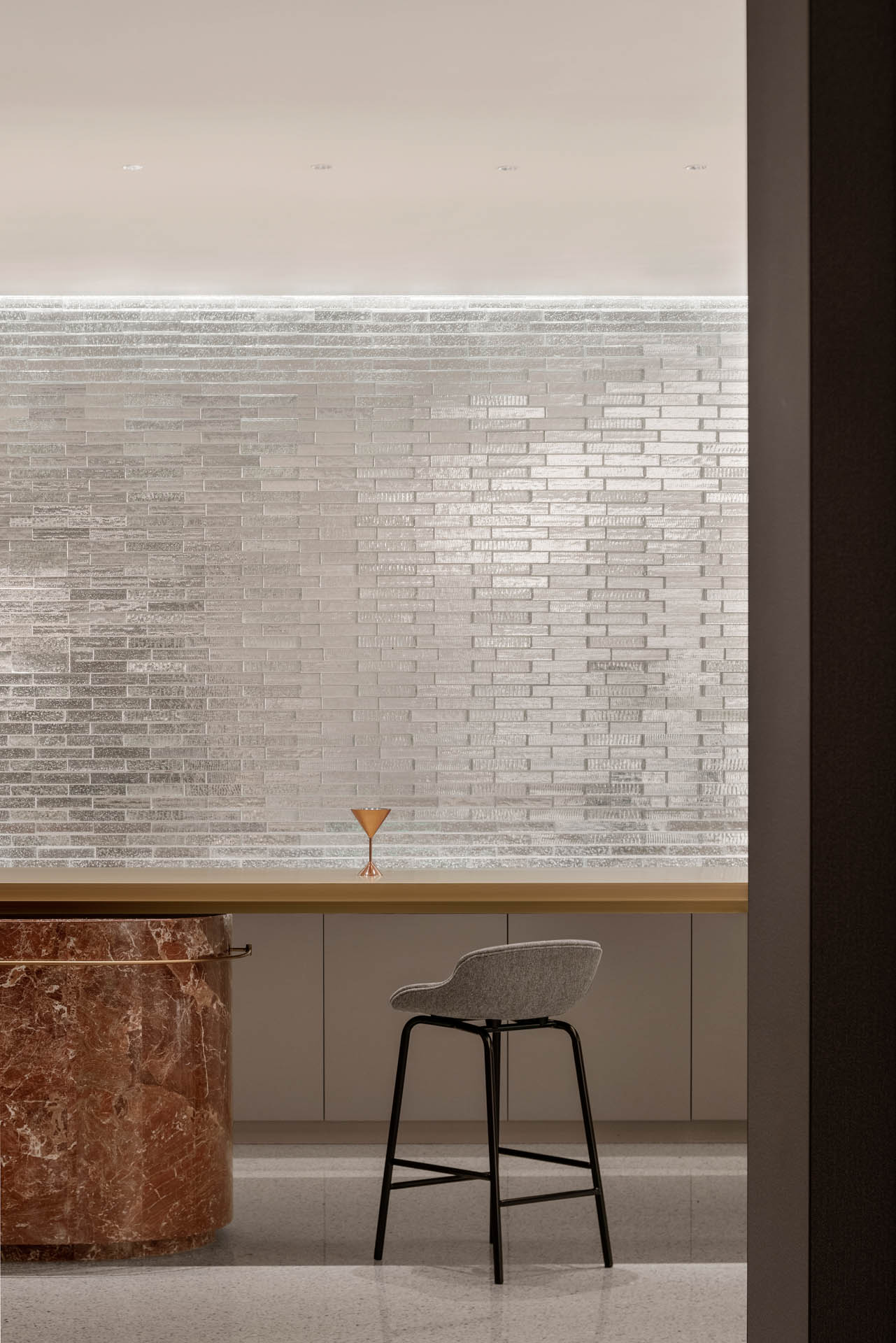
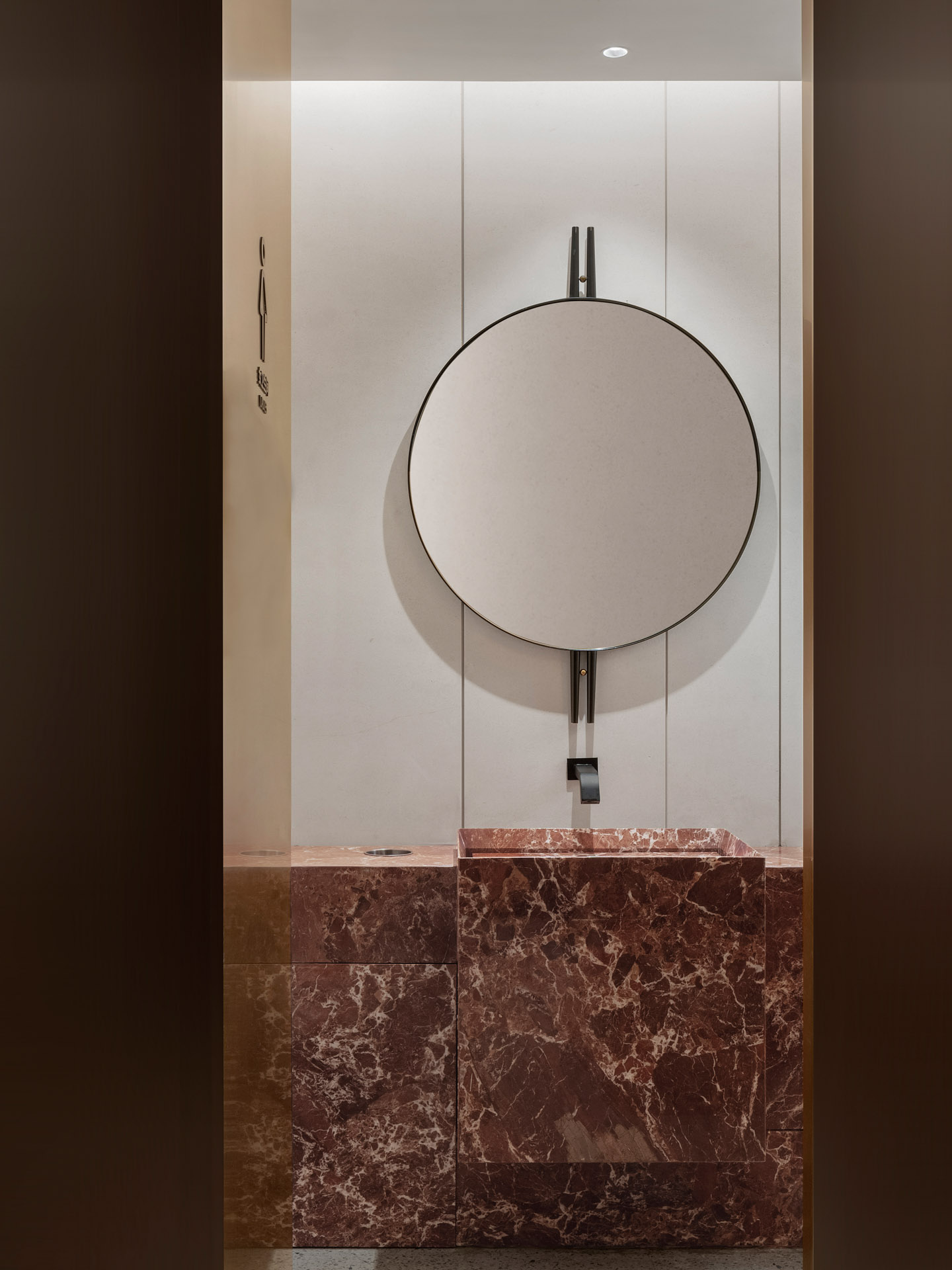
大理石紋理與與金屬組合,共同塑造了奢華的觀賞性。高低差、參差感,兩處不同的觸感順暢自然地連接起來。
The combination of marble texture and metal creates a magnificent ornamental aesthetic. The height disparity and unevenness, while creating two distinct feelings, also blend seamlessly and naturally.
金屬的質感加上暗紅的色調伴隨著背景灑下的柔和燈光,這便是酒精所特有的不拘與浪漫。
The metallic texture and dark crimson tone, together with the gentle light sprinkled in the backdrop, create innate free and passionate sensations unique to the wine.
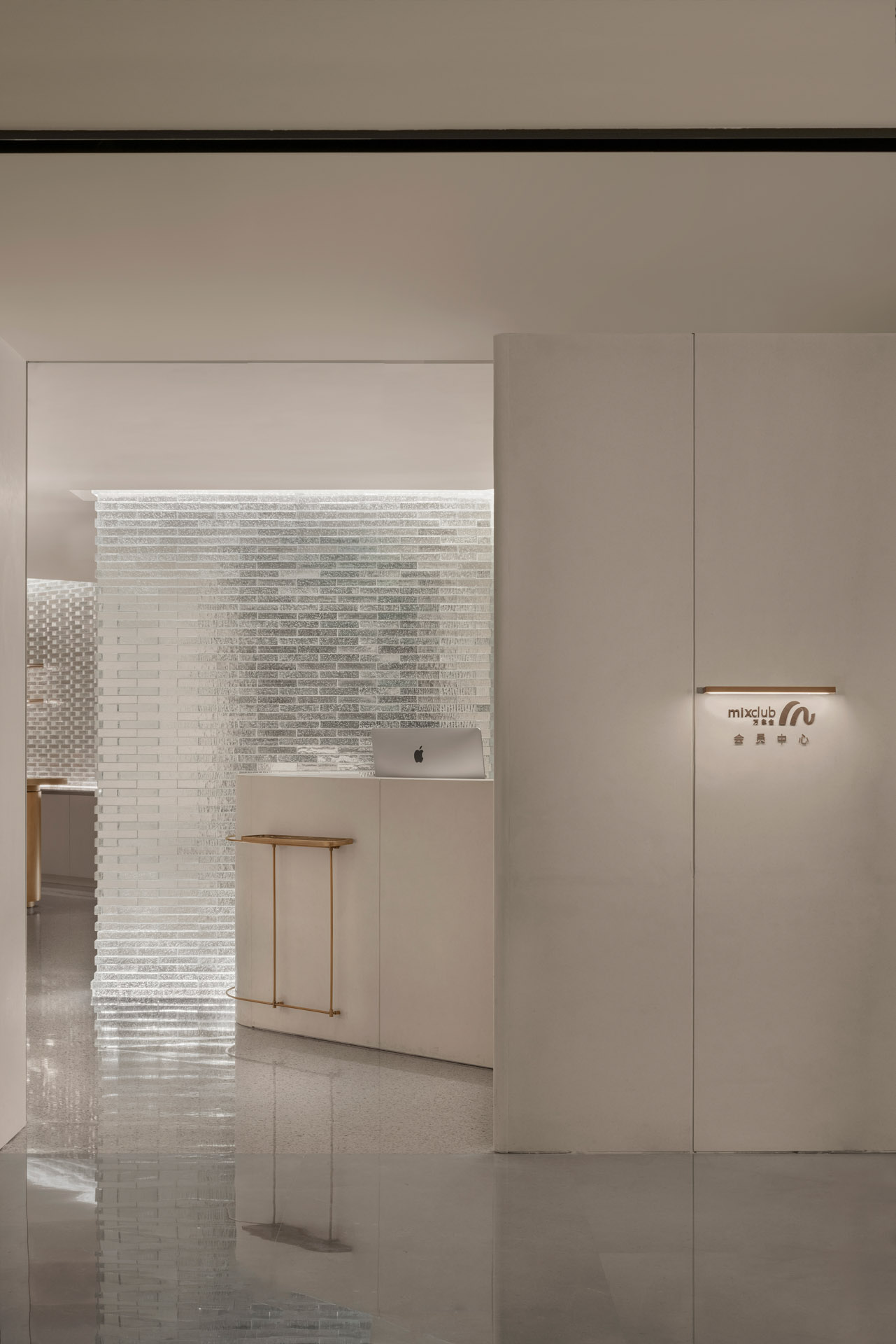
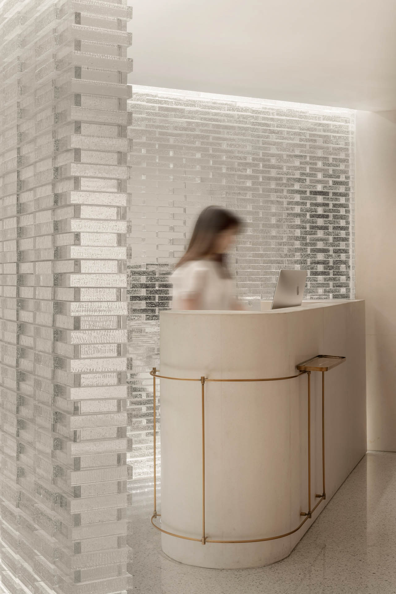
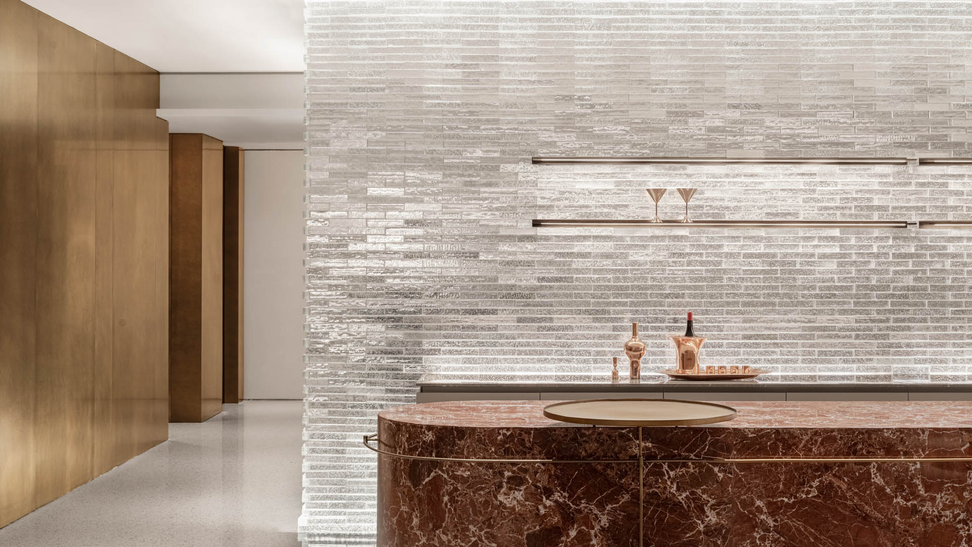
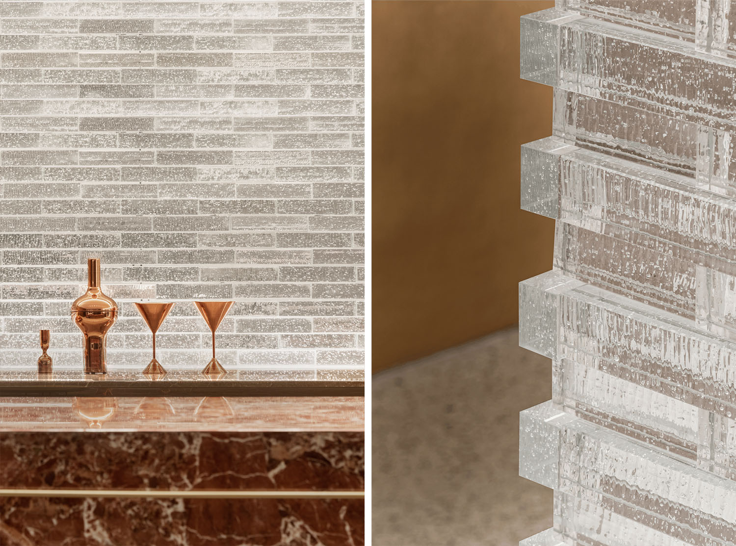
為了突破全室內的封閉感,入口迎賓及吧台背景牆利用玻璃磚層疊排布形成光的棱鏡效果,若隱若現的剪影透射而出,隱而不盲、藏而不喧。
To create a prismatic impression of light, glass bricks are placed in the background wall of the entry and bar. The sense of closure in the building might thus be reduced. The hidden shadow weaves its way through the background wall subtly and serenely.
“沒有光就沒有空間。”水晶玻璃磚透光不透影的美學變化在有序的空間中更顯精致。它巧妙運用玻璃折射與反射造成的錯位感,創造視線與空間的隔離交叉。
“There’s no space without light.” The crystal glass bricks tend to be more refined in the ordered space with the pervious light rather than shadow. The design cleverly uses the sense of dislocation caused by the refraction and reflection of glass to create an isolated intersection of sight and space.
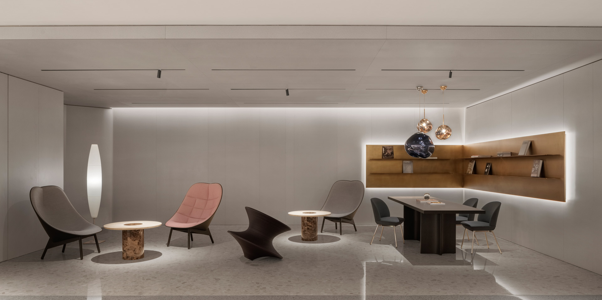
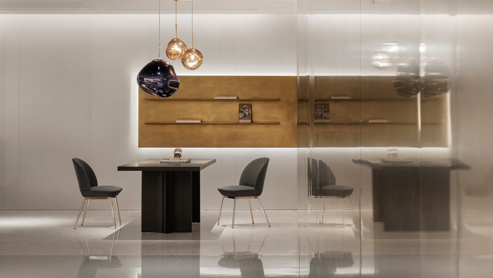
洽談區在空間分設多處,分別是由沙發單椅、小茶幾圍合而成的一類交談角以及小單椅、會議桌形成的輕便商務區。
There are several communication areas in the VIP Lounge, including the conversation corners surrounded by single chairs and a small coffee table, and business areas formed by chairs and the conference table.
為了滿足不同需求的到訪會員各種交互需要,這裏硬裝背景退居留白,家具配飾占著據絕對主角。
To meet various interactive needs of different clients, furniture and accessories domain the space without the hard decoration background in consideration.
長沙發、Hay沙發椅更是在視覺層麵就引發舒適的尺度,留出精致的安全感。
The couch and Hay sofa look comfortable and create a sense of security.
熔岩吊燈、沙發邊角照明燈飾都選擇了形狀簡單而細節滿滿的款式,無形地激發更多的遐想。
For lava lamps and sofa corner headlamps, we chose the kind with simple shapes and full details, which can inspire more fanciful thoughts potentially.
所有視覺背景都是簡潔色彩體塊搭配精致的工藝細節,讓每個轉角及留白處都更具層次。金屬色澤在其中低調而不容忽視,冷靜而柔和。
The visual background is consisted of simple color chunks and exquisite details, thus giving a progressive feeling to people in each corner and margin. Among that, the metallic color is modest but cannot be ignored for its calmness and softness.
作為與會員建立連接的重要載體,我們從空間每個細節單位入手,小空間與大空間的氛圍格調實現統一,作出基礎功能之外的藝術價值與商業地位的平衡。
The VIP Lounge is a vital carrier to establishing connections with VIPs. The design starts with every small unit of the space, unifying the atmosphere of small and large spaces to balance the artistic value and commercial status beyond the basic functions.
項目信息
工程名稱 | 深圳萬象天地會員中心
硬裝設計 | 於強設計-EK DESIGN異開設計團隊
軟裝設計 | 於強設計-WOW DECO沃屋陳設團隊
項目完工 | 2022年
項目麵積 | 304㎡
項目地點 | 深圳
項目攝影 | 覃昭量
Project name | The Mixc VIP Lounge, Shenzhen
Hard decoration design | YuQiang&Partners-EK DESIGN
Soft decoration design | YuQiang&Partners-WOW DECO
Project completion | 2022
Project area | 304 ㎡
Project location | Shenzhen
Photographer | Jack Qin


