行業特征 Industry characteristics
當今是一個創意的時代,多數創意空間隻停留在臨摹新資訊的新奇上,而缺少自身行業或者空間應有的內涵和特征。
Today is an era of creativity, where most creative spaces only focus on copying the novelty of new information, lacking the connotation and characteristics of their own industry or space.
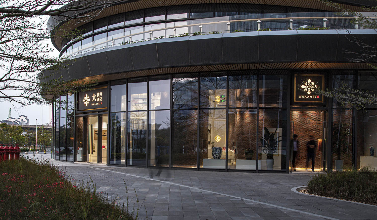
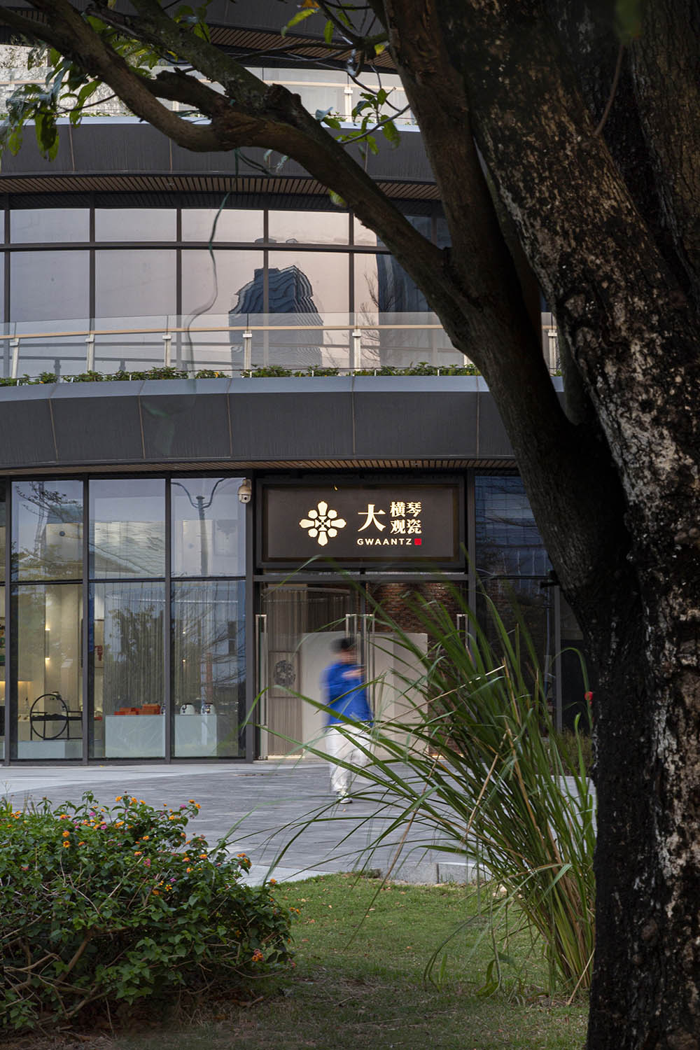
大橫琴觀瓷藝述館,毗鄰港澳,坐落於橫琴自貿區,以陶藝文化為窗口,麵向大灣區乃至世界。如何讓今天中國區域性的陶瓷文創產品帶著自己應有的姿態表達在世人的心裏。我們不光要滿足項目的基本運行功能,還需要在行業的屬性中進一步挖掘,力圖在參觀者心中留下深刻的印象。
Located in the Hengqin Free Trade Zone, adjacent to Hong Kong and Macao, the Dahengqin Porcelain Art Exhibition Hall is open to the Dawan District and even the world through the window of ceramic art culture. How to make today’s regional ceramic cultural and creative products in China express themselves in the hearts of the world with their due attitude. We not only need to meet the basic operational functions of the project, but also need to further explore the industry’s attributes in an effort to leave a deep impression on visitors.
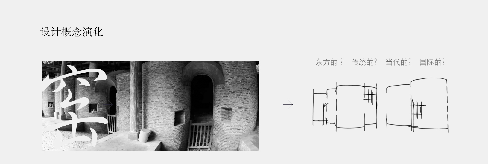
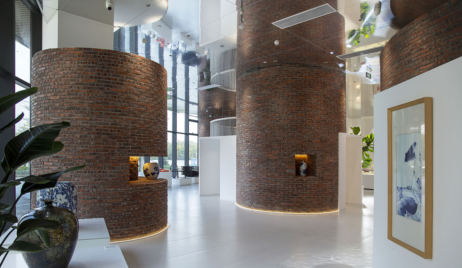
於是傳統的“窯”的概念應運而生,我們的設計由此展開。
The traditional concept of “kiln” emerged as the times require, Our design unfolds from this.
設計手法 Design techniques
空間的敘事和音樂一樣,可以華麗、可以流行、可以抒情、可以歌頌、也可以悲愴……
The narrative of space, like music, can be gorgeous, popular, lyrical, eulogizing, or pathetic……
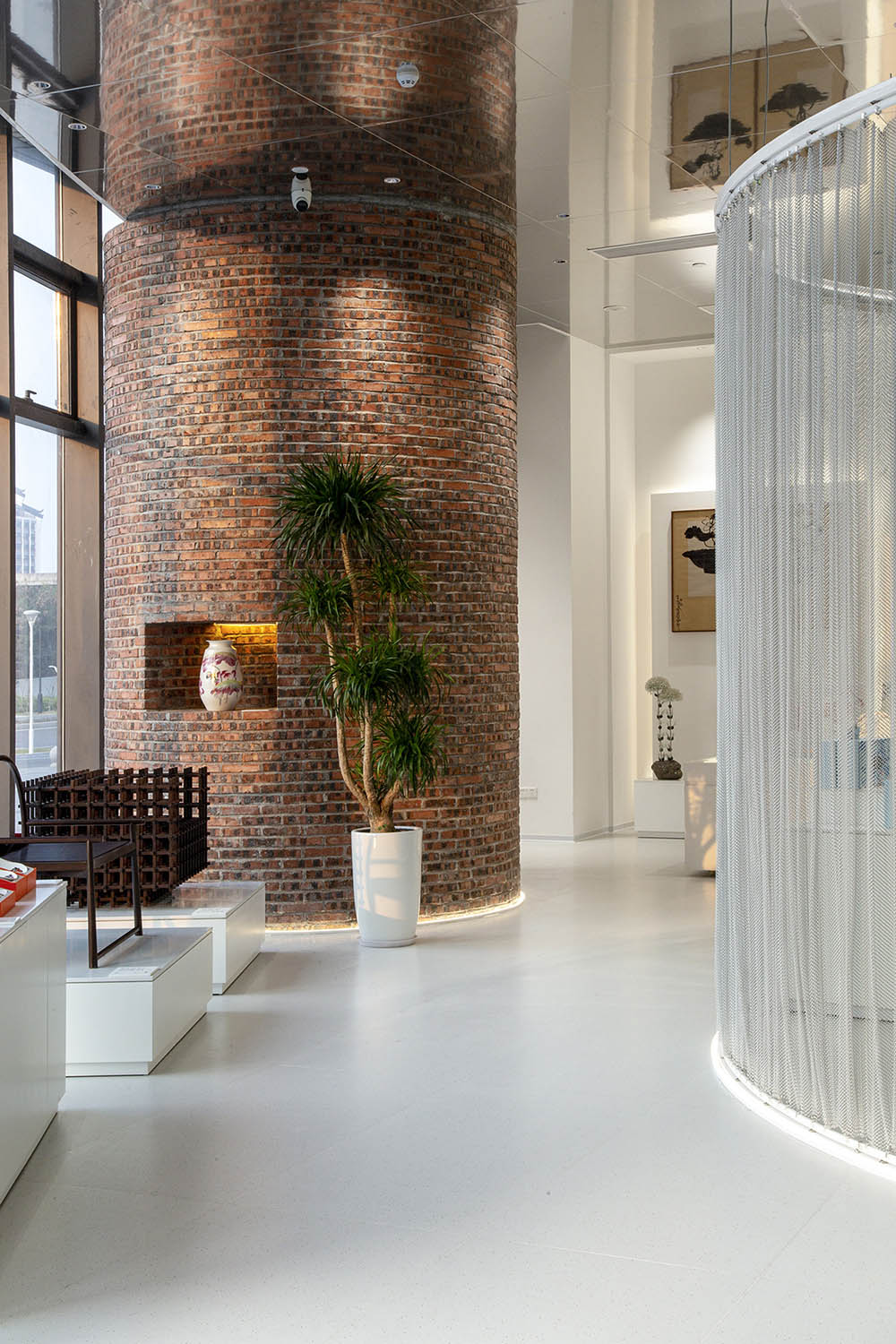
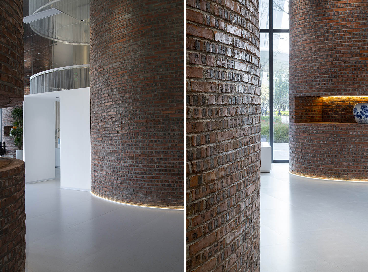
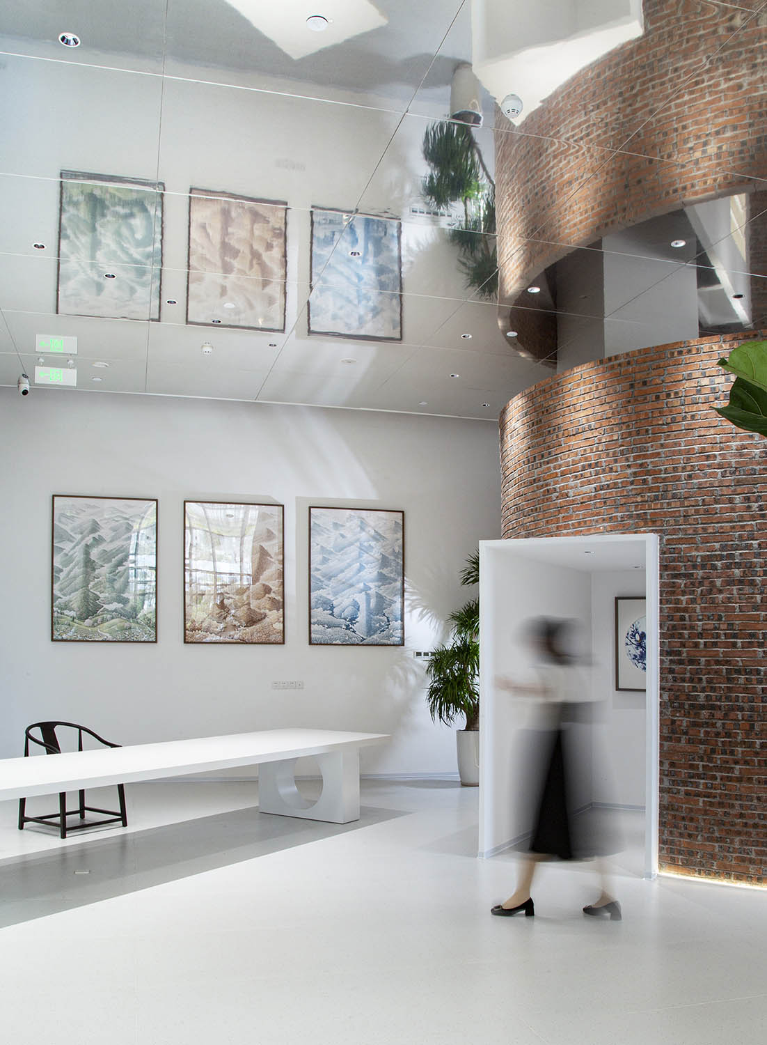
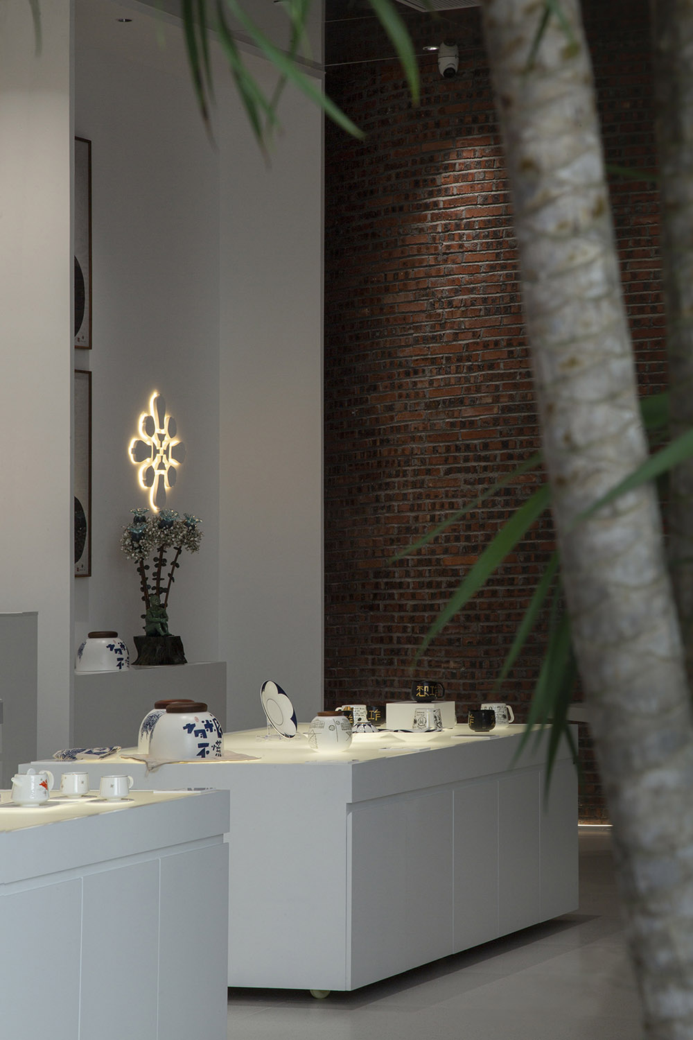
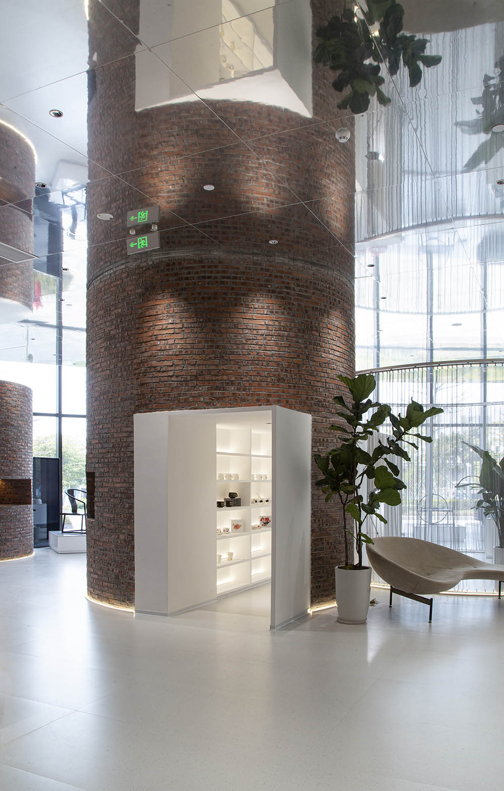
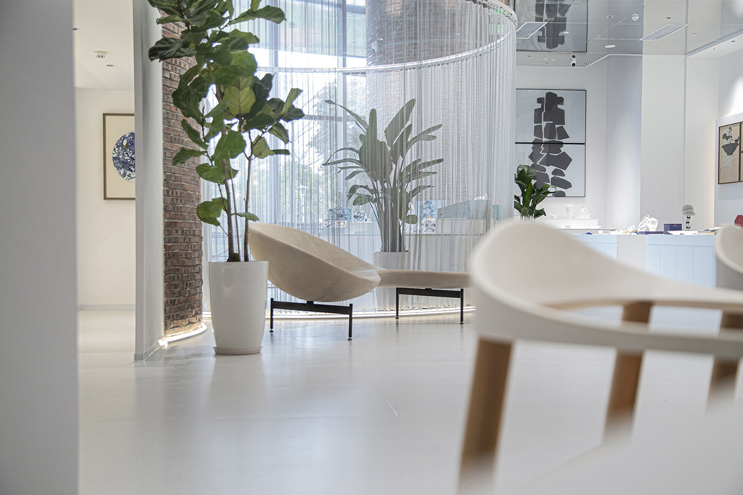
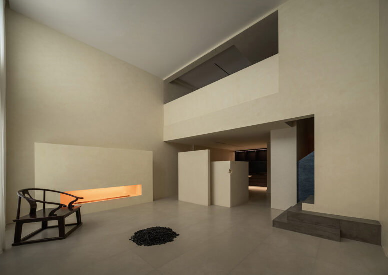
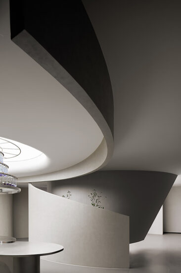
這次我們在空間中設定的材料元素極單純,隻強調白色和粗糲的紅磚進行對撞;其它輔助材質都是用來強化這個對比關係的,這種對比關係形成很強的視覺衝突感。為此,我們在選擇樣板時刻意選定了一款很平常的紅磚,並強調在砌築時保留混凝土砂灰砌築的縫隙來強化我們預設的視覺效果。這樣一來不但可以很好的控製成本,重要的是選擇這樣的材料和工藝在這個浮誇的時代,需要設計決策者有足夠的定力、勇氣和擔當。事實證明我們的選擇是對的,並且這樣的效果是普羅大眾也可以全然接受的。如果你仔細感受這個空間,它是有某種情緒的。
This time, the material elements we set in the space are extremely simple, emphasizing only the collision between white and rough red bricks; Other auxiliary materials are used to strengthen this contrast relationship, which creates a strong sense of visual conflict. To this end, we deliberately selected a very common red brick when selecting the template, and emphasized that the gaps in the concrete sand mortar masonry should be retained during masonry to enhance our preset visual effect. In this way, not only can cost be well controlled, but it is important to choose such materials and processes in this grandiose era, requiring design decision-makers to have sufficient determination, courage, and responsibility. Facts have proven that our choice is correct, and such an effect can also be fully accepted by the general public. If you feel this space carefully, it has some kind of emotion.
人與空間 People and Space
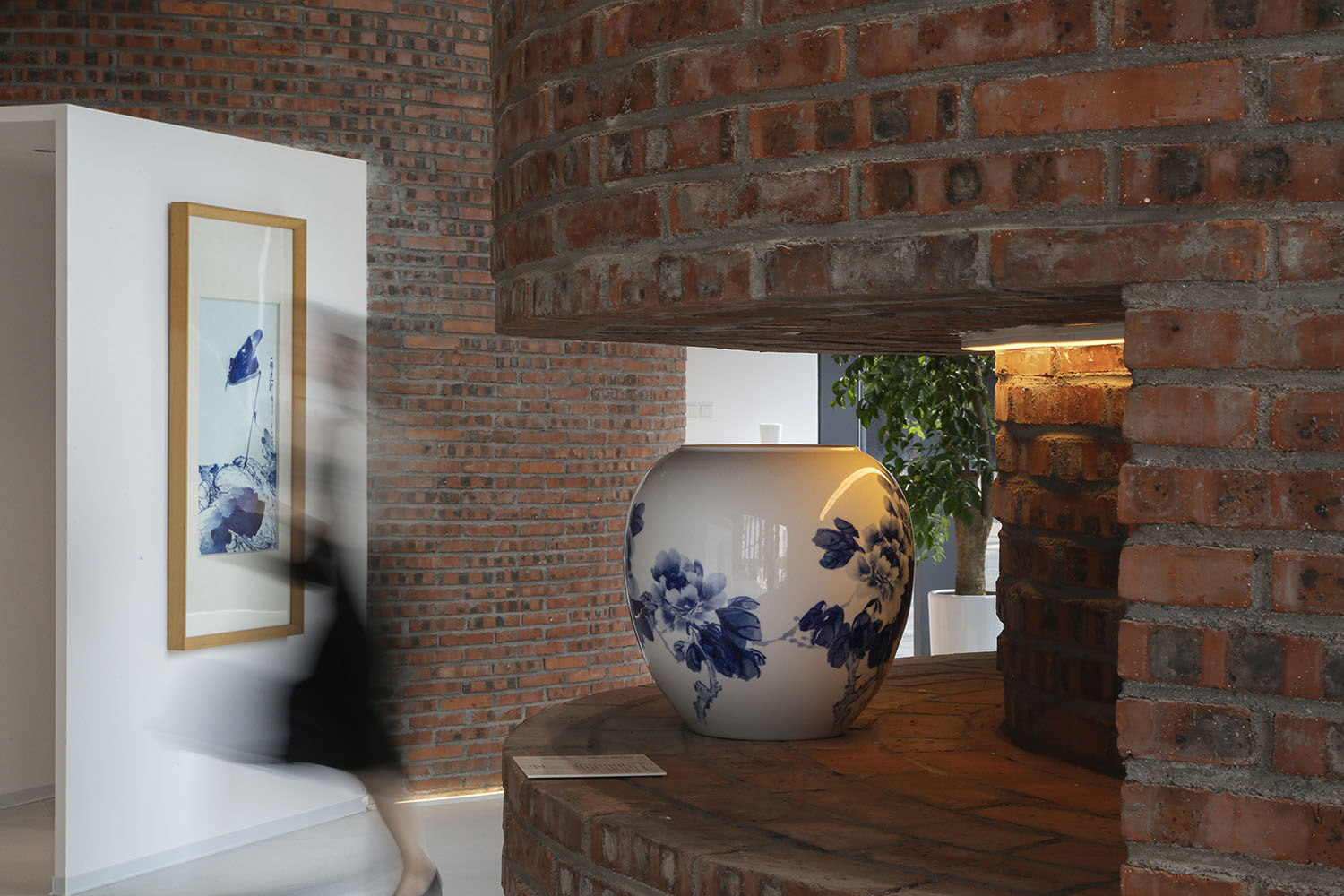
設計營造的整體張力,似乎很容易把體驗者置身於一個近乎冷漠的空間中。我們希望達到這種近乎不友好的空間表達,反而刻意使人的思緒和空間相對獨立開來,進而產生自我反思。不自主的從內在產生一種相對關注的審視狀態,督促人與陳列物品之間產生互動。這就好比展覽館或者博物館,空間中最強調的就是人和物品之間的關係,其它所有的設置都是用來輔佐這個重要功能的實現。
The overall tension created by design seems to easily place the experimenter in a space that is almost indifferent. “We hope to achieve this almost unfriendly spatial expression, but instead deliberately separate one’s thoughts and space, thereby generating self reflection.”. An involuntary and inwardly focused state of scrutiny promotes interaction between people and displayed items. This is similar to an exhibition hall or museum. The most important thing in space is the relationship between people and objects. All other settings are used to assist in the realization of this important function.
產品呈現 Product Presentation
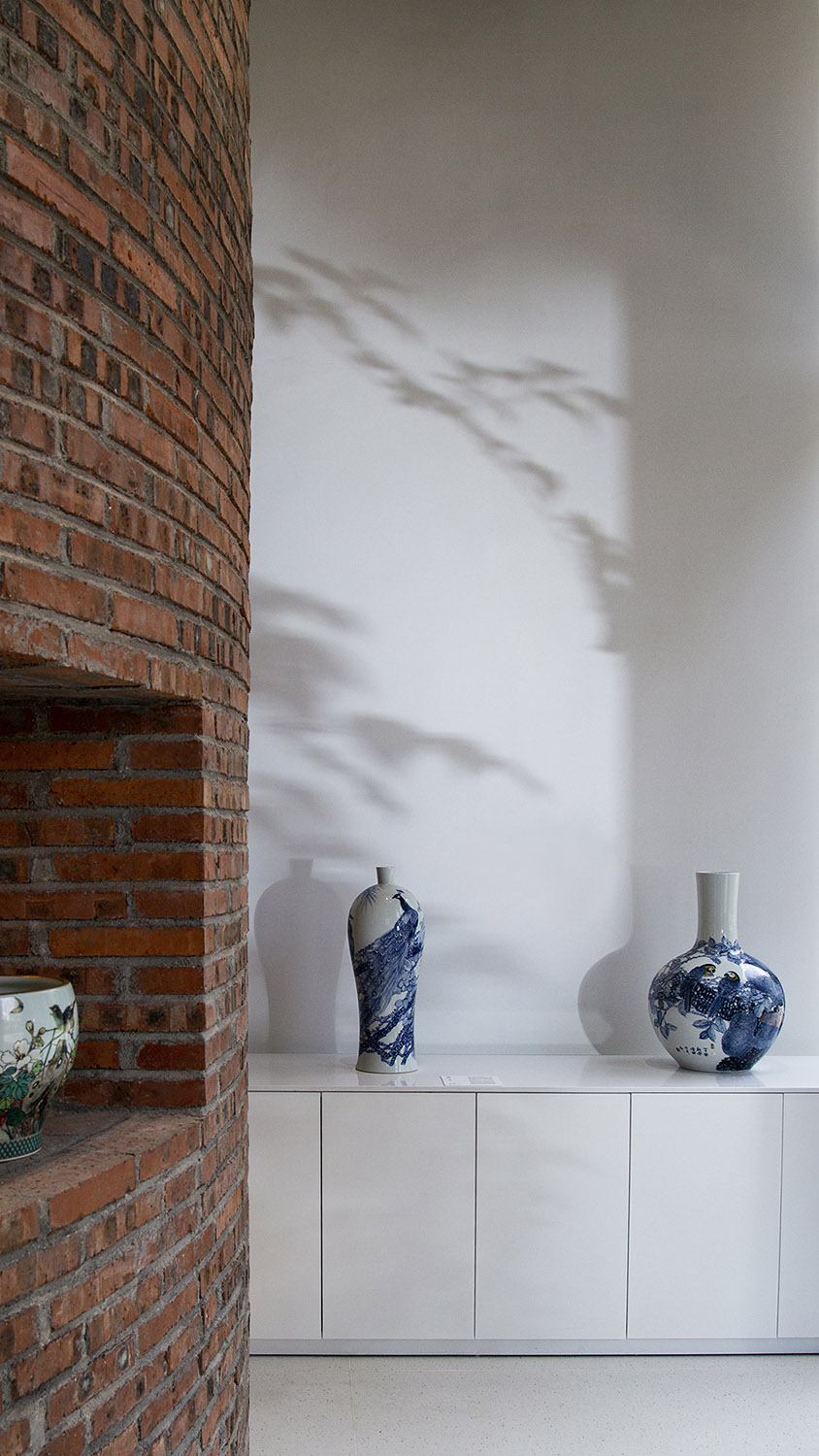
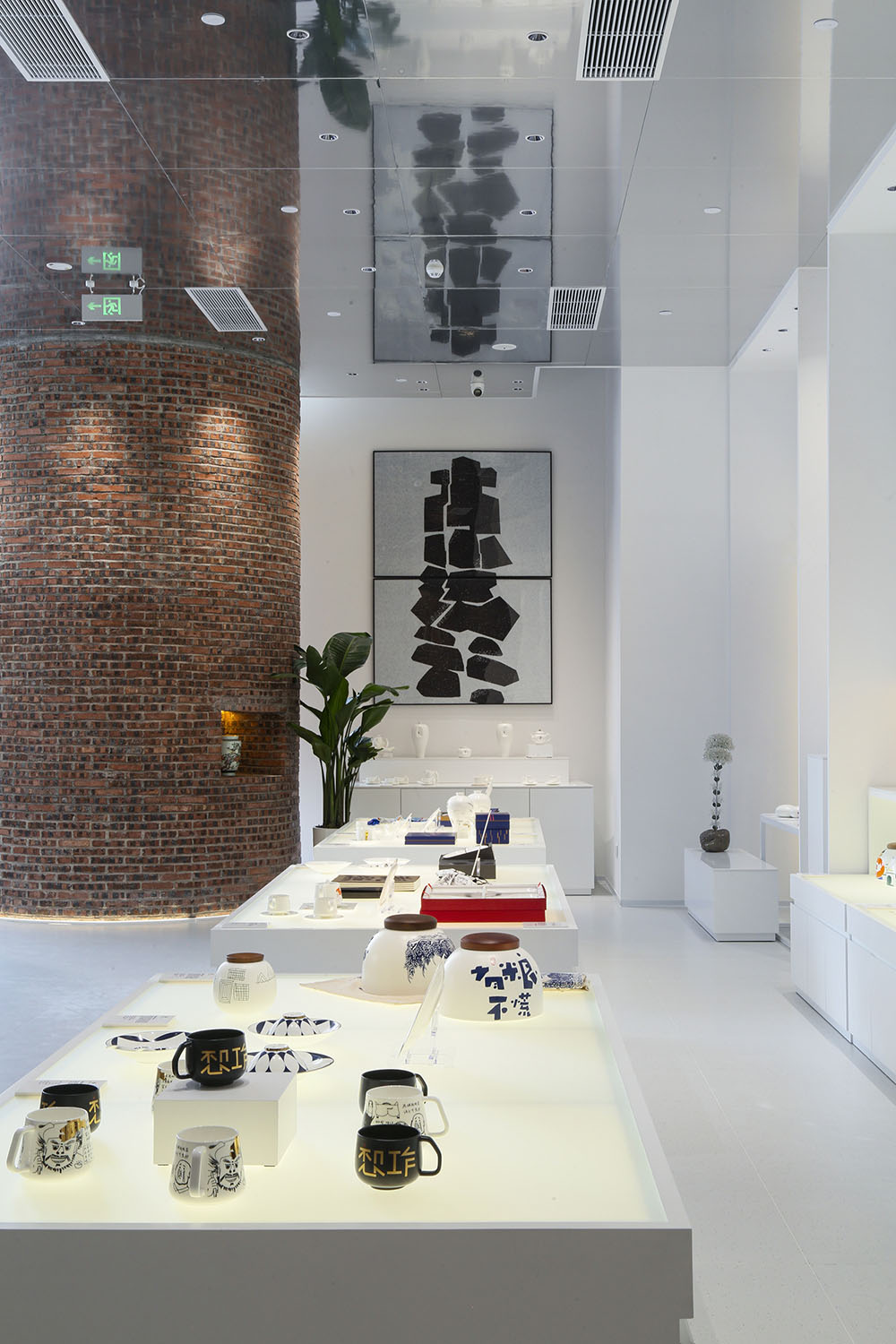
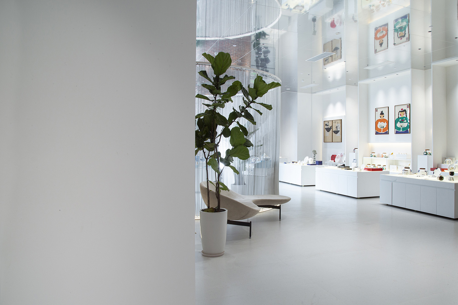
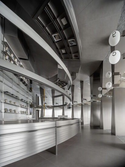
根據我們過往對類似空間的處理經驗,我們有意的克製空間本身的設計元素和語言。這樣正是為了給未來林林總總的產品呈現留有足夠的表現餘地。反之,如果在基礎空間中表達太多所謂的設計元素,到了真正的主角(產品)陳設後,空間的層次就會主次不分,表達意圖本末倒置。淩亂無章的空間很難讓人們建立視覺上的瀏覽次序,尤其是有大量不同類別、不同材質的產品展示空間。
Based on our past experience in dealing with similar spaces, we intentionally restrict the design elements and language of the space itself. This is precisely to leave enough room for performance in the future of a myriad of products. On the contrary, if too many so-called design elements are expressed in the basic space, when the real protagonist (product) furnishings arrive, the level of space will not be divided between primary and secondary, and the expression intention will be reversed. It is difficult for people to establish visual browsing order in a cluttered space, especially with a large number of product display spaces of different categories and materials.
產品分類 Product classification
參觀動線 Visit the moving line
獨立燈效 Independent lamp effect
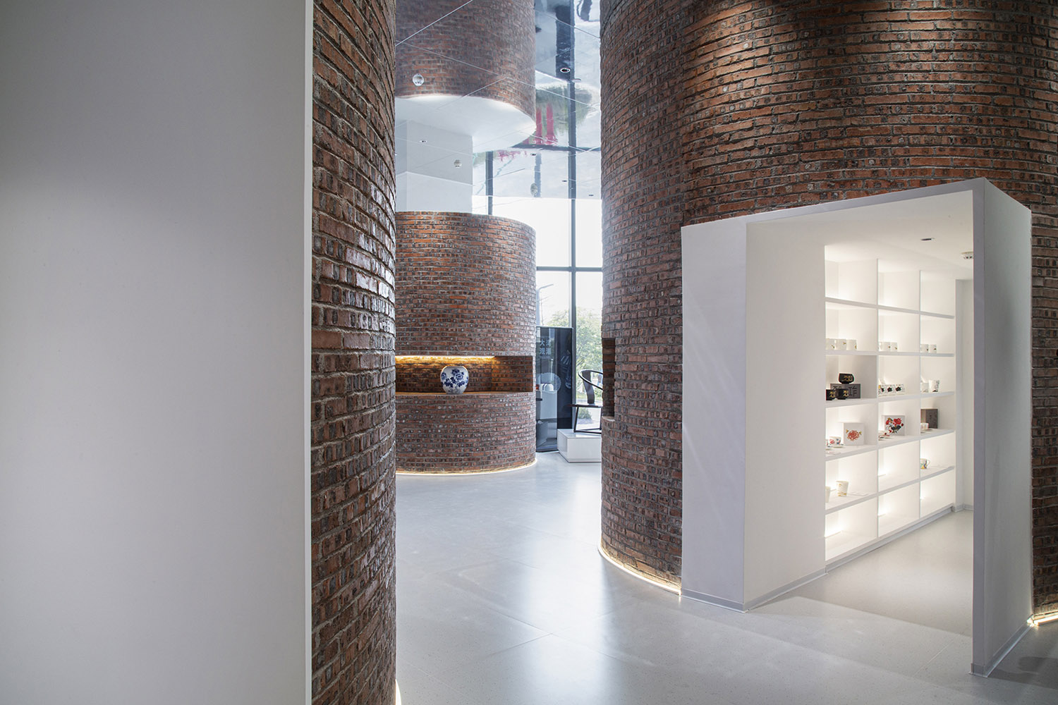
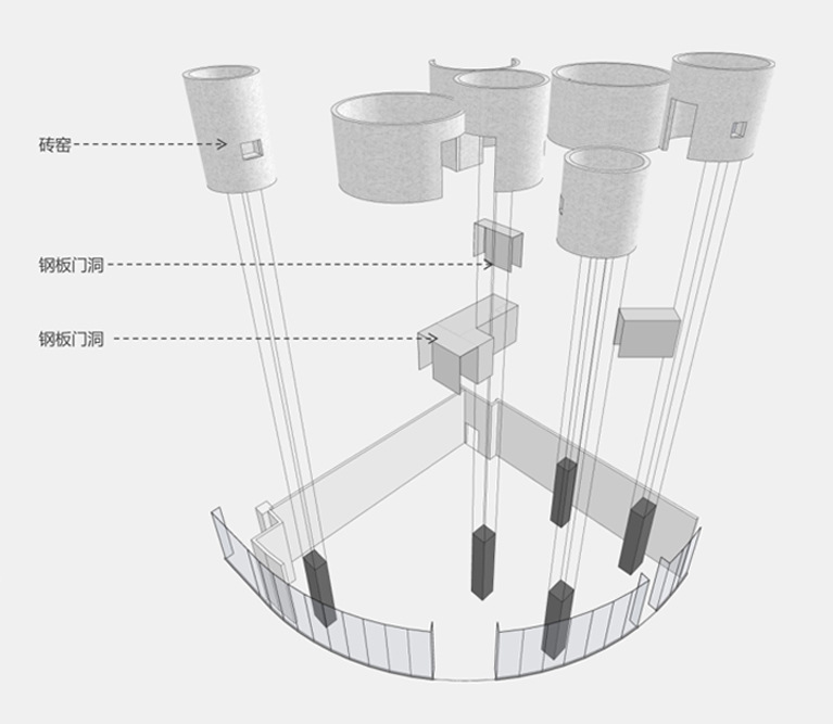
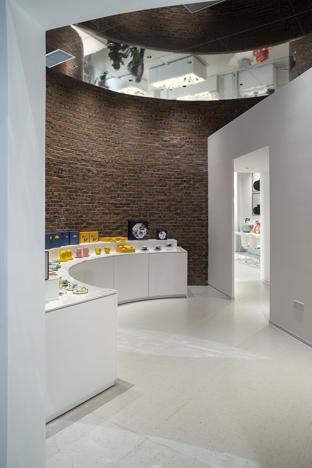
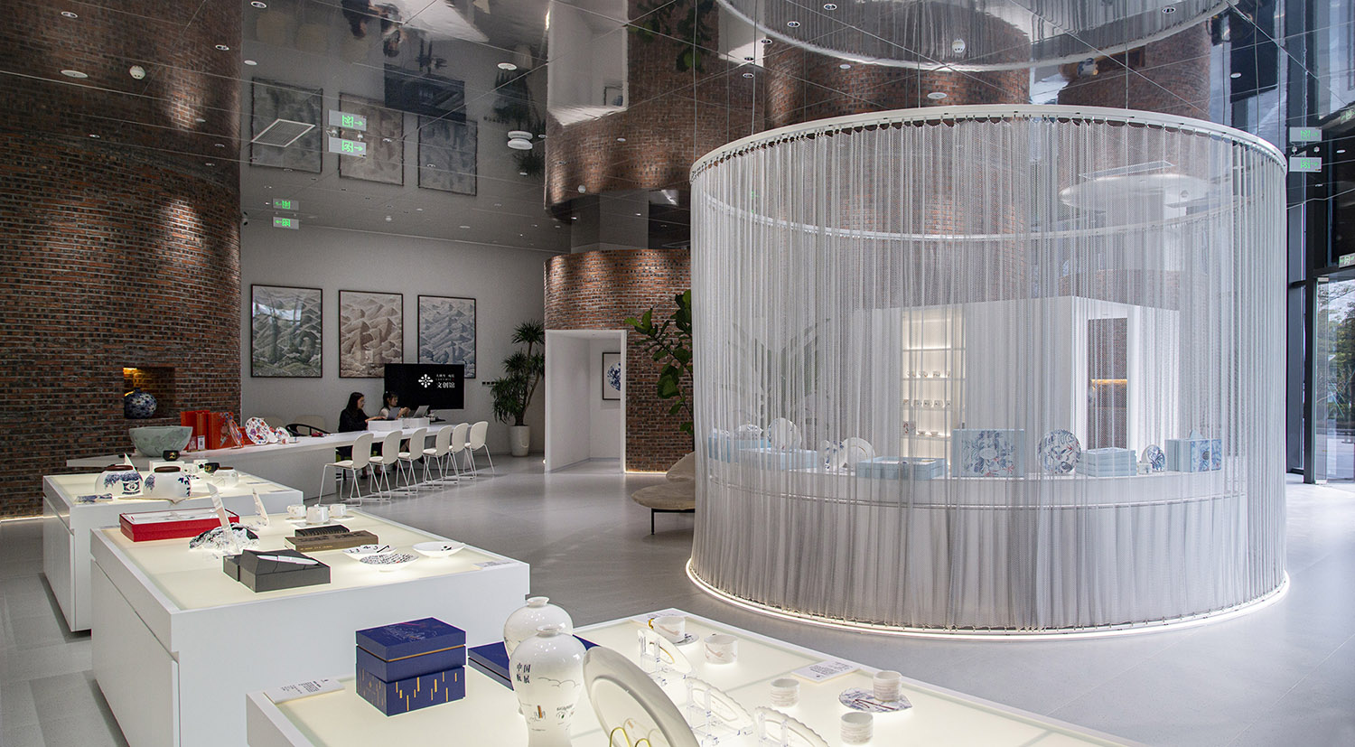
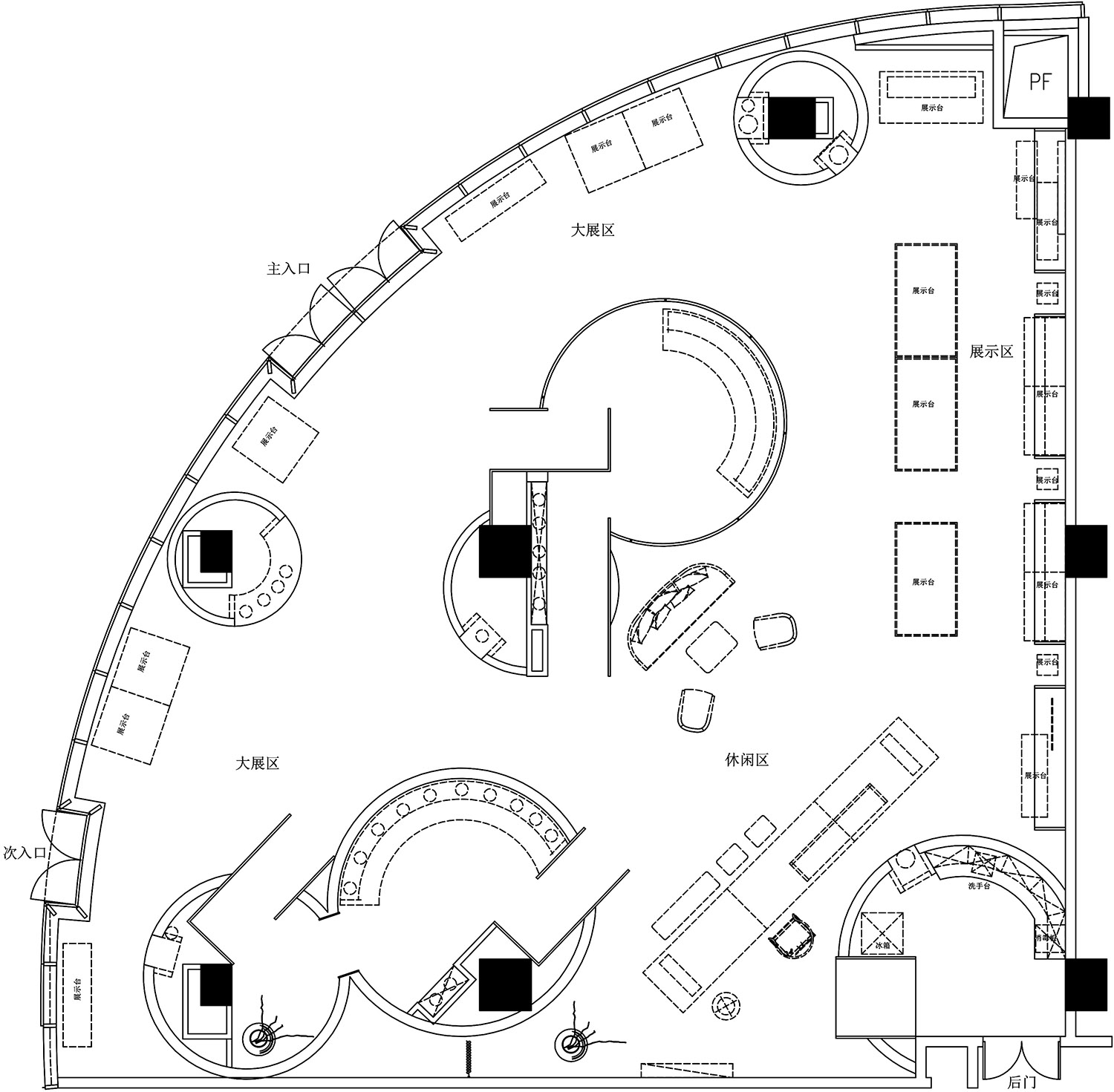
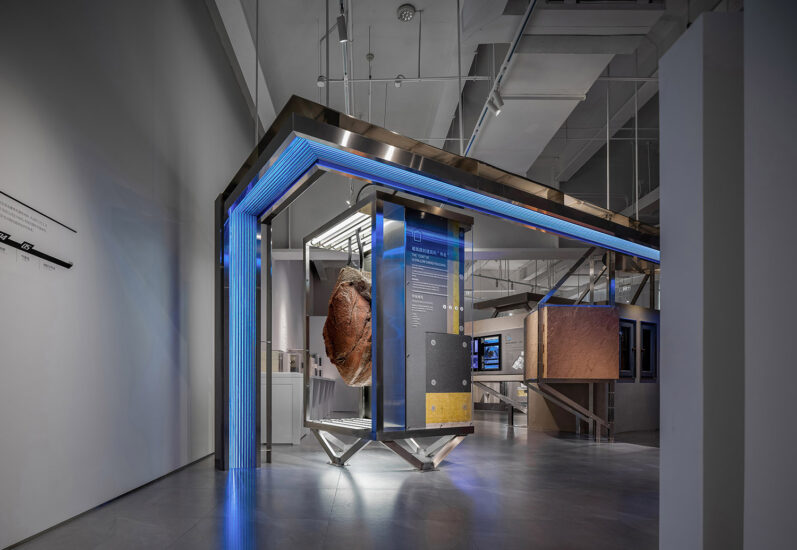
通過設定參觀動線和獨立展區,我們巧妙的化解了這個原始空間中的許多問題。這些展區恰好把原結構的巨大立柱包含在內,規避了它在空間中的突兀感。連同展區在內的窯形結構隨機分布在展廳中,形成了空間獨特的基調。
By setting up tour routes and independent exhibition areas, we skillfully solved many problems in this original space. These exhibition areas just include the huge columns of the original structure, avoiding its abrupt sense in space. Kiln shaped structures along with the exhibition area are randomly distributed in the exhibition hall, forming a unique tone of the space.
由於產品不同的特質、顏色、質感,在每個獨立展區,都分別用了不同的燈光模式,使不同的產品在相應的燈光下得以完美的呈現。
Due to the different characteristics, colors, and textures of products, different lighting modes are used in each independent exhibition area, enabling different products to be perfectly presented under corresponding lighting.
獨立展廳本身就是對人情緒的管理,在此,他可以相對寧靜的與產品對話,而不受整場複雜因素的幹擾。其實人是怕開放性選擇的,由於人自身的選擇困難,會大大削弱產品的呈現狀態。
The independent exhibition hall itself is the management of people’s emotions. Here, it can converse with products in a relatively calm manner, without being disturbed by complex factors throughout the exhibition. In fact, people are afraid of open choices. Due to their own difficulties in choosing, the presentation of products will be greatly weakened.
∇ 軸測圖
空間的機動性和可塑性 Mobility and plasticity of space
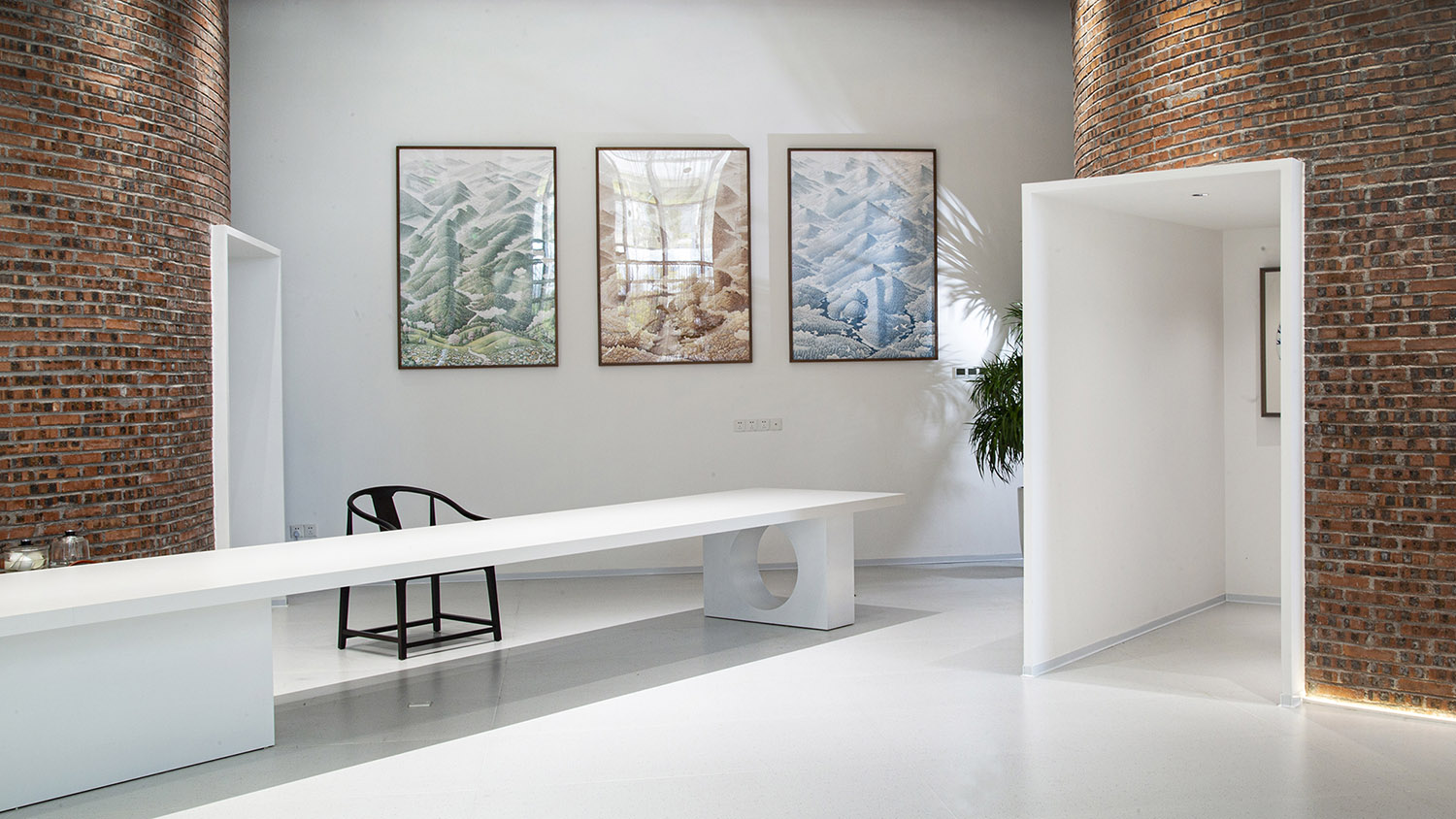
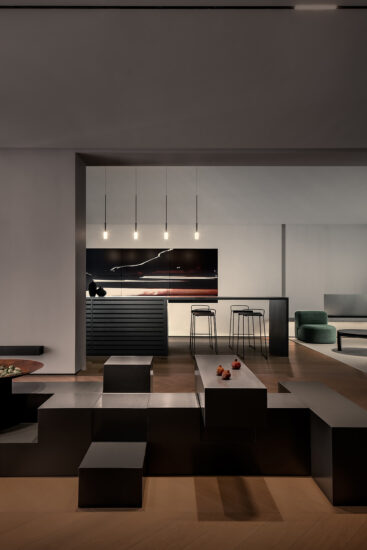
在公共空間的部分,我們設有主要的用於工作溝通的大茶台,建立了空間交互的基礎格局;在此處設有用於產品演播或者小型會議以及沙龍的視頻功能。空間中所有休憩的椅子都可以因需組合,滿足各種機動功能需求。
In the public space, we have set up a major tea table for work communication, establishing a basic pattern of spatial interaction; Here, there are video functions for product shows, small conferences, and salons. All resting chairs in the space can be combined as needed to meet various mobility functional requirements.
∇ 多種場景模式 Multiple scene modes
∇ 平麵圖 Plan
項目信息
項目名稱:大橫琴觀瓷藝述館
項目類型:展覽展示
項目地址:廣東珠海橫琴國際科技創新中心8號樓
項目麵積:490㎡
設計單位:珠海借光建築空間設計有限公司
服務內容:室內設計
設計時間:2022年08月
施工時間:2022年09月-12月
項目甲方:大橫琴觀瓷藝述館
項目狀態:完工,運營中
Project Name: Dahengqin Porcelain Art Exhibition Hall
Project Type: Exhibition
Project address: Building 8, Hengqin International Science and Technology Innovation Center, Zhuhai, Guangdong
Project area: 490 ㎡
Designer: Zhuhai Jieguang Architectural Space Design Co., Ltd
Service content: interior design
Design time: August 2022
Construction time: September to December 2022
Project Party A: Dahengqin Porcelain Art Exhibition Hall
Project status: Completed, in operation


