演繹逐“浪”人生
Performing the Pursuing-waves Life
新生代青年人流行一句話:“‘浪’是每個人的宿命,不過形式和遲早的問題”。人生海海,生命被一往無前的時代浪潮裹挾奔流,但新生代青年人卻在巨浪翻湧的生活中敢於直麵風與浪的變幻莫測,進而學會借力使力、逐浪狂歡,詮釋了勇於挑戰、樂於變化的先鋒精神。
There is a popular saying among the new generation of young people: “‘Lang’ (the Chinese word, meaning roaming about) is everyone’s fate, and it is a matter of form and time.” In the sea of life, most people are driven by the continuous tide of the times. While the new generation of young people are bold in facing the vagaries of the wind and waves in the wavy life, and then learn to transforming the coming force to counterattack and enjoy themselves in pursuing waves, which shows the pioneering spirit of boldness to challenge and embracing change.
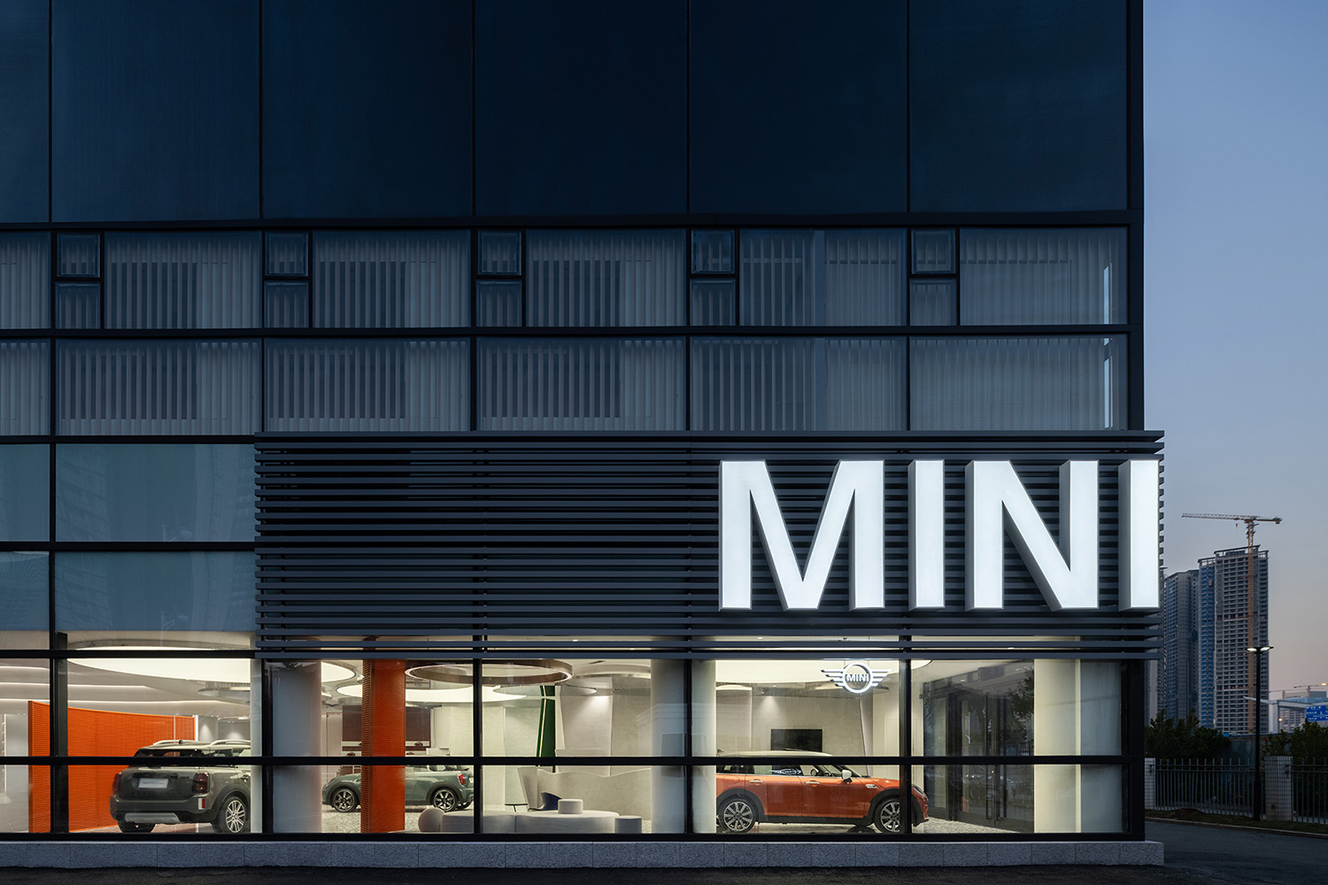
寶馬MINI品牌主張“迷你所愛”,提倡“執迷所愛,不求答案”的生活方式,精準表達用戶情感、品味與態度,與年輕人的“逐浪人生”深刻契合。前海寶馬MINI展廳將“海浪”元素貫穿始終,以時尚萬變的形式,映射出年輕人執著追求的精彩人生路徑與理想主義光芒。
The BMW MINI brand advocates “Big Love” and a lifestyle of “obsessing with what you love without asking for an answer”, and accurately expresses users’ emotions, tastes, and attitudes, which fits deeply with the “pursuing-waves life” of young people. The element of “waves” is used throughout the design of the exhibition hall for BMW MINI in Qianhai. In the fashionable and ever-changing form, it reflects the wonderful life path and idealistic light of aspiring young people.
車是頑鐵,是人賦予其生命氣息。同樣,空間亦是窠臼,是核心設計賦予其精神內核。MINI的品牌概念更偏向年輕、時尚,因而設計師在全案的構思中,著重突出線條的交織、材質的複合,以及光影的層次,預期以豐富的組合與變化演繹MINI精神與用戶情感交互而生的多元成果。
Cars are just hunks of metal, and it is people who give them life. In the same way, space is just a set mold, and it is the core design that gives it the spirit inside. The brand concept of MINI is more oriented towards youth and fashion, so in the overall design of the project, the designers highlighted the interweaving of lines, the composition of materials, and the layer of light and shadow, expecting to show a diversified design resulting from the interaction between MINI spirit and user emotions with rich combinations and changes.
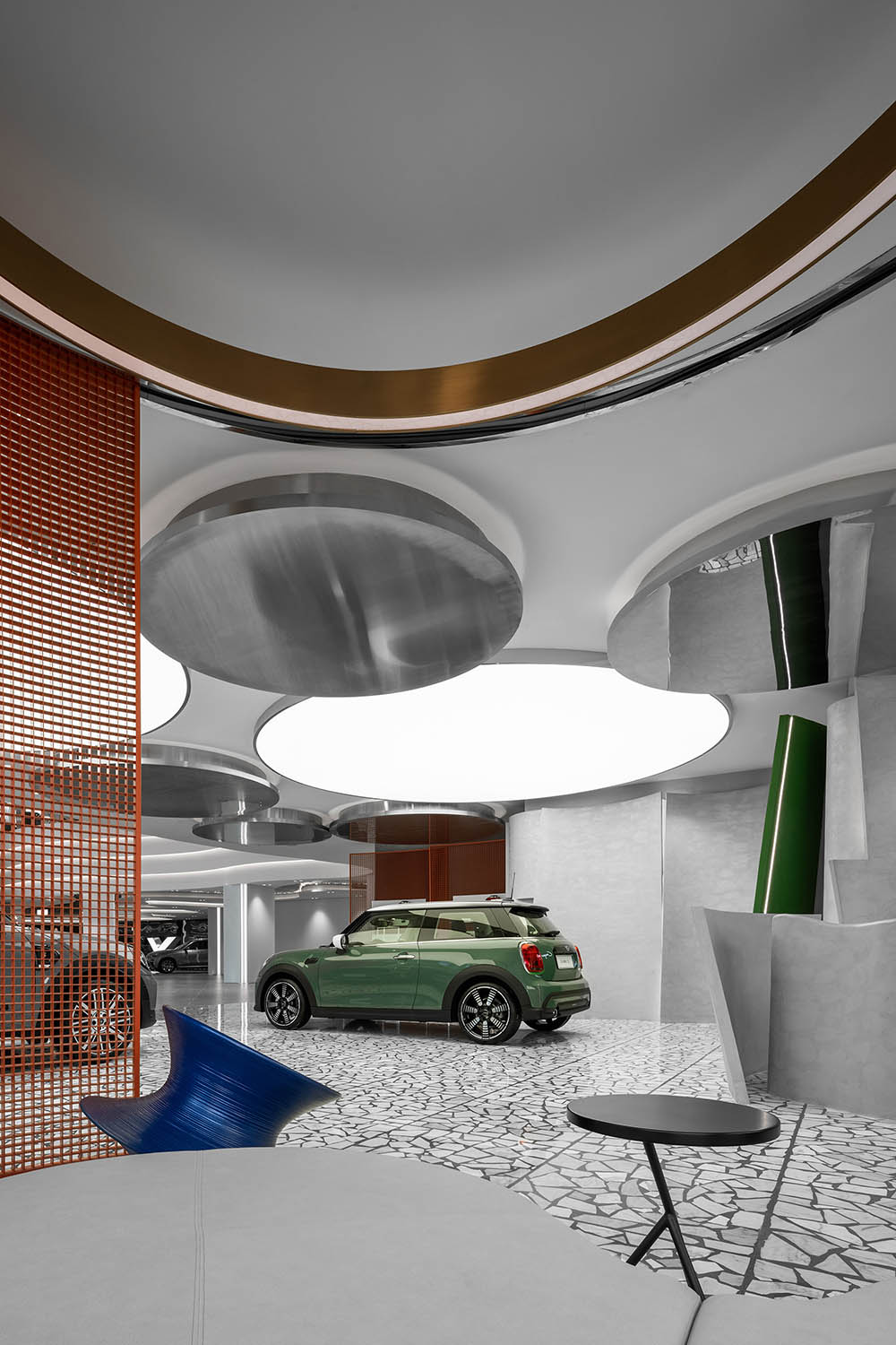
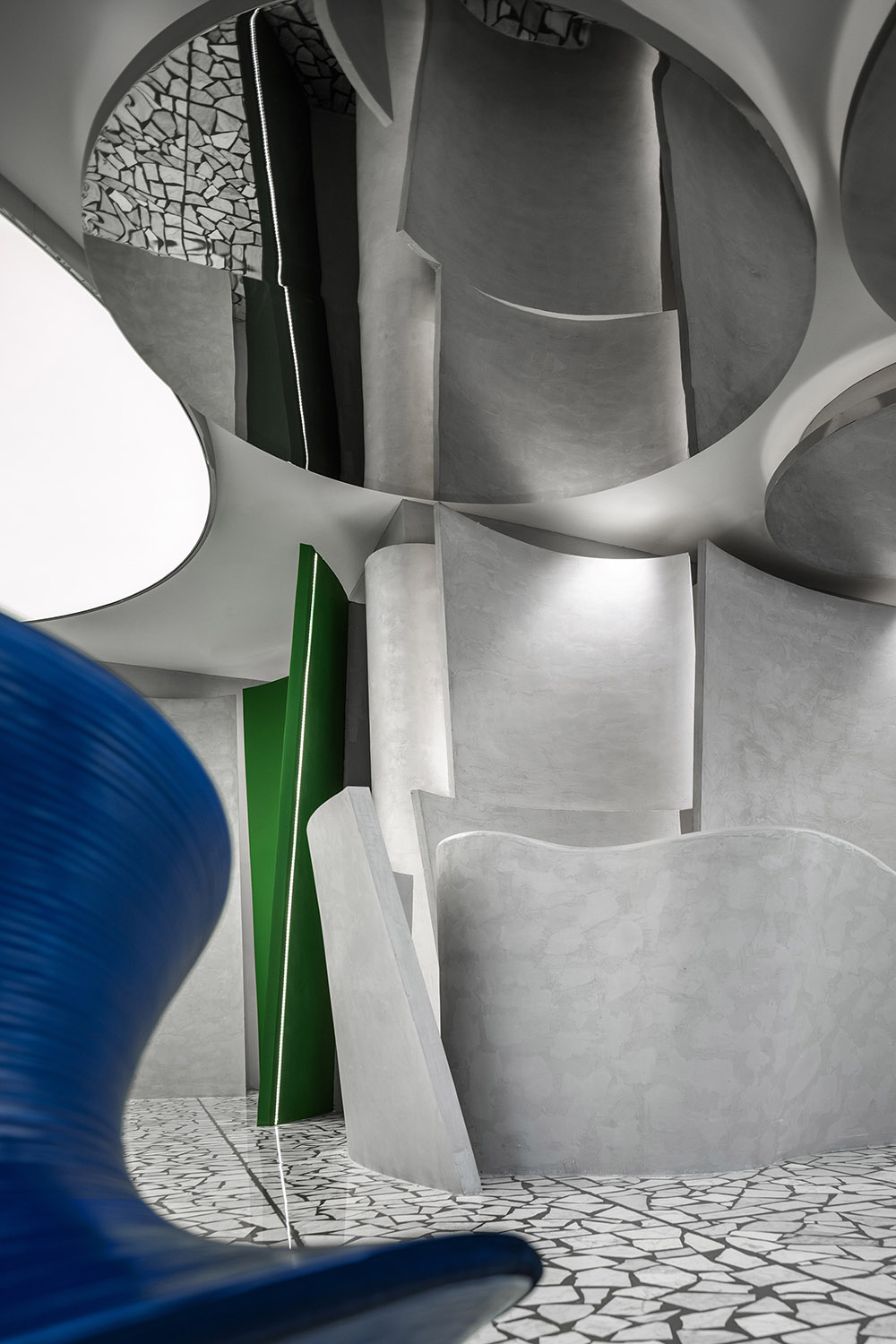
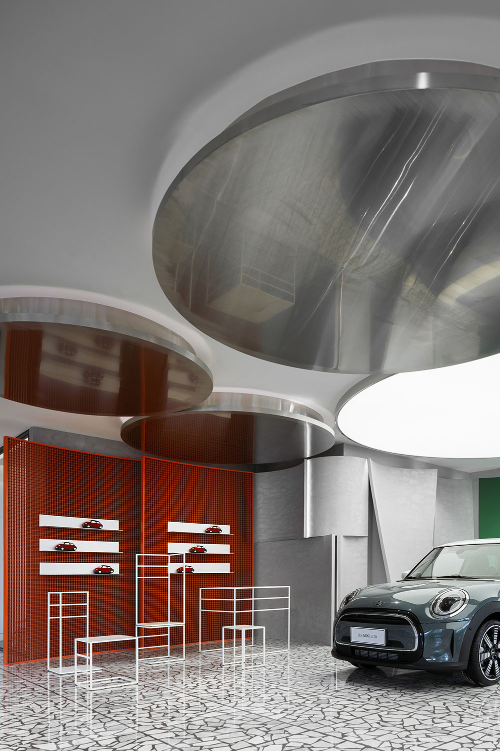
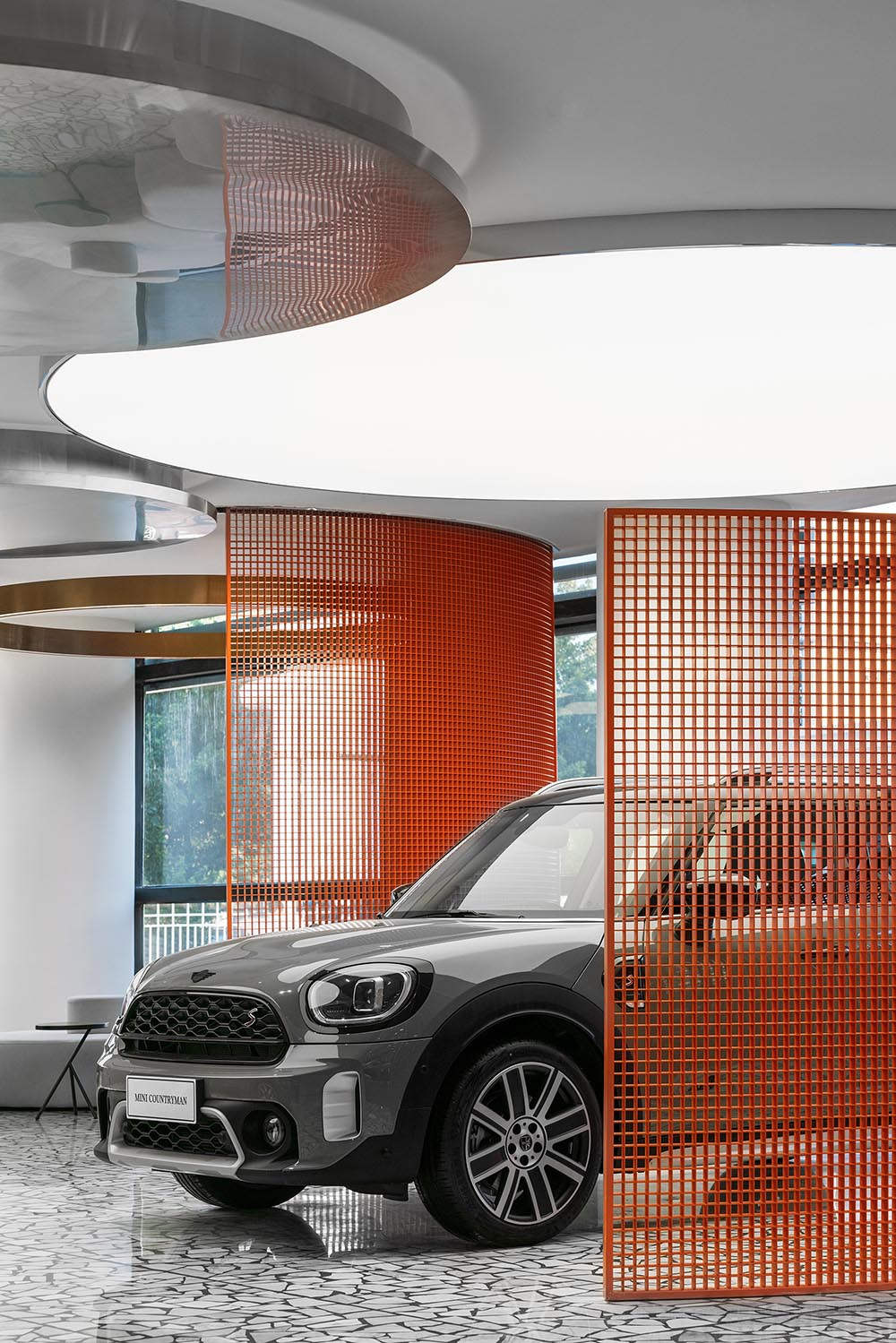
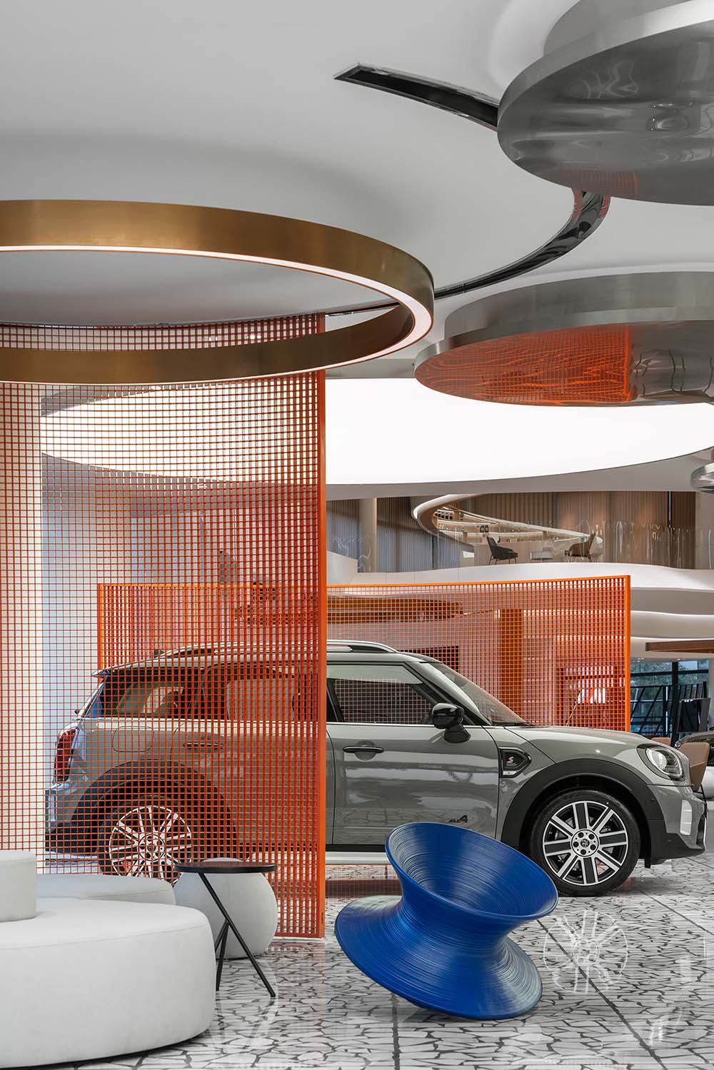
踏入展廳的瞬間仿佛被拉升了次元界限,平滑自洽的各類弧線如波浪般拓開人的官能感知邊緣,目光隨線條的起伏變幻即可將整個空間盡收眼底。與柔化的背景設計元素相對應,設計師以鮮明跳脫的色彩突出核心元素,墨綠、橘紅、靛藍等重點色的應用呼應了展車的不同風格,既清晰劃分各功能區域,亦保持無拘無界的觀感體驗。
The moment stepping into the exhibition hall, it seems as if the dimensional boundaries are stretched. The smooth and self-consistent arcs extend the edge of human sense perception like waves, and gazing with the ups and downs of the lines, you can have a panoramic view of the entire space. Corresponding to the softening design elements of the background, the designers highlighted the core elements with vibrant and vivacious colors. The key colors such as blackish green, tangerine, and indigo echo the different styles of the display cars, which not only clearly divides the space into different functional areas, but also maintains an unhampered visual experience.
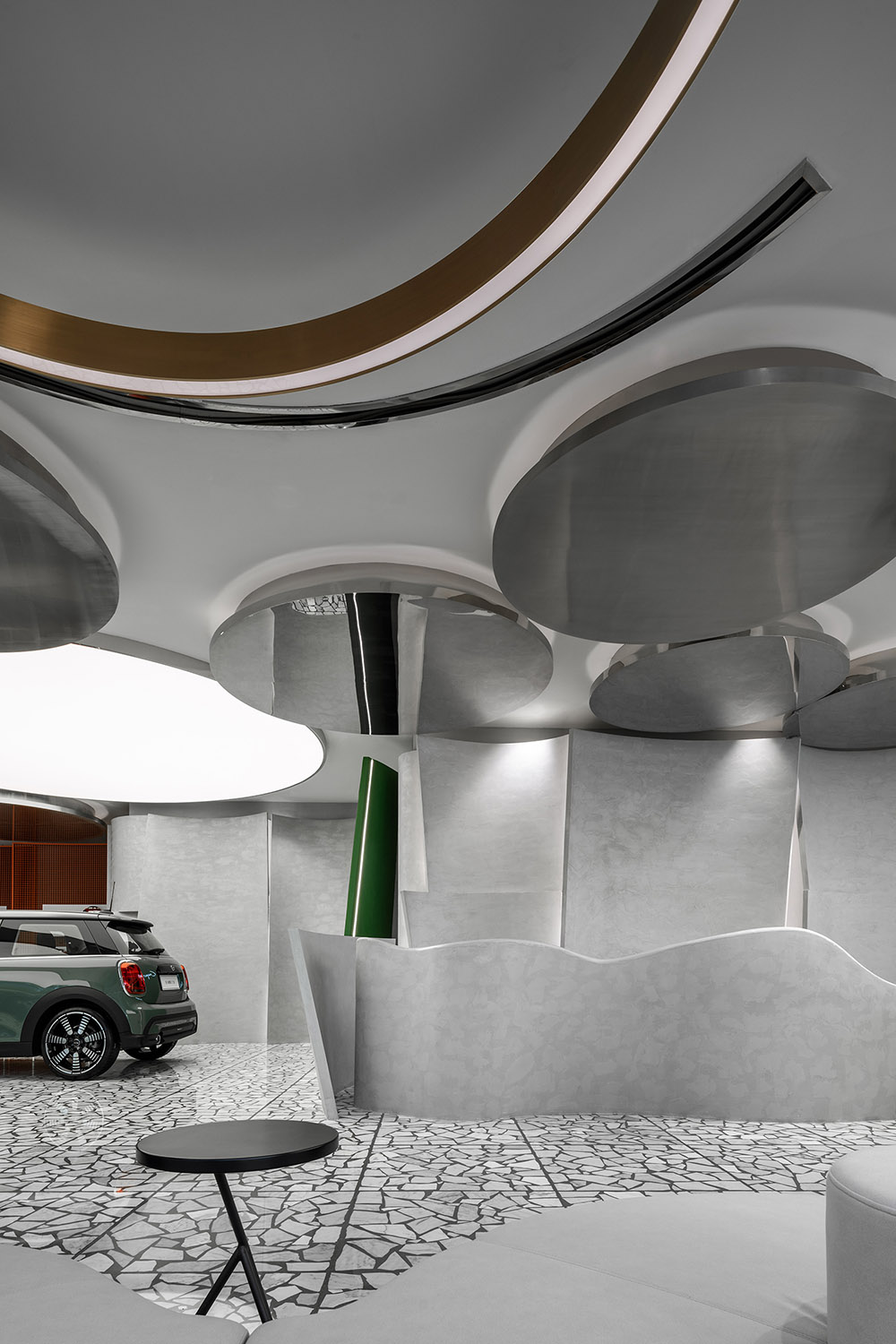
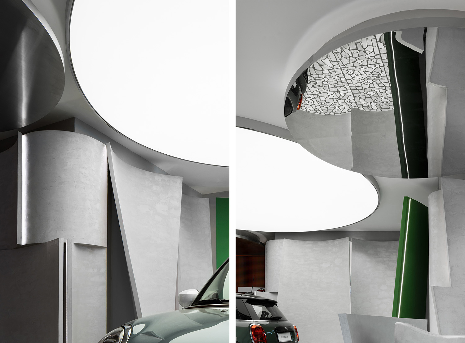
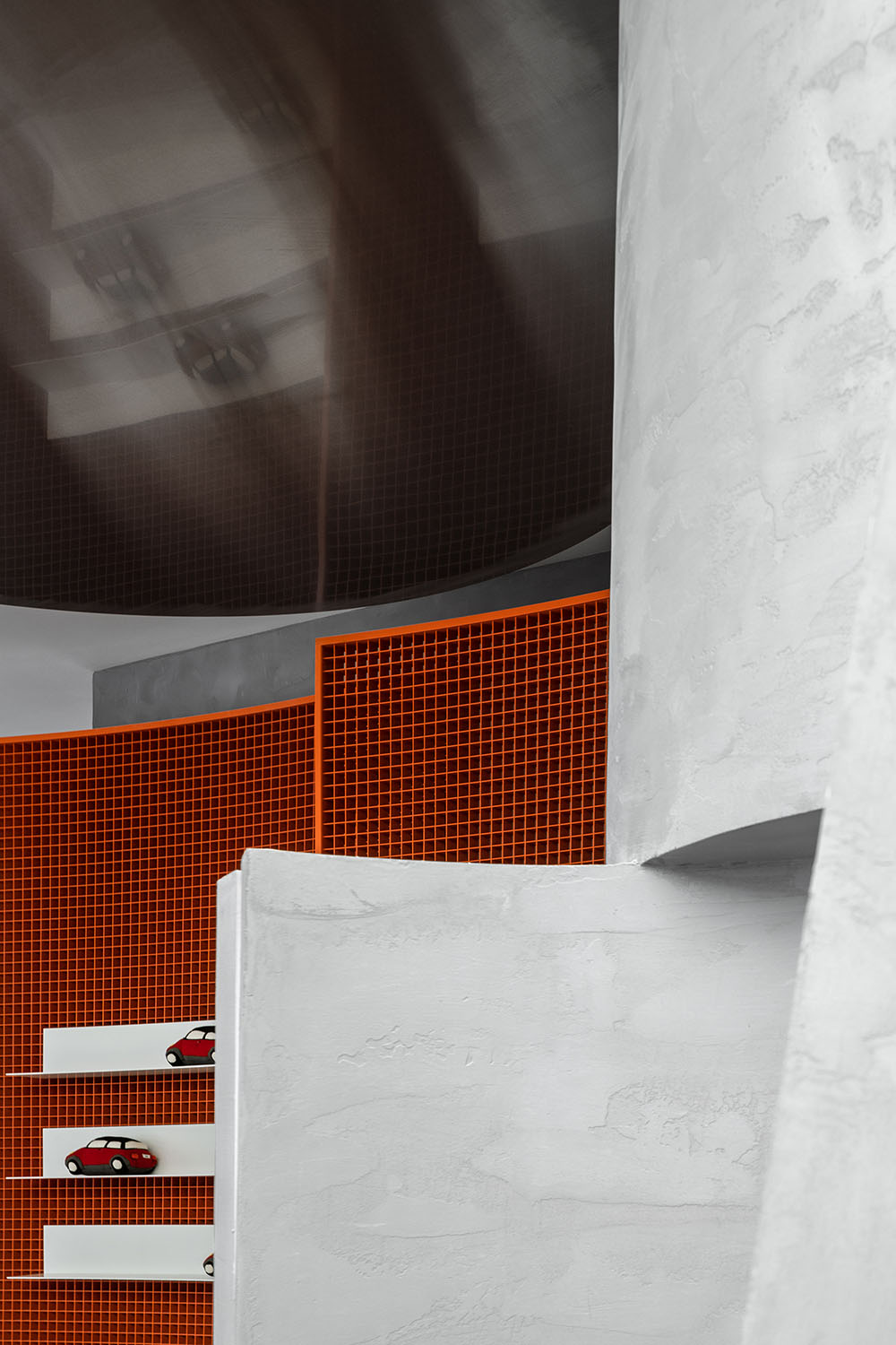
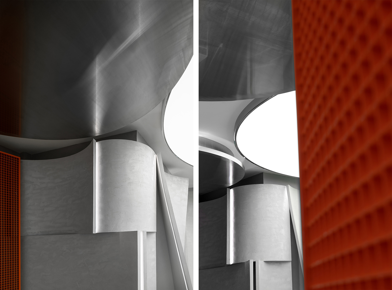
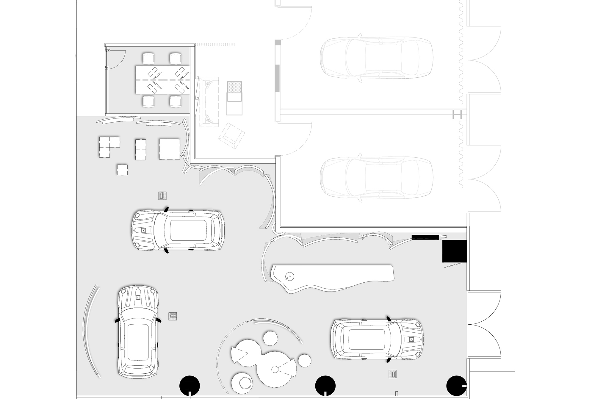
“微瀾彙聚即成巨浪”,空間造型靈感來源於波浪,設計師利用GRG材質塑造牆麵與吧台的弧度造型,曲度各異的線條交錯彙集,描繪出海浪交疊的輪廓,賦予空間奔騰流動的生命感。海浪既有包容兼收的文化特性,又含變革衝突的力量感,在展廳中多維呈現波浪造型,不僅能夠以豐富的線條變化拉伸空間視覺層次,更將包容變革的精神力爆發式地具化表現出來。
“Slight waves will converge to form a surging wave.” The space modeling is inspired by waves. The designers used GRG to create the curved shape of the wall space and the bar counter. Lines with different curvatures crisscross and converge, outlining the overlapping waves and giving the space a surging and flowing life. Waves with both an inclusive cultural characteristics and a sense of power with Innovation and conflicts, the wavy shapes presented in the exhibition hall from multiple dimensions not only enhance layering of the space visually with rich changes of lines, but also embody the spirit of inclusiveness and innovation explosively.
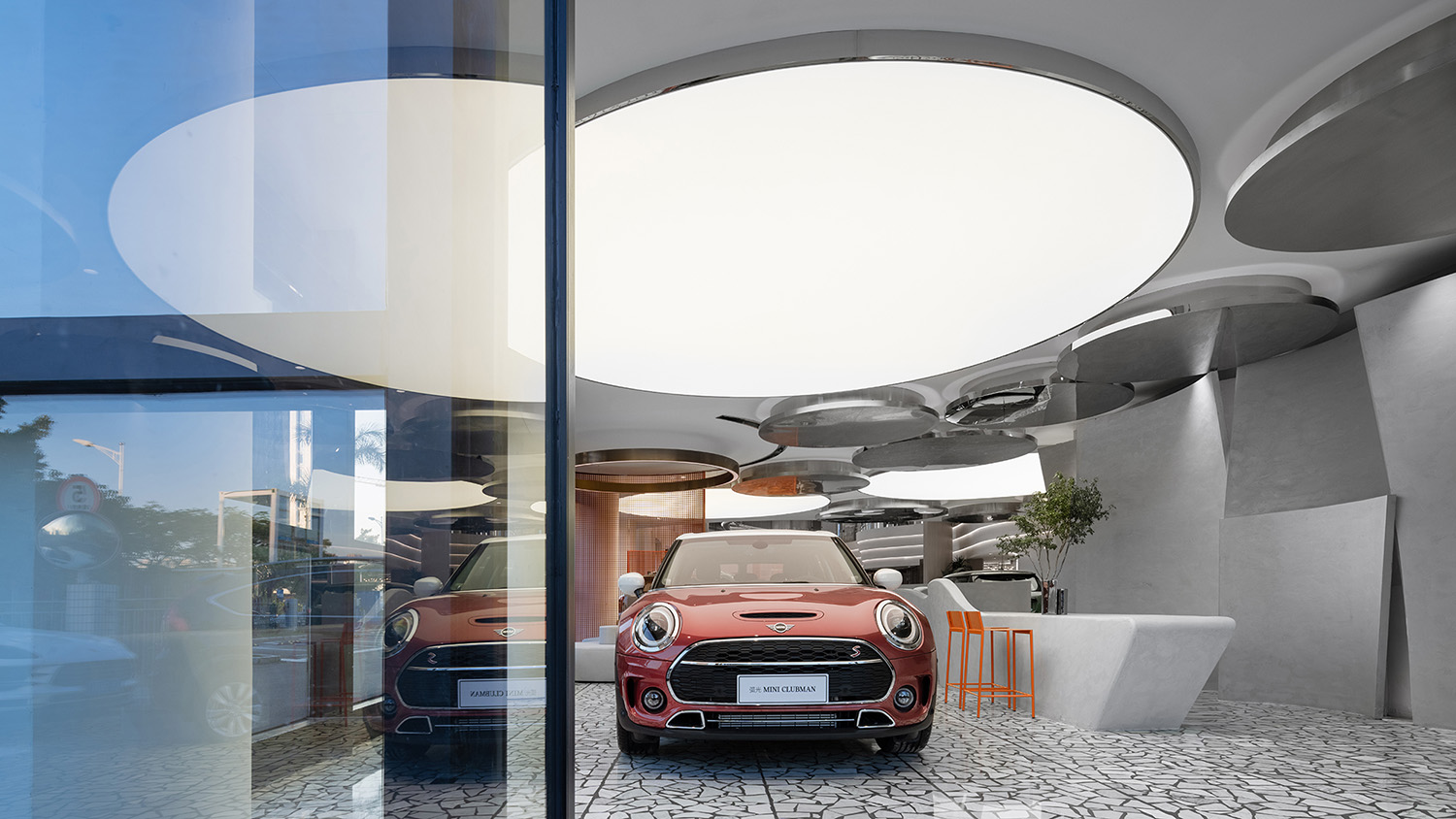
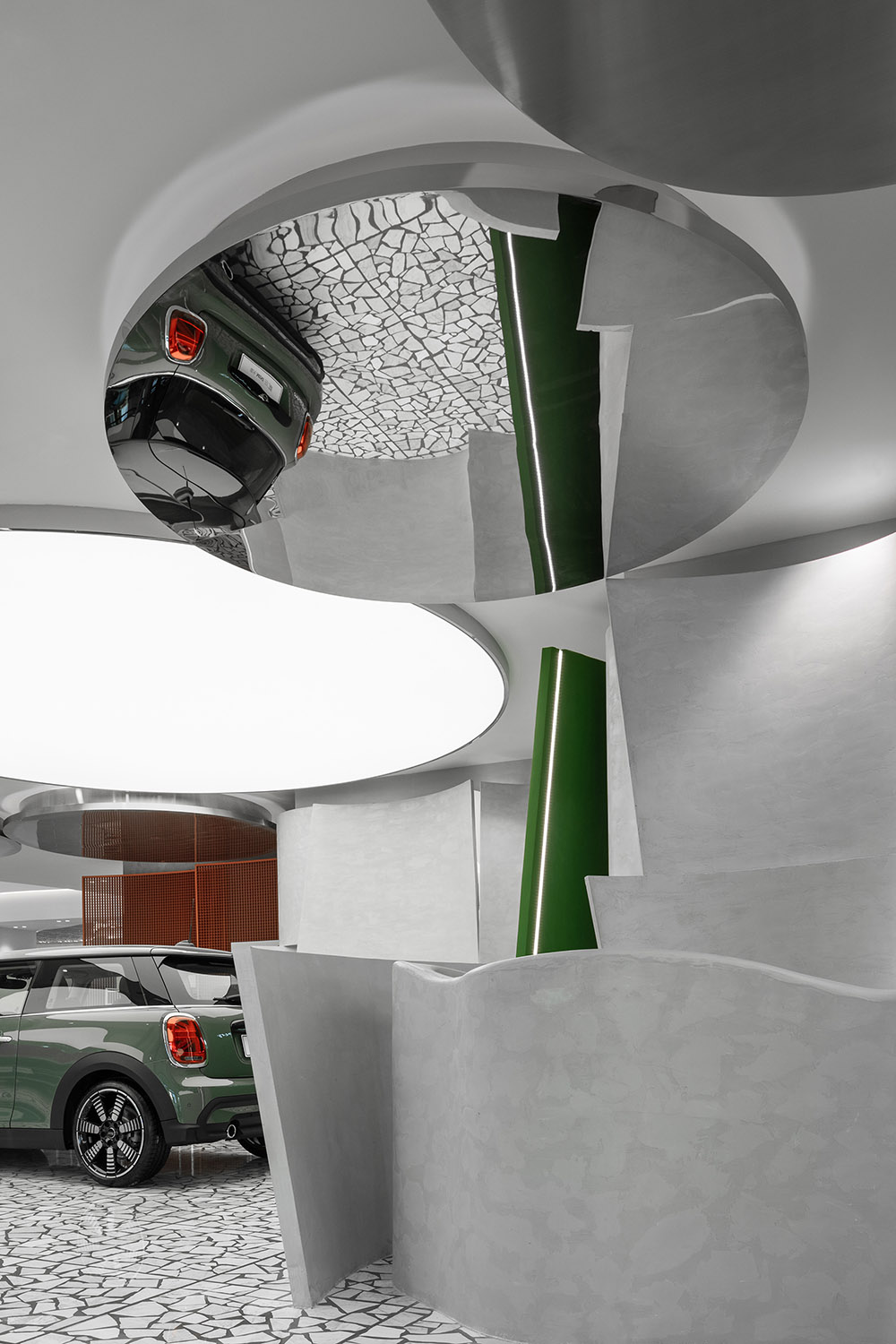
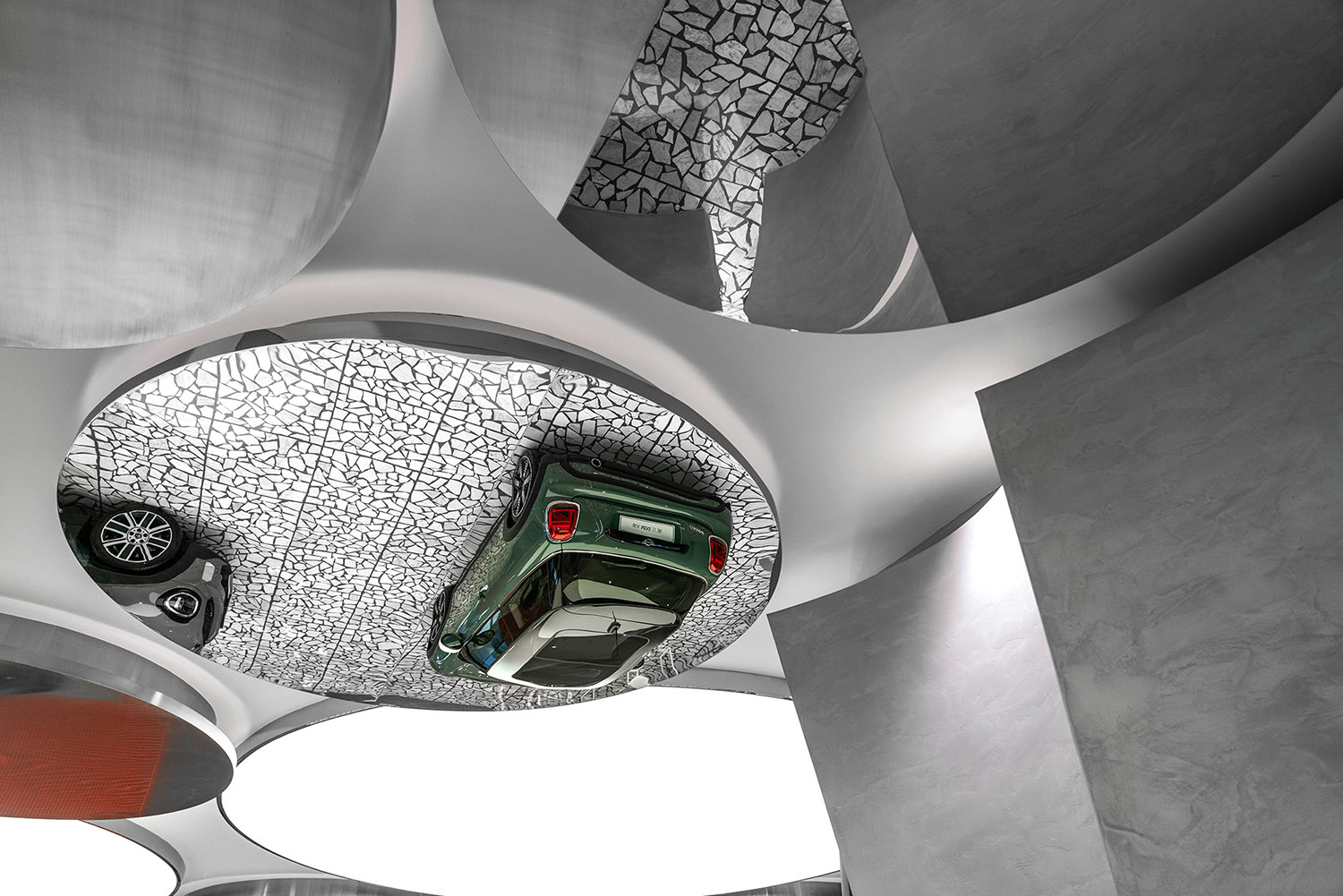
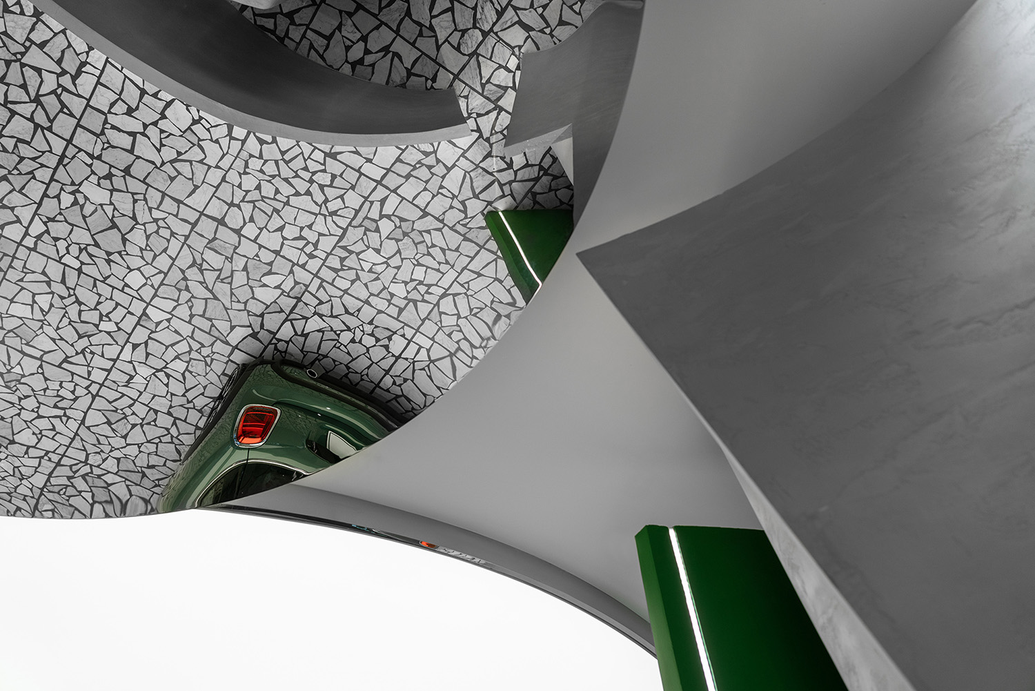
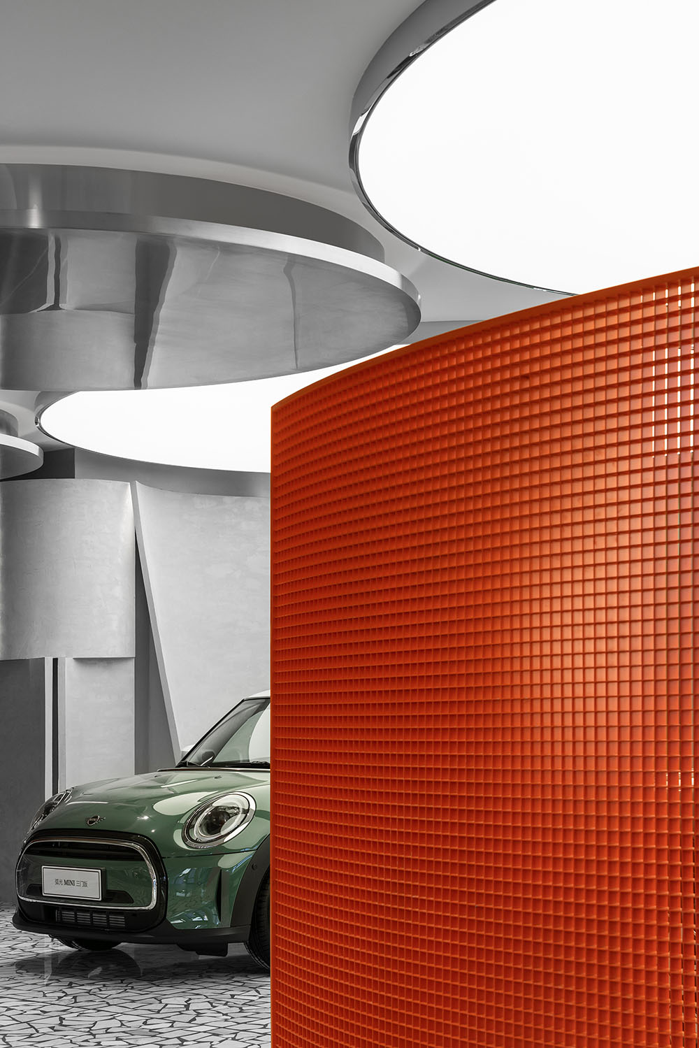
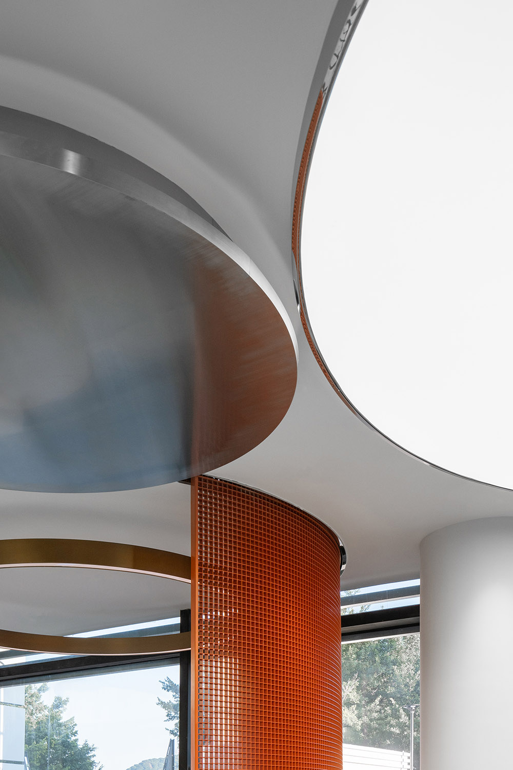
極目遠眺,海波如鏡;淺灘近看,浪沫浮白。大海從來不是某種單一的文化符號,詭譎莫測的變化與對立衝突的質感才是其藝術內蘊的核心所在。本案的設計並不止於以單純弧線模仿波浪,設計師抓住水波本身的特質,在天頂以大小不一的圓形鏡麵隱喻浪沫中的萬千氣象,多重鏡麵從不同角度折射空間的千姿百態,看似各自獨立的元素將空間串連為一個敘議參半的奇妙故事,聚焦不同的語彙便可窺得別樣的世界。
Looking far off, the sea waves are like mirrors; looking closer, the white foams are floating on the shoal. The sea is never a single cultural symbol, and the core of its artistic connotation lies in its fantastic and unpredictable changes and textures full of contradictions and conflicts. The designers are not limited to imitating waves with single arcs in the design of the case. They grasped the characteristics of the water waves, installing various sizes of circular mirrors on the ceiling to symbolize the world in the foam. Multiple mirrors reflect the various shapes of space from different angles. Seemingly independent elements connected, the space becomes a wonderful story in the way of narration with discussion where focusing on different vocabularies you can see different worlds.
寶馬MINI的強大精神力來源於從不同客戶的人生經曆中汲取內驅力量,展廳作為品牌精神的具象表達,更須凸顯MINI集眾所愛、自成風尚的個性特質。為此,設計師選擇多元材質:微水泥質感牆麵、圓形鏡麵不鏽鋼局部吊頂、橙色不鏽鋼置物架、水磨石地麵預製板……不同材質的糅合渲染出戲劇性的碰撞與反差,形成意象與現實的重疊、對立,將空間向度引向未來,築成一域映照現實又鏈接未來的馭美空間。
The strong spiritual power of BMW MINI comes from internal driving force drawn from the life experiences of different customers. As a concrete expression of the brand spirit, the exhibition hall must highlight the popular and distinctive personality characteristics of MINI. Therefore, the designers chose multiple materials: microcement for wall space, circular mirror stainless steel for partial ceiling, orange stainless steel for shelves, terrazzo prefabricated panels for floor… The combination of different materials creates dramatic collisions and contrasts, forms an overlap and opposition of imagery and reality, and guides the dimension of the space towards the future, creating a space with beauty that reflects reality and links the future.
逐“浪”是一種全新的人生態度,即能理解為年輕人群敢想敢為、執迷所愛的不懈追求與探尋,也可隱喻身居“浪浪山”的青年群體在傳統環境中革新生活模式的期許與願景。前海寶馬MINI展廳從年輕人最感興趣的“浪”入手,糅合多重意象給每個心懷遠海的年輕人以恰當的答案,將產品精神與每個用戶的獨特情懷精準對接。
“Pursuing waves” is a brand-new attitude towards life. It can be explained as the unremitting pursuit and exploration of young people who dare to think, dare to do and are obsessed with what they love. It can also be a metaphor for the expectations and visions of young people living in “Wave Mountain” to innovate their lifestyle in traditional environments. The exhibition hall for BMW MINI in Qianhai starts with the “waves” that young people are most interested in, and the combination of multiple imagery provides an appropriate answer for each young person who has a deep ocean within his heart, and accurately connects the product spirit with the unique feelings of each user.
∇ 平麵圖 © 朱海博建築設計事務所 Plan © ARCHIHOPE
項目信息
項目名稱:MINI前海客戶體驗中心
項目地址:深圳市前海
設計單位:ARCHIHOPE朱海博建築設計事務所
主持設計師:朱海博
設計師團隊:方潔、許暢
建築麵積:200平方米
主要材料:GRG、水磨石、微水泥等
完工時間:2022年12月28日
項目攝影:吳鑒泉
Project Name: Customer Experience Center for MINI in Qianhai
Project Location: Qianhai, Shenzhen City
Design Company: ARCHIHOPE Ltd.
Chief Designer: Hihope Zhu
Designer Team: Jane Fang, Xu Chang
Floor Area: 200 square meters
Main Materials: GRG, Terrazzo, Microcement, etc
Completion Date: December 28th, 2022
Project Photographer: Vincent Wu


