木頭是藝術家的創作靈感之源,通過它打造的商業空間為訪客的探索帶來更多生機和活力。——HRD翰弘設計
Wood is the one of the creative inspirations for artists, and the commercial space applied in woods, brings more vitality and introduces natural ambiance to visitors’ exploration.——HRD Design
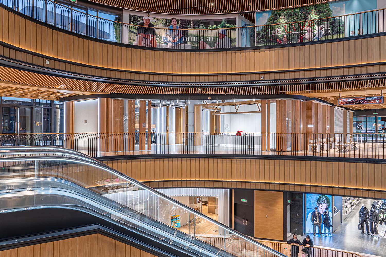
nicerice前灘店位於上海浦東前灘太古裏商場的木區內,是該區域的標誌性地點,也是nicerice在上海開設的第三家店鋪。在上海經曆了三年的疫情後,線下體驗對消費者變得尤為重要,這促使本土設計師品牌nicerice分別開設了新樂路店(首家線下店)和新天地南裏店,並收獲了良好的市場反饋,積累了許多熟知和喜愛品牌風格的客戶群體。
Nicerice Qiantan Store is situated in the wooden area of Taikoo Li Mall in Pudong, Shanghai. It serves as a distinctive landmark in the area and marks nicerice’s third store opening in Shanghai. After going through three years of the pandemic in Shanghai, offline experiences have been expected to bring more possibilities to consumers. This prompted the Shanghai-based, designer brand nicerice, to open its first offline store on Xinle Road followed by the second in Xintiandi, both of which have received positive market feedback and attracted many customers, fond of the brand’s style.
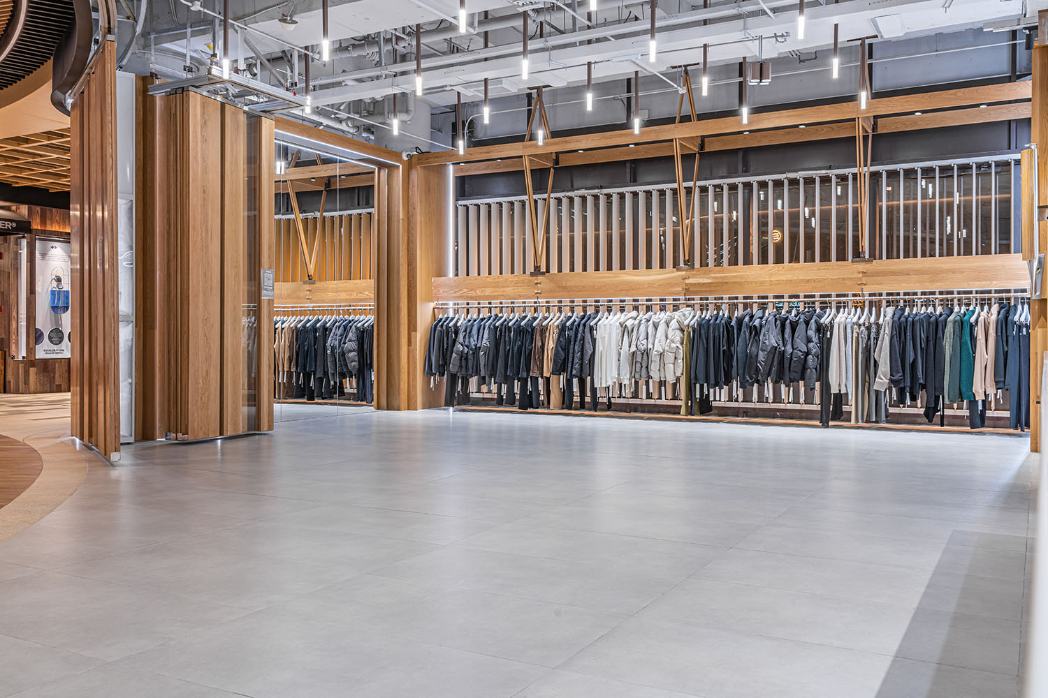
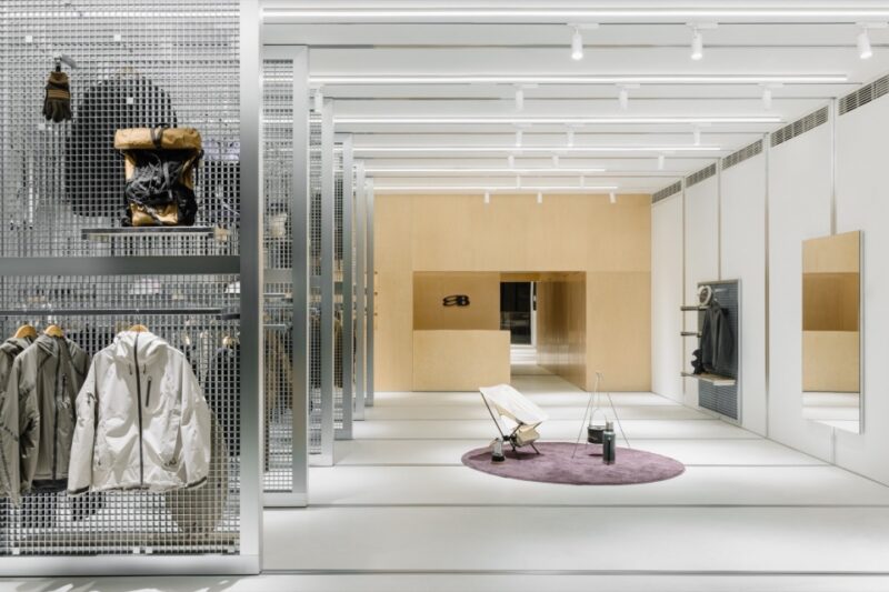
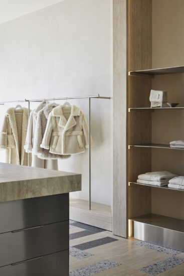
HRD翰弘設計將nicerice前灘店設計成多功能的複合體驗空間,用於展示品牌理念、產品陳設、拍照打卡以及銷售試衣等。受品牌傳達的理念“隻是衣服而已”,一種輕鬆、簡單的生活態度影響,設計師在店鋪的後方,劃分出一片區域供人茶歇休憩。逛完前灘店後,你會感到一種新奇、而又舒適的感覺。
HRD Design has transformed the Nicerice Qiantan Store into a multifunctional experiential space, dedicated for presenting brand concepts, product displays, check-out spots, and clothing trials. Inspired by the brand’s philosophy of “just clothes,” which reflects a relaxed and simple lifestyle attitude, the designers have planned an area at the back of the store for people to relax and take a break. After exploring the Qiantan Store, you will experience a sense of novelty together with the comfort endowed in the entire space.
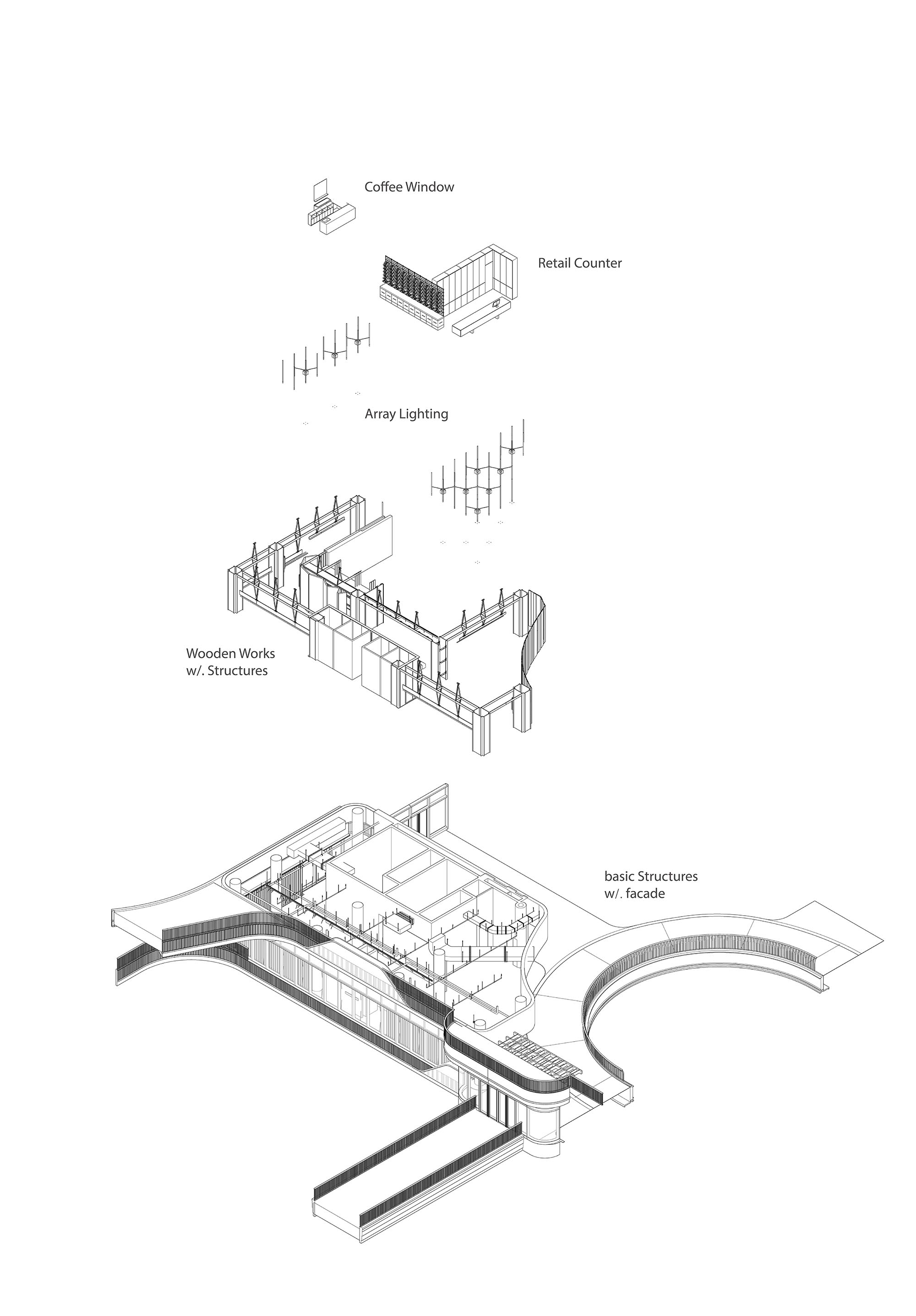
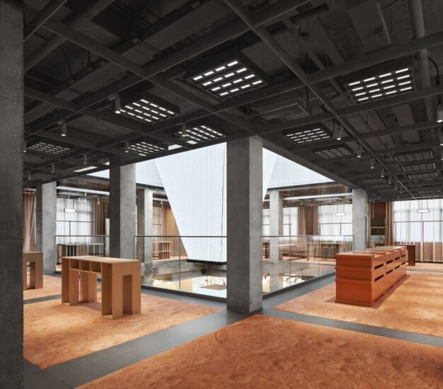
∇ 爆炸圖概括
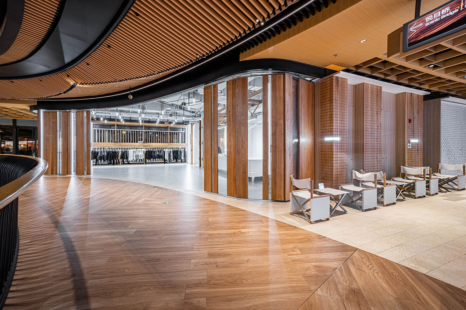
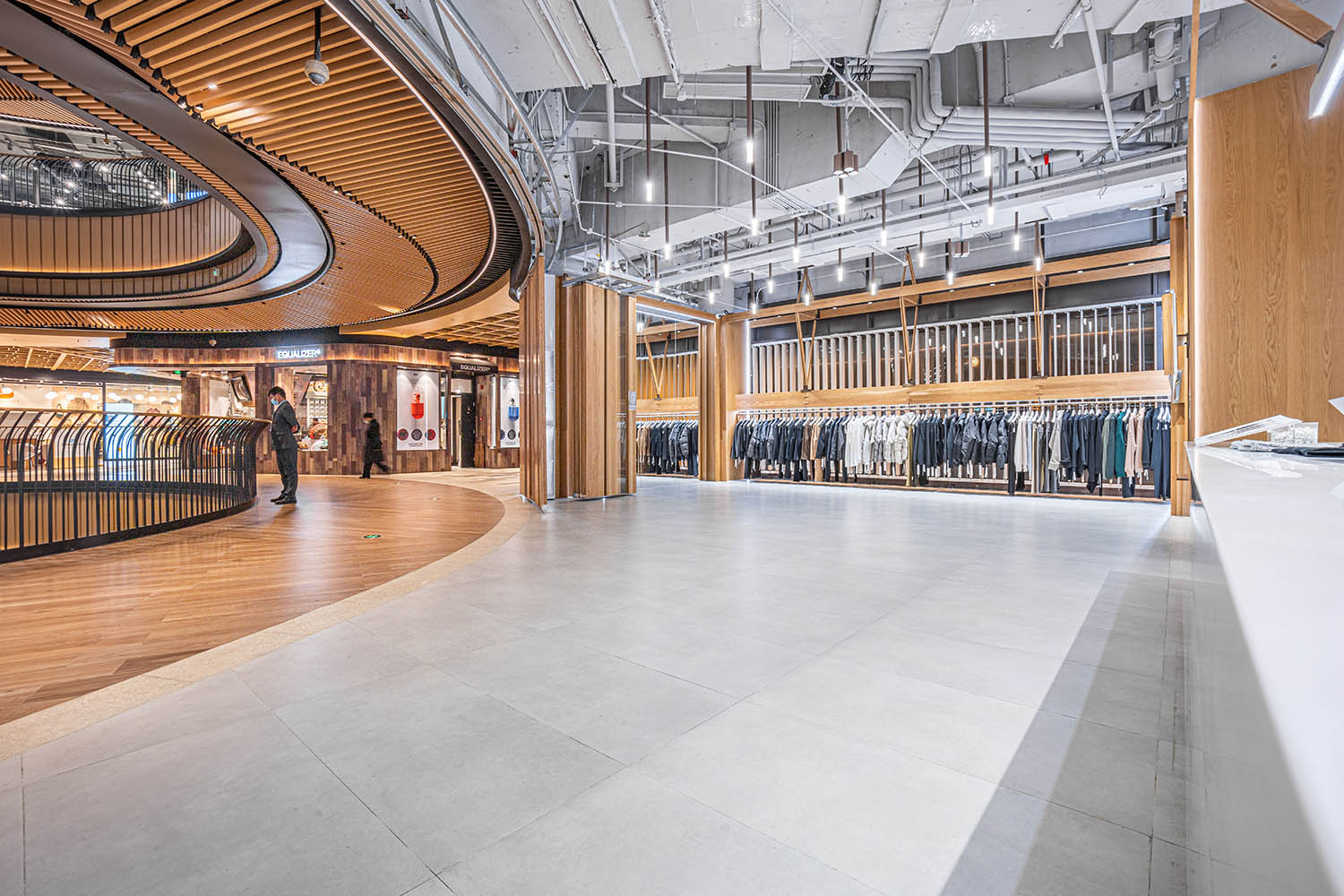
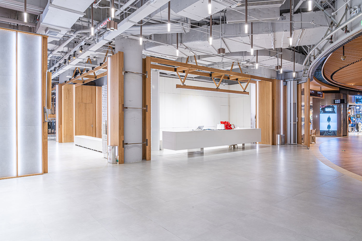
通過引入“木屋中的木屋”概念,我們將品牌空間與商場公區環境相融合,為人們帶來無縫的漫步體驗。這一設計理念旨在突破品牌在線下空間中極力凸顯自我識別度的常規思想,讓小空間延續大空間的氛圍,並以此強化品牌的調性。我們的目標是營造寧靜、放鬆和溫暖的氛圍,讓人們感受到內心愉悅和對自然木作的共鳴,從而提升訪客的探索體驗,與品牌產生深層次的情感聯係。
By introducing the concept of “a wooden house within a wooden house,” we seamlessly integrated the interior with the public area of the shopping mall, creating intact wandering experience for people. This design concept aims to break up the conventional idea of emphasizing spatial identity, instead allows the inner space to extend certain atmosphere of the building already established, thus the brand’s feature appears in a more compelling way. In the end, our goal is to create a tranquil, relaxed, and welcoming atmosphere, where people can feel the inner joy evoked by discovering while also resonate with natural woodwork, thereby one’s experience could be completed in more explorative way establishing a deep emotional connection with the brand.
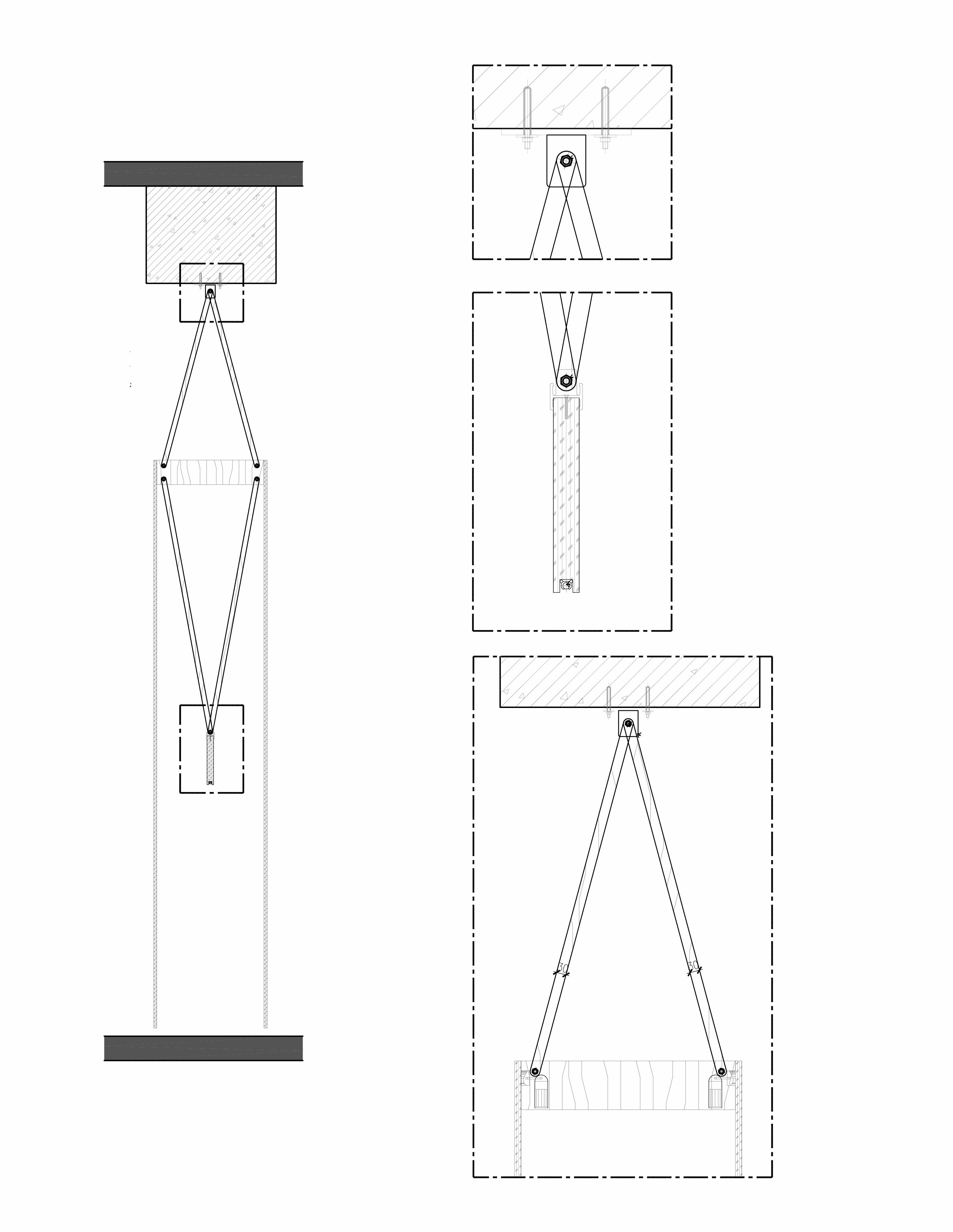
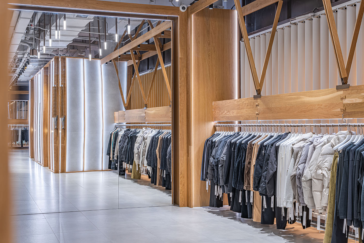
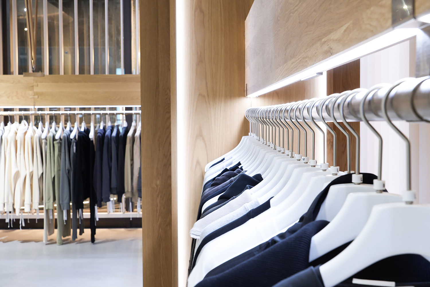
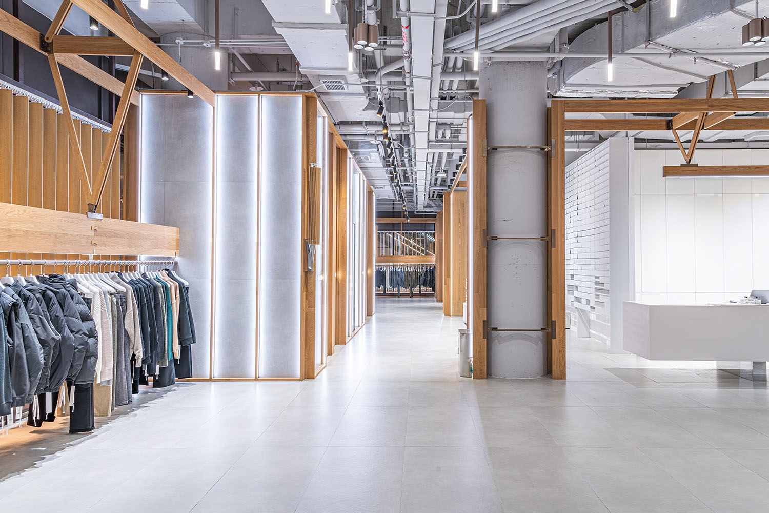
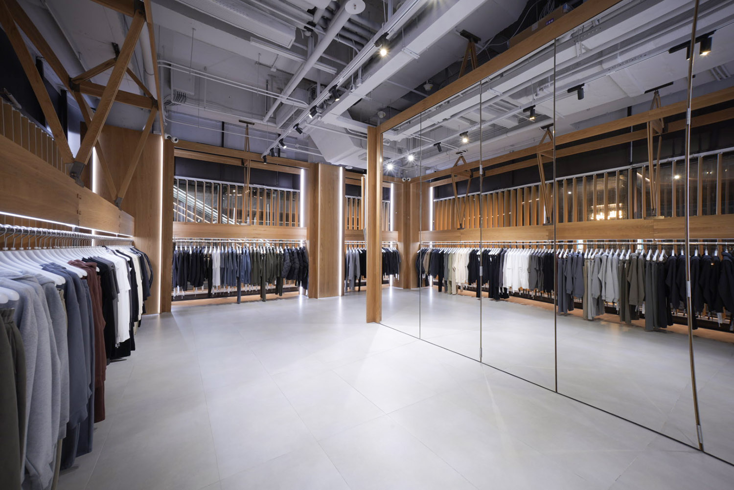
“木屋中的木屋”不僅僅是使用木材進行裝飾,也是以木質美學為設計指導,以結構力學為依據,構建了一個完整的功能係統。這個係統用以滿足照明、陳列、試衣功能和倉儲收納的需要。
“The wooden house within a wooden house” is more than just using wood as decoration. It is guided by the aesthetics of wood and built upon the principles of structural mechanics, creating a comprehensive functional system. This system serves the purposes of lighting, display, fitting rooms, and storage, fulfilling various demands within the space.
∇ 道具 木構
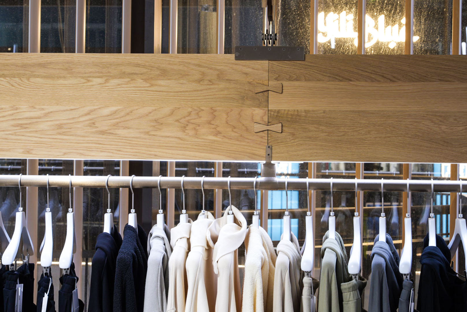
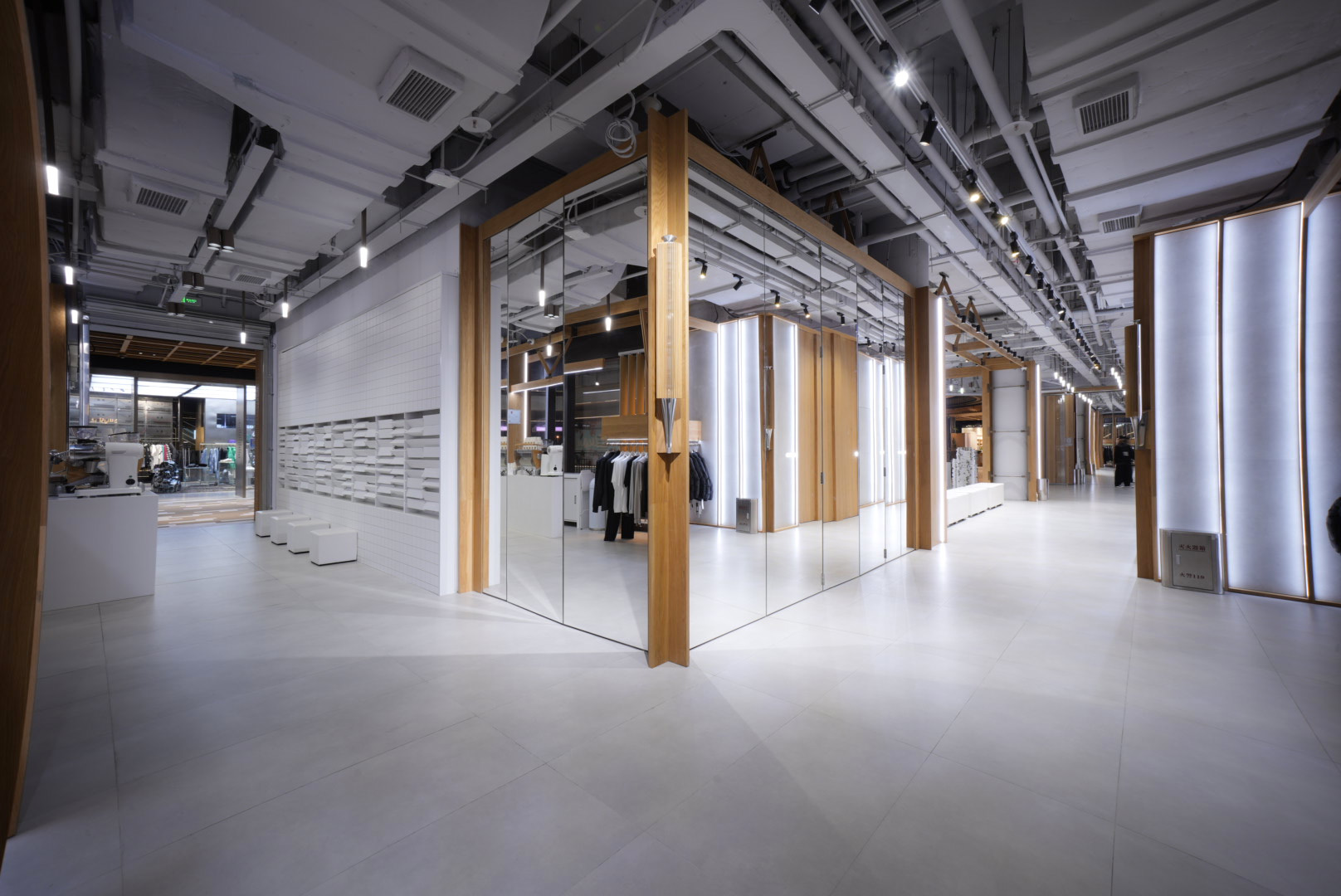
我們也在空間中進行了木頭與其他材料的融合探索,木構件的連接處嵌入了金屬構件,將白色的人造石和啞光塗料引入核心筒區域,灰色水泥則作對比,差異化地呈現出現代與工業感,它帶來一種堅實和穩定的氛圍,因此選作地麵和基底牆體的材料。
We also explored the fusion of wood with other materials in the project. Metal components were employed at the joints of the wooden structure, incorporating white artificial stone and matte coatings into the core area. In contrast, gray cement was used to create a sense of modernity and industrial aesthetics, which contributes to a more solid atmosphere, alternating an ideal choice for the flooring and base walls.
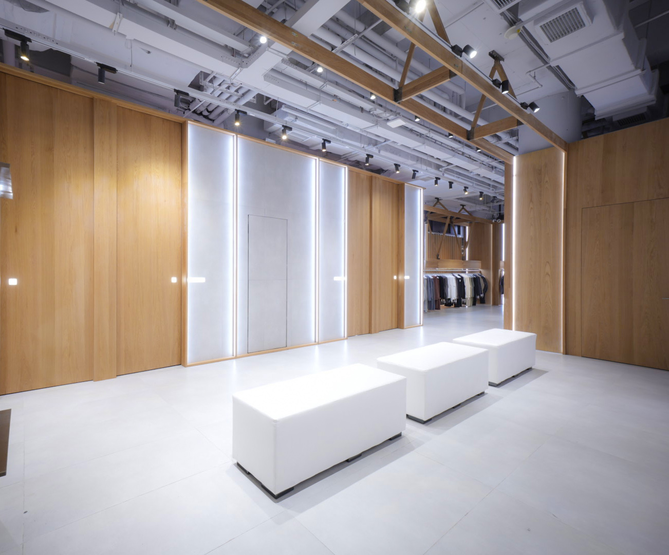
試衣間區域布置了簡潔的皮質軟包長凳,背靠著輕聲吹拂的電力驅動風牆,為人們創造了一個私密而舒適的空間,用於等待、休息或與朋友交談。
The fitting rooms are furnished with sleek leather cushioned benches, backed by electrical wind walls that gently blows. It creates a private and comfortable space for individuals to wait, relax, or engage in conversations with friends.
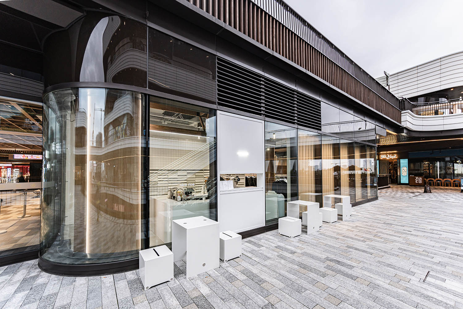
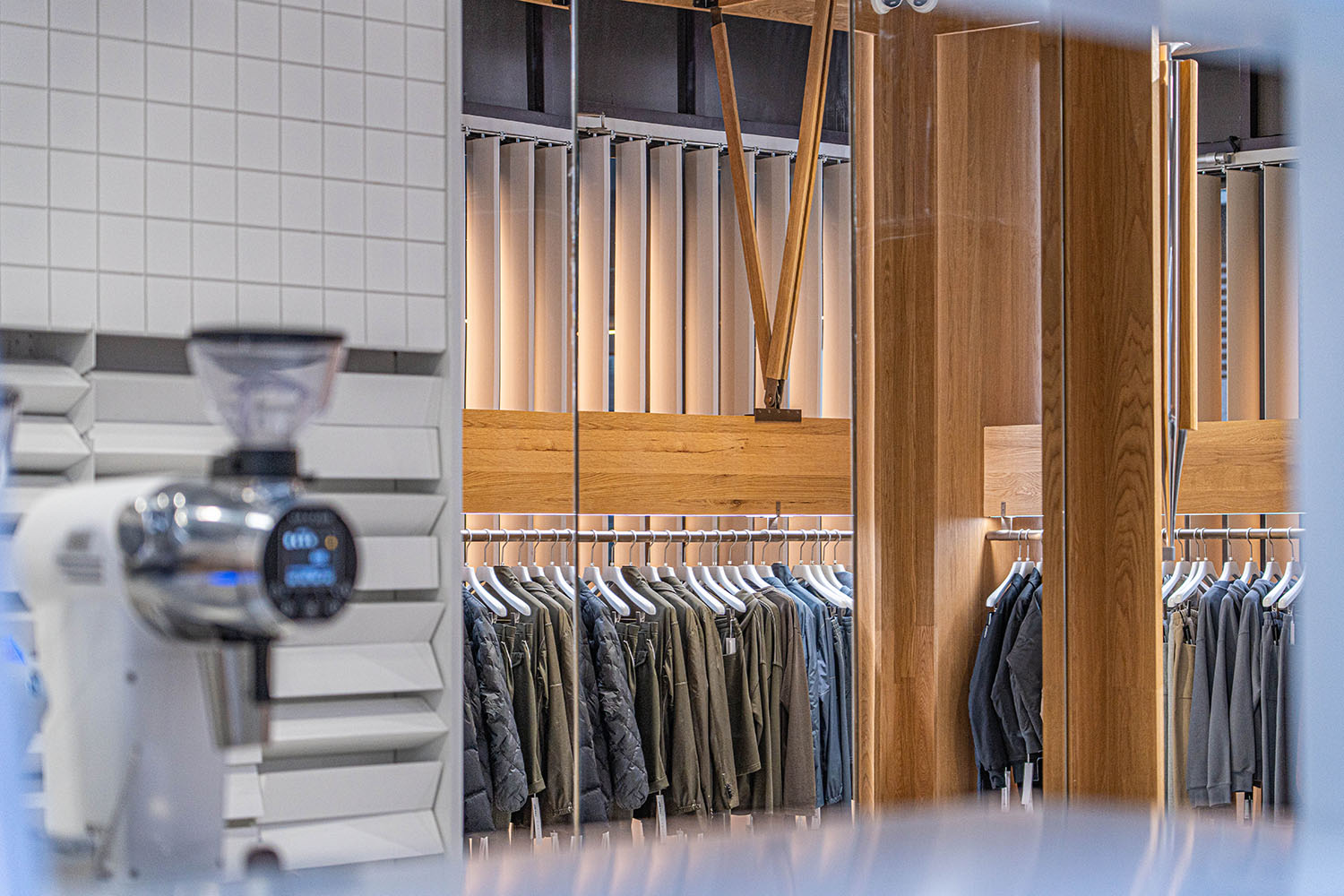
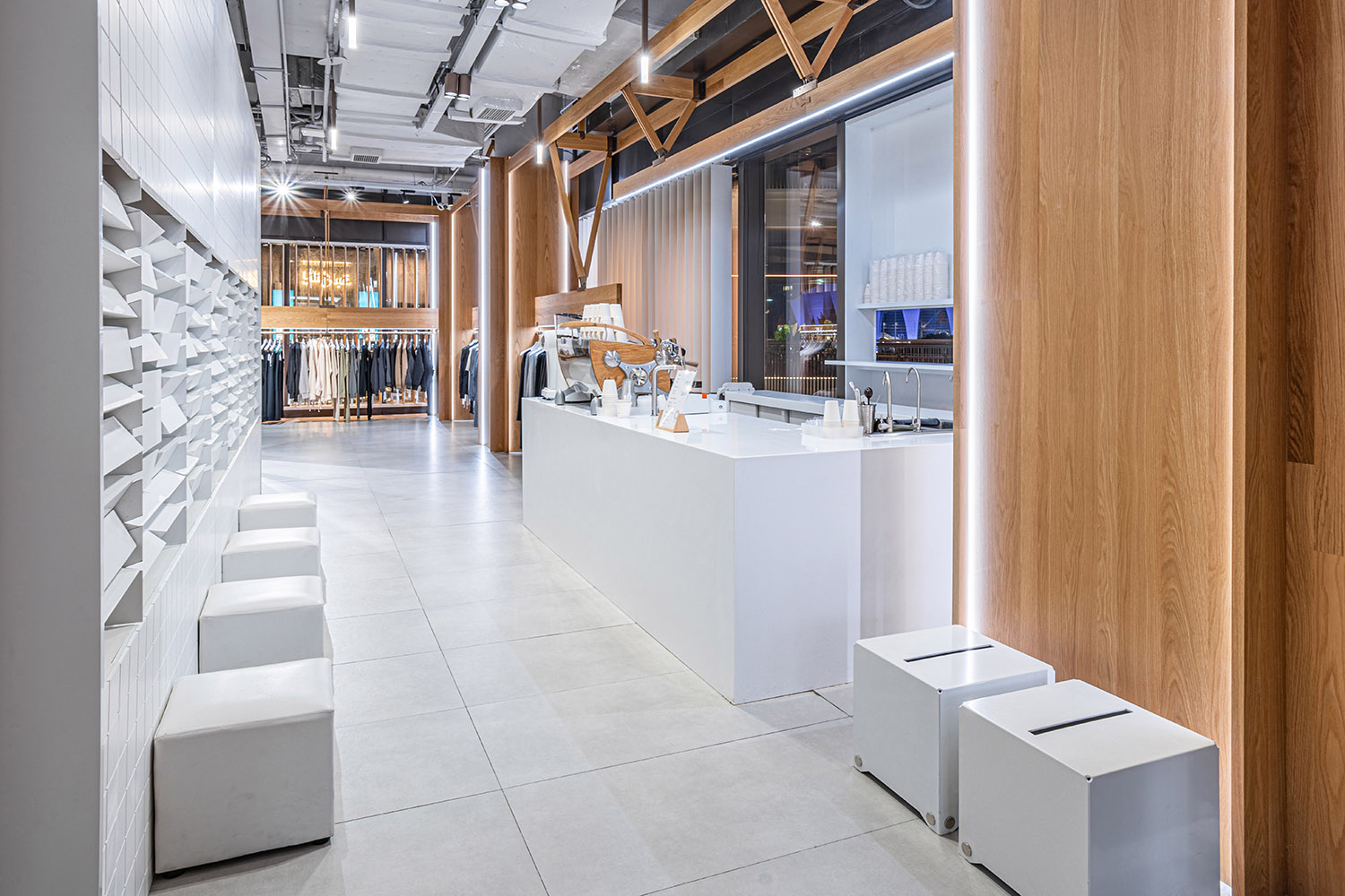
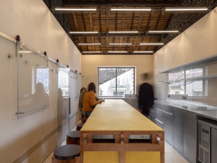
此外,木屋的後區還設有一個同時為內外提供服務的咖啡吧台,使用與收銀台一致的純白色人造石進行打磨,呈現一致的視覺效果,也打造完整的店鋪體驗。同時,我們在此設計了 “第二互動區”,置入隨手可撥動的翻滾牆,為人們在等待和休息時帶來孩童時代熟悉的趣味體驗。
In addition, the rear area of the site features a coffee bar that serves both the interior and exterior. The bar is crafted with pure white engineered stone, polished to match the cash counter, creating a cohesive visual effect and enhancing the overall store experience. Furthermore, we have designed a “Second Interactive Zone” in this area, introducing a rolling wall that can be easily manipulated. It provides a playful experience, which is reminiscent of childhood for people to enjoy.
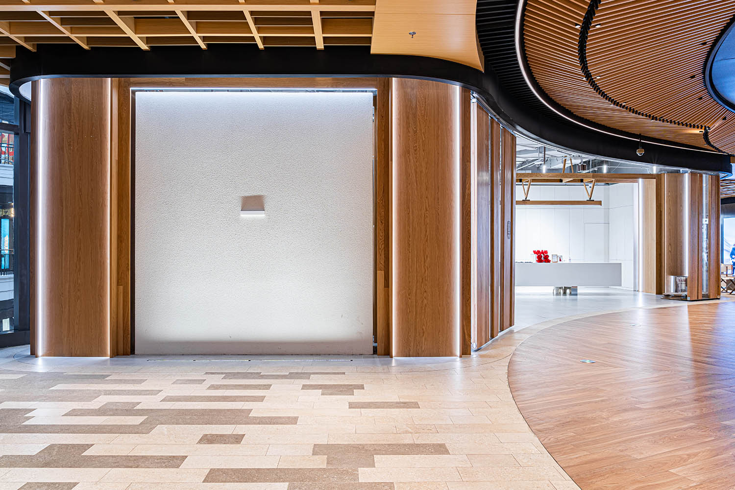
經過與太古裏商場的運營及物業方多方溝通後,我們獲得了在木屋外側商場公區立麵,進行一致風格裝飾的許可。在確保設備房和消防逃生樓梯正常使用的前提下,我們開辟了第三互動區。通過可視交互的數字化風牆裝置,連同CNC切割加工的實木飾麵板,將店鋪的兩麵開口連接起來,形成內外貫通的nicerice空間視覺形象。
After extensive communication with the operations and property management of Taikoo Li, we obtained permission to decorate the exterior facade of the wooden cabin in a consistent language with the mall’s public area. With the proper functioning of facility room and fire escape stairs, we created a “Third Interactive Zone”. By combining a visually interactive installation that features digital wind wall with CNC-cut solid wood panels, we connected the two sides of the store’s openings, creating a seamless visual impact that unifies the interior and exterior of Nicerice Qinatan Store.
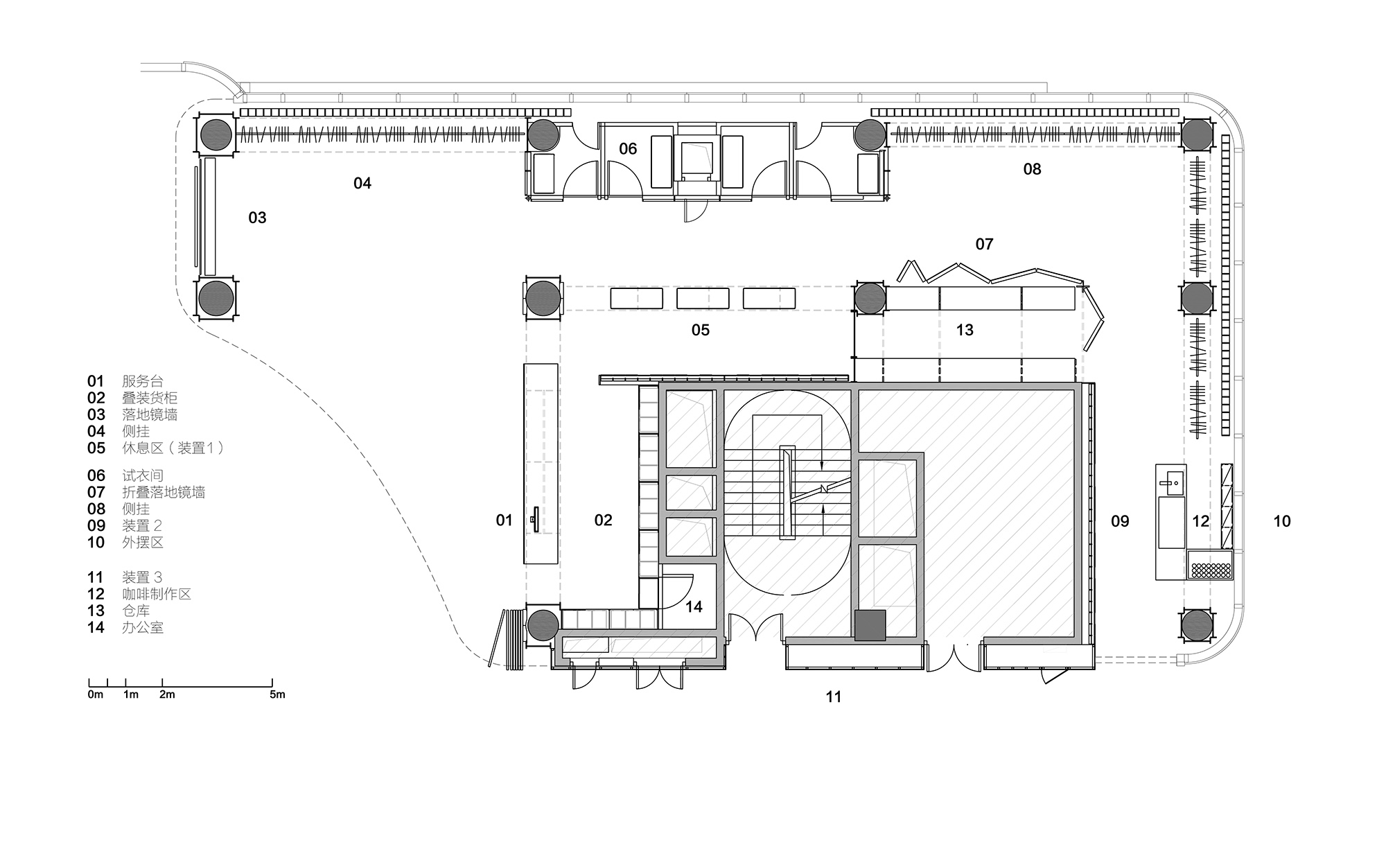
∇ 平麵圖
項目信息
木屋裏的木屋 – Nicerice前灘店
業主:Nicerice好飯
完成時間:2022
麵積:280sqm
地址:上海市浦東新區前灘太古裏木區3樓
項目類型:商業
建築設計:HRD Design 上海翰弘建築設計
主持設計:柴弘、孟寰
團隊:徐冰峰(項目主管),袁衛兵(現場主管),蔡東瑋(施工圖)
施工:上海重玖建築裝飾工程有限公司
攝影:NI陸林妮
主要材料:杜邦人造石、木飾麵、PET、大師漆、岩板
裝置設計:李昕(互動裝置),範可(結構裝置),楊磊(藝術裝置),楊廣瑞(百葉裝置),
呂新娟、管洪毅(收納定製)
照明支持:張勇
木作:安信偉光
Client: nicerice
Completed year: 2022
Floor area: 280sqm
Address: 3rd floor of wooden area, Qiantan Taikoo Li, Pudong, Shanghai
Project type: commercial
Architectural and interior design: HRD Design
Design Director: Red Chai, Meng Huan
Design Team: Steven Xu (Project Manager), Weibing Yuan (Site Manager), Dongwei Cai (drawings)
Construction Firm: Chongjiu Architectural Deco, Shanghai
Photographer: Linni Lu
Material: artificial stones, wooden finish, PET, painting, tiles
Installation Design: Xin Li (interactive), Ke Fan (structural), Lei Yang (Art), Guangrui Yang (Fins)
Lighting Support: Yong Zhang


