我們這次選擇了一處擁有獨立院落的住宅空間作為新的辦公場所。
麵對相比原工作室縮小近40%體量的情形,如何合理且有效利用空間,同時營造一處弱化辦公標簽的場所成為了我們此次設計嚐試的方向。
We have chosen a residential space with an independent courtyard as our new office space this time.
Faced with a reduction of nearly 40% in size compared to the original studio, how to make reasonable and effective use of space while creating a space that weakens office labels has become the direction of our design attempt this time.
原始戶型屬於框架式結構,全屋隻有兩根柱子。這在住宅建築裏較為少見,該結構形式極大的滿足了我們在空間布置上去挖掘更多可能性。
The house type belongs to a frame structure, with only two columns throughout the house. This is less common in residential buildings, and this structural form greatly satisfies our exploration of more possibilities in spatial layout.
∇ 開物營造分析動畫
布局優化 esign scheme
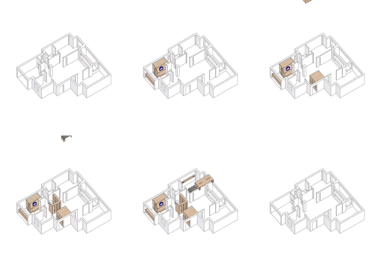
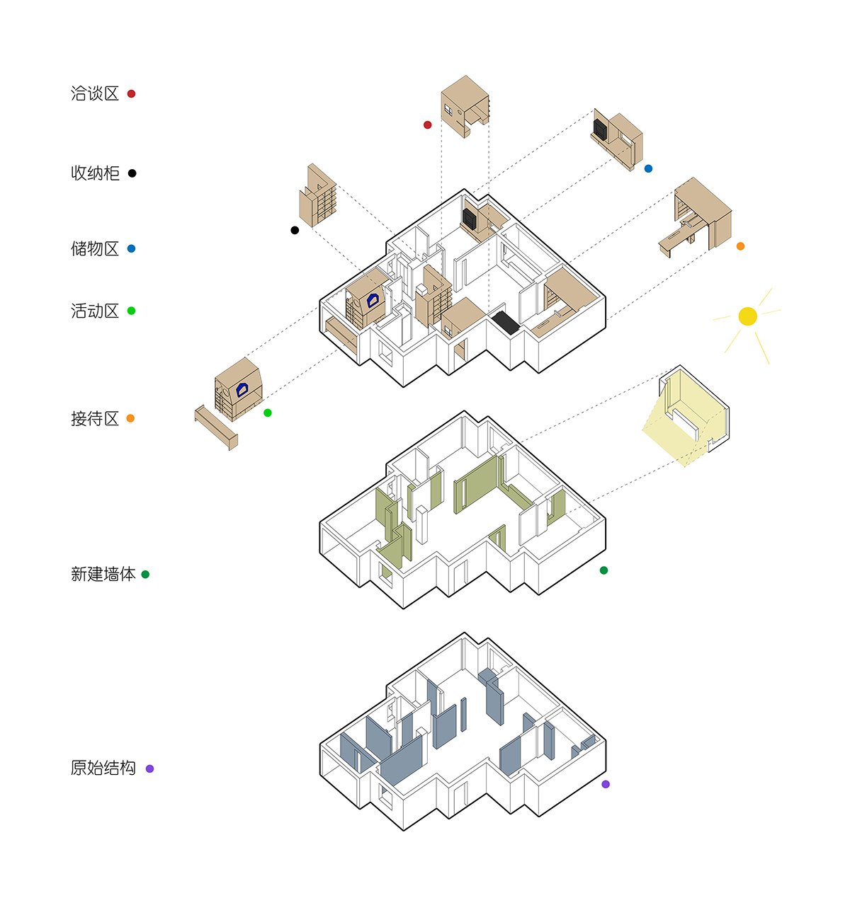
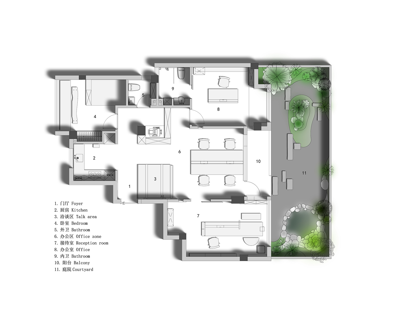
縮小原有入口,使其與廳內柱體北側齊平。拆除部分牆體後通過“H”形動線的設置,分離出洽談區與陳列區的功能,同時分離出南北兩條動線脈絡。原有的朝南三開間布局確定了主辦公區的位置,將原雙陽台結構改為單陽台,並將陽台與客廳之間的牆體南移,擴大室內有效麵積的同時,確立了陽台“灰空間”的屬性,並在陽台東西兩側牆體上設置窗戶,使陽台成為“光盒”,為東西兩個房間引入采光。 拆除原廚房、客衛及北側房間隔牆,通過空間的相互錯位借用,建立起新的茶水、客衛與書房/休息室布局,實現了空間的進一步利用。
Reduce the original entrance to be level with the north side of the pillars in the hall. After dismantling some of the walls, the functions of the negotiation area and the exhibition area are separated through the setting of an “H” shaped moving line, while also separating the two moving lines of the north and south. The original three bedroom south facing layout has determined the location of the office area, changing the original double balcony structure to a single balcony, and moving the wall between the balcony and the living room south to expand the effective indoor area. At the same time, the property of the balcony as a “gray space” has been established, and windows have been installed on the walls on both sides of the balcony, making it a “light box” and introducing daylight to the east and west rooms. Dismantle the original kitchen, guest bathroom, and partition walls of the north room, and establish a new layout of tea, guest bathroom, and study/lounge through mutual displacement and borrowing of space, achieving further utilization of space.
∇ 開物營造分析圖
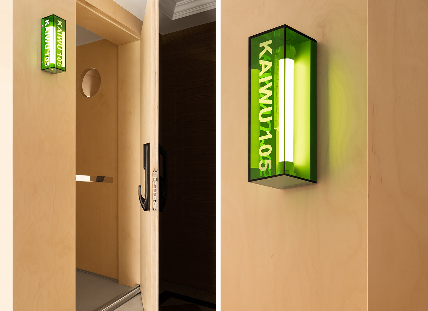
∇ 入口使用內部空間相同的材料來實現內外視覺上的一致性
The entrance uses materials with the same internal space to achieve visual consistency both inside and outside
∇ 入口看向內部視角 Looking indoors from the entrance
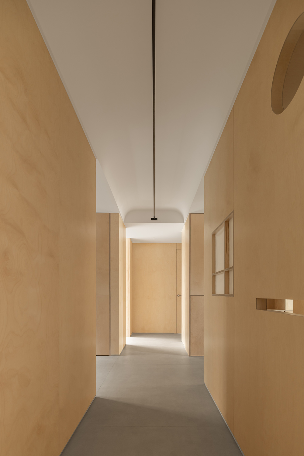
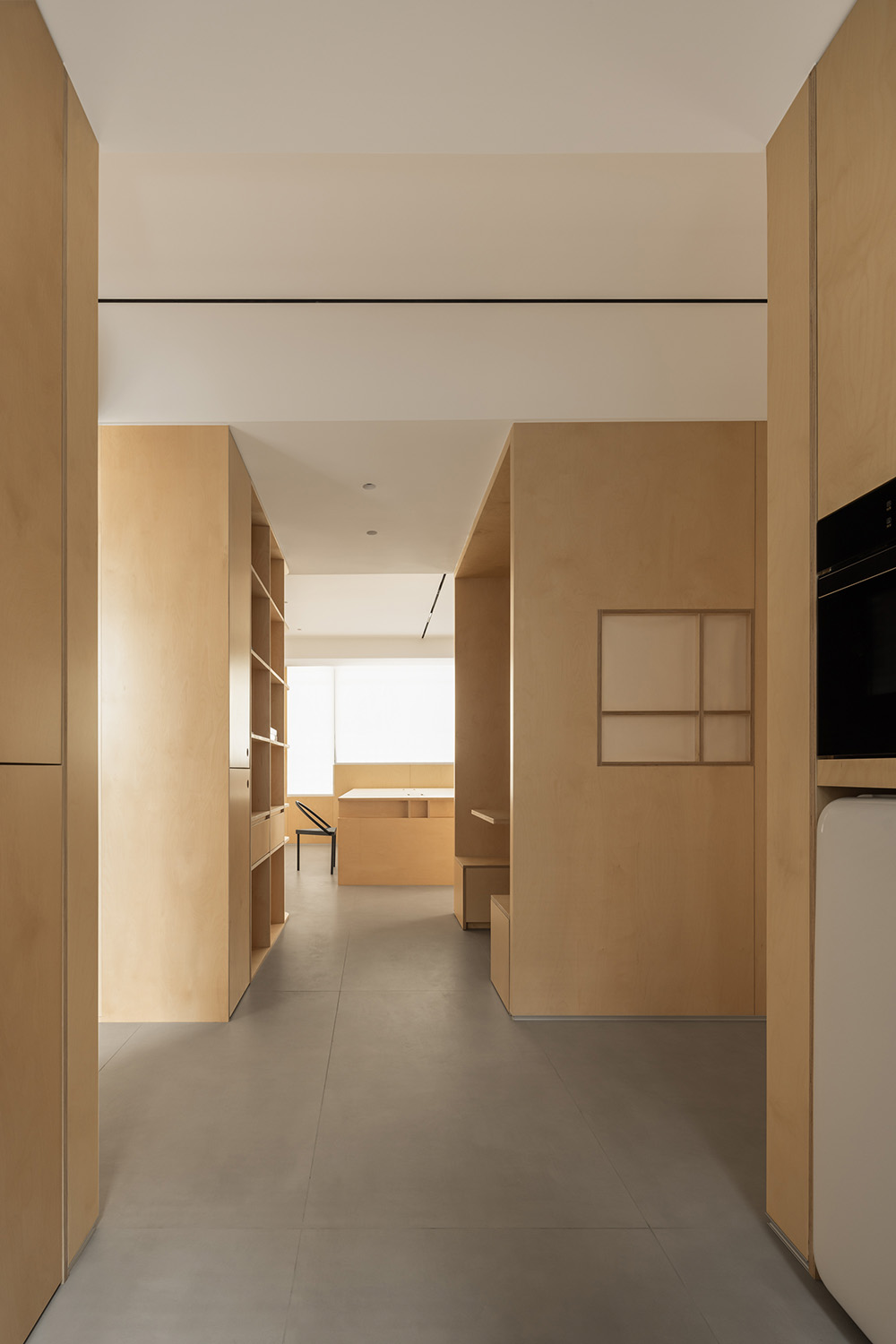
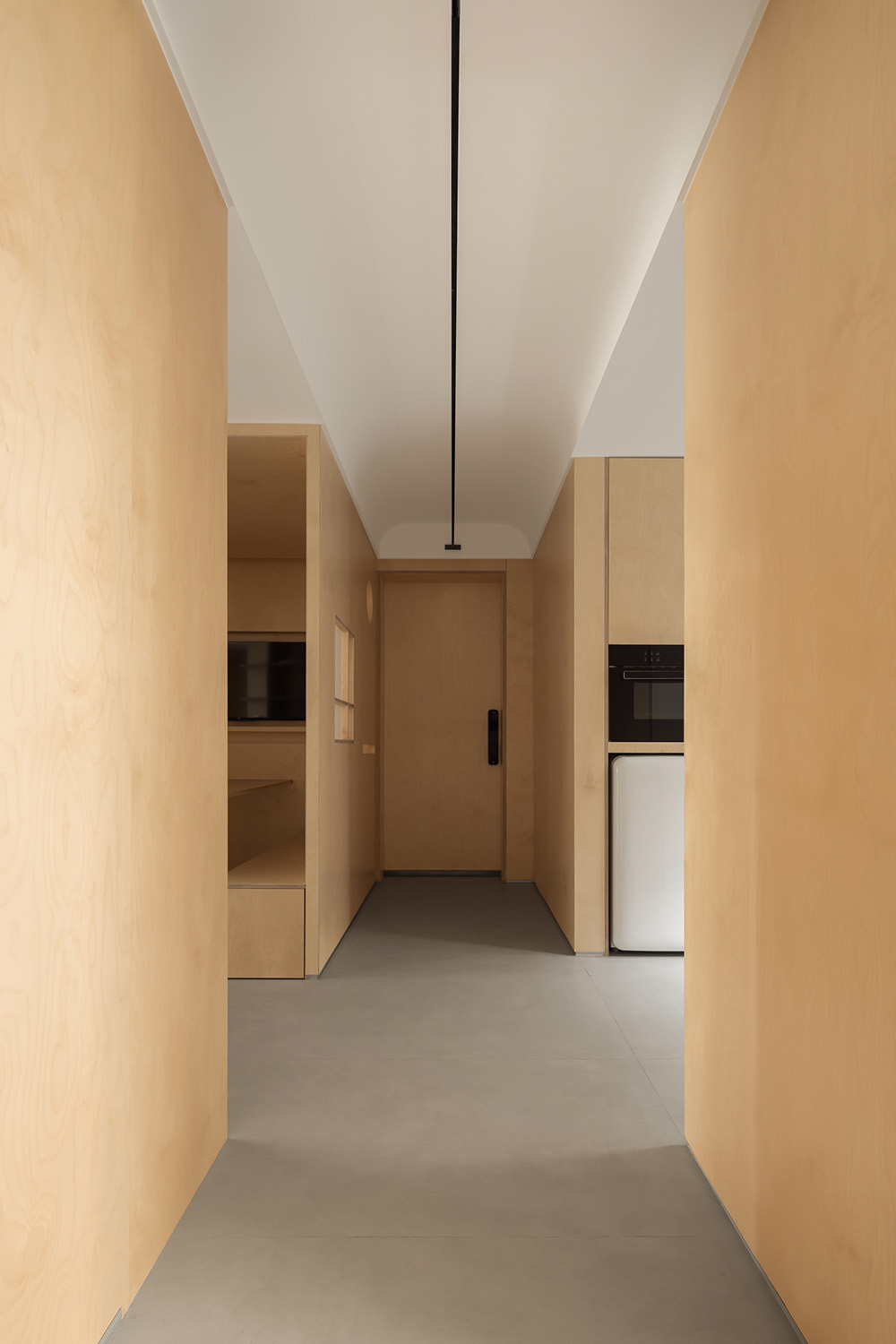
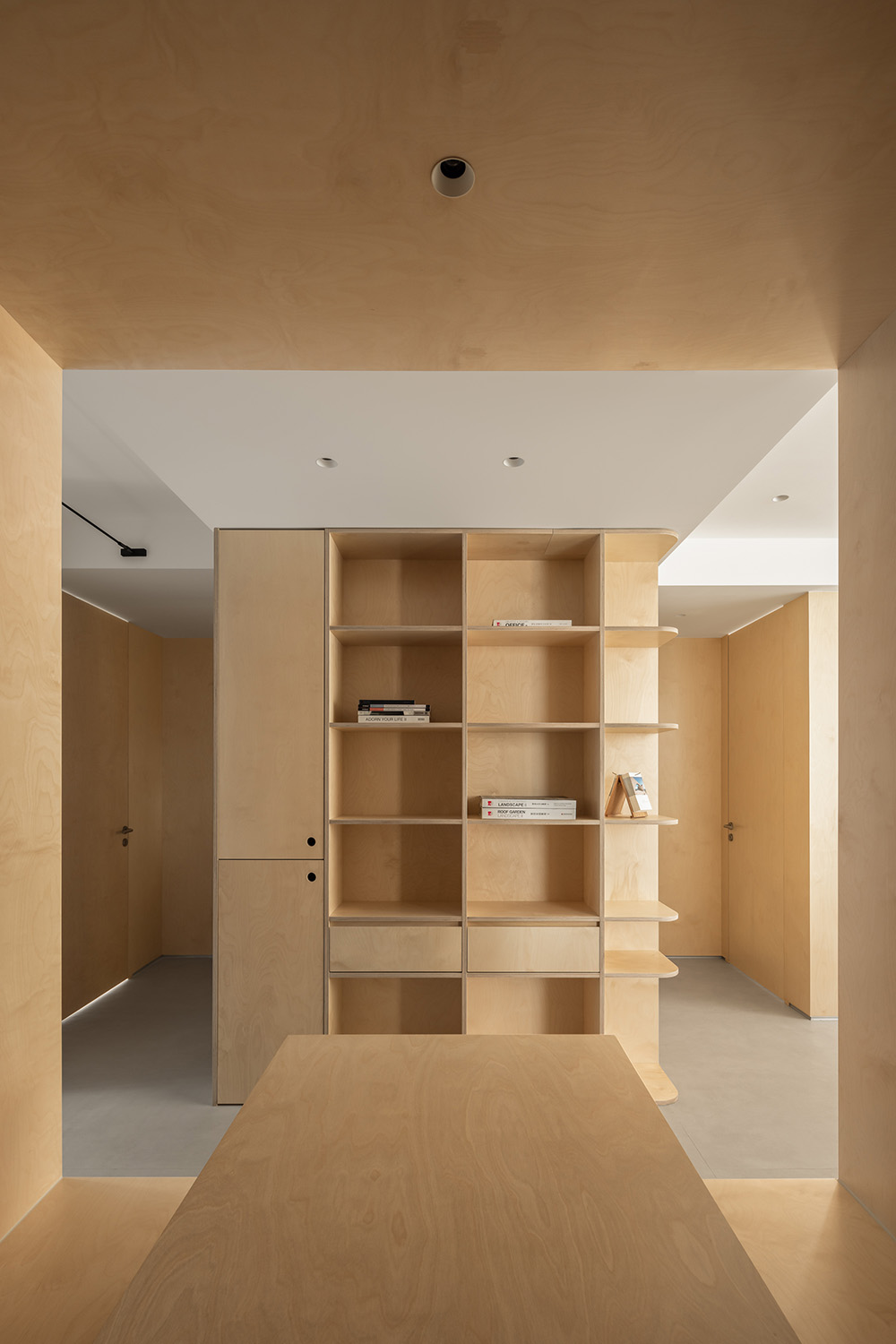
進入“H”動線的第一條通道,通道右側為洽談室,左側為茶水間,自然光從南北兩側交錯湧入,與暖色樺木板覆蓋的牆體營造出整體秩序感。
Enter the first channel of the “H” streamline, with a negotiation room on the right and a pantry on the left. Natural light flows in from both sides, creating an overall sense of order with the warm birch board covering the wall.
∇ 由北向南視角 View from north to south
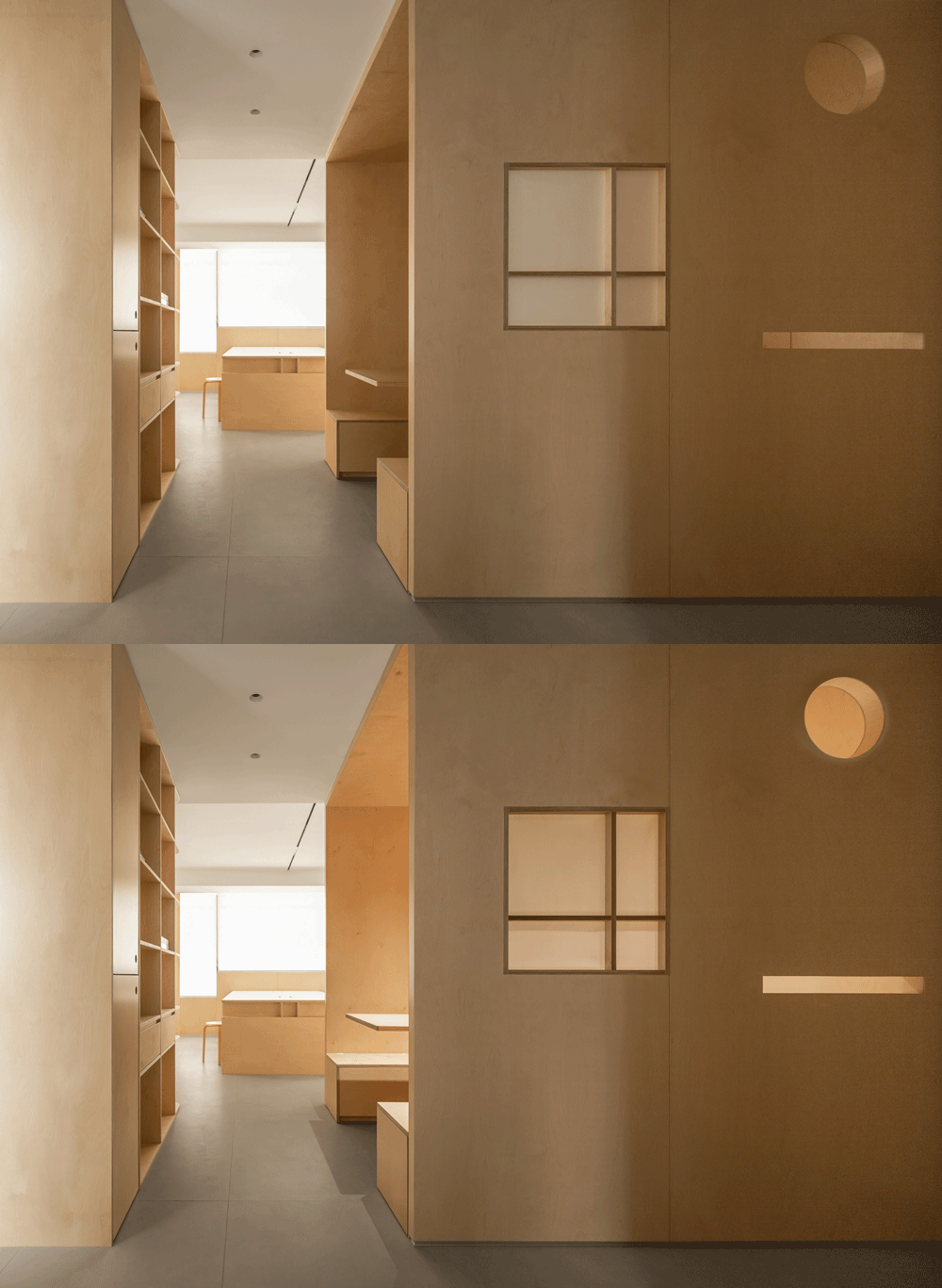
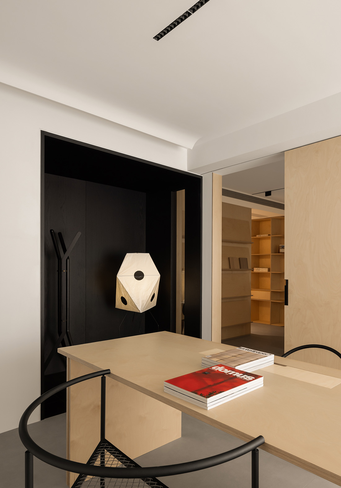
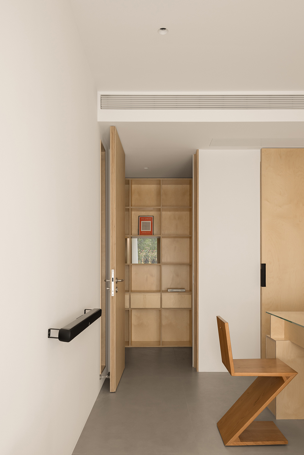
“H”動線的橫向連接通道將洽談區與“L”型陳列櫃分為東西兩個體塊,在洽談區木屋上設置了三組不同高度不同形態的洞口,將障子紙嵌入方形窗洞,通過燈光開關的控製,使木屋呈現“點亮”的動態效果,形成有趣的互動。
The horizontal connection channel of the “H” streamline divides the negotiation area and the “L” display cabinet into two individual blocks, east and west. Three sets of holes with different heights and shapes are set up on the wooden house in the conference room, and paper is embedded in the square window opening. Through the control of the light switch, the wooden house presents a dynamic effect of “lighting up”, forming an interesting interaction.
∇ 茶水間看向洽談室及工作區 The pantry looks towards the negotiation room and work area
∇ 入口走廊由西向東視角 View from west to east of the entrance corridor
∇ 入口走廊與洽談區 Entrance Corridor and Discussion Area
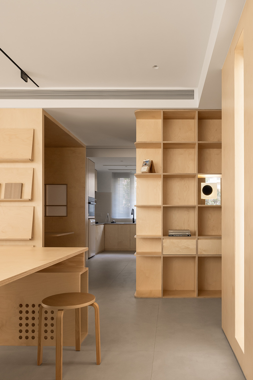
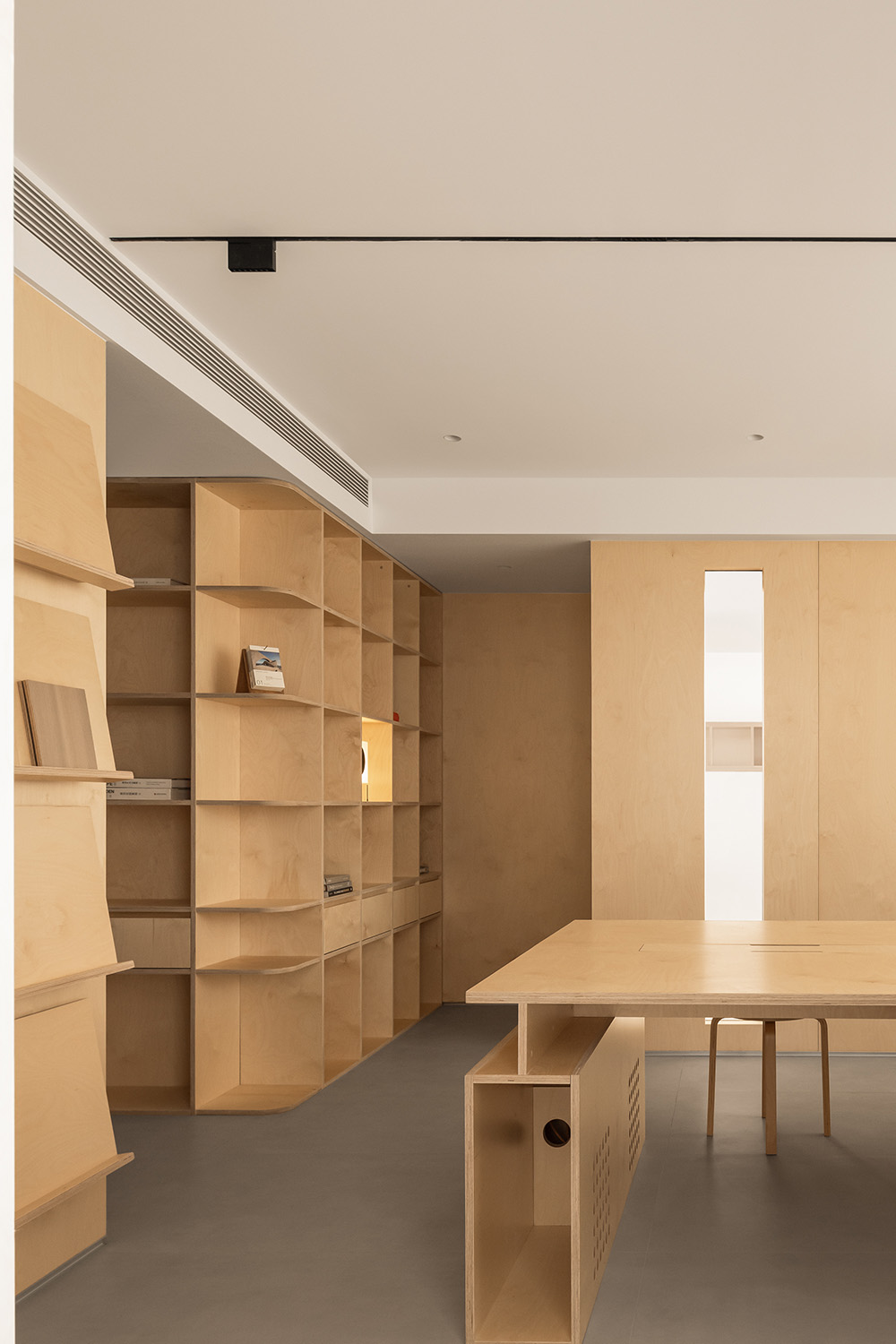
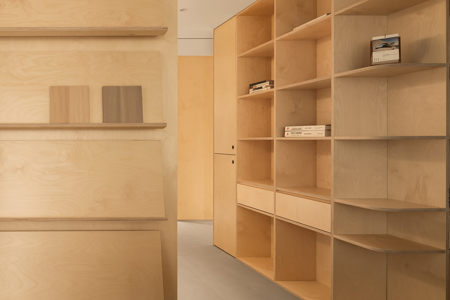
∇ 洽談區看向陳列櫃,呈現出H動線與功能區的關係
The negotiation area looks towards the display cabinet, presenting the relationship between the H streamline and the functional area
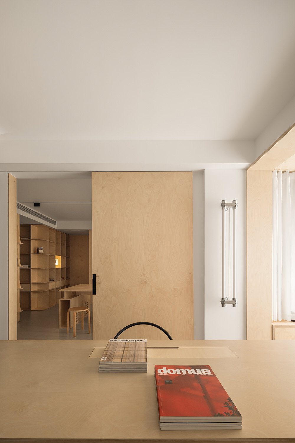
∇ 洽談區看向工作區 Discussion area looks towards the workspace
∇ 工作區與陳列區及洽談區 Work area, exhibition area, and discussion area
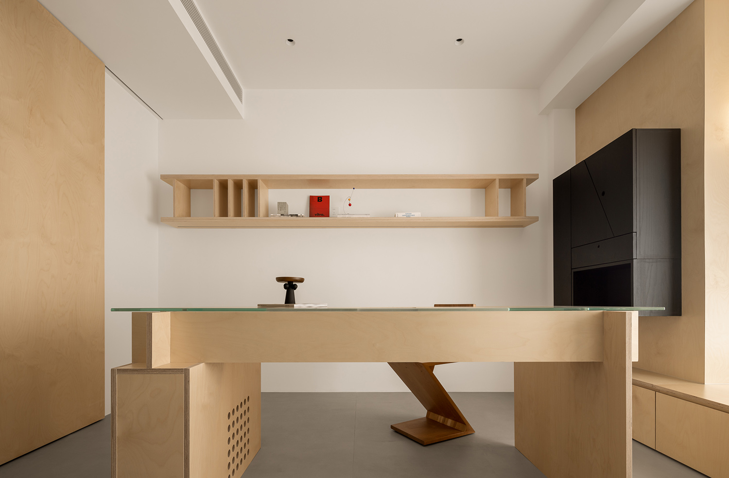
∇ 工作區由南向北全貌 Overview of the work area from south to north
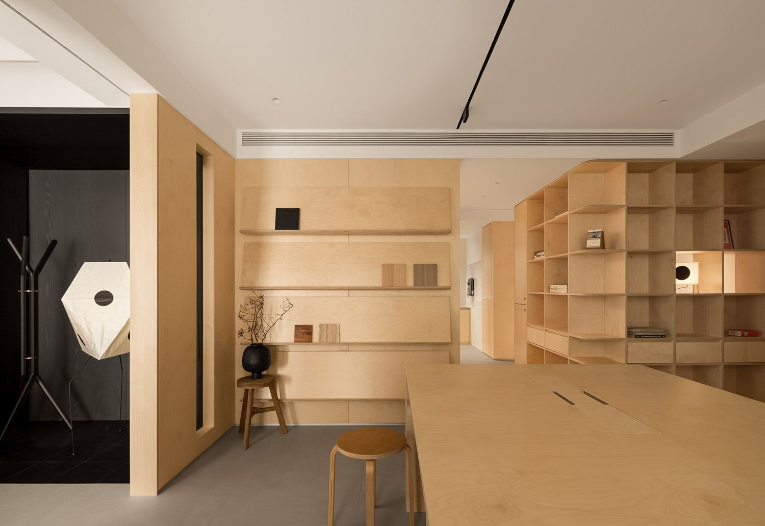
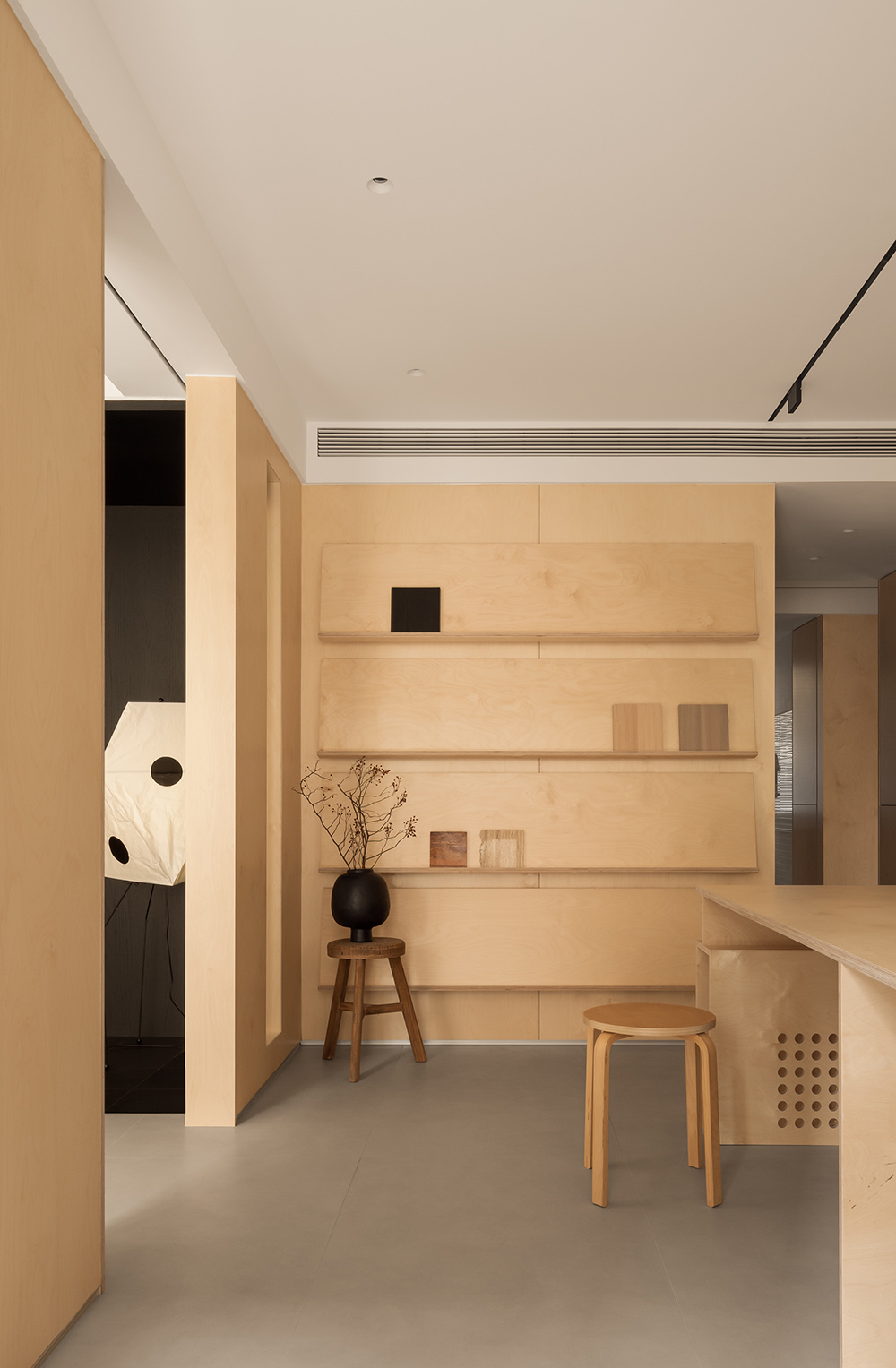
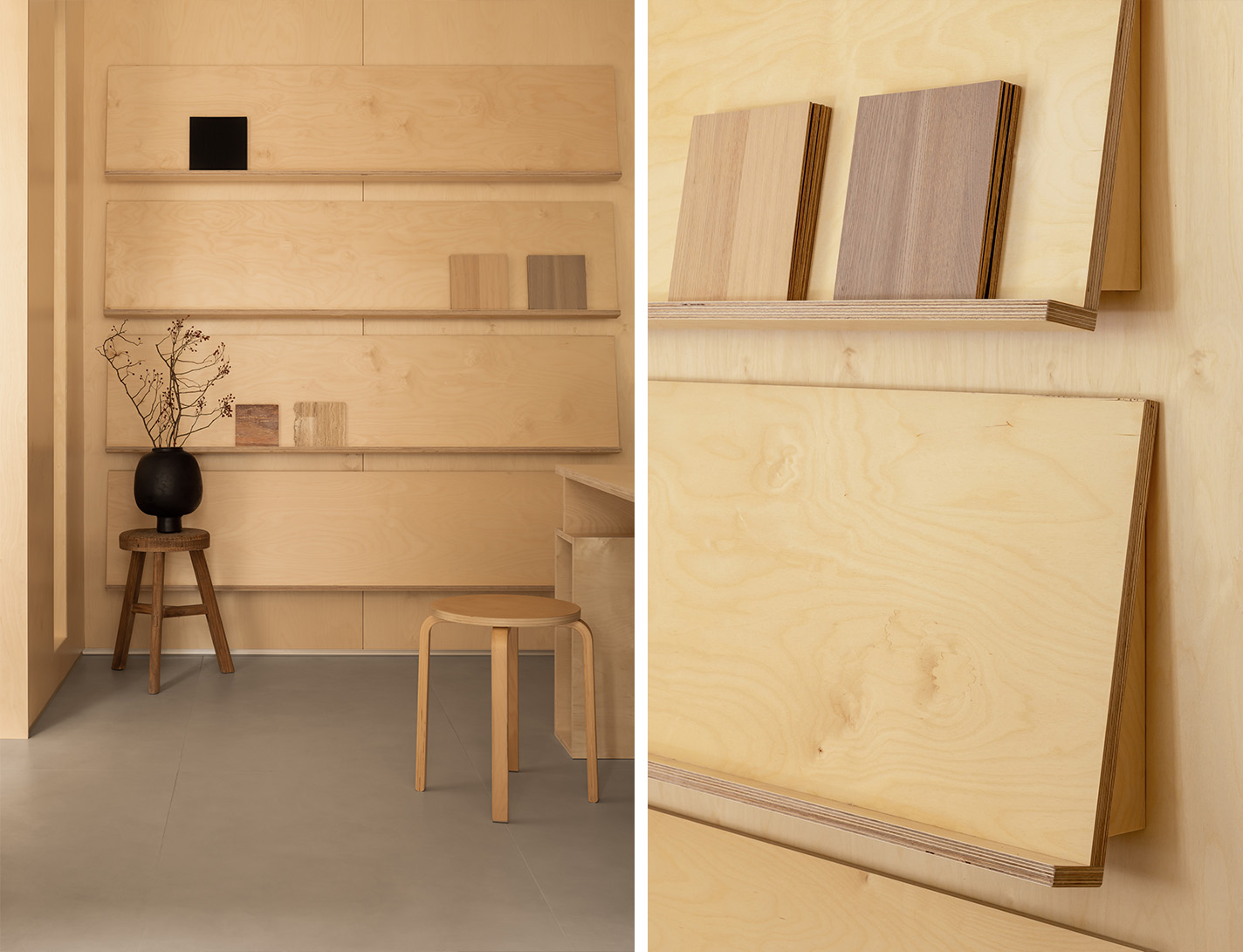
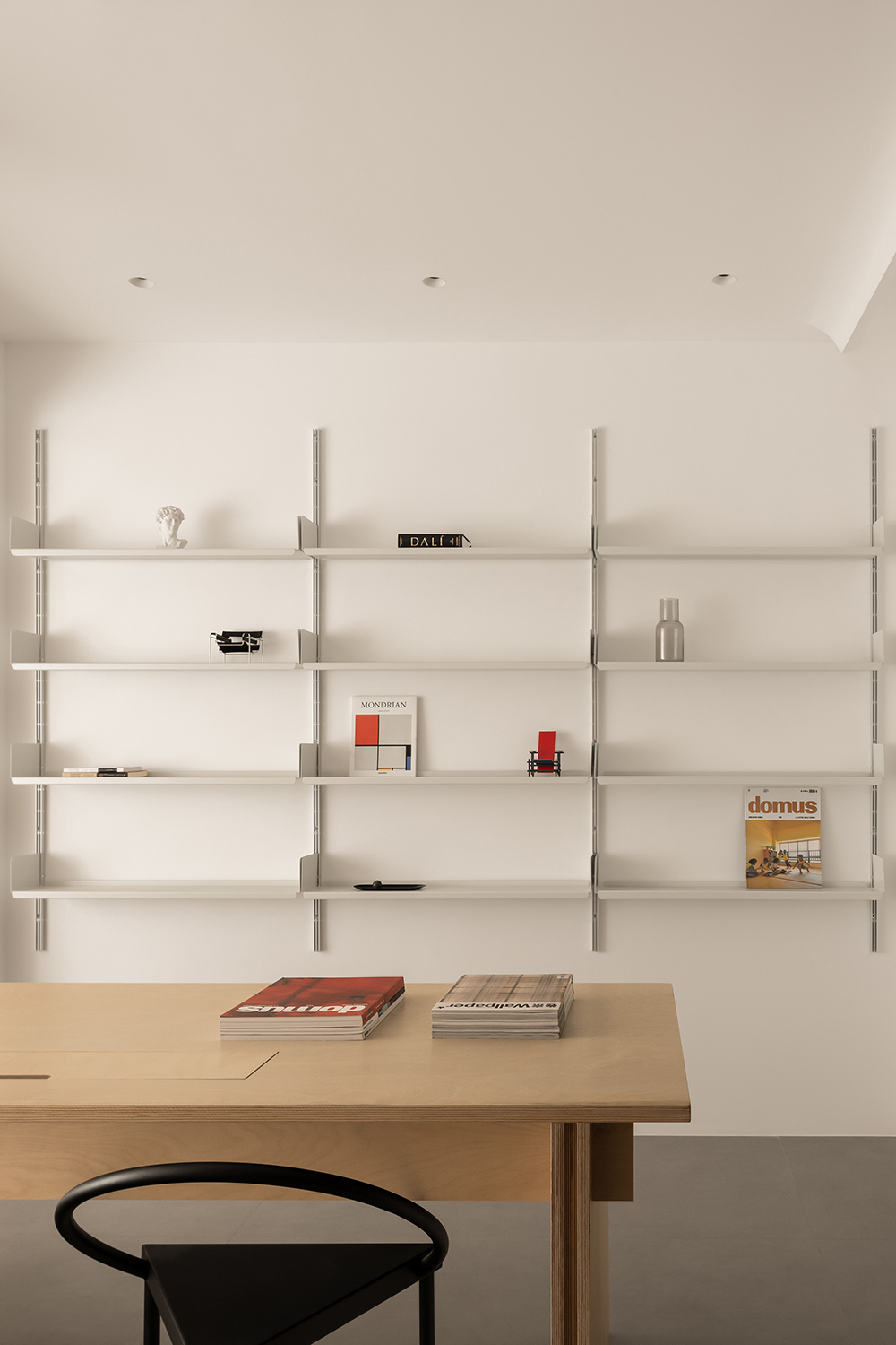
∇ 利用洽談室南側的立麵設置了材料展示架
A material display rack was set up on the south side facade of the discussion room
∇ 材料架細部 Material rack details
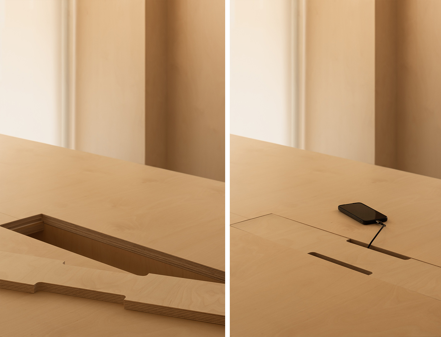
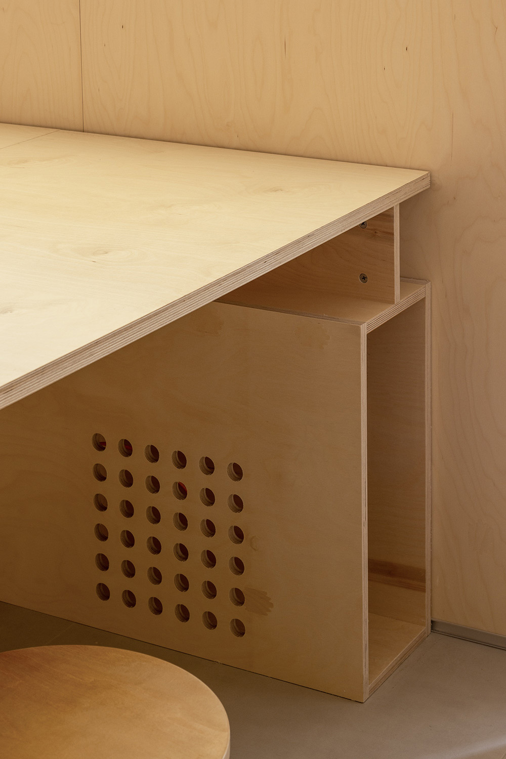
∇ 工作台細部 Workbench Details
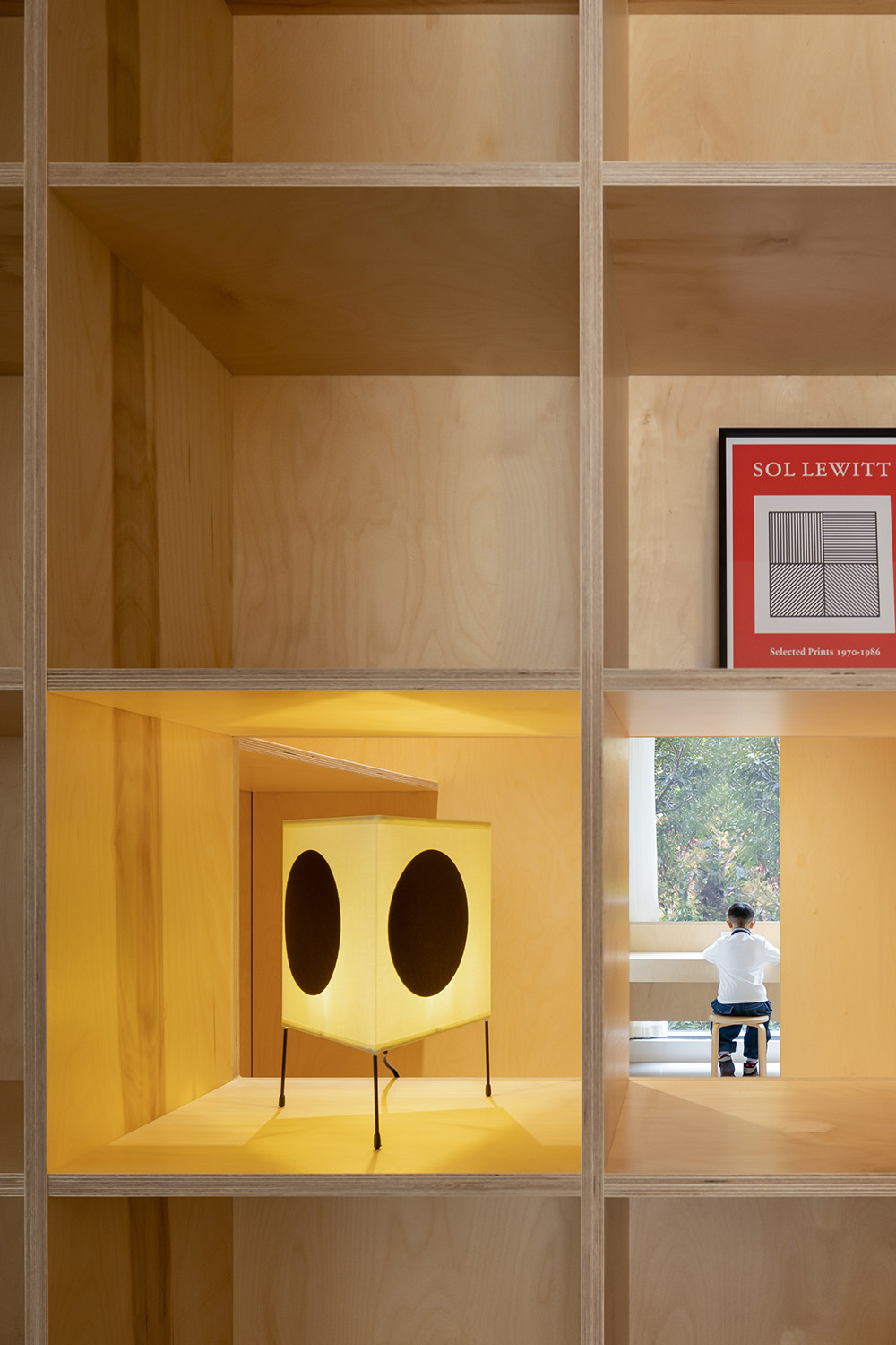
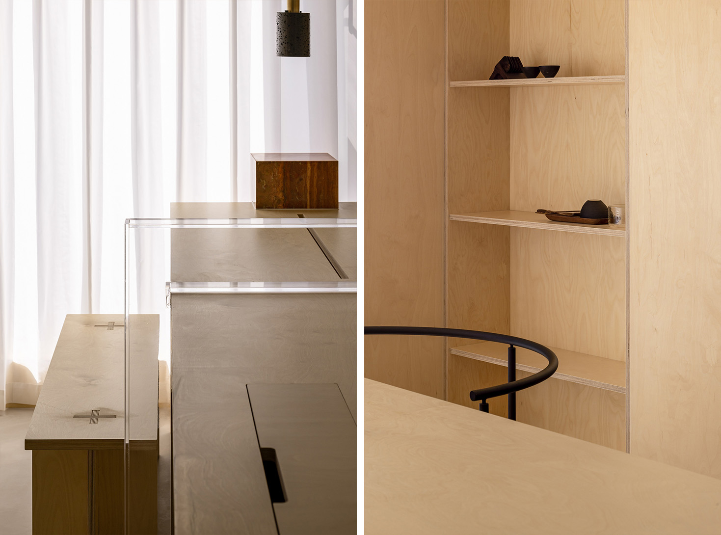
∇ 陳列櫃細部,貫穿式的洞口增進了兩個空間的聯係,並將更多光線引入
The details of the display cabinet and the penetrating openings enhance the connection between the two spaces and introduce more light into them
∇ 工作區看向接待室 Looking towards the reception room from the work area
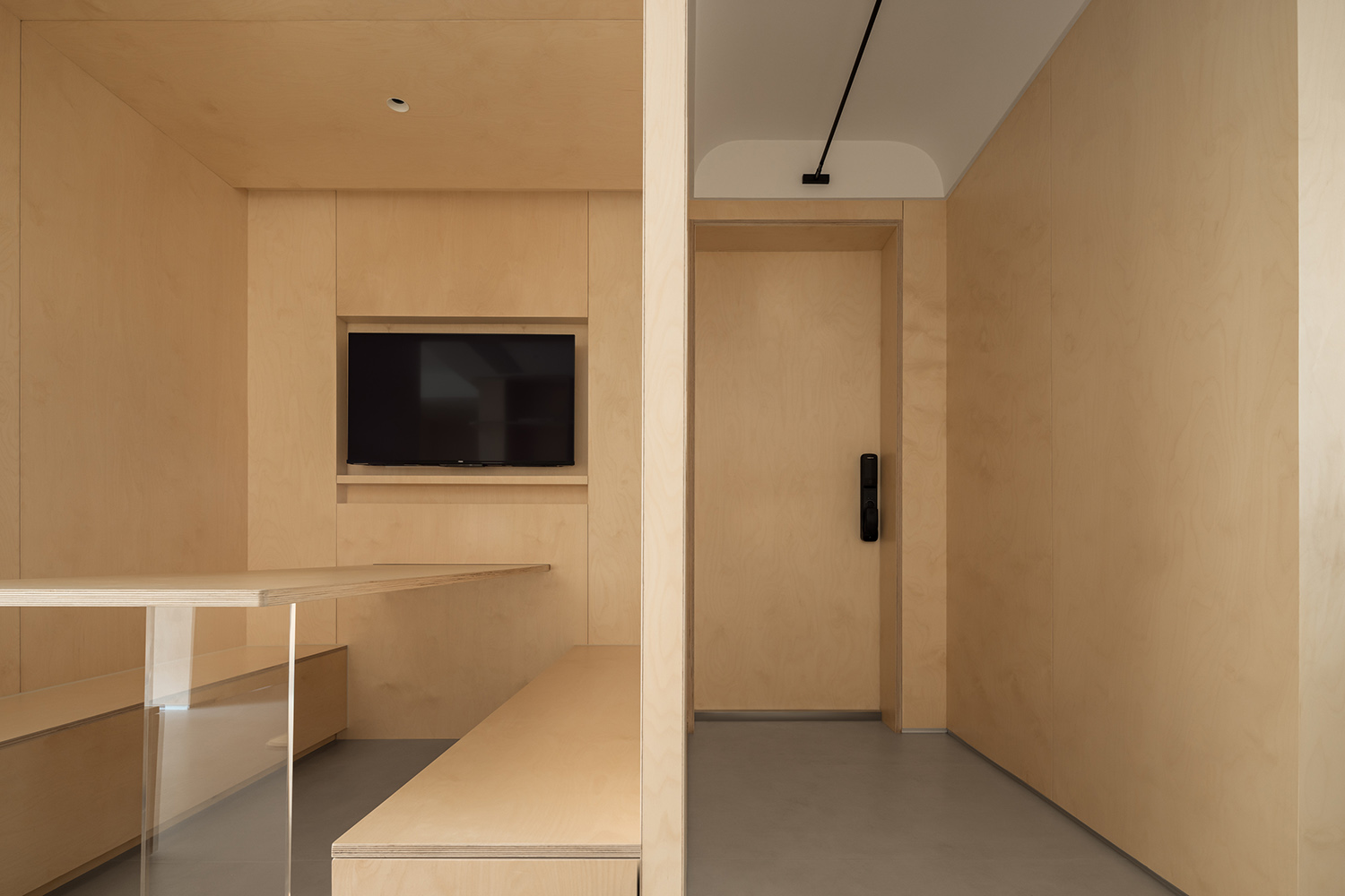
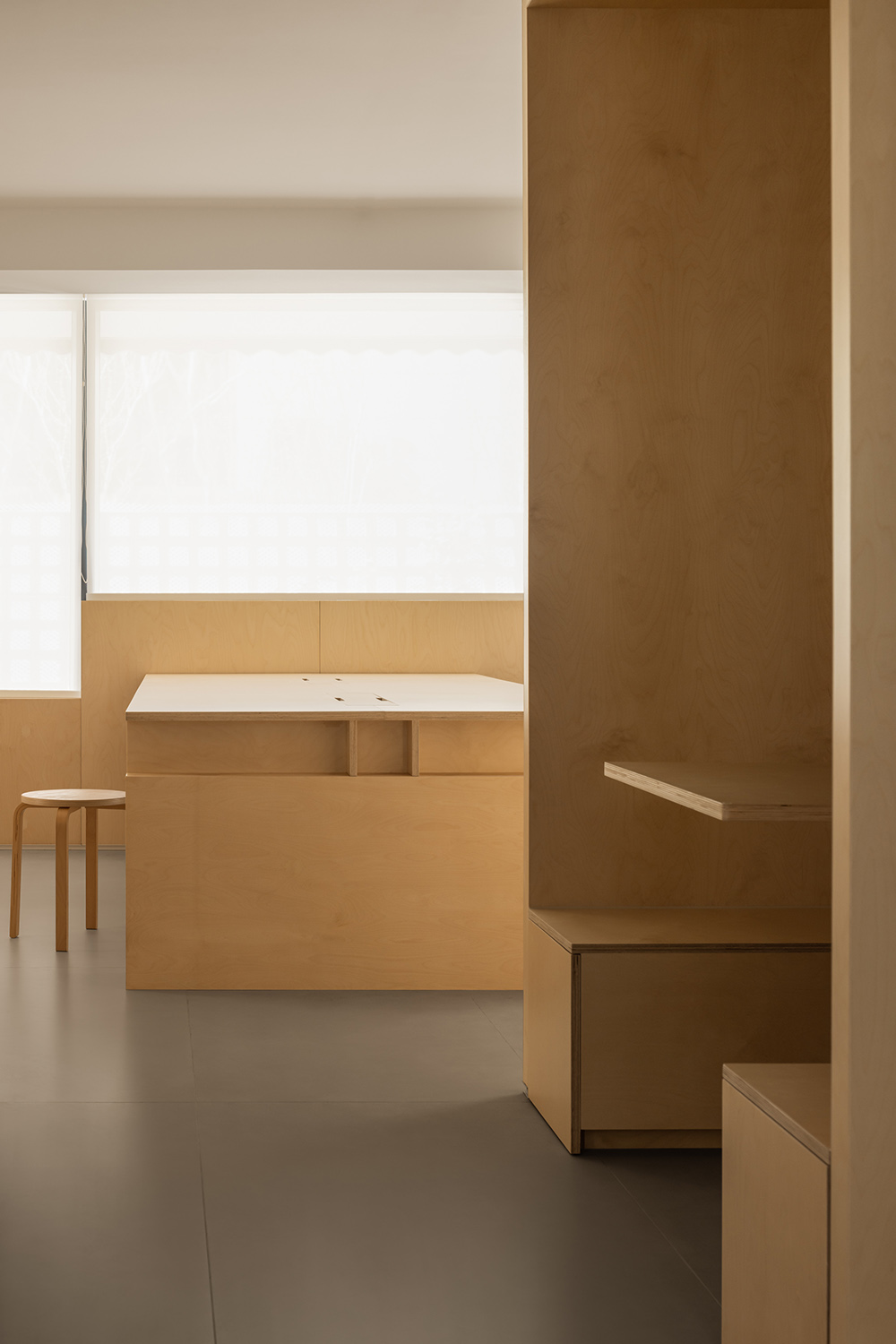
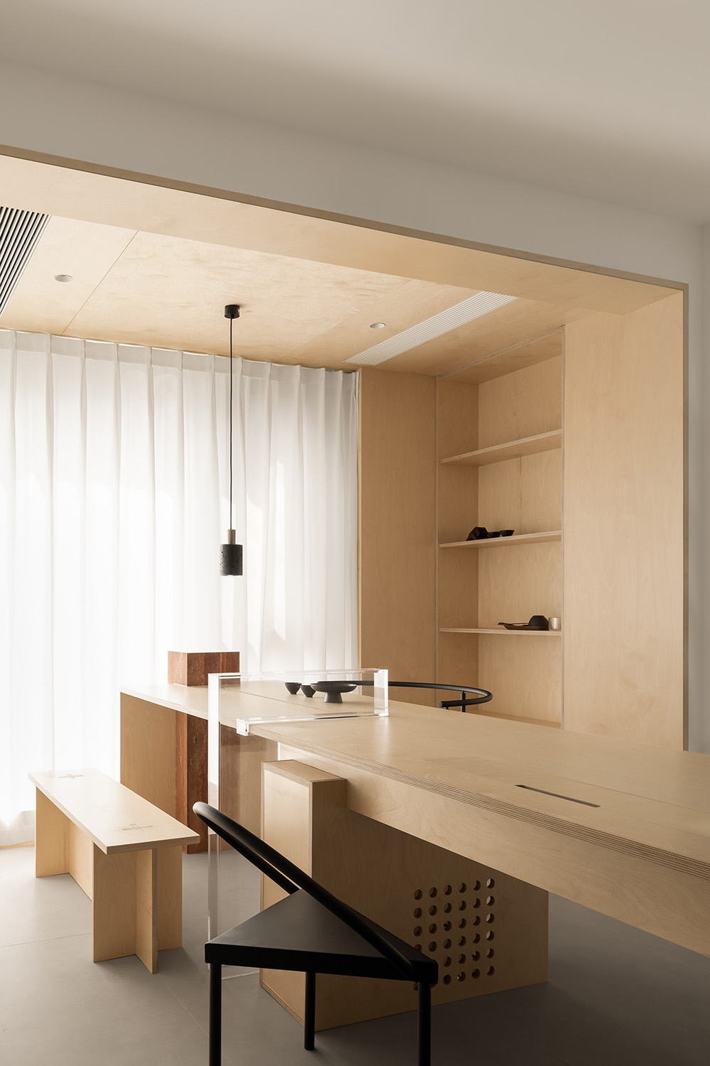
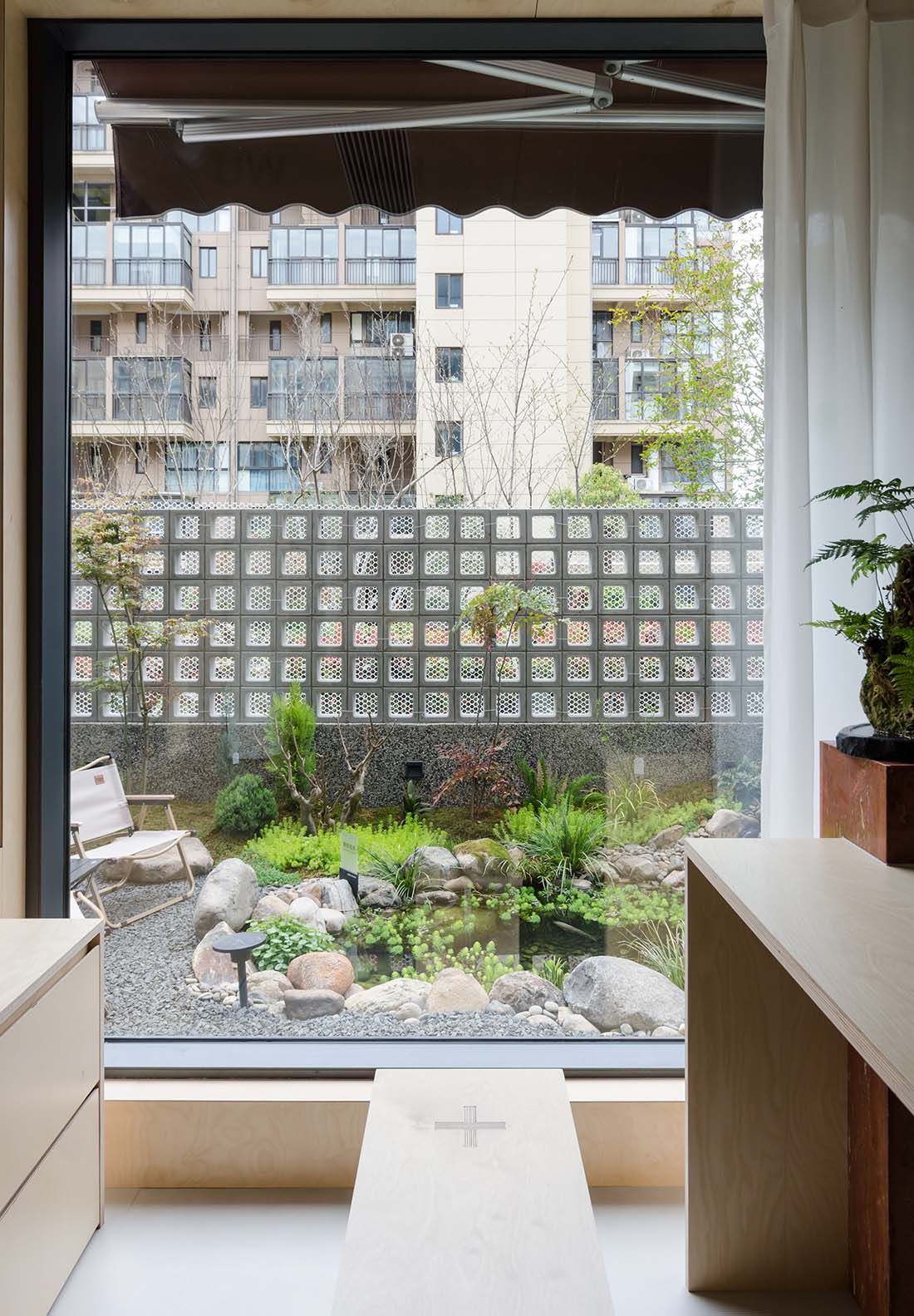
∇ 接待室兼茶室功能,因地製宜的采用了定製木質長桌,滿足了更多場景需求
The reception room also serves as a tea room, using customized wooden long tables tailored to local conditions to meet the needs of more scenarios
∇ 接待室細部 Reception Room Details
∇ 接待室與辦公區 Reception and office areas
∇ 接待室窗景 View outside the window of the reception room
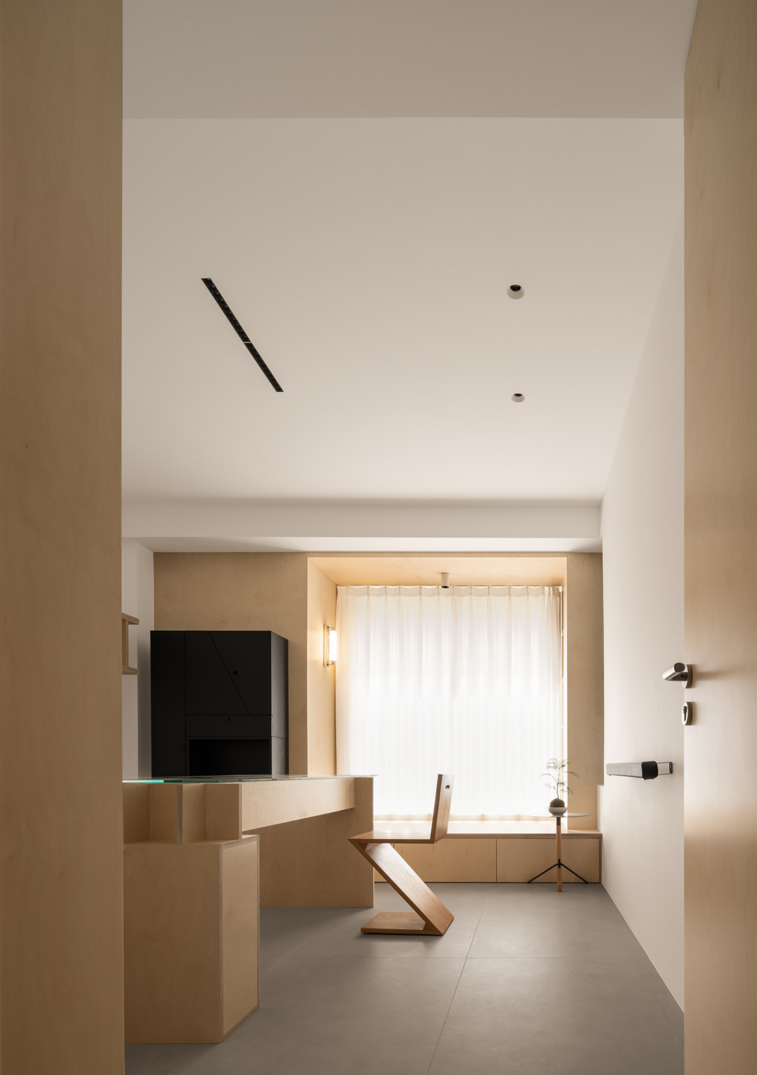
∇ 獨立辦公室 Independent Office
∇ 獨立辦公室細部 Independent Office Details
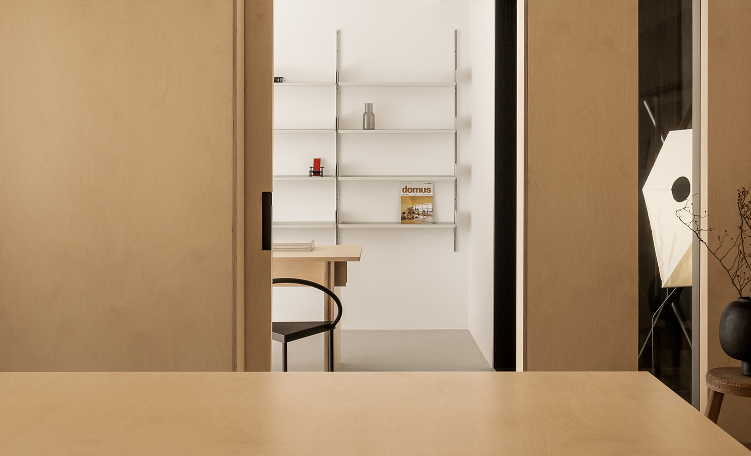
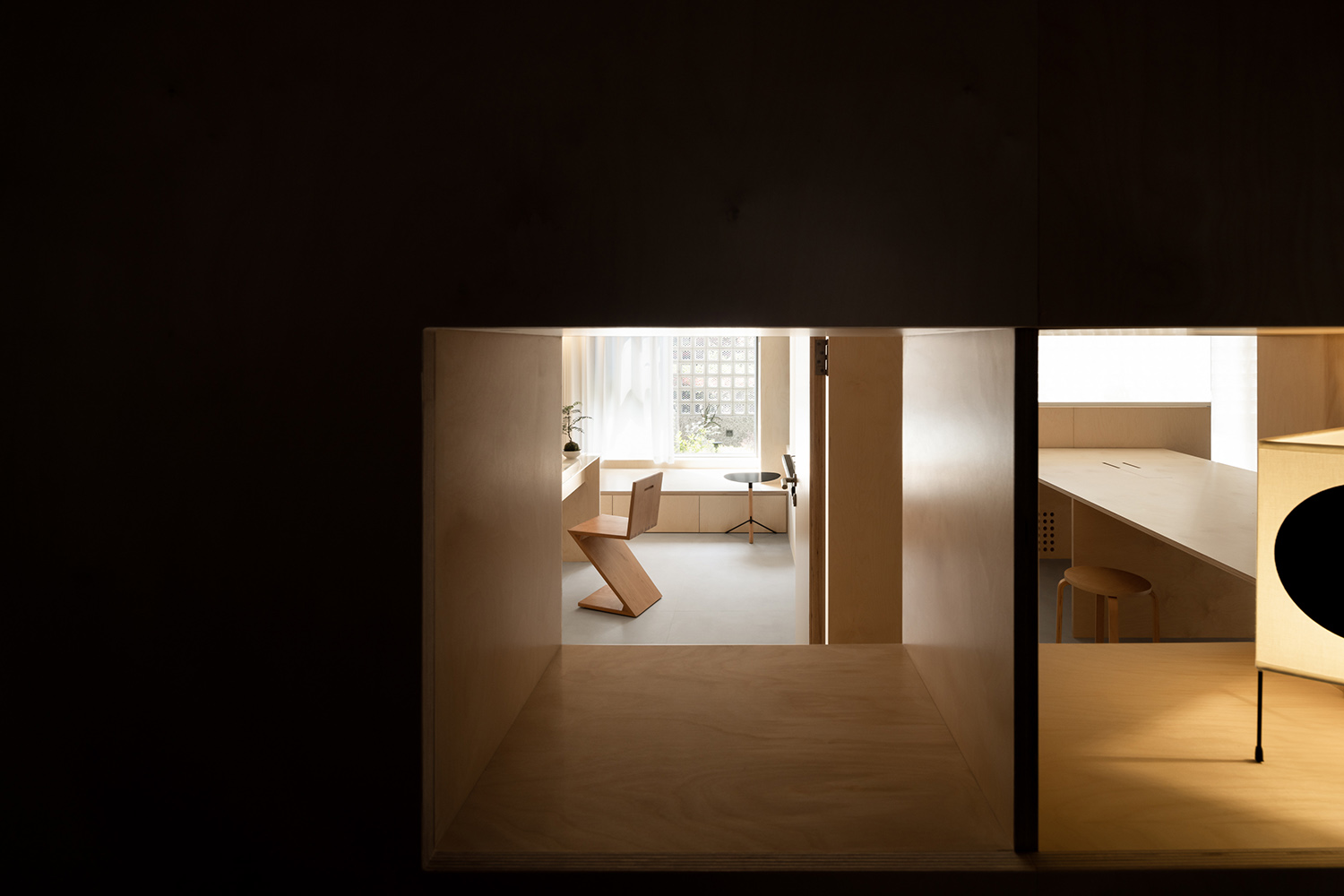
∇ 櫃體北側的洞口看向獨立辦公室及工作區,貫穿的洞口為空間增加了更多的趣味
The opening on the north side of the cabinet looks towards the independent office and work area, and the penetrating opening adds more fun to the space
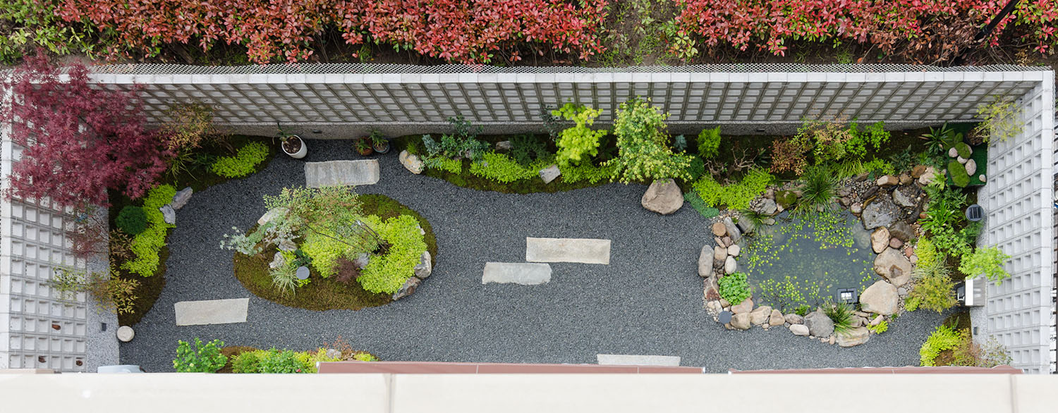
∇ 工作室庭院鳥瞰視角 A bird’s-eye view of the studio courtyard
∇ 平麵圖
項目信息
項目名稱: 開物營造辦公室
Project name:KaiWu Design Office by Kai Wu Design
設計公司: 開物營造研究室
Design:Kai Wu Design
項目地址:江蘇南通
Project location:NanTong
項目類型:辦公空間
Project type:office
設計年份:2022.6
Design year:2022.6
項目完成年份:2023.4
Completion Year:2023.4
建築麵積:105㎡
Gross built area: 105㎡
主持設計師: 高遠
設計團隊:張聰 張雯靜
Leader designer & Team:GaoYuan ZhangWenjing ZhangCong
攝影版權:©川河映像 ©高遠
Photo credit: ©川河映像 ©高遠


