A3 VISION艾舍爾設計將他標誌性的實用主義美學應用於5號餐廳設計,工作室解釋說:“對空間的重新構想始於將一切都削減到最合適的狀態,其中一切都以某種有序、最有效和最好的方式設計,它們通過空間、比例、光線和材料的純粹相互作用,以產生最大程度的清晰度和純度。”
A3 VISION, renowned for its iconic utilitarian aesthetic, has applied this style to the design of Restaurant No. 5. The studio stated that, “The transformation of the space began by simplifying everything to its most suitable state, where each element is designed in an ordered, efficient, and optimal manner, utilizing the natural interaction of space, proportion, light, and materials to achieve the utmost clarity and purity.”
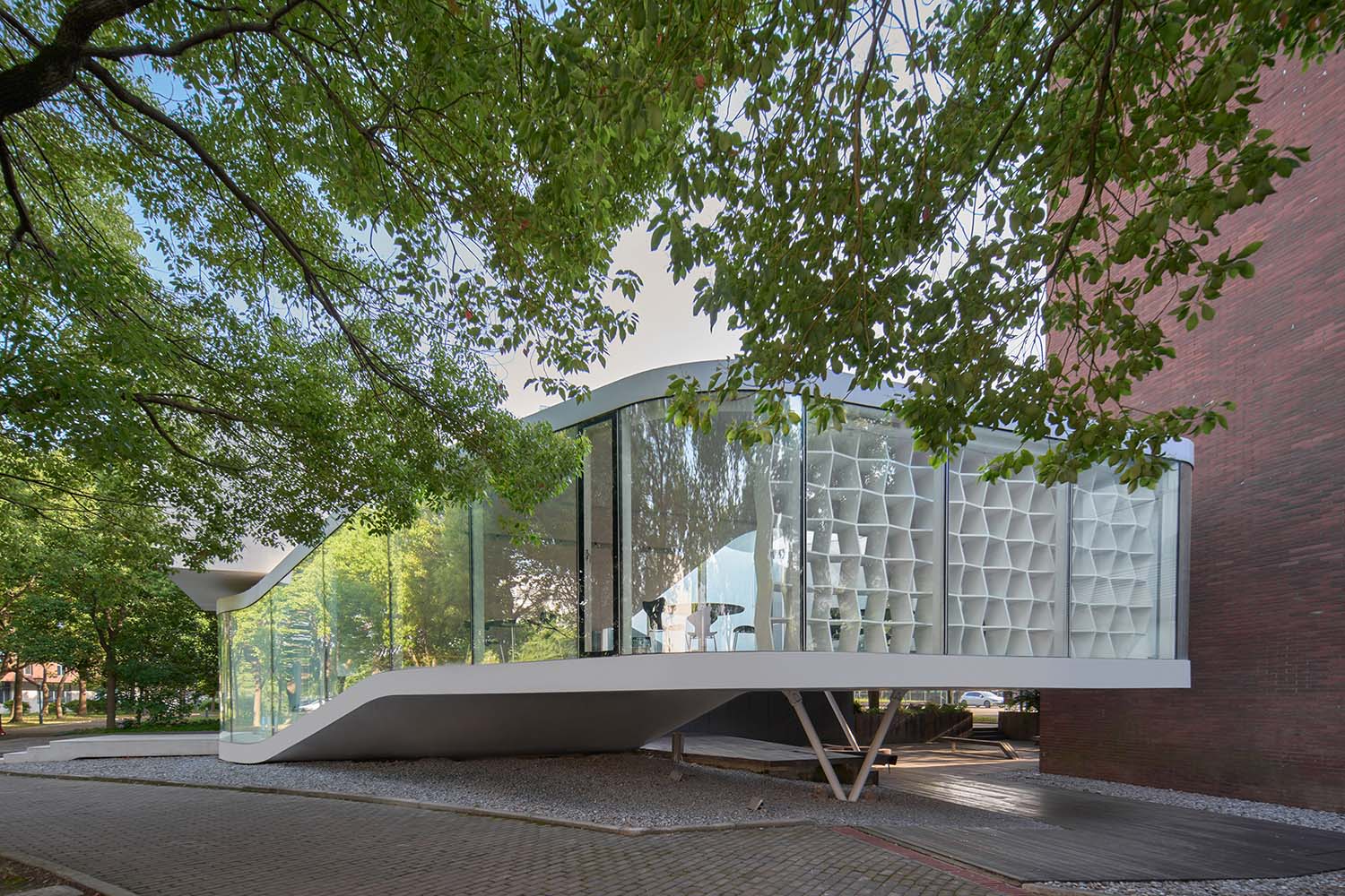
該建築是個單層式的獨立建築,在重新設計之前,該建築是企業的文化活動中心,此次通過重新規劃創建了一個獨特的開放式輕餐食空間。
The building is a standalone single-story structure. Prior to the redesign, it functioned as the cultural activity center for the enterprise. The redesign aimed to create a distinctive, airy dining area.
明亮、開放的空間關係
Bright and open spatial relationship
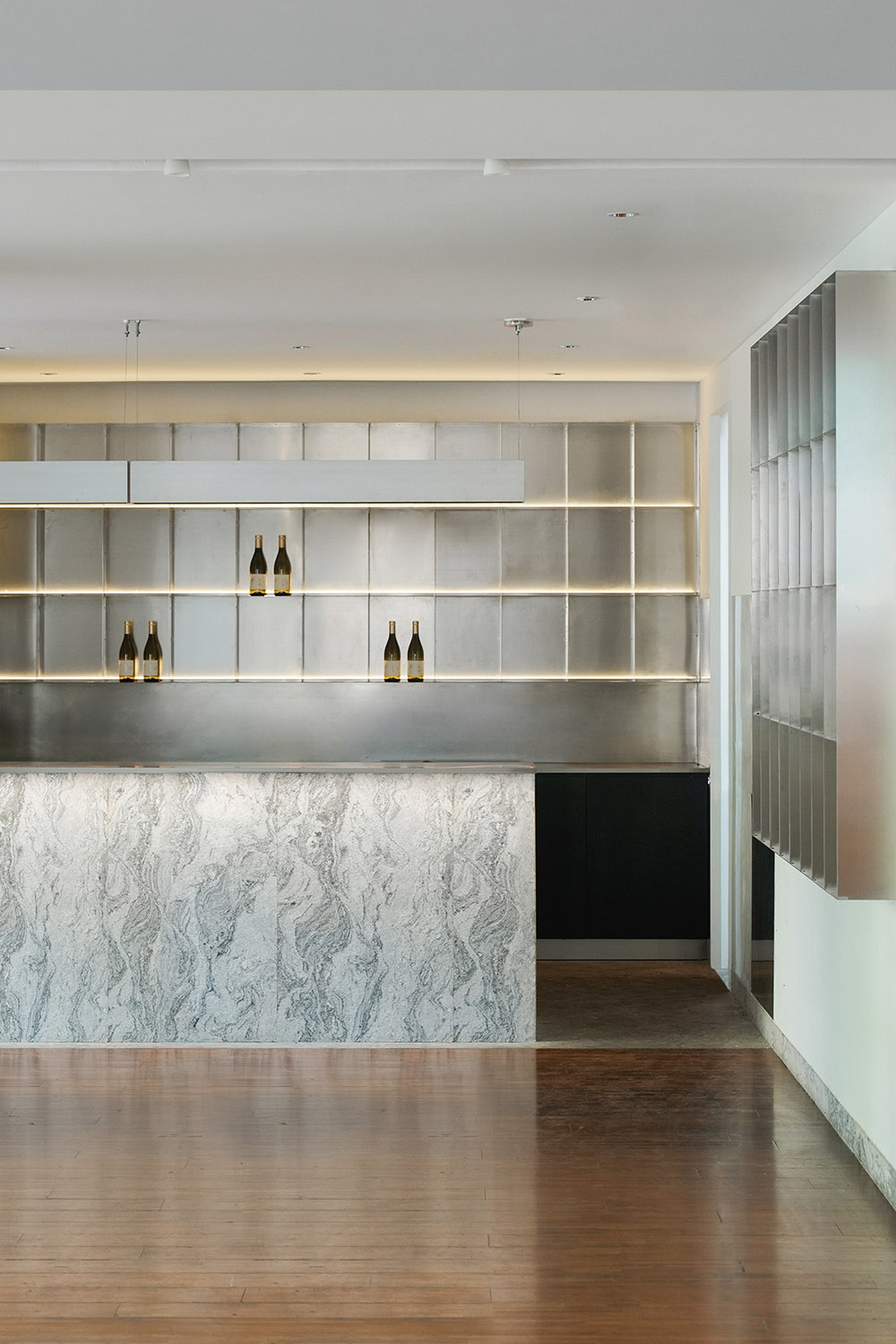
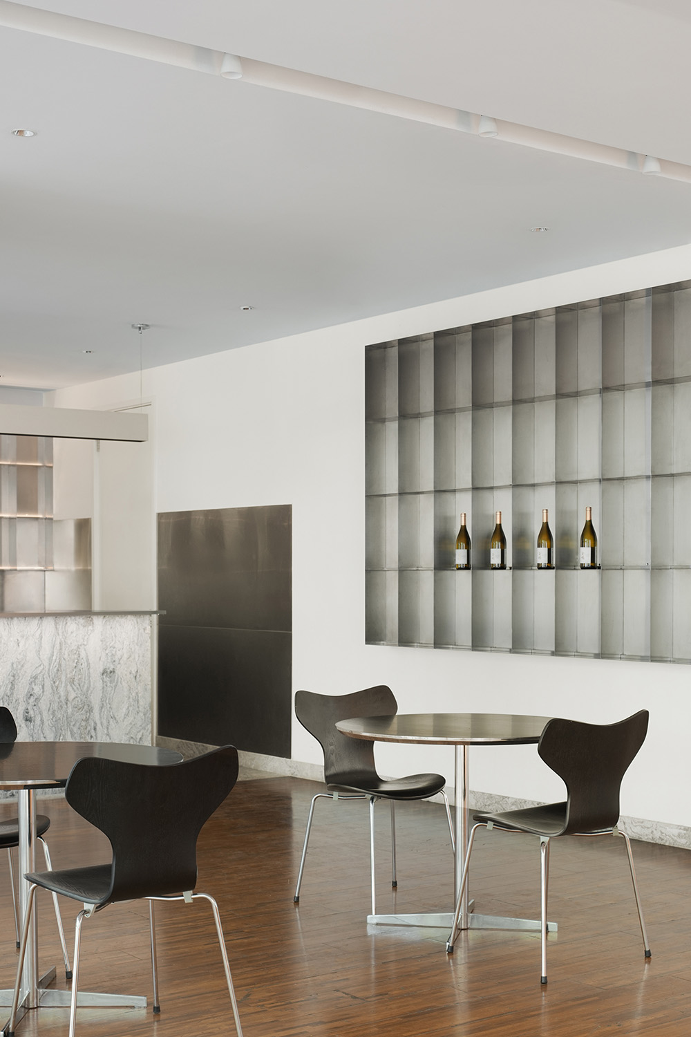
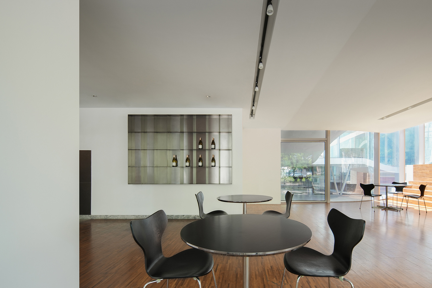
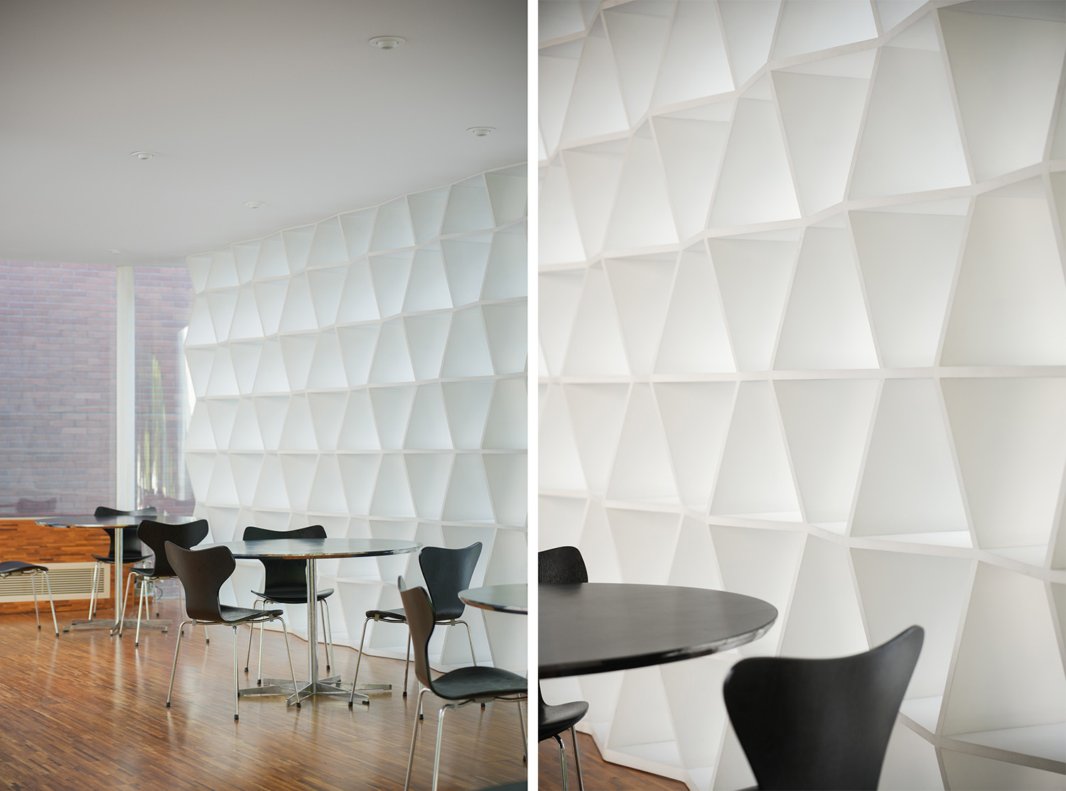
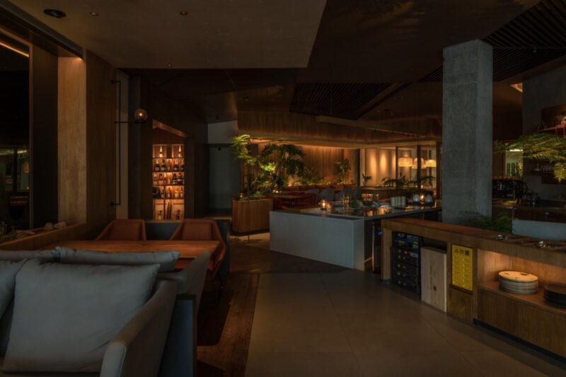
吧台區位於主入口的位置,使用了淺色水洗麵花崗岩和拉絲不鏽鋼兩種材質,花崗岩的紋理和不鏽鋼的光滑搭配在一起,輕盈而明亮。
The bar area,located at the main entrance, is constructed from two materials: light-colored washed granite and brushed stainless steel. The texture of the granite and the smoothness of the stainless steel complement each other, resulting in a bright and airy ambiance.
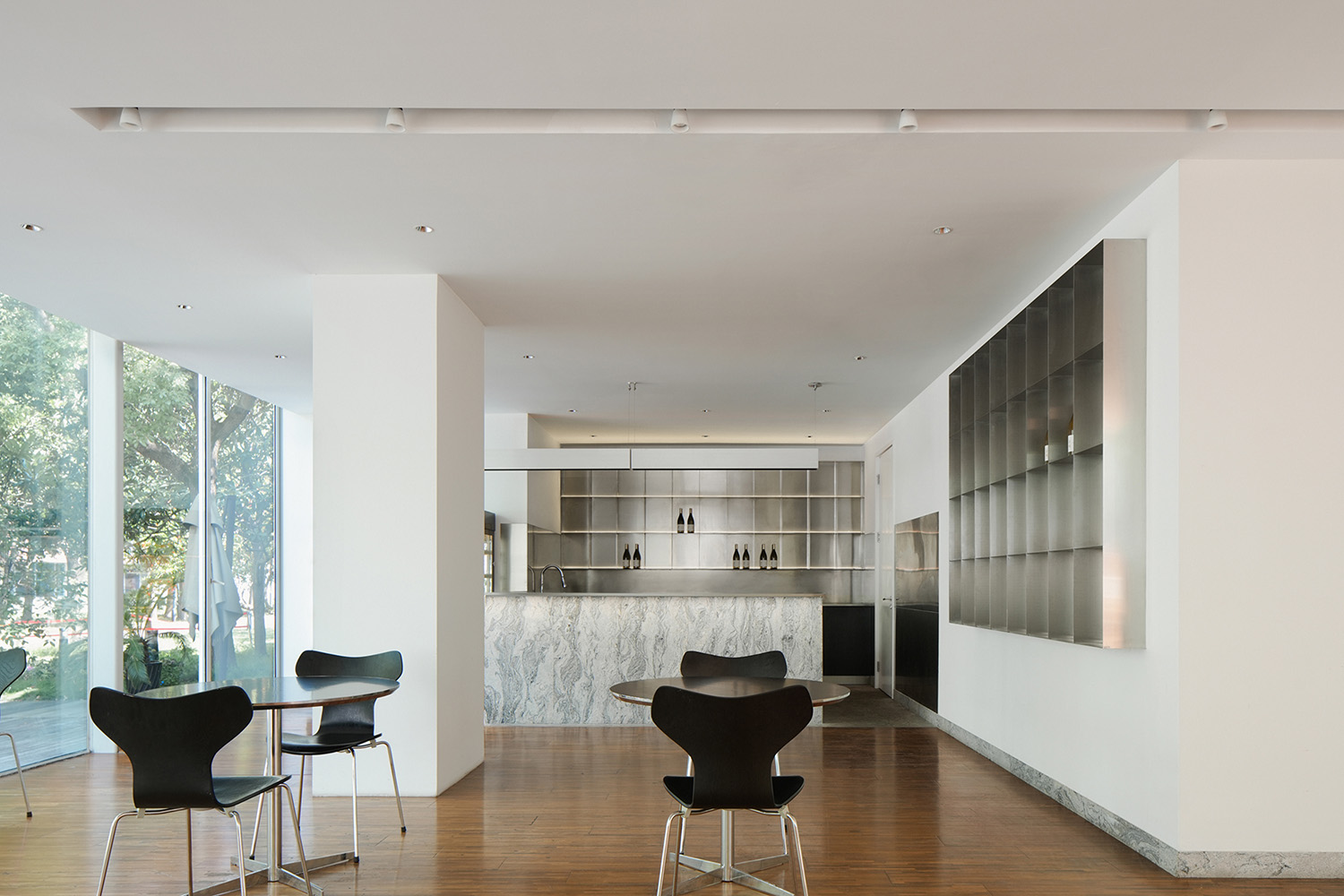
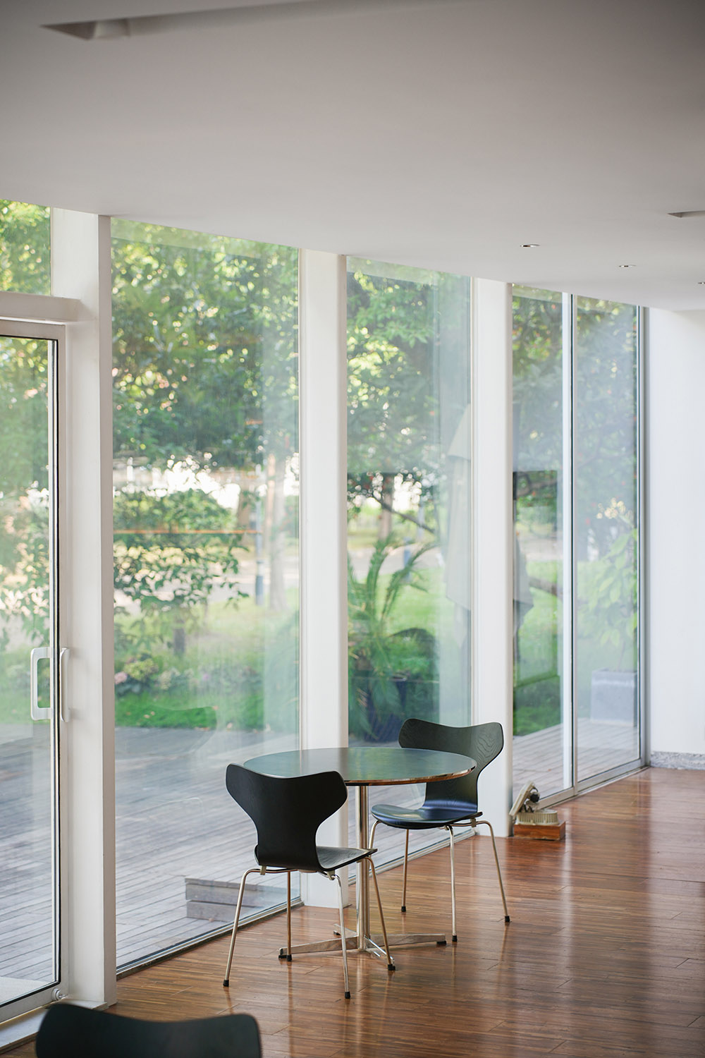
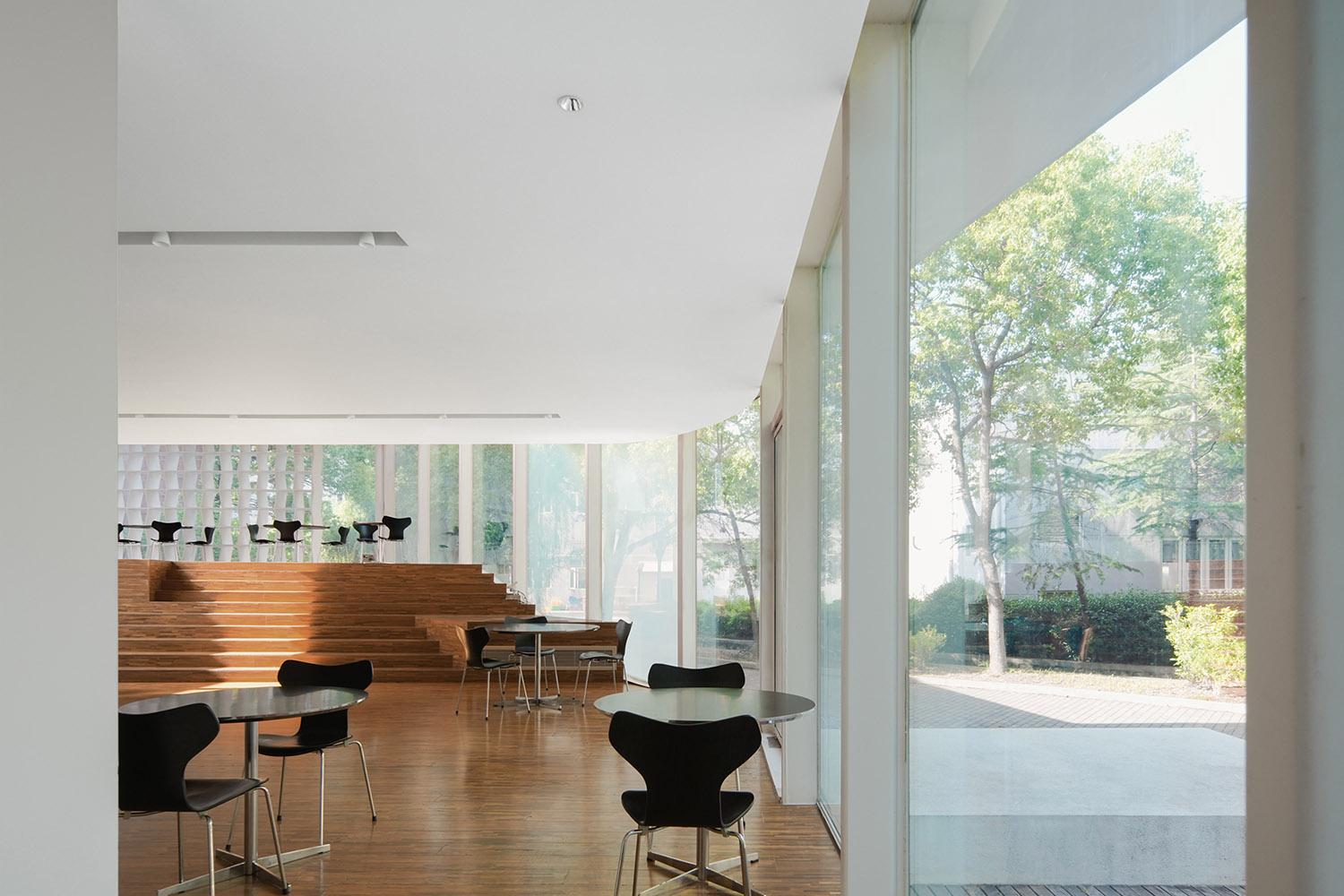
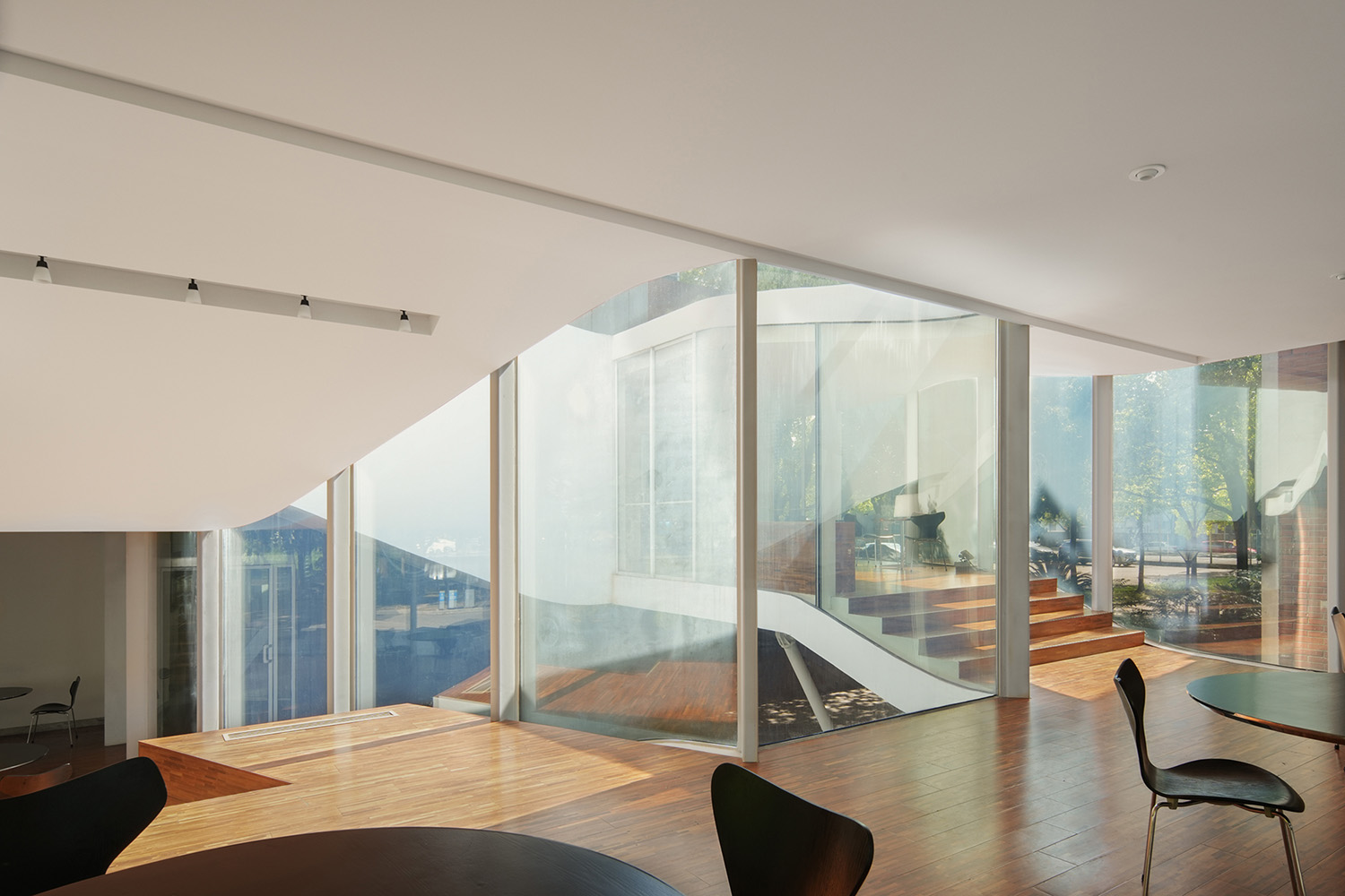
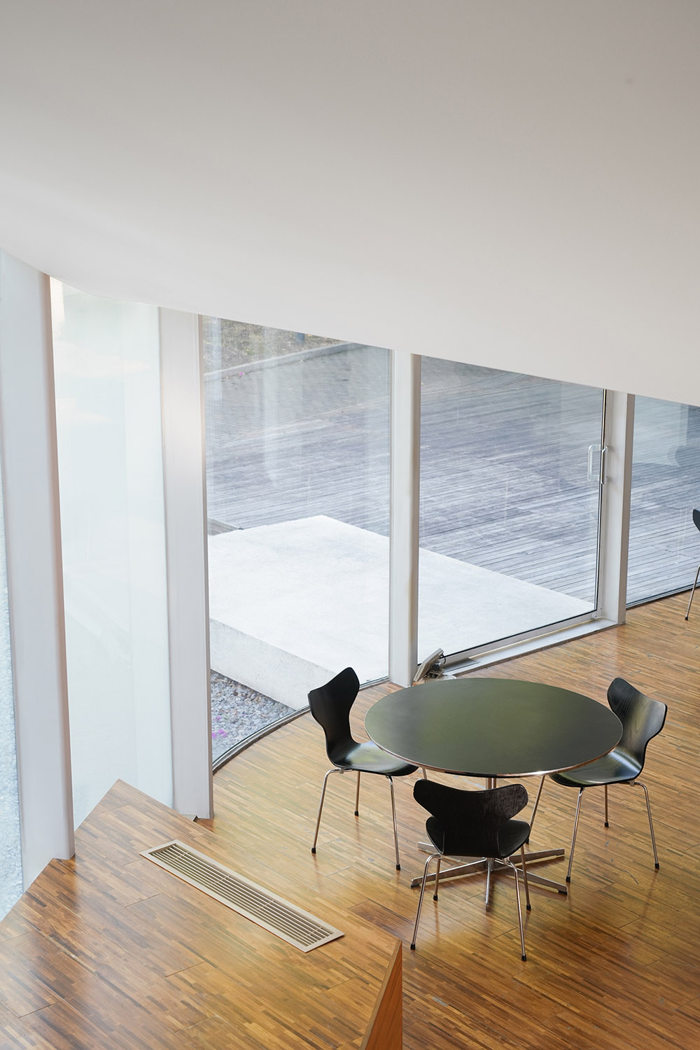
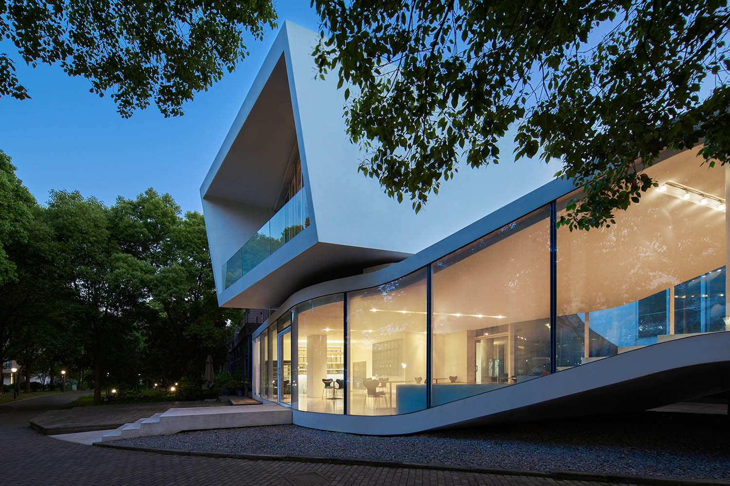
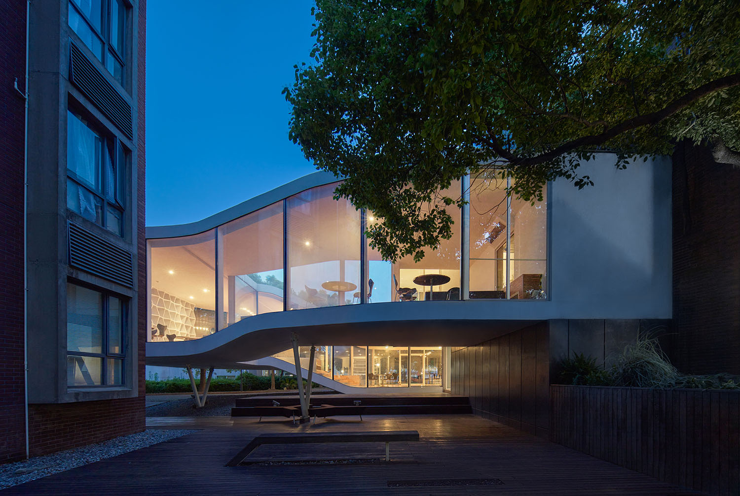
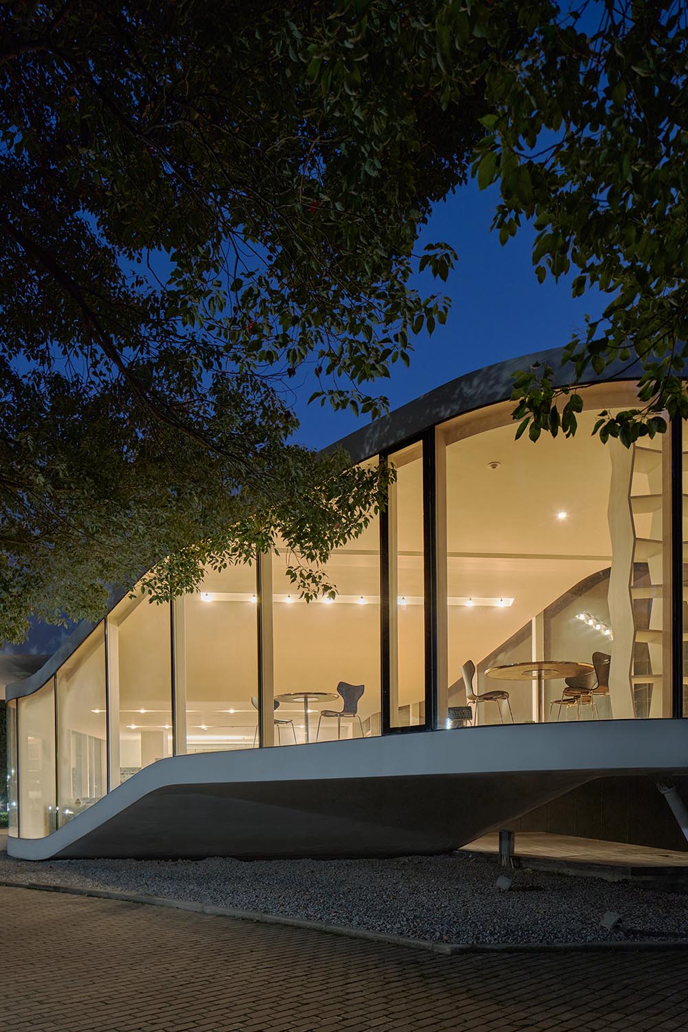
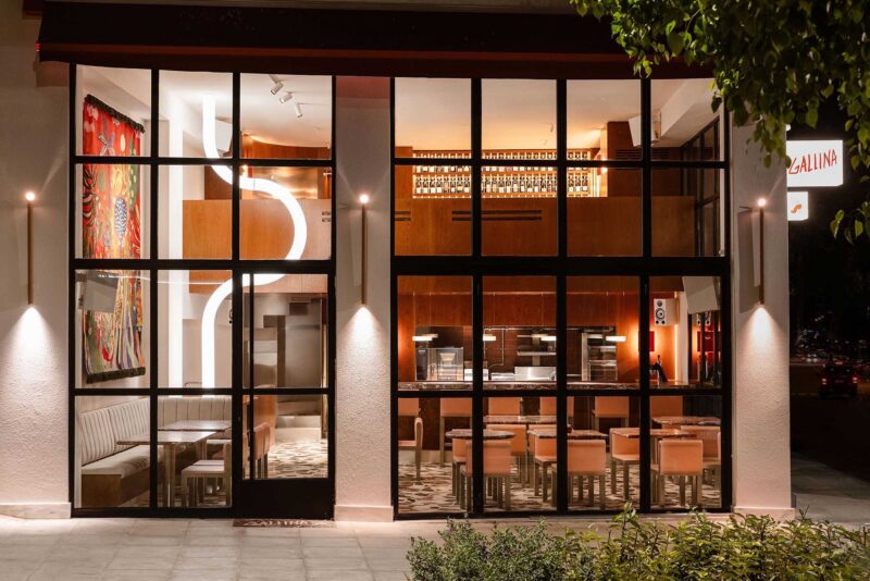
四周通體落地玻璃把室內空間與室外的自然景色融合在一起,輕巧而透明,呈現出「穿透」與「流動」的質感。在這裏,流線和走道相互重疊、連接,人們在室內獲得更高的自由度和多樣的活動體驗。
The floor-to-ceiling glass throughout the space seamlessly integrates the indoor environment with the natural scenery outside, creating a sense of lightness and transparency that promotes a feeling of ‘penetration’ and ‘flow’. The flow lines and walkways overlap and connect, providing individuals with greater freedom and diverse activity experiences within the space.
簡單、自然、舒適的氛圍
Simple, natural, comfortable atmosphere
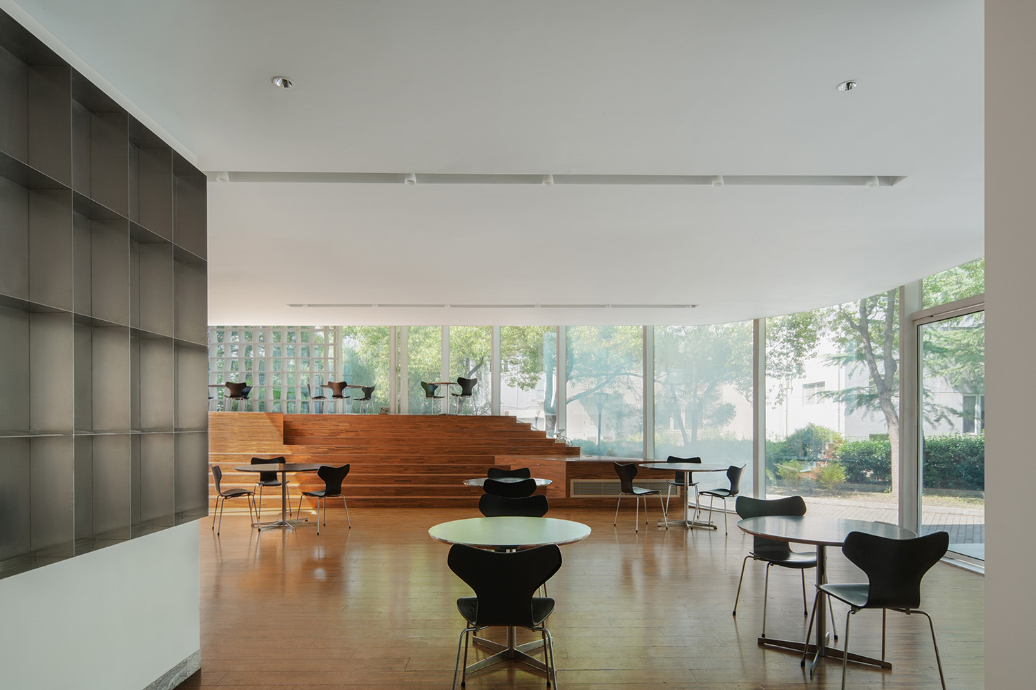
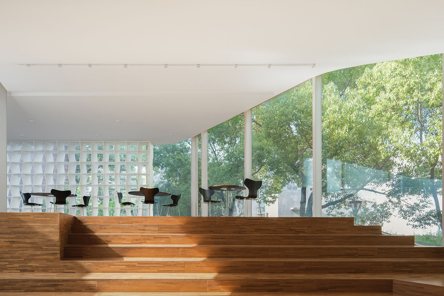
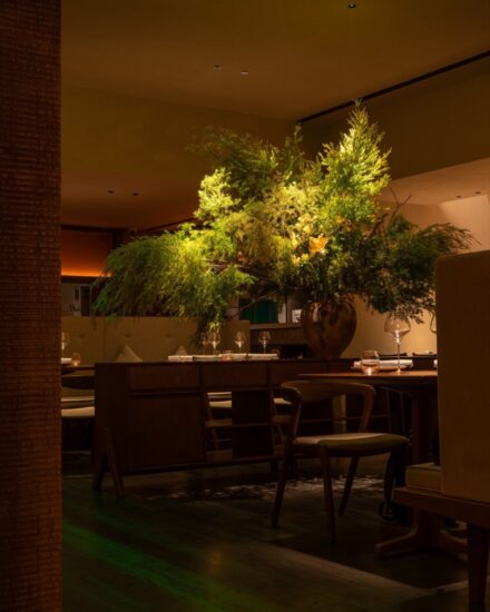
大麵積柚木天然材料地板,使室內保持溫暖和簡單,白色的頂部和深色木地板地麵,在視覺上分為上與下、輕盈與厚重的關係。
The interior is kept warm and simple with large areas of natural teak flooring. The white top and dark wood floors are visually divided into upper and lower sections, creating a contrast between lightness and heaviness.
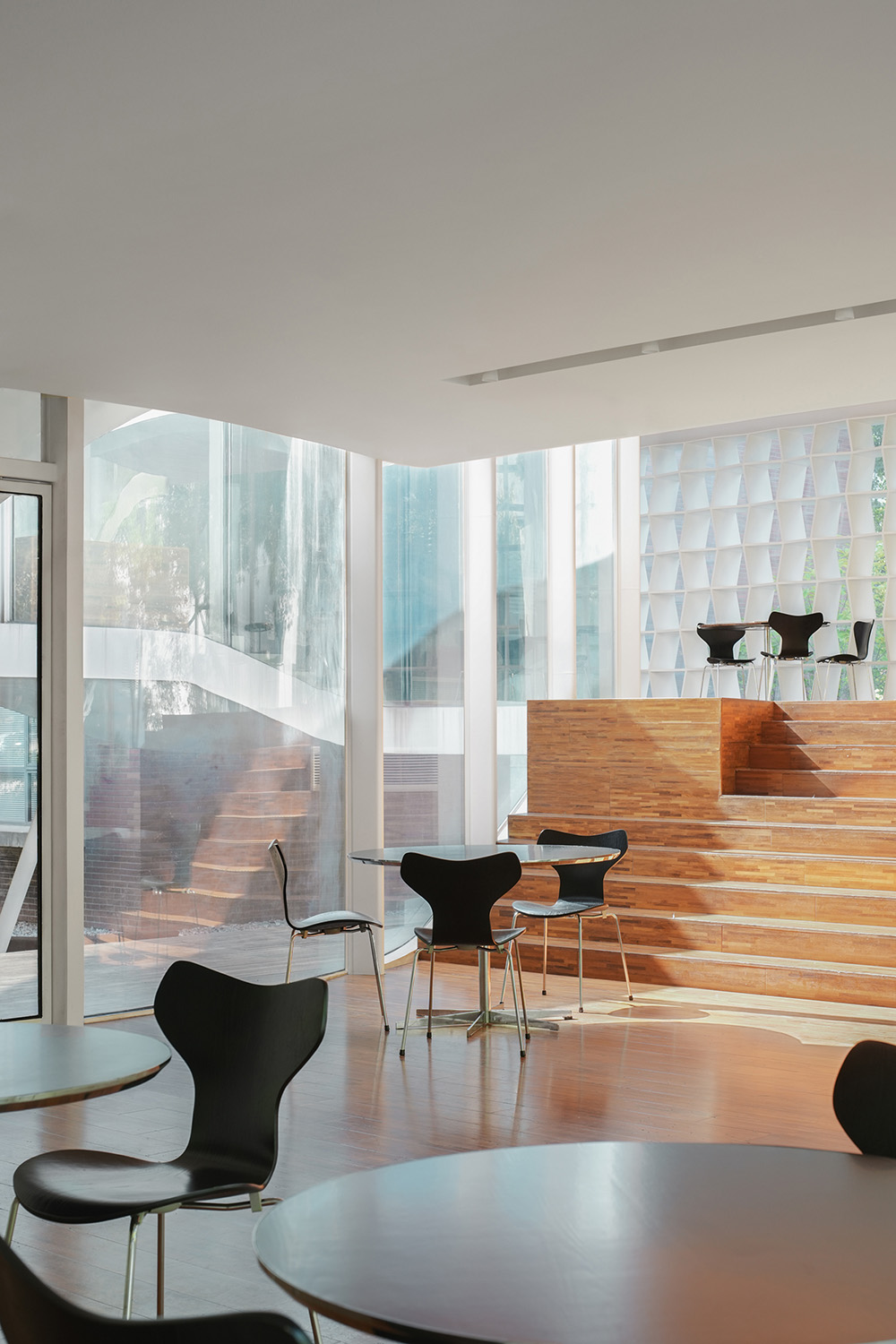
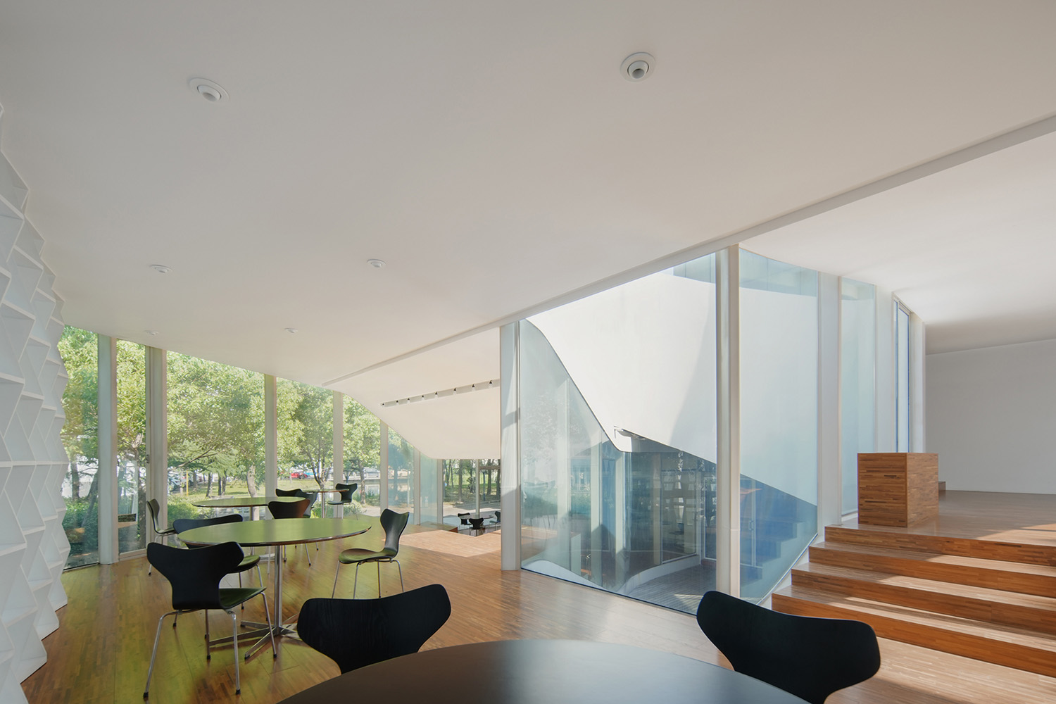
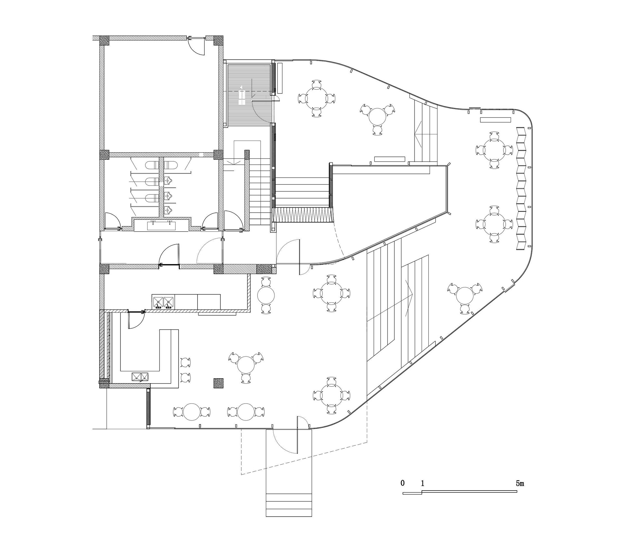
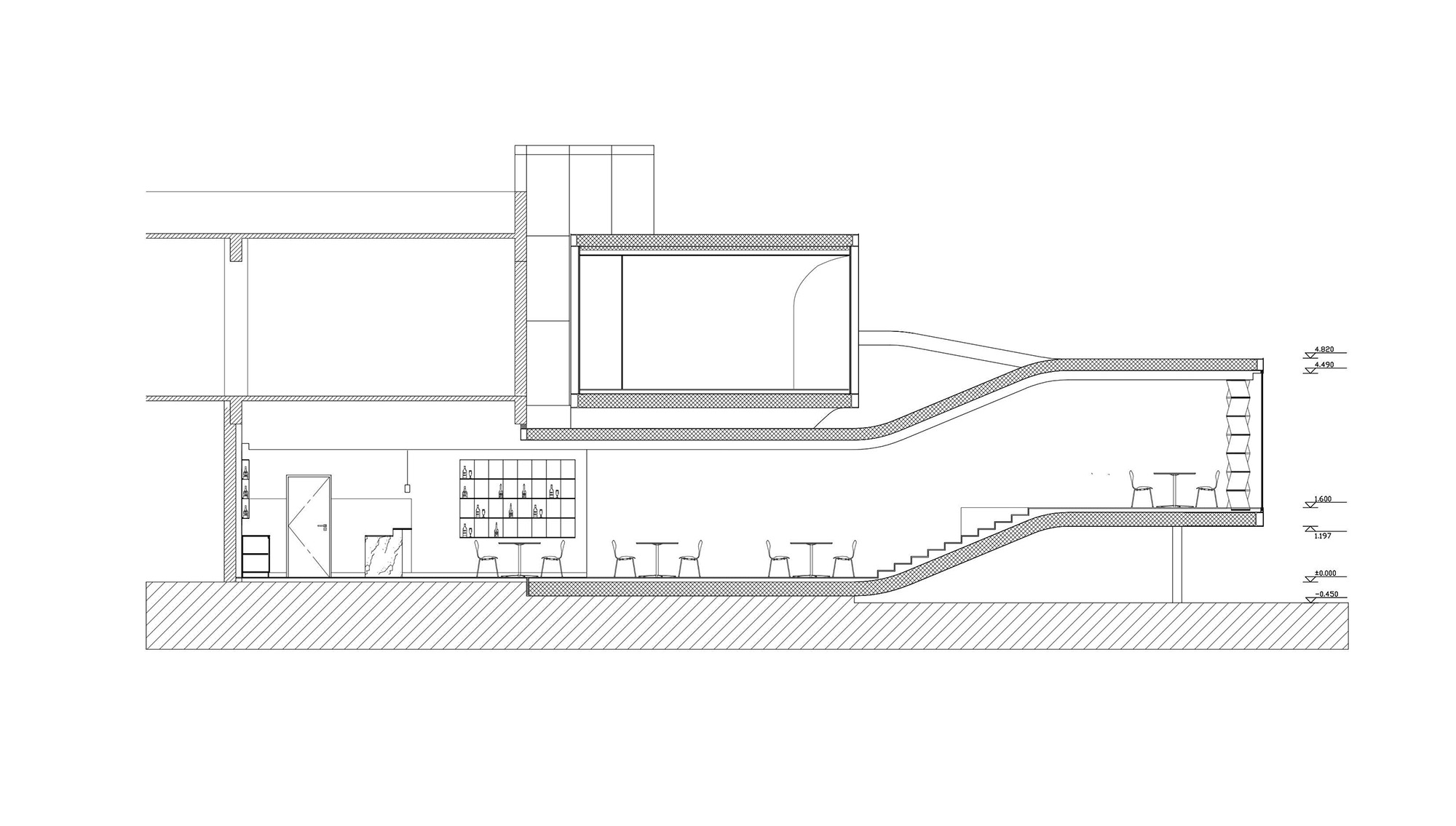
整個室內是一個圍繞中心點旋轉上升的開放式平麵,利用落差形成四個不同的高度平台作為就餐空間,形成多層次的就餐區域。天氣晴朗時,陽光透過玻璃灑滿室內,人們在裏麵與周圍的盎然綠意互動共生、相映成趣。
The entire interior is designed as an open plan that revolves and ascends around a central point, utilizing the varying heights to create four distinct elevated platforms as dining spaces, forming a multi-level dining area. On sunny days, natural light streams through the glass, infusing the interior with lush greenery, fostering an interactive and harmonious atmosphere between the occupants and the surrounding environment.
由於沒有明顯的棱角,圍護界麵的物質屬性被消解,室內與室外的界限模糊,空間本身成為唯一凸顯的主角。
Because there are no distinct edges and corners, the material attributes of the enclosure interface are dispelled, the boundaries between indoor and outdoor are blurred, and the space itself becomes the only prominent protagonist.
夜幕降臨,室內亮起了溫暖的燈光,整個建築升起,漂浮在地麵上,輕盈又明亮。
As night falls, the room lights up warmly, the whole building rises, and the ladle floats on the ground, light and bright.
∇ 平麵圖 Floor plan © 艾舍爾設計
∇ 立麵圖 Elevation © 艾舍爾設計
項目信息
項目名稱:5號餐廳
項目地址:上海
建築麵積:300平方米
室內設計:艾舍爾設計
設計總監:王誌峰
項目總監:範進
設計深化:裴泳翰
建築設計:formless design
項目時間:2023年3月
項目攝影:yuuuunstudio
Project Name: Restaurant No. 5
Project Address: Shanghai
Building Area: 300 sqm
Interior Design: A3 VISION
Design Director: Wang Zhifeng
Design Management: Fan Jin
Design Team: Pei Yonghan
Architectural Design: formless design
Project Time: March 2023
Photography: yuuuunstudio


