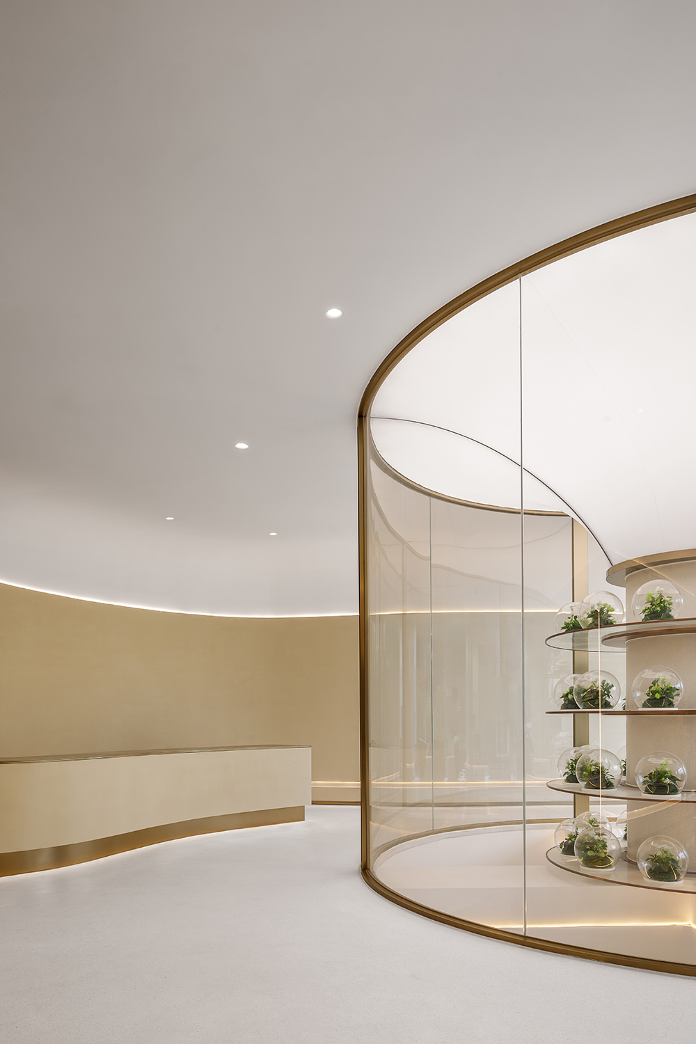
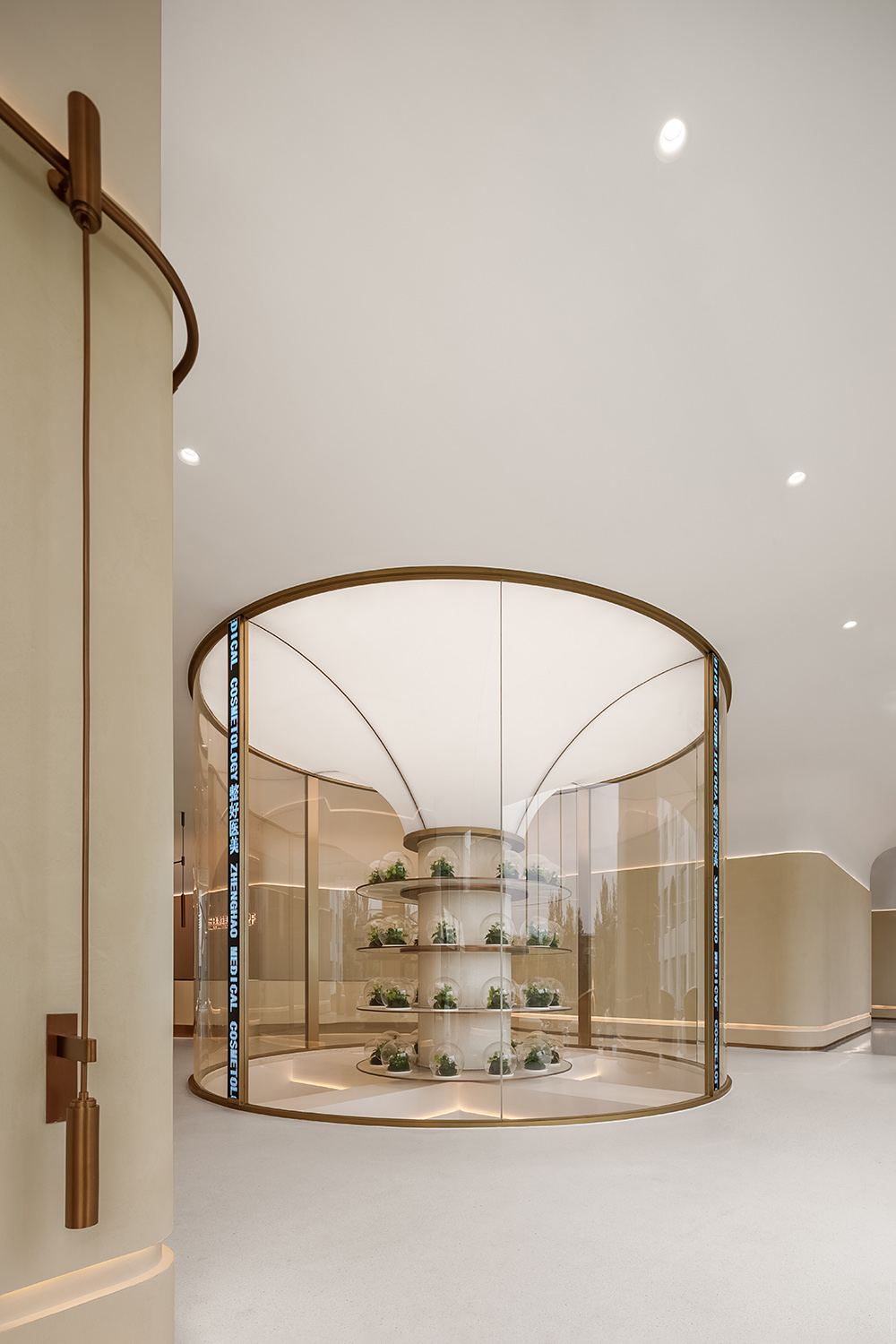
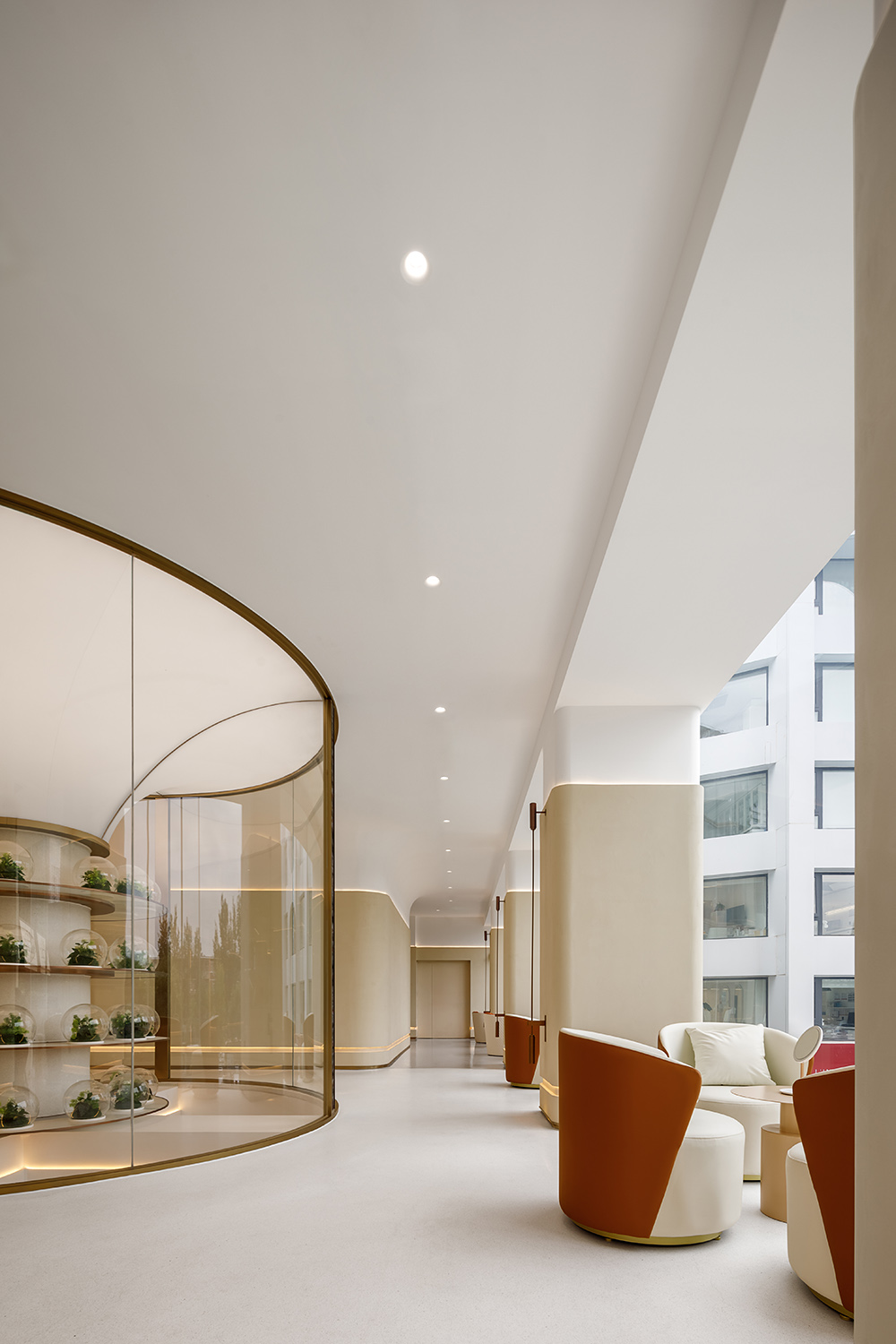
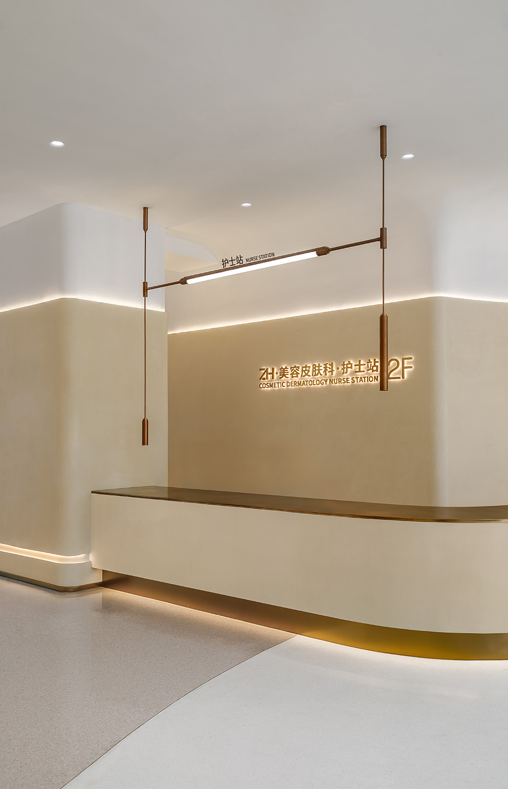
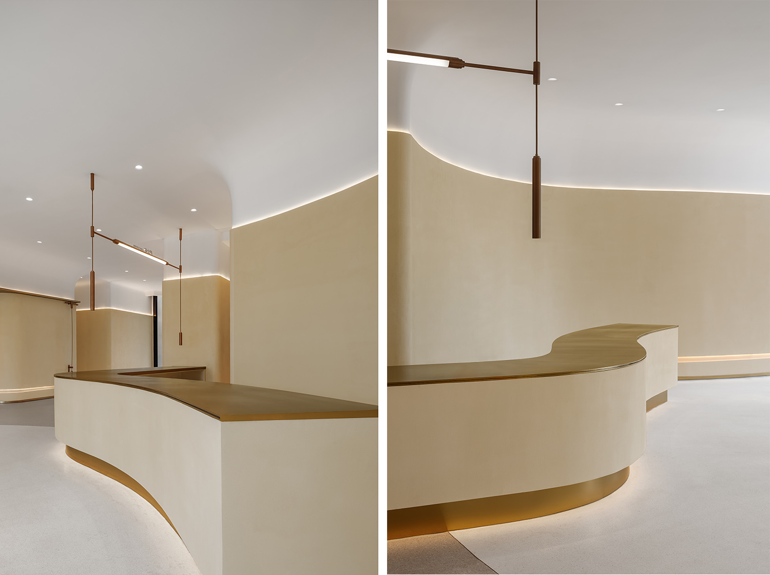
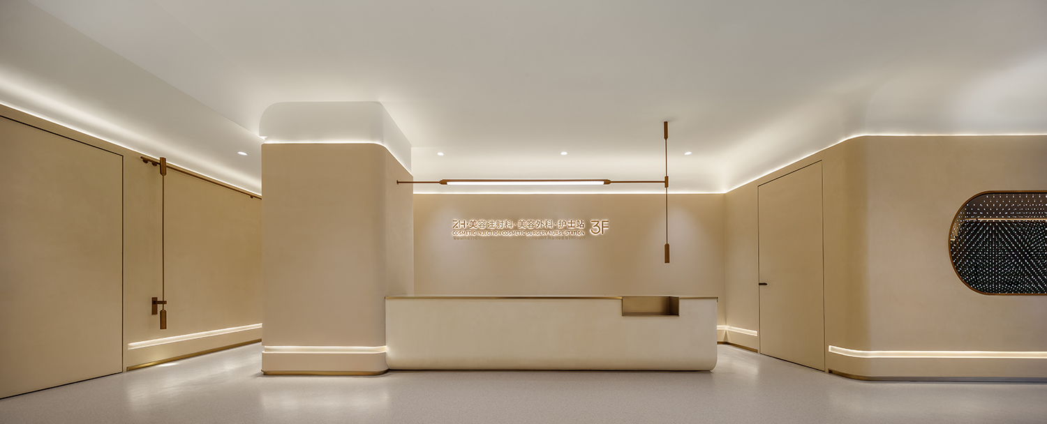
項目位於北京市朝陽區兆龍飯店附屬樓,建築占地麵積1500平米,緊鄰北京最繁華商業街區三裏屯商區。項目為三層獨立建築,前身曾是餐廳,健身房,宴會廳三個獨立空間,經大觀設計改造後,合並成一個獨立的醫療美容醫院。設計旨在打造出一個可容納100人靈活工作環境,包含接待區,等候區,谘詢區,辦公區,治療室,注射室,手術室及相關專業功能區域的綜合類醫療美容醫院。
The project is located in the auxiliary building of the Zhaolong Hotel in Beijing’s Chaoyang District, covering an area of 1,500 square meters and adjacent to Sanlitun, the most bustling commercial area of Beijing. The project is a three-storey independent building, formerly composed of three independent spaces: a restaurant, a gym, and a banquet hall. The three independent spaces mentioned above have been transformed into an independent medical beauty hospital through grand sight design. Our design aims to create a comprehensive medical beauty hospital that can accommodate a flexible working environment for 100 people, including reception area, waiting area, consultation area, office area, treatment room, injection room, operating room, and related professional functional areas.
空間以源於自然的色彩氛圍展開敘事,平靜的色調為空間帶來沉浸的魔力,勾勒空間形態藝術之美。
The space unfolds a narrative with a colorful atmosphere derived from nature, and the quite tones bring an immersive magic to the space, outlining the artistic beauty of spatial form.
秩序,徘徊與流連之間
Order,Wandering and lingering
布局,顏色,材質強調空間質感和無邊界感,錯落有致的結構內,每一個轉角都有回響,所有空間都可以流線似的聯通起來,自然純粹。
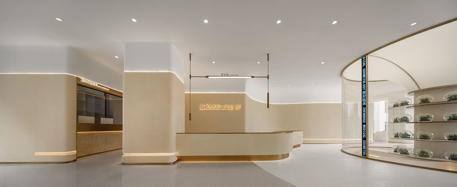
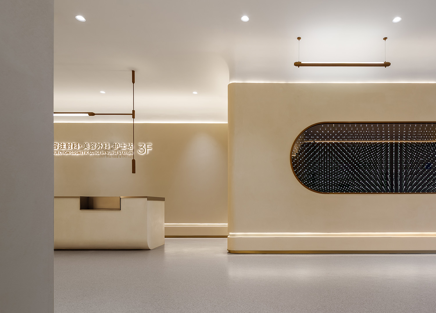
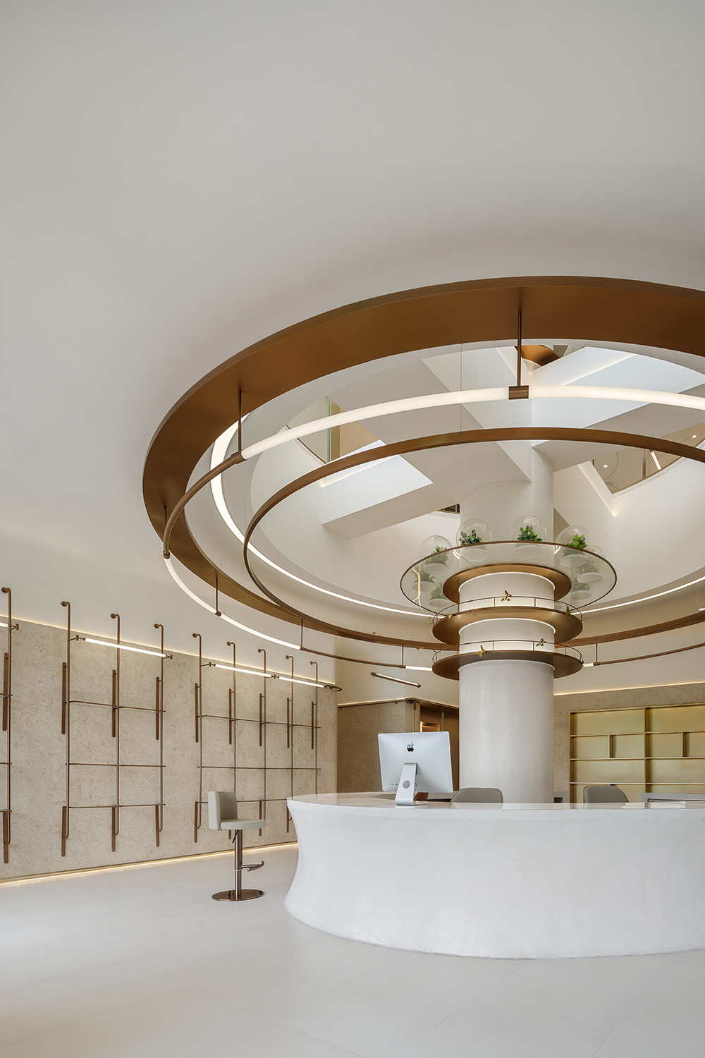
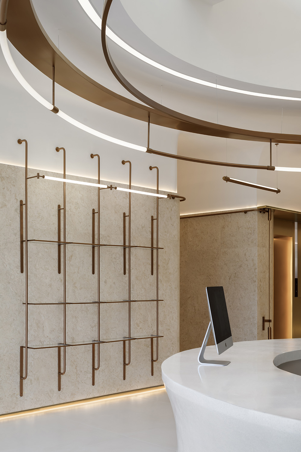
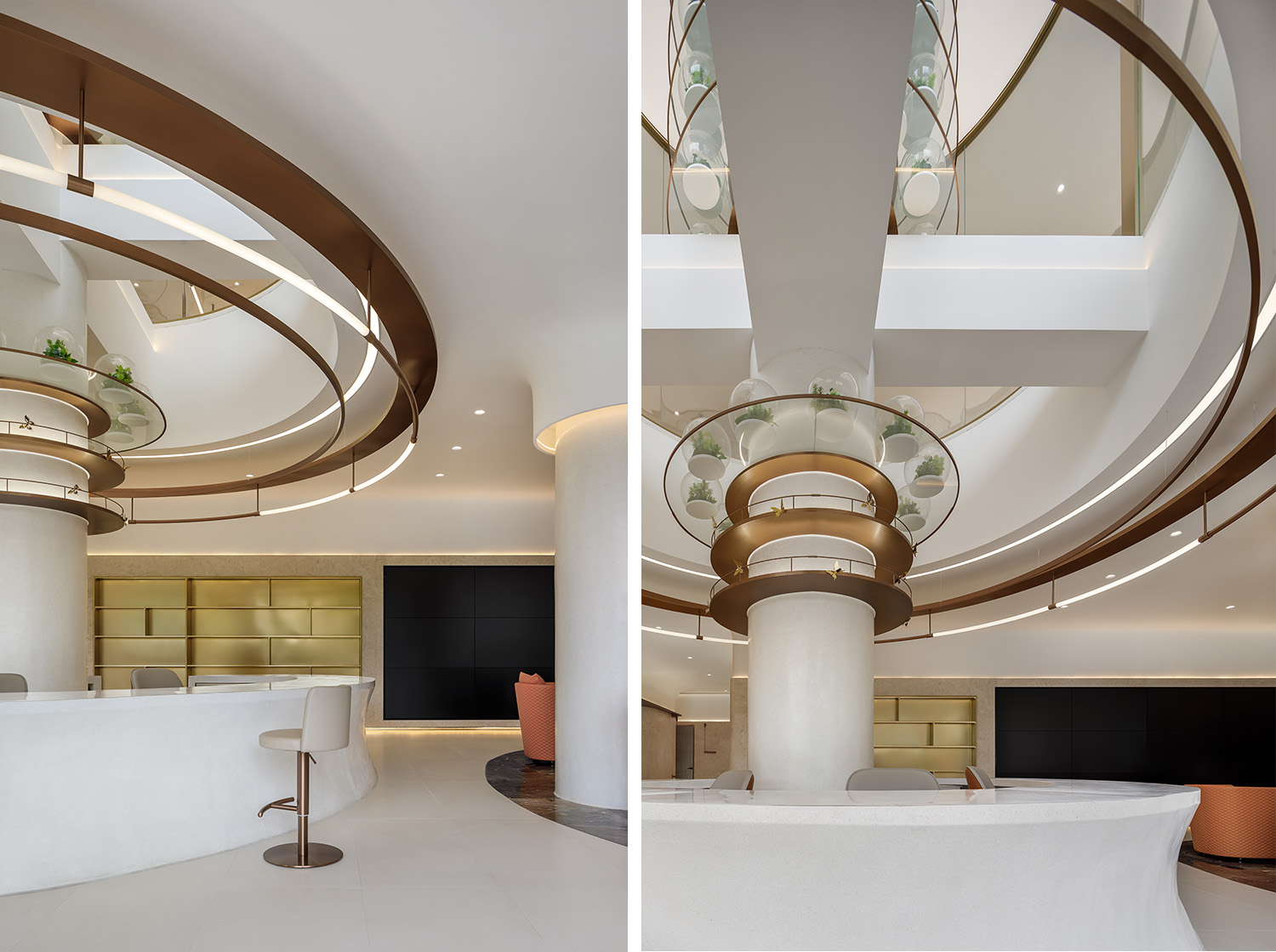
貫通天井保留原有結構的特征與原樣,結合結構柱體設置大型生命自然主題藝術裝置,每一個獨立玻璃生態景觀代表一個獨立的生命個體,從而組成整個世界。
The layout, colors and materials emphasis the texture of the space and the sense of no boundaries. Within the staggered structure, every corner has an echo, and all spaces can be connected like a streamline, naturally and purely. The courtyard will retain the characteristics and original structure, combined with the structural columns to set up large-scale life and nature-themed art installations, each individual glass ecological landscape represents an independent individual life, which in turn constitutes the whole world.
光影,溫柔如陽春三月
Light and shadow,Gentle as spring season
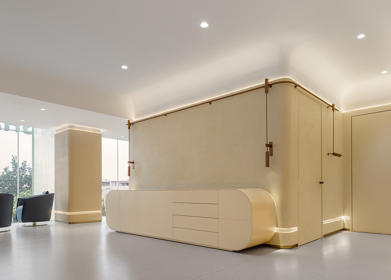
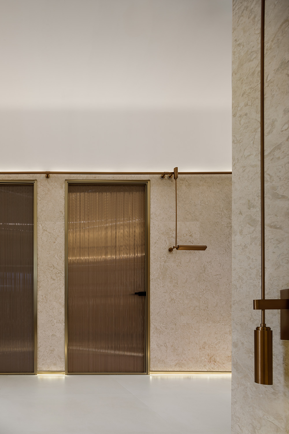
進入空間,被一種寧靜,溫暖的氛圍所包圍。室內色調以米色,白色為主,平和,自然。自然光線透過整麵玻璃幕牆進入空間,起舞清影。感受空間本身對自然光線的享受。
As you enter the room, you are surrounded by a peaceful, warm atomosphere. The interior colors are beige and white, calm and natural, Natural light enters the space through the entire glass curtain, let you dancing with your shadow and immerse yourself in nature even indoors.
盤旋,行走虛實之間
Circling,Walking between virtual and real
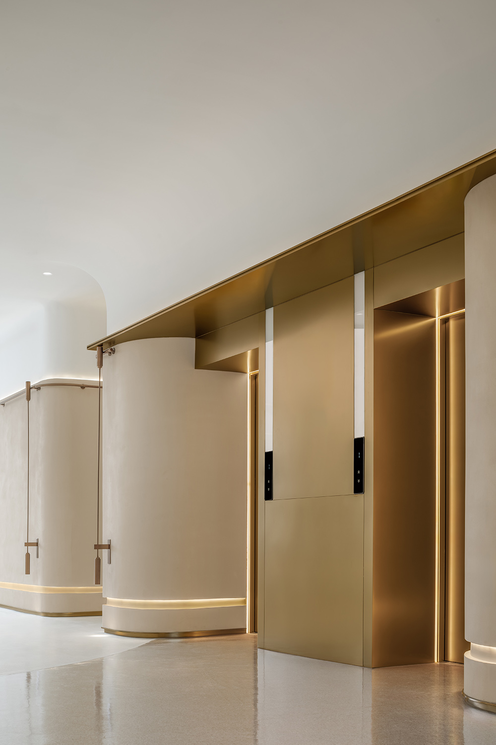
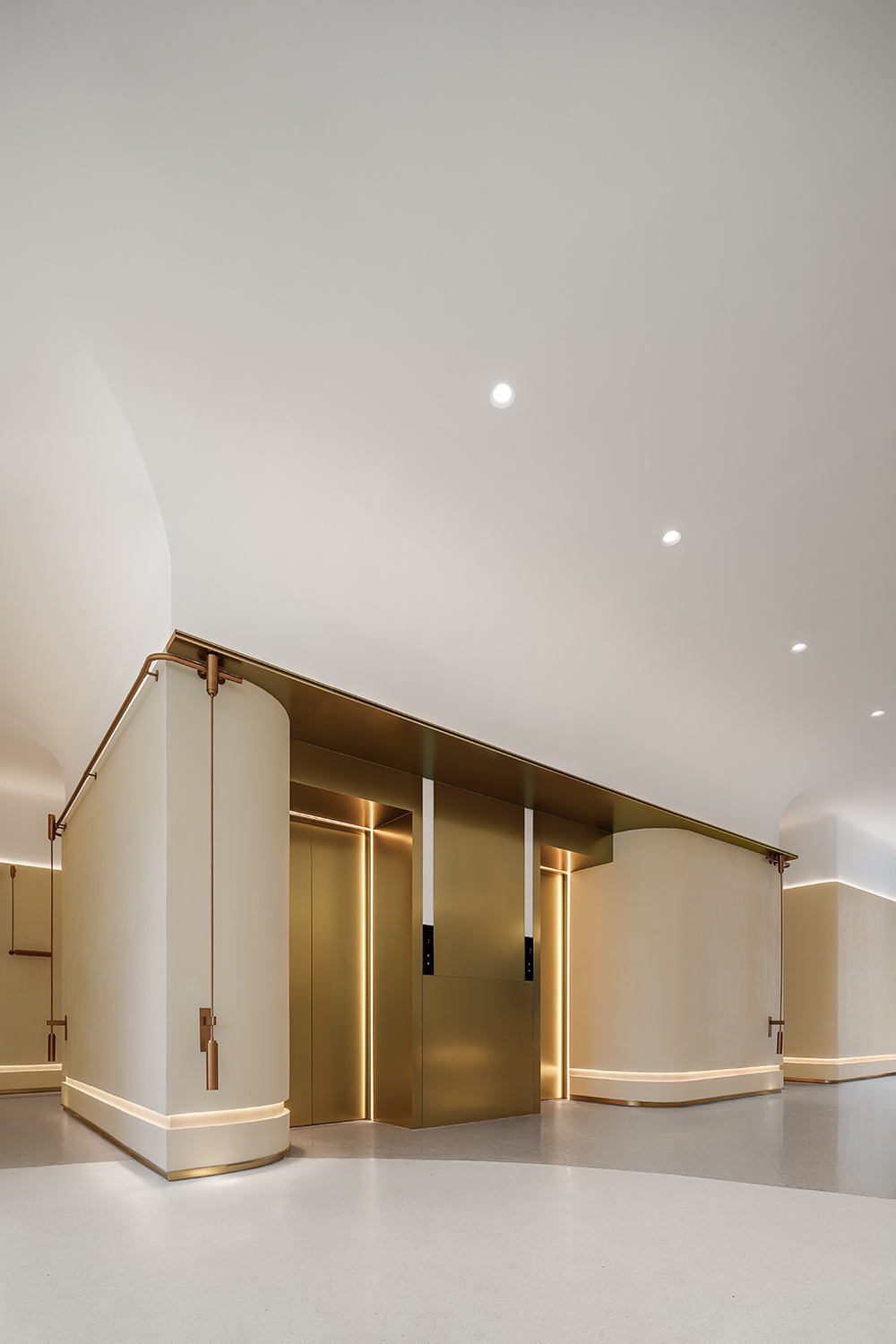
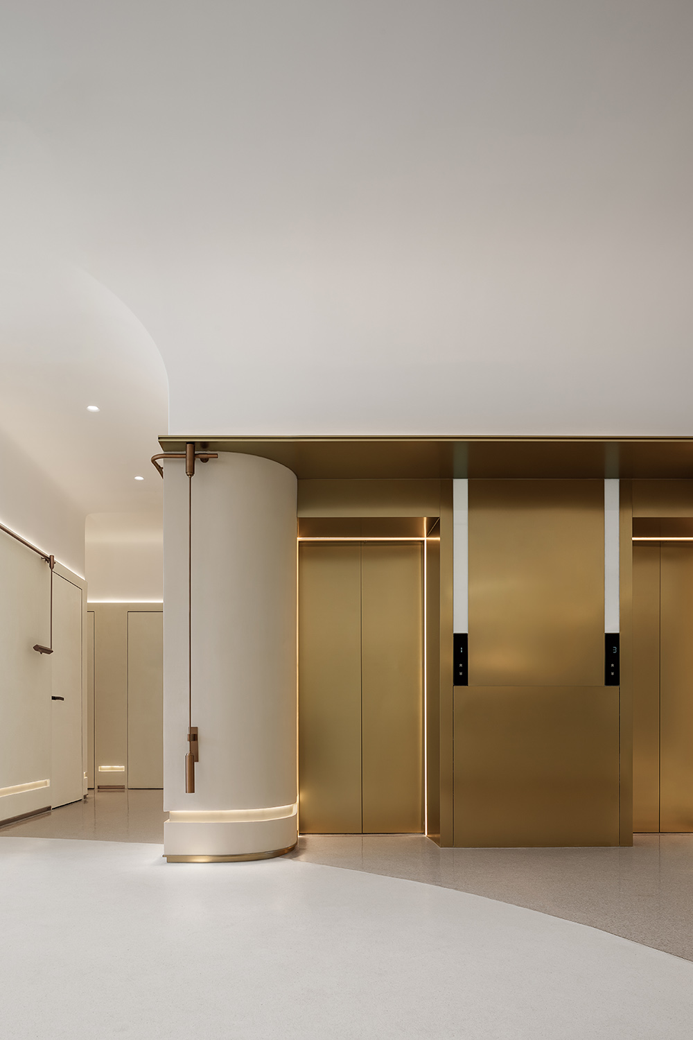
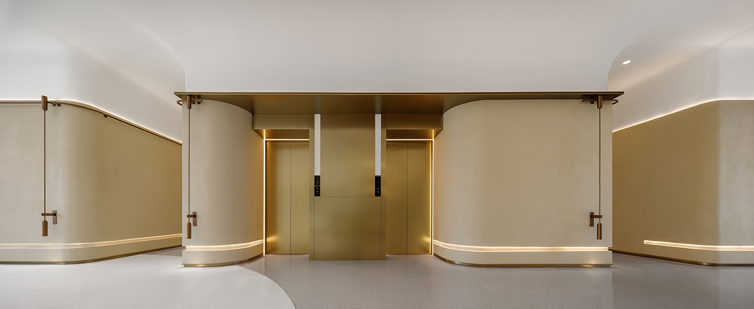
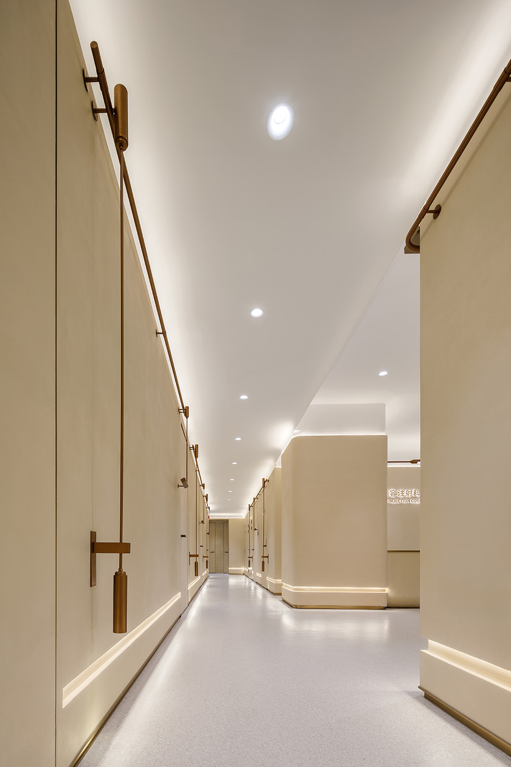
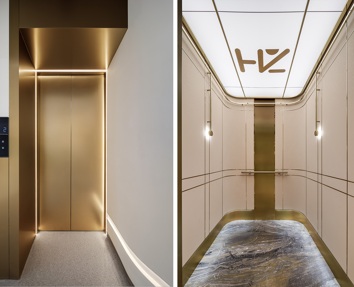
流線造型同回旋動線設置,如同行走在虛實之間,空間通過每一個弧形轉角連接,流暢而富有動感,仿佛在詮釋著一種流動的藝術。
By introducing streamline and convolute motion line into the design, customers feel like they are walking between the virtual and the real. The space is connected through each curved corner, smooth and dynamic, as if interpreting a flowing art.
線條,和諧的輪廓感
Lines,A harmonious sense of silhouette
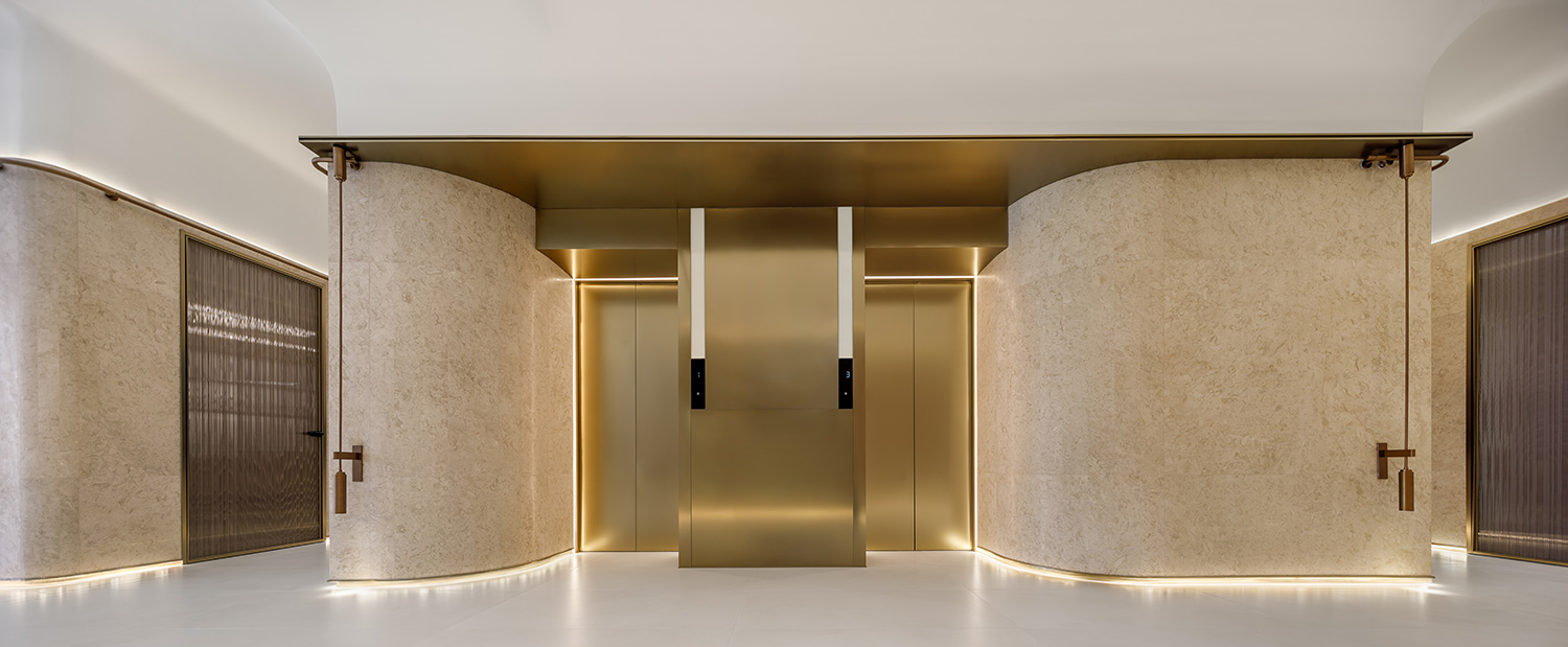
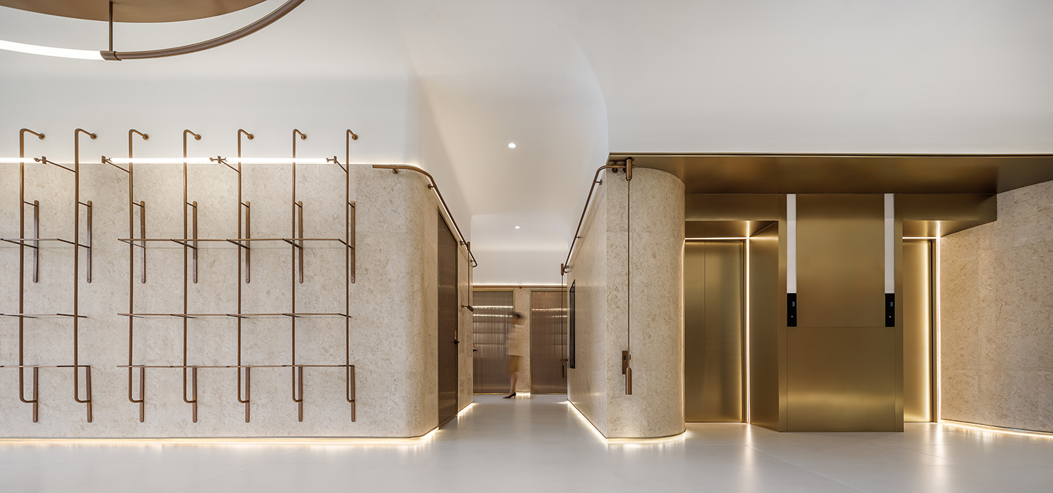
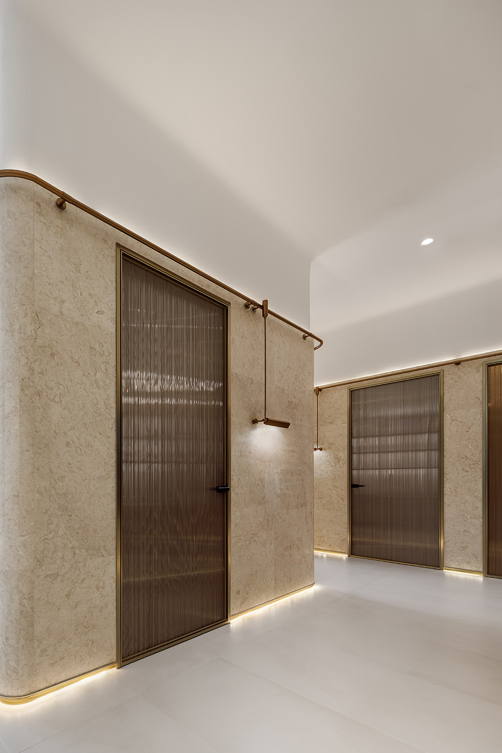
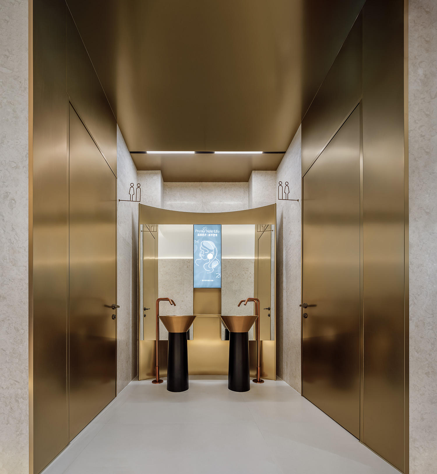
步步悠然,結合建築自身的弧形,勾勒出舒適的室內輪廓。用極簡線條把空間整合的更加完整和諧。微水泥作為空間主基調,形成獨特的空間語言,既突出美感又展現舒適性。
Every leisurely step, combined with the curved shape of the building itself, outlines a cosy interior. Minimalist lines are used to integrate the space a more wonderful and harmonious way. Micro-cement is used as the main tone of the space, creating a unique spatial language that emphasizes both aesthetics and comfort.
靜謐,寧靜
Stillness,Peace
生活,不應該照著生活的樣子,也不該照著你覺得它應該怎樣的樣子,而應當照著它在我們夢想中的那個樣子…
它應該就是我們在夢想中的樣子—整好醫美。
Life, should not be lived as it is, or as you think it should be, but as it is in our dreams…
Life should be what we dream it to be in our dreams—ZhengHao beauty clinic.
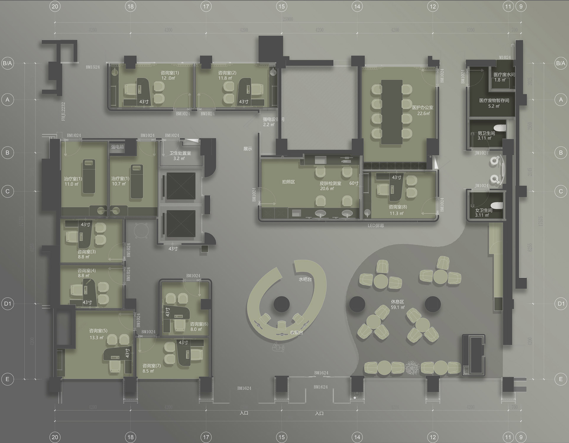
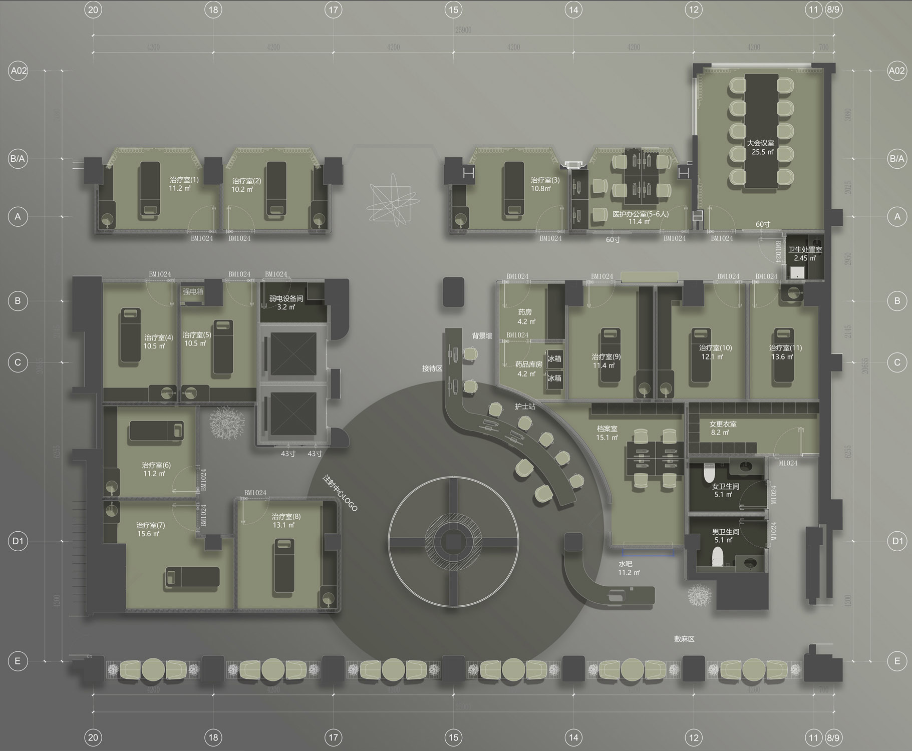
∇ 1F平麵圖
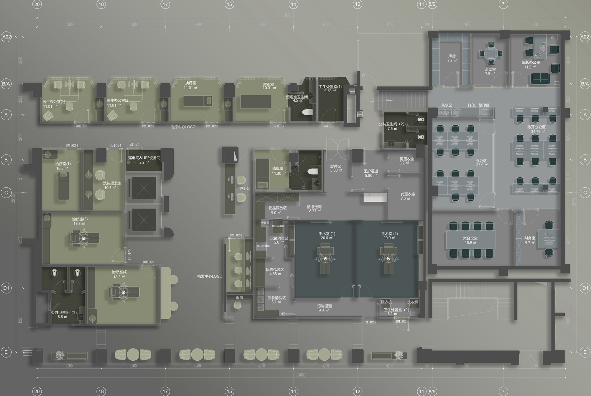
∇ 2F平麵圖
∇ 3F平麵圖
項目信息
項目名稱: 整好醫美
項目地點: 北京市朝陽區 兆龍飯店
竣工時間:2023年8月
建築麵積:1500平米
設計機構:北京市大觀思瑞裝飾設計工程有限公司
設計師: 宋德峰 楊治明
項目主材:水磨石 天然石材 微水泥 木飾麵 PVC地膠
Project Name: ZhengHao beauty clinic
Location: Zhaolong Hotel, Chaoyang District, Beijing
Year: 2023
Site Area: 1500m2
Design institution: Beijing Daguansirui decorative design engineering Co., Ltd
Designers: Defeng Song, Zhiming Yang
Materials: terrazzo, natural stone, microcement, veneer, PVC


