通透的共享走廊,消弭辦公空間內的冰冷圍牆
Transparent shared corridors eliminate the cold walls in the office space
空間的呼吸感 The Breath Of Space
MARS星球建築受到業主的委托,對北京國際超甲級寫字樓嘉銘中心二層空間進行改造和更新。嘉銘中心的功能布局類似三明治結構:外層靠外窗為辦公區,內層靠核心筒布置輔助空間,中間夾著公共走廊。沿走廊通透的軸向線性動線讓辦公空間更具呼吸感。
MARS Studio was commissioned by the owner, has undertaken the transformation and renovation of the second-floor space of the Jiaming Center, an international super A-grade office building in Beijing. The layout of Jiaming Center resembles a sandwich structure: the outer layer facing the external windows serves as office space, the inner layer near the core is arranged for auxiliary functions, and a public corridor runs in between. The transparent axial linear circulation along the corridor creates a breathing sensation in the office space.
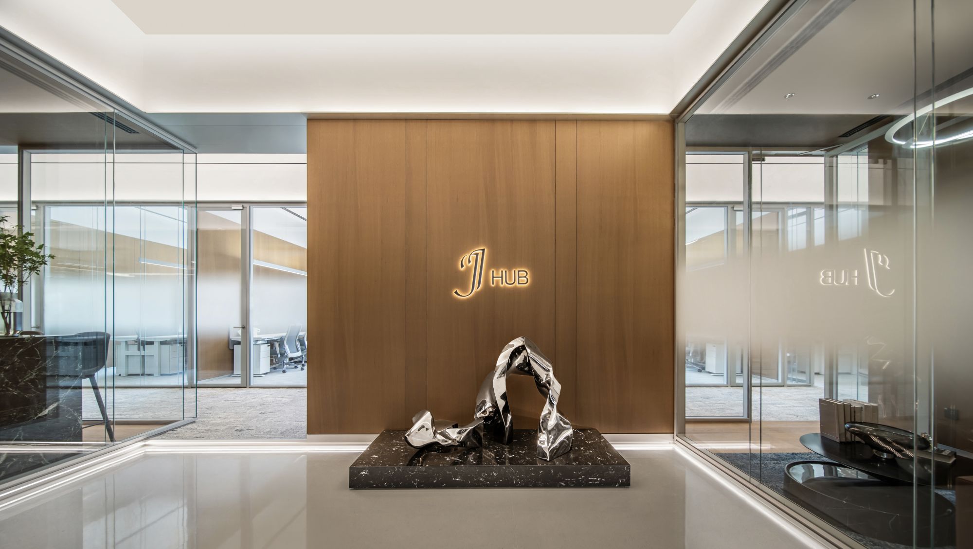
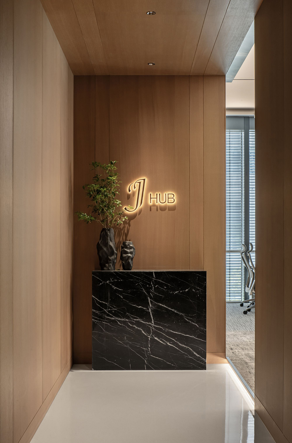
∇ 門廳不同肌理的虛實對比,The Contrast of Different Textures in the Lobby
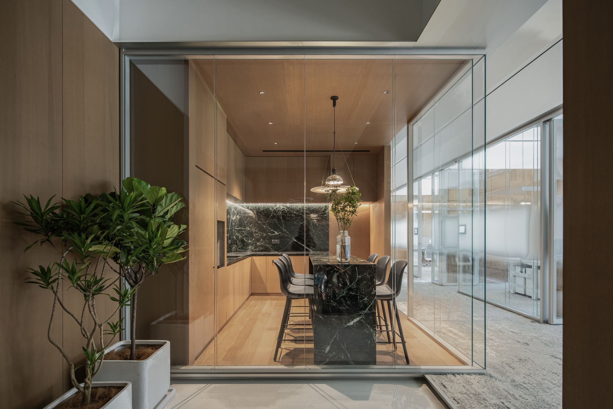
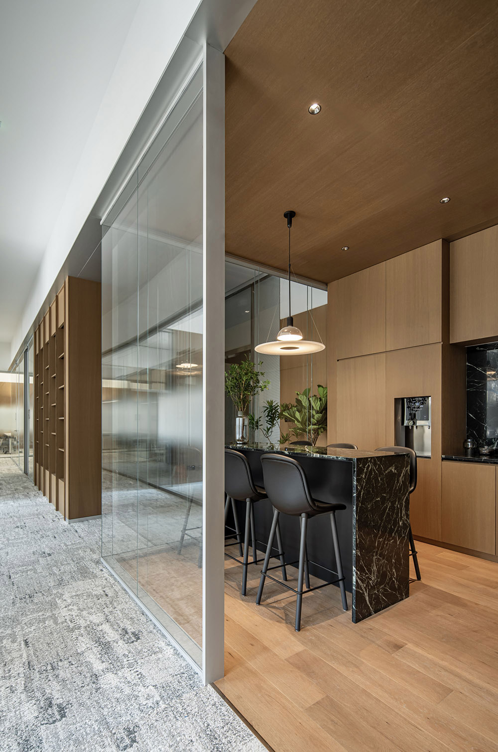
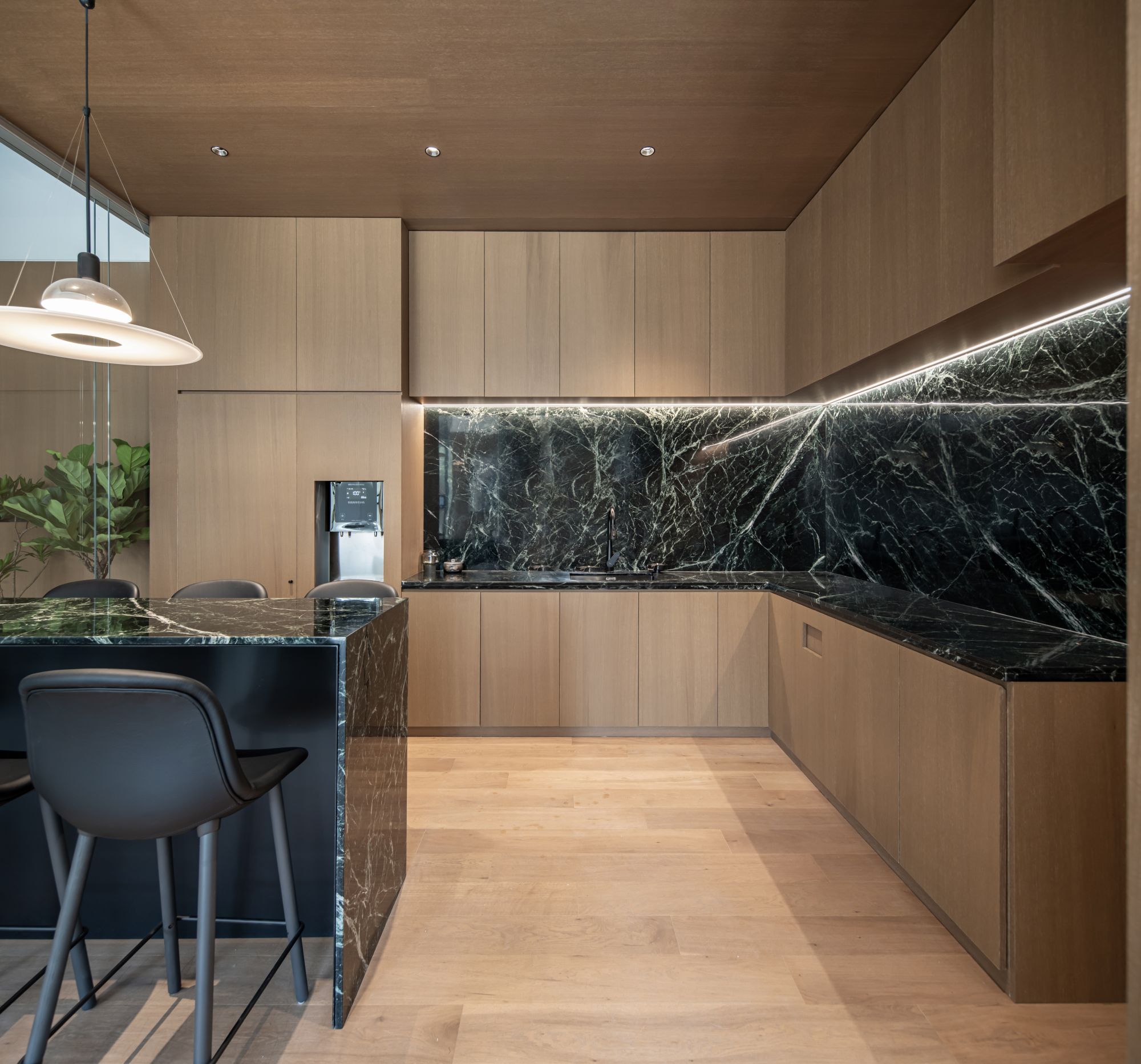
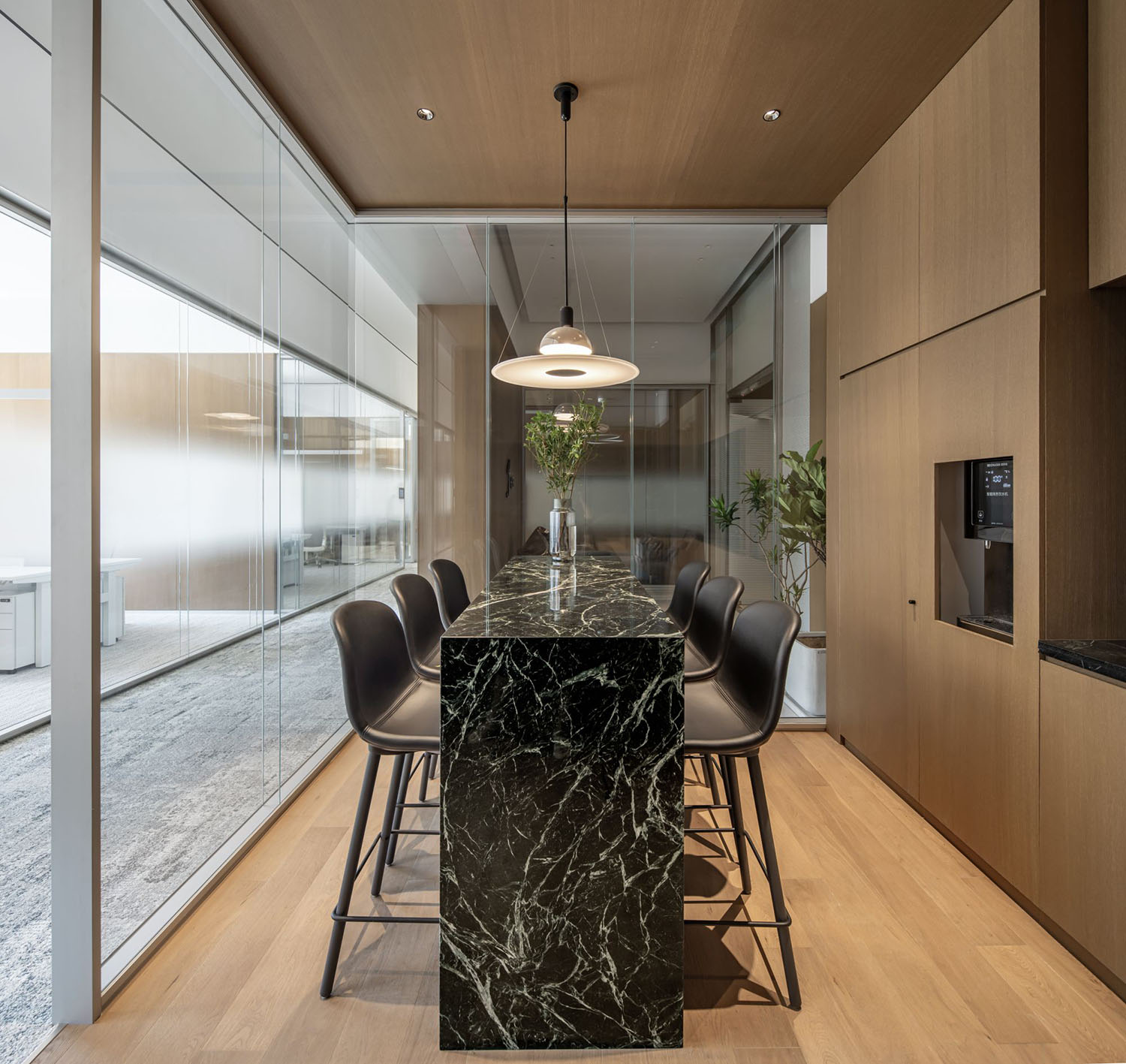
∇ 開放茶水間,Pantry
∇ 從門廳進入到公共區域,The Foyer Leads into the Public Area
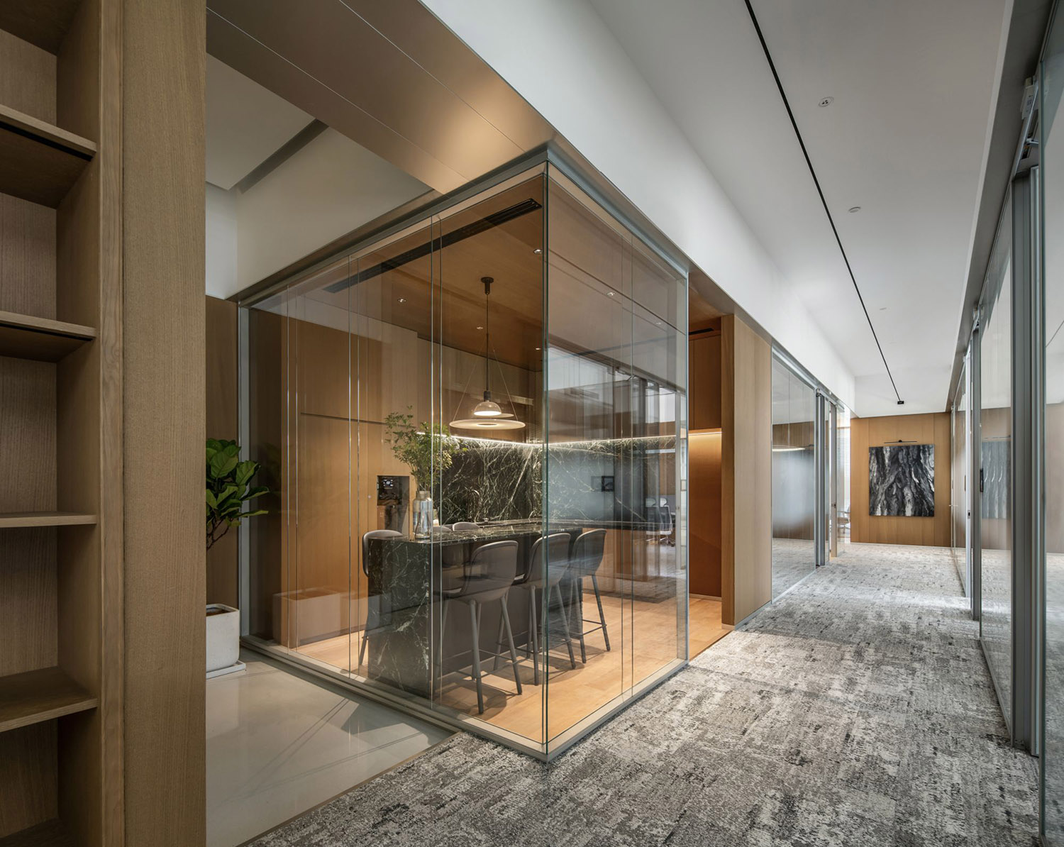
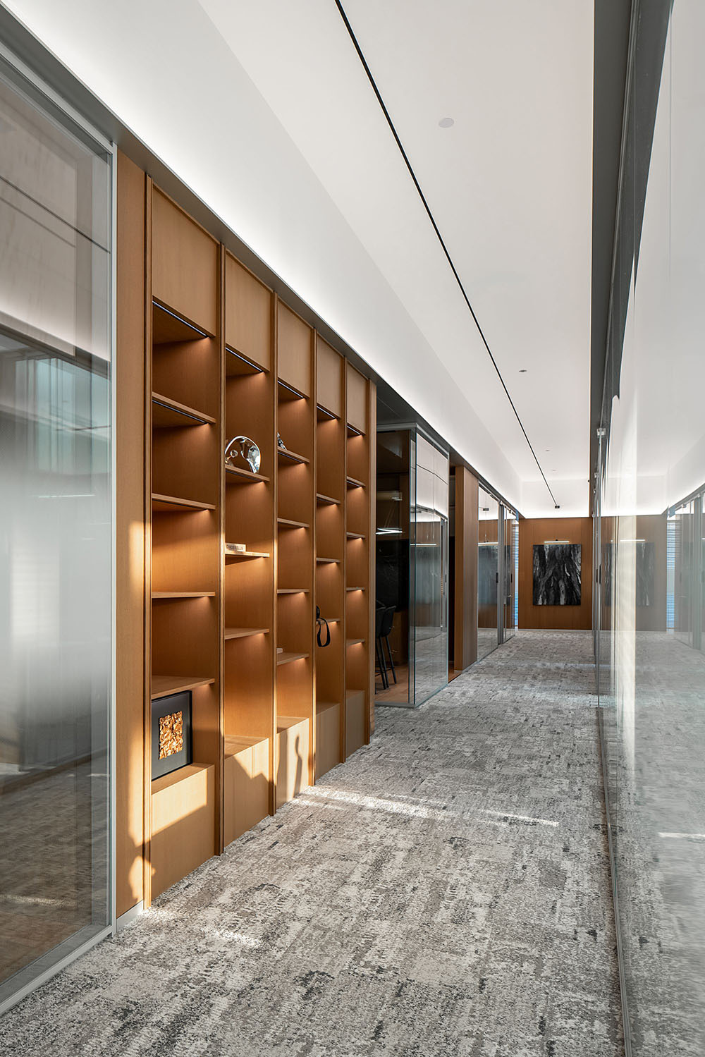
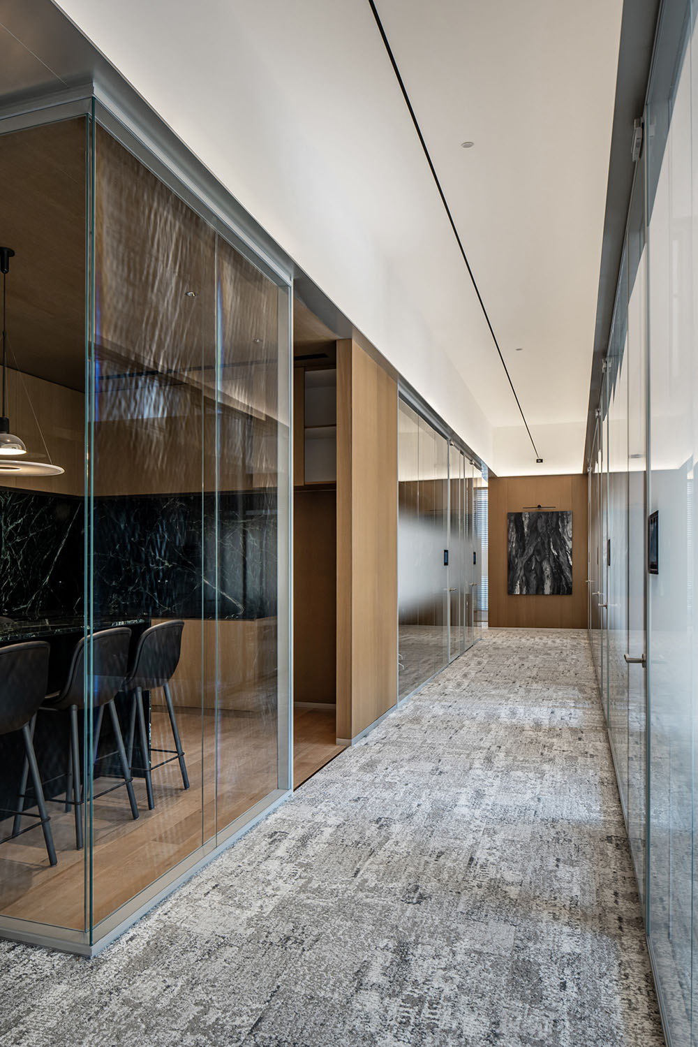
∇ 公區走廊,View of Corridor
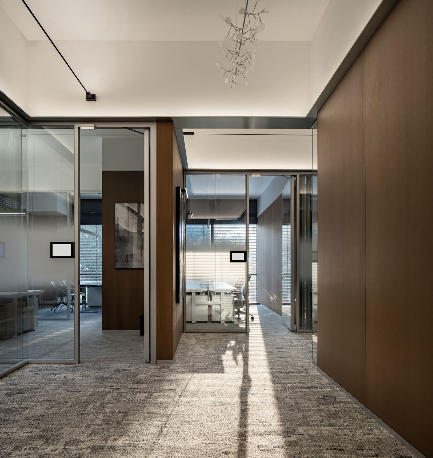
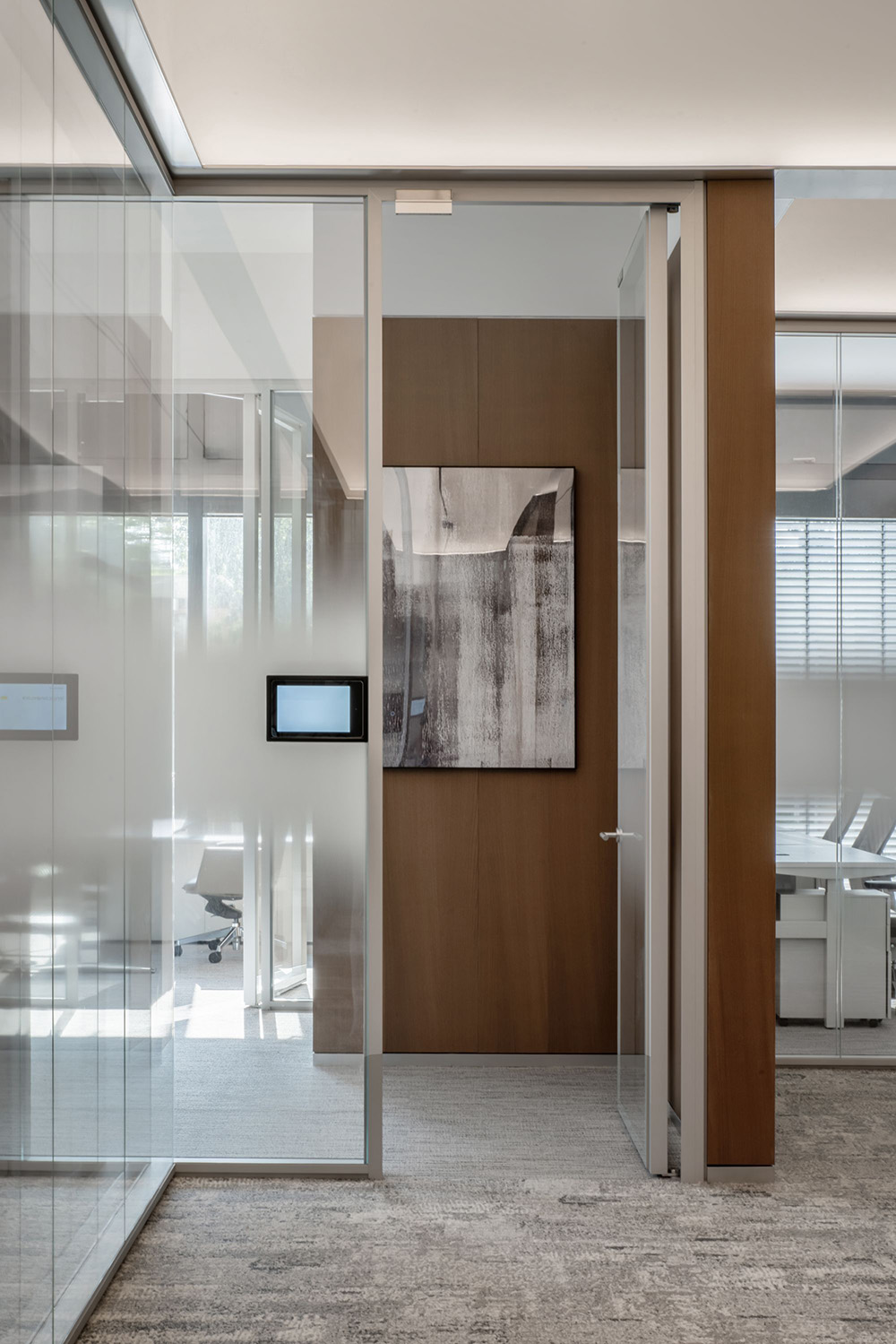
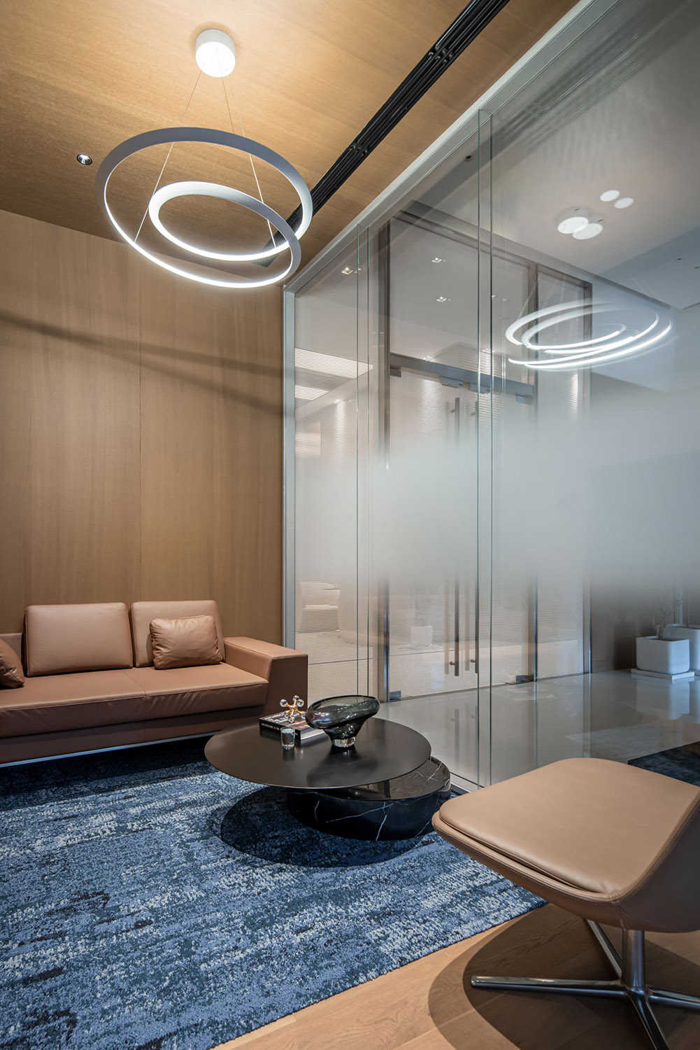
主入口位於主電梯廳一側,次入口位於商業電梯一側。進入門廳後,映入眼簾的木質背景牆,與兩側的玻璃隔斷形成虛實對比,並構成空間整體氛圍基調。洽談區和茶水間分置入口兩端,L型的公共走廊鏈接各辦公空間和輔助空間,會議室、電話間及其他輔助空間沿走廊內側線性布置。
The main entrance is located on the side of the main elevator hall, while the secondary entrance is on the side of the commercial elevator. Upon entering the foyer, the warm wooden background wall catches the eye, creating a juxtaposition with the glass partitions on both sides and establishing the overall ambiance of the space. The negotiation area and Pantry are placed at the ends of the entrance, and an L-shaped public corridor connects various office spaces and auxiliary areas. Meeting rooms, phone booths, and other supporting spaces are linearly arranged along the side of the corridor.
∇ 次入口玄關 Secondary Entrance Vestibule
∇ 公共走廊串聯各個空間,Corridor Links the Various Spaces
“無盡走廊”的啟示 Inspiration From The Infinite Corridor
麻省理工學院(MIT)的無盡走廊(The Infinite Corridor),連接了各個學科的建築,學生、教授和研究人員可以方便地在不同的學科之間流動,促進了學術交流和合作。無盡走廊是MIT校園內學術社區的核心,承載著學校的社交、展覽和聚會,並成為MIT追求知識和探索科學的象征。
The Infinite Corridor at the Massachusetts Institute of Technology (MIT) connects buildings across various disciplines, allowing students, professors, and researchers to move seamlessly between different academic fields, fostering academic exchange and collaboration. The Infinite Corridor serves as the core of MIT’s academic community, hosting social events, exhibitions, and gatherings, and symbolizing MIT’s pursuit of knowledge and exploration in the field of science.
∇ 嘉銘中心的“無盡走廊”,The ‘Infinite Corridor ‘ of Jiaming Center
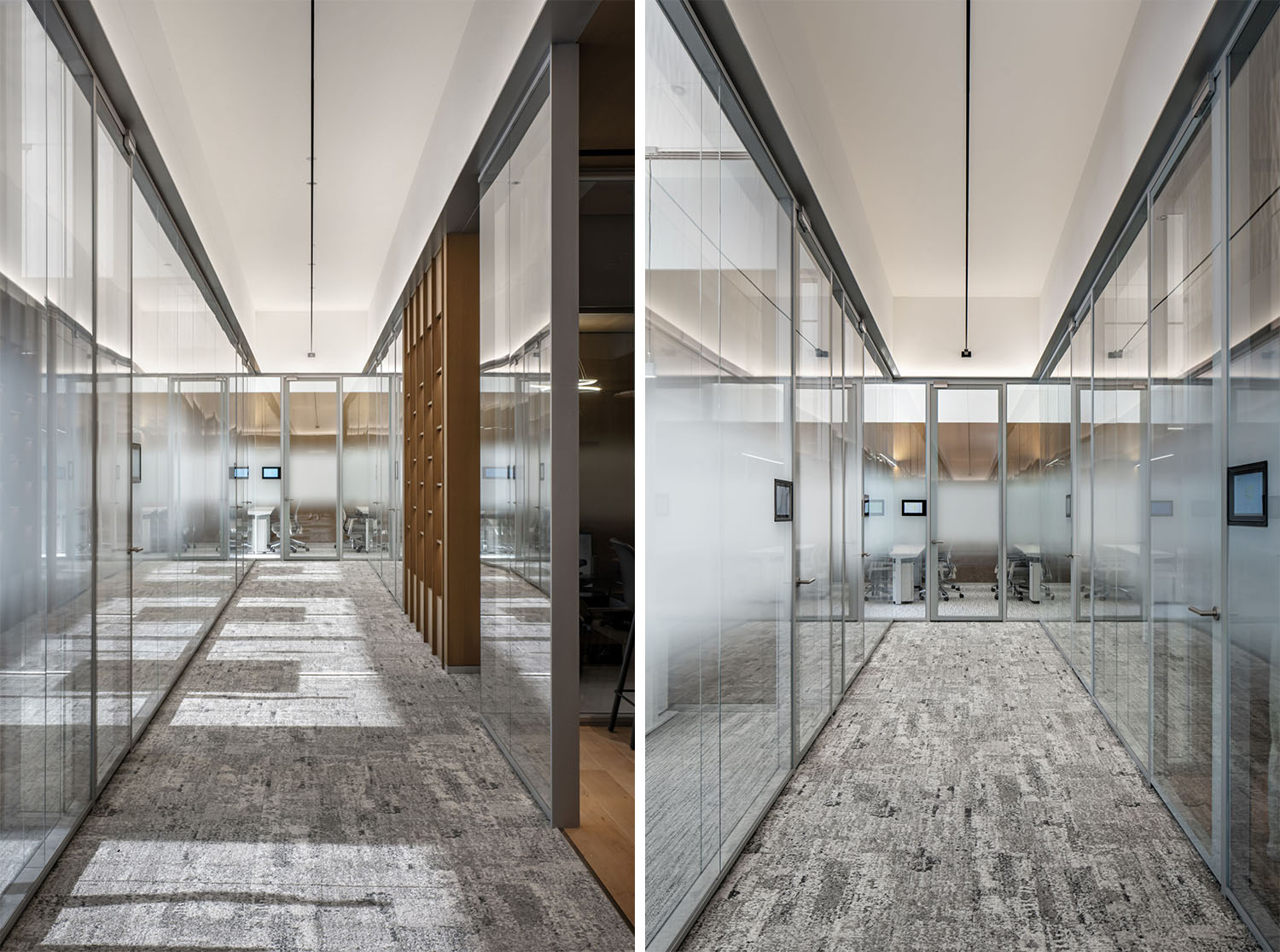
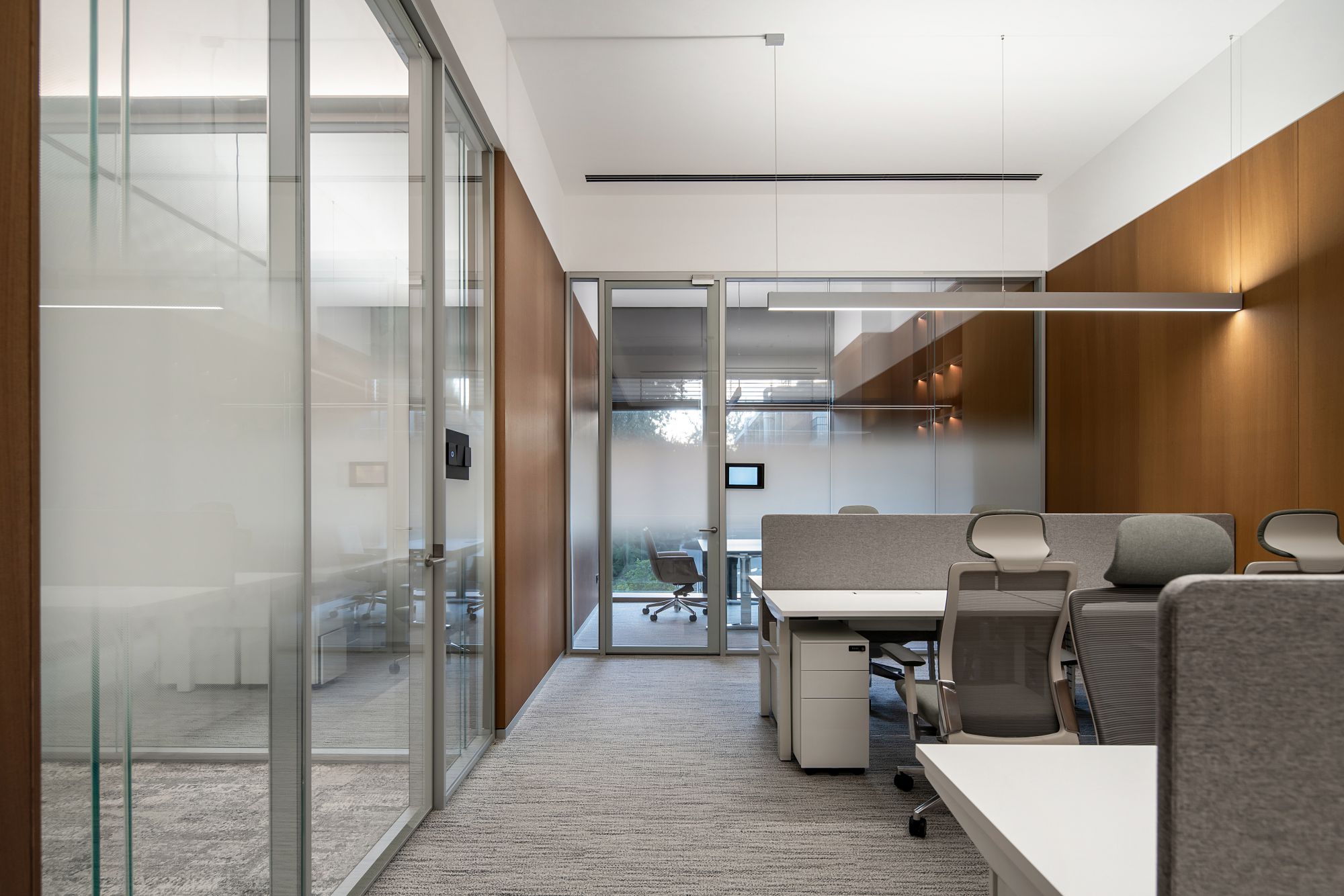
受“無盡走廊”的啟發,原本設計中最容易被忽視的走廊,成為了我們的設計重點。設計摒除了傳統走廊吊頂上筒燈和射燈的混亂布置,而是通過連接走廊兩側盡端的一根超長的懸浮燈線,照亮整體的公共走廊空間。
Inspired by the “Infinite Corridor,” the originally overlooked corridors in our design have become a focal point. We have discarded the chaotic arrangement of traditional corridor ceiling tube lights and spotlights. Instead, we have implemented a design featuring a single, ultra-long suspended light line connecting theends of the corridor, illuminating the entire public corridor space.
∇ 盡端的辦公室,The Office at the End
∇ 柔性與模糊的分界,Flexible and Fuzzy Boundary
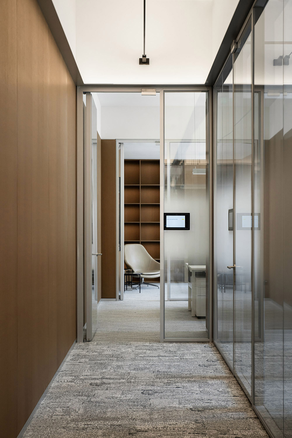
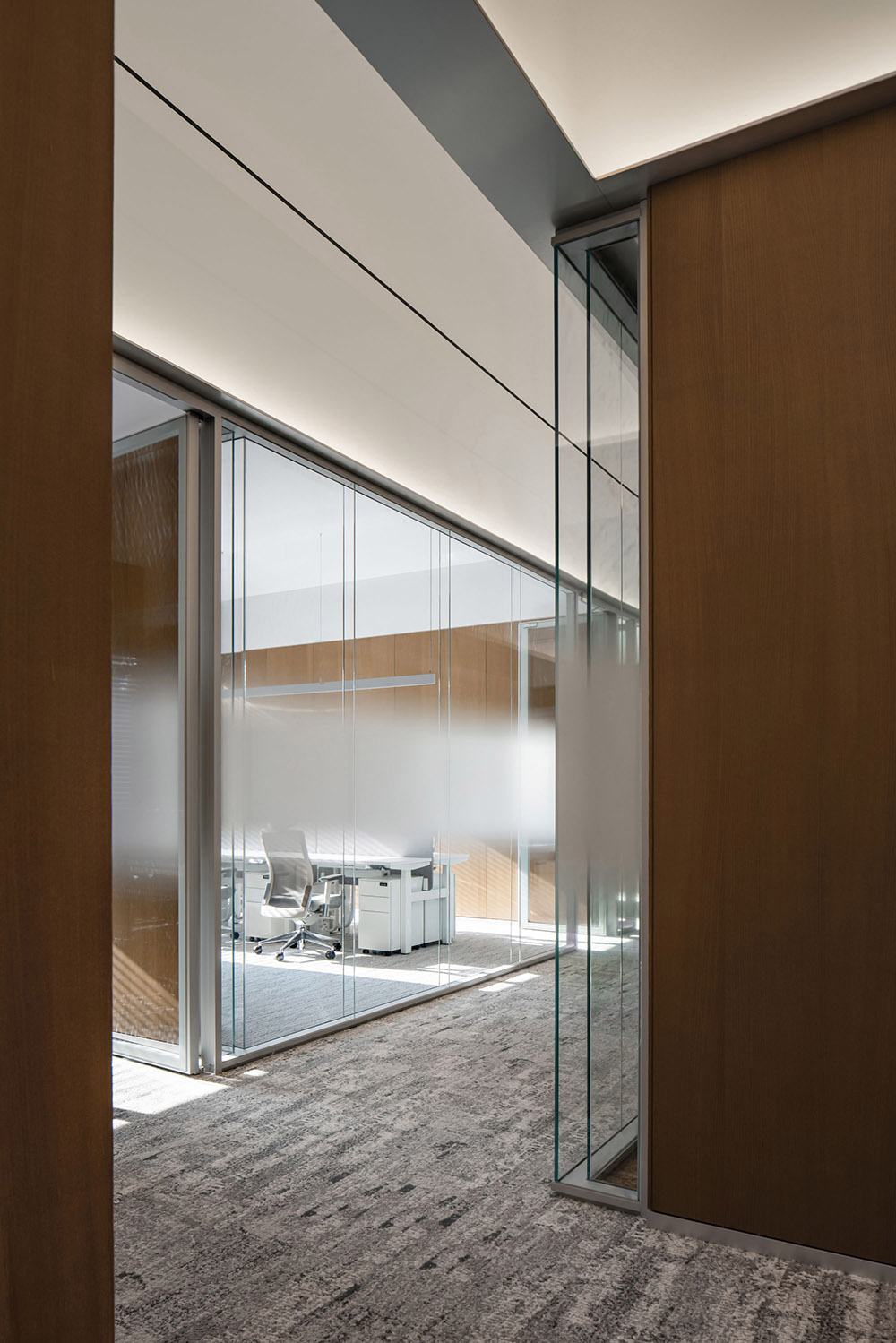
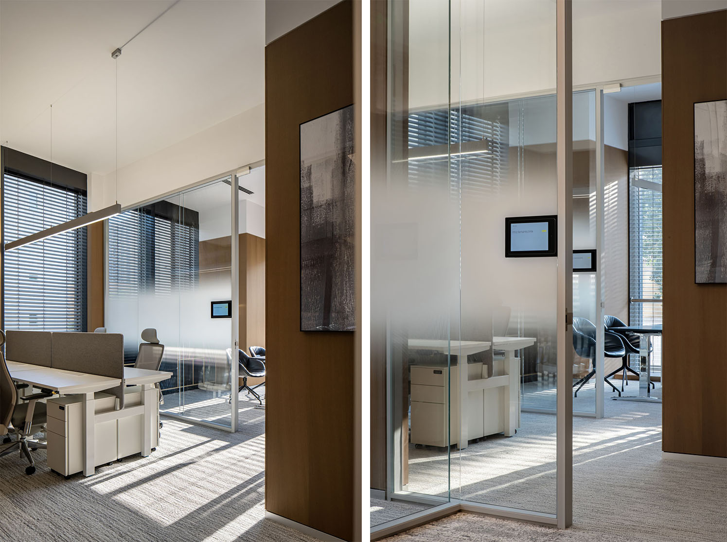
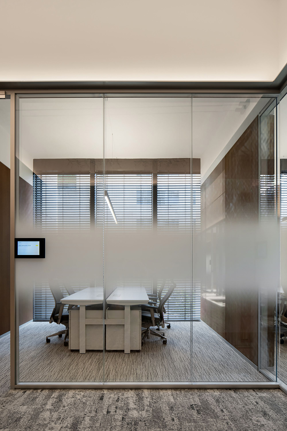
走廊兩側超白玻璃隔斷的運用不僅減少了房間之間視覺上的阻擋,也使得走廊更加通透幹淨。同時,雙向漸變膜的設置又保證了空間使用的隱私。
The use of ultra-clear glass partitions on both sides of the corridor not only reduces visual obstructions between rooms but also enhances the transparency and cleanliness of the corridor. Simultaneously, the implementation of bidirectional gradient films ensures the privacy of space utilization.
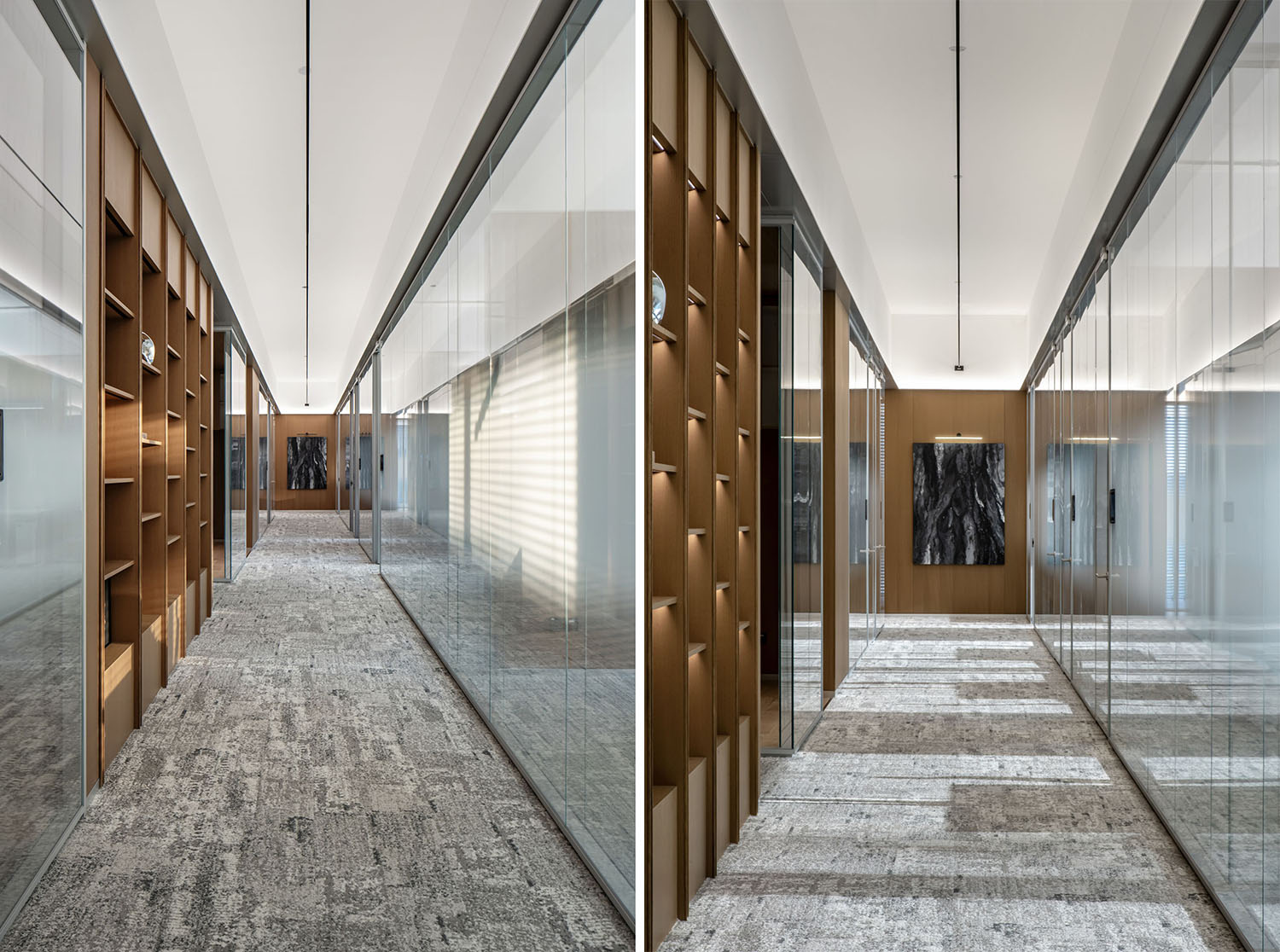
∇ 走廊上的光影畫卷Light and Shadow Scroll in the Corridor
改造後的走廊不僅僅是一個通道,更是一個期待思想碰撞的場所。牆麵的展示櫃,開放的茶水間,允許了偶遇、引導非正式的溝通隨時發生。人們可以在這裏駐足,暢談,成為空間交流和互動的中心。這樣的設計不僅能夠激發辦公空間內部的創新合作,也成為各個部門之間交流的紐帶。
The transformed corridor is not merely a passageway; it has evolved into a space anticipating the collision of ideas. Display cabinets on the walls, open tea areas, and corner artworks allow for chance encounters and encourage informal communication at any time. People can pause, converse, turning it into a hub for space communication and interaction. Such a design not only sparks innovation and collaboration within the office space but also serves as a link for communication between different departments.
∇ L型走廊L-Shaped Corridor
照明的沉浸體驗 Immersive Illumination
入口門廳處,玻璃隔斷上方和架空地麵下方的隱藏的燈帶分別向上和向下照射,配合吊頂的燈光設計,共同構成了門廳的燈光視覺效果。這樣的照明形式,營造出輕盈“線性”感,與空間塊麵做對比,降低體塊對視覺上帶來的厚重感。
At the entrance foyer, concealed light strips above the glass partitions and below the elevated floor are directed upwards and downwards, respectively. Along with the ceiling lighting design, they collectively create the visual lighting effects of the foyer. This lighting approach establishes a light and airy “linear” feel, contrasting with the spatial “solidity” and reducing the visual perception of heaviness brought by massing.
∇ 木質賦予了空間更細膩的質感,Wood Imparts a More Delicate Texture to the Space
走廊上方,依靠漂浮於空中的超長燈線主光源,和玻璃上方金屬帶背後的線性燈帶輔助光源,共同照明,形成走廊的燈光氛圍。這樣係統化的燈光布置不僅使得吊頂更加的簡潔和幹淨,讓身處其中的人能夠快速切換狀態,且讓辦公人群可以在走廊有了更多的停留,整體沉浸式的代入感,可以適應不同空間角色之間的自由轉換。形成更多的溝通和交流。
Above the corridor, the main light source relies on an extended suspended light line floating in the air, while linear light strips behind the metal band above the glass act as supplementary sources, collectively illuminating and creating the corridor’s lighting ambiance. This systematic arrangement of lighting not only contributes to a cleaner and more concise ceiling but also enables individuals within it to quickly transition between states. It encourages the office population to linger in the corridor, fostering an immersive sense of involvement, adapting to the free interchange between different spatial roles, and promoting more communication and interaction.
∇ 辦公區域,Office Area
∇ 辦公入口,Office Entrance
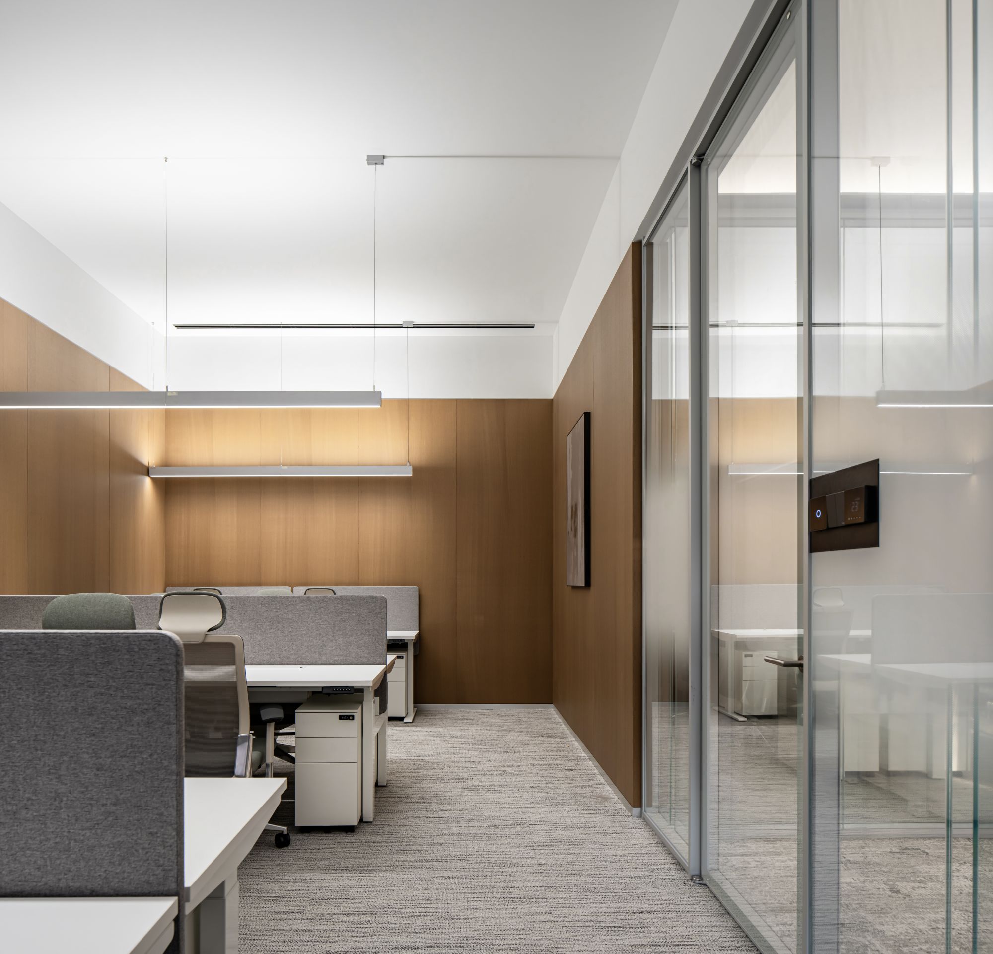
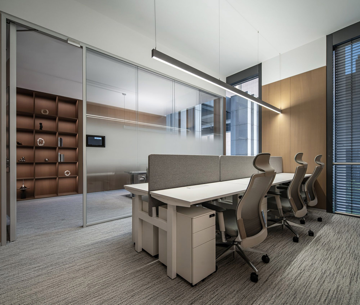
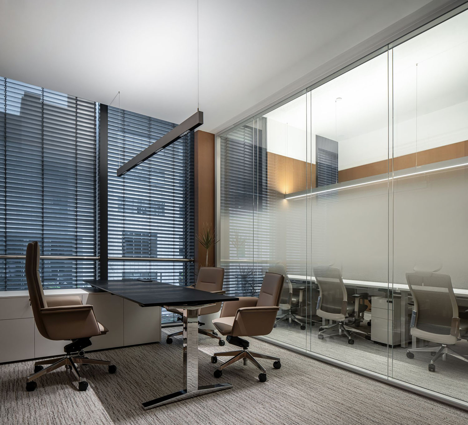
辦公室內,每台辦公桌上方配置智能護眼的線性燈,上下發光的設計同樣解放了吊頂的布局,摒棄掉傳統辦公吊頂上雜亂的燈光布局,讓人們更加享受舒適愜意高級的辦公環境。
Inside the office, each desk is equipped with intelligent eye-friendly linear lights, featuring top and bottom illumination. This design not only frees up the layout of the ceiling but also eliminates the clutter of traditional office ceiling lighting. It allows people to enjoy a more comfortable, pleasant, and sophisticated office environment.
∇ 上下發光的線性燈,Linear Lights emitting Light from Top to Bottom
∇ 辦公氛圍,Office Atmosphere
∇ 董事長辦公間,Executive Office
材質的情緒表達 Emotional Expression Of Material
鱗次櫛比的建築群體,略顯疏離的鋼筋水泥森林,當人們已經厭倦了這些,辦公空間需要的是更加貼近生活、更具溫度體驗的環境。
In the tightly ordered array of architectural structures, within the somewhat distant forest of steel and concrete, when people grow weary of these surroundings, what office spaces require is an environment that is closer to life, one that embodies a more personalized and warm experiential ambiance.
∇ 茶水間裏不同材質的穿插,Interplay of Different Materials in the Pantry
∇ 冷與暖的對比,The Contrast between Cold and Warm
光是設計中最主要的材質語言。通透的空間將自然光引入室內,悄然在走廊上織就一幅斑駁的光影畫卷。隨著時光的推移,光影在空間中流動,營造一種虛實之間的關係,讓場域氛圍產生一種獨特的變化,在不同的透明盒子之間建立起虛擬的交流,給人留下充滿探索感和靈動感的獨特印象。
Light serves as the primary language in our design. The transparent space welcomes light into the interior, quietly weaving a dappled tapestry of light and shadow in the corridor. As time progresses, the interplay of light and shadow flows through the space, creating a dialogue between the ethereal and the tangible. This dialogue results in a unique transformation of the atmosphere, establishing communication and connection between different transparent compartments. The interplay of light and shadow leaves a distinctive impression, full of a sense of exploration and dynamism.
∇ 柔和的光線灑進室內,Soft Light Spills into the Room
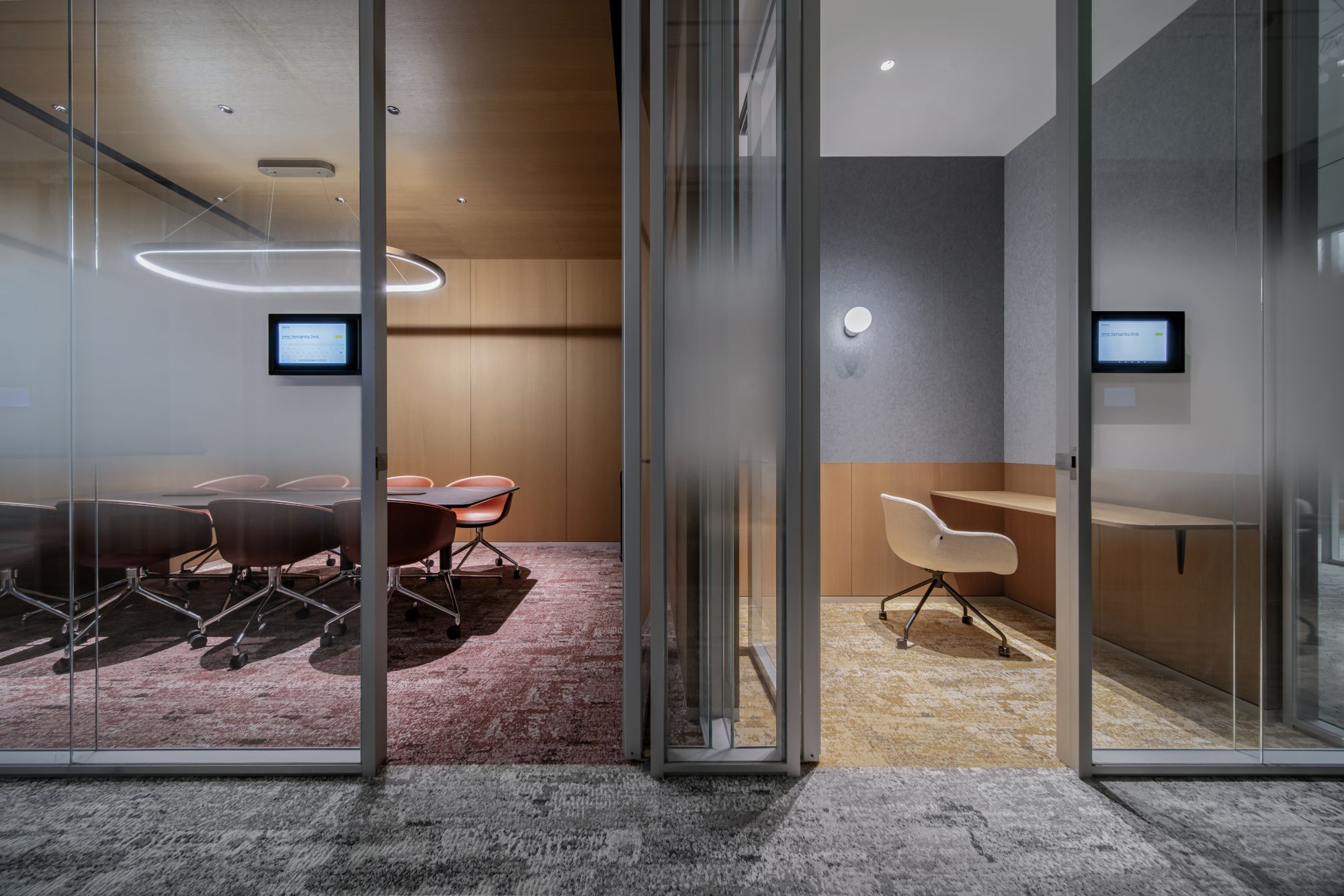
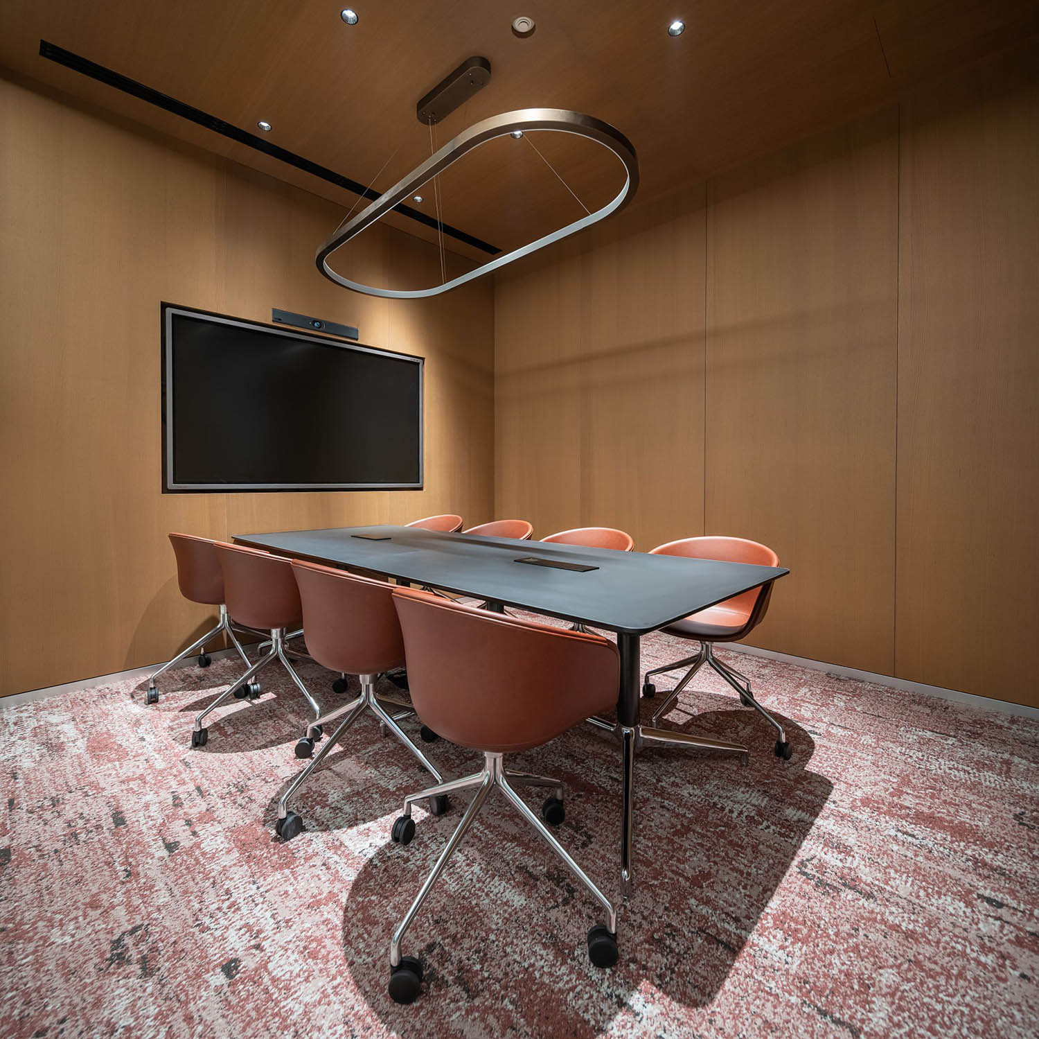
通透的雙層超白玻璃隔斷的使用,保證了隔音和隱私的同時,還增添了一絲未來的科技感;空間中大篇幅的“木”元素的運用,不僅為空間增添了溫暖,還賦予了空間更豐富細膩的質感。設計通過虛實材質的對比,將拋光和啞光的肌理巧妙融合,為空間創造出舒適柔和的層次感和觸感。
The use of transparent double-layer ultra-clear glass partitions ensures soundproofing and privacy while adding a touch of futuristic technology. The extensive incorporation of “wood” elements in the space not only adds warmth but also imparts a richer and more nuanced texture to the environment. The design, through the emotional expression of various materials, creates comfortable, gentle layers and tactile sensations within the space.
∇ 通透與私密,Transparency and Privacy
空間的模糊界限 Blurred Boundaries Of Space
我們從辦公室流線清晰化、功能合理化、空間柔和化三方麵進行改造,在初期就確定了空間中不同尺度的盒子適用於不同功能需求。
From the perspectives of streamlining the office, rationalizing functions, and softening the space, we established early on that boxes of varying scales in the space would be allocated for different functional needs.
∇ 會議室和電話間,Meeting Room and Phone Booth
體塊的語言,不再是單一結構的立體構成。通過柔性與模糊的分隔,消除了不同體塊和房間的界限,消解了辦公空間內的冰冷圍牆,讓辦公空間更加具有“城市公共空間”的屬性,賦予辦公空柔和而溫暖的色彩。
The language of massing is no longer confined to a singular three-dimensional structure. Through flexible and blurred partitions, we have eliminated the boundaries between different masses and rooms, eradicating the cold walls within the office space. This imparts the office environment with characteristics reminiscent of “urban public spaces,” infusing a gentle and warm color palette into the workspace.
∇ 智能會議室,Smart Conference Room
∇ 洽談區,Lounge Space
項目信息
項目名稱:嘉銘辦公商務中心
設計單位:星球建築設計 MARS Studio
設計時間:2023.03
竣工時間:2023.08
項目位置:北京,中國
建築麵積:400平方米
主持建築師:馬寧
項目負責人:陳悅
設計團隊:張晨,杜婧,劉世宇,張坤,李然
燈光設計:陳夢婷
品牌:JEB,Shawn,Artelds,VF,Pure,Hay
攝影:UK Studio
Project Name: Jiaming Office Business Center
Design Firm: MARS Studio
Design Time: 2023.03
Completion: 2023.08
Project Location: Beijing, China
Building Area: 400 sqm
Principal Architects: Ma Ning
Project Manager: Chen Yue
Design Team: Zhang Chen, Jing Du, Liu Shiyu, Zhang Kun, Li Ran
Lighting:Chen Mengting
Furniture: JEB,Shawn,Artelds,VF,Pure,Hay
Photography: UK Studio


