拾級而上,奔赴少女星
CHERRYHOUSE櫻桃家醫療美容抗衰中心一家坐落於貴州的高端醫療美容連鎖機構,擁有業內資深專業團隊,專注於高品質高服務的高端醫美品牌。探索以人為本的未來科技美容的可能性,同時注重品味與質感,打造了一個科技與美感兼具,高雅而具有溫度的精致美學空間。
<拾級而上,奔赴少女星>則是樓房花朶設計機構為櫻桃家量身定製的全新旗艦店,就讓我們從這裏開始,打開新紀元,開啟令人耳目一新的櫻桃星時代。
CHERRYHOUSE Medical Beauty Anti-aging Center is a high-end medical beauty chain located in Guizhou, with a senior professional team in the industry, focusing on high-quality and high-service high-end medical beauty brand.Explore the possibility of people-oriented future technology beauty, while paying attention to taste and texture, creating a technology and aesthetics, elegant and exquisite aesthetic space with temperature. <Step up and go to the girl star> is a new flagship store tailored for Cherry House by the IN BLOSSOM DESIGN . Let’s start from here, open a new era, and open a refreshing cherry star era.
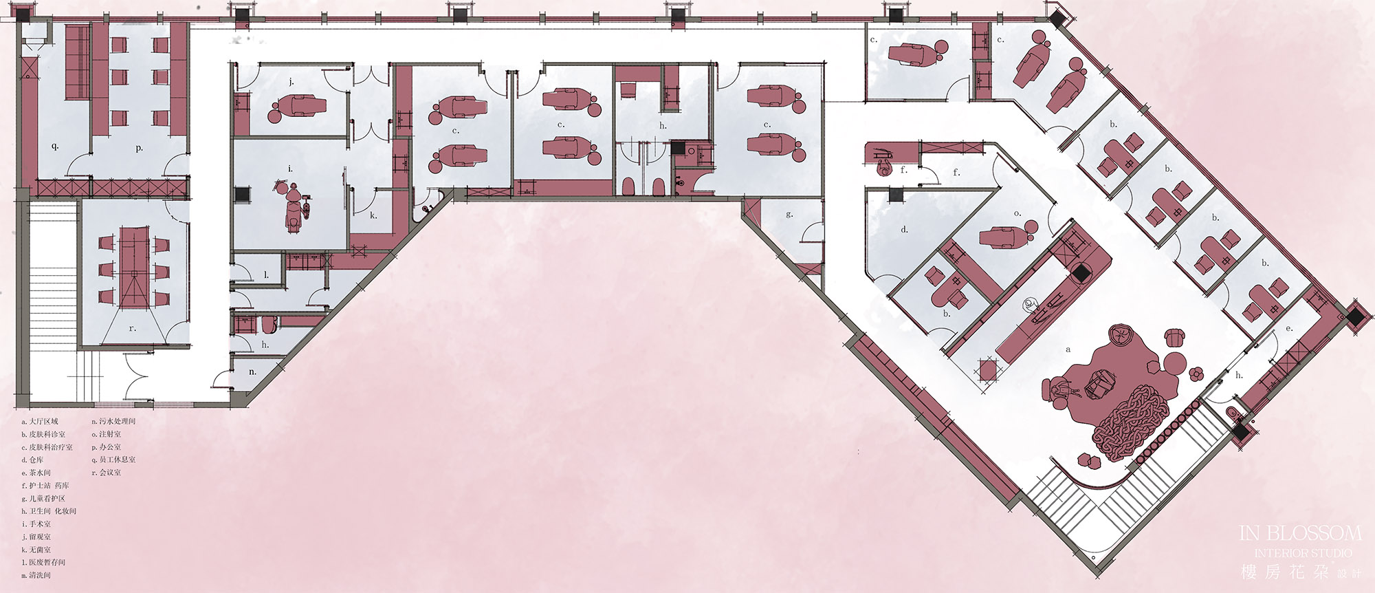
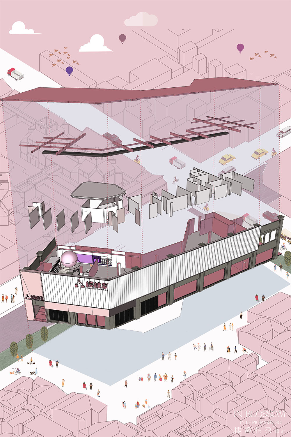
∇ 平麵布局圖
啟功計劃
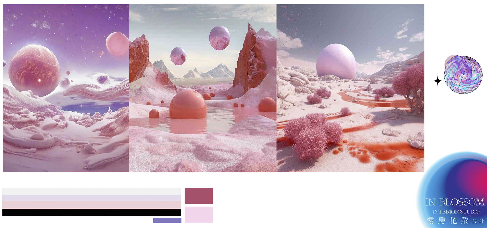
∇ 粉色少女星概念圖
商業設計是從品牌營銷理念到空間一體化的思考,滿足消費者心理的體驗式消費才是當前消費主流,設計師深度挖掘品牌故事,提煉品牌內核,有品牌才能有設計。 本案設計初始我們與櫻桃家的主理人進行了多次深入的交流,在充分了解該行業的現狀和該機構特色的基礎之上,確定整體設計概念取自宇宙的浪漫-GJ504b少女星球。
Commercial design is from the brand marketing concept to the thinking of space integration. The experiential consumption that meets the consumer’s psychology is the current mainstream consumption. The designer digs deep into the brand story, refines the brand core, and has the brand to have the design. At the beginning of the design, we have conducted many in-depth exchanges with the principal of Cherry House. On the basis of fully understanding the current situation of the industry and the characteristics of the agency, we determine the overall design concept from the romance of the universe – GJ504b girl planet.
GJ504b是一顆太陽係外行星,距離地球 57光年,由於它通體粉色,除了地球以外為數不多。鮮豔顏色的星球,所以親切地稱它為少女星
球。CJ504b屬於氣態流浪行星,大小與木星差不多,但質量是木星的好幾倍。
它也有著自由的靈魂:不圍繞恒星公轉而是有著自己的軌道。雖然亮度不高,但並沒有掩飾掉它的高顏值。少女星球就像是一個流浪星球,想去哪就去哪,不被束縛不受限製,這樣的浪漫而自由。
GJ504b is an extrasolar planet 57 light years away from the earth. Because it is pink all over, it is one of the few bright colors of the planet except for the earth.So it is affectionately called the girl planet. CJ504b belongs to the gaseous wandering planet, the size is almost the same as Jupiter, but the mass is several times that of Jupiter. It also has a free soul: not around the star but has its own orbit.Although the brightness is not high, but did not hide its high level of appearance.The maiden planet is like a wandering planet, where you want to go, not bound by restrictions, such a romantic and free.
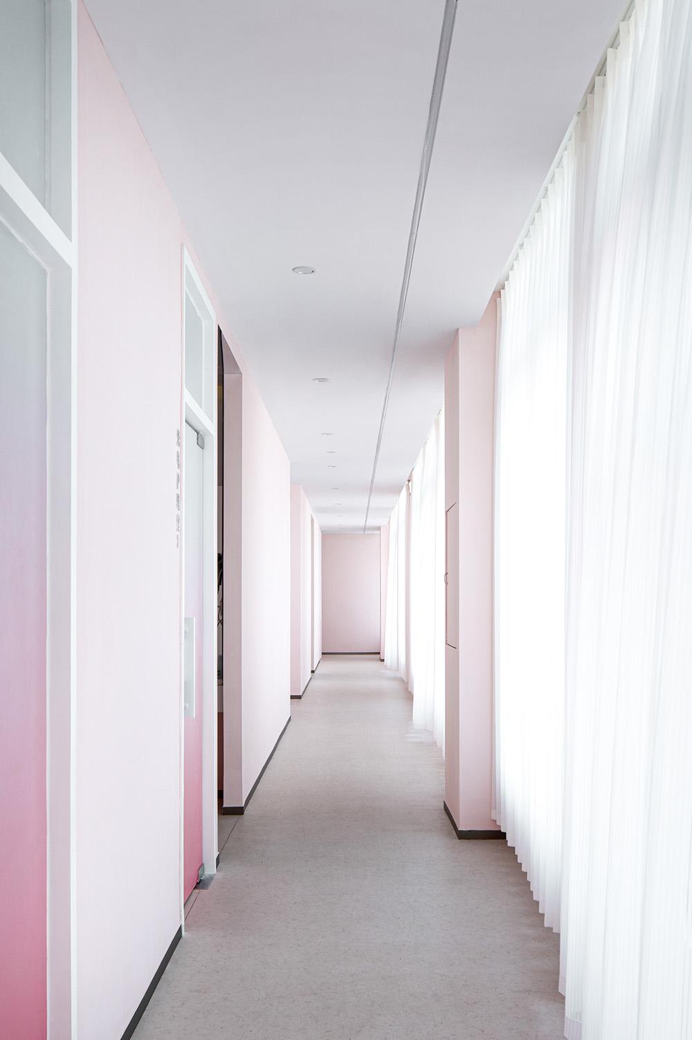
傳達出作為承載“讓人變美”的功能屬性的醫美空間,對話探索科技與人體自然形體美的理想狀態和可能性,將櫻桃家商業形象粉色和粉色星球做延展,空間氛圍以純淨、柔美但不失冷靜專業的風格,構造出既不失科技醫美的專業謹慎度,又具有平易近人的親和力空間是本案設計的重要切入點。
To convey the function o the medical beauty space as a carrier of “make people beautiful”, the dialogue explores the ideal state and possibility of science and technology and the natural shape of the human body, the cherry home commercial image pink and pink planet do extension, the space atmosphere is pure, soft but calm professional style, constructs a professional degree of caution without losing the technology of medical beauty, and has an approachable affinity space is an important breakthrough point in the design of this case.
登陸計劃
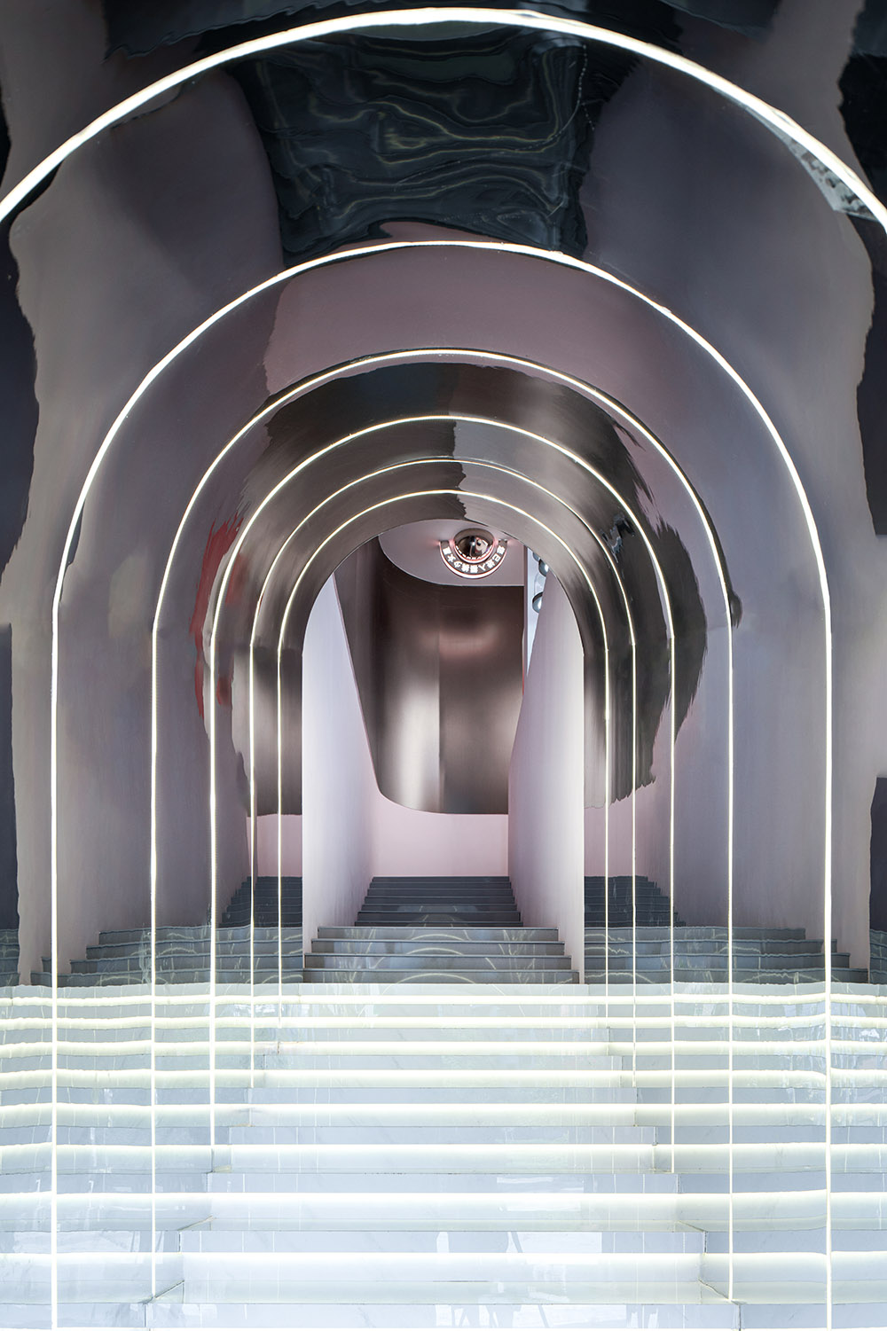
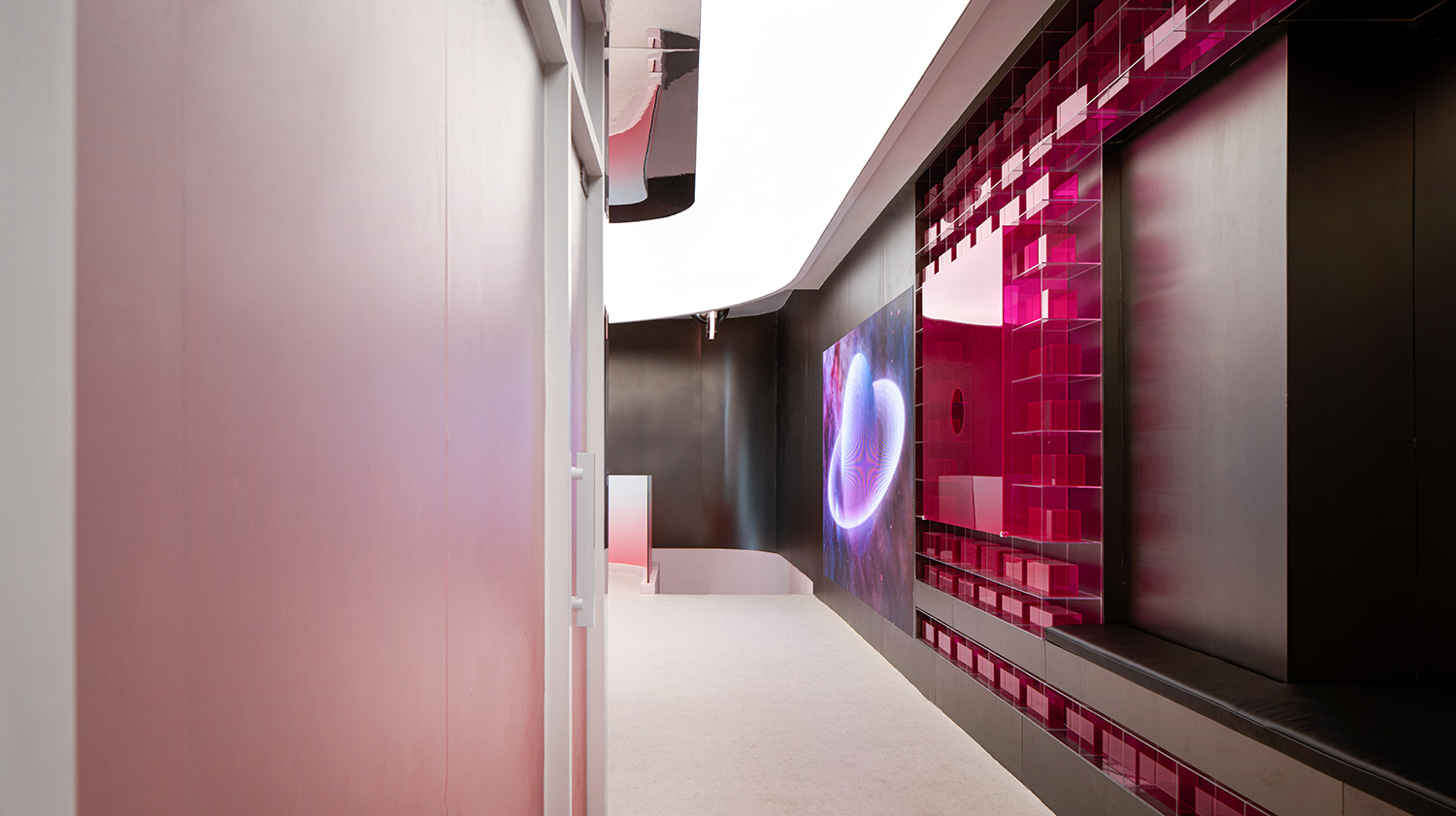
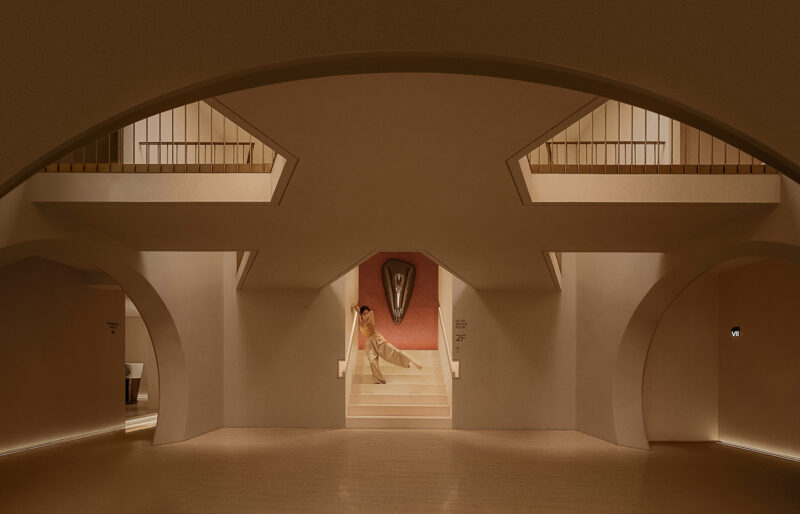
原空間在臨街商業二樓,需通過一個狹長的樓梯轉入,設計師利用鏡麵材料與燈光結合,改變了空間的視覺縱深,打造出一個穿越時空的隧道,強化空間進入的儀式感,小空間到大空間的轉折變化配合品牌藝術裝置牆的置入豐富了顧客的空間體驗,欲揚先抑、明暗交織讓美的體會更加深刻。讓我們拾級而上,奔赴少女星,短暫沉浸在一個超現實世界裏,找尋青春密碼。
The original space is on the second floor of the street-facing commercial building, which needs to be turned into by a long narrow staircase. The designer uses the combination of mirror materials and lighting to change the visual depth of the space, creates a tunnel through time and space, strengthens the sense of ritual of the space, and the transition from small space to large space with the placement of the brand art installation wall enriches the customer’s space experience. To promote the first suppression, the interweaving of light and shade makes the experience of beauty more profound. Let’s step up and go to the girl star, briefly immerse in a surreal world, find the youth code.
∇ 星際計劃
櫻桃家是醫療美容屬性的女性空間:
女孩是由什麼做成的?你可以是鮮花、戒指、花、果醬做成的;你也可以是鋼鐵做成的,是由毅力和仁慈做成的,是由勇氣和握緊的拳頭做成的。無論男女,使自己成為自己,比什麼都重要。設計師希望通過設計,為傳統醫美空間帶來更深刻的人性化感官體驗,借此表達品牌的內核,‘粉色亦朋克’,粉紅色證明陳規觀念的下降,一切皆有可能,沒有計劃或建立,這就是它的美。沒有規則,或者說每個人都有自己的。這就是為什麼這是新一代人的顏色,他們為自己的夢想而戰,在沒有地圖和建議的情況下找到自己的路,隻是跟隨內心和直覺,粉色是一代人的顏色勇敢的一代人那些不怕變化的人,
The Cherry House is a female space with medical beauty attributes: What are girls made of?You can be made of flowers, rings, flowers, jam;you can also be made of steel, made of perseverance and mercy, made of courage and clenched fists.Whether men or women, making yourself yourself is more important than anything.The designer hopes to bring a deeper humanized sensory experience to the traditional medical beauty space through design, so as to express the core of the brand, ‘pink is punk’. Pink proves the decline of stereotypes. Everything is possible, no plan or establishment, this is its beauty.There are no rules, or everyone has their own.That’s why this is the color of the new generation. They fight for their dreams, find their own way without maps and advice, just follow their hearts and intuition. Pink is the color of a generation. The brave generation of people who are not afraid of change.
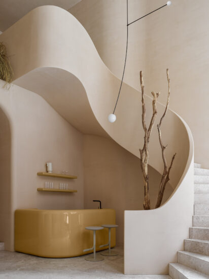
目前市場上常見的醫美空間以柔美居多,美則美矣,卻顯得單一。樓房花朶設計機構摒棄常見的醫美空間傳統審美,跳脫出既定的風格框架,從整體的空間基底入手,以空間作為物質載體,精準傳遞品牌意誌,以設計表現和彰顯女性的內在力量,通過對於剛柔關係和原始場域的思考,空間多變且無限,從用戶需求中獲得啟發,運用關係變化打造層次對比。
At present, the common medical beauty space in the market is dominated by soft beauty. The beauty is beautiful, but it is single. Building flower design agency abandoned the common traditional aesthetic space of medical beauty, jump out of the established style framework, from the overall space base, to space as a material carrier, accurately convey the brand will, to design performance and highlight the inner strength of women, through the thinking of the rigid and flexible relationship and the original field, the space is changeable and infinite, get inspiration from the user’s needs, and use the relationship change to create a hierarchical contrast.
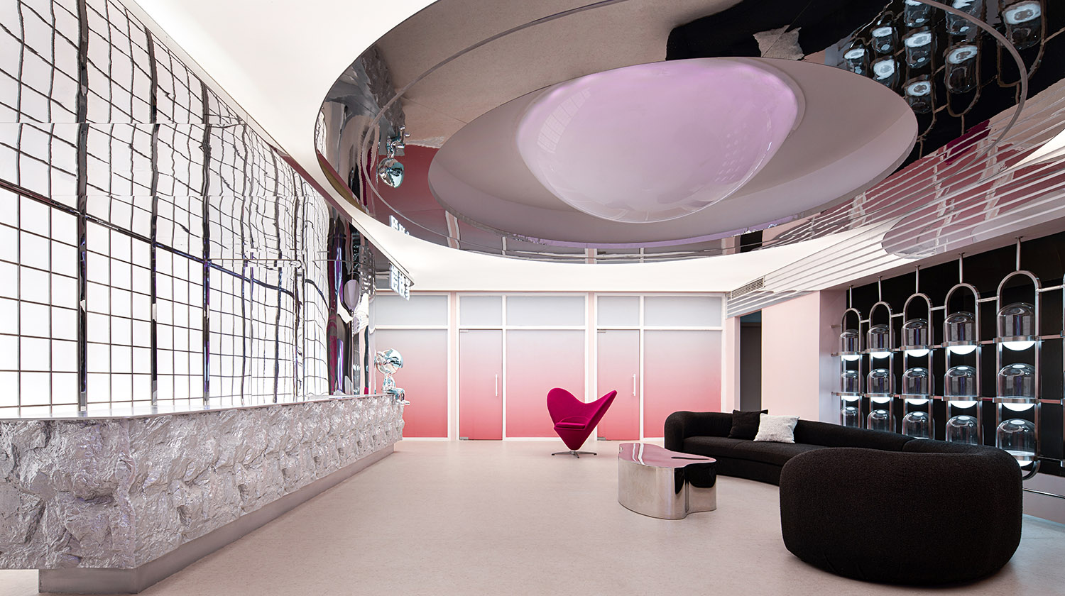
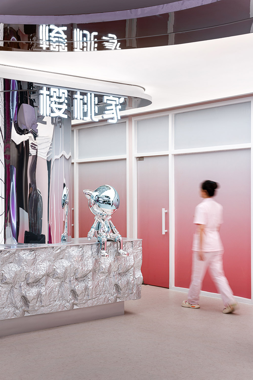
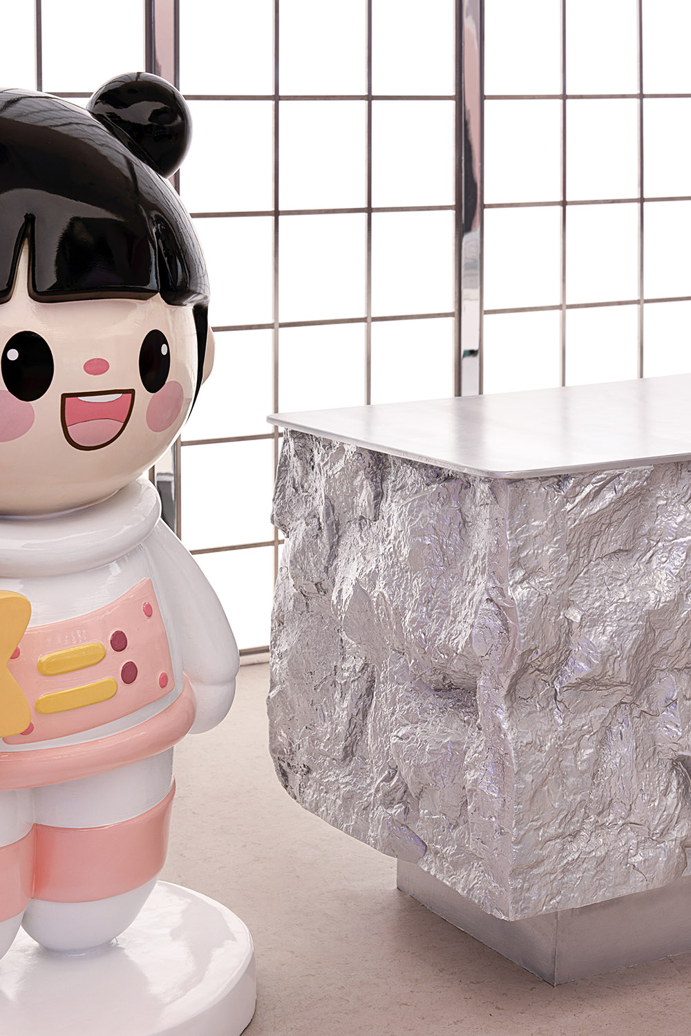
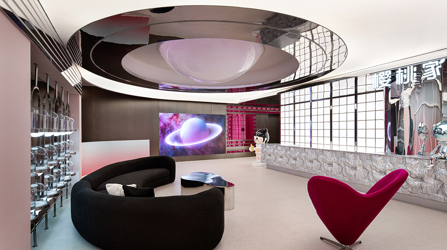
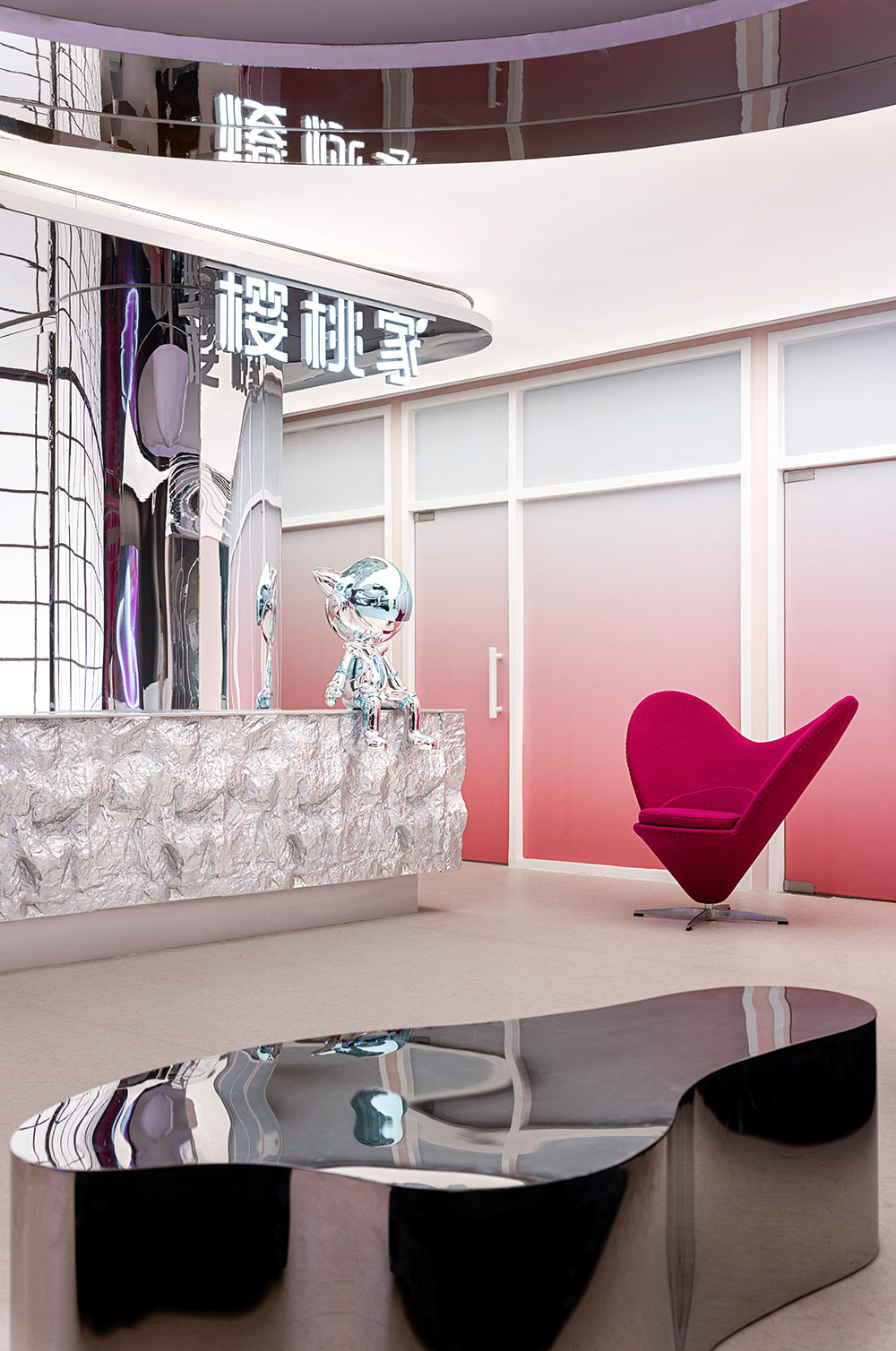
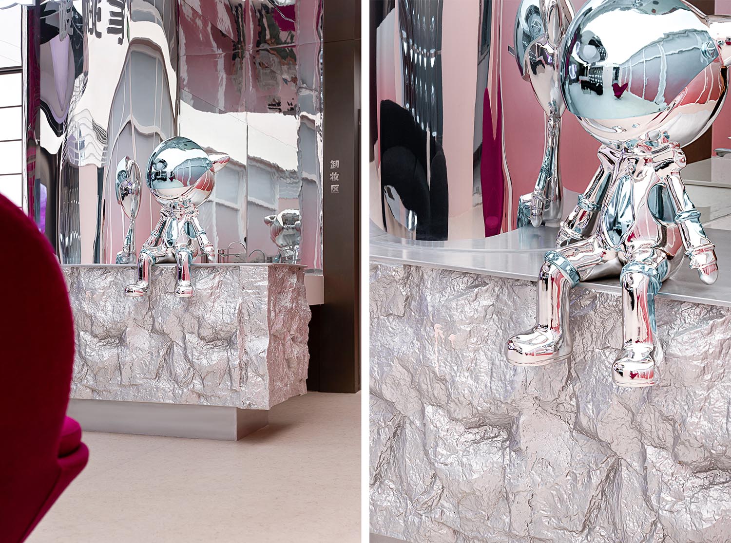
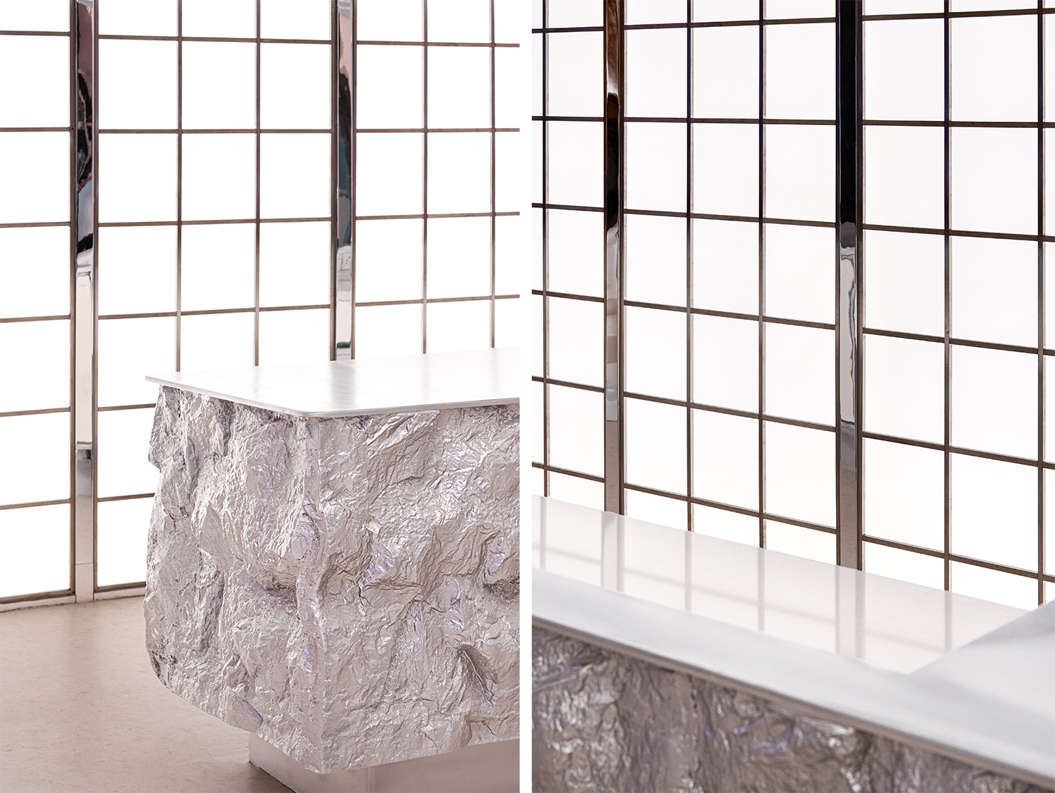
空間大麵積使用冷硬的不鏽鋼板與粉色,強烈的質感對比展現時尚和科技的未來主義的空間。
The space uses cold hard stainless steel plate and pink in large area, and the strong texture contrast shows the futuristic space of fashion and technology.
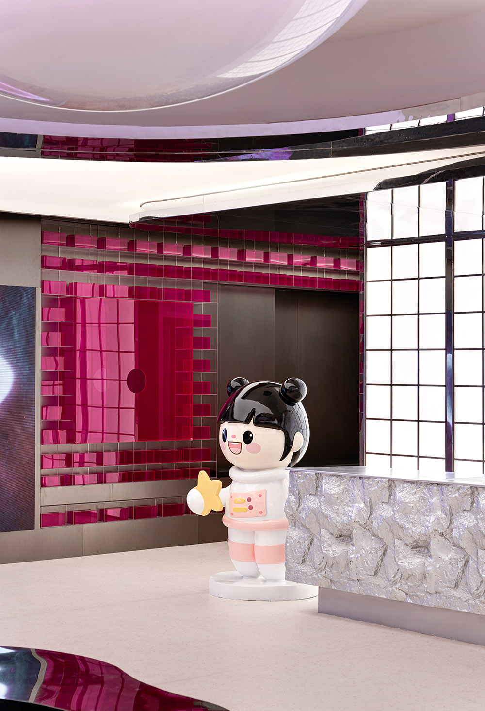
設計師在空間用了鏡麵、不鏽鋼、亞克力、玻璃等多種材質穿插,意味著無數對比、關聯、視角和動線之間的協調。模糊了自然與人造的邊界,不僅可以轉換透視距離,還可以編排出一係列的精彩片段。
The designer used mirror, stainless steel, acrylic, glass and other materials in the space, which means the coordination between countless contrasts, associations, perspectives and moving lines.The blurred boundary between nature and man-made can not only transform the perspective distance, but also compile a series of wonderful fragments.
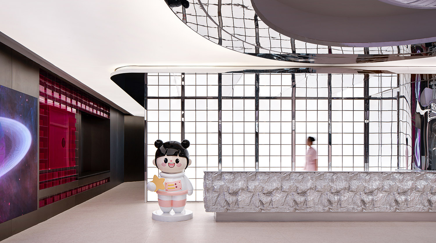
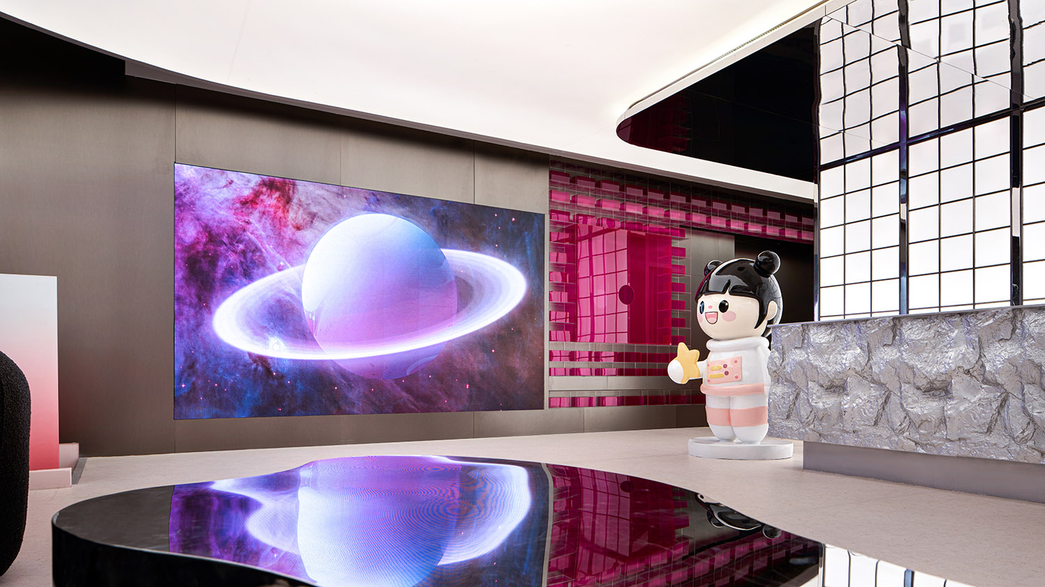
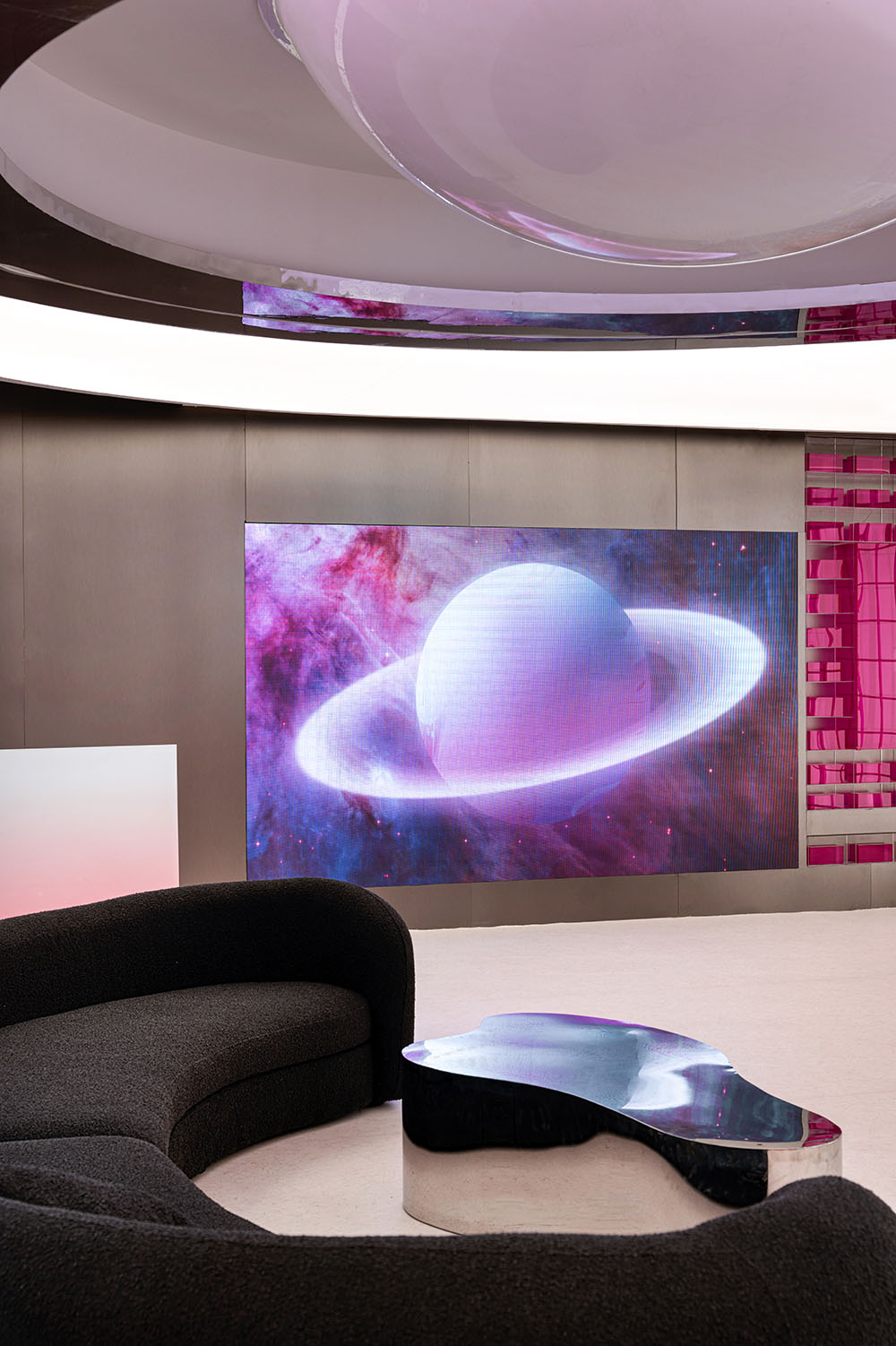
進入大廳空間一側設置的LED畫麵,是星球的敘述者。星雲的變幻,光的尺度,從物象到意象、空間到精神,人在其中。沉浸其間,看到的不隻是星空,更是時光的流逝與畫麵的定格。
The LED screen set on one side of the hall space is the narrator of the planet.The changing of the nebula, the scale of light, from the object to the image, the space to the spirit, people are in it.Immersed in it, what we see is not only the stars, but also the passage of time and the freeze of the picture.
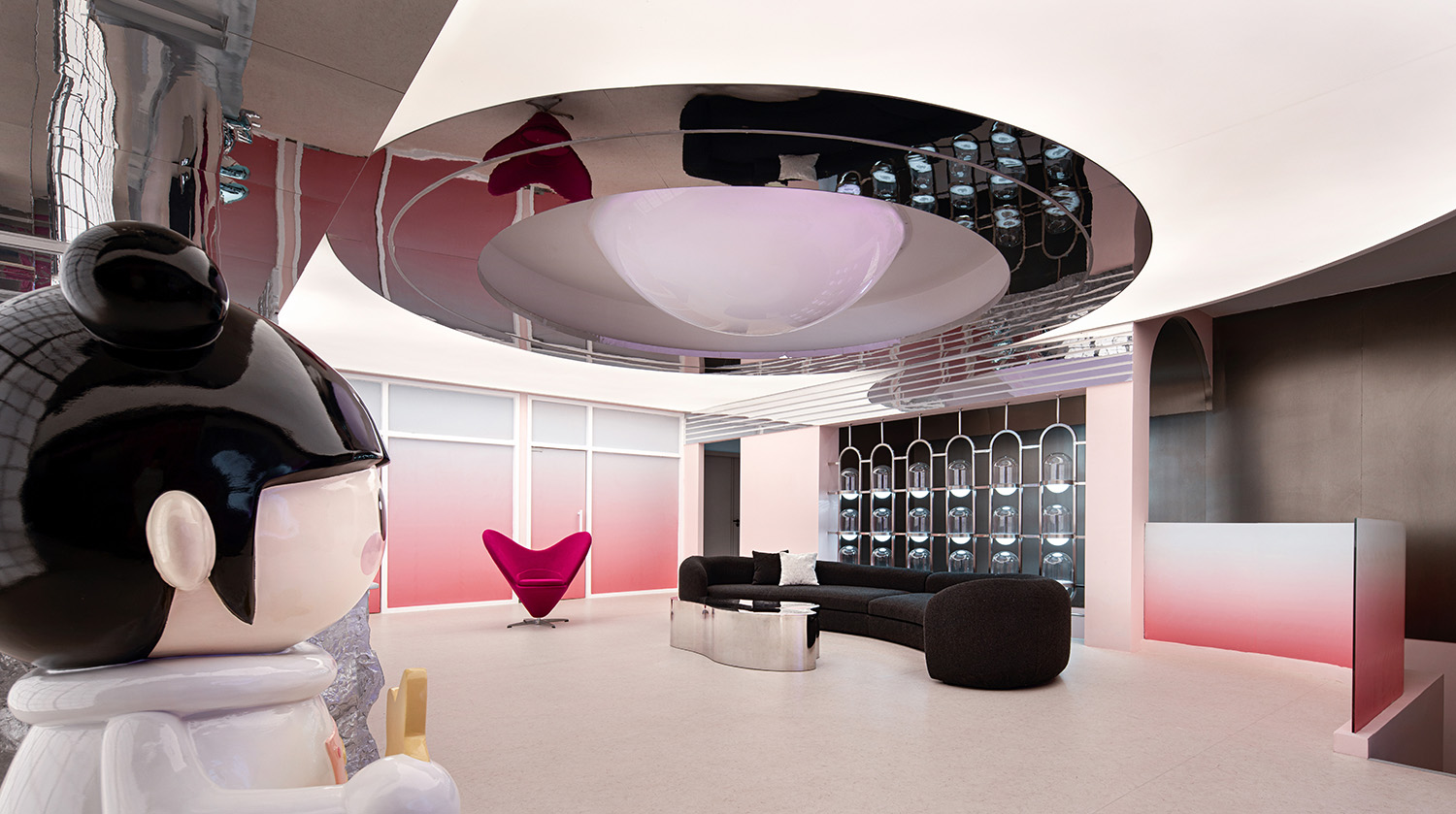
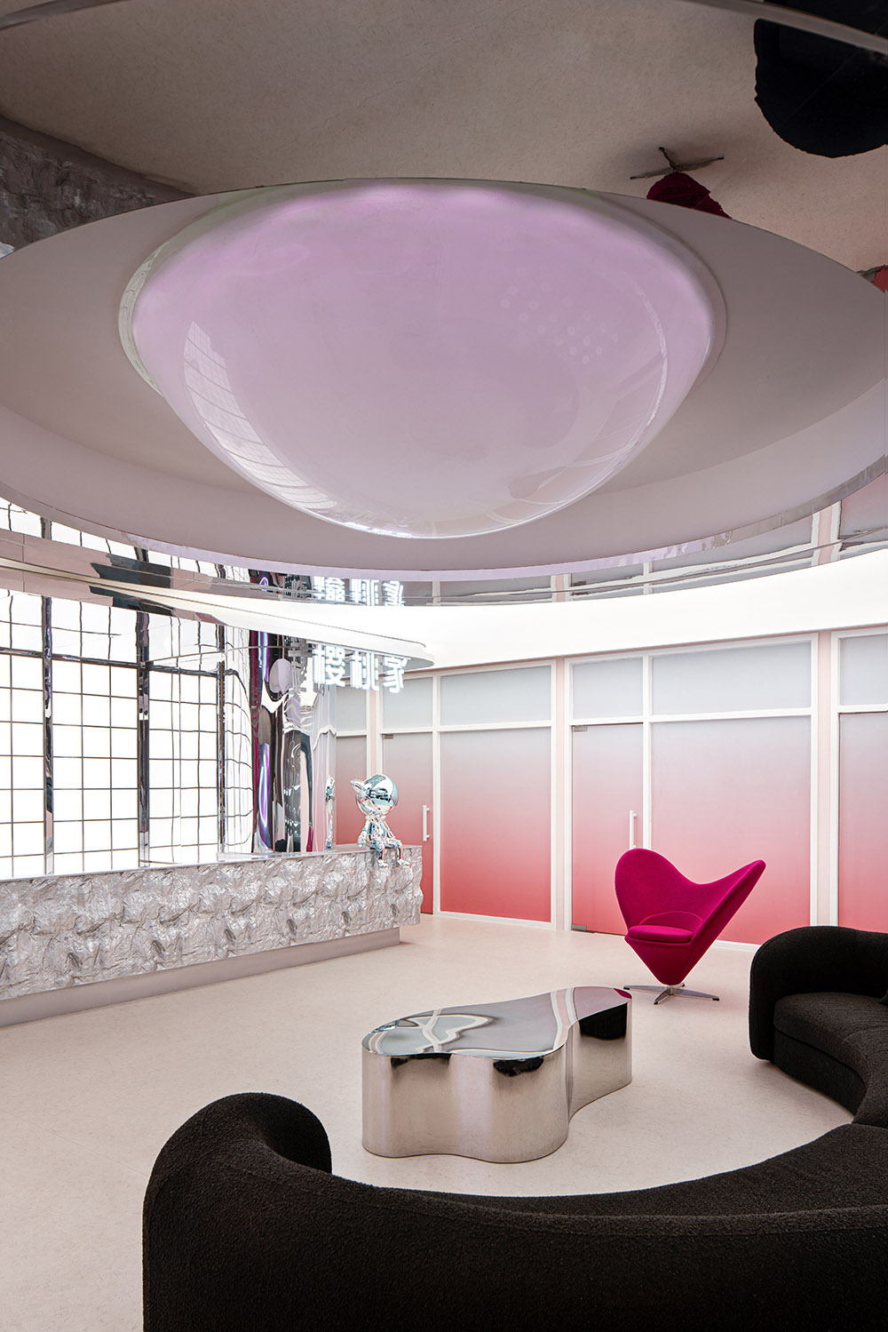
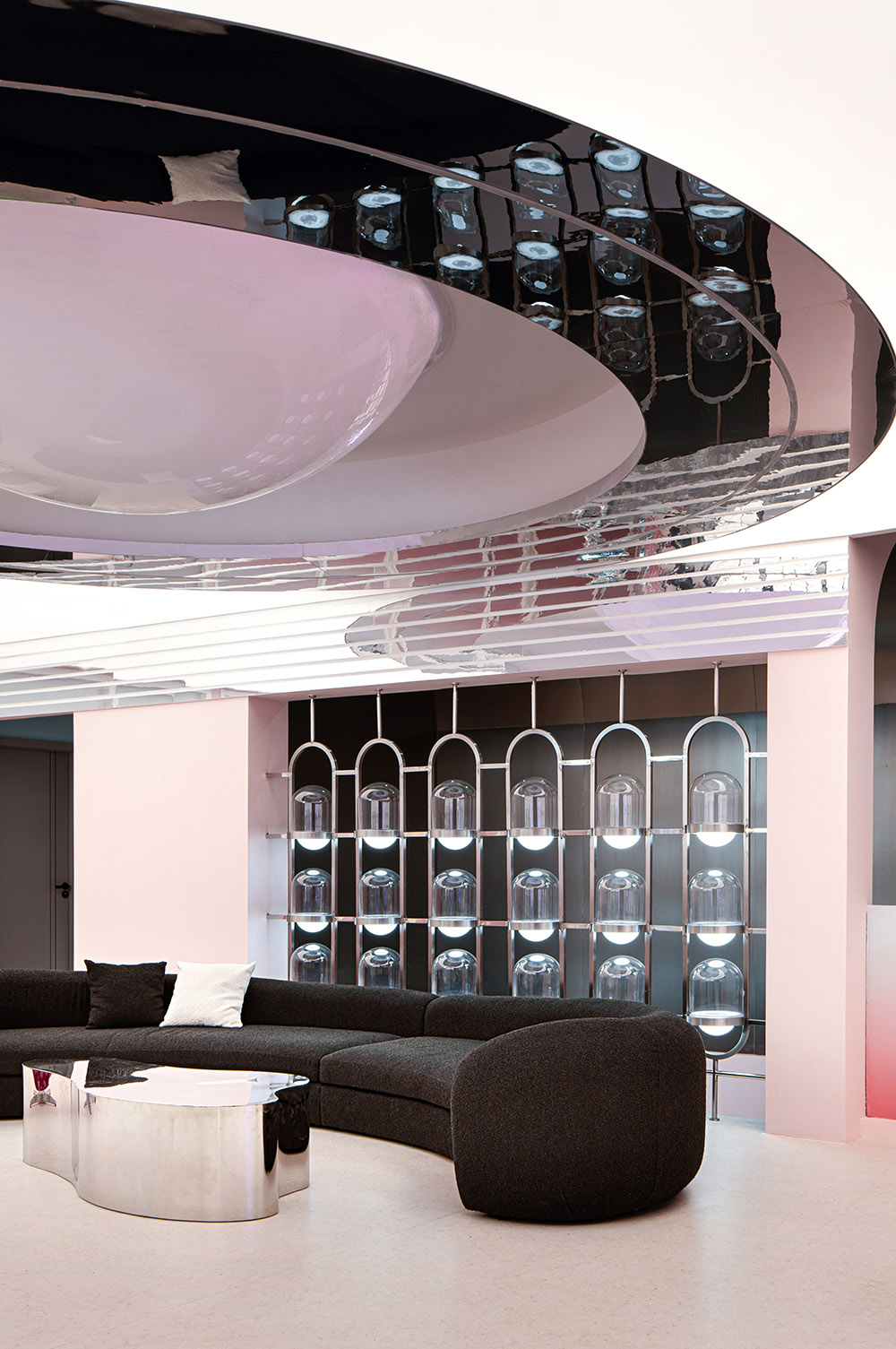
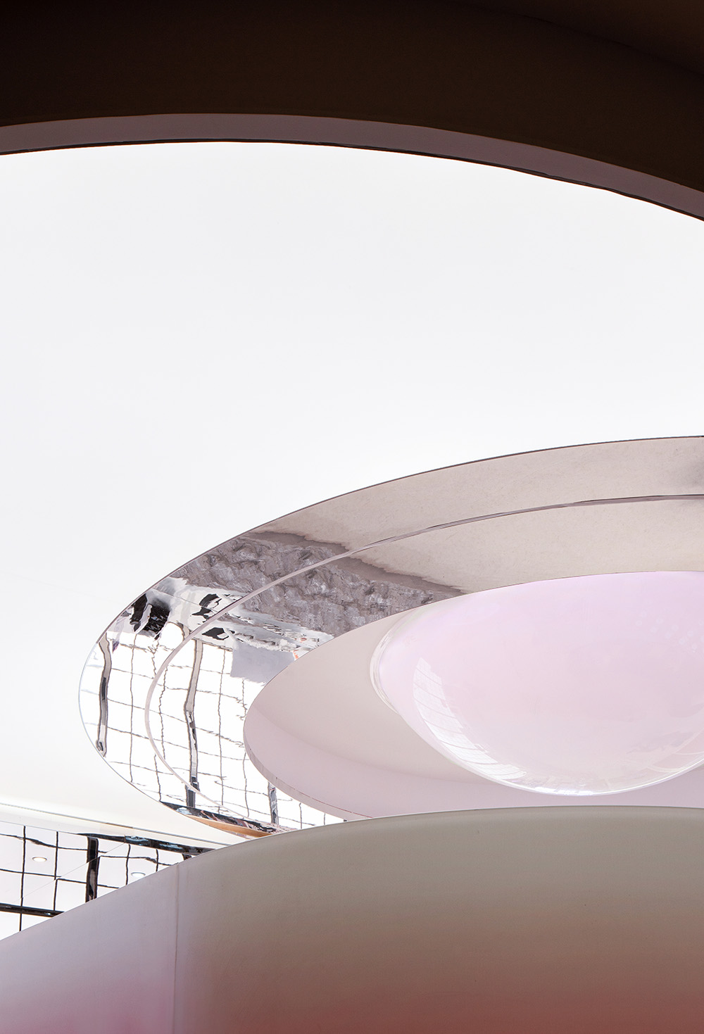
大廳中間上空懸掛的IP裝置以星球的設計理念深化構造,內層粉色高亮光效果 ,將空間渲染成一抹柔美的色彩,科幻而浪漫。
The IP device suspended above the middle of the hall deepens the structure with the design concept of the planet, and the inner layer pink high bright light effect renders the space into a soft color, science fiction and romance.
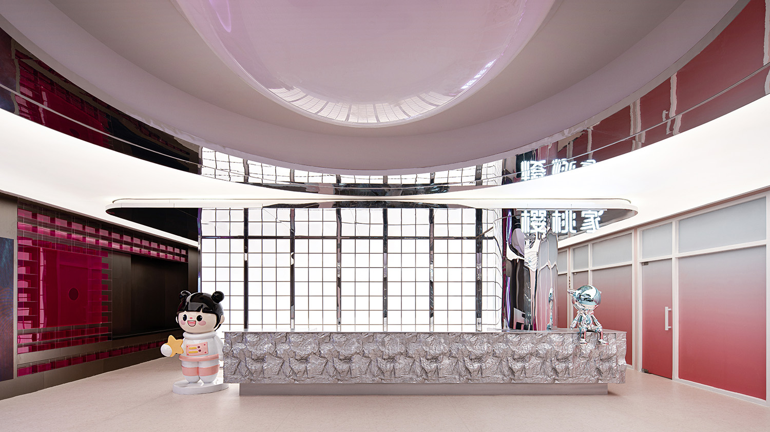
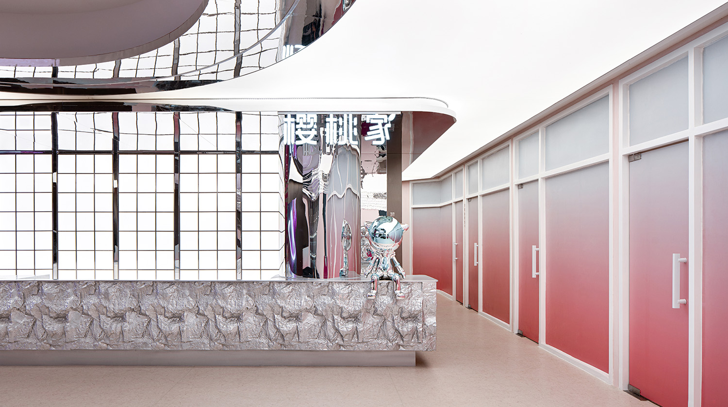
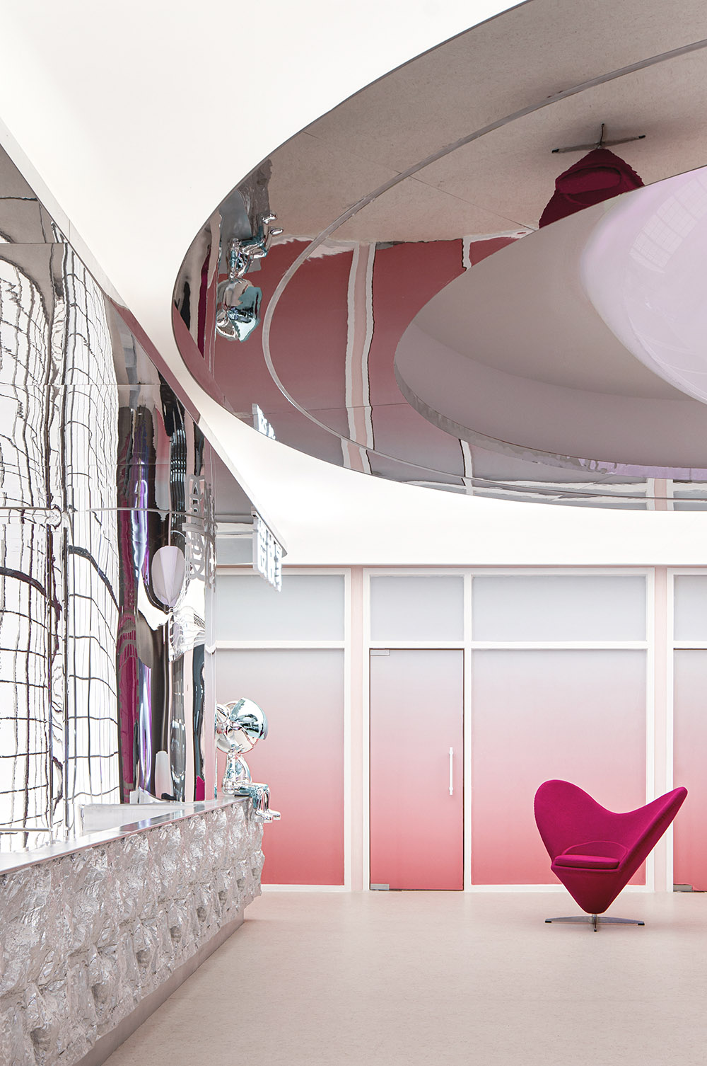
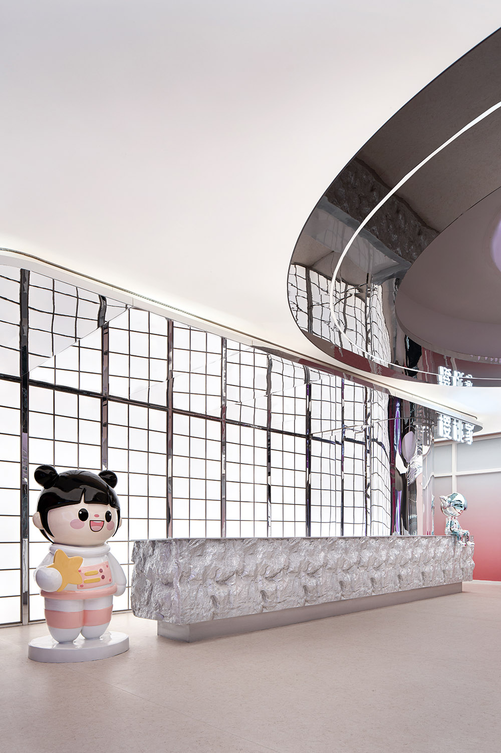
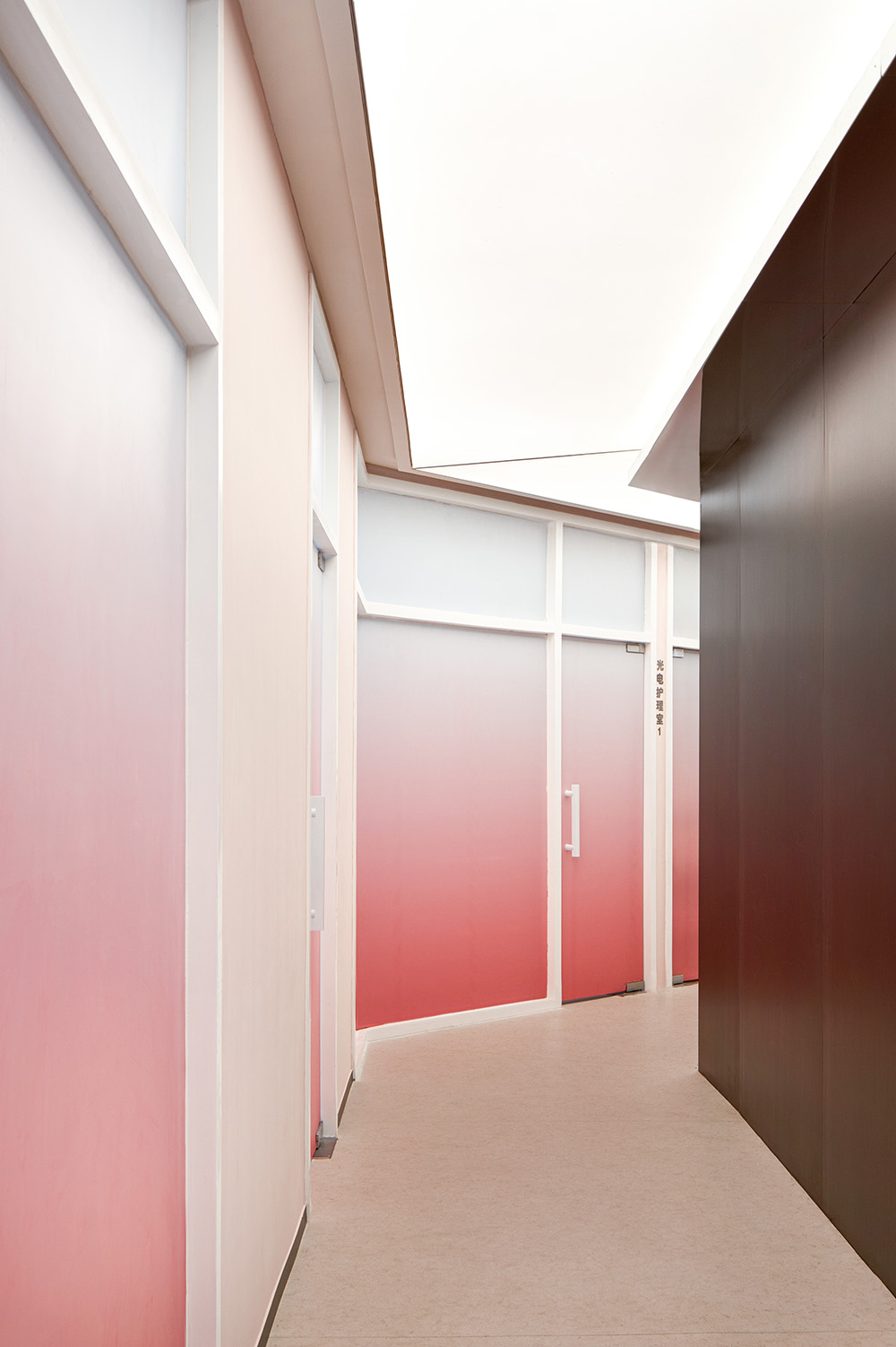
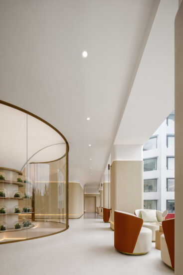
簡約精致的接待大廳頂部采用鏡麵不鏽鋼和燈膜模糊了空間界限,配合大麵積的粉色漸變玻璃在空間中注入了豐沛柔和的自然光線,消解了醫療機構慣有的冰冷質感,為顧客營造一個更加愜意的等候場所。
The top of the simple and exquisite reception hall uses mirror stainless steel and light film to blur the space boundary, and injects abundant and soft natural light into the space with large areas of pink gradient glass, which eliminates the cold texture usually used in medical institutions and creates a more pleasant waiting place for customers.
洽談區的沙發、茶幾以流動感造型,又將溫柔的力量注入空間,從而達到整體共性的平衡又多一份隨性。
The sofa and tea table in the negotiation area are shaped with a sense of flow, and inject gentle power into the space, so as to achieve the balance of the overall common sense and more casualness.
絲絨麵料和金屬茶幾相碰撞,剛柔並濟彰顯出女性獨特的韌性之美,在科技感的燈光裝置下形成一番獨特的秩序感。
The combination of hardness and softness highlights the unique beauty of women’s toughness, and forms a unique sense of order under the lighting device of science and technology.
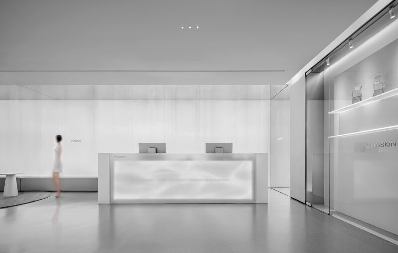
前台區域呈現銀色妝裹的科技境界,空間效果順應粉色光譜,向四麵無限延伸,進入診療室的路徑通過居中的前台區分至兩側,保證功能區劃清晰的同時使得每項醫美體驗都能夠快速到達,並且有效的避免了狹長且乏味的走廊出現。
The front desk area presents the scientific and technological realm of silver makeup, and the space effect conforms to the pink spectrum, extending to the four sides infinite. The path into the diagnosis and treatment room is divided into two sides through the middle front desk, ensuring clear functional zoning and making each medical beauty experience able to arrive quickly, and effectively avoiding the appearance of narrow and boring corridors.
少女計劃
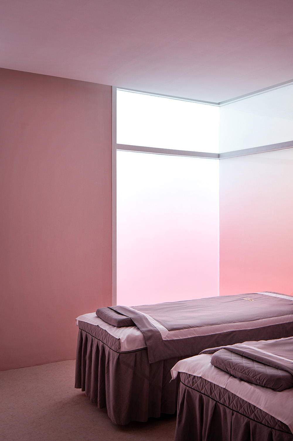
粉色半透明的玻璃房是麵診室,以極簡白統籌空間,讓麵診氛圍更專注、更高效。
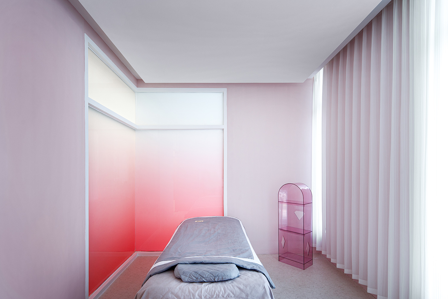
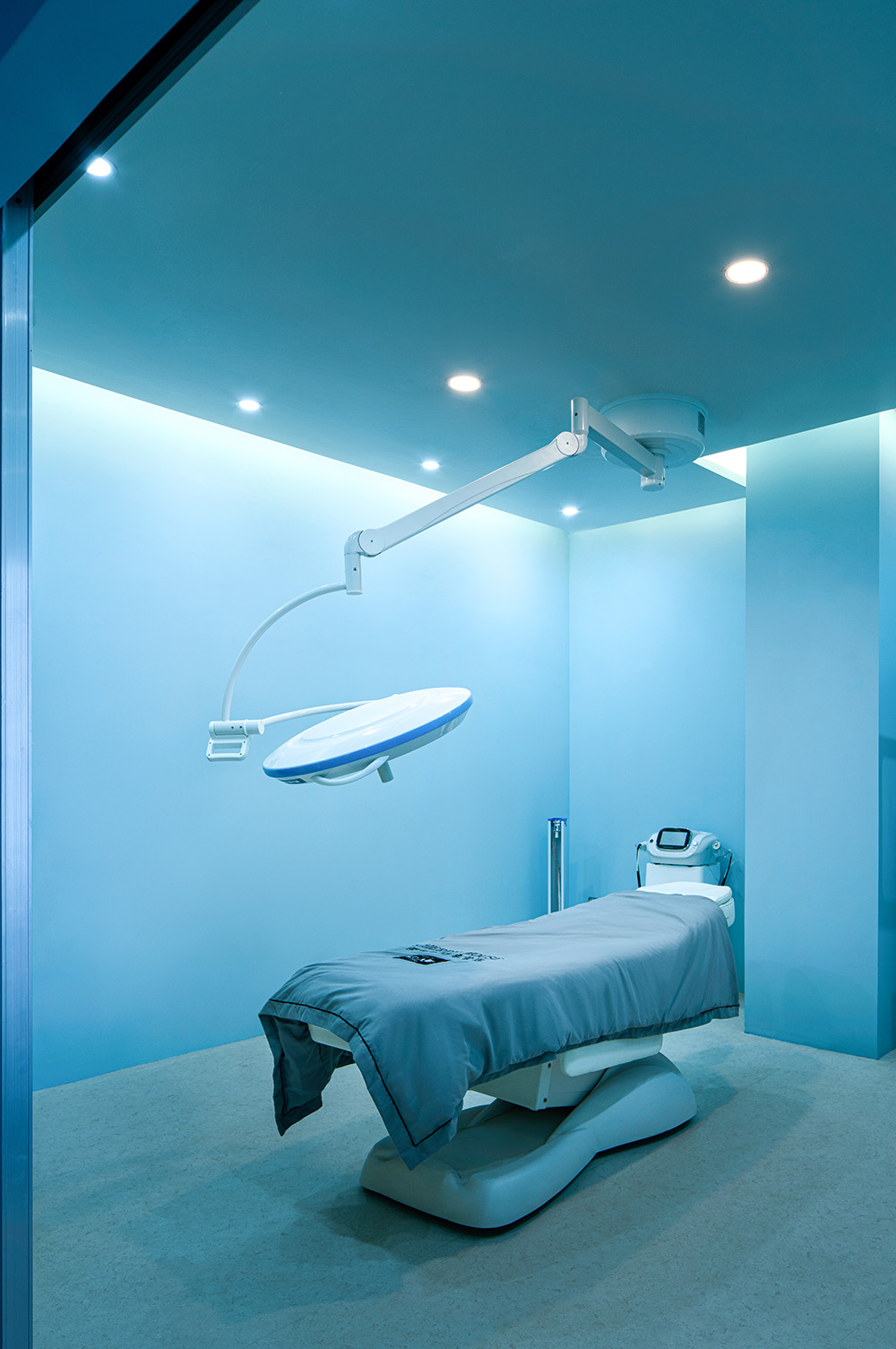
診療室以粉色和紫色、藍白的等多種色彩搭配,更是充滿了浪漫色彩。多元化的空間拚接效果,在白色床品的主色調下,有序的呈現空間層次,搭配夢幻式吊燈,充滿柔和與浪漫氛圍。設計師希望空間能呼吸到夢幻,同時又能達到精致和建築美學的極簡主義。給項目帶來一種夢幻和蛻變的感覺。
對美的追求是自由和幸福的起點,在此次醫美空間的探討中我們希望顧客不僅體驗到了優質的醫美服務同時更能感受到空間帶來的審美悅感,是一場身體和心靈深切的尋美之旅,自然美和理想美的交織共生。
The pink translucent glass room is the face diagnosis room, with a minimalist white space, making the face diagnosis atmosphere more focused and more efficient. The diagnosis and treatment room is filled with a variety of colors such as pink, purple, blue and white, which is full of romantic color.The diversified space splicing effect, under the main tone of white beds, presents the space hierarchy in an orderly manner, with a dreamlike chandelier, full of soft and romantic atmosphere. The designer hopes that the space can breathe dream, while at the same time achieving the refinement and minimalism of architectural aesthetics.Bring a sense of fantasy and transformation to the project. The pursuit of beauty is the starting point of freedom and happiness. In this discussion of medical beauty space, we hope that customers can not only experience the high quality of medical beauty services, but also feel the aesthetic feeling brought by the space. It is a deep journey of beauty seeking for the body and soul, the intertwined symbiosis of natural beauty and ideal beauty.
項目信息
設計機構:樓房花朶設計IN BLOSSOM INTERIOR STUDIO
設計總監:劉佳佳
項目地址:貴州
項目麵積:1000平
項目材料:鏡麵不鏽鋼,亞克力,漸變玻璃,發光燈膜
項目攝影:邊界攝影


