場地概況 Site Analysis
項目位於雲南省昆明市官渡區昆明市官渡區世紀城商圈廣福路與金源大道交彙處,改造前場地為卡丁車跑道,廢棄已久,店鋪所在層公共活動場地稀缺。業主希望提升該區域運動品質,為該商圈周邊的兒童提供一處可以滿足日常運動和兒童綜合素養培訓的場所,同時也滿足該品牌會員在等待孩子運動時充分放鬆,提供專屬健身場地,品牌設計提升的目的是讓客戶學習的同時享受運動,擴展運動品牌的多樣性。
The project is located at the intersection of Guangfu Road and Jinyuan Avenue in Century City Business District, Guandu District, Kunming City, Yunnan Province. Before the renovation, the site was a go-kart track, which has been abandoned for a long time. Public activity venues on the store floor are scarce. The owner hopes to improve the quality of sports in the area and provide children around the business district with a place that can meet daily sports and children’s comprehensive literacy training. It also allows the brand members to fully relax while waiting for their children to exercise, and provides an exclusive fitness venue. The brand The purpose of design enhancement is to allow customers to enjoy sports while learning, and to expand the diversity of sports brands..
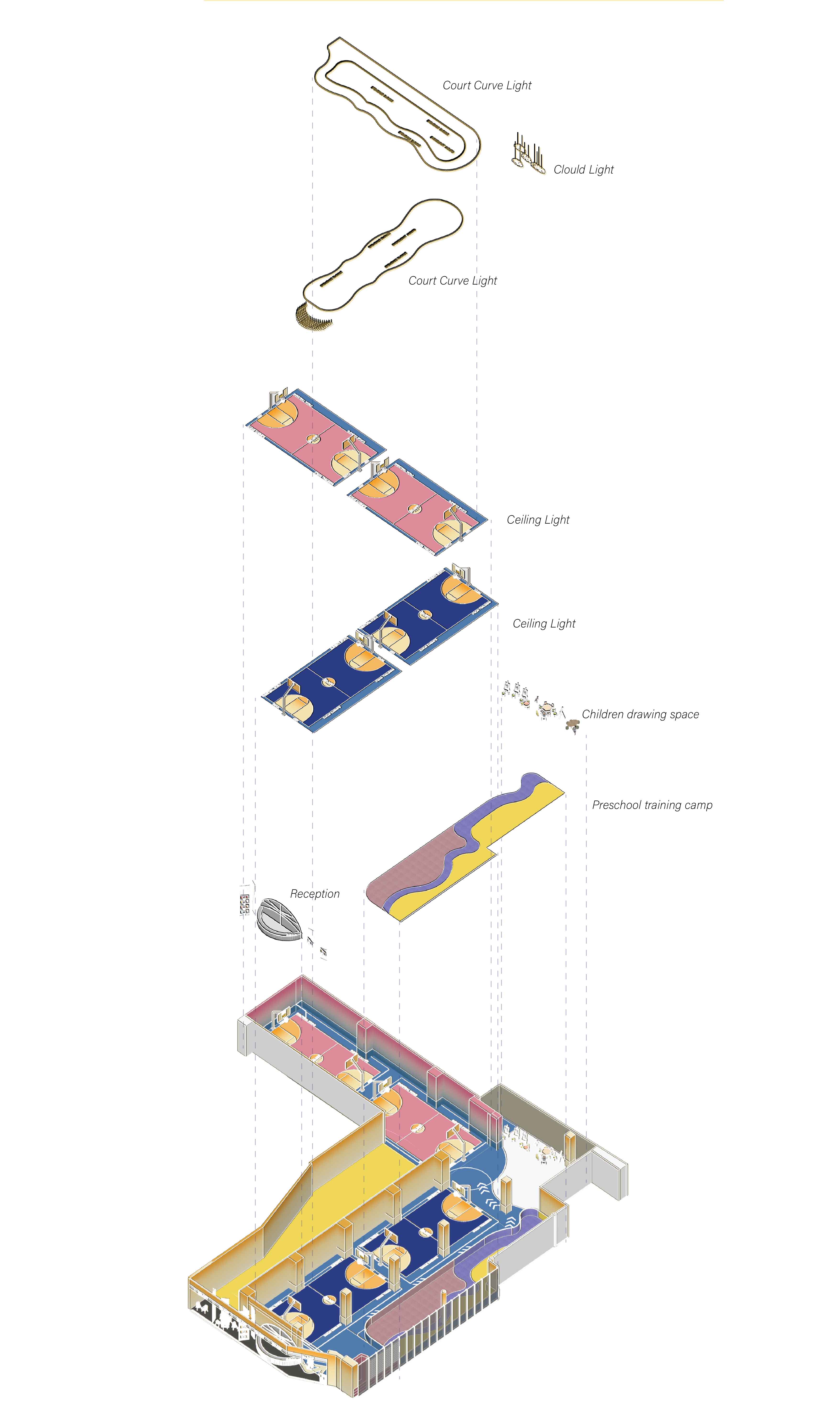
∇ 空間分析圖 space analysis
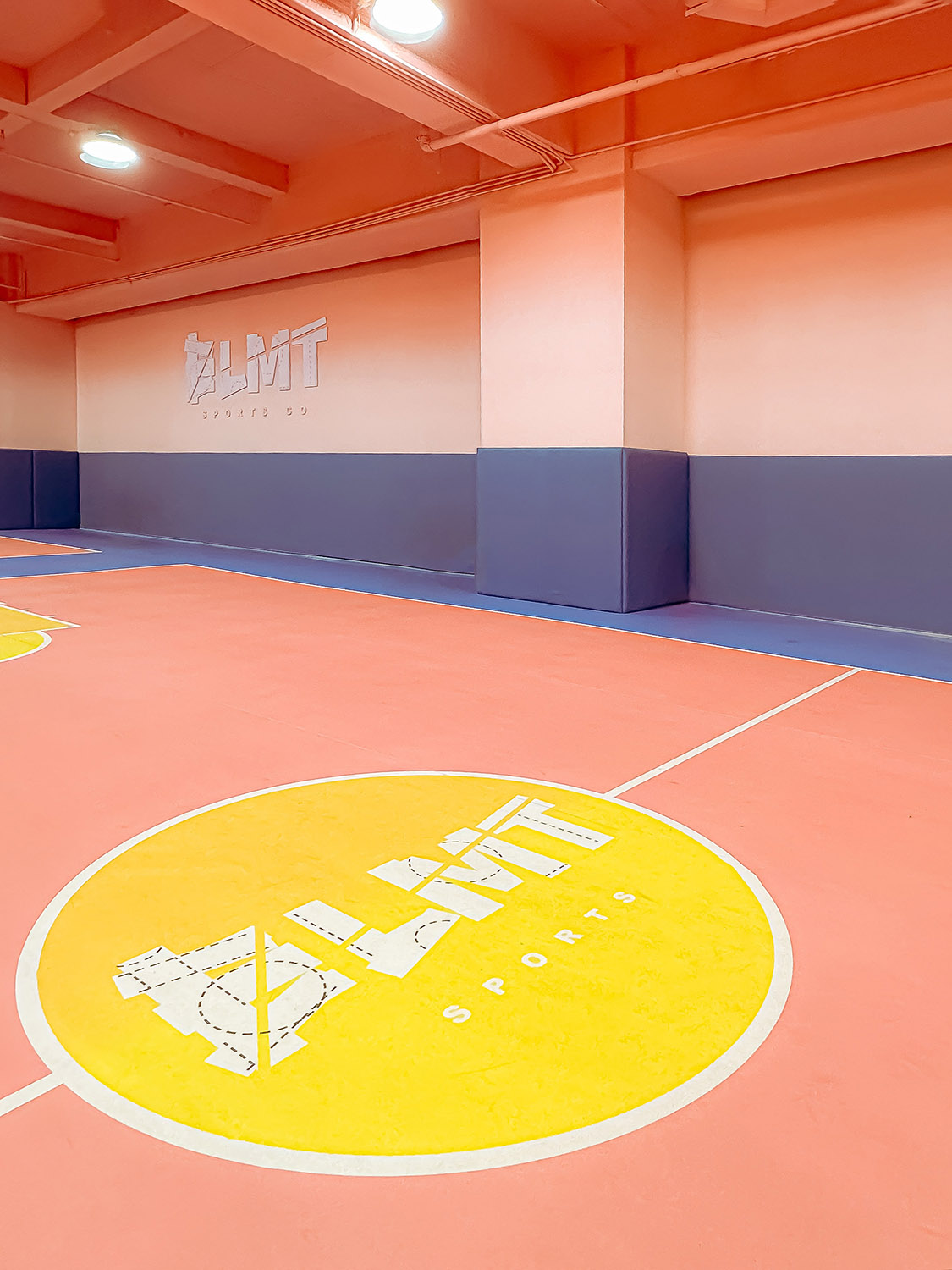
該場地以創造一座讓兒童身心皆能自由發展的運動遊樂場為目標,探尋跨越籃球場固有形式的可能性,在保持場地組成的同時,讓人們在運動中改變對顏色的認知。設計師對室內以及地麵標識進行了創意彩色設計,在鮮豔色彩的環繞下,可以激發孩子們更為豐富的情感和想象空間。
The goal of this venue is to create a sports playground that allows children to develop freely both physically and mentally. It explores the possibility of transcending the inherent form of the basketball court and allows people to change their perception of colors during exercise while maintaining the composition of the venue. The designer made creative colorful designs for indoor and floor signs, which, surrounded by bright colors, can stimulate children’s richer emotions and imagination.
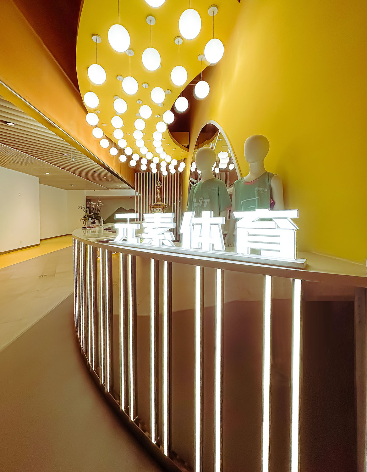
∇ 入口前台元素組合 The Entrance © Yan Dong
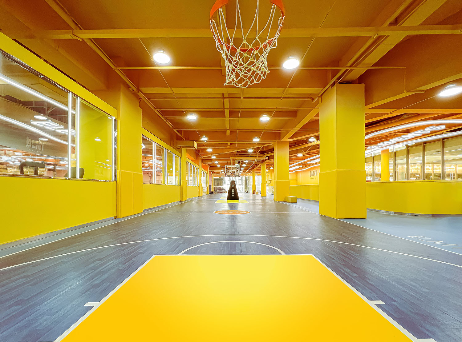
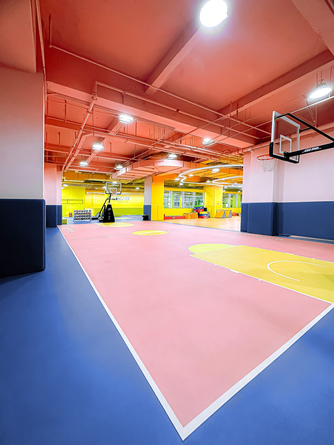
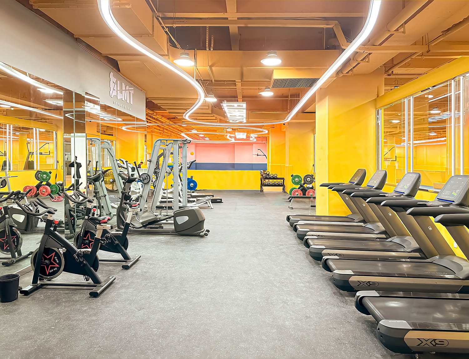
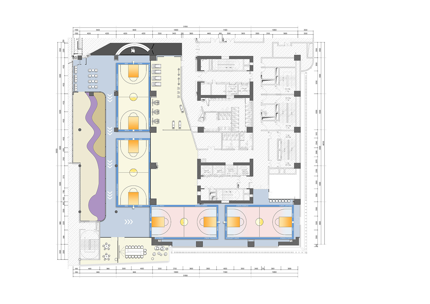
元素體育的彩色海洋,由四塊籃球場,兩個少兒體適能區域,一個健身中心構成,除此之外也包含貴賓室、兒童休息區、更衣室等輔助功能空間。其中四塊長30米寬17米的標準籃球場,可提供正規籃球比賽與休閑活動;一塊長24米、寬17米的健身房,雖然麵積不大,但足以為兒童提供健身培訓、力量訓練等需求。
The colorful ocean of Element Sports consists of four basketball courts, two children’s fitness areas, and a fitness center. In addition, it also includes auxiliary functional spaces such as VIP rooms, children’s rest areas, and locker rooms. Among them, four standard basketball courts with a length of 30 meters and a width of 17 meters can provide regular basketball games and leisure activities; a gymnasium with a length of 24 meters and a width of 17 meters, although not large, is enough to provide children with fitness training, strength training, etc. need.
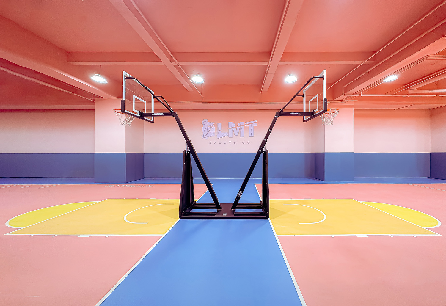
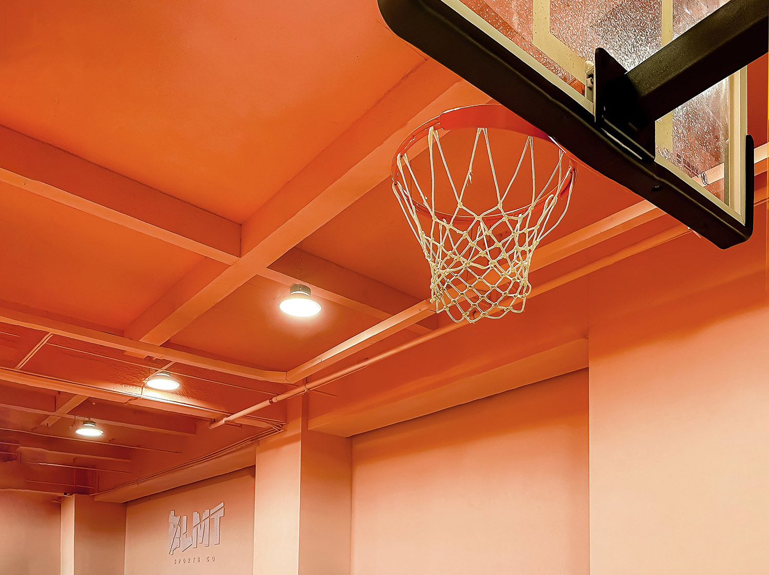
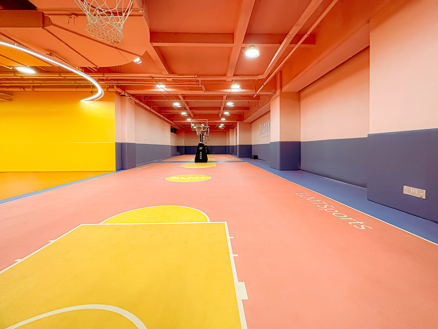
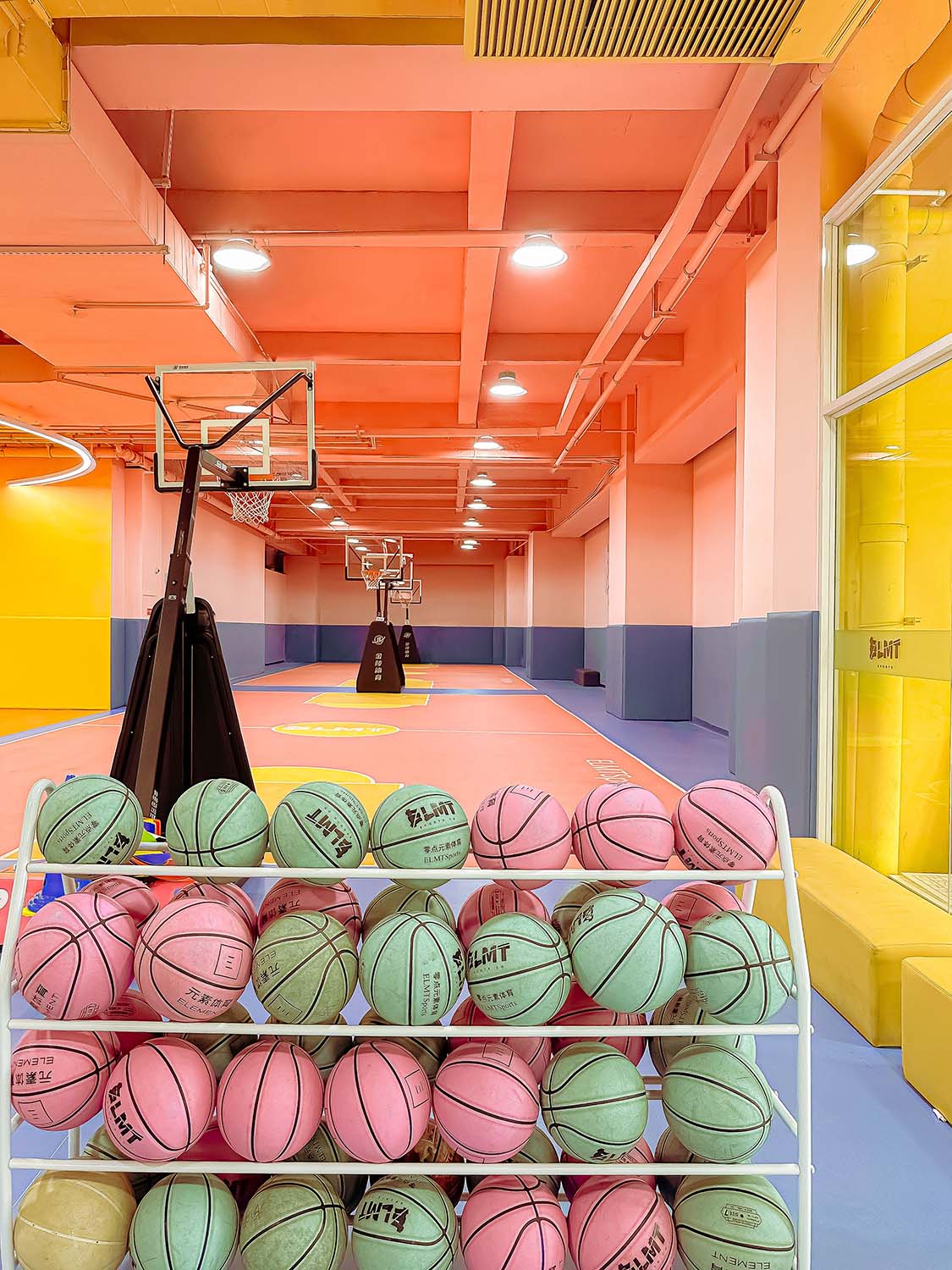
∇ 球場一側的粉色場地 Pink Basketball Court © Yan Dong
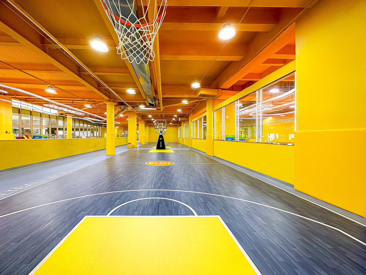
∇ 球場一側的黃色場地 Yellow Basketball Court © Yan Dong
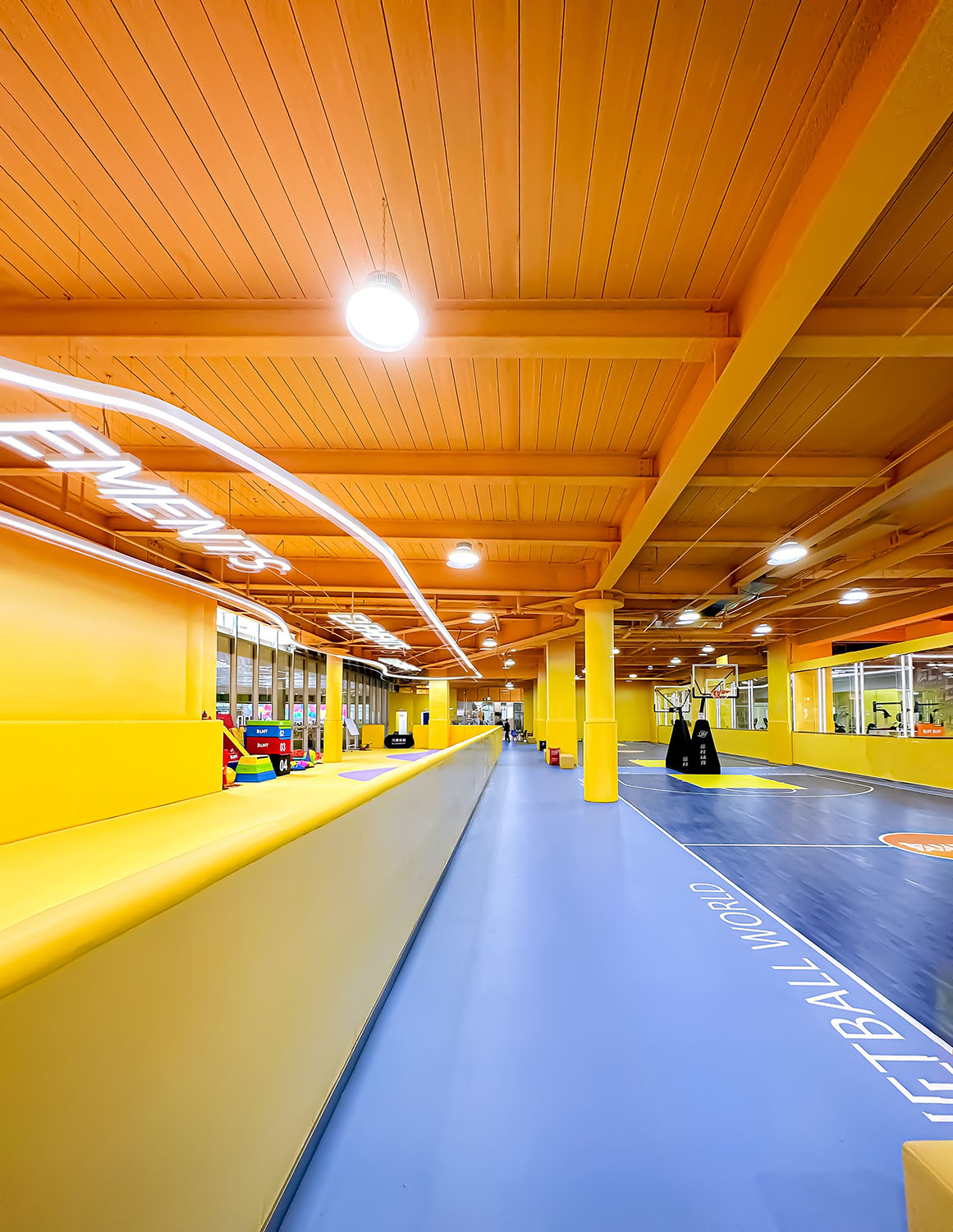
∇ 從公共過道望向兩側功能區 View to the basketball court and children activity court from the corridor © Yan Dong
設計理念 Design Concept
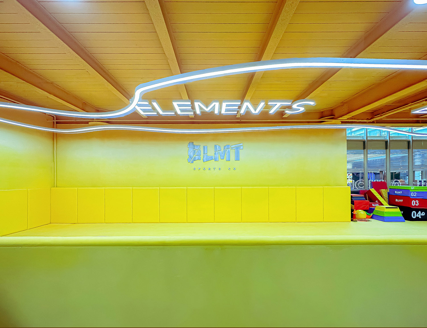
室內采用了多種顏色,主要為明快輕鬆的黃色係為主,一下子就抓住孩子們的目光,設計力求打造出“彩色世界—活力海洋”的氛圍,致力於營造一個體育、休閑、交流甚至放鬆聚會於一體的最具活力凝結力的焦點。黑暗的混凝土重新獲得生命,有了色彩的加入,這是一個全新的從無到有的新世界。
A variety of colors are used in the interior, mainly bright and relaxing yellow, which immediately catches the children’s attention. The design strives to create an atmosphere of “colorful world-vibrant ocean” and is committed to creating a place for sports, leisure, and communication. The most dynamic and cohesive focal point for even a relaxing gathering. Dark concrete comes to life again, and with the addition of color, it’s a whole new world made from scratch.
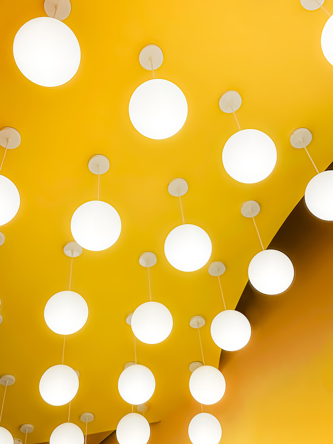
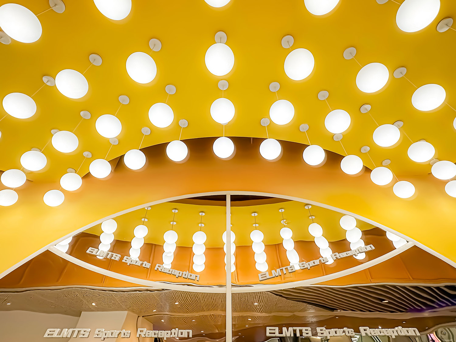
∇ 場地中的球形燈與黃色對比中的秩序感 A sense of order formed by linear light belts and yellow in the site © Yan Dong
除了考慮籃球比賽所需的固有場地劃分,將色彩和沒有界限的漸變植入其中,帶給人自由的感受。設計師將運動相關的事物作為顏色選擇的出發點,從籃球場上進行色彩采樣,並加入一些變化,創造出最終的漸變效果。流動的曲線形成了一種充滿音樂感的節奏,激發人們的活力,將原本有限的空間無限放大。
In addition to considering the inherent division of the court required for basketball games, color and boundaryless gradients are implanted to give people a feeling of freedom. The designer used sports-related things as a starting point for color selection, sampling colors from the basketball court and adding some variation to create the final gradient effect. The flowing curves form a musical rhythm, stimulating people’s vitality and infinitely amplifying the originally limited space.
∇ 粉色的漸變流動 Visual gradient pink © Yan Dong
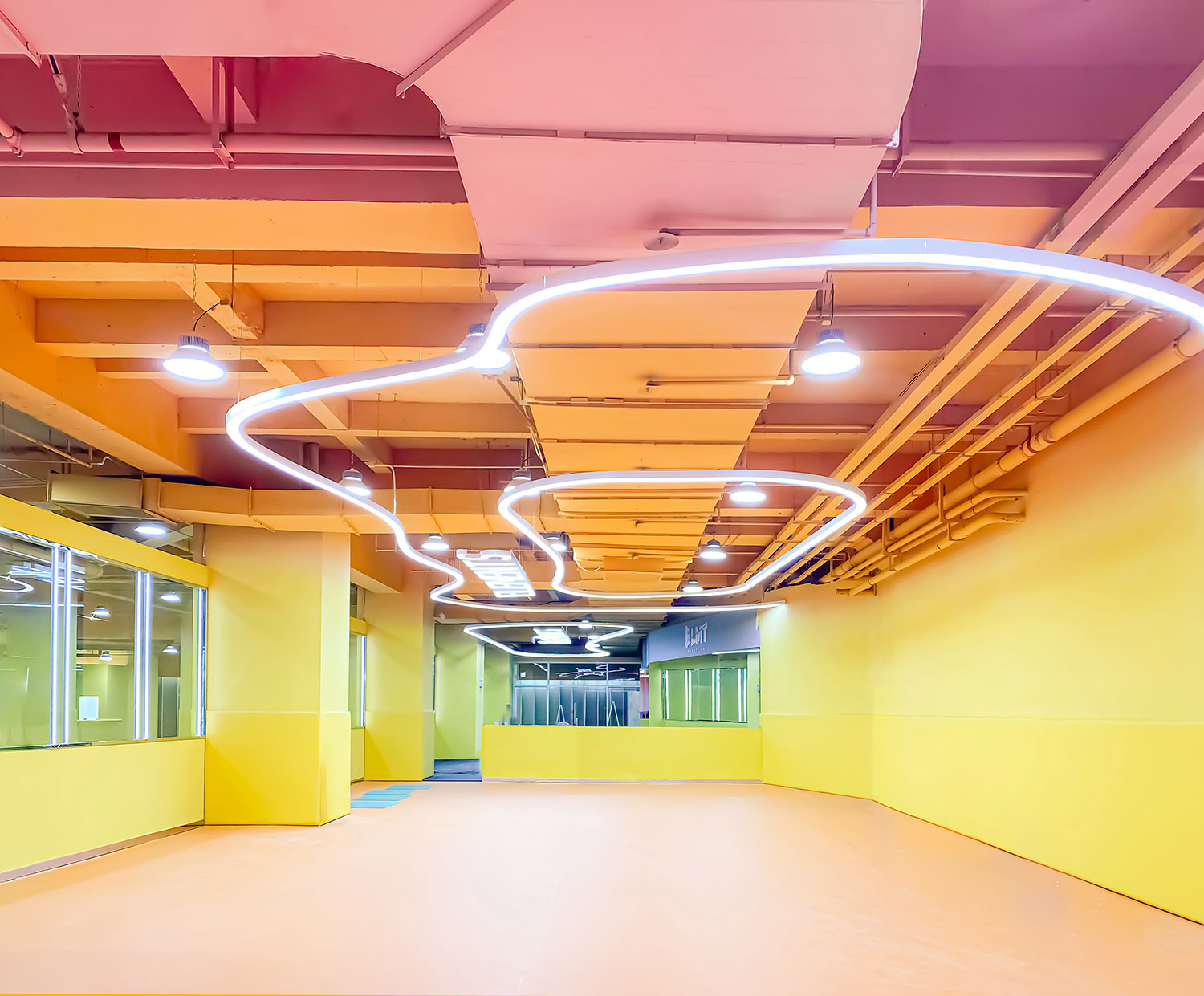
立麵上由4種顏色組成豐富的彩色漸變世界,包含愉悅粉向深海藍的漸變,活力橙向明亮黃的漸變,明黃色主要覆蓋了整個室內空間吊頂。其中牆麵設計中也包含1.5m高的軟包,保護孩子們的安全,為孩子們提供溫柔嗬護。部分牆麵由玻璃分隔空間,給人以開放感的同時與外界保持距離,溫柔地從視覺上對兒童進行保護。
The facade consists of 4 colors to form a rich gradient world, including the gradient from pleasant pink to deep sea blue, and the gradient from vibrant orange to bright yellow. The bright yellow mainly covers the ceiling of the entire indoor space. The wall design also includes 1.5m high soft bags to protect the safety of children and provide them with gentle care. Part of the wall is separated by glass, giving a sense of openness while maintaining distance from the outside world, gently and visually protecting children.
∇ 線型空間 Linear visual elements © Yan Dong
∇ 黃色與粉色藍色的漸變色彩組合 The combination and contrast between yellow pink and blue © Yan Dong
所有的自由開放的家長休息區、兒童開放遊樂區、休息更衣儲物區一一展開,通過吊頂的變化、燈具的點綴,實現區域的限定與功能特點的呈現,在枯燥的走道空間上創造豐富的活動出發點。在細節設計中也尤其注意,整個地麵後都設置了引導性的標識,導向清晰明確,生動的展開,引導孩子逐步進入溫暖活潑的彩色運動世界。
All free and open parent resting areas, children’s open play areas, resting and changing storage areas are unfolded one by one. Through the changes in the ceiling and the embellishment of lamps, the limitation of the area and the presentation of functional characteristics are realized, creating richness in the boring corridor space. starting point for activities. Special attention has been paid to the detailed design. Guidance signs are set up behind the entire floor. The guidance is clear and vivid, guiding children to gradually enter the warm and lively colorful world of sports.
∇ 室內采用黃色,配合彩色橡木地板、軟包等,創造一個有層次的空間
Basketball court, using the neutral color tones, oak floor system to create an interior space with simple and elegant spatial layers © Yan Dong
彩色軸線 Color Palette
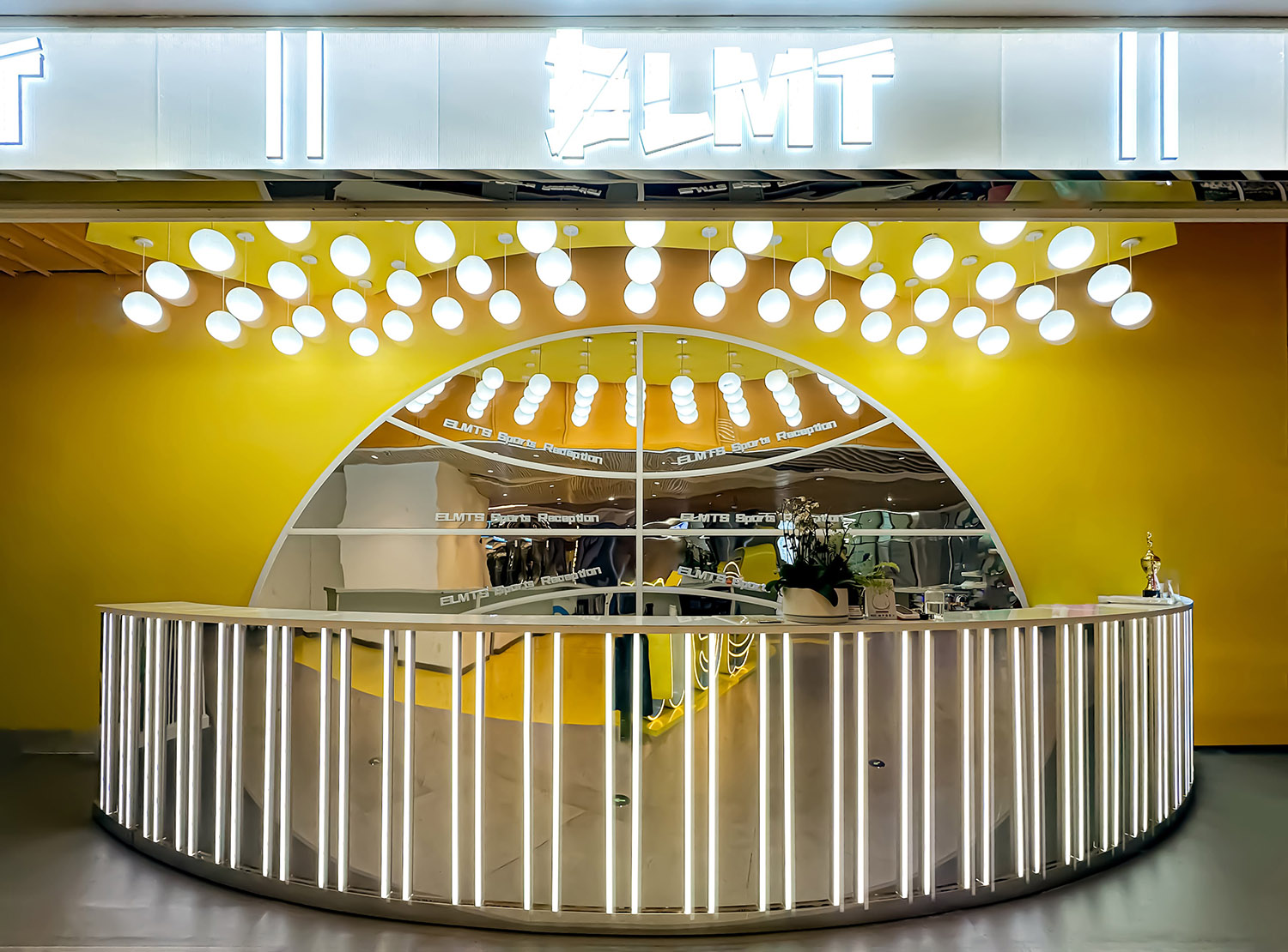
彩色設計致力於讓人一進入元素體育,就能感受到撲麵而來的時尚活力的氣息,設計在入口前台營造時,選用銀色金屬漆麵和燈光的強烈視覺搭配突出力量感與線條感。背景牆和前台融入了細膩的籃球形態,在一目了然的籃球打造出整體感,而吊頂、周邊牆麵以新型材料聚碳酸酯板和燈帶配以明黃色突出元素體育logo,通過有縱深感、有層次的圖底關係,充分展現出一個體育文化氛圍濃厚的公共空間。
The colorful design is designed to make people feel the fashionable and energetic atmosphere as soon as they enter Element Sports. When the design is created at the entrance front desk, a strong visual combination of silver metallic paint and lighting is used to highlight the sense of strength and lines. The background wall and front desk are integrated into the delicate basketball shape, creating a sense of integrity in the clearly visible basketball. The ceiling and surrounding walls are made of new materials polycarbonate boards and light strips with bright yellow prominent elements sports logo, creating a sense of depth and The hierarchical relationship between the picture and the ground fully demonstrates a public space with a strong sports culture atmosphere.
球形元素的亞克力燈與包在前台上的線性燈柱,結合黃色也起到了加強空間線性的作用,旨在在視覺與材質上將不同運動空間銜接在一起。
The acrylic light strips with linear elements and the color surrounding the columns and steel frames also play a role in defining the space, aiming to connect the different movement Spaces visually and materially.
∇ 燈的秩序感空間 Linear visual order © Yan Dong
按秩序排列的燈條形成了一種充滿音樂感的節奏,結合球形燈如飄浮的音符,延伸至兩側,激發人們的活力,給人留下難忘的印象。
The different lengths of the lights form a musical rhythm, such as floating notes, extending to the sides, stimulating people’s energy, enlarging their range of action, making the game more intense, leaving a memorable impression.
色彩提煉 Color Palette
整體視覺色彩中,黃藍色與粉藍色搭配帶來強烈視覺衝擊力,搭配中和了粉色的稚嫩感,凸顯空間的活力,平衡了黃色帶來的靚麗感,創造出極致彩色的歡樂空間觀感。
Among the overall visual colors, the combination of yellow, blue and pink blue brings a strong visual impact. The combination neutralizes the childishness of pink, highlights the vitality of the space, balances the beauty brought by yellow, and creates an ultimate colorful and happy space. Perception.
∇ 色彩的視覺碰撞 Visual contrary between pink and blue © YanDong
待在色彩豐富的環境中可以讓兒童更為敏感,並且有利於培養每個孩子的個性。處處融入人性化地關懷與個性化的需求設計,相信這裏也將成為人們最愛去的運動場館之一。被色彩包圍,生活在色彩中,接觸不同的色彩,元素體育希望以這樣的方式豐富兒童的情感,讓他們健康成長每一天。
Being in a colorful environment can make children more sensitive and help develop each child’s personality. Integrating humanized care and personalized design into every aspect, I believe this will become one of people’s favorite sports venues. Surrounded by colors, living in colors, and exposed to different colors, Element Sports hopes to enrich children’s emotions in this way and allow them to grow up healthily every day.
∇ 球場視角 The play view © Yan Dong
材料的透明性 Sustainable material
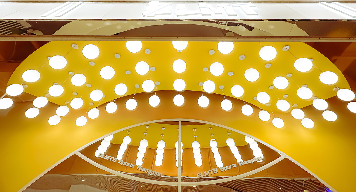
入口所用燈具與門頭材料均為定製亞克力,以聚碳酸酯板包覆門頭,亞克力球形燈點綴其中,形成秩序感的空間。在有限的造價下,結合黃色牆麵,來圍合一個基礎單元空間。豐富的模數在不同的位置有特殊的搭接處理,目的是讓單調的圍護結構變的豐富而有親和力。把材料的質感使用到極致,圍合一個虛實對比清晰,通透又堅固耐用的空間。
The lamps and door head materials used at the entrance are all custom-made acrylic. The door head is covered with polycarbonate plates and embellished with acrylic spherical lights to create a sense of order in the space. With a limited cost, it is combined with yellow walls to enclose a basic unit space. The rich modules have special overlapping processing at different locations, aiming to make the monotonous building envelope rich and friendly. The texture of materials is used to the extreme to enclose a space with clear contrast between reality and reality, which is transparent, sturdy and durable.
∇ 入口前台 Entrance hall © Yan Dong
立麵的設計 The elevation
升級後的元素體育3.0係列,立麵設計強調被色彩包裹的空間體驗與視覺體驗,相互兩個方麵形成互補,用燈光加強立麵的黃色與粉色漸變,增強視覺豐富性,讓空間體量變得通透完整。
The upgraded Element Sports 3.0 series, the facade design emphasizes the spatial experience and visual experience wrapped in color, which complement each other. Lighting is used to enhance the yellow and pink gradients of the facade, enhance visual richness, and make the space volume become Transparent and complete.
∇ 粉色與藍色的視覺碰撞 Visual contrary between pink and blue © Yan Dong
∇ 健身區域 Gym © Yan Dong
∇ 休息區域 Rest area © Yan Dong
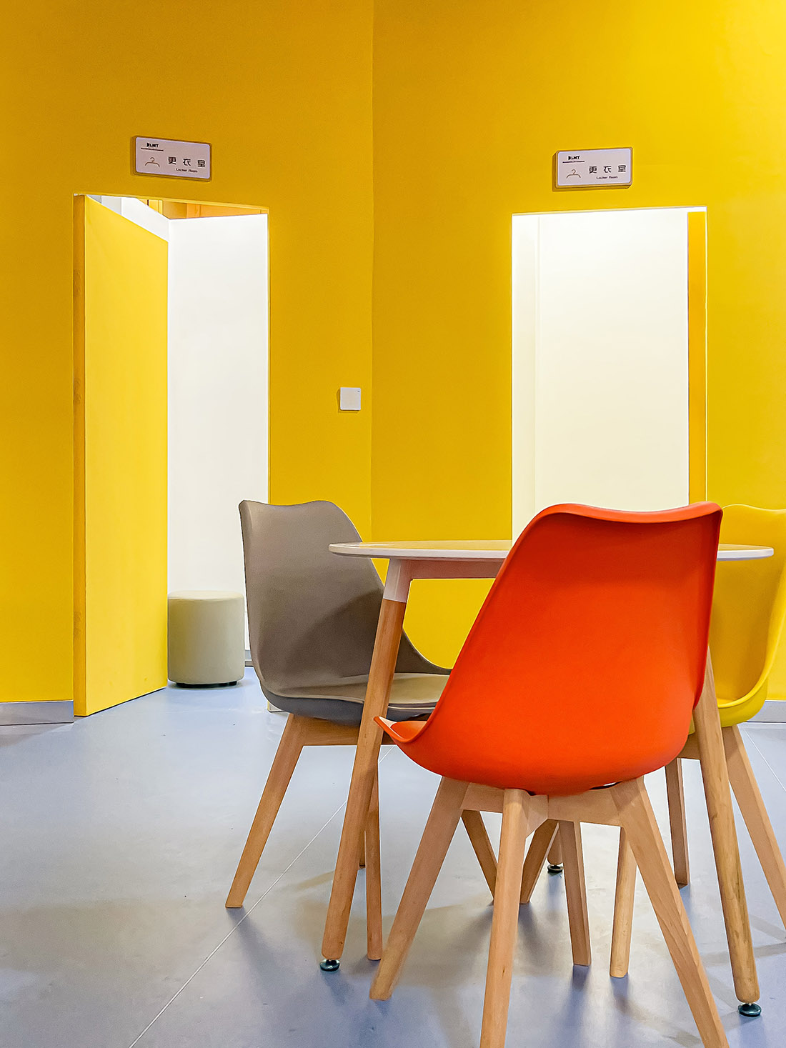
∇ 休息室與更衣室 Other area © Yan Dong
∇ 空間平麵圖
項目信息
項目名稱:元素體育昆明海樂世界3.0店
設計方:平介設計
公司網站:parallect-design.com
聯係郵箱: info@parallect-design.com
項目設計&完成年份:2023
主創及設計團隊:董豔
項目地址:雲南省昆明市官渡區世紀城商圈廣福路與金源大道交彙處
建築麵積:1300 m2
攝影版權:董豔
合作方:昆明碩越廣告有限公司
客戶:昆明悅體體育文化有限公司
Designer: Parallect Design
Website: parallect-design.com
E-mail: info@parallect-design.com
Time of Design & Accomplishment: 2023
Main Designer and Design Team: Yan Dong
Address: Guangfu RD. and JinyuanRD., Guandu DIST., Kunming, Yunnan
Covered Area: 1300 m2
Copyright of Photography: Yan Dong
Partners: Kunming Shuoyue Advertising Company
Client: Kunming Yueti Sports Culture Company


