辦公空間一方麵需要解決物理性的功能問題,另一方麵也在潛移默化中,傳遞著企業文化性的精神凝聚力。在超級番茄設計完成的思摩爾(SMOORE)辦公室中,就將其企業文化,成功轉譯為空間的表達。
Office spaces need to address functionality on the one hand, but also need to convey corporate culture and spiritual cohesion in a subtle way. In this workspace, Super Tomato successfully translated SMOORE’s corporate culture into spatial expressions.
項目位於深圳寶安區東財工業區8號樓,空間改造後用於思摩爾(SMOORE)公司的日常辦公使用。在2500多平方米的空間中,滿足常規辦公需求的同時,通過這一場域傳達思摩爾的品牌精神及企業文化,亦是業主最重要的訴求之一。
The project is located in Dongcai Industrial Zone, Bao’an District of Shenzhen, and it was transformed to suit the company’s daily business needs. With an area of more than 2,500 square meters, the design was required to satisfy basic office functions while conveying SMOORE’s corporate culture and spirit.
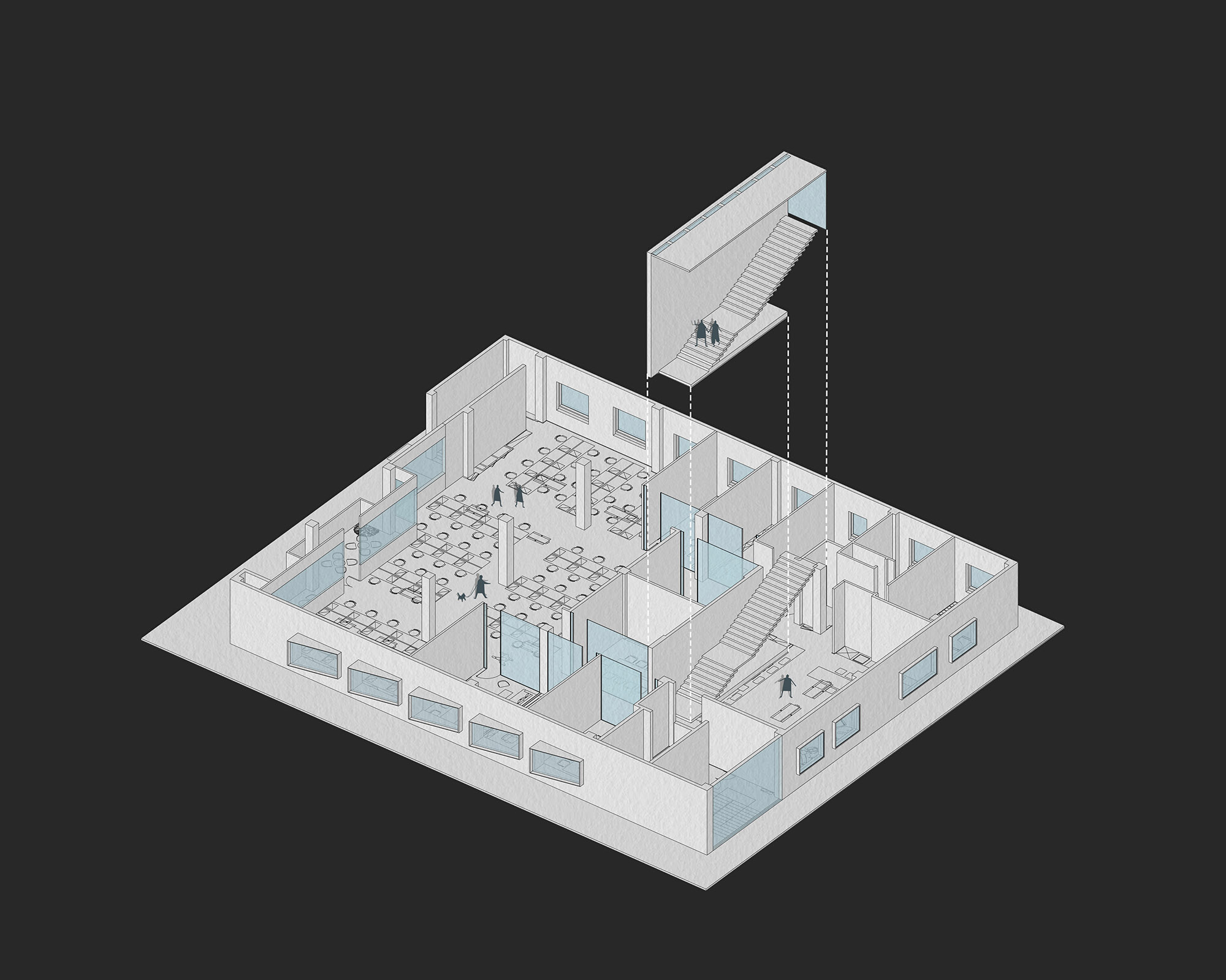
項目原有建築空間規整方正,讓功能布局與動線的組織得以更加高效。設計團隊將傳達企業文化的區域重點放置在了一層與四層的公共空間之中。
The original space was neat and square, allowing for efficient organization of functions and the circulation routes. The design team made use of the public space on the first and fourth floors to be the highlight for communicating the corporate culture.
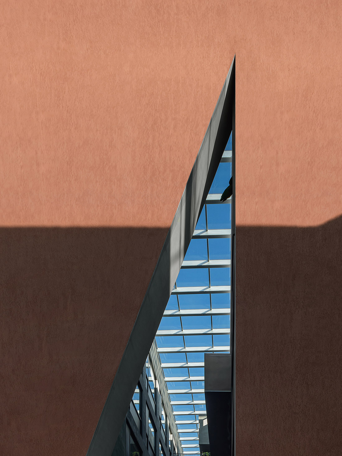
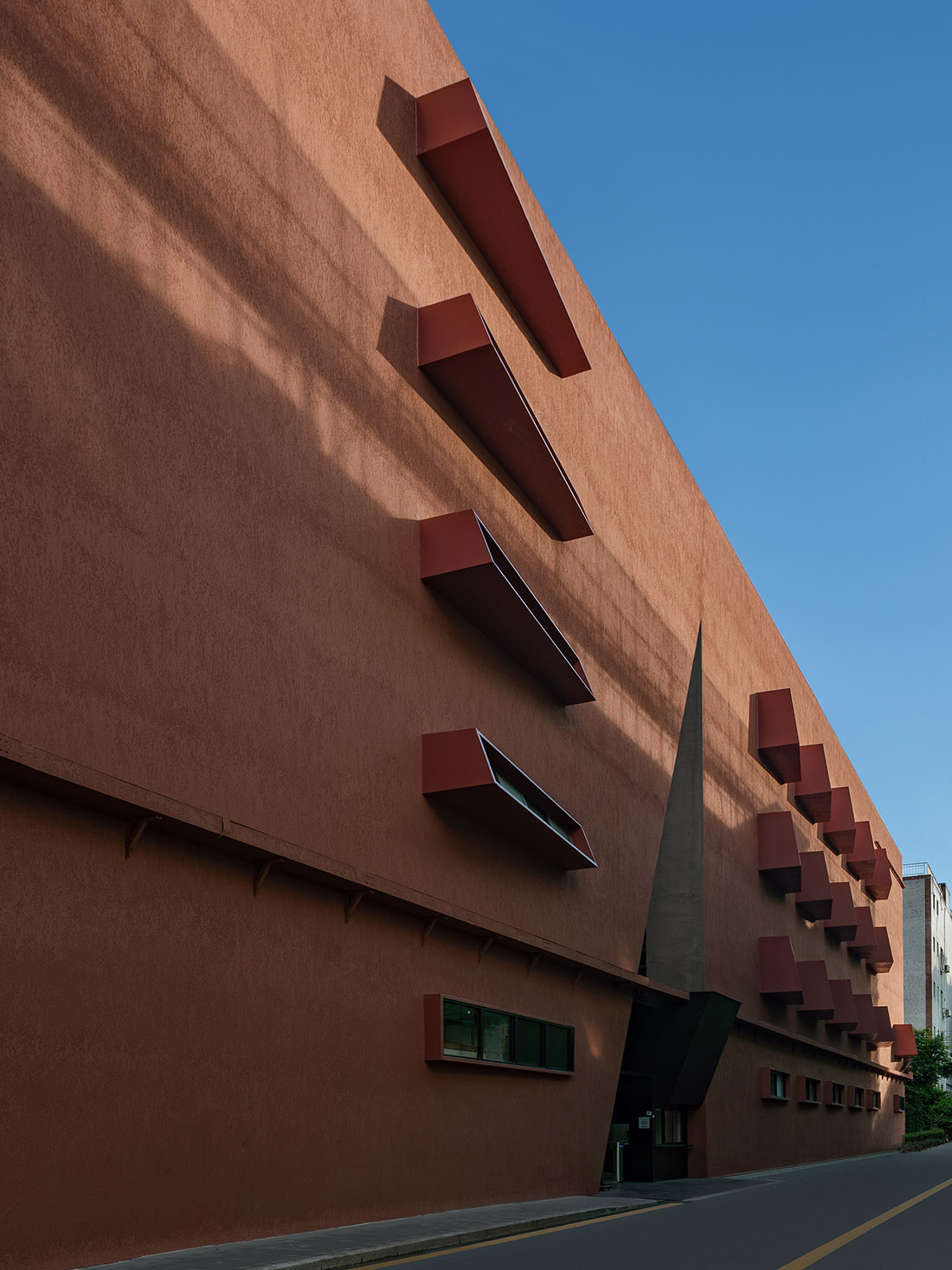
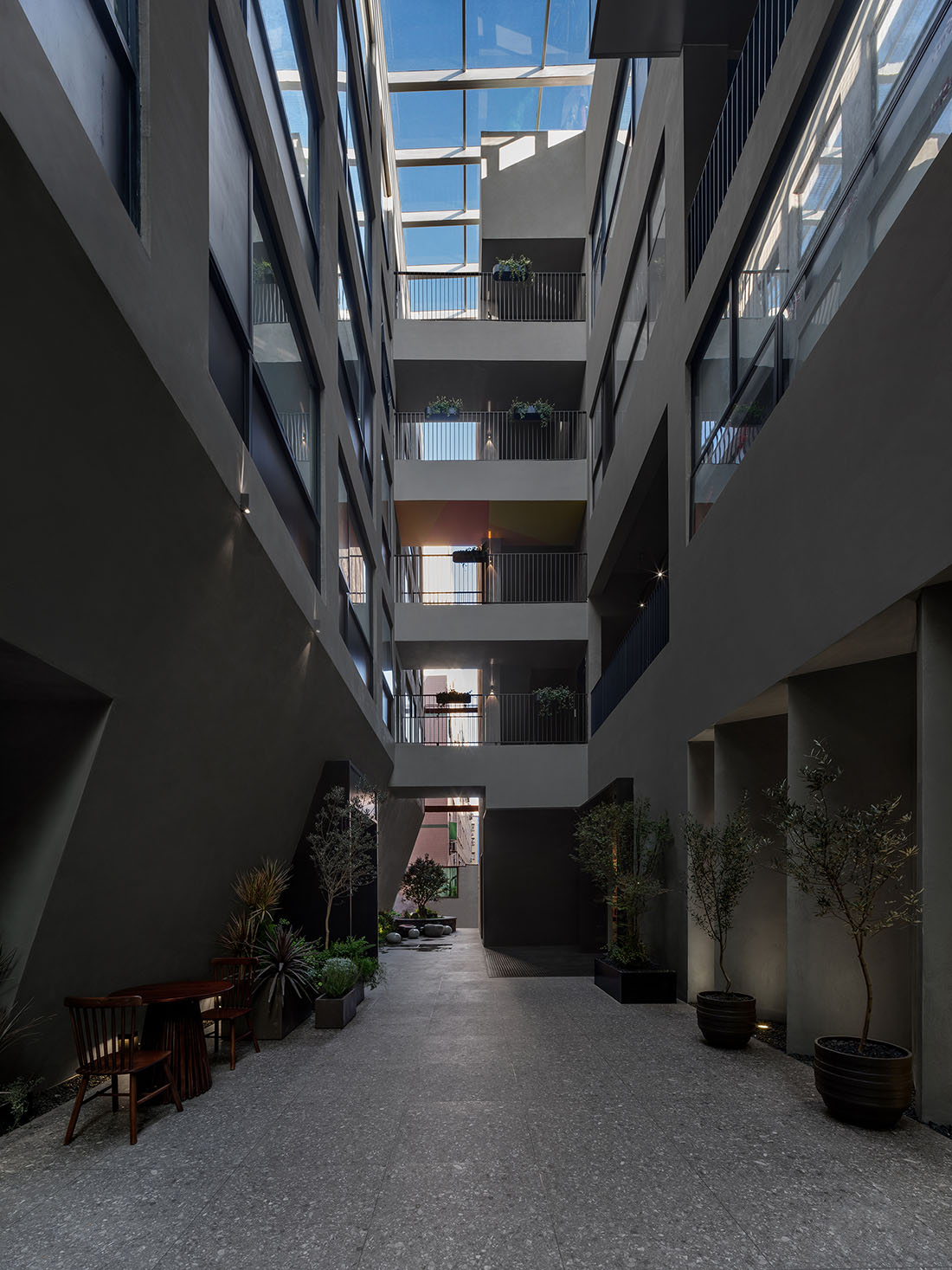
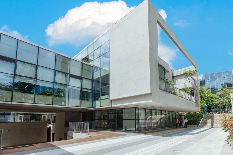
∇ 項目建築中庭 Atrium
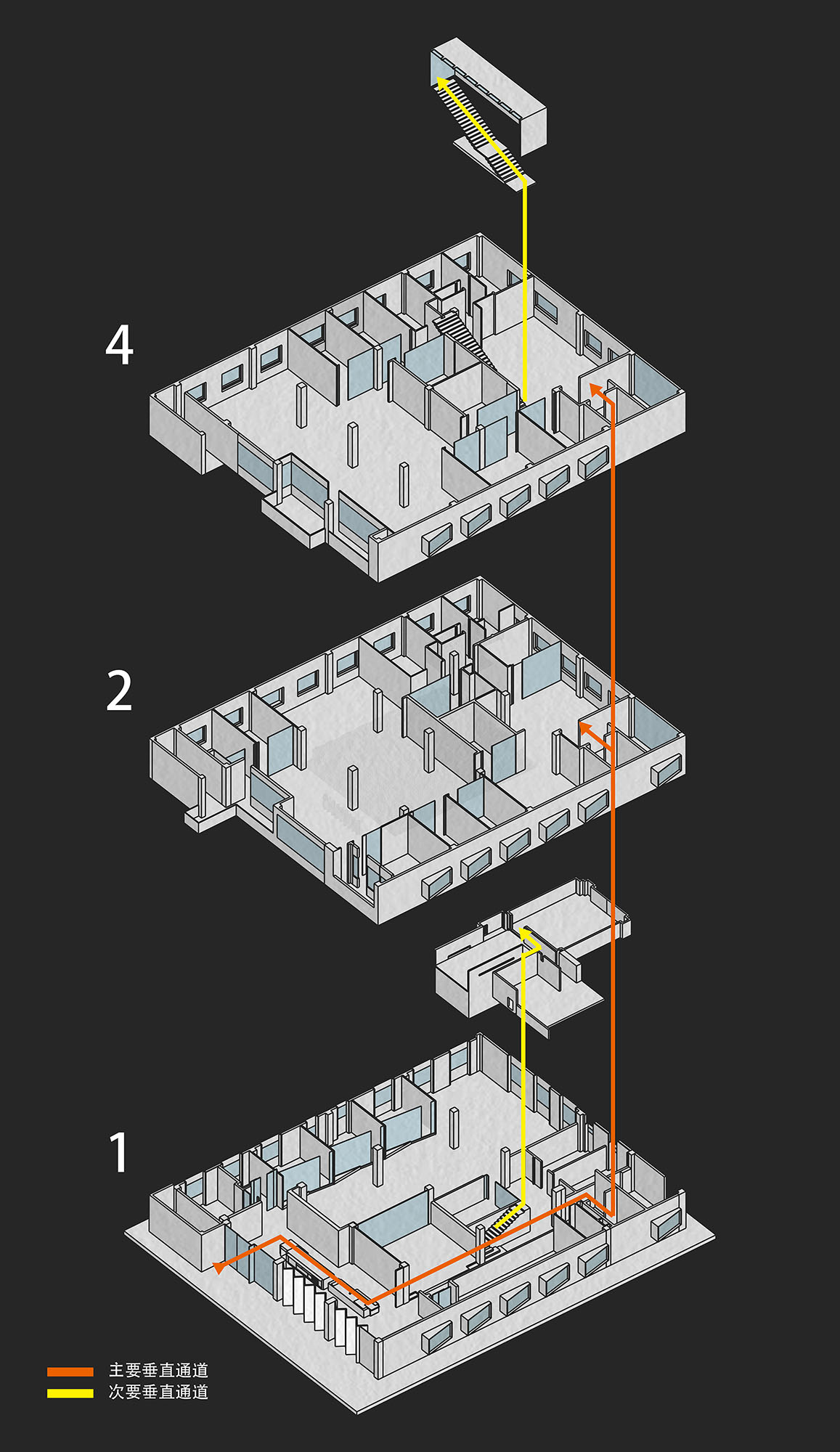
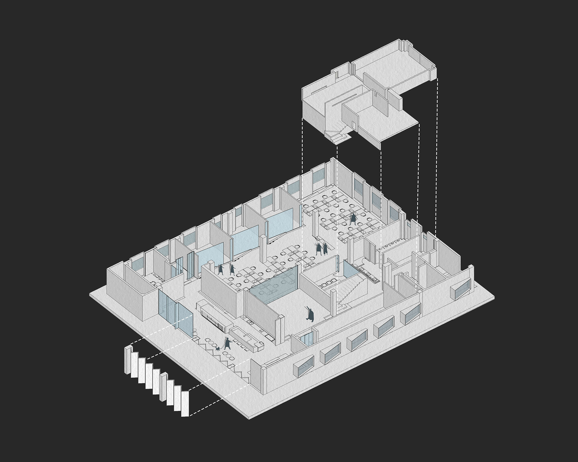
∇ 項目動線分析圖 © 超級番茄
Circulation routes diagram © Super Tomato
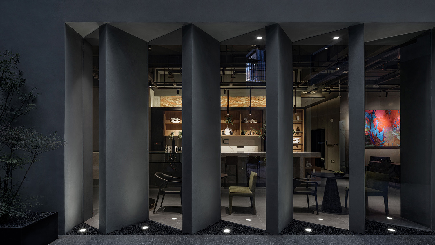
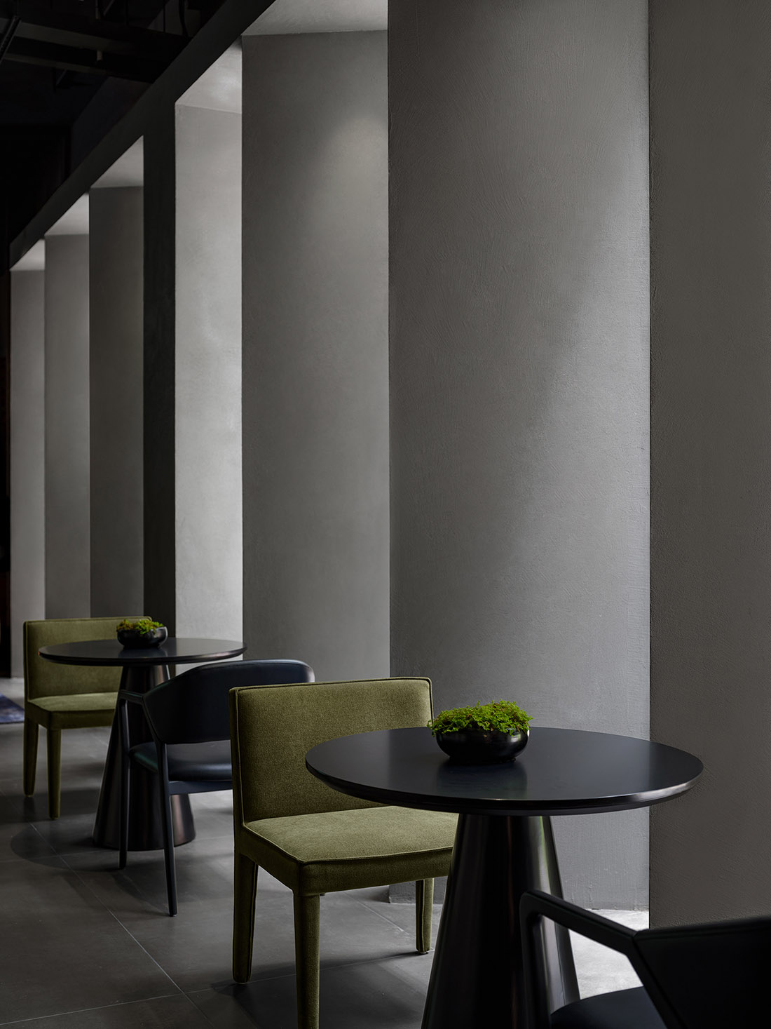
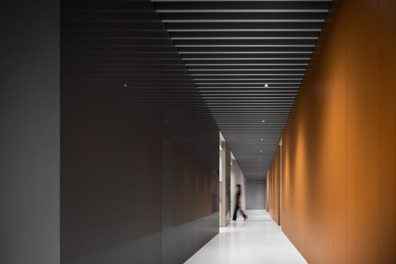
黑陶覆膜霧化芯是思摩爾重要的代表產品,由此為線索,業主提出希望以富有質感的暗色係為空間主調,來回應這一代表性產品。透過鋸齒狀陣列排布的灰黑色牆體,首層公區的光線引導著訪客們自建築中庭步入辦公區域。
Black ceramic atomization coil with metallic film is a representative product and technology of SMOORE. In response to the client’s requirement, the design team adopted a tasteful dark color palette as the main tone of the space to echo the product. The jagged array of grayish black screen walls set at the public area brings in daylight, which guides visitors into the office area.
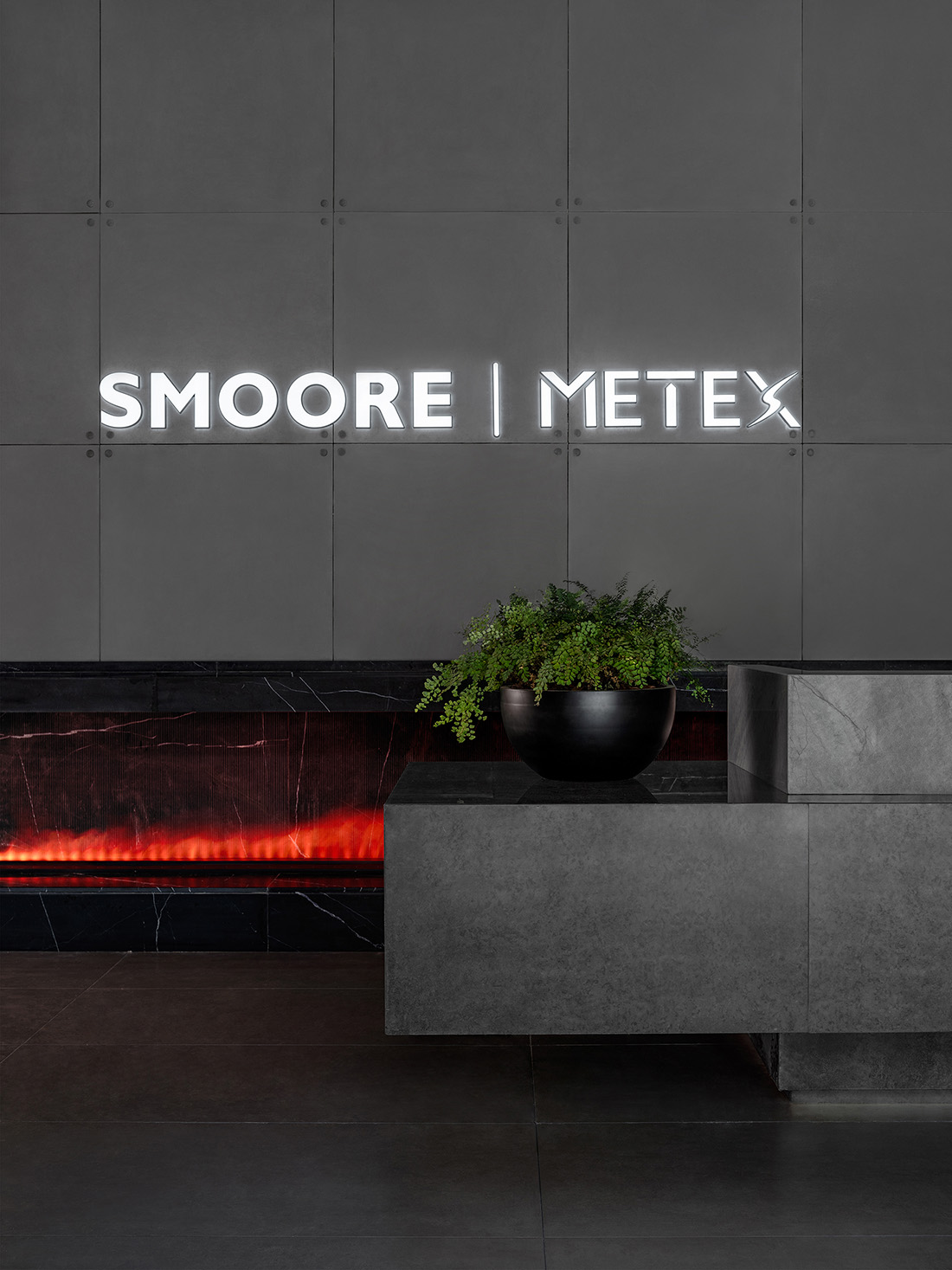
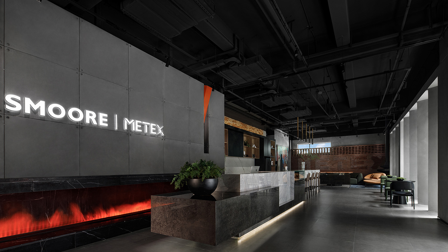
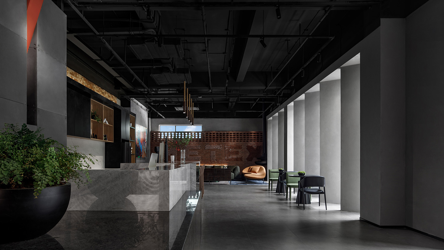
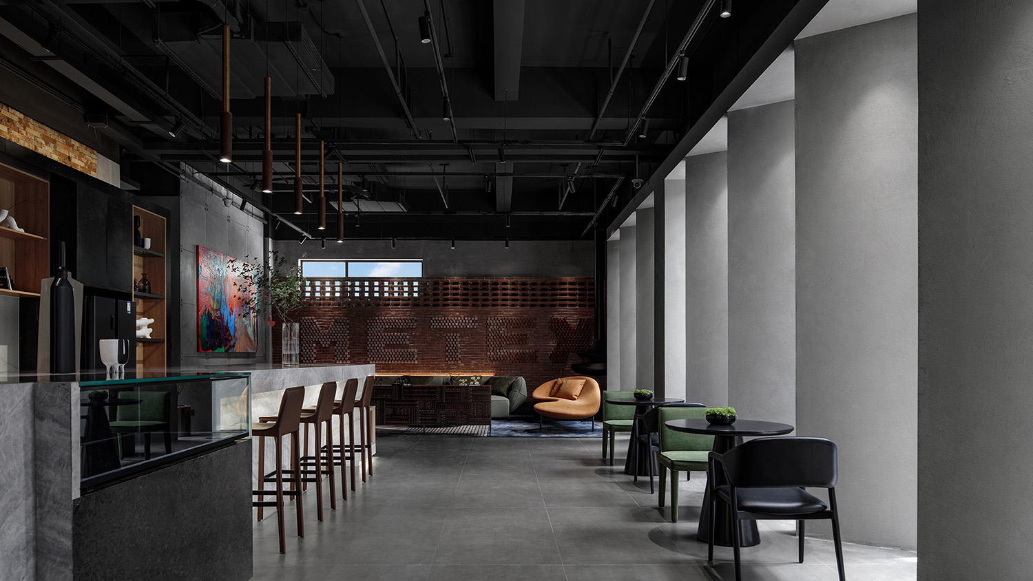
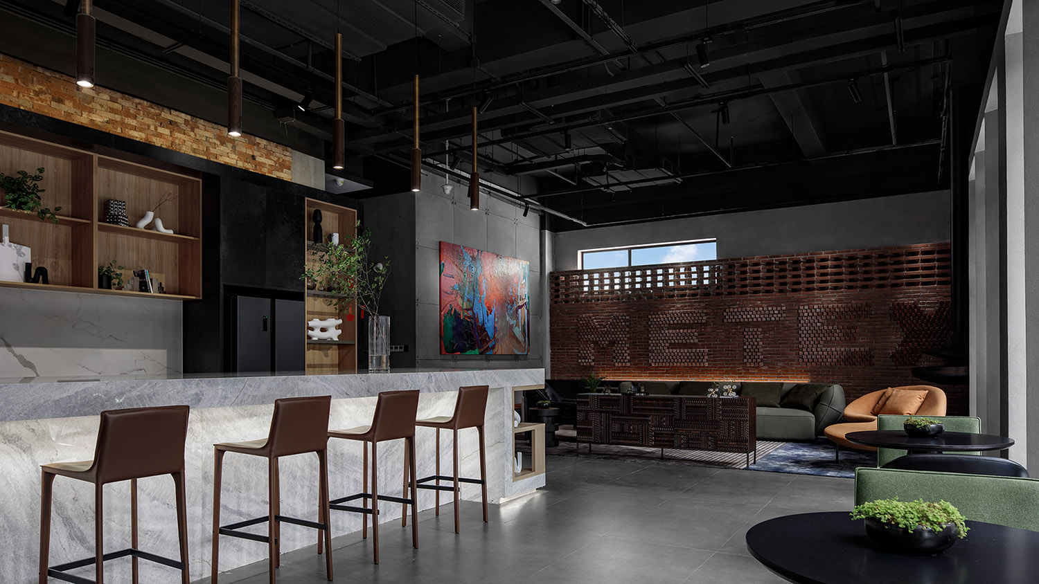
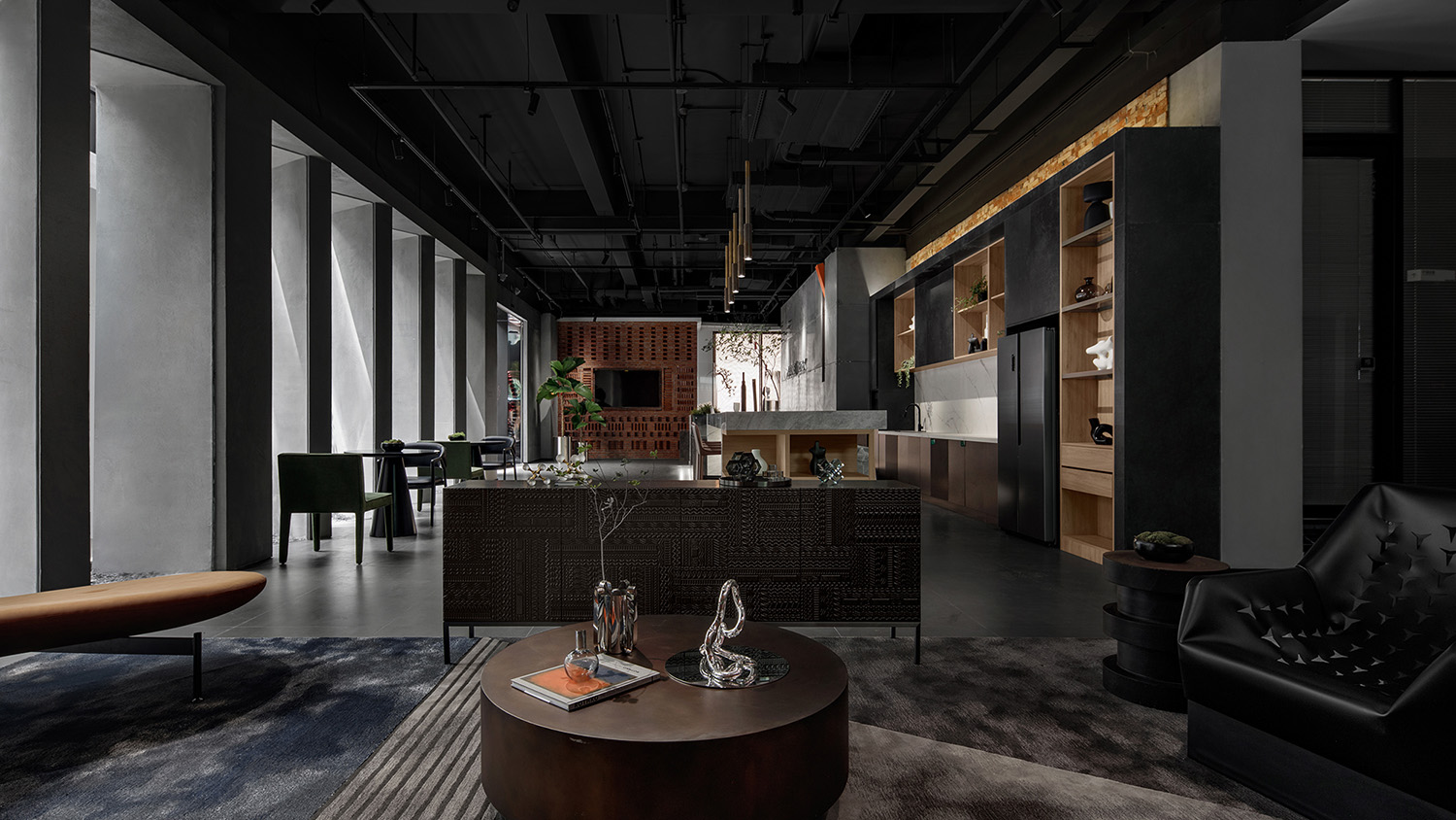
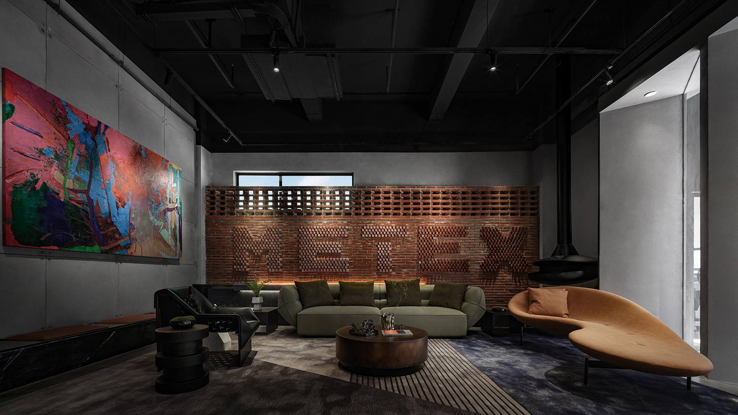
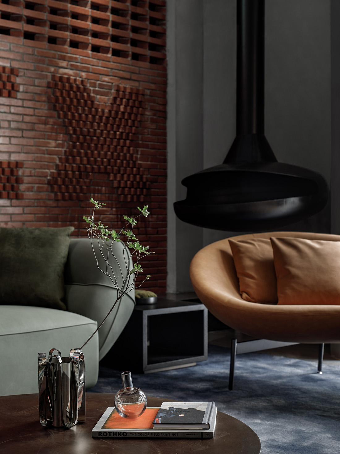
入口大堂標誌性的企業LOGO牆與造型噴霧機的一抹亮色樹立了空間的第一印象。與此同時,空間中充盈著開放感與體驗感,旁側的水吧與接待區在滿足日常接待需求的同時,也是員工在繁忙工作中得以放鬆的休憩之處。
The visitors’ first impression of the space is defined by the iconic corporate logo wall and bright-colored “fireplace” in the entrance lobby. Meanwhile, the space teems with a sense of openness and experience, with a water bar and reception area on the side that perform reception functions while serving as a place for employees to unwind.
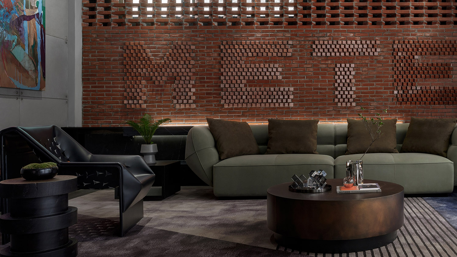
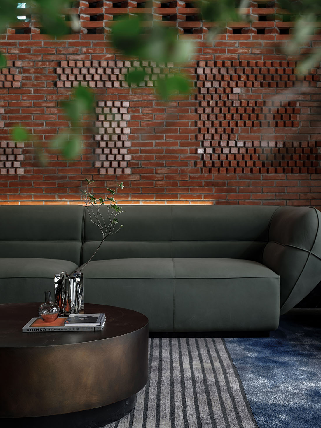
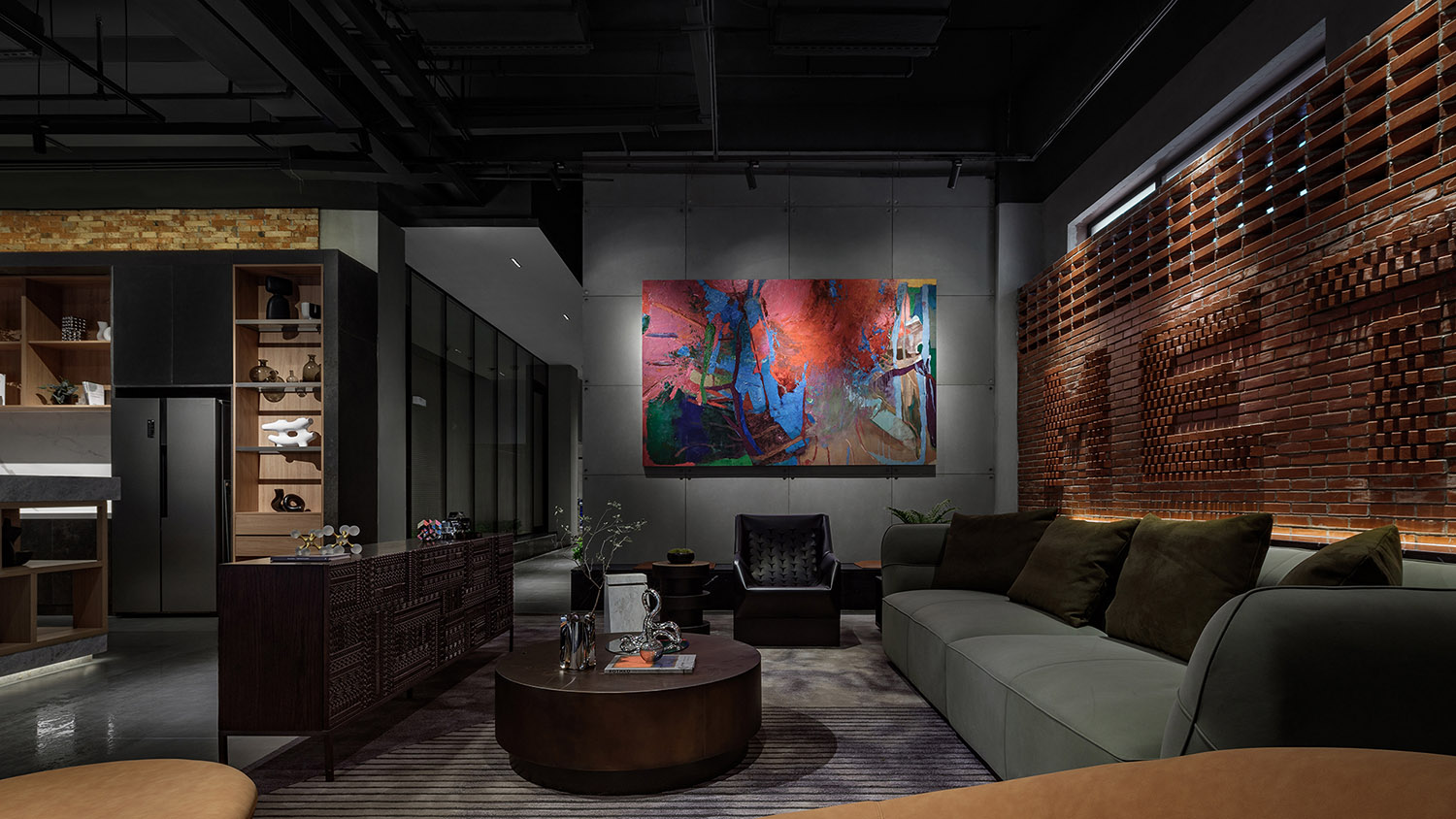
在整體的灰黑色調中,設計巧妙的引入一麵由紅磚砌築的品牌LOGO牆,為空間融入年輕摩登的氣息。
A brand logo wall made of red bricks is subtly set in the dark-toned space, to infuse a youthful and modern vibe into the interior.
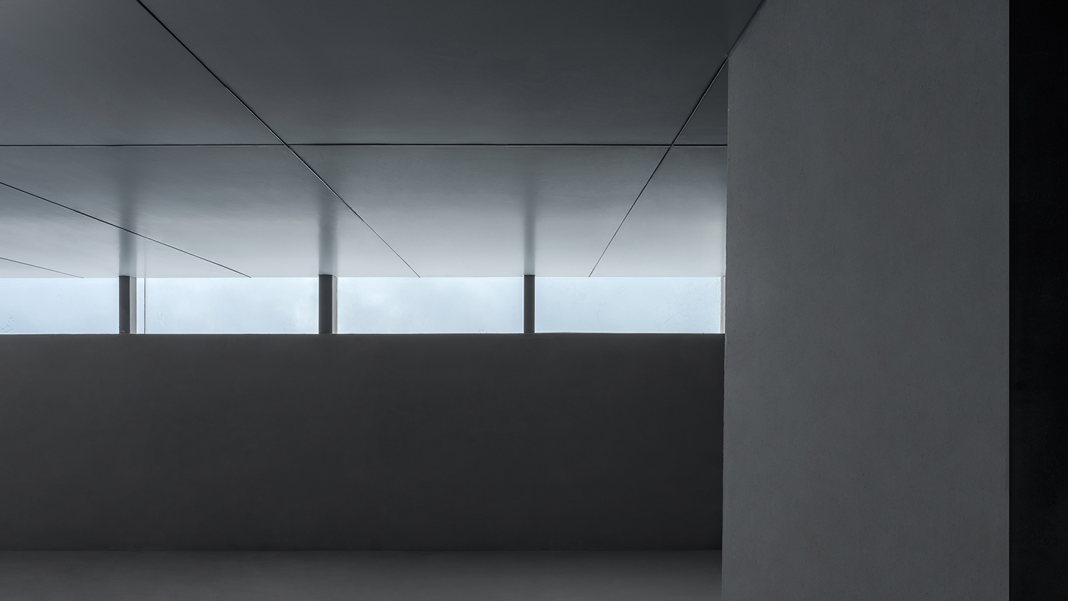
另一側富有節奏感的牆體結合采光窗,為空間引入光線的同時,也構建了獨特的秩序感。
The rhythmic wall on the other side is installed with windows to bring light into the space and create a unique sense of order.
∇ 一層平麵軸測圖 © 超級番茄
Axonometric diagram (1F) © Super Tomato
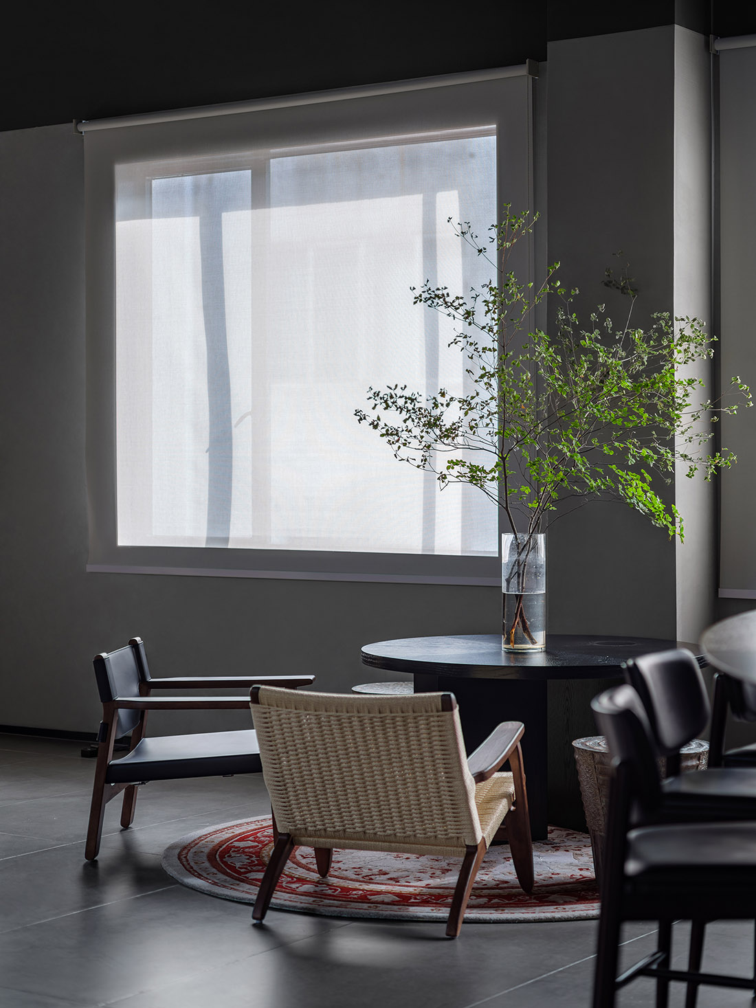
在整體灰暗的色調中,窗外的自然光與室內燈光互相配合,呈現空間的細節質感。接待區構建了親密舒適的交流場景,鮮豔的藝術畫與橙色沙發的選擇,形成視覺焦點,讓氛圍更為輕鬆。
The overall space is dominated by gray and dark tones. Natural light from the outside and the interior lighting complement each other, while accentuating the detailed textures of the space. The reception area provides an intimate and comfortable communication setting. The colorful artistic painting and the orange sofa create a visual focus, and produce a more relaxing spatial atmosphere.
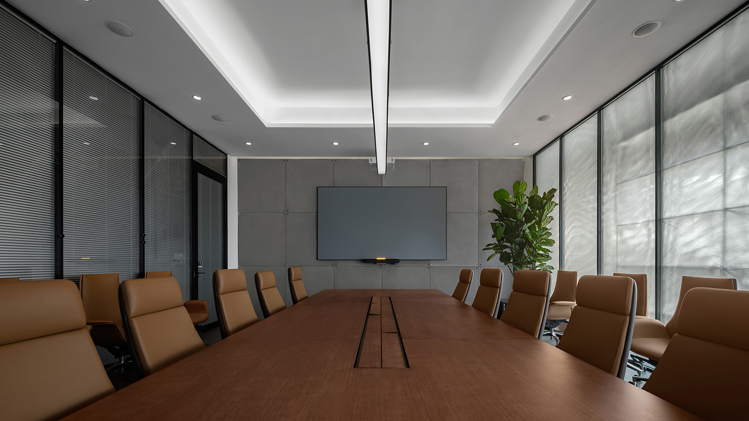
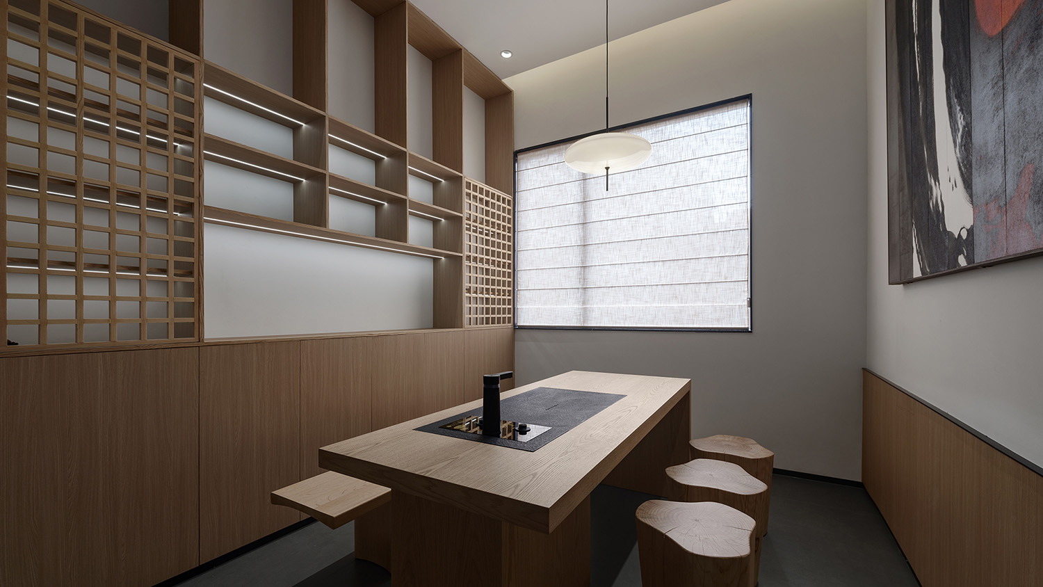
對於不同的功能空間,設計也采用了差異化的風格呈現,在會議室與更為私密的接待茶室中,明亮利落的空間更能聚焦思緒,投入探討與交流。
The project adopts a differentiated style for varied functional spaces. In the meeting room and the more private reception tea room, the bright and neat space makes it possible to concentrate users’ thoughts to engage in discussion and communication.
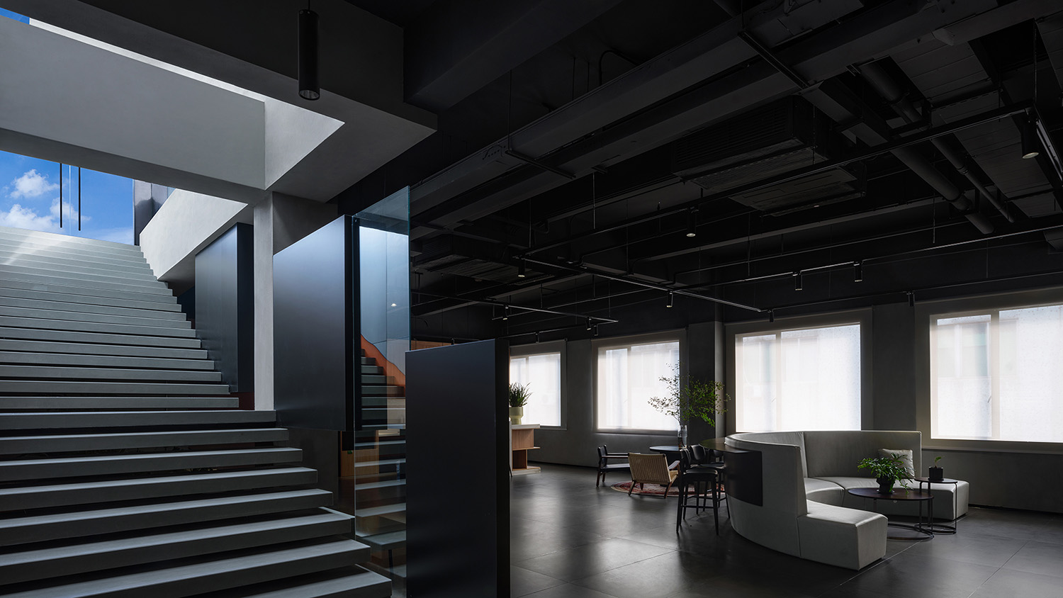
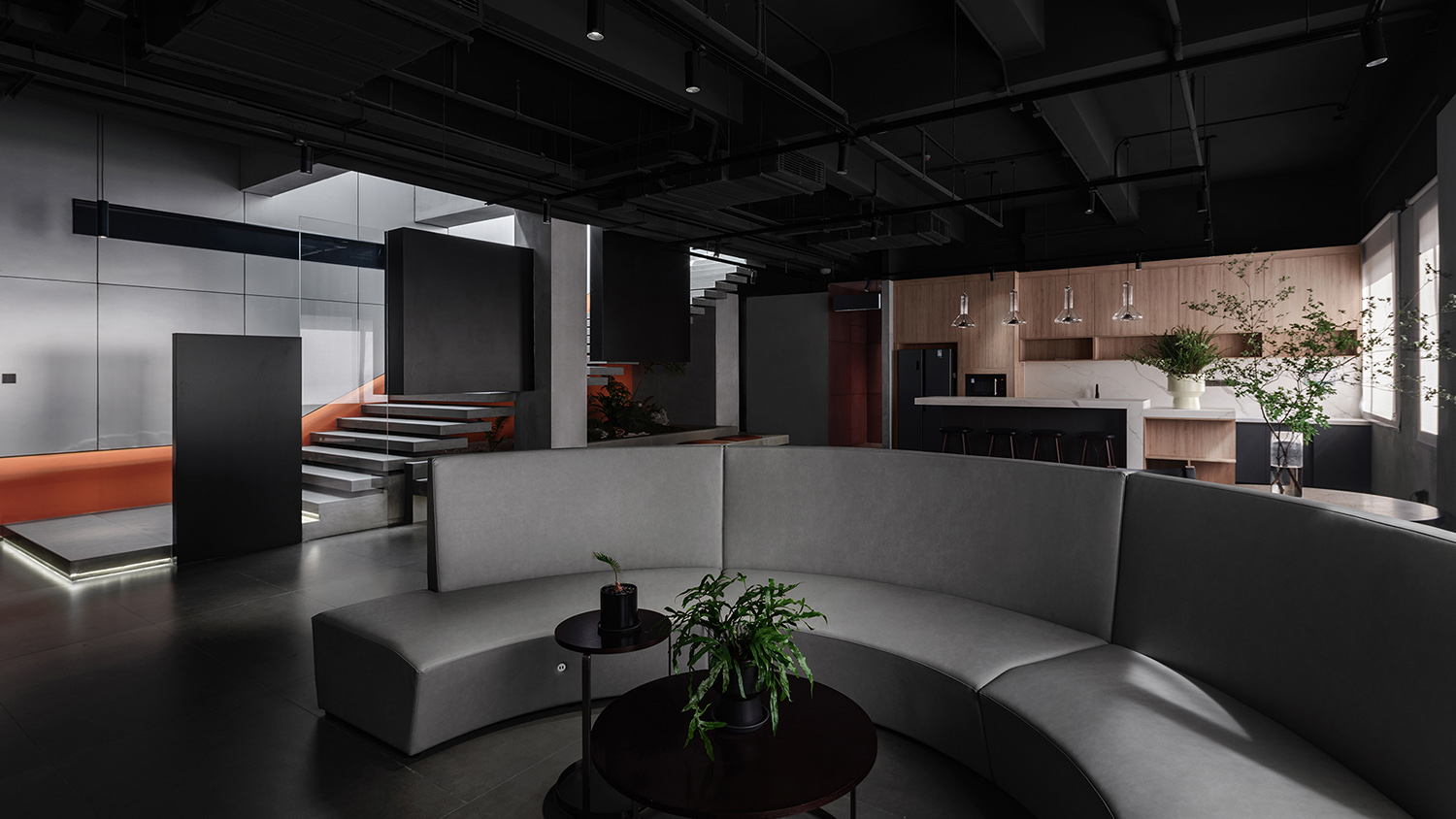
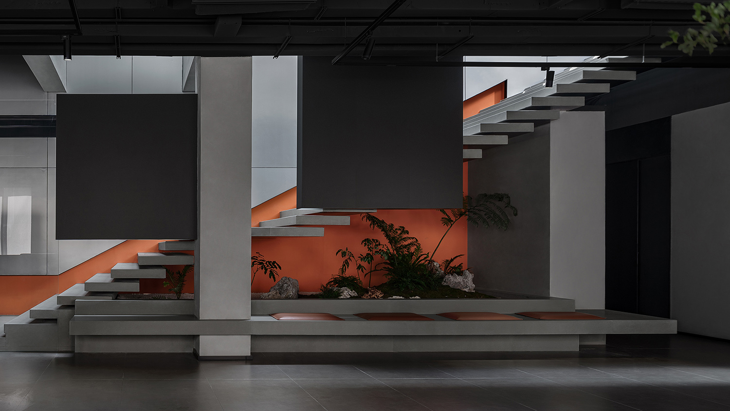
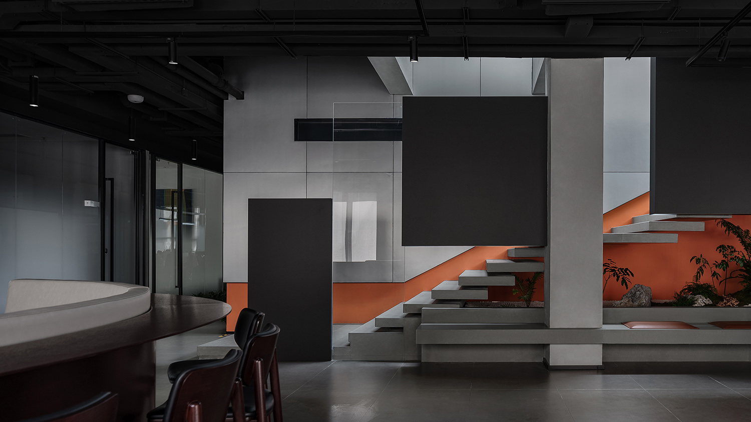
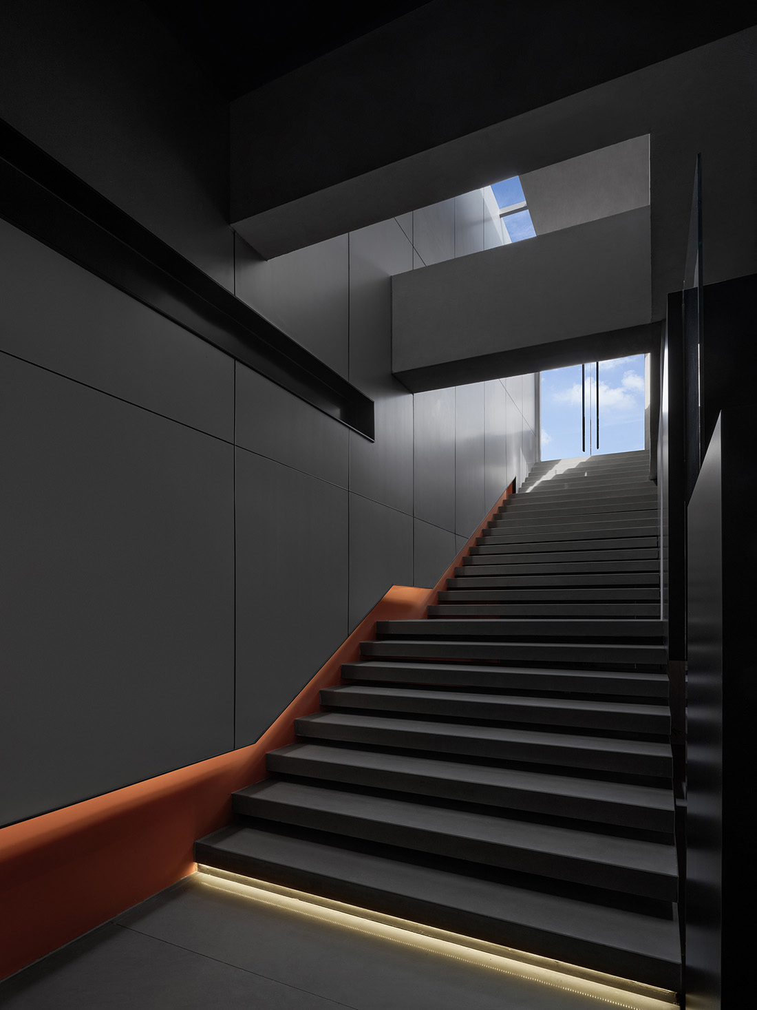
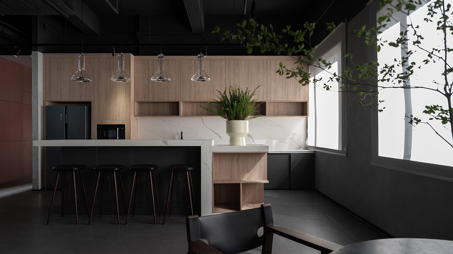
相比一層大堂公區,位於四層的公區更多用於企業內部使用,設計在延續主色調的同時,將空間的亮點聚焦於通往天台的樓梯上。
Different from the lobby on the first floor, the public area on the fourth floor is used more for in-house purposes. Its design extends the gray and black tones while highlighting the staircase leading to the terrace.
∇ 四層平麵軸測圖 © 超級番茄
Axonometric diagram (4F) © Super Tomato
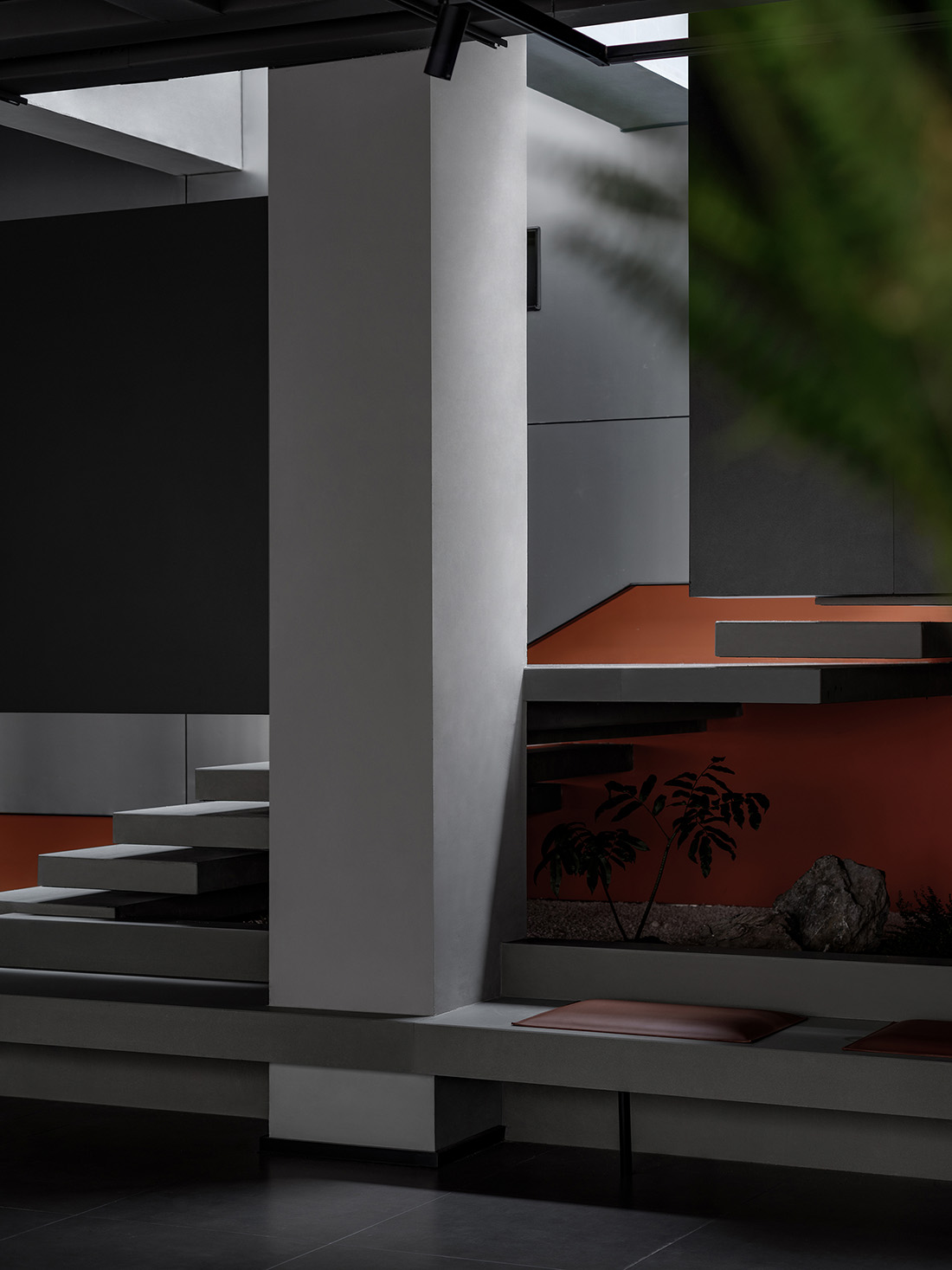
層層交疊的體塊讓樓梯輕盈跳躍,在灰黑色調中,代表品牌的亮橙色借由天窗光線的照射,更顯活力亮眼。
Formed by overlapping blocks, the staircase appears lightweight and dynamic. A bright orange that represents the brand, stands out in the dark-toned space and appears even more vibrant under the natural light brought in by the skylights.
而在另一角度,層層交疊的樓梯踏步與造型扶手又如庫布裏克經典電影《2001太空漫遊》中的黑石碑,傳遞著精密、探索與啟迪的意向。
From another angle, the overlapping steps and handrails remind of the black stone monolith in Stanley Kubrick’s classic film 2001: A Space Odyssey, conveying ideas of precision, exploration and enlightenment.
代表思摩爾產品的創新科技、高品質與精密構造,傳達對員工的細致關懷。超級番茄以思摩爾品牌理念為設計線索,打造符合其創新品質的辦公空間,簡約利落的形式與複合的功能相結合,成為思摩爾品牌精神的空間化呈現。
The spatial design communicates the technological innovation, high quality and precision of SMOORE’s products, and the company’s humanistic care for employees. Super Tomato takes SMOORE’s brand concept as a clue for creating an office that showcases its innovative character. Simple forms are combined with diverse functions, which convey SMOORE’s brand spirit through spatial expressions.
∇ 一層平麵圖 © 超級番茄 1F plan © Super Tomato
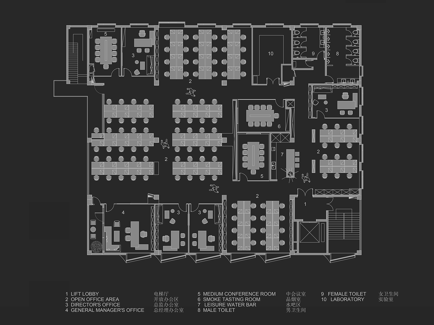
∇ 二層平麵圖 © 超級番茄 2F plan © Super Tomato
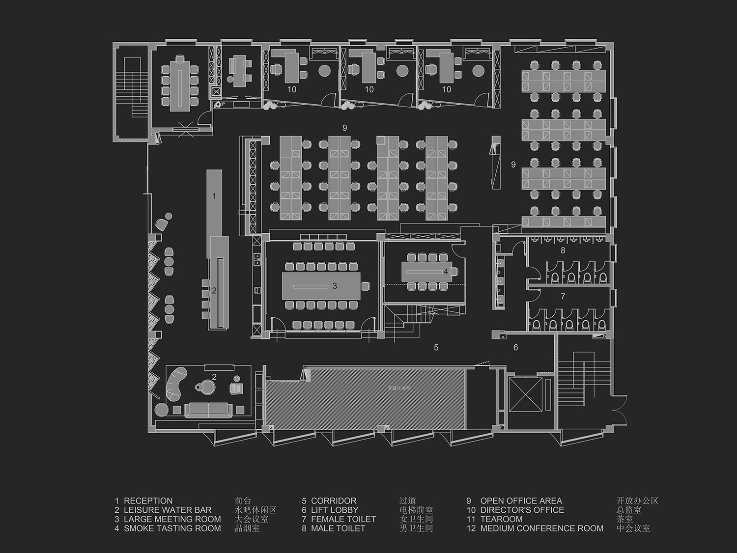
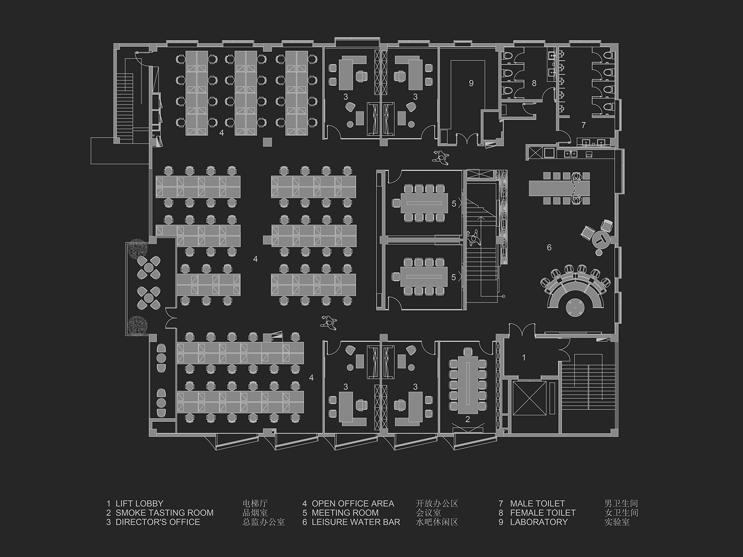
∇ 四層平麵圖 © 超級番茄 4F plan © Super Tomato
項目信息
項目名稱:東財工業區8號樓
業主單位:思摩爾國際(SMOORE)
項目地點:廣東省深圳市寶安區寶安大道東財工業區8號樓
項目類型:辦公室
項目麵積:2520㎡
設計範圍:室內設計
設計公司:SUPER TOMATO超級番茄
建築設計:深圳對角線建築設計有限公司
深化設計:番茄加設計(深圳)有限公司
施工單位:深圳三圖建設集團有限公司
項目攝影:羅湘林
主要材料:美岩水泥板、紅磚、摩登灰石材、灰色藝術塗料
Project name: Building 8, Dongcai Industrial Zone
Client: SMOORE
Location: Building 8, Bao’an Avenue, Dongcai Industrial Zone, Bao’an District, Shenzhen, Guangdong
Category: office
Area: 2,520 sqm
Design scope: interior design
Design firm: SUPER TOMATO
Architectural design: Shenzhen Diagonal Architectural Design Co., Ltd.
Design development: Tomato Plus Design (Shenzhen) Co., Ltd.
Construction firm: Santu Group
Photography: Luo Xianglin
Main materials: cement board, red brick, gray stone, gray paint


