南枝憑昨記,回味舊粵香
Memories of South Branch Sign, Savoring the Old Cantonese Fragrance
味道甚至是難於記憶的,隻有你又聞到它你才能記起它的全部情感和意蘊。——史鐵生
Even the taste can be challenging to remember, but once you smell it again, you can recall all its emotions and significance.——Shi Tiesheng
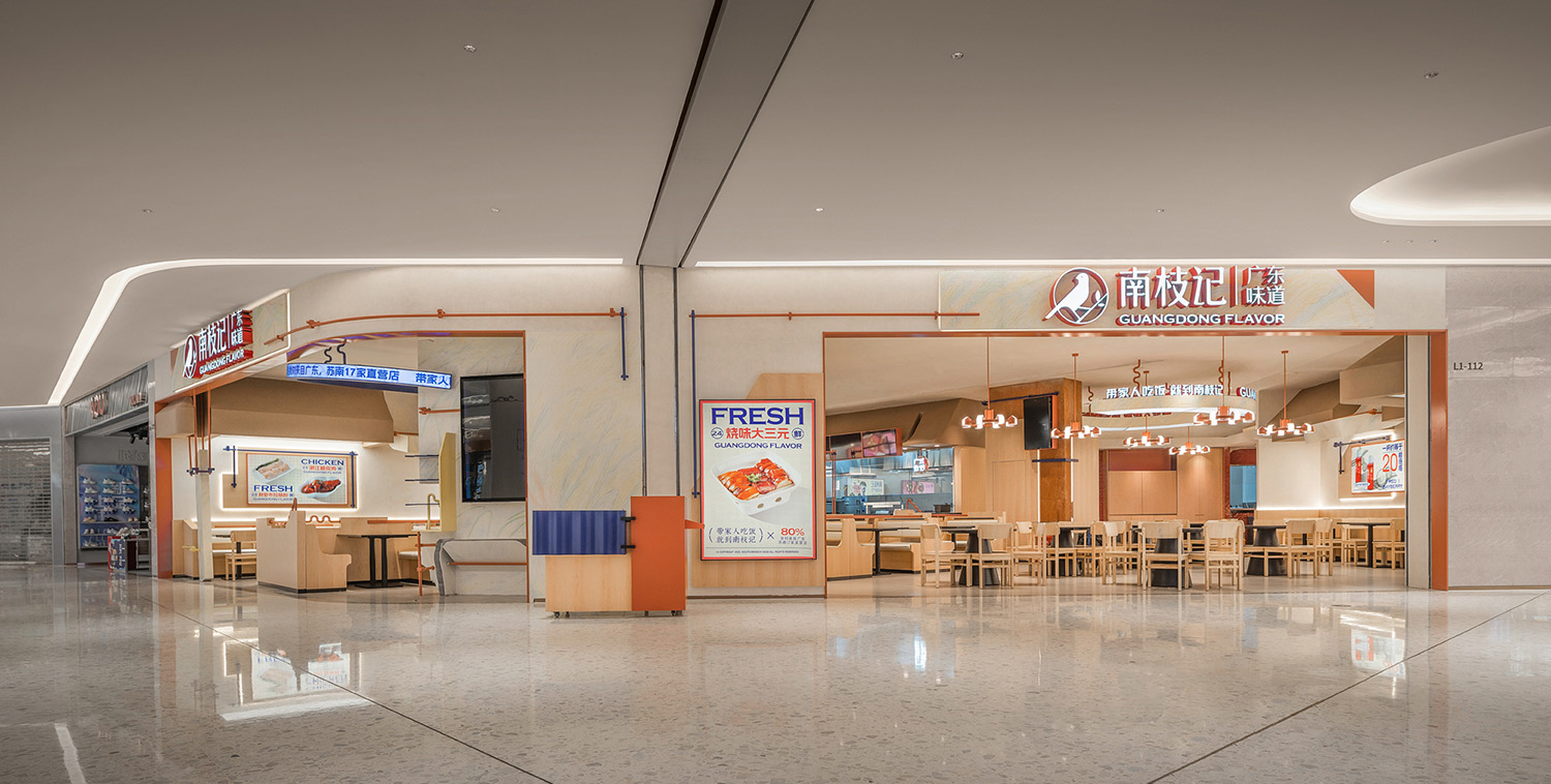
近十年間,廣東味以其飲食風味和餐飲文化在內地的大街小巷遍地開花,大有百花齊放的繁華態勢。與一般快餐速食不同,南枝記作為新派廣式餐廳在傳承之餘也在以變換姿態,展現出在地性與現代性,用實力成為港餐的代表之一。本案落址於江蘇常熟的“城市會客廳”——溪裏花園,以烹炒鑊氣與和美氛圍為遠近居民提供了一個聚餐好去處。
Over the past decade, Guang Dong-style cuisine has flourished the Chinese mainland, with its culinary flavors and dining culture blooming in streets and alleys. Unlike typical fast food, South Branch Sign, as a contemporary Guang Dong-style restaurant, not only inherits tradition but also demonstrates its locality and modernity. Located in Xilihuayuan, the “urban living room” of Changshu, Jiangsu, it offers a dining haven for local residents, blending the aromas of stir-fried dishes with a harmonious ambiance.
南枝向暖
South Branch Sign’s Warmth
以老廣東味為餐飲發心,用新裝潢演繹多樣食味,常熟南枝記通過對顏色、質感與形態的把控,將餐飲區域營造出家庭之味,讓“帶家人吃飯,就到南枝記”超越語言與口號,成為店中可觀可感的餐食與環境。
Inspired by the old Guang Dong flavors, South Branch Sign interprets diverse tastes through its new decoration. By controlling colors, textures, and forms, it creates a homely dining area, where the idea of “having a meal with family, go to South Branch Sign” transcends language and slogans, becoming a tangible experience of food and environment.
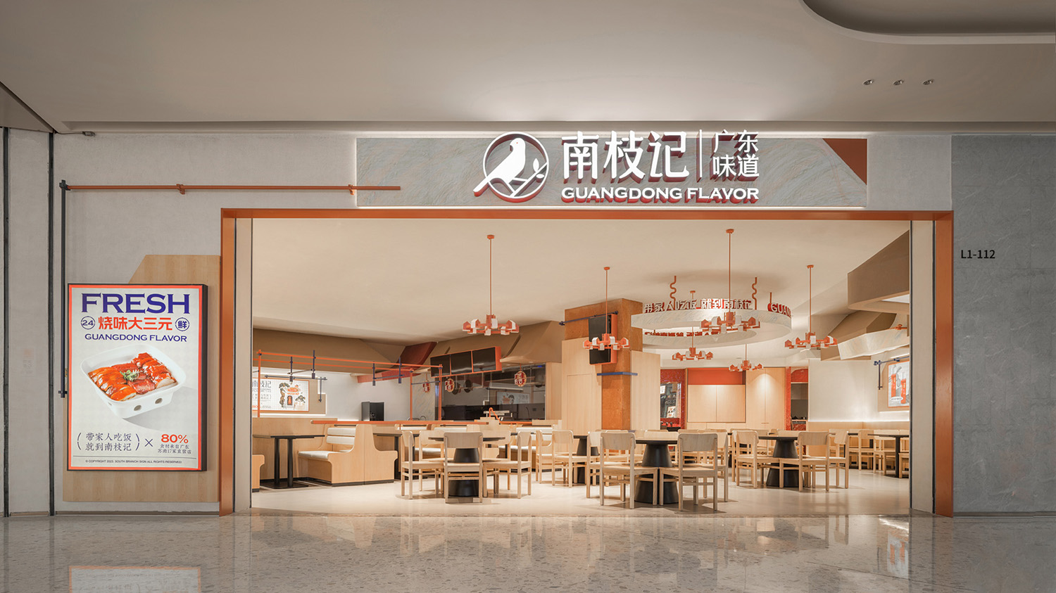
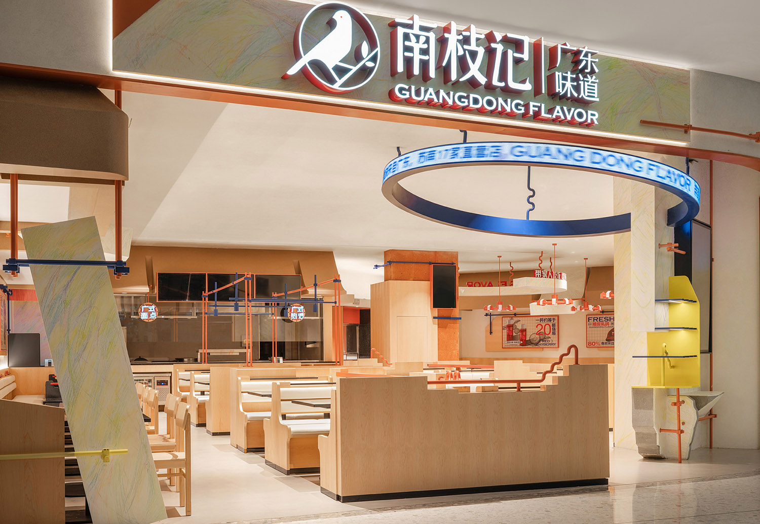
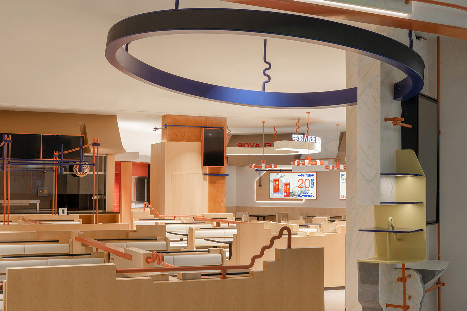
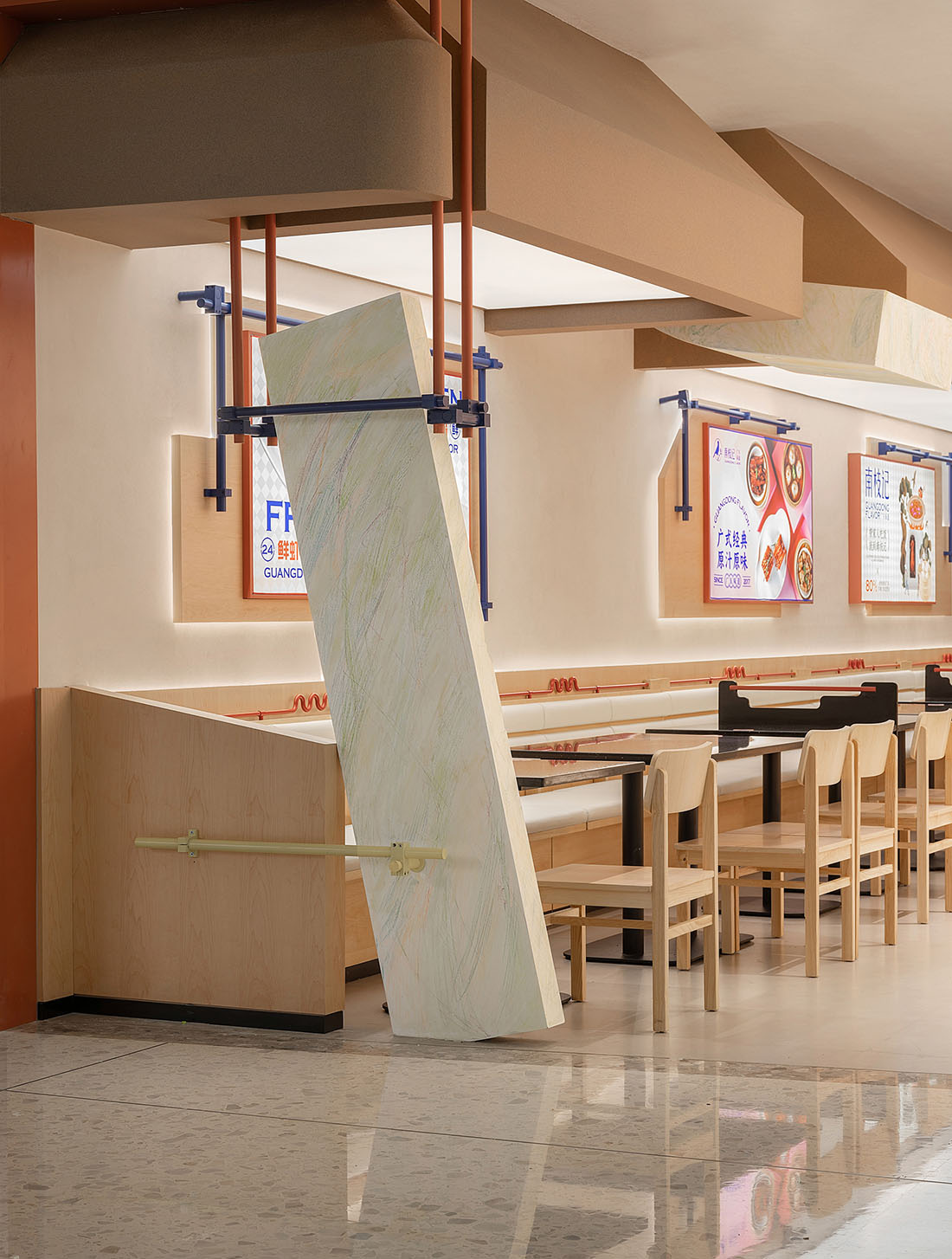
主門頭處,縱橫的彩色鋼管板材交織出工業風格,反射出柔和光澤,斜置的穿插體塊則用自由形態與柔和筆觸與色彩展現出不羈趣味。在這自由現代的氣息中,LOGO襯於童真筆觸的淺淡顏色之上,與木飾卡座交映,溫潤而又質樸的觀感就此形成。懸置半空的圓環顯示器既增加了空間的動感趣味,也成為品牌文化與店麵營銷的重要輸出平台。
At the main entrance, colorful steel plates intersect to form an industrial style with soft luster. Intersecting and slanted elements convey a sense of playfulness with a free-spirited touch of color. In this modern and free atmosphere, the logo stands against a pale color background with a childlike touch, harmonizing with wooden decorations to create a warm and simple atmosphere. The suspended circular monitor not only adds dynamism to the space but also serves as an important platform for brand culture and storefront marketing.
舊時記憶
Old memories
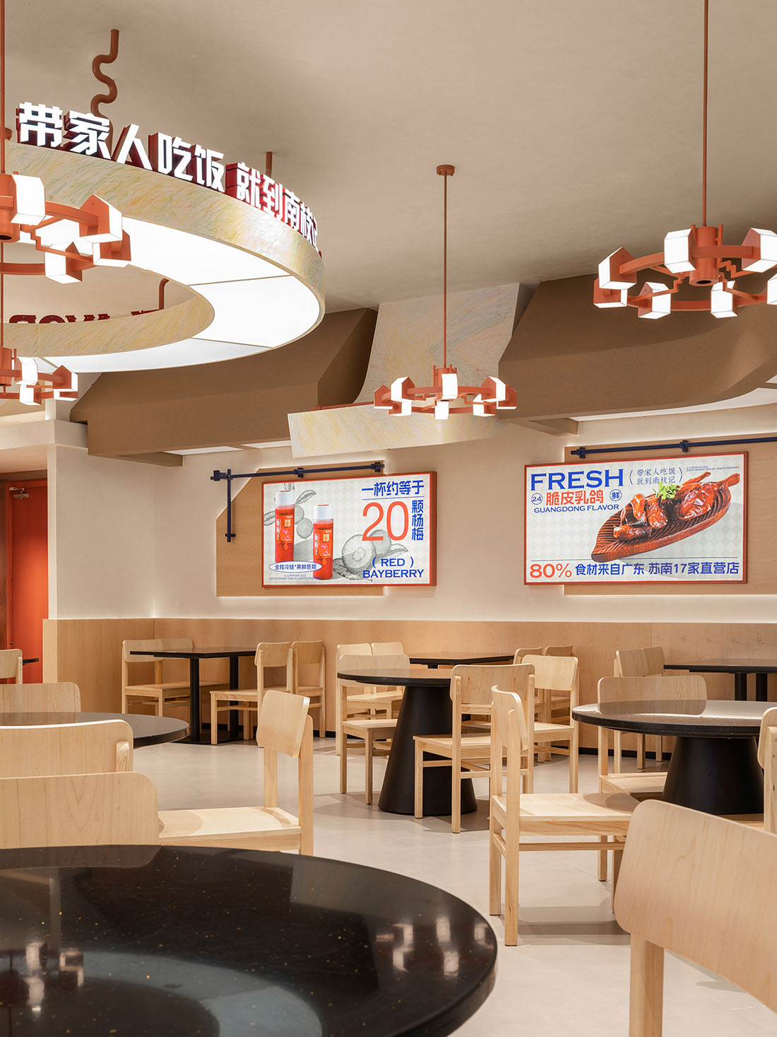
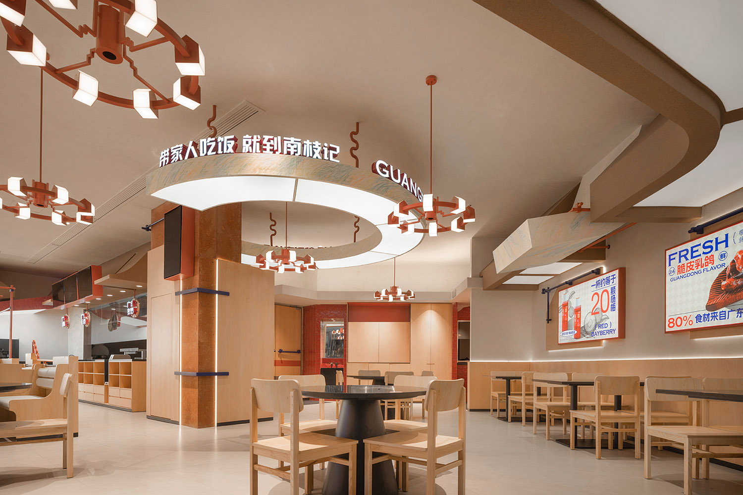
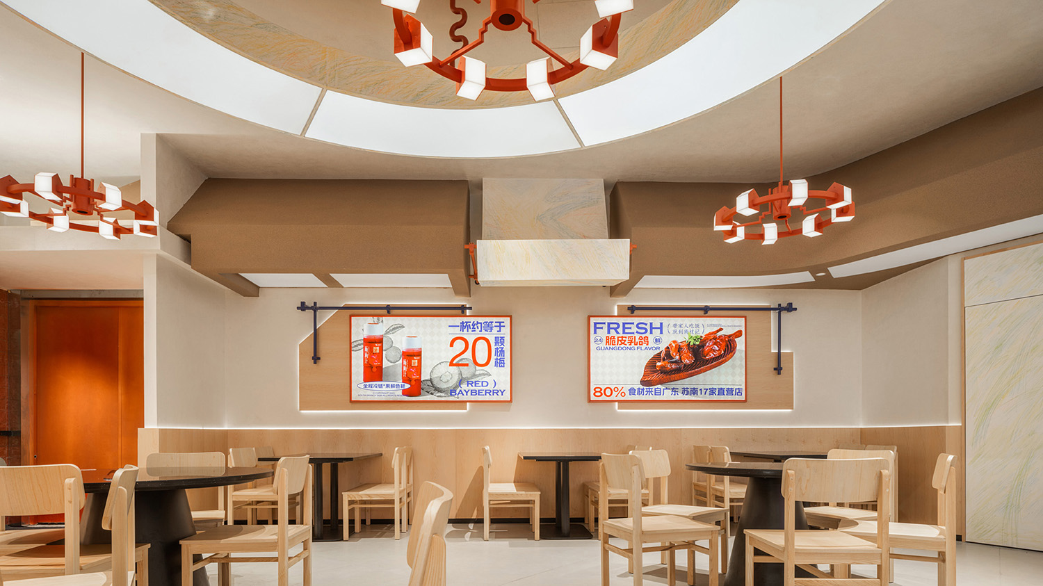
步入店內,四周淺色原木遍布各處,成為家庭溫馨的物質載體,讓往來食客都可感受到安然氣息。體塊天花與金屬裝飾杆靠牆而設,與產品宣傳共同營造出舊時廣東茶檔風格,置身其中,宛如回到了舊時街頭。
Upon entering the restaurant, light-colored wooden materials are spread throughout, creating a warm and welcoming atmosphere. Rectangular ceilings and metal decorative rods against the walls, together with product displays, evoke the style of old Guang Dong tea stalls, transporting diners back in time.
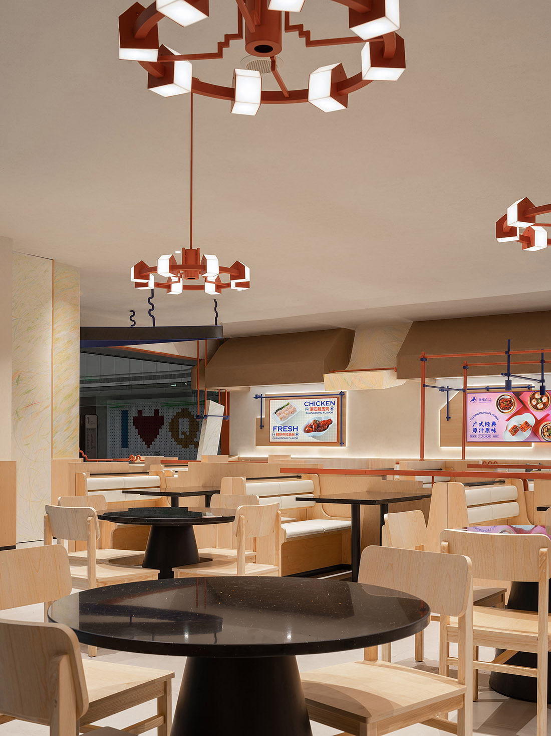
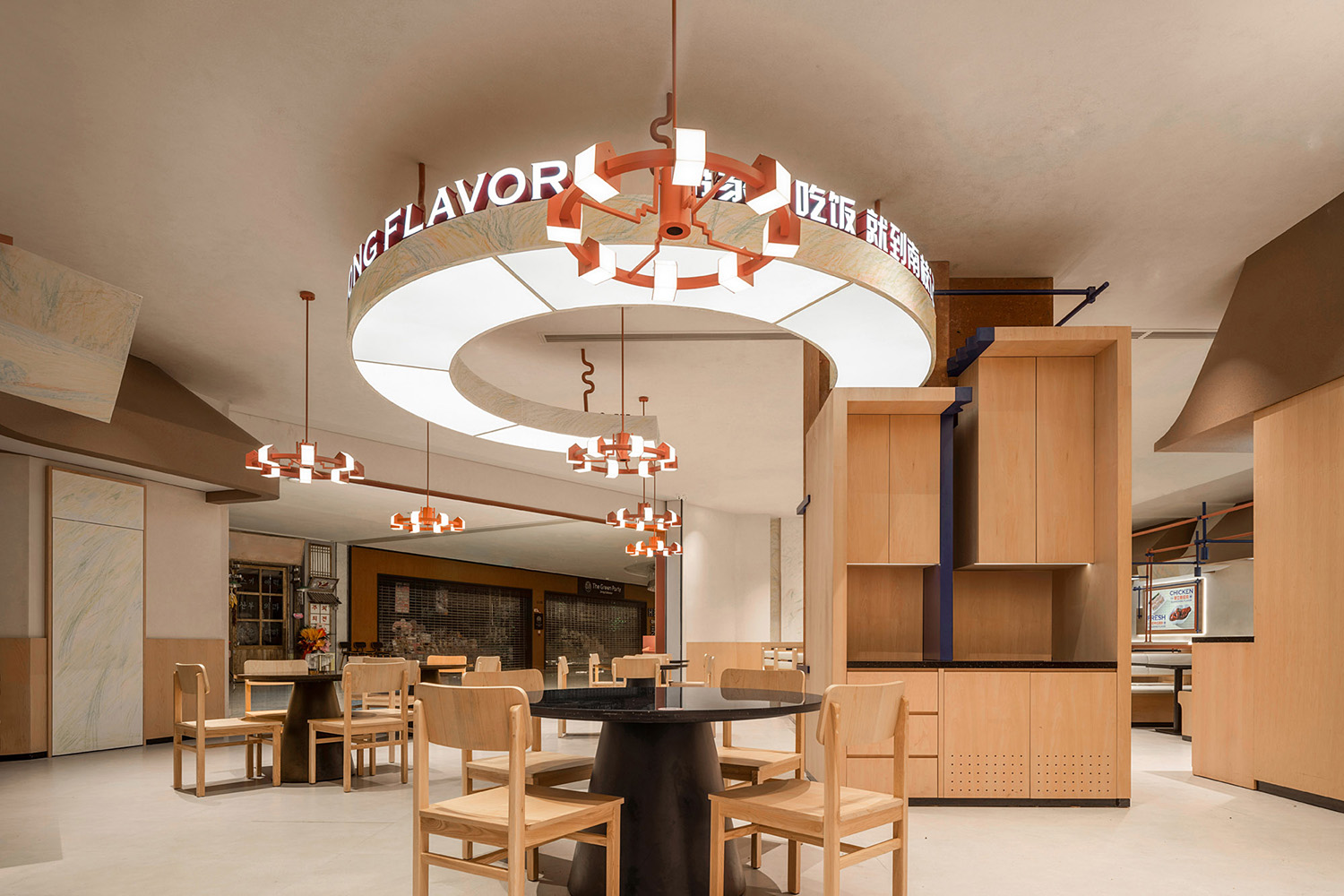
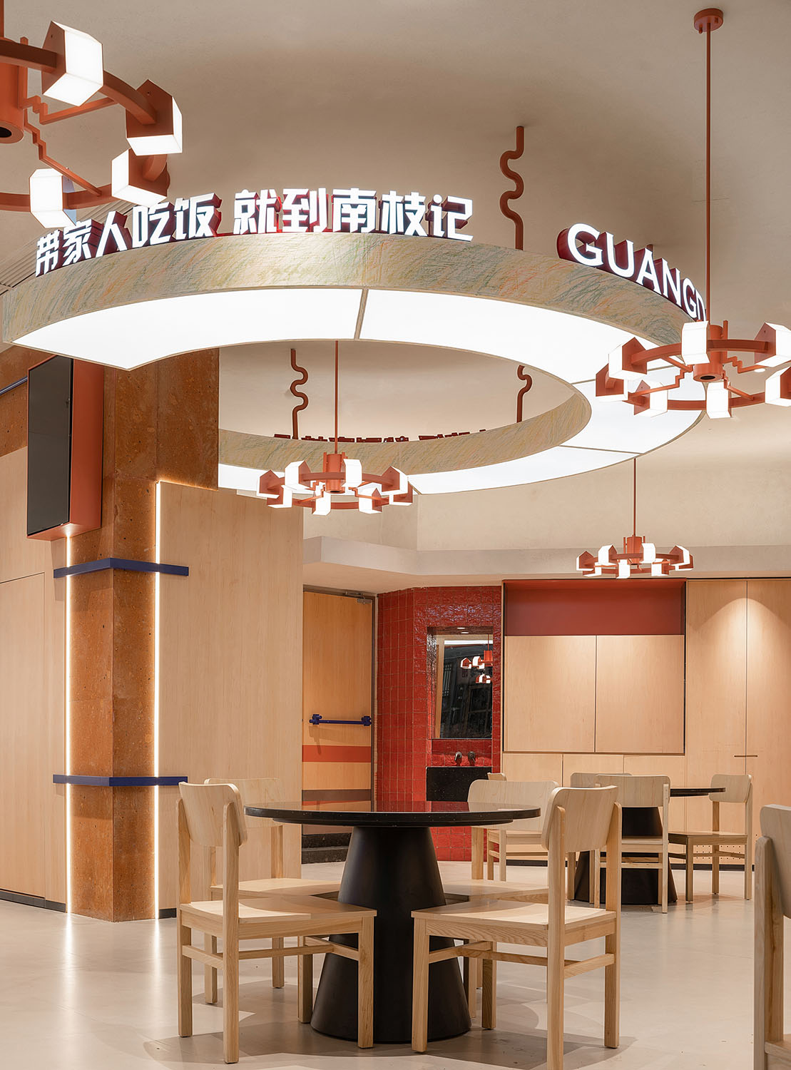
卡座與散座分設兩邊,以木質與大理石的組合一以貫之,從而構建出空間的變中有序。圓桌散座更是以倒椎桌形,增添更多活潑之氣。在方圓座位之上,環形吊燈狀似屋形積木串聯而成,與橫梁立柱的彩色塗鴉交相輝映,天真與自由、童趣與爛漫於細枝末節盡情展露。
The restaurant is divided into booth and free seating areas, with consistent use of wood and marble to maintain orderly spatial variations. Round tables adopt inverted trapezoidal shapes to add a lively atmosphere. Above the seating areas, circular pendant lights resemble house-shaped building blocks, and they complement the colorful graffiti on the beams and columns, expressing innocence, freedom, playfulness, and romance in every detail.
行至深處,出餐檔口以紅色鐵藝聚焦視覺中心,輔以木質格柵櫃展示產品特色,與背後的透明玻璃窗共同構築出潔淨而整飭的店麵風格,擴展空間的同時,為食客帶來信賴與安心。
As you move further inside, the kitchen counter at the serving area takes center stage with its red ironwork, and wooden lattice cabinets display product characteristics. Together with the transparent glass windows behind, they create a clean and orderly storefront style, expanding the space and building trust and reassurance among diners.
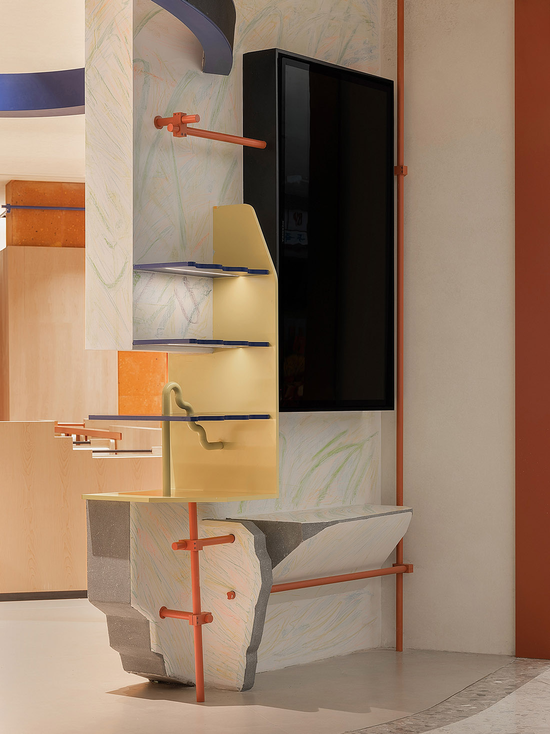
堂中立柱成為自助服務台,一麵用紅色火山岩石打造複古質感,給人以無限遐想;另一麵則用深藍鐵藝點綴高低木櫃,藉由色彩的碰撞,調和空間的沉穩與活潑。
The central pillar in the dining area becomes a self-service counter. One side is built with red volcanic rock for a retro feel, sparking endless imagination. The other side is decorated with deep blue ironwork accents on high and low wooden cabinets, balancing the space’s stability and liveliness through color contrast.
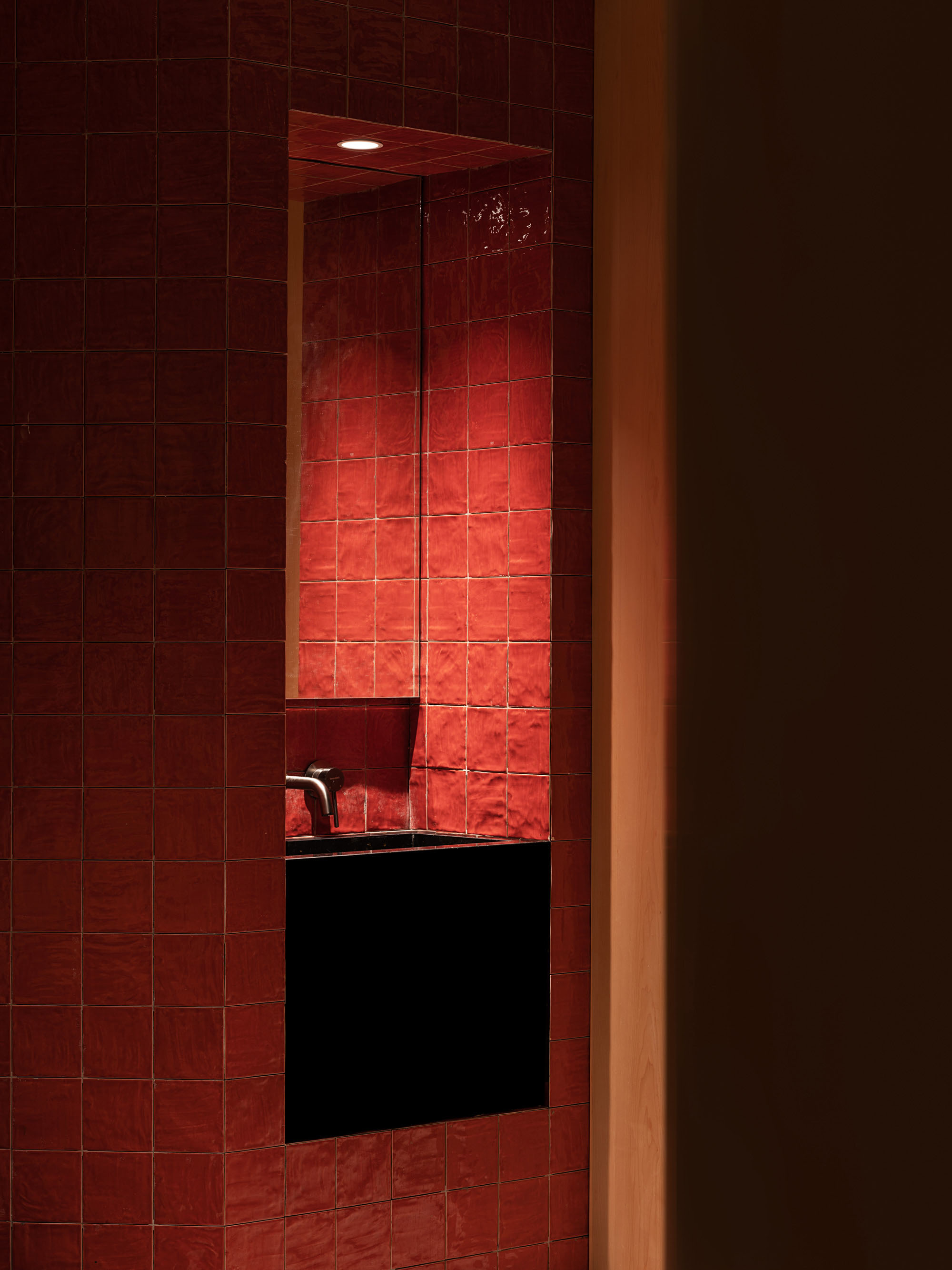
轉角洗手台以內嵌形式成為景觀一角,以經典的紅黑配色醞釀港風格調,顯現出喧囂之外的舊時華光。頂燈光影間,粗糲壁磚映照出別樣質感,此間優雅就在喧囂與水聲中落下,與周圍的年輕活力共舞出時刻變換的店中風景。
Corner washbasins are embedded as a scenic corner, featuring classic red and black colors to evoke a nostalgic Hong Kong style, offering a glimpse of the old-time charm amid the hustle and bustle. Amidst the interplay of overhead lights and textured rough wall bricks, elegance unfolds within the bustling atmosphere, dancing with the surrounding youthful energy in this ever-changing restaurant scene.
歲月積澱底蘊,也帶來更迭與成長,就如同現在的南枝記,一步一步,走向明確的清晰,以及越來越完整的成熟,這與一個家的建立過程如出一轍。設計師從簡單處著筆,以童真的簡單浪漫描摹南枝記的“初心”,無論是餐食還是氛圍,屬於“家”的安然質樸於動靜張弛間緩緩透露,讓品牌理想與食客體驗在和諧溫馨的環境中共生共榮。
Years of accumulation bring depth and growth, much like South Branch Sign today. Step by step, it becomes clear and increasingly mature, mirroring the process of building a home. The designers begin with simplicity, capturing the “original intention” of South Branch Sign in its purest form. Whether in food or ambiance, the tranquility and simplicity of “home” gently reveal themselves amid the ebb and flow, allowing brand ideals and diner experiences to thrive in a harmonious and cozy environment.
項目信息
項目名稱:南枝記
Project Name: South Branch Sign
項目地址:常熟蛇口招商琴湖花園店
Location: Changshu, China
設計單位:無錫歐陽跳建築設計有限公司
Design Company: OYTT Design
主案設計師:歐陽跳、蔣越
Chief Designer: Tiao Ouyang,Yue Jiang
落地主案設計師:周丹鳳
Landing Designer: Danfeng Zhou
項目麵積:285㎡
Area: 285 square meters
製造:無錫莫川裝飾、郅飛展櫃
Manufacturer: Wuxi Mochuan Decoration, Zhifei Exhibition Cabinet
燈光:無錫米未照明
Lighting: Wuxi Miwei Lighting
主要材料:大理石、不鏽鋼、防火板、藝術漆、定製磚
Main materials: marble, stainless steel, fireproof board, artistic paint, customized bricks
材料品牌:臻藏時光、墨墨瓷磚
Material Brand: Zhencang Time, MOMO Ceramic Tile
項目攝影/視頻:馬利仁
Photographer/Video: Liren Ma


