先鋒的和諧主義 懷有熱愛的鋒芒
以和諧的姿態與世界相處
——AVVENN
Pioneer Harmonism With a passionate edge,
Engaging the world in harmony.
——AVVENN
在城市宏大的敘述框架中,個體的表達時常隱匿著細膩的情感。上海,除了名勝建築與繁華街區,更有著不斷更新的新潮和活力,持續豐富著城市的文化底蘊和內在肌理。
Within the grand narrative framework of the city, the individual expression often conceals delicate emotions. Shanghai, beyond its famous buildings and bustling districts, possesses an ever-evolving trendiness and vitality, continuously enriching the city’s cultural depth and internal texture.
AVVENN,多元設計師品牌,2021年創立於上海。擅長將藝術美感與先鋒意識結合投射在服裝設計中,以去繁就簡的方式傳遞著自洽而舒適的狀態。
全新線下門店回歸於上海,空間作為品牌敘述的載體,TIME TO GATHER 以服飾的雛形 —— 紙樣為概念,從外觀、內裏和細節,多維度詮釋著【先鋒的和諧主義】的品牌精神。
AVVENN, a diverse designer brand, was established in Shanghai in 2021. Skilled in merging artistic aesthetics with avant-garde consciousness in clothing design, it conveys a self-consistent and comfortable state through a simplification approach.
The brand’s new physical store returns to Shanghai, where the space serves as a medium for brand narration. TIME TO GATHER, conceptualized around the prototype of clothing — the pattern paper, interprets the brand spirit of “Pioneer Harmonism” from multiple dimensions, including appearance, interior, and details.
01 形態 Form
先鋒的和諧 Pioneer Harmonism
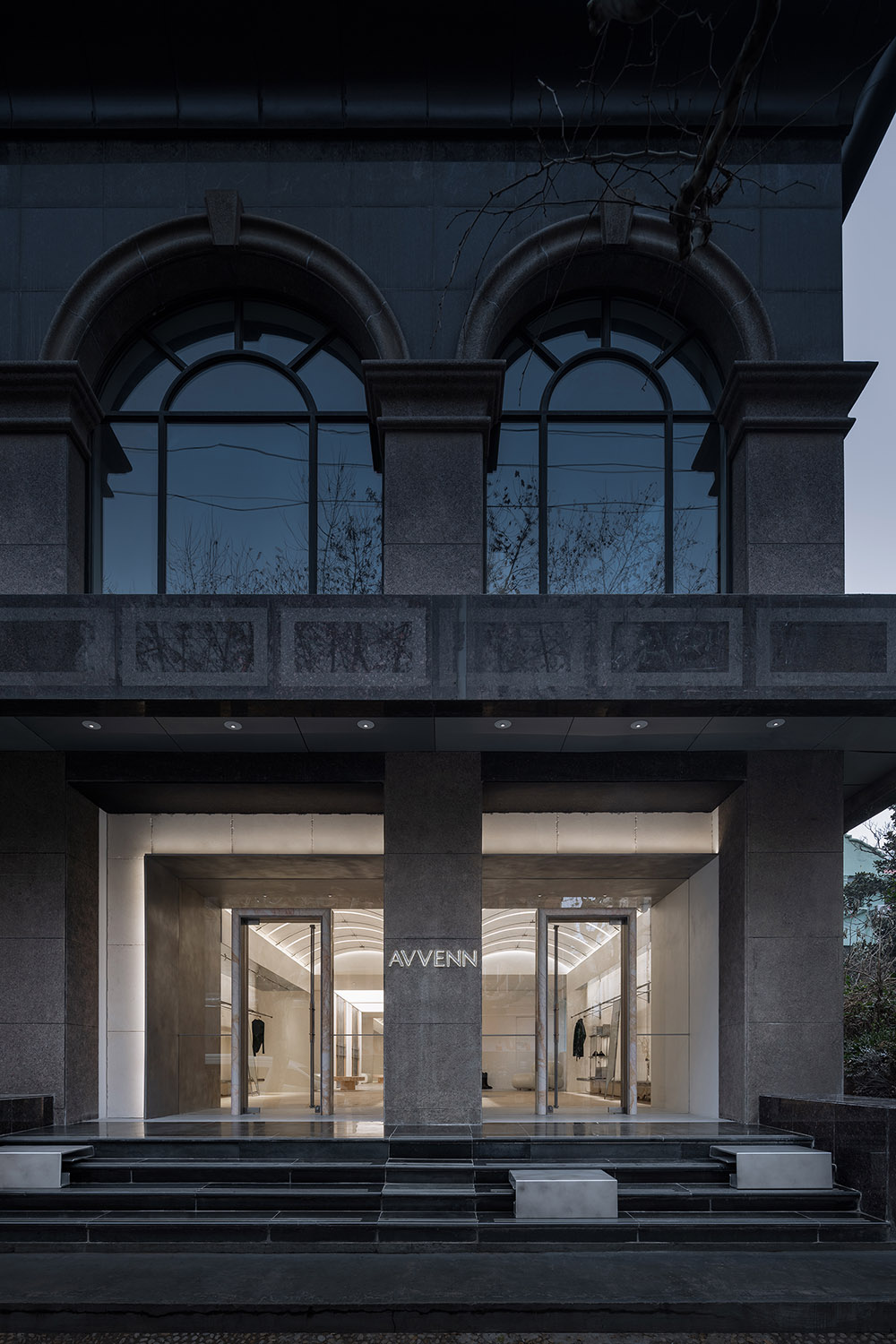
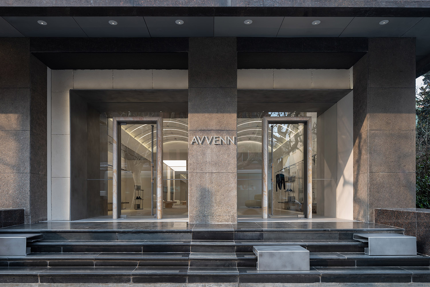
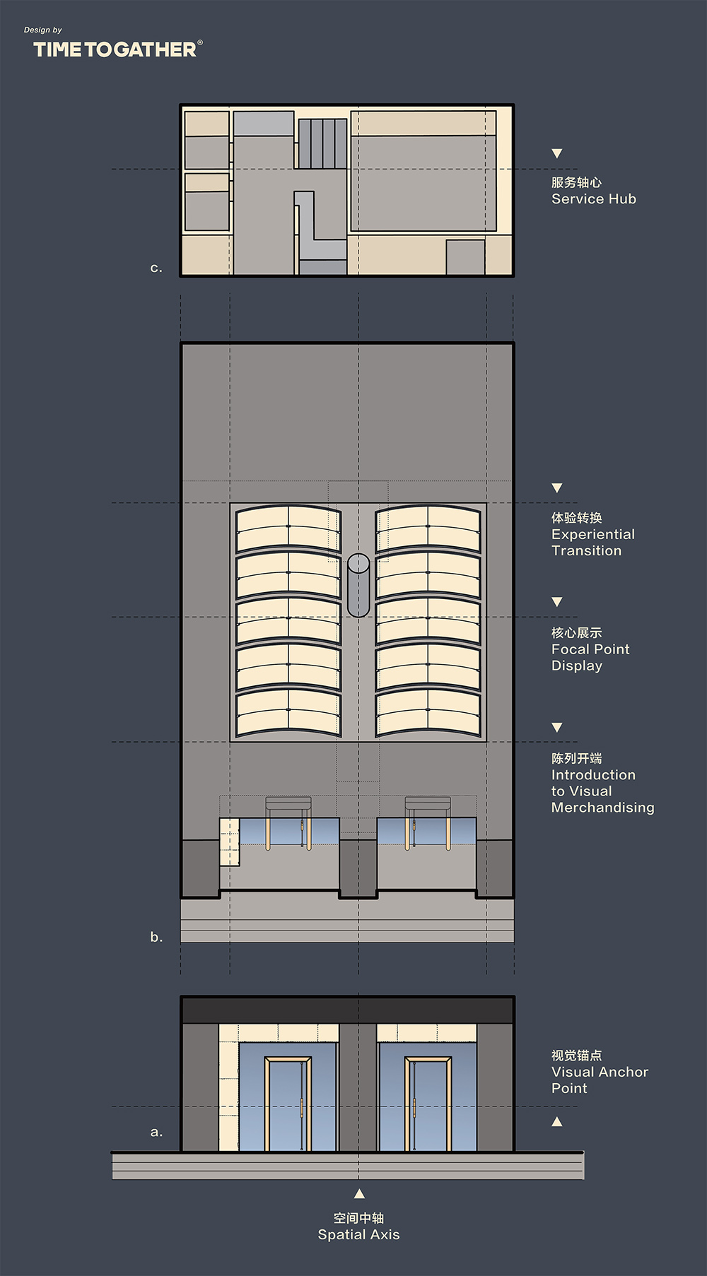
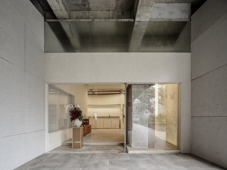
由外觀之,建築打破常規形態,以L形重新組合定義。左右兩個入口視覺對稱,以宣言般挑明品牌在“先鋒的和諧主義”的矛盾與共生、鋒利與鬆弛。
From the perspective of appearance, the architecture breaks away from conventional forms, redefining itself with an L-shape. The visually symmetrical entrances on either side boldly proclaim the brand’s stance on the contradictions and coexistence, as well as the sharpness and relaxation, inherent in “Pioneer Harmonism”.
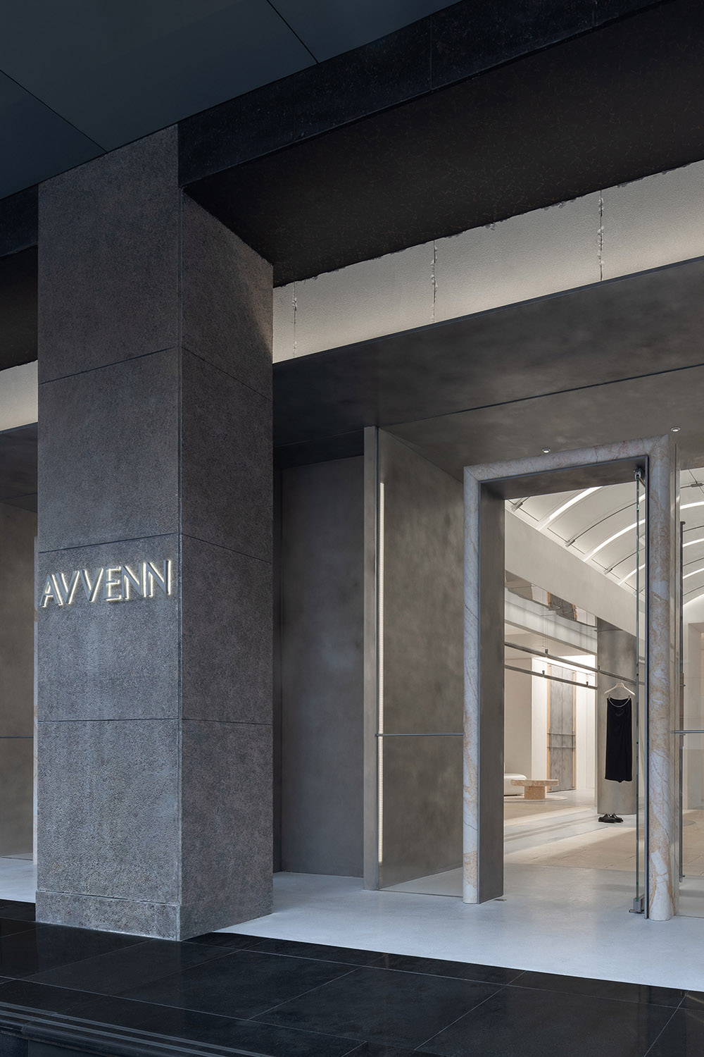
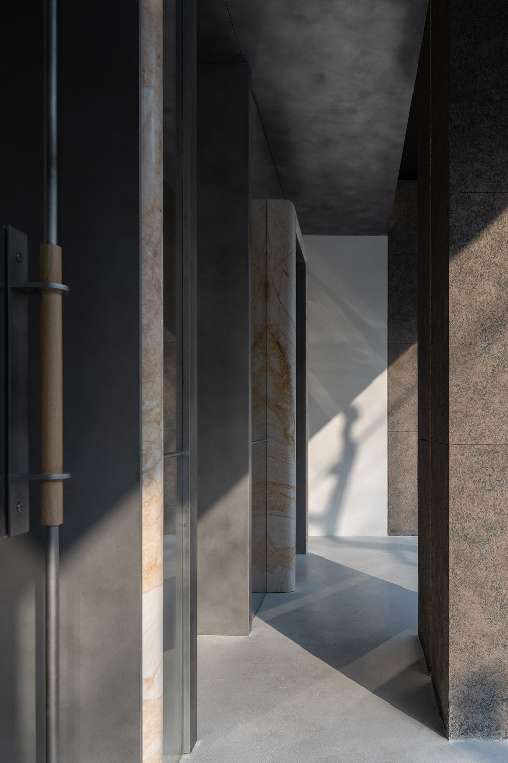
“先鋒”意味著差異與獨特,天然石材作為內嵌結構的主材,構成了空間立麵的唯一性。金屬塊麵從室外穿插至室內,在視覺上進一步增強過道的體量,對人流有一定的導向,同時形成進入空間的儀式感。石材、金屬板經手工做舊的處理,弱化表麵的硬朗,喚醒空間的自然溫度與故事感,讓品牌表達的“和諧”也有跡可循。
“Pioneer” signifies difference and uniqueness. Natural stone, serving as the primary material for the embedded structure, establishes the uniqueness of the spatial facade. Metal blocks interweave from the exterior to the interior, visually enhancing the volume of the passageway, directing foot traffic, and simultaneously creating a sense of ceremony upon entering the space. The stone and metal plates, aged by hand, soften the surface’s rigidity, awakening the space’s natural warmth and sense of story, allowing the “harmony” expressed by the brand to be traceable.
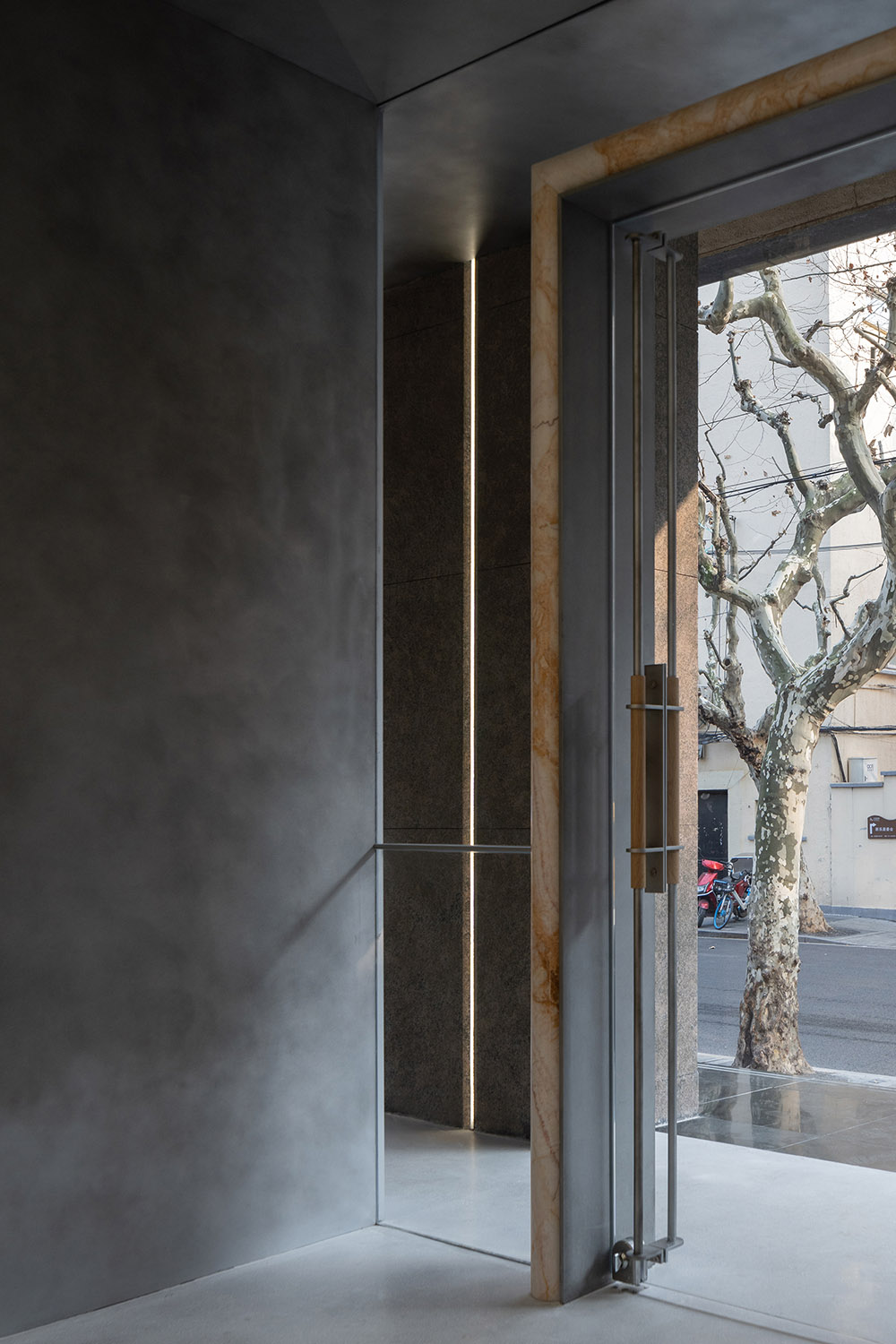
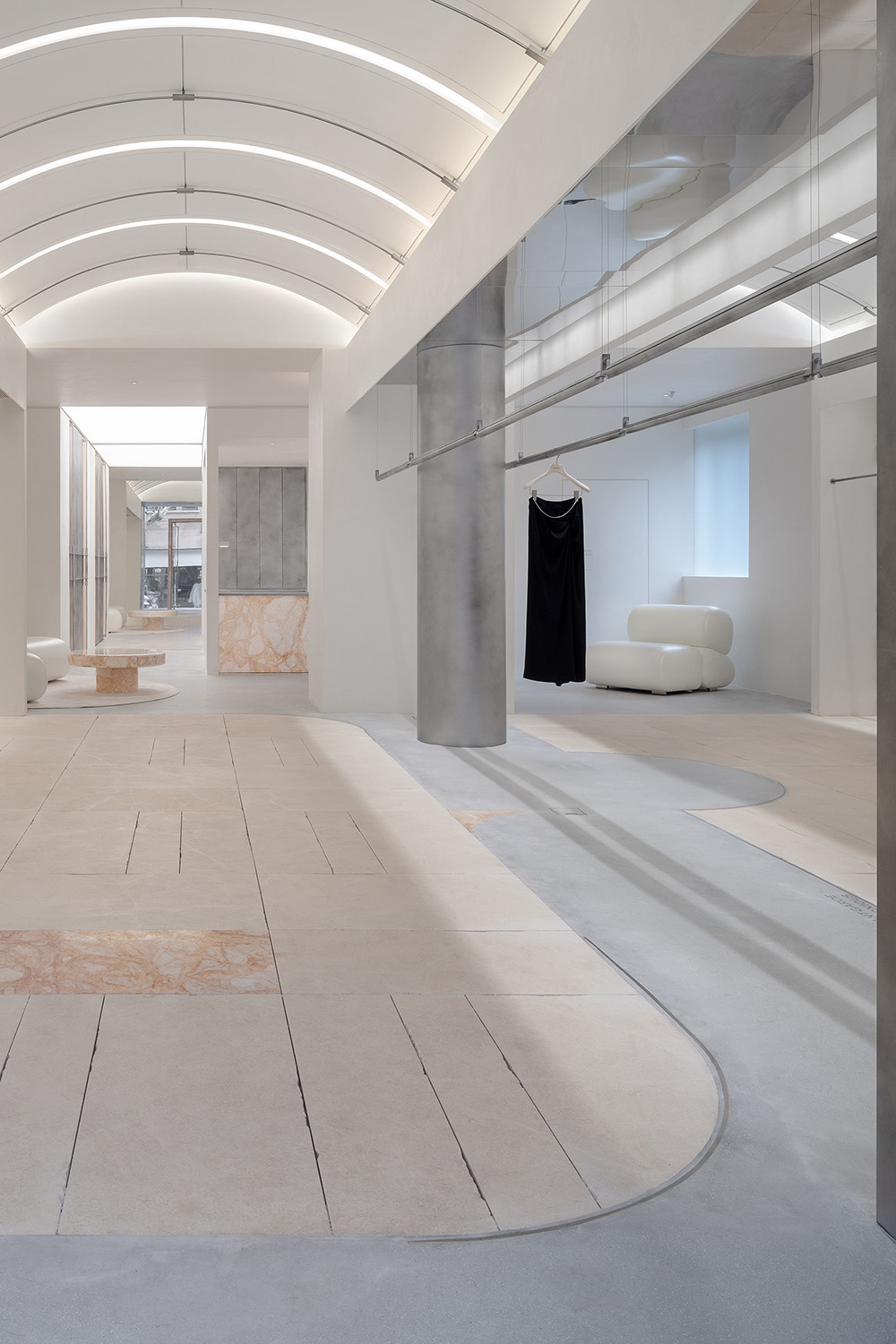
慣有的商業設計思維,是將每一寸空間占滿。而先鋒之所以為“先”,在於敢勇當先,反行其道。門口退讓一定的物理空間,給予情緒緩衝過渡。淺灰色水磨石,從室外至室內一脈相承,引導來訪者進入不同的情境。
Conventional commercial design thinking is to occupy every inch of space. However, what makes a pioneer “pioneering” is the courage to lead and go against the norm. By conceding a certain physical space at the entrance, it allows for an emotional buffer and transition. The light grey terrazzo, continuing from the outside to the inside, guides visitors into different settings.
隨著步伐的移動,階梯上金屬凳的邊緣內折,是對“紙樣”輕薄質感的轉譯;
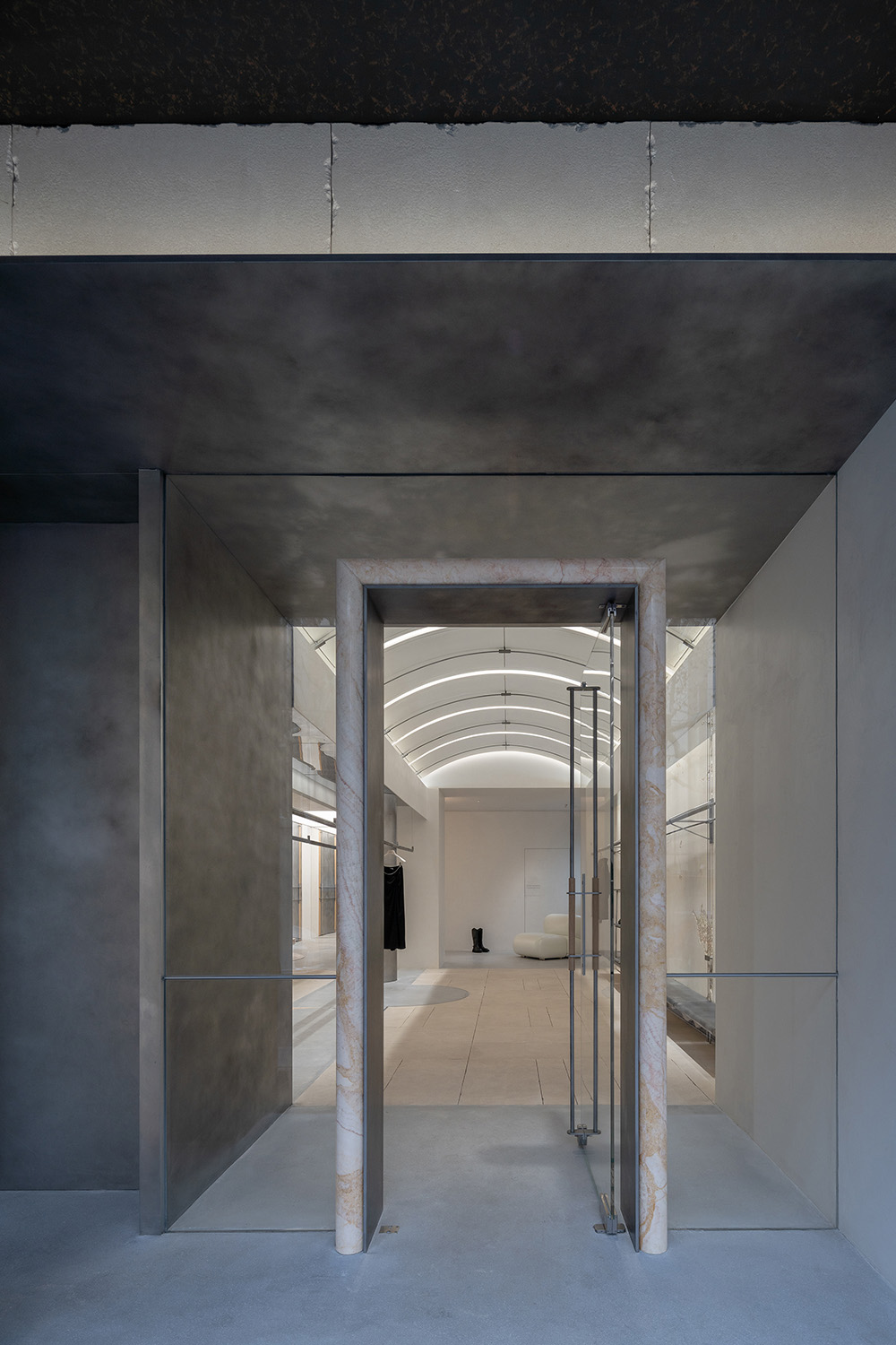
入口的弧形石材門框,是對“裁剪”運動軌跡的提取;門把精細穿插的結構,是對“縫紉機”穿針引線的表達。細微之處,關於品牌精神的具象探索,正逐一展開。
As one moves, the inward folding edges of the metal stools on the stairs translate the lightweight texture of “pattern paper”; the curved stone doorframe at the entrance extracts the movement trajectory of “cutting”; the intricately interwoven structure of the door handle expresses the action of “threading” through a sewing machine. In these subtle details, a concrete exploration of the brand spirit unfolds.
02 概念 Concept
創意的尺度 The Scale of Creativity
“紙樣”的概念源自服裝設計的雛形,象征著無限的創意與精準的尺度。邁入室內,猶如置身於一張未完成的服裝設計圖紙之中。線條、形態、質感和色彩,都在表達設計的創意構想。
The concept of “pattern paper” originates from the prototype of clothing design, symbolizing unlimited creativity and precise measurement. Stepping inside is like being in an unfinished clothing design drawing. Lines, forms, textures, and colors all express the creative ideas of the design.
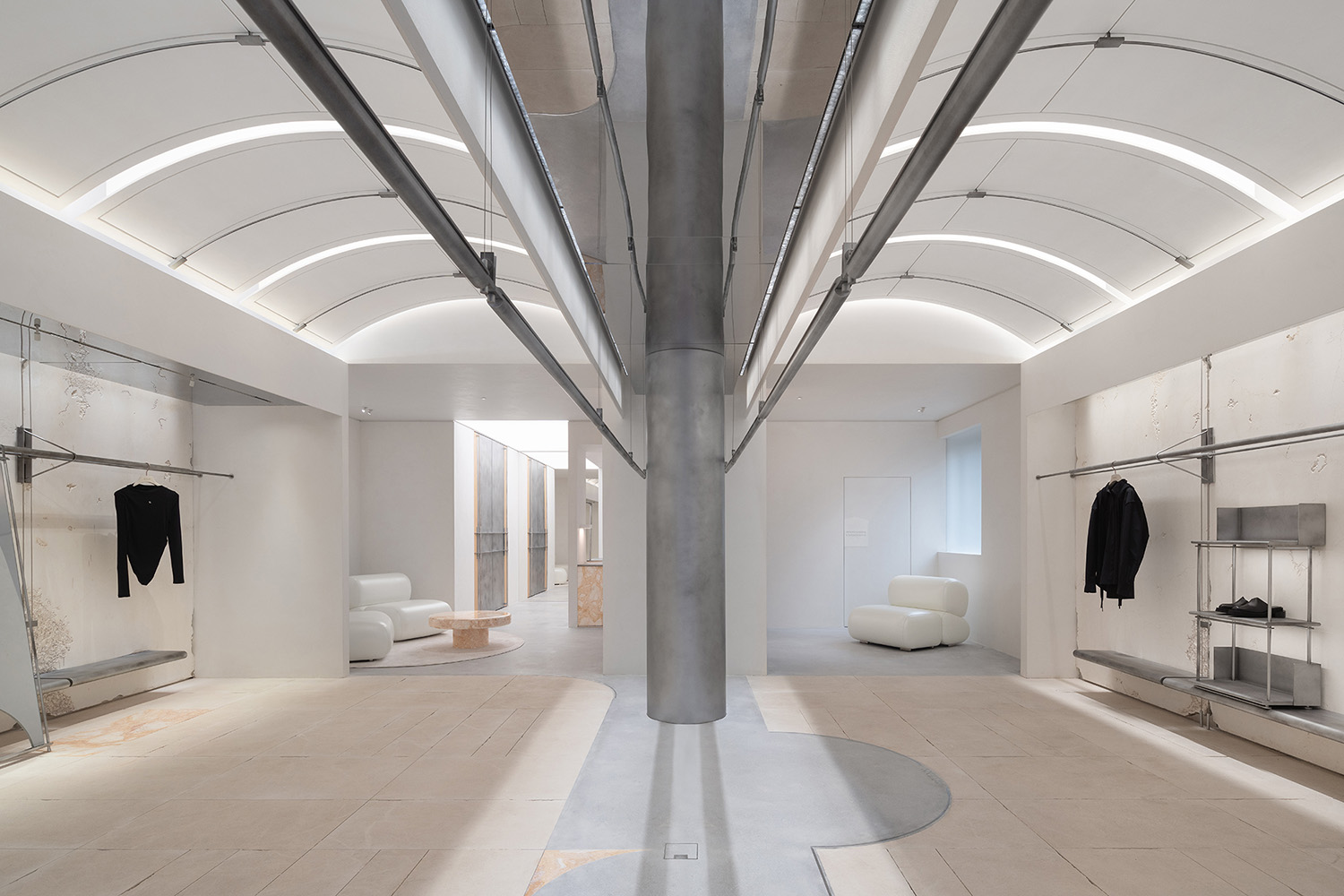
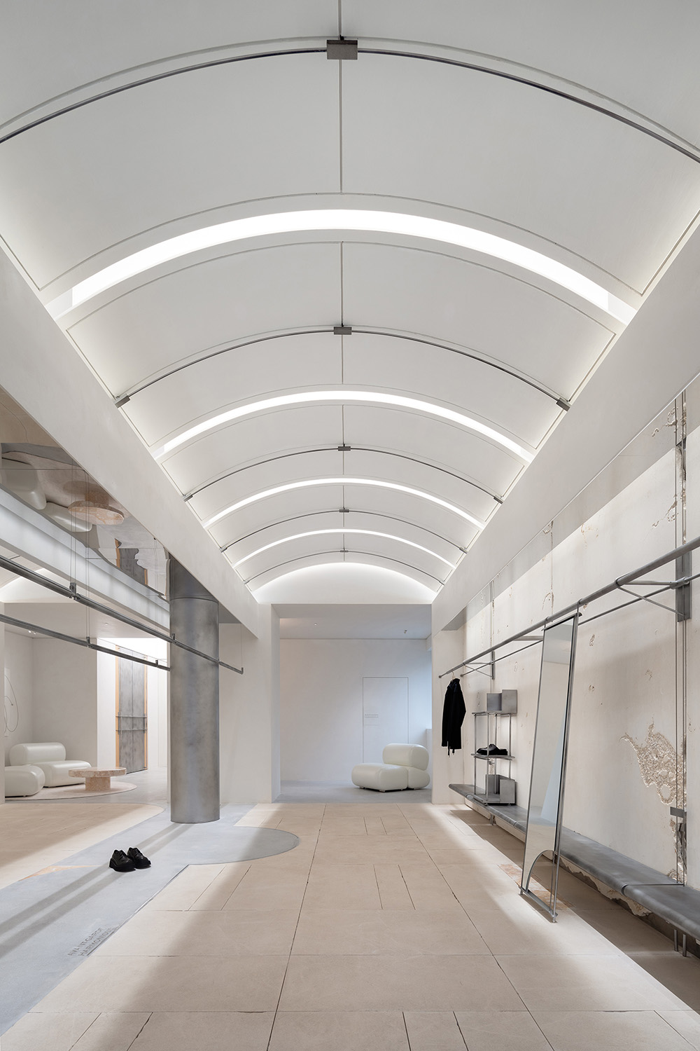
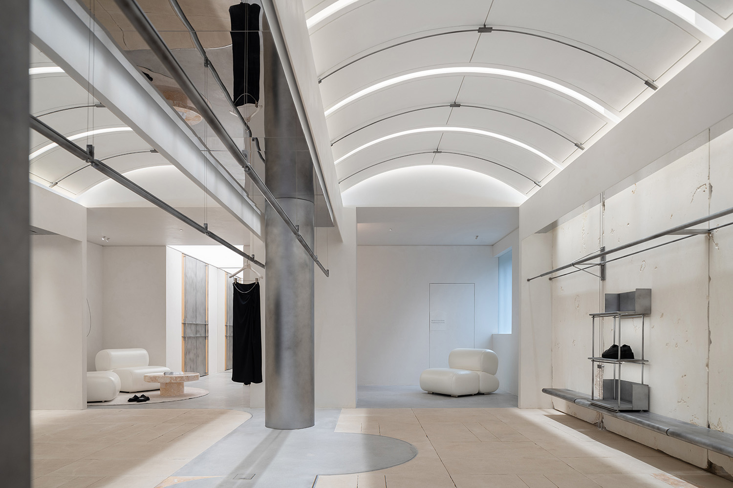
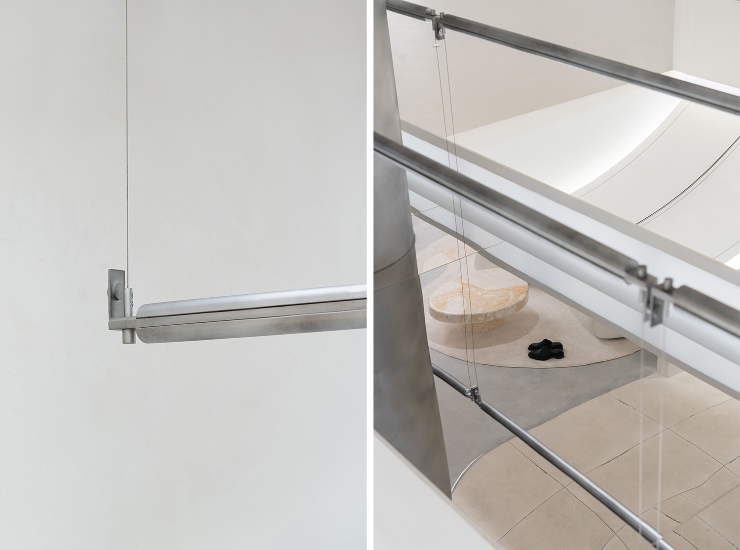
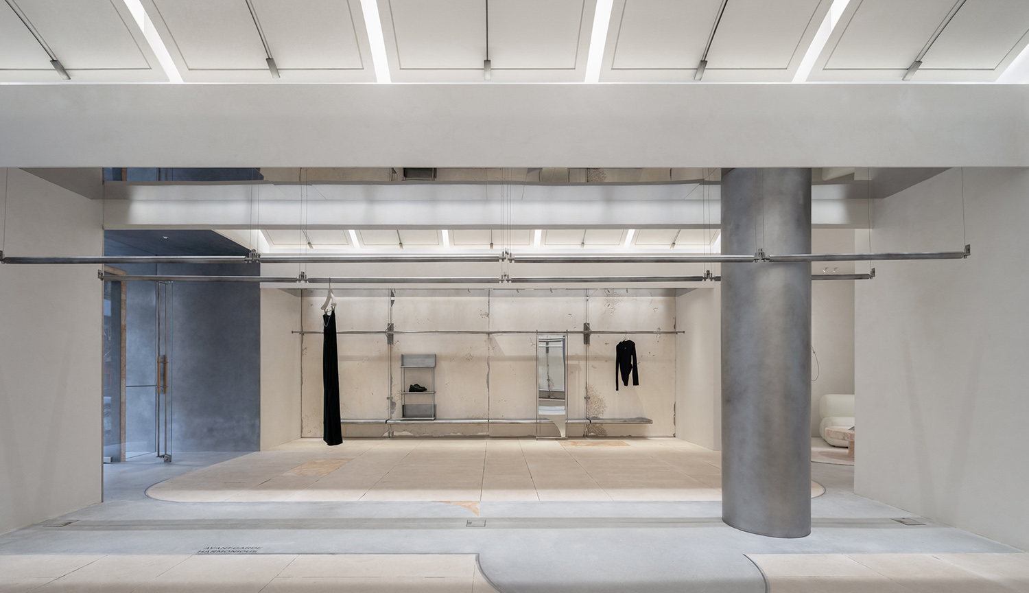
延續外立麵的結構造型,室內呈對稱布局。拱形的頂麵以片狀結構有序排列,輕薄的量感讓人聯想到紙樣的自由裁剪、輕盈肆意。四周10mm寬的凹槽與金屬結構,模擬了製衣過程中的固定釘連接卡扣,流暢的線條宛若匠人繪製時的精準把控。燈光從縫隙透露,形態強化,凸顯“紙樣”之概念。
Continuing the structural design of the facade, the interior is symmetrically arranged. The arch-shaped ceiling, with its orderly arrangement of slab structures, evokes the freedom of cutting and the lightness of pattern paper. The 10mm wide grooves surrounding the metal structure simulate the fixed pin connections and clasps found in garment-making, with smooth lines reminiscent of a craftsman’s precise control during drawing. Light seeping through the gaps emphasizes the form, highlighting the concept of “pattern paper.”
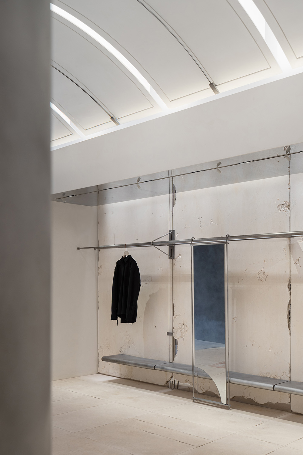
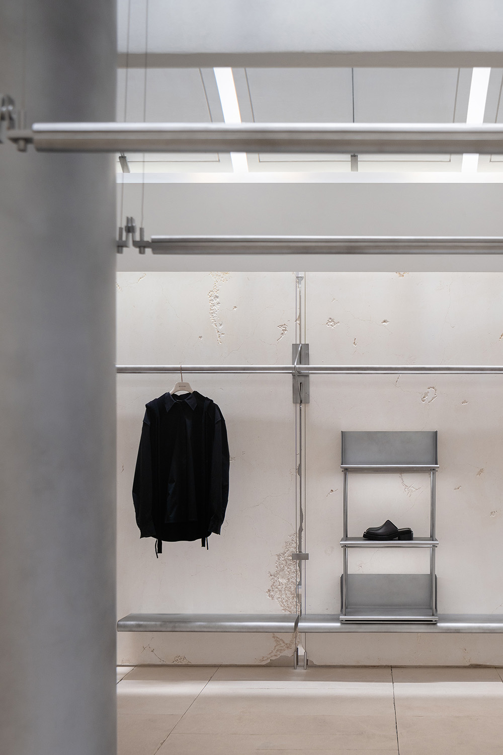
肌理是空間的情緒。大麵積的白,掙脫規則的束縛,賦予了更多自由的想象。手工雕琢的蟲洞石牆麵如大自然的筆觸,看似隨意,卻在靠近時輕而易舉地牽動著細微情愫。每一件服飾有如獨立的藝術品,給予來訪者足夠的空間觀賞。
Texture is the emotion of a space. A vast expanse of white liberates from regular constraints, offering more freedom for imagination. Hand-carved wormhole stone walls, like strokes of nature, seem random but effortlessly evoke subtle emotions upon closer inspection. Each piece of clothing, like an independent artwork, provides visitors ample space for appreciation.
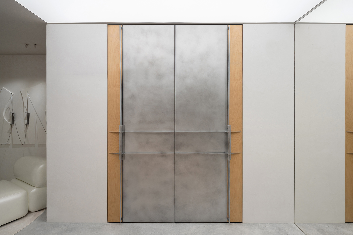
做舊的不鏽鋼、自然斑駁的藝術塗料、局部卡入的米黃色石材,不同材質的差異化表達構成了空間的細節之詩;粗獷與細膩並存,帶來了更多的微妙感知。而地麵嵌入的金屬文字與線條,再次回應品牌的質感屬性。
Aged stainless steel, naturally mottled artistic paint, and sections of beige stone introduce a poetry of details through the contrast of different materials; ruggedness and delicacy coexist, bringing a nuanced perception. The metal text and lines embedded in the floor once again respond to the brand’s textural attributes.
03 演繹 Interpretation
自由的表達 Freedom of Expression
從“紙樣”到服裝展示,是設計的脈絡,也隱喻了空間的多樣化與可能性。
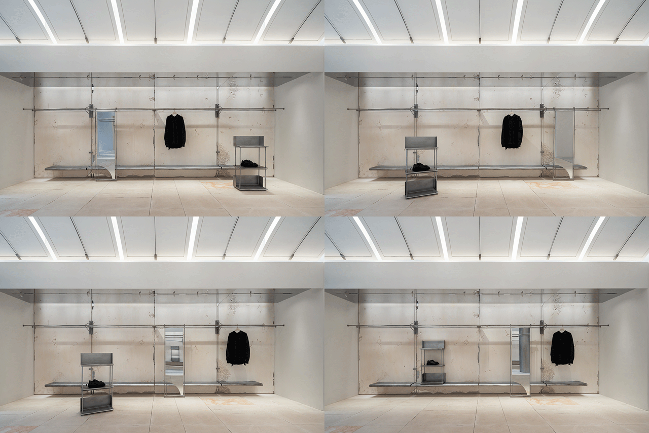
中場區域,以縫紉機的穿插交織為設計靈感,引入兩兩一組的懸掛係統,滿足於 1200mm – 2400mm區間內不同高度的調節,適配品牌不同季時裝展示的需求。
From “pattern paper” to clothing display, the design narrative also metaphorically represents the diversity and potential of the space. The central area, inspired by the intertwining of sewing machines, introduces a hanging system arranged in pairs, accommodating adjustments within a height range of 1200mm to 2400mm, to suit the display needs of the brand’s seasonal collections.
AVVENN在品牌建立之初,便意圖構建無齡化、無國界多元文化交融的生活方式社區。當懸掛係統調控至高點,可完全隱藏,空間化身為多功能社交場域。在這裏,釋放品牌的奇思妙想,邂逅同頻有趣的靈魂。
From its inception, AVVENN aimed to build an ageless, borderless community that blends diverse cultures into a lifestyle. When the hanging system is adjusted to its highest point, it can be completely concealed, transforming the space into a multifunctional social arena. Here, the brand’s creative ideas are unleashed, facilitating encounters with like-minded, interesting souls.
設計對品牌的解讀,不限於外在的展露,更蘊含在所有小而美的細節裏。
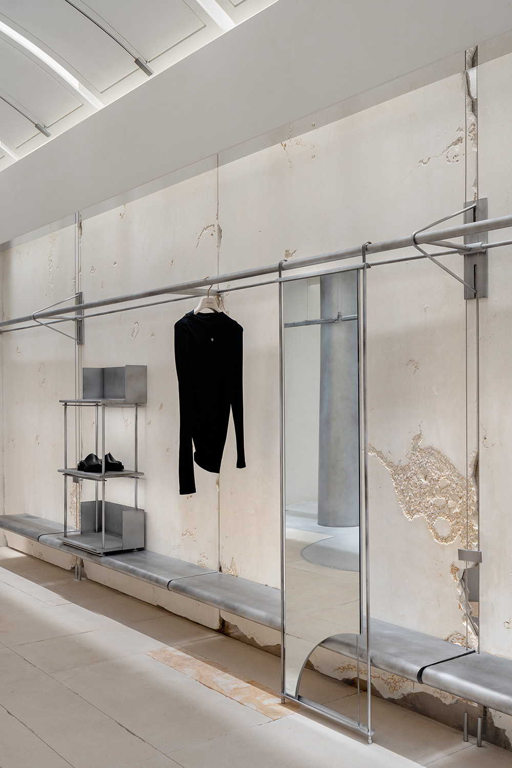
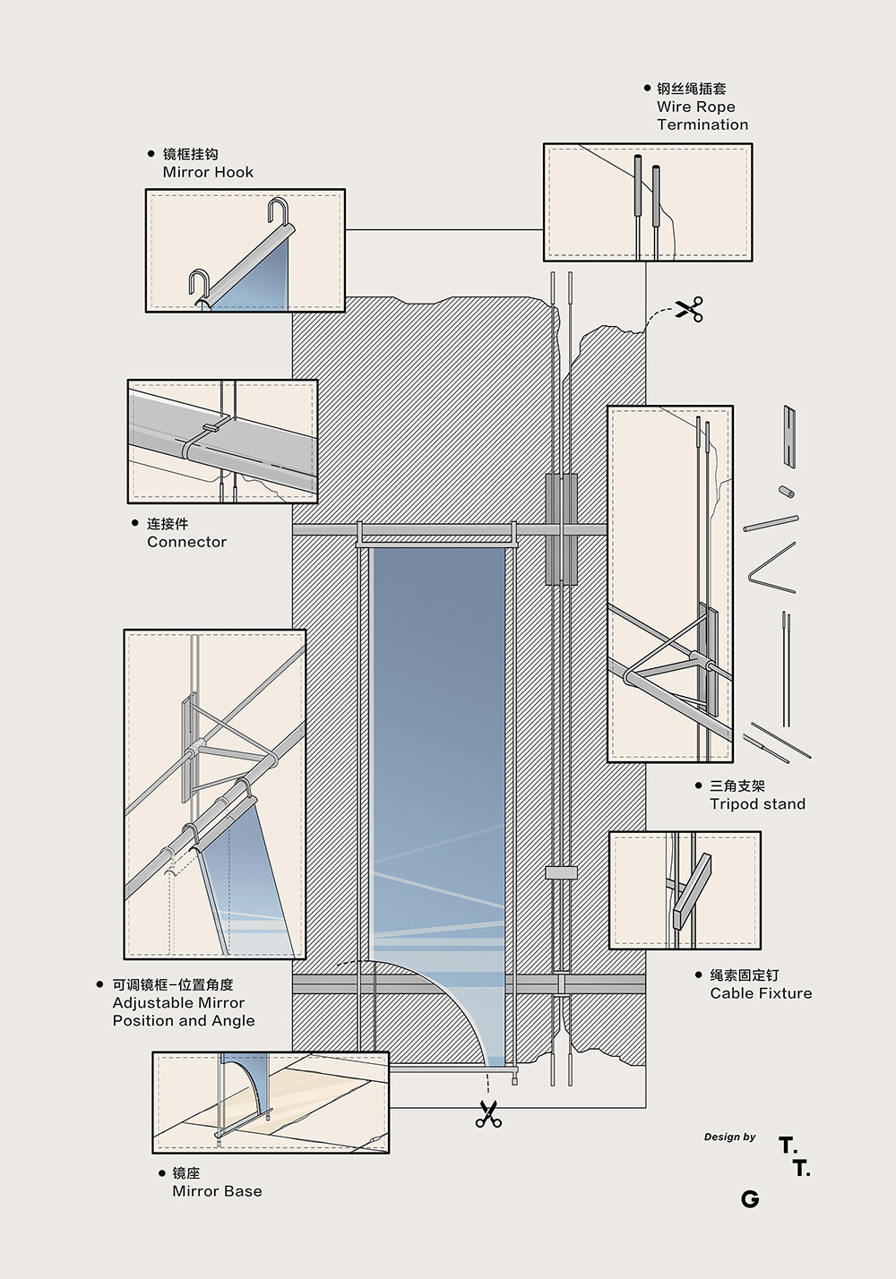
依附牆邊的掛衣係統,穿插、連接、交疊是對製衣過程中穿針引線瞬間的藝術化再現,仿佛見證了一塊布料到一件服裝的蛻變。
The design’s interpretation of the brand extends beyond its outward display to lie within all the small, beautiful details. The wall-mounted clothing system, with its interweaving, connecting, and overlapping, artistically reenacts the moment of threading a needle in the garment-making process, as if witnessing the transformation from a piece of fabric to a piece of clothing.
試衣鏡通過掛鉤的形式與衣杆巧妙連接,不僅可隨意移動到不同位置,還能圍繞懸掛點進行不同角度的調整,全方位展示服裝在不同視角下的美。350mm高度的弧形陳列台,恰到好處地為品牌的鞋帽等配飾預留了展示區域。單體的展架,則根據品牌日常需求進行靈活放置,豐富了不同場景下的陳列需求。
The fitting mirrors, cleverly connected to the clothes rod via hooks, can be easily moved to different positions and adjusted at various angles around the hanging point, offering a comprehensive display of the clothing’s beauty from different perspectives. The 350mm high curved display stand perfectly reserves a display area for the brand’s shoes, hats, and other accessories. Individual display racks are flexibly placed according to the brand’s daily needs, enriching the display requirements in different scenarios.
∇ 鏡子©TIME TO GATHER
AVVENN是以女性為主導的品牌。原本的方形柱子以金屬板包裹成圓柱,空間愈加柔和。女性之美,不止於柔,更在於表象之下的內在力量。以三角形的形態進行的穿插固定,線條幹淨利落,更寓意著現代先鋒女性的強大內核,呈現出整體的剛柔並濟。
AVVENN is a female-led brand. The original square pillars are wrapped in metal sheets to form cylinders, softening the space. The beauty of femininity lies not only in softness but also in the inner strength beneath the surface. The interlocking fixation in a triangular form, with clean and sharp lines, symbolizes the strong core of modern pioneering women, presenting a balance of strength and softness throughout.
04 鬆弛 Relaxation
自在的心境 A State of Ease
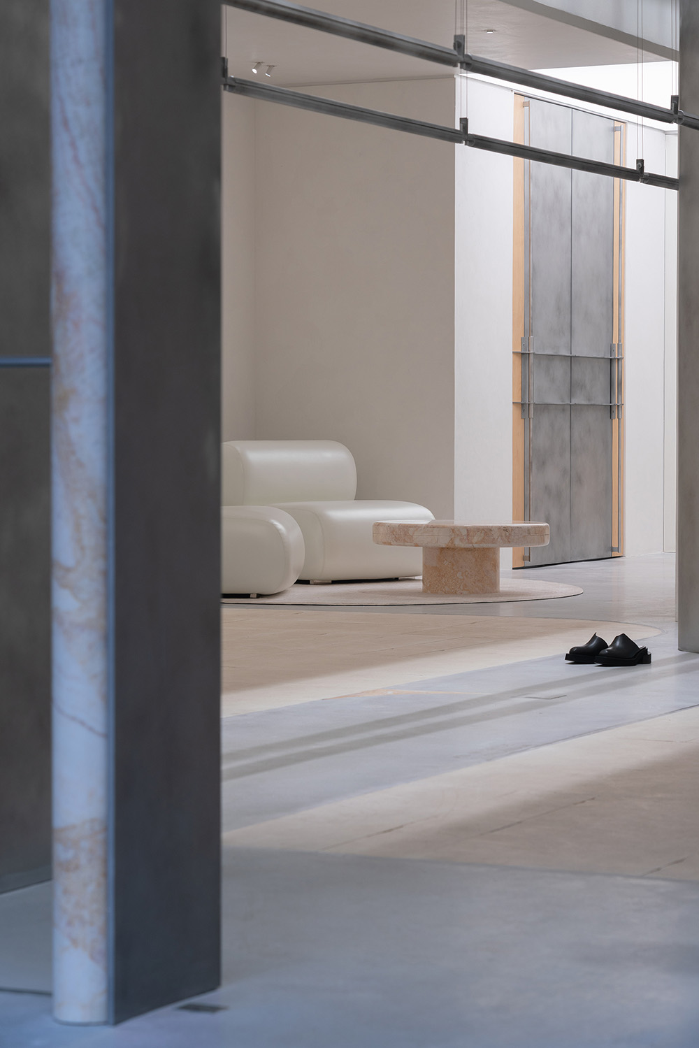
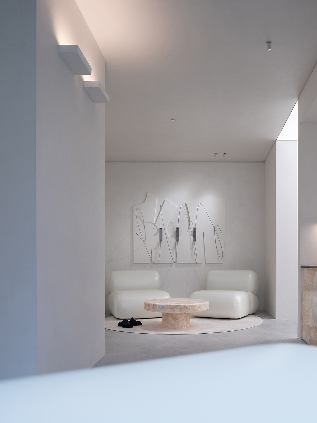
隨著路徑前移,或是探索、或是收獲——後場褪去了武裝,享受鬆弛自在的當下。牆上的不規則畫布,是對“紙樣”的再度呼應,綴以靈動的金屬線條,恰似品牌對服裝搭配的別致有趣。原創設計的沙發與邊幾,以柔軟圓潤的組合呈現,給休閑區帶來更多舒適自如的氛圍。
As one advances along the path, whether exploring or reaping— the back area sheds its armor, embracing a relaxed and comfortable present. The irregular canvases on the wall echo the concept of “pattern paper” once more, adorned with lively metal lines, akin to the brand’s unique and interesting take on clothing combinations. The original design sofas and side tables, with their soft and rounded combinations, bring a more comfortable and relaxed atmosphere to the lounge area.
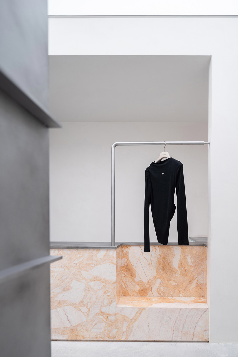
收銀台由延續著外立麵邊框的色彩,由天然石材圍合而成,正麵朝向前場陳列區域,方便來訪者識別及銷售引導。側麵則分割一塊區域用於掛衣,更充分地進行空間利用。
The cash desk, continuing the color scheme of the facade’s frame and enclosed by natural stone, faces the front display area for easy identification and sales guidance for visitors. The side carves out a space for hanging clothes, making fuller use of the space.
試衣間作為店鋪最隱秘場所,是最能表達細節的設計區域。掛衣鉤由製衣過程中的“固定釘”演變而來;石材作為空間表皮,展示著自然紋理與溫暖色彩,營造著更鬆弛的氛圍。而考慮到石材的凹凸質感可能對來訪者、衣服有所剮蹭,對其表麵進行了精心打磨,既保留了其質地的天然美感,又彰顯了品牌對消費體驗的極致追求。
The fitting room, as the most private area of the store, is where detail-oriented design shines brightest. The clothing hooks are evolved from the “fixing pins” used in garment making; the stone, serving as the space’s surface, displays natural textures and warm colors, creating a more relaxed atmosphere. Considering the potential for the stone’s rough texture to scratch visitors or clothing, its surface has been carefully polished. This not only retains the natural beauty of the material but also highlights the brand’s ultimate pursuit of an exceptional consumer experience.
當試衣間門緊閉時,呈現出平麵化狀態,猶如未經裁剪的紙樣一般。以中間的軸線為界,門如同被巧妙地從中線裁剪開,從平麵化轉變為立體狀態。開合之間,也暗含著消費體驗的先後變化。
As the door to the fitting room closes, it assumes a flattened appearance, reminiscent of an uncut piece of pattern paper. Defined by a central axis, the door appears as if it has been ingeniously split along this median, shifting from a two-dimensional facade to a tangible, three-dimensional form. This interplay of opening and closing not only physically transforms the space but also metaphorically represents the evolution of the consumer experience.
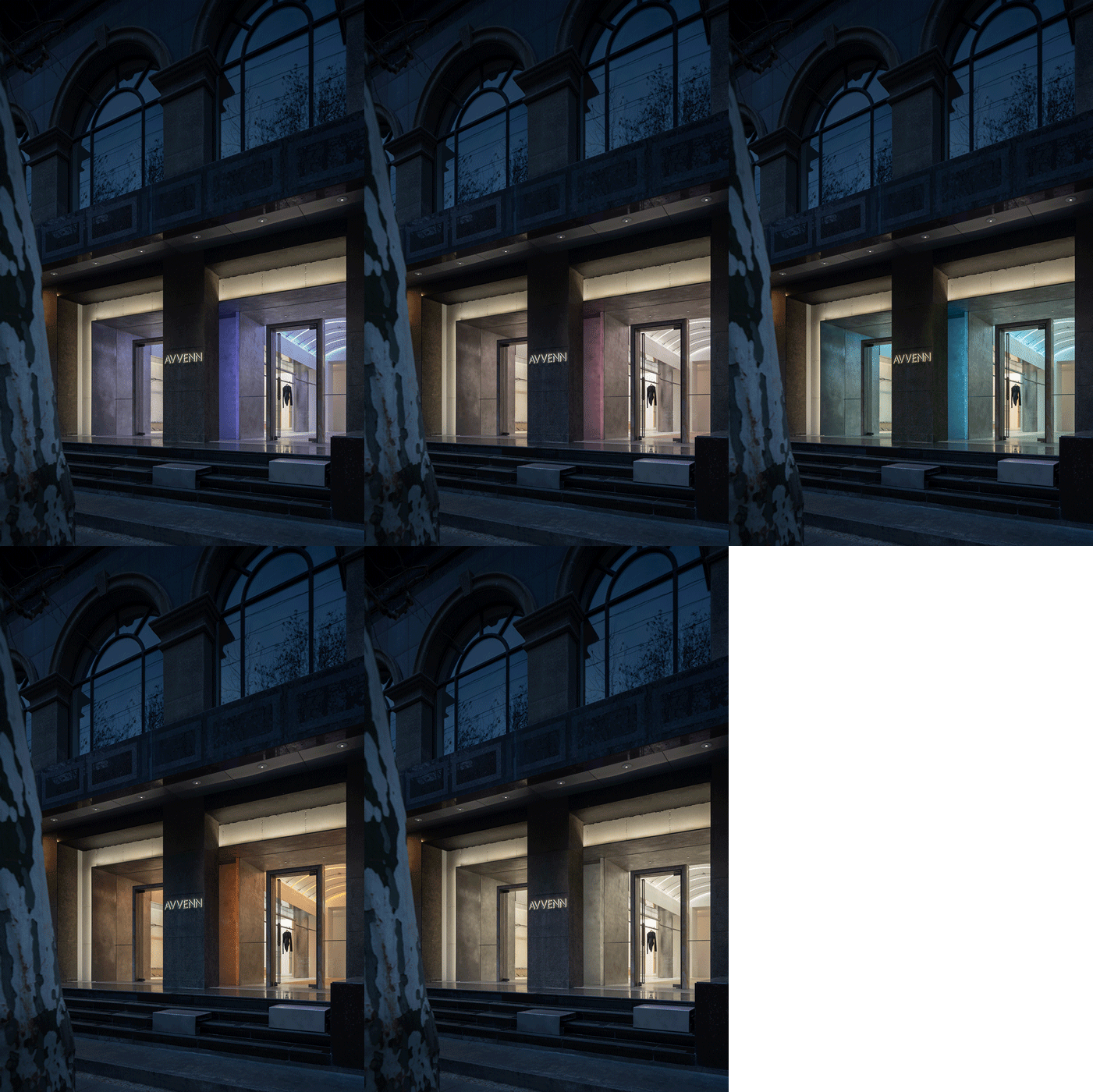
多彩的燈光模式,為品牌運營提供了不同的情境氛圍,滿足其不定期舉辦的展覽、藝術沙龍、交流會及直播等多樣化活動需求。細致的表達、多元的文化、簡潔的呈現無不體現設計與生活的儀式感,更展現了品牌的深厚底蘊與匠人的精湛技藝。
The colorful lighting modes provide diverse atmospheric settings for brand operations, fully satisfying the needs of various activities such as irregular exhibitions, art salons, exchanges, and live streaming. The meticulous expression, diverse culture, and concise presentation all embody the sense of ceremony in design and life, further demonstrating the profound heritage of the brand and the exquisite craftsmanship of its craftsmen.
AVVENN所秉持的“先鋒的和諧主義”,是植根於品牌的核心。正如服飾之於個體,不僅是衣取蔽寒的工具,更是內在情感與追求的直觀表達。品牌空間的具象呈現,在達成現代審美的同時,更需要超越單一的空間界限,構建出一個充滿創意與想象的精神世界,消費者才更有機會觸及到品牌的溫度與內核。
The “Pioneer Harmonism” upheld by AVVENN is rooted in the core of the brand. Just as clothing serves the individual—not only as a means to keep warm but also as a direct expression of inner emotions and pursuits—the tangible presentation of the brand space, while achieving modern aesthetics, must transcend the boundaries of a singular space. It should construct a spiritual world filled with creativity and imagination, offering consumers a greater opportunity to connect with the warmth and essence of the brand.
∇ 空間©TIME TO GATHER
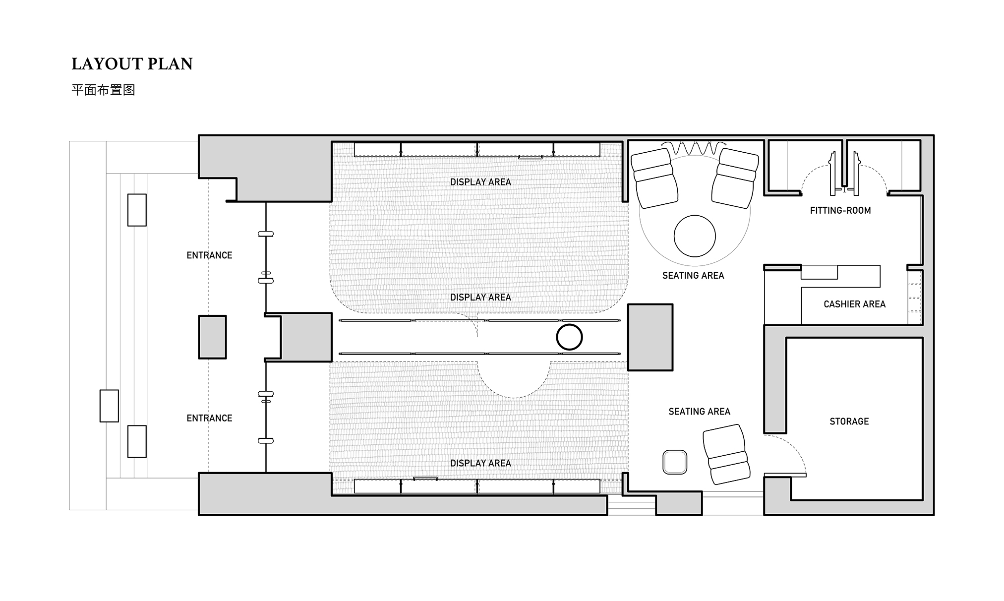
∇ AVVENN平麵布置圖©TIME TO GATHER
項目信息
項目名稱:AVVENN
項目麵積:126㎡
設計時間:2023年9月
完工時間:2024年1月
設計公司:TIME TO GATHER
主創設計:薛菲
設計團隊:陳夢欣
燈光設計:Artluci-歐榮威
攝影:吳鑒泉
文案:橙叁
施工單位:上海邑築裝飾工程
Project Name: AVVENN
Project Location: Xinle Road, Shanghai, China
Design Area: 126㎡
Design Time:2023.01
Completion Time: 2024.01
Design Firm: TIME TO GATHER
Chief Designer: Xue Fei
Design Team: Chen Mengxin
Lighting Design: Artluci-Owen
Photographer: Wu Jianquan
Copywriter: Cheng San
Construction Company: Yi Zhu Deco


