一個無限的秀場,AD艾克建築升級打造歐文萊總部大地主義展館
AD ARCHITECTURE reimagines Overland’s headquarters showroom as a boundless “runway” for the new Earthism Series
建築是拿捏自如的體塊在光線下神奇、恰當而又絕妙的表演。
我們的眼睛生來是觀看光線下的各種形式的。
光與影讓形式得以顯現,幾何是光線下最善於展示的偉大的基本形式:他們的形象對於我們來說是明確的、肯定的、毫不含糊的。
因此,他們是美的形式,是最美的形式。——走向新建築,1923年
“Architecture is the masterly, correct and magnificent play of masses brought together in light. Our eyes are made to see forms in light; light and shade reveal these forms; cubes, cones, spheres, cylinders or pyramids are the great primary forms which light reveals to advantage; the image of these is distinct and tangible within us and without ambiguity. It is for that reason that these are beautiful forms, the most beautiful forms.”— Towards a New Architecture (1923)
光與幾何
Light & geometry
建築是一種關係,一種純粹的心靈創造,抽象的、靜寂的、純粹的、幾何學的空間創造,建築空間內部自然與人為地導入了各種光的啟示,感受空間的力量,讓人與精神共振。
Architecture is a relationship, bringing a pure spiritual experience and creating an abstract, tranquil, pure and geometric space. The interior space is awash with natural daylight and artificial lighting, allowing people to feel the spatial power and resonate with its spirit.
01 項目背景
Project background
2023年10月份,艾克建築設計收到了歐文萊集團的再次邀請,參與總部的二次升級,為其新產品大地主義主題產品係列做體驗空間,這是團隊與歐文萊的再次攜手合作。項目位於佛山陶瓷總部基地,歐文萊總部公共空間與品牌體驗中心,是一次品牌形象的升級工作,承載著接待與展示體驗為一體的多維度空間。
In October 2023, the porcelain and stone tile brand Overland entrusted AD ARCHITECTURE to conceive an experiential showroom for its new Earthism Series, as a part of the brand’s headquarters upgrade initiative. This commission also marks a continuation of the collaboration between the two sides in 2021 when AD ARCHITECTURE initially crafted a showroom for Overland. Situated within Overland’s headquarters in Foshan, this project serves as a brand experience center, aiming to enhance the brand’s image as a multifunctional space that combines reception, display, and experiential functions.
02 品牌延續
Brand analysis
歐文萊素色瓷磚是將人對瓷磚細微的主觀感受轉化成技術參數,把素色美學與現代製造技術相結合,基於自然、現代元素以及複合元素,從色感、紋理、肌理、光感、觸感等多維度進行設計研發。歐文萊品牌應高階審美而生,產品強調自然與時尚元素的融合,涵括高端岩板、瓷磚等品類集成,主打具有獨特審美眼光的精英群體市場,保持著現代時尚、簡潔純粹的格調。
Overland innovatively translates people’s subtle subjective feelings about ceramic tile products into technical parameters, and merges a subdued color aesthetic with modern manufacturing technology. Based on natural, modern and composite elements, the brand’s products are designed and developed across multiple dimensions such as color, texture, grain, luster, and touch. Overland is born to cater to high-end aesthetics, emphasizing the integration of natural and fashionable elements. Its product range includes high-end sintered stone, ceramic tile, quartz stone and others, targeting elite groups with unique tastes and advocating for a modern, fashionable, simple, and pure style.
歐文萊2024年推出素色瓷磚品類第八代符號產品[大地主義]主題係列,以“致廣大而盡精微”為理念進行瓷磚材質語言創新,倡導“過一種沒有天花板的生活”,新品研發采用“肌紋共生技術”,解決傳統瓷磚紋理與肌理自然融合的美學實現難題,還原材質設計的自然調性。
In 2024, Overland launched its eighth-generation symbol product series in solid colors, themed “Earthism.” Guided by the philosophy of “attaining the broad and great while addressing the delicate and minute,” the new series aims to innovate the language of ceramic tile materiality, advocating for a lifestyle without limitations. The development of the new product series utilizes “texture-grain symbiosis technology” to address the aesthetic challenge of naturally seamlessly traditional ceramic tile textures and grains, thereby restoring the natural tone of material design.
03 產品特點挖掘
Product features exploration
基於品牌產品文化內核的一次深度思考,基於對大地主義主題產品係列的表現方式的思考。
The showroom design was based on a thorough reflection on the essence of new product series and a deep dive into its presentation and display.
歐文萊認為:[大地主義]解讀為“大地風格,自然主義”,大地是一個沒有天花板的地⽅,生活本應是一種鬆弛感的姿態,⼈類在城市⾥也不是脫離⾃然。因為優秀的建築是自然的延續,人們棲居在建築⾥,建築就是⼈與⾃然溝通的介質,建築皮膚所用的瓷磚材質也能傳達自然的情緒。
Overland illustrates that “Earthism” can be interpreted as “earth style, naturalism”. Earth is a realm without a ceiling, where life naturally assumes a relaxed posture. Even within the urban landscape, humans remain connected to nature. Remarkable architecture seamlessly extends from nature, serving as both habitat and a conduit for human-nature interaction. The choice of ceramic tile as a building material further amplifies these natural sentiments.
設計既要深挖歐文萊尊重自然,強調素色美學,純粹的品牌文化,更要充分理解新產品的設計理念,以建築空間與光為介,為新產品提供一個背景。尊重自然、和諧共生。
Therefore, the project’s design needed to grasp the design philosophy of the new product series, leveraging architectural space and light as mediums to create a backdrop that highlights the new products. The overall design needed to show respect for and harmonious coexistence with nature.
04 破冰邏輯
Innovative logic
如何呈現未來的品牌展廳?如何破冰?一種去樣板間式的設計,讓團隊在歐文萊總部展廳的一期獲得了有效的結果,在展示體驗與品牌認知上都表現了正向的力量。一期的設計打造的像一個藝術館,而這一次,空間像是一個時尚的走秀舞台,以一種新的表現形式來與瓷磚這樣的產品進行互交,這是對中國陶瓷展廳體現的一次重要思考。
How to present a future showroom? how to employ an innovative logic to break away from the homogeneous design of conventional showrooms? These were the key questions driving AD ARCHITECTURE when designing Overland’s headquarters showroom for the first time in 2021. The resulting showroom not only effectively showcases product experiences but only conveys brand identity with a positive impact. In contrast to the initial showroom, which resembled an art gallery, this time AD ARCHITECTURE opted for a showroom space reminiscent of a fashion runway. This project introduces a fresh approach to spatial presentation, engaging with porcelain tile products in a unique way while reflecting a profound contemplation on the presentation of ceramic tile showrooms in China.
05 自由陣列平麵
Free arrays
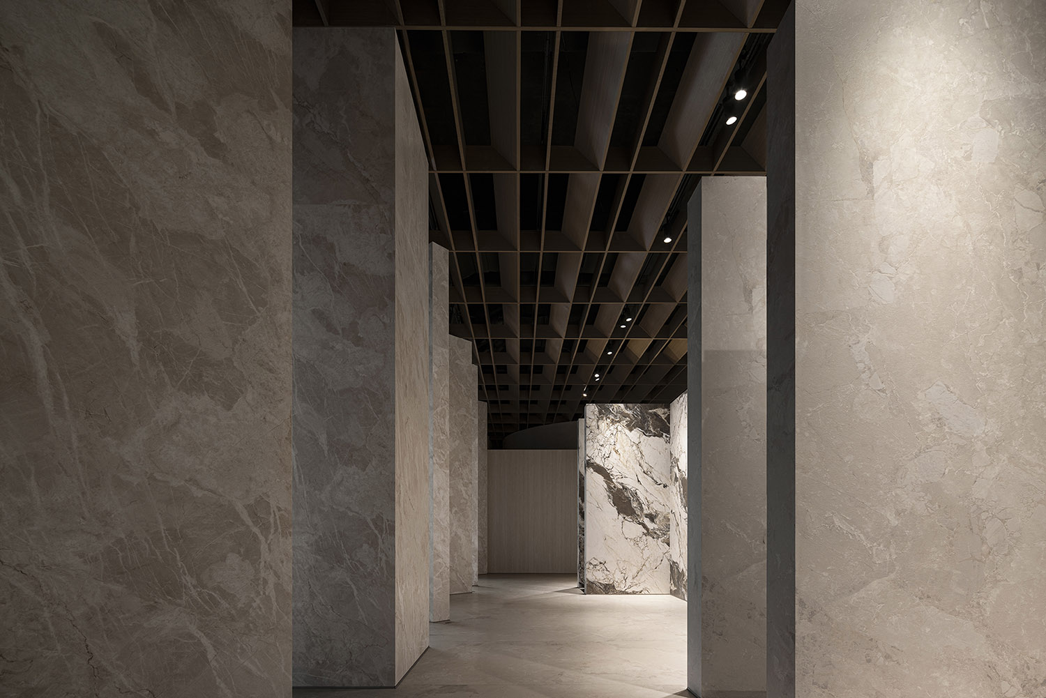
陣列所帶來的空間序列感貫穿整體設計,縫隙的介入,闡述了空間自由性的過程空間的方向性並沒有缺失,相反,變得有趣與神秘,個體與個體之間形成了低密度的互動,邊界之間就不是一個對立的姿態,而是一個模糊的,融合的現象。
The sense of spatial sequence brought by the arrays of structures permeates the overall design. The insertion of gaps adds a sense of freedom without compromising the directionality of the space. Instead, the space becomes intriguing and mysterious, fostering low-density interaction between individuals. The boundaries are not opposing, but blurred yet integrated.
06 嚴謹的工作
Rigorousness
歐文萊的大地主義主題產品係列用一種新的姿態對大理石自然的肌理進行表達,經過了這幾年的純色係與高級灰的市場熱浪,歐文萊表達了一種新的潮流。這是大理石紋理在行業的一種回歸,而這種回歸也必須是產品的一種進步,一種經典的傳承而非複刻。
Overland’s new Earthism Series presents a fresh interpretation of the natural textures of marbles. In the wake of the market’s recent fascination with solid colors and high-end gray tones, Overland has introduced a new trend through the new product series. This marks a resurgence of marble textures in the industry, emphasizing progress and classic legacy rather than mere replication.
而正是多種大理石自然的花紋為設計的和諧增加了難度,也讓團隊意識到了嚴謹的產品歸納的重要性,因此在設計過程中對產品的色彩與花紋的表現進行歸類,用半圍合的方式來為每個產品形成一種獨立的姿態,更好地表現出產品的個性與品質。
However, the diverse natural patterns of marble presented challenges in achieving harmony in the showroom design, underscoring the importance of rigorous product categorization in display. Therefore, during the design process, AD ARCHITECTURE classified the colors and patterns of the products, utilizing a semi-enclosed way to display each product with a distinct identity, thereby better showcasing their personality and quality.
07 空間闡述
Spatial narratives
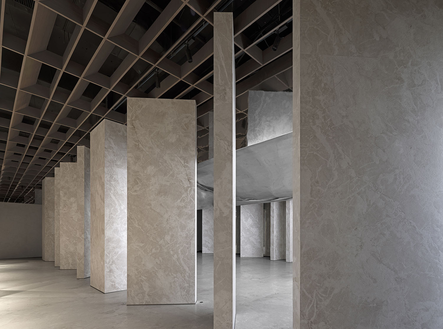
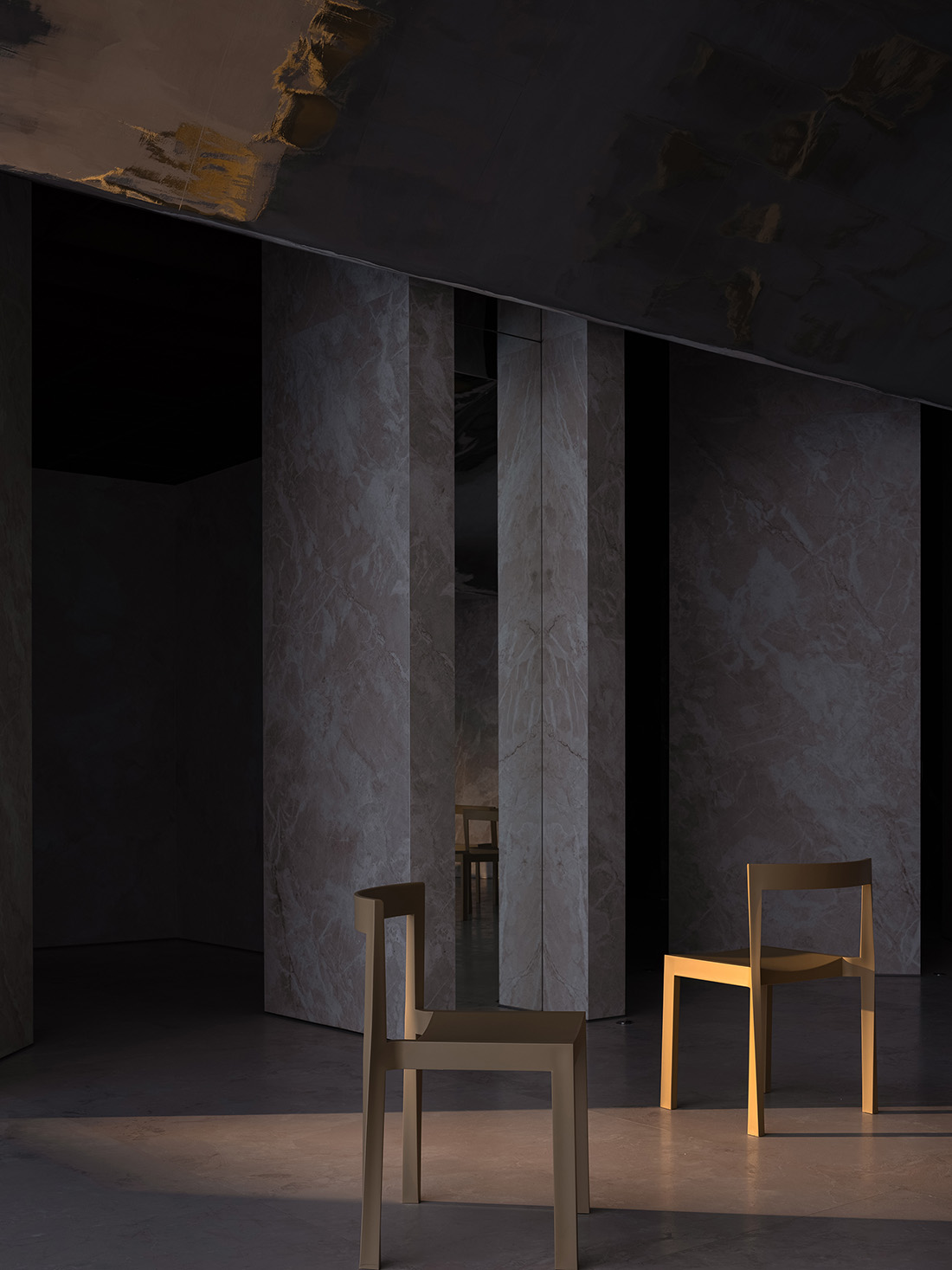
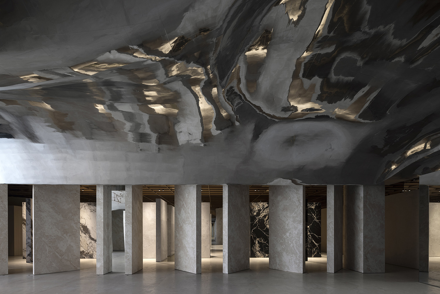
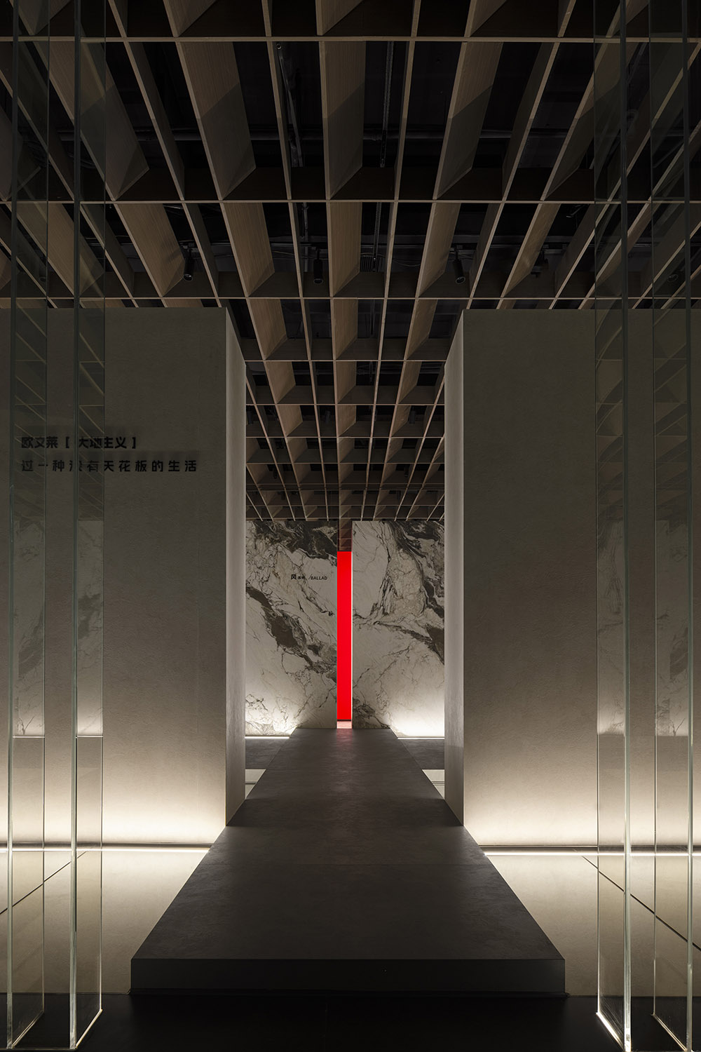
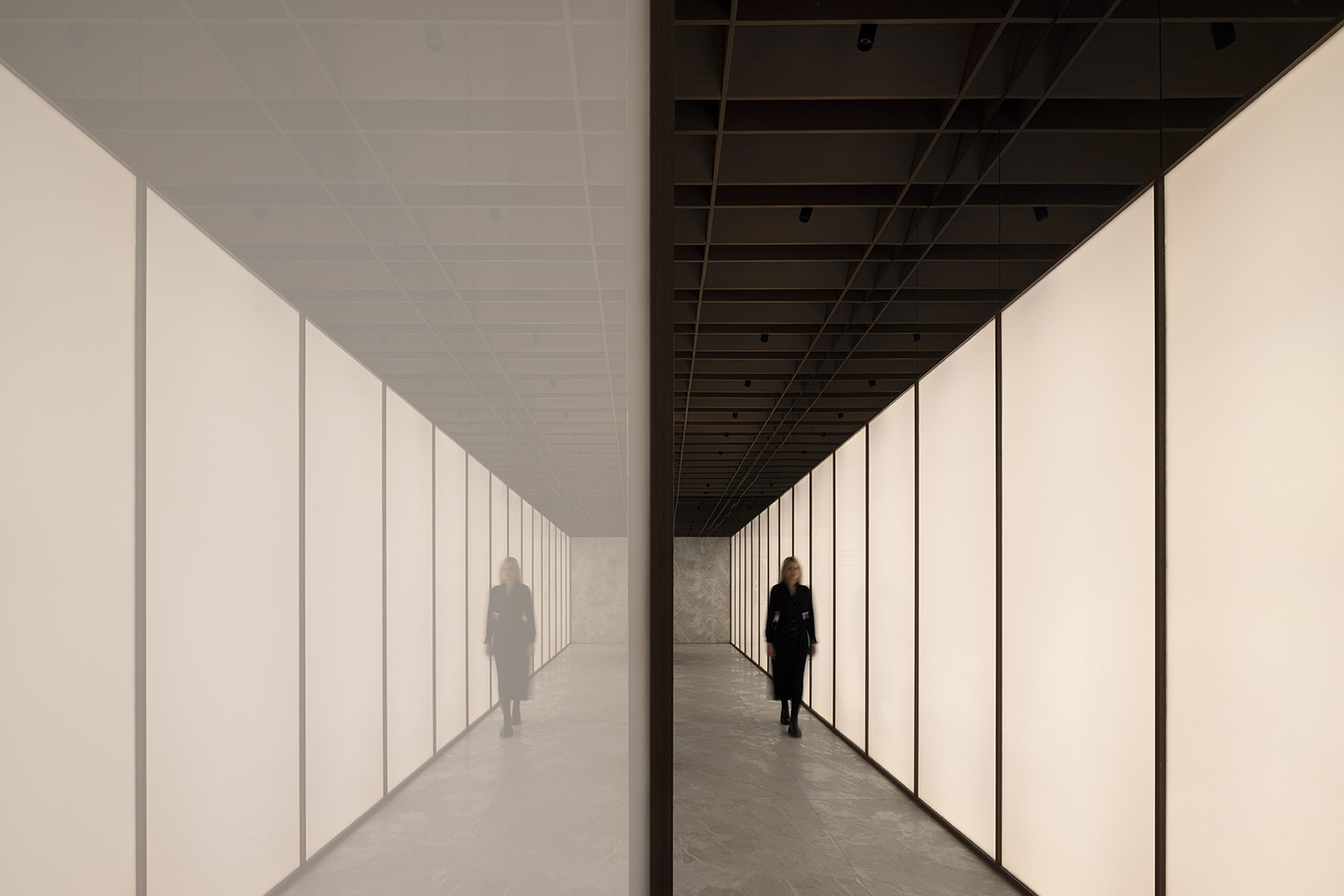
空間整體設計邏輯,是一個產品的秀場,化人為物,人與物互動,展示人與空間、與產品的關係,整體以岩板為核心,木質天花結構來提升空間自然與溫和的設計目的。
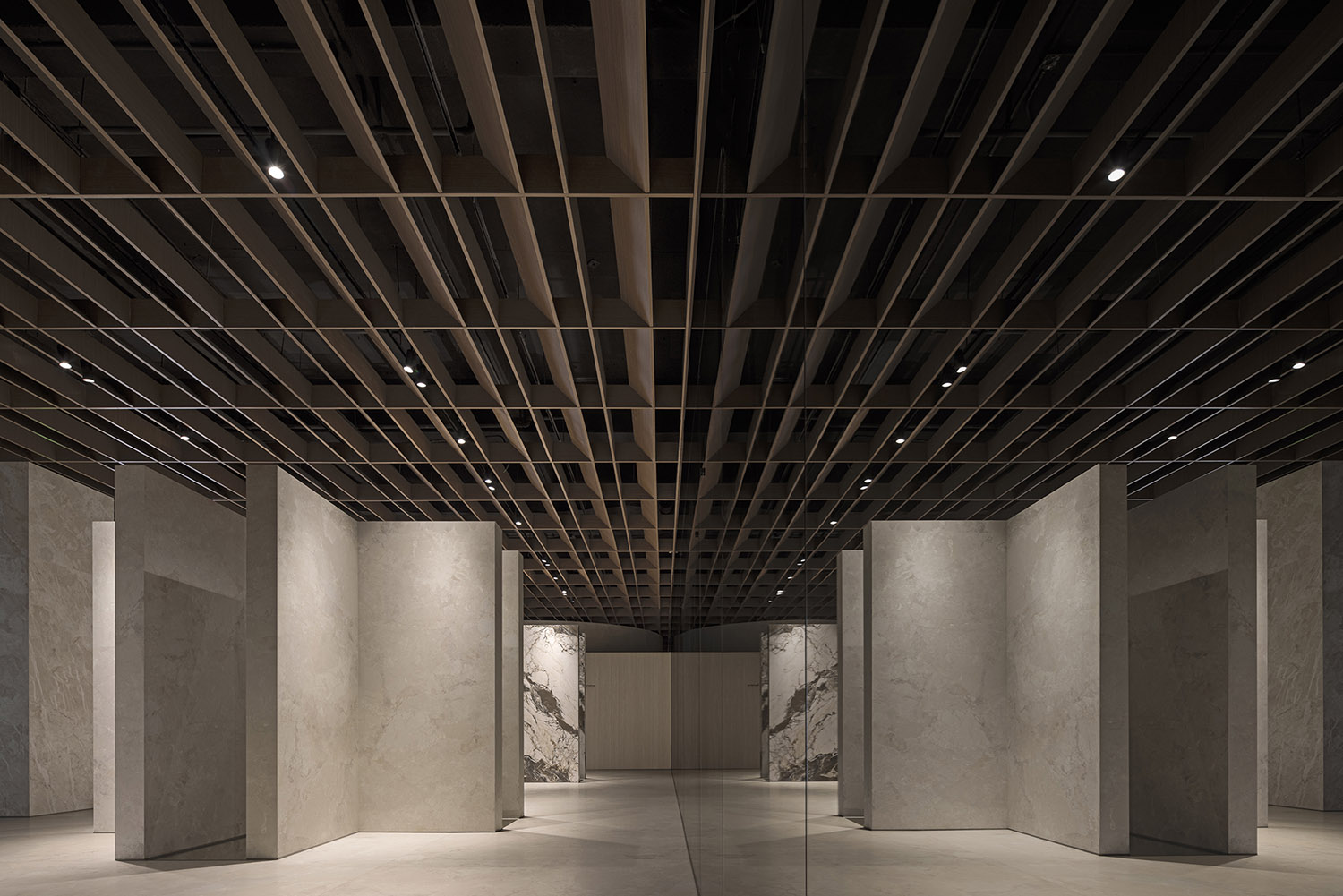
The overall design concept of the space is to create a “runway” for products, facilitating interaction between people and objects and showcasing the relationship between people, space, and products. The overall space highlights the sintered stone products, complemented by a wooden ceiling structure to enhance the space’s natural and gentle ambiance.
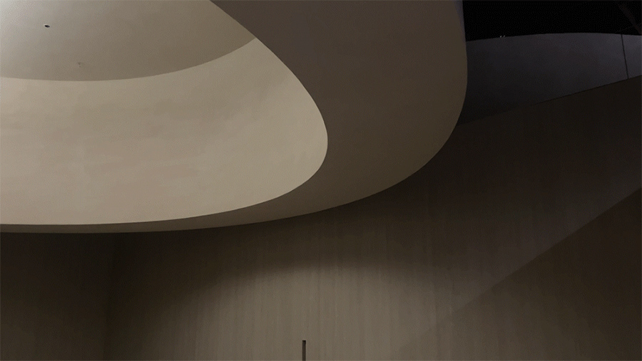
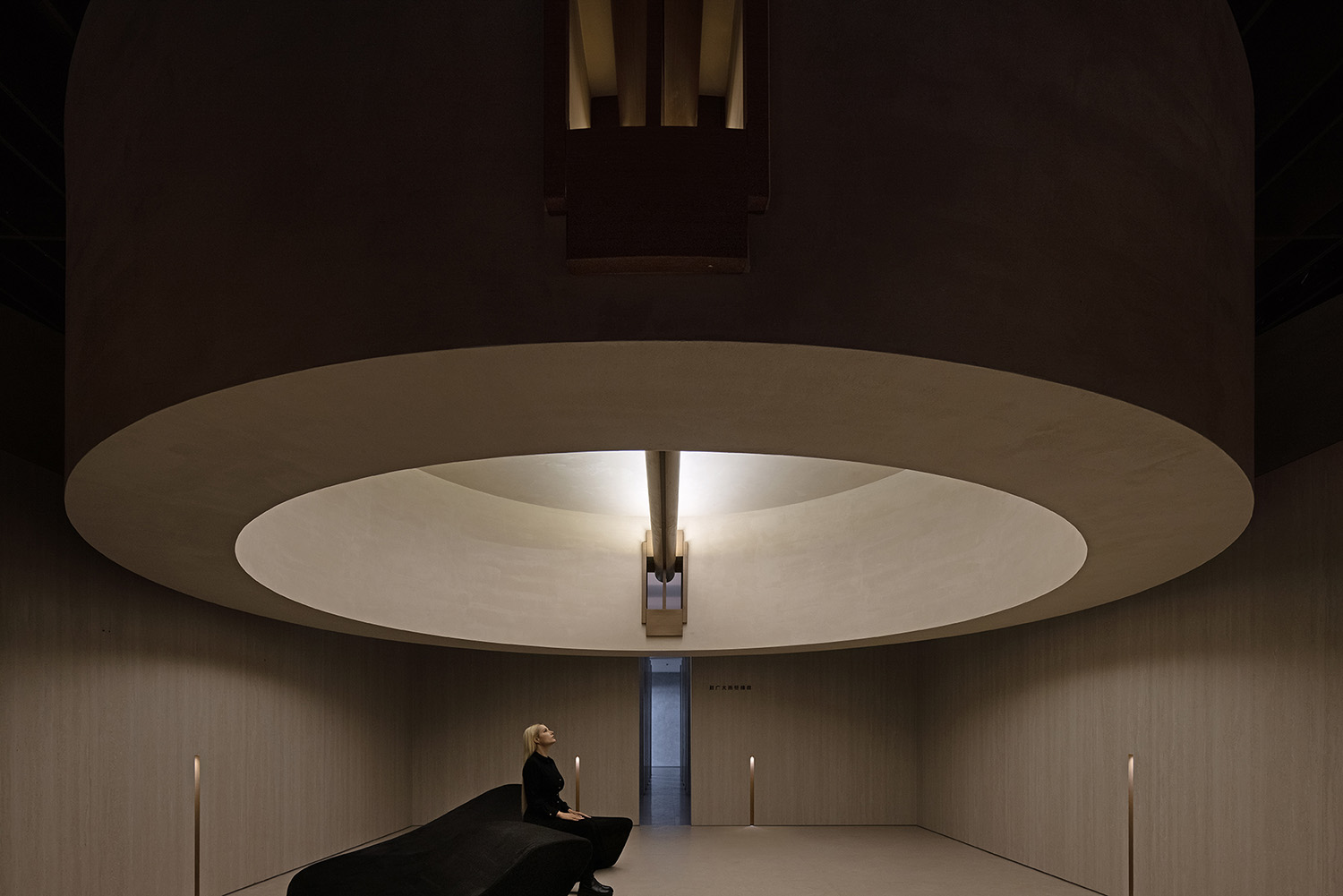
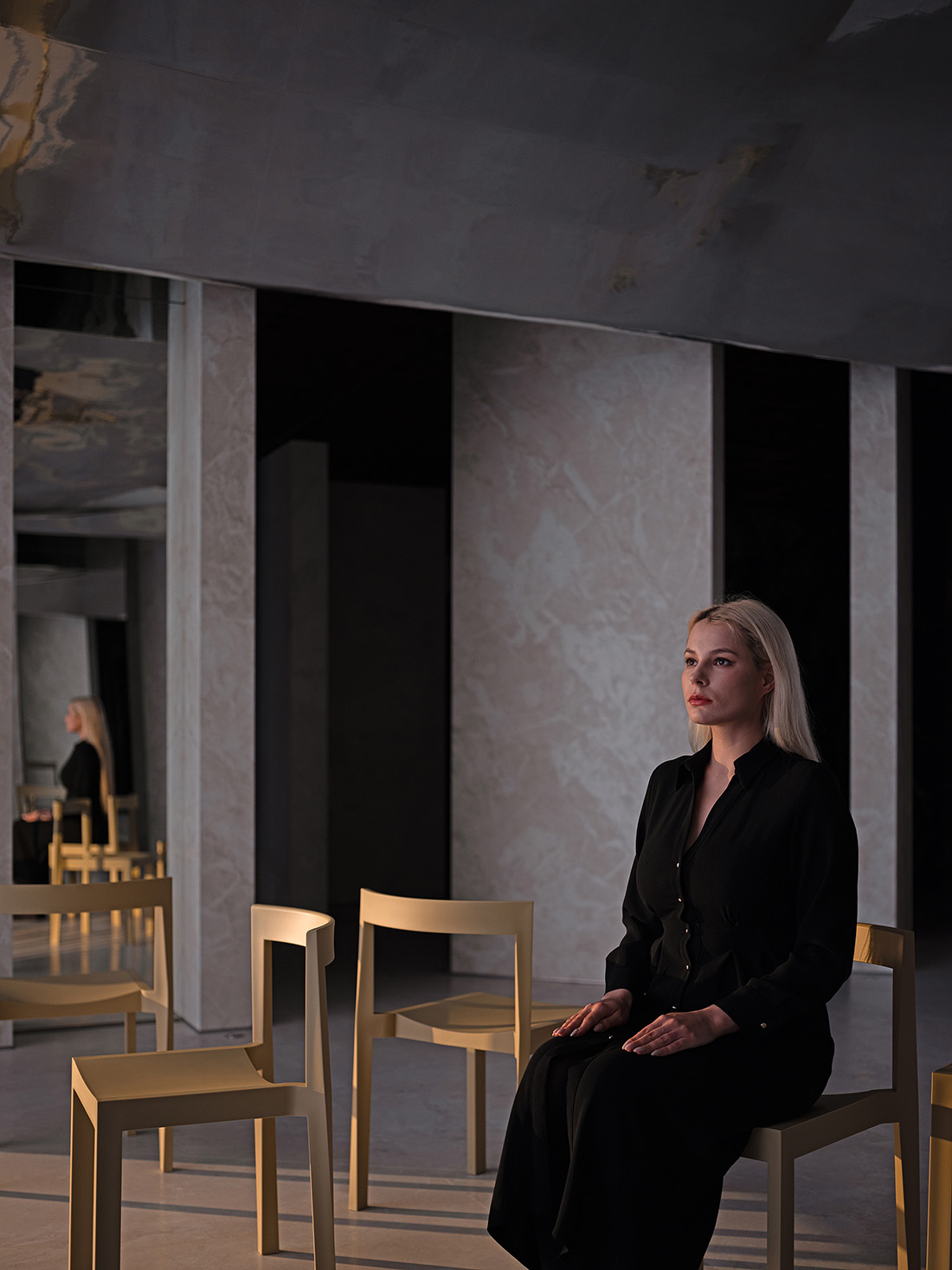
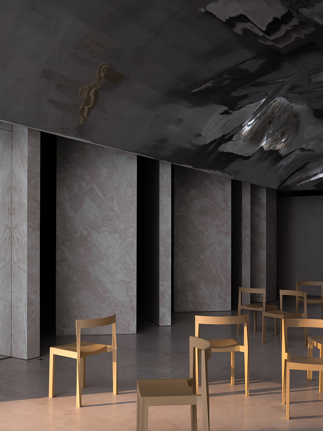
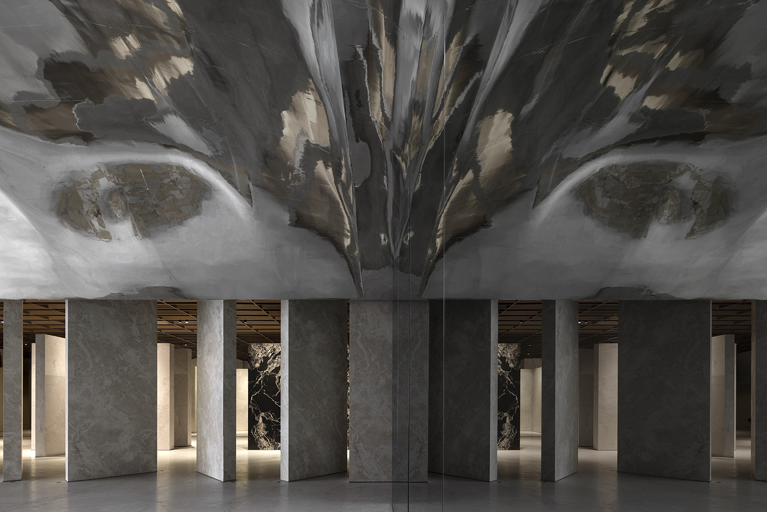
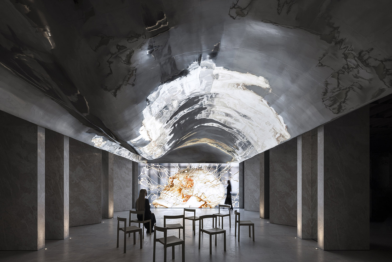
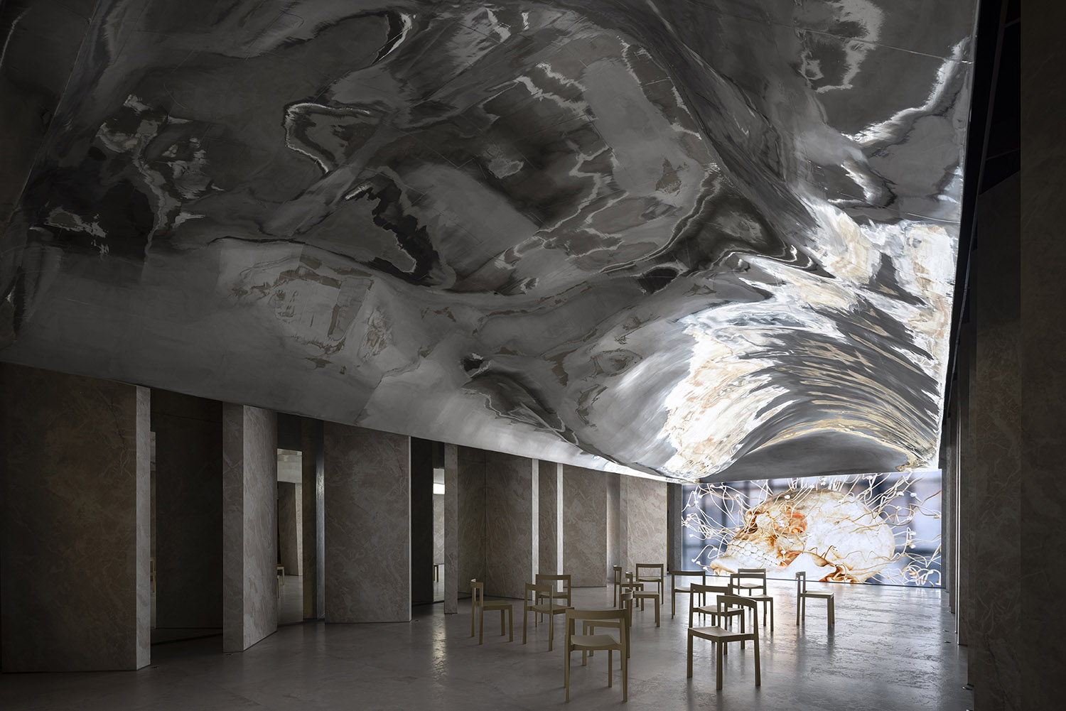
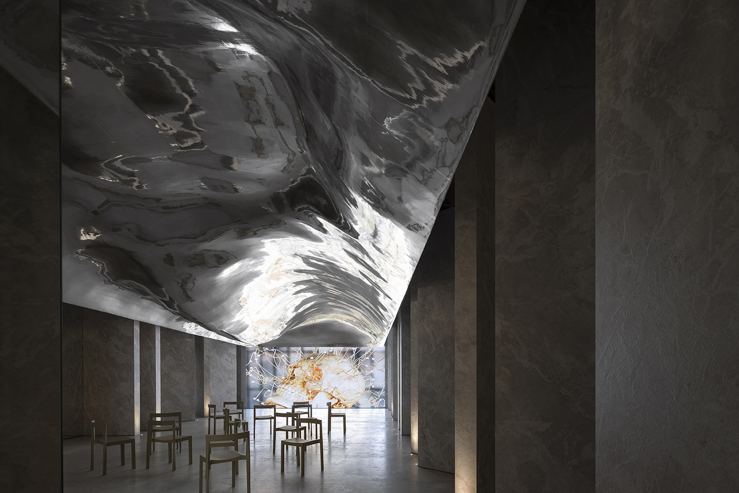
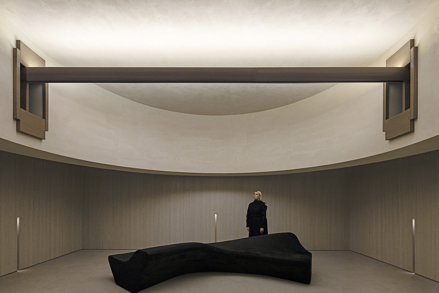
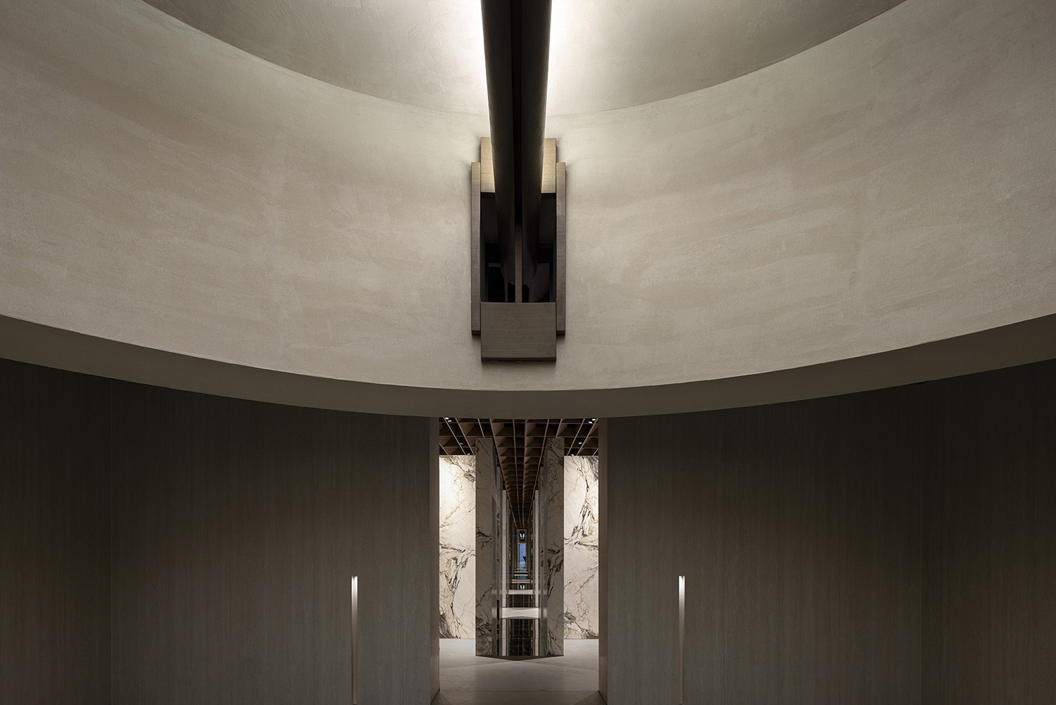
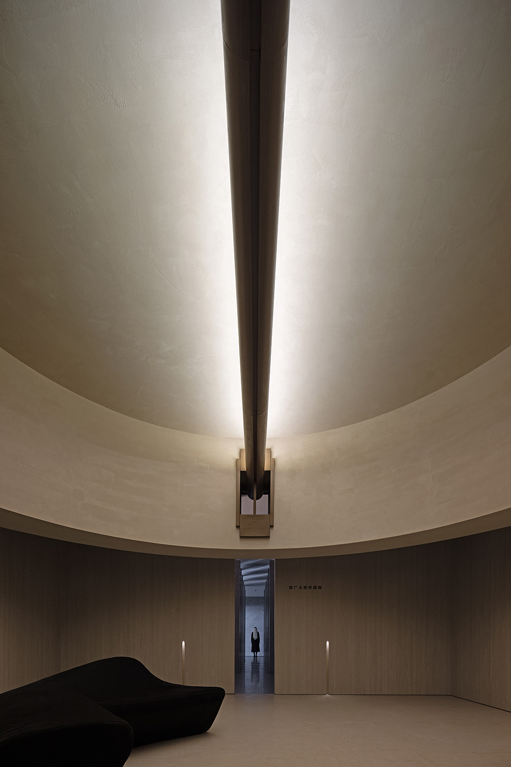
總部的客戶主要是經銷商與設計師群體,在整個歐文萊的總部裏麵,首先在整體的空間體係裏麵置入了一個多元的空間,未來主要用於沙龍的空間。沙龍空間以對稱的形式來表達空間的氣度與尊重,通過頂麵的大尺度流動性造型來軟化整體的空間硬度,讓總部的中心形成強烈的藝術視覺,強化品牌的記憶點。
The visitors at Overland headquarters mainly consist of dealers and designers. Within this environment, AD ARCHITECTURE have incorporated a diversified space — a salon area intended for future use. Designed with symmetry to evoke grandeur and respect, the salon space features a large scale, flowing shapes on the ceiling to soften the overall ambiance and create a visually captivating experience that reinforces the brand’s identity.
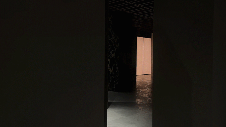
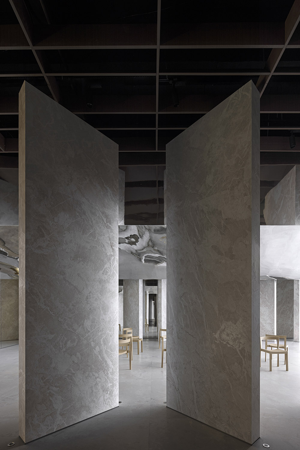
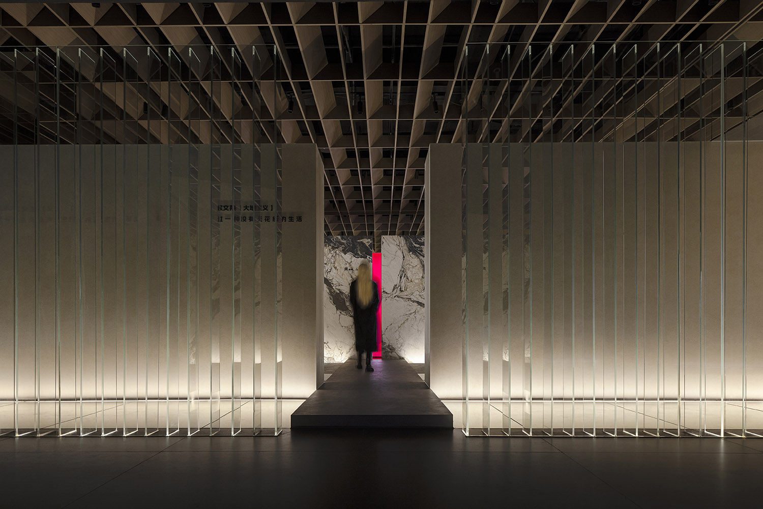
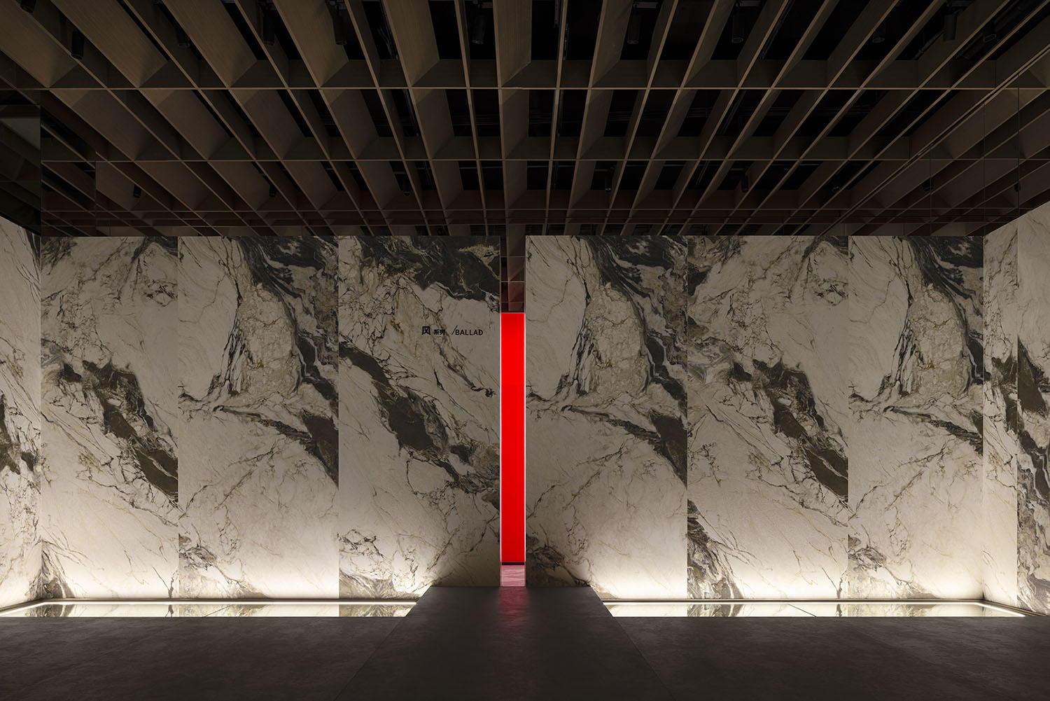
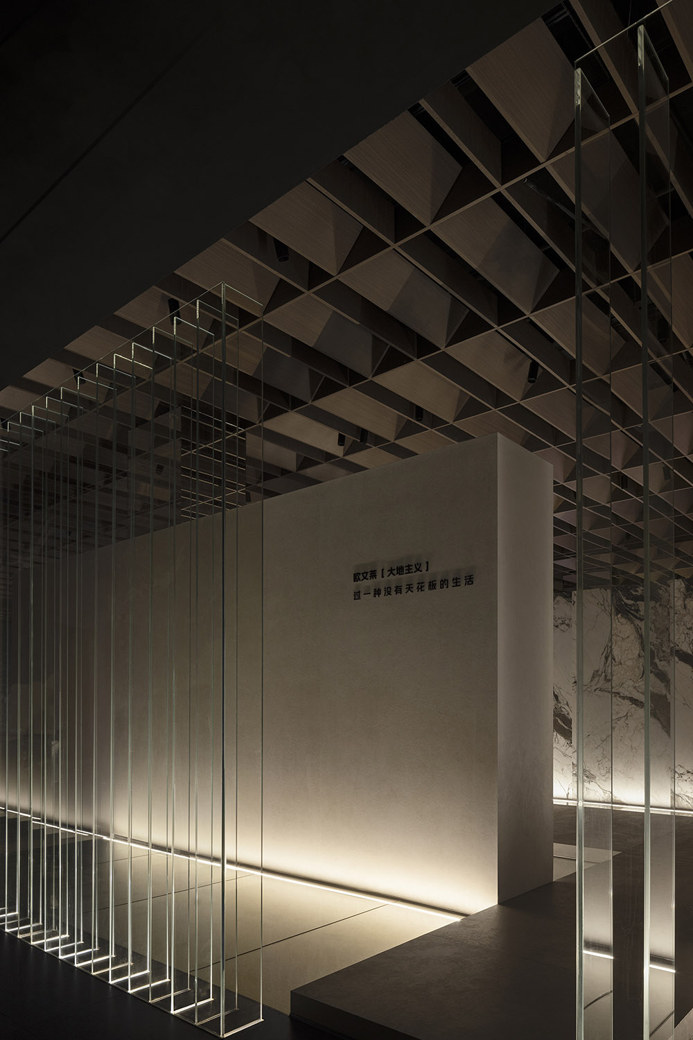
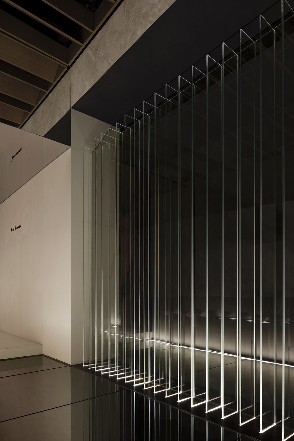
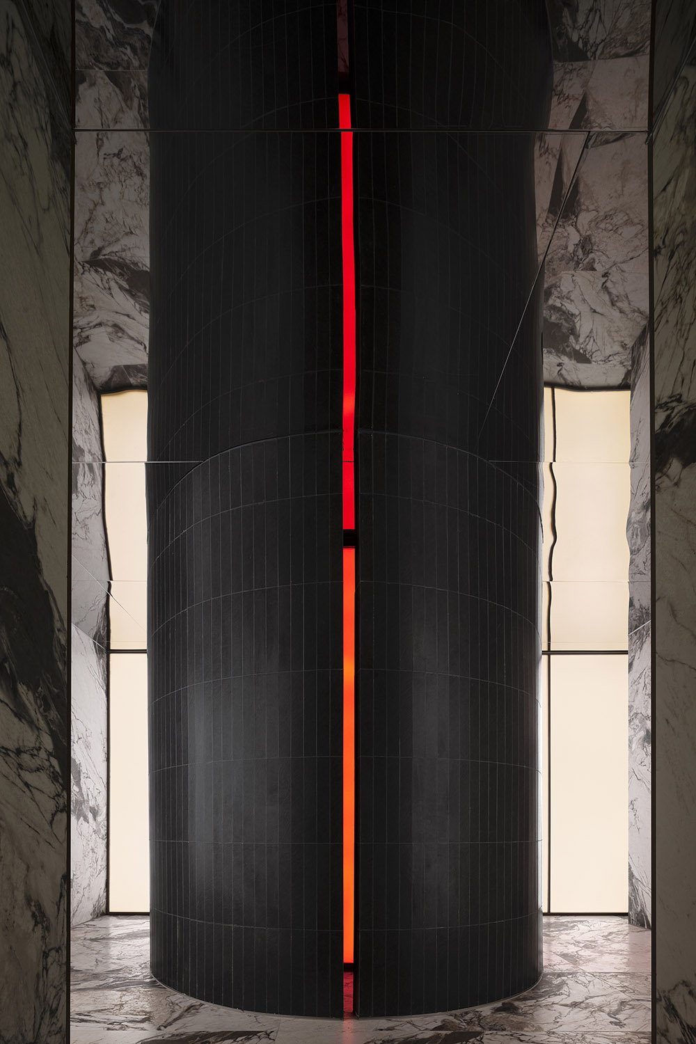
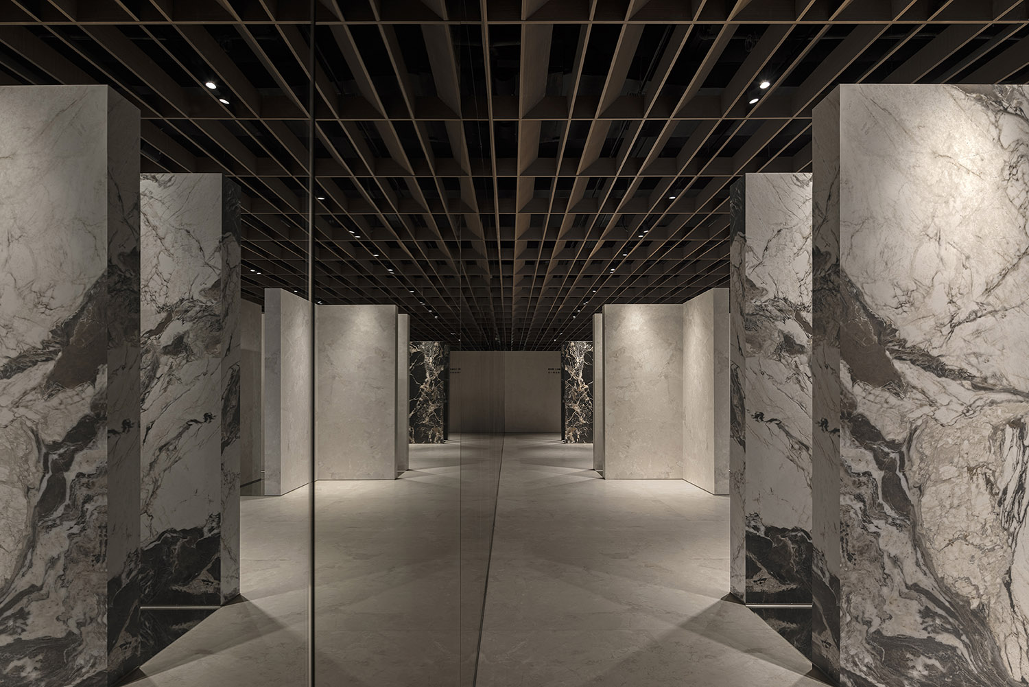
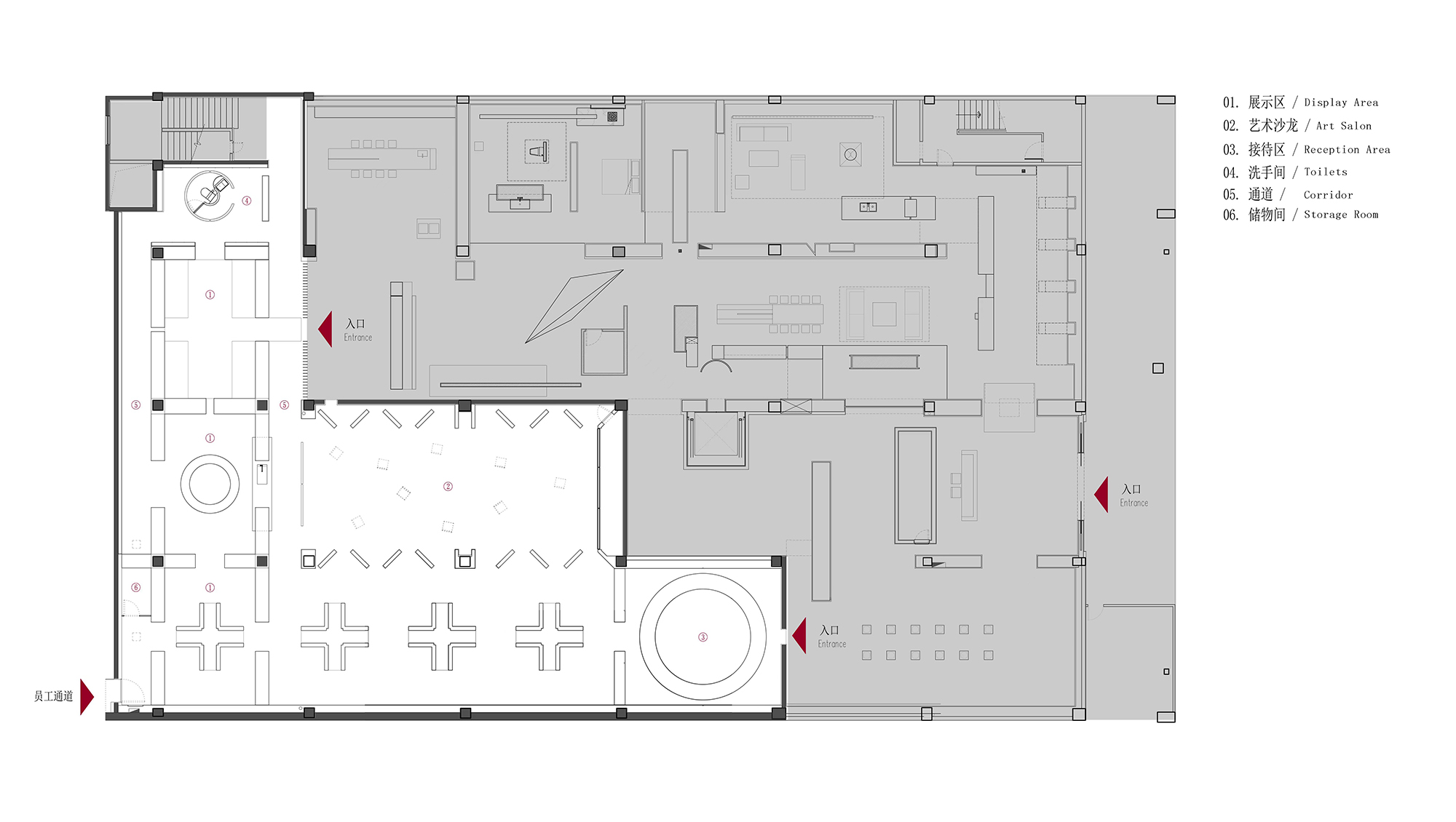
原建築未改造的空間區域,用陣列的玻璃作為隔斷,四片L型的厚牆圍合形成了第一個產品的運用展示空間;接待休息區由入口處最近的品牌空間相鏈接,地麵的鏡麵有水的意境,有效地柔化了空間的硬度,同時讓空間的鏈接產生了斷裂。圍合的空間展示了歐文萊大地主義主題產品係列“風”,周圍幹淨的產品有效地突出產品“風”自然不羈的特點。十字型的地麵讓空間產生了極度的平衡感,大的開口引導體驗者通向廊道。
In the original, unaltered areas of the building, the design team brought in glass arrays as partitions, with four L-shaped thick walls enclosing the first product display area. The reception and lounge area is connected to the adjacent brand space at the entrance. The reflective surface on the floor evokes the imagery of water, effectively softening the space while generating a sense of fluidity. The enclosed space displays the Ballad Collection of the brand’s new Earthism Series, with the neat product displays effectively emphasizing the natural and unrestrained characteristics of the Collection. The cross-shaped floor design imparts a profound sense of balance to the space, while the large openings guides visitors toward the corridor.
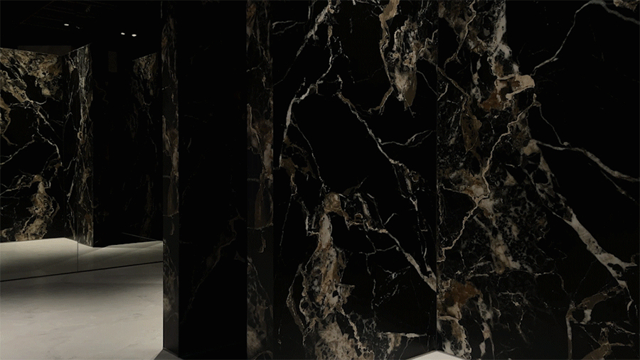
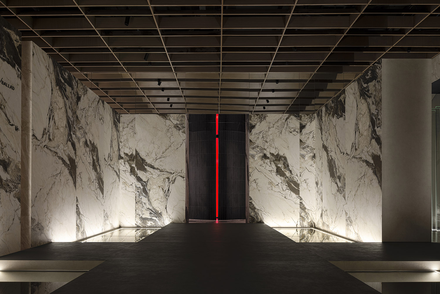
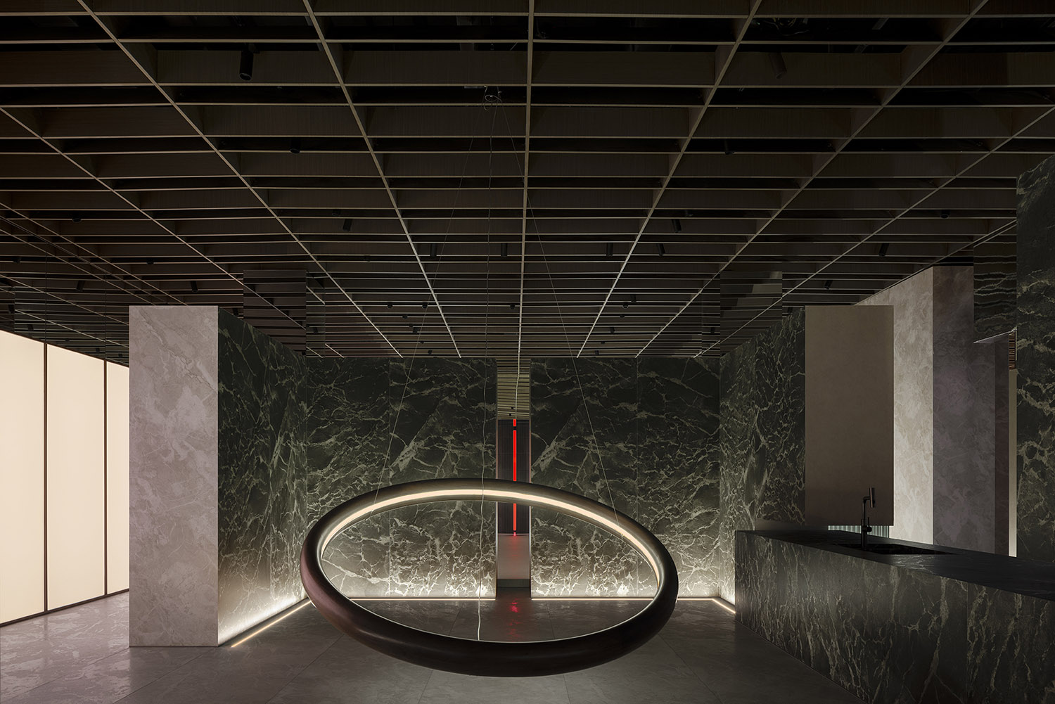
綠色大理石紋的圍合空間既是產品的圍合展示區,又是沙龍的水吧配套,強調體驗中的視覺感的同時又強調功能性的融合,同時未來感的空間感與感受是設計的另外一個核心。
The enclosed space clad with products featuring green marble patterns serves both as a product display area and a water bar for the salon space, emphasizing both visual experience and functional integration. Additionally, the space features a futuristic feeling, which is another key consideration in its design.
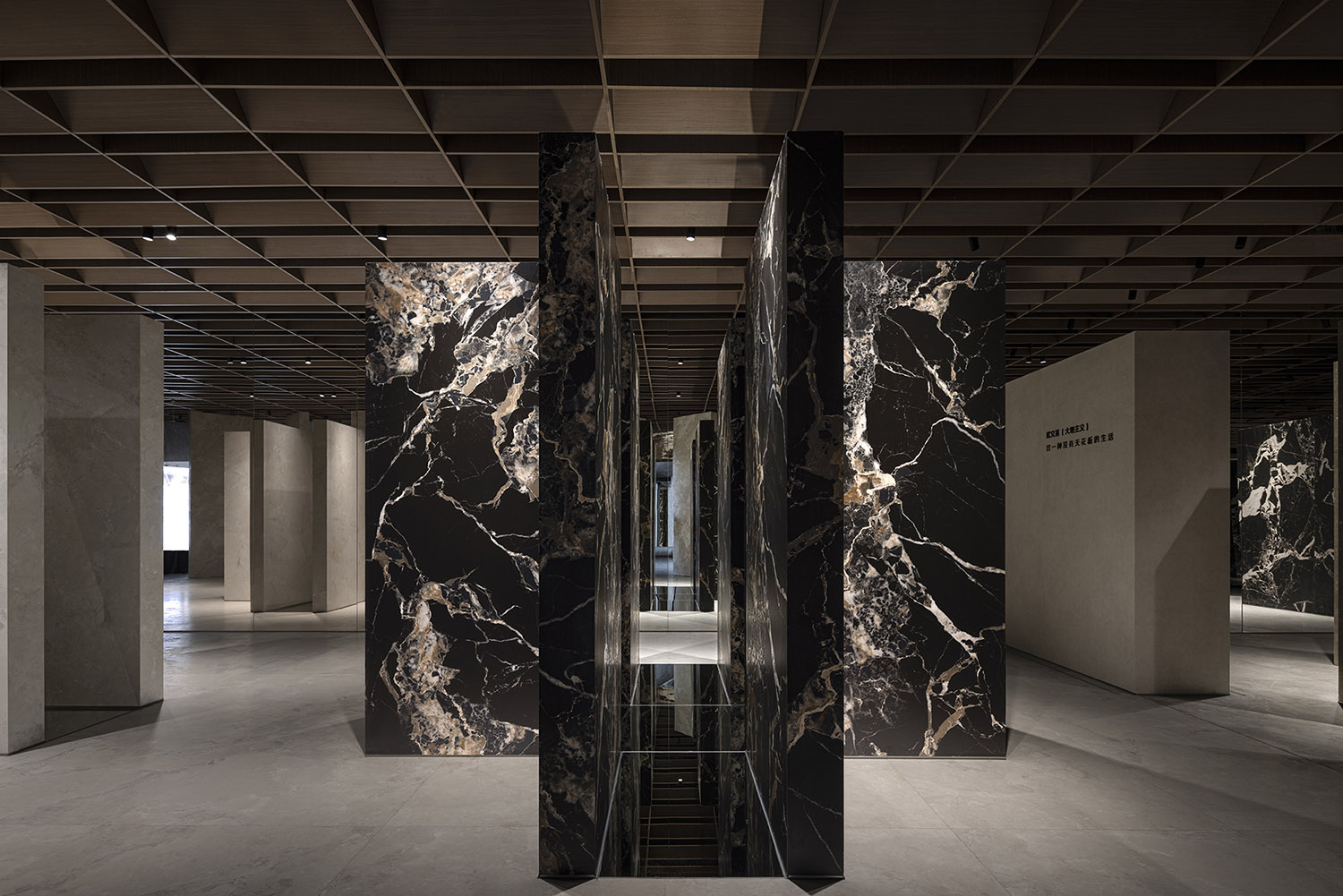
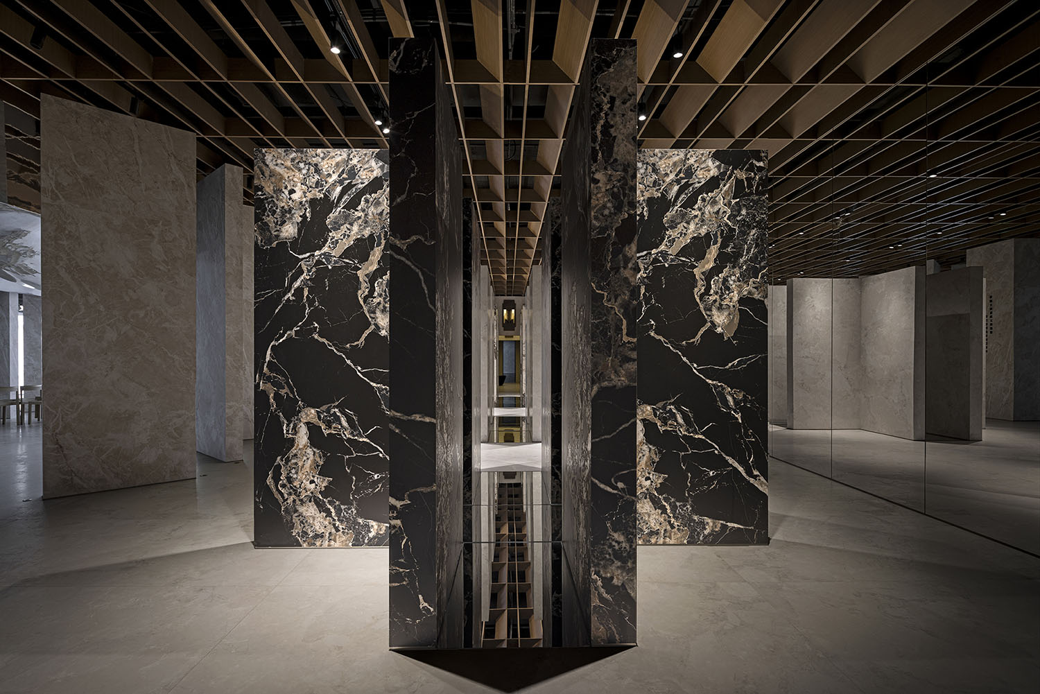
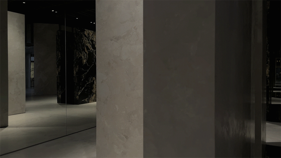
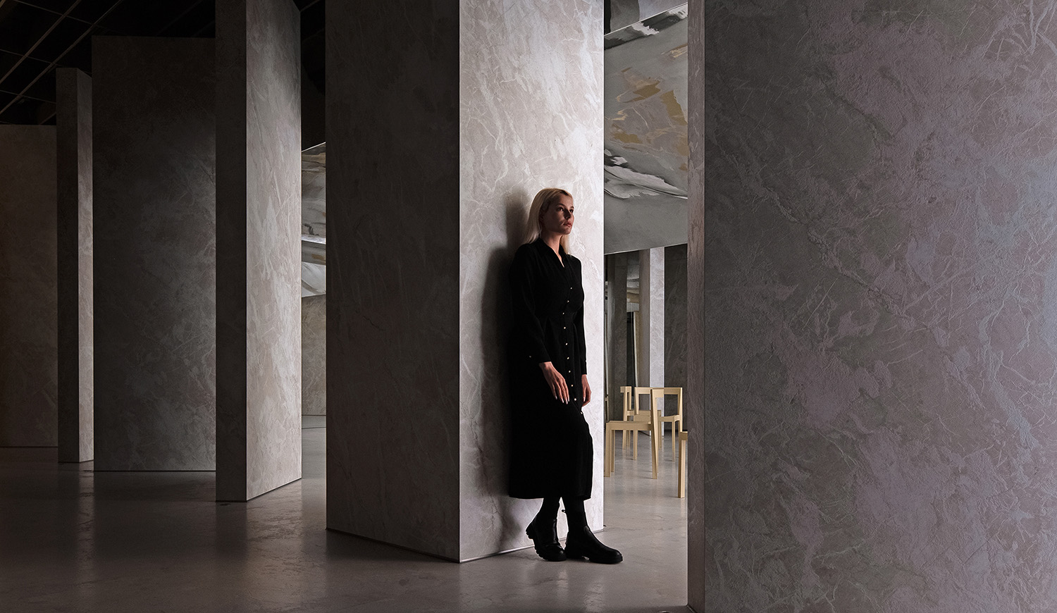
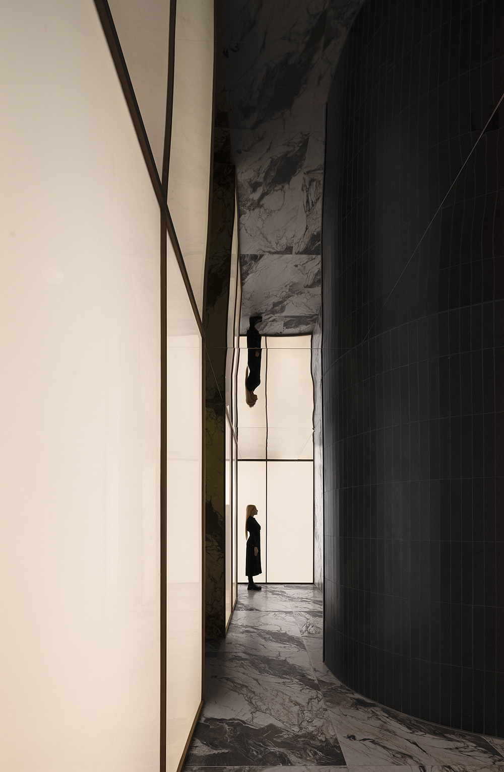
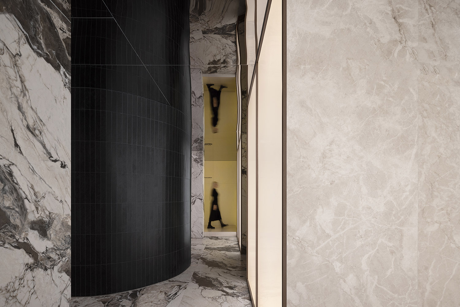
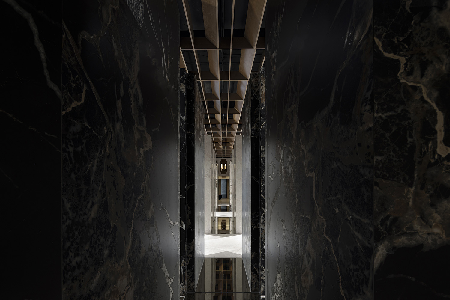
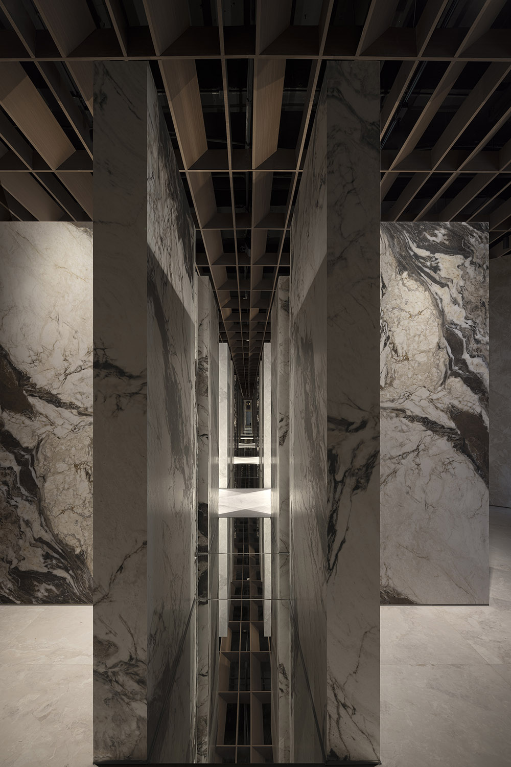
樣板區在傳統的展廳中,都是以貼牆的形式出現,這一次嚐試一種新的表達形式,四個L型的形體構成的十字型的結構將產品立於空間的中心,突顯產品才是空間背後的核心價值。通過結構的重複發生,演變了強烈的序列性。牆麵的鏡麵與地麵的鏡麵的運用,則又一次模糊了空間的邊界,讓人試圖進入一個虛幻又真實的場景中。
In contrast to traditional porcelain and stone tile showrooms where samples are typically affixed to walls, AD ARCHITECTURE opted for a new approach. Several cross-shaped structures, each of which is formed by four L-shaped units, showcases the products at the focal point of the space. The repetition of this structure creates a strong sense of sequence in the space. Furthermore, the use of mirrors on the walls and floor further blurs the spatial boundaries, inviting visitors into an illusionary yet tangible environment.
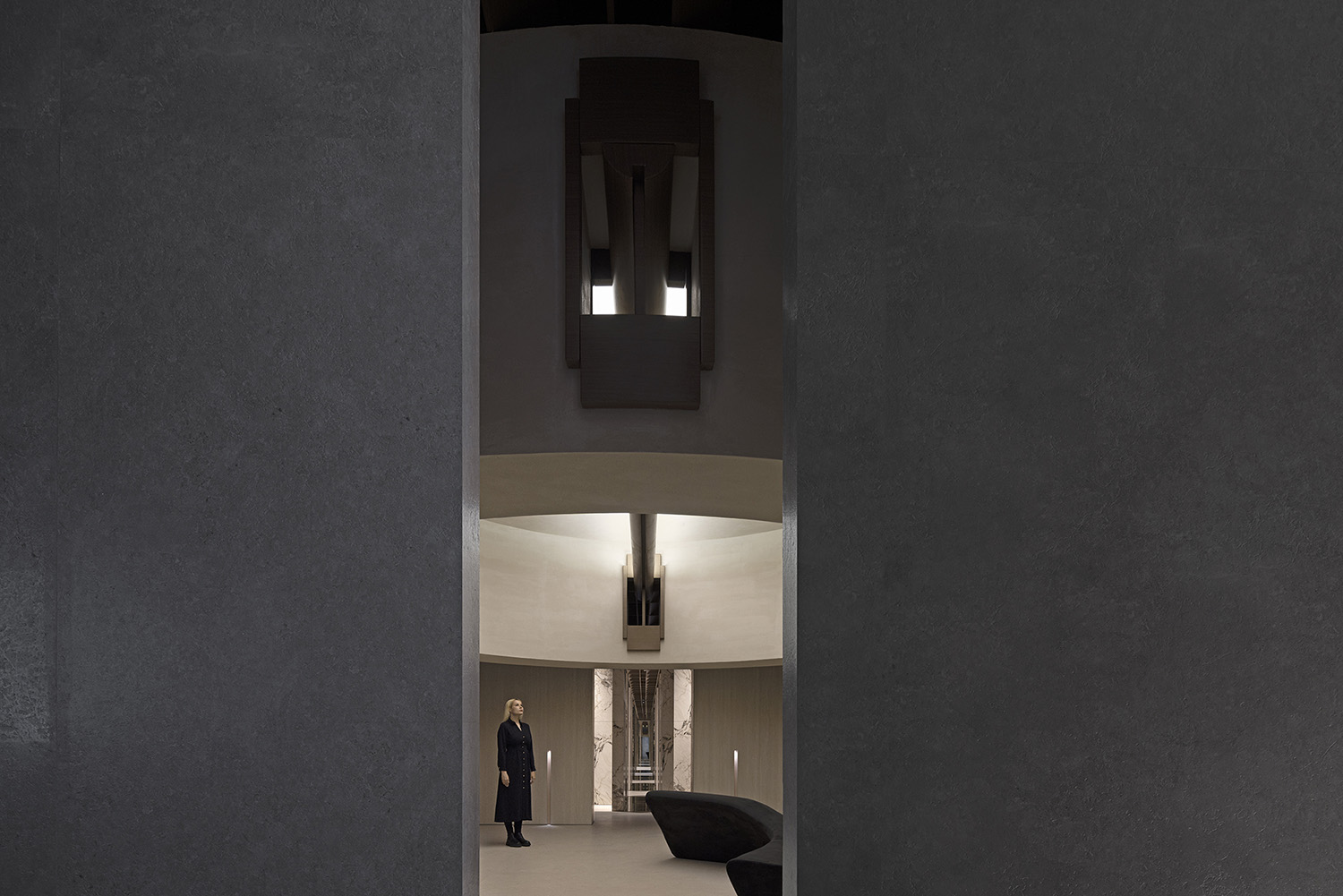
最後利用一個圍合的正方形空間來作為項目原空間與新的改造空間進行鏈接,更好地成為空間中的過渡,強烈的建築形式與燈光讓空間靜止下來,最後給人一個交流的畫麵。一張孤獨的曲麵沙發卻闡述了一個互動的場景。
An enclosed square space is leveraged to connect the original and renovated areas, facilitating a smoother transition within the space. The distinctive architectural languages and lighting bring serenity to the space, culminating in a scene conducive to communication. Additionally, a solitary curved sofa is subtly placed to create an interactive setting.
∇ 平麵圖 © AD艾克建築 plan © AD ARCHITECTURE
項目信息
項目名稱:歐文萊總部大地主義展館
項目業主:廣東歐文萊陶瓷有限公司
設計機構:AD ARCHITECTURE|艾克建築設計
總設計師:謝培河
項目地點:廣東佛山
建築麵積:850㎡
主要材料:岩板、藝術漆、鏡子、木格柵、金屬
設計時間:2023年11月
竣工時間:2024年01月
項目攝影:歐陽雲
視頻剪輯:AD艾克建築
Project name: Overland’s Headquarters Showroom for the New Earthism Series
Client: Overland
Design firm: AD ARCHITECTURE
Email: office@arch-ad.com
Chief designer: Xie Peihe
Location: Foshan, Guangdong
Area: 850 sqm
Main materials: sintered stone, art paint, mirror, wooden grille, metal
Design time: Nov. 2023
Completion time: Jan. 2024
Photos: Ouyang Yun
Video editing: AD ARCHITECTURE


