01 向購物中心學習
Learning from shopping malls
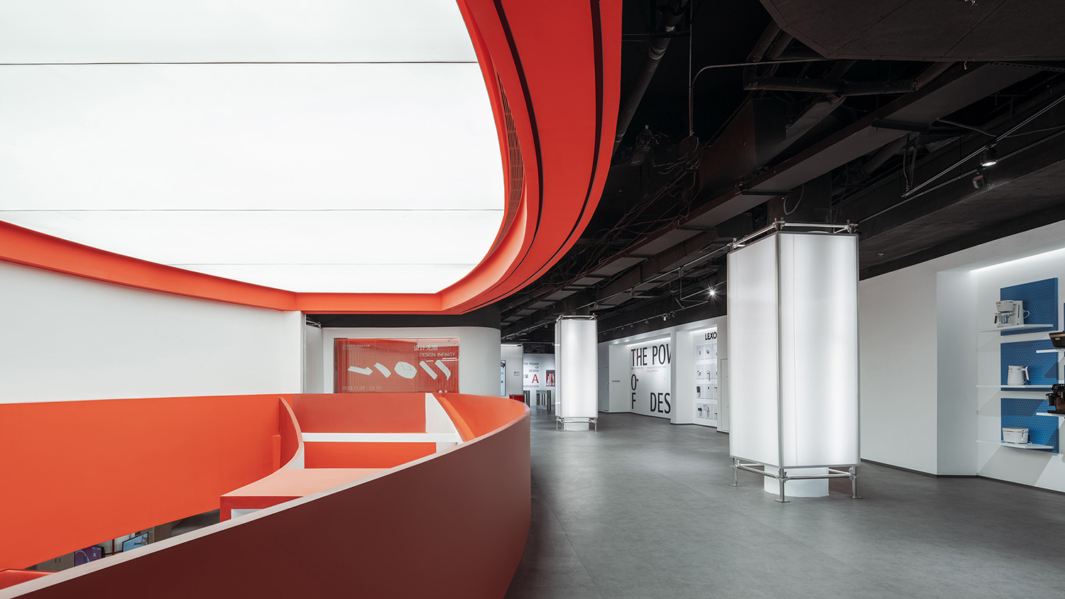
廈門紅點設計博物館是德國紅點設計大獎在全球設立的第三家、亞洲第二家博物館。區別於傳統的博物館,紅點設計博物館的展品大多為貼近日常生活的工業設計產品,與大眾消費文化息息相關。
Red Dot Design Museum in Xiamen is the third Red Dot Design Museum globally and the second in Asia. Different with traditional museum, Red Dot Design Museum mainly exhibit industrial design products that are close to people’s daily life, which naturally inspires us with the relation of consumer culture.
∇ 空間概覽 © CreatAR Images (Ai Qing)
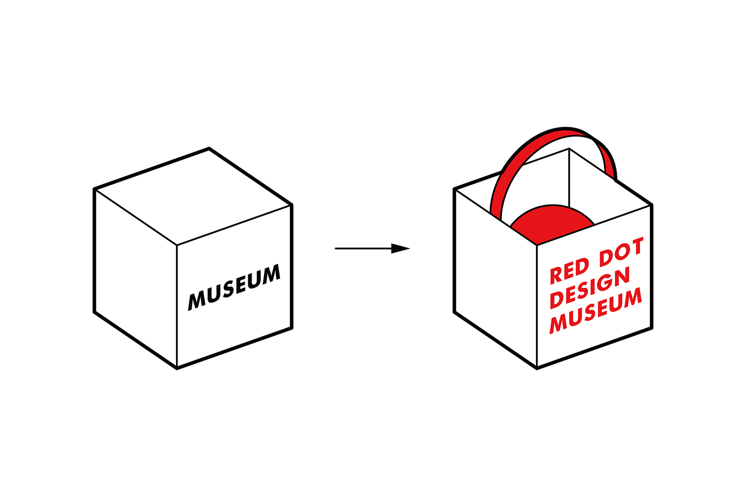
安迪·沃霍爾曾預言:“所有的購物中心將會成為博物館,所有的博物館將會成為購物中心。”受此啟發,我們決定:與其設計一個保守而冰冷的白盒子式博物館,不如大膽嚐試打破博物館和購物中心兩種空間模式的界限。幸運的是,我們的想法與紅點決策層希望打造一座接地氣、有活力的新型設計博物館的初衷不謀而合。
Andy Warhol once commented: “All shopping malls will become museums, and all museums will become shopping malls.” Also inspired by this comment, we decide that rather than designing another traditional white-box type of museum, we should break the boundaries between the two spatial systems of museum and shopping mall. Luckily, this coincides with museum leadership’s idea of building a new type of design museum.
∇ 概念示意圖 © STEPS大台階建築
自19世紀初巴黎的拱廊街到今天的購物中心,本雅明曾在《拱廊計劃》中提出的“漫遊者”的生活方式早已成為建築師們共同守護的價值觀:在城市的消費環境中盡可能創造免費的公共空間,供人們度過休閑時光。在紅點設計博物館中,我們通過沿用購物中心這種大眾熟悉的日常空間形式,充分平衡商業空間與免費公共空間的關係,打造出一個讓人們可以像逛街一樣自在漫遊的博物館,拉近博物館與參觀者的距離。
From arcades emerging in 19th Paris to shopping mall now-days, the concept of “idler” that Benjamin created has now become a common value that architects firmly guards: Creating as more free public spaces as possible in urban consumer environment for people to leisure. Learning from shopping malls, we try to create a museum that feels like wandering in shopping mall by balancing commercial and free public spaces.
∇ 自在漫遊的空間 © CreatAR Images (Ai Qing)
02 商業裙樓的新生
The rebirth of a commercial podium
新館的選址位於廈門集美杏林灣商務區最高寫字樓的商業裙樓。我們試圖將裙樓自帶的商業空間屬性與博物館空間結合,重新激活城市中這處已空置許久的商業裙樓。
The new museum is located in the commercial podium of the highest office building in Xinglin Bay, Jimei District, Xiamen. We try to adapt the original spatial properties of a shopping mall into new museum spaces, thus activating this long-vacant podium.
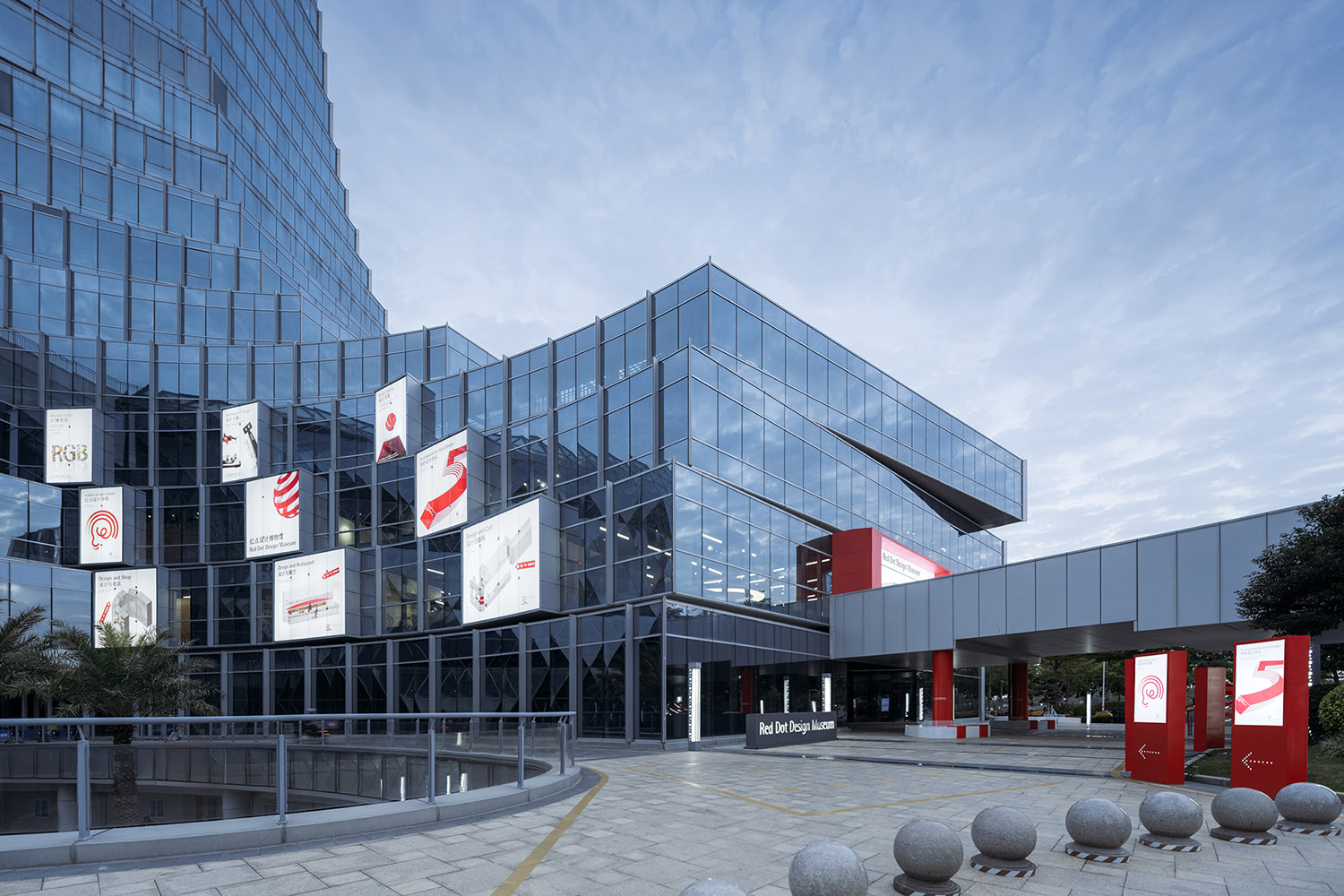
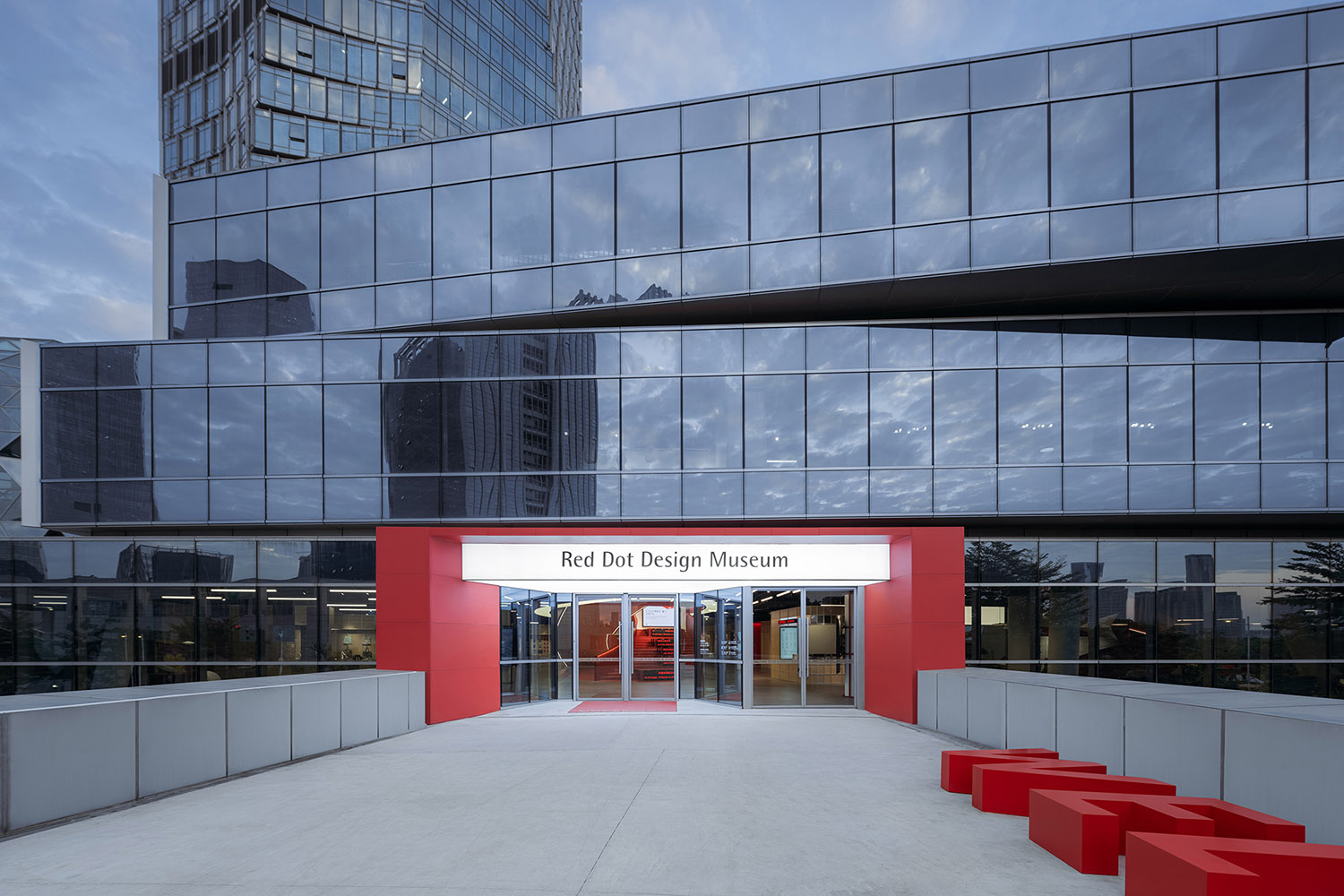
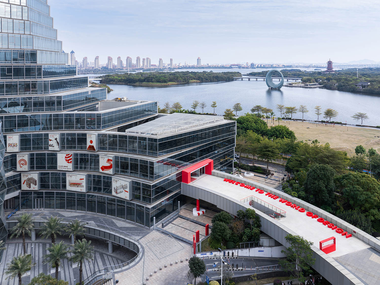
我們直接利用裙樓原有的立麵櫥窗作為博物館的海報櫥窗。在室外廣場和人行橋上,通過設置一係列局部的紅色元素:廣告箱、柱子、扶手、雨棚、字母座位等,作為醒目的導視指引,將參觀者引向博物館入口。既形成了博物館的戶外公共空間,也為城市增添了一抹鮮明的紅色。
We reuse the commercial façade showcases as showcases for museum posters. On the exterior plaza and bridge, by implanting a series of red elements as poster installation, column and railing paint, alphabetical seatings and canopy, we create a distinct pathway that leads people to the entrance of the museum, which also serves as the exterior public spaces of the museum, bringing a distinct shred of red to the city.
∇ 一係列紅色元素作為戶外導視指引 © CreatAR Images (Ai Qing)
∇ 博物館入口 © CreatAR Images (Ai Qing)
∇ 博物館的戶外公共空間 © CreatAR Images (Ai Qing)
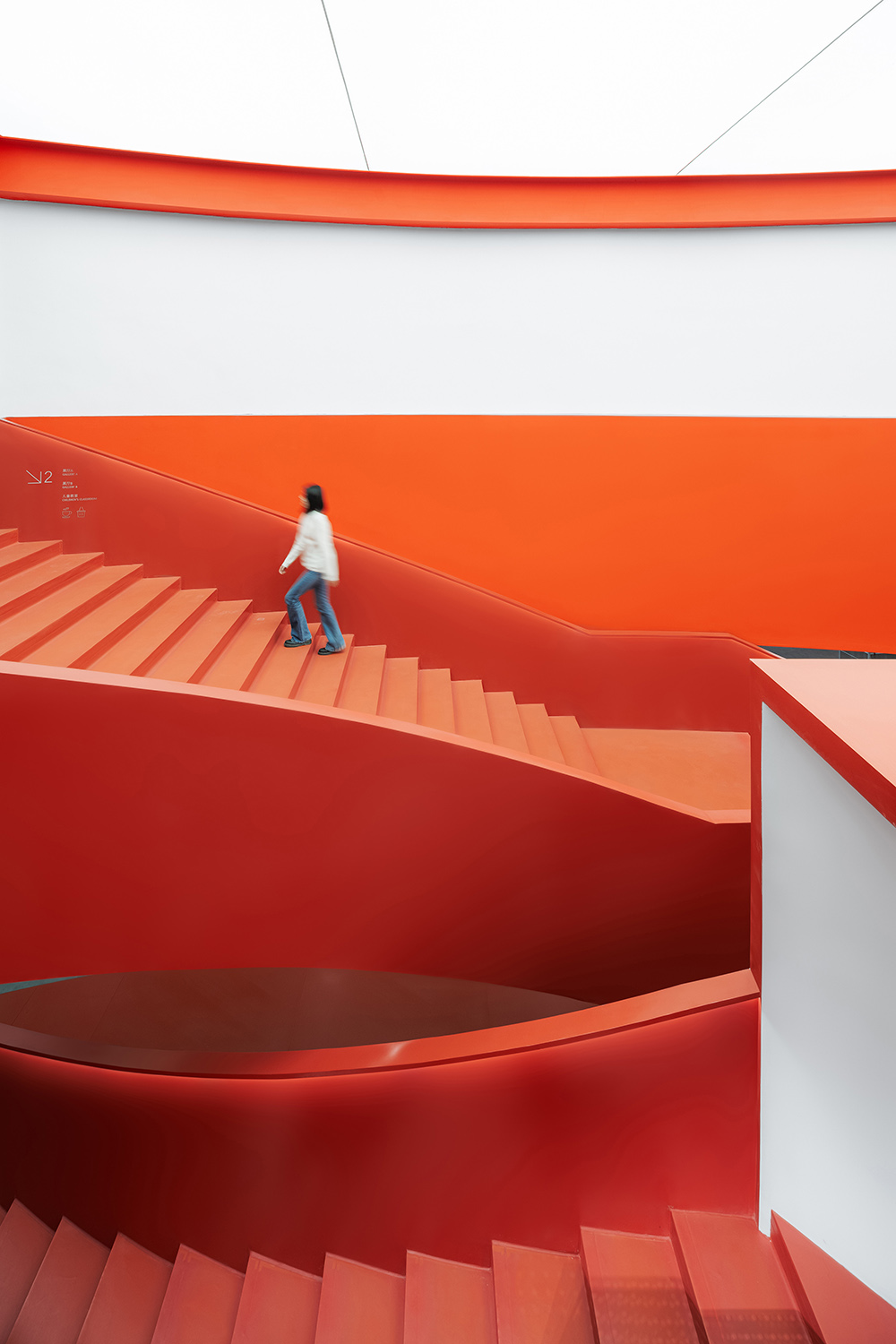
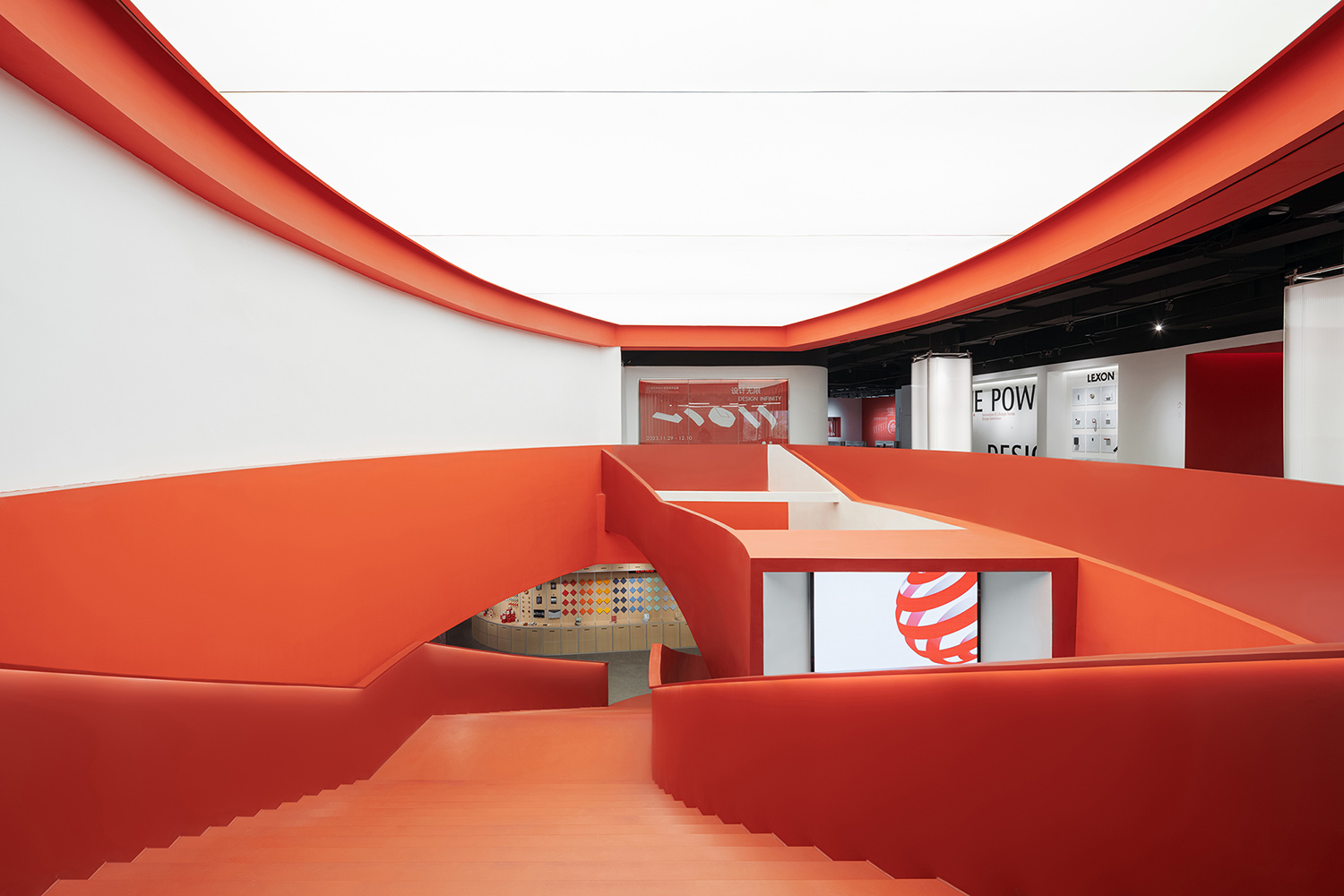
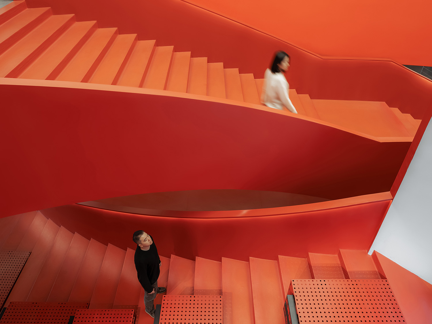
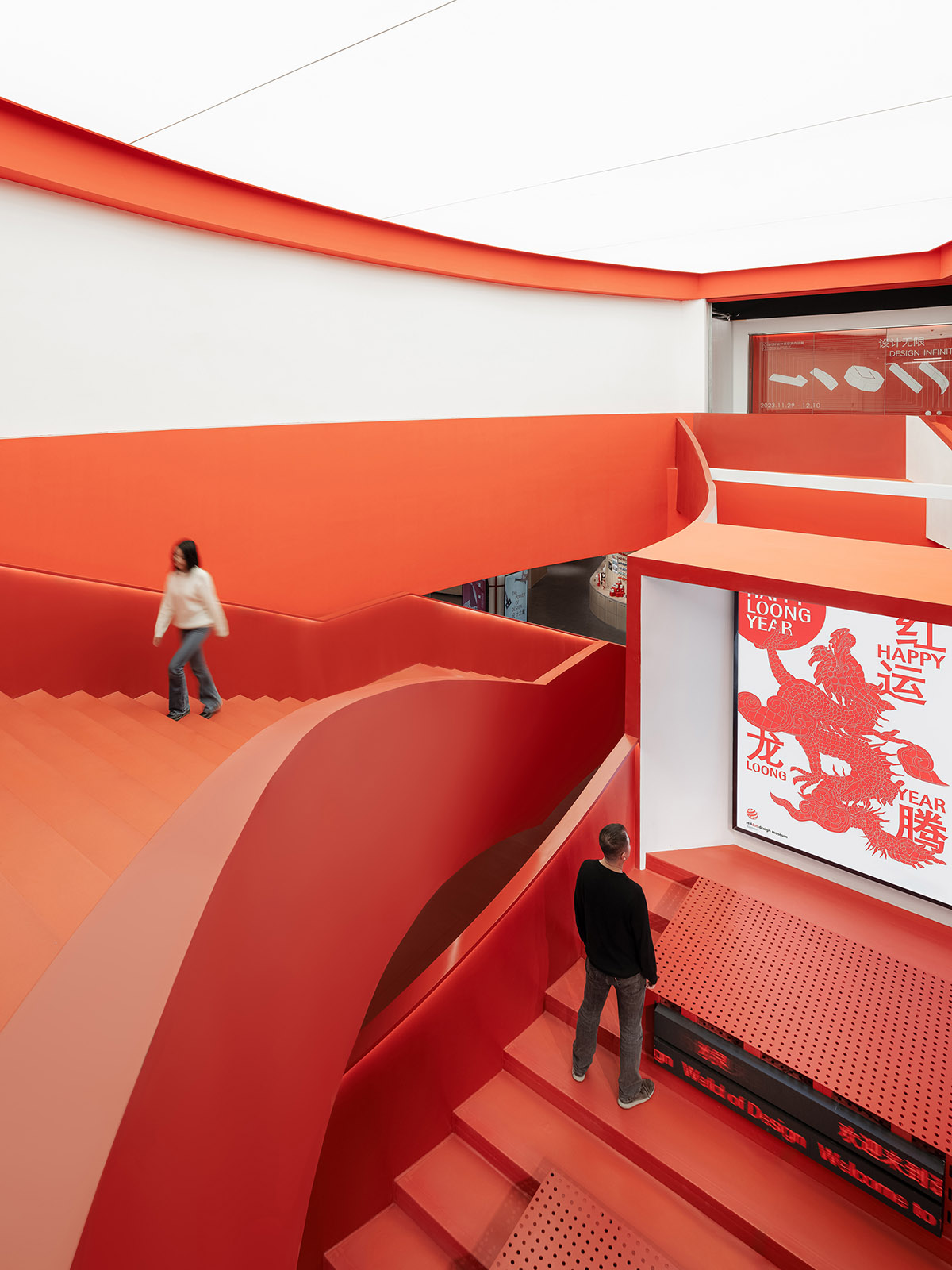
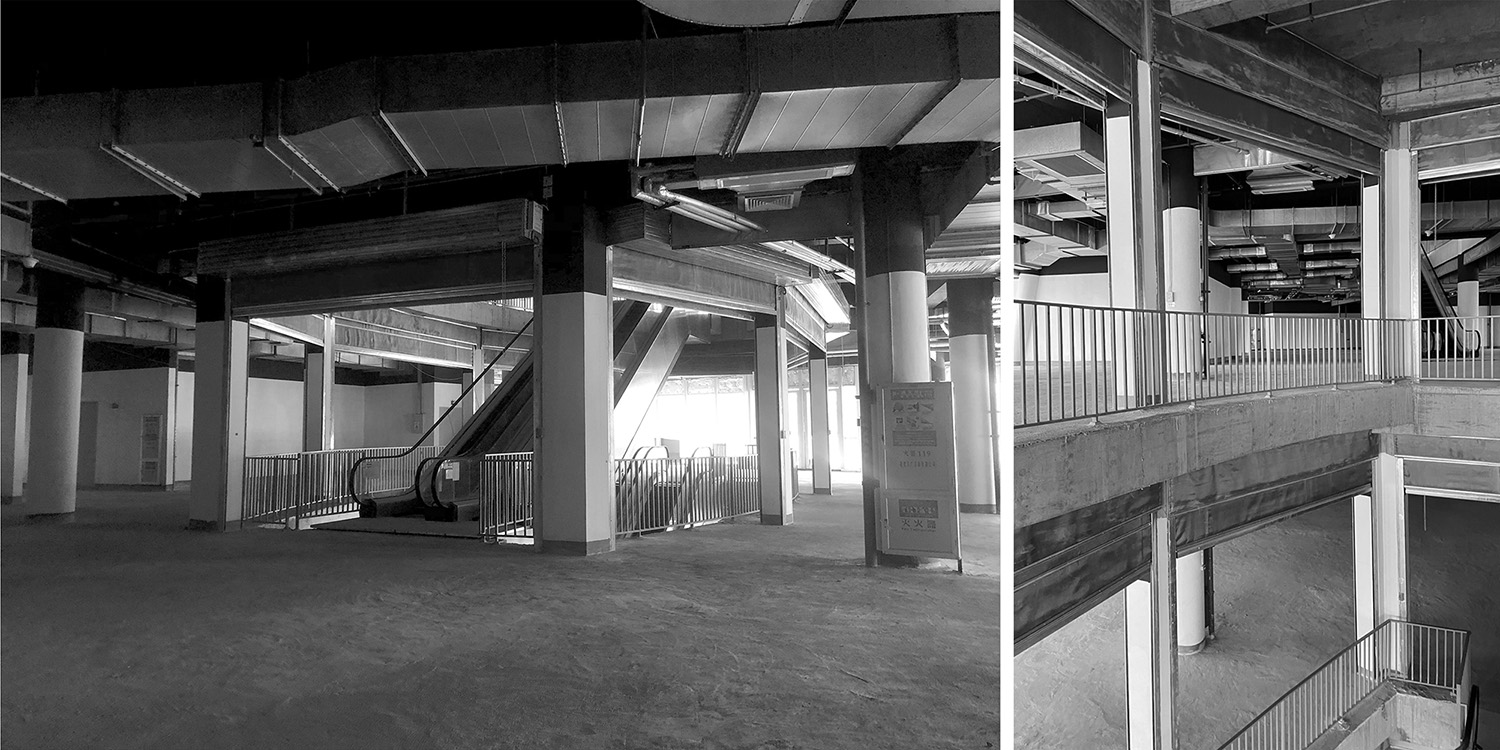
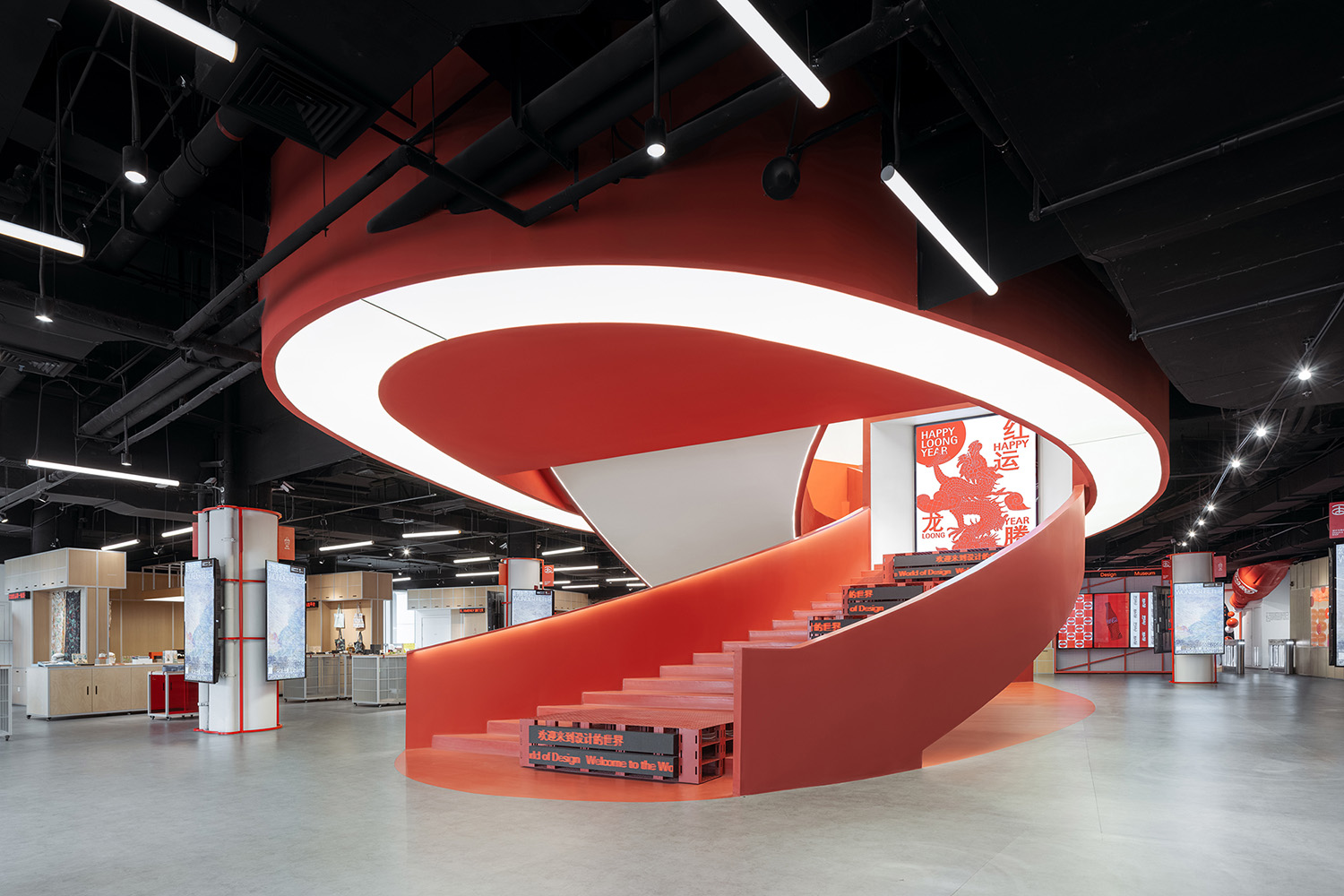
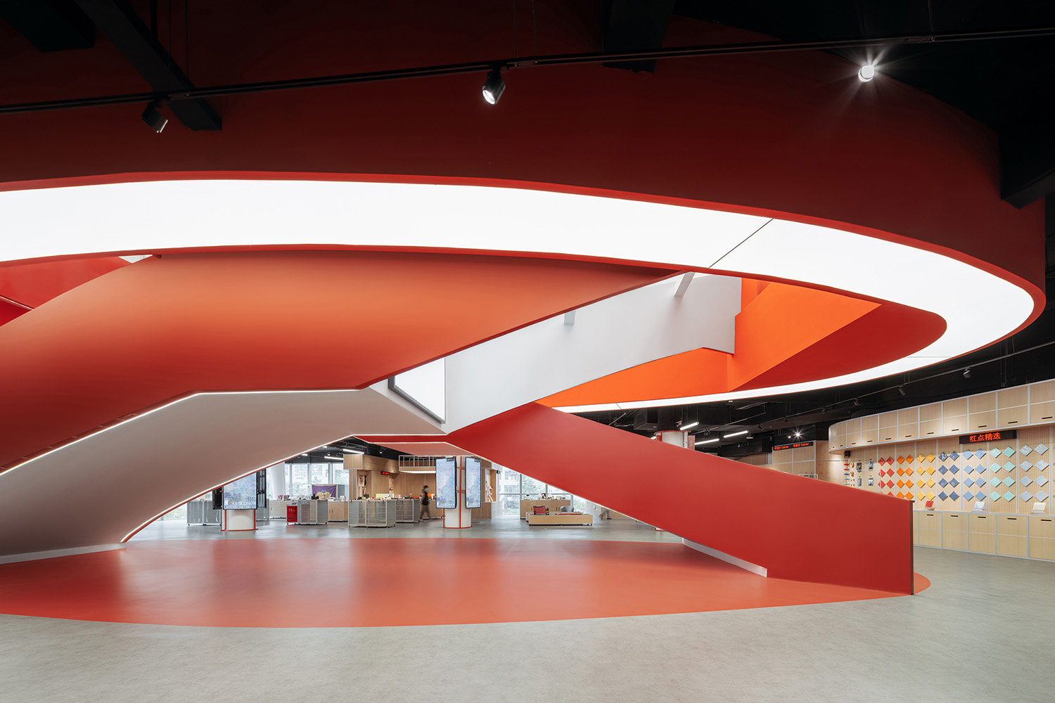
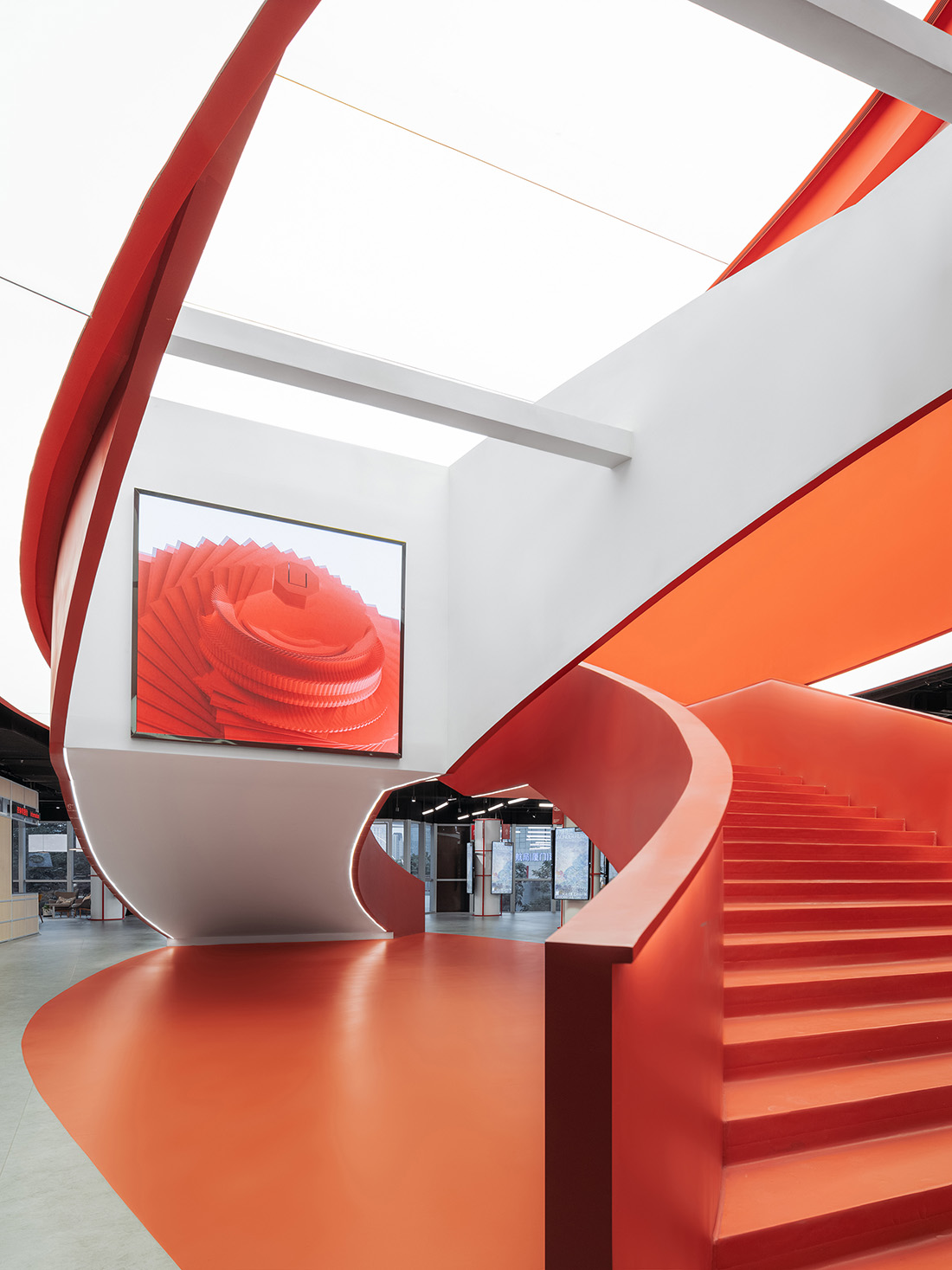
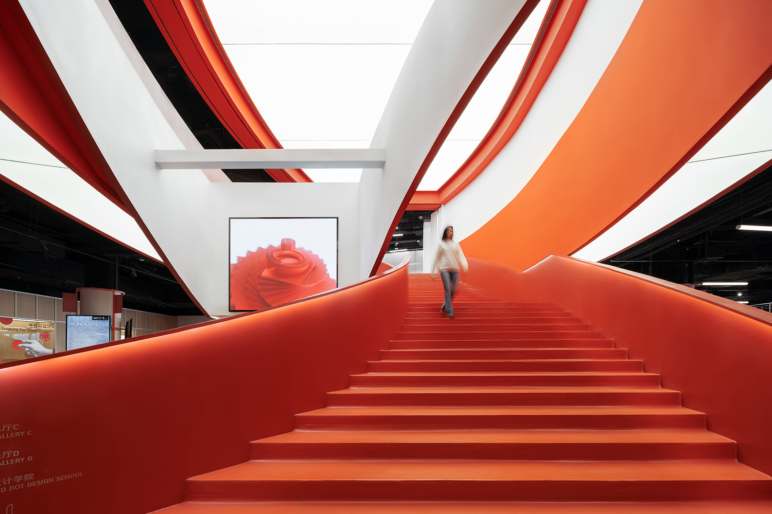
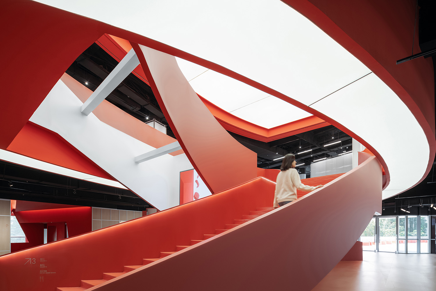
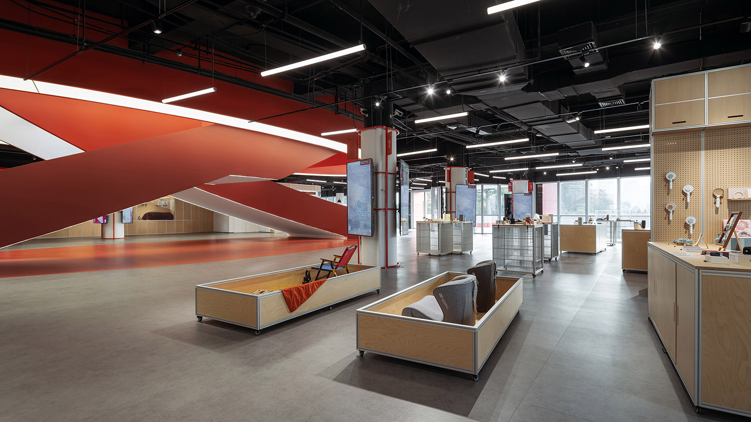
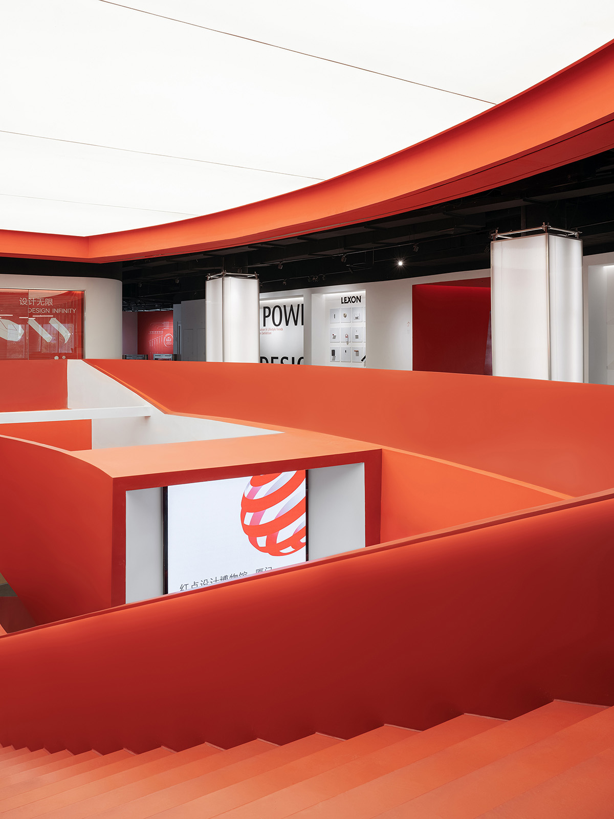
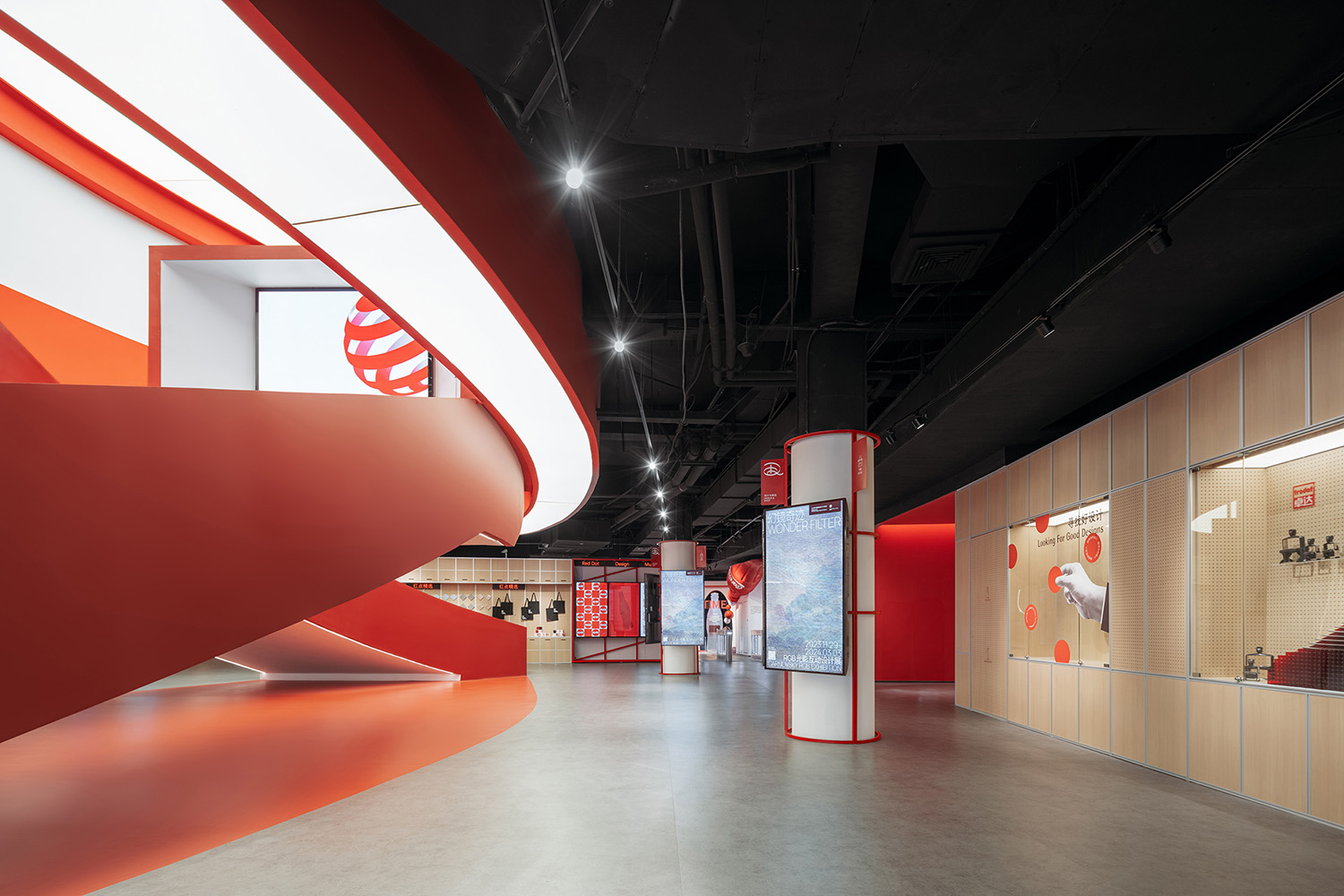
我們與跨媒介設計團隊協作派對合作,充分挖掘利用現有商業裙樓的空間優勢,打造博物館的重點公共空間,即最具開放性的商業零售區及餐飲咖啡區。通高的中庭空間作為全館核心正對著博物館入口,我們拆除了原電動扶梯,設計了極具標識性的巨型雙螺旋紅色樓梯取而代之,成為視覺核心。麵向入口的梯段為展示樓梯,設置LED屏幕,可不定期更換主題展品和視頻內容;另一梯段為通向上層的功能性樓梯。兩段樓梯交錯纏繞,頗具遊戲性和戲劇性,吸引參觀者在此拍照打卡,通過社交媒體為博物館宣傳引流。
Collaborating with Network Party, we fully take advantage of the interior spatial properties of the commercial podium to form essential public spaces of the museum, which are the spaces of retail, coffee and restaurant. The atrium facing the entrance is the most distinct feature, we remove the escalators and turn it into the most iconic double-spiral red stair that serve as the visual core of the museum. The one half of the double-spiral stair facing the entrance serve as the “display stair” which seats the LED screens showing posters and videos that are updated periodically, and the other half leads people to upper floor. The double-spiral stair intertwines dramatically, bringing much attraction both off and on-line.
∇ 通高的中庭空間原狀 © STEPS大台階建築
∇ 麵向入口的展示樓梯 © CreatAR Images (Ai Qing)
∇ 作為視覺中心的中庭樓梯 © CreatAR Images (Ai Qing)
∇ 展示樓梯的鏤空部分設置大屏幕 © CreatAR Images (Ai Qing)
∇ 通向三層的交通樓梯 © CreatAR Images (Ai Qing)
∇ 富有動感的中庭樓梯 © CreatAR Images (Ai Qing)
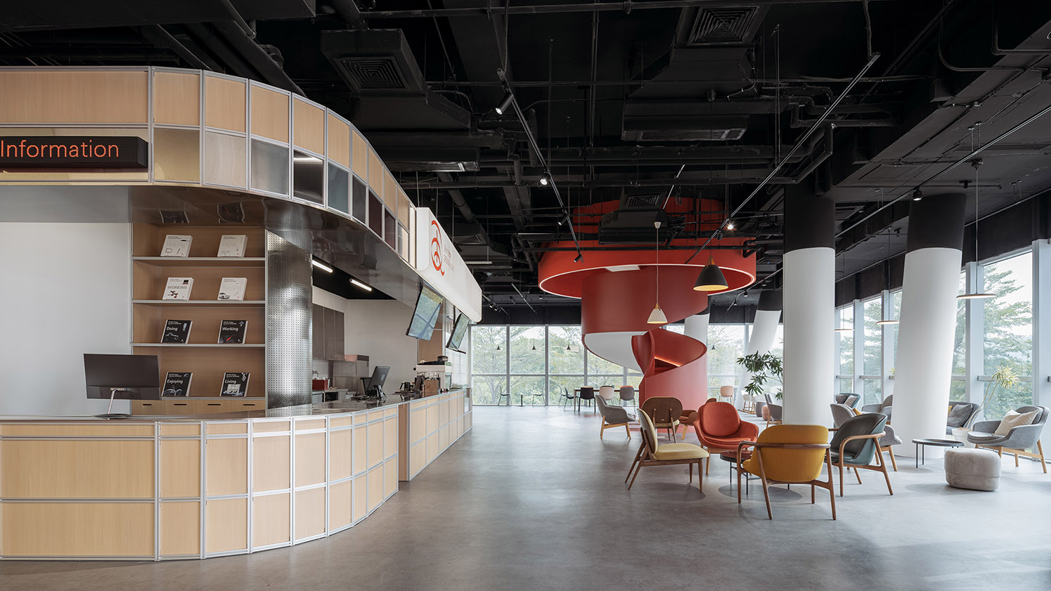
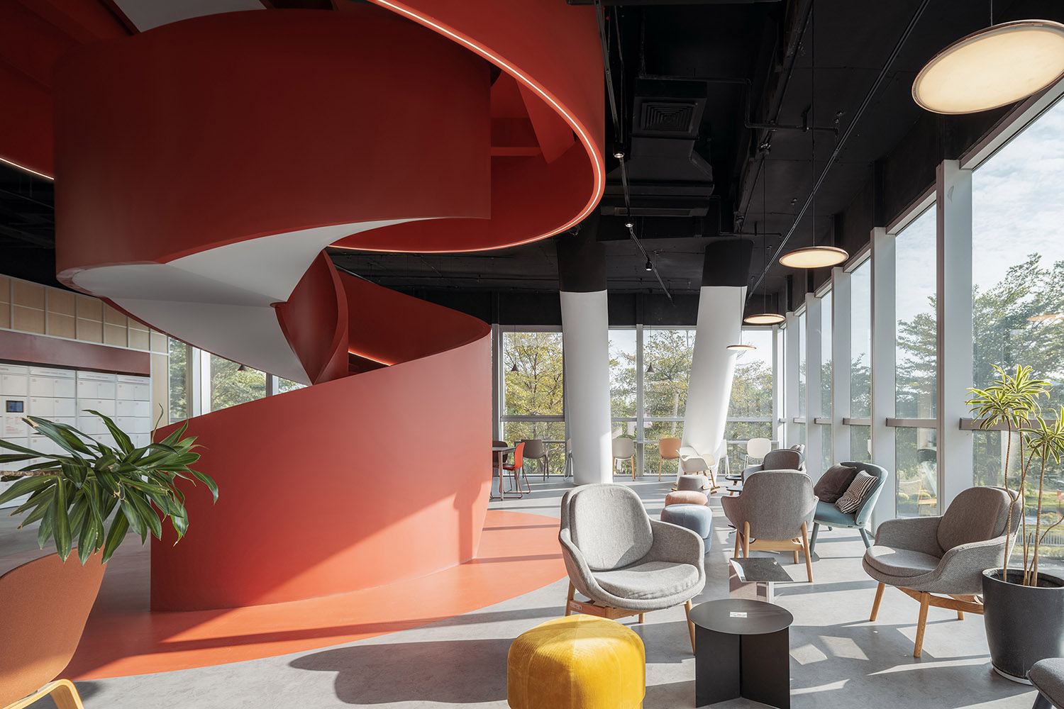
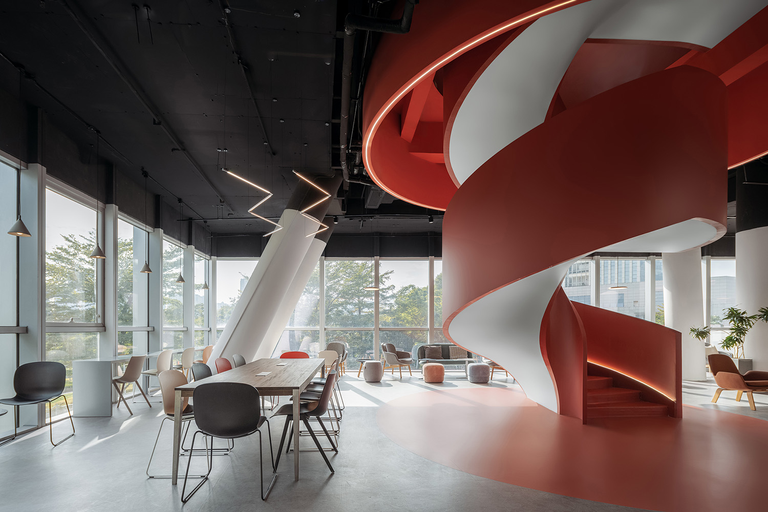
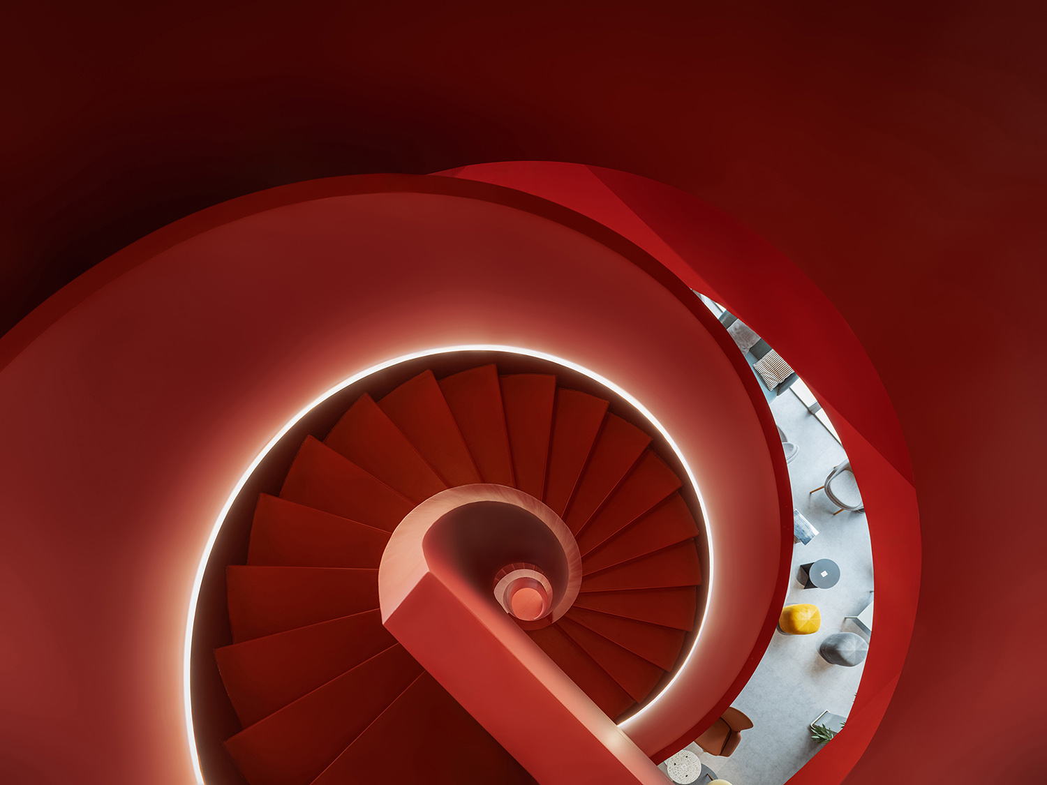
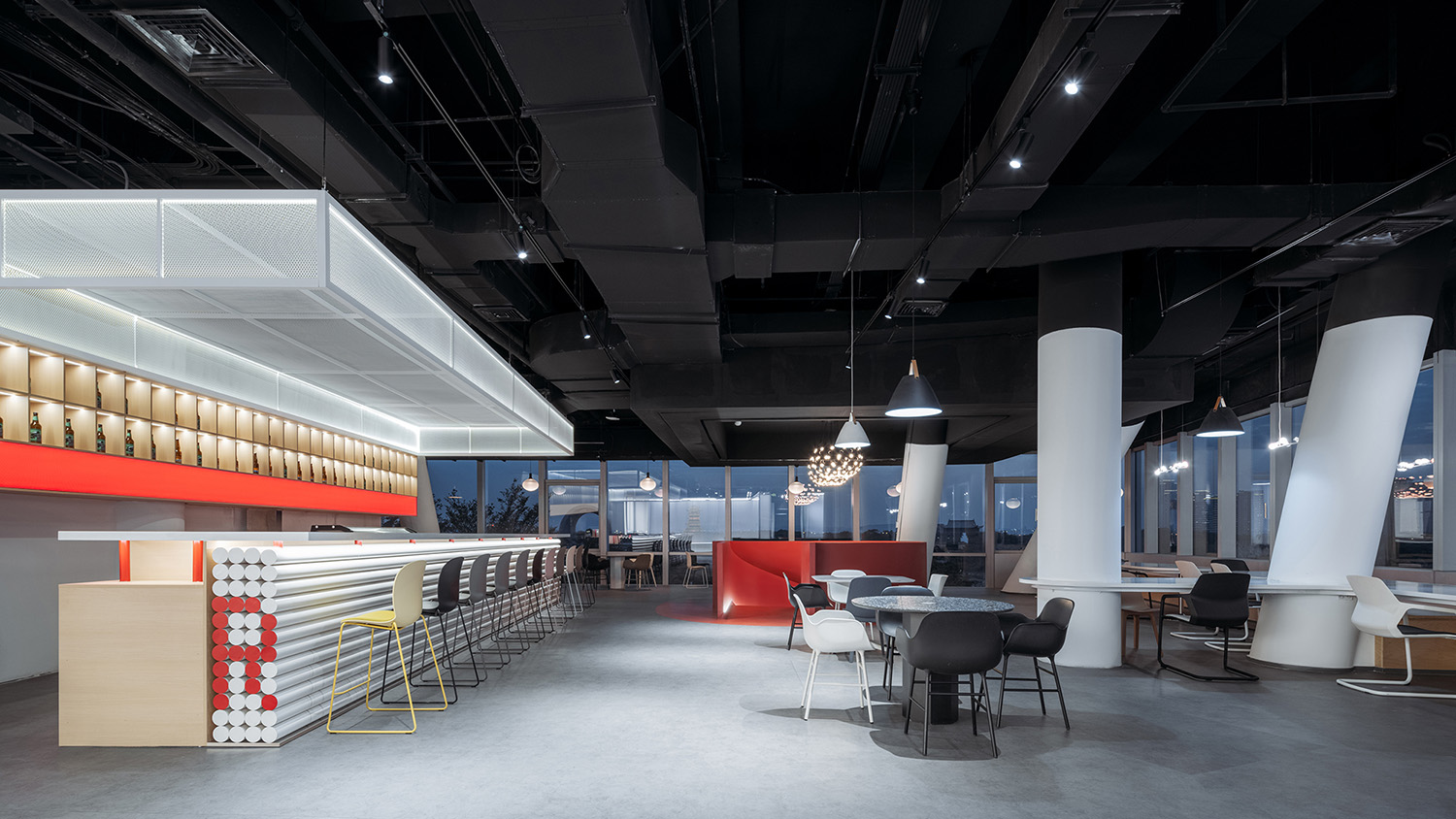
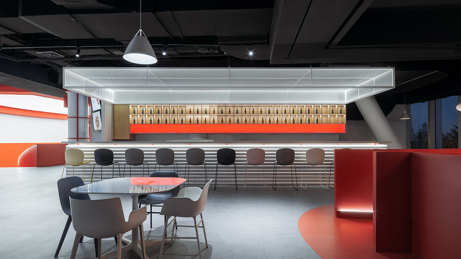
二、三層靠近玻璃幕牆的空間正對著廈門園林博覽苑,充足的光線和美好的景色已然非常奢侈,我們僅增加了功能性吧台、利舊獲獎燈具和家具,便輕鬆打造出舒適的觀景咖啡廳及餐廳,並以鮮明的紅色螺旋樓梯相連上下二層。
The edge spaces on 2nd and 3rd floor facing Xiamen Horticulture Expo Garden is sufficient with daylight and sceneries, we only add counters and reutilized award-winning furniture, creating comfortable coffee space and restaurant, and to connect these two spaces we implant another iconic red spiral stair.
∇ 從博物館入口看向咖啡廳 © CreatAR Images (Ai Qing)
∇ 明亮舒適的觀景咖啡廳 © CreatAR Images (Ai Qing)
∇ 明亮舒適的觀景咖啡廳 © CreatAR Images (Ai Qing)
∇ 連接咖啡廳與餐廳的紅色旋轉樓梯 © CreatAR Images (Ai Qing)
∇ 餐廳夜景 © CreatAR Images (Ai Qing)
∇ 餐廳吧台 © CreatAR Images (Ai Qing)
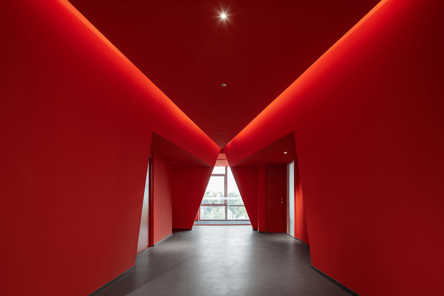
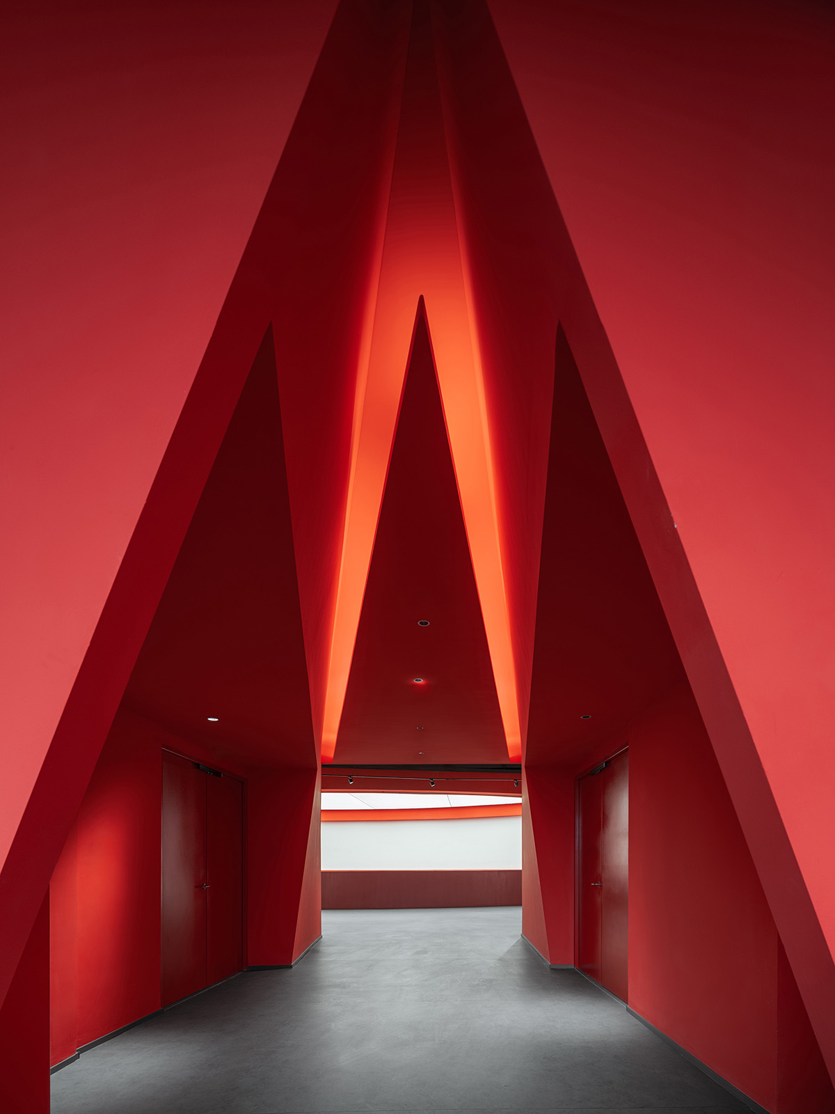
購物中心常見的通向衛生間的過道空間也沒有浪費,我們將其改造為戲劇性的紅色隧道,盡頭自然形成三角形櫥窗,既可觀景,亦可用作展覽空間。
We also take advantage of the space leading to restrooms that are common in shopping malls, transforming it into a dramatic red tunnel, which naturally forms triangle glass showcase in the end, serving not only as viewing window but also as exhibition space.
∇ 戲劇性的紅色隧道 © CreatAR Images (Ai Qing)
03 沒有牆的博物館
Museum without walls
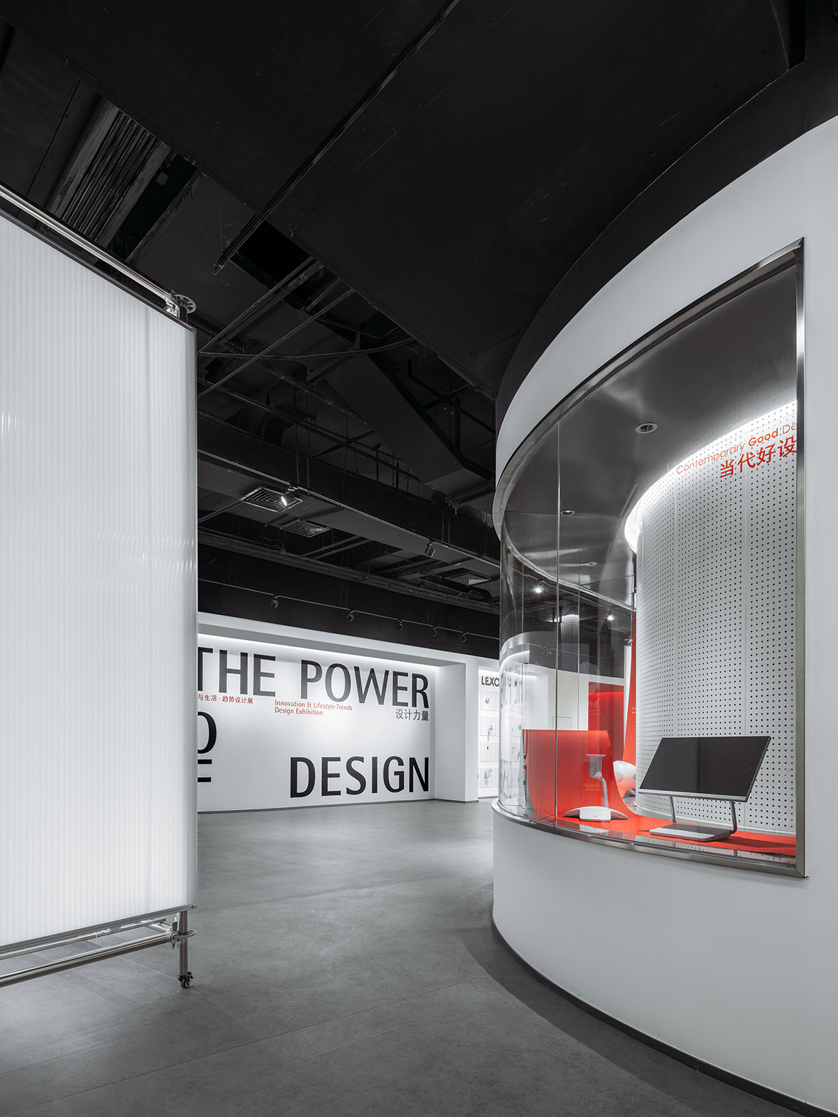
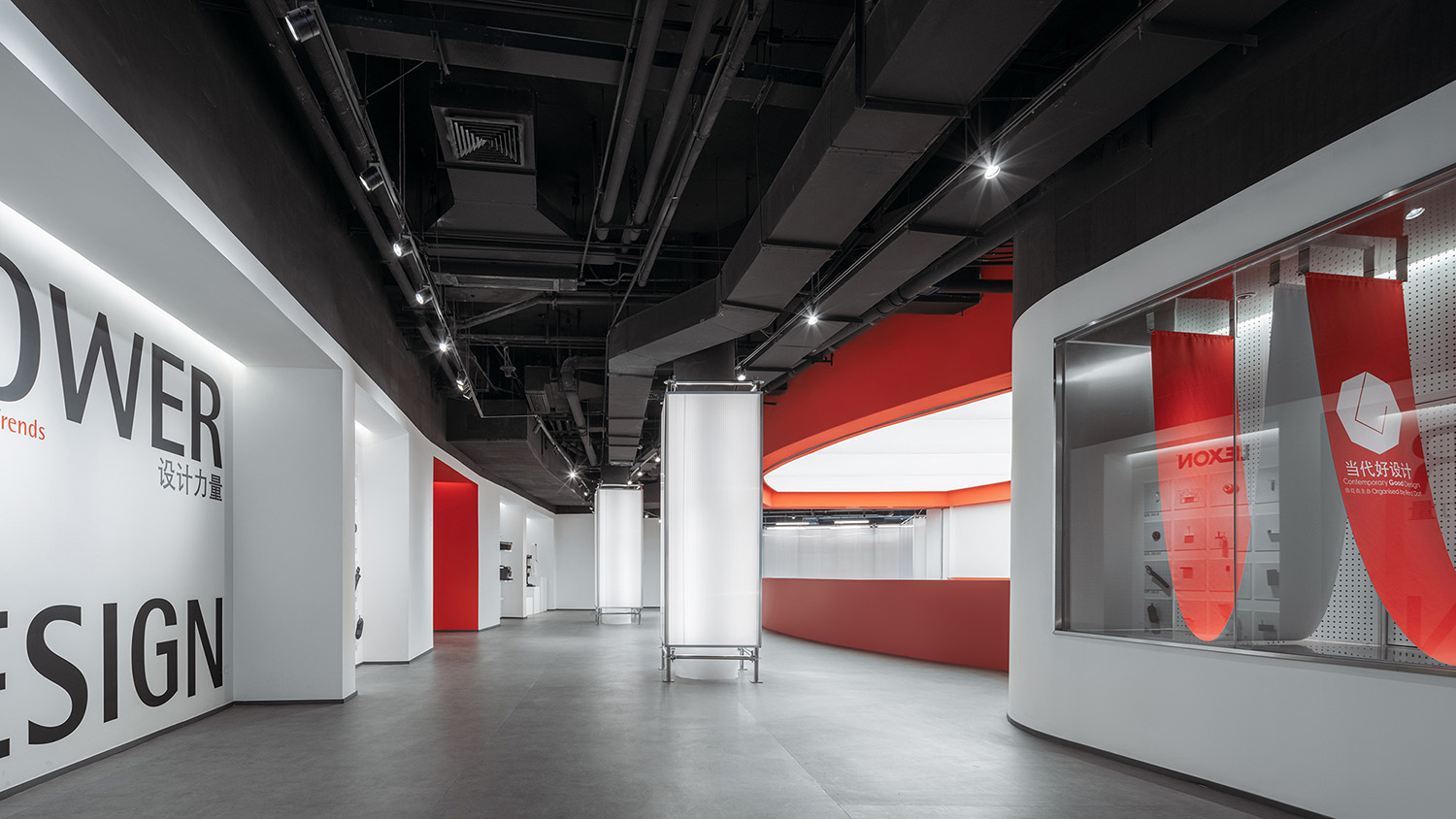
延續“向購物中心學習”:營造連續的漫遊式參觀體驗,我們試圖模糊展廳空間與非展廳空間的邊界,令參觀者仿佛置身於一個完整的、流動連續而富有變化的大展廳之中。而將空間分隔界麵展覽化、預製化是實現“沒有牆的博物館”兩大設計策略。
To achieve the continuous wandering experience that we learn from shopping malls, we try to blur the boundaries between exhibition halls and other spaces, creating the sense of a big integral space without partitions. Exhibition-oriented and prefabricated boundaries are two strategies that we imply to achieve the goal of museum without walls.
∇ 博物館作為完整連續的大展廳 © CreatAR Images (Ai Qing)
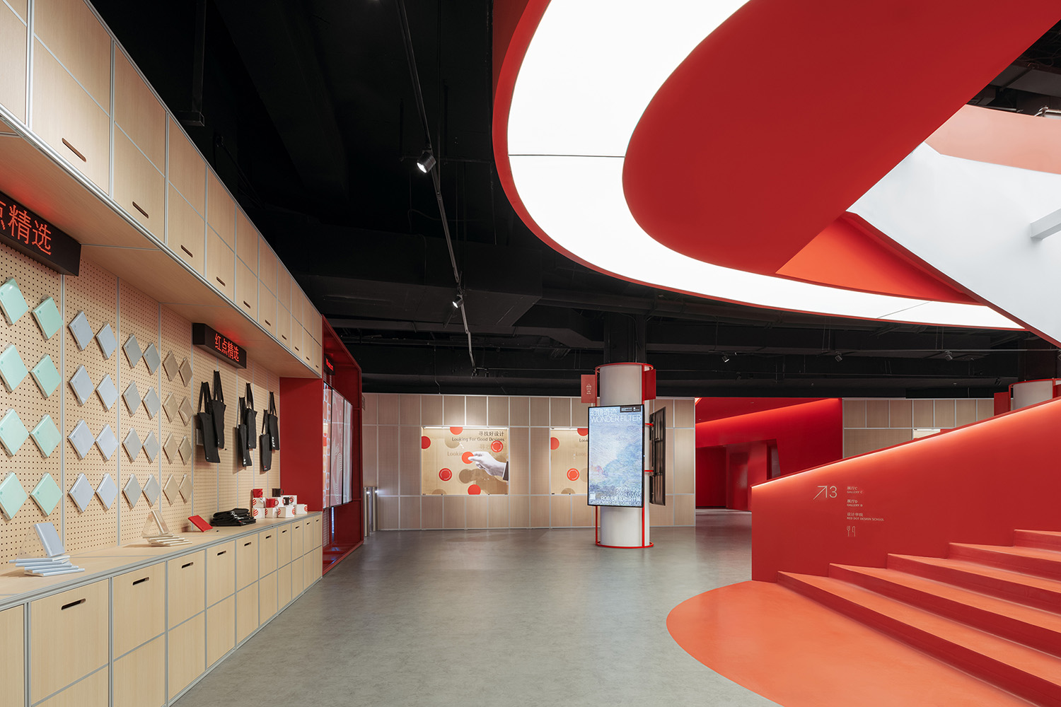
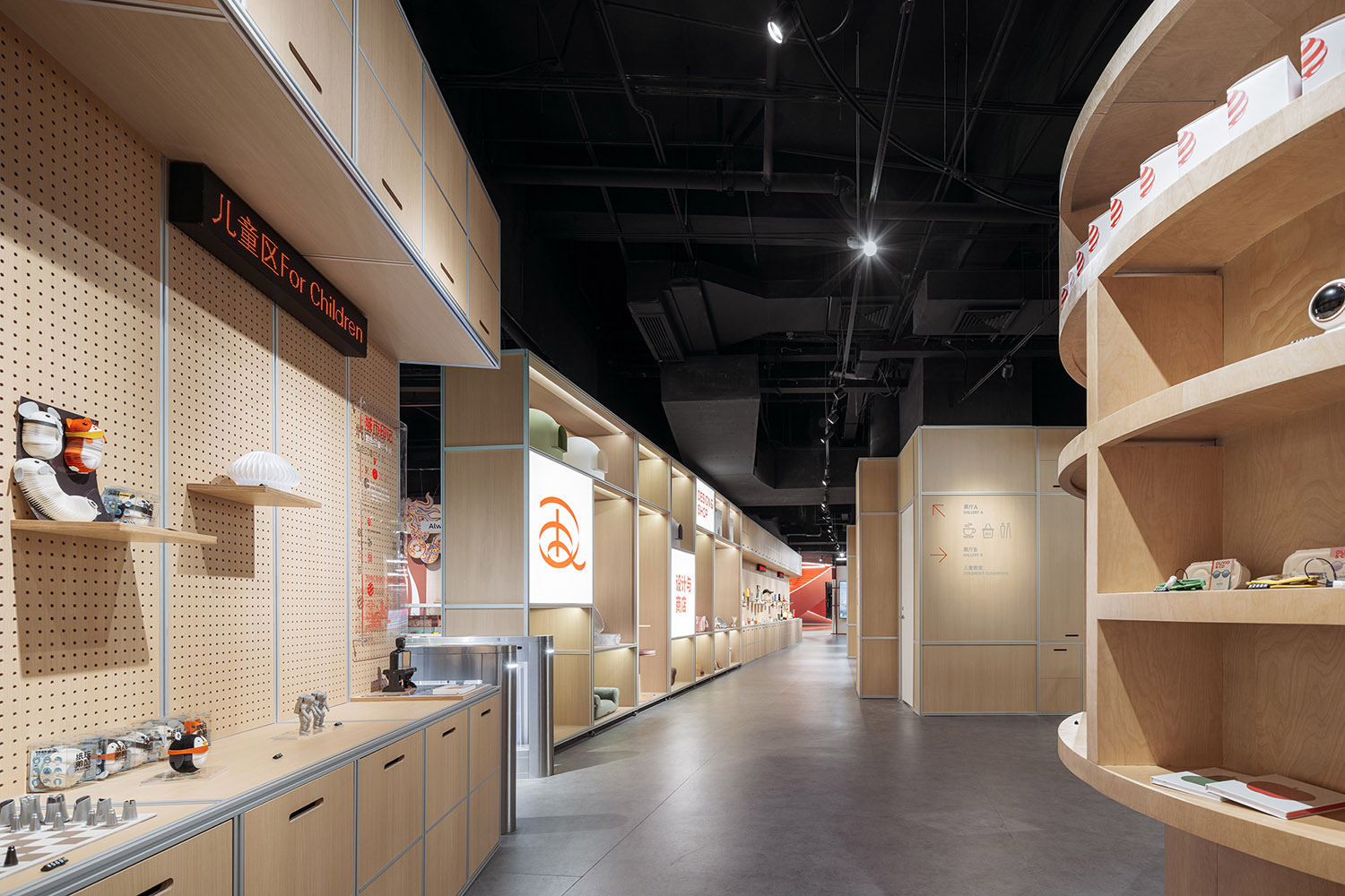
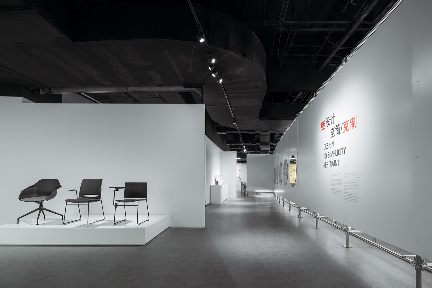
空間分隔界麵展覽化:我們在館內各種過道空間的牆麵上布置了大量形態各異的櫥窗、洞口、洞洞掛板,賦予過道空間展覽屬性,使其成為免費展廳,對於參觀者是一大福利,也為博物館帶來了商家品牌入駐櫥窗的創收業務。
Exhibition-oriented boundaries: We place many showcases, openings and perforated panels in different forms on walls of corridors, giving these spaces the property of exhibition, making them free exhibition halls for viewers, and also bringing extra cash to the museum by leasing these showcases to companies.
∇ 零售空間的品牌入駐櫥窗 © CreatAR Images (Ai Qing)
∇ 零售空間的商品展示櫥窗 © CreatAR Images (Ai Qing)
∇ 零售空間作為免費展廳 © CreatAR Images (Ai Qing)
∇ 過道空間的櫥窗、洞口 © CreatAR Images (Ai Qing)
∇ 過道空間的櫥窗、洞口 © CreatAR Images (Ai Qing)
∇ 過道空間作為免費展廳 © CreatAR Images (Ai Qing)
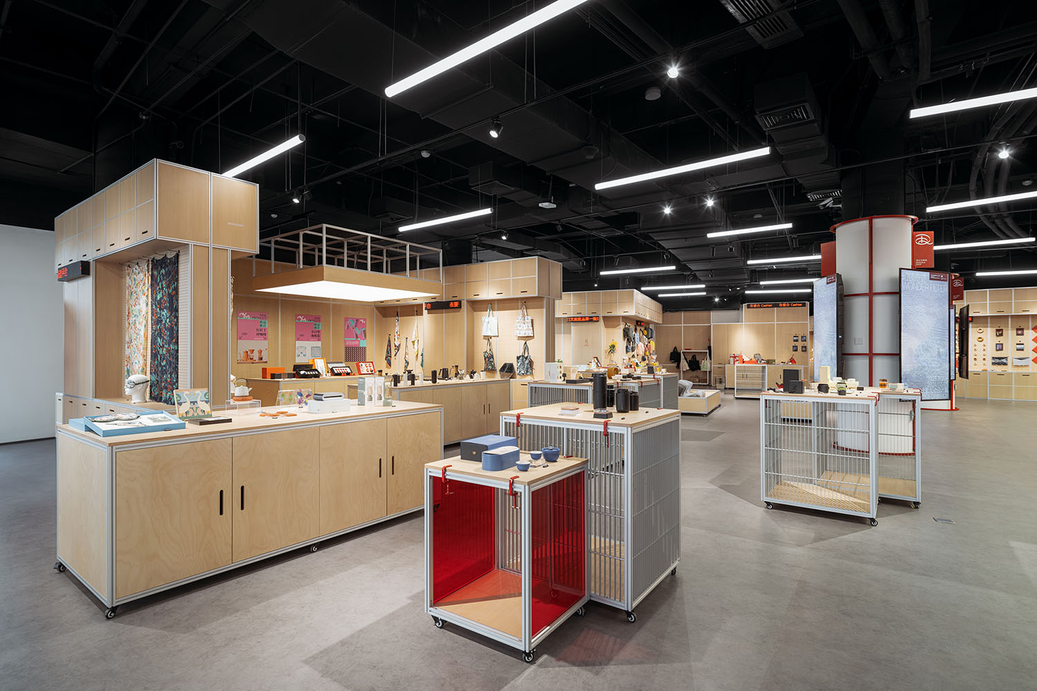
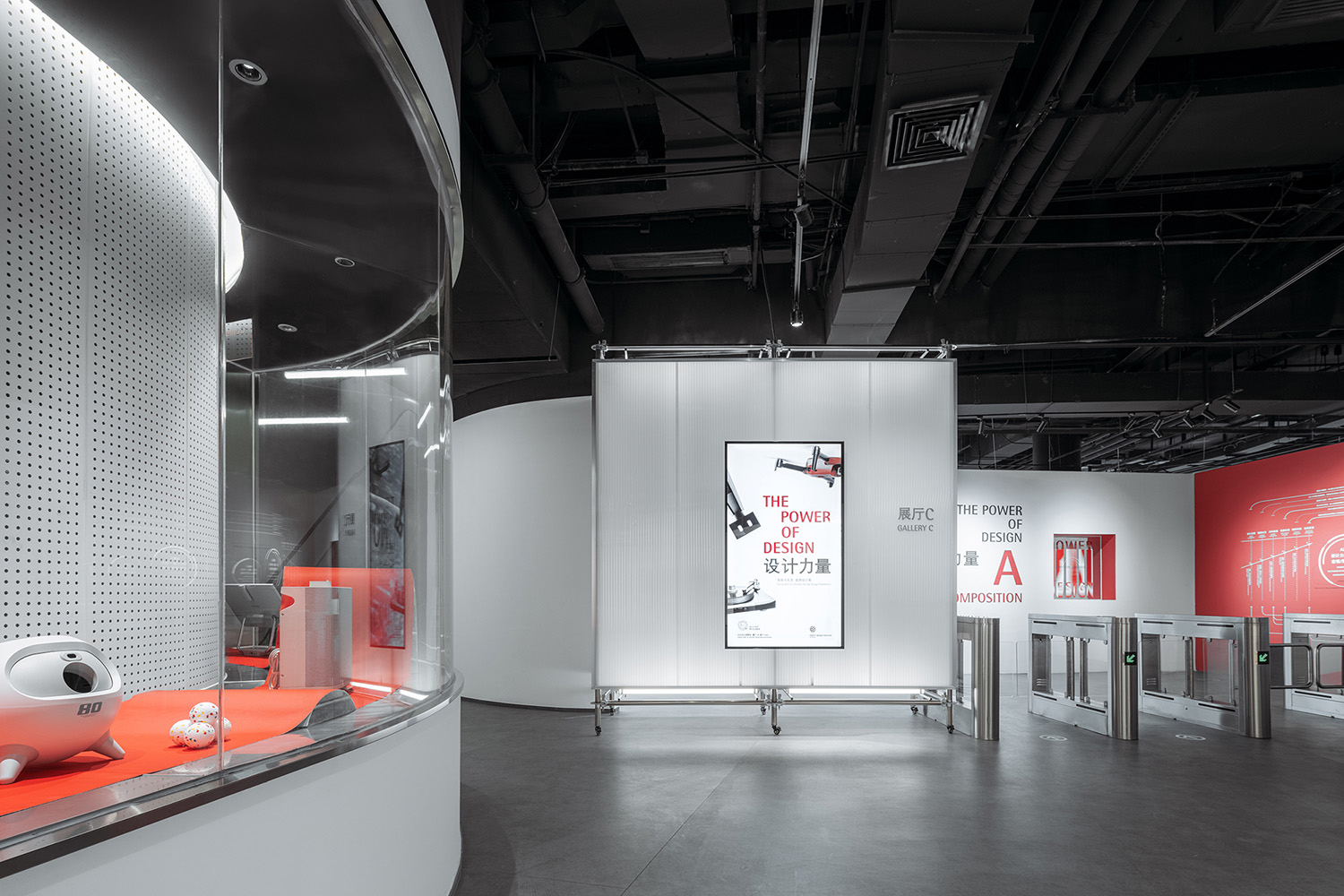
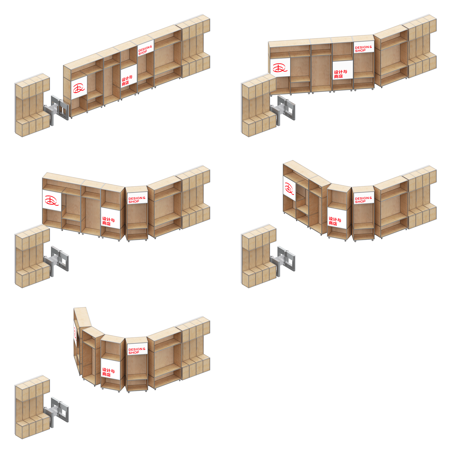
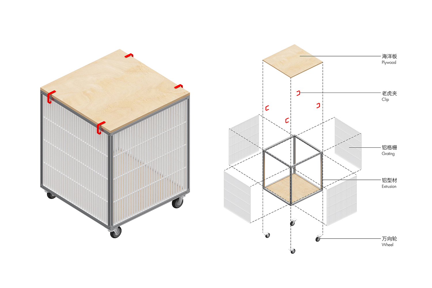
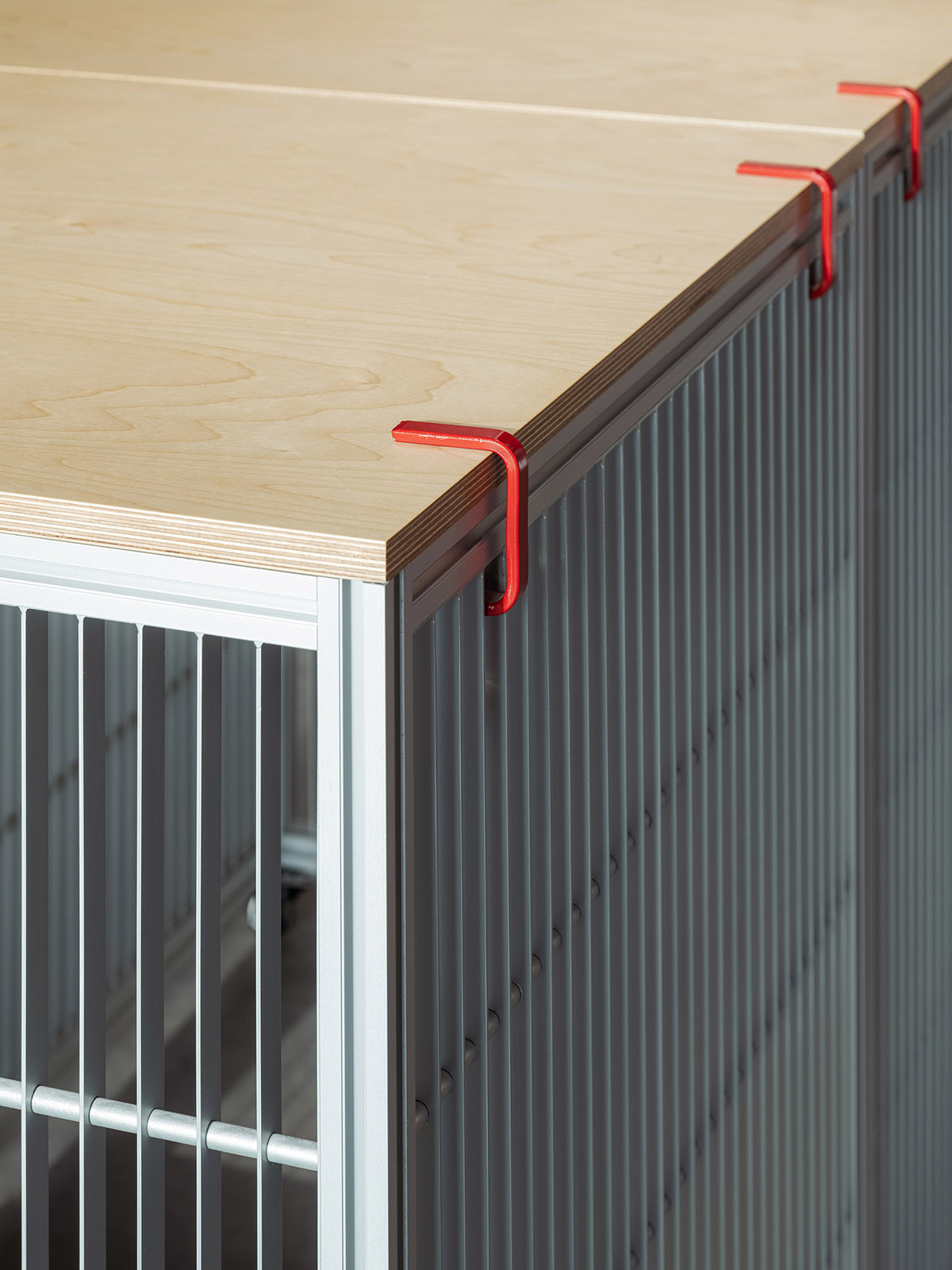
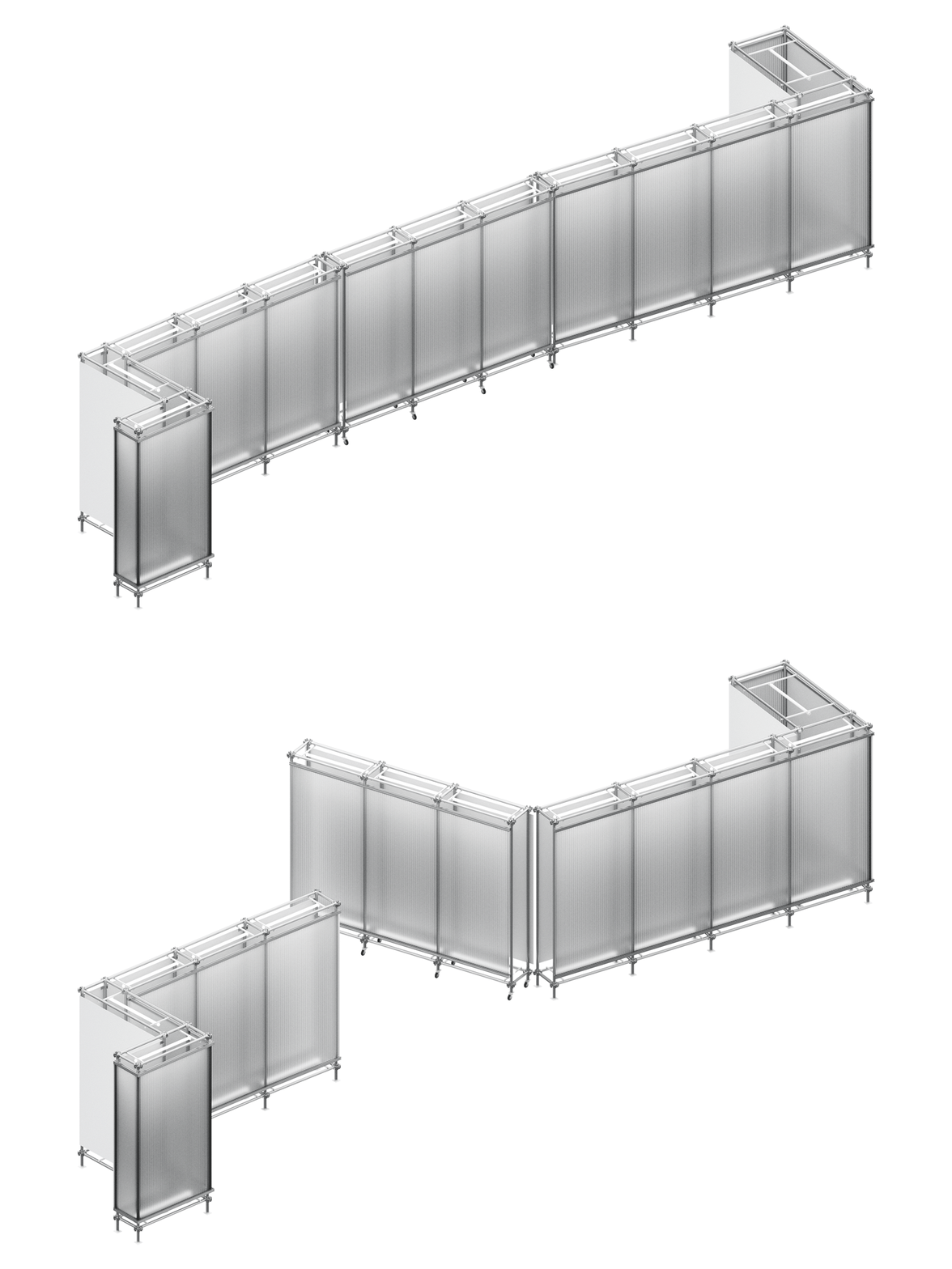
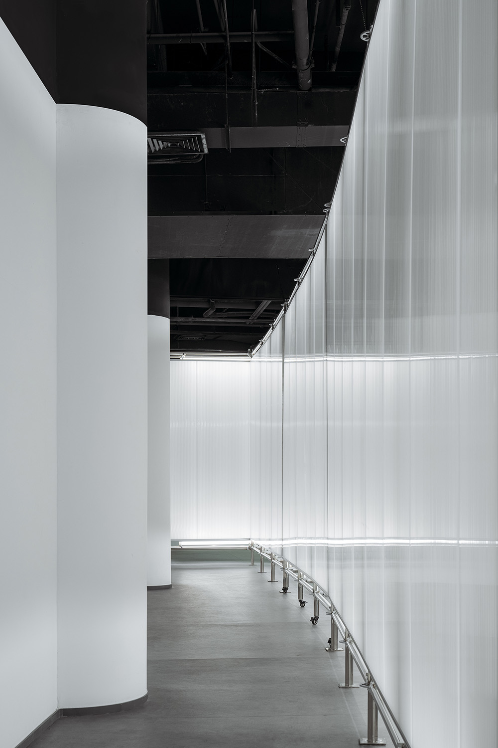
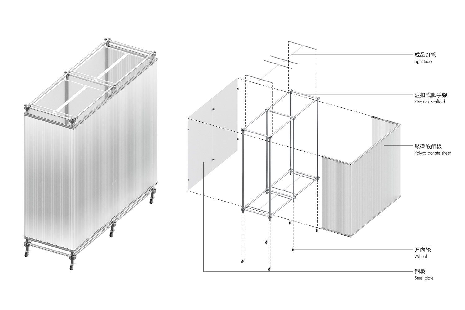
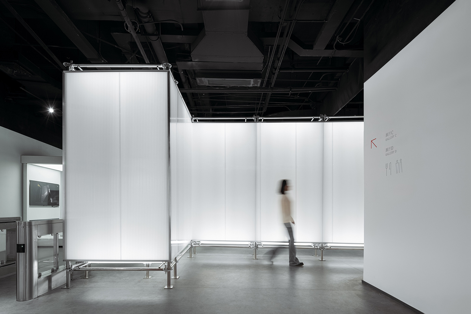
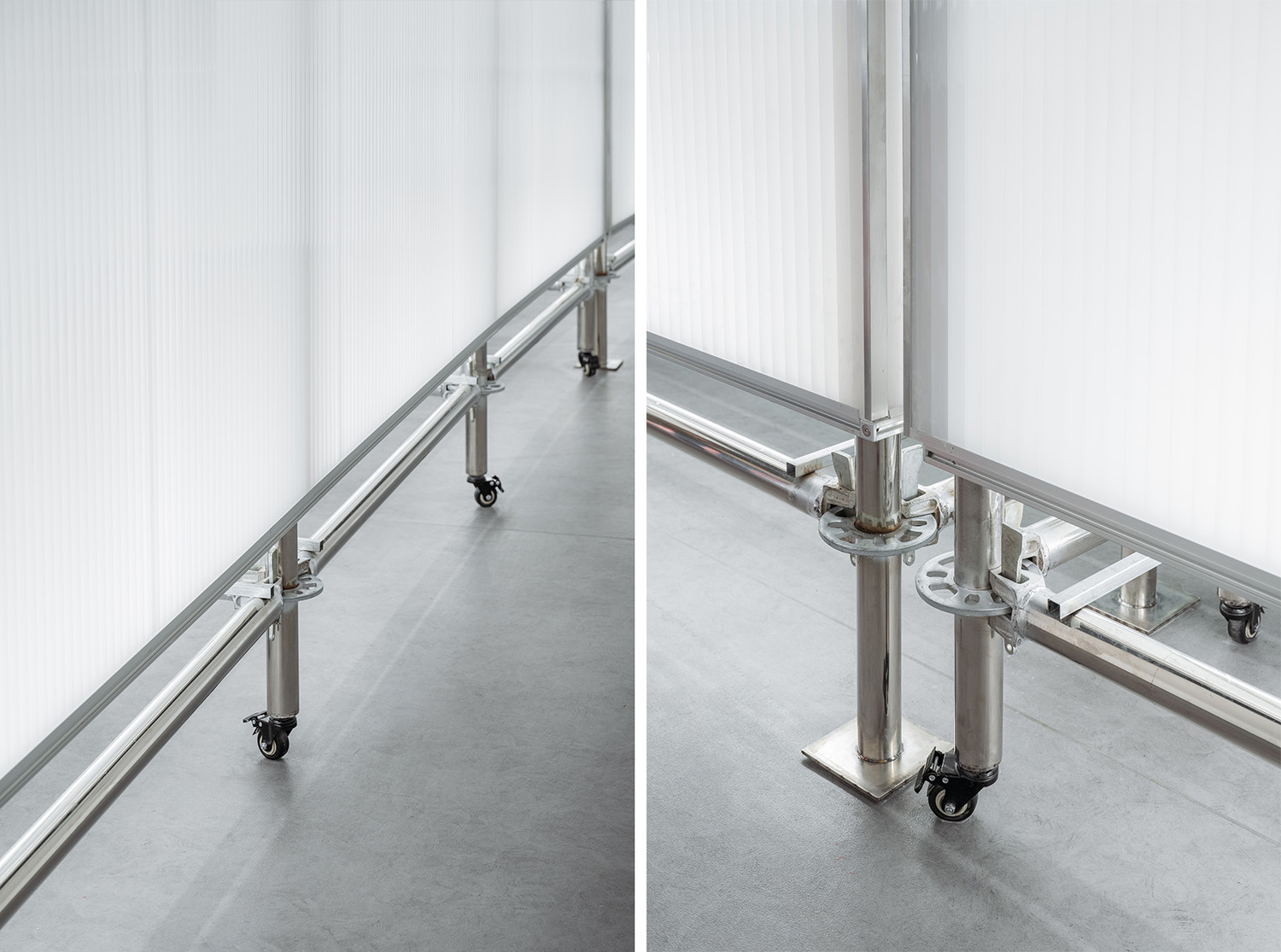
空間分隔界麵預製化:我們運用工業設計的思維,采用腳手架等預製化元素替代了常規的實牆作為靈活多變的展廳邊界,打破了傳統盒子式的封閉展廳空間。一方麵滿足了靈活布展和展品運輸的使用需求,一方麵在緊張的預算和工期下,現場施工與工廠加工同步進行大大節省了時間,也因工業化零件可控度高,使空間品質更有保障,這也與紅點設計獎作為工業設計產品獎的特點相契合。
Prefabricated boundaries: We imply the thinking mode of industrial design, using prefabricating elements such as scaffolding to replace walls of exhibition hall, thus breaking the sense of a closed box of exhibition space. On one hand this meets the need of flexible exhibition spaces and cargo shipping, on the other hand this saves tremendous time and cost due to the simultaneous work on site and in factory. Moreover, the overall quality of space is elevated due to high controllability of prefabrication, which also coincide with the spirit of Red Dot Design Award that recognizes the value in top-notch industrial design.
∇ 零售區櫃體作為展廳邊界,可旋轉形成運貨口 © STEPS大台階建築
∇ 零售區櫃體作為展廳邊界 © CreatAR Images (Ai Qing)
∇ 零售區櫃體,采用鋁型材框架,嵌入海洋板的形式,易於拆卸 © STEPS大台階建築
∇ 零售櫃細節 © CreatAR Images (Ai Qing)
∇ 腳手架裝置作為展廳邊界,可挪動形成運貨口 © STEPS大台階建築
∇ 腳手架裝置作為展廳邊界 © CreatAR Images (Ai Qing)
∇ 腳手架裝置,靠展廳側包裹白色鋼板作為展板,靠走道側包裹聚碳酸酯板作為燈箱 © STEPS大台階建築
∇ 腳手架外側聚碳酸酯板作為走道燈箱 © CreatAR Images (Ai Qing)
∇ 腳手架內側白色鋼板作為展廳展板 © CreatAR Images (Ai Qing)
∇ 腳手架裝置細節 © CreatAR Images (Ai Qing)
04 麵向未來的設計
Design for the future
除了全程參與新館的策劃、設計、施工,我們也協助了博物館未來的運營規劃,並提供了部分展覽設計。紅點設計獎作為設計行業標杆,肩負著培養下一代優秀設計師的使命。“教育”是新館業務及運營規劃中的重點板塊。
Apart from planning, design and construction, we also participate in planning the future operation of the museum, and provide exhibition design. As the leader in the field of design, Red Dot Design Museum serve as the platform where next generation of designers grow. Education plays an essential role in museum’s operation.
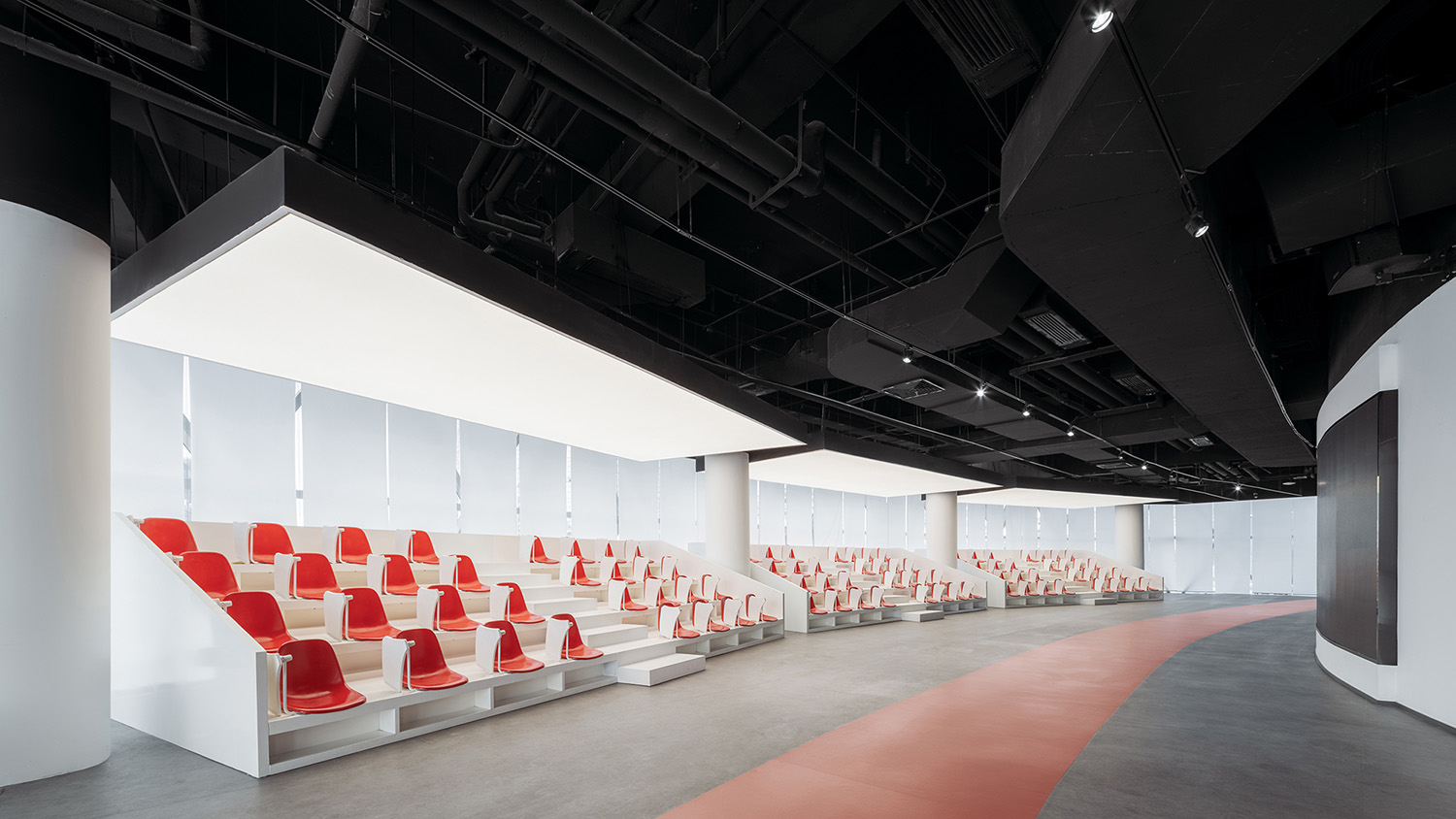
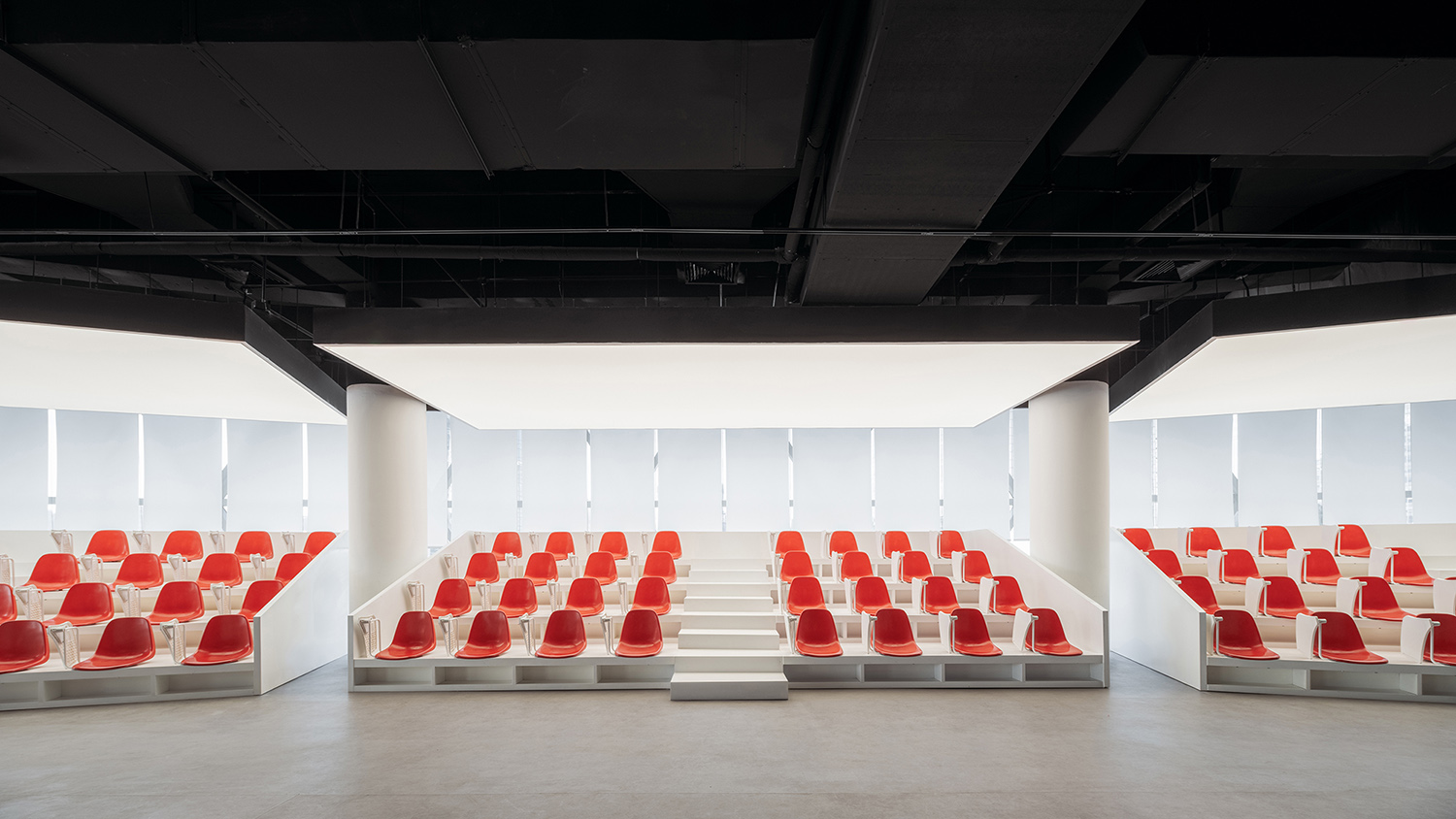
紅點設計學院為業內設計師提供培訓及交流的場地,不定期舉辦課程、論壇等活動。為了適應豐富的使用場景需求,我們設計了靈活的多功能劇場式看台,座位與旋轉桌板均可拆卸。
Red Dot Design School provides space for sessions, forums and conferences for designers to learn, communicate and social. To accommodate such various activities, we design flexible theater-like seatings on which the rotating table plate and seats could be disassembled and reassembled.
∇ 可舉辦多種活動的設計學院 © CreatAR Images (Ai Qing)
∇ 靈活的多功能劇場式看台 © CreatAR Images (Ai Qing)
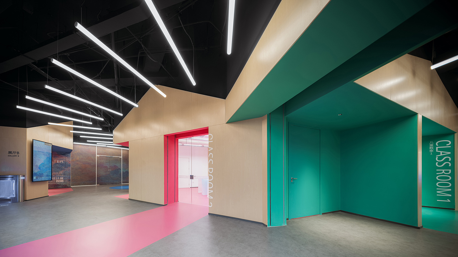
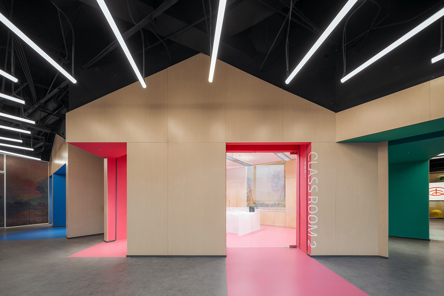
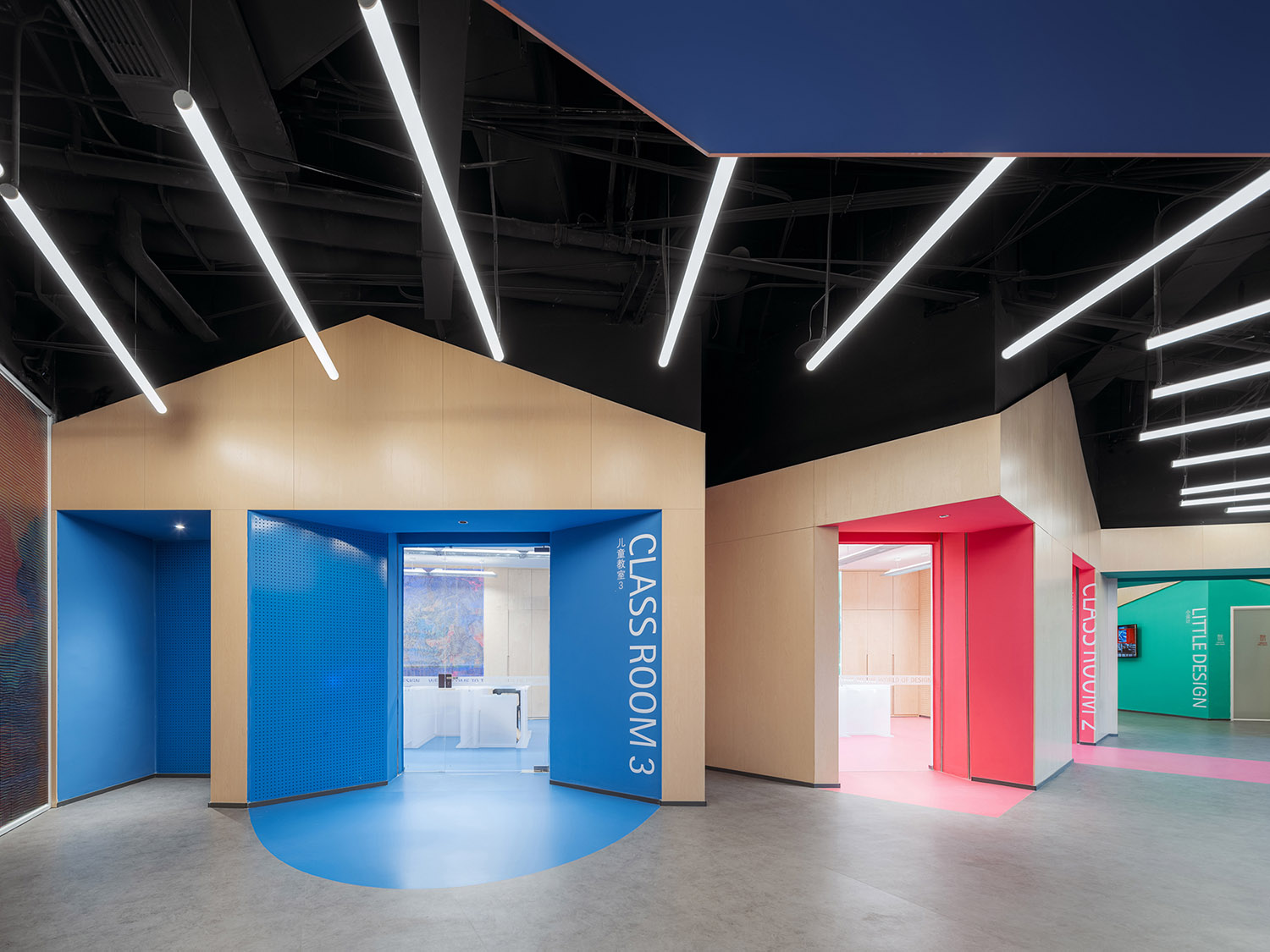
兒童區是相對獨立的區域,包含教室及展廳。我們將兒童教室打造成三個不同主題色的小木屋,通過體塊切割產生類似櫥窗的界麵展示空間,可用來展示小朋友的設計作品。通透的教室空間亦可根據展覽需要作為免費迷你展廳。
The section of museum space for children is relatively independent, including children’s classrooms and exhibition hall. We design three distinct “wood cabins” that vary in color for the three classrooms, the mass of the cabins is cut to create openings that serve as showcases for children’s artwork. The transparent classrooms also serve as free exhibition spaces when needed.
∇ 小木屋般的兒童教室 © CreatAR Images (Ai Qing)
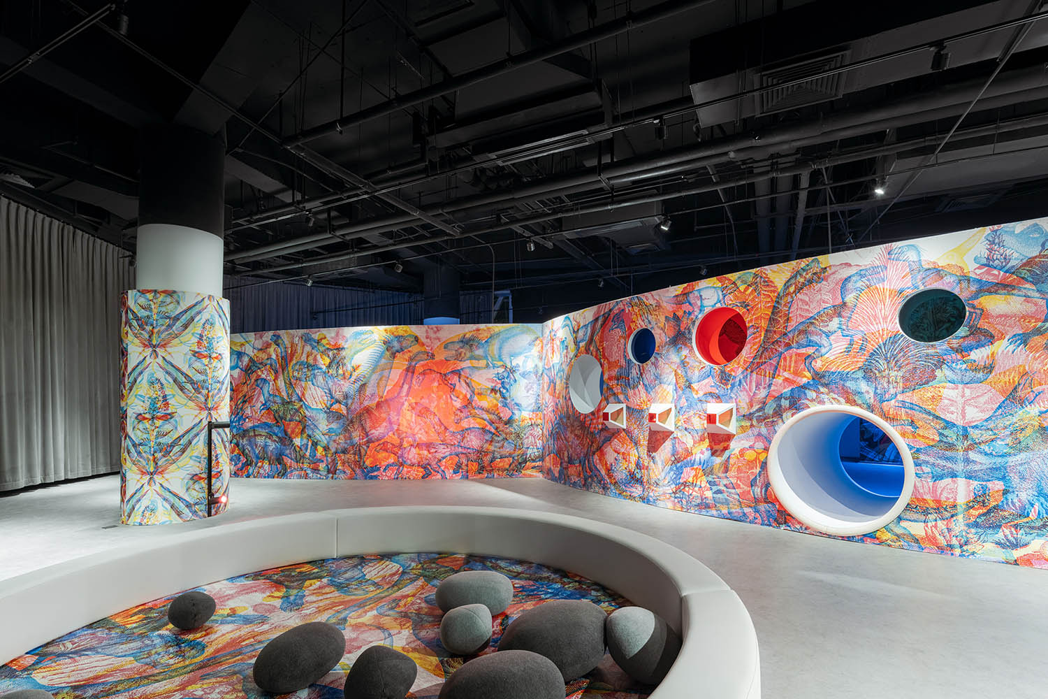
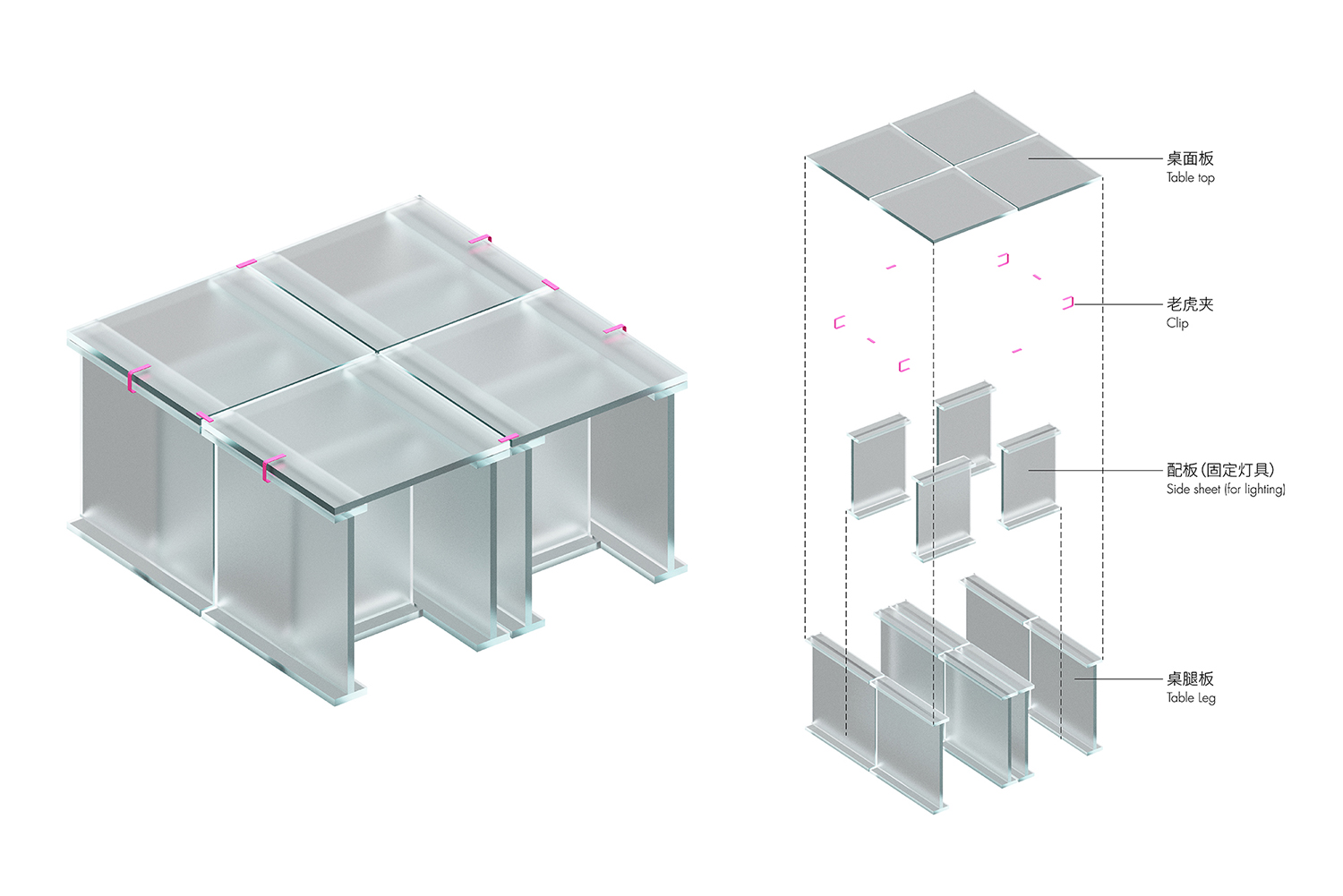
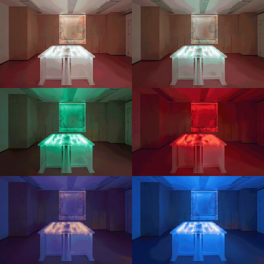
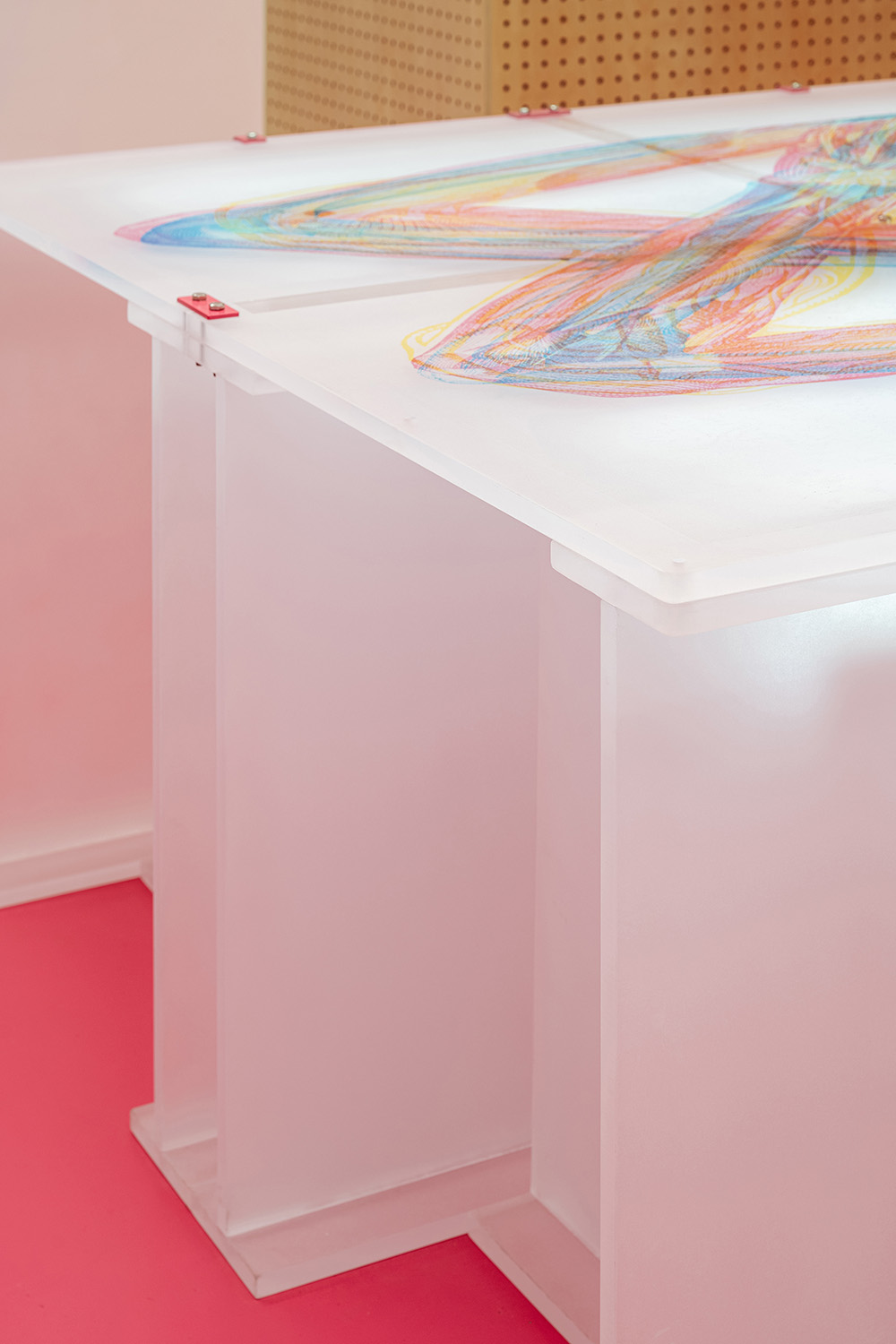
我們為兒童展廳設計了開館展覽——幻鏡奇跡:RGB光影互動設計展。歐洲藝術家團隊基於RGB原理,將紅藍綠三種顏色的插畫交疊在一起,通過光色的變化產生絢麗多變的畫麵。我們設計了多種觀看方式:通過LED燈光讓空間在紅藍綠三色中切換,或通過牆麵彩色洞口觀看等,形成豐富的空間體驗。考慮到小朋友貪玩的天性,我們通過設置夾層、洞口、台階、滑梯,讓遊戲空間和展覽空間融合,寓教於樂。此外,我們為兒童展廳設計了一套特殊展具,透光的磨砂亞克力板由彩色連接件可拚成各種形式,方便組合及存放。
We design the exhibition for children’s exhibition hall during museum opening——Wonder Filter, RGB Interactive & Design Exhibition. Based on RGB principles, Artists in Europe overlap patterns in three colors, creating psychedelic effects when color of light changes. We design multiple ways of viewing wall patterns: through ever-changing LED lighting that shift in RGB, and through wall openings that vary in color, creating dynamic spatial experiences. We also design a serious of mezzanine, openings, steps and sliding for children to explore, thus combining education with fun. Moreover, we design a unique set of exhibition furniture, frosting acrylic panels are easily assembled and disassembled with colorful connectors, creating various forms.
∇ 遊戲空間和展覽空間的結合 © CreatAR Images (Ai Qing)
∇ 兒童展廳展具構造 © STEPS大台階建築
∇ 透光的亞克力展具 © STEPS大台階建築
∇ 亞克力展具細節 © CreatAR Images (Ai Qing)
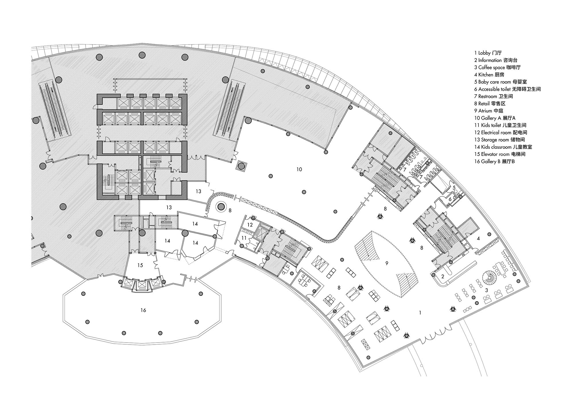
∇ 二層平麵圖 © STEPS大台階建築
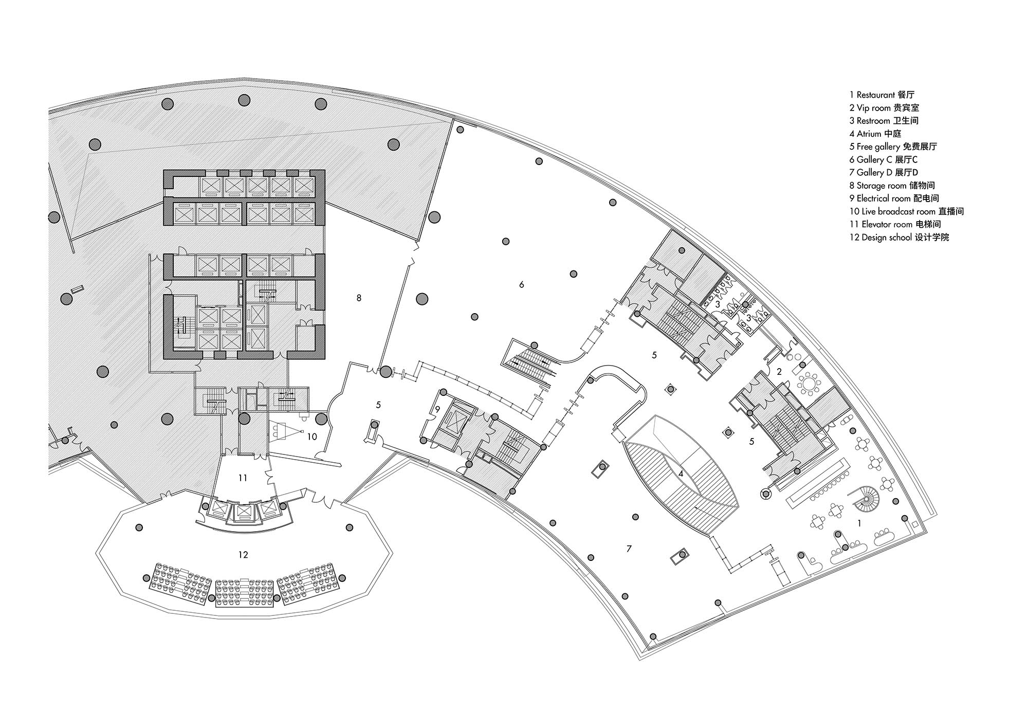
∇ 三層平麵圖 © STEPS大台階建築
項目信息
項目名稱:紅點設計博物館·廈門
項目類型:建築改造、室內設計
設計方:STEPS大台階建築、協作派對
完成年份:2023
主創設計:吳俁、季子瀟
設計團隊:蔡凱(協作派對)、李晨澍(協作派對)、陳岩平(協作派對)、曾天(協作派對)、趙月銘、李弢、趙蕙、王凱平、程廣曉、閆瑞琪、劉羽、Sadiq、王博、時露航、李春蓉等。
設計谘詢:北京炎黃聯合國際工程設計有限公司
施工圖:福建省博意建築設計有限公司
施工方:福建興港建工有限公司
代建方:廈門市政城市開發建設有限公司
項目地址:福建省廈門市集美區杏林灣路502號誠毅國際商務中心
建築麵積:8,000㎡
攝影版權:CreatAR Images (Ai Qing)
照明設計:Lumia Lab麓米照明設計
導視設計:out.o studio 再平麵
多媒體設計:協作派對
訂製家具設計:STEPS大台階建築、協作派對
展覽設計:STEPS大台階建築、協作派對、韋田設計有限公司
客戶:紅點設計(廈門)品牌運營有限公司
材料:氟碳噴漆、海洋板、聚碳酸酯板、PVC地膠
Project name: Red Dot Design Museum · Xiamen
Project type: Renovation, interior design
Design: STEPS Architecture, Network Party
Completion Year: 2023
Leader designer: Wu Yu, Ji Zixiao
Design team: Cai Kai (Network Party), Li Chenshu (Network Party), Chen Yanping (Network Party), Zeng Tian (Network Party), Zhao Yueming, Li Tao, Zhao Hui, Wang Kaiping, Cheng Guangxiao, Yan Ruiqi, Liu Yu, Sadiq, Wang Bo, Shi Luhang, Li Chunrong
Project location: Chengyi International Business Center, No. 502, Xinglinwan Road, Jimei District, Xiamen, Fujian
Gross built area: 8,000㎡
Photo credit: CreatAR Images (Ai Qing)
Lighting design: Lumia Lab
Wayfinding design: out.o studio
Multi-media design: Network Party
Millwork design: STEPS Architecture, Network Party
Exhibition design: STEPS Architecture, Network Party, Weitian Design
Clients: Design China ltd.
Materials: Fluorocarbon paint, plywood, PC sheet, PVC flooring







![[4K] 4.84G WABI – SABI侘寂視頻](http://www.online4teile.com/wp-content/uploads/2024/04/f5b8aca9e-1-414x550.jpg)