充分考慮在地化和適應性,ARCHIHOPE打造BMW寶馬“綠星燈塔”
BMW Foshan Baochuang Center by ARCHIHOPE
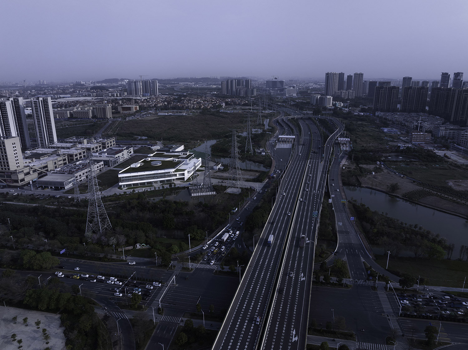
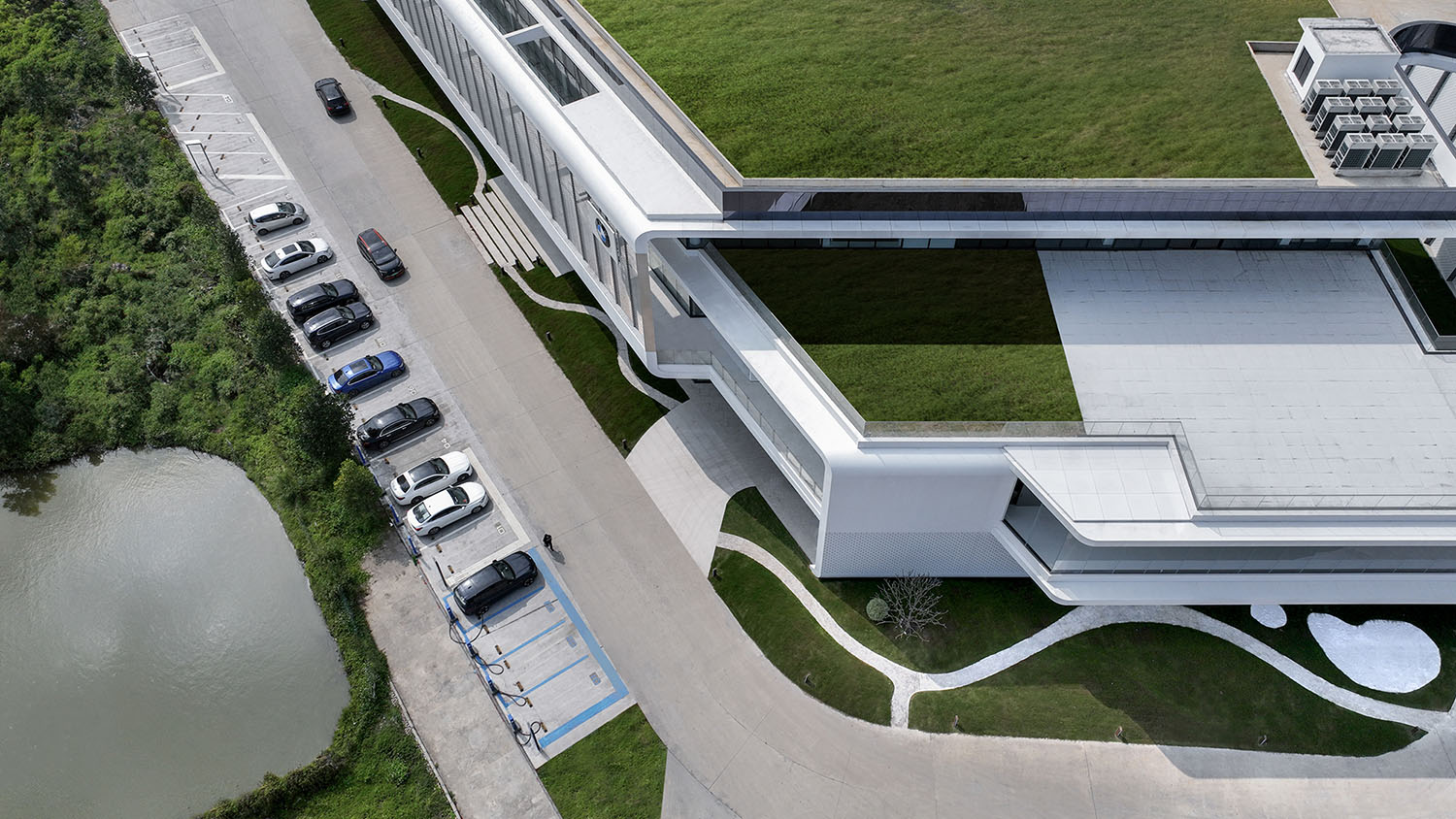
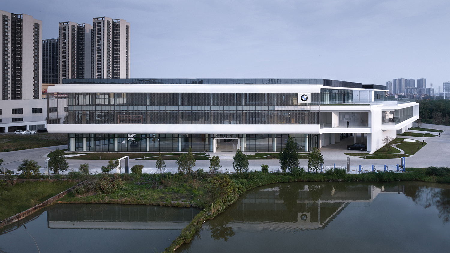
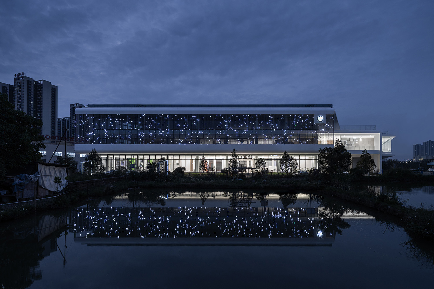
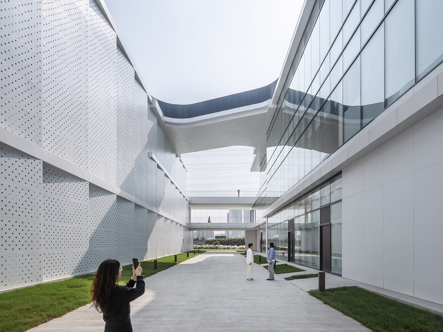
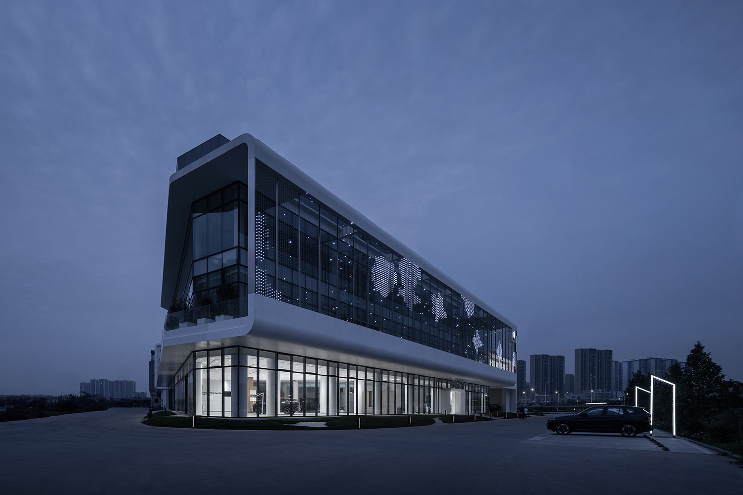
該項目坐落於佛山禪城區,占地麵積達7865平方米,呈現為兩個獨立地塊。朱海博建築事務所獨具匠心地運用連廊設計,巧妙地將兩棟建築主體連為一體,形成一座外觀流暢連貫的建築綜合體。設計目標旨在將這個由不同功能建築構成的複合體,打造成為BMW綠星燈塔項目,並通過LEED BD+C金級認證,以展示展覽、社交互動及高效辦公等多功能於一體的建築室內空間,為城市注入新的活力。
The project is located in Chancheng District, Foshan with a total site area of 7,865 square metres. From the general layout, these are two parcels of land. The design goal is to build two new buildings with different functional requirements, that is a BMW Green Star BEACON project and LEED BD+C gold certification, human-centred multifunctional showroom with its internal space integrating social contact and office. A corridor runs through the two buildings to form a single building volume from the appearance.
#01 綠色可持續建築的探索
Exploration of Green Sustainable Buildings
以嶺南為代表的南方氣候特別需要遮陽、避暑。從方案設計之初,朱海博建築設計事務所就從可持續建築這一核心路徑開始思考,受到嶺南建築的“騎樓”啟發,設計團隊充分考慮在地化建築的氣候適應性,尤其對遮陽、通風、散熱的問題解決,以應對高溫天氣和城市熱島效應。
The southern climate, represented by Lingnan, is particularly in need of shade and protection from the heat. From the very beginning of the scheme design, ARCHIHOPE have been thinking about sustainable architecture as the core of the design. Inspired by the Qilou, a unique architectural style in Lingnan, local buildings’ adaptation to climate, solution to shading, ventilation, and heat dissipation in particular, was taken into full consideration to deal with high temperature weather and urban heat island effect.
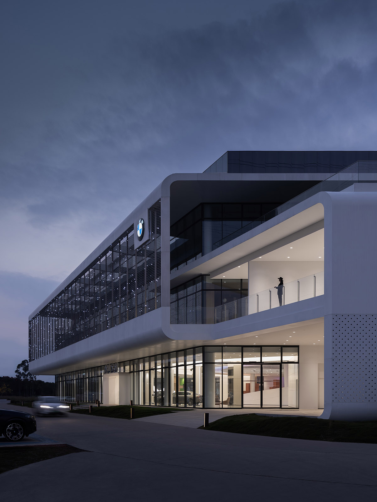
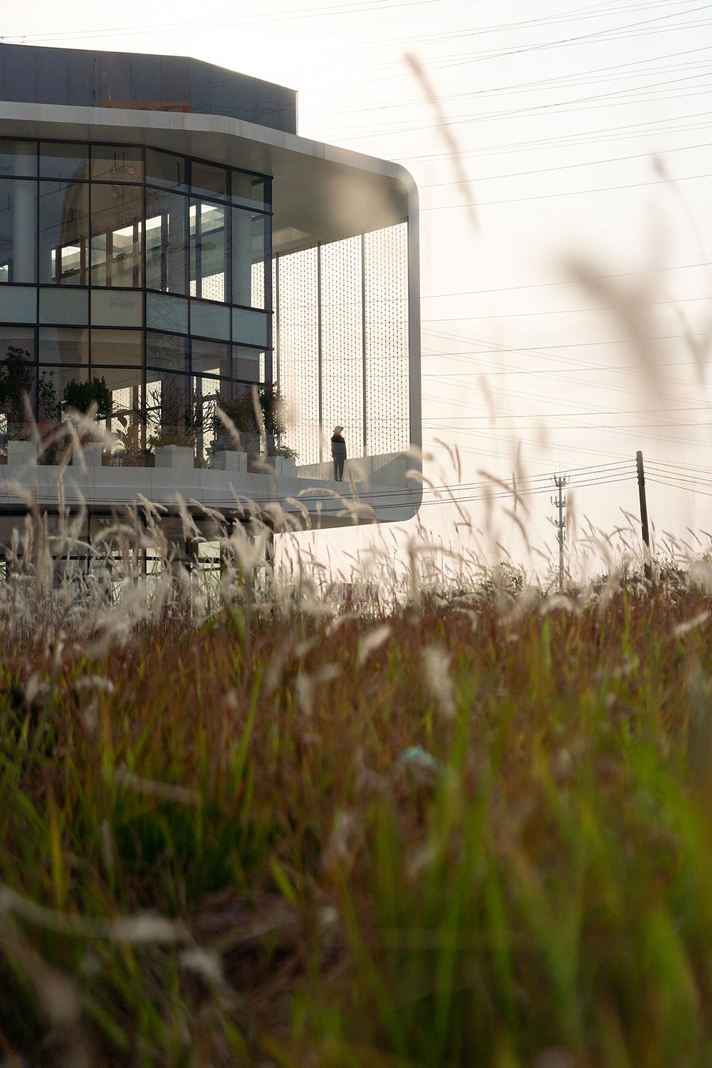
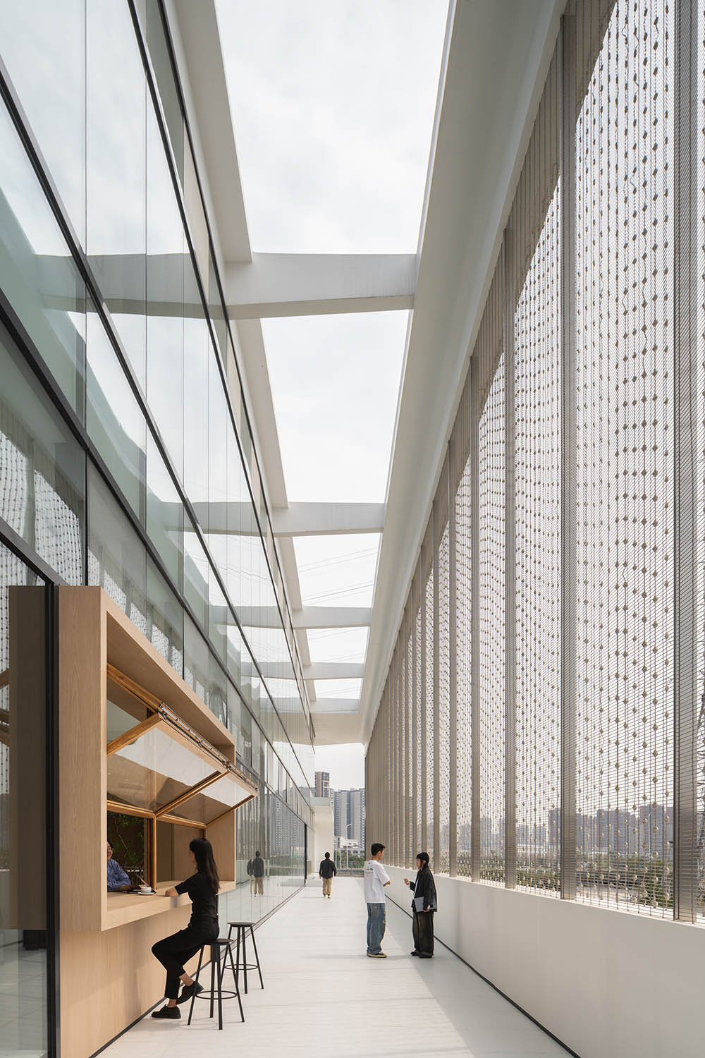
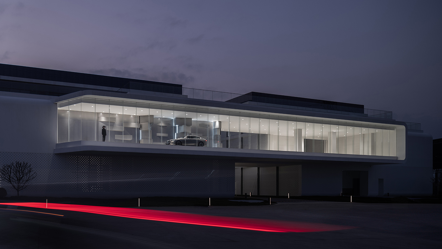
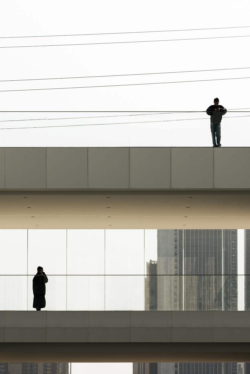
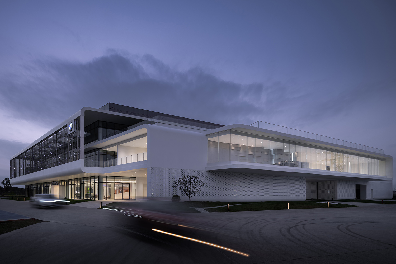
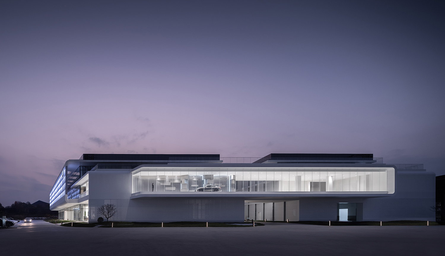
因此整個建築內外充分采用了天井、冷巷、架空層、呼吸牆等通風散熱措施,加強了自然風的對流。並用連廊打通兩棟建築之間的橫向交通動線,懸挑出幕牆外,形成了既是架空風雨走廊也是櫥窗,還是遮陽棚的多功能合一的建築形式,連廊的傳統遮陽形式也演變出了該建築的新立麵係統。
Therefore, ventilation and heat dissipation measures such as skywells, cooling alley, open floor, secluded alley and breathing wall, are made full use of inside and outside the whole building to strengthen the convection of natural wind. A corridor is used to connect the horizontal traffic moving line between two buildings and overhangs the curtain wall, forming a multifunctional building form integrating elevated corridor, showcase and sunshade shed. And the corridor in the traditional form of sunshade has also evolved into a new facade system for the building.
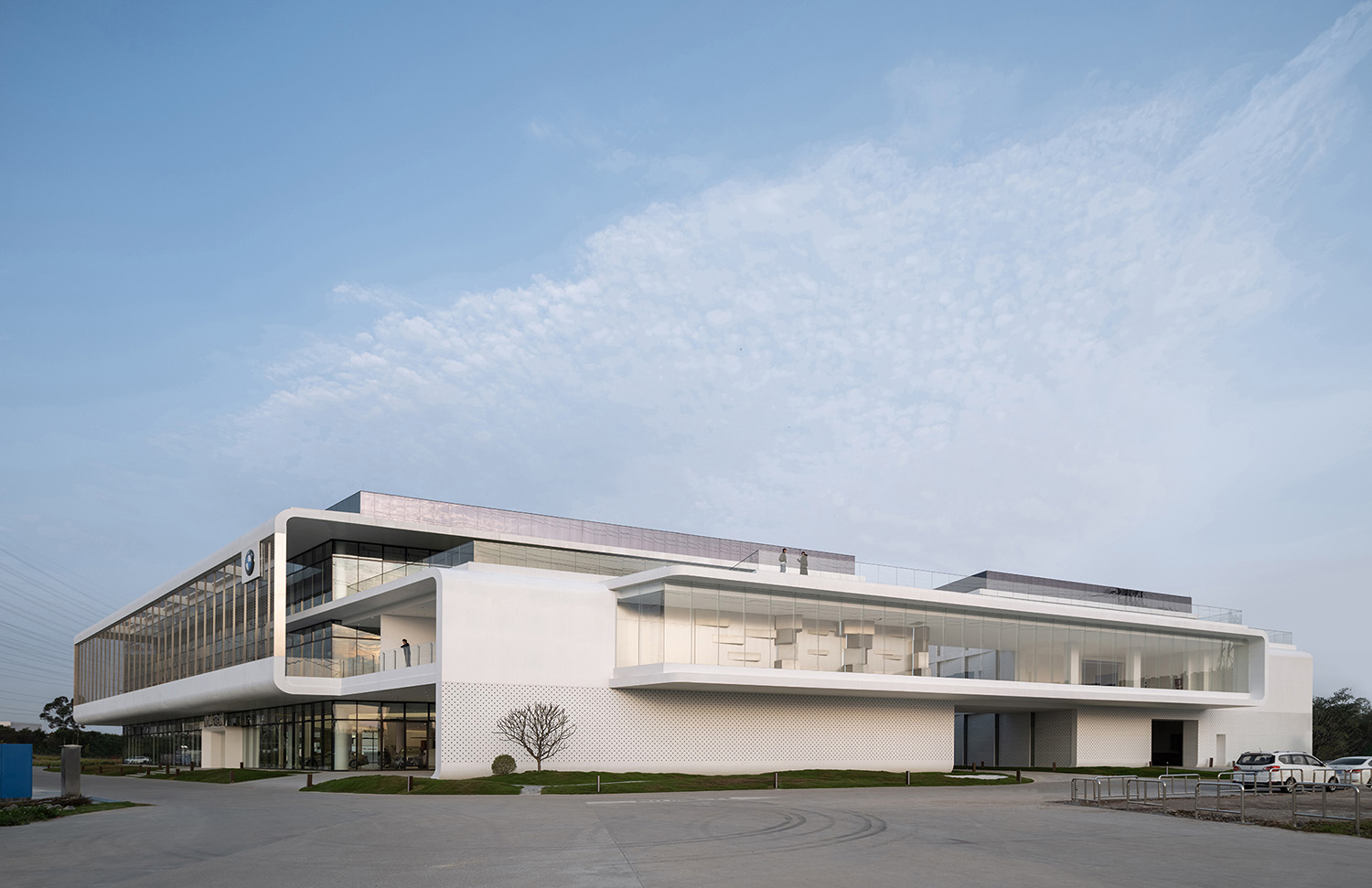
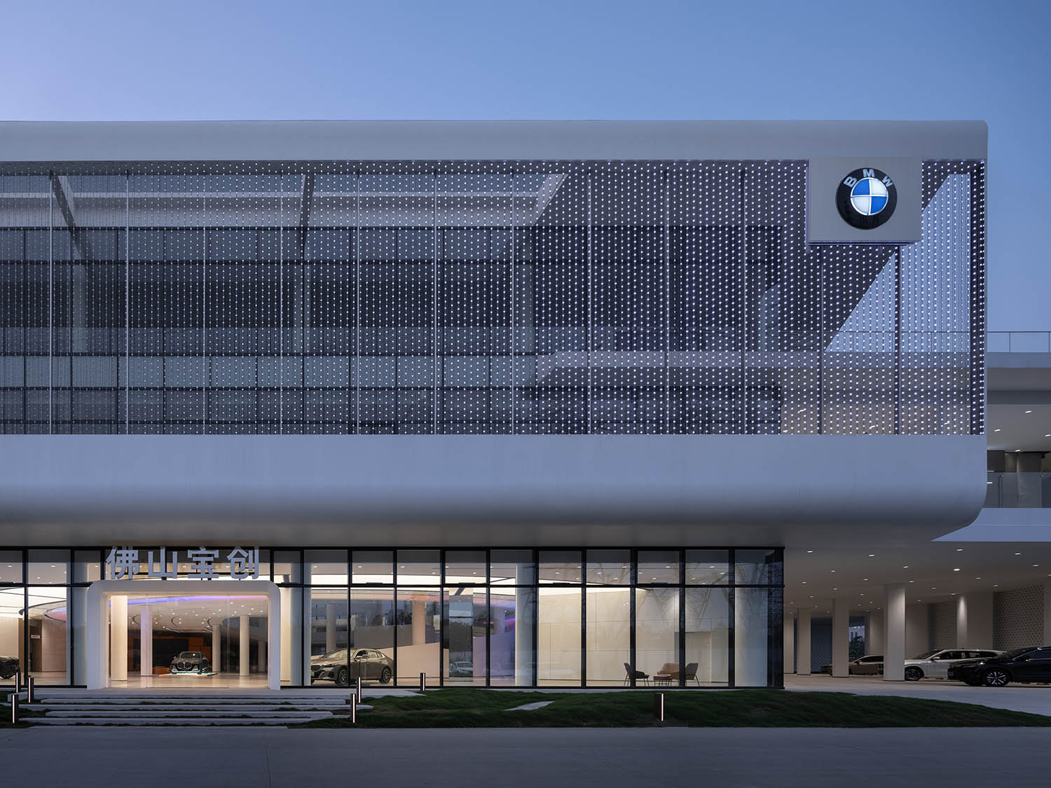
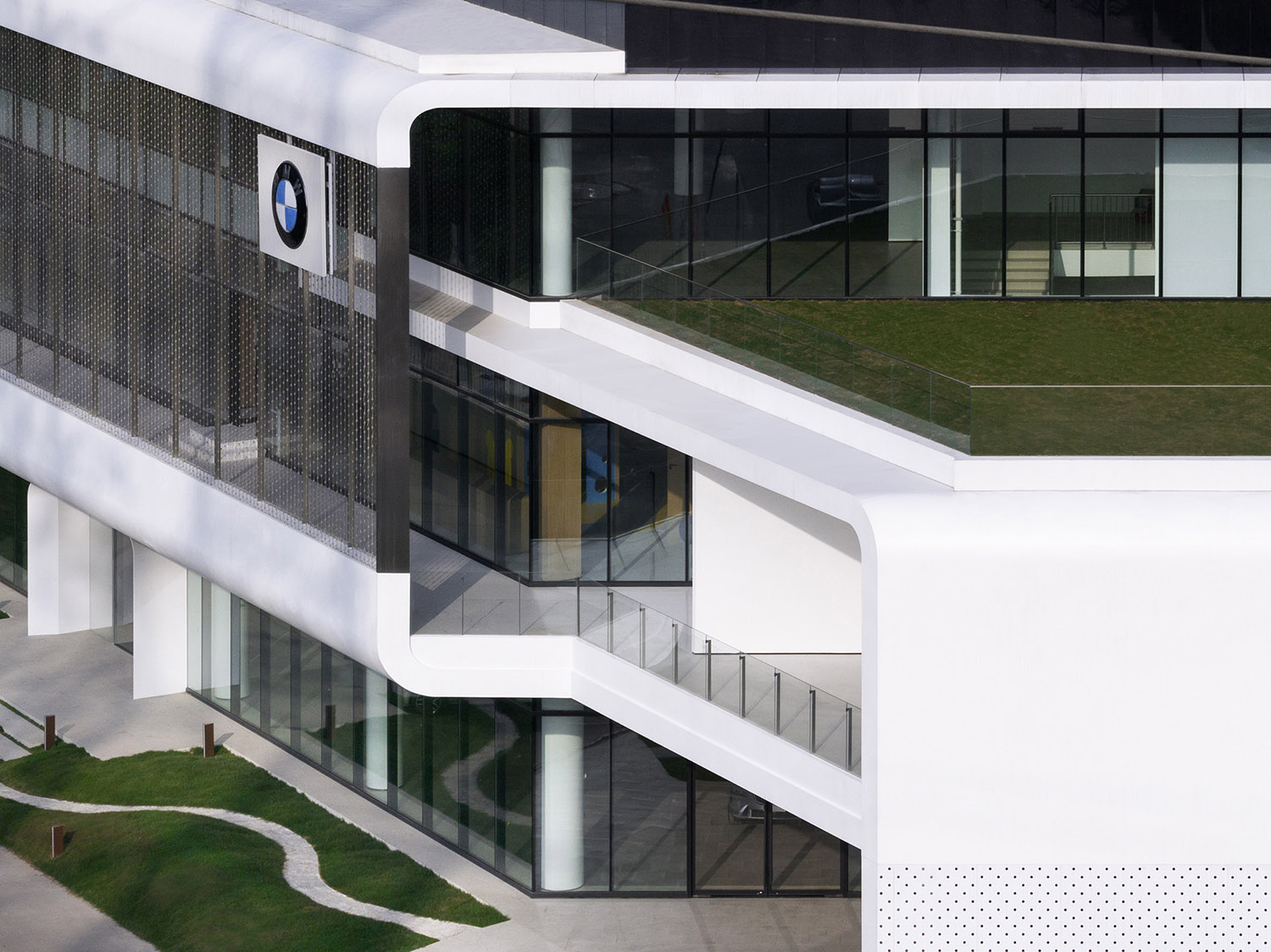
除了強調遮陽的功效,同時也在探索遮陽與建築的一體化,以回應亞熱帶氣候的建築形式,環繞的連廊和兩個地塊的建築形成了一個不可分割的體量。基於這種思考,建築主立麵采用了體塊的穿插咬合的手法,像兩個C型結構扣在一起,將幾個不同的大功能區貫穿在一起。
In addition to emphasizing the efficiency of shading, it is also exploring an architectural form with the integration of shading and architecture to respond to the subtropical climate. And to design an inseparable volume made of surrounding corridor and buildings on two parcels of land is also based on this consideration. Therefore, the main facade of the building is formed by the interpenetration and occlusion of the massing, like two C-shaped structures fastened together, to integrate several different functional areas together.
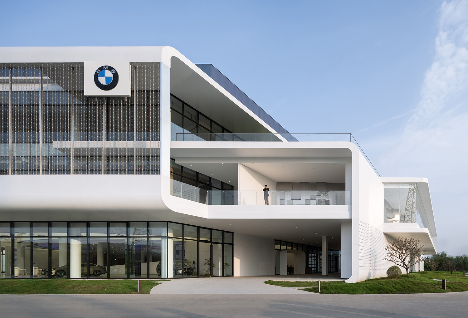
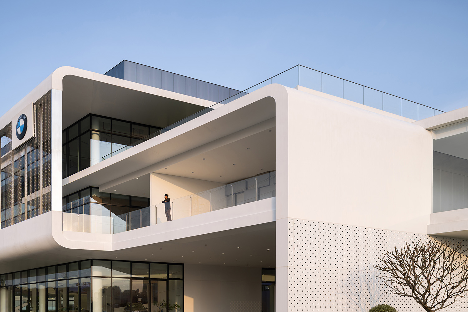
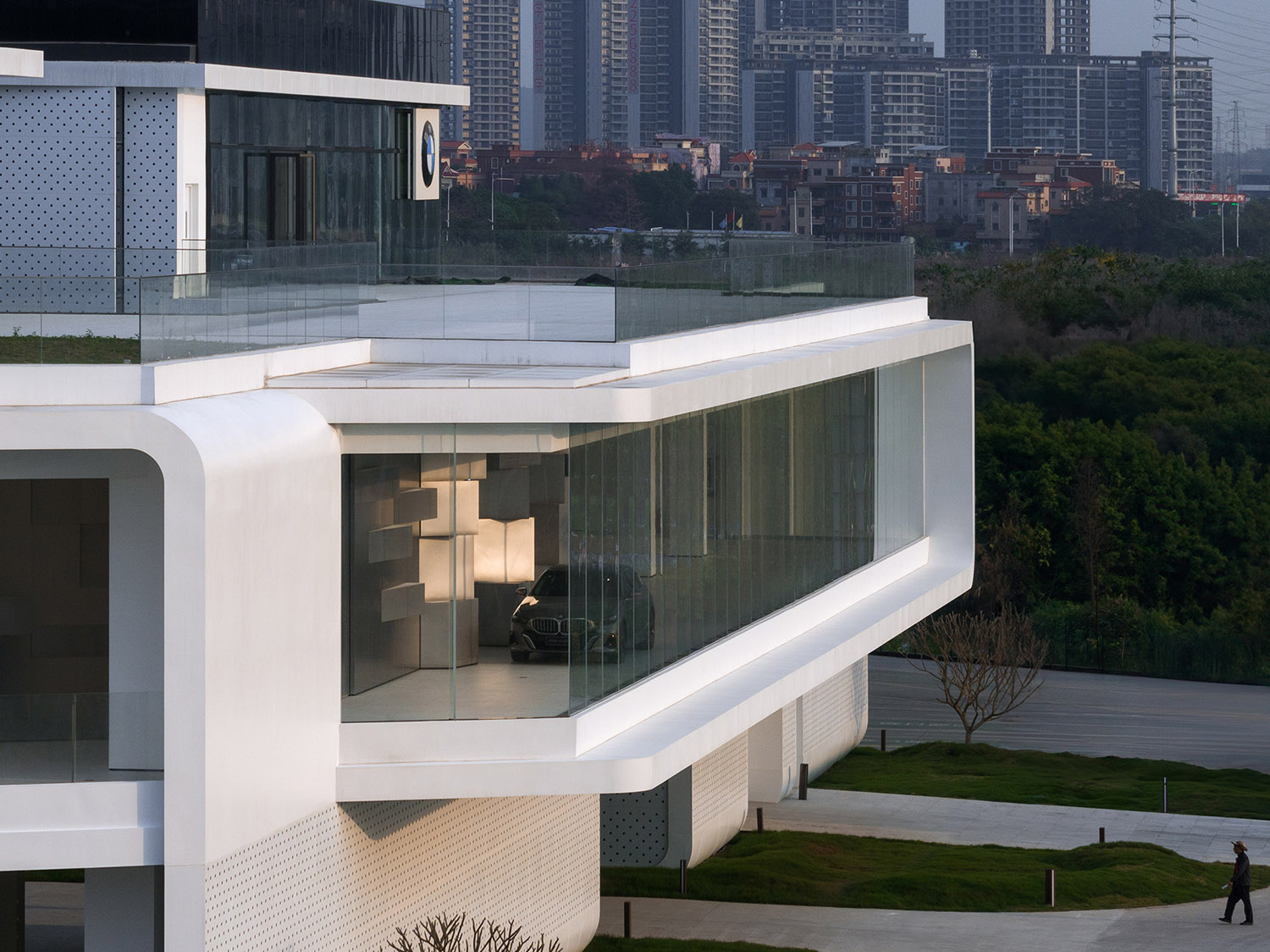
首層幕牆退讓形成的騎樓式懸挑結構,是一個風場流暢的幕牆環境,起到很好的遮陽效果,以最大限度地減少眩光。從而避免室內過熱,起到了幕牆內的遮陽避暑效果,也為運營方和行人提供一片遮風避雨的交互空間。
The arcade building with cantilever structure produced by setting back of the curtain wall on the first floor, provides a curtain wall environment with fluent wind field, excellent shading effect to minimize glare, so as to avoid the interior space from overheating and provide interactive space away from sunshine, heat, wind and rain for the operator and pedestrians, with shade and protection within the curtain wall.
“騎樓”上方出挑的區域,外立麵以自然界中的蜘蛛網為靈感,將點陣燈屏和金屬網合二為一,可以有效地遮陽,同時不會擋住陽光完全地照射到室內。還形成了二層大的露台灰空間,使來的客人擁有更多麵積的戶外活動空間,並保障良好的采光和通風。
For the cantilevered area above the “arcade”, its external facade is inspired by spider webs in nature, merging lattice screen and metal mesh having a good effect of shading but not completely hindering the daylight into the interior. It has also formed a large grey space of terrace on the second floor, providing guests with larger outdoor activity space and ensuring good lighting and ventilation.
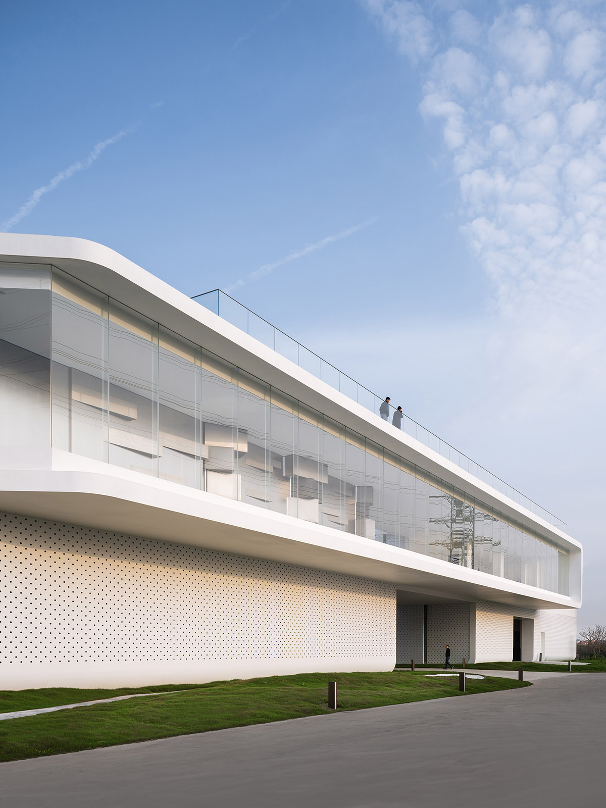
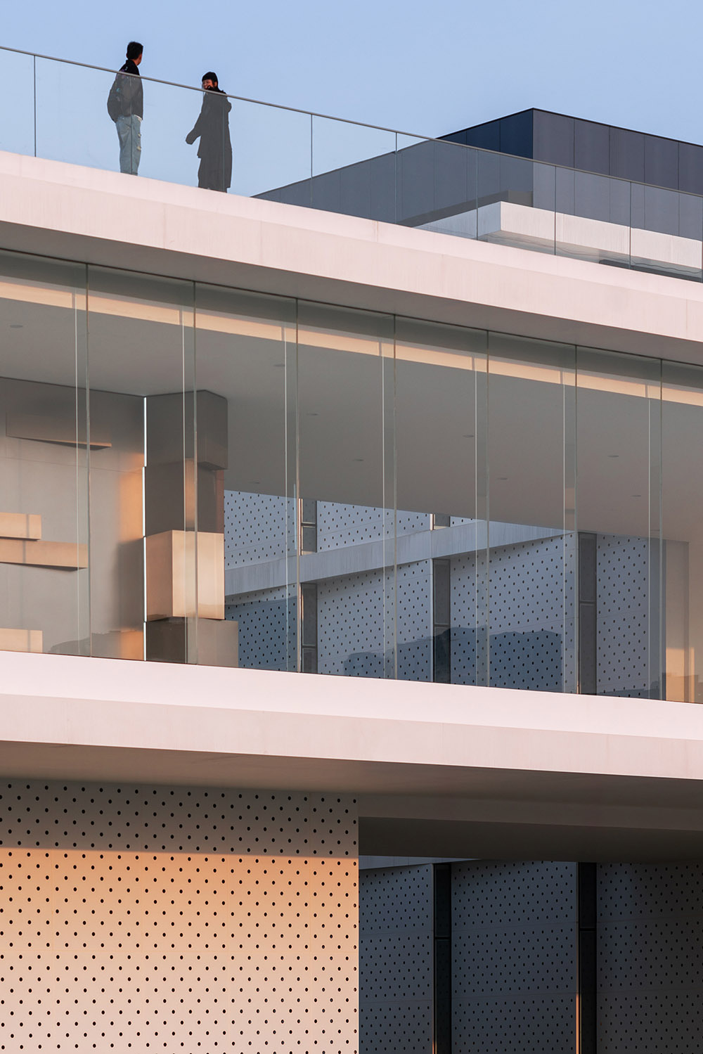
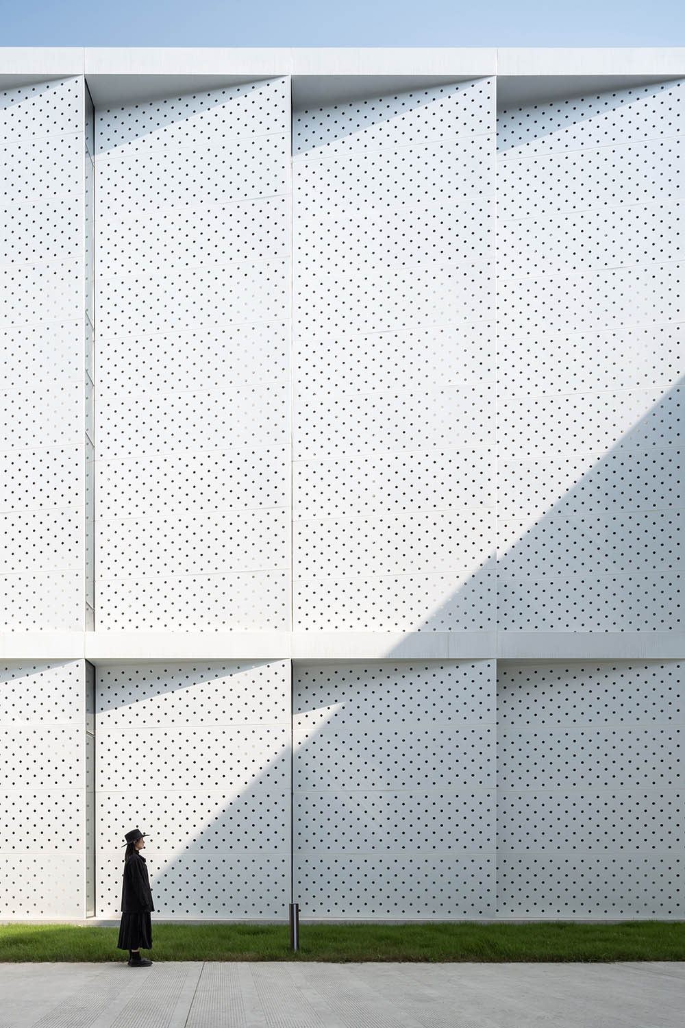
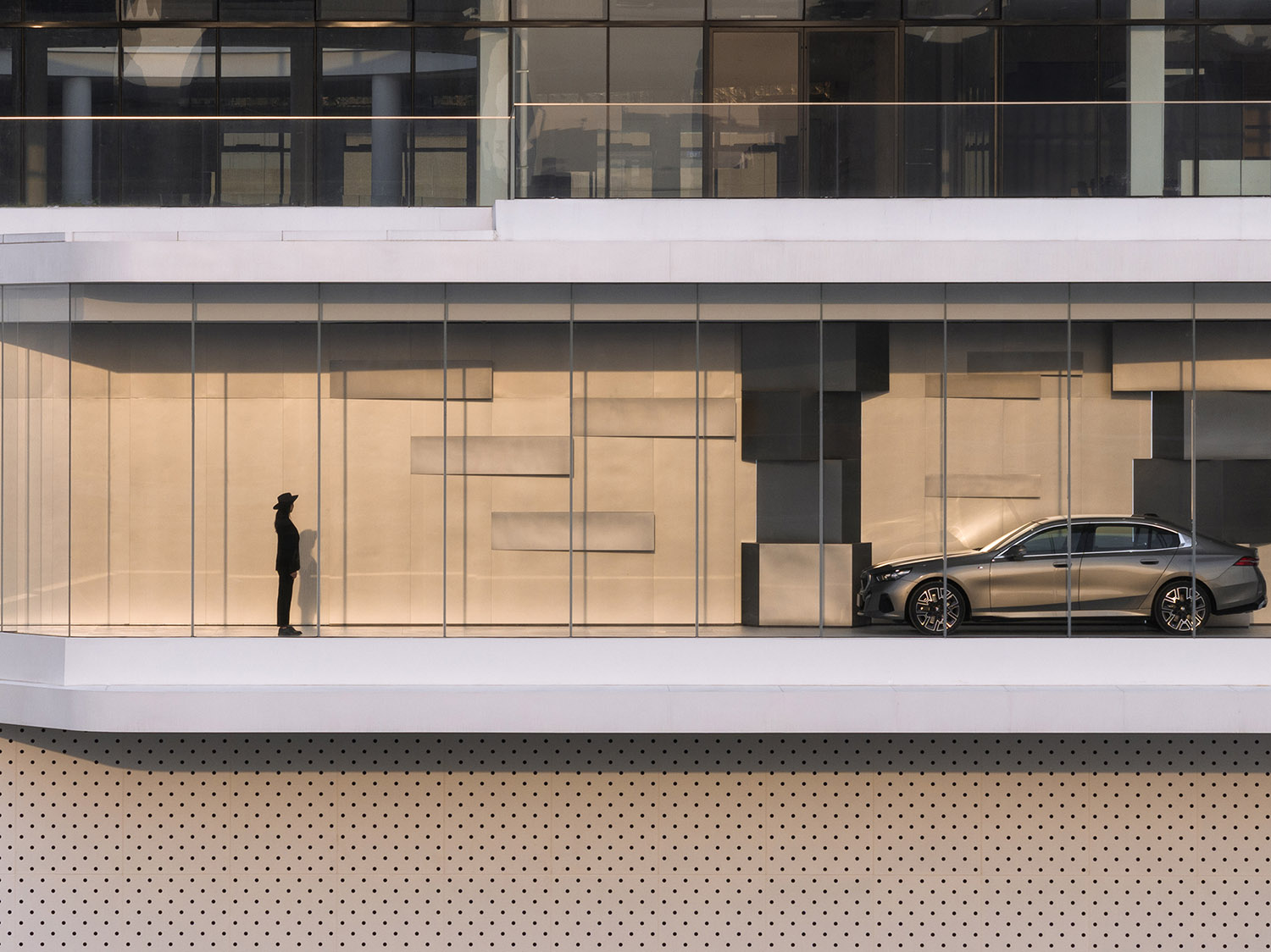
而東南麵車輛接待區的“騎樓”立麵設計了衝孔鋁板,盡量避免建築立麵因陽光照射而產生的熱增益效應,實現建築的自遮陽目標,更是創造了極致的客戶體驗。
The facade of the “arcade” in the southeast vehicle reception area is designed with perforated aluminum plates to minimize the heat gain effect caused by sunlight on the facade, achieving the goal of self-shading and creating an excellent customer experience.
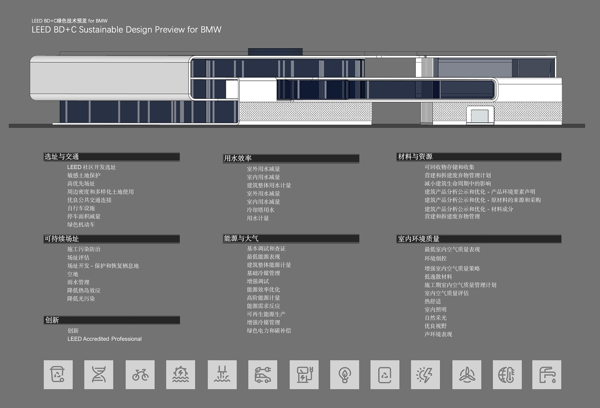
基於可持續的設計思考,還采用了一係列可持續發展的設計策略,包括從圍護結構的熱工性能,到建築自遮陽係統、自行車及更衣淋浴設施、新風監測係統、高效冷熱源係統等,再到建築亮化及室內智能照明控製等的建築能源計量、高效景觀灌溉節水……直至施工汙染防治等每個得分項細節,以及室內展車區和辦公區的大部分采用了可拆卸的隔斷形式、模塊化的工作台等,大大減少了能源消耗,並增強了建築的可持續性。
For the sake of sustainable design, a series of sustainable design strategies have also been adopted, with every detail of scoring item including the thermal performance of the enclosure structure, building’s self-shading systems, bicycle and changing and shower facilities, fresh air monitoring systems, efficient cooling and heating source systems, building energy metering for building lighting and indoor intelligent lighting control, efficient landscape water-saving irrigation, construction pollution prevention and control. In addition, detachable partitions and modular workstations have been adopted in most of the indoor exhibition areas and office areas, which greatly reduces energy consumption and enhances the sustainability of the building.
∇ © ARCHIHOPE
#02 動線及功能體塊
Moving Line and Functional Blocks
人車合一是整個建築的動線設計核心,鼓勵更多活動和功能的可能性,使人和車都能有趣地任意穿梭,人開著車都能任意行駛到建築中的每個樓層和內外空間,乃至屋頂層。
Achieving the unity of people and vehicles is the design core of moving line in the entire building, encouraging more possibilities for activities and functions and allowing both people and vehicles to shuttle freely and interestingly. People can drive a car to every floor, interior and exterior space, and even the top floor of the building.
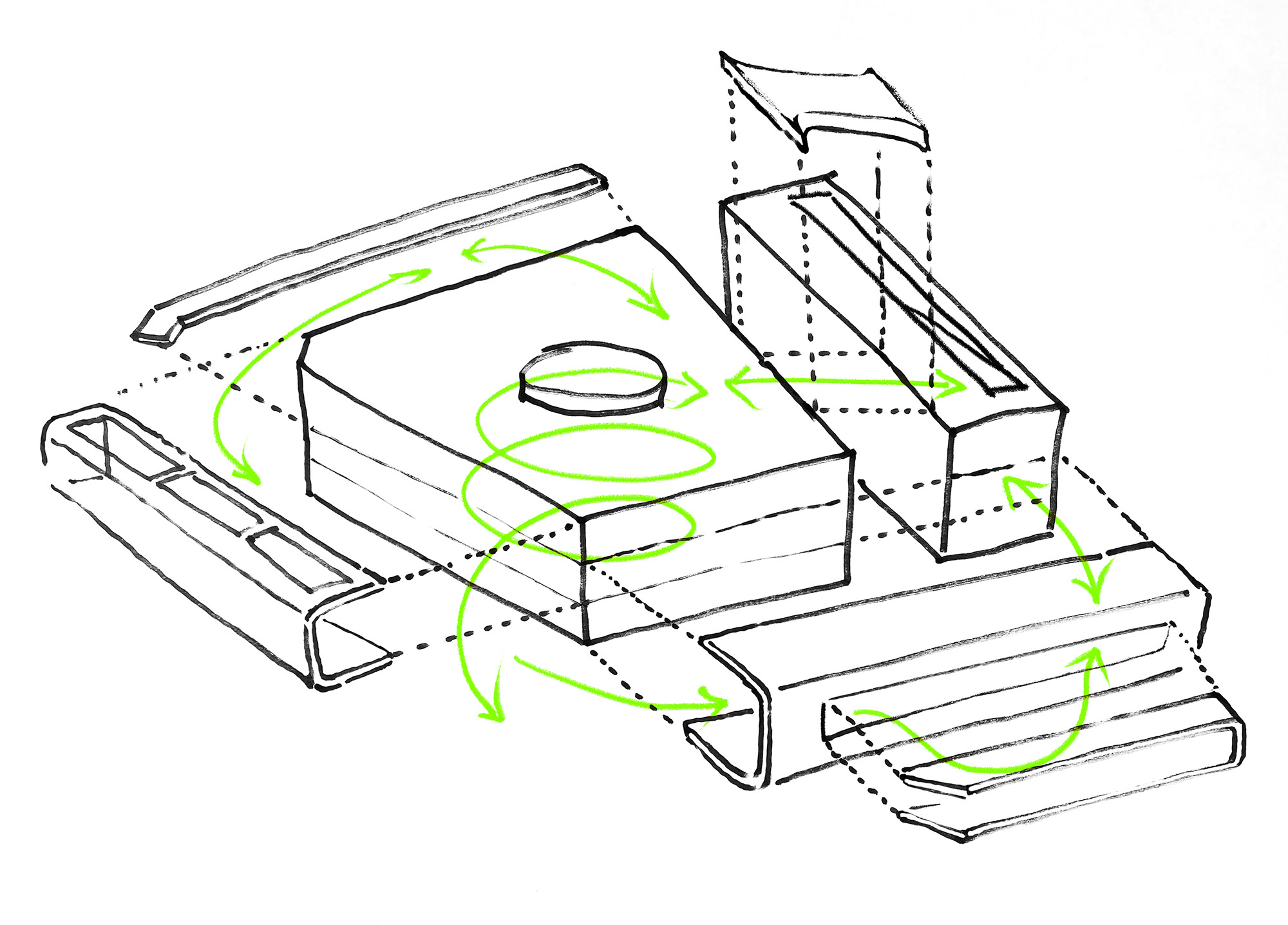
∇ 連廊手稿 © ARCHIHOPE
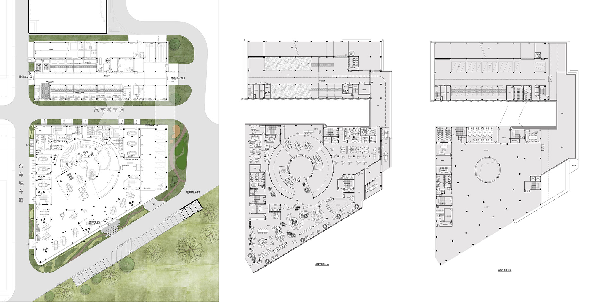
建築的每個麵都有出入口,宏觀層麵看,南邊是展車區、辦公室,停車場……共三層,北邊是車間。南邊展車區包含了一層的汽車展廳,和部分客戶洽談區、辦公區;二層則集合了客戶休息區、互動區、餐廳、茶室、咖啡廳、書吧、兒童遊樂區、辦公區於一體;三層主要以辦公區和停車區為主。連廊貫穿南北建築,北邊三層都是維修車間,車間後有一個跑道,車可以直接開到屋麵。
There are entrances and exits on each side of the building. From a macro perspective, exhibition areas, offices, and parking lots are arranged on three floors in total on the south with the workshops on the north. The exhibition areas on the south include car showrooms on the first floor, as well as a part of customer negotiation areas and offices. On the second floor, is the integration of customer rest areas, interactive areas, restaurants, tea rooms, cafes, book bars, children’s playground and offices while on the third floor is mainly office and parking areas. With the corridor running through buildings between north and south, there are maintenance workshops on all the three floors on the north. There is also a runway behind the workshop through which cars can directly drive up to the roof.
#03 藝術感展廳
Art Exhibition Hall
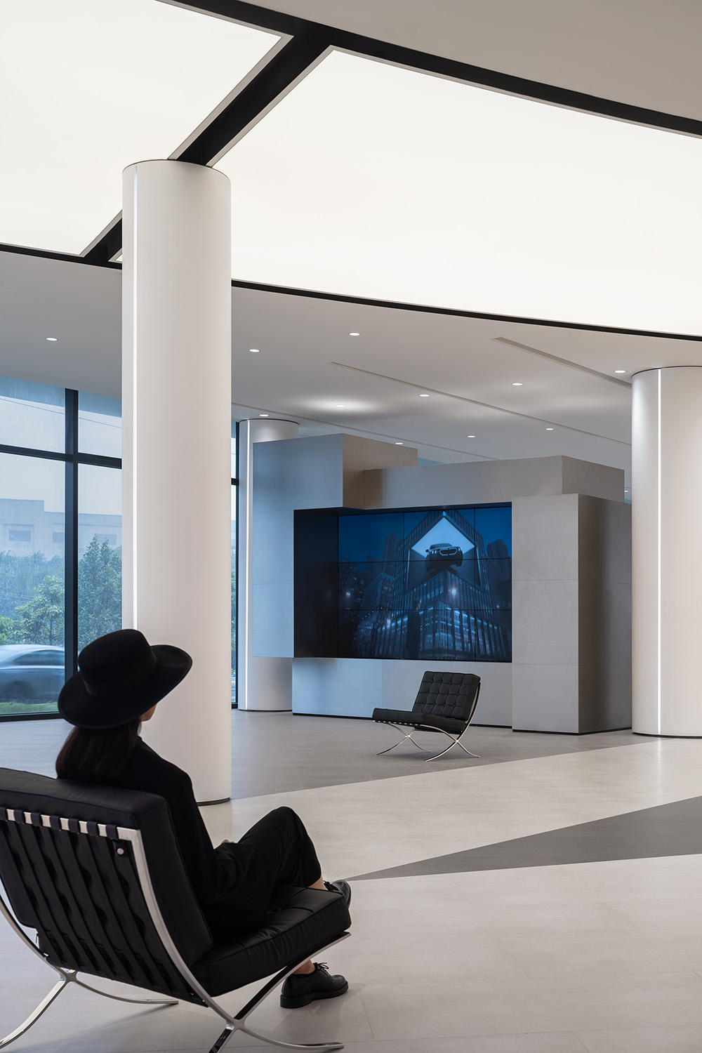
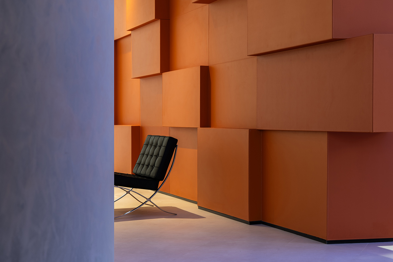
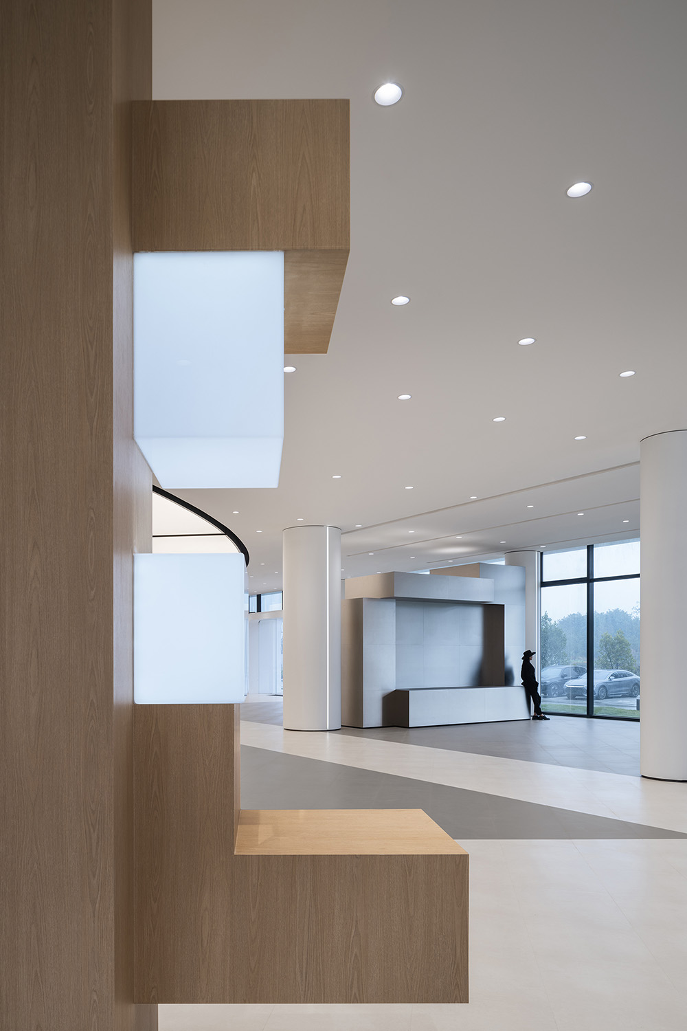
室內的設計營造了一個光線充足、溫馨的環境氛圍,設計團隊希望整個空間是一種更加具有鬆弛感的布局,藝術展廳般的開放空間、一覽無餘的自由視覺感、讓來的人更加放鬆,是此次體驗感設計的目的。
It is hoped to create a bright and warm atmosphere in the interior design and a spatial layout with a sense of more relaxation throughout the space. So the purpose of ARCHIHOPE’s design for experience sense is to build an open space like an art exhibition hall with a clear and free visual experience making visitors more relaxing.
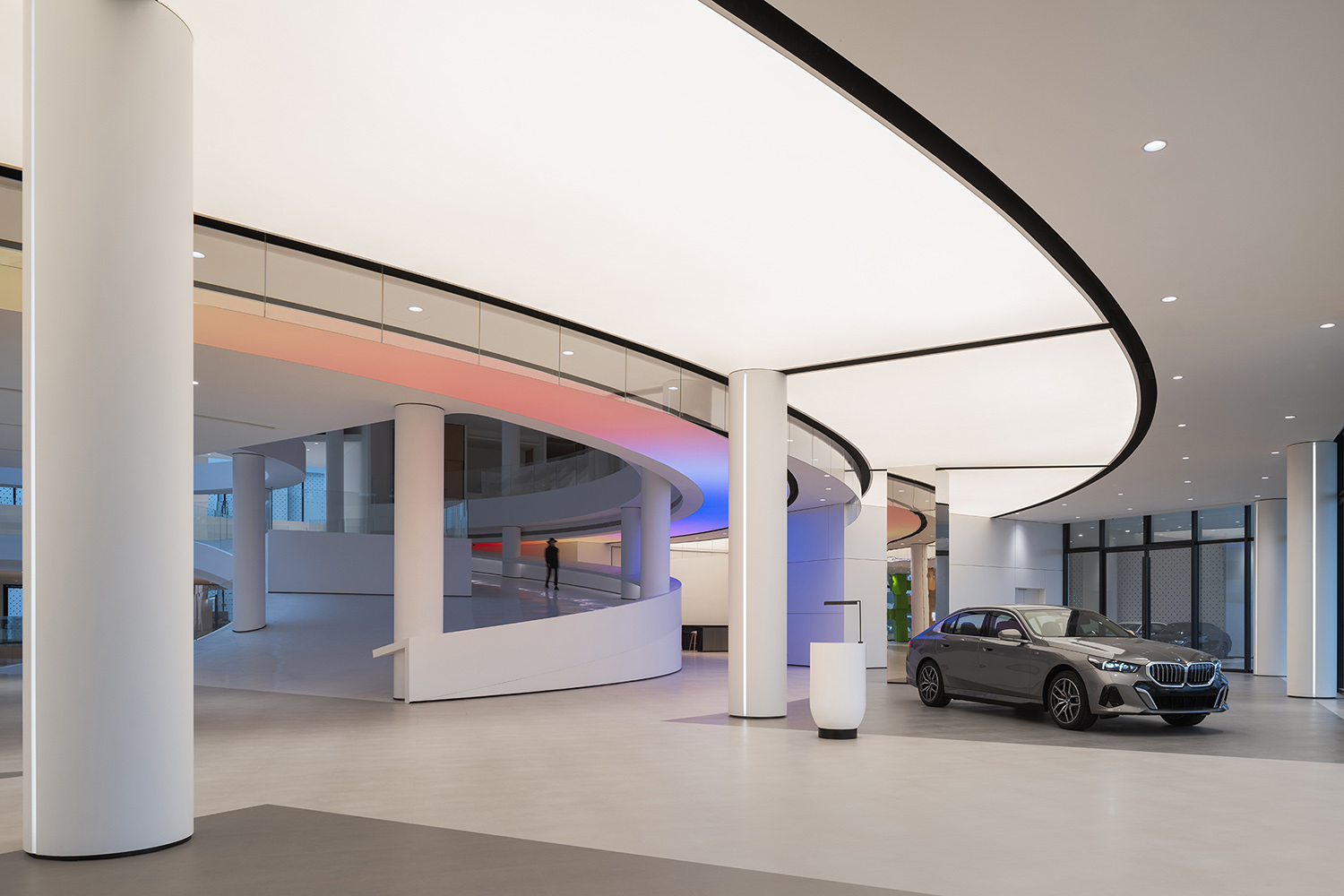
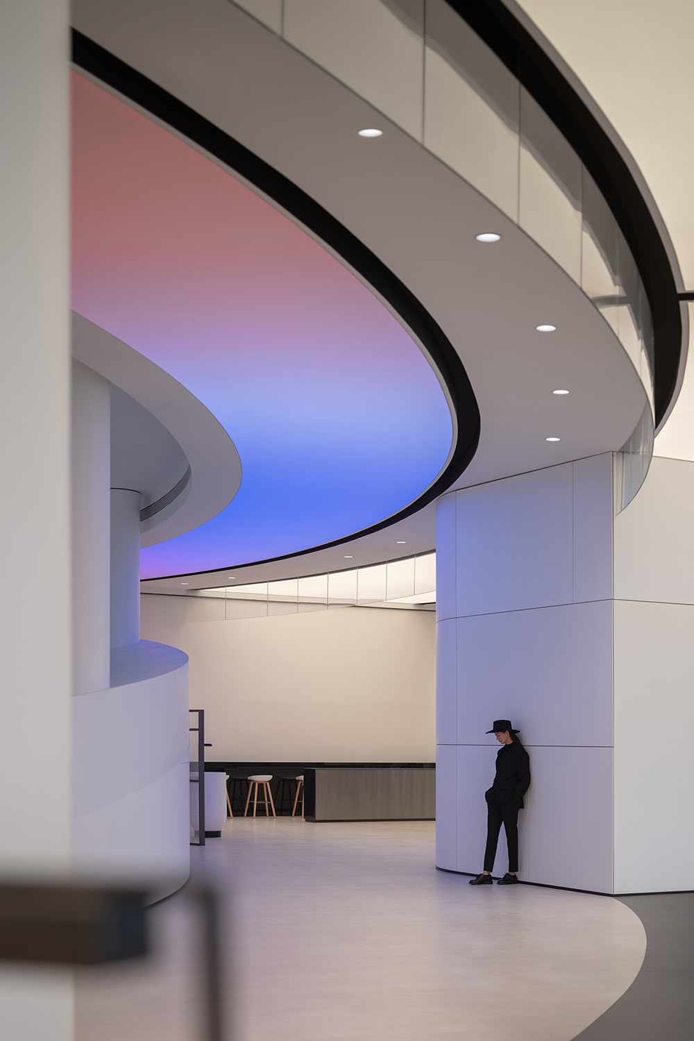
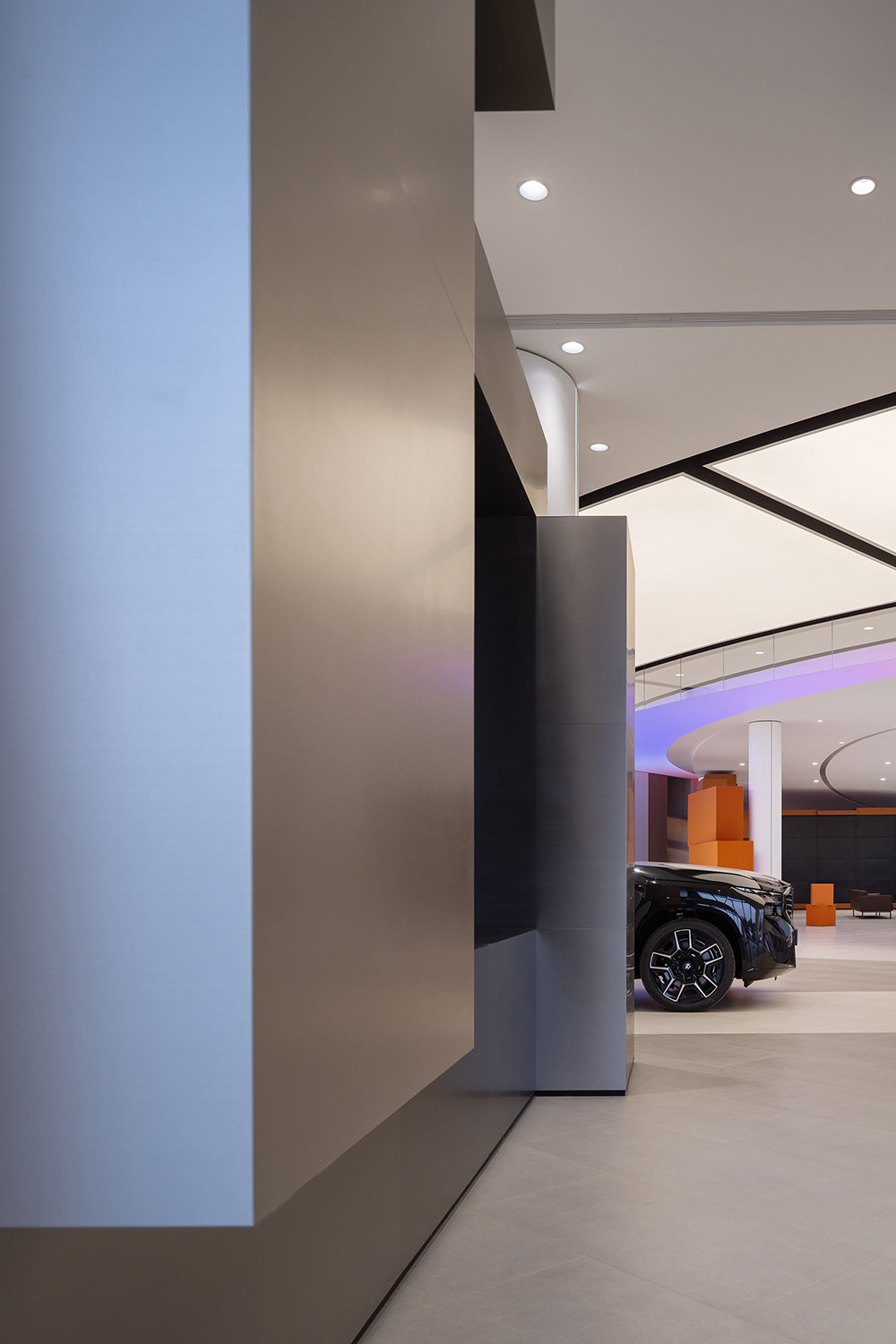
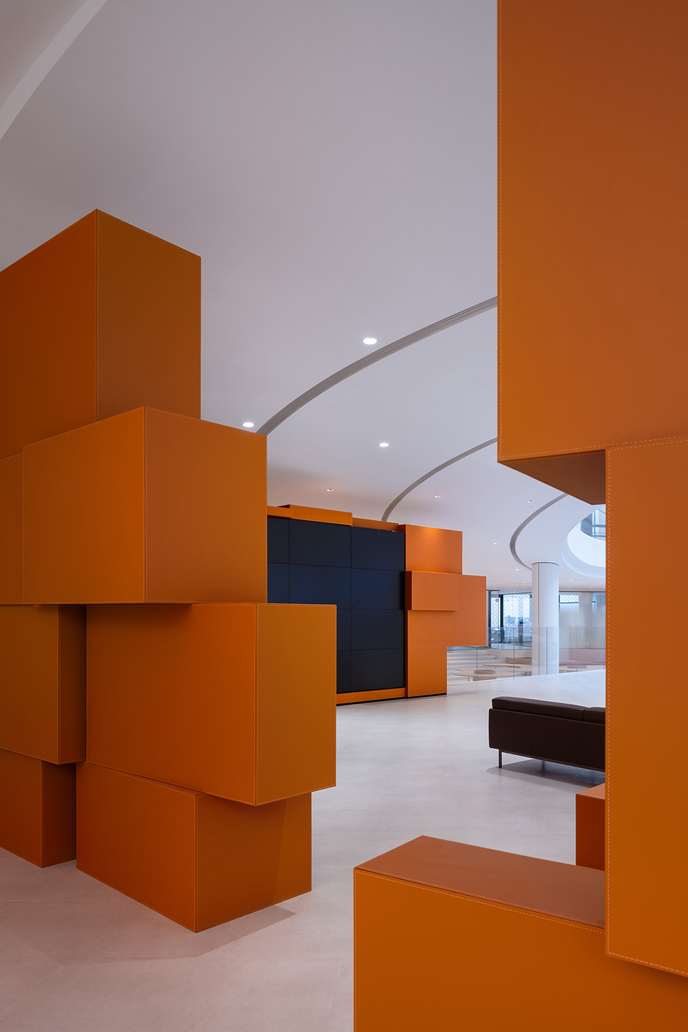
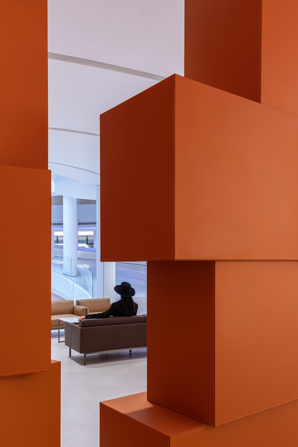
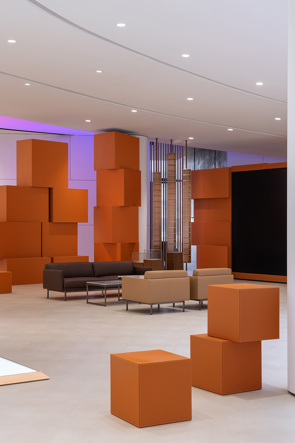
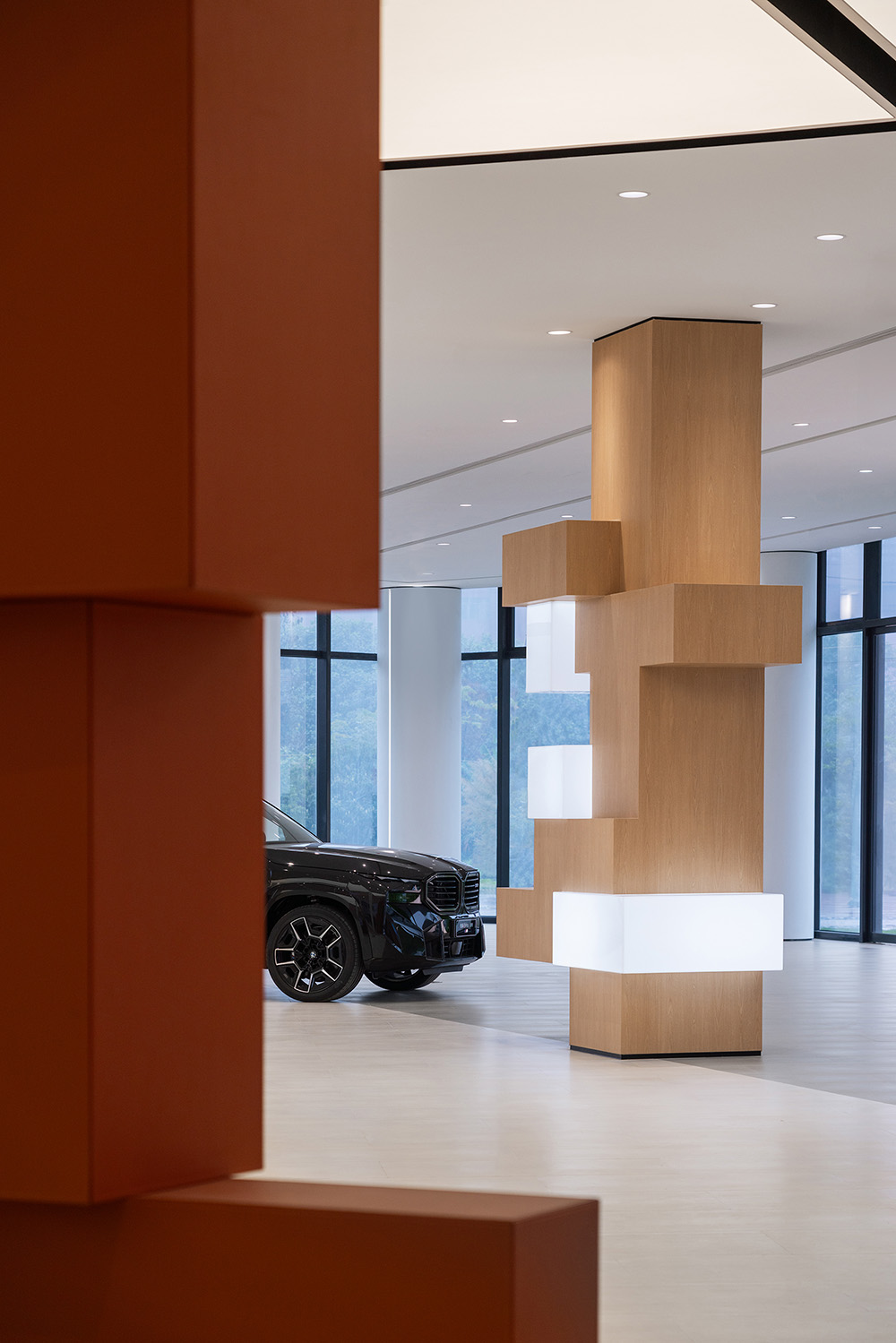
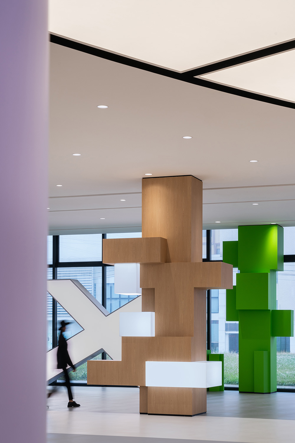
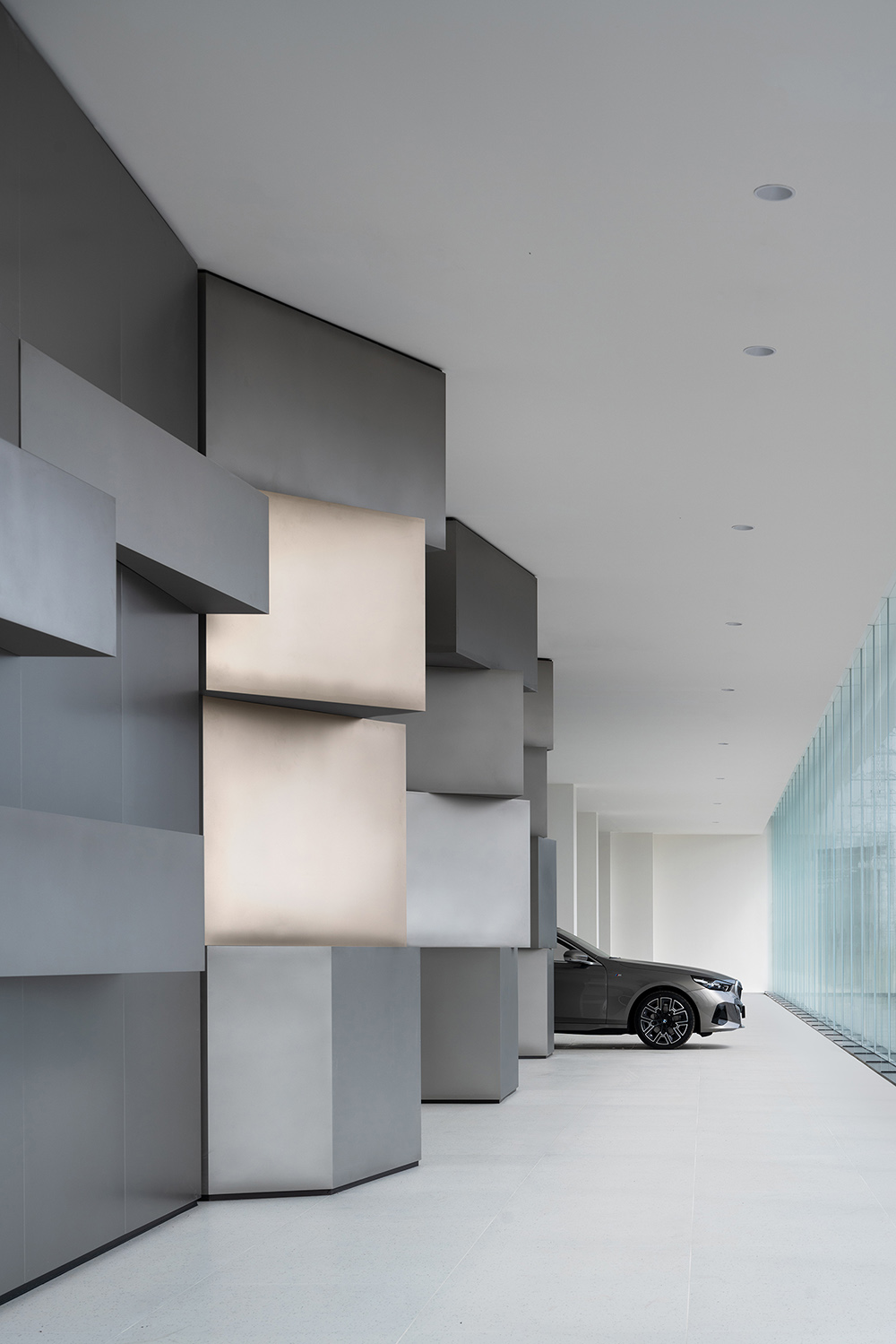
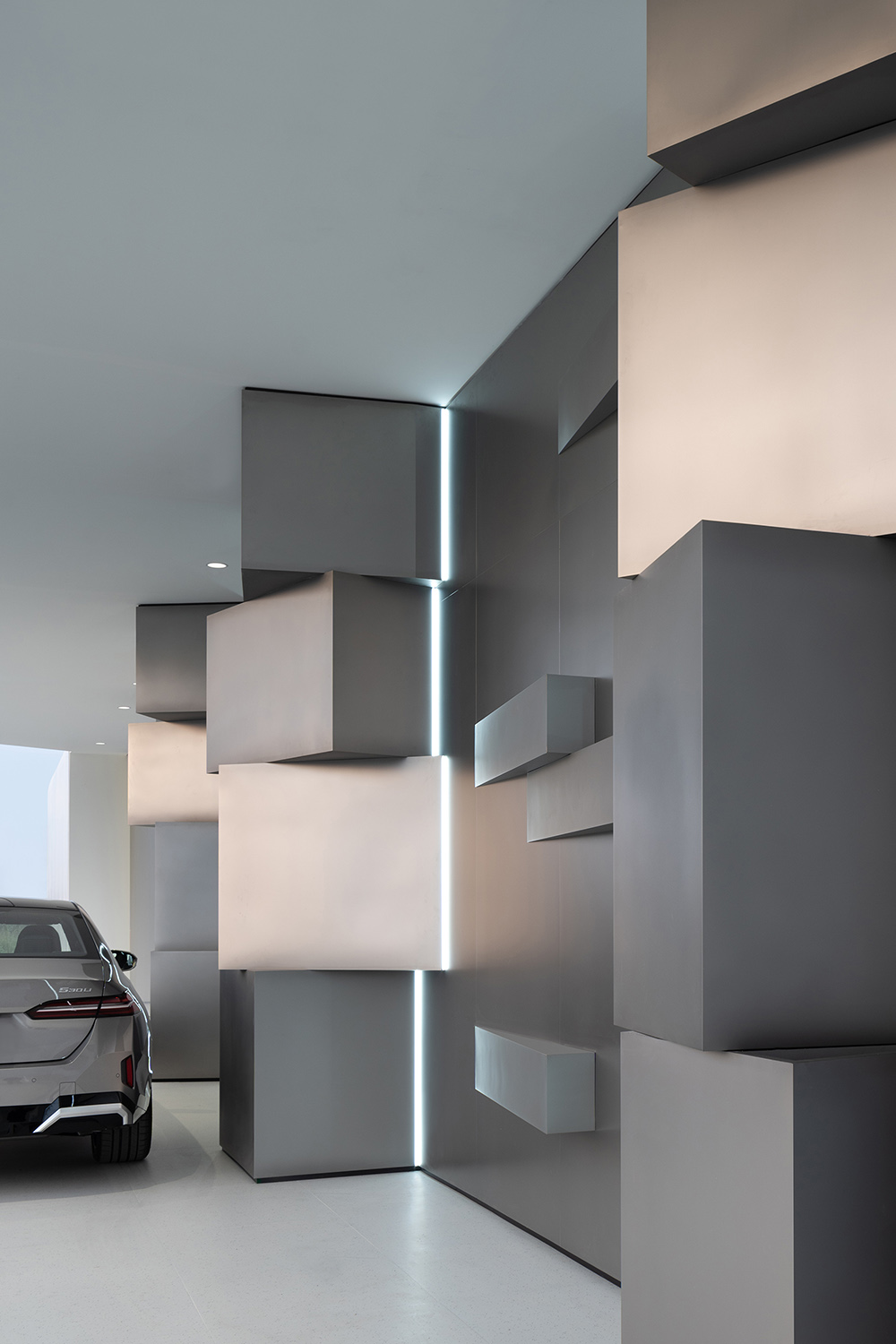
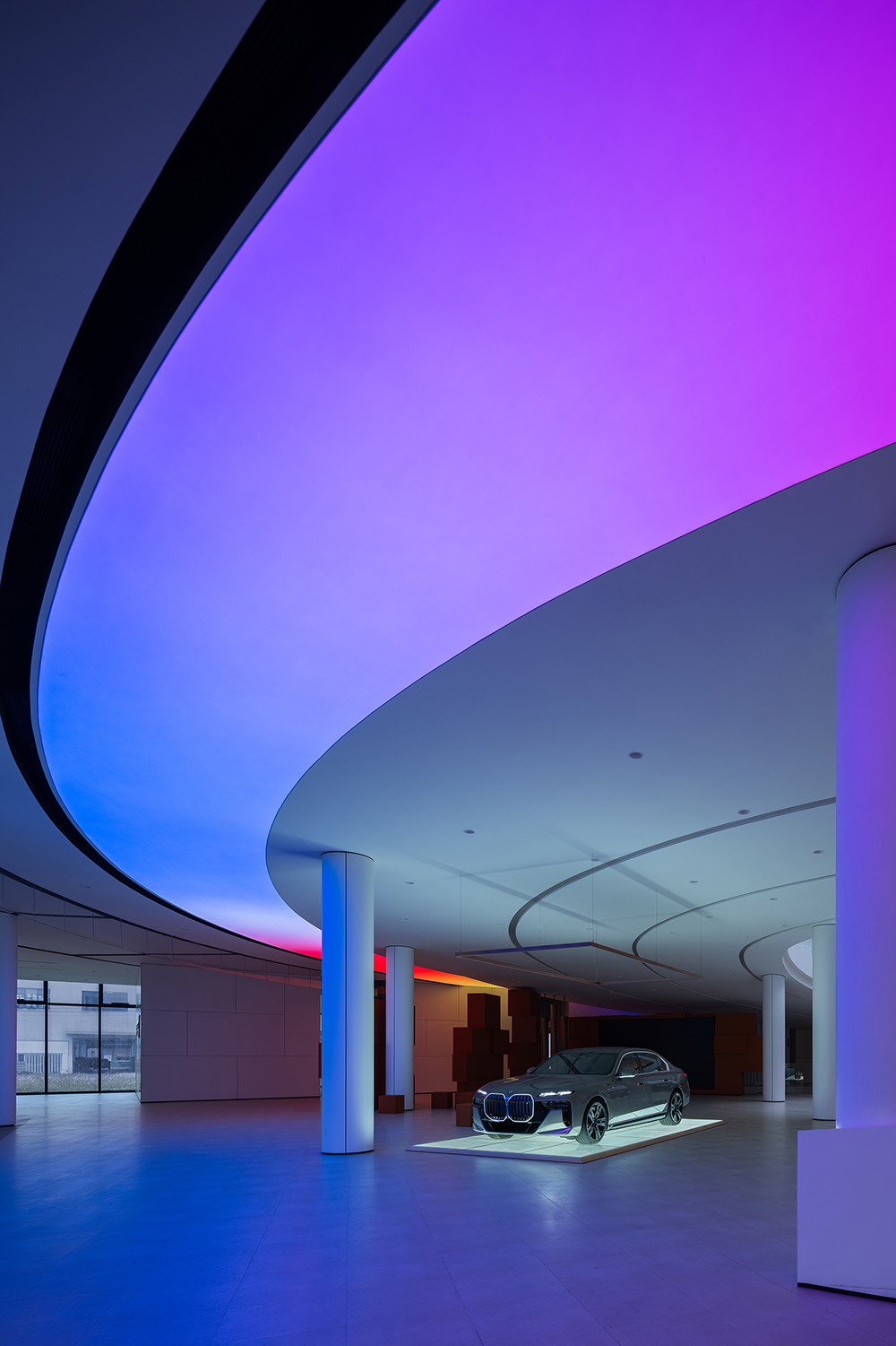
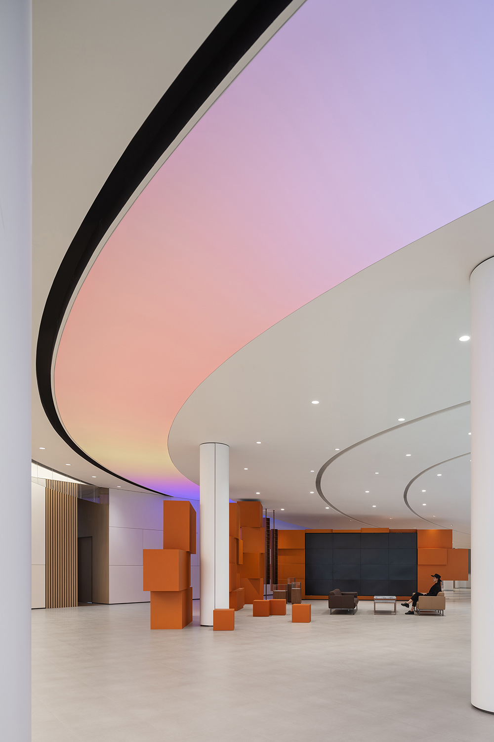
一層展車區的概念是像素模塊化,通過放大的像素堆疊成不同造型,與展車混搭在一起,並用天花大跨度的動態環形彩色燈膜來進行對比,造型和色彩的協調與衝突,表達一種年輕化、娛樂化的生活。
The design concept of the exhibition areas on the first floor is pixel modularity. Enlarged pixels are stacked into different shapes, mixing and matching with the exhibition vehicles and contrasting with dynamic annular coloured light film in large span on the ceiling, expressing a youthful and entertaining life inspiration with the coordination and conflict of model and color.
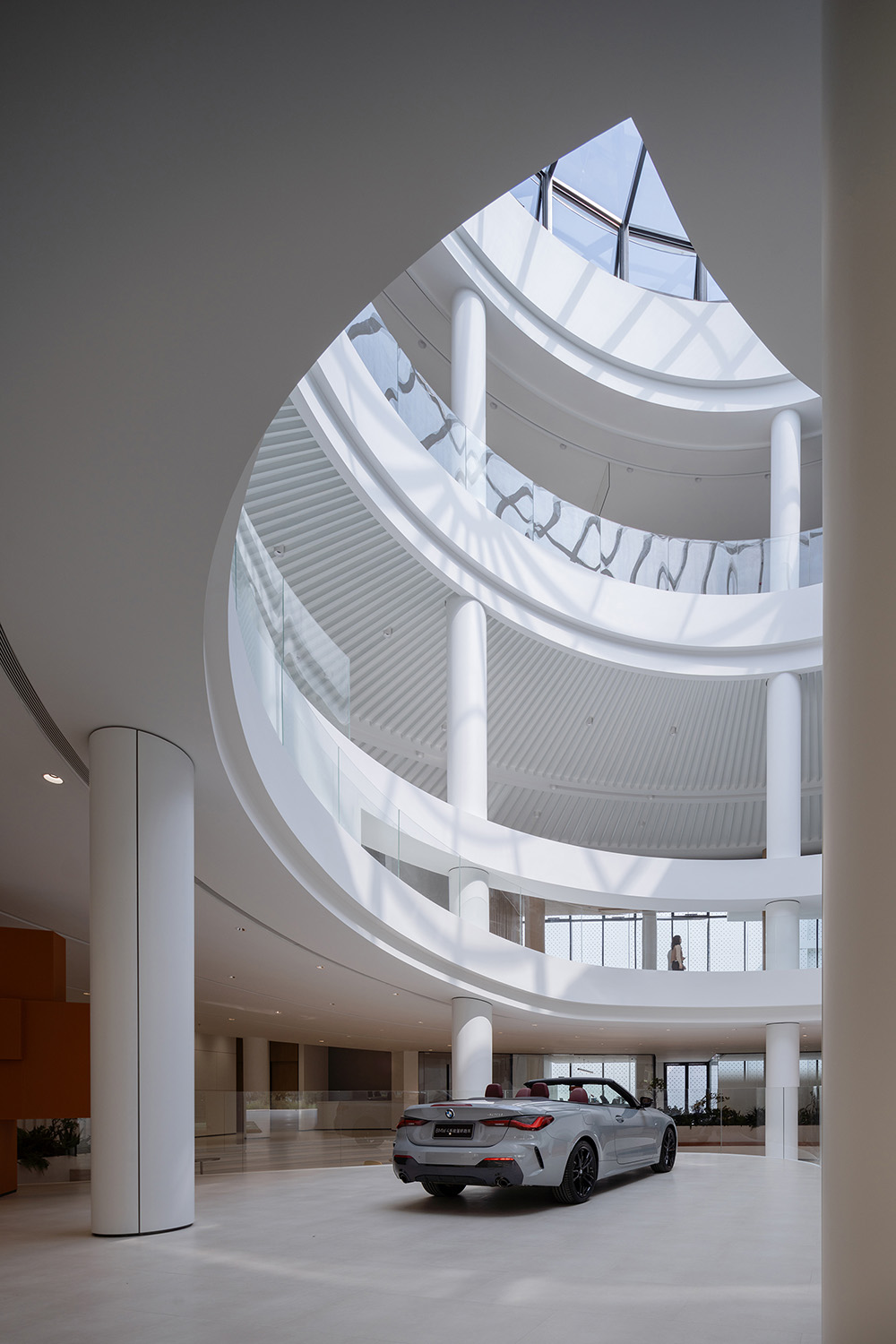
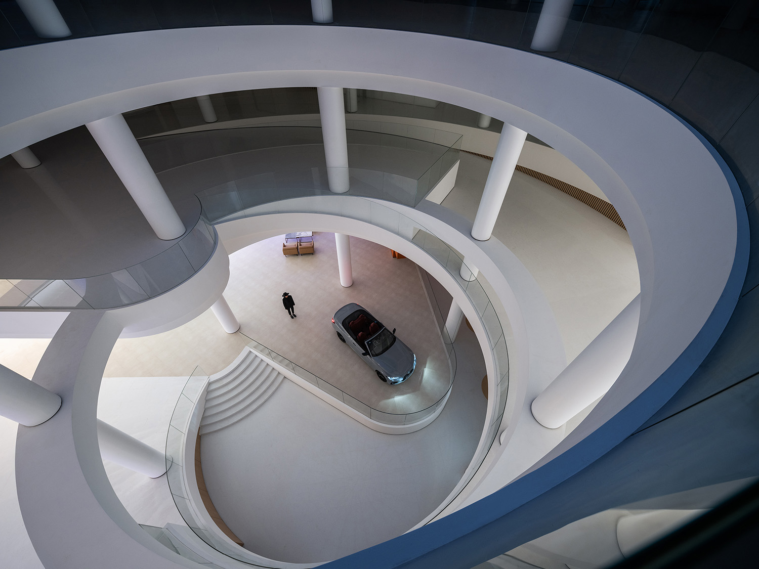
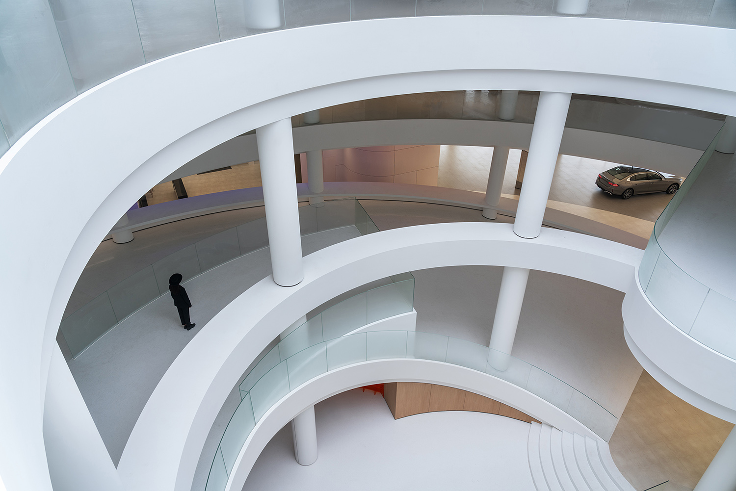
中庭是一個下沉式的咖啡區,中空是圓形的挑空空間,也是整個建築中央部分,陽光從頂上的采光井透下來,三五友人在此喝咖啡好生愜意,咖啡服務台也是以像素模塊化為概念基礎,但更加年輕化和充滿色彩感。中庭的環形車道從一層緩緩環繞到二層,環形車梯天井的設計,在增加自然采光的同時,於建築內部形成風自外而內貫穿循環,促進室內空氣對流,從而散熱降溫,有效改善了建築環境的微氣候。
The atrium is designed into a sunken coffee area, a circular hollow space which is also the central part of the entire building. Sunlight pouring down through the light well on the top, how comfortable it is to enjoy coffee with a few friends here. Besides, the design of the coffee service counter is also based on the concept of pixel modularity, appearing more youthful and colorful. With the circular lane in the atrium slowly around from the first floor to the second floor, the design not only increases natural lighting, but also creates a circulation of wind from outside to inside of the building, promoting indoor air convection and cooling, which can effectively improve the microclimate in building environment.
室內外的綠化采用了高爾夫概念的景觀設計手法,建築外場做了環繞的微地形處理,並伴隨小徑穿插在微地形中,幕牆及窗邊的植物選苗基本都是以花箱土培。
The indoor and outdoor forestation adopts the landscape design techniques of golf concept, and the building outfield is surrounded by micro-topography with paths curved round in it. Seedling selected for curtain walls and windowsills plants are mostly under soil culture in flower boxes.
朱海博建築設計事務所設計的初衷,是希望這棟建築能給生活在裏麵的人帶來幸福的工作環境和鬆弛的生活感受,借此提升生活質量。
The initial intention of ARCHIHOPE’s design is to provide a happy working environment and relaxing living conditions for those living in the building so as to improve their life quality.
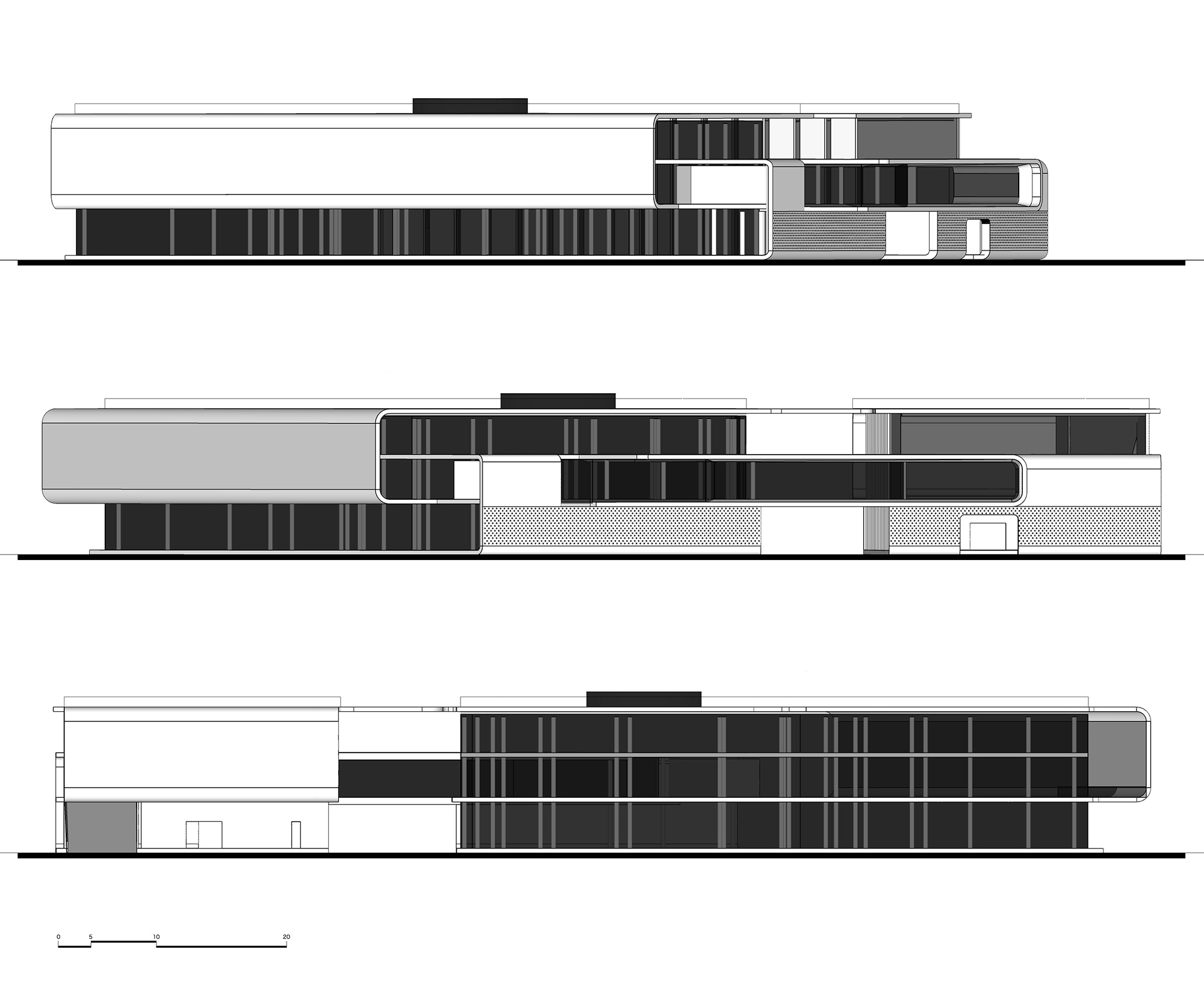
∇ 立麵 Elevation © ARCHIHOPE
∇ 平麵規劃 Plan Layout © ARCHIHOPE
項目信息
項目名稱:BMW佛山寶馬寶創綠星燈塔項目
項目地址:廣東省佛山市禪城區季華西路
建築設計:ARCHIHOPE朱海博建築設計事務所
主持建築師:朱海博
方案設計師團隊:方潔、許暢、何夢君等
室內設計:深圳故事空間設計有限公司
建築麵積:7865平方米
主要材料:鋁板、衝孔鋁板、low-E雙層中空玻璃、金屬網、點陣屏等
完工時間:2024年3月30日
項目攝影:吳鑒泉
Project Name: BMW Foshan Baochuang Center
Project Location: Jihua West Road, Chancheng, Foshan, Guangdong
Design Company: ARCHIHOPE Ltd.
Chief Designer: Hihope Zhu
Designer Team: Jane Fang, Xu Chang, He Mengjun
Interior Design: Shenzhen SIAD CO., LTD.
Total floor space: 7865 square meters
Main Materials: Aluminum plate, perforated aluminum plate, Low-E Hollow Glass, metal mesh, lattice screen, etc.
Completion Date: March 30, 2024
Project Photographer: Vincent Wu






![[4K] 十位偉大建築大師](http://www.online4teile.com/wp-content/uploads/2023/02/2023.v02413-414x550.jpg)
