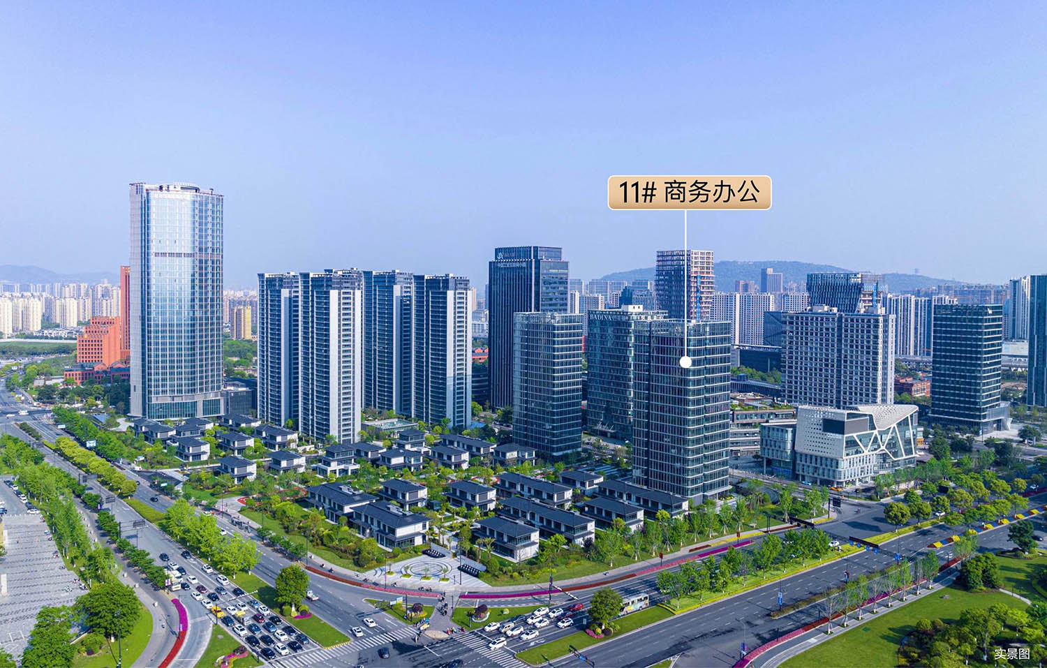
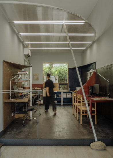
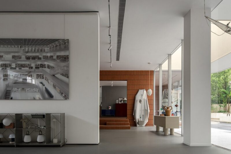
TIZI DESIGN受辛宣科技邀請為其打造位於杭州臨平新城,濱耀城的新辦公樓,在此設置運營及展示中心,緊鄰藝尚小鎮與藝尚小鎮潮流街區,是時尚企業總部的聚集帶,濱耀城位於臨平繁華中軸線迎賓路上。辛宣位於濱耀城11#10F,建築麵積約1000㎡,四周環繞著大窗戶,自然光線充足,城市全景(藝尚小鎮、潮流街區、東湖公園、迎賓公園等)盡收眼底。
TIZI DESIGN was invited by XINXUAN Technology to build a new office building in Binyao City, Linping New City, Hangzhou. It has set up an operation and display center here. It is close to the fashion block of Yishang Town and YISHANG Town. It is the gathering belt of the headquarters of fashion enterprises. Binyao City is located on Yingbin Road, the bustling central axis of LINPING. XINXUAN is located at 11#10F of BINYAO City, with a construction area of about 1000m2, surrounded by large windows, plenty of natural light, and a panoramic view of the city (YISHANG Town, Fashion Block, East Lake Park, YINGBIN Park, etc.).
∇ ©來源於網絡
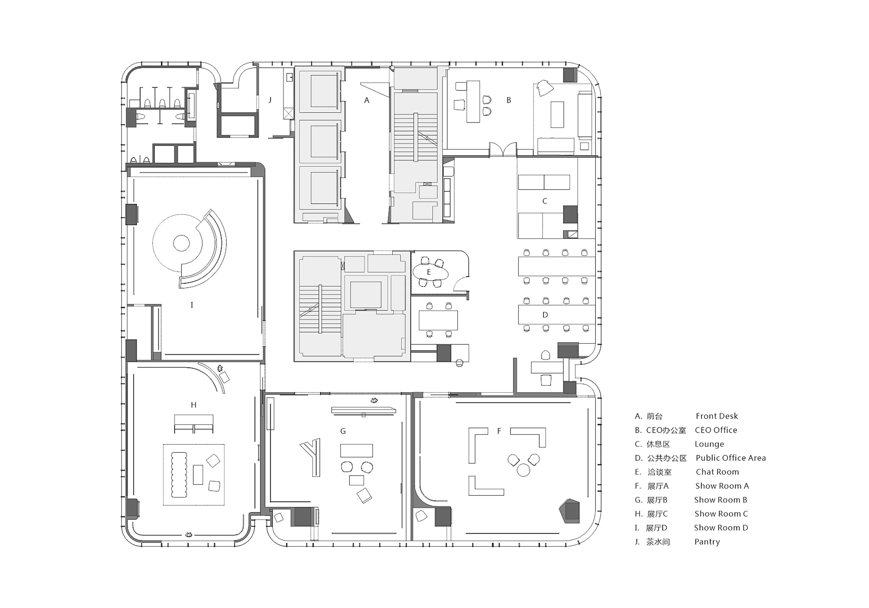
∇ Plan 平麵圖
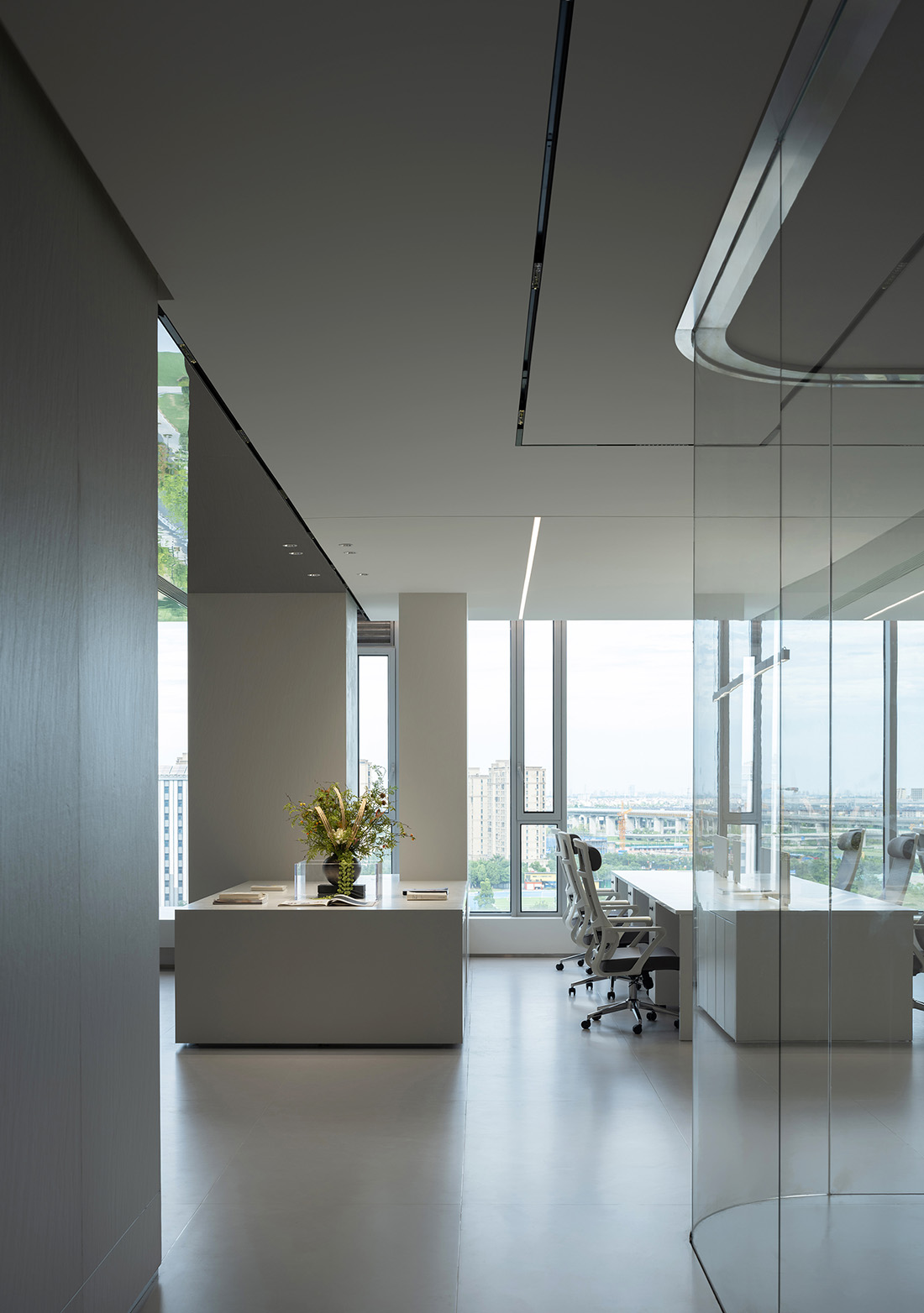
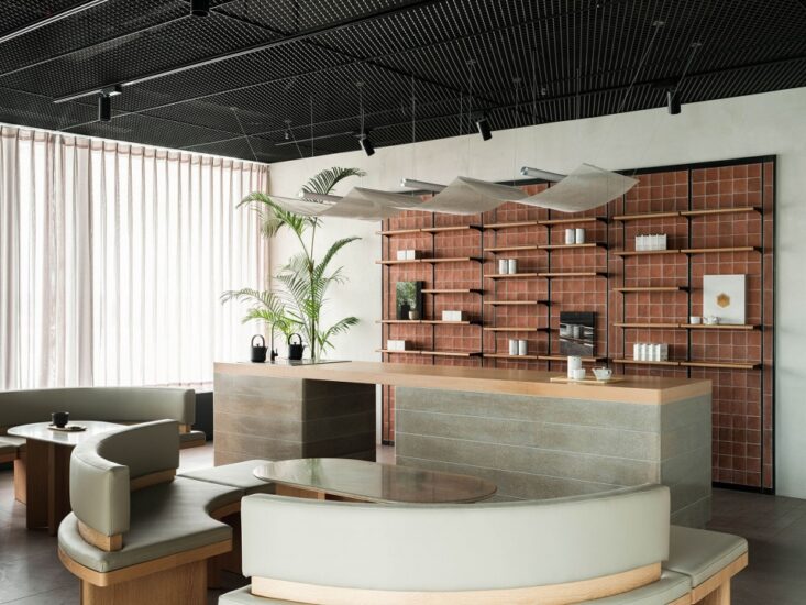
空間設有辦公區、多功能區、接待室、主理人辦公室、茶水空間、展示廳,生活區域。設計師結合區域使用頻率及長期主義來規劃空間,陽光從東升到西落,東方設置為工作區及主入口,跟著光線行走,其它功能區域沿“中心筒”依次展開,每一位來訪者都獲得“完整”的空間體驗。
The space is equipped with office area, multi-functional area, reception room, manager’s office, tea space, exhibition hall and living area. The designer combines the frequency of regional use and long-termism to plan the space. The sun rises from east to west, and the east is set as the work area and the main entrance. Walking with the light, other functional areas unfold along the “center cylinder” in turn, and each visitor gets a “complete” space experience.
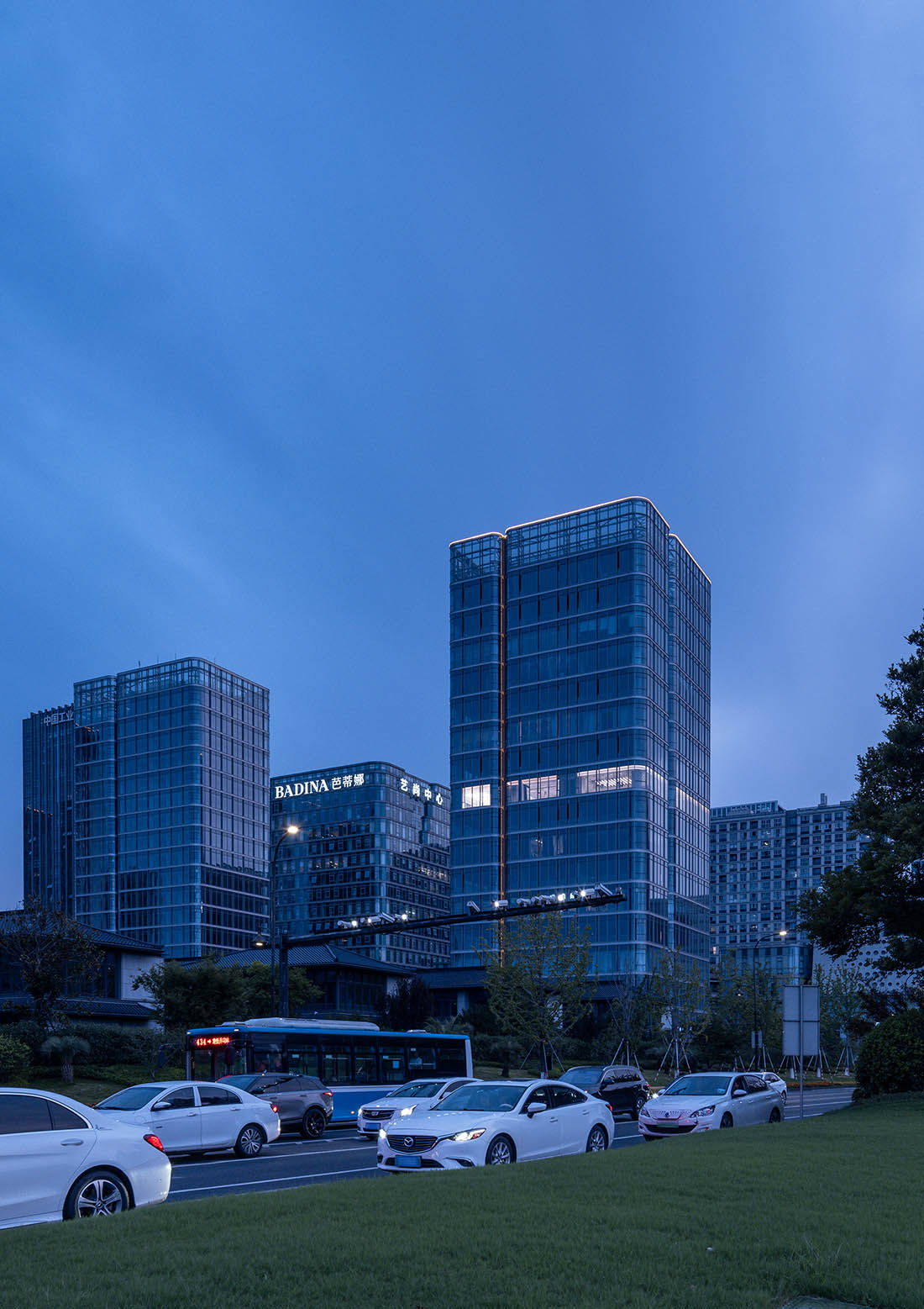
∇ Shooting the building from YINGBIN Road 從迎賓路拍攝下樓宇
整層在夜色下整層散出現代、明亮、和諧的時尚氣息。梯子設計回應辛宣科技提出“對外展現品牌品牌化形象,向內體現員工關懷”的訴求,雙方共同創造一個麵向客戶、團隊協作、以幸福體驗為驅動力的工作場所及展示空間。妥善利用樓層視野,臨街界麵及周邊景觀,充分發揮項目的優勢,將開放、通透、自然的理念植入,設計思考如何在任一場域都能收獲遠跳的絕掛景觀。達到抬頭有景、眼前有韻,辦公區設置在場所的東方,中午至下午陽光向西移位,辦公區域實現低碳節能,展示區域結合模塊化燈光模擬自然光照。
The exterior exudes a modern, bright and harmonious fashion atmosphere in the night. The TIZI design responds to Xinxuan Technology’s appeal of “showing the brand’s brand image externally and reflecting employee care internally”. The two sides jointly create a customer-oriented workplace and display space with teamwork and happy experience as the driving force. Make good use of the floor view, the street interface and the surrounding landscape, give full play to the advantages of the project, implant the concept of openness, transparency and nature, and design and think about how to harvest the unique landscape of the long jump in any area. The office area is set in the east of the place, and the sun is shifted westward from noon to the afternoon. The office area is low-carbon and energy-saving, and the display area is combined with modular lighting to simulate natural light.
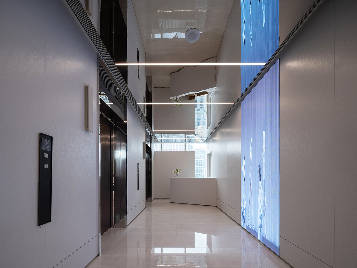
∇ Elevator Entrance 電梯入口處
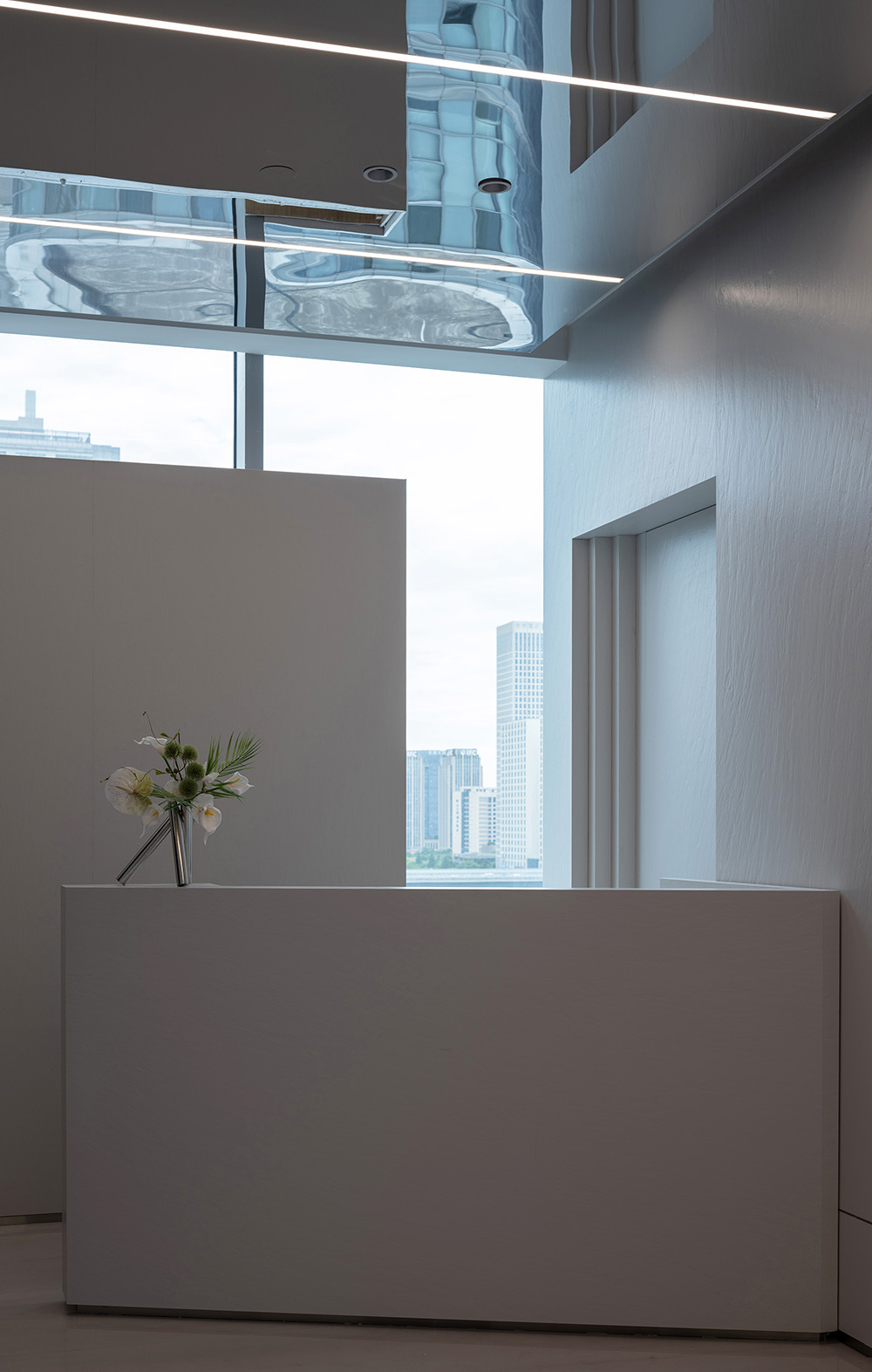
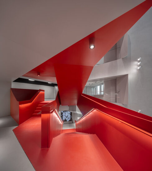
業主給予預算充足,設計才有了大刀闊斧。將原本精裝的電梯間全部拆除,從出電梯的這一步到下電梯的前一腳空間調性都保持高度統一,電梯上到10層,明快的色調及動態視覺自動進入眼簾,步入其中,鏡麵吊裝的工藝要求,看上去更加開闊與通透,鏡麵天花映襯著潮流影像,虛實交錯、空間簡約、明快、摩登。
The owner gave a sufficient budget to make the design bold. Remove all the original hardcover elevator rooms. From the step of getting out of the elevator to the front of the elevator, the space tone is highly unified. When the elevator goes up to the 10th floor, the bright tones and dynamic vision automatically enter the eyes. When you step into it, the process requirements of mirror lifting look more open and transparent, and the mirror ceiling is reflected. Trendy images, virtual and real staggered, simple space, bright and modern.
∇ Office Entrance 辦公室入口
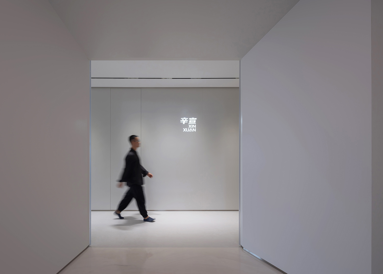
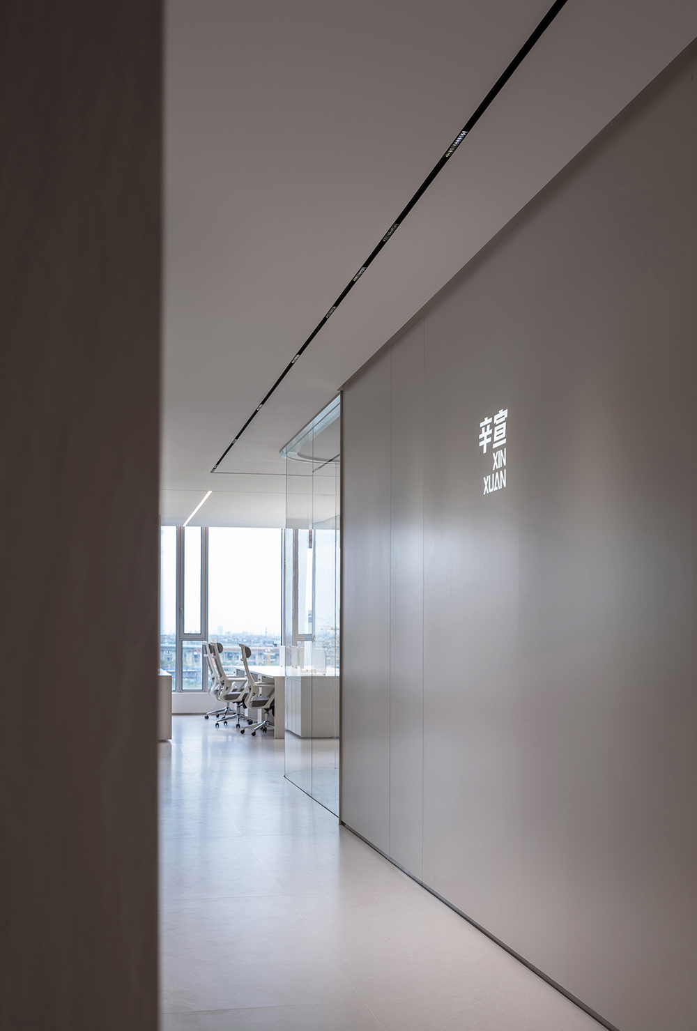
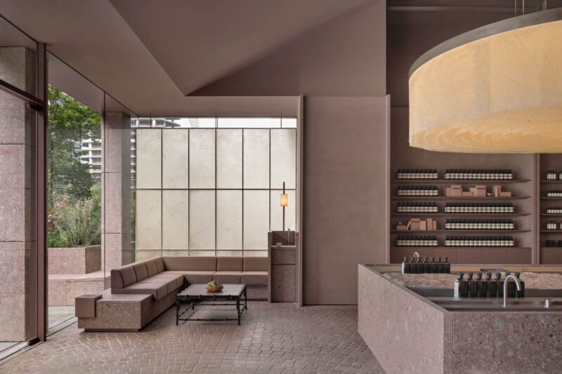
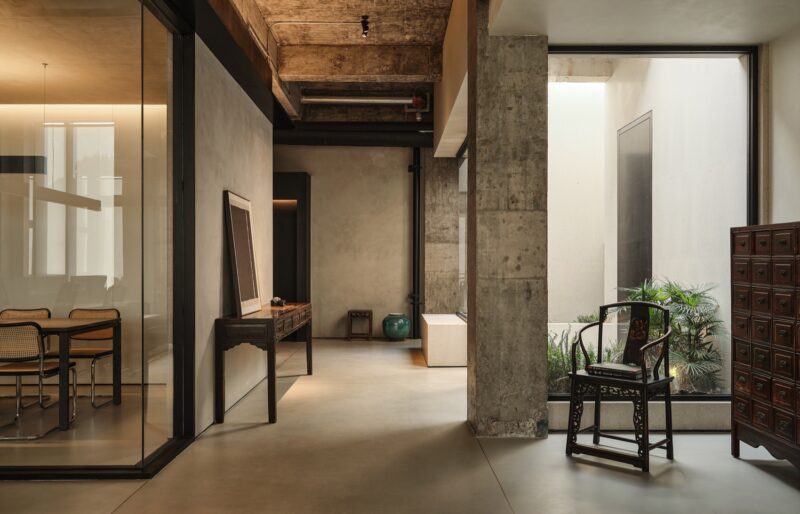
空間的質感基於對細節的把控,TIZI DESIGN選用不同的紋理、不同光感的岩板,平麵與富有流動紋理的兩種岩板搭配,遠看有型,近細有細節。地麵、牆麵、接待台、均采用岩板製作而成,,接待台的背景與室外保留一簇空間,不規劃的入口引導我們進入內部空間,簡約主義的美學,充滿設計感,LESS IS FUN,簡而有型,簡而有趣。
The texture of the space is based on the control of details. TIZI DESIGN chooses rock slabs with different textures and different light senses. The plane is matched with two kinds of rock slabs rich in flowing texture. The ground, the wall, and the reception desk are all made of rock slabs. The background of the reception desk and the outside retain a cluster of space. The unplanned entrance guides us into the internal space. The aesthetics of minimalism is full of design. LESS IS FUN, simple and stylish, simple and interesting.
∇ Entrance perspective and DP point 入口視角及DP點
此處內容需要權限查看
會員免費查看

