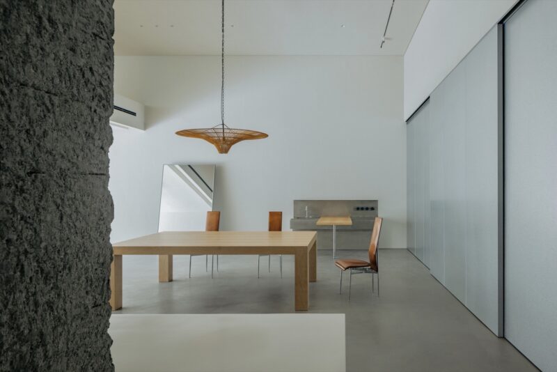
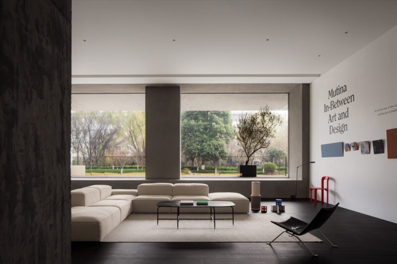
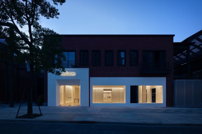
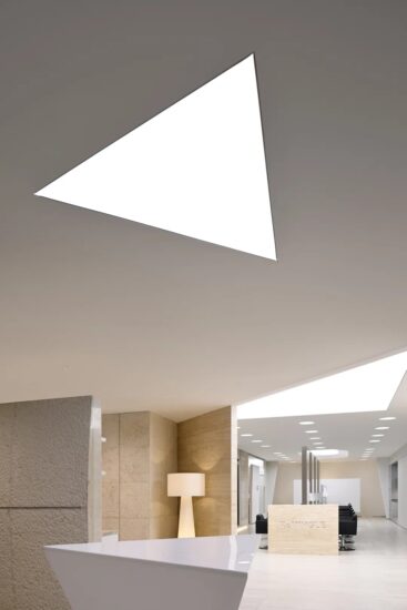
本案是Unknowndesign為HOOKA品牌打造的第二家美發空間,項目坐落於浙江嘉興普民路與文賢路交彙的街區轉角,場地前身為售樓部。靈感汲取自理發器械的工業特質,我們希望將這種精確且係統化的屬性融入設計,空間采用低飽和度材料、簡潔純粹的線條及幾何形態,結合富有光澤的金屬元素,塑造出工業機能的整體氛圍,強化品牌的專業形象。
This is Unknowndesign’s second hairdressing space for the HOOKA brand, located on the corner of Pumin Road and Wenxian Road in Jiaxing, Zhejiang Province, where the former sales office was located.
Inspired by the industrial nature of barber equipment, we wanted to incorporate this precise and systematic attribute into the design, using low saturation materials, clean and pure lines and geometric forms, combined with glossy metal elements, to create an overall atmosphere of industrial functionality and to strengthen the brand’s professional image.
入口立麵上因不可抗因素,保持視覺透視性,采用了實驗室風格(Laboratory Style)的透明設計理念,強調空間的功能主義和技術感,並通過“可視化”的形式使室內的機械結構與功能劃分直接與外部環境發生互動,增強了空間的視覺透視性。並通過玻璃材質的通透性,強調了建築的開放性與流動性,打破傳統空間的邊界感。
On the entrance façade, the visual perspective is maintained due to irresistible factors, and the transparent design concept of Laboratory Style is adopted to emphasise the functionalism and technicality of the space, and to enhance the visual perspective of the space by making the mechanical structure and functional division of the interior interact directly with the external environment through the form of ‘visualisation’. Through the form of ‘visualisation’, the mechanical structure and functional division of the interior interact directly with the external environment, enhancing the visual perspective of the space. Through the transparency of the glass material, the openness and mobility of the building is emphasised, breaking the traditional sense of spatial boundaries.
傳統店招的創新轉換
Innovative conversion of traditional store signs
設計靈感來源於老式三色理發燈的旋轉動態,賦予這一傳統元素全新的表現形式。旋轉的動態被抽象化並簡化為二維波紋圖案,這種圖形語言使傳統的機械動態表現呈現出極簡主義的視覺風格。通過將這一圖案進一步轉化為具有三維空間感的導視係統。
The design is inspired by the rotating dynamics of the old tricolor barber lamp, giving this traditional element a new form of expression. The rotating motion is abstracted and simplified into a two-dimensional ripple pattern, a graphic language that gives the traditional mechanical motion a minimalist visual style. By further transforming this pattern into a three-dimensional spatial sense of the guidance system.
此處內容需要權限查看


