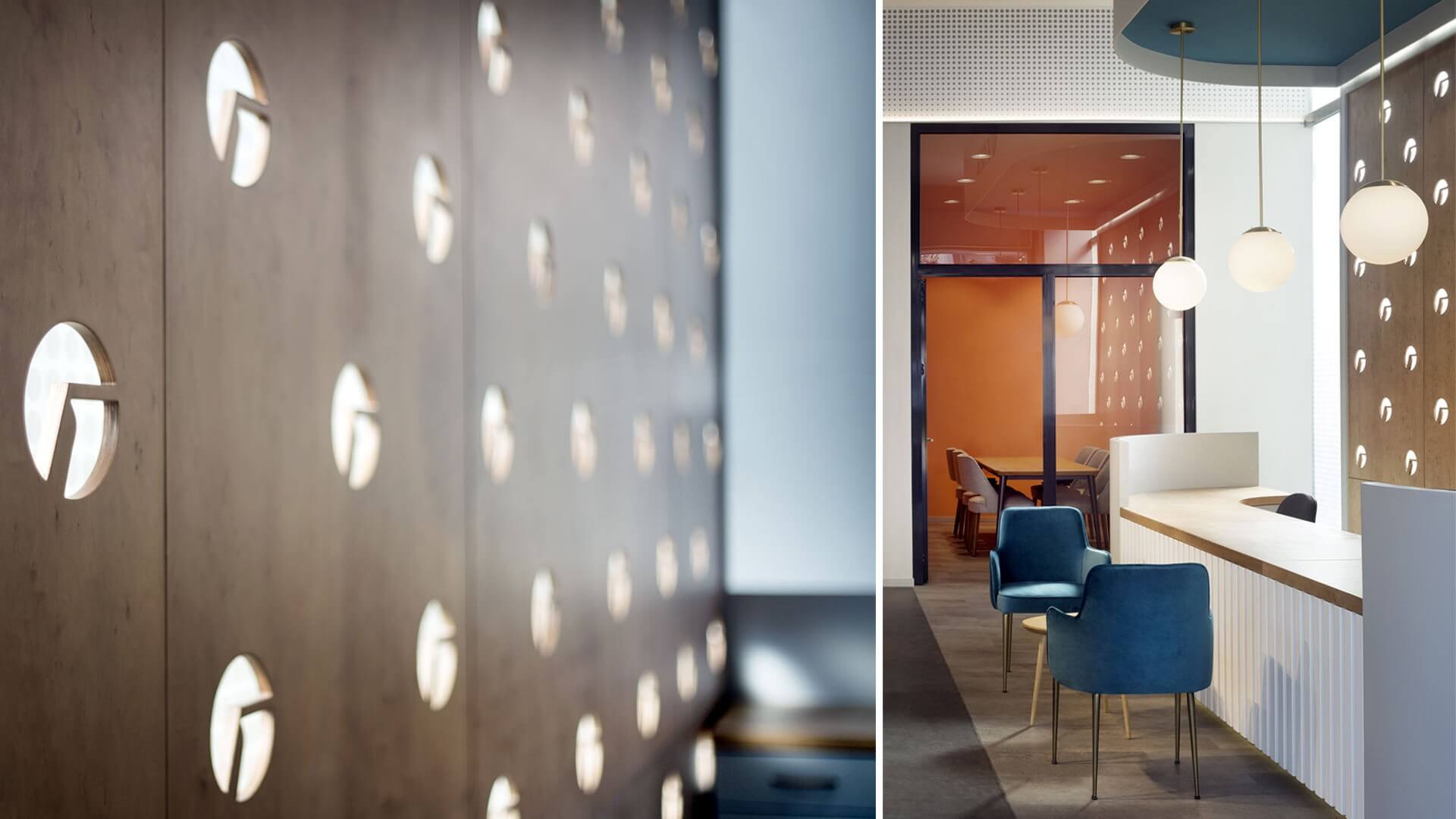
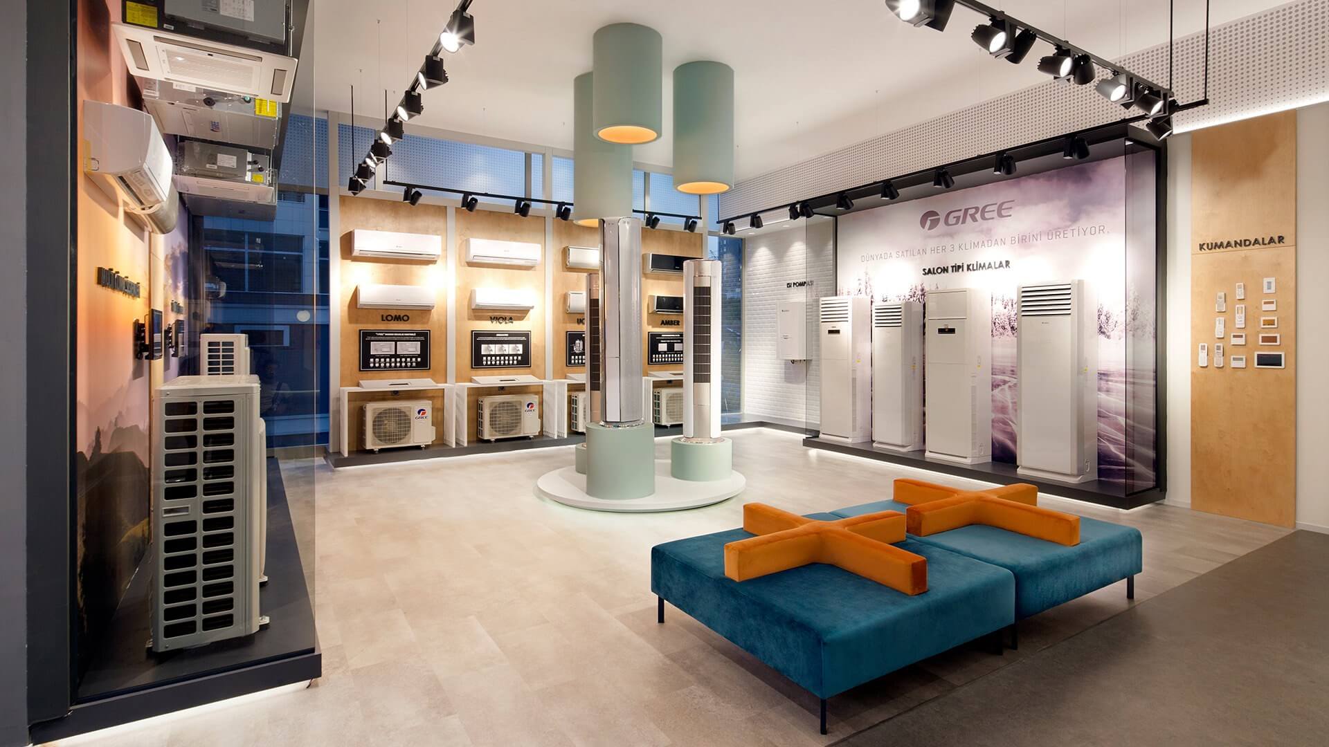
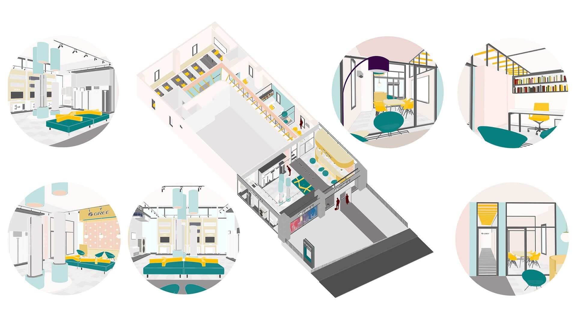
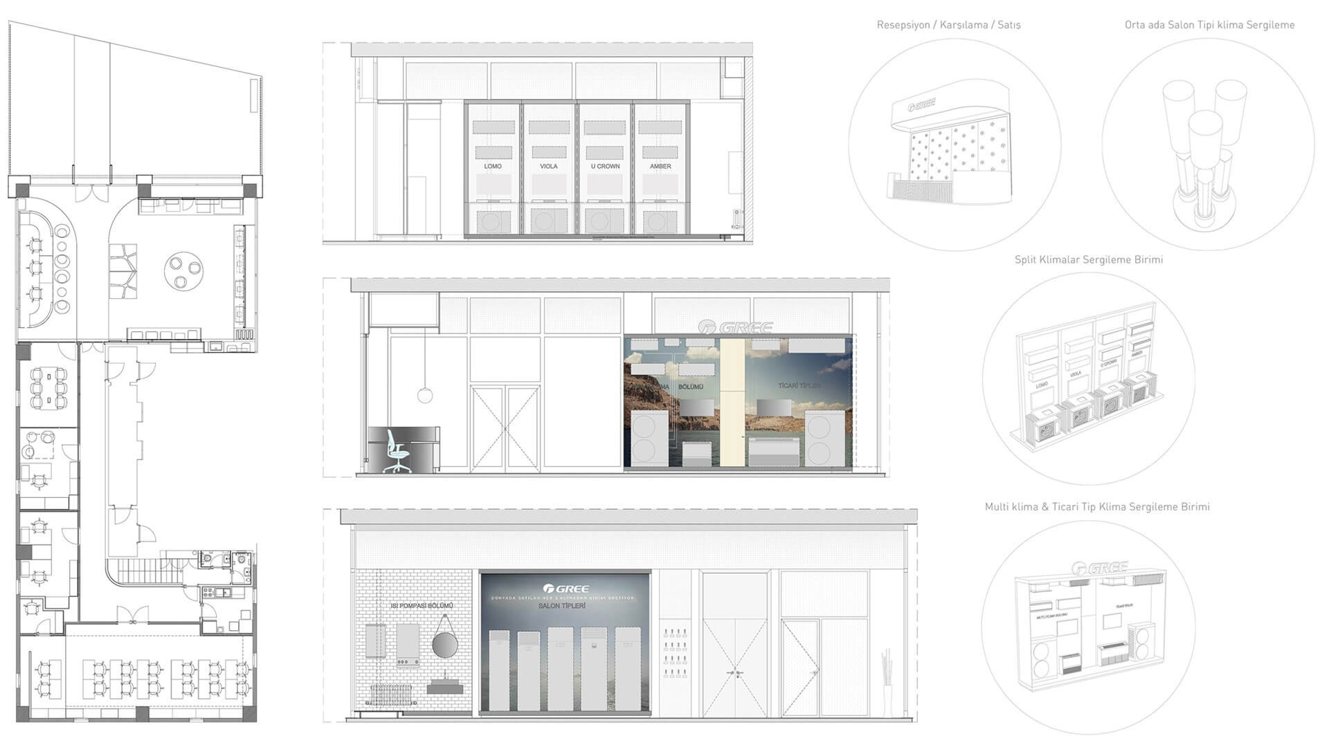
此次的任務是為全球最大的空調公司之一格力設計其在伊斯坦布爾的新旗艦店。設計的基本概念在於創造一個引人入勝的展示空間,以及促進在土耳其對這個世界品牌的認可。設計圍繞兩個區域展開:前區規劃包括客戶接待和銷售、會議室和空調展示空間,後區規劃容納員工辦公室、研討室和儲藏室。前麵區域的循環軸通過使用不同的地板材料而突出。
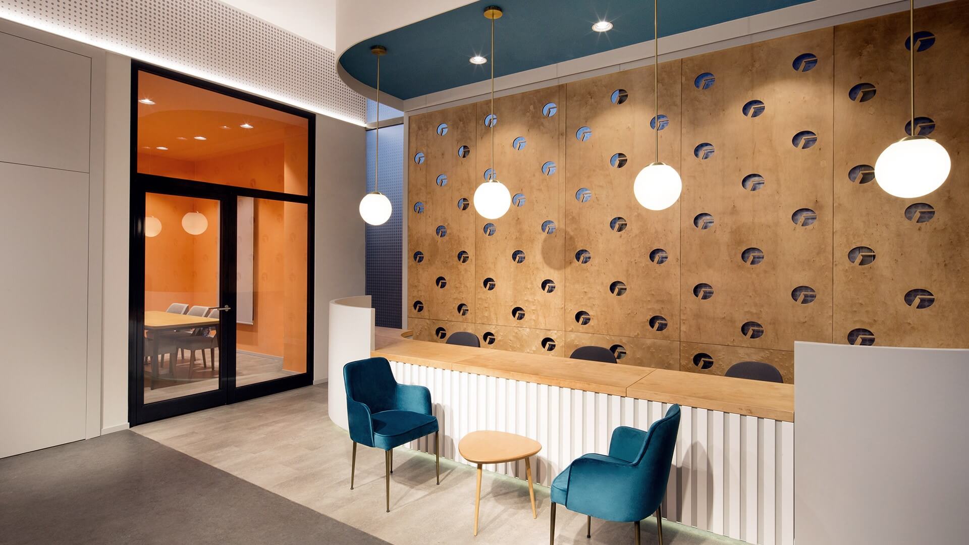
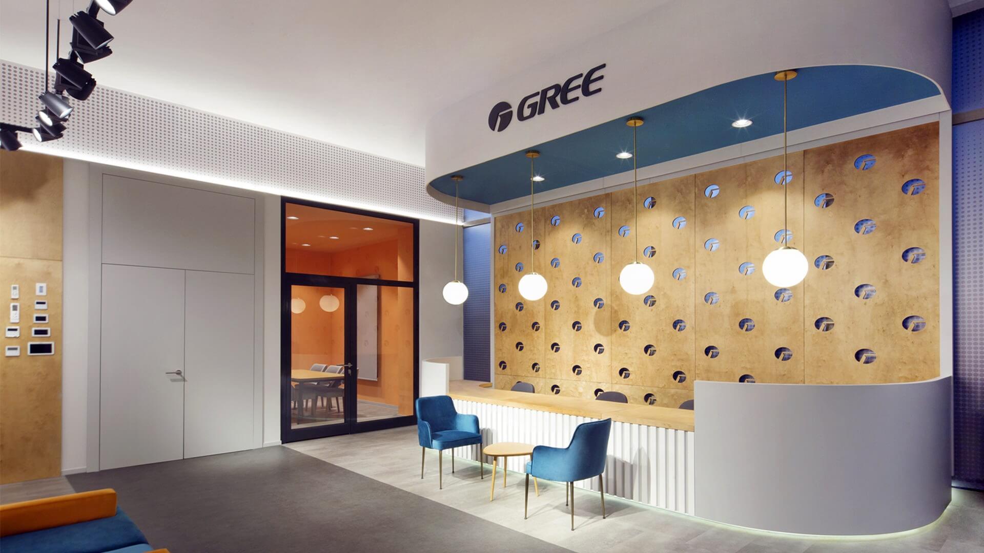
The task has been to design the new flagship store for Gree, one of world’s largest air conditioner companies, in Istanbul. The underlying concept of the architectural design focuses on creating an engaging display space as well as promoting the recognition of this world wide brand in Turkey. The design is shaped around two areas: the front area is planned to include client reception and sales, meeting room and air conditioner display space while the back area is planned to host the employee offices, seminar room and storage. The circulation axis in the front area is highlighted by the use of different flooring materials.
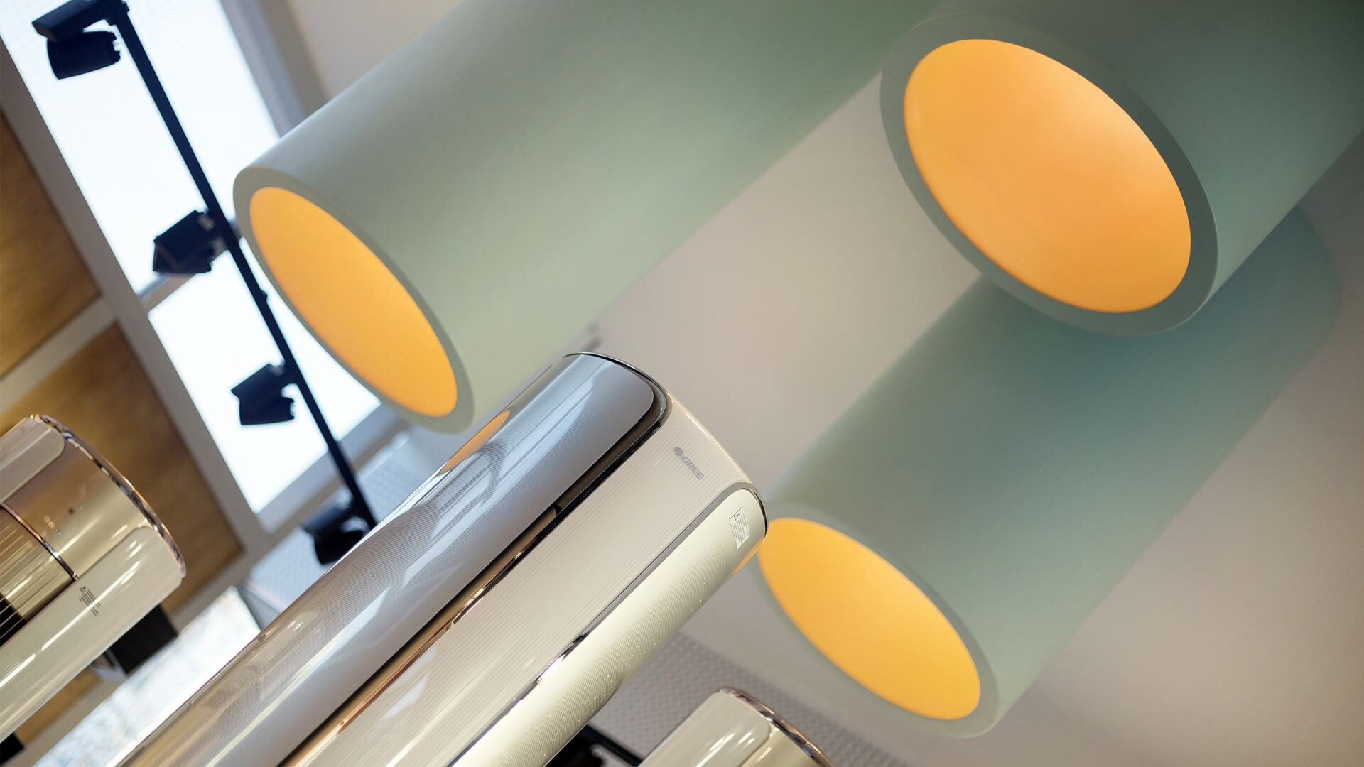
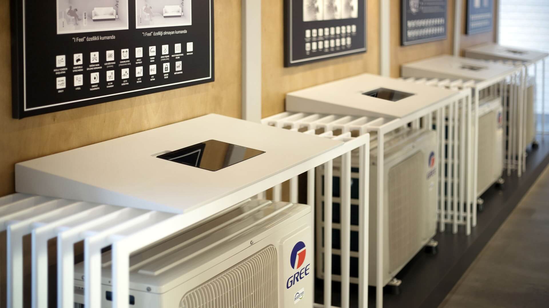
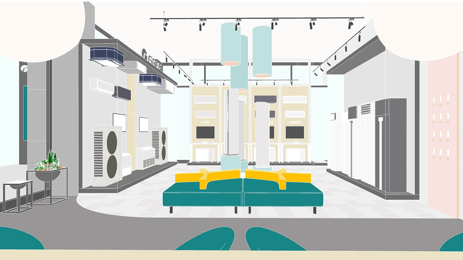
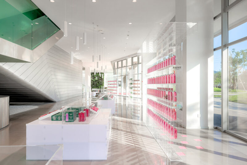
空調展區的設計考慮了壁掛式和立柱式地板空調的特點,其技術和設計各具特色。因此,將不同設計的模型放置在中心空間,創造了一個內部展示空間。壁掛式空調機的技術性能在其下方的黑板箱上以圖形方式顯示,平板上提供了關於產品的額外信息。通過展示格力產品的品質和技術性能,幫助客戶找到自己選擇的空調。
The air conditioner display area is designed to accomodate the wall – mounted types and the stand up cylindrical floor conditioners, which have their distinct technology and design. Placing the models with a different design in the centre space, thus, creates an internal showcase. The technical properties of the wall-mounted type air conditioners are provided graphically on the black boards beneath them and additional information about the products are supplied on the tablets well integrated in the design. By displaying the qualities and technical properties of the Gree products in this manner, it is aimed to help customers find the air conditioner of their choice.
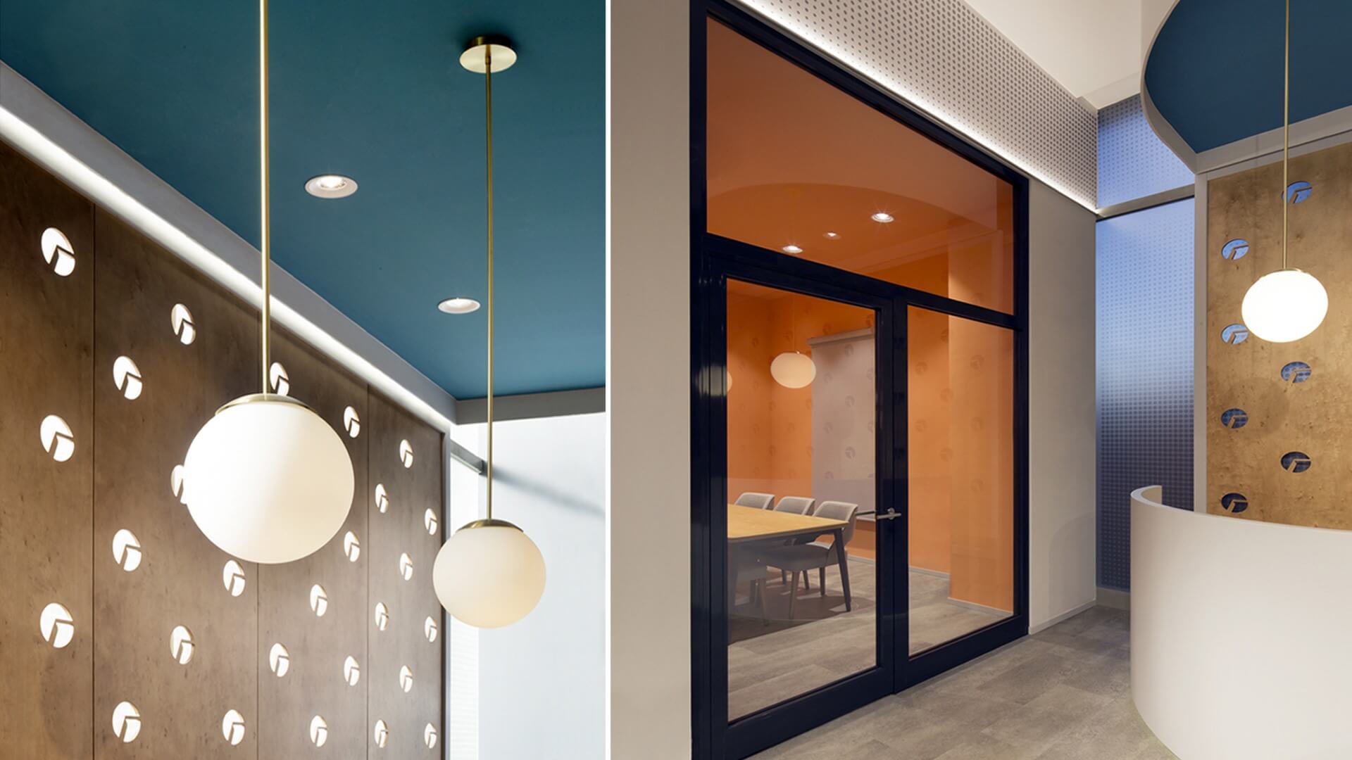
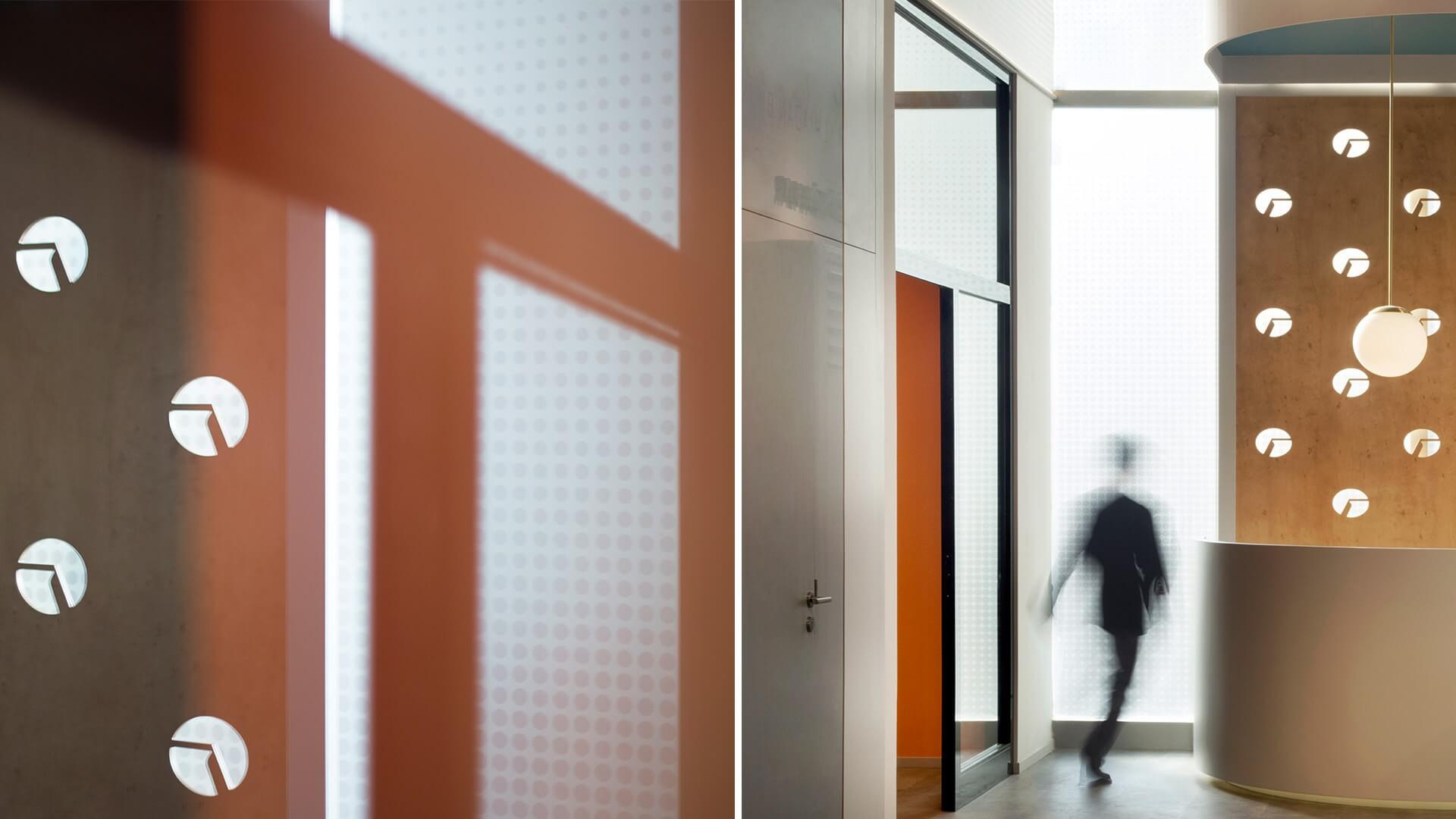
商店的主要展示窗口圍繞“每個人的加熱和冷卻”主題設計,圍繞著“加熱”和“冷卻”的抽象空氣而建,讓快速駛過的汽車也能注意到這一點。由於強調了藍冷和紅暖色調的混合,並將其反射到商店的招牌上,主展示窗口從建築的其他部分中突出出來,這在建築上毫無特色。在會議室使用大膽,溫暖的色彩,與其他區域的藍色不同,使用不同的材料,如木材,金屬和玻璃,也旨在反映冷和暖的和諧理念。
The main display window of the store, designed around the theme of “Heating and Cooling for Everyone Everywhere”, is built around the abstraction of the air that is ‘heated’ and ‘cooled’ in a way to be noticed also by the cars rapidly passing by. With the emphasis on the blending of the blue-cold and red-warm color tones and the reflection of this on the store signborad, the main display window stands out from the rest of the building, which is architecturally nondescript. The use of a bold, warm color in the meeting room in contrast to the different tones of blue in other areas, and the use of different materials like wood, metal and glass also aim to reflect the idea of harmony betwen the cold and warm as displayed on the showroom window .
完整項目信息
項目名稱:格力旗艦店/Gree Flagship Store
完成時間:2018
項目類型:展廳/辦公室
項目地點:土耳其伊斯坦布爾
設計公司:ZAAS
設計團隊:AyçaTaylan,ZeynepŞankaynağı,Nail Egemen Yerce,ZülfiyeYıldız
主要材料:木材,金屬和玻璃
攝影:AyçaTaylan


