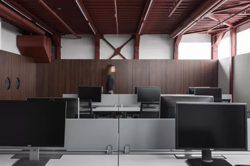
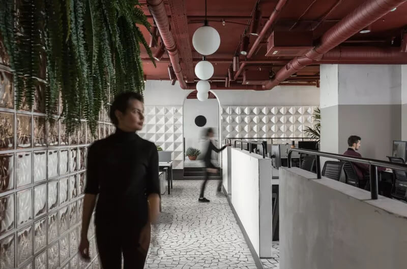
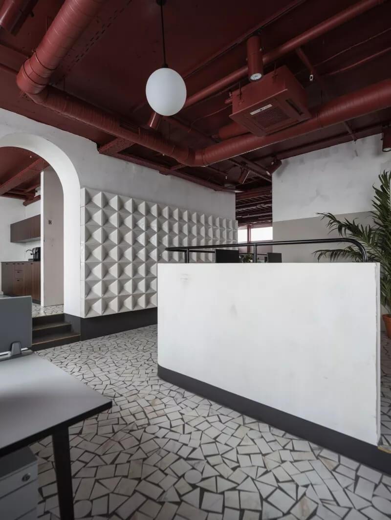
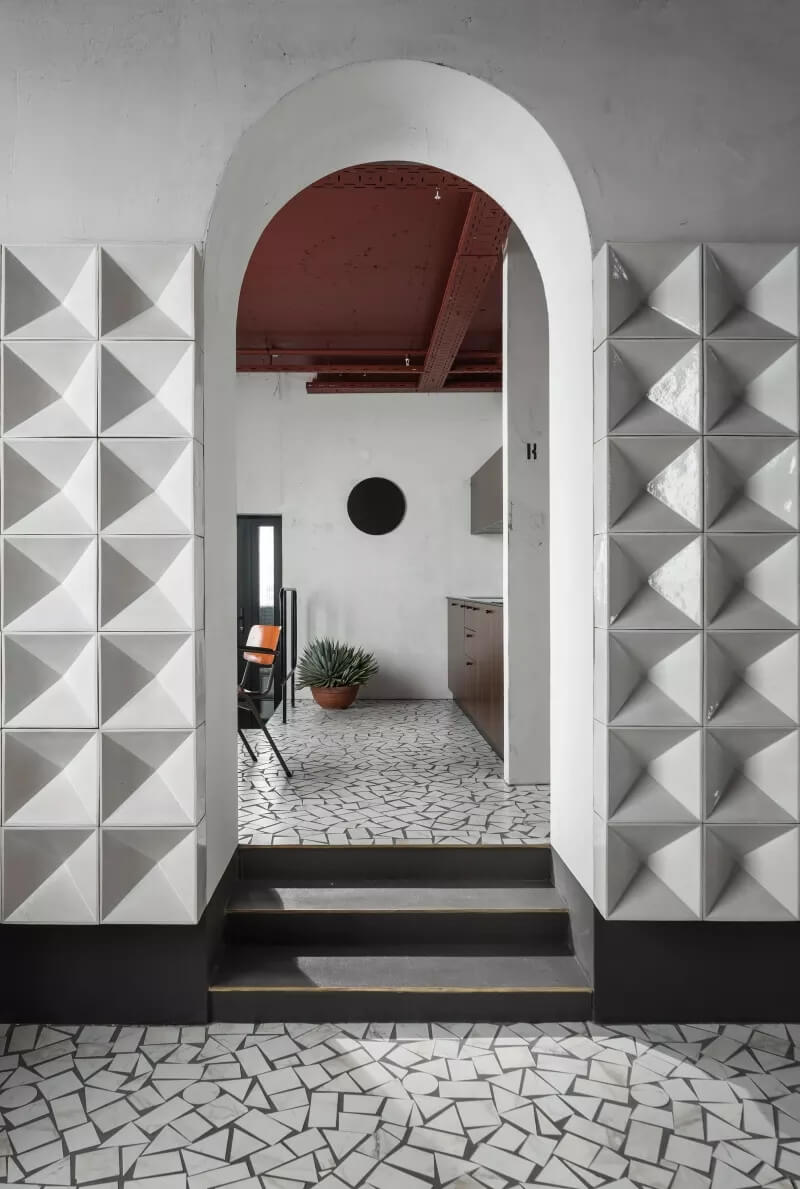
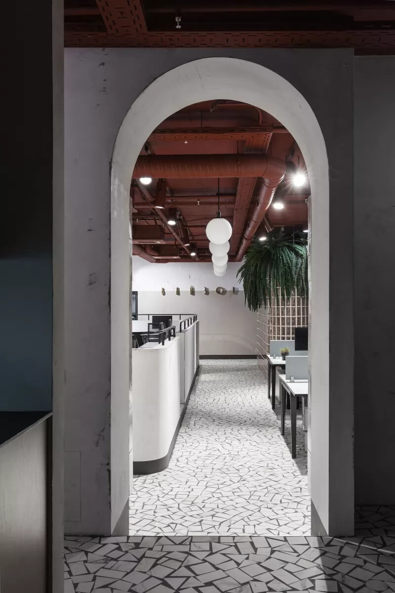
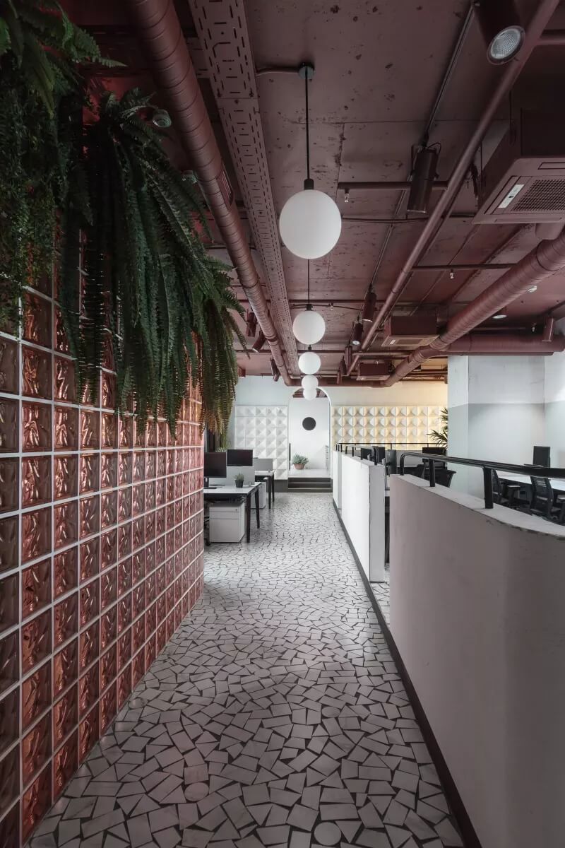
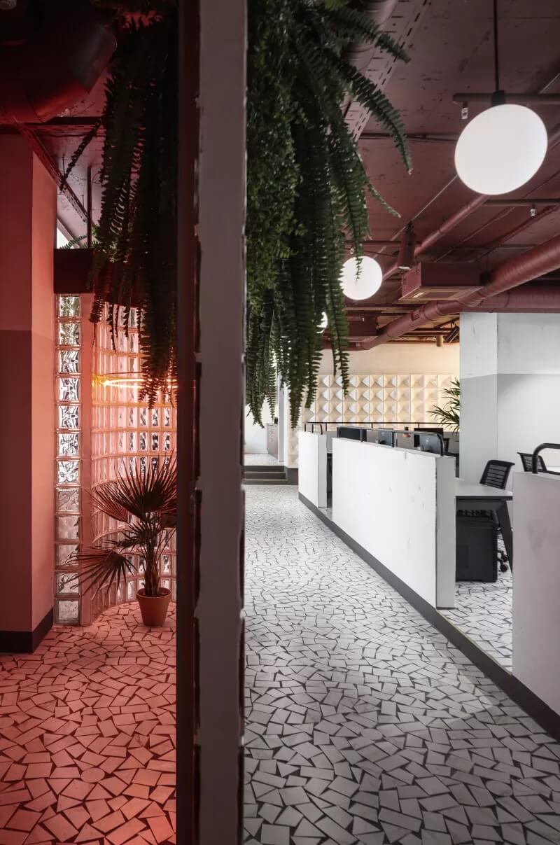
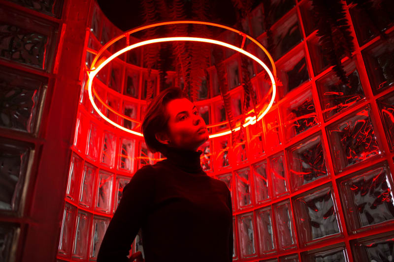
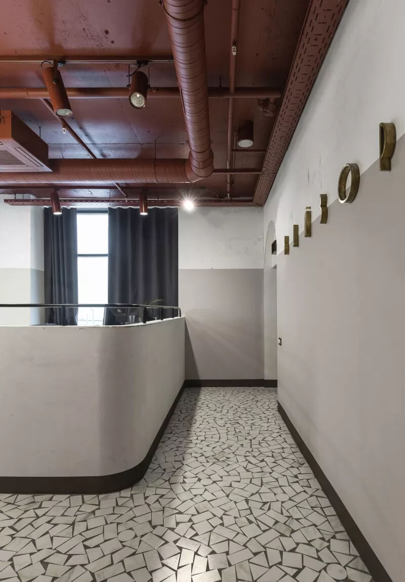
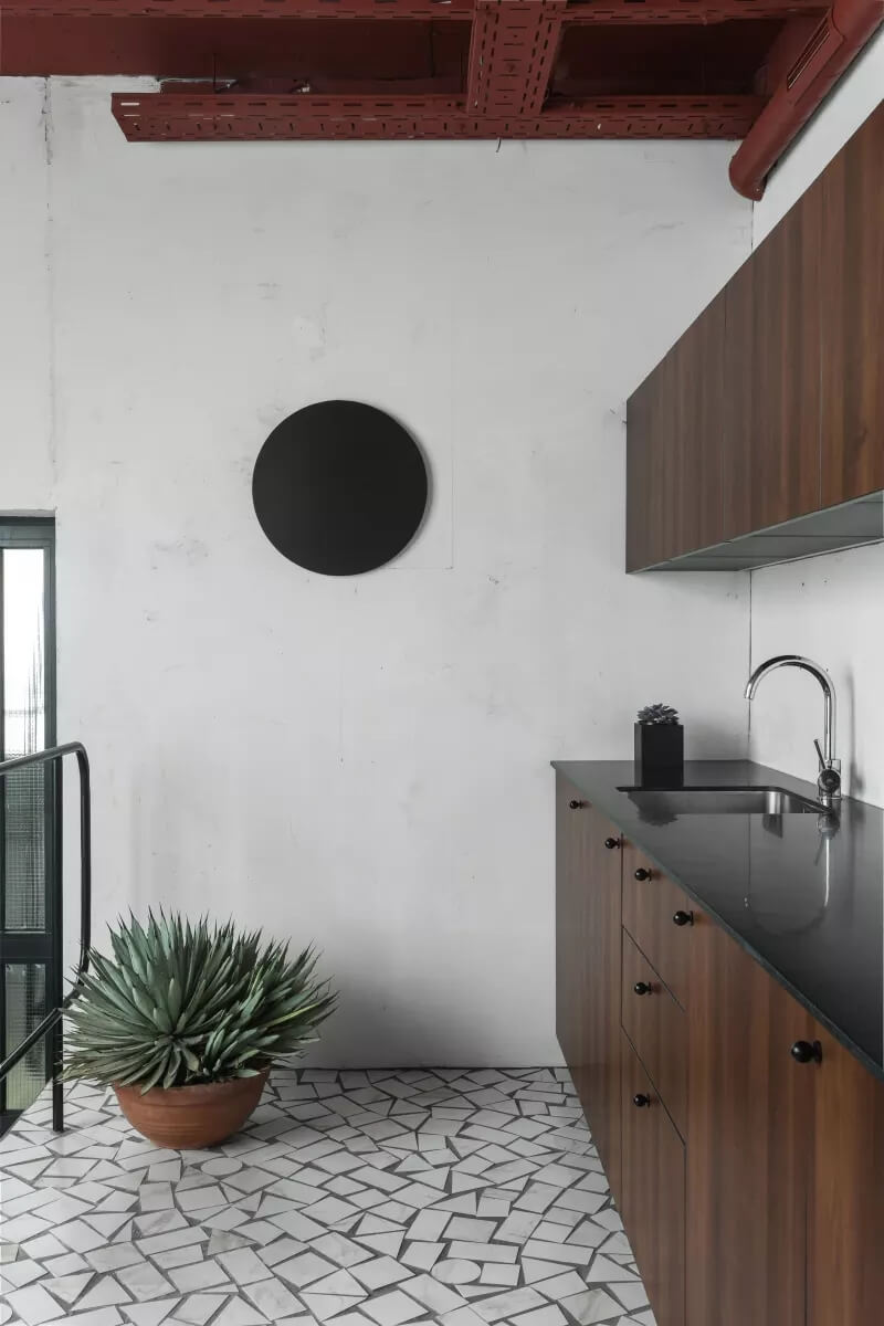
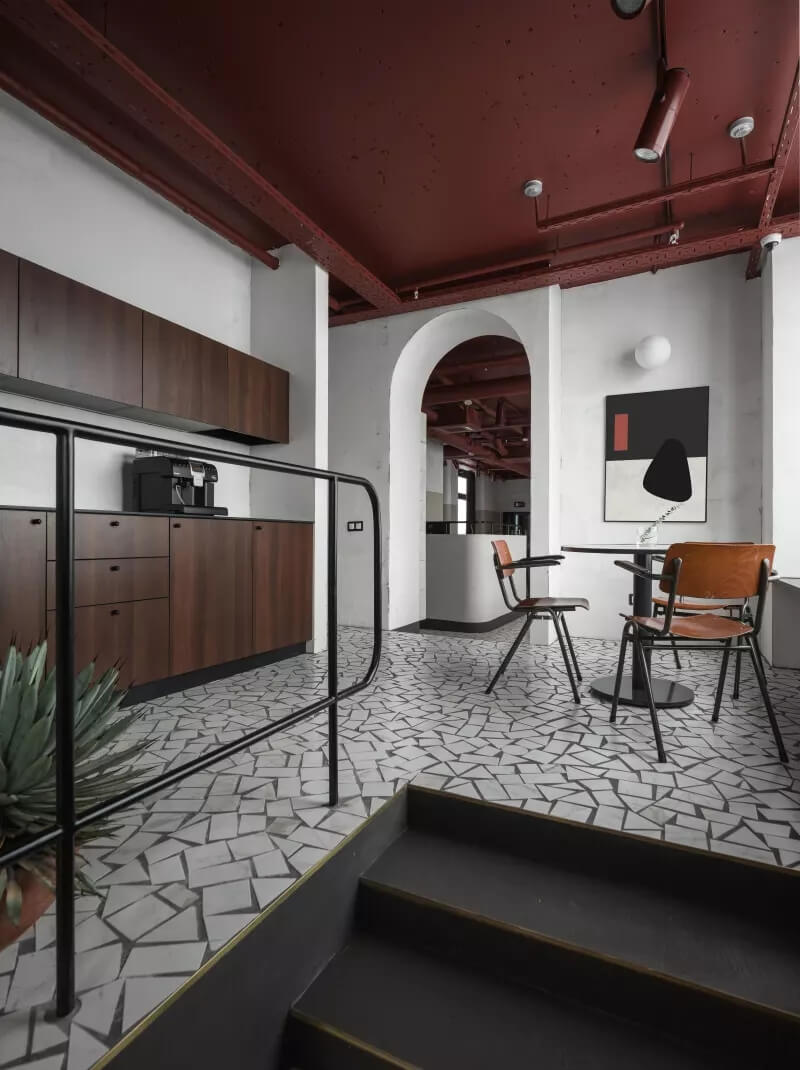
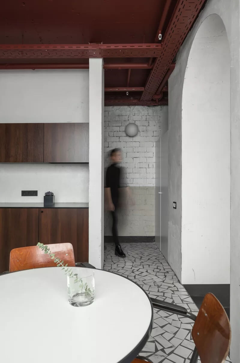
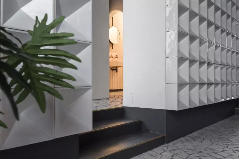
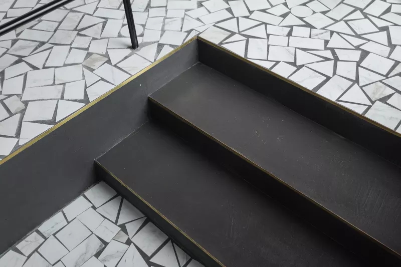
Vizor公司的內部是對20世紀70年代和80年代蘇聯設計和建築的重新詮釋,設計團隊將公眾的注意力集中在這一趨勢的美學價值上。室內充滿了明亮和清晰的空間,從一個體量延伸到另一個體量。相同材質的地板和紅色的天花板是塑造室內的主要元素。地板代表了蘇聯公共建築的精神,嵌入不同幾何形狀的小瓷磚圖案中。開放式交流的天花板被漆成複雜的顏色。入口以圓形大廳的形式設計,由淺玫瑰色的玻璃磚組成。入口單元頂部有一圈綠色的懸掛植物。
The interior of Vizor company is a reinterpretation of Soviet design and architecture of the 70s and 80s of the 20th century where we focus public attention on the aesthetic value of this trend. In general the interior is filled with light and clear space extending and flowing from one volume to another. The floor designed in the same material and the red ceiling are the main elements shaping the interior. The floor represents the spirit of Soviet public buildings embedded into a pattern of small tiles of different geometric shapes. The ceiling with open communications is painted in a complex accent color. The entrance is designed in the form of a rounded lobby executed with the help of light-rose glass blocks. The entrance unit is topped with a strap of green hanging plants.
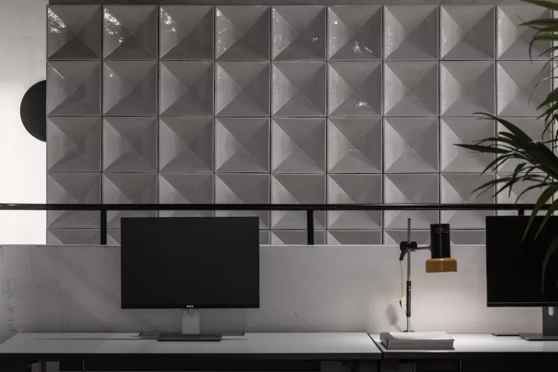
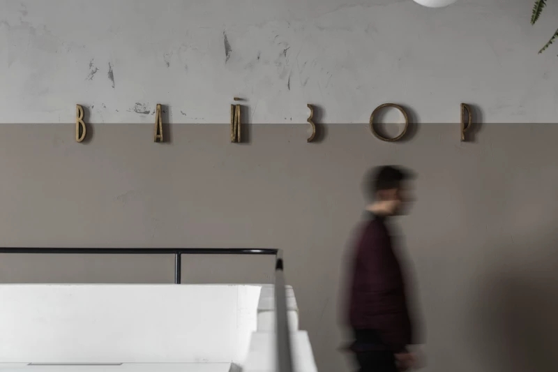
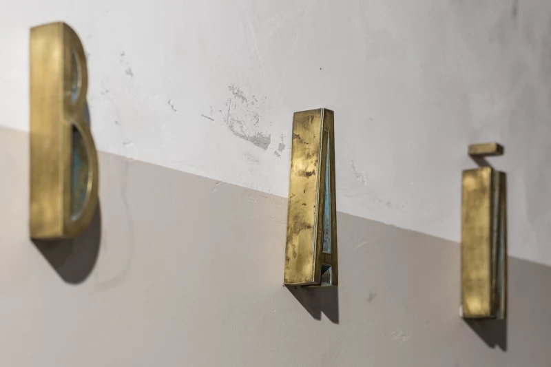
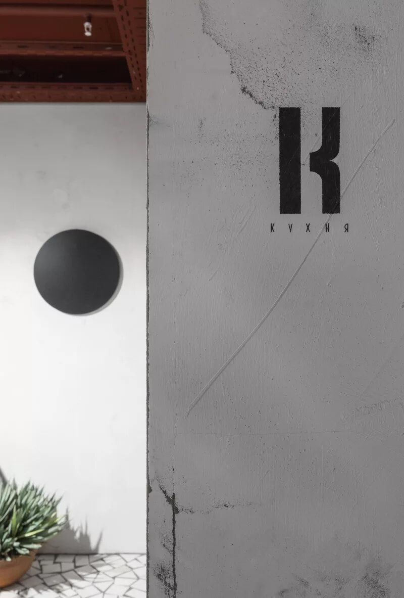
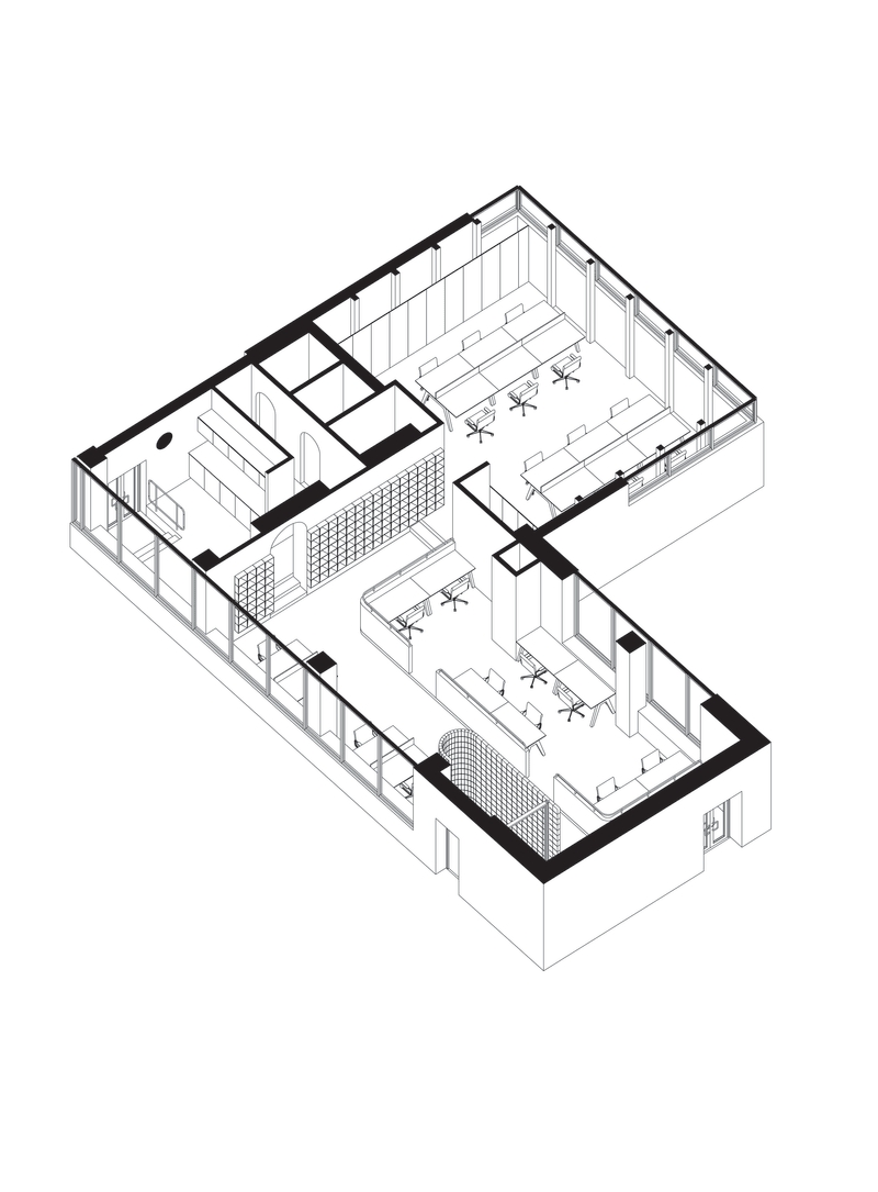
風格,字體和材料的選擇基於蘇聯地下車站的標識。站在入口的正前方,我們到達了整個空間的主軸。長景由工作區域比例和懸掛球形燈的節奏支撐;它集中在拱門上,以一個黑點結束。這種方法的效果幾乎是神聖的。中心內板垂直於這個軸。通過與類似物的對比分析,設計出陶瓷模組的總體組成。兩種色調的牆蓋補充了主要區域。其中一個區域是由勒柯布西耶(Le Corbusier)扶手風格的低矮隔斷形成的。
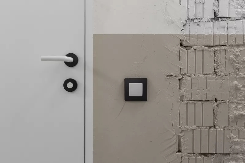
The style, font and material were chosen based on the inscriptions of Soviet underground stations. Standing right at the entrance we hit the main axis of the entire space. Long vista is supported by working areas proportions as well as the rhythm of hanging spherical lamps; it concentrates in the arch and ends with a black point. The effect of such method is almost sacred. The central interior panel is located perpendicular to this axis. The ceramic modules were analyzed by comparison with analogues and designed into the general composition. A two-tone wall cover complements the main area. One of the zones is formed by low partitions in the style of Le Corbusier handrails.
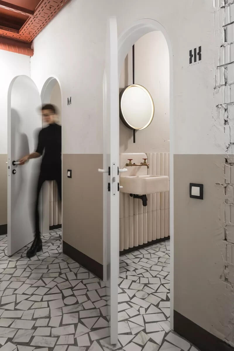
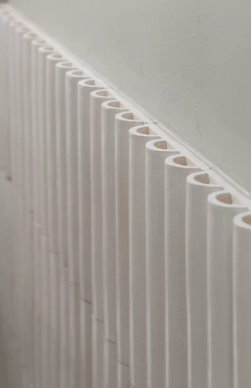
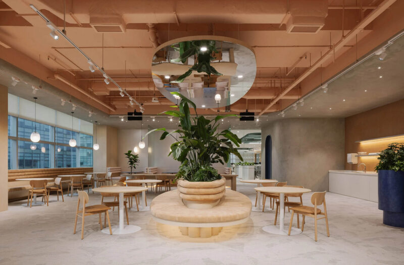
第二個工作區的牆壁是用木板完成的,就像廚房的外牆一樣。廚房文體與北歐家具和基於上世紀現代主義藝術的抽象構圖相得益彰。衛浴設施有機地傳達了30年代的現代性和精神。我們還使用了特別設計的陶瓷元素和洗手盆。內部充滿精心挑選的技術和細節,同時看起來輕盈通風。這是對當地建築和設計傳統的重新詮釋。
The walls of the second workspace are finished with wood panels, just like the facades of the kitchen. Kitchen stylistics is complemented by Scandinavian furniture and abstract composition based on the modernist art of the last century. WC facilities organically convey modernity and spirit of the 30s. We also used specially designed ceramic elements and wash-basins in the proportions of those years. The interior is filled with neatly selected techniques and details, but at the same time looks light and airy. This work is a reinterpretation of the original local architectural and design tradition.
完整項目信息
項目名稱:VIZORGAMES OFFICES
設計事務所: STUDIO11
項目地址:明斯克
完成時間:2016
攝影:DMITRY TSYRENCSHIKOV


