LOFT中國感謝來自 Nota Architects 的餐飲空間項目案例分享:
關於喜茶HEYTEA
喜茶HEYTEA創立於2012年,為芝士現泡茶的首創者。喜茶創立的初衷是想製作出用料優質、受消費者喜愛的茶飲,實現茶飲的年輕化。此外,喜茶還致力於發掘喝茶這件事更多的可能性,支持藝術創造,堅持原創精神,讓喝茶成為一種風格,一種生活方式。希望一杯喜茶,能夠激發一份靈感,讓中國古老的茶文化煥發出新的活力。
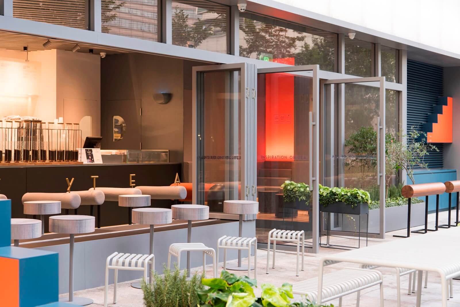
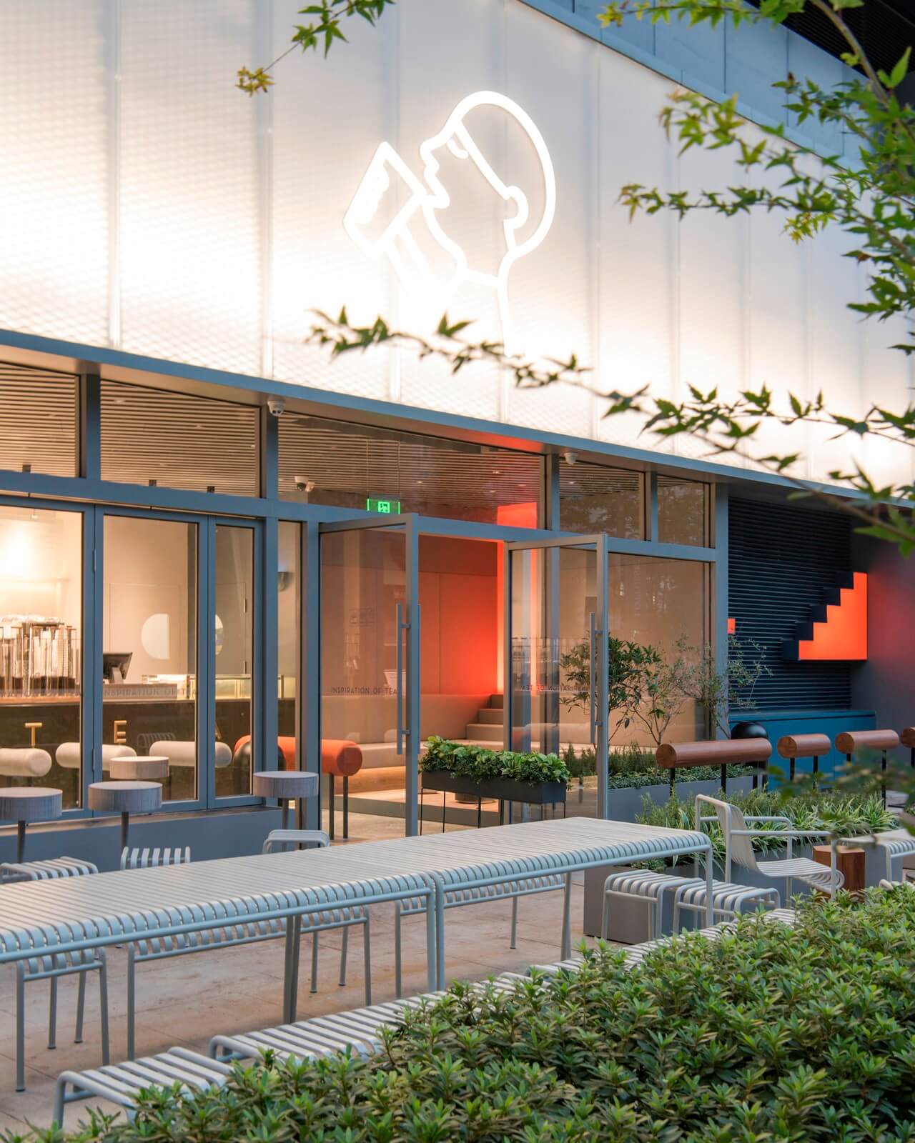
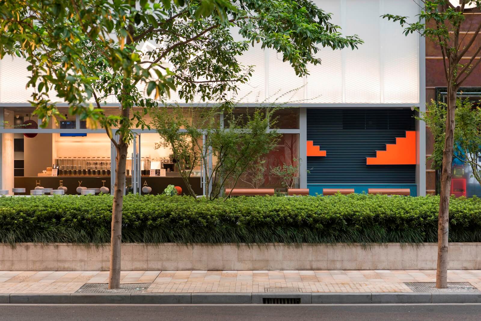
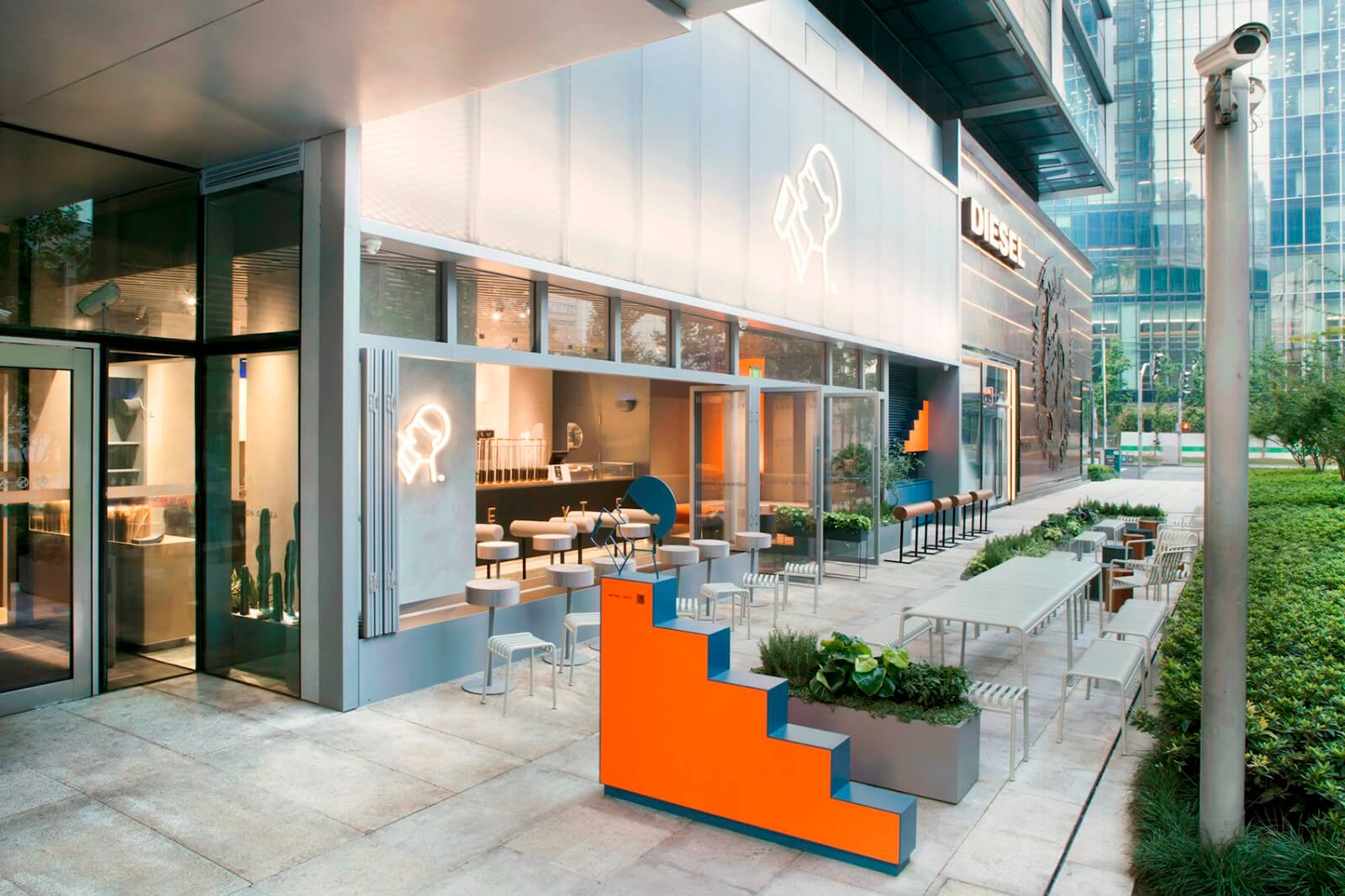
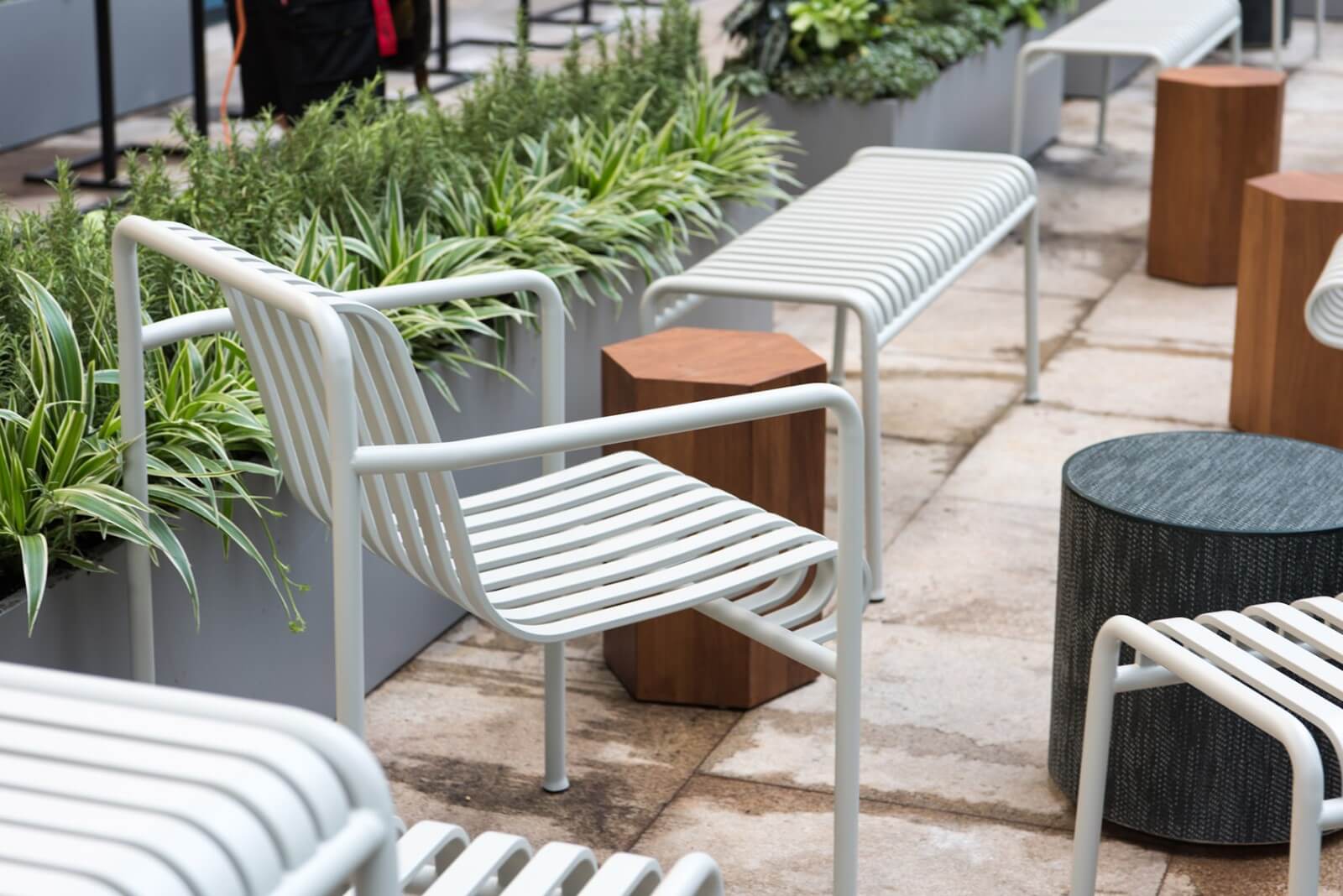
位於上海靜安嘉裏中心的這家喜茶,是連接商場南北片區的休閑餐飲街上第一間戶外街鋪,帶有雙層高的幕牆門麵和沿街排開的外擺空間。
Located in Shanghai Jing An Kerry Centre, Heytea stands as the first F&B along the leisure street between the mall’s south-north connection, covered with a double height curtain wall and outdoor seating area along the sidewalk.
城市界麵與室內空間的激活
Stimulation of Urban Interface and the Interior
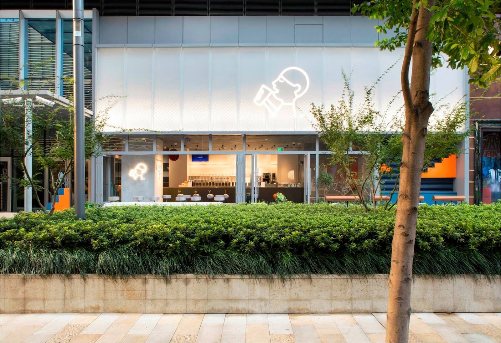
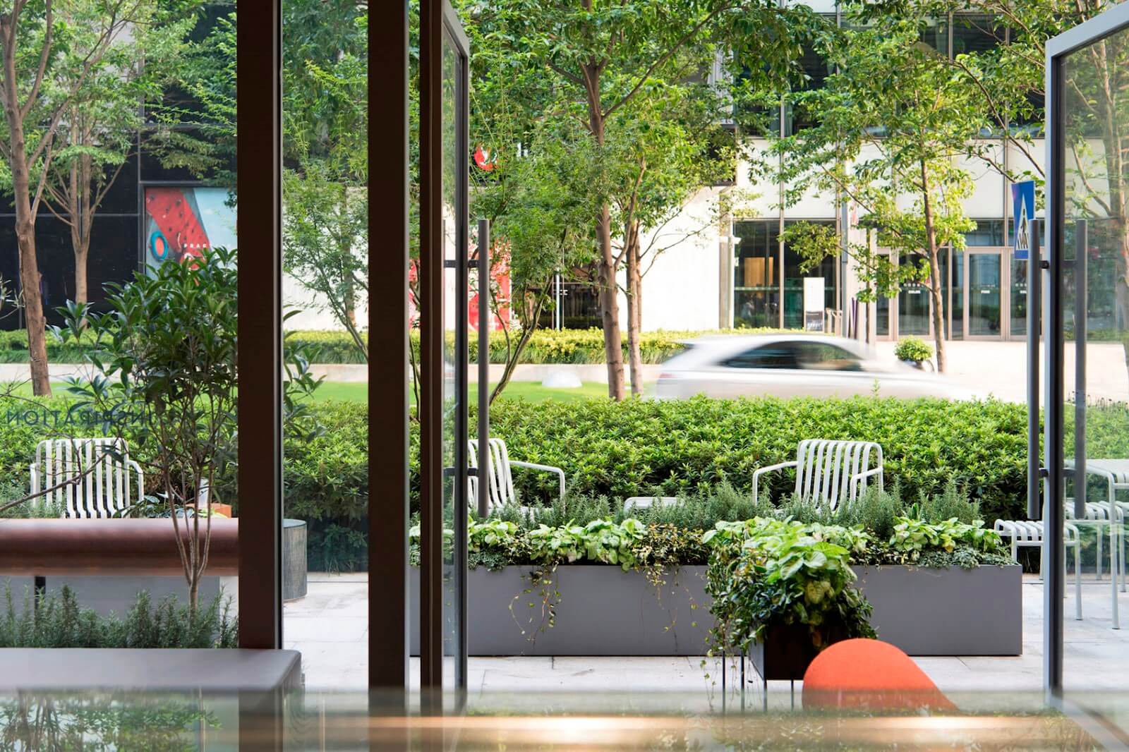
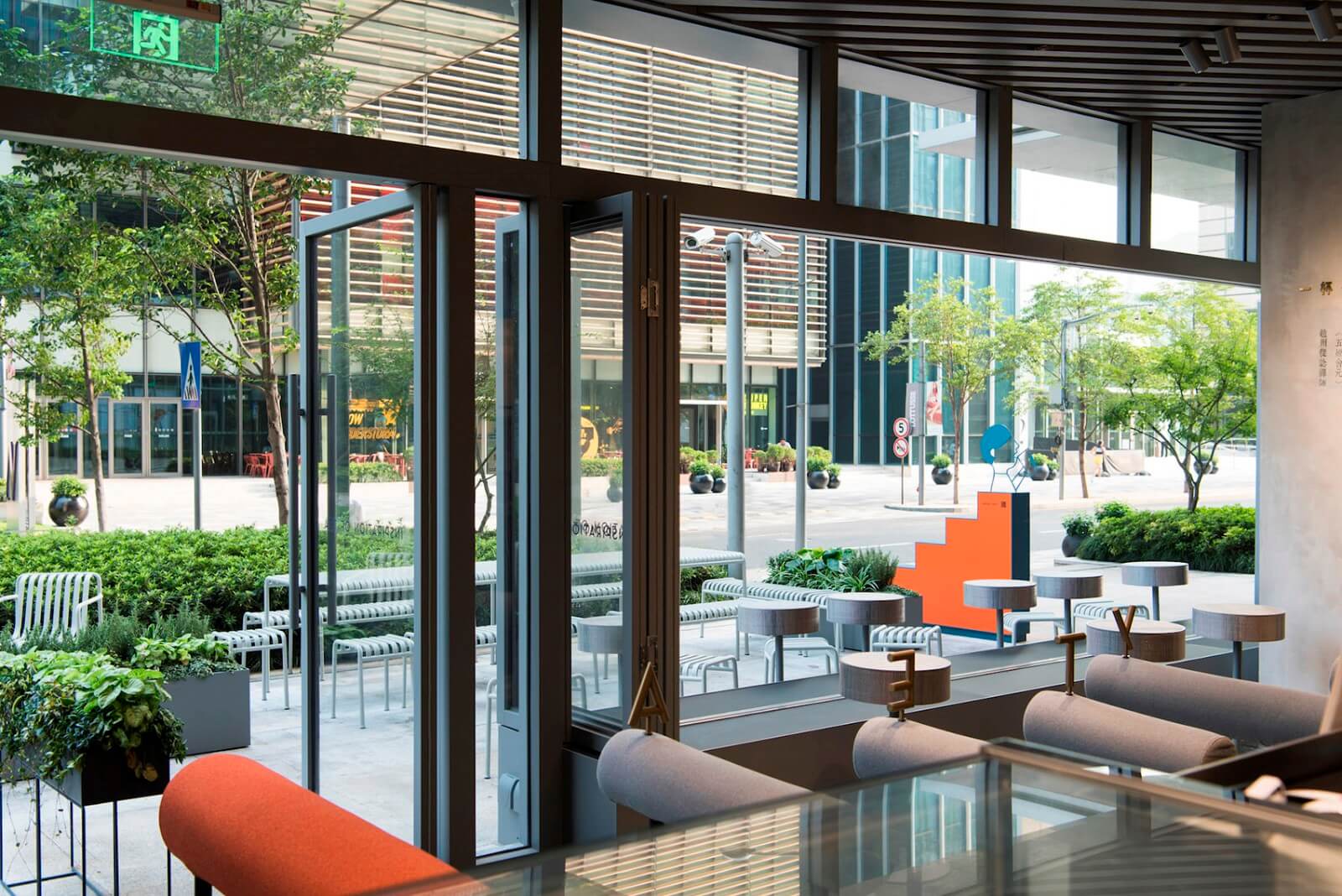
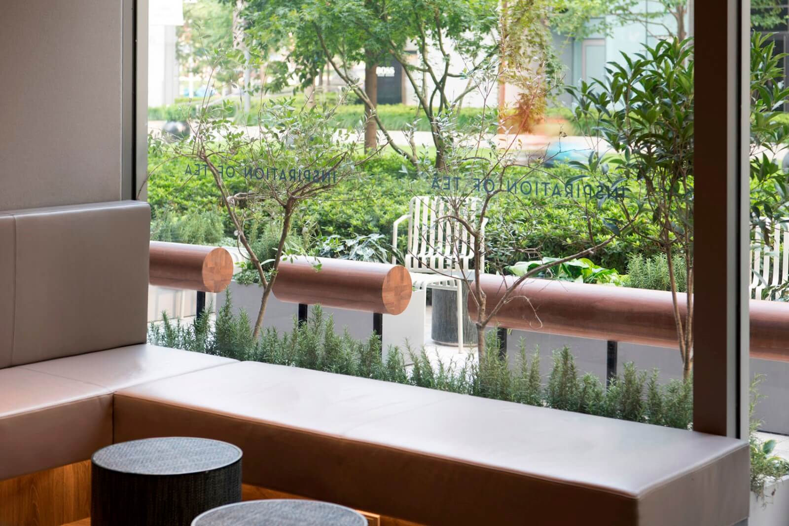
設計將原有櫥窗式封閉商鋪立麵改造為打通室內外空間關係的互動式門麵,入口主立麵改為玻璃移門側置、室內外都可入座的方式,另一側立麵退進做成帶有立麵裝置的短暫站留空間,以最大化空間利用、並提升街區氛圍和品牌影響力。
The former shop window facade system is replaced by an open and interactive interface that blurs inner and outer space. Sliding doors, double-sided seating, along with a recessed quick-resting place on the main facade, each part of the facade is made to maximise space utility, which also enriches streetscape activity and brand influence.
行為引導與流線分離
Behavior guidance and Circulation
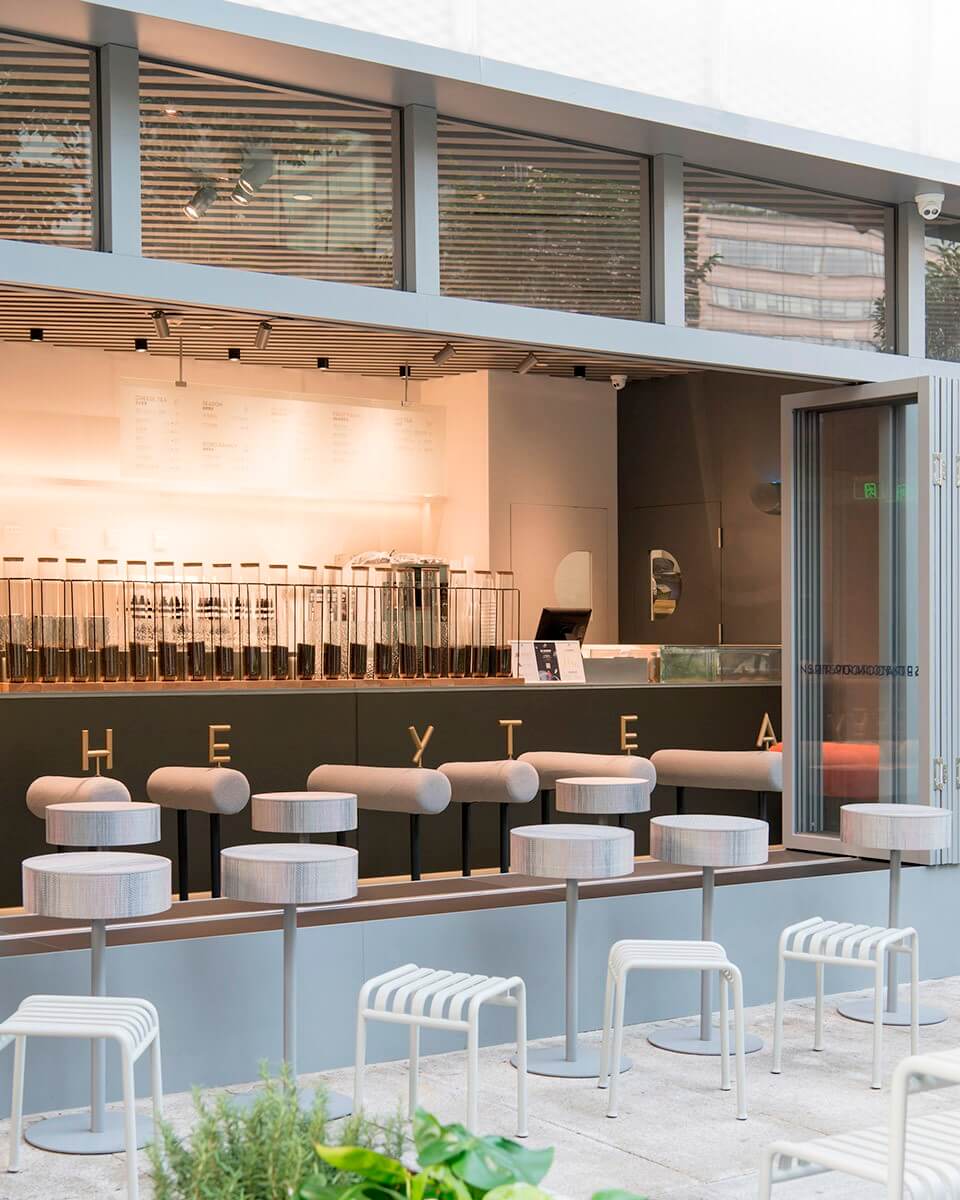
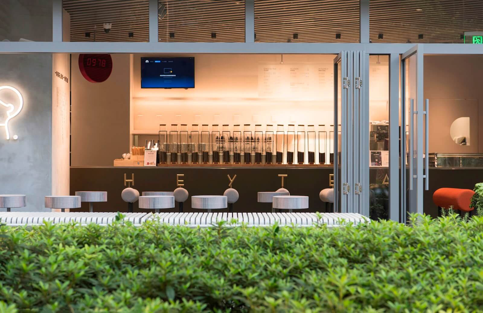
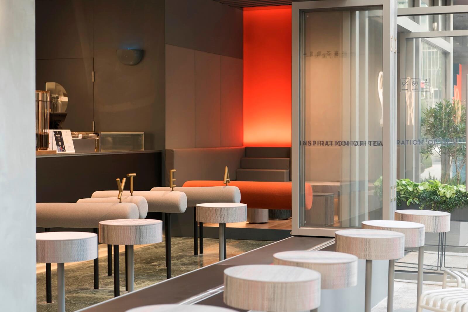
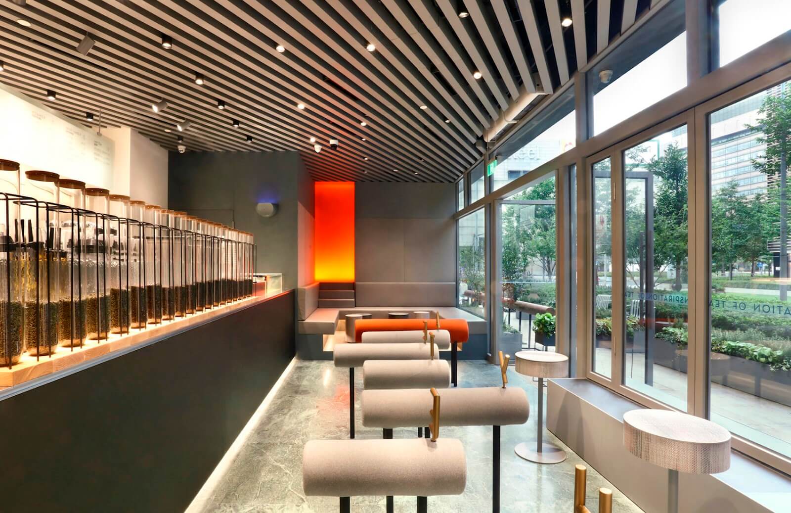
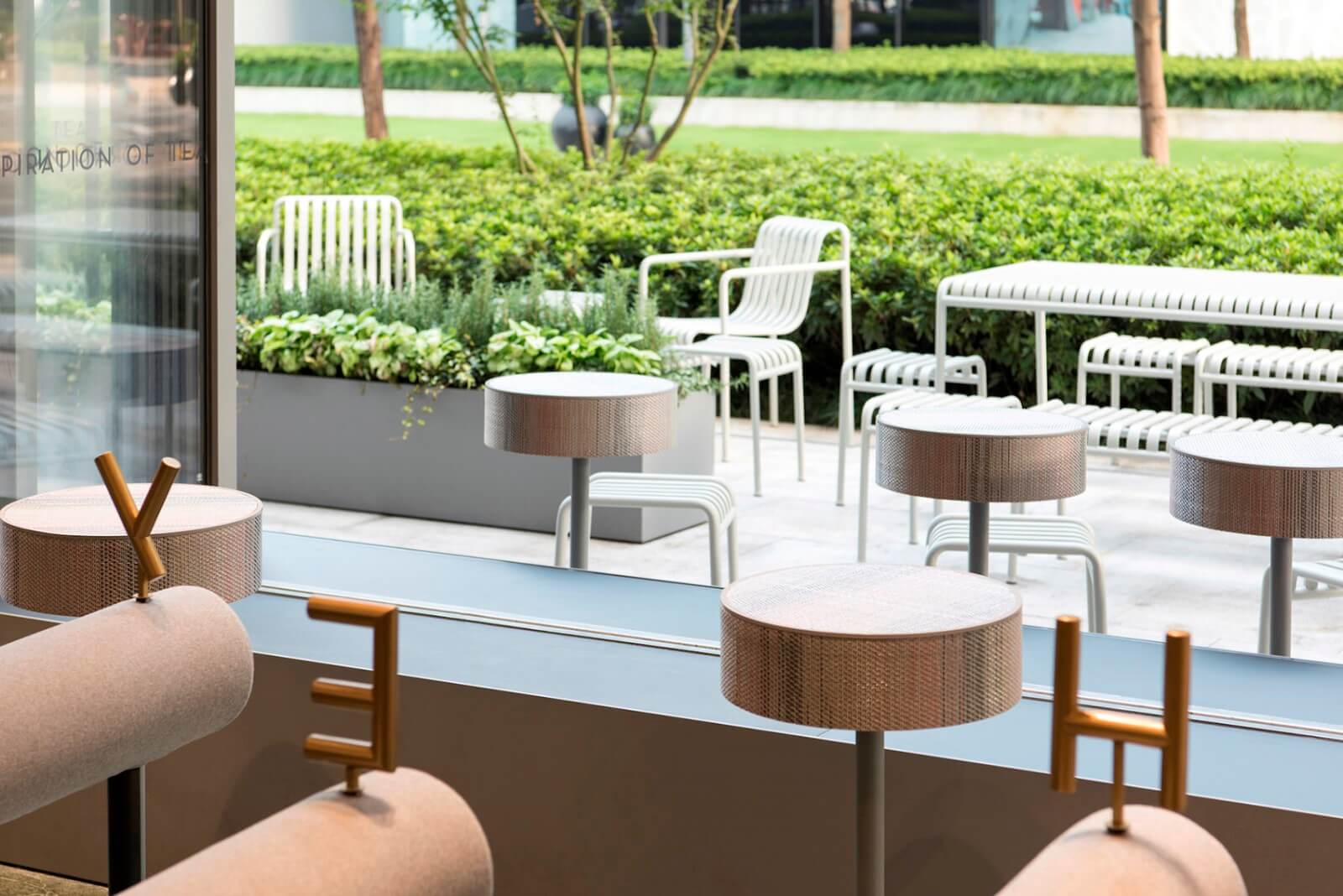
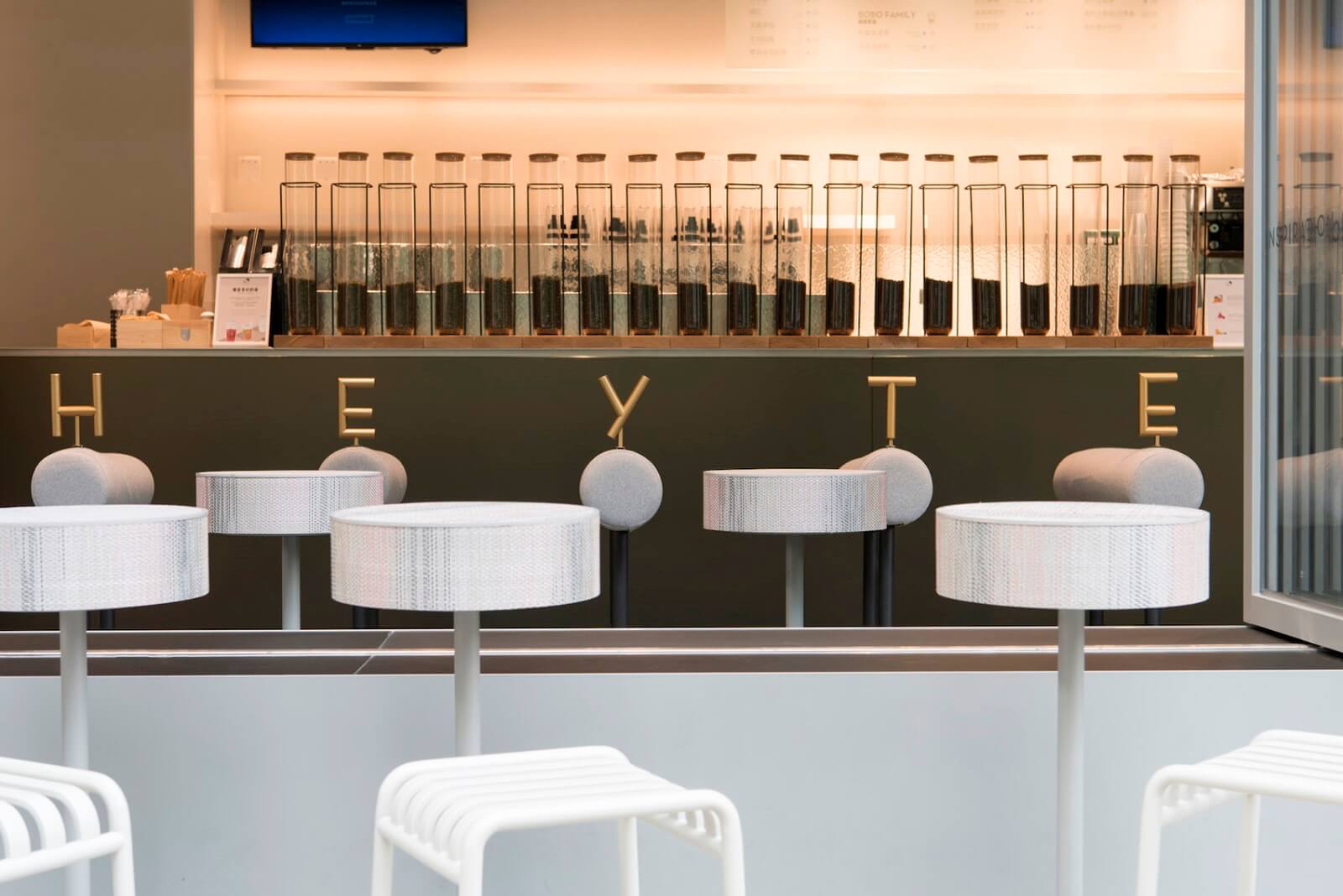
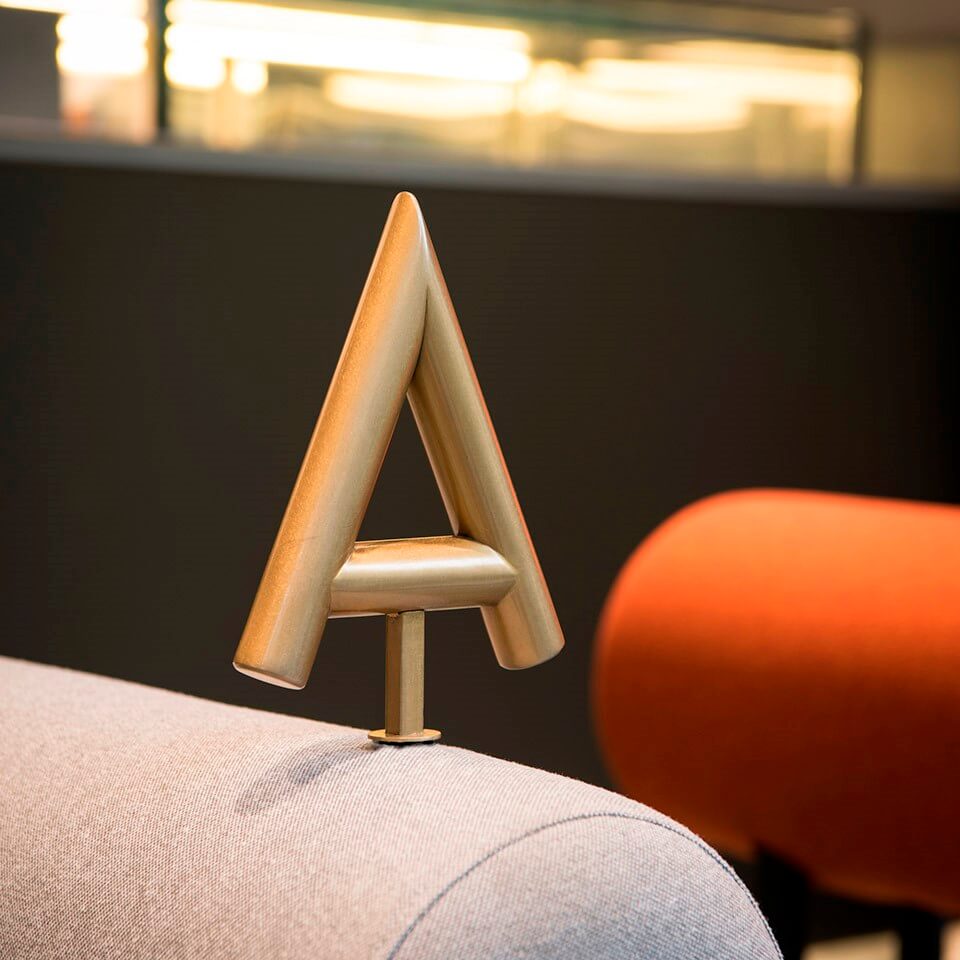
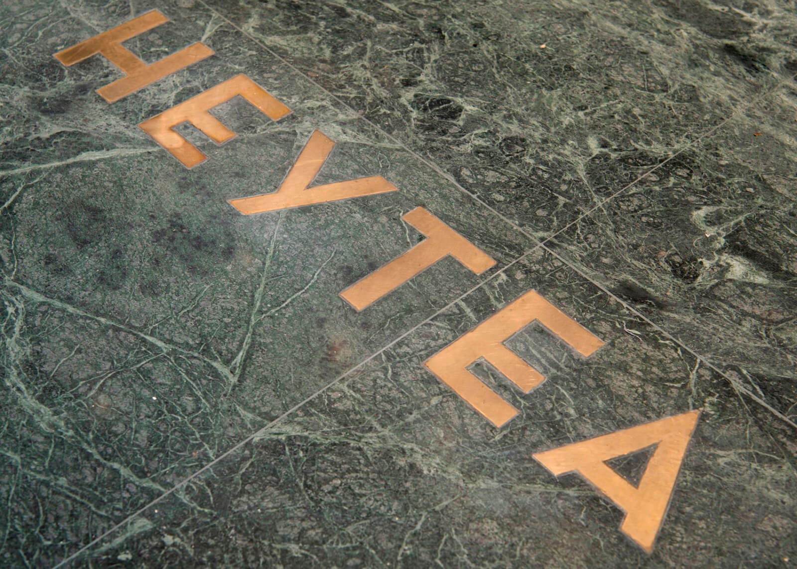
這是一例為排隊而作的設計。顧客順著戶外的引導裝置開始排隊,逐步折入並停留在鑲有HEYTEA字樣的一米等位線前,每一步移動的間隙都有半高的倚靠裝置可供小憩。點單後同樣可以選擇一隻倚靠裝置短歇,等候取杯,或者在長凳、沙發及野餐座中選擇適宜的地方。
It is all designed for queue. Following the outdoor installation guides, customers join the queue until they turn into the shop and stop at the HEYTEA characters engraved one-meter line before the bar. The half-height installations are there for quick rest during the long queue line. After ordering, one can always hang around amongst those soft leaning installations or pick another window seat, choose a comfortable sofa or simply join the outdoor picnic tables while waiting for the drinks get prepared.
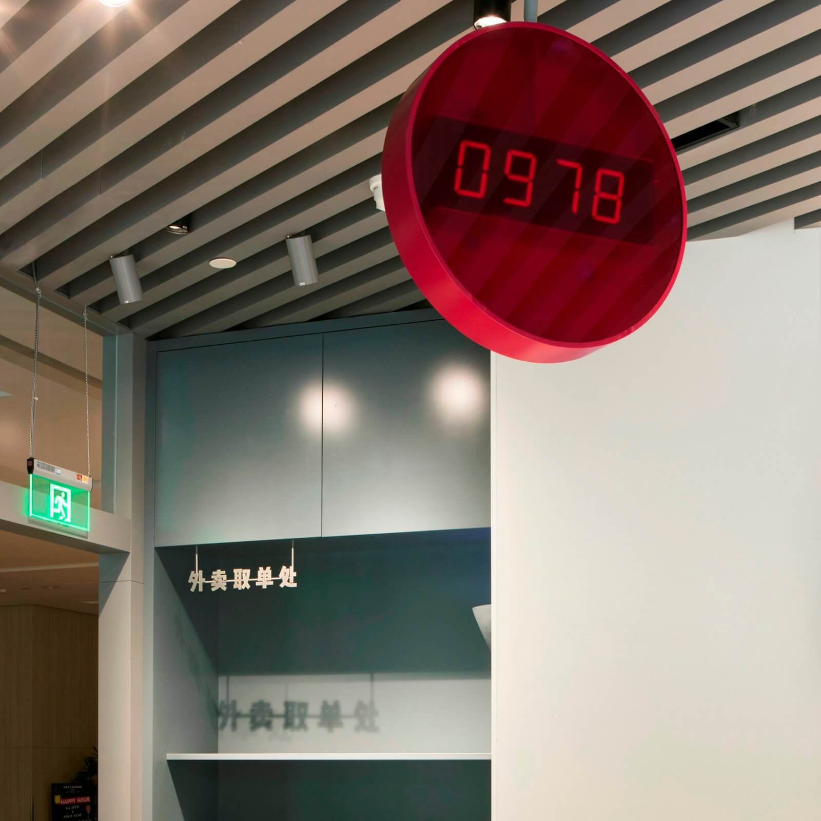
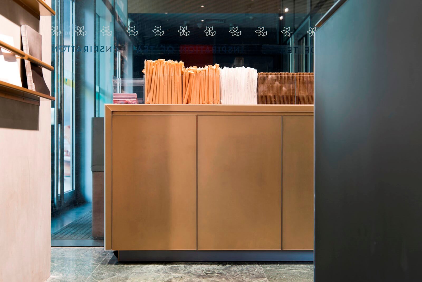
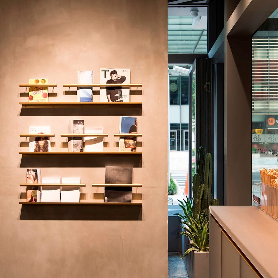
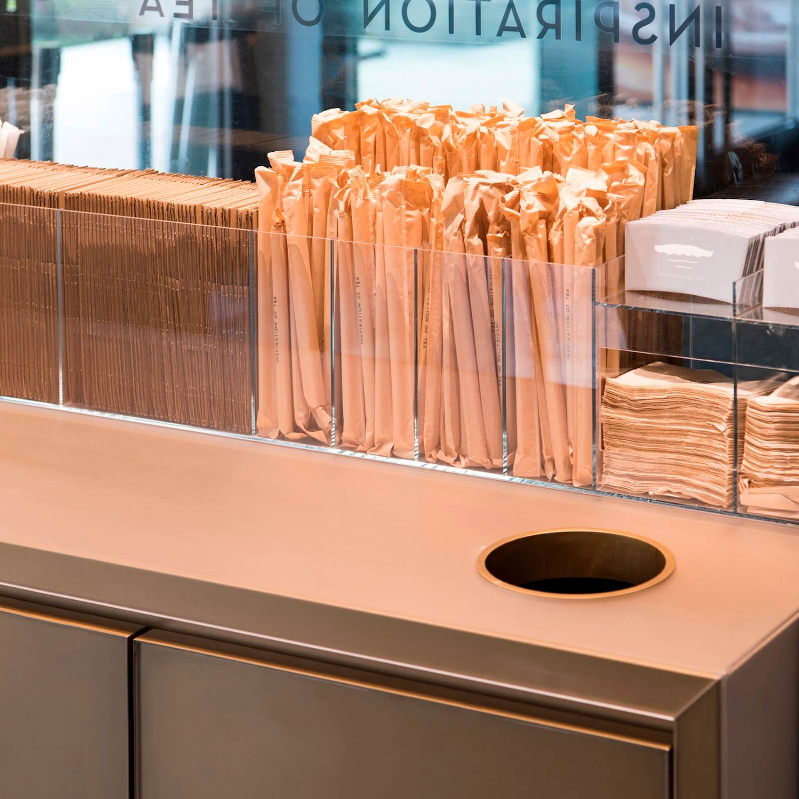
店內空間本身非常局限,設計將顧客出入店鋪與外賣取單的流線一一分離,並以短靠裝置、自助打包台、雜誌及牆體文字呈現的方式分散等待出杯的人流,減少擁堵,便於快速撤離。
Circulation of customers and delivery are clearly separated to increase capacity. Leaning installations, self-packing station, magazine rack and wall stories help to distract and disperse the massive crowd, thus reduce the congestion and faster evacuation.
禪意的探索
Exploring Zen
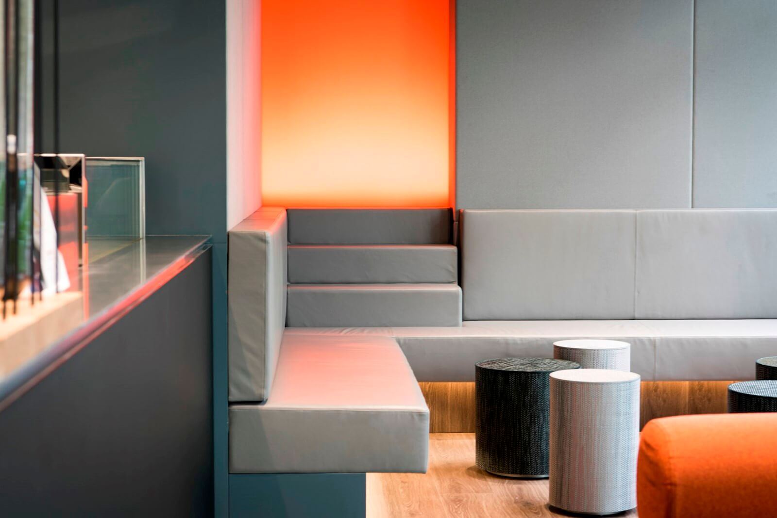
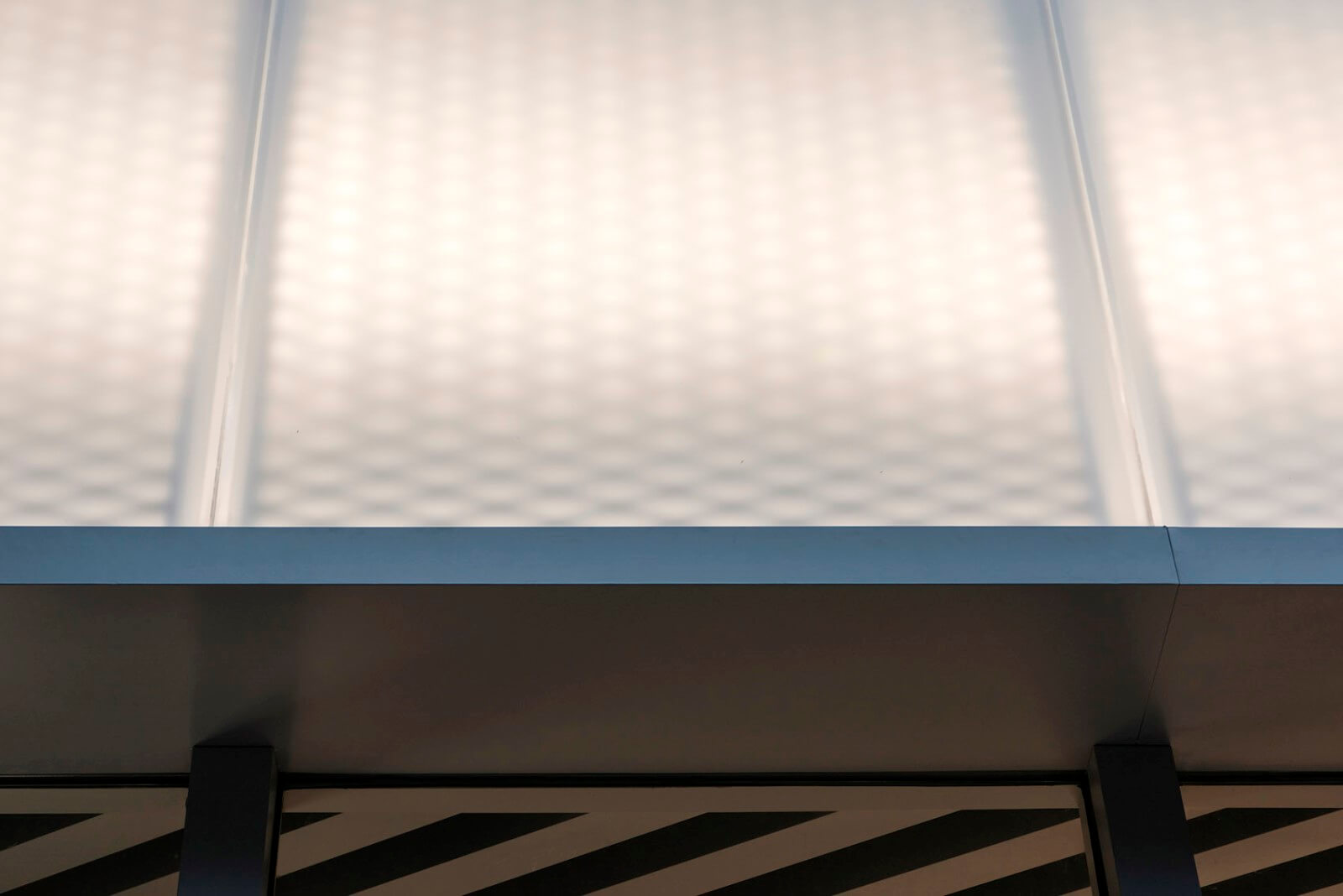
設計在多種不同層麵上探索禪意。禪是關於開悟見性的,一係列有啟示感的場景和氛圍以設計的語言呈現於整個店鋪中,意在引發悟見。二層幕牆立麵的設計受日本攝影師HIROSHI SUGIMOTO作品Seascapes的啟示,門頭均質柔和的背投光透過金屬網板和霧麵樹脂,渲染出“海天一色”的靜謐和神秘。店鋪中不同質感的材料拚就的大麵積淺灰色與局部高純度熒光色的對比象征頓悟。
The concept of Zen is explored from various perspectives. Zen is about Satori (the experience of awakening, enlightenment) and Kensho (seeing on’s true nature). A series enlightening scenarios and atmosphere are experimented all over the space as inspirations for Satori and Kensho. Inspired by Japanese photographer Hiroshi Sugimoto’s Seascape, the shop front facade is designed to recall mysteries seascapes that melts into the sky, by rendered lighting through matte resin and perforated metal panels. Grey, as the major proportion color, is collaged with different materials. High saturation colors scattered in the space, contrast of which symbolizes sudden enlightenment.
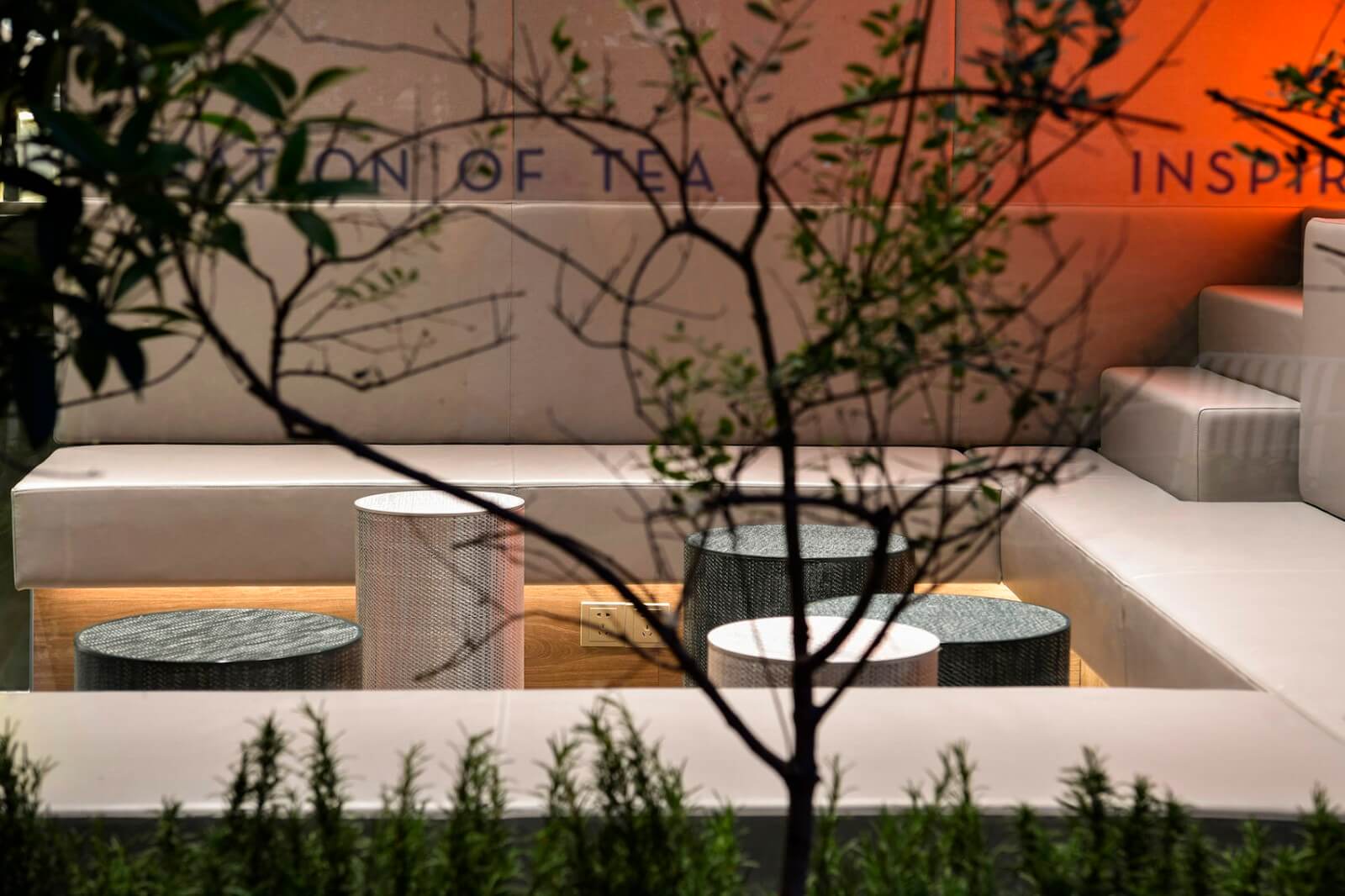
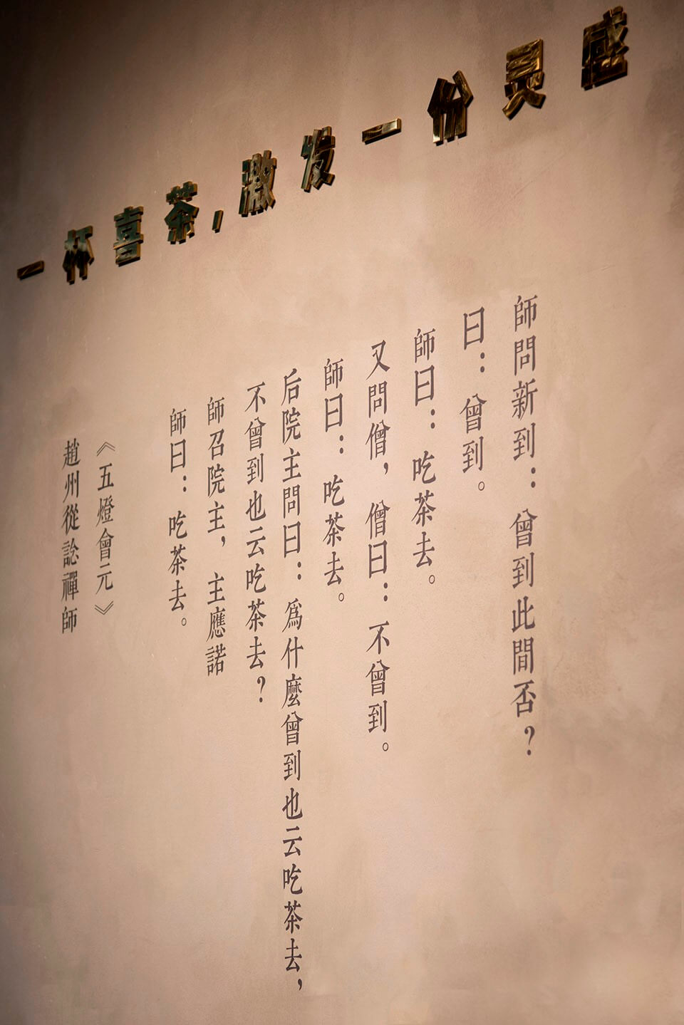
橙色彌漫的發光麵與上升梯段的組合延續到戶外,沿街立麵上一大一小的梯段構成水中“平遠的”小島,成為令人遐想的空間謎點。牆麵上亦引用了禪宗從諗祖師“吃茶去”的段子,以期帶來“茶”以外的玩味空間。
The combination of diffusing orange surface and stairs extends to the exterior. A pair of stairways, in big and small sizes, compose themselves like islands-in-water in perspective, creating an inspiring spatial enigma. An interesting story Go for Tea of Chan master Congshen is also quoted on the wall as plus of enjoyable reading experiences.
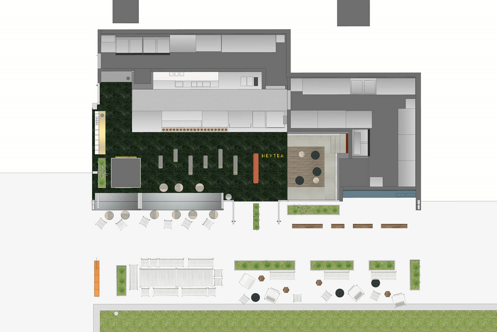
▽平麵圖 plan
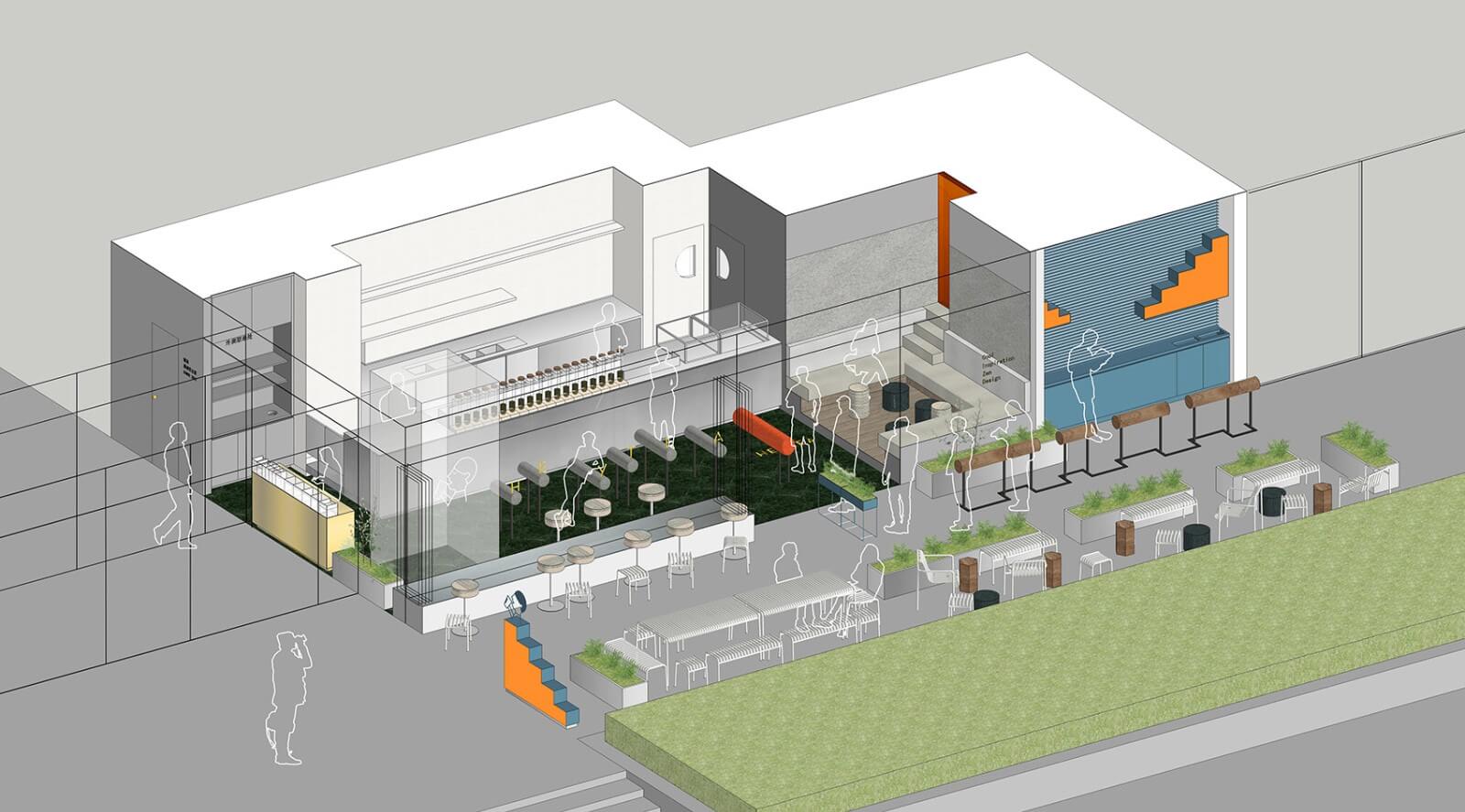
▽軸測圖 Axonometric
完整項目信息
項目名稱: 喜茶靜安嘉裏中心
設計事務所: nota建築設計工作室
事務所網站: www.notaarchitects.com
電郵聯係方式: info@notaarchitects.com
主創建築師: 錢詩韻
設計團隊:錢詩韻、高翔、徐升、薛君
項目詳細地址: 延安中路1238號靜安嘉裏中心南區一樓
項目完成年份: 2018年
建築麵積(平方米): 110㎡
攝影師: 大鈞、錢詩韻、nota建築設計工作室
業主: 喜茶
照明顧問: 魏偉
綠植顧問:nota建築設計工作室
工程施工:晨一裝飾工程 王亮星團隊
建材商品牌 + 產品
1. 蓋珂Arctic mist 1000霧麵樹脂板
2. HAY Palissade 戶外家具
3. FIDIVI Trevira CS 布料
Project name: HEYTEA Jing An Kerry Centre
Architect’ Firm: Nota Architects
Website: www.notaarchitects.com
Contact e-mail: info@notaarchitects.com
About Architect:
nota is an architectural design studio founded in Shanghai in 2014.
Lead Architects: QIAN Shiyun
Design Team: QIAN Shiyun,GAO Xiang, XU Sheng, XUE Jun
Project location: N1 Jing An Kerry Centre, No.1238,Middle Yan An Road
Completion Year: 2018
Gross Built Area (square meters): 110㎡
Photo credits: Da Jun,QIAN Shiyun , Nota Architects
Other participants
Client: Heytea
Lighting Consultant: WEI Wei
Landscape design: Nota Architects
Construction: Chengyi Construction,WANG Liangxing team
Brands / Products
1. GAINKER Arctic mist 1000 Resin
2. HAY Palissade Outdoor Furniture
3. FIDIVI Trevira CS Fabric


