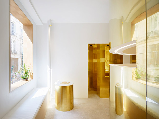
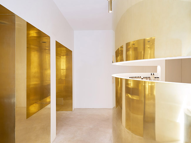
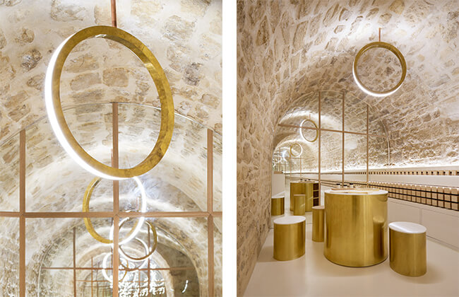
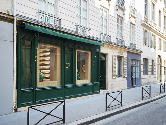
巴黎工作室ARCHIEE設計了日本化妝品品牌en的第一家精品店,設計受到其名稱“en”的三個含義的影響,即美、圓圈和連接。該商店位於巴黎市中心一座18世紀的建築內,分為兩層:一層是一樓,一層是拱形地下室;用拋光黃銅的圓形隔板分隔成較小的區域。
parisian studio ARCHIEE has designed the first boutique of japanese cosmetics brand en, playing with influences from the three meanings of its name: beauty, circle, and connection. situated in an 18th century building in the center of paris, the shop is divided in two levels, the ground floor and a vaulted basement, separated in smaller areas using circular partitions in polished brass.
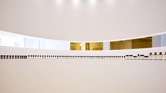
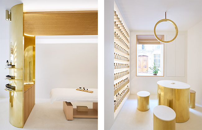
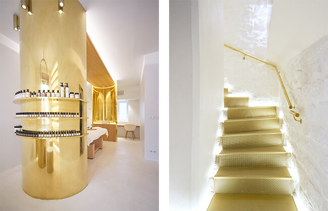
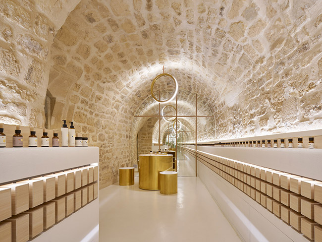
ARCHIE保留了原有建築的大部分現有結構元素,並添加了一係列圓形分區,以輕柔地定義不同的區域。在外部,隔板采用拋光黃銅製成,為空間帶來溫暖的多方向光反射;而在內部采用白色飾麵,表達了品牌的純淨。
ARCHIEE has preserved most of the existing structural elements of the original building, and added a series of circular partitions to softly define the different internal areas. externally, the partitions are finished in polished brass, which brings distorted and warm reflections to the space, while internally, they are layered in a white surface that expresses the pureness of the brand.
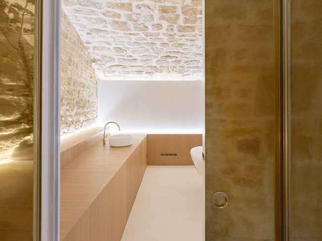
作為一個化妝品品牌,客戶可以通過混合100多種香精來創造原創產品,en的精品店就是為了適應這一需求而開發的,同時還提供谘詢、治療和按摩服務。一樓分成兩個房間,入口谘詢和治療空間,采用白色飾麵,以營造優雅精致的氛圍。
being a cosmetics brand that allows customers to create original products by mixing over 100 types of essences, en’s boutique has been developed to accommodate this practice, together with areas for counseling, treatments, and massages.the ground level is split in two rooms, the entrance and the counseling & treatment space, which are finished in white plaster to contribute to an elegant and refined atmosphere.
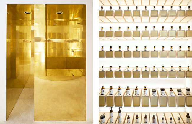
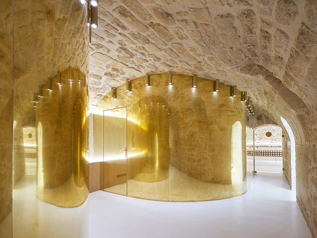
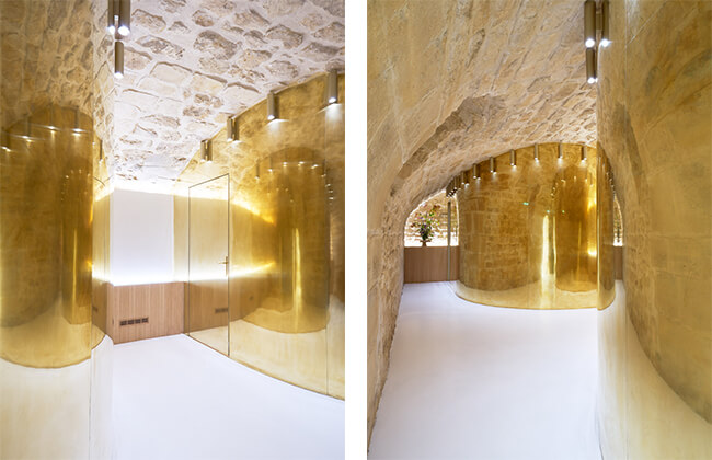
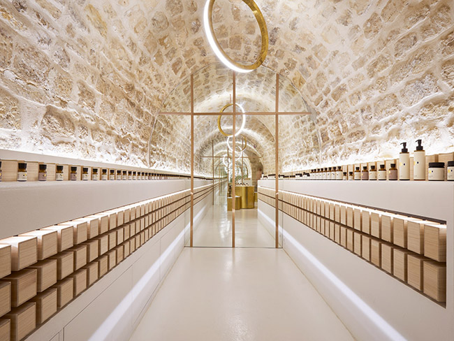
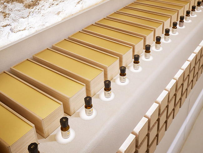
在這裏,客人不能直接訪問服務的房間,而是需要沿著彎曲的小路通往自己的目的地——這是日本熱情好客的典型特征,也見於傳統的茶道儀式。石拱形地下室的兩個房間包括按摩空間和混合櫃台所在的產品廊,易讓人想起酒窖,ARCHIEE的設計參考了法國葡萄酒廠的儲藏方法。每個瓶子都使用特殊的燈光單獨展示,而儲物盒則采用日本泡桐木製成,並以一種營造酒窖氛圍的方式堆放。
visitors in the boutique cannot access the service rooms directly, but must instead walk along a winding path toward their destination – a typical characteristic of japanese hospitality, seen also in traditional culture of tea rituals. the two rooms of the stone vaulted basement include the massage spaces and the product gallery where the blending counter is located. reminiscent of a wine cellar, ARCHIEE’s display of the products references the method of storage in french wineries. each bottle is displayed separately with special lighting, while the storage boxes have been made using japanese paulownia wood and are also stacked in a way that creates a cellar atmosphere.
完整項目信息
客 戶: tow branding
項目名稱:EN
項目位置:巴黎
項目類型:商業空間/化妝品品牌店
完成時間:2018
使用材料:黃銅、混凝土地板、木材
設計公司:ARCHIEE
設計團隊:archiee(yusuke kinoshita & daisuke sekine)
攝影:David Foessel


