如果一個辦公室的布局可以用“但是首先,是咖啡…”來定義,那麼這就是這個地方。Studio11已經完成了PandaDoc在明斯克的一個新項目,並巧妙地圍繞咖啡區設計了辦公室平麵圖和流通區域。最後,一個適合所有依賴咖啡因員工的辦公室被設計出來。
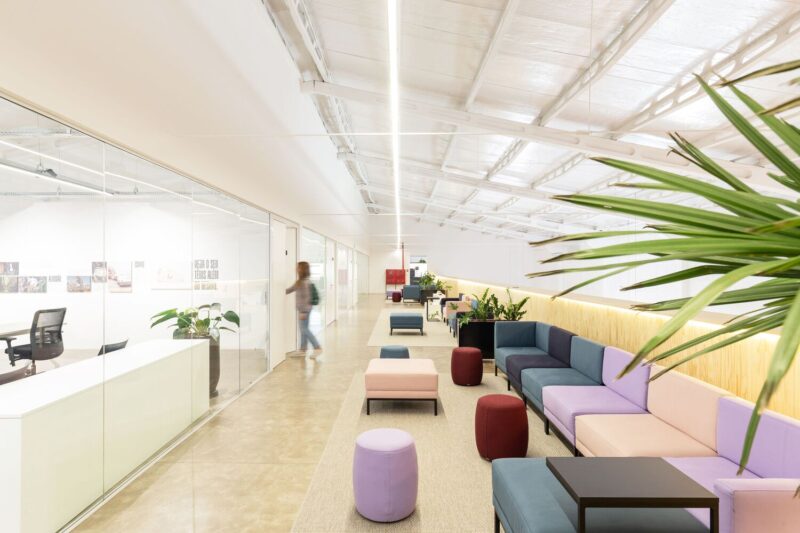
If an office layout could be defined by the quote “But first, coffee…” then this is the place. Studio11 has completed a new project in Minsk for PandaDoc and has cleverly structured the floor plan and circulation area around coffee points. Finally, an office design worthy of all the caffeine dependent employees.
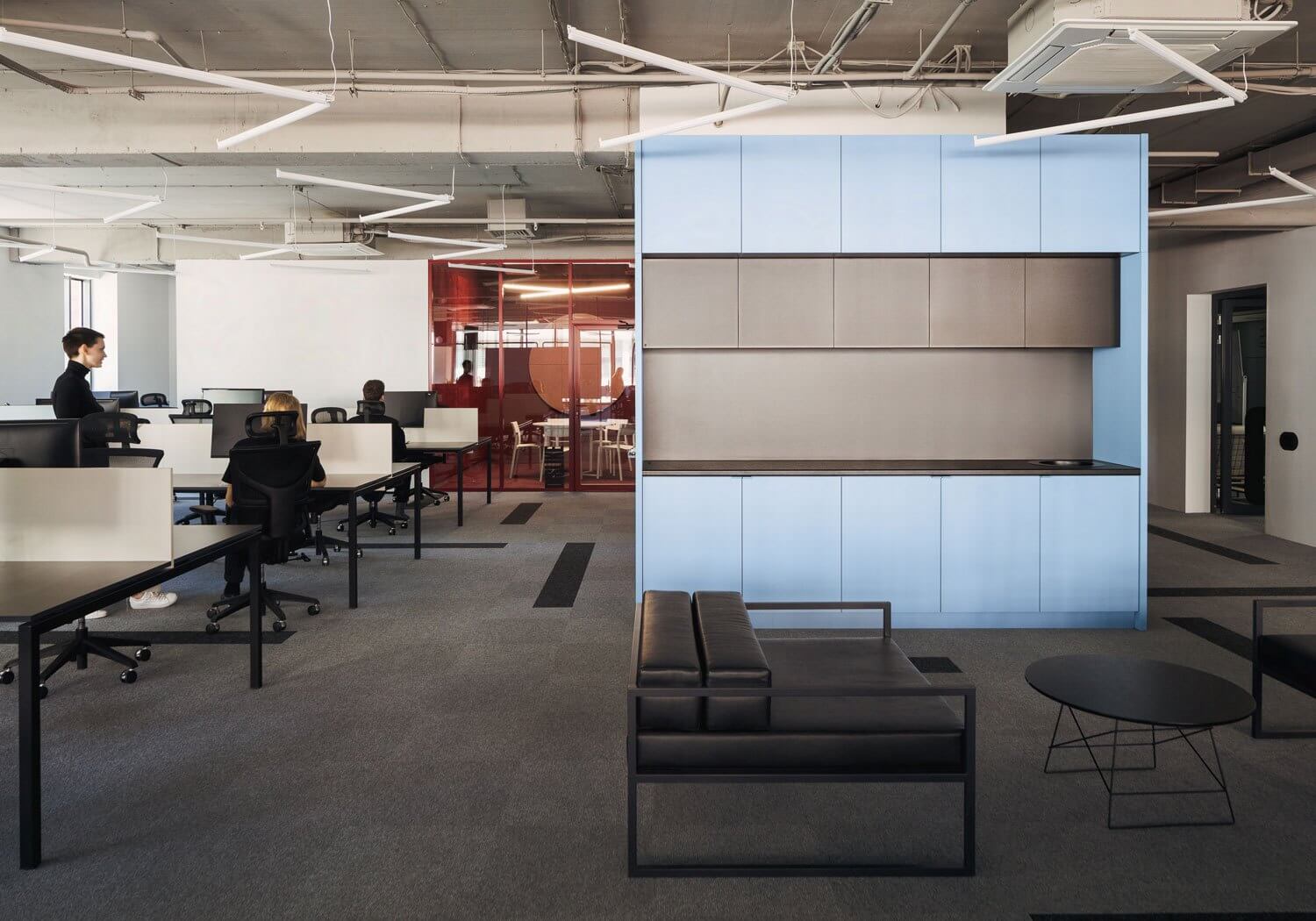
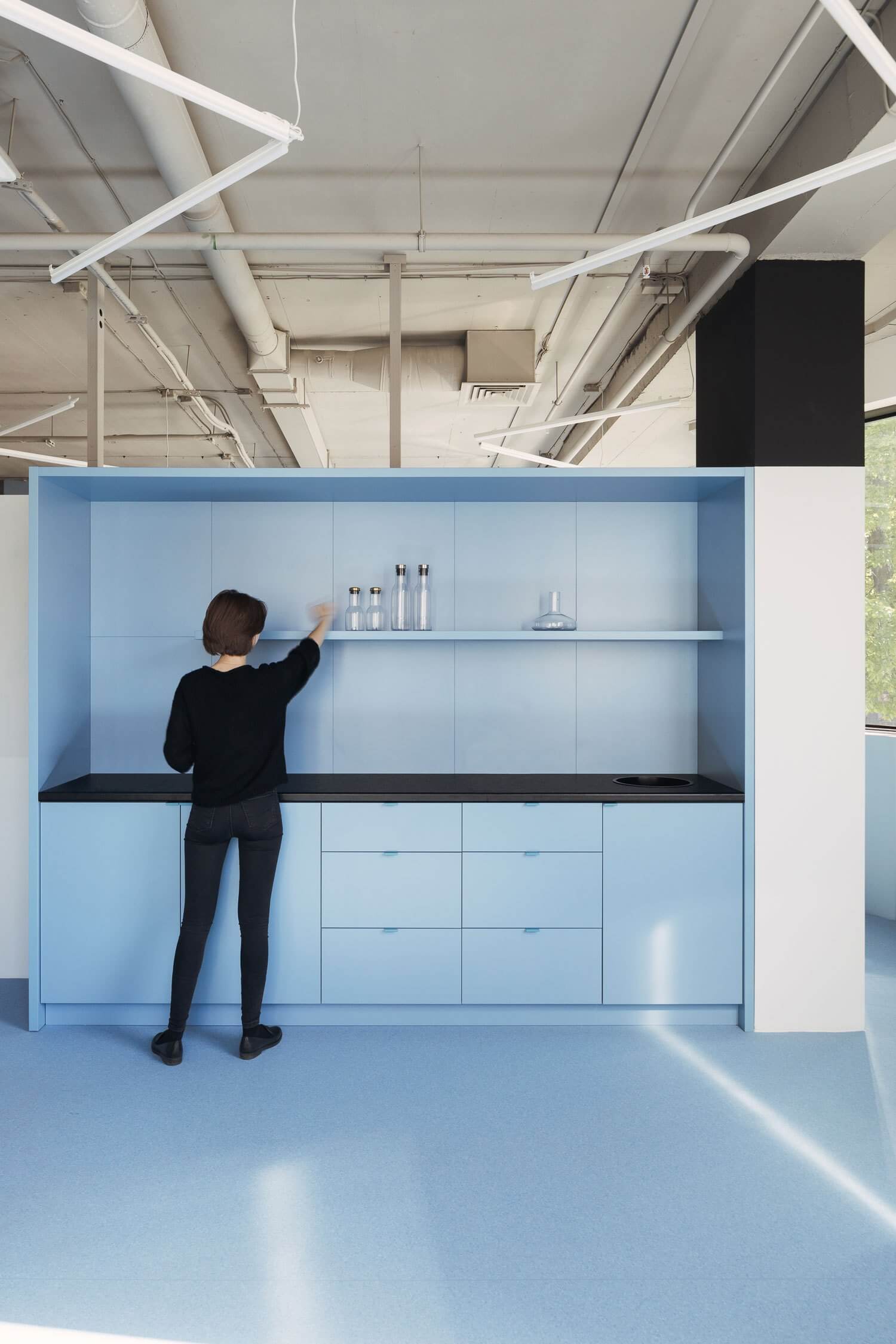
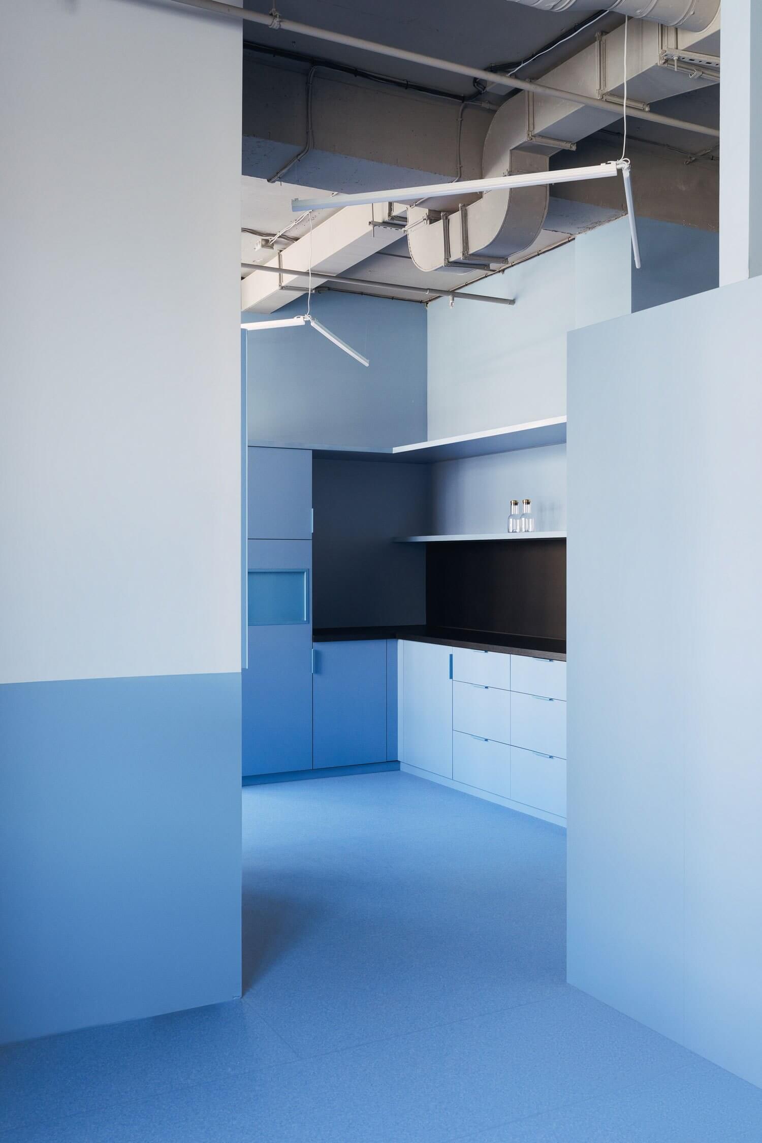
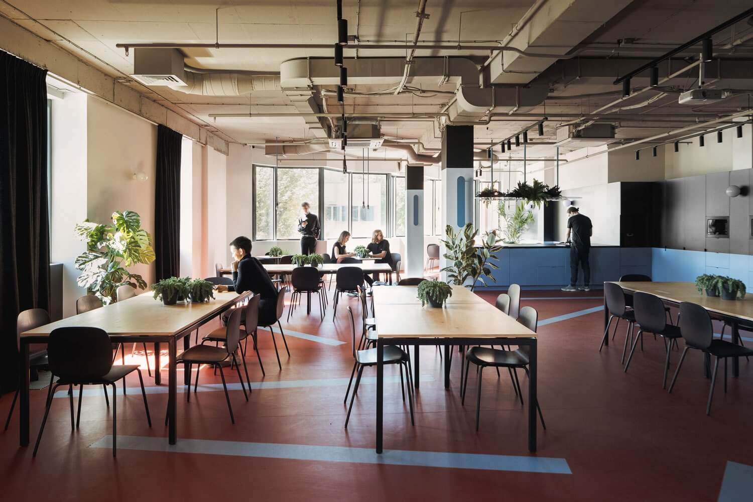
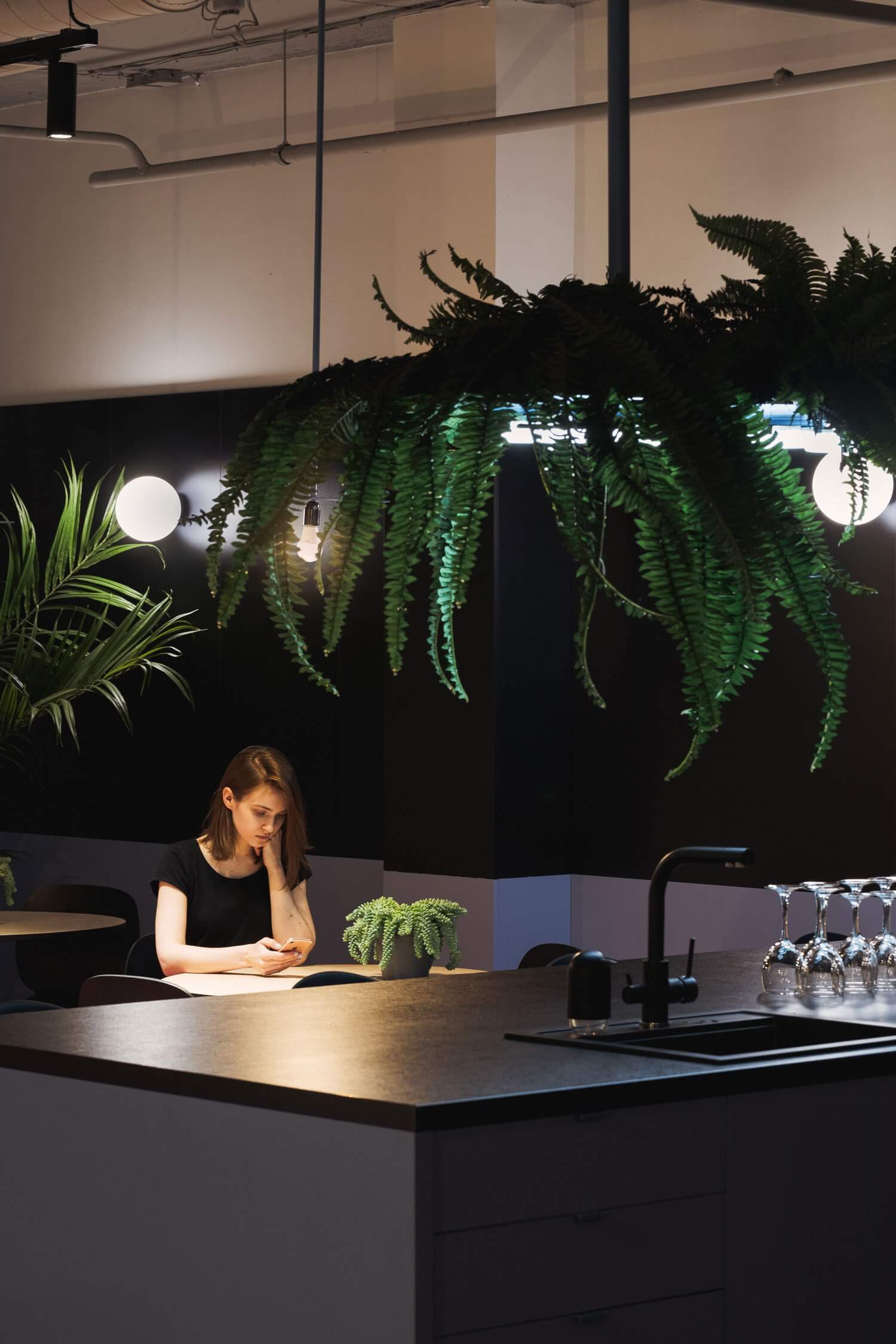
1200平方米的內部空間被Studio11巧妙的設計賦予了鮮明的色彩,分為四個大型開放式空間和第五個空間-公共廚房。但這就是圍繞咖啡區設計的天才想法所在。團隊不必去主廚房,他們隻需在自己的工作區域裏“加油”就行了。
The 1,200 square meter interior, boldly coloured by the deft hand of Studio11, is divided into four large open plan spaces and a fifth for the communal kitchen. But this is where the genius of the coffee bar works. Instead of the teams having to make their way to the main kitchen space, they simply pop up in their own workspace area to refuel.
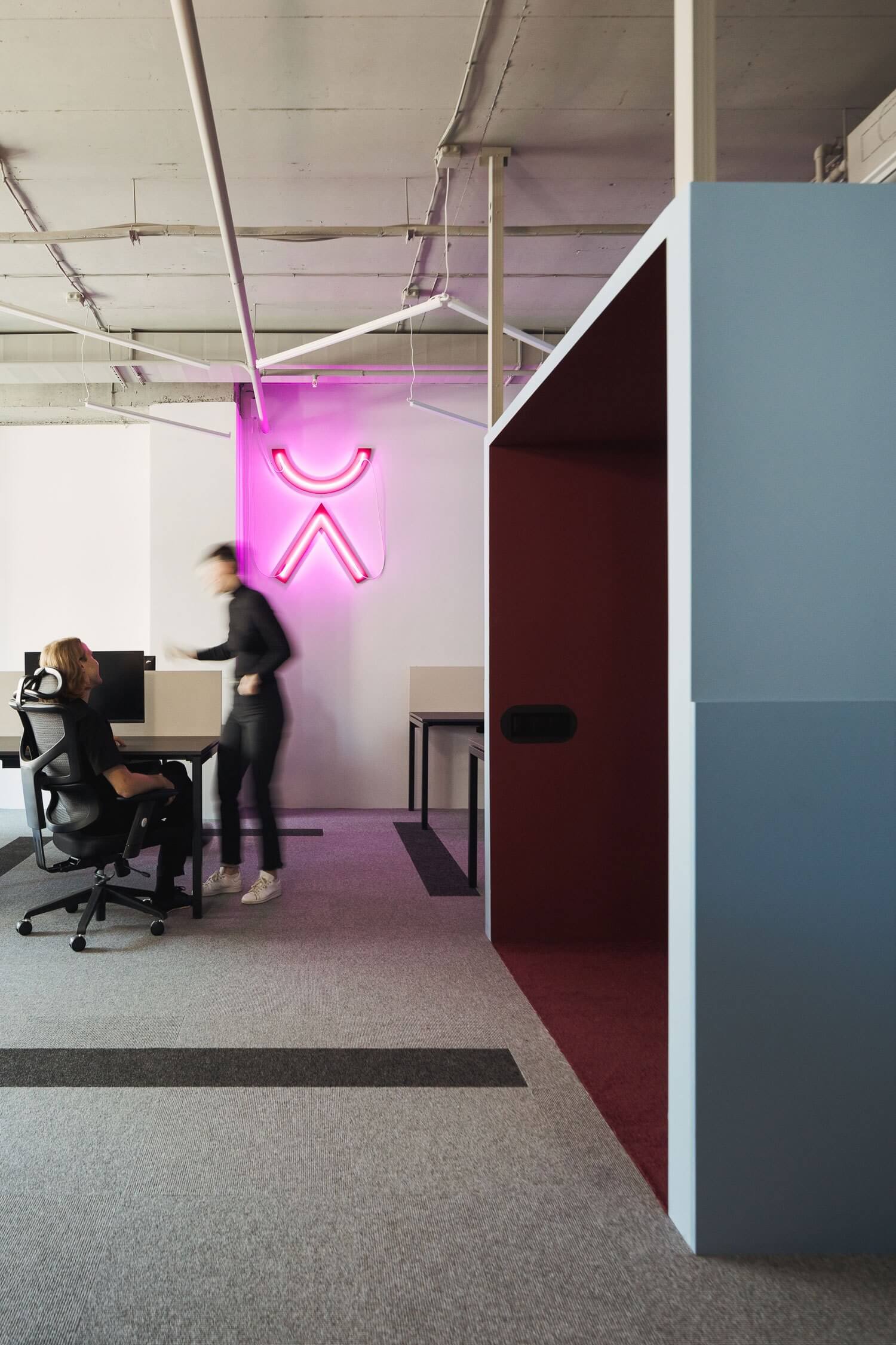
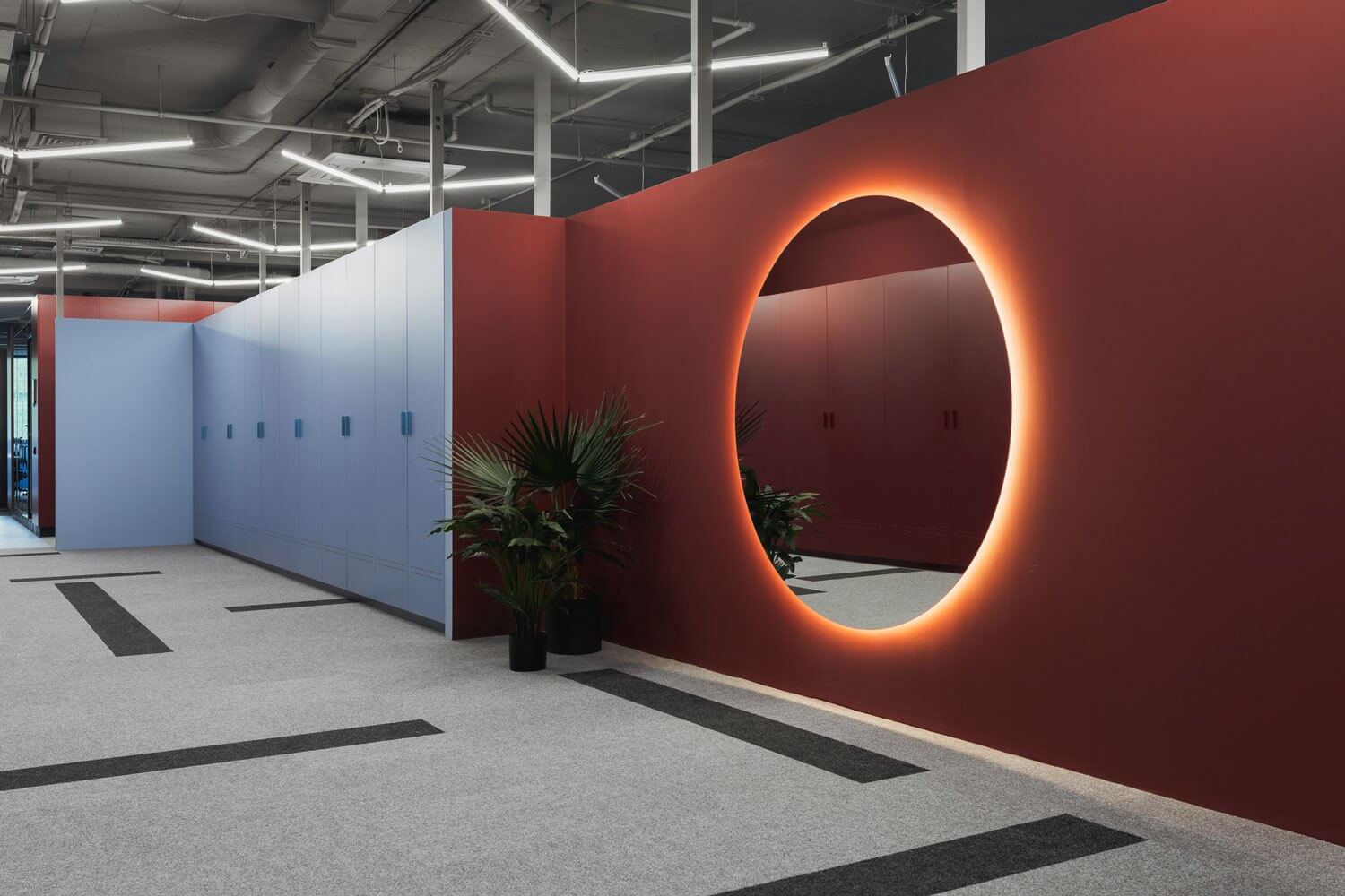
“每個功能區的分區包括一個入口空間,在視覺上與工作空間分開的衣櫥。”在衣櫃的另一側,每個開放空間都被一個麵對著窗戶的小咖啡區封閉起來。
“The zoning of each block includes an entrance space with a wardrobe visually separated from the work spaces. On the opposite side of the wardrobes, each open-space is closed by a small coffee point facing the window line,” explain the architects.
說實話,促使人們產生這種想法的,不僅僅是那些豐富而苦澀的飲料。它是基於所有好的開放式設計應該是關於高效溝通的。高效的溝通源於偶然的會議,使團隊能夠交叉傳播想法和增加對話。“每個功能區區的咖啡點都是一個帶有社交和交流功能的休閑場所,”建築師說。
If truth be told, it’s not just the rich, bitter beverage that prompted this idea. It’s based on what all good open plan design should be about – communication. Transparent communication born of serendipitous meetings enabling teams to cross-pollinate ideas and increase dialogue. “The coffee point for each block is a leisure place carrying a social and communicative function,” said the architects.
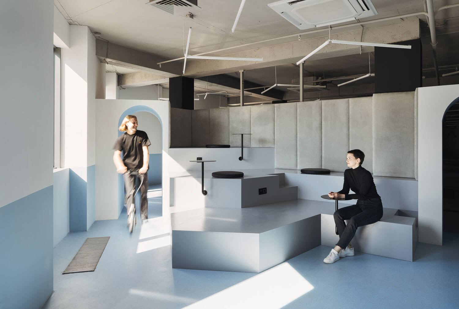
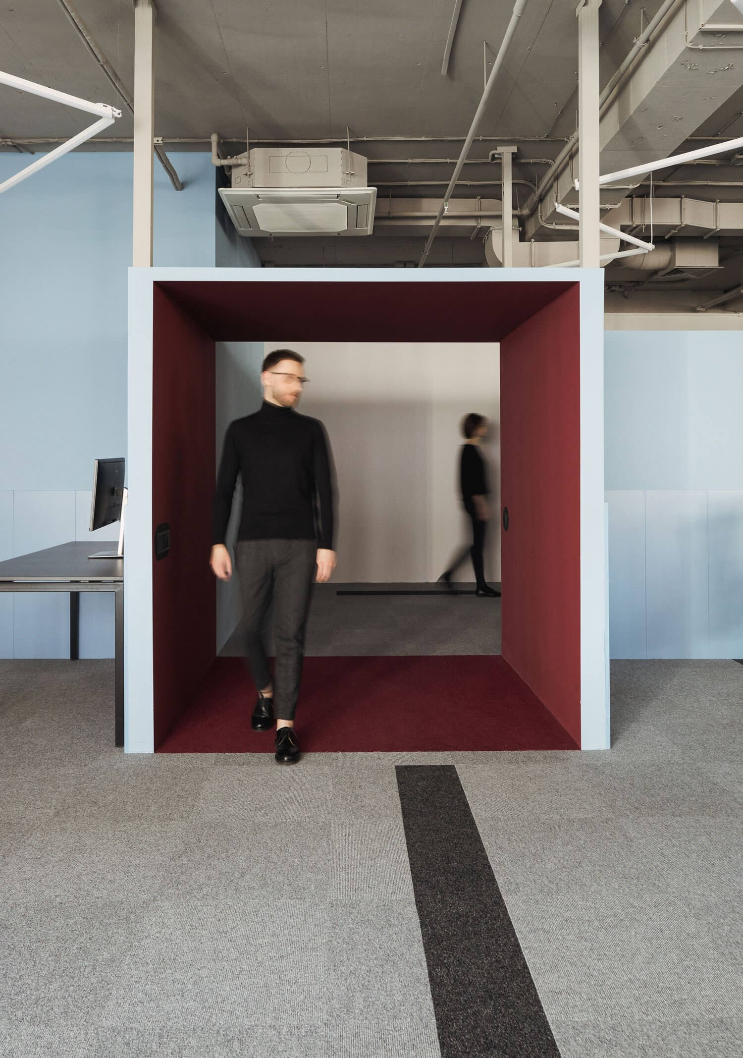
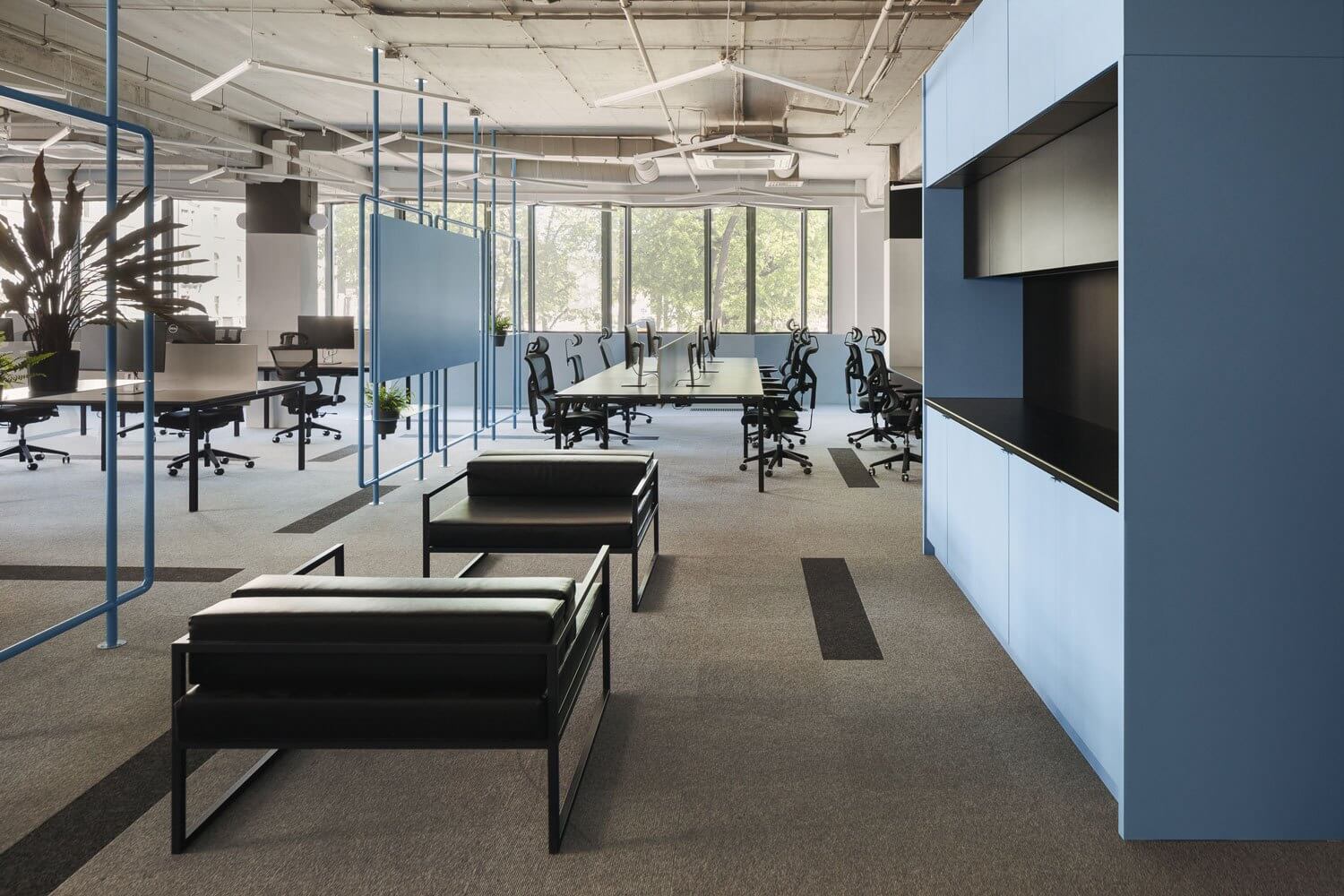
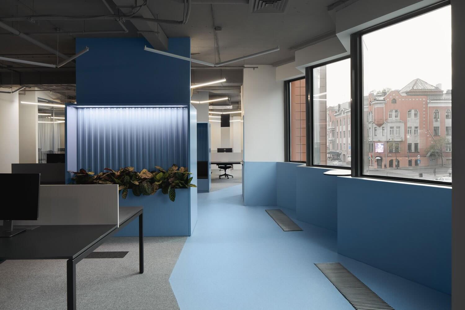
粉藍色長廊沿著整個辦公室的周邊延伸,將所有的工作空間連接起來。
The chance meeting of work colleagues is physically enhanced by the direction of the powder blue promenade, which runs along the perimeter of the entire office connecting all of the work spaces.
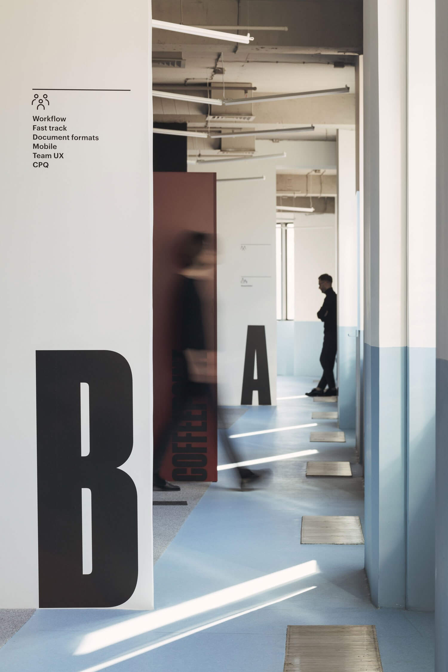
“每個功能區的咖啡點都位於走廊的正前方,這意味著不同團隊的成員可以在這裏進行短期會議。”為此,咖啡點配備了導視牌,這為討論創造了有效的條件,”設計團隊解釋說。
“The coffee points of each of the blocks are located exactly on the way of the promenade, implying places for short-term meetings of members from different teams. For this purpose, the coffee points are equipped with markerboards, which creates effective conditions for discussions,” explains the design team.
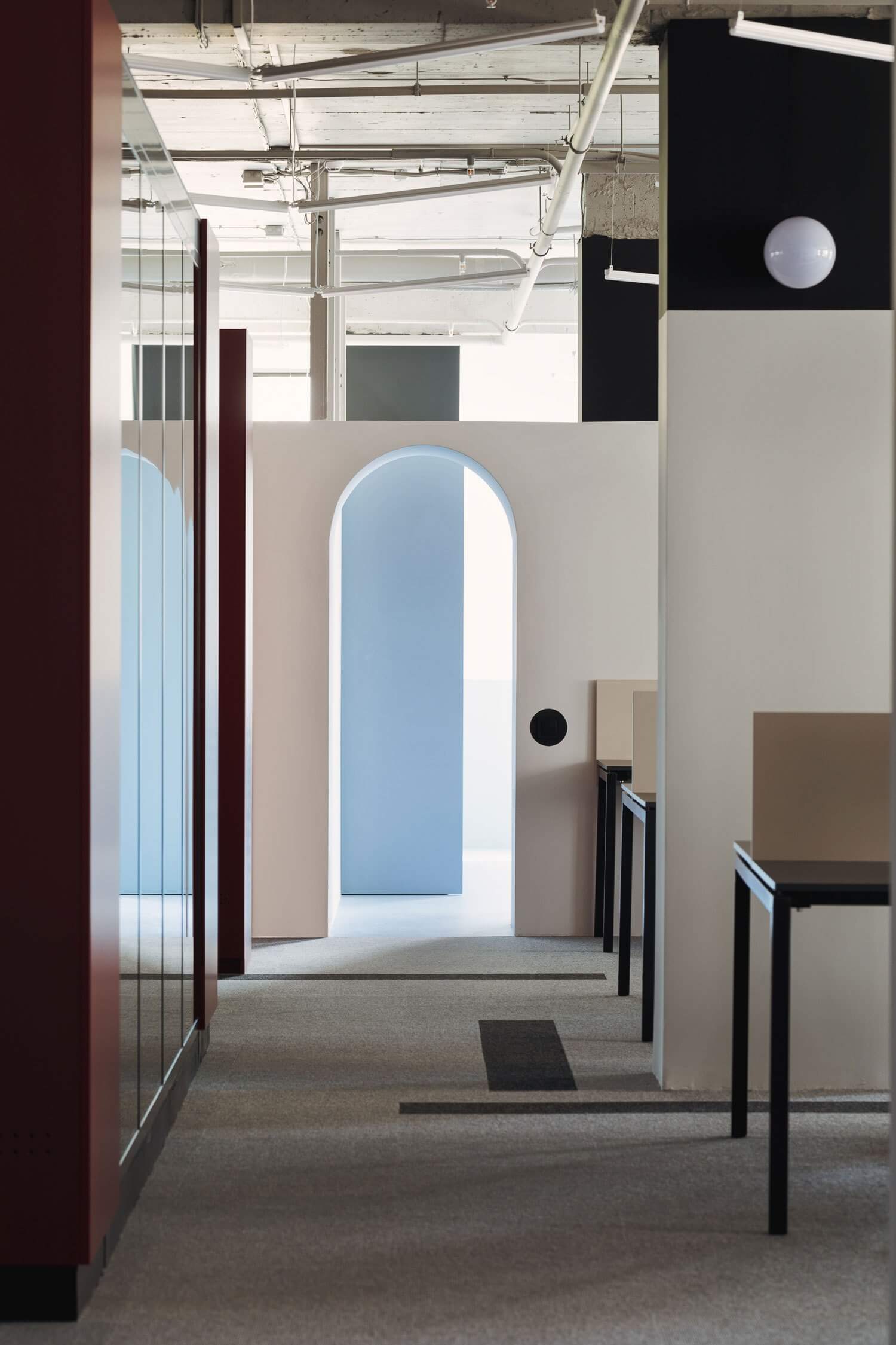
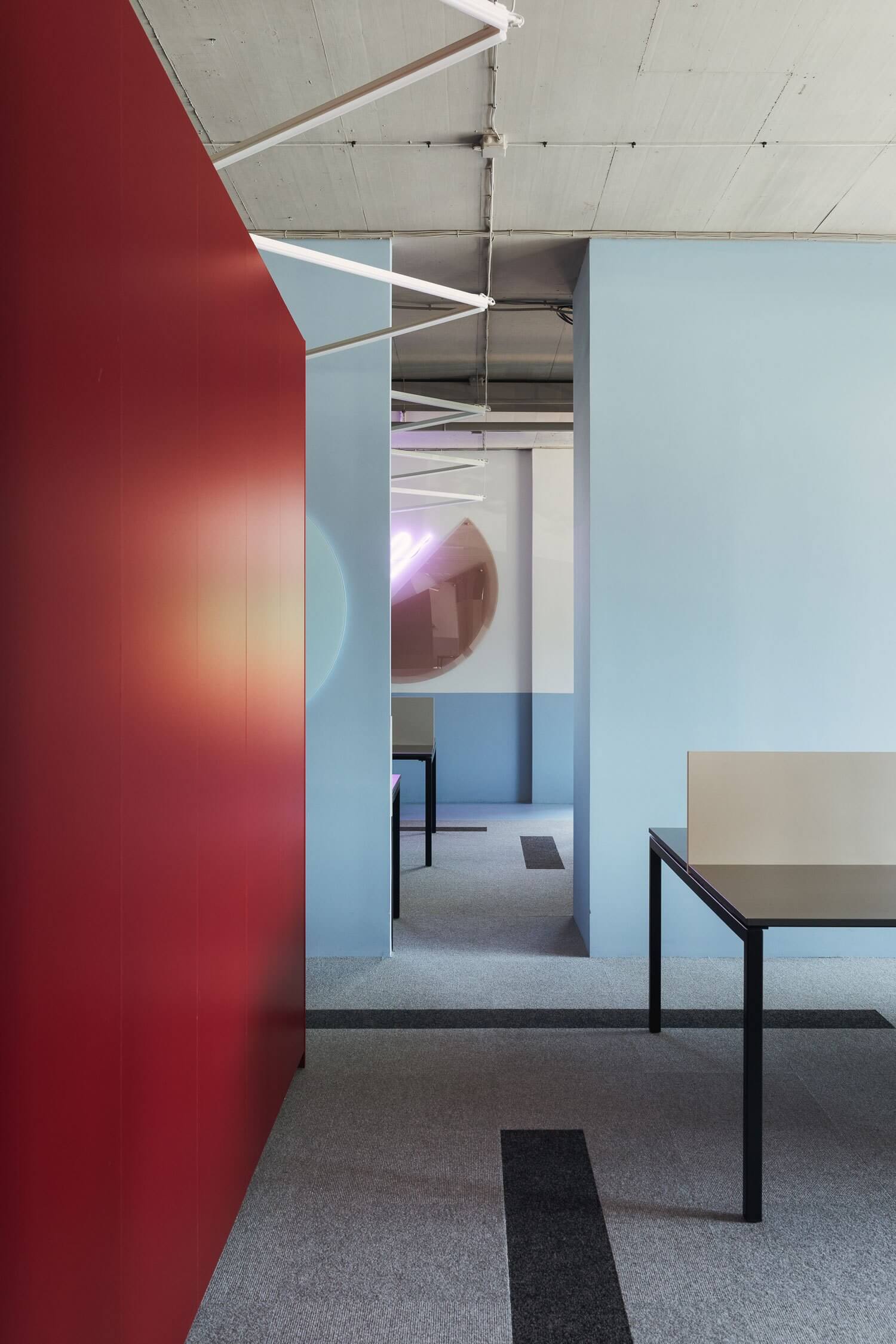
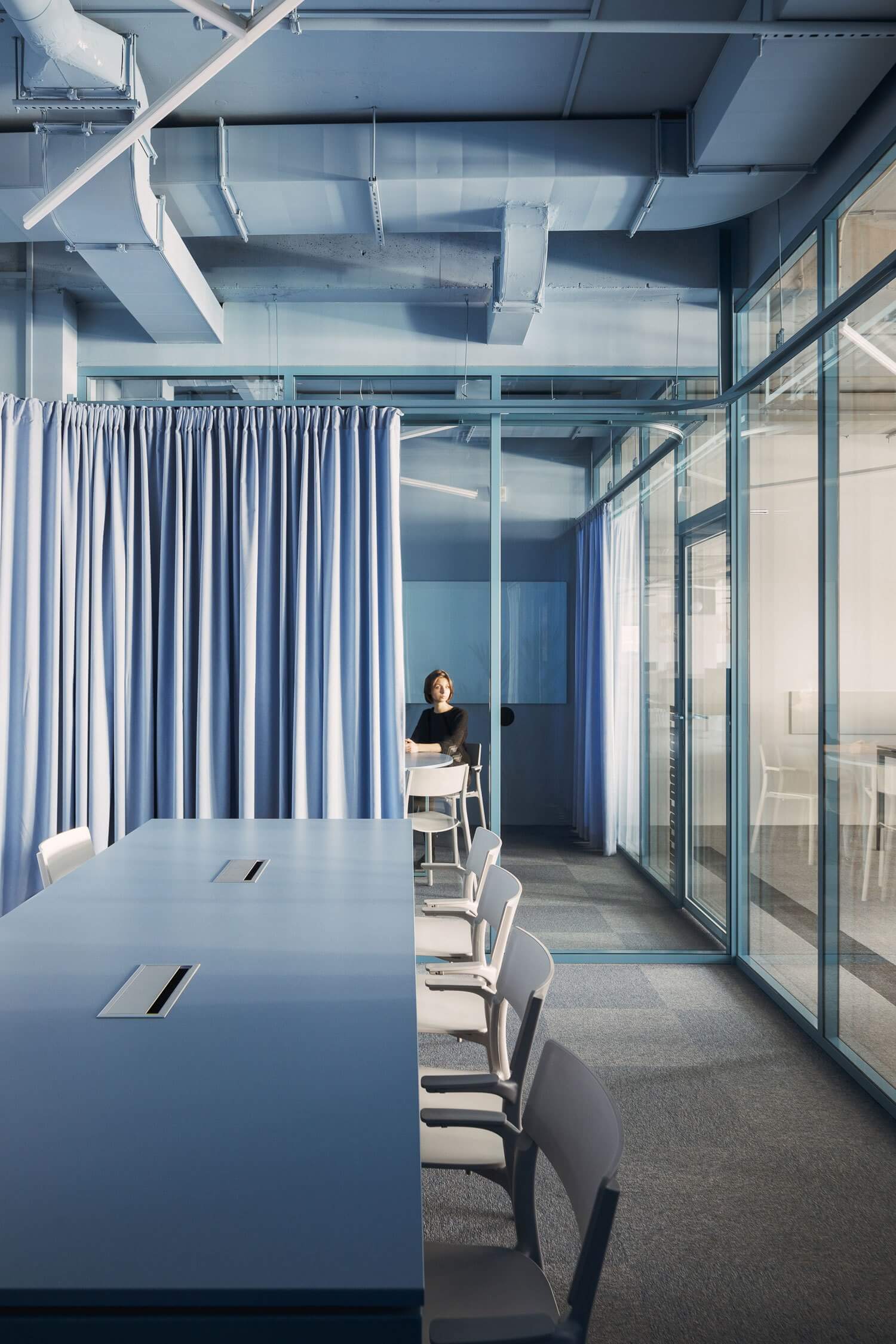
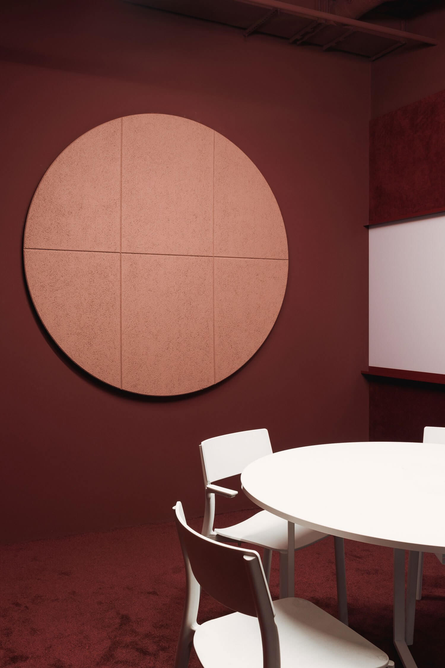
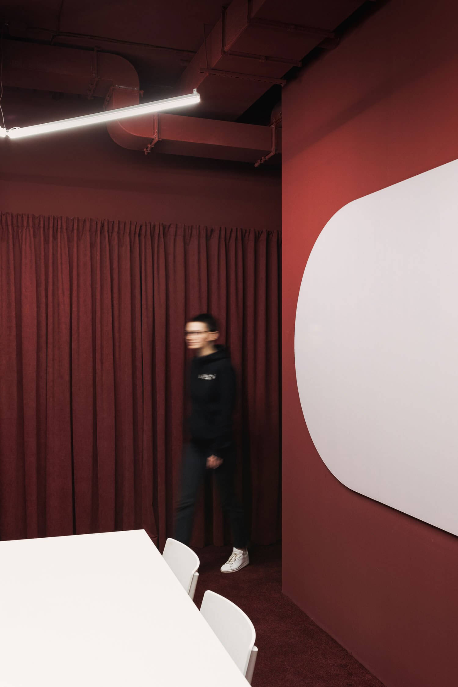
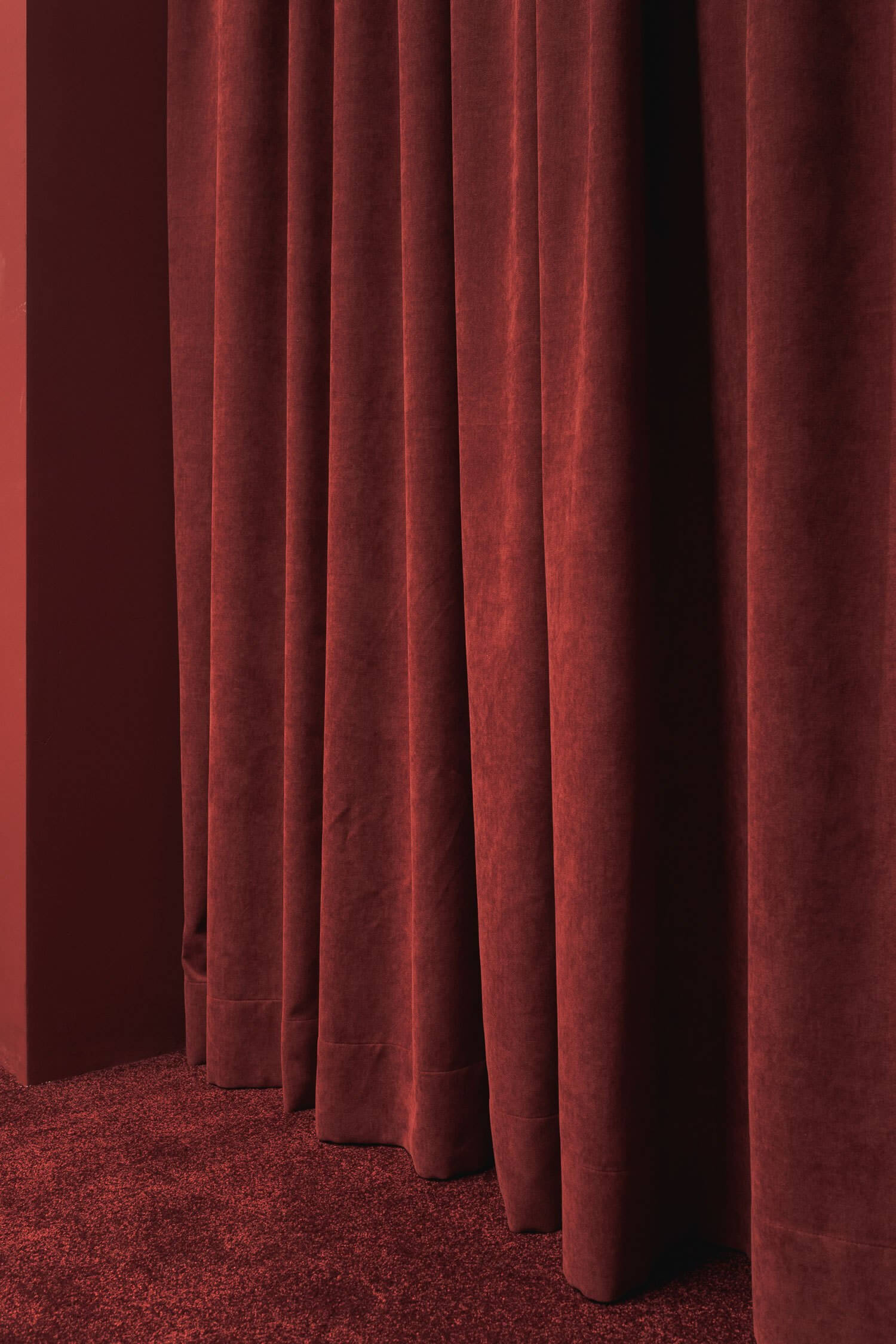
但是,正如人們所預料的那樣,健身並不僅僅是如何解決咖啡因的問題。在這個空間裏色彩絢麗,Studio11擁有一種非凡的能力,它可以采用大膽的顏色,將空間連接在一起,也可以將它們分開。柔和的藍色、明亮的橙色以及特定幾何形狀的使用都是Studio11設計的標誌。兩種顏色的地毯——底色為灰色,深淺為直線黑色。廚房裏的彩色乙烯基地板,帶有強烈的幾何圖案,會議室則是藍色或紫紅色。令人耳目一新的感覺,這裏不用擔心色彩的運用。從任何角度看,它都不顯得幼稚或過於甜膩。相反,Studio11實現了複雜的調色板和動態的調色板。還有一個潛在的……令人難以置信的問題,取決於有多少人每天24小時喝咖啡。
But the fit-out, as one might expect, is not all about how to get your caffeine fix. Colour is resplendent in this space. Studio11 have an exceptional ability to take bold colours and apply them to connect spaces together but also to divide them. Pastel blues, bright oranges and the use of specific geometric forms are all hallmarks of a Studio11 design. The carpet of two colours – background grey with accents of rectilinear black. The coloured vinyl flooring in the kitchen, with its strong geometric pattern and the meeting rooms in blue or burgundy. Refreshingly, there is no fear of the application of colour here. At no point does it look childish or seem overly saccharine. Instead, Studio11 have managed to achieve both a sophisticated palette and a dynamic one. And potentially… a gittery one, depending on how many folks take them up on the 24/7 coffee hit.
完整項目信息
項目名稱:白俄羅斯明斯克的PANDADOC辦公室
項目位置:白俄羅斯,明斯克
項目類型:辦公室
完成時間:2018
使用材料:藍色塗料、橙色塗料、乙烯基地板、地毯
設計公司:STUDIO11
攝影:Dmitry Tsyrencshikov


