我作為一個空間設計師工作了幾十年,我意識到與人的關係以及在與人的關係中所做的一切都是重要的。我認為在人際關係中連接一切的媒介是“同理心”。我第一次見到客戶時談了很長時間。在決定合作之後,我們繼續多次交談,客戶分享了很多故事。當時,他的工作性質和病人是他故事的主要主題。我覺得他想要別人強調他的某些東西,同時自己也要同情別人的某些東西。
I have been working as a space designer for decades, and I realized that relationships with people and everything that is done in the relationships with people are important. And I think that the medium that connects everything that is done in relationships is ’empathy’. I had a long talk when I first met with client. We continued to talk many times after deciding to work together, and client shared many stories. At that time, the nature of his job and patients were the main topics of his stories. I felt that he wanted something of his to be emphasized with another person and also himself empathize something of another person.
我們參加的會議越多,我開始認為,隨著時間的流逝,能夠在內心感受到並自然而然地融入其中的東西,比被迫、說服或理解的東西更能給人留下持久的印象。然後我開始設計,希望這個空間能成為一個讓來到這個診所的病人感到平靜的地方,可以談論他們的一切。
The more meetings we had, I came to think that as time passes, more than something being forced, persuaded or understood, things that can be felt in the heart and soaks in naturally leaves a longer lasting impression. I started designing hoping for the space to become a place where the patients who come to the oriental medicine clinic feel peaceful and be able to talk about everything about them.
為了創造這種感覺,在空間中有三個點是可視化的。
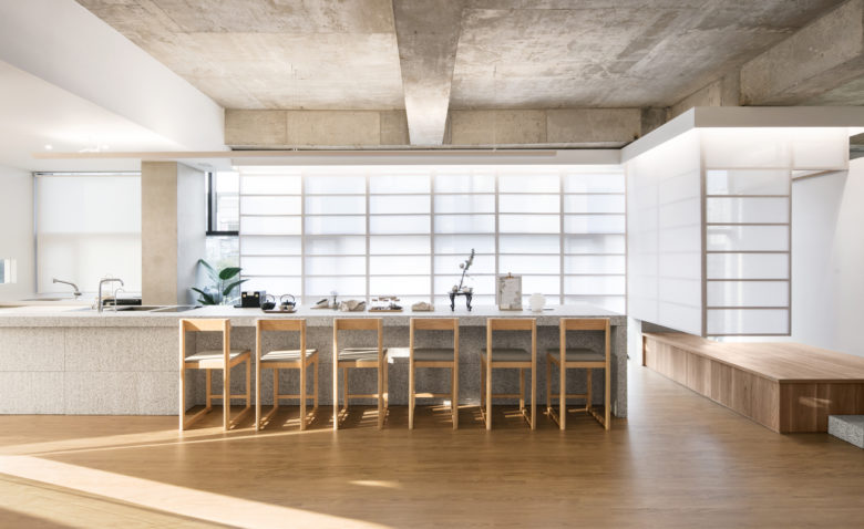
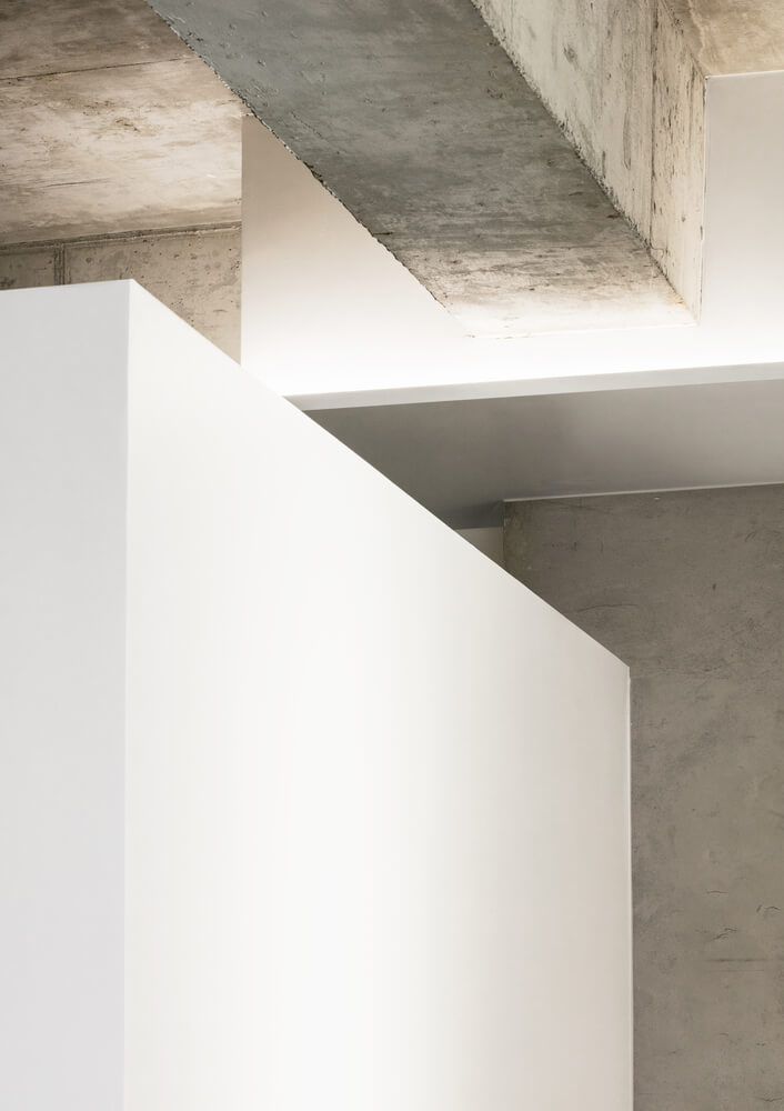
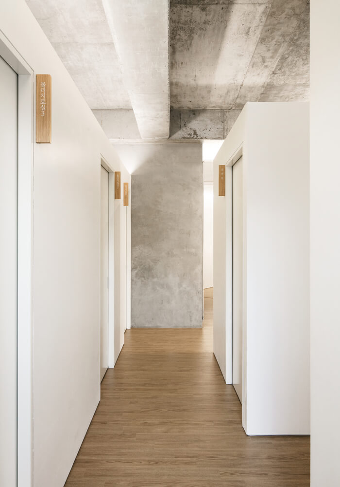
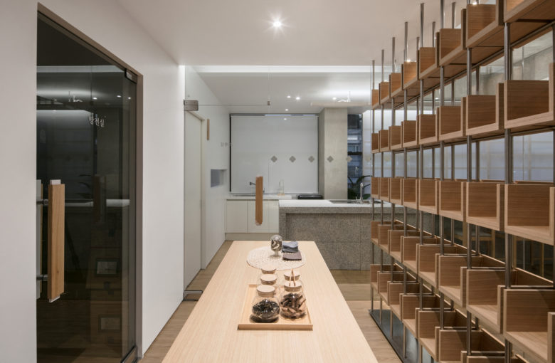
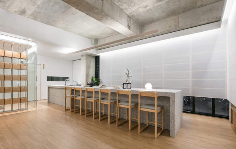
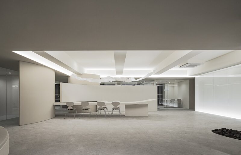
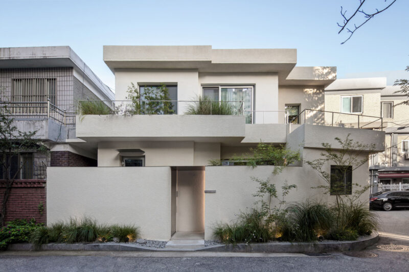
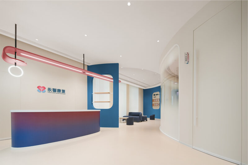
首先是空間的簡化結構。除了功能結構,我們想要取出裝飾結構。我們希望診所的結構所傳達的信息簡潔明了,不需要任何華麗的語言。
To create that feeling, there are three points visualized in the space.
The first is the simplified structure of the space. Except for functional structure, we wanted to take out the structures for decoration. We wanted the message given by the structure of the ‘Aeichi Korean Medical Clinic’ to be concise and simple, that did not need any florid language.
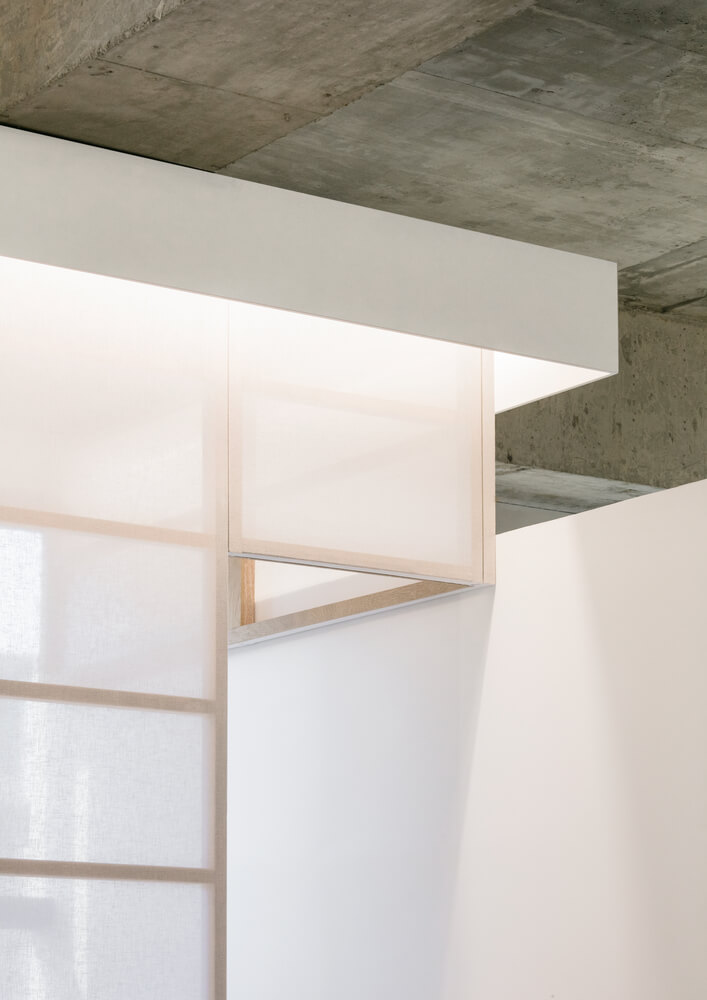
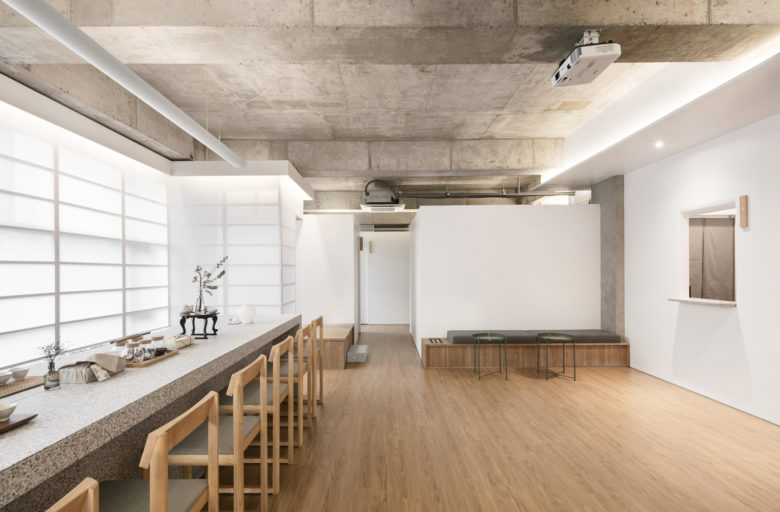
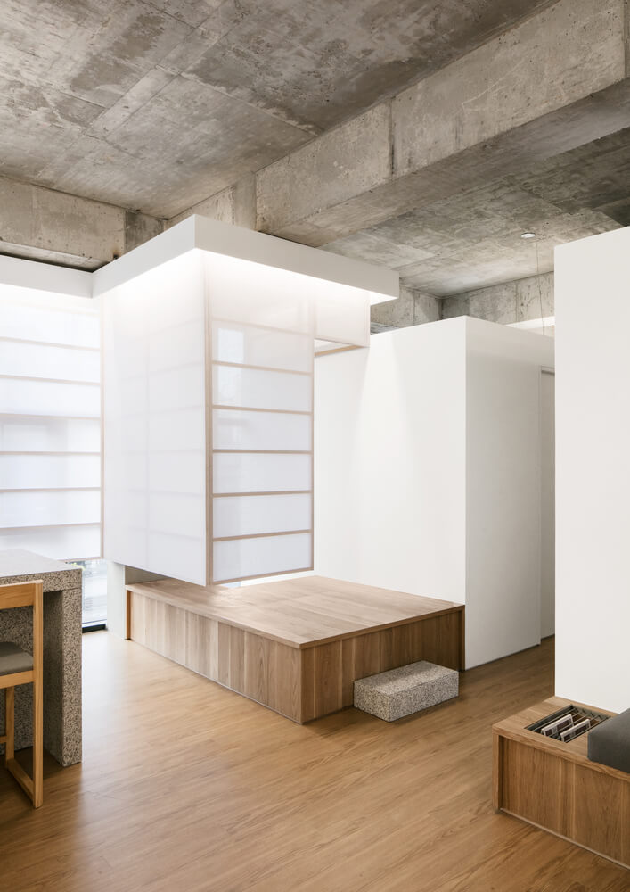
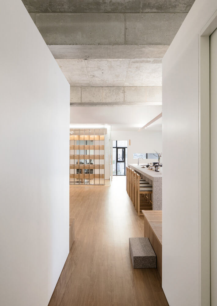
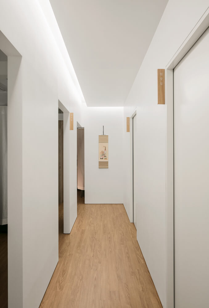
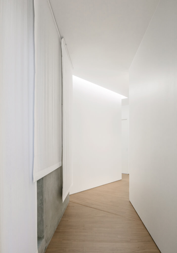
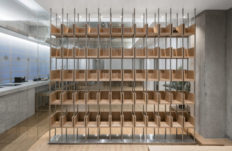
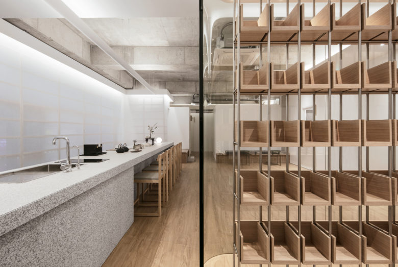
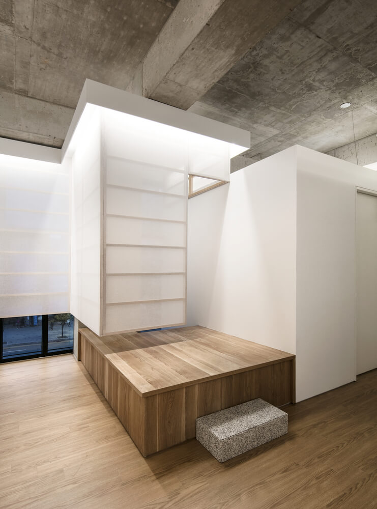
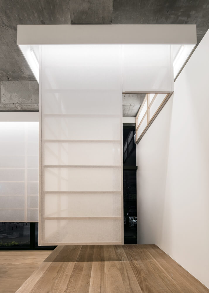
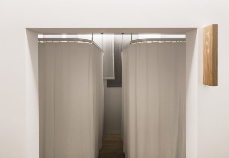
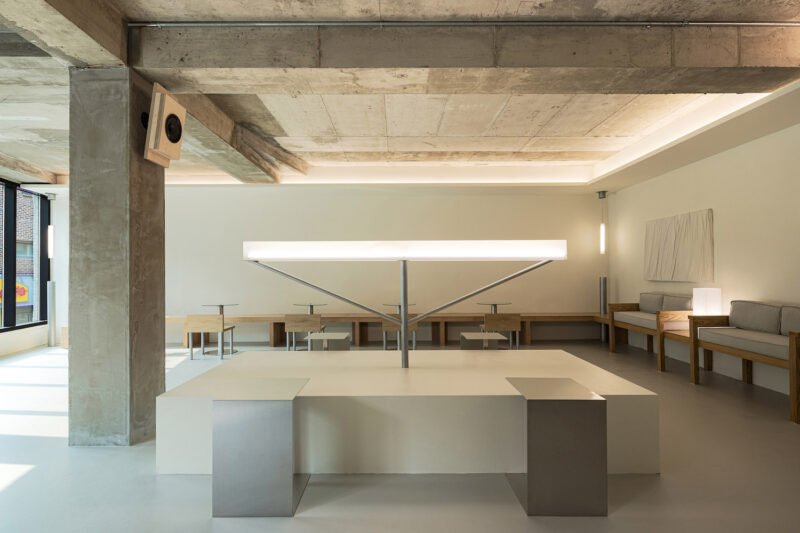
第二個是通信設備。 我們使用物體打開空間並讓光線浸透,以便通過自然地歡迎外部元素,外部光線可以滲透到空間中而不會幹擾生活方式,也可以自然地識別空間中的白天變化。 此外,牆壁部分打開,門被最小化到不影響功能的程度。我希望通過開放部分,能夠形成一種超越空間的情感交流或同情紐帶(即使不是視覺交流)。我認為廣泛地觀察這個空間給了一個額外的元素,帶來了視覺交流的圖像。
And the second is the devices for communication. We used object to open the space and to let light soak in so that by welcoming the outside elements naturally the outside light can permeate into the space without disturbing the lifestyle and also to naturally recognize the changes of the day in the space. In addition, the walls are partially opened and doors are minimized to the extent that they do not harm the function. I hoped that through the open section, an emotional communication or bond of sympathy (even if it is not visual communication) beyond space could form. And I think that looking at the space widely gave an extra element that brought out an image of visual communication.
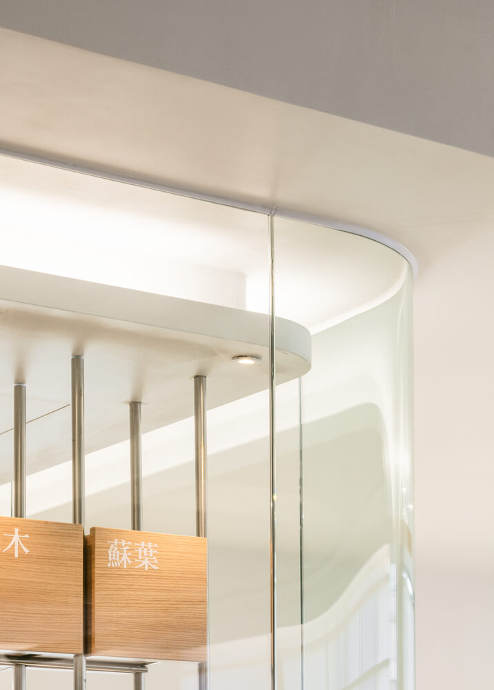
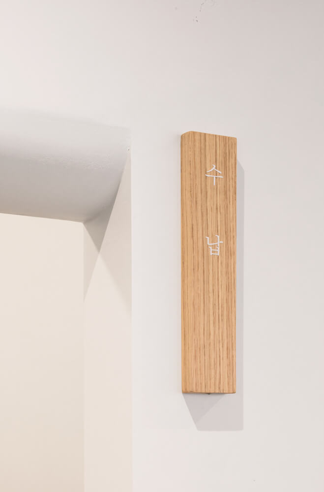
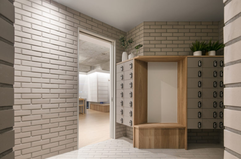
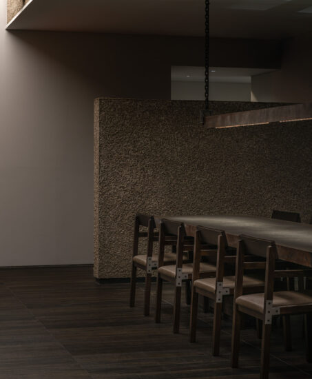
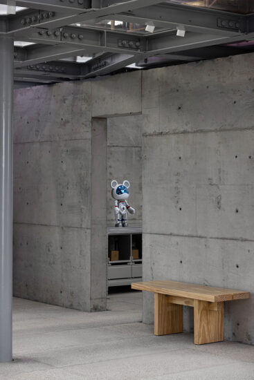
最後,我們使用了一種熟悉的、溫暖的材料,不會讓任何人感到不安。新的和有趣的材料不斷湧現,但我認為熟悉和友好的材料應該符合診所的信息。
Finally, we used a familiar and warm material that isn’t discomforting to anyone. New and interesting materials continue to emerge, but I thought familiar and friendly material corresponded with the message of ‘Aeichi Korean Medical Clinic’.
完整項目信息
項目名稱:
項目位置:日本愛知縣
項目類型:群體住宅/住宅重建
設計公司:studio velocity (Japan)
設計團隊:KENTARO KURIHARA + MIHO IWATSUKI
攝影:studio velocity


