LOFT中國感謝來自 杭州術銳室內設計 的商業案例分享:
男人是一種什麼樣的生物?有時候,男人非常簡單,就如同一個規整的序列,邏輯觀念強,一通到底,規規整整。但男人也同時非常複雜,男人的腦子裏藏著各種數據、萬千成分,也或者藏著整個宇宙,有時候連他們自己也搞不懂自己。
What kind of creature is a man? Sometimes, men are very simple, just like a regular sequence, the logic of the concept of a pass in the end, rules and regulations. But men are also very complicated at the same time. Men’s minds contain all kinds of data, thousands of components, or the whole universe, sometimes even themselves.
但是這種矛盾感,本身是迷人的。偶爾迷糊,偶爾清醒。偶爾認真,偶爾紈絝,捉摸不定,才迫使人去一步步了解。
But this sense of contradiction itself is charming. Occasionally confused, occasionally awake. Occasionally serious, occasional stupid, unpredictable, forcing people to step by step understanding.
有魅力的男人,是棱角分明的,有著距離感、嚴肅感,深邃而卻又散發著致命的吸引力。而其實,再成熟的他們,內心也有彷徨無措,仿佛是一個不知道如何去選擇的、驚慌的小男孩。
所以,男人這種生物,簡單而複雜,規整而繁亂。
Charismatic man, is angular, with a sense of distance, a sense of serious, deep and yet exudes a fatal attraction. And in fact, and then they mature, the heart also have a loss flawless, as if one does not know how to choose, panic little boy.
Therefore, men, such creatures, simple and complex, regular and chaotic.
魅影重重,暗色的調是他的基調。著迷,如同黑夜與銀光,忍不住想要探尋他內心的世界。
他的世界,是一個乾坤。
Phantom heavy, dark tone is his tone. Fascinated, as the night and silver, could not help but want to explore his inner world.
His world is a universe.
該空間性質為男裝店鋪。趨於對後現代的解構主義的理解,設計靈感來源於三組反差性的關鍵詞:矛盾、融合,有序、無序,解構、重組。
The space for men’s clothing shop. Tending to the deconstruction of postmodern understanding, the design inspiration comes from the contrast of three key words: contradiction, integration; orderly, disorderly; deconstruction, restructuring.
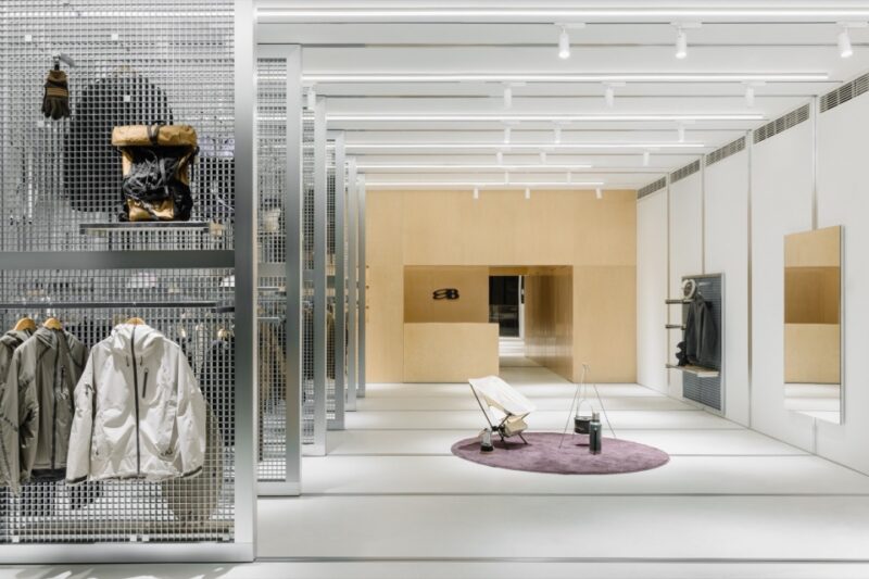
空間特有的純粹寧靜,搭配以理性的手法和低度設計,耐看又帶有less is more 的設計理念,不做線板,讓陳列空間保持利落,簡單,沒有花哨的裝飾博人眼球,但自然形塑的簡約美學又讓人印象深刻。
Unique pure quiet space, with a rational approach and low-level design, patience and with less is more design concept, not board, the exhibition space to keep neat, simple, no fancy decorative blog eye, but naturally Shaping simple aesthetic and impressive.
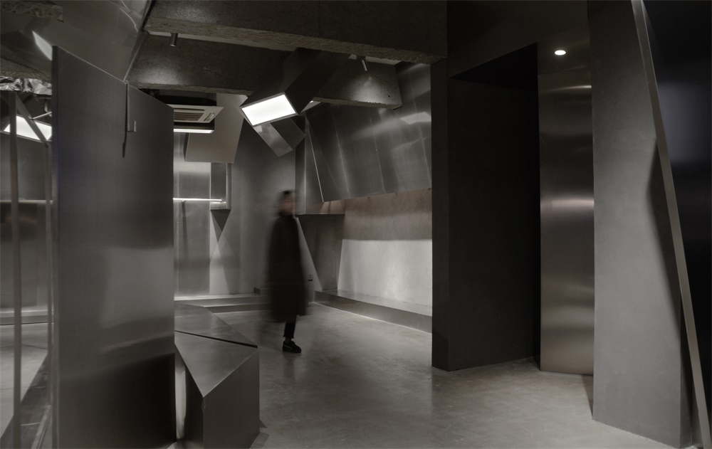
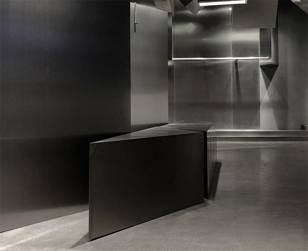
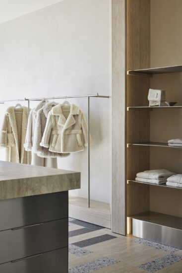
空間展現出的主要材質是不鏽鋼、金鋼水磨石、水泥色藝術漆和原建築的水泥色,色調既是融合,質感既是矛盾衝突。
The main material presented in the space is stainless steel, a steel terrazzo, a cement art paint, and a cement color of the original building. The colors are both blended and the texture is both contradictory.
水泥飽滿的灰度及細膩的質感猶如複製粘貼般真實,但是水泥並不張揚,不喧鬧,不喧賓奪主,像一位隱居的居士一樣,無懼與鬧市融合,也能守得住那份清幽。正如我們一直傳達的設計人文理念一樣,得到最大限度的融合與闡釋,傳遞著高端品質人生的精神,經久不衰,曆久彌新。
Full of grained cement and delicate texture like copy and paste as real, but the cement is not publicity, no noise, not overwhelming, like a seclusion of lay people, fearless and downtown integration, but also keep the share quiet. As we have been conveying the concept of human design, like the same, get the maximum integration and interpretation, delivering the spirit of high-quality life, enduring, everlasting.
水泥在很多時候並不被世人理解,冷冷的基調,做舊的色彩,一種不走尋常路的風格,通過巧妙的設計,水泥則披上了神秘麵紗,賦予時尚、文藝、曆史的厚重感,逆襲成為時尚潮流的前線,對於牆麵,世人厭倦了千篇一律的壁紙,反而水泥給人以最本質的美感,比奢華的裝飾來的更有藝術感,體現自然,不羈,樸實無華的藝術品味。
Cement is often not understood by the world, cold tone, old colors, a style that does not take the unusual way,By clever design, cement is covered with mystery, given the heavy sense of fashion, art, history, fashion has become the front line of counter-attack,for the walls, people are tired of the monotony of wallpaper,Instead, cement gives people the most essential sense of beauty, which is more artistic than luxury and rich decoration, reflecting the natural, uninhibited, unpretentious art tastes.
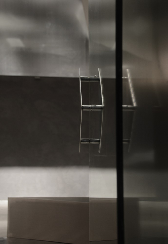
而不鏽鋼和水磨石的材質又為整個空間多了幾分剛強,堅不可摧,矛盾錯雜,又相互連結,不鏽鋼的材質肌理變化非常微妙,表麵經過處理後,複古的工業風味道更濃。
The stainless steel and terrazzo materials for the entire space more than a bit strong, indestructible, contradictory and complicated, but also linked to each other, the texture of stainless steel material changes are very subtle, the surface after treatment, the retro industrial flavor thicker.
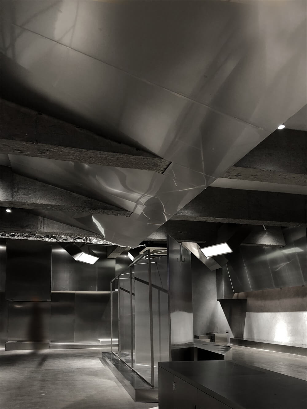
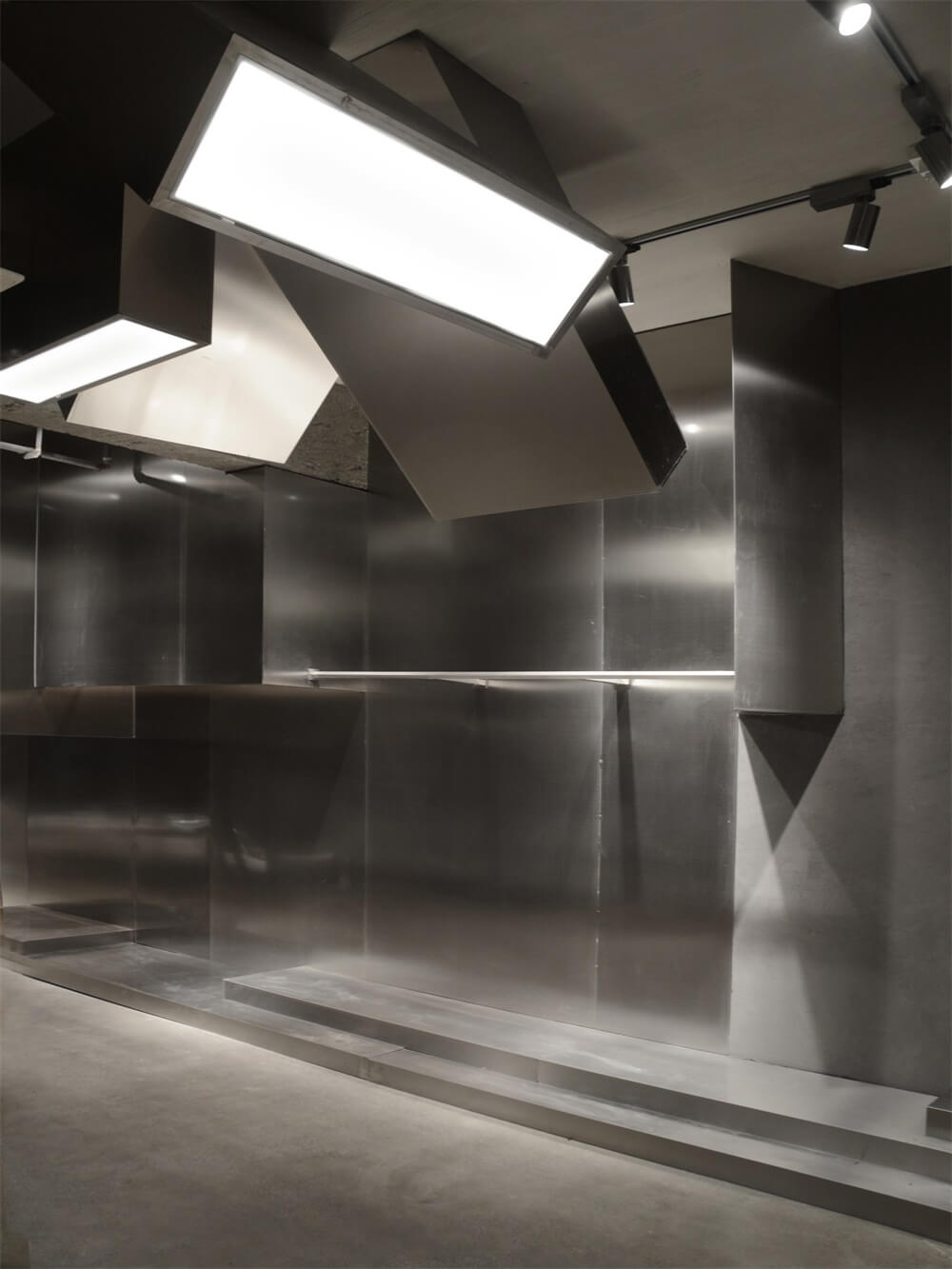
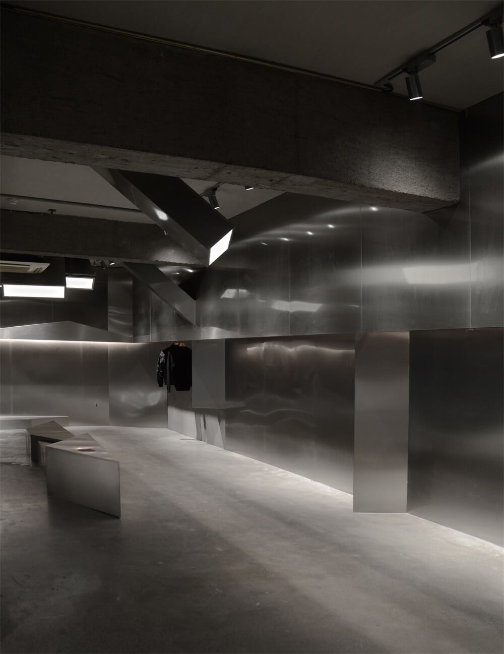
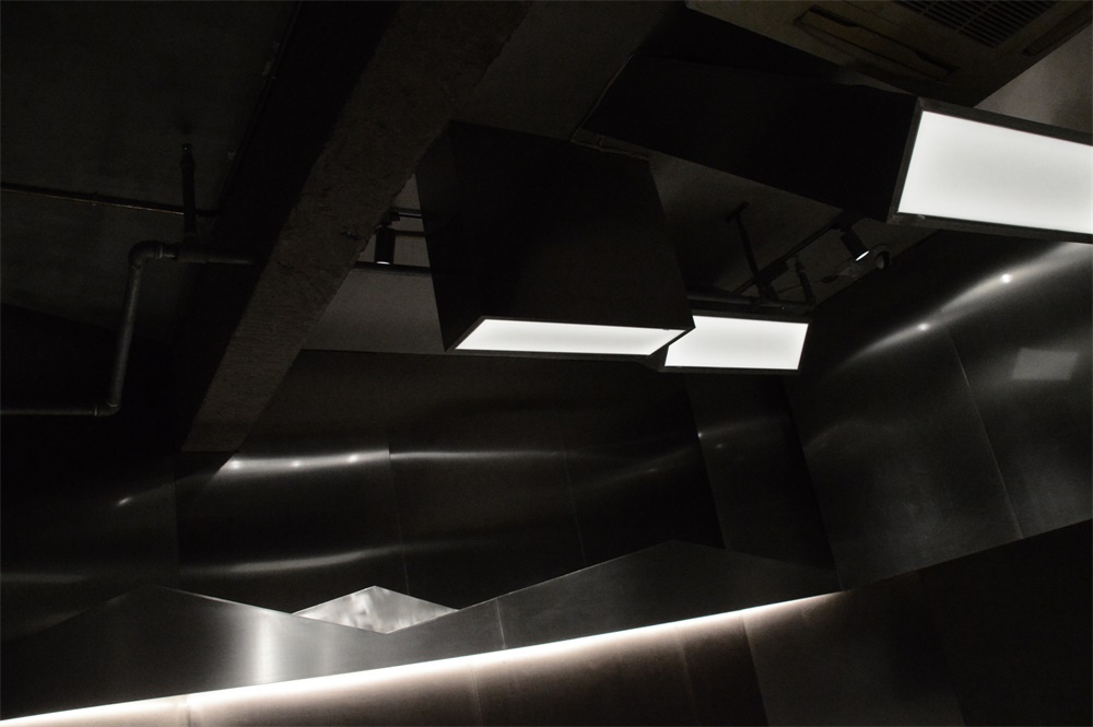
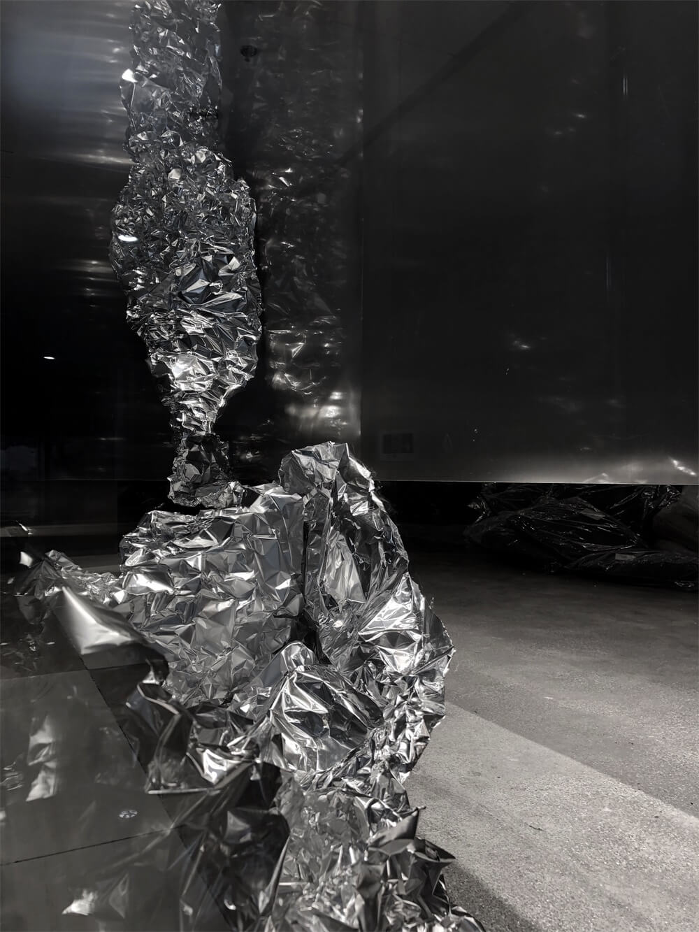
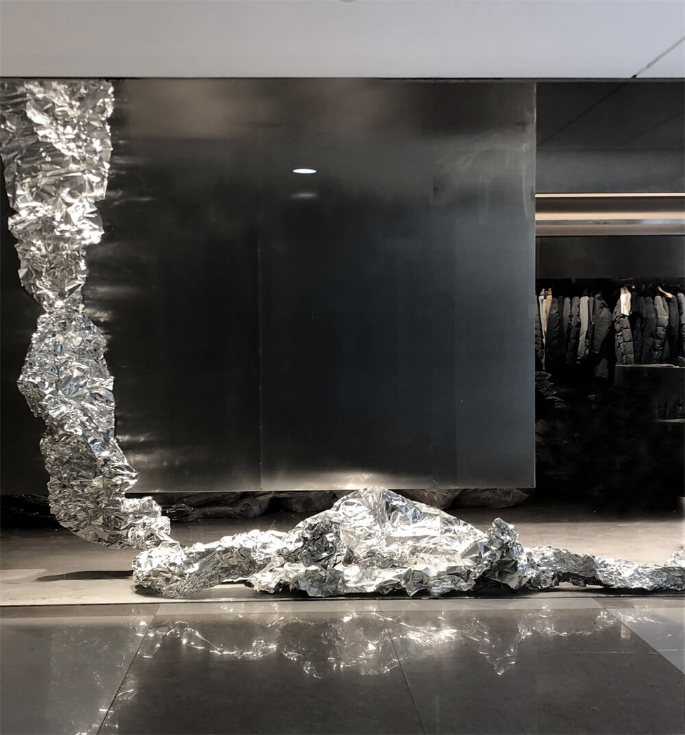
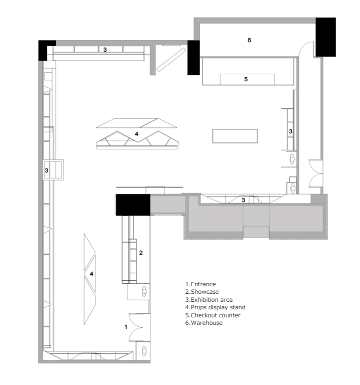
根據規則圖形的先解構再重組,構成店鋪內的道具和頂部的造型結構。不鏽鋼加燈光結構的體塊造型穿插在頂部,與原建築水泥房梁的視覺衝突體現出無序感。不規則的道具排列於空間中又展現出有序的節奏。用光影整合所有的視覺上的複雜矛盾感受,體現更加豐富的秩序淩亂感。室內整體空間由大塊麵的銀灰色牆和立方體,三棱柱的陳列櫃構成,配以銀色管架,再綴以白色塊狀照明,這其中不規則的銀色錫箔,使得空間的點線麵關係明確又不孤立,壁麵的“凹”與地麵的“凸”更是相映成趣,實現了整個空間的豐富與節製。
Deconstruction and reorganization according to the rules of the graphic first, constitute the shop props and the top of the shape of the structure. Stainless steel plus light structure body shape interspersed with the top, with the original building cement beams visual conflict reflects the sense of disorder.Irregular props arranged in space and show an orderly rhythm. Integration with complex and contradictory feelings of light and shadow on all the visual clutter reflect a richer sense of order.The overall interior space consists of large silver wall and cube, triangular prism display cabinet, together with the silver tube rack, then decorated with white block lighting, of which irregular silver tin foil, making the space point-line surface clearly not isolated, the wall of the “concave” with the ground “convex” is side by side to achieve a rich and moderation throughout the space.
完整項目信息
項目名稱:易寫男裝
項目麵積:200㎡
項目位置:中國,杭州
完成時間:2017.12
使用材料:不鏽鋼,水磨石,水泥色藝術漆
項目設計:杭州術銳室內設計有限公司
設計團隊:鄭傑 曾中明 孫淑婷


