Studio Boscardin.Corsi Arquitetura設計了一個名為新型創新微型咖啡館,為巴西的繁忙都市工作者提供一個快速而愉快的地方,讓他們可以享用他們喜愛的飲品。
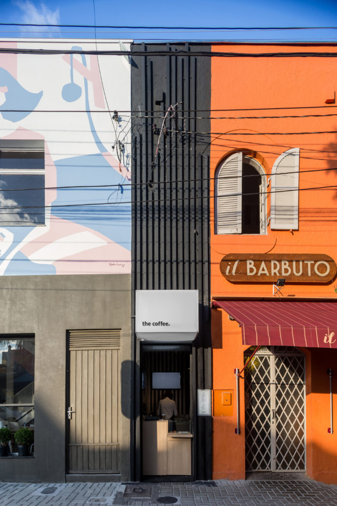
A new and innovative miniature cafe called the coffee has been designed by Studio Boscardin.Corsi Arquitetura to give busy city workers in Brasil a quick but enjoyable place to stop for their favourite beverages.
這個超小型咖啡館的目標是利用非常小的城市空間,同時為都市人提供他們想要和享受的東西。 咖啡是巴西的一家微型咖啡館,采用空間效率和環保材料的理念,建立了一個咖啡館最小化所需的地方,並且可以隨意安排,讓他們在創紀錄的時間內為客戶提供訂單。 步行窗口式服務甚至不需要他們在下次會議途中停下來打開門。
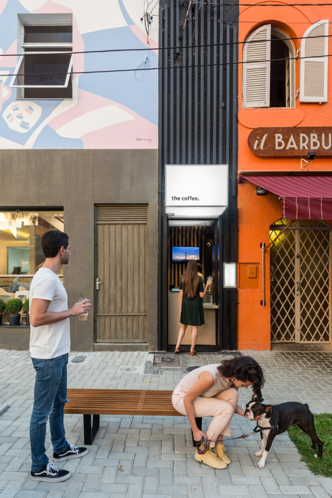
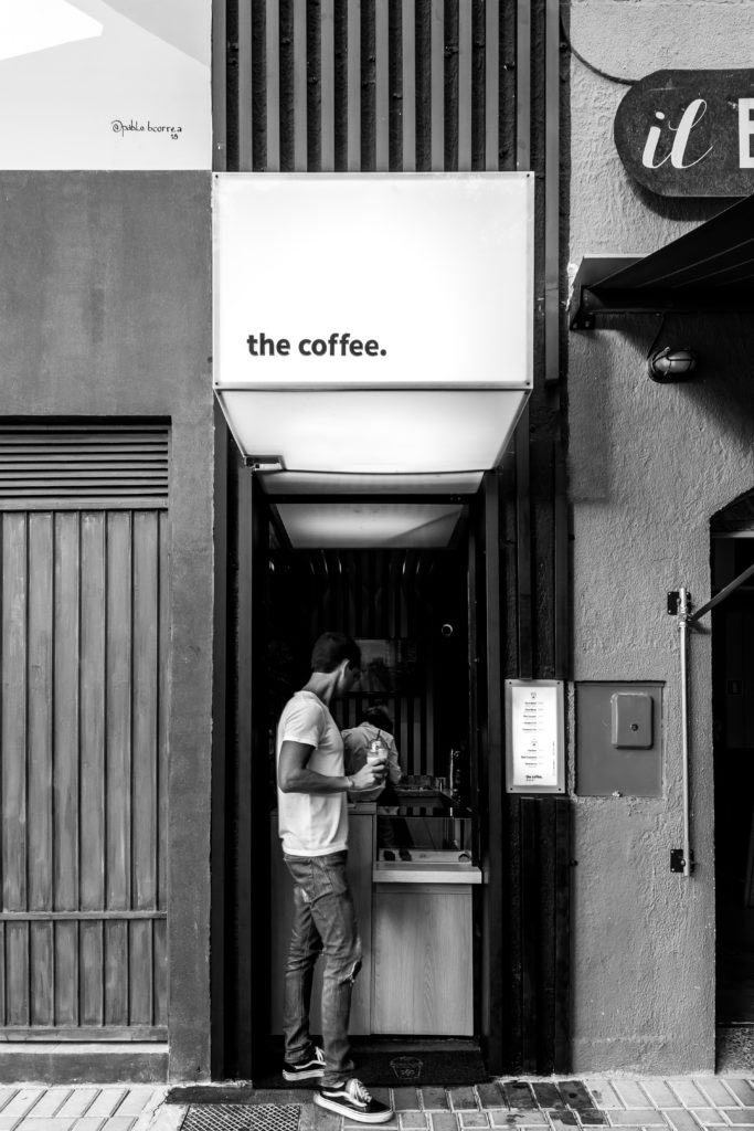
The goal of this ultra tiny cafe was to take advantage of very small urban spaces while also providing urbanites with something they want and enjoy. the coffee, a micro-cafe in Brasil, is built using ideas of space efficiency and eco-friendly materials to establish a place where baristas have what they need in minimum and arranged accessibly, letting them provide customers with their orders in record time thanks to the walk-up window style service that doesn’t even require them to stop and open doors en route to their next meeting.
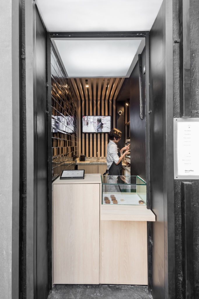
在擁擠不堪、基本上沒有擴張空間的市中心,新商業店鋪的發展空間往往也非常有限。這就是為什麼這個項目團隊決定充分利用存在於古老城市建築的角落和縫隙中的微小空間。他們改造了原先無法使用的小服務門,在兩家餐廳之間沒有優雅和風格的邊緣,並把它變成了一個很有潛力的生意。
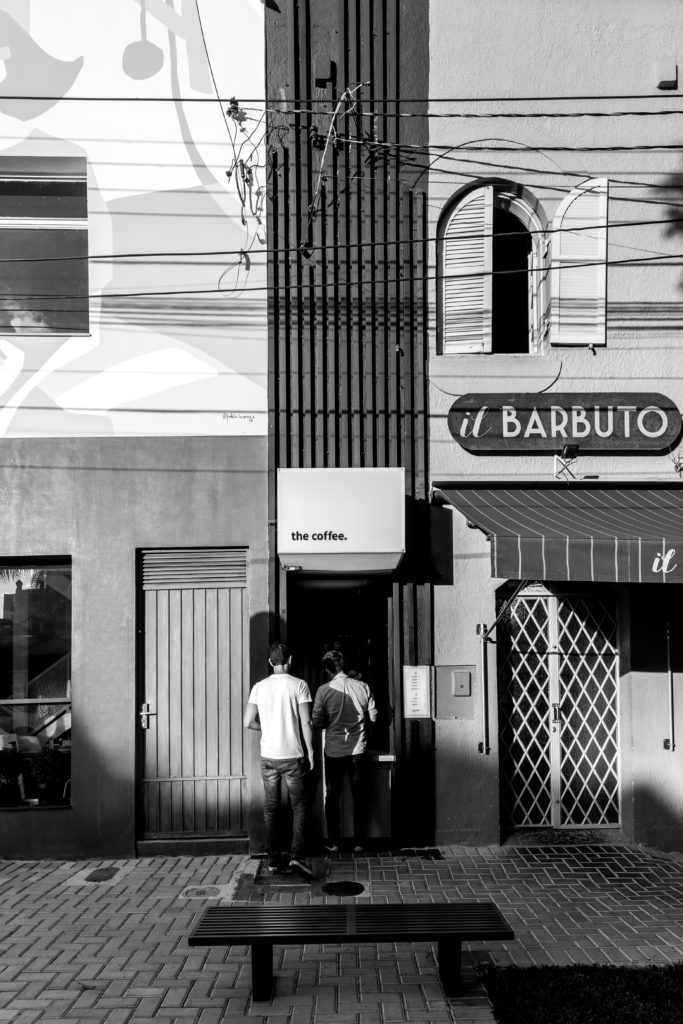
In packed city centres where there is essentially no room for expansion, there is often also very limited room for new businesses. That’s why this project team decided to make full use of what tiny space does exist in the nooks and crannies of old urban architecture. They transformed a small service door that was formerly unusable, edged without grace or style between two restaurants, and turned it into a business with a lot of potential.
咖啡廳的設計和空間組織是基於日本簡單和極簡主義的價值觀。當然,有很多地方可以讓你快速地喝到外帶咖啡,但是這個特殊的行業把這個想法提升到了一個新的高度。隻要拿著你的現金走到室內-室外的窗戶前,喝杯咖啡就可以了,甚至不用穿過裏麵的門廳。
The design and space organization of the coffee was based on Japanese values of simplicity and minimalism. Sure, there are plenty of places that will make you a quick takeaway coffee, but this particular business takes that idea to the next level. Simply walk up to the indoor-outdoor window with your cash and leave with a coffee without even having to walk across an inner foyer!
不過,如果你真的有時間想坐下來,咖啡已經巧妙地安排在了一個公共長椅豐富、城市生活景觀優美的地方。這是一個店麵將自己整合到已經存在的空間中的最終例子。
Just in case you actually do have a moment and you want to take a seat, however, the coffee has strategically placed itself in an area that’s rich in public benches with nice city life views. It’s the ultimate example of a business integrating itself into an already-existent space.
盡管咖啡的物理空間是極簡主義的,隻留下絕對實用和必要的空間,但該店麵的立麵並沒有在街上消失。部分原因是,設計師選擇在視覺上向上建造,而不是向外擴張。因此,窗戶和指示牌都很高,無論空間多麼狹小,從人行道上都能看到它們,也很有趣。
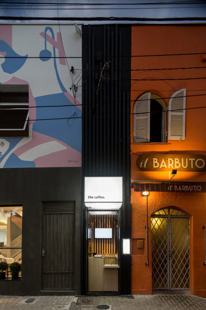
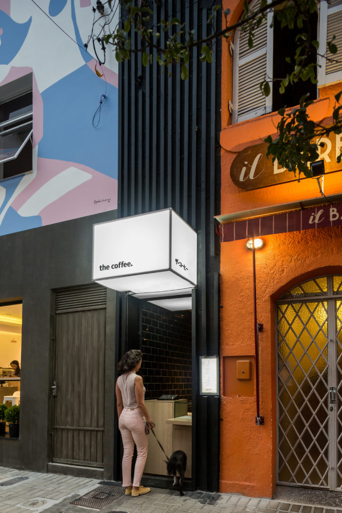
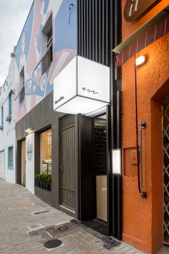
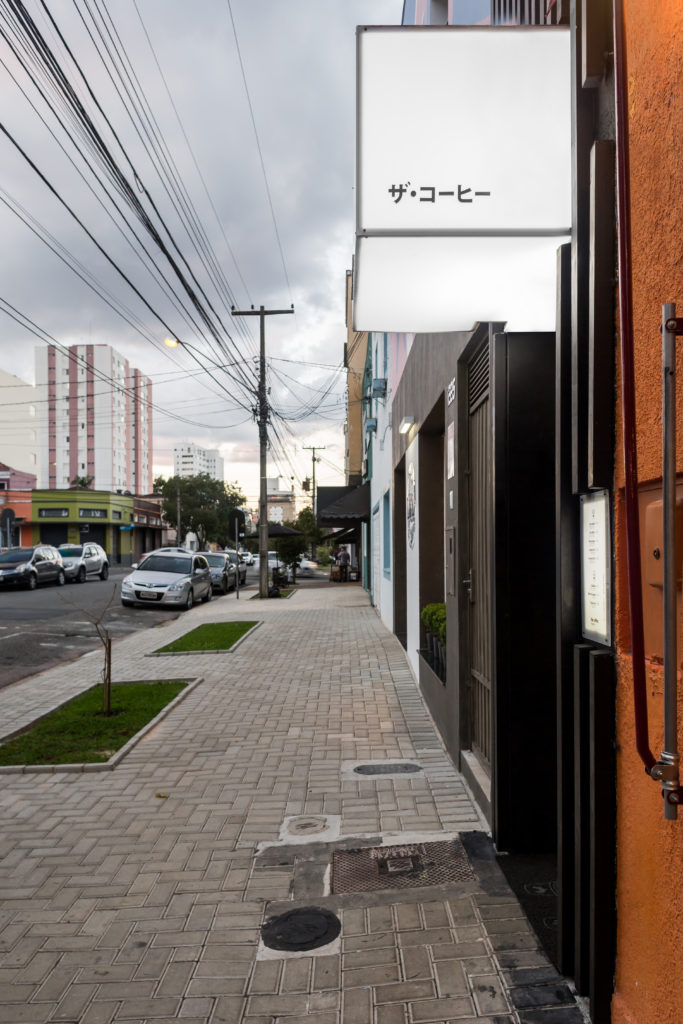
Despite the physical space of the coffee being minimalist and leaving room only for what’s absolutely functional and necessary, the business’s facade is not lost on the street. Part of what makes it fit so well into the tiny urban space is the designers choice to visually build upwards, rather than expanding outwards. As such, the window and the signage reach high, making them visible and interesting from the sidewalk regardless of the narrow space.
超現代的風格也幫助店麵從其他建築中脫穎而出。設計師使用了純白色的配色方案和光線,以及金屬、木材和亞克力,創造了一個非常明亮的空間,並從大多數城市的大量灰色混凝土和汙跡玻璃中直觀地勾勒出這個空間。
Ultra modern styling also helps the business stand out from the other buildings. Designers used stark white colour schemes and light, as well as metal, wood, and acrylic, to create a space that is very well lit and visually delineated from the abundance of grey concrete and smudged glass most cities are home to.
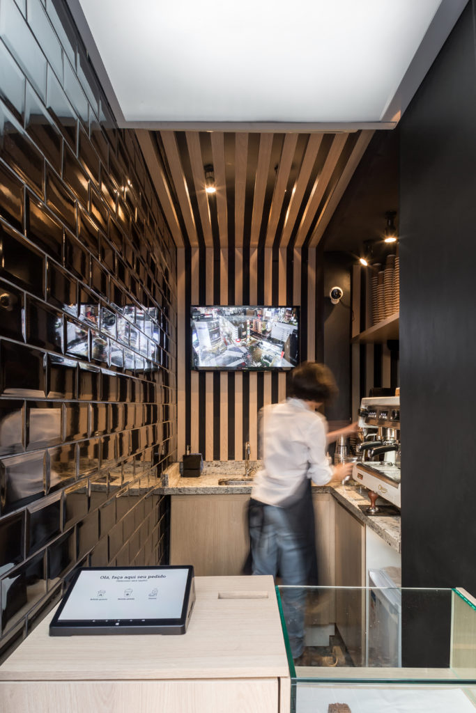
在室內,咖啡廳的空間隻有三平方米,留給有限的可能性,一個功能布局,實際上為客戶提供了快速、優質的服務。設計師非常小心地放置咖啡師的工具和要求,確保幾乎不需要移動。所有的東西都在手邊,咖啡師甚至很少會背對著窗戶和顧客!
Inside, the coffee exists in a space of only three square metres, leaving limited possibilities for a functional layout that actually provides customers with a quick, quality service. Designers were careful to place the barista’s tools and requirements just so, making sure very little movement is required. Everything is always at hand and the barista rarely even has to turn their back on the window and their customers!
顧客在平板電腦上下單,這意味著顧客在選擇飲料和等待的過程中總是在移動,而不是在咖啡師結賬、處理和下單的過程中陷入長隊。咖啡師專注於他們的工作和產品的質量,而顧客則享受著咖啡廳窗外的城市空間。由於其對小空間的獨特使用,這使得業務不僅僅是架構上的創新;這也是一種獨特的體驗!
Orders are placed on a tablet, meaning that customers are always in motion while they choose their beverage and wait, rather than getting caught in long lines while the barista rings up, processes, and makes their order. The barista concentrates on their tasks and the quality of their product while customers enjoy the urban space outside the coffee’s window. This renders the business more than just an innovation in architecture thanks to its unique use of small spaces; it’s also a unique experience!
完整項目信息
項目名稱:巴西Ultra Modern Walk-Up Cafe
項目類型:餐飲空間丨咖啡廳
項目位置:巴西
完成時間:2018
項目設計: Boscardin.Corsi Arquitetura
使用材料:金屬、木材、亞克力、瓷磚
攝影:Eduardo Macarios


