新的一年已經到來,各大油漆製造商和色彩預測機構已經推出了各自的2019年年度色彩。從冷灰色到溫暖的赤褐色,再到橙色的色彩範圍,這五種顏色趨勢有望在2019年主導設計和製造行業。
1.Sherwin-Williams——Cavern Clay SW 7701
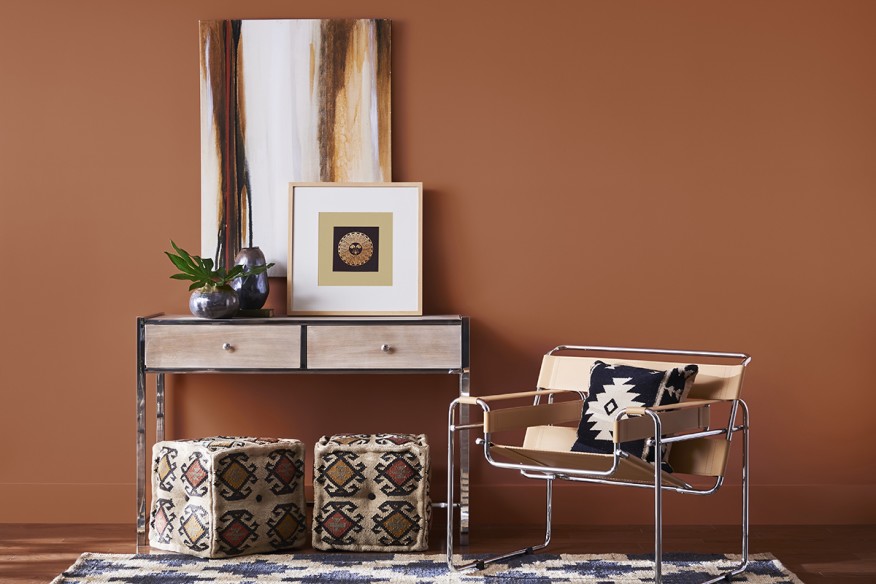
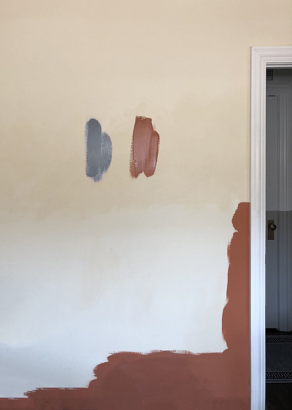
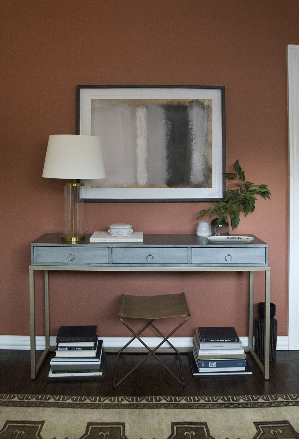
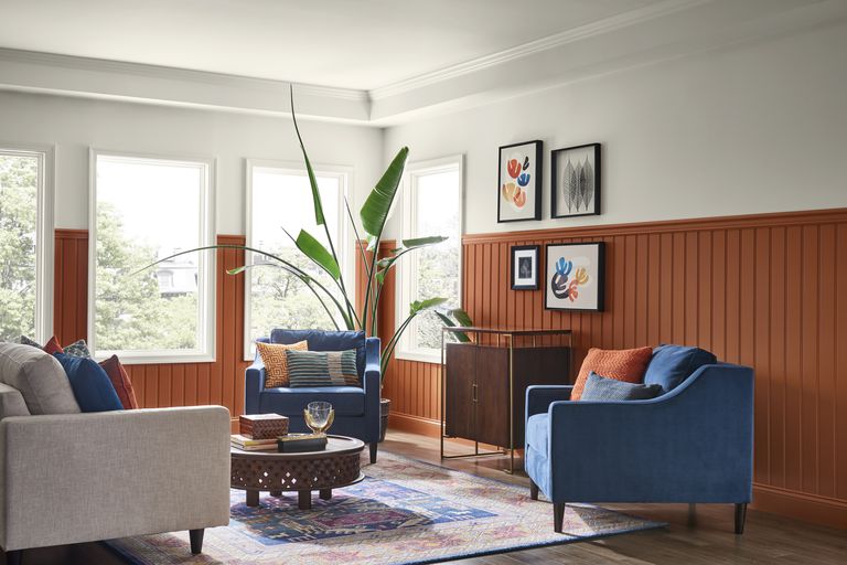
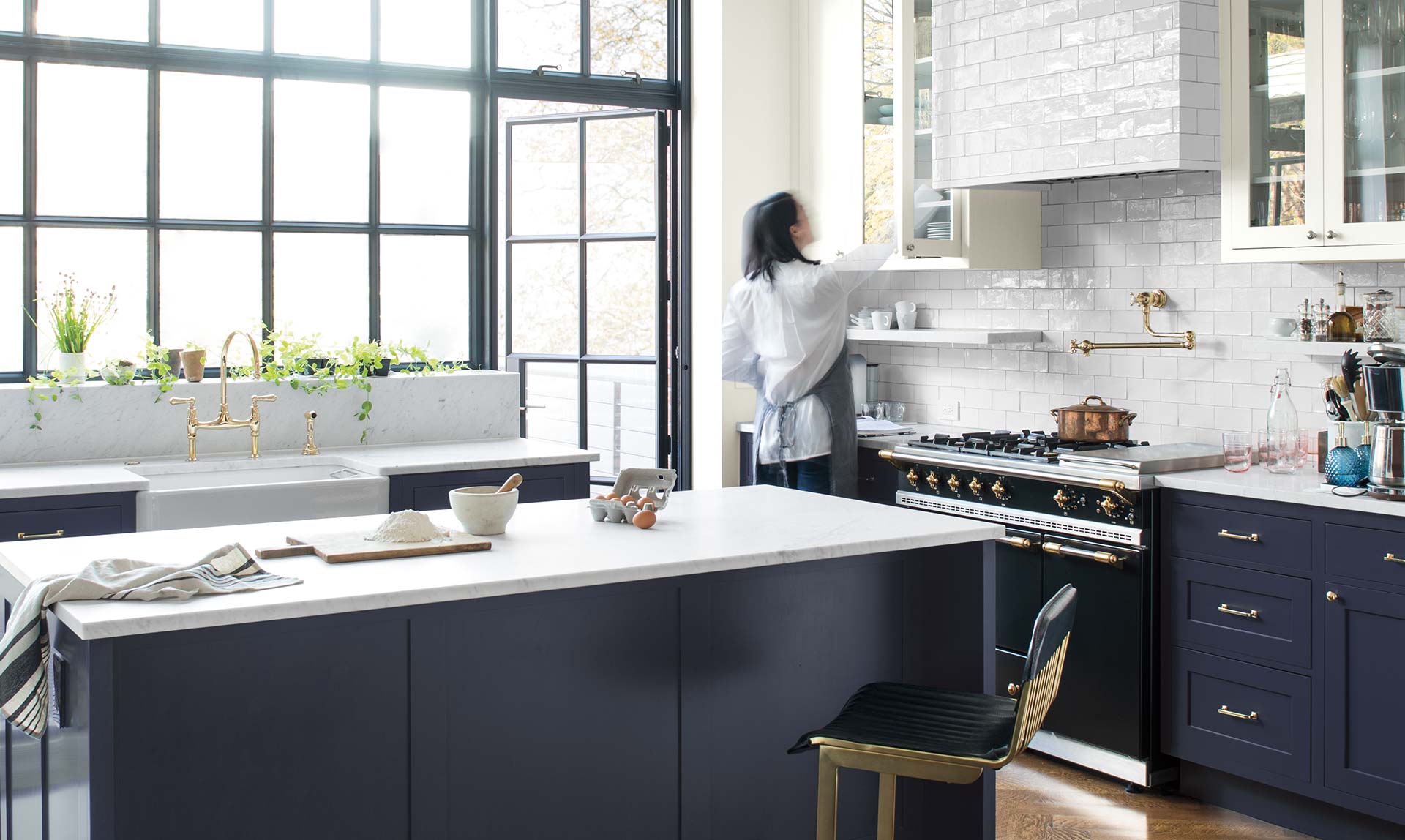
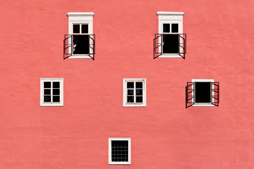
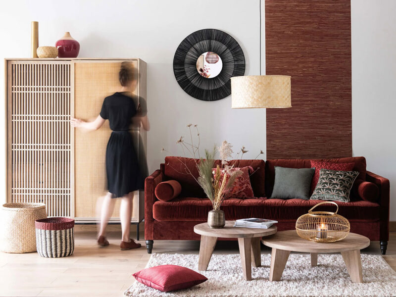
Sherwin-Williams對2019年度色彩的描述是向世紀中期的現代風格致敬。“Cavern Clay代表著重生,簡約,自由奔放和波西米亞風格。”Sherwin-Williams的色彩營銷總監Sue Wadden說。這種溫暖的陶土色調是接地氣的,受歡迎的,精致的,並與溫暖的灰色、深褐色、中音藍色,和溫暖的中性色很好地搭配。
“A nod to mid-century modern style” is how Sherwin-Williams describes its 2019 color of the year. “Cavern Clay embodies renewal, simplicity, and free-spirited, bohemian flair,” says Sherwin-Williams’ director of color marketing Sue Wadden.This warm, terra-cotta hue is down to earth, welcoming, and refined, and pairs well with warm grays, deep browns, mid-tone blues, and warm neutrals.
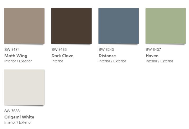
Sherwin-Williams建議將這種顏色與Moth Wing SW 9174(溫暖灰褐色),Dark Clove SW 9183(深棕色),Distance SW 6243(平靜藍色)或Origami White SW 7636(中性白色)一起使用,以創造平衡,內部或外部空間的精致外觀。
Sherwin-Williams recommends using this color with Moth Wing SW 9174 (warm taupe), Dark Clove SW 9183 (deep brown), Distance SW 6243 (rich, calming blue), or Origami White SW 7636 (neutral white) to create a balanced, sophisticated look in interior or exterior spaces.
2.behr——Mid-tone Blues
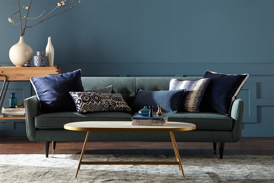
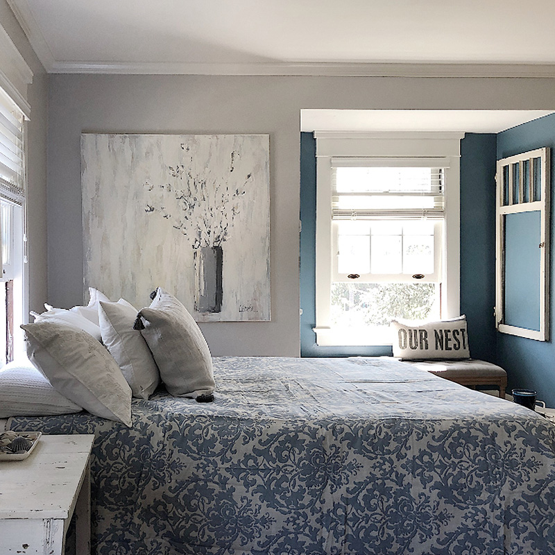
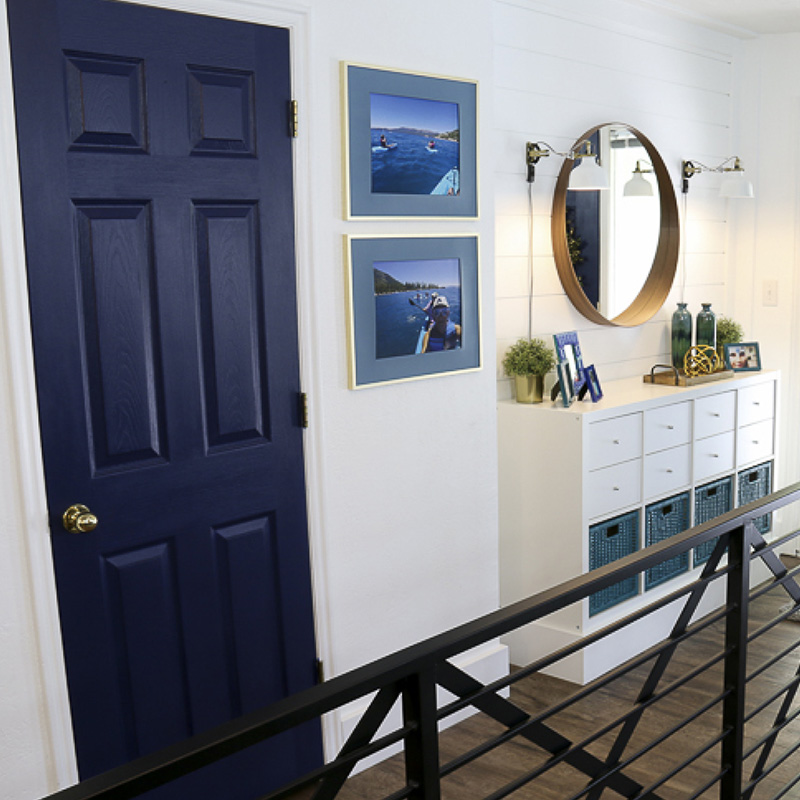
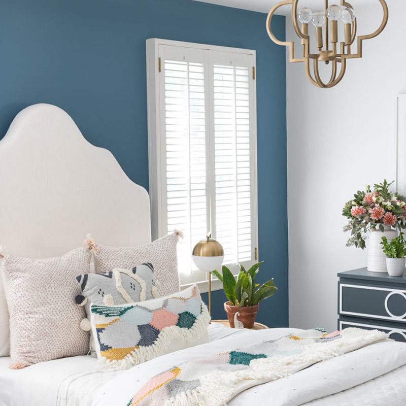
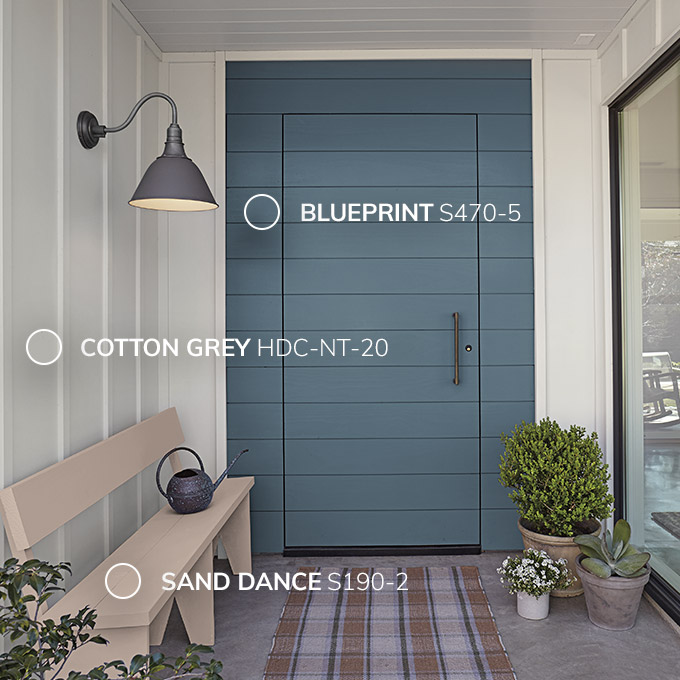
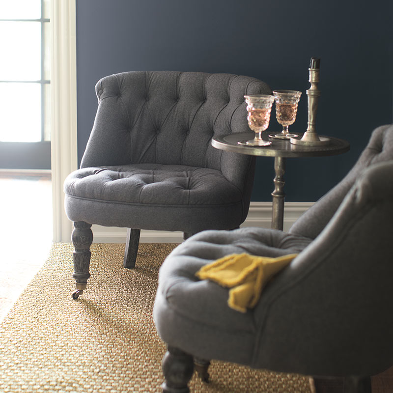
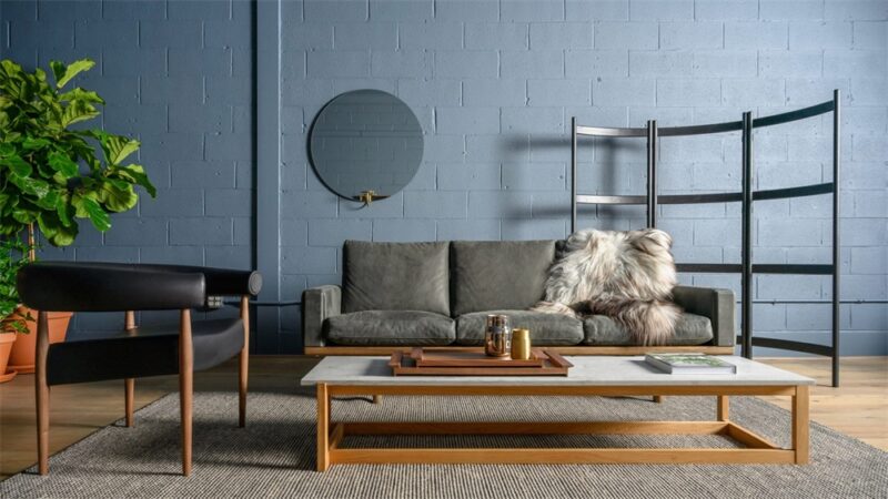
Behr的2019年度色彩旨在代表永恒,現代,平易近人,平靜。“這款中等色調的牛仔布藍色可以讓全國各地的房主和公寓居民可以輕鬆重新構想他們的空間。”Behr首席營銷官Jodi Allen說。
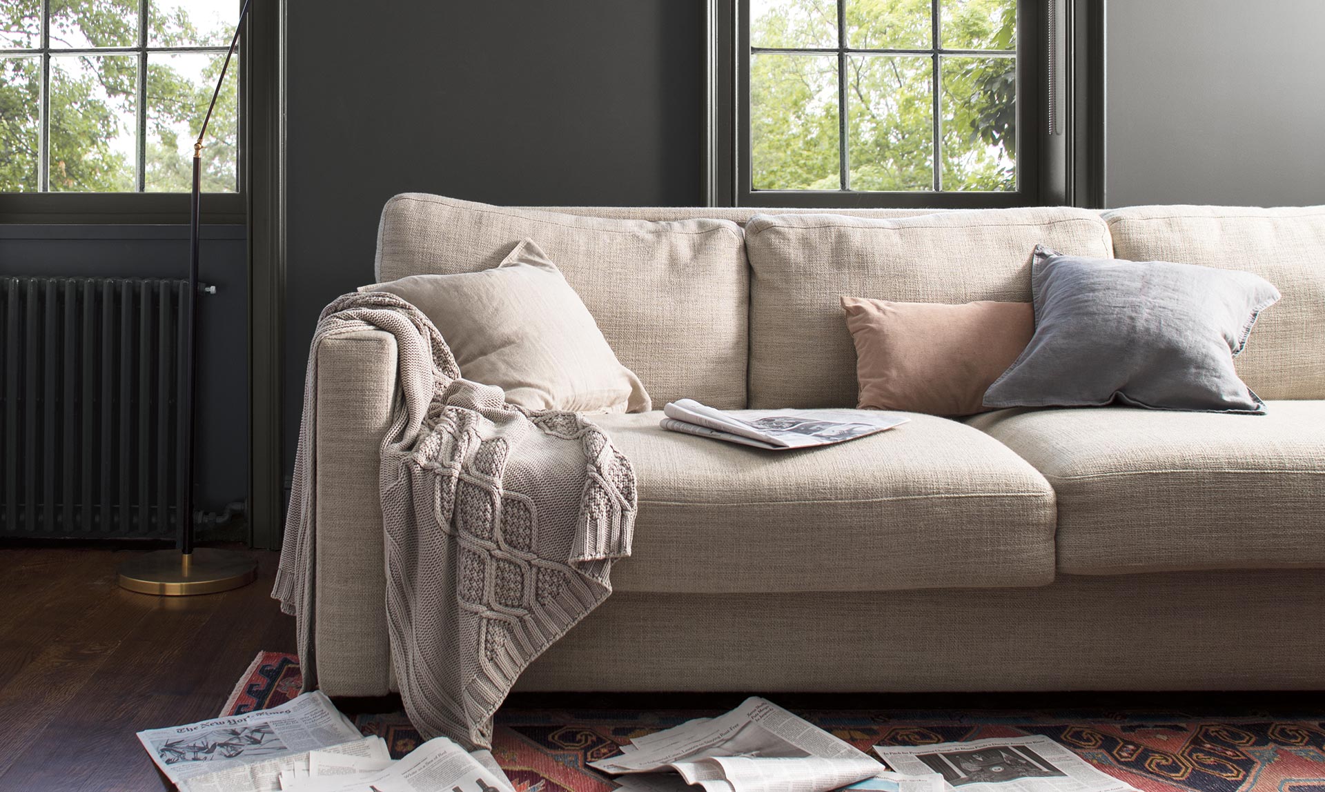
Behr’s color of 2019 aims to be timeless, modern, approachable, and calming. This mid-toned denim blue “makes it easy for homeowners and apartment dwellers across the country to reimagine their space,” says Behr chief marketing officer Jodi Allen.
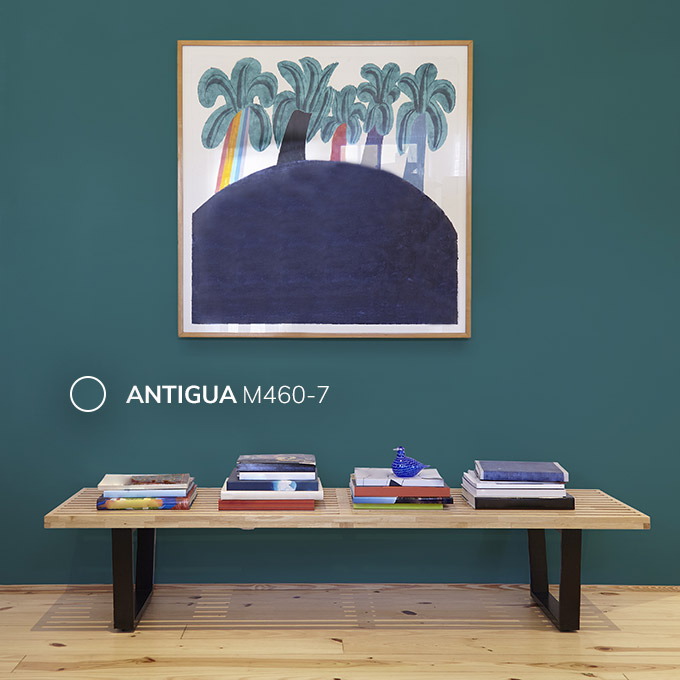
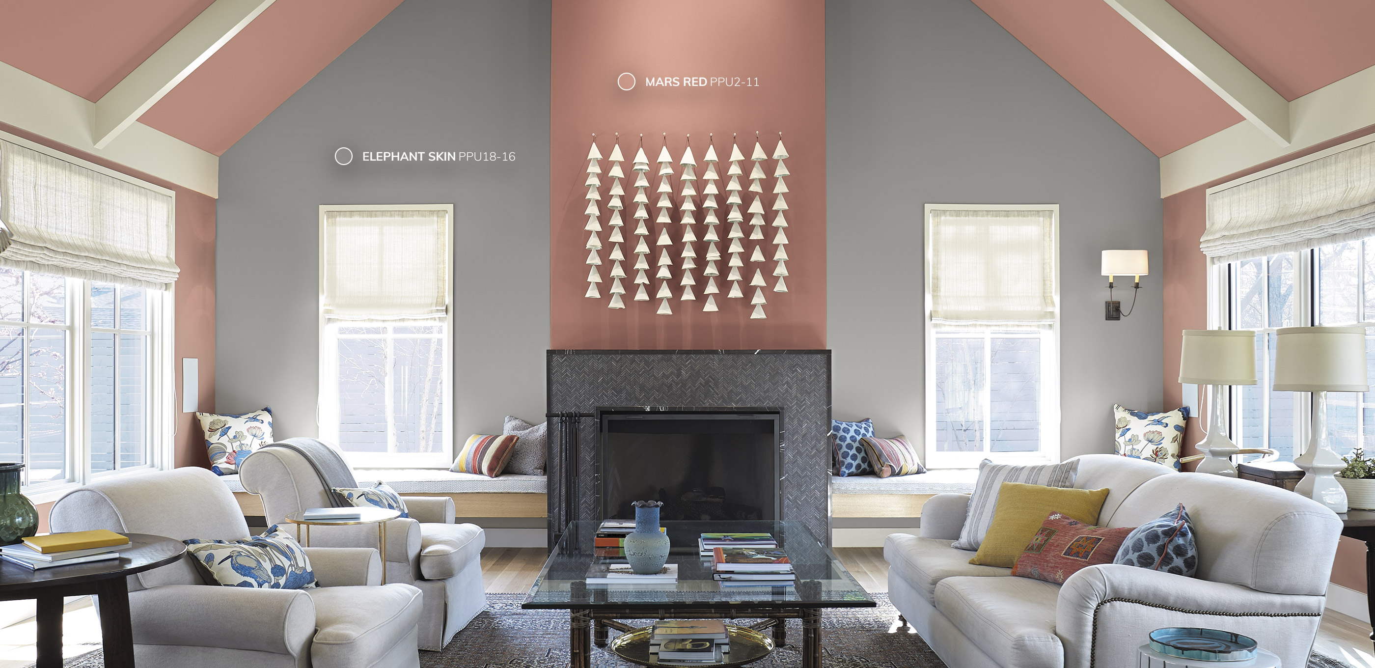
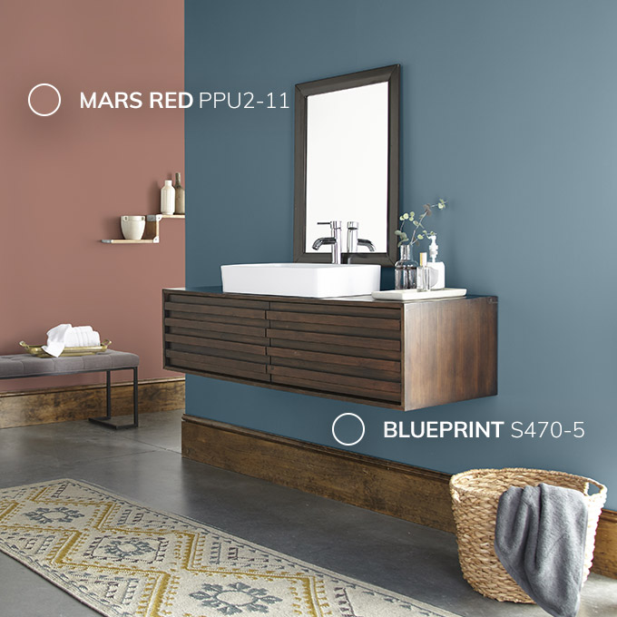
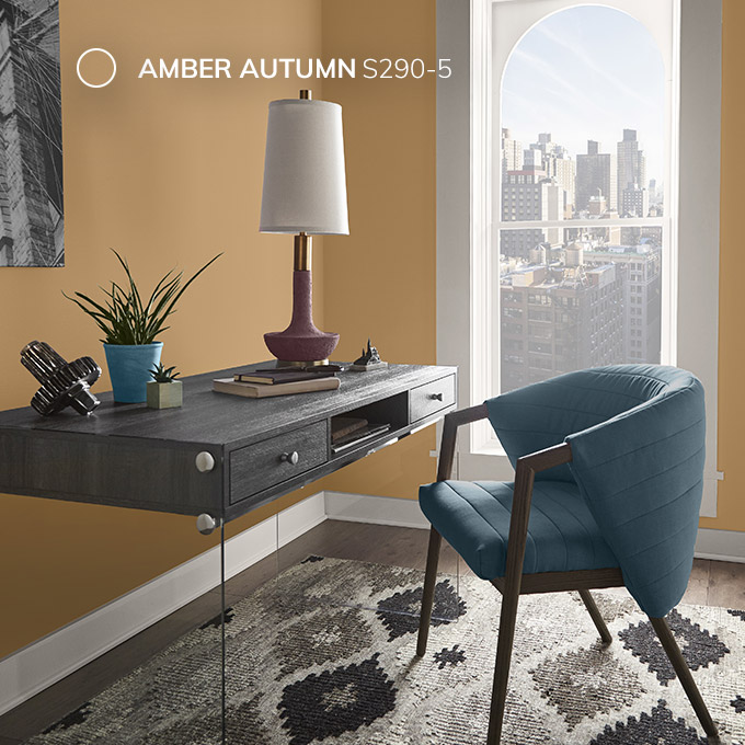
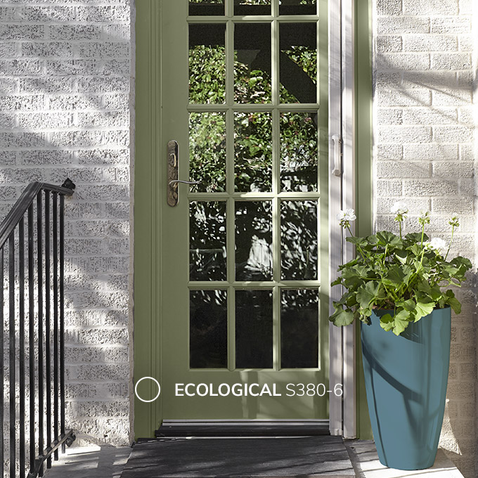
為了增加深度和多功能性,Behr建議將Blueprint與Amber Autumn S290-5(溫暖的金色米色),Ecological S380-6(柔軟、溫暖的綠色),Elephant Skin PPU18-16(溫暖的中調灰褐色),Sand Dance S190-2(溫暖的桃紅色)和 Antigua M460-7(鮮豔的藍綠色)配對。
To add depth and versatility, Behr suggests pairing Blueprint with Amber Autumn S290-5 (warm, golden beige), Ecological S380-6 (soft, warm green), Elephant Skin PPU18-16 (warm, mid-toned taupe), Sand Dance S190-2 (warm, peachy-pink), and Antigua M460-7 (vibrant blue-green).
3.Benjamin Moore——Calm Grays
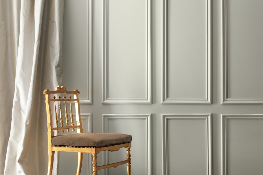
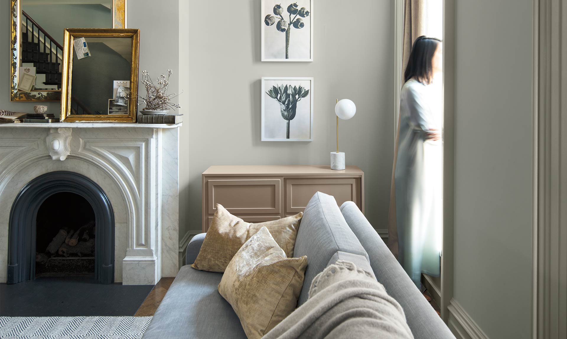
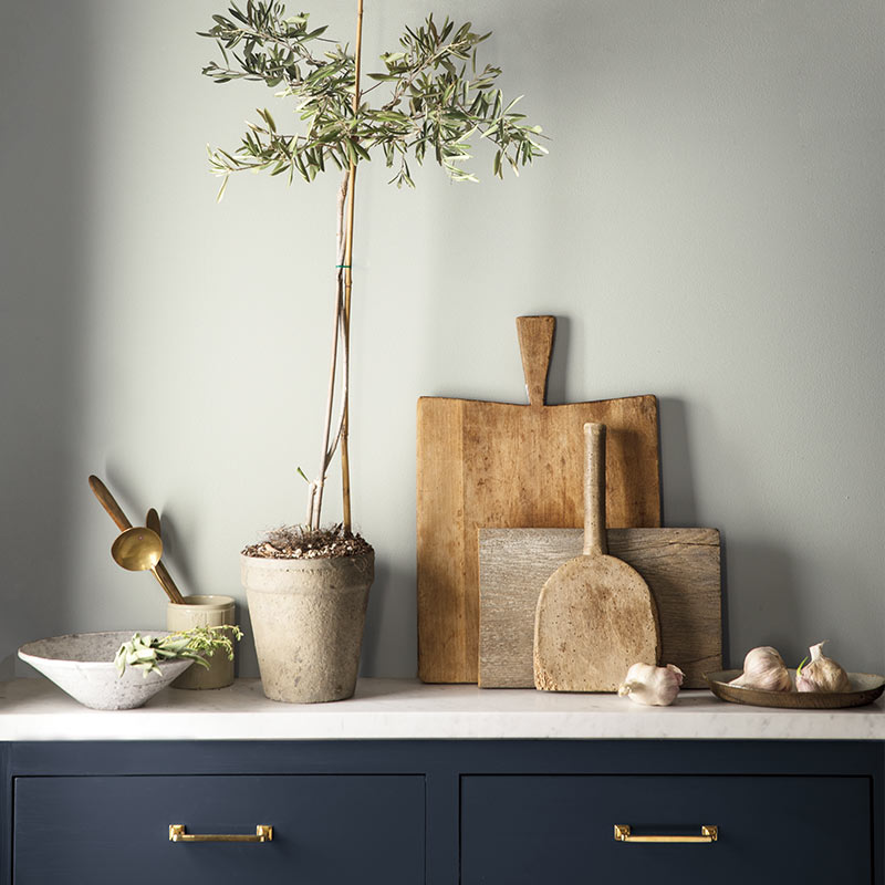
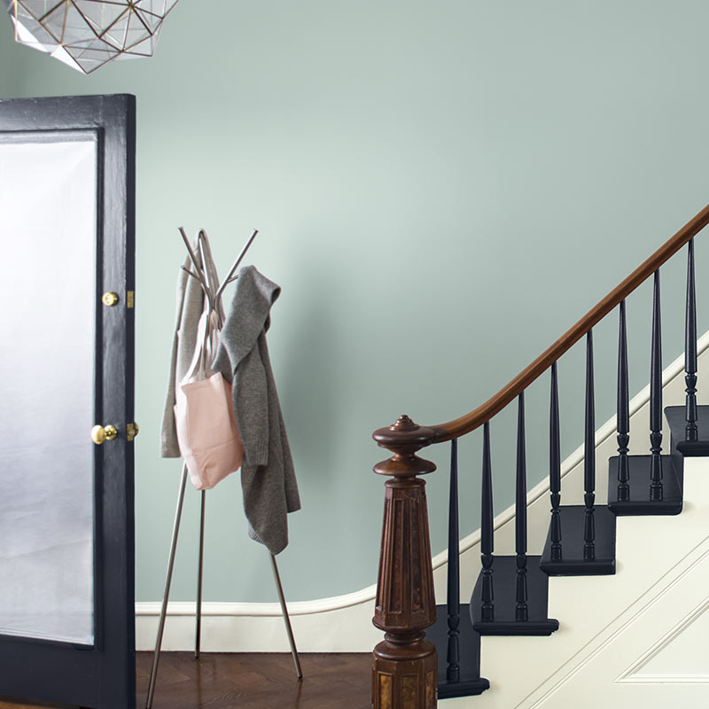
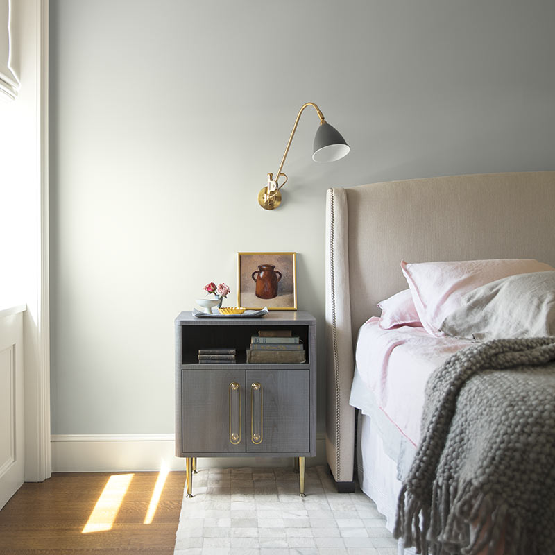
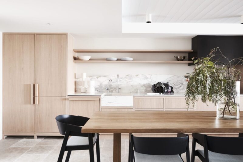
這一淡灰色帶著冷靜的色調是Benjamin Moore的2019年度流行色。這種灰色的內在寧靜有助於在室內空間中創造一種舒緩和通風的感覺,或在外觀上創造一種複雜的外觀。
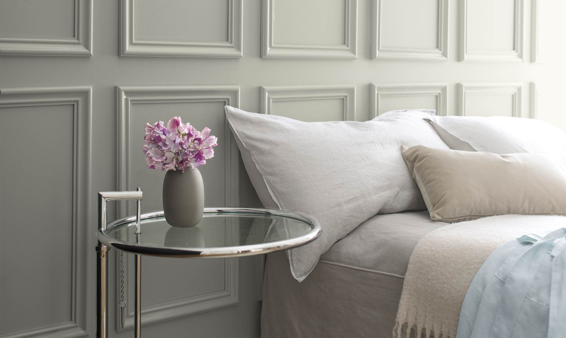
This light gray hue with cool undertones is Benjamin Moore’s color of the year. The inherent serenity of this gray helps create a soothing and airy feeling in interior spaces or a sophisticated look on exteriors.
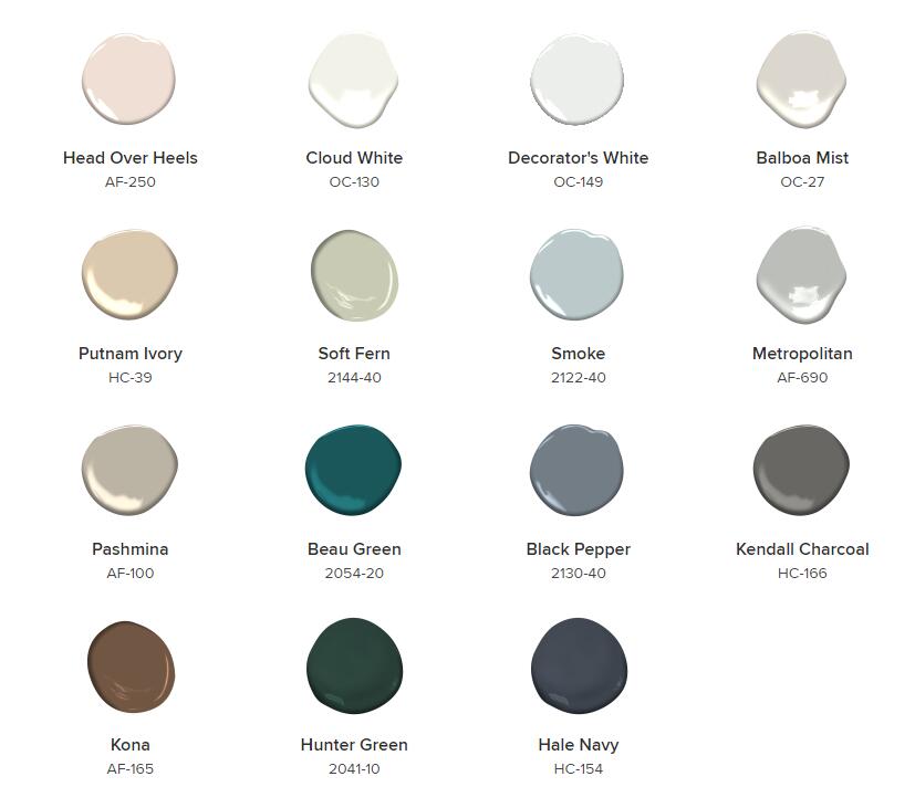
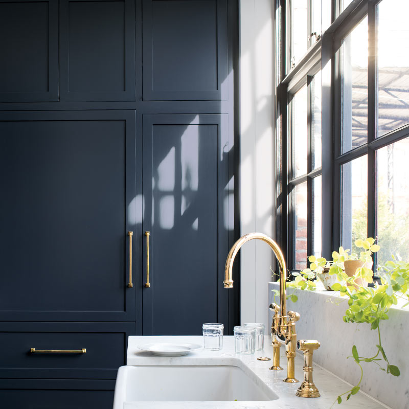
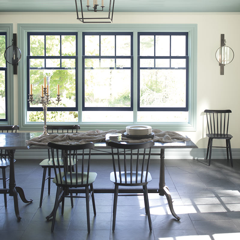
Benjamin Moore與大都會藝術博物館(Metropolitan)一道,推出了15種和諧的色調,與它的年度色彩互補。像是帶有金屬色調和海軍藍的顏色,如黑爾海軍藍HC-154,飽和的經典綠色,如亨特綠2041-10,或豐富的木炭灰色,如肯德爾木炭HC-166。
“It’s a color in the neutral spectrum that references a contemplative state of mind and design,” says Benjamin Moore director of strategic design intelligence Ellen O’Neill. Along with the Metropolitan, Benjamin Moore has introduced a palette of 15 harmonious colors that complement its color of the year. Benjamin Moore suggests pairing Metropolitan with metallic accents and a navy blue color such as Hale Navy HC-154, a saturated classic green such as Hunter Green 2041-10, or a rich charcoal gray such as Kendall Charcoal HC-166.
4.PPG——Classic Greens
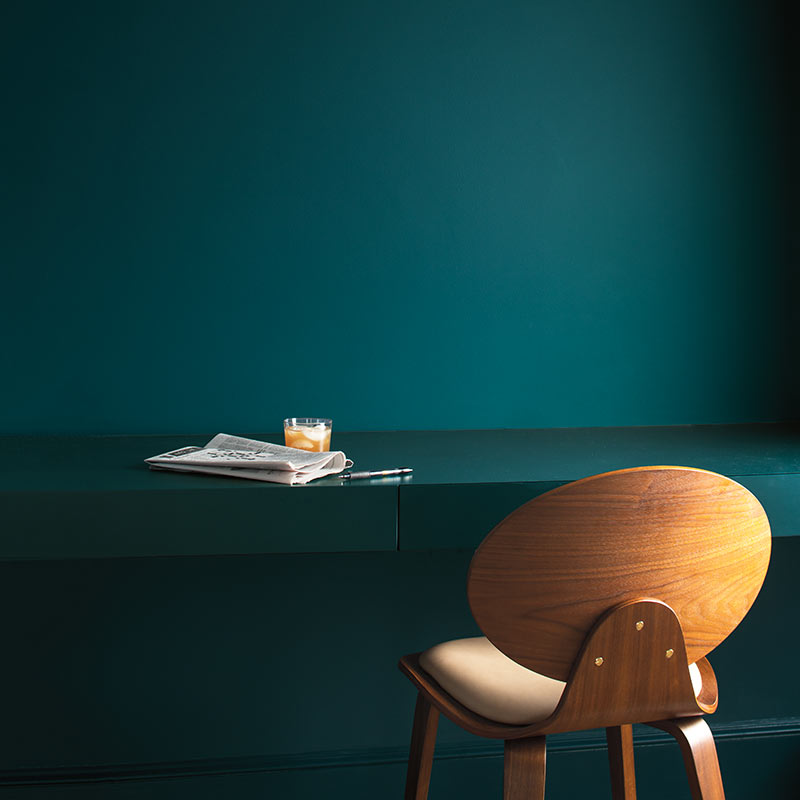
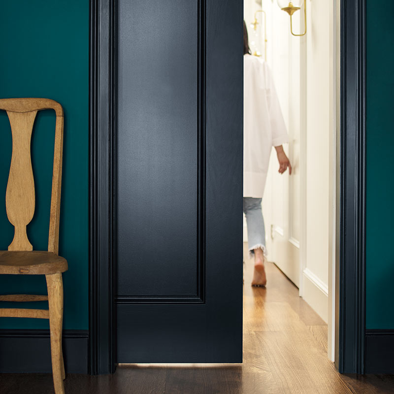
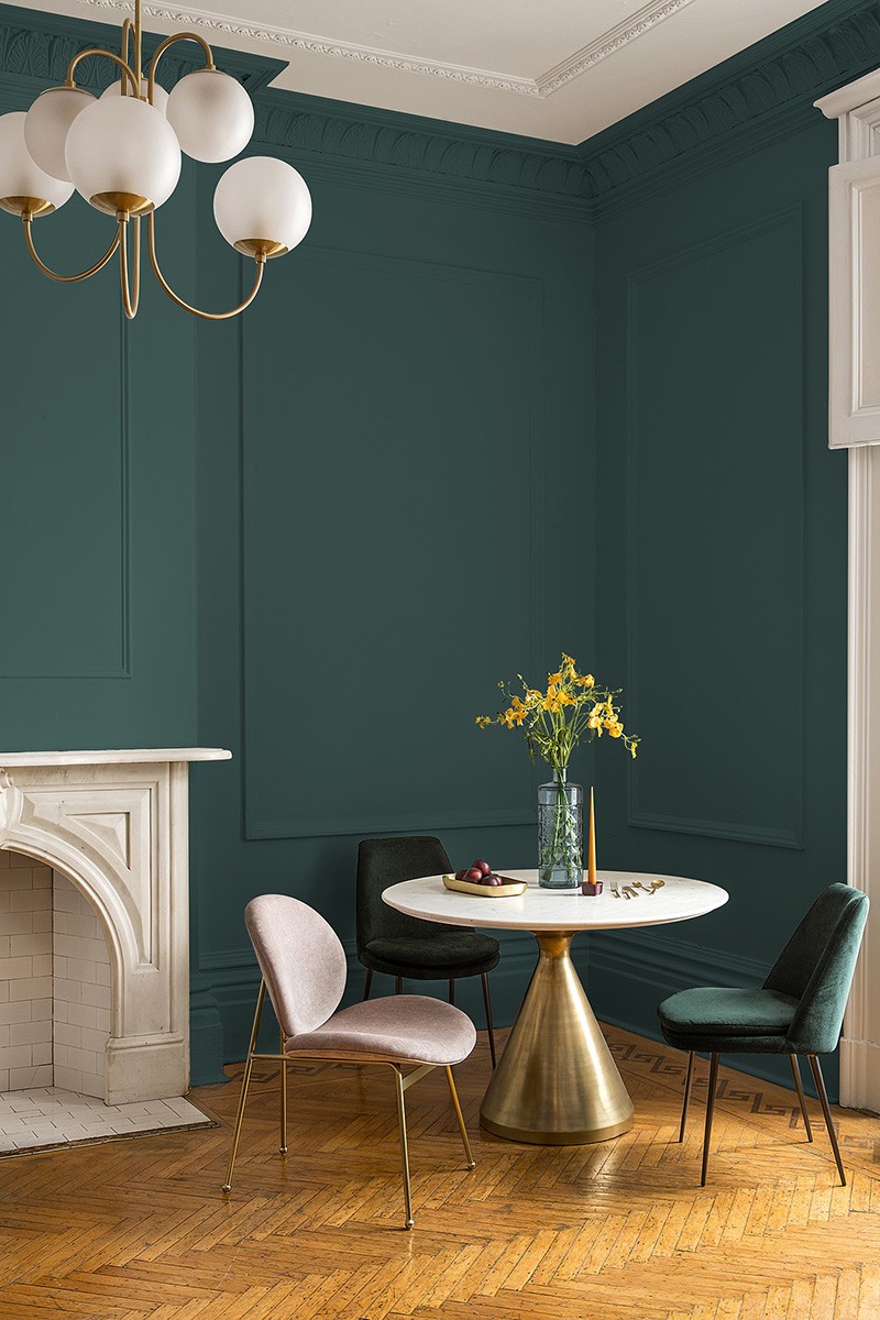
PPG的年度色彩是深綠,旨在激發大自然的活力,並建議搭配金色和黃銅色調。
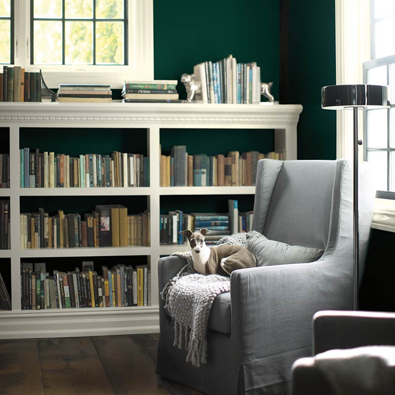
PPG’s color of the year is a deep hunter green that aims to invoke the invigorating impact of nature. In addition, Night Watch works particularly well when paired with gold or brass accents.
5.Pantone——Blush Oranges
延伸閱讀:
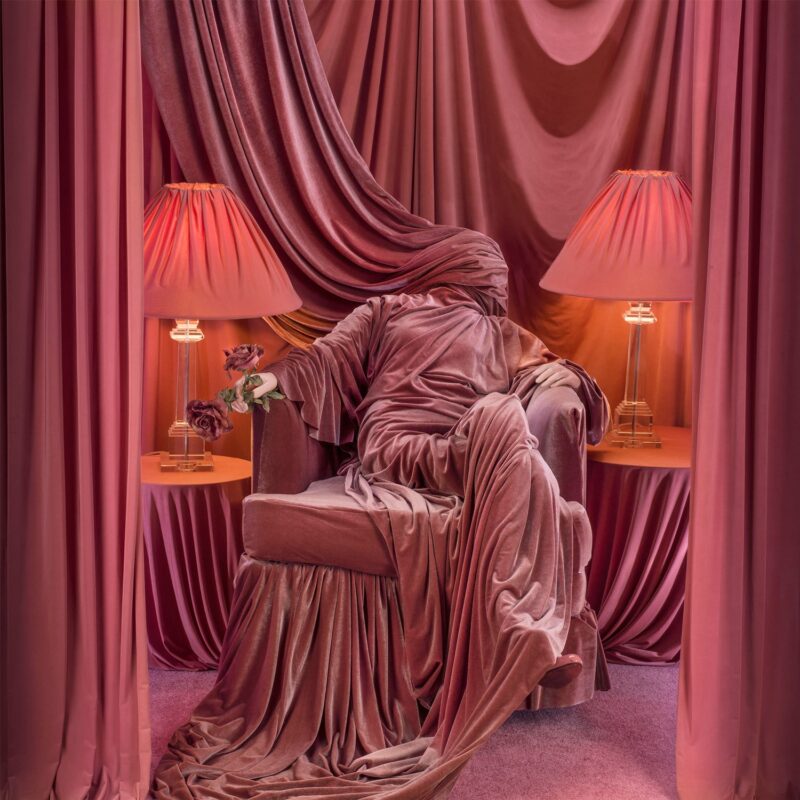
活珊瑚有著活潑有趣的天性,當它被用作一種宣言,如在一麵特色牆上,或作為地毯、牆紙、毯子和室內裝飾的一種強調色時,就會煥發生機。
Living Coral’s playful nature comes to life when used as a statement like on a feature wall, or as an accent color with rugs, wallpapers, blankets, and upholstery.


