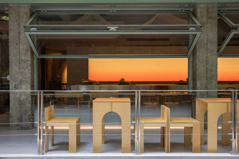
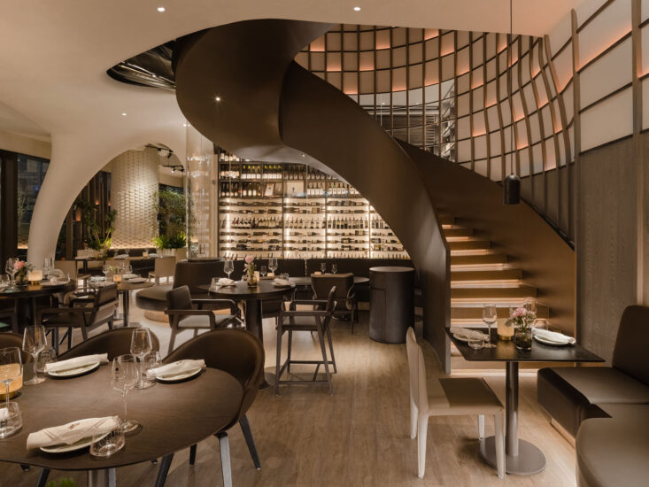
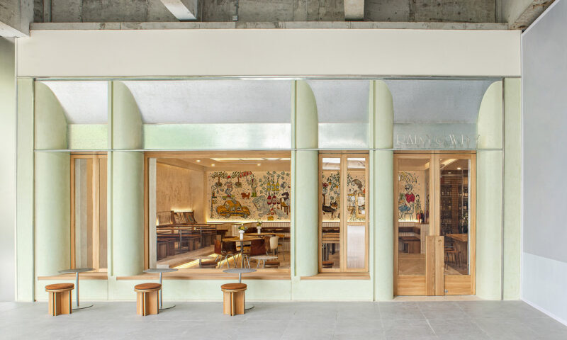
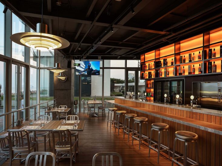
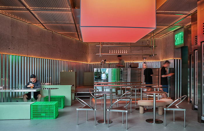
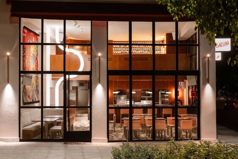
位於澳大利亞拜倫灣的這家墨西哥餐館被稱為Locura,它提供美味的食物、可口的飲料和美妙的音樂。簡單的內部裝飾遵循同樣的簡約精神,保留完整的設計想法,純粹的幾何形狀和簡單的裝飾讓人感覺既低調又有意義。
Dubbed ‘Locura’ (Madness in Spanish), the casual Mexican eatery celebrates fine and honest food, delicious drinks, and good music. The modest interior follows the same ethos, preserving the integrity of intent, pure geometries, and simple finishes that feel equal parts humble and meaningful.
觸覺材料給這個幾乎沒有裝飾的空間帶來溫暖、質感和色彩。精心設計的燈光營造出誘人的氛圍。酒吧的環境並不會吸引顧客的注意力,而是愉快地融入到背景中,產生一種放鬆和特別的體驗,與該地區的其他場所略有不同。
Tactile materials bring warmth, texture, and colour to the mostly undecorated space. Well considered lighting creates an inviting mood and ambience. The physical setting of the bar doesn’t compete to command the attention of the patrons but happily dissolves into the background, supporting and facilitating an experience that feels laid back and special, and a little different to other venues in the area.
工作室的目的是創造一種對“墨西哥餐廳”的現代詮釋,避免空間刻意簡單化或在文化上對其南美文化的直接引用。相反,該設計謹慎地參考了墨西哥城各處小型夜場的真實特征和原始美。
Pattern Studio’s response was to create a contemporary interpretation of a ‘Mexican restaurant’, deliberately staying clear of simplistic or culturally-appropriated references to South American culture. Instead, the design discretely references the genuine character and raw beauty of small, late-night venues found across Mexico City.
空間靈感來自於粗糙和原始的城市肌理,基礎材料包括混凝土、灰磚和軟鋼。天然石材和皮革飾麵,為空間增添精致感,使人們在空間中感到舒適。家具和細木工製品的布局,包括專利作品和定製的設計作品的組合,營造了簡單的空間氛圍。
Inspired by rough and raw urban textures, the base materials palette embraces concrete, grey brick, and mild steel. Natural stone and leather soften the finishes, adding a sense of sophistication and ensuring the comfort of those in the space is considered. The layout of furniture and joinery, including a mix of proprietary and custom designed pieces, is uncomplicated so as not to clutter the space.
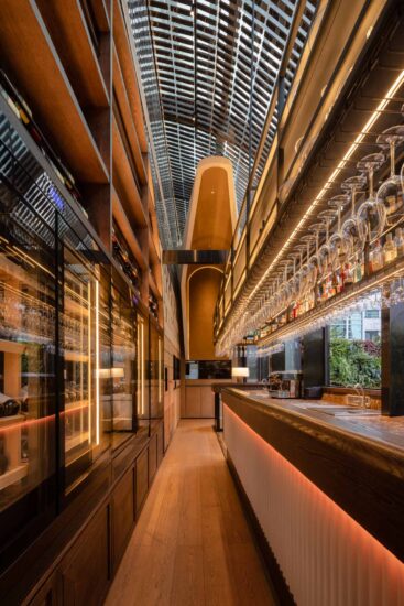
室內基本上沒有裝修,相反,視覺衝擊來自於空間中幾何形狀和重複元素的運用,如磚砌條形酒吧字體的線性圖案,或經典圓形壁燈的重複裝飾。通過裝飾燈具和隱藏的LED條形燈營造出一種柔和環境的燈光氛圍,暗示著這裏可能會發生一些特別的事情。
The interior is mainly undecorated. Instead, visual impact arises from geometry and repetition like the linear pattern of the brick-clad bar font, or the repeat of the classic round wall sconces. Soft and ambient illumination by decorative light fittings and concealed LED strip lights create the kind of mood that suggests something special might well happen here.
通過James Turrell風格燈光的指引,在洗手間中可以找到現代主義墨西哥建築師Luis Barragan運用大膽色彩的作品。顧客從燈光昏暗且相對樸素的酒吧空間進入色彩豐富的浴室時,會感受到出人意料的空間效果。牆壁和天花板上的飾麵麵采用白色處理,白色樺木膠合板隔板可以使彩色LED照射所有表麵,將所有表麵都浸入全彩色之中。這種照明係統控製允許將色調設置為任意RBG值,使場地能夠在任何時間快速改變空間的情緒。條形led燈被小心地放置在隔板的頂部,使得直接光源被隱藏,空間沐浴在柔和的色調中。
A playful reference to the works of Modernist Mexican architect Luis Barragan‘s bold use of colour can be found in the venue’s restrooms, delivered via a James Turrell-inspired light installation. This gesture comes as an unexpected surprise as patrons travel from the moodily-lit and relatively unadorned bar space into the richly coloured bathrooms. A white treatment to the finishes on walls and ceiling, along with whitewashed birch plywood partitions allows coloured LEDs to wash all the surfaces, immersing everything within the space in full colour. This lighting system control allows the tone to be set to any RBG value, enabling the venue to quickly change the mood in the spaces at any time. Strip LEDs are carefully located along the tops of partitions ensuring the direct light source is concealed, and space is bathed in a soft hue.
作為拜倫灣當地人,團隊意識到需要一個不同於海灣目前場所的酒吧空間,那裏有明亮的白色空間。這種對當地夜生活的補充為遊客提供了一種既輕鬆又特別的選擇,其設計和裝飾柔和地融入空間背景中,讓您體驗到美味的食物、飲料和音樂。
As Byron Bay locals, Pattern Studio recognised the need for a venue a little different than what’s currently on offer in the Bay where bright, white, rendered spaces are aplenty. This addition to the local nightlife offers visitors an alternative that’s both relaxed and special, where the design and décor dissolve softly into the background, allowing the experience of excellent food, drink, and music to shine.

完整項目信息
項目名稱:拜倫灣LOCURA酒吧
項目位置:澳大利亞拜倫灣
項目類型:餐飲空間/酒吧
使用材料:混凝土、灰磚、軟鋼、天然石材、皮革、木材
設計公司:PATTERN STUDIO
攝影:Ben Hosking


