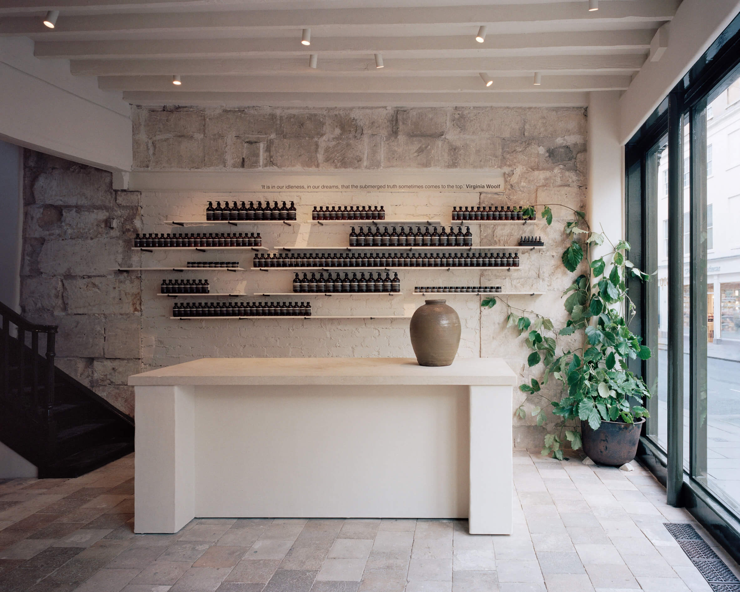
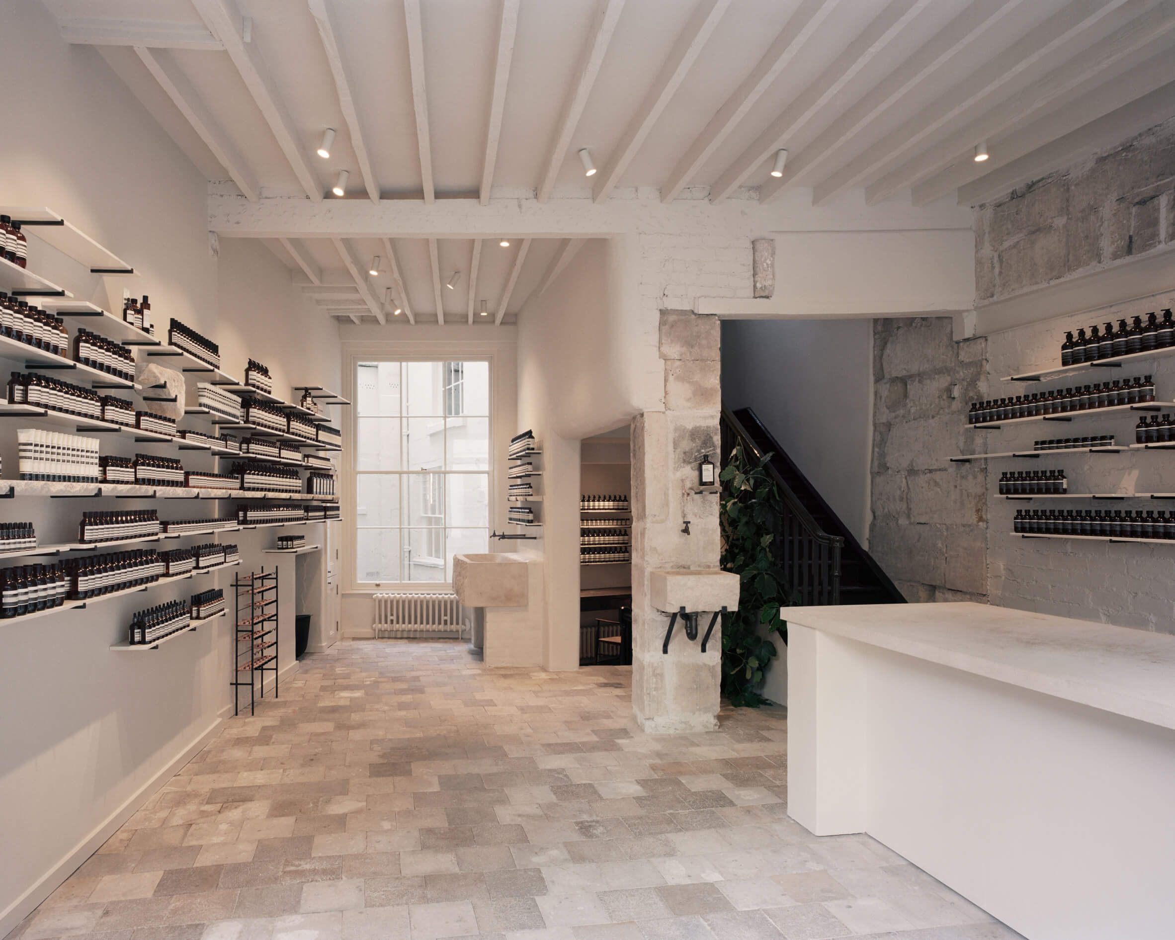
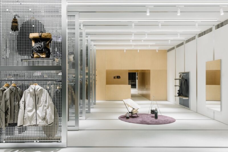
位於巴斯新邦德街(New Bond Street)的這家店是由JamesPlumb設計的,旨在彰顯英國城市的建築景觀。巴斯這座城市的特色是擁有大量由巴斯石打造的溫馨蜂蜜色建築。
The store on Bath’s New Bond Street has been designed by JamesPlumb to honour architectural landscape of the English city, which is defined by its abundance of warm, honey-coloured buildings crafted from Bath stone.
工作室的創始人James Russell和Hannah Plumb說:“Aesop的主要宗旨始終是創建一個對其位置有回應和共鳴的商店,然而,我們不希望我們的設計給人一種曆史課的感覺。我們的目標是創造一個擁有安靜的、現代的城市精華的店鋪。”
“Aesop’s main brief is always to create a store that responds to and is sympathetic to its location… however, we didn’t want our design to feel like a history lesson. Our aim was to create a quiet, contemporary distillation of the city,” James Russell and Hannah Plumb, founders of the studio, told Dezeen.
我們被吸引到建築的地下室和較低的樓層,那裏有一種簡單但實用的美學,有著精美的細節。在對穿過城市的住宅、道路、博物館和采石場進行研究之後,工作室決定巧妙地反映他們在商店內部看到的圖像。
“We were drawn to the basements and lower floors of buildings where a simple but functional aesthetic prevails, but with wonderful details.”After traversing the city’s residences, roads, museums, and quarries for research, the studio decided to subtly reflect the imagery they’d seen within the shop’s interiors.
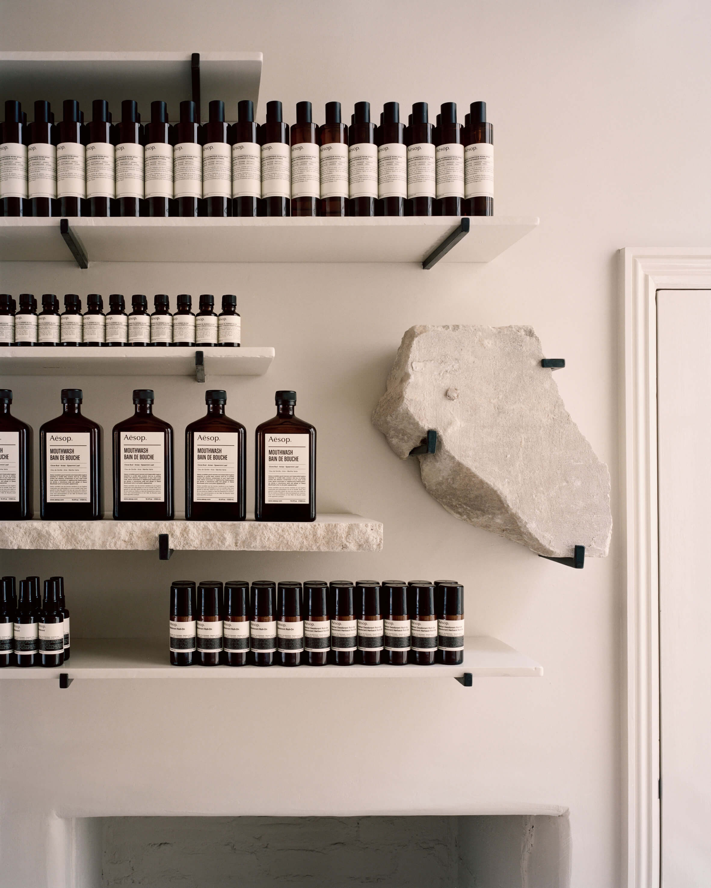
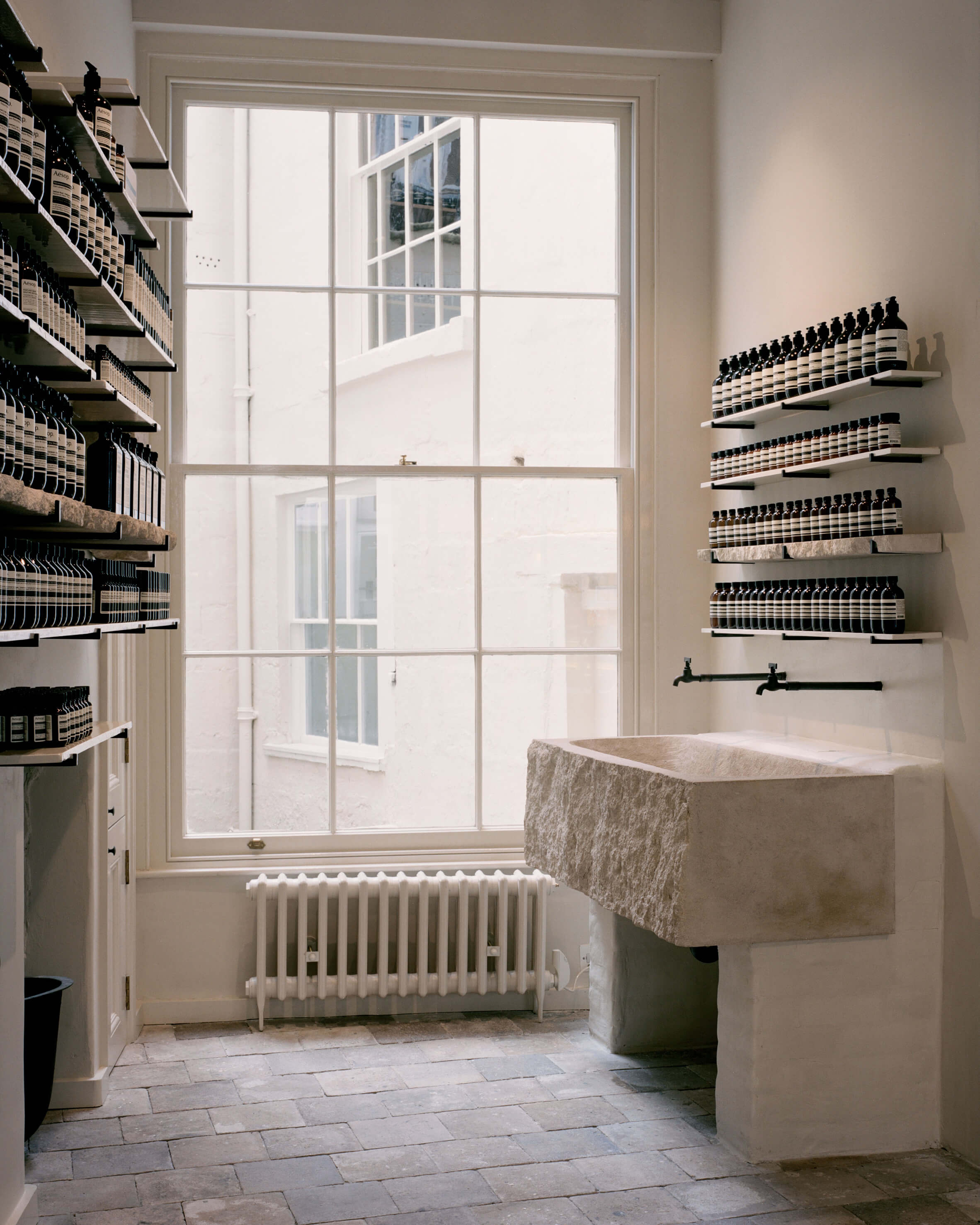
從附近教堂回收的白色瓷磚鋪在地板上,與白色的牆壁和服務台相輔相成。在建築低層發現的巴斯石碎片被放置在鋼條上,在架子之間展示手工製品。同樣的石頭被用來製作厚實的麵盆,顧客可以站在那裏測試各種產品。每個都被五個小排水孔所點綴,以模仿在巴斯著名的皇家新月宮(Royal Crescent)的一個台地房屋中看到的廚房水槽的外觀。
Pale tiles reclaimed from a nearby chapel are laid across the floors, complemented by white-painted walls and service counter. Rough fragments of Bath stone found in the building’s lower level have been placed on steel pegs and displayed artefact-style between the shelves.The same stone has been used to make chunky basins where customers can stand and test various products. Each has been punctuated with five small drainage holes to mimic the appearance of a scullery sink the studio saw in one of the terraced houses that form Bath’s renowned Royal Crescent.
顏色隻出現在商店的外立麵上,它被塗上了一層光滑的森林綠色油漆。在JamesPlumb重新設計之前,這棟建築已經年久失修,這使得團隊還需要對商店的內部結構進行一些更改。三扇窗戶和一個以前用木板封住的樓梯已經被打通,使空間恢複到原來的喬治亞風格。
Colour only appears on the shop’s facade, which has been updated with a glossy coat of forest green paint.Prior to JamesPlumb’s redesign the building had largely been in a state of disrepair, filled with unsightly fixtures from previous shop fit-outs. This left the studio to also carry out a number of changes to the store’s internal structure. Three existing windows and a previously boarded-up staircase have been unblocked to return the space to its original Georgian proportions.
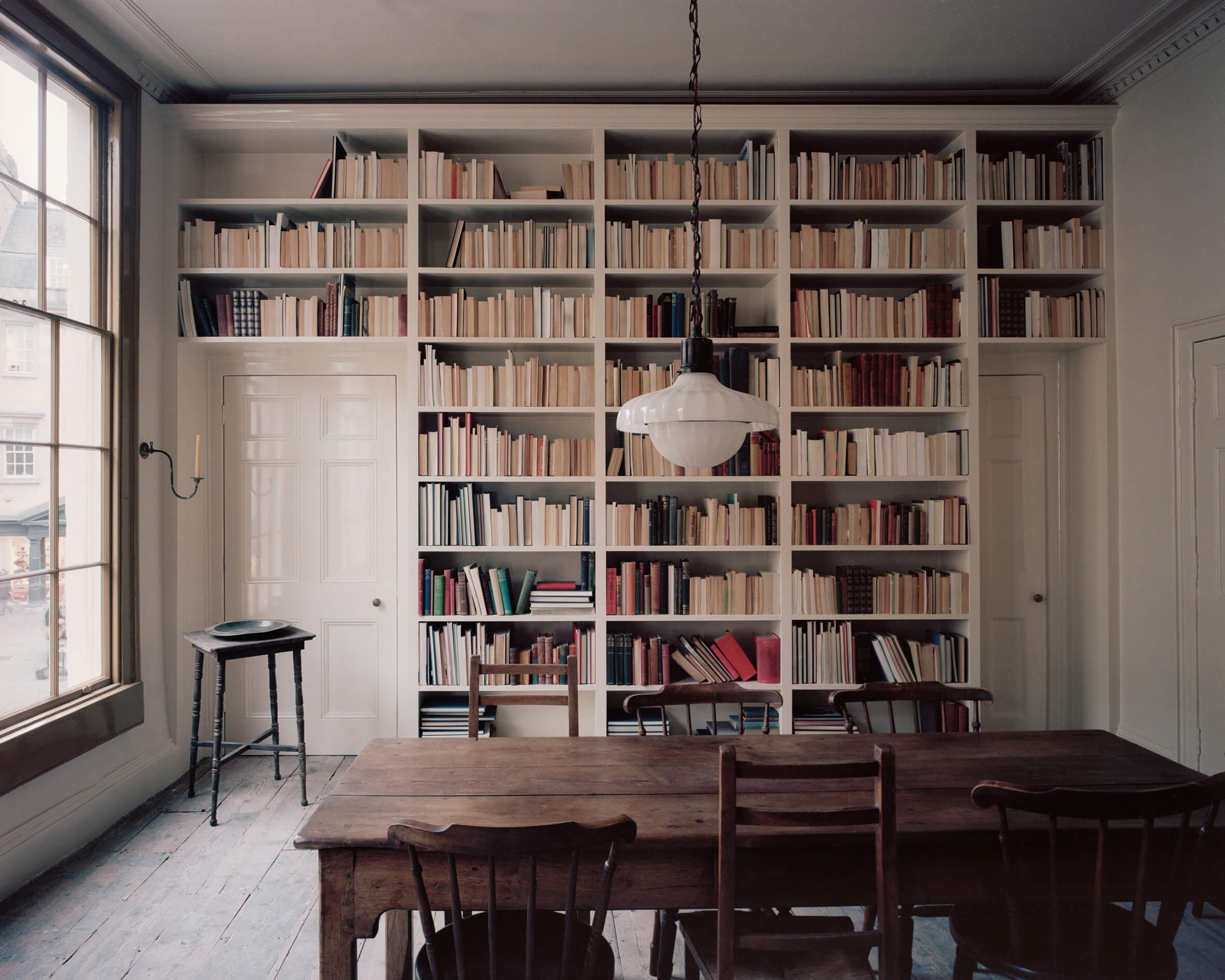
在樓上,一個以舊木桌為中心的圖書館被保存了下來,形成了一個“隱藏的家庭生活層”。也因此,JamesPlumb決定在零售空間內設立一個指定的閱讀區域。
Upstairs, a library centred by a worn timber table has been preserved, forming a “hidden layer of domesticity”. JamesPlumb’s decision to have a designated area for reading within the retail space .
完整項目信息
項目名稱:Aesop商店
項目位置:英國巴斯
項目類型:商業空間/零售店
使用材料:巴斯石、木材
設計公司:JamesPlumb
攝影:Aesop


