LOFT中國感謝來自 唯想國際 的聯合辦公項目案例分享:
在當下眾多聯合辦公紛紛湧現的大潮下,聯合辦公不僅僅隻是低成本、共享辦公的一種選擇方式,更多的市場競爭下對場所有了更多的要求,不同的客戶群體也對空間有了不同欲望。
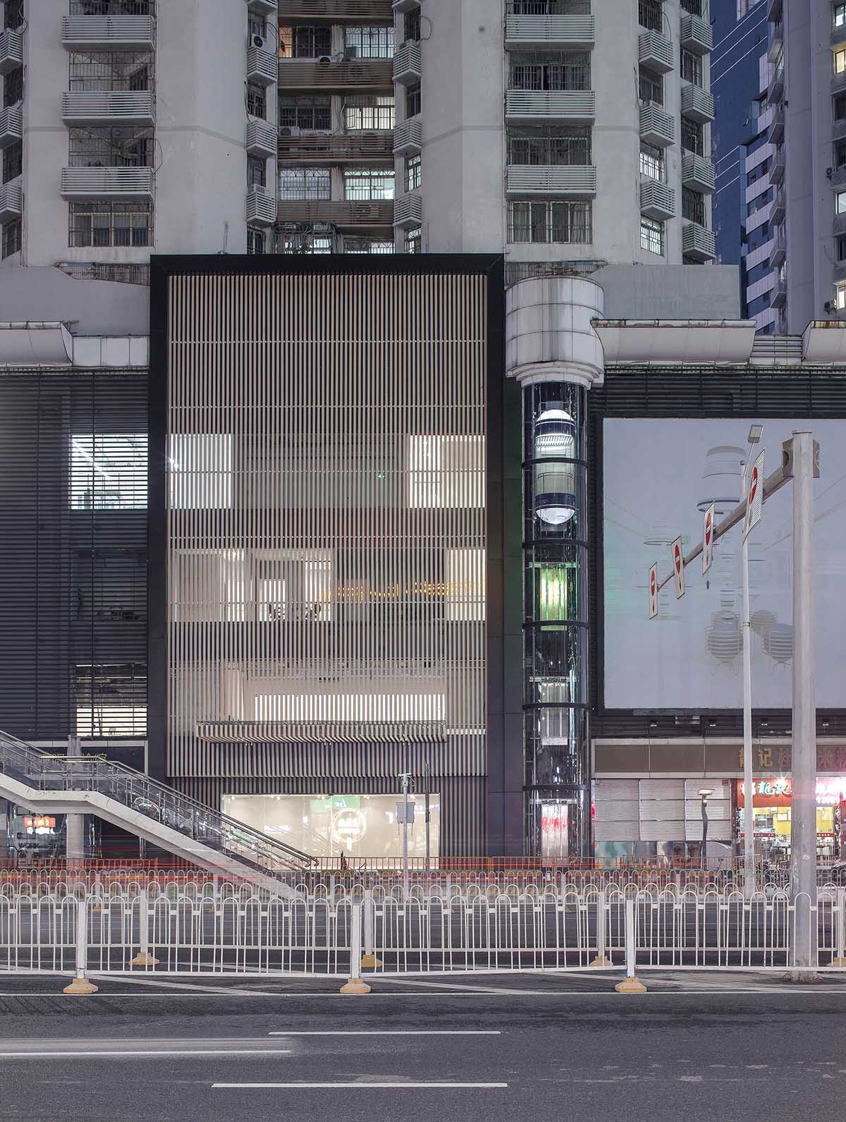
The project is a co-working space located in Shenzhen, which was designed by X+LIVING. The goal was to create a space which can accommodate multiple companies and give full play to the employees’ individuality, and let “co-working” no longer be just a synonym for “low-cost”.
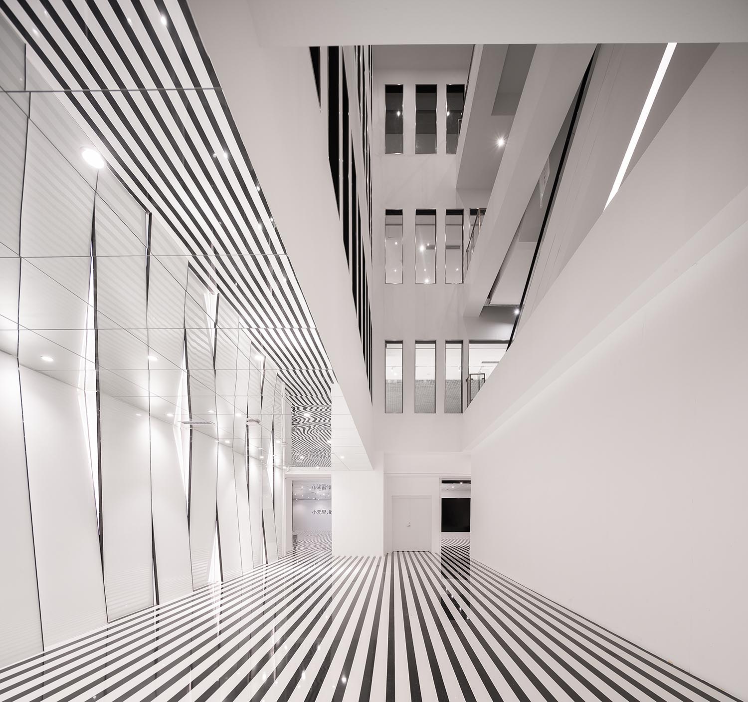
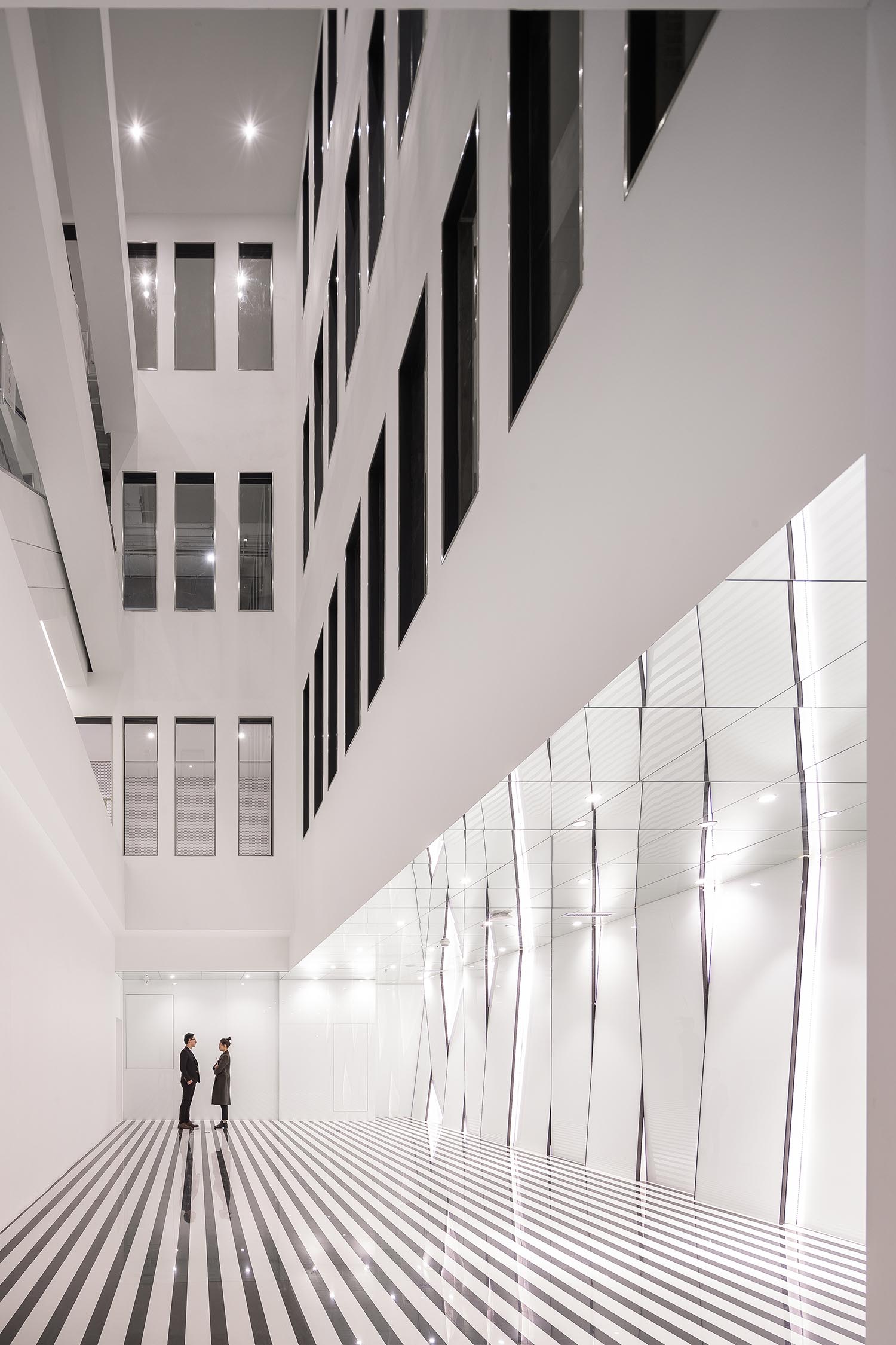
∇ 1F大堂
小元裏項目我們整體是在一個四層樓的空間,一層作為大堂接待;二層作為辦公配套的餐飲空間;三四層為辦公空間,其中三層主要是小型辦公空間,針對的客群偏年輕化。四層主要是大型辦公空間,針對的客群偏成熟。由於不同樓層所承擔的不同的功能,因此我們在空間的調性上也做了明顯的差異化。
The chief designer, Li Xiang, integrated artistic aesthetics and interesting visual effects into the four-storey space, and differentiated the tone and style of each floor based on functions.
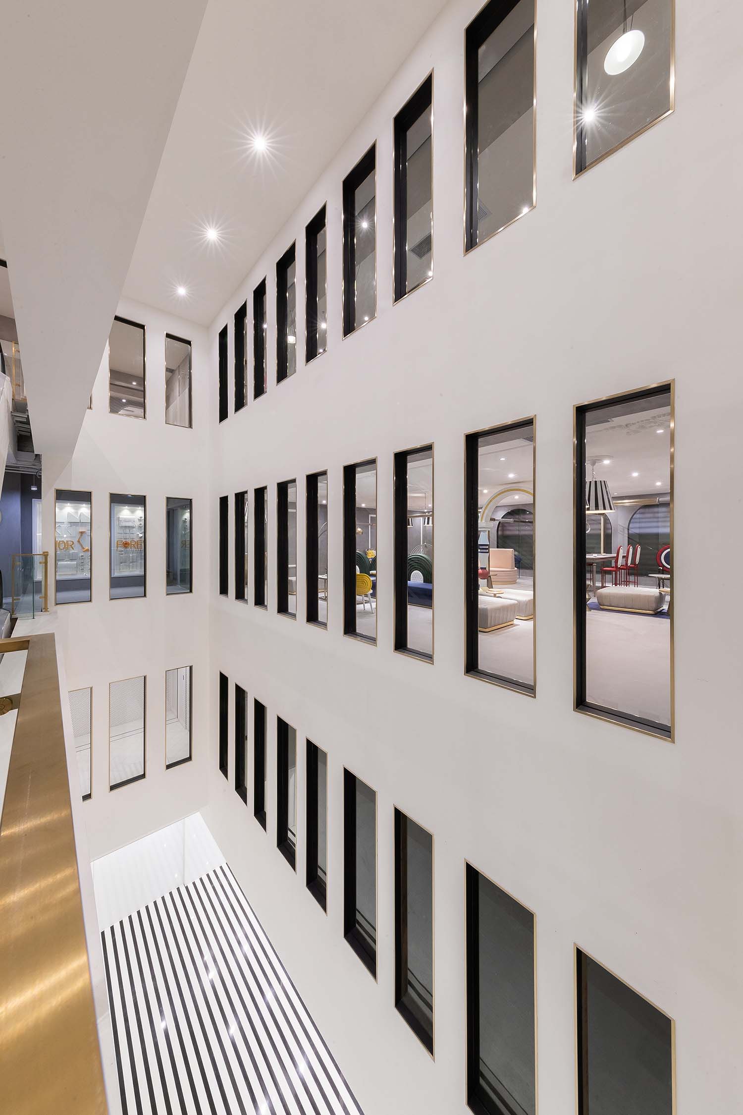
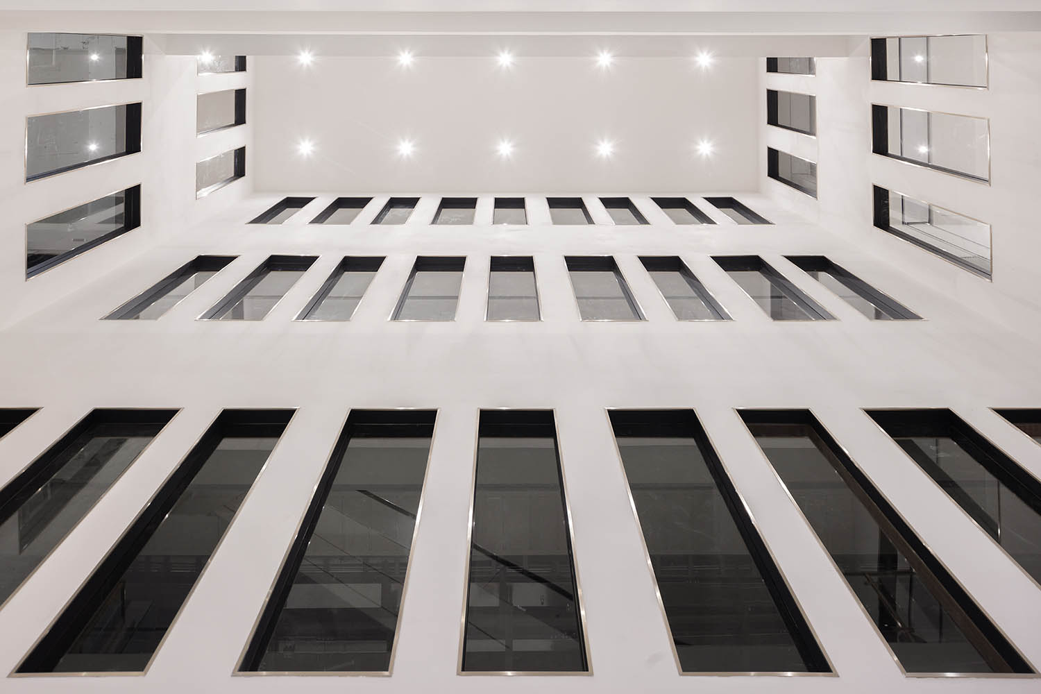
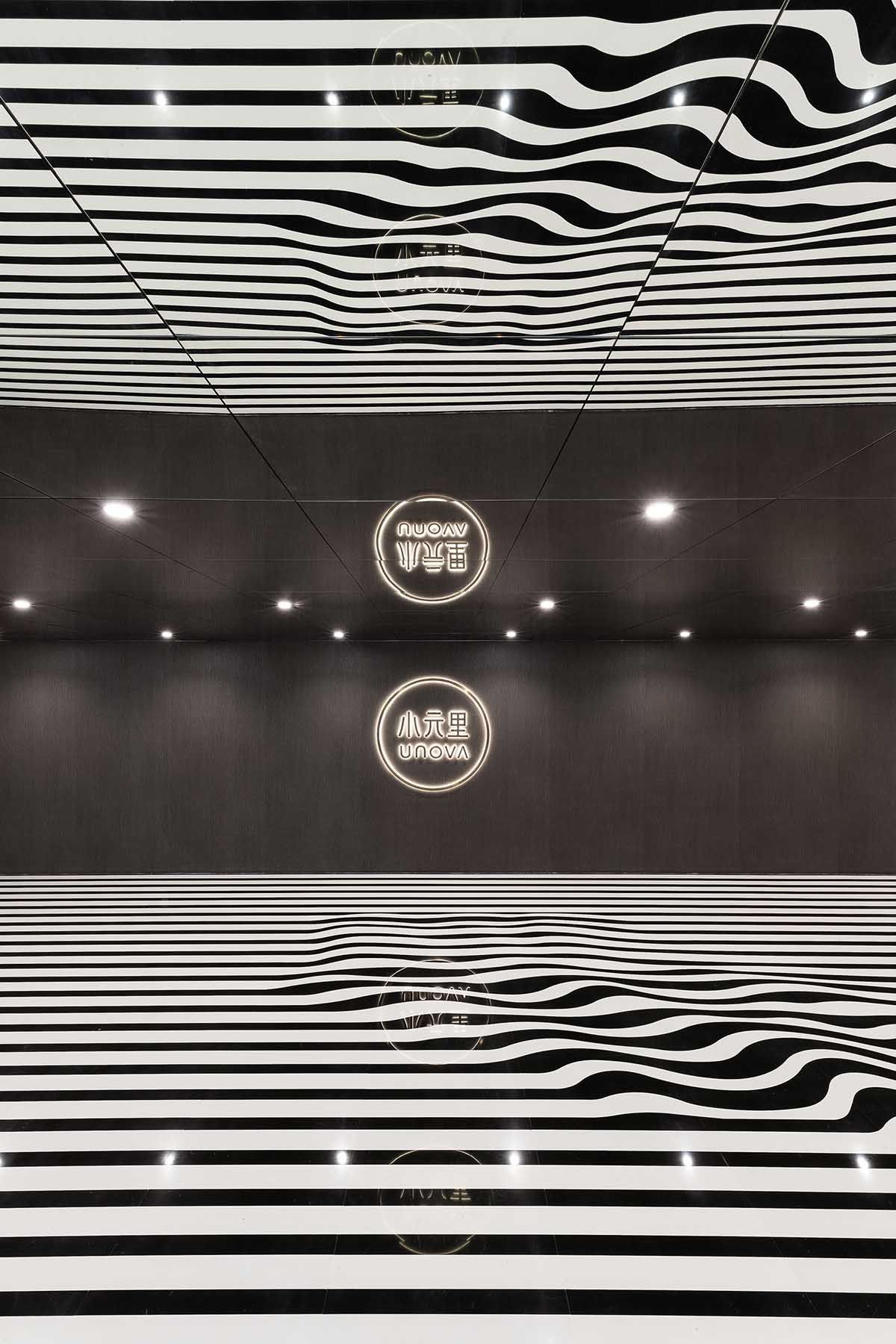
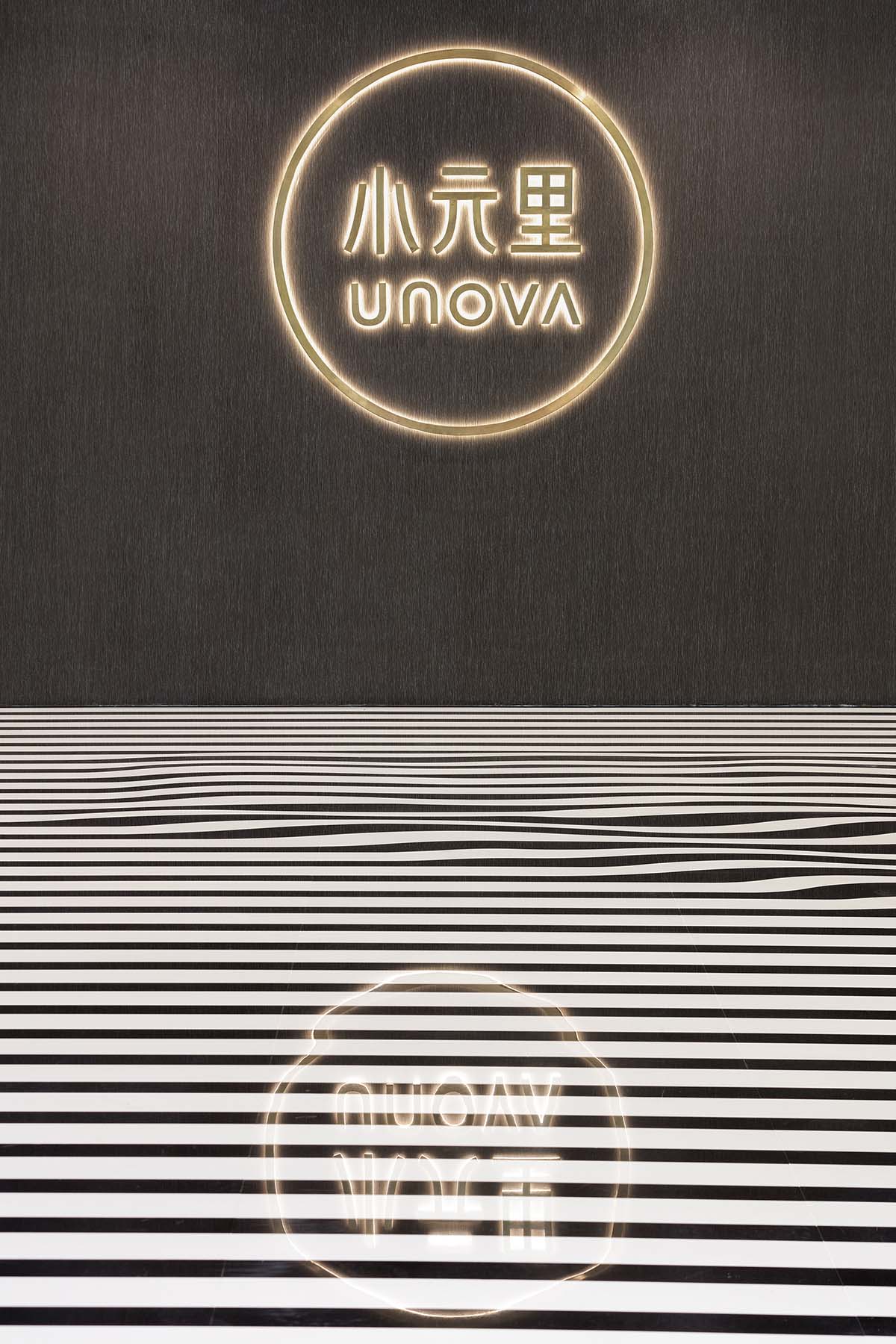
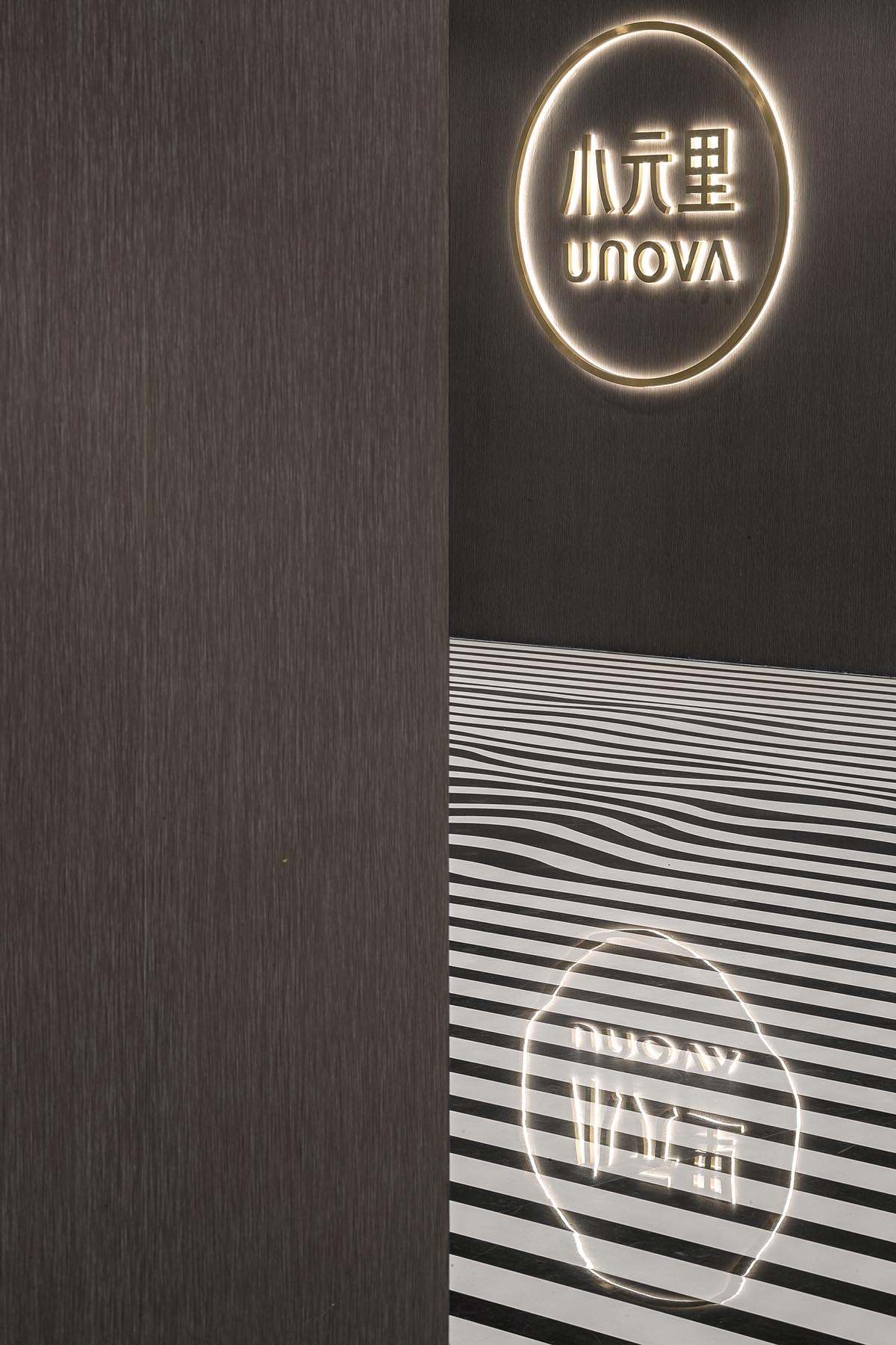
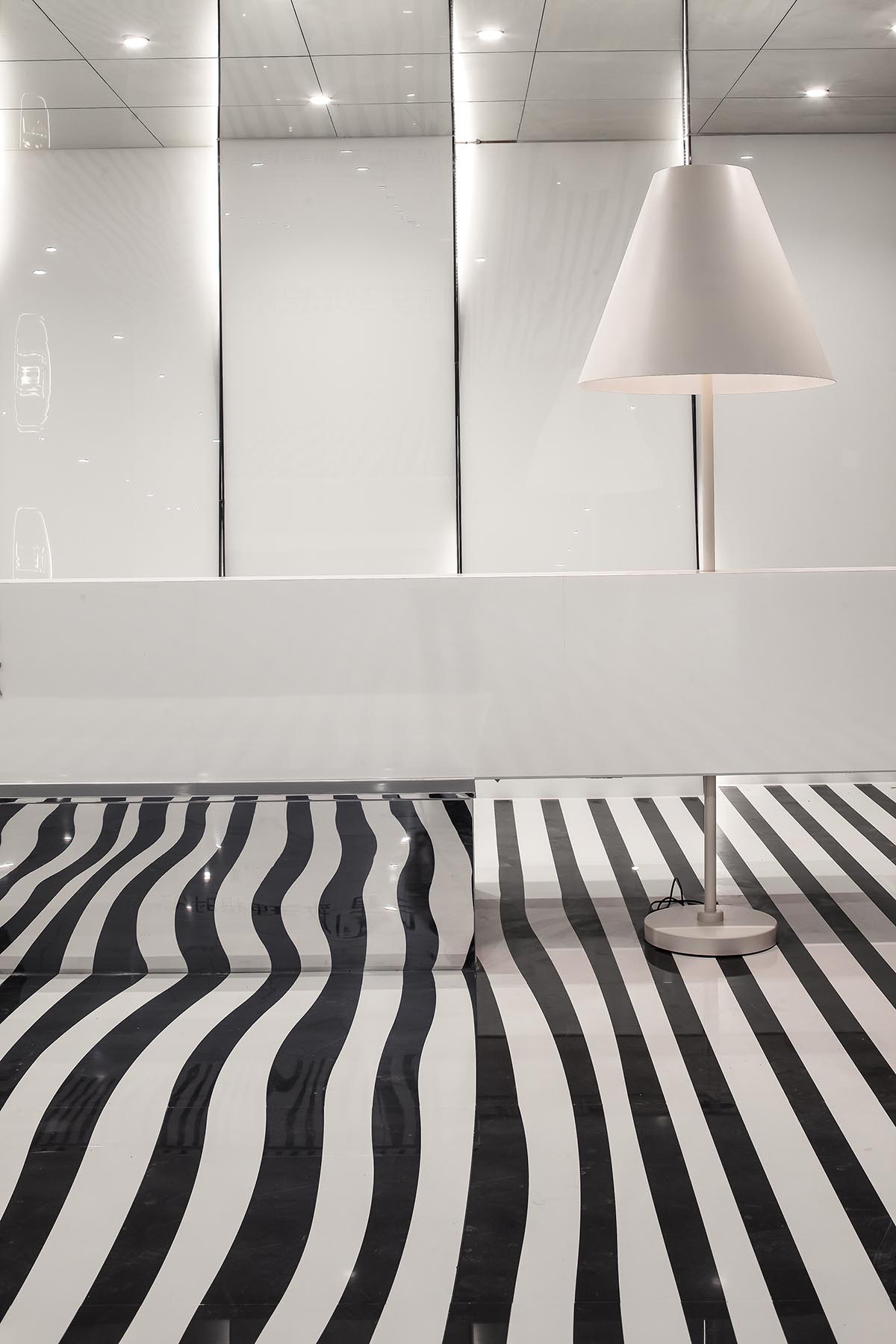
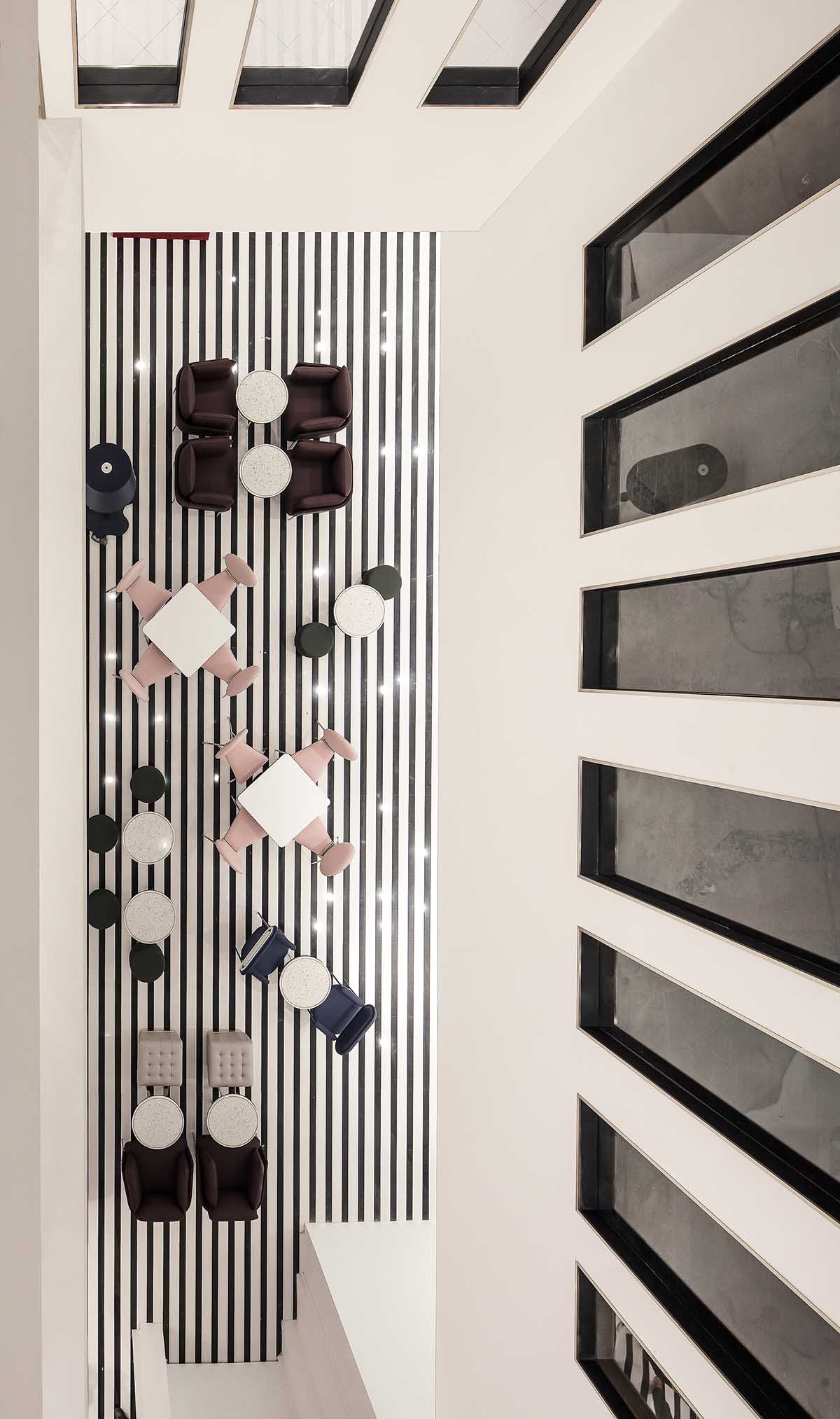
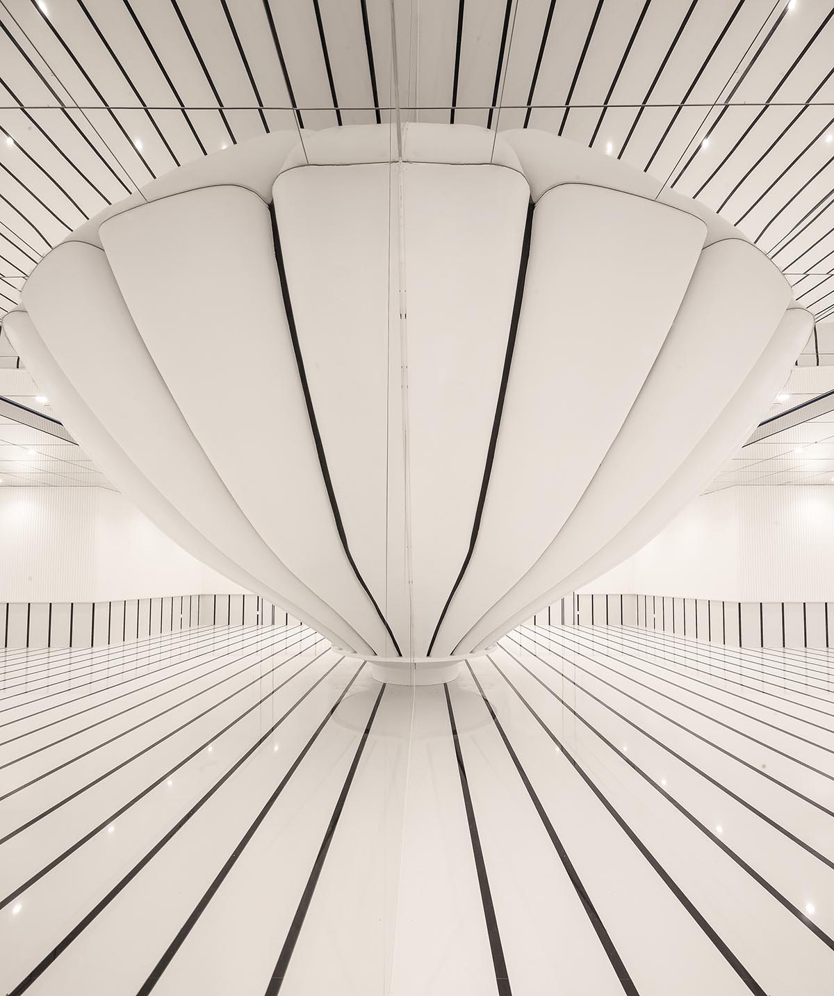
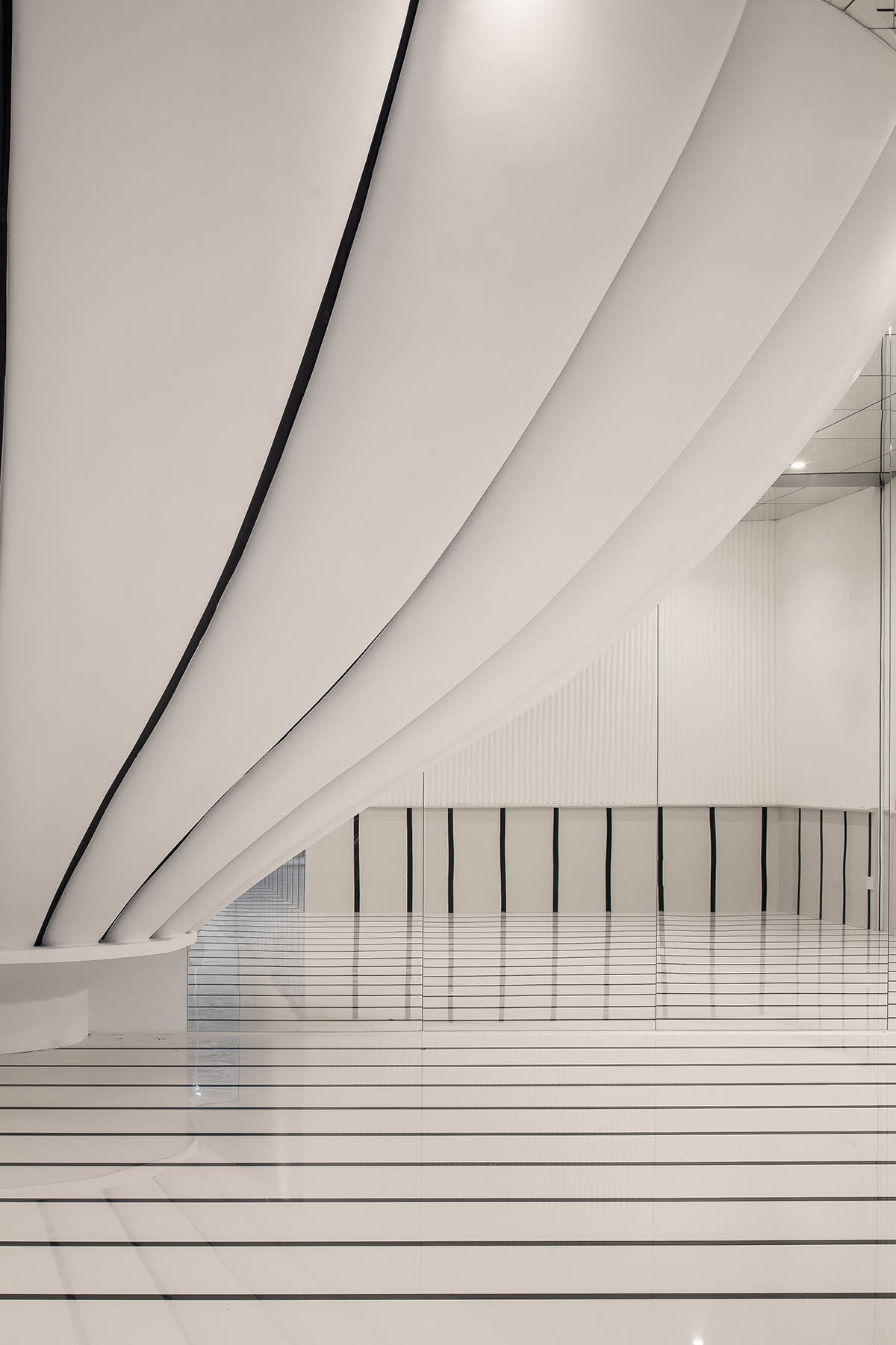
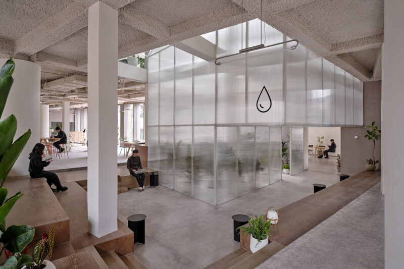
在一層我們設置了兩個入口,南側的主大堂空間,主要作為辦公層的入口,主要承擔接待問詢的功能,我們留了很大的空白來體現大堂的氣質。並且在內部我們營造了一個連通一到四層整個空間的內中庭,把建築的外立麵窗格做在室內,讓人們在室內感受室外的建築感,並且在扶梯的上升過程中能感受一到四層不同的空間美感。在大堂我們引用了水流的概念,黑白條地麵水波紋的起伏,流動,象征著企業的承載和不斷的前進。北側的次入口,主要是餐飲層的入口,做了一個大型的熱氣球裝置,作為視覺的焦點。整體白色的空間,為未來企業的宣傳展示和小型展覽留下無限的可能性。
1F serves as the lobby and reception area, with two entrances. The main entrance is on the south side, from which people can reach the main area of the lobby and the workspace. The secondary entrance at the north area leads to the dining space, featuring a large striking art installation with the shape of a hot-air balloon.
An atrium runs through the overall space. Besides, the window panes were embedded into the interior wall, making it appear to be the facade. When the escalator rises and passes through each floor, people can enjoy varying visual experience.
∇ 2F餐飲層
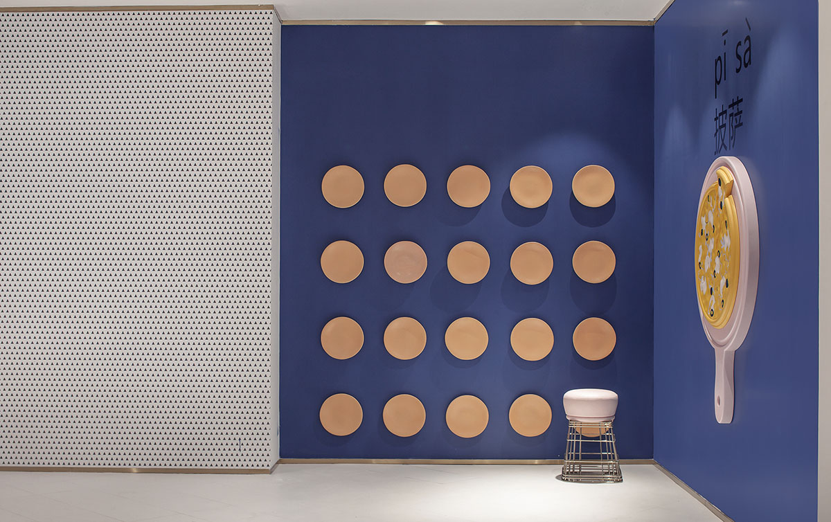
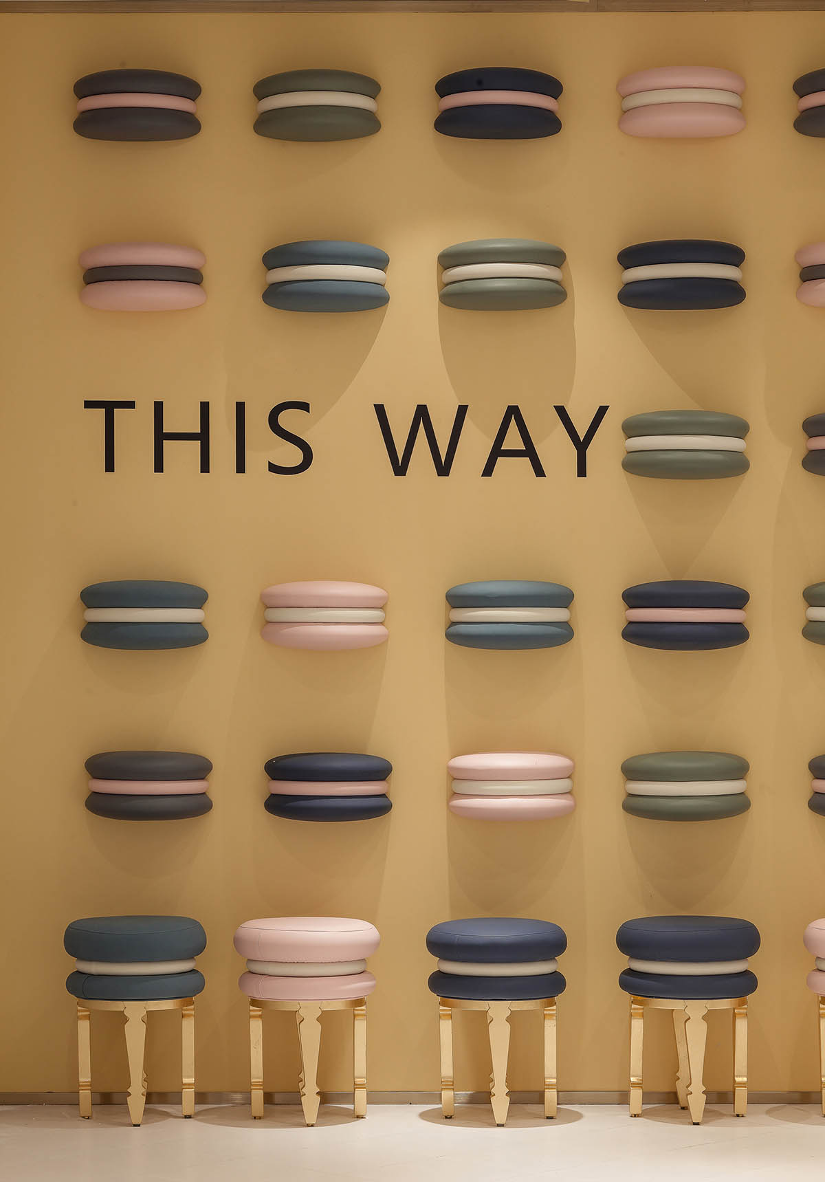
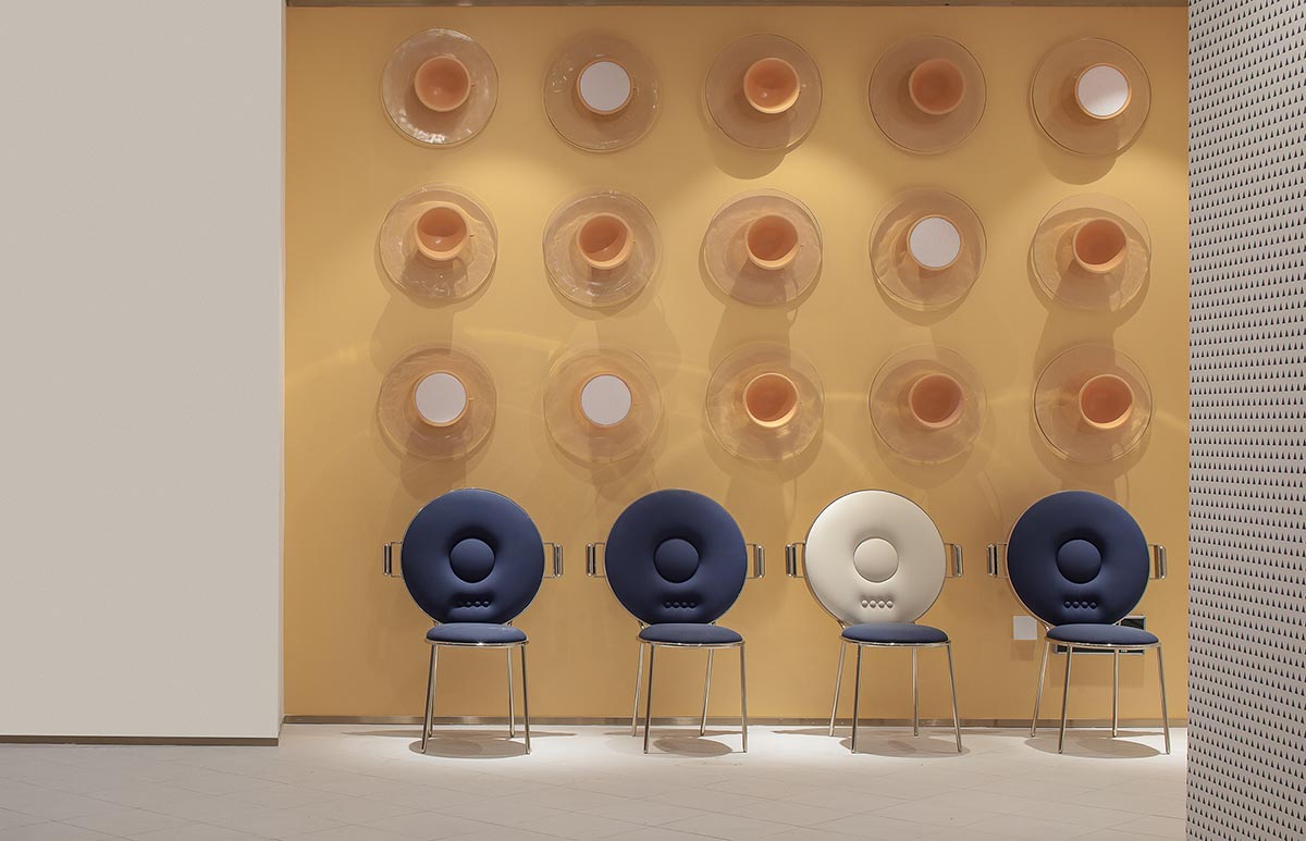
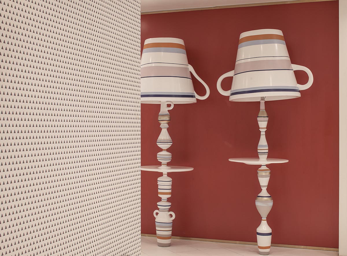
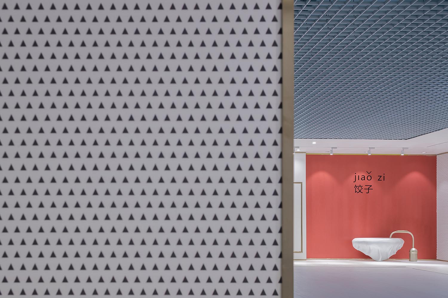
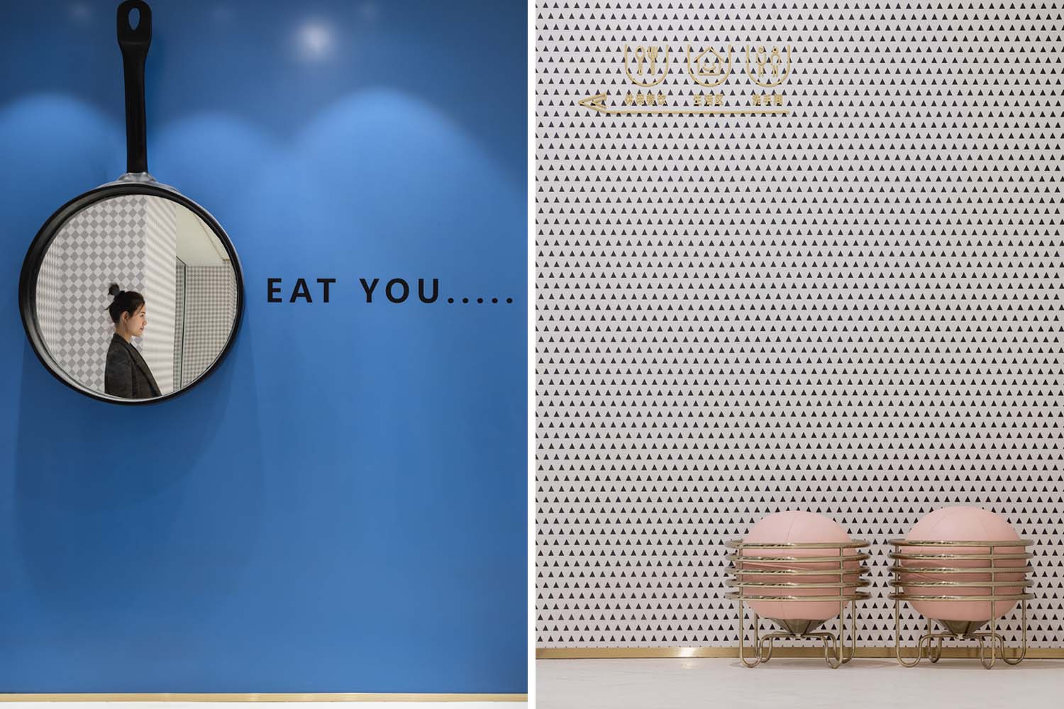
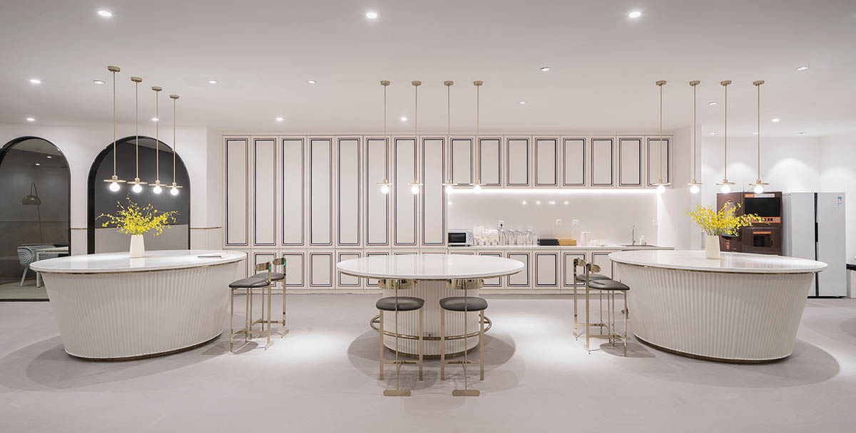
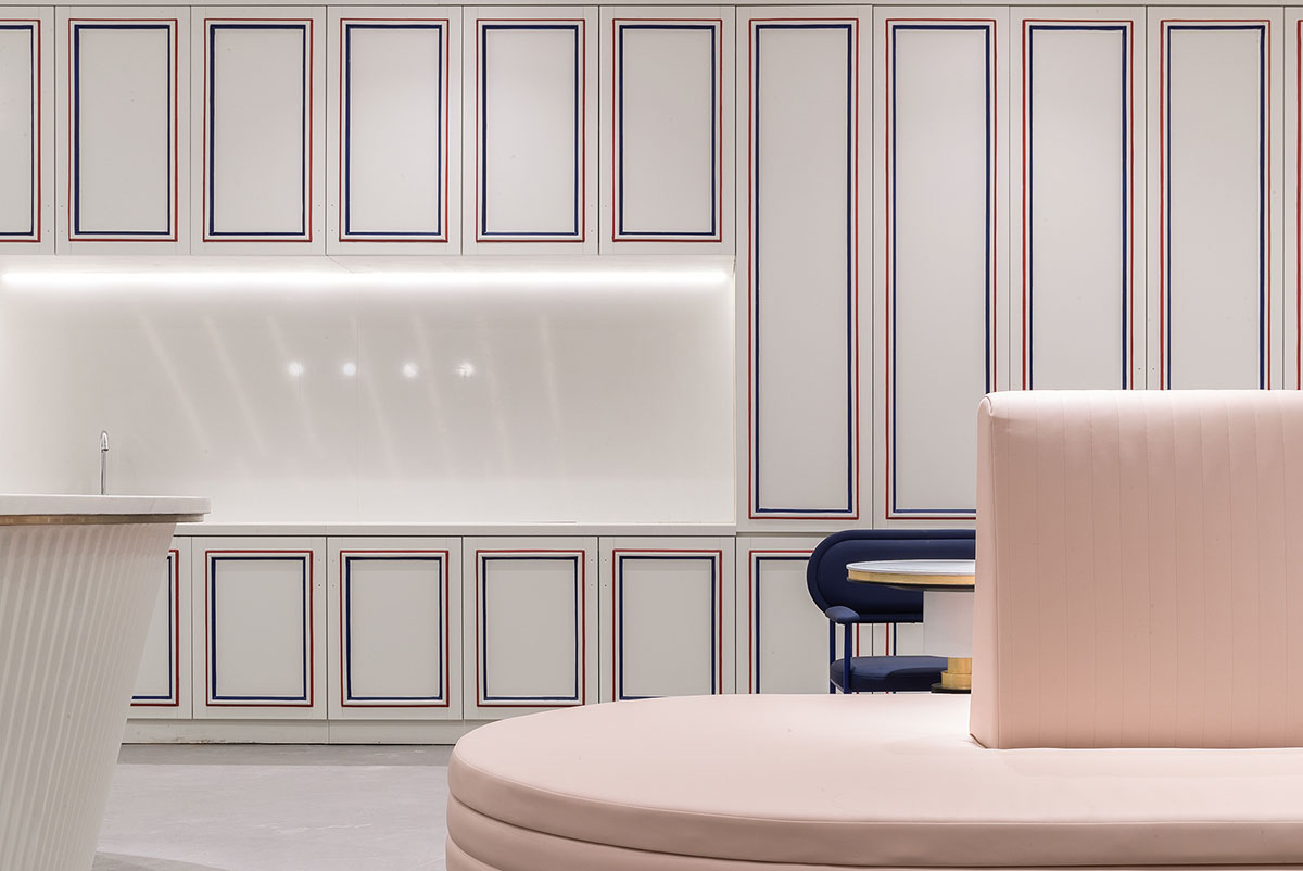
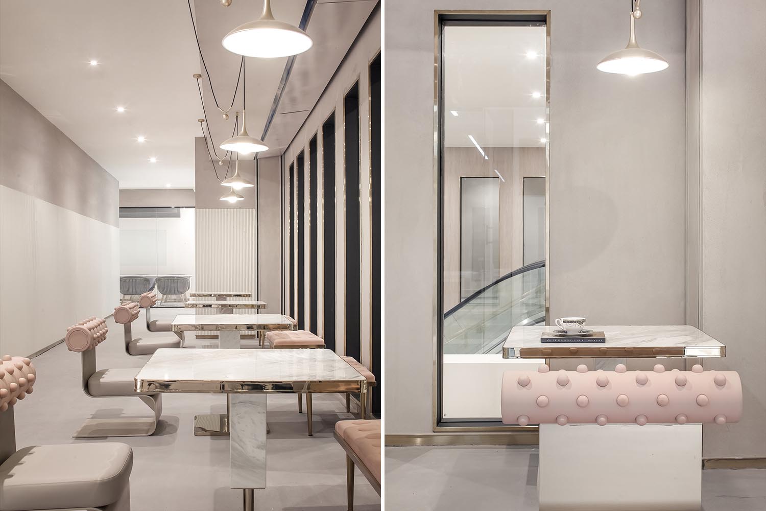
二層的餐飲層作為辦公層的服務空間,我們把大部分的空間留給了商戶,把設計點主要放在了走廊的端頭牆麵,利用彩色的背景牆麵和一些餐飲相關的趣味家具和裝置在視覺上吸引人們的眼球,同時起到和人們互動的作用。這些家具除了視覺上的吸引,同時也是餐飲層的共享桌椅和休息空間。
2F functions as the dining space. X+LIVING laid emphasis on design of the end area of the corridor. Colorful background walls, combined with interesting dining-related furniture and installations, add visual appeal to the space and allow interaction among people, space and articles.
∇ 3F青年聯合辦公
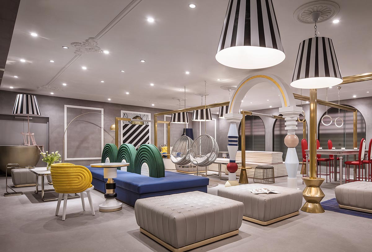
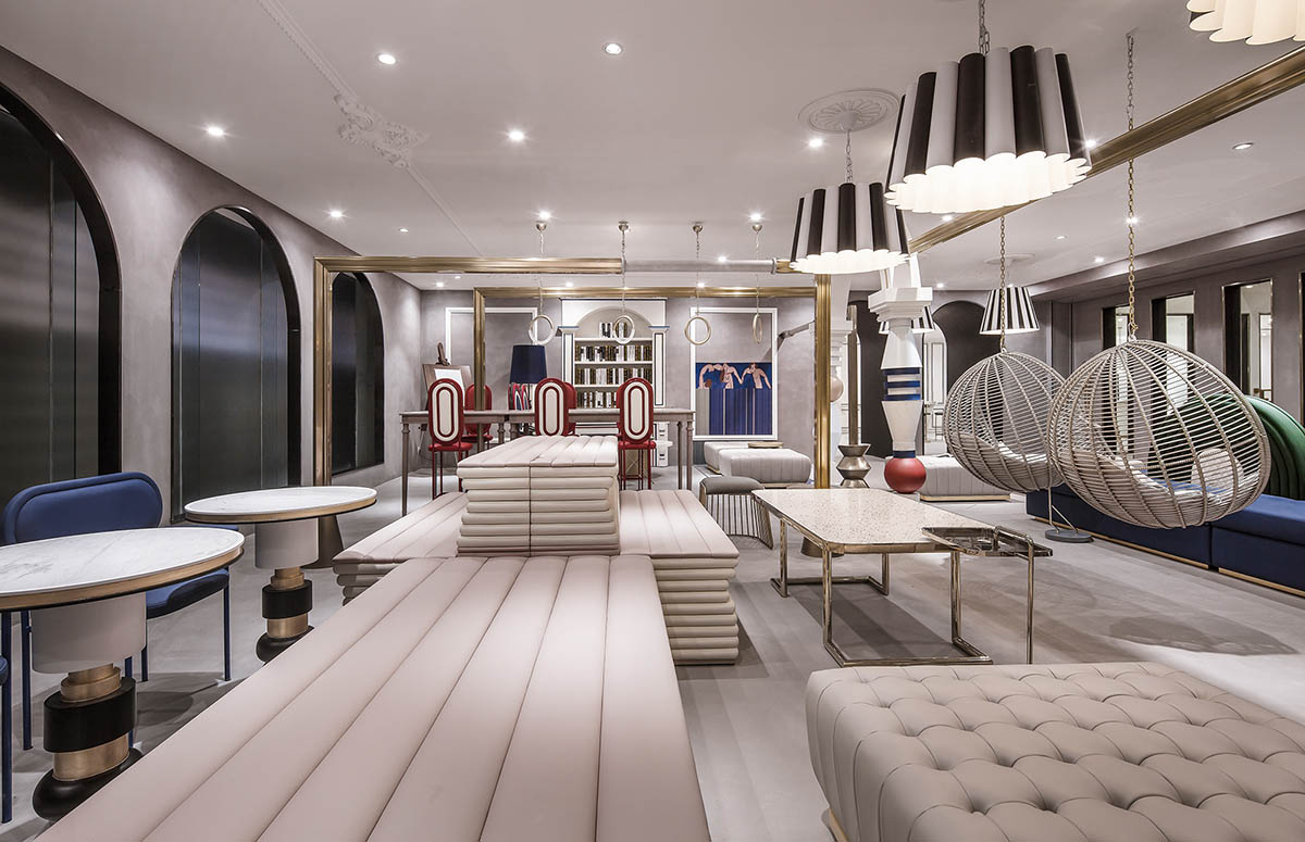
經過扶梯上到三層辦公空間,在三層整體的布局上,我們分別在兩個扶梯上來的空間作為公共客廳區域,並且把兩個公共客廳用共享會議區、休息區串聯起來,把需要比較私密安靜的辦公空間放在客廳之外。動靜分離的布置,一方麵讓視覺點更集中,一方麵也便於後期的運營管理。
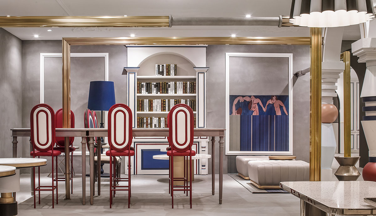
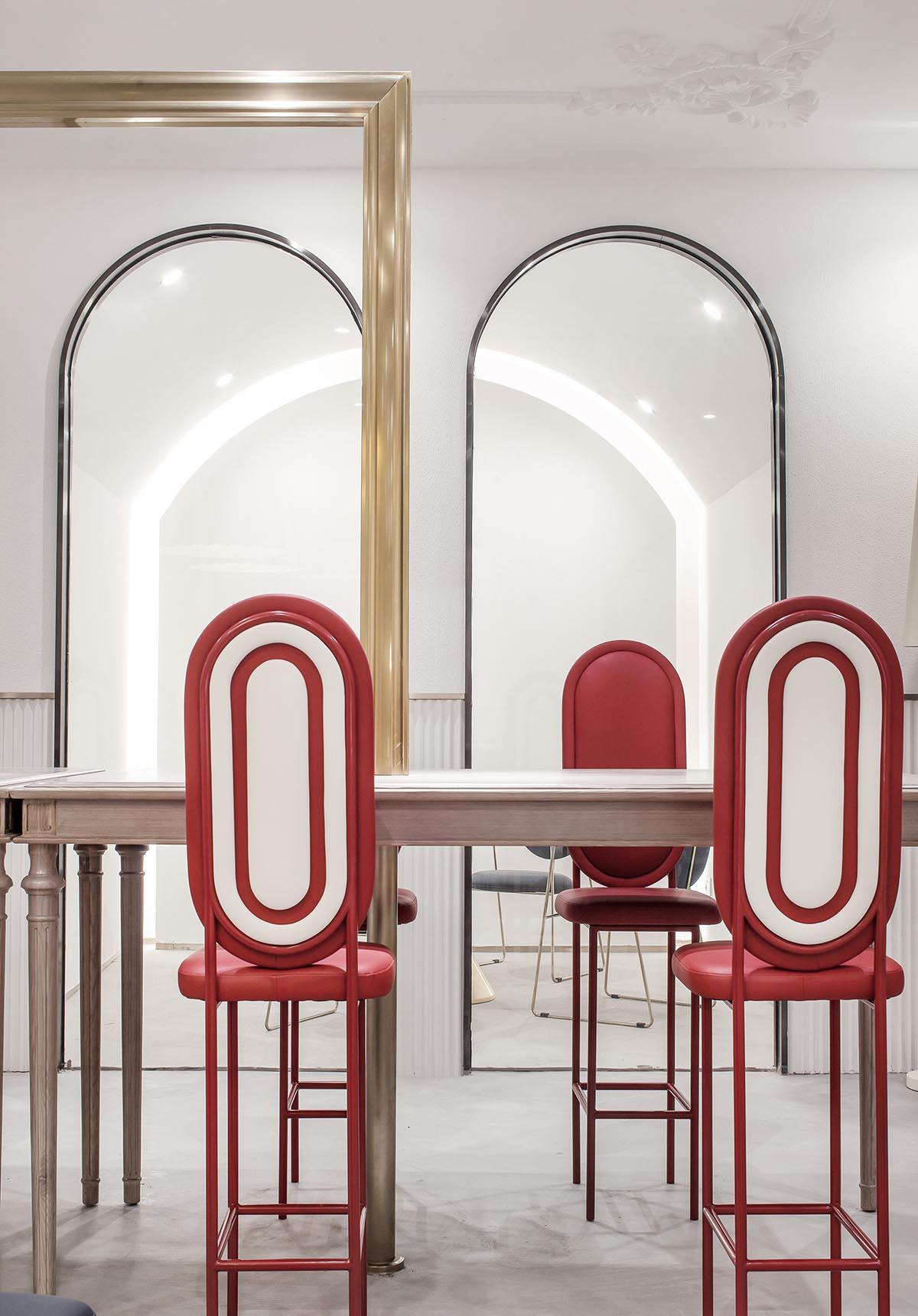
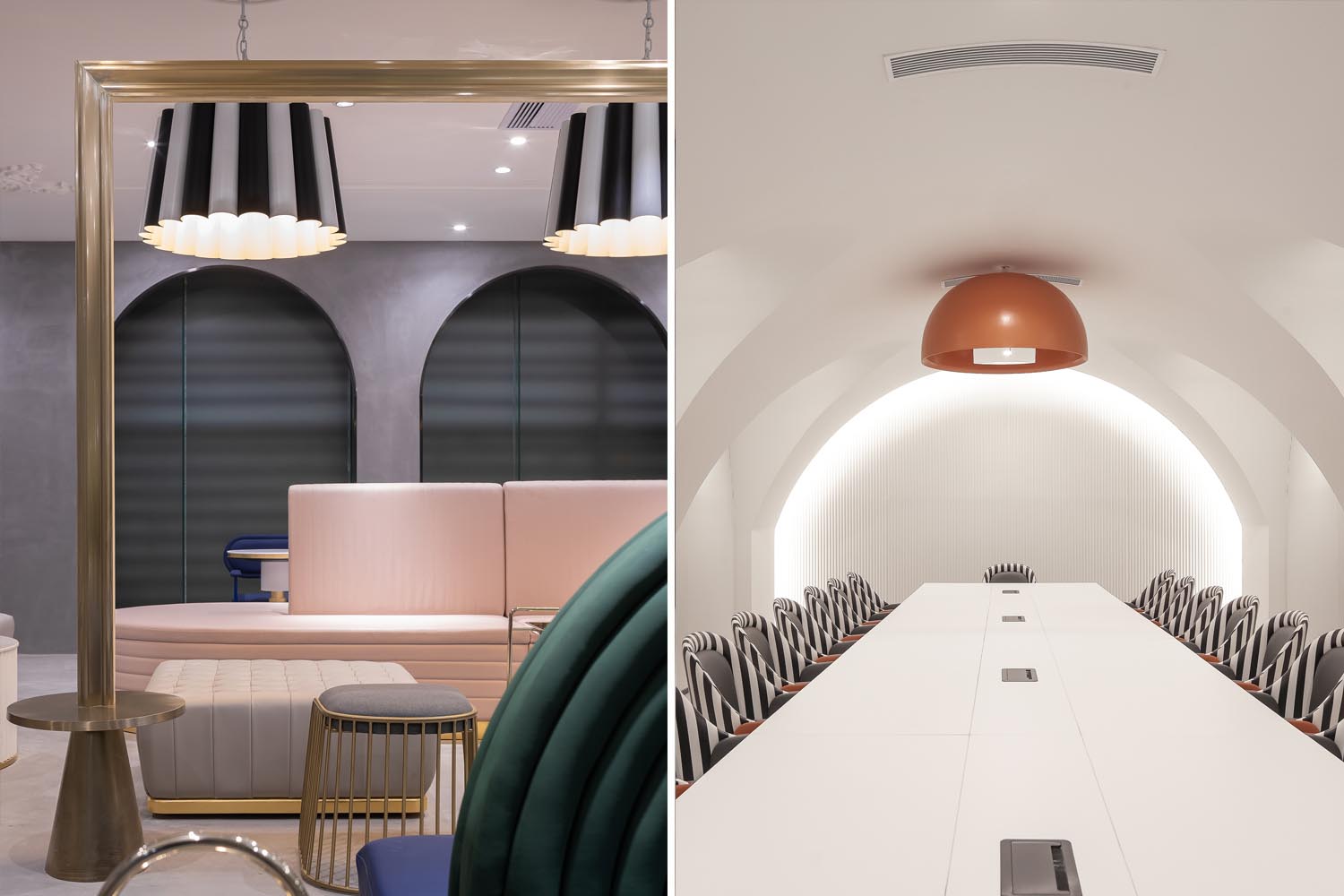
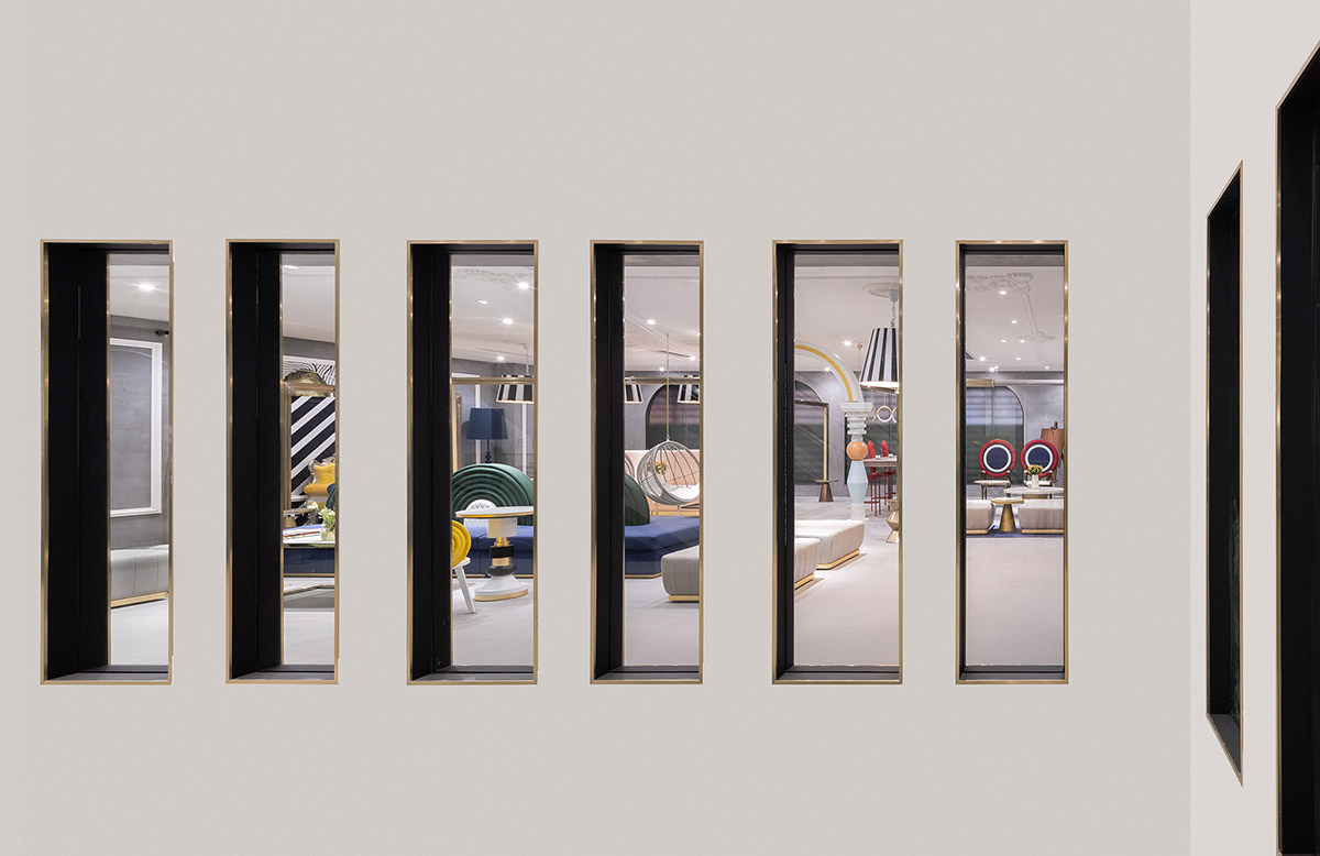
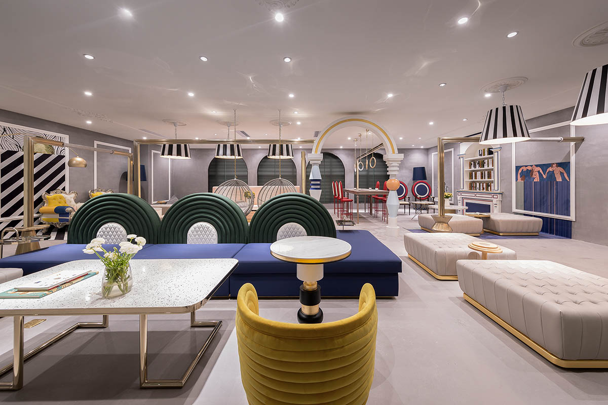
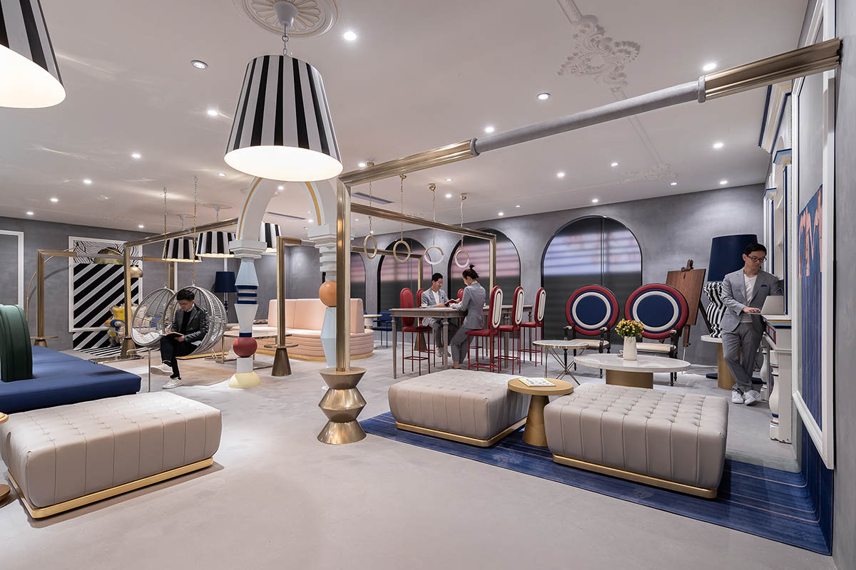
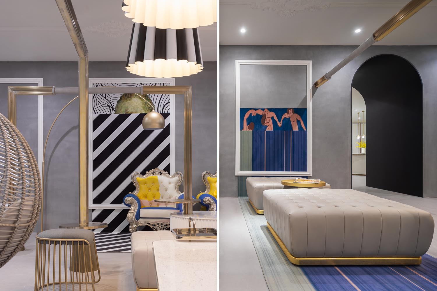
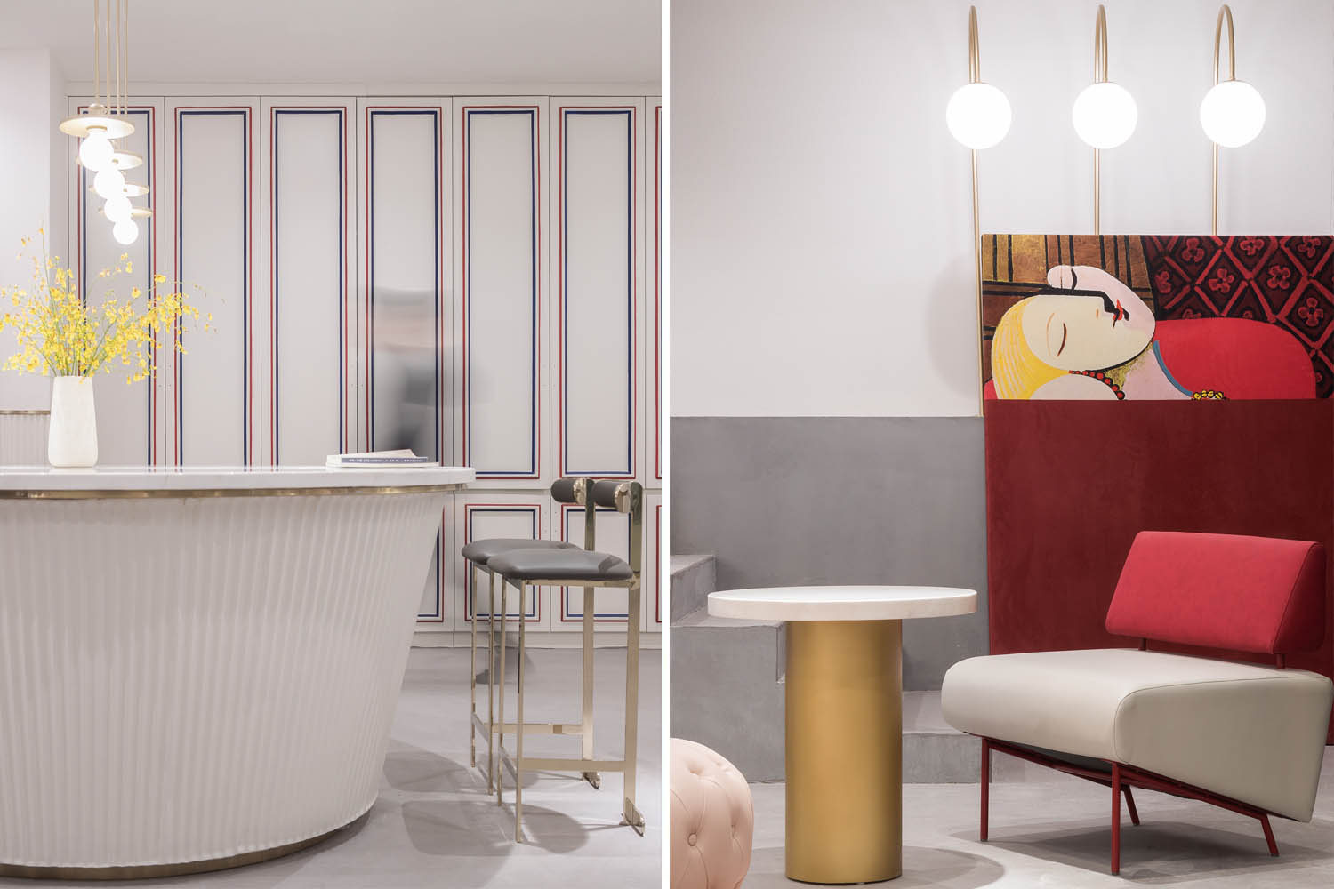
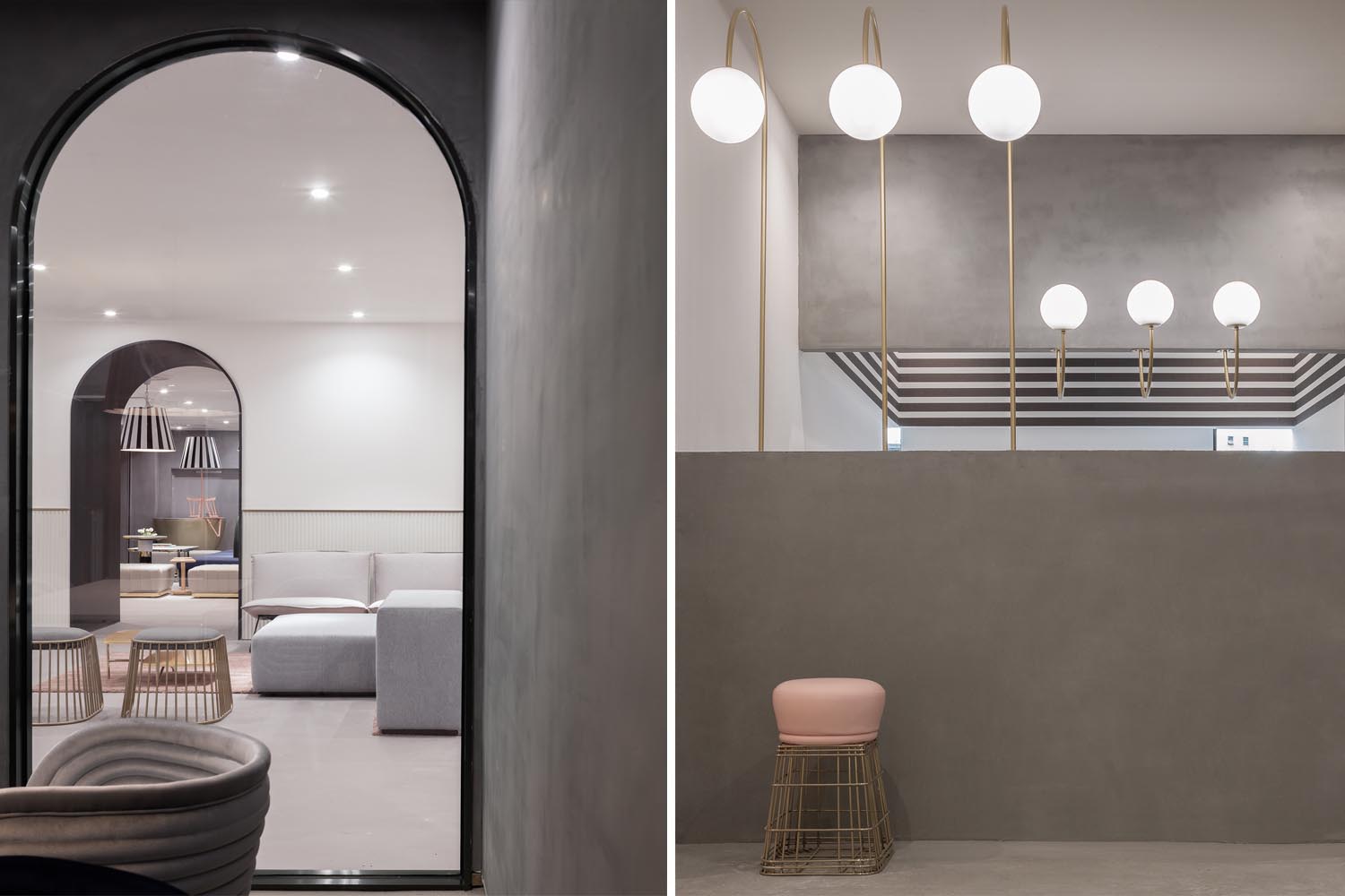
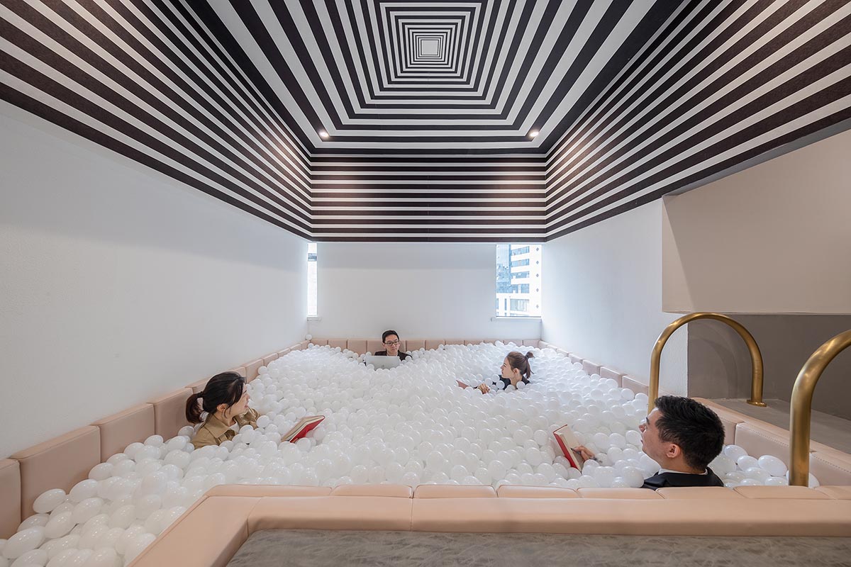
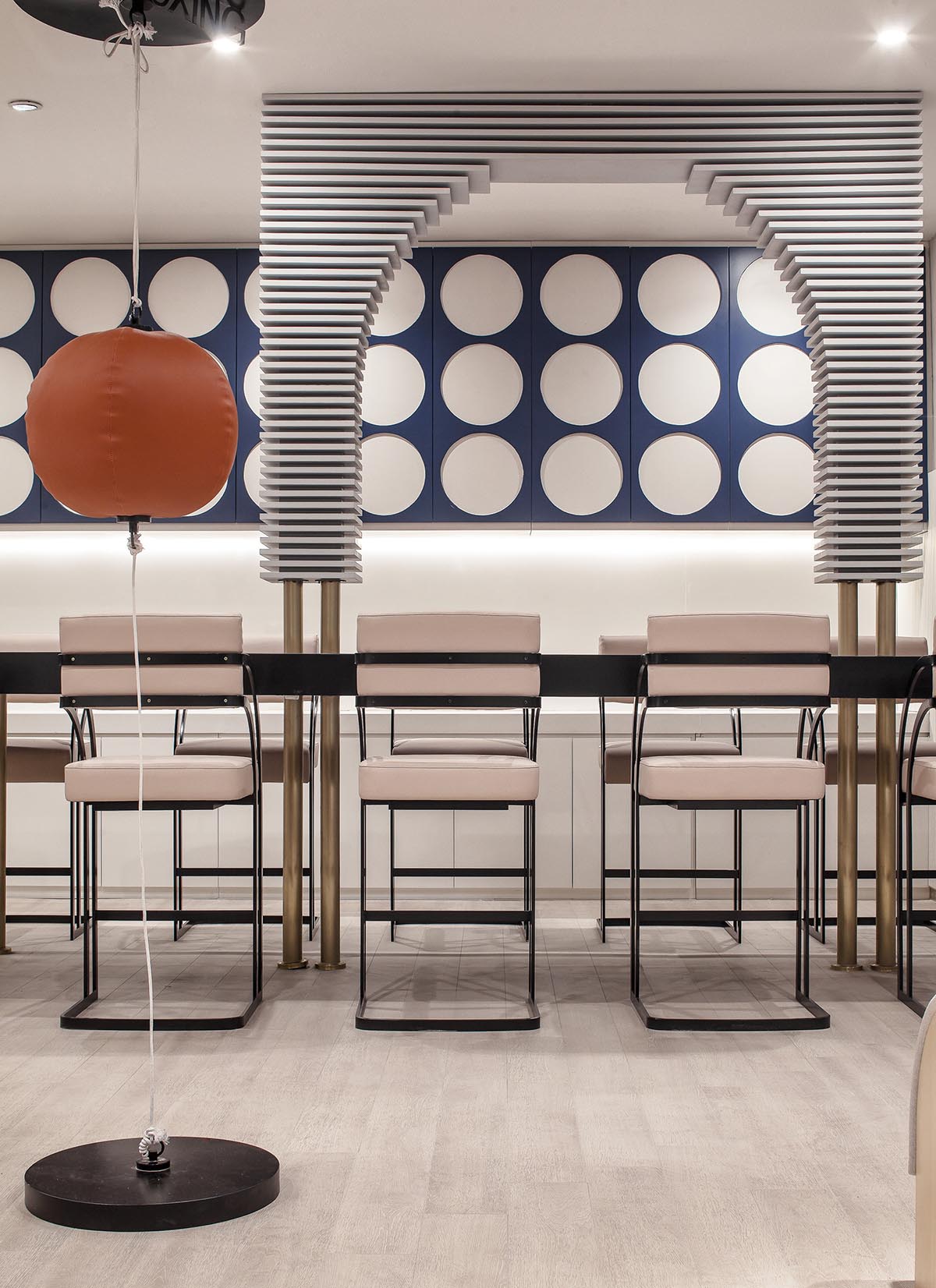
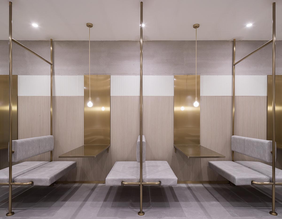
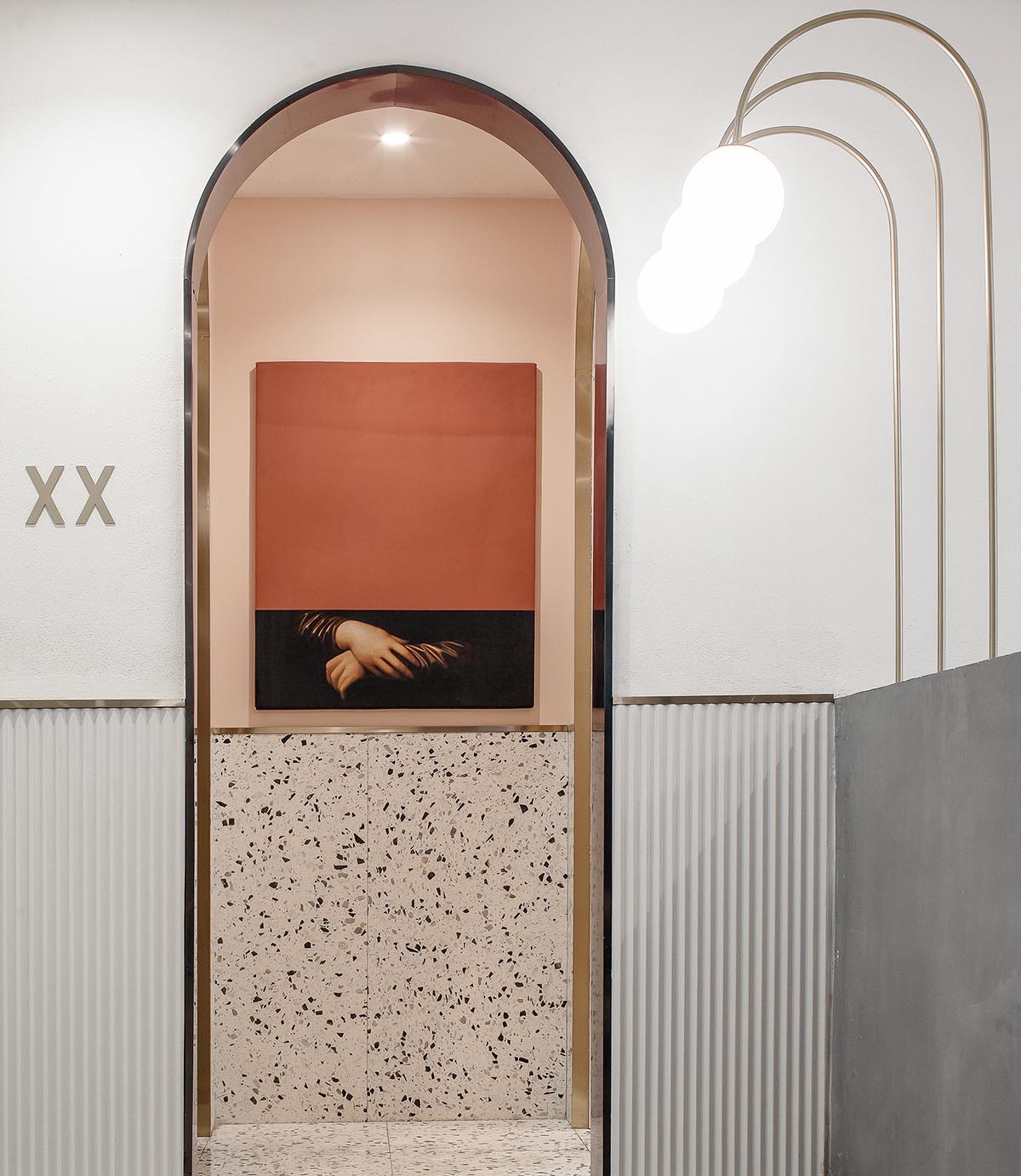
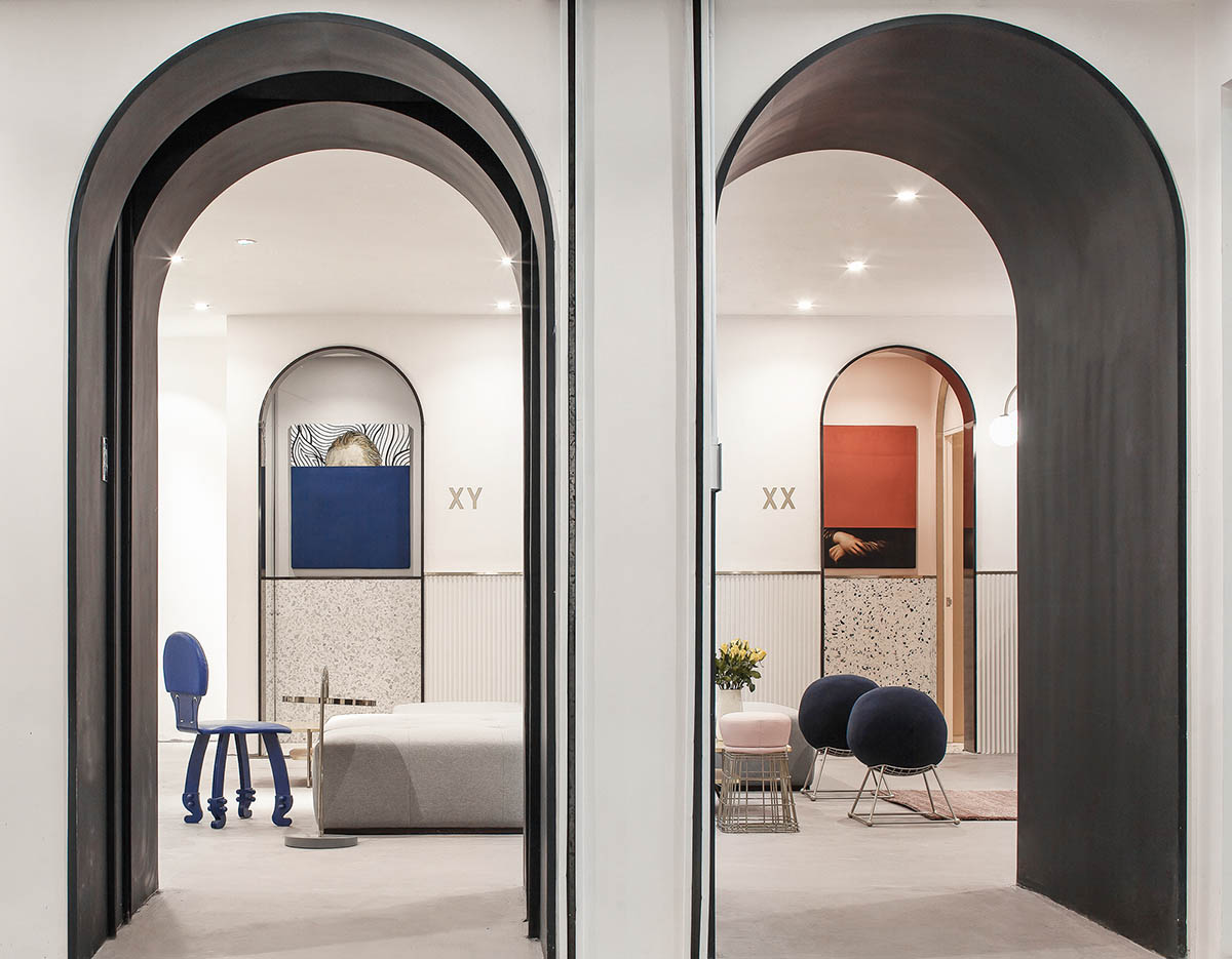
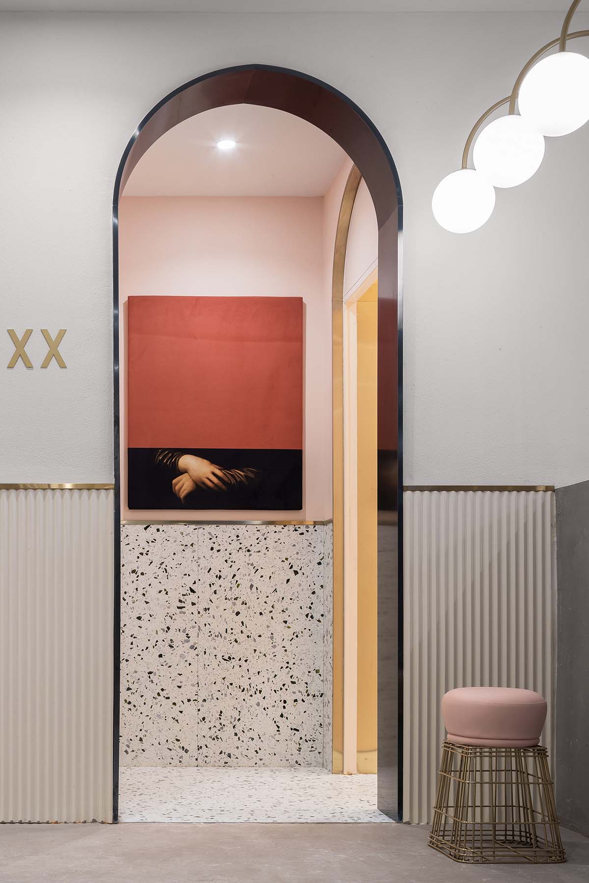
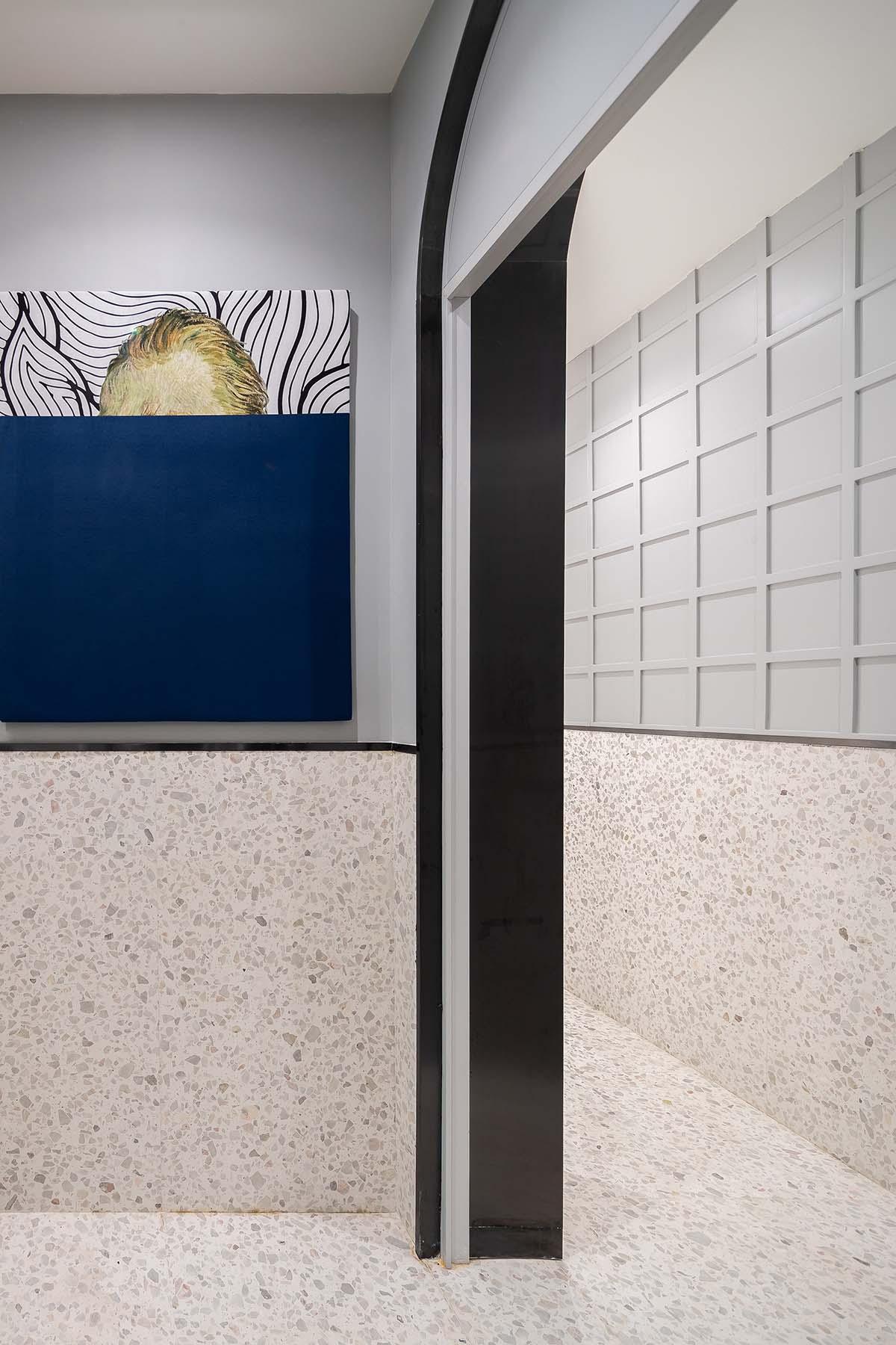
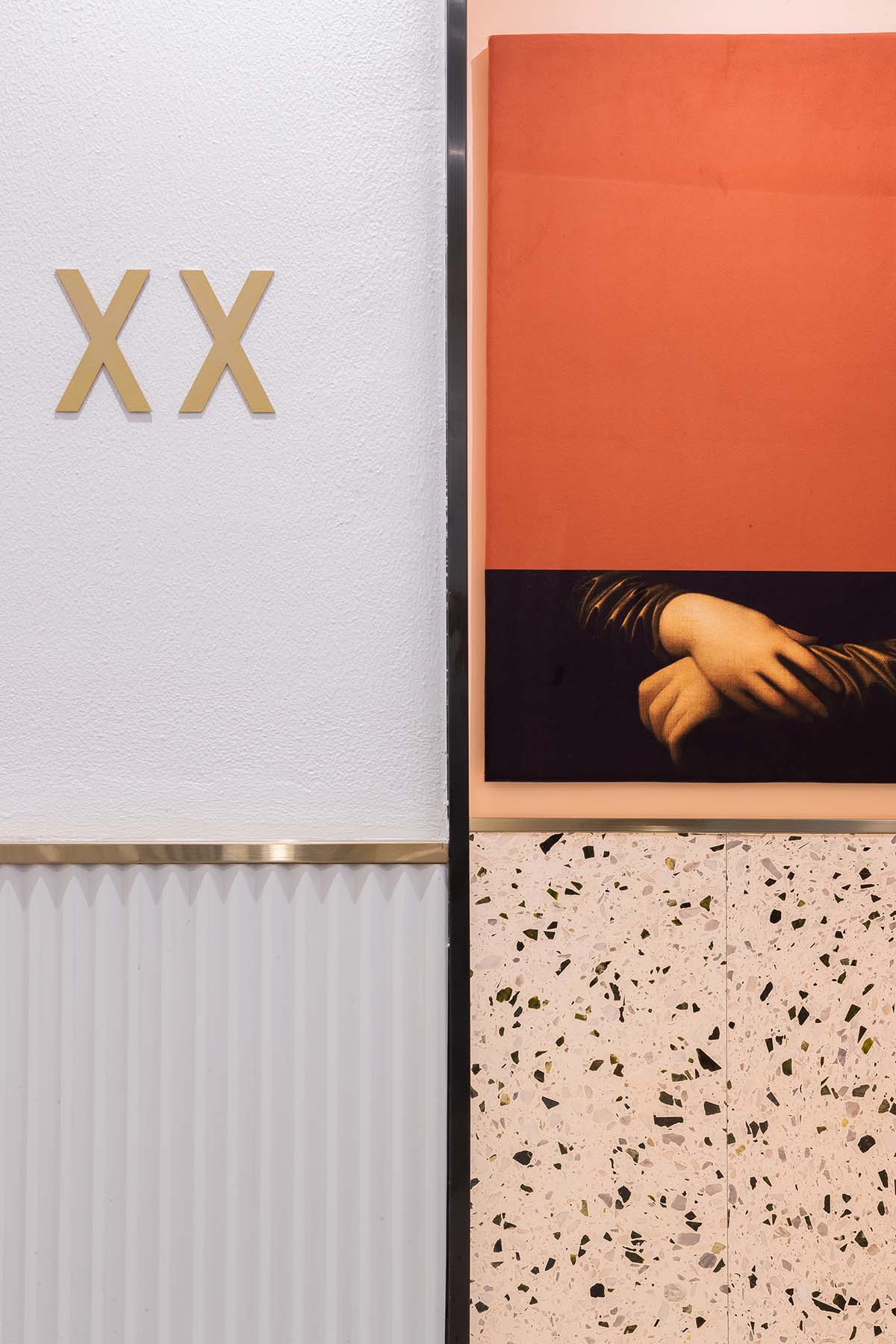
從主大堂扶梯上來,首先看到的是work hard 的歡迎櫥窗,然後轉身會看到一個特別怪誕、藝術的公共客廳。這裏我們引用了健身器械的元素進來,想要傳達健康工作的理念。我們把單杠吊環意化成巨大的香檳金畫框,當你穿梭其中就像置身於一幅幅畫作當中,我們根據使用的行為模式,設計了多種座椅形式,寬敞的大沙發,一個人安靜獨享的座椅,休閑的吊椅,學習的吧椅長桌。當你在這裏休憩工作時,也可以在旁邊的單杠吊環拉伸一下。為了打造客廳的舒適感,我們設計了一些地毯,並且讓它和牆麵的畫作結合在一起,讓它不僅是裝飾還是空間不可或缺的一部分。在客廳的邊上是一條開放式的水吧空間,還有一個休閑玩樂的海洋球池。透過水吧區可以看到兩幅怪誕的畫作,梵高自畫像的頭部和蒙娜麗莎的手分別代表男女衛生間的標誌。
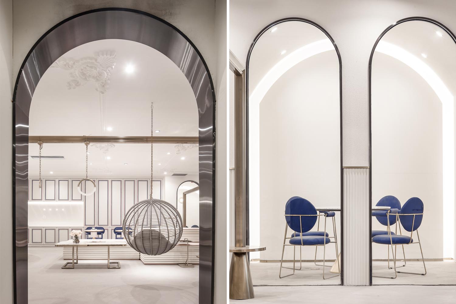
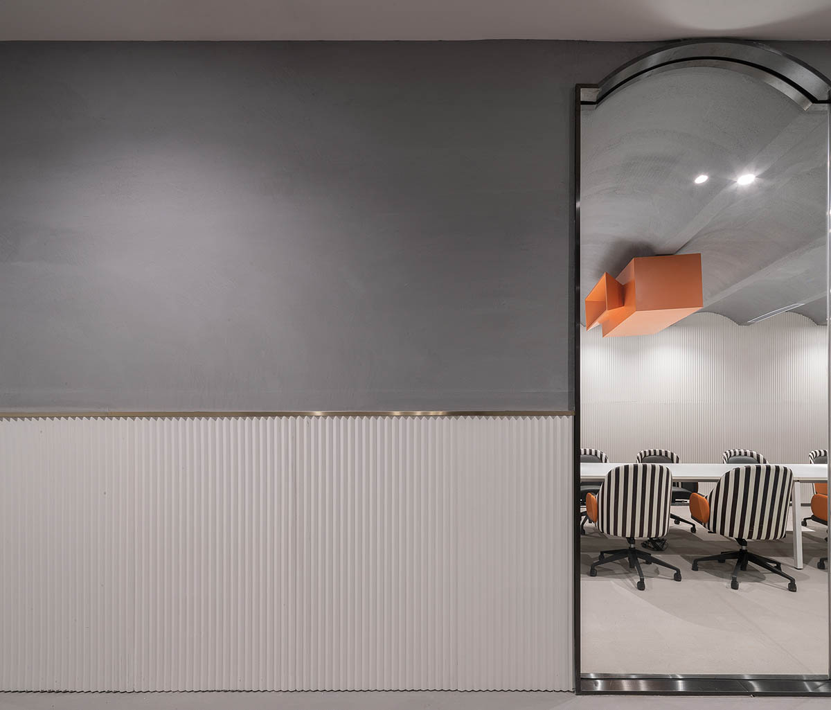
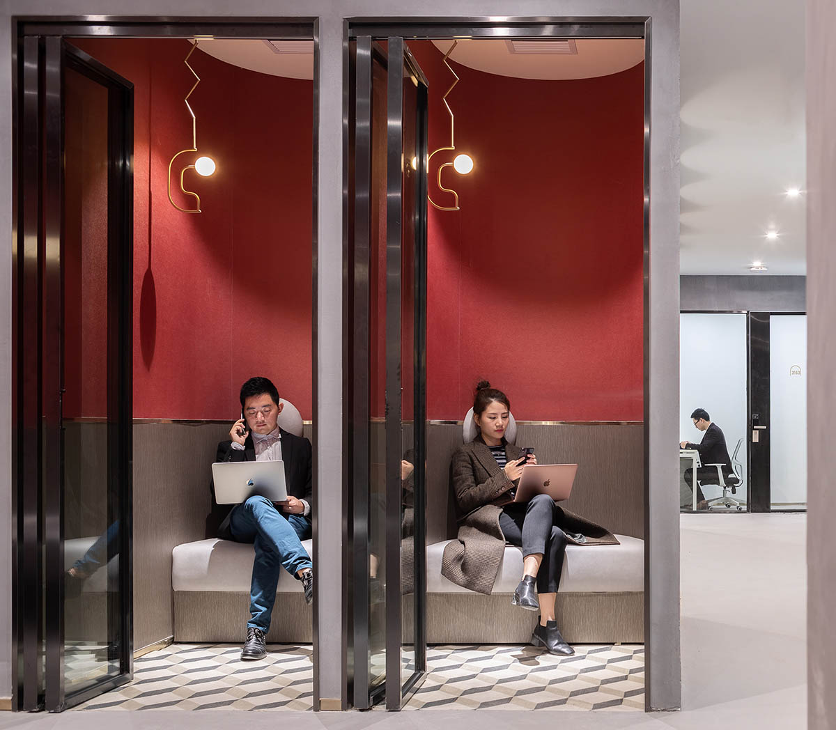
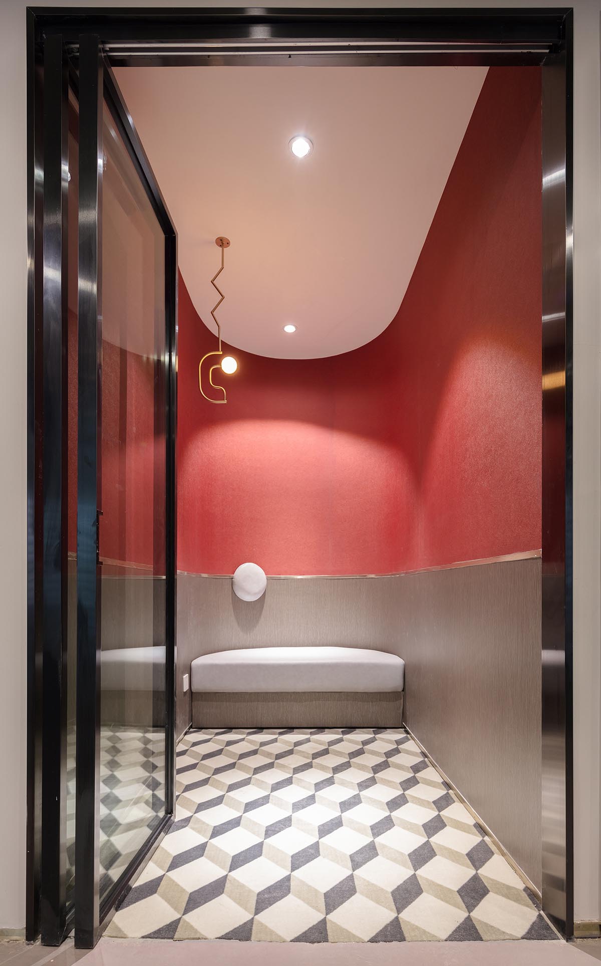
穿過客廳到達共享會議室和電話亭休息間,會議室我們采用簡練的硬裝,不進行過多裝飾,把投影機的盒子作為一個視覺亮點突顯出來。電話亭休息區我們采用比較溫暖的色調,考慮使用的舒適性,采用軟包的坐墊和靠墊。
3F is a small workspace, targeted at young groups. The space around the two escalators is used as public reception area, which is connected with the shared conference room and resting area, and separated from the office that requires privacy and quietness. Such clear spatial layout makes the visual point more focused, and facilitates future operation and management.
As reaching 3F by taking the escalator from the lobby, people will be firstly welcomed by the words “Work Hard” on a show window, and then see the public reception area with grotesque artworks when turning around. X+LIVING utilized elements of gym equipment in the space to convey the idea of keeping balance between health and work. The champagne gold horizontal bars and rings are very eye-catching, enriching the spatial experience. Chairs were designed with diversified forms and shapes for the sake of serving different needs, including social interaction, leisure, learning and staying alone.X+LIVING designed several rugs in the public reception area, which not only echo the paintings on the walls but also make the space more comfortable and visually attractive. The open bar area and relaxing ball pool are on the side of the reception area. It is interesting that two paintings can be seen from the bar area. The head part of Vincent Van Gogh’s self-portrait and hands of Mona Lisa indicate the washrooms for males and females.
Passing through the reception area, people will come to the shared conference room and the telephone-booth-shaped resting rooms. The conference room is characterized by minimalist design, with the projector box as the highlight. The resting rooms were decorated with a warm tone, equipped with soft seat and wall cushion.
∇ 4F大型聯合辦公
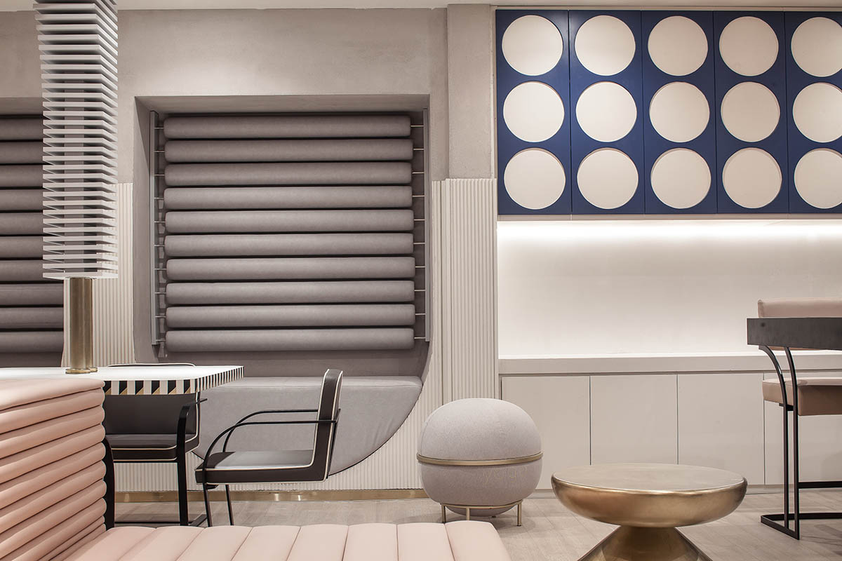
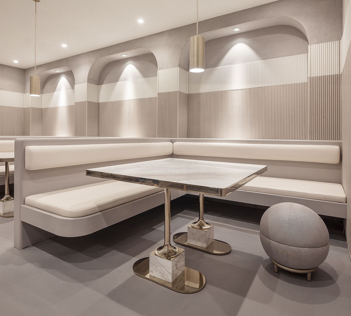
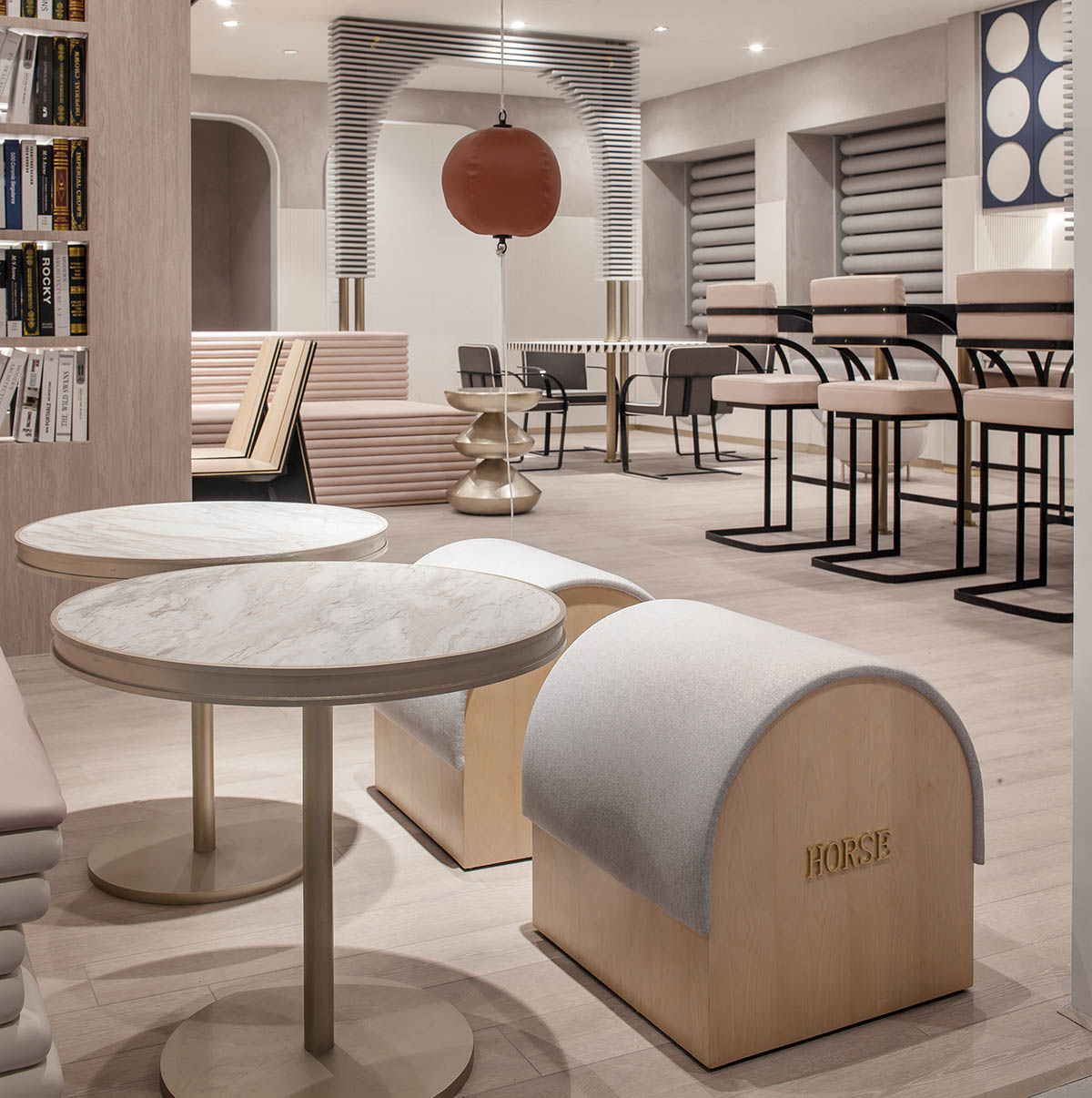
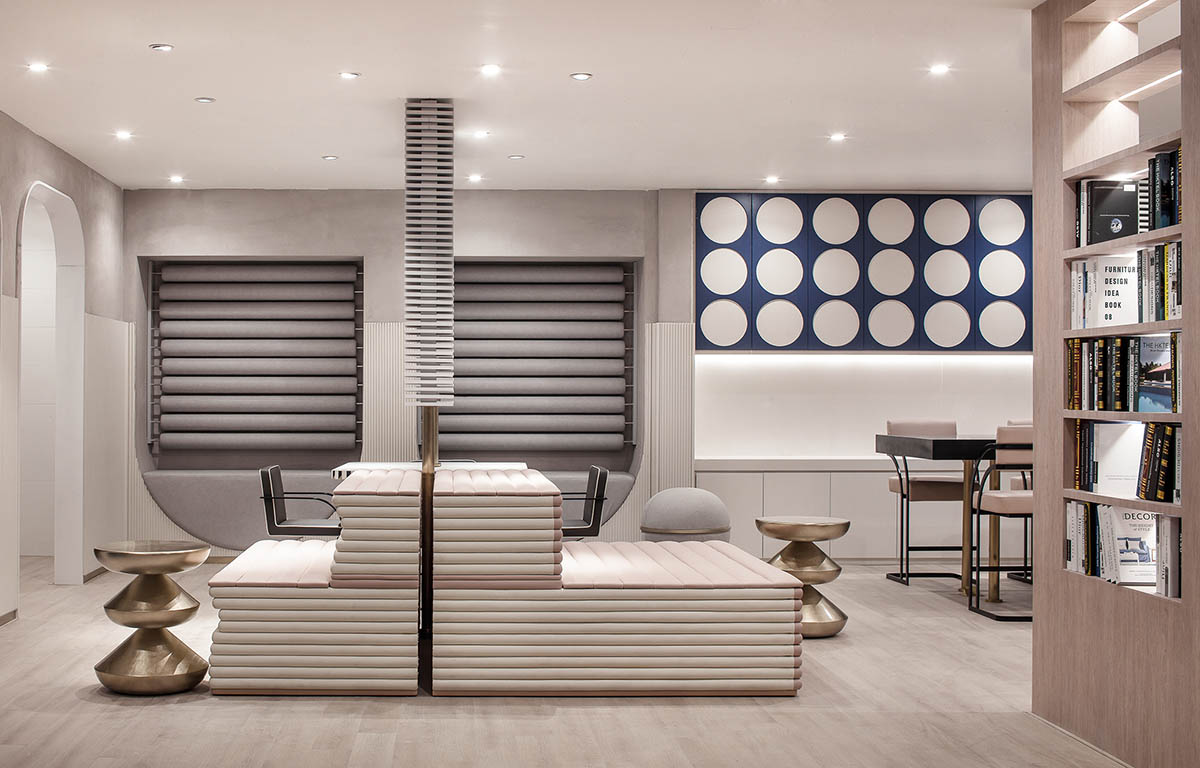
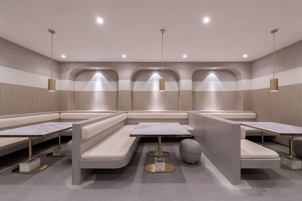
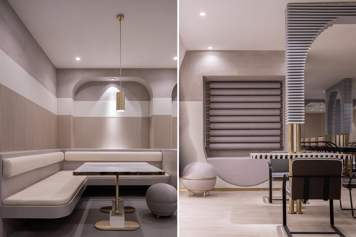
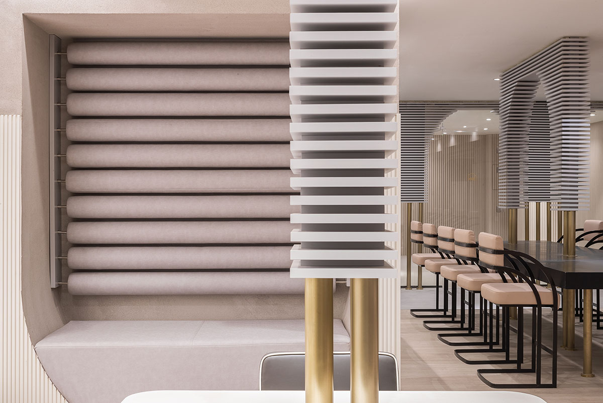
四層作為大型辦公空間,整體的布局上,同三層一樣,分別在兩個扶梯上來的空間作為公共客廳區域,大型的辦公室環繞在客廳周圍,讓每一間公司都能快速的到達。客廳區域依然采用多種的座位形式滿足不同的需求,公共的水吧空間也融合在這裏,同時設置相應的私密休息空間。因為針對的客群的不同,在調性上偏成熟穩重,在空間裏運用比較多的木飾麵和灰粽色的混凝土飾麵。家具也不同於三樓的怪誕色彩,更偏簡練沉穩。這裏我們也引用了健身器械的概念,很多卡座和坐凳都引用了按摩椅、瑜伽球的概念,提醒人們在工作之餘也能關注一下自己的身體。
4F is a large workspace for mature and elite groups. It has the same layout as 3F. The space near the escalators also functions as a public reception area, with the large office area surrounding it, so that employees of each company can reach their working area very conveniently. The overall space on this floor was endowed with a sedate and mature atmosphere by use of wood veneers and grayish-brown concrete coating in a large area. The furniture was designed in a minimalist style. Besides, elements of exercise equipment can be found in the space as well, reminding people to pay attention to physical health after work.
∇ 洗手間
∇ 1F平麵圖
∇ 3F平麵圖
∇ 4F平麵圖
完整項目信息
項目名稱:深圳小元裏聯合辦公項目
項目地點:中國 深圳
項目麵積:8800㎡
完工時間:2018.12
設計單位:唯想國際(www.xl-muse.com)
主持設計:李想
項目總監:任麗嬌 吳鋒
參與設計師:錢慧蘭 陳雪 羅紫豔 範祺 劉汝琴 江雪萍
定製家具:XiangCASA
XiangCASA品牌部總監:Justin周 鄭敏平
XiangCASA設計師:楊歡 高玲
項目攝影:邵峰 周玉強 胡義傑
Project Name: UNOVA CO-WORKING SPACE
Location: Shenzhen, China
Area: 8800 m2
Completion Time: December 2018
Design Company: X+LIVING(www.xl-muse.com)
Chief Designer: Li Xiang
Project Directors: Ren Lijiao, Wu Feng
Participating Designers: Qian Huilan, Chen Xue, Luo Ziyan, Fan Qi, Liu Ruqin, Jiang Xueping
Customized Furniture: XiangCASA
XiangCASA Directors: Justin CHEW, Zheng Minping
XiangCASA Designers: Yang Huan, Gao Ling
Photography: Shao Feng, Zhou Yuqiang, Hu Yijie


