Torafu architects在日本東京完成了aesop shibuya的店麵設計,這是該澳大利亞護膚品牌的第十家零售店。該項目要求對明治大道的一層空間進行室內重新設計,後麵是這個城市熱鬧的原宿地區。現有結構的門麵長度為7米,空間深度為12米,建築師保留了原有的框架,運用彎曲的木質框架,引導零售體驗。
torafu architects has completed ‘aesop shibuya’ in tokyo, japan, its tenth retail outlet for the australian skin care brand. the project called for the interior redesign of a first floor space along meiji avenue, trailing towards the city’s lively harajuku area. the existing structure has a frontage of 7 meters and a depth of 12 meters with architects retaining the original framework with the addition of an curved infrastructure which navigates the retail experience.
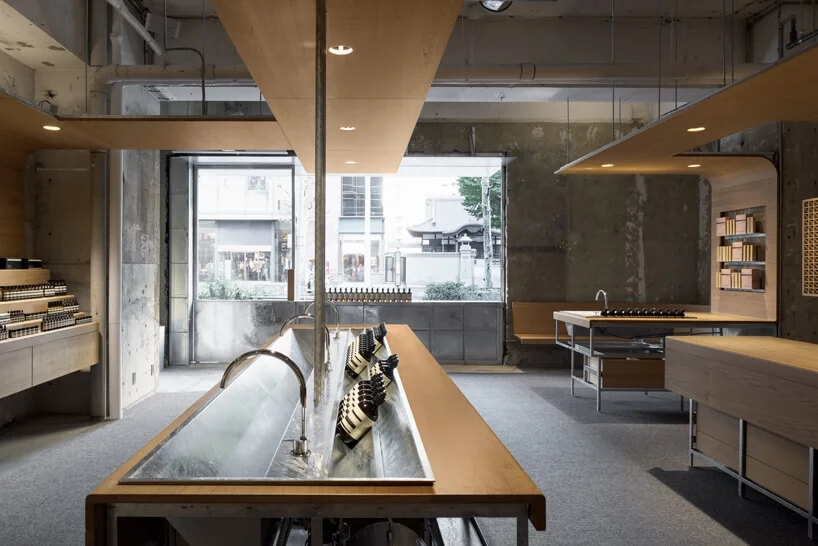
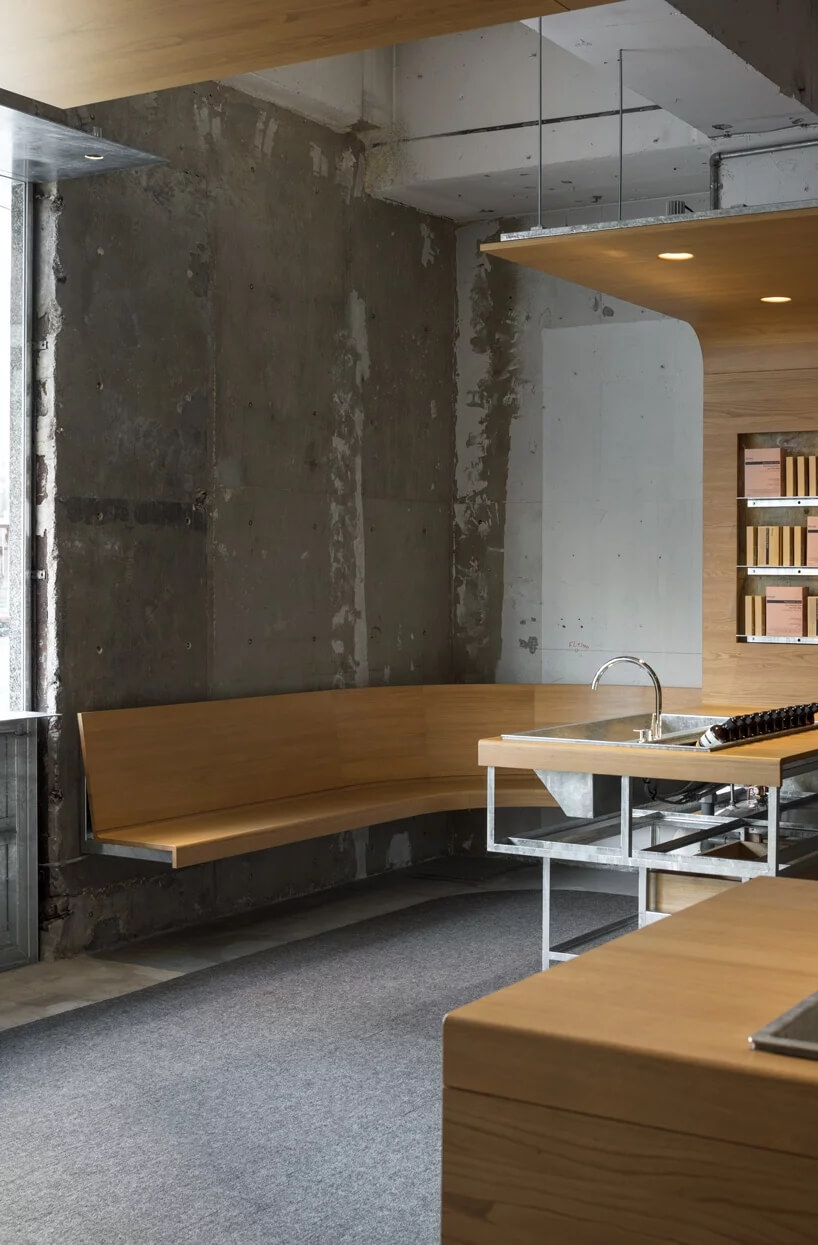
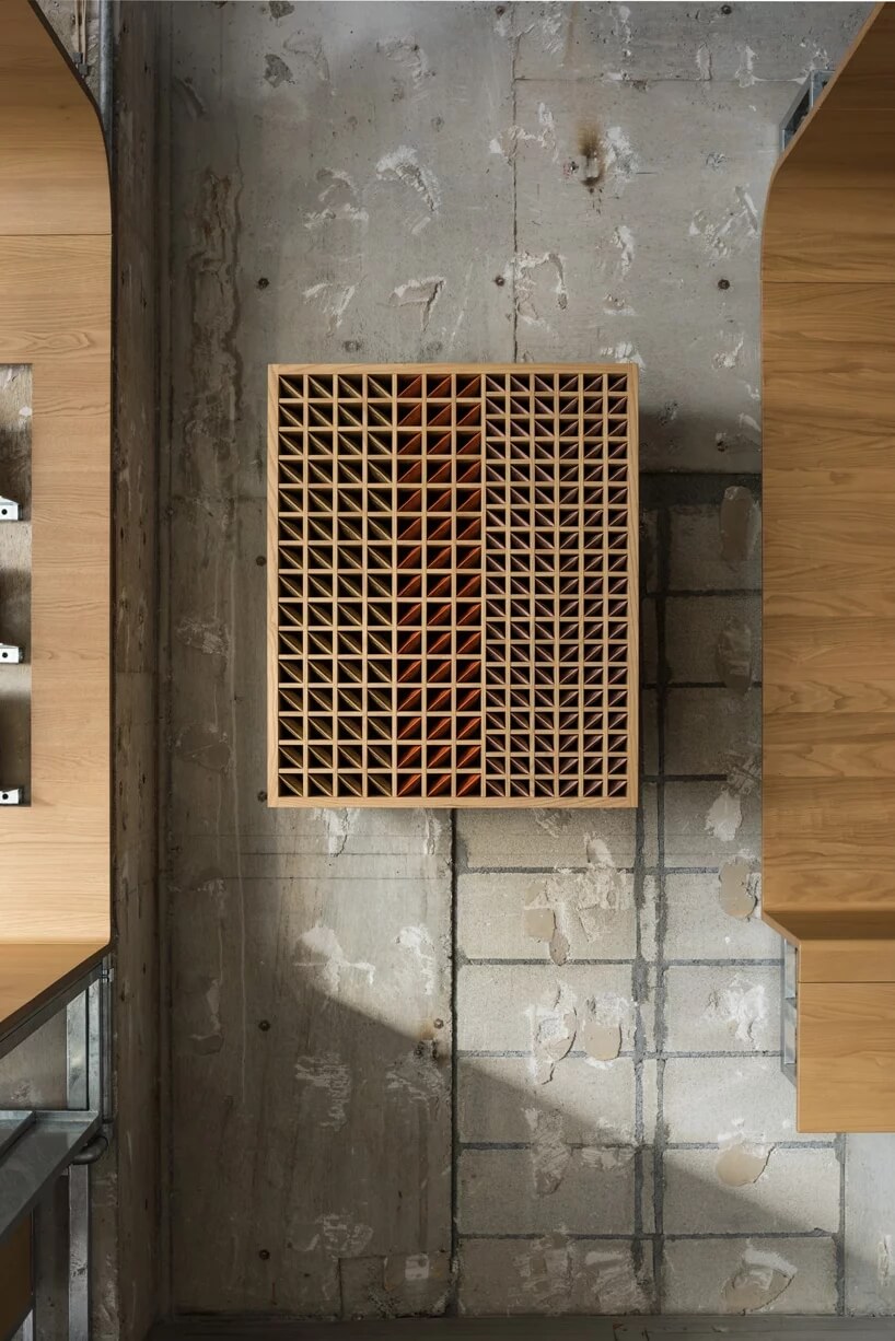
這家店從涉穀地區不斷變化的氛圍中汲取靈感,涉穀是一個新舊建築交相輝映的地方。在拆除現有的內部結構後,一個混凝土框架暴露在外,torafu決定保留其目前的狀況。板栗木製成的木製框架為其增添了一種幹淨的表麵和對比鮮明的觸感。torafu委托日本木家具製造商karimoku new standard生產這些框架的,這些框架將空間組織得像一個分層畫廊。
the store takes cues from the ever-changing atmosphere of shibuya, an area where old towns and new architecture coincide. after dismantling the existing interior a concrete skeleton was left exposed which torafu architects decided to leave in its current condition. the rawness of this is complimented by fixtures made from chestnut wood offering a clean finish and a contrasting tactility. japanese wood furniture maker karimoku new standard was commisioned by torafu to handle production of these fixtures which organize the space like a tiered gallery.
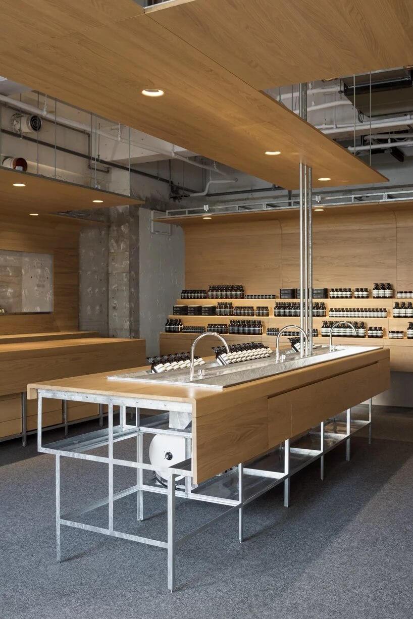
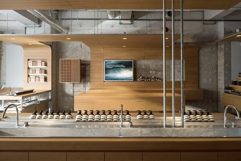
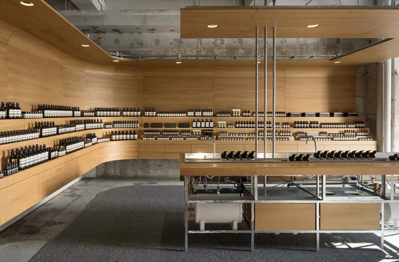
這些木製框架的弧型結構有助於勾勒出內部,成為基礎設施的一部分,主導整個空間。空間以一個大水槽為中心,這是aesop商店的支柱,旨在創造一種真實的體驗,鼓勵顧客試用產品。在空間的左側,一個獨立的島嶼提供了一個銷售點。與此同時,商店前麵的一個彎曲的長椅,與對麵的層疊書架的形式相呼應,為遊客創造了一個私密的空間。至於地麵,羊絨地毯占據了現有混凝土的部分,每當人們從堅硬的路麵進入商店時,從腳部開始給人一種柔軟的印象。
the curvature of these wooden units helps to delineate the interior, forming part of a larger infrastructure which navigates the space as a whole. the roundabout plan is centered on a large sink, a mainstay in aesop stores which aims to create an authentic experience encouraging customers to try out products. running adjacent to the left-hand side of the space, a separate island offers a place for point of sale. meanwhile, a curved bench at the front of the store, mirroring the form of the tiered shelving sat opposite, creates an intimate space for visitors to sit. as for the floor, cashmere carpet occupies areas on the existing concrete giving an impression of softness starting at the feet whenever people enter the store from the hard road surface.
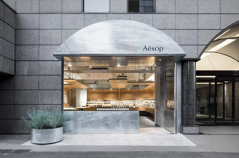
建築師為aesop店麵出口選擇了鍍鋅鋼覆層,使外立麵和內部金屬配件之間保持統一。作為街麵商店的門麵,外立麵的設計通過增加屋簷來繼承現有環境,屋簷似乎重複應用了隔壁建築入口的拱形大門。
the architects chose galvanised steel cladding for the aesop outlet, imparting unity between the façade and the metal fittings inside. serving as the face of the street-level store, the façade was designed to inherit the existing environment by adding eaves that appear to repeat the arch-shaped gate applied to the entrance of the next-door building.
Torafu解釋說:“我們想到了一個原始結構和新裝潢可以共存的空間。仿佛是為了回應澀穀地區的不斷更新發展,我們的目標是創造一個擁有新舊動態對比的商業空間。”
‘we thought of a space where foundation and finish would coexist,’ torafu architects explains. as though in response to the continuous renewal of shibuya, we aimed to create a store space that possessed a dynamic contrast between the old and the new.
完整項目信息
項目名稱:東京aesop商店
項目位置:東京澀穀
項目類型:商業空間/aesop商店
完成時間:2018
使用材料:鍍鋅鋼、混凝土、板栗木
設計公司:torafu architects
設計團隊:archiee(yusuke kinoshita & daisuke sekine)
攝影:aesop


