LOFT中國感謝來自 堂晤設計 的辦公室項目案例分享:
壹 頭 牛
貳 隻猴子
叁 個豆袋
肆 塊黑板
伍 組櫃子
陸 個樹池
集齊六個條件,完成一個工作室
該項目位於上海市閔行區七寶萬科國際;
我們希望工作室足夠的輕鬆、溫性、創意,於是通過顯性與隱性的符號對我們的目標進行構建;
A cow
Two monkeys
Three lazy couches
Four blackboards
Five sets of cabinets
Six tree pool
Collect six conditions, complete a studio
The project is located in Minhang District, Shanghai Qibao Vanke International.
We hope that the studio is relaxed, warm and creative enough, and then constructs our goal through explicit and implicit symbols.
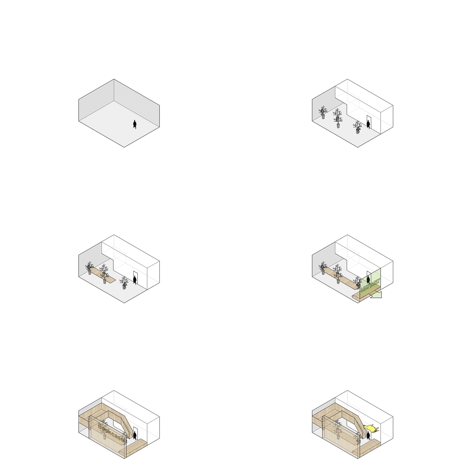
∇ 空間概念動畫
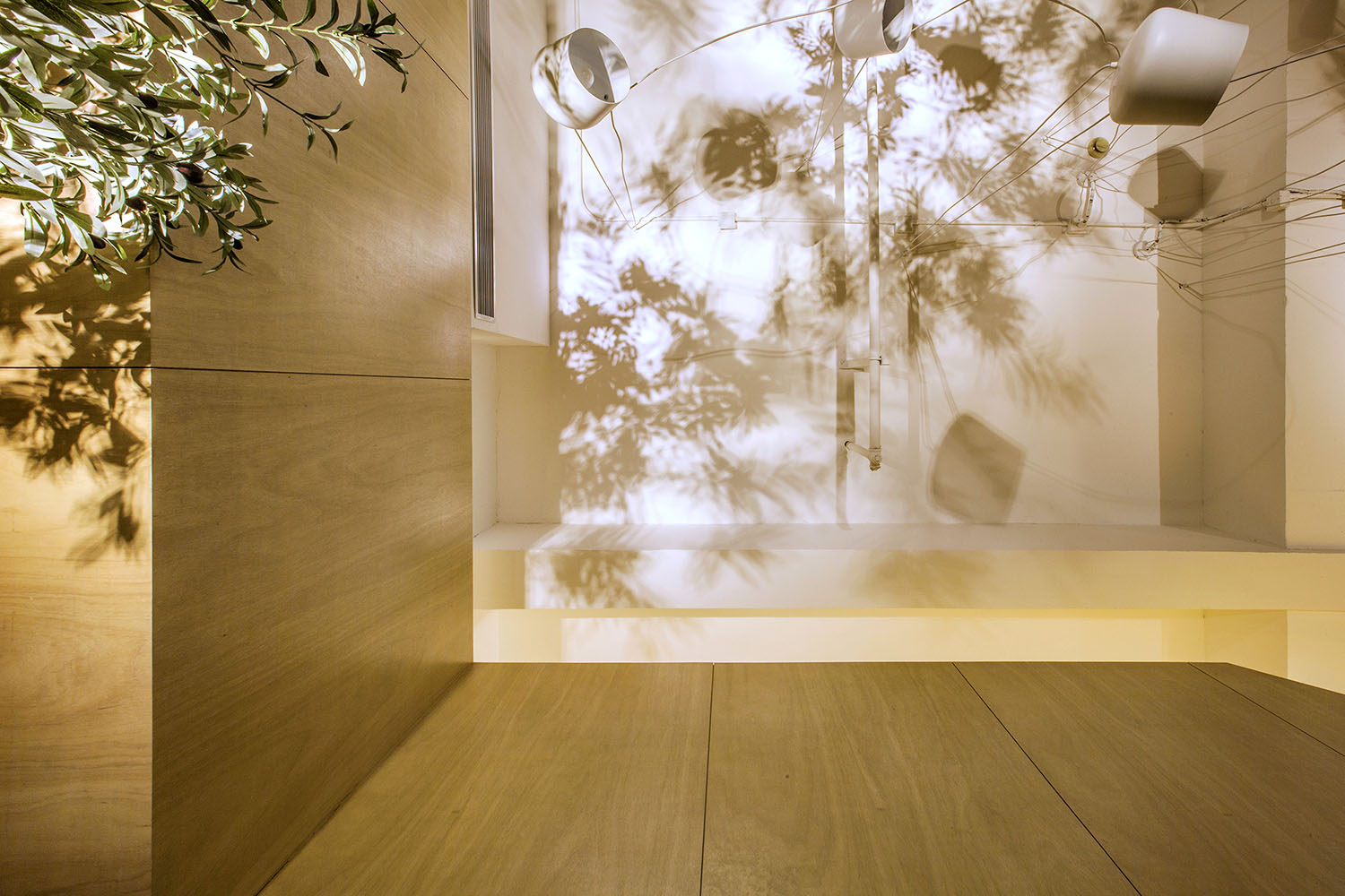
∇ 陽光灑進來,我們在這裏工作,有樹還有牛
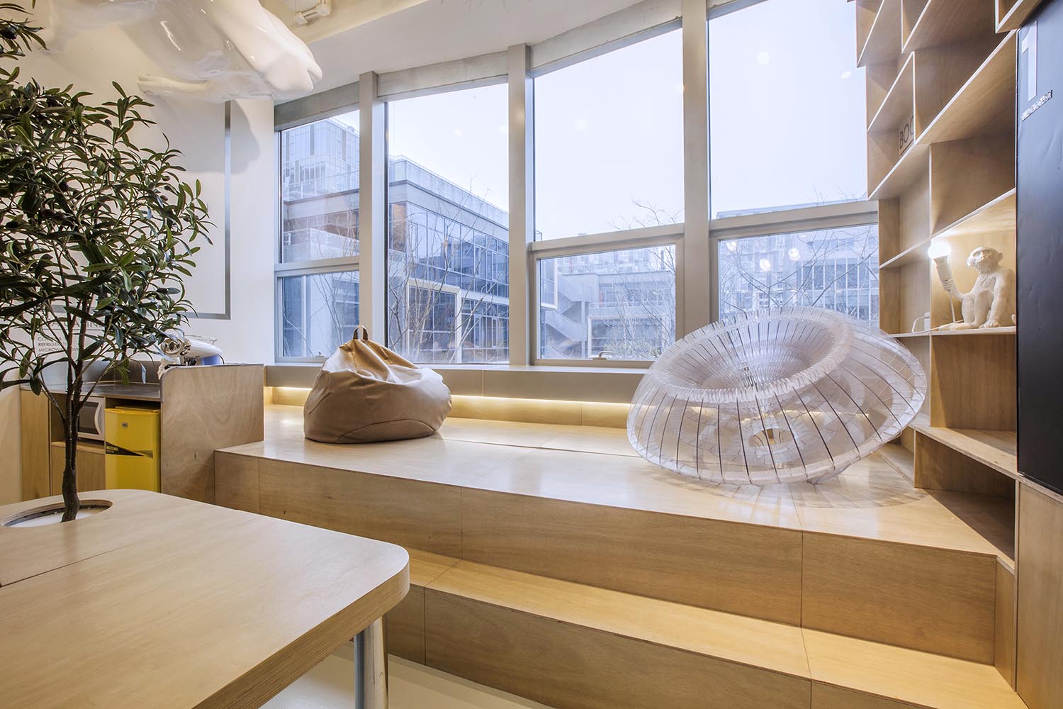
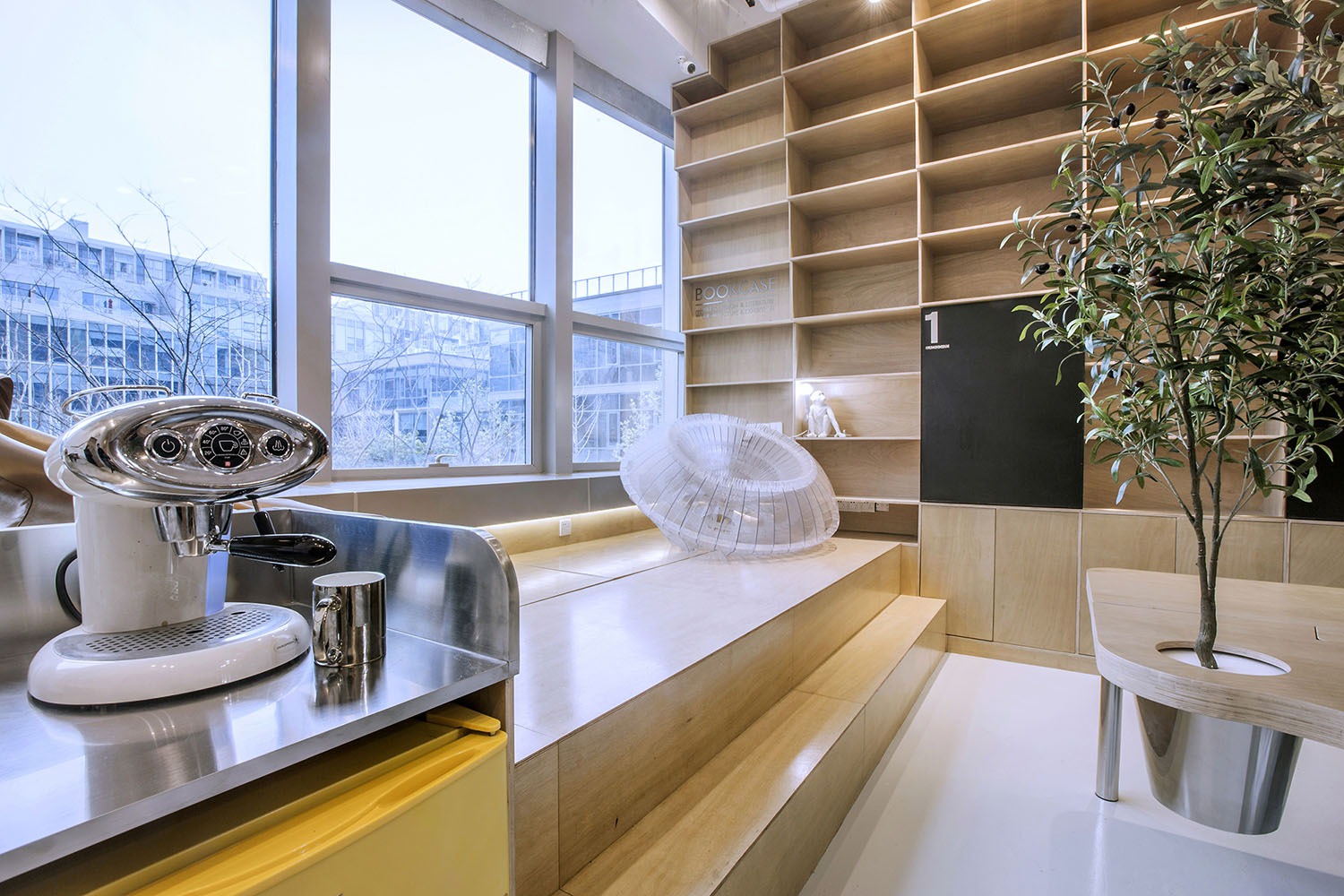
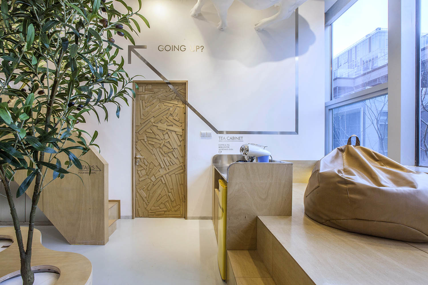
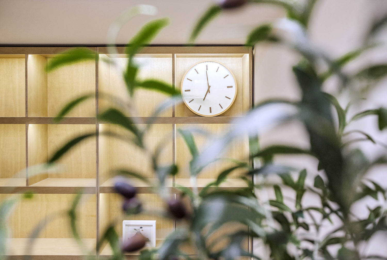
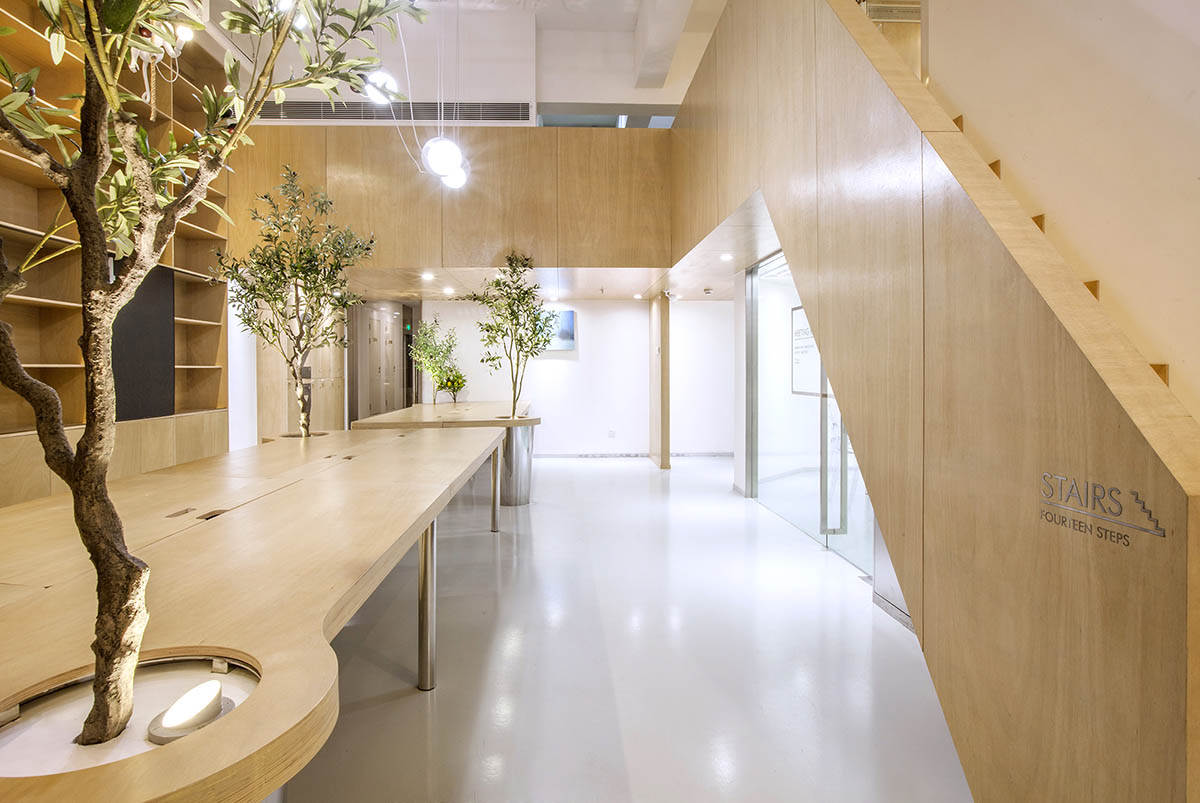
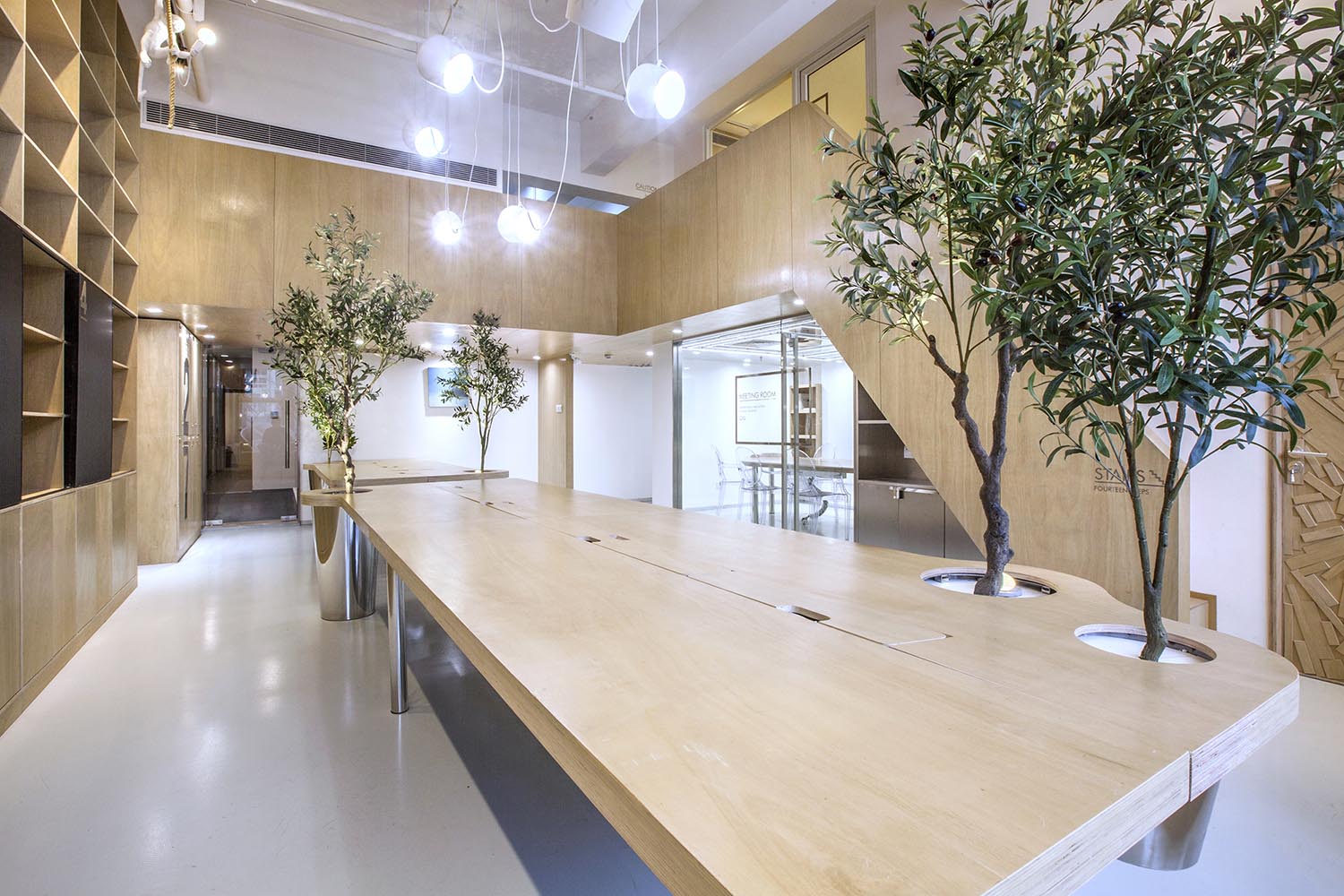
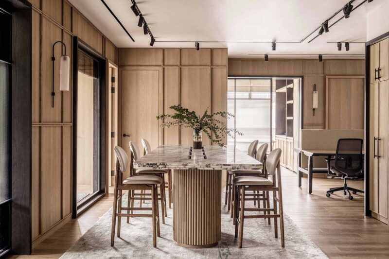
空間用了大量溫暖的木色,並組成木質的空間體塊,這些體塊以整個白色空間為背景,進行功能與空間節奏上的構築;
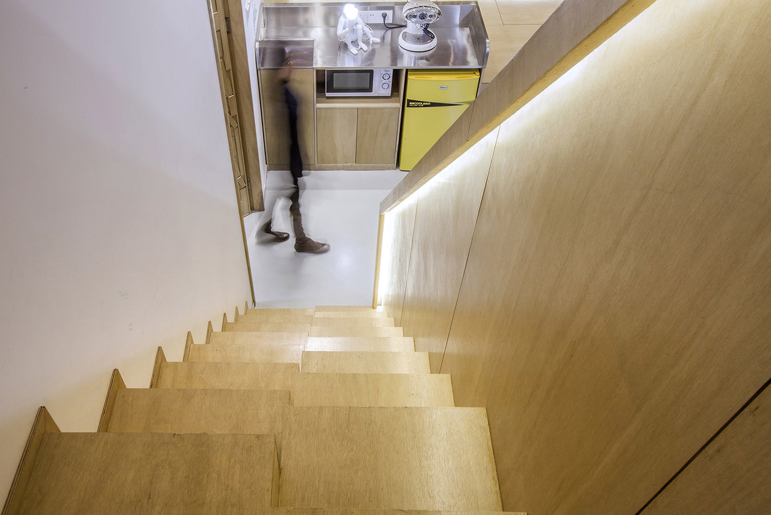
有的形成斜線——樓梯;
有的形成直線——地台;
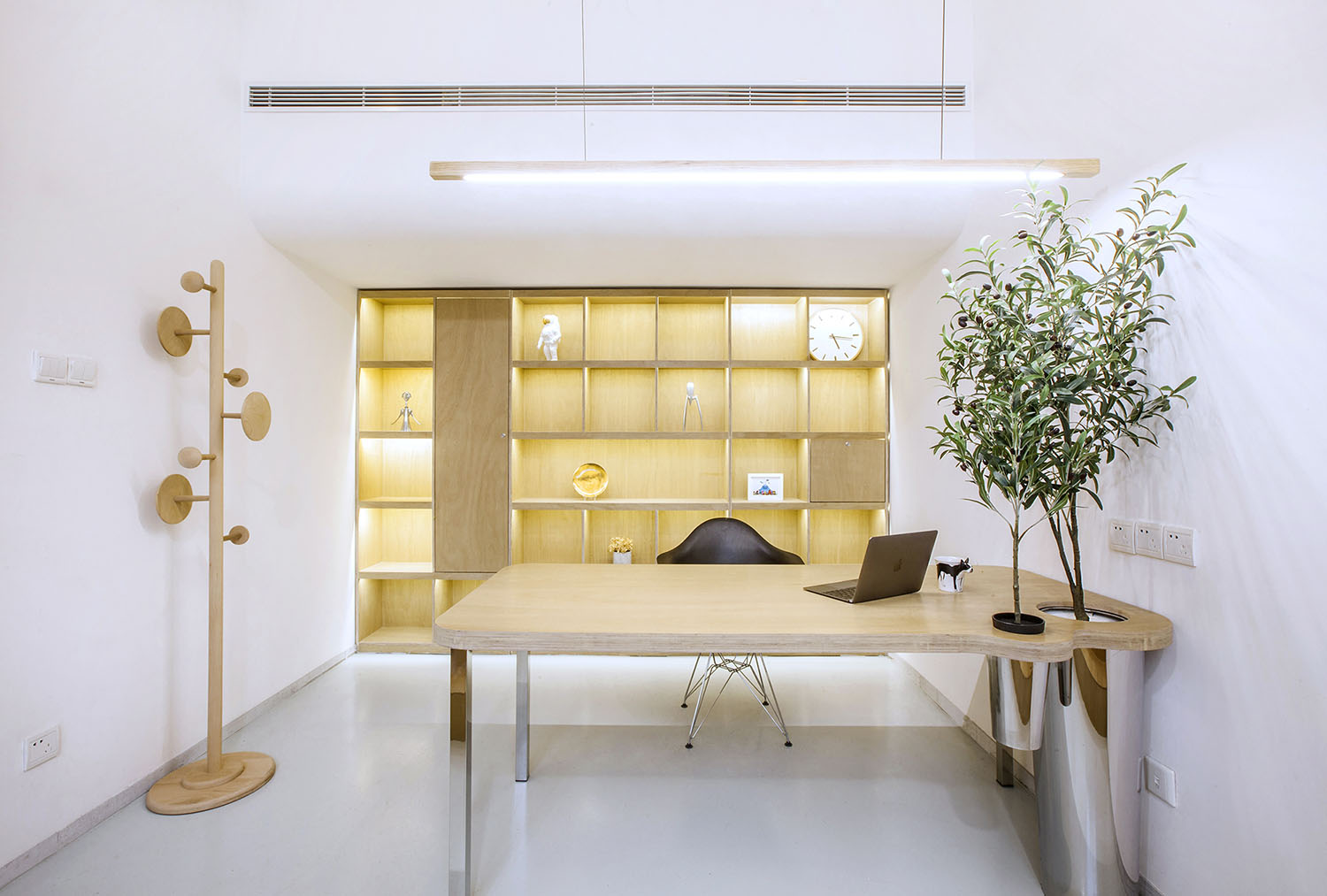
有的成為網格——書架;
但是又連為一體,與空間相融;
有了一個富有韻律的空間構築物後,就是一些吸睛的柔性元素介入。
The space uses a large amount of warm wood color and forms a wooden space block which takes the whole white space as the background to construct the function and space rhythm.
Some form slashes – stairs
Some form a straight line – the platform
Some become grid – bookshelf
But even as one, and the integration of space
With a rhythmic space structure, there are a few eye-catching, flexible elements involved.
所以——
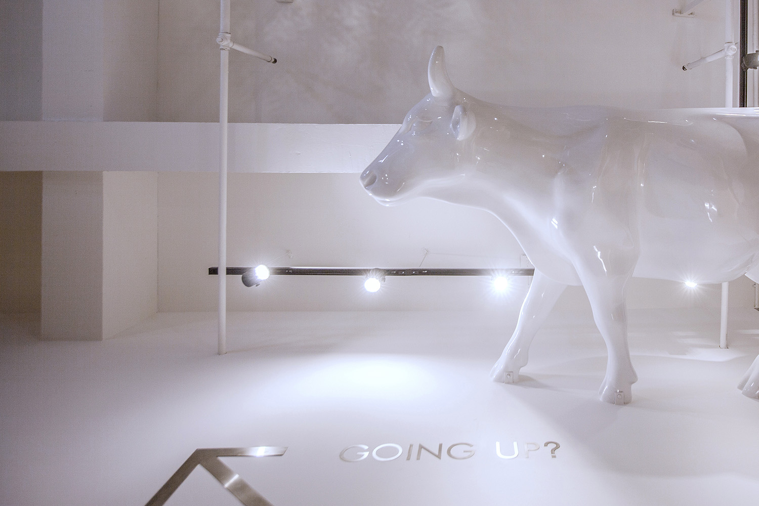
牛,上天了;
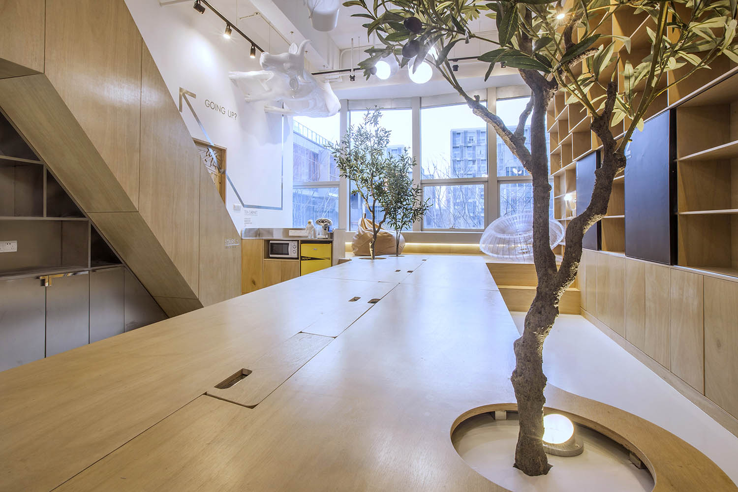
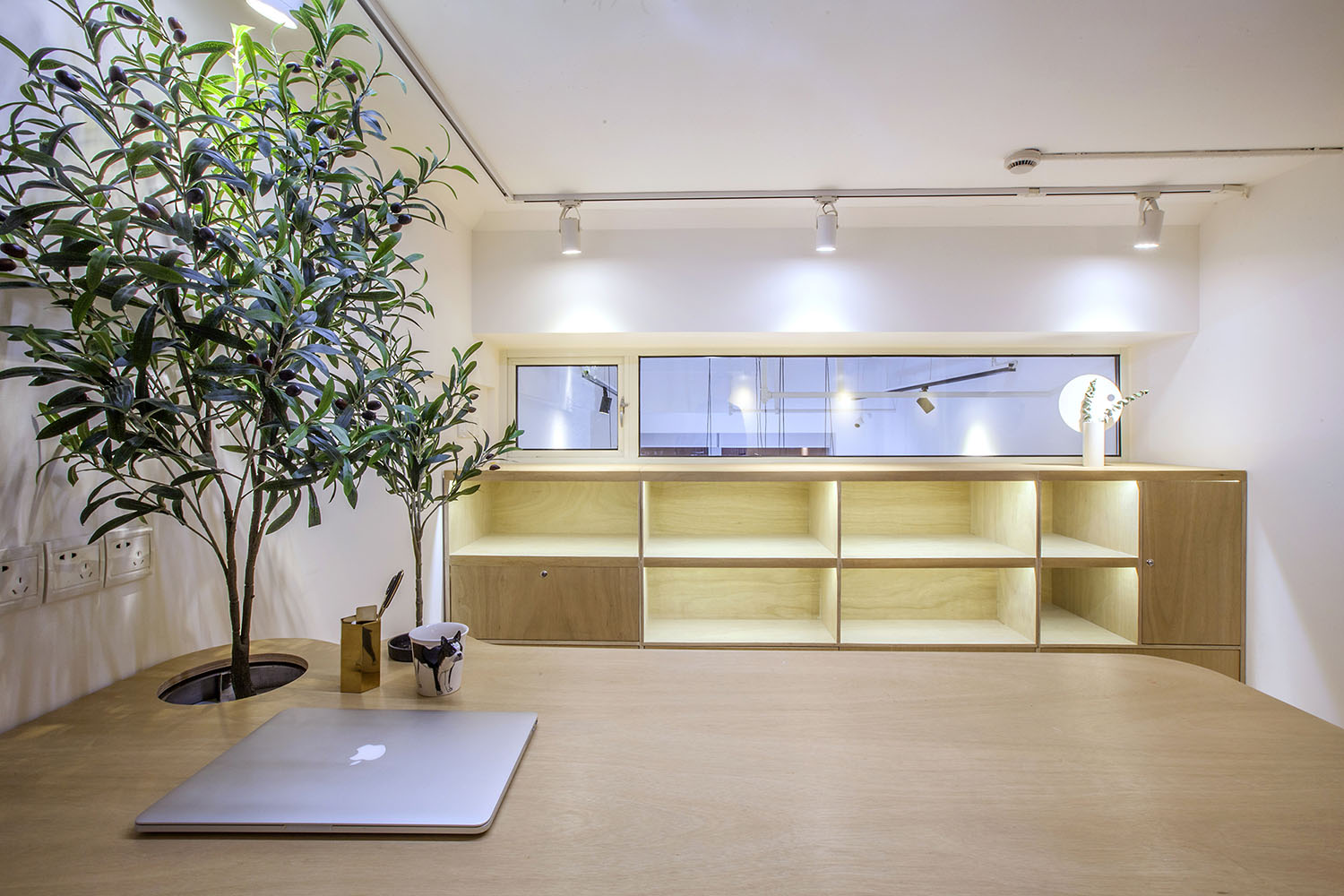
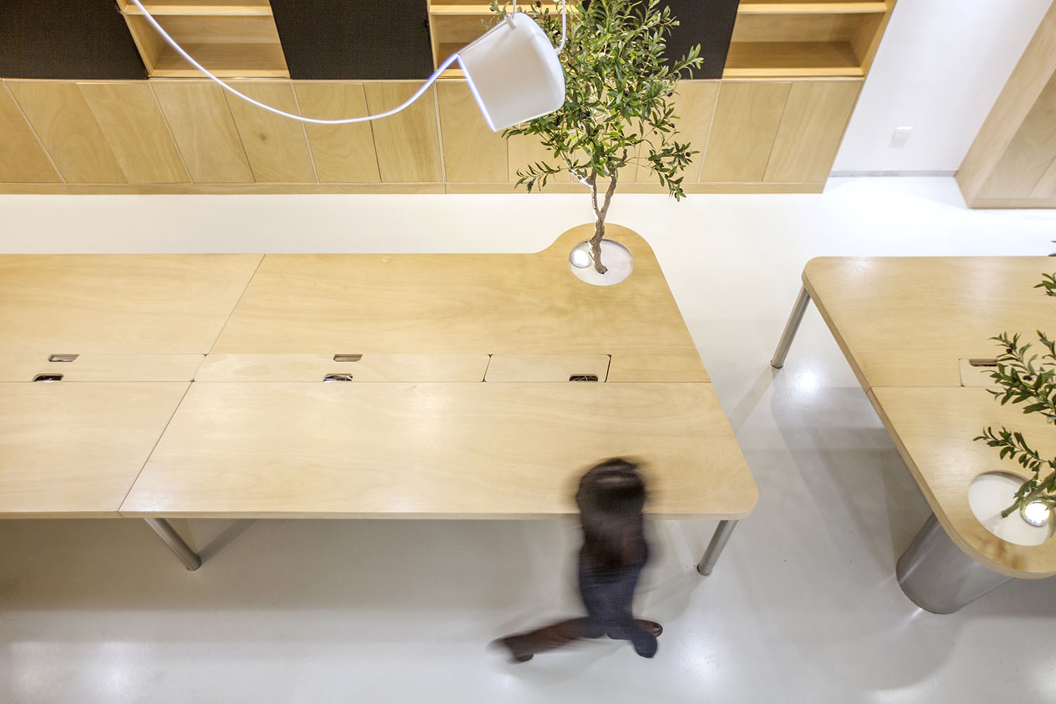
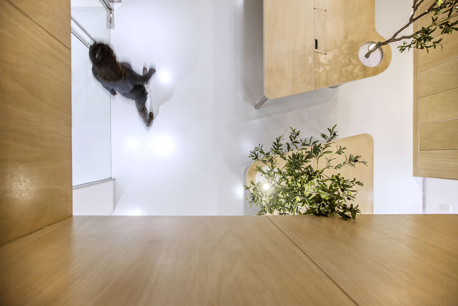
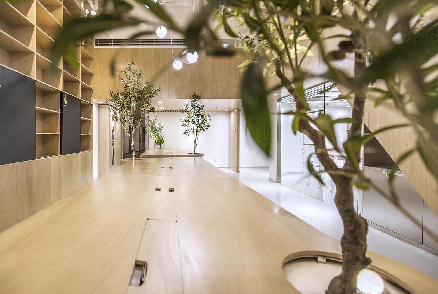
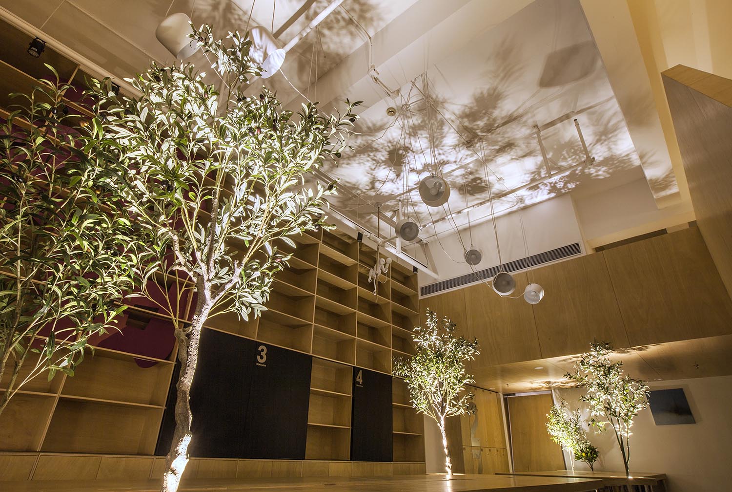
樹,栽桌子上了;
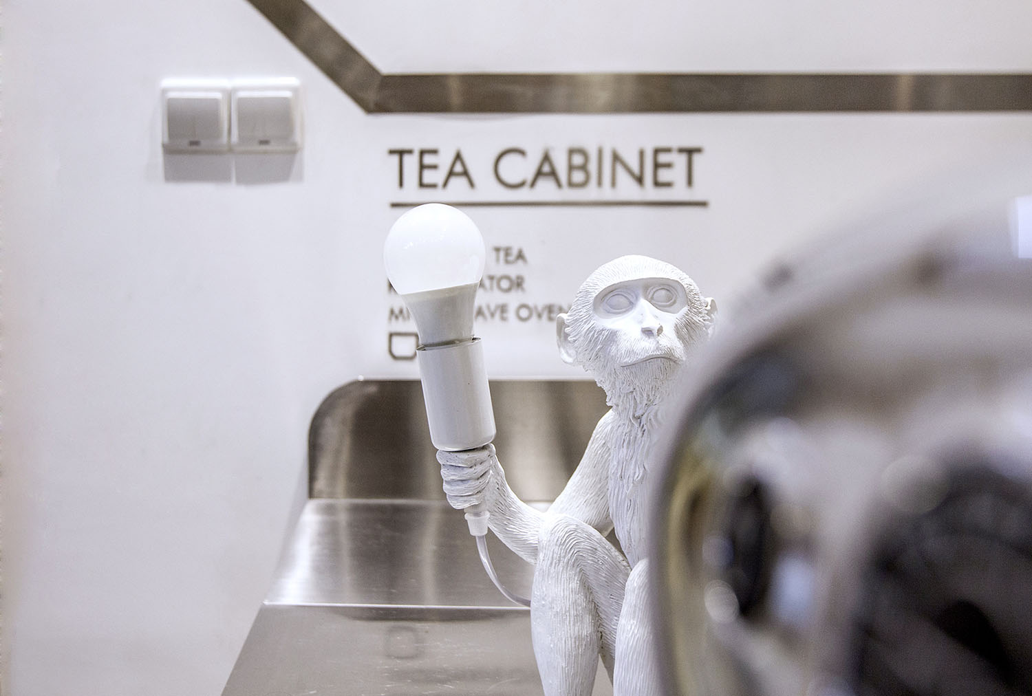
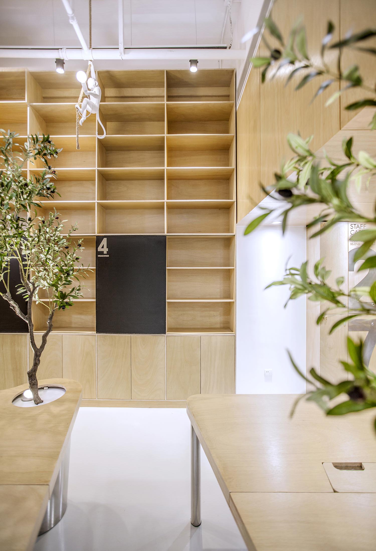
猴子,掛在書櫃邊…
這些無厘頭的元素一方麵均衡的軟化整個空間,
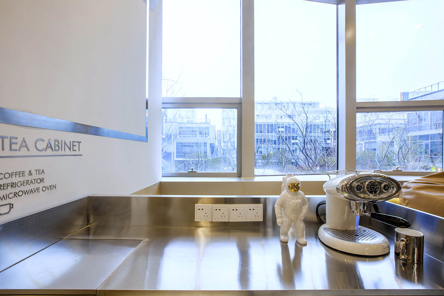
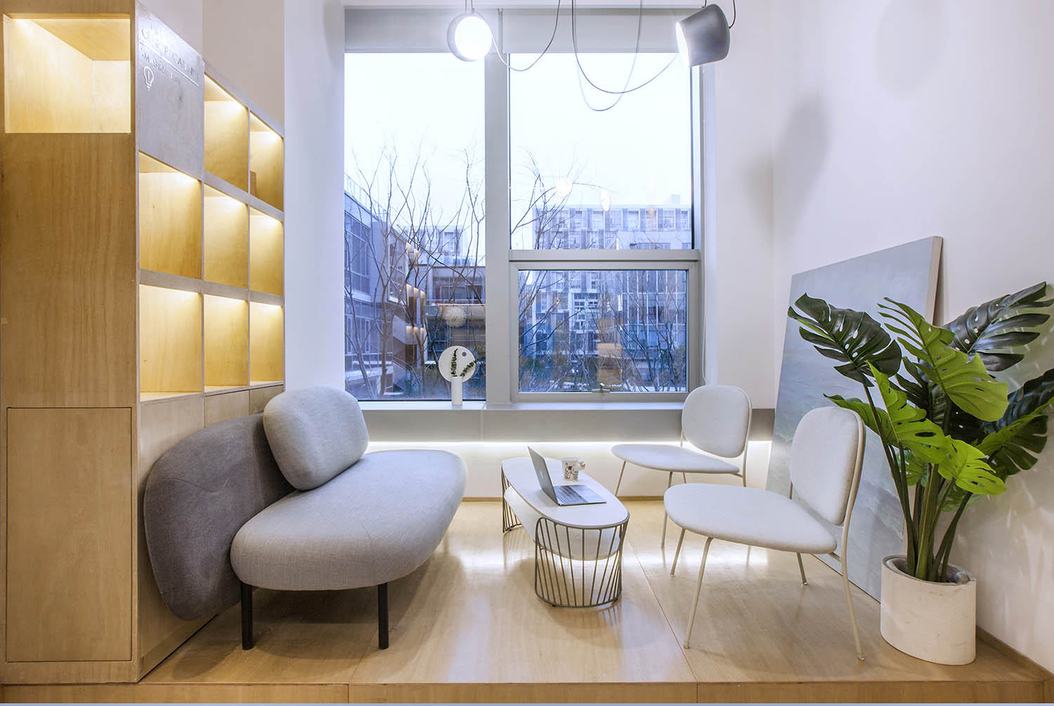
另一方麵讓我們在忙碌時候,大開腦洞.工作之餘,一抬頭,會心一笑,累的時候,一杯咖啡,坐在窗邊放飛一下自我;
so
Cattle fly to heaven
Tree, planted on the table
Monkey, hanging in the bookcase
On the one hand, these irregular elements soften the entire space
On the other hand, when we are busy, we open our brains, spare time, look up, smile, tired, a cup of coffee, sit by the window to fly about self.
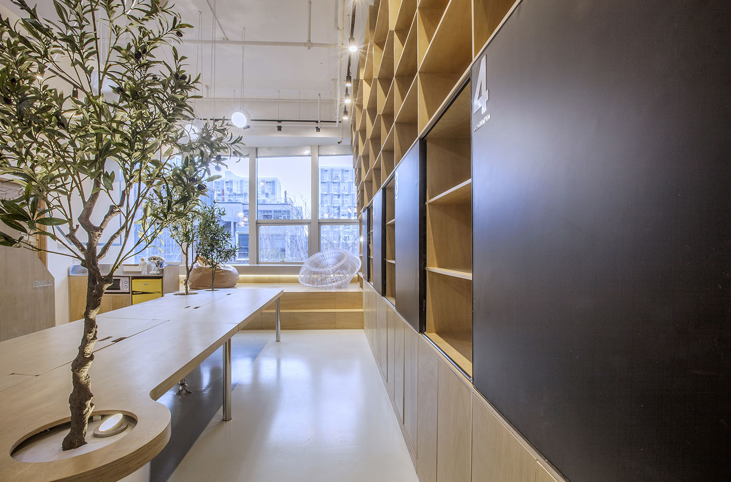
∇ 移動黑板,隨時記錄我們的靈感
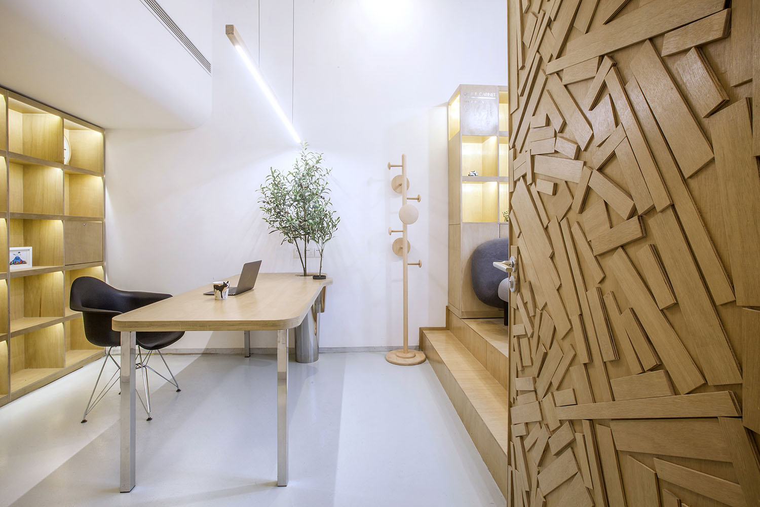
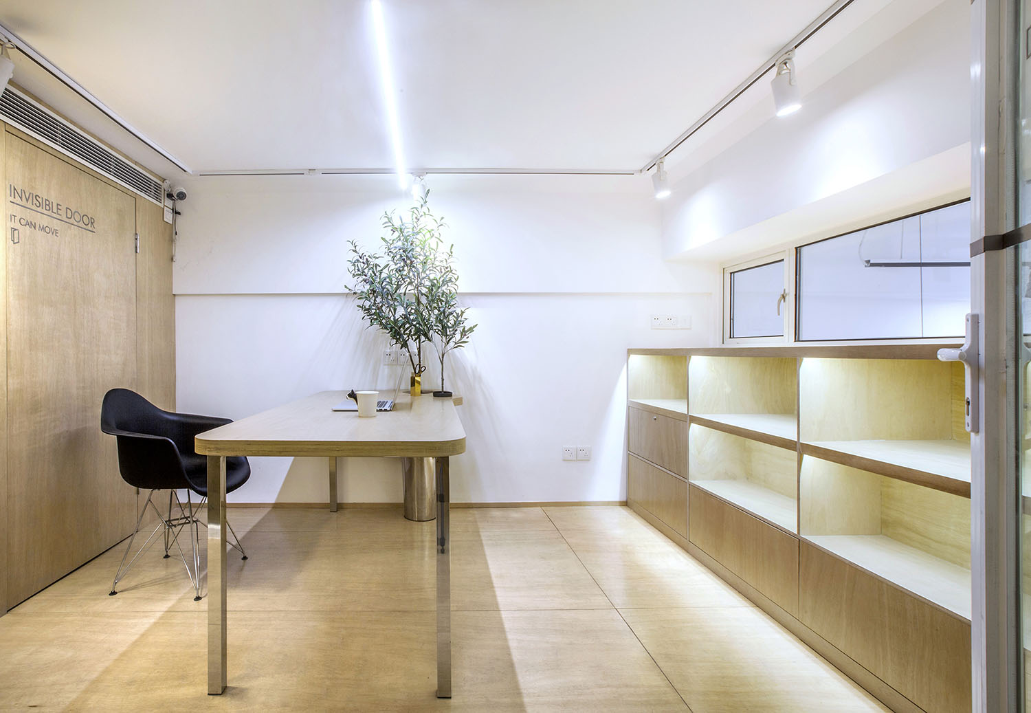
辦公桌與樹的結合,成為了整個空間的內景觀,也與外麵的綠色形成呼應,消減以往辦公的緊張氛圍。整牆的書架也不甘無趣,在實用的框架下,產生一絲波動的起伏,如同山崖,如同坡麵。
The combination of the desk and the tree has become the interior landscape of the entire space and also forms an echo with the green outside to reduce the tension in the office. The entire wall of the shelves are unwillingly boring, in a practical framework, resulting in a wave of fluctuations, like a cliff, as the slope.
∇ 空間的每個元素都參與美與樂趣的構築
∇ 給予時間以生命而不是給生命以時間
空間中景觀最好的位置進行的抬高,讓原來的窗戶有了落地窗的感受,獲得更好的景觀視野,同時高度上的變化與分割,也讓空間更有樂趣.
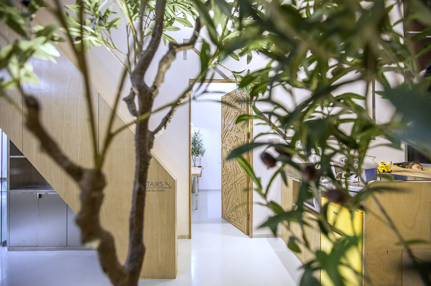
空間每個元素都希望滿足功能的同時,本身就是一個符號.於是門就變成碎木頭塊,規矩中藏著隨性,配合平麵符號,讓這麵牆充滿樂趣.
The elevation of the landscape in the space is maximized, allowing the original window to have a floor-to-ceiling window feeling, a better view of the landscape, and a greater degree of change and fragmentation, all while making the space more enjoyable.
Each element of the space that wishes to satisfy its function is itself a symbol, so the door becomes a block of wood, which is hidden in the rules, with flat symbols, to make the wall fun.
∇ 樓梯的造型與辦公桌構成空間的大結構
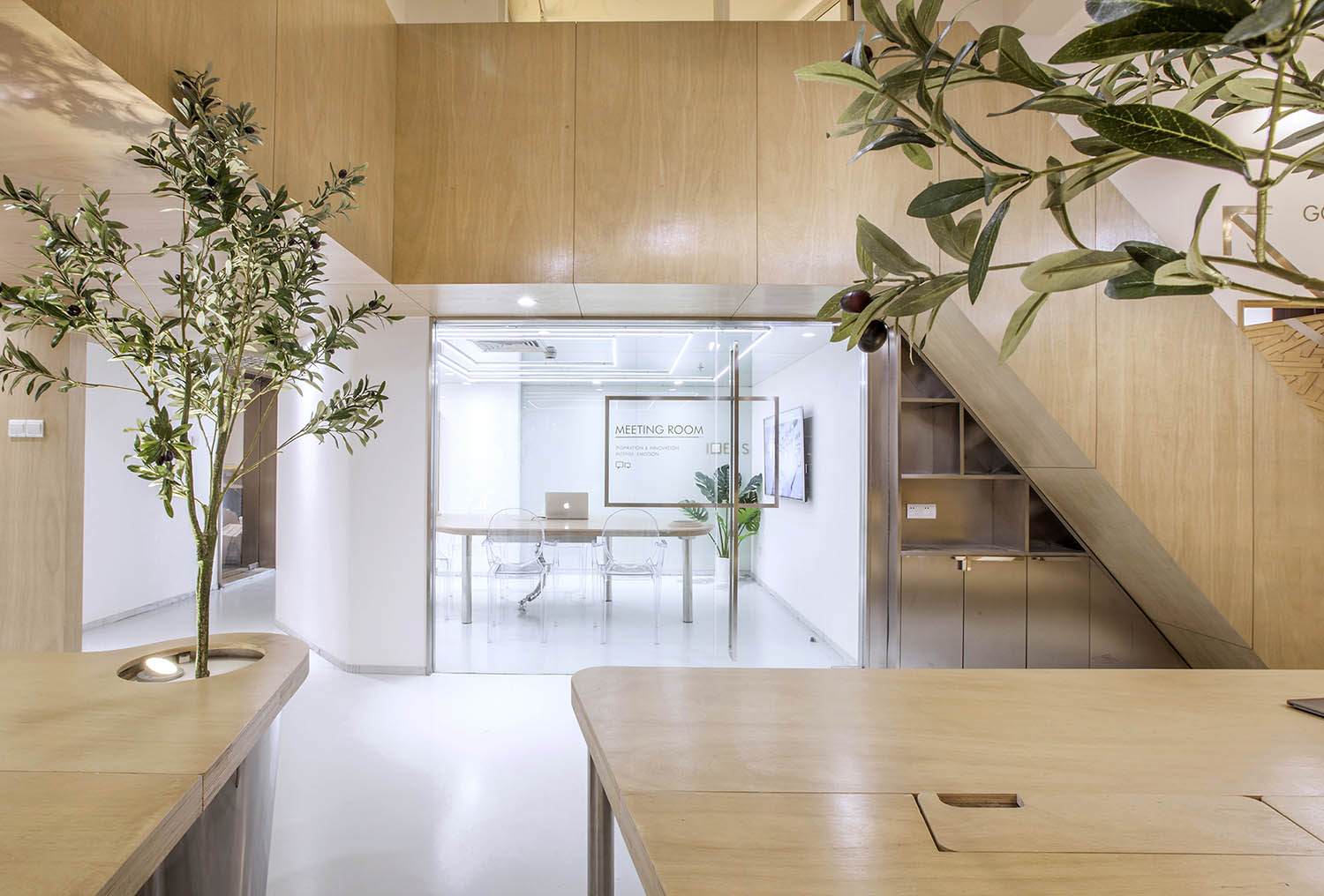
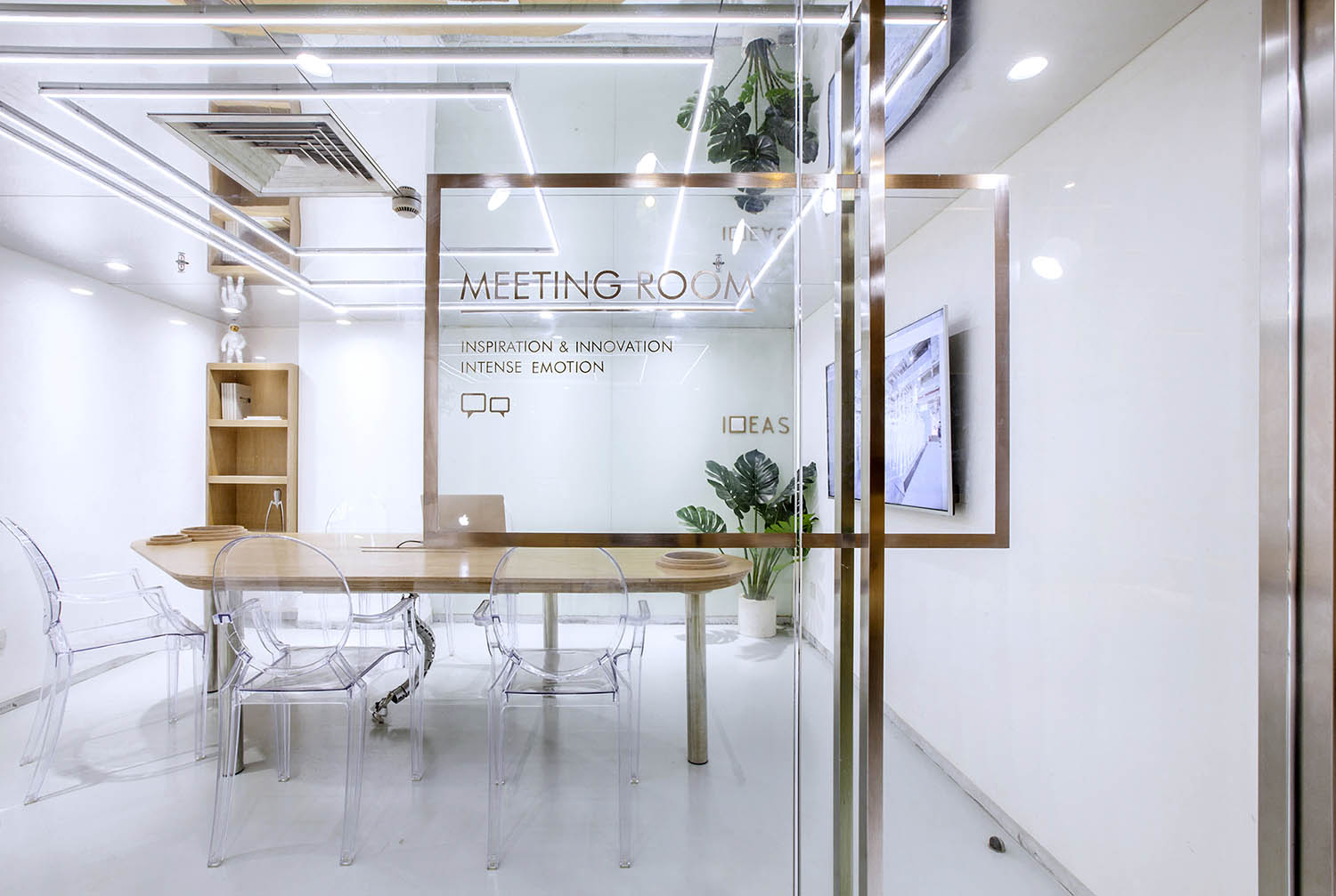
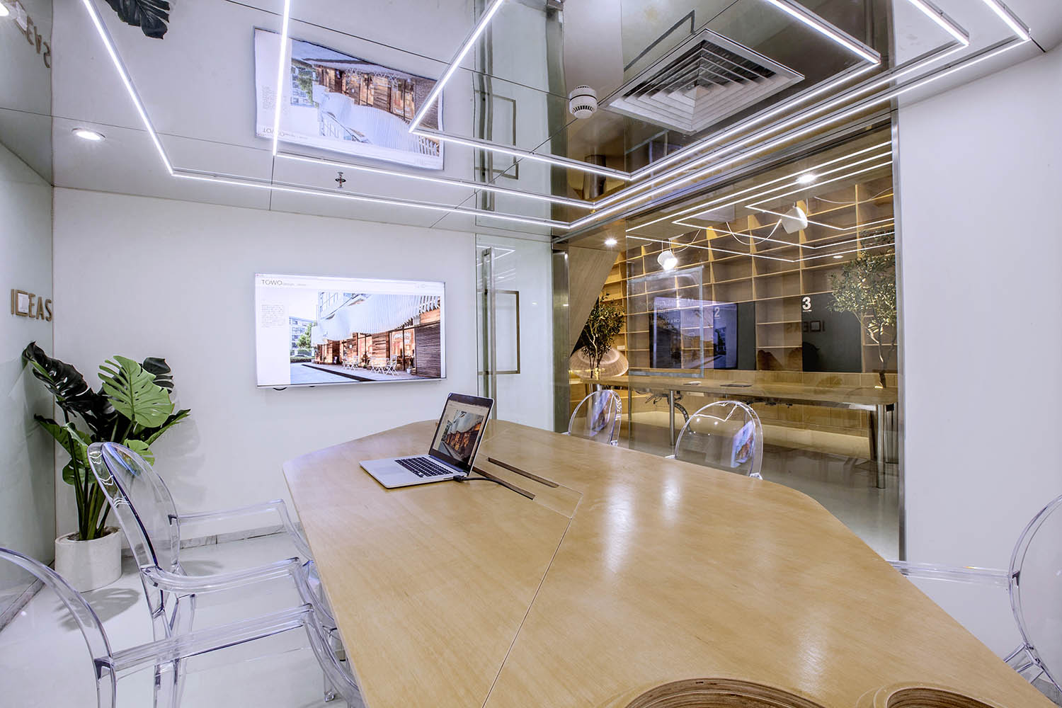
由於層高的限製,會議室感覺比較壓抑,所以將整個天花變為鏡麵,化解的層高的局限,也讓空間感別具一格.但是空調的出風散流器非常紮眼,空調的位置決定了風口位置無法移動.而市麵上又找不來合適的可以符號化的替代品,於是,就順勢而為,將會議室的照明以散流器為中心進行布置,讓散流器的方框與燈光呼應起來,形成了會議室有意思的圖形.
Due to the restrictions of the floor, the meeting room feel more depressed, so the entire ceiling into a mirror, to resolve the limitations of the storey, but also a sense of space unique style. But the air conditioning diffuser is very loud, air conditioning determines the outlet The location cannot move. While the market cannot find a suitable symbolic alternatives, so, to take advantage of the situation, the conference room lighting to the diffuser as the center of the layout, so that the diffuser box and lighting Echoes, forming a meeting room interesting graphics.
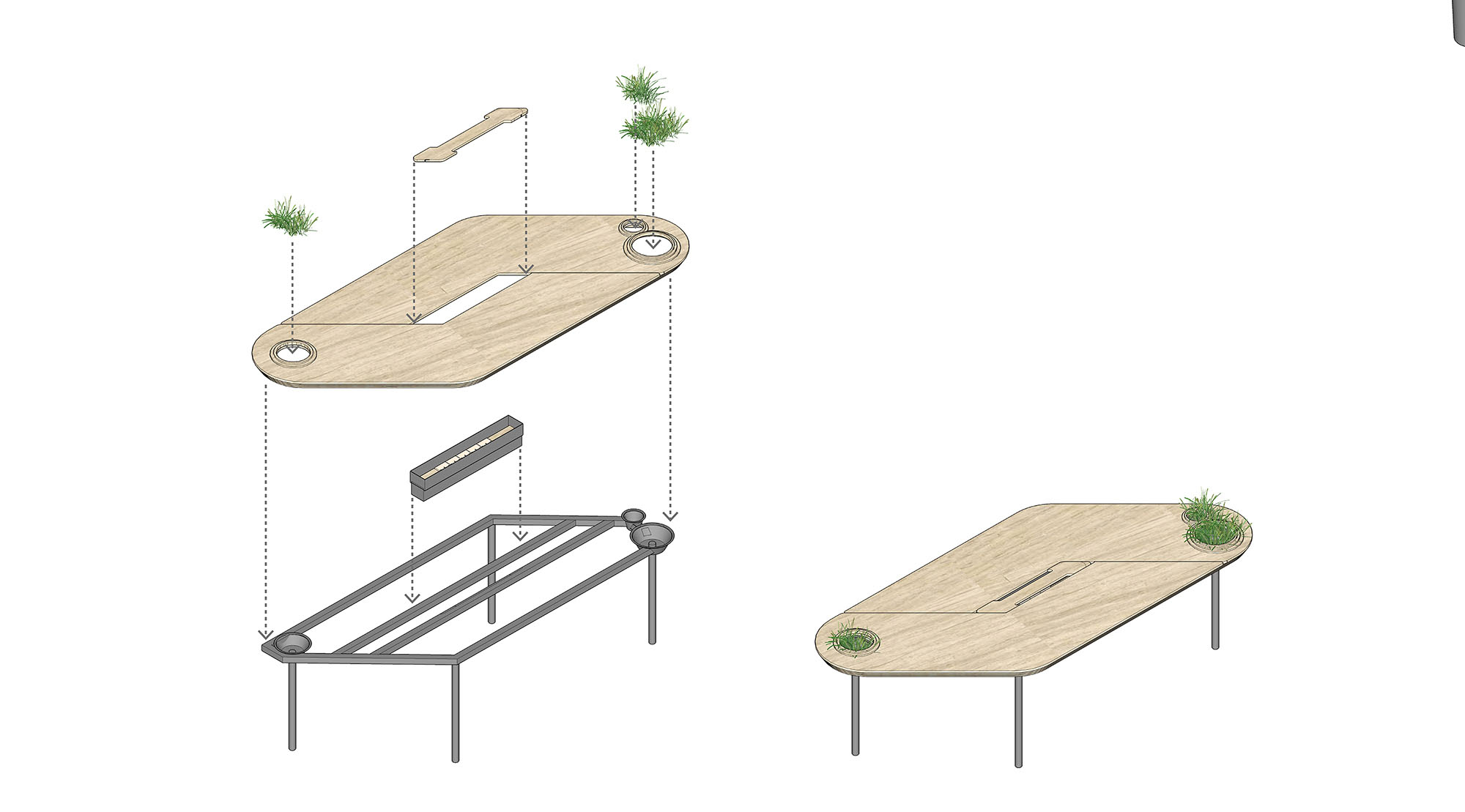
同時我們希望有一個張別具一格的會議桌,但是會議桌極強的功能性使得難以去進行改變.於是,會議室空間本身的形狀缺陷成了這張桌子想法的起點.由於避讓入口玄關,會議室空間有一個角是切掉的,牆壁是斜著放置,如果是長方形的會議桌,就必然在這個斜牆前造成使用空間不夠缺陷,無法坐人.所以就產生了一個平行四邊形的會議桌,斜邊與空間的斜牆平行,也讓整個斜牆前的空間可以坐下一個參會者,再嵌入一些小草,一張獨特又實用的會議桌就出來了.
At the same time, we wanted to have a unique conference table, but the extremely functional nature of the conference table made it difficult to make changes, so that the shape defects of the conference room space became the starting point for this desk idea. Due to the avoidance of the entrance porch, There is a corner of the space is cut off, the wall is placed diagonally, if it is rectangular conference table, it is inevitable in the oblique wall caused by the use of space is not enough defects, cannot sit .So there was a parallelogram conference table, The hypotenuse is parallel to the sloping wall in the space, allowing the entire space in front of the sloping wall to sit under one participant, embedding some grass and a unique and functional conference table.
∇ 會議桌功能分解圖
∇ 必經之路上的樂趣
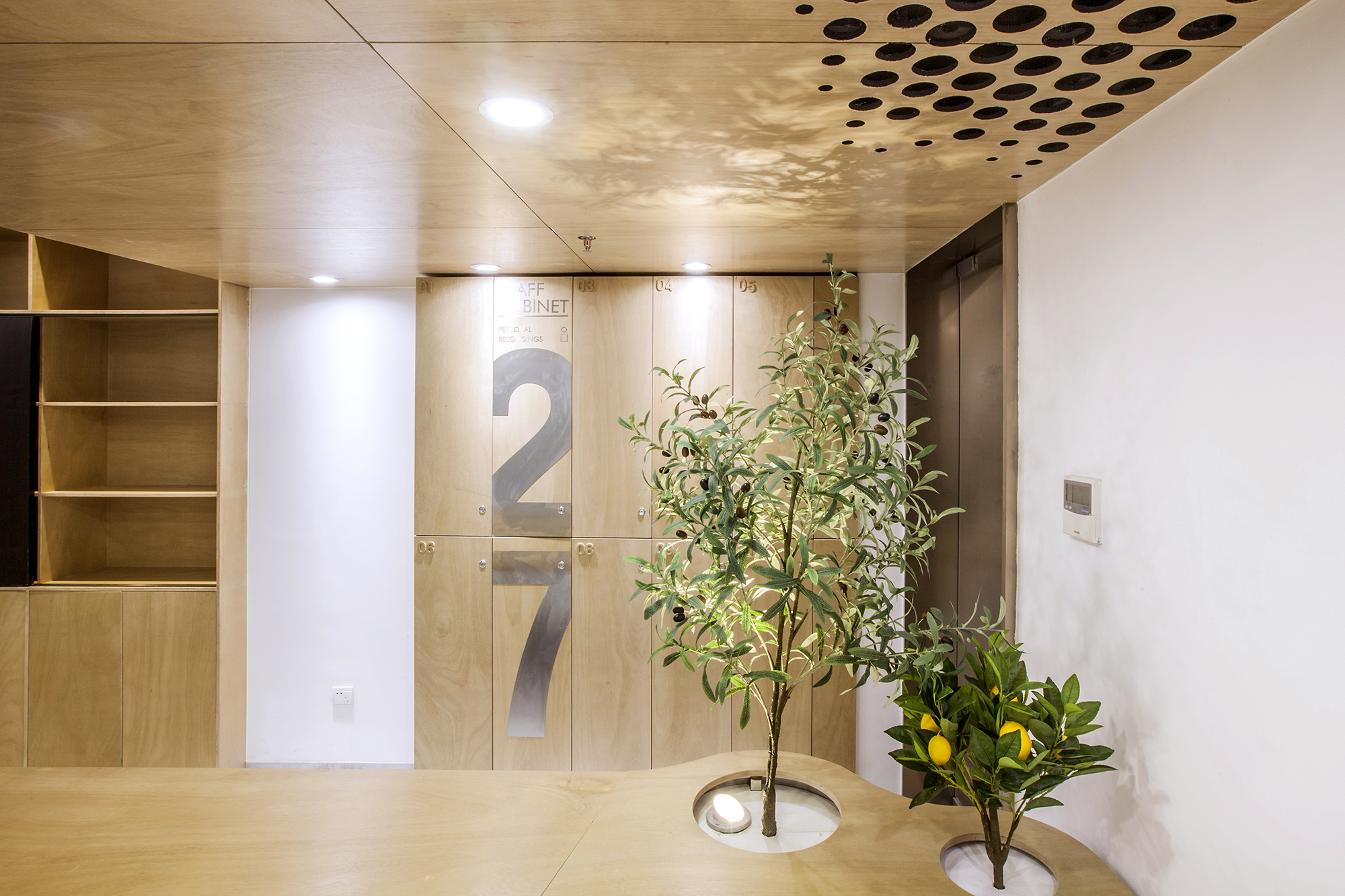
∇ 員工個人儲藏櫃
∇ 入口
∇ 入口
∇ 關掉燈,是另一種表情
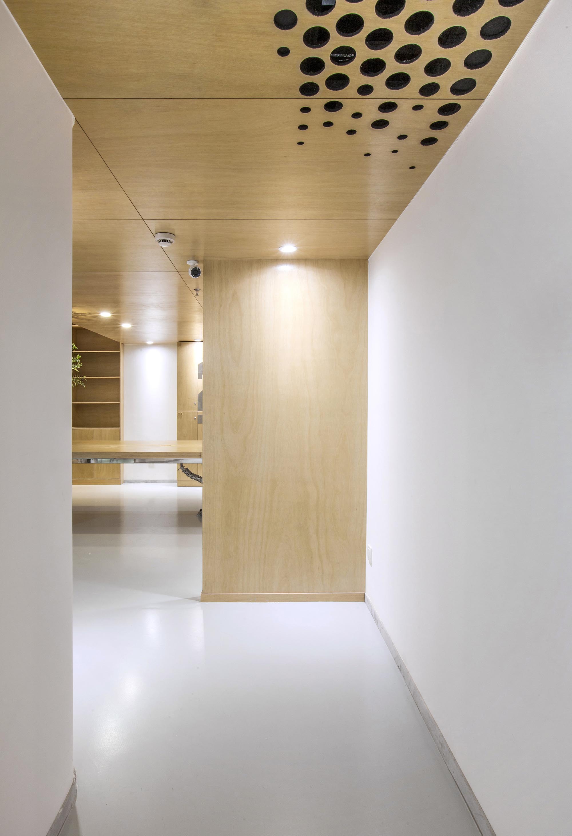
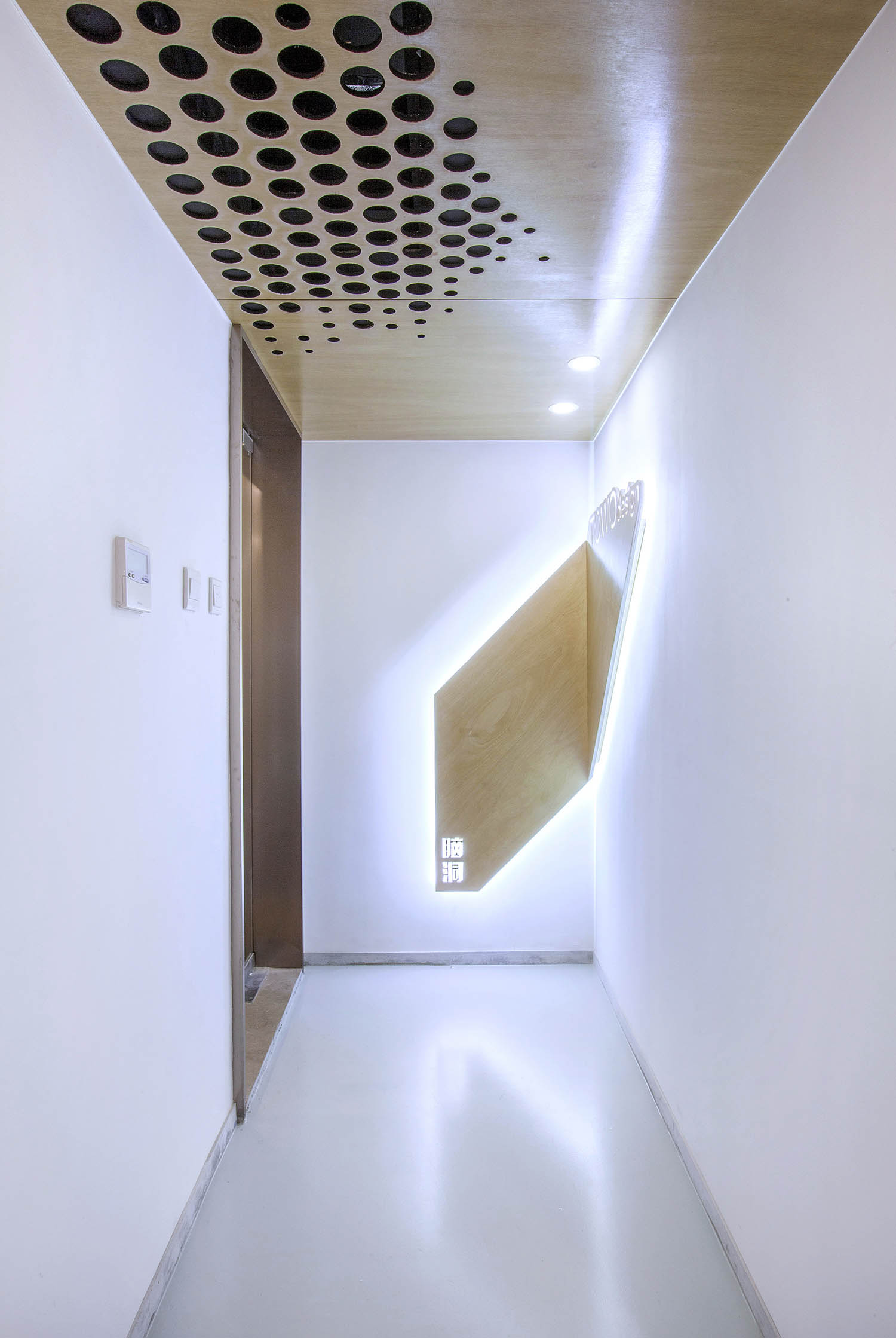
功能融於樂趣與創意,兩個空調的回風孔也不能放過,市麵上的百葉口為了實用而完全無法融入環境.由於吊頂也屬於木質體塊,所以經過試驗,一個充滿漸變的點陣圖形,解決了這個問題,不同規格的開孔器進過精心布置並開洞,讓空間回歸純粹與樂趣.
Function into the fun and creativity, the two air-conditioning return air holes cannot let go, the market for the practical and completely jacketed not integrated into the environment due to the ceiling also belong to the wooden body block, so after testing, a full of gradient lattice Graphics, to solve this problem, different specifications of the hole into the well-placed and open hole, so that space returns to pure and fun.
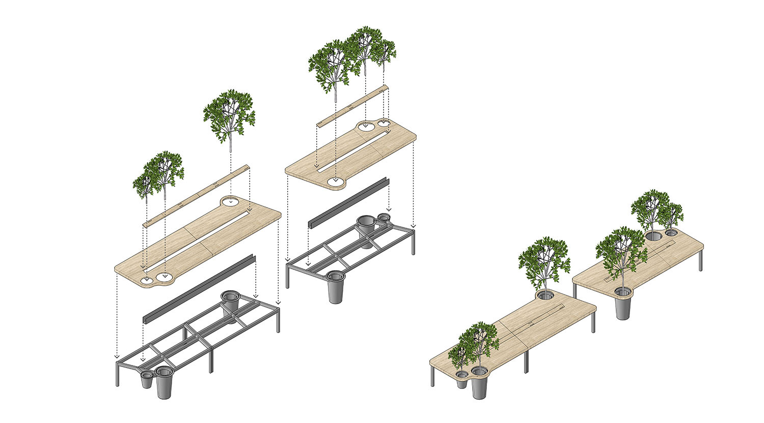
∇ 大辦公桌功能分解圖
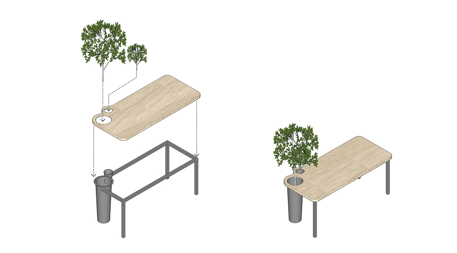
∇ 辦公桌功能分解圖
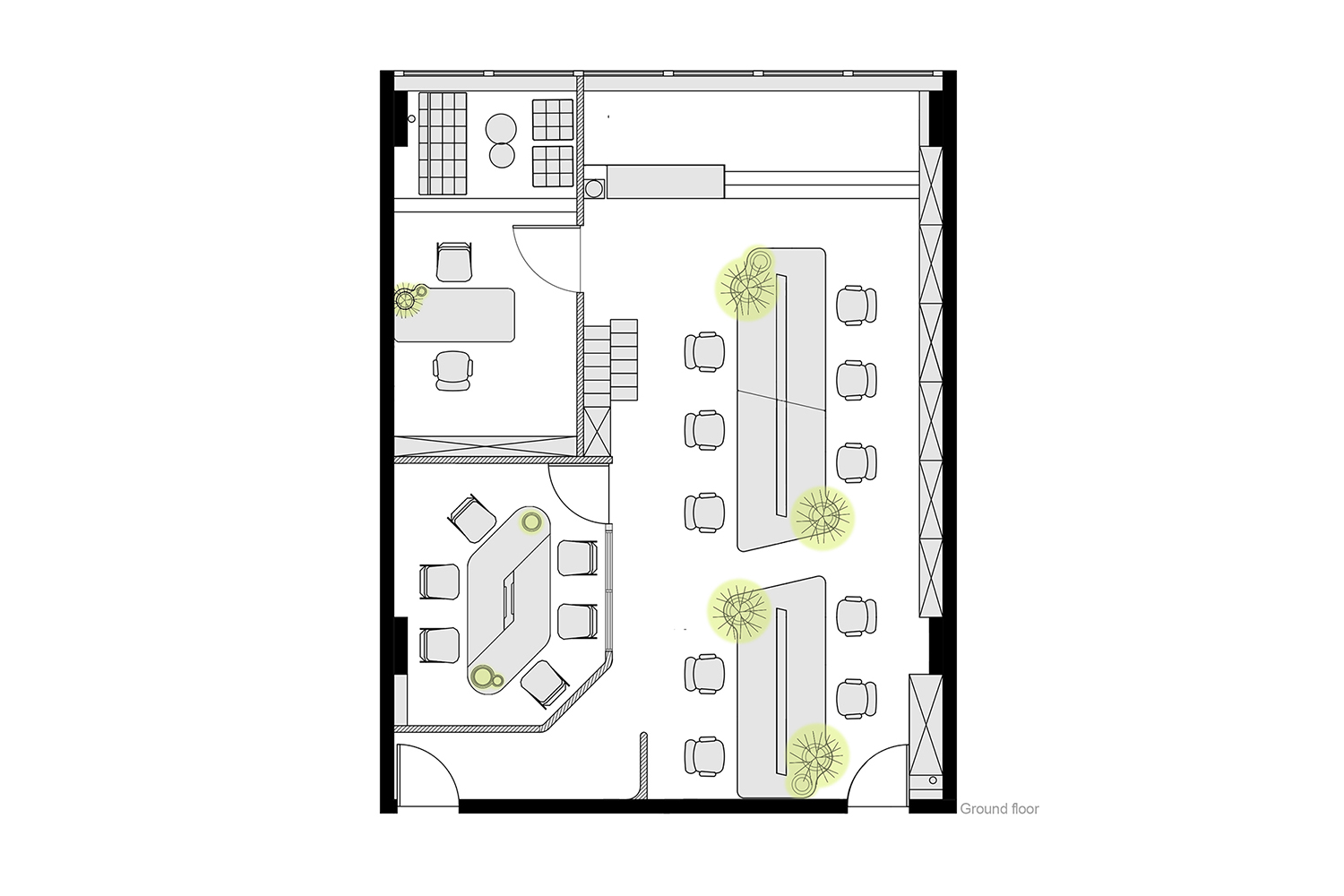
∇ 一層平麵圖
∇ 二層平麵圖
完整項目信息
項目名稱:TOWO堂晤設計工作室
項目地點:中國.上海
完工日期:2017.12
項目麵積: 130㎡
設計團隊:towodesign堂晤設計
主持設計師:何牧
項目團隊:劉雄傑、遲玉瑛
堂晤官網:www.towodesign.com
攝影:towodesign
微信公眾號:towodesign
Subtitle: TOWOdesign studio
Location: Shanghai,China
Completion: 2017.12
Area: 130㎡
Design team: Towodesign
Design in charge: He Mu
Project team: Xiongjie Liu/Yuying Chi
Website: www.towodesign.com
Photo: Towodesign
Official Accounts: towodesign


